OBSERVATIONS
- Student 1 was observed in Frist, sitting in a long (>10 minutes) gap between classes. He was browsing the internet on his laptop. When asked what he generally did between class in short periods (10 minutes), he said he only had time to walk to classes. When asked what he did during long periods, he said he generally tried to get homework done.
- Student 2 was observed in Frist, sitting in a long (>10 minutes) gap between classes. She was reviewing class notes. When asked about activity during long breaks, she said she tried to do classwork. When asked about short breaks, she said she didn’t have time to do much, but would sometimes try to look over notes before a precept.
- Student 3 was observed in a long break before classes. He seemed to be walking around looking for people to talk to. When asked about what he did during long breaks, he generally said he went back to his room to either work or hang out. When asked about short breaks, he said he only ever had time to go to class.
- Student 4 was observed in a long break in Frist. He was reading over notes for a class. When asked about long breaks, he said he generally tried to get school work done. During short breaks, he said he didn’t have time to do anything except get from class to class. He also added that during “mid-length” breaks (~30 minutes), he struggled to find anything productive to do.
All students, when asked about what they did during the short period, seemed to be mildly surprised by the idea of actively trying to get any errand or task done during the short interclass period. All also mentioned that it was sometimes a struggle just to get from class to class, much less attempt anything during that time. During long breaks, all students observed seemed to have a plan to be productive, but during short breaks, there was no attempt. All students said that concentration was an issue in the long breaks. The salient problem for long breaks seemed to be keeping students productive and focused within that limited time frame, while the salient problem during short breaks seemed to be simply getting students from class to class on time while allowing them to do anything else.
BRAINSTORMING
- An app that counts the number of people in the lecture hall of your next class, letting you know if you have to rush to get a seat.
- An app that lets you know how far your professor is from the lecture hall, letting you know whether you need to run to class (helpful in small classes/seminars).
- An app that, given two classes and a destination that must be reached in between, gives the shortest path.
- An app that allows you to access the notes for your next class with a single button click, and updates itself without user action between classes.
- An app that displays your upcoming homework due dates graphically
- An app that shows you the number of people waiting at different coffee vendors around campus.
- An app that lets you know whether your friends are in your next class or not (so you can skip and get their notes)
- An app that, given a syllabus at the start of the semester, updates you on the readings/lecture topics each day.
- An app that lets mail services know you are coming for a package so they can find it for you (sort of like a fast-track line)
- An app with games to warm up your fingers on cold days.
- An app that maps your activities for the whole day (classes, meals, extra curriculars)
- An app with an “on the way” signal that is sent to you professor when you are close to the lecture hall (so the professor can decide whether to wait for stragglers).
- An app that gives you a spot to meet friends so you can walk to your next class together.
- An app with an onscreen arrow that points in the direction of your next class.
- An app that signals when you pass close to a coffee vendor so you don’t forget to get a cup in a rush.
PROTOTYPES
QuickNote – This idea was chosen because 10 minutes is plenty of time to review notes on the way to a class, but current tools don’t make note-viewing on the go instantly accessible.
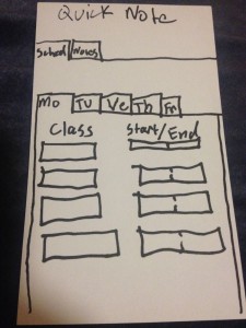
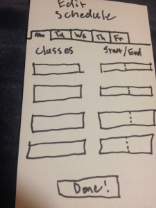
The schedule editing screen (accessible on phone or web) allows users to enter their class schedule into the app. Since the app knows when the users classes are, it can provide the notes for the next class without user prompting, ideal for note access on the go.
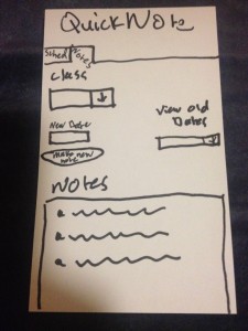
The note entry screen (accessible by phone or web) allows you to add notes to the app to display later. Accessibility by computer allows you to easily take notes on the computer and copy and paste them into the app. Extensions for a desktop application could be made that would automatically read a directory, parse the files contained in the subdirectories, and update the notes on the app.
Users first select the class they want to add notes for, create a new note and give it a date, and enter the note. They can also view older notes for a class and edit them.
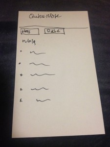
The note viewing screen (the default screen on the mobile app) automatically updates to show the notes for the upcoming class. Since the app knows your schedule, opening the app from a phone will automatically bring you to the notes for your next class first, thus minimizing use time. Users can also select notes by class and date if they do not want to view the notes of the upcoming class.
——————————
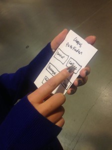
PathFinder – This app combined the various map based ideas from brainstorming to create a tool that could allow students to get from class to class quicker, while giving them the information that would allow them to efficiently perform simple errands (such as stopping by a different building, getting coffee or picking up packages) in between.
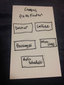
The home screen allows the user to pick what service they want. They can
- Edit their schedule
- find the shortest path from class to class while detouring through another location
- find the fastest place to get coffee
- see wait times for picking up a package and join the “fastpass” package line
- and find the shortest path from class to class normally.
This screen lets you edit your schedule.
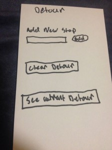
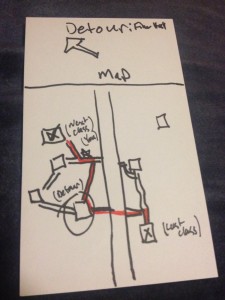
This screen lets you add a new stop to your detour path, and the app can reorder the stops to have the shortest path. It also allows you clear the detour path you have set. If you navigate away from the screen and come back, you can see what detour path you are currently on. After reaching a class, the detour path automatically clears itself.
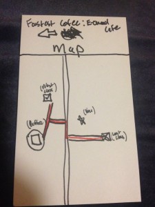
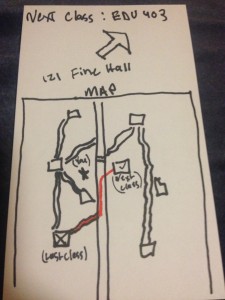
On the top of the screen is an arrow that gives you the straight line direction to your next destination. This feature is for those people who like to go off the normal paths and find shortcuts through campus.
The coffee finder screen takes two things into account when finding the fastest coffee location. The deviation from the path to your next class, as well as the number of people in line at the coffee vendor. Taking into account these two variables, the coffee finder function provides the location that will provide the minimum delay. It also has the shortcut arrow at the top of the screen.
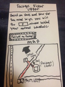
Like the coffee finder, the package picker upper calculates the time you will be delayed in picking up a package by looking at the deviation from the path to your next class and the number of other people using the app that have said they are picking up packages. If you decide to pick up your package, you can notify the mail staff and they can take your package out of the stacks ahead of time, and you could be served by an express line. It also displays the shortcut arrow to your destination.
The simplest feature, it shows you the path (and shortcut arrow) to your next class without any distractions.
TESTING AND FEEDBACK
User testing was conducted in Frist. Temperature and unwillingness of test subjects prevented the tests from occurring outside while walking from place to place. Instead testing took place in Frist, and I attempted to recreate the situation of moving from class to class by giving situational “events” (i.e. “you’re leaving your class. Do you want to get coffee?” or “Is there anything in another building you need to pick up.”)
Five users were tested. All said without prompting that if such an app were to exist, they would use it, with three encouraging me to either make the app or propose it to the USG.
Insights:
Users differed in whether they were more likely to follow the arrow or the map, with 3 users preferring the map and 2 preferring the arrow. Care should be taken to present the arrow and map as complementary, so that users do not feel like the two are presenting conflicting information. In an app specifically designed to minimize decision making in stressful times, forcing an unexpected choice (whether to follow the arrow or map) introduces a huge inefficiency.
The choice of the word “detour” was confusing to some users, with one thinking it was a function that would provide a pastime to users with time to kill. The “add detour” wording was also confusing to some users, with some users being unsure whether pressing add would add a new stop along the path or create a new path entirely. In an app designed with a minimal interface for maximum intuitiveness/inefficiency, a few extra words could go a long way towards clearing up use (i.e. “add new stop to current path” instead of “add new stop”.)
User suggestions:
The class/time schedule, with locations coming from the registrar, could have problems when class locations are changed. Instead, the schedule should be location/time, so class changes could be easily fixed, and the app could generalize to all activities for the entire day instead of just classes.
Instead of just having a shortcut for just coffee and packages, a “common detours” menu should be available that would also include libraries and food vendors (dining halls, convenience stores, etc).
A time estimate display similar to that on the package menu should be added for the coffee finder.
An explicit back button and help/instruction menu should be added.

