Observations
1. (HCI) Wednesday 2/20 2:50 pm before class started:
The majority of students were checking their email on their laptops. Fewer students were on Facebook and a surprising handful of students were browsing through Youtube videos. The class is relatively full and there are few empty seats dispersed in the seating configuration. There are many small clusters of students (friends I’m presuming) sitting close to each other and chatting together.
2. (COS340) Monday 2/25 2:50 pm before class started:
The nature of work before lecture differs from HCI. In this class, a majority of students are going over notes, rereading assigned readings, or working on part of the problem set. Still, there are students on their laptops checking email. I notice a couple of students listening to their iPhones. Regardless, the new theme here is that students are reviewing material before lecture. After lecture ends, students wait around in line to speak with the professor.
3. (COS333) 10:50 am before lecture:
The most striking observation made was the professor’s effort in remember every students’ face and name. He goes back and forth between referring to his printed sheets of enrolled students’ prox IDs and greeting students through the door by name if he recognizes them. Right before lecture starts, he walks throughout the lecture hall taking pictures of students.
4. (REL) 1:20 pm before precept starts:
Students in the precept are quiet and either going over the assigned readings or reviewing each student’s discussion post on Blackboard.
5. (SOC) 9:50 am before lecture starts:
It is relatively early. While most students are seated already, there is a stream of students rushing into class well pass 10 am. This goes on until 10:10 am. Before lecture starts, most students are reviewing readings for today’s lecture. Again, other students are checking email or Facebook. Because it’s still early, several students are drinking (coffee or tea) or eating a small fruit.
General Observations
- Laptops and phones for checking email and Facebook
- Many students go over notes and readings, especially for humanities or theory classes
- Clusters of students chat together
Brainstorm Ideas:
1. Review compressed notes in a flashcard app before lecture
2. Alarm app that tells a student when to leave for class on time
3. Class Q&A app for asking questions before lecture and answering them after lecture
4. Reminder app that tells busy students when and where is their next class or event
5. Classwide quiz game to review previous lecture major points
6. Platform for sharing notes organized and contributed by students so they can have quick access to a complete synopsis of class material
7. Listen to transcription of notes while commuting to class to make walking more productive
8. Rating application students use after class to rate the quality of the lecture and material
9. Guest Speaker profile app that provides and quizzes you on a guest speaker’s background and biography
10. Related Topics app that shows relevant and interesting news related to a specific class
11. Curate top news around Princeton and give updates on campus events
12. An application that gives a quick summary of other students’ discussion posts in humanities precepts
13. Automator App that automates the routine of web-surfing and email checking so you don’t have to manually redo the same actions
14. Application to help teachers remember students’ names and faces
15. Survey for teachers to gather what topics students are interested in
Top Two Favorite Ideas
I chose idea # 7 because I felt many students, who seek to make their commute between classes more productive, would benefit in optimizing their time between reviewing notes with this app as they are walking or biking to class (it is also an app that I will personally use).
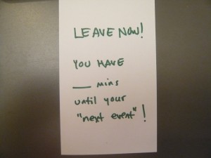
2. I chose to prototype idea # 6 because I notice many students (including myself) always scrambling to get to their next class on time wish they had an automatic alert telling them when to leave for class!
Paper Prototypes
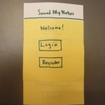
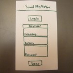
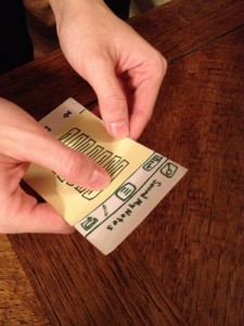
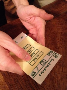
Idea # 7: “Sound My Notes” (Listening to notes while commuting)
Prototype Photos
- Login or register at the home screen
- Register for an account. Otherwise, you can continue logging in
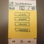
- The main screen has a menu of accessing notes via Class, most recently played, and uploading or creating a new note
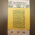
- Clicking either Class or Recent brings up notes arranged accordingly.
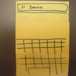
- The app has a search function.
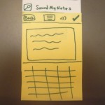
- Users can create a new note. The options are to save the note or listen to a preview of what’s been written.
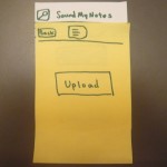
- User can upload new note
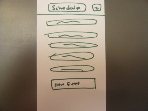
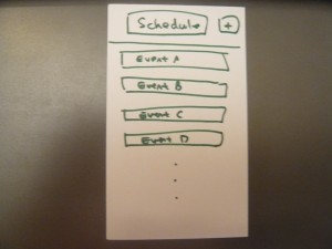
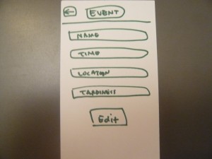
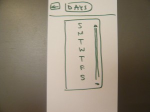
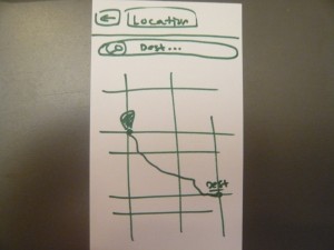
Press the add button on the top right and a new event slot will appear and send you to the “New Event” screen
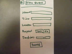
Enter information for new events. Notice you can set a ‘tardiness’ level, which means how close do you want to cut it.
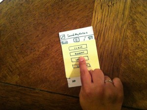
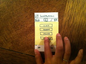
User Test Photos
Feedback
Margaret Wang (East Asian Studies ’14)
My first test trial with Margaret revealed certain features of the prototype that could be improved. After login/registration stage (a relatively straightforward process), once she arrived at the main screen she found the CREATE option very ambiguous. She was not sure if CREATE was a functionality which allowed her to add a new note or if it was for recording audio. She also could not tell exactly how the EDIT option in the menu should function. Lastly, when she did want to add a new note to the current playlist, there was no clear indication where the note was placed.
Picking and playing a note from a given class lecture or a note that was most recently played was intuitive. She understood how to pick the desired note and play it.
Natalie Sanchez (Woodrow Wilson ’14)
For Natalie, she was confused between UPLOAD and CREATE. According to her, she would not really want a CREATE functionality because she would not frequently write long notes on a phone. Instead, all her writing takes place on her laptop. Furthermore, she would like visual notifications – like a status bar – when UPLOADING a file. Other than that, she appreciated how few choices there were and found the app useful.
Luke Cheng (ORFE ’14)
Luke volunteered for the last user test. He found the app convenient but offered lots of critiques. First, UPLOAD is not useful. Most likely, students would work on their personal computers anyway. The app is better off syncing those files on the phone, so UPLOAD is a rather weak feature. Also, he experienced MENU confusion. After clicking through several layers of buttons, he sometimes found that BACK and MENU brought him back to the same page. Those options were overloaded with similar functionality.
Luke actually wanted an ADD or NEW note function. However, he would like it if there were fewer choices in the menu screen. Instead of having the original configuration from my prototype, he would rather have a LISTEN and ADD/NEW option. Finally, a lot of the interactions with my prototype did not take advantage of touch gestures like swiping. I could rely on gestures instead of explicit control buttons on the app.
Insights
In the next few iterations, my current prototype could be further simplified and refined. A common theme among the test users is that the UPLOAD feature is not useful. Students generally work on their computers or laptops, so it would be sufficient for the app to sync note files from their primary computer to the phone.
Users will probably not write long notes on their phones. The main function of the app is to take existing notes and listen to their audio on the go. There is probably no desire to write pages of notes on this app. However, users still have a need to jot and record small notes. The app could accomodate for that by having a audio-recording functionality.
Naming and labeling each option matters. I intended for CREATE to be an option allowing a user to write a new note and add it to the current playlist for listening. However, that name was ambiguous. Labeling should be clearer and more explicit, like ADD or NEW instead of CREATE. This reduces confusion for the users and makes it obvious what they intend to do.
However, designing good interaction needs to a balance between over-explicitness and intuition. Instead of representing every possible action with a button (as I did in my prototype), it is a cleaner approach to take advantage of touch and intuitive gestures such as swiping or pressing. Such actions leads to a more flexible app while reducing clutter. Taking all this into considering, interacting with the app will be more intuitive and cause less confusion than my current prototype.

