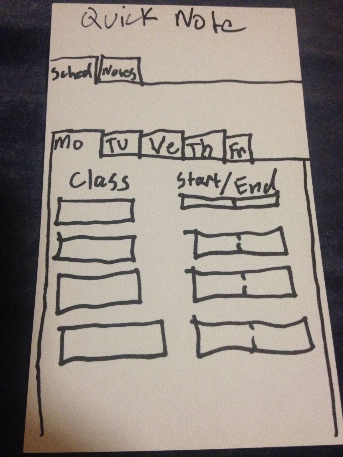
Our group wanted to create a system that could make the interaction between customers, the kitchen, and servers smoother and more efficient. In our first prototype test, we hope to see whether our new interface is intuitive to use and actually improves efficiency, or whether it introduces too much information to servers and confuses them.
Mission Statement:
Our goal for this project is to create a system that can aid the work of servers in a restaurant by easily providing them information on the state of the tables they are waiting. This information could help them make better decisions of how to order the tasks they complete, and complete those tasks more efficiently.
Avneesh, Kuni, and Yaared created the rough prototypes.
Joe and John reviewed and improved the prototypes. They also wrote the task descriptions.
All members participated in documenting the prototypes and writing up the discussion.
PROTOTYPE DOCUMENTATION
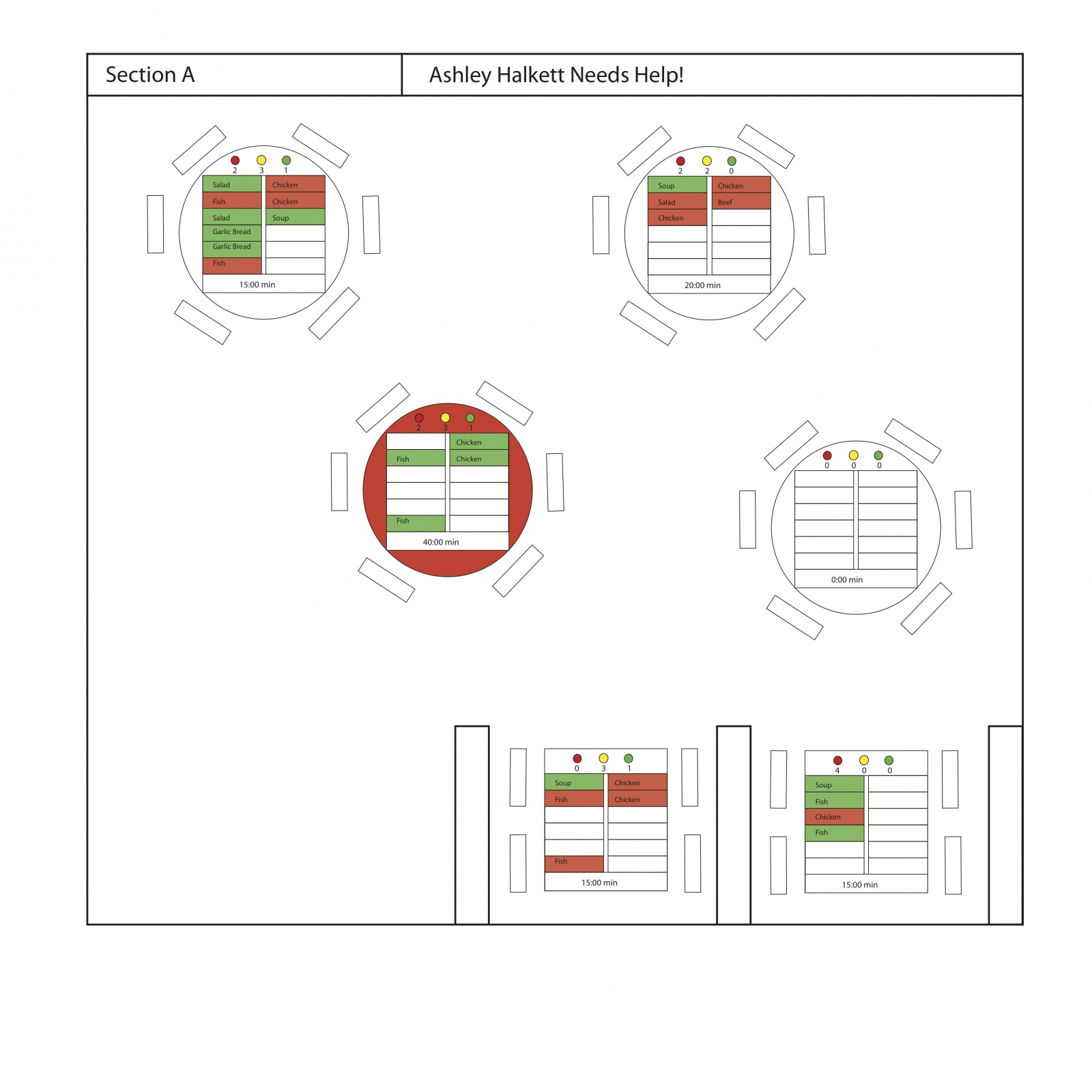
The Motherboard displays all the statuses of the tables in a given section of the restaurant. The tables are arranged in the floorplan of the section, where each table has indicators for cup statuses, a two column list table of all the orders, and a timer for how long since the order has been placed. For cup statuses, we have 3 lights–green yellow and red–that correspond to full, half-full, and empty, respectively. A number beneath each of these lights indicated how many cups are in each state. Our table of orders highlights each order as either green or red, depending on whether the item has been prepared or not, respectively. When the item has been delivered, the entry becomes a white box. Finally, there is a timer for every table that notifies how much time has passed since the orders were placed. If a table has had all green items for over 5 minutes, the table itself turns red, indicating that the food has been sitting for a while. Our coasters were simply cardboard squares for the moment.
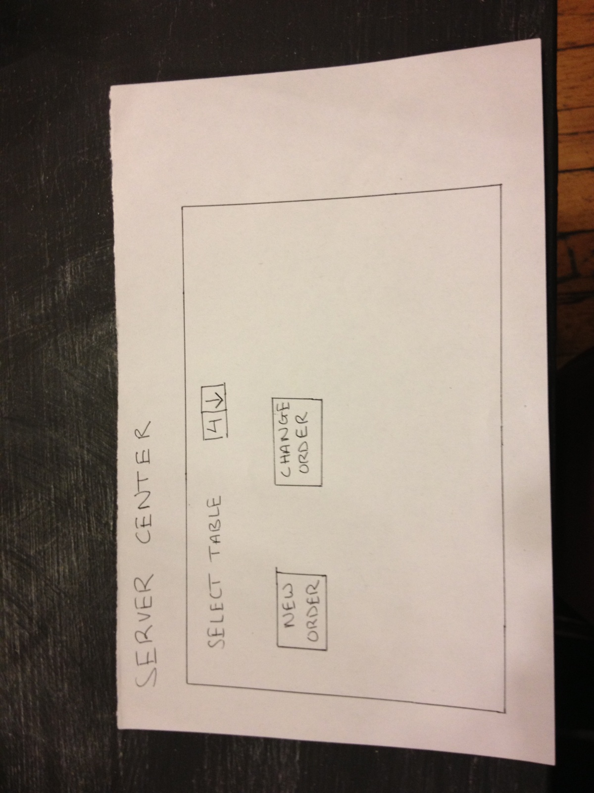
The start screen for entering a new order
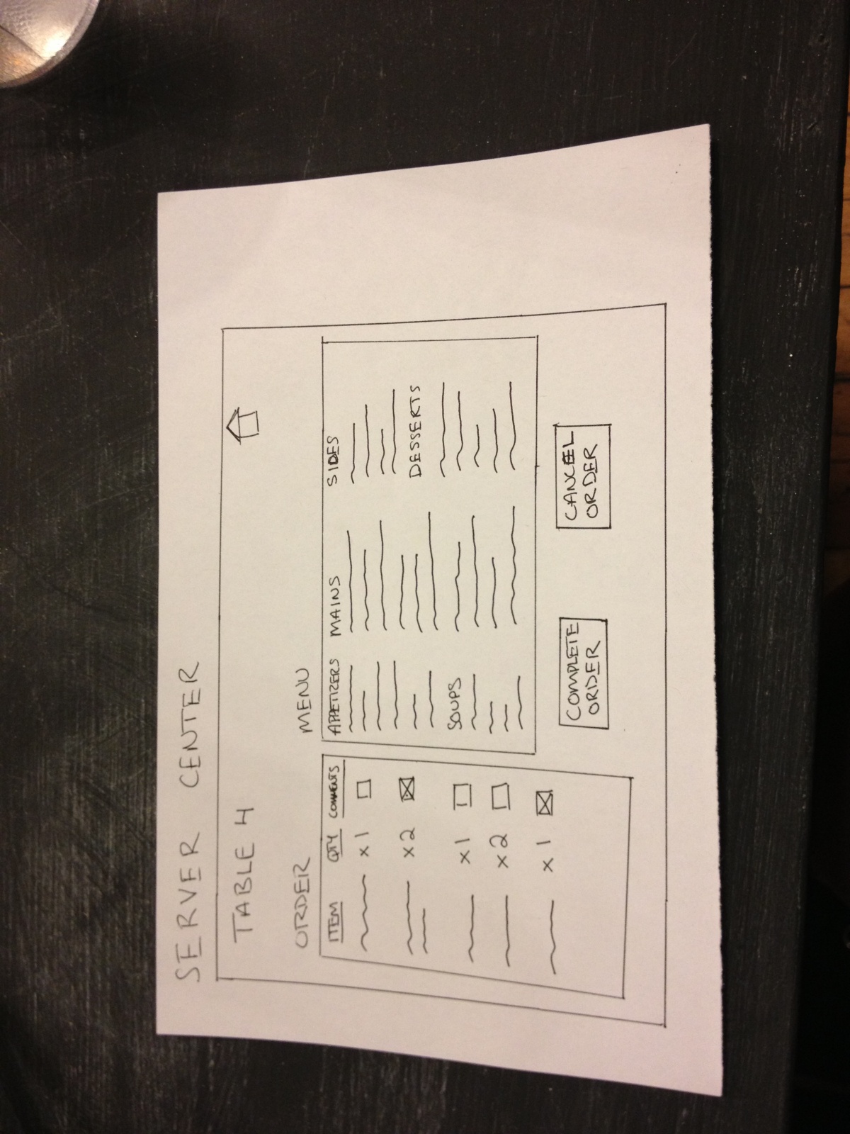
The screen to enter the details of an order.
The screen to enter comments for a particular item ordered
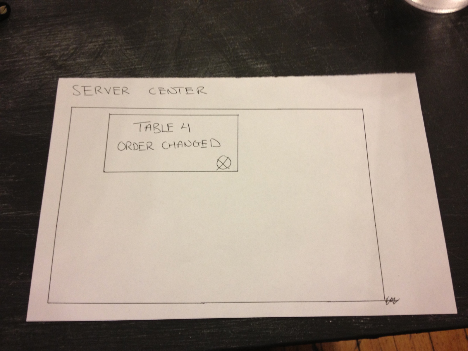
The confirmation screen for changing an existing order
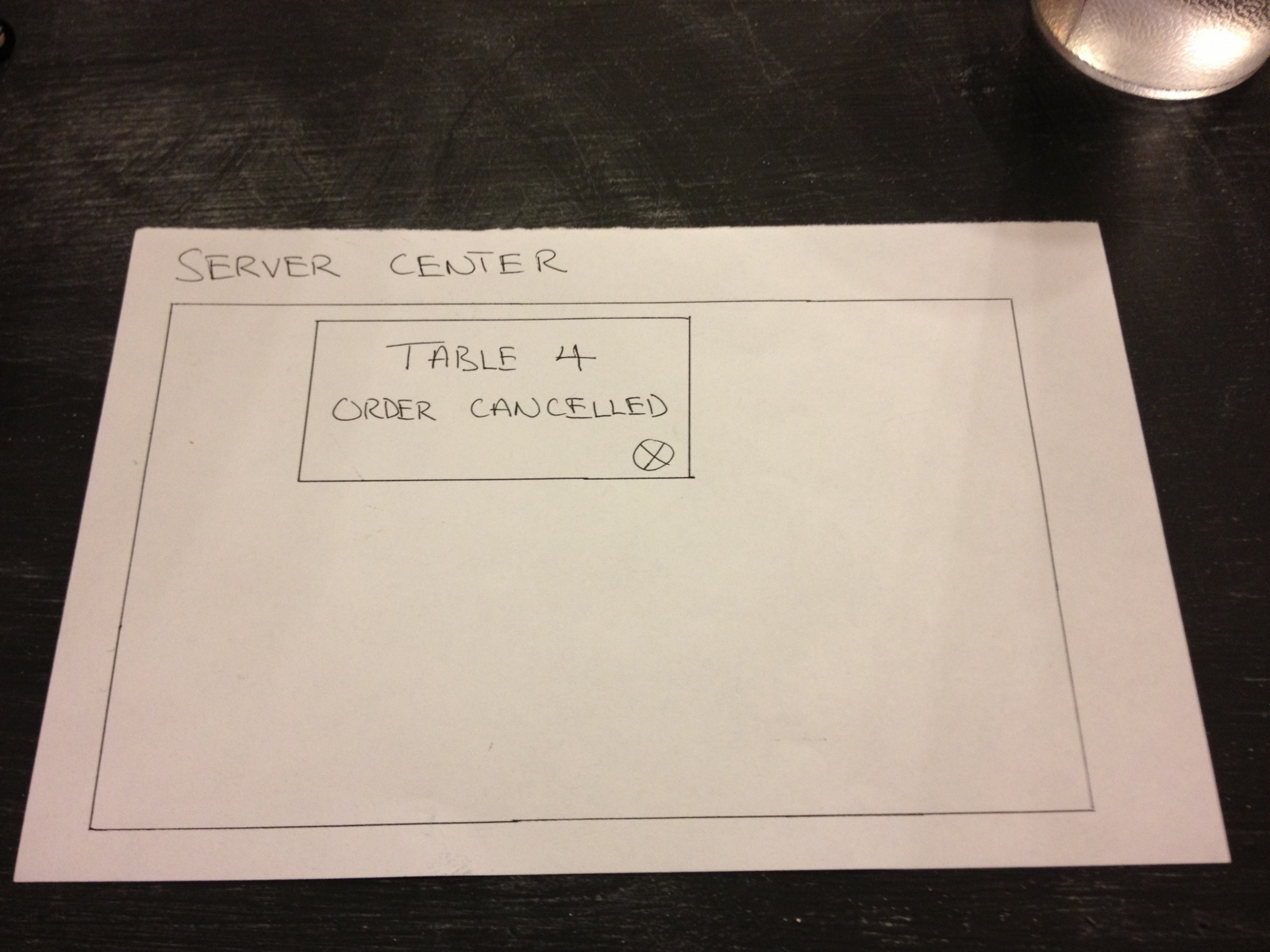
The confirmation screen for canceling and order

The confirmation screen for completing an order and sending it to the kitchen.
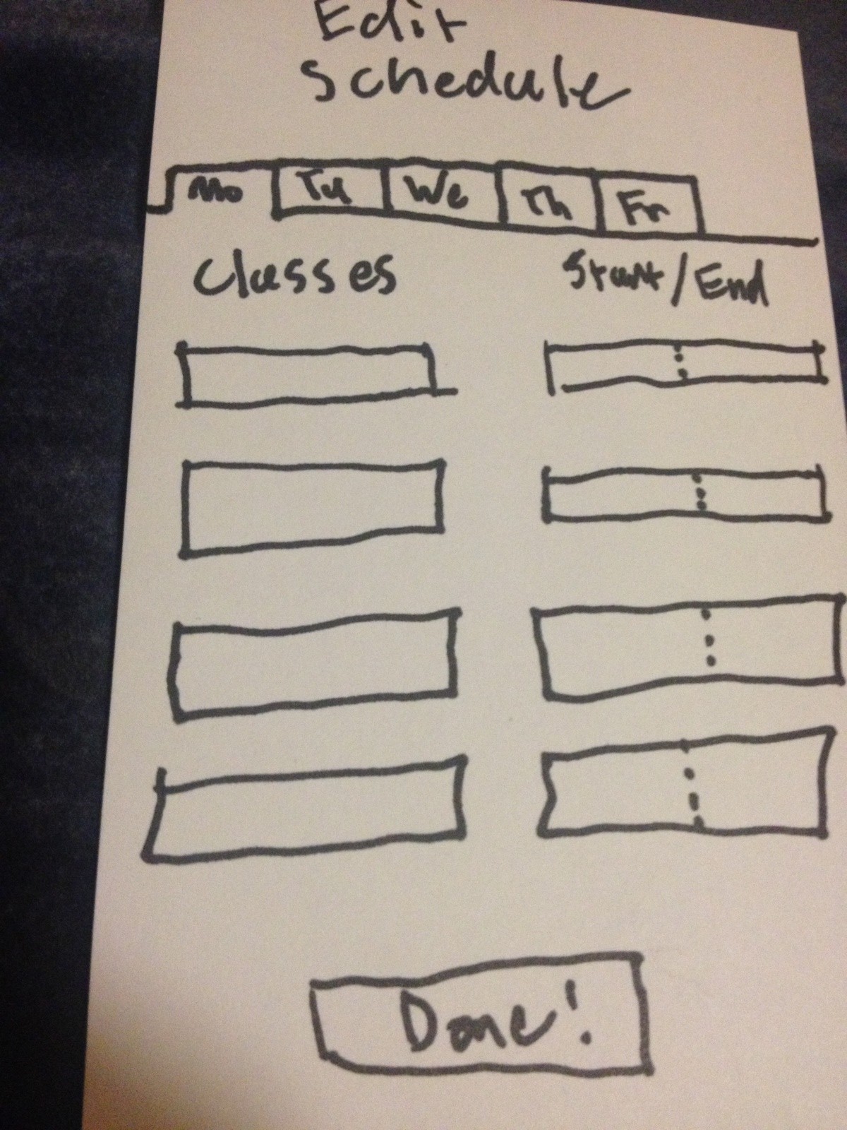
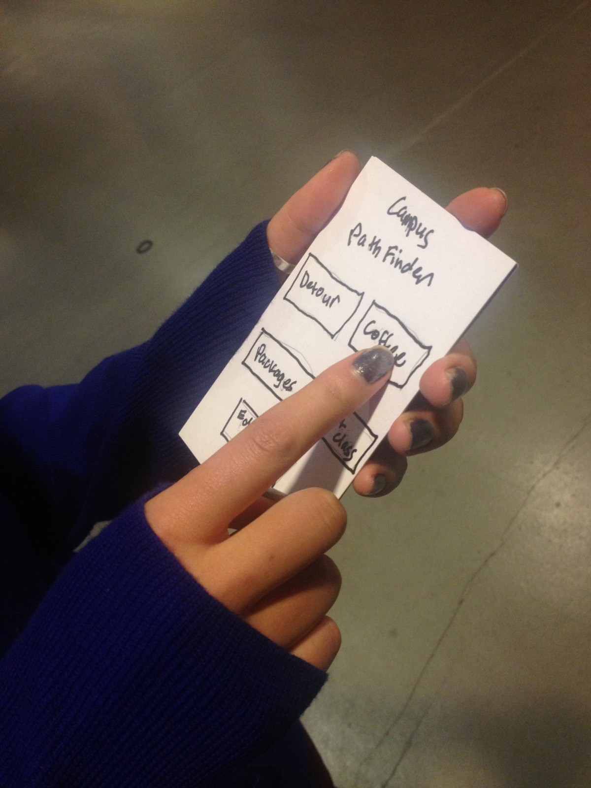
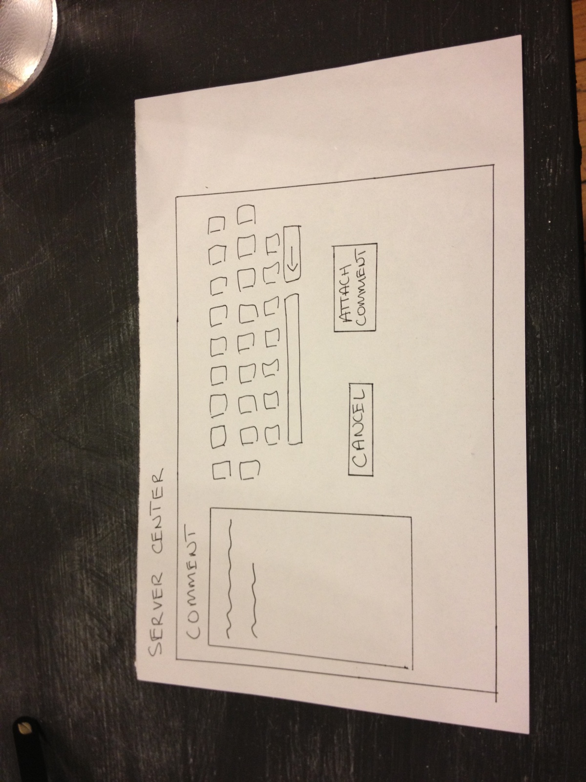
The is the device through which servers input orders. It has three functionalities – making new orders, changing existing orders, and canceling existing orders. The interface is a touch-display screen. The home screen simply allows users to pick a table and then either “Make a new order” or “Change the existing order” for that table. The order screens respectively display the “Current order” (+ any comments), “Menu”, and the “Make new/change order” and “Cancel order” buttons. For a server to add something to an order, he or she must simply ‘flick’ an item from the menu to the left (this will propel the item to the left and add it to the current order, for more than one simply flick again). To delete an item from the current order, simply ‘flick’ it to the left again so it is out of the order (if there are x2 of an item in an order flick left twice to get rid of both items). Servers can also add comments (e.g. well done, spicy) by simply pressing the comment box next to each item in the current order, which navigates to a comment screen with a keyboard in which you can attach or cancel comments. Once the order is done press “Make/change order”. If an order wants to be canceled simply press “Cancel order”. serverCenter is set up so that we don’t run into consistency issues with information in the kitchen center/mother board.
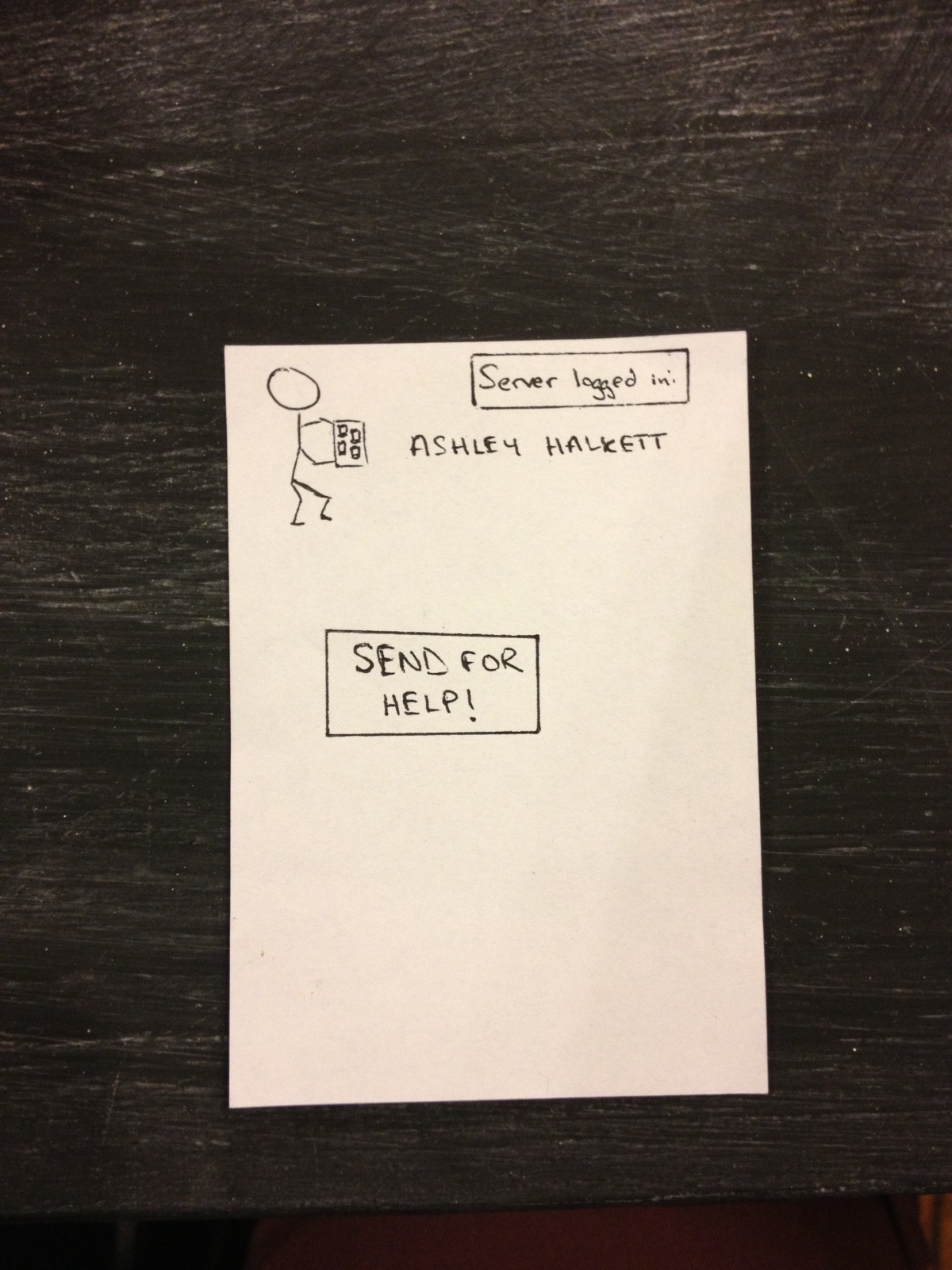
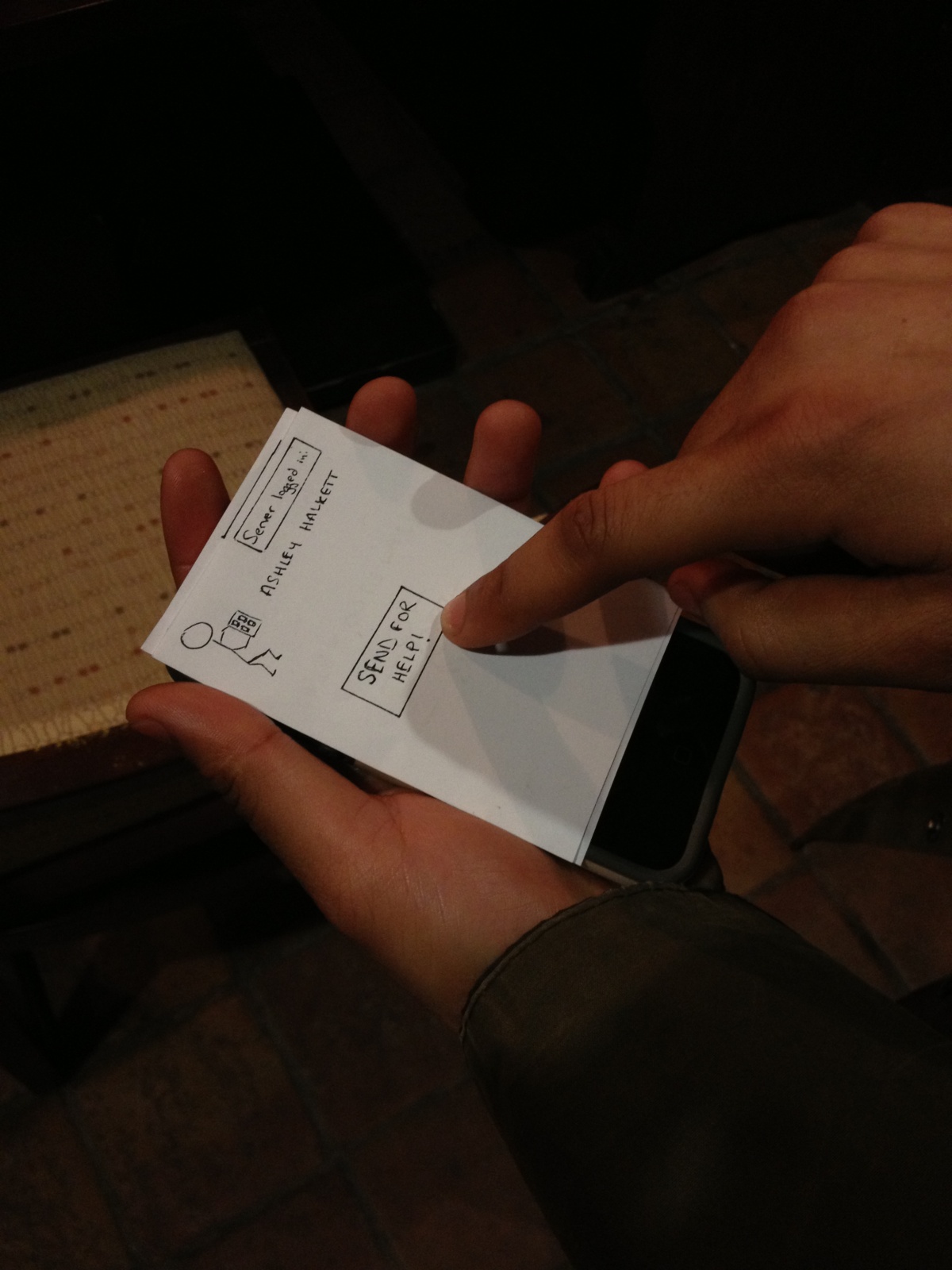
The help button
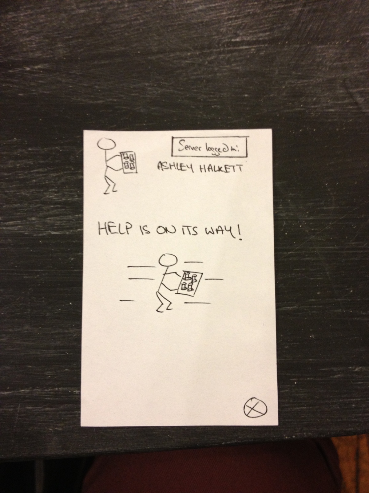
The help button after calling for help.
TASKS
EASY – Calling for Help
Yaared is serving a customer and see’s that another one needs to be served.
Yaared calls for help from another waiter.

Avneesh sees the call for help on the Motherboard.
Avneesh helps Yaared’s other customers
Job well done team!
Yaared calls for help from another waiter.
Avneesh sees the call for help on the Motherboard.
Avneesh helps Yaared’s other customers
Job well done team!
When extremely busy and unable to ask another waiter for assistance, a waiter may request help by pressing a button on his or her handheld device. The other waiters then receive a notification on their handheld device that the given waiter needs help. If the solution to the problem is obvious, a nearby waiter can address it directly. Alternatively, they could consult the motherboard to see if anything is amiss with the busy waiter’s tables. If the problem is less obvious, they can at least come to the vicinity of the troubled waiter so that they can receive instructions directly. The original waiter can then clear the help requested status when the problem has been resolved.
MEDIUM – Checking customer status

The motherboard shows the “state” of each table so the server can infer customer impatience from this low level data.
A medium-level task that a waiter may have to perform is checking to see which tables are waiting on orders, have drinks that need refilling, or may be requesting attention directly. Currently serving staff in restaurants needs to physically go over to the area in question, survey all tables in detail, and then report back to the kitchen for what they need. The prototype app makes this task nearly trivial. Each table’s order data and drink levels are displayed on the prototype screen, along with the amount of time the group has been at the table. The user can see easily the number of drinks that need refilling by looking at the red and yellow lights. If a group has been waiting at a table for a significant amount of time without ordering food, this will also be clearly visible because the table will change colors. All of this data can be easily monitored from a central location instead of by manual survey.
HARD – Determining task order
Determining task order is made much easier when there is information to see what issues are urgent.
Perhaps the hardest task of the waiting staff is just to determine in what order to complete the various other tasks to be completed. Different tasks take different amounts of time, and it is often difficult to complete them in an order that leaves no patron waiting for too long. The most time-consuming of these is actually bringing out the food – since a waiter has to estimate how long it will take for the food to be prepared and may waste time standing around to wait for it – or, in the opposite case, miss it when it comes out since he or she is performing a different task. In the prototype, the presence of red and green highlighting underneath the food ordered at each table shows whether or not it is ready. Using this system, the user will no longer have to waste time going back to the kitchen to check, as the info is right in front of them on the prototype. This data, combined with the easing of checking customer status, should provide the user with an easier way to determine a task order, and provide a greater margin of error for a sub-optimal task order.
DISCUSSION
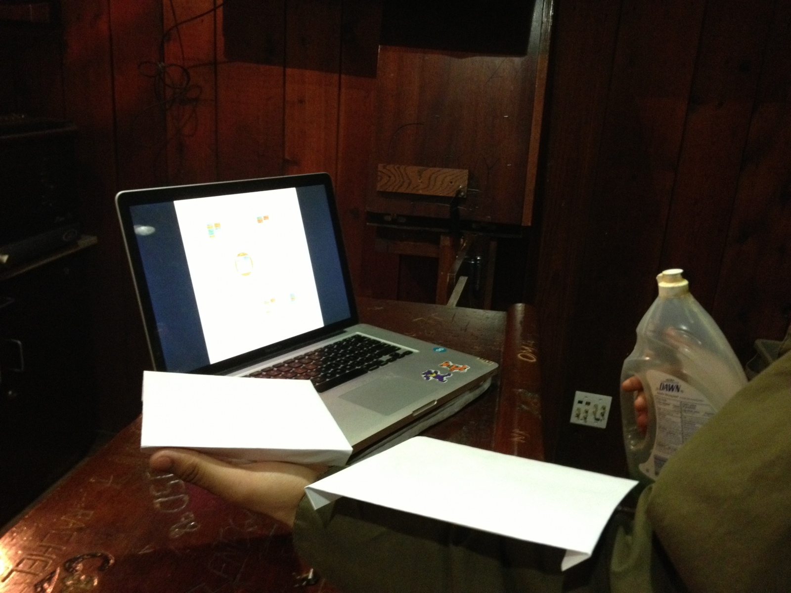
We created the layout for the motherboard on Adobe Illustrator, and all other parts were constructed from paper (the coasters were cardboard squares). Using Illustrator was a new technique, but it didn’t take too much time since we had a group member who knew how to use it. The most difficult part of our prototyping was figuring out a good interface for the input of the ordered items. We did not want to make the interface complicated and slow down the wait staff, but we wanted to be able to log enough information so that the Motherboard would be effective. We also did not want the waitstaff to have to record orders twice, once at the table and again inputting into the system. To solve this, our system could use a dedicated employee to take the waitstaff’s order notes and then enter them into the system. This way, the waitstaff have no “down time” where they can’t be serving or on the floor, and the pattern breaking activity of order entry for all waitstaff is concentrated in a single employee. We thought organizing the table information on the floor plan worked well for the motherboard, since we are presenting the information in a layout that people are already used to. Color coding various signals also provided a very simple way to signal certain information. We feel mix between textual and color information prevents the motherboard from becoming too cluttered with text.