Assignment 2-Paper prototype testing
John Subosits
Observations
The activities of people in lecture hall between classes can be divided into three categories. Some pursued academic activities by looking over the syllabus for that class or doing homework for another class. Social activities involved talking with neighbors, texting, and using Facebook. The last class, which I will term passive content acquisition, consists of activities such as reading the paper, checking email, watching sports highlights, and browsing Facebook. About 3.5 minutes before class is scheduled to start, students start to stream in and the noise level increases substantially. The professor typically arrives about 3 minutes before class. The professor spent the 3 minutes organizing his lecture notes. One student was intently completing exercises for Japanese class. Another was reading the front page of the WSJ. To me, this suggests that professors already make good use of their time before lecture, but students are looking for ways to be productive. Many of my ideas aim to make that 10 minute window useful while others are designed to make the 10 minutes a break to mentally prepare students for lecture.
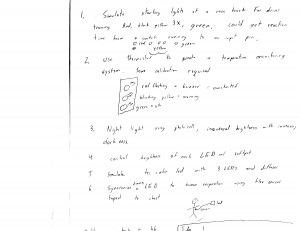
Brainstorming
- Video selector searches Youtube for interesting videos of appropriate length
- App to allow the Professor to remotely show A/V relevant to the upcoming lecture
- App to allow students to submit questions anonymously (mobile, agile Piazza)
- Scheduling app meet friends for meals, study sessions, or acquire party supplies
- Distributed computing so people can nibble away at major problem in spare time( reCapcha)
- Prayer/meditiation app that uses active noise cancelling to give you peace and quiet
- Email sorting app that forces you to respond, delete, or store in a folder emails from your inbox.
- App that does the same thing with social media friends or documents on your computer
- Disable electronics so that you have to have a real conversation with person next to you
- Aggregator that shows new emails, tweets, Facebook news feed, and blogs in one place
- Remote ordering for takeout and dine in lunches to ease between class rush
- Use hardware to assess and track physical and mental state (blood pressure, HR, blood glucose)
- Quiz yourself using professor, TA, or student created questions (flash cards)
- Short tutorials to teach you a random skill (knots, exercises, etc.)
- Vocabulary booster. Could also be used for equations
- Track students movements with GPS so that classrooms can be optimally scheduled to minimize travel time
Selections
I chose to prototype the Youtube video finder because I feel that there is a lot of excellent content on Youtube, but better tools are needed to filter what you want from the junk. I also like the forced organization apps ideas 7 and 8 above because I often will not respond to emails immediately, and extra Facebook friends and documents make it hard to find what you need.
Prototypes
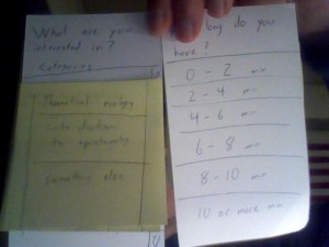
Both apps have simple prompt based interfaces. The Youtube video finder asks you what you are interested in and presents a list of your courses for that semester as well as a “something else” button. “Something else” leads to a list of broad categories and potentially some narrower user-defined categories. Once a selection is made, the user is asked how much time they have and several ranges are presented. Finally, a popular video, based on views and like/dislike ratio, of the appropriate length and content is shown. This app could both be used to pique interest in a topic before class and to take a mental break.
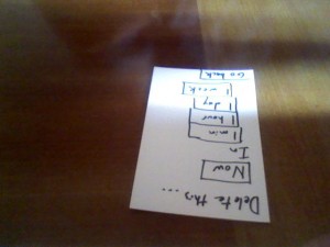
2 screens of the video finder
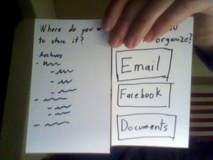
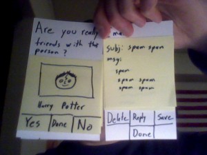
The email, document, friend clean up app asks the user which of the 3 they want to organize. When given an email from the inbox, the user may respond, delete, or save the email. Save presents a list of archival folders while delete allows the user to have the email deleted immediately or automatically after a set amount of time. Selecting friends brings up a random Facebook friend. The user must decide to keep or delete the friend. If the keep button is held quickly, that person will come up less often in the future. Documents work like the friend sorter.
2 screens of organizer
The friend and email sorting screens
Feedback
Thank you to Alice Fuller, Chiraag Galaiya, and Katie Gnostic for helping to test the prototypes. Despite little explanation of the purpose of the prototypes or goals of the applications, users seemed fairly comfortable with them. One suggestion for the Youtube video sorter was to give the user an initial choice between their classes, other courses, and other topics since people might be interested in their friend’s classes. Some confusion arose as to when the video finder no longer required user input, so perhaps it should close automatically when the video is over and it is time for class to start. Enthusiasm for the video sorter varied depending on the user’s general Youtube usage. However, when people who did not often use Youtube were asked if they would use it more often if it were easier to find quality content, they answered, somewhat predictably, that they would.
User confusion. Perhaps it would have been better if the video actually played.
Testing of the document and email friend clean up app revealed that an option to send unwanted documents to an external storage would be helpful. It was also noticed that there was a lack of back or undo delete buttons to correct mistakes. Some testers were confused as to why emails could be marked for automatic deletion in the future as well as deleted immediately. People were generally less enthusiastic about this application.
A confusing and possibly unnecessary menu.
Insights
This exercise reinforced two obvious lessons. Users do not always find the necessary path as easy to find as the designer expects, and users need a way to correct erroneous or unintended interactions. The absence of back buttons to allow users to correct pressing the wrong button is an obvious example of the second point. User uncertainty about which menu choice to select arose in part from a lack of a clear task since users were given software to test rather than choosing that software to accomplish a task they had in mind. Future tests of this sort will address this. Expectations about menu choices and the ordering of options are important. Paper prototyping seems to be a good way to get feedback on this subject.

