Group 10 – Team X
Junjun Chen (junjunc), Osman Khwaja (okhwaja), Igor Zabukovec (iz), Alejandro Van Zandt-Escobar (av)
Summary:
A “Kinect Jukebox” that lets you control music using gestures.
Supported Tasks:
1 (Easy). The first task we have chosen to support is the ability to play and pause music with specific gestures. This is our easy task, and we’ve found through testing that it is a good way to introduce users to our system.
2 (Medium). The second task is being able to set “breakpoints” with gestures, and then use gestures to go back to a specific breakpoint. When a dancer reaches a point in the music that they may want to go back to, they set a breakpoint. Then, they can use another gesture to go back to that point in the music easily.
3 (Hard). The third task is to be able to change the speed of the music on the fly, by having the system follow the speed of a specific move. The user would perform the specific move (likely the first step in a choreographed piece) at the regular speed of the music, to calibrate the system. Then, when they are ready to use this “follow mode” feature, they will start with that move, and the music will follow the speed at which they performed that move for the rest of the session.
Changes in tasks and rationale
Our choices of tasks has not changed much over P3 and P4. We thought Not changing the first task was an easy decision, as it is simple, easy to explain to users and testers, and easy to implement. This makes it a good way to introduce users to the system. We’ve also learned from testing that starting and stopping the music is something dancers do a lot during rehearsal, so it is also an useful feature. Our second and third tasks have morphed a little (as described below), but we didn’t really change the set of tasks, as we thought that they provided a good coverage of what we wanted the system to do (to make rehearsals easier). Being able to go back to specific points in the music, and have the music follow the dancers were tasks that were well received in both our initial interviews with dancers as well as P4 testing.
Revised Interface Design
Our first task didn’t change, but our second task has morphed a little from P4. We had originally planned to allow only one breakpoint, as it was both easier to implement and simpler to explain, which was ideal for a prototype. However, since one of our users said that he would definitely want a way to set more than one, we are including that in our system. Our third task has also changed slightly. We had thought that the best way to approach our idea, which was to have the music follow the dancer as they danced, was to have it follow specific moves. However, it did not seem feasible for us to do that for a whole choreography (as it would require the user to go through the whole dance at the “right” speed first for calibration), we decided to follow only one move in P4. However, this did not seem to work well, as dancers do not just isolate one move from a dance, even during practice. So instead, we’ve decided to follow one move, but use that one move to set the speed for the whole session.
Updated Storyboards:
Our storyboards for the the first two tasks are unchanged, as we did not change those tasks very much. We did update the storyboard for the third task:
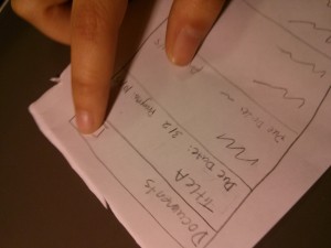
Sketches of Unimplemented Features:
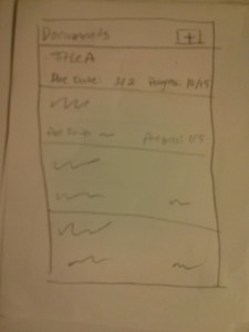
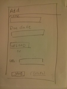
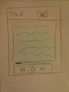
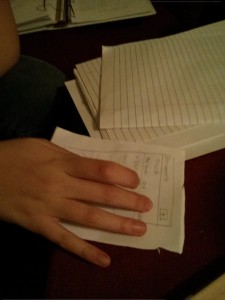
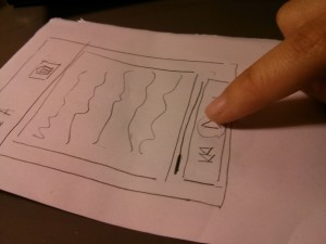
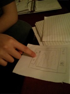
A mockup of our GUI:
Some other sketches of our settings interface can be found on our P3 blog post (https://blogs.princeton.edu/humancomputerinterface/2013/03/29/group-10-p3/) under the “Prototype Description” heading.
Overview and Discussion:
Implemented functionality:
We implemented the core functionality of each of our three tasks, which includes recognizing the gesture using the Kinect, and generating the appropriate OSC messages that we can then pick up to process the music. As seen in the pictures, with the software we’re using (Kinect Space), we’re able to detect gestures for pausing, playing, setting a breakpoint, as well as detect the speed of the gesture (Figures A1 and A2). We are then able to process and play music files using our program (Figure B1), written in Max/MSP. As show in the figure, we are able to change the tempo of the music, set breakpoints, as well as pause and play the music.
Functionality Left Out:
We decided to leave out some of the settings interface (allowing users to check and change customized gestures), as we believed that this is would not affect the functionality of our prototype too much. Also, the software we are using for gesture recognition includes a rudimentary version of this, which is sufficient for testing (Figure A3). We also realized that we are not able to change the playback rate of an .mp3 file (because it’s compressed), so we need to use .wav files. It should be simple to include (as part of our system), a way for users to convert their .mp3 files into .wav files, but we’ve decided to leave this out for now, as we can do user testing just as well without it (it would just be more convenient for users if we supported mp3 files).
Wizard of Oz Techniques:
Our prototype is essentially two parts: capturing and recognizing gestures from the Kinect, and playing and processing music based on signals we get from the first part. The connection between the two can be done using OSC messages, but we need the pro version of the software we are using to recognize gestures for this to work. We’ve been in contact with the makers of that software, who are willing to give us a copy if we provide them a video of our system as a showcase. For now, though, we are using wizard-of-oz to fake this connection. Figure B2 shows the interface between our music manipulation backend, GUI, and the Kinect program.
Code from Other Sources
We are using the Kinect Space tool for gesture recognition (https://code.google.com/p/kineticspace/). For now, we are using the free, open source version, but we plan to upgrade to the Pro version (http://www.colorfulbit.com).
Images:
Figure A1 (The Kinect Space system recognizing our “breakpoint” gesture.)
Figure A2 (The Kinect Space system recognizing our “stop” gesture. Note that it also captures the motion speed (“similar” for this instance), which we are using for task 3).
Figure A3 (We are able to set custom gestures using Kinect Space.)
Figure B1 (A screenshot of our backend for audio manipulation, made with Max/MSP).
Figure B2 (A screenshot of interface between the different parts of our system. This is how people will control it, and it also shows communication with the kinect program.)

