Websites for University groups and departments
Managed WordPress
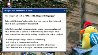
Our shared hosting service includes the basic setup and support of WordPress sites that support the mission of the University, including sites of officially recognized student groups. We invite faculty, staff, undergraduates, and graduate students to use this service.