Group 17 – BlueCane
Team Members: Evan Strasnick, Joseph Bolling, Xin Yang Yak, Jacob Simon
Project Summary: We have created an add-on device for the cane of a blind user which integrates GPS functionality via bluetooth and gives cardinal and/or route-guided directions via haptic feedback.
Tasks Supported in this Prototype: Our first, easiest task arises whenever the user is in an unfamiliar space, such as a shopping mall or store. As they mentally map their surroundings, it’s imperative that the user maintain a sense of direction and orientation. Our cane will allow users to find and maintain an accurate sense of north when disoriented, increasing the reliability of their mental maps. Our second and third tasks both confront the problems that arise when a user must rely on maps constructed by someone else in order to navigate an unfamiliar space, as is the case with navigation software and GPS walking guidance. In the second task, (medium difficulty) our cane would assist users on their afternoon walk by providing haptic and tactile GPS directions, allowing users to explore new areas and discover new places. In our third and most difficult task, our cane alleviates the stress of navigation under difficult circumstances, such as frequently occur when running errands in an urban environment. In noisy, unfamiliar territory, the BlueCane would allow users to travel unimpaired by environmental noise or hand baggage, which can make it very difficult to use traditional GPS systems.
How Our Tasks Have Changed Since P4: As our tests in P4 were conducted on seeing users who are not familiar with cane travel, we hesitate to generalize our findings to our target user group. Now that we’ve managed to find blind people in the community to volunteer to test our next prototype, we can be more confident that our findings from P6 can be better generalized. The aim of our testing procedure remains largely the same – we still want our users to be able to navigate with one hand free while being able to pay attention to other auditory cues. Since our previous round of tests did not give us much useful insight, we decided to keep most of the tasks the same. For example, seeing users found the task of walking-in-a-cardinal-direction-given-North challenging, but we expect blind users to perform better at this task, since they already have to orient themselves relative to a known direction without visual cues. Thus, the feedback that blind users give while performing this task would still be useful, and we are not changing this task. Also, blindfolded seeing users walked slowly while being heavily reliant on tactile feedback for guidance as they performed the task of follow-the-direction-of-the-tactile-feedback, which is unrealistic. We expect blind people to walk much faster than blindfolded seeing people, and this would lead to a different set of challenges for our system. As such, we are not changing this task either. However, we also recognize that cane users also make use of a great deal of tactile feedback in normally getting around obstacles. Thus, for the task where the user is given auditory distractions, we are modifying the task by adding obstacles along the users’ path in order to simulate a more challenging use case and to check if the cane vibration would be too distracting.
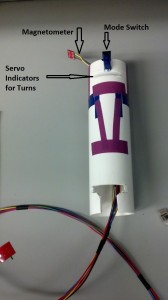
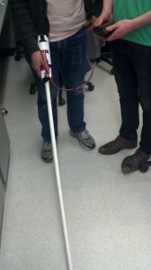
Revised Interface Design: Obviously, because we were only able to locate seeing participants for our first round of user testing, we were hesitant to drastically change aspects of our design in ways that may not actually be relevant to blind users. Most notably, our prototype now currently takes the form not of a cane itself but as a simple add-on which can be placed on a cane. This design was chosen because we wanted to test the usability of our system without the confound of the additional learning a blind user would have to do simply to get used to a new cane. With our prototype, the user can test with their own familiar cane, adding only the slight weight and form factor of the device. As noted in the discussion of our P4 blog post (http://blogs.princeton.edu/humancomputerinterface/2013/04/09/p4-bluecane/), we wanted to make it very clear to the user which of the navigation “modes” the cane was currently in. Thus, we added a simple switch which alternates between the two modes and has braille markings on either side to make the distinction quite clear.
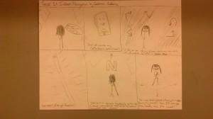
Updated Storyboards:
Task 1
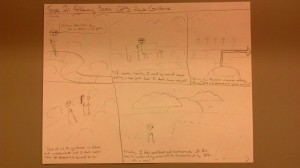
Task 2
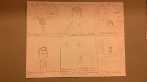
Task 3
Elements Still to Be Added:
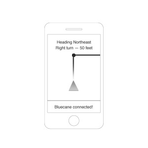
The Eventual Smartphone App
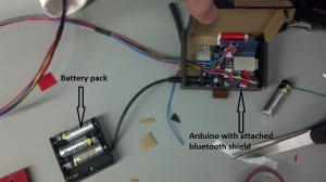
Overview and Discussion of the New Prototype:

