Observation
I focused my observation on two major settings, each of which involved more than 3 individuals interacting in some way.
At first, I spent some time observing the handful of students who are in both COS426 and COS436, which happen back-to-back on Tuesdays and Thursdays in the Small and Large Auditoriums, respectively. There is no class in the Small Auditorium after COS426, but there is class before COS436 in the Large Auditorium on Thursdays only. As a result, student behaviors differed between Tuesdays and Thursdays. On Thursdays, students generally gathered in the banana gallery outside the auditoriums and either worked individually on laptops, or chatted in groups at a normal volume. Most students checked their phones more than once, and occasionally a few would wander to the bathroom or water fountain. On Tuesdays, however, students generally entered the Large Auditorium early and sat either individually or in pairs, usually with laptops out. Students spoke in quieter tones, and there was less movement: students tended to stay put once seated. Two students in particular exemplified this behavior in that they consistently talked with each other between these two classes, but in different ways depending on their location and the day of the week: they spoke more loudly and with other students in the banana gallery on a Thursday, and they sat together and chatted quietly in the Large Auditorium on a Tuesday. When sitting down, the two students chatted over their laptops and some work they both had at the time, one for graphics and one for another unknown course.
I also spent some time observing masses of students attempting to cross the northern portion of Washington Street to get to/from class. Pedestrian traffic here is pretty predictable in its patterns, peaking a couple minutes after class ends and before the next class starts. At these times, there are typically dozens of people waiting at the light at a time, on both sides. When pedestrian traffic is heaviest, students tend to stalk holes in vehicle traffic and cross during, just before, or just after red crossing lights whenever possible. At times, this causes floods of students to cross illegally, holding up vehicle traffic. Also during these times, bikers tend to have trouble avoiding pedestrians, adding to the mess (especially since bikers must take more roundabout routes to avoid stairs at the northernmost pedestrian crossing). Of particular interest were the times just after class began, when students were clearly running late. I observed a particular student run to catch a crossing light, dash across after the crossing light was already red, then slow to a brisk walk once across, continuing on at a more leisurely pace. This seemed to be a common pattern for students running late.
Brainstorming
(Completed with Edward Zhang (edwardz))
- Somehow sync a mobile app with stoplights on Washington and Alexander, allowing people to check the light status at any time, and possibly to click the “wait” button from a certain distance away.
- Place simple security cameras with monitors (or just mirrors) outside classroom doors or in hallways. People love looking at themselves.
- Provide space and tables to allow for administrative activities (i.e. signing in, distributing handouts) to start outside classroom.
- Install ipod docks/speakers in waiting areas near classrooms that create “bubbles” of soft music that can’t be heard a few meters away.
- Strategically place tablets on stands/walls that have short daily math/trivia/etc. puzzles on them
- Program a timed phone silencer that turns the ringer on during waiting periods and off again during class based on calendar information.
- Rent scooters/bikes/etc. at unmanned stations around campus. Students can get and return vehicles at any station for small fee by swiping their PUID to open the vehicle locks at the stations.
- Create an app with an “I’m bored” button that starts a short game/convo with someone very nearby who is also bored. Should expire 1min before class.
- Install a terminal in each classroom that starts a short group game between classes, which any mobile device can join within that time window (imagine in-flight entertainment).
- Use sensors to track the number of students that walk into buildings and classrooms, for an idea of how traffic flows and what may be improved.
- Create a small portable fan/vent that diffuses/absorbs/counteracts the smell of any food you are carrying.
- Create a lightweight app that allows people to post a relevant status (e.g. “We’re [talking about final projects]/[complaining about workload] [at the front of the classroom]/[outside the doors]”).
- Display “Student(s) of the Day” profiles in classrooms,letting everyone associate a name with a personality and a face.
- Install a large floor display with interesting effects (e.g. lights up or makes sounds where stepped on) at a popular crossroads.
- Install large electronic white boards on walls that students can use for notes/games/graffiti/etc.
- Create a mobile app that shows a map of all available outlets on campus.
Prototypes
I chose to prototype ideas 1 (stoplight tracking) and 7 (bike/scooter rental). I chose the first because of the problem I saw with street crossing on campus, and because of personal experience with getting caught at a red light and being late for class as a result. The latter I chose because it presents some interesting security and economics questions to explore, and because I often find myself wanting a bike without the commitment of purchase or long-term rental.
Stoplight Tracking
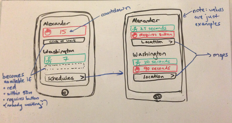
Below is the concept sketch of a simple app that would provide students with the status and information about the two prominent stoplights on campus.
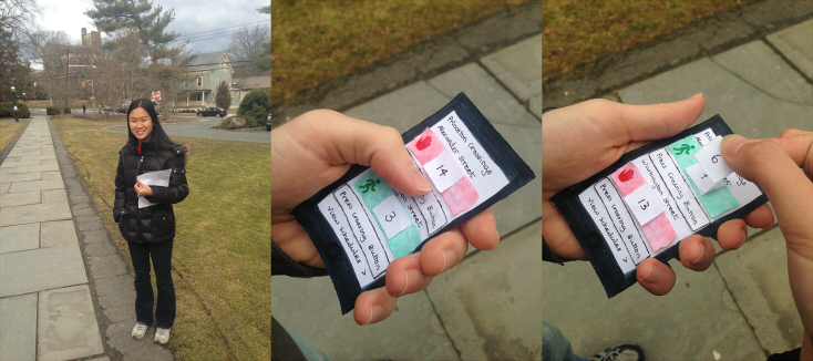
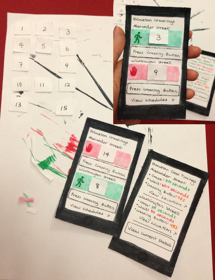
From this, I created a paper prototype (shown below). It includes a full frame for each major screen in the sketch, along with cut-outs of the buttons and numbers, which are secured with scotch tape. This was mainly to facilitate quick changing of the screen’s state for user testing, without the need to create a new panel for each possible combination of the colors and numbers. It was made entirely using printer paper, washable marker, and ink pen, over the course of about an hour.
Bike Rental Stations
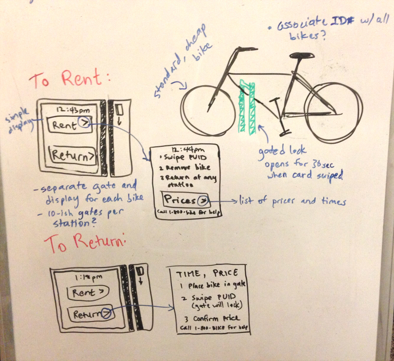
I started with a few sketches on what a single gate at a single station would look like, including both the gate itself and the interface used to rent a bike from it.
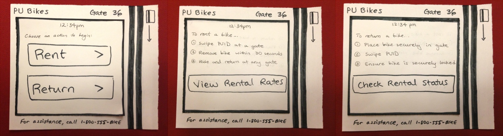
From this, I created a simple paper prototype of the interface only, which is designed to be informative and easy to understand. I used a larger sheet to represent the device itself, which would presumably be simple plastic with a place to swipe a card. The various screens themselves are separate, interchangeable sheets. The three major screens are shown below. Two screens are missing, primarily because the pricing and status format requires thought beyond the prototyping stage, as described below. Again, this prototype is made of printer paper, washable marker, and ink pen.
Aside from the basic mechanism and interface for renting and returning bikes, there are three other major components of this system that I considered while designing it: convenience, security, and pricing. Addressing convenience is mostly a matter of determining where to place rental stations. I suggest a possible configuration below. Security is mostly concerned with ensuring that bikes are not stolen or destroyed, or if they are, it is possible to track down the perpetrator. With some careful planning, this should be possible using the information from a swiped PUID, and damages (and rental fees) can be charged to a student’s account. The actual prices require more research, but I feel a system with a small upfront fee and additional hourly rate would be appropriate. I initially considered a 10-minute grade period of zero cost, but this may encourage too much traffic at busy periods and prevent students who actually need the bikes from finding one.
Possible set of locations:
- Dinky Station
- Frist Campus Center
- Friend Center
- Dillon Gym
- Rocky/Mathey
- Firestone
User Testing
For the sake of user testing, I staked out a spot outside Forbes, where the stoplight on Alexander is not yet visible (about a 10 second walk away). Unfortunately, I could not do this at a time when students were actually rushing to class, otherwise I could never get anyone’s attention for long enough to complete the test. So instead, I loitered around the parking lot during my free time and accosted students heading toward Alexander, following this general procedure:
- (beforehand) Choose a setting for Alexander: green-high, green-low, red-high, or red-low (where high and low indicate big and small numbers, respectively).
- Introduce the user to their shiny new iPhone 5. Establish that they are late for class.
- Give user about 10 seconds to take in the app.
- Start counting down on the Alexander light and ask how they would react.
- Change the color and/or number of Alexander and Washington and ask again how they would react.
- Repeat for the other possible settings of color and number.
- Collect any additional feedback.
I tested this with four individuals, choosing a different starting setting for each and varying them somewhat randomly throughout the test. I also, on a whim, flagged down a pair of friends to look at it together, to see how their interactions might differ.
The first key observation is that across the board, students understood the purpose of the app after looking at it for less than 10 seconds. This is actually in contrast to the short inquiries I made of my roommates based on the original sketch above — they took a long time to figure it out, even with the notes in blue. The addition of a title and the change in the button text are probably responsible for the difference, since they are more explicitly descriptive of their actual function.
The meat of the experiment revealed a key part of the users’ nature: telescopic vision. The individual users I tested fell neatly into exactly two categories: those who used the app to decide how fast the approach the intersection, and those who used the app to repeatedly push the “wait” button. These categories were robust for each user regardless of the current status of the light — button pushers would continue to push the button even if the light was green, and the others never considered pushing the button, regardless of whether they decided they would slow and wait for the next light. Users did realize they were expected to change their responses somehow as the settings changed; however, instead of changing what types of activities they would do, they focused on a change in the same type of action (e.g. walk slower or faster, or press the button more or less). One button presser was confused about the excessive number of questions, since he wouldn’t actually change anything and would have just continued pressing the button all the way across the intersection.
Lastly, there were a few significant holes in the way users interacted with the app. Almost all users focused explicitly on Alexander street, ignoring Washington entirely (although one button presser went ahead and pressed buttons for both each time). This clearly came from the bias of being 30 meters away from Alexander Street, so it was not surprising. Also somewhat unsurprising is that users completely ignored the “view schedule” option. This could be due to many things: having something counting down draws immediate attention, the schedules are not really relevant to someone heading toward the light (though perhaps it would be for someone waiting at it), and the “view schedule” button itself does not catch as much attention as the other pop-out buttons in the paper prototype.
In general, it seemed that users would be able to make fast use of this app, as it is clearly understandable and gets the point across. However, each user would tend to use it in a way that perhaps satisfies them the most, but may not be the most useful or effective way to use the app. Even so, there may not be much merit in catering the app to specialized needs or structuring it to encourage intelligent usage — in the end, it is meant to display a status (plus some helpful functionality) that users can use as they wish.