Observations:
I would have to say that there really wasn’t any time during the day when I failed to observe the people around me. I suppose that I was particularly careful to observe people’s activities while waiting for my Computer Networks lecture to start. Classroom settings gave me the opportunity to observe both undergraduates and professors. I decided not to spend much time observing graduate students or TAs. I also observed people walking to and from classes as I traveled between Forbes and my classes. I observed people mostly between classes, but I also decided to observe my own routine as I got ready for my first class each morning. I also paid attention to the way people behaved when entering and leaving dining halls. I generally conducted my observations alone, as I don’t often walk to classes with friends or sit near other people. A few of my ideas were inspired by fortuitous conversations with friends, as I will describe below.
My first fruitful idea came when I observed my Computer Networks professor, Michael Freedman, before class. Professor Freedman holds office hours immediately before class, which I realized was quite unusual. Most of my professors spend the first ten or so minutes before class preparing for their lecture. I realized that Freeman didn’t have to worry about setting up for lecture because he uses PowerPoint to teach his material. I then realized that my math and physics professors don’t have this same luxury because of the difficulty of displaying complicated math in PowerPoint. It occurred to me that math and physics professors might like it if they could digitally save the notes they write on whiteboards and return them to the whiteboard at a later time. In other words, the whiteboard would be a screen with memory. Once an old whiteboard is loaded, it should be editable just like any normal whiteboard. This technology would allow professors to load previously created notes to a whiteboard in seconds.
My second idea came as I was walking through Wilson on my way to the E-Quad. I saw one boy ask another, presumably his friend, if he could borrow the other’s bike. Did this boy not have his own bike? If he did, was it broken or else unusable? While I do not know the answer to this question, it made me think about the possibility of Princeton having community bikes which could be shared among the entire student body. The bikes would be checked out of special racks using our proxes, and they would then be usable for a certain period of time before they would have to be returned at the risk of incurring charges on our proxes. I assume that these bikes would mostly benefit undergraduates, as they often need bikes to get to classes on time. Graduate students usually make use of the university buses, but they may also find the bikes useful from time to time. I imagine that these bikes could save students from being late to class or even exams!
The last observation I will list here took place when Jean Jacque, one of my friends, mentioned to me after our classics class that he needed to run two errands before his next precept. He wanted to grab coffee from the café in East Pyne, but he also needed to buy a ticket to a student theater production of No Exit / The Chairs. I decided that both of these errands needed to be made faster and easier to complete within ten minutes. Rather than going to Frist to purchase tickets to student performances, one ought to be able to purchase the tickets online from one’s phone. As a frequent theater-goer myself, I know that such an app would certainly benefit me. In fact, I suspect such an app would benefit both theater-goers and theater-producers, as making ticket purchases simpler would likely increase student attendance at shows.
Online purchasing could also make it easier for students like Jean Jacque to get their morning coffee. I envision an app which allows one to place an order for coffee to pick up from numerous café locations around campus, such as Small World, CaFe, or Starbucks. In order to prevent the student body from overwhelming these establishments with online orders, a quota would have to be put in place. However, given that the establishment of your choice is accepting online orders, one could select the coffee of one’s choice and then have it ready by the time one goes to pick it up and pay for it.
Brainstormed Ideas:
- A flashcard app which connects to your notes and converts them to cards
- A shared bike service with NFC or prox checkout
- A bike locator app
- Printing documents from a phone
- App for rating lectures and sending the results to professors
- App which alerts you to friends walking in the same area of campus
- App which takes pictures you snap with your phone and uploads them to a remote digital photo frame
- Bluetooth umbrella which flashes a light when the weather is rainy
- A battery which charges when you ride your bike and can plug into laptops
- App for remotely checking out books from Princeton libraries
- In-class social networks for meeting people in your classes
- Whiteboard screens which save and load what is written on them
- App for purchasing tickets to student productions
- Coffee app which lists available locations and allows for remote ordering and fast pickup
- A Princeton encyclopedia of eating clubs, extracurricular clubs, sports teams, classes, etc.
Paper Prototyped Ideas:
- I chose to paper prototype my flashcard app because I think there ought to be a way to transform the notes I take in class into a format that is more amenable to quick, piecemeal use between classes and at meals.
- I chose to paper prototype the app for uploading pictures to a remote digital photo frame because I often want to update my parents on how I am doing or what I am up to despite being too pressed for time to have a meaningful phone conversation.
Prototypes:
Notecard app:
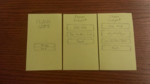
The main screens of FlashNote. The left screen is simply the main screen. The middle screen is the screen of decks available to study prior to searching for new decks. The right screen is the screen of decks available after searching for new decks.
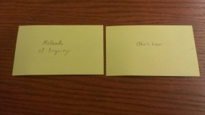
The COS 436 deck, showing both sides of each card.
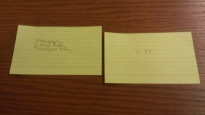
The mythology deck, showing both sides of each card.
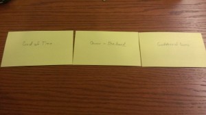
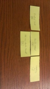
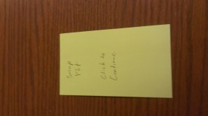
The various popup screens which alert the user to such events as the results of a search for decks or the completion of a deck.
The photo-frame app:
The main screen of the app.
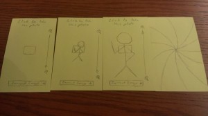
The photo-taking interface. The left card shows the basic interface, including a target box, a slider for zoom, and a button to see the image currently displayed on the remote photo frame. The second card from the left shows the same interface with a man in focus and the zoom all the way out. The third card from the left shows the same man but with zoom all the way in. The card furthest right shows what the user sees when a photo has been snapped successfully.
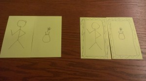
The displayed images as seen on the app and on the photo frame. The first card from the left shows the picture that will be saved as the current image once the user takes the photo. The second card from the left shows the picture that is saved as the current image right now, before the user has taken the picture of the man. The third card from the left shows the picture of the man as it will be displayed in the remote photo frame. The card on the right shows the picture of the flowerpot as it is currently displayed in the remote photo frame.
User Testing:
Michelle Tan:
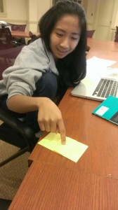
Michelle chose to study the COS 436 deck before searching for new decks. She then selected the mythology deck, completed that deck, and then exited the app. Michelle checked both sides of each flashcard before moving to the next.
Nate May:
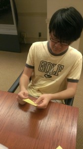
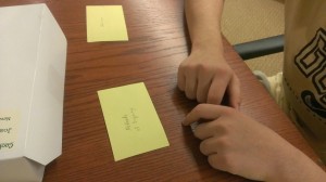
Nate started by adding the mythology deck. He then studied COS 436, though he did not view both sides of each card. After viewing only the one deck, Nate exited the app.
As you can see from the second photo, Nate was confused by what to do with the first card he saw. Not only did he slide the card in the wrong direction, he never even flipped the card over.
Christina Noya:
Christina first studied for COS 436, viewing both sides of each card before moving to the next. She then searched for the mythology deck and studied it, again viewing both sides of each card before moving on. After studying both decks, Christina exited the app.
As you can tell from this video, Christina didn’t understand how to interact with the flashcards either. I had to encourage her to slide finished flashcards to the left.
Insights:
- Users did not realize that they were supposed to slide from one flashcard to the next by swiping their fingers from right to left.
- Users were confused by what happened when they reached the end of the deck. Specifically, Nate didn’t understand that the deck ended automatically after each card had been flipped past.
- Users confused by not being able to go back to old cards. Nate wanted to be able to go back and see skipped cards.
- Users didn’t know if they could quit the deck early
- Confused by where decks came from / relationship to notes taken
- Users unsure why main screen existed
If I were to go back and make a new prototype, I would make sure to include on-screen instructions for how to flip between cards. I would also allow users to flip between cards in both directions and return to skipped cards. I would add an ‘X’ to the cards which would be the only way to exit the deck. I would also expand the entire demo to make it obvious that the decks “found” during searches are constructed by the app from the user’s very own class notes. Not a single one of my testers understood the main point of the app because my prototype only demonstrated the GUI. I would consider making the user manually feed files to the app to be converted into flashcards. Though this may seem like a step backward, given that the app currently adds new decks automatically, the functionality of the app is so mysterious currently that it probably require instructions teaching the user to drop notes into a particular folder a la Dropbox. By having the user add decks manually, there is no longer any confusion.

