Group Number and Name
Group 18: %eiip
First Names
Bonnie, Erica, Mario, Valya
Netids (for our searches)
bmeisenm, eportnoy, mmcgil, vbarboy
Mission Statement
We are evaluating a bookshelf system for storing and retrieving books. Our system currently involves a bookshelf, with embedded RFID scanners; RFID tags, which must be inserted into each book; and a web application for mobile devices that allows a user to photograph their book to enter it into the database, as well as search through the database and view their books. The purpose of our project is to allow book owners the flexibility of avoiding a rigid organizational system while also being able to quickly find, retrieve, and store their books. With our low-fidelity prototype, we want to learn if users think that using our system is natural enough that they would be willing to use it. We want to observe how users choose to interact with the system, and whether or not it frustrates them. Specifically, we also want to observe their physical motions in order to tailor the construction of our more high-fidelity prototypes. Based on this, we state our mission as follows: We believe that there’s something uniquely special about personal libraries. Rigid organizational systems remove some intangible, valuable experience from book collections; also, we’re lazy! We want to build a way for people to keep track of their books that’s as natural and easy as possible. In this assignment, Mario is drawing interfaces for the mobile website and writing up descriptions; Bonnie is writing responses to questions from the first part (mission statement, etc), writing description of prototypes, and creating task walkthrough films; Valya is writing test user stories for each task and creating task walkthrough films; and Erica is constructing the cardboard prototype shelf, writing the prototype discussion, and putting together the blog post.
Description of Prototype, With Images
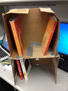
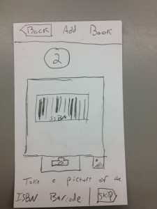
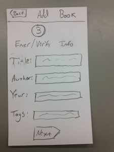
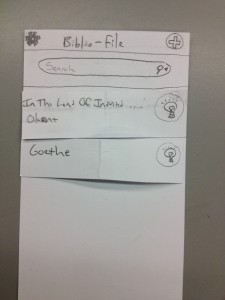
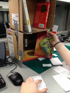
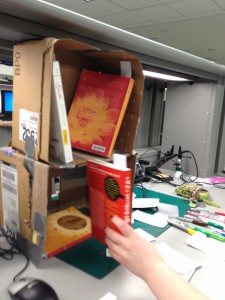
Our prototype consists of a two-shelf, cardboard “bookshelf” with paper “RFID sensors” taped to the back; index cards representing the mobile web interface for adding books to the system; some books; and some index cards representing RFID tag bookmarks.
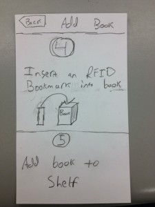
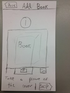
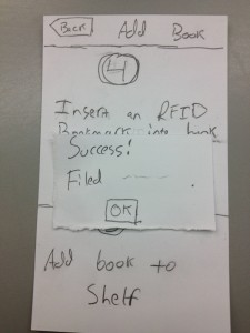
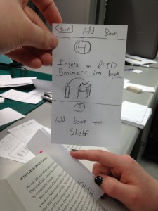
Adding books, steps 4 and 5: Instructs the user to insert the RFID bookmark or tag sticker and add the book to the shelf.
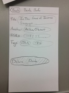
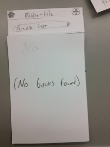
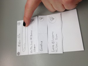
Detail screen for a particular book. The user can see the book’s information, and has the option to delete it from the collection.
Tasks
Easy Task:
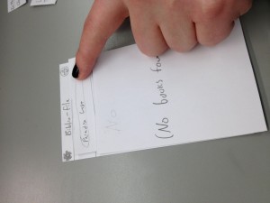
We brainstormed a few tasks that a user interacting with our prototype could feasibly want to do. Some easy tasks that we thought of were putting a book that’s already in the system onto the shelf, checking if a given book is in a user’s collection, and retrieving a book from the shelf. Ultimately we decided that retrieving a book from the shelves was a more important task to test. Moreover, checking if a book is there could be part of the retrieval process. We would tell our testers the following: Imagine that you have acquired a new bookshelf, for storing your books. You also have a database which keeps track of the books that are on the bookshelf, and where they are, accessible via a mobile website. Suppose that you want to get a textbook for your Imagined Languages class, for example In the Land of Invented Languages by Arika Okrent. Can you get the textbook from the bookshelf? Having accomplished that, could you also get me John Milton’s Paradise Lost? We will ask the user to perform these tasks using our mobile web application. [Note: The Imagined Languages textbook is actually on the bookshelf, so getting it should be easy for the user. However, Paradise Lost is not. We want to see if the user can search the database and accurately understand the information given. If the book is on the bookshelf, the user should go and get it, if the book is not in the system we expect them to say something along the lines of “I do not have this book.”]
Moderate Task:
For our moderate task we chose adding a book to our system, which would include tagging it, adding it to the database, and then placing it on the shelf. We would tell our testers the following: You’re starting a new semester, so you have lots of new classes. In particular, you just purchased Lotus Blossom of the Fine Dharma (The Lotus Sutra). You want to add this book to your collection so that you can find it in the future. We will have the user tag the book, add it to the database, and then place it on our prototype bookshelf.
Difficult Task:
Finally, for our difficult task we chose adding an entire collection to the system. The reason we’re concerned with this as a separate task is because it’s unclear to us how annoying this would be for a user, and we want to see if we can make it more natural and less tedious. We would tell our testers the following: Suppose that you just bought a new bookshelf that keeps track of all of your books for you. The problem is that you already own quite a few books, and you need to add all of them to the system. Here is a pile of the books you own. We will then have the user tag all of them, add them to the database, and add them to the bookshelf so that they can find them in the future.
Prototype Discussion
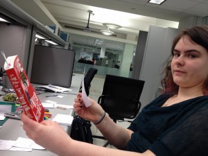
While our prototype includes a software system, we are also extremely interested in seeing how the users interact with the physical objects in our system. Thus, we constructed a scaled-down cardboard bookshelf that can hold a few books. Since paper isn’t exactly sturdy enough, we used cardboard, duct tape, and index cards to put together a bookshelf. We constructed the bookshelf using a couple of disassembled cardboard boxes folded into a shelf-like shape. We added “RFID readers” by folding index cards into vaguely reader-like shapes and taping them onto the back. We are using index cards folded in half to simulate RFID tags. We used index cards to create a paper prototype, in the usual manner.
Putting together cardboard in a way that will hold a few books using minimal amounts of cardboard was slightly difficult but doable. We used some index cards to stabilize it, which was pretty cool. We prototyped our web application (the main interface to the system) using paper index cards, which we felt were appropriate given that the application is targeted primarily at mobile devices. Getting the specifics of all the workflows correct at first was somewhat difficult, since we had not fully fleshed them out before – for instance, our first implementation of the “add book” workflow did not allow users to verify the quality of the pictures they took before proceeding to the next step, which was an awkward design. We also had some initial struggles with conforming to standard mobile UI conventions and best-practices; thinking consciously and critically about the layout of UIs is difficult, especially for mobile contexts where screen real-estate is at a premium.

