P3 – Team VARPEX

Group Number: 9

Group Name: VARPEX

Group Members: Abbi, Dillon, Prerna, Sam

In this assignment, Sam was responsible for writing up the mission statement and brainstorming prototypes. Dillon was responsible for writing up the discussion of the prototype and brainstorming prototypes. Abbi was responsible for building the prototypes. Prerna was responsible for describing the prototype and how it applies for our tasks.

Mission Statement:

The purpose of this project is to create a prototype piece of clothing which can take input from an MP3 player and create sensations on a user so that the user can feel lower bass tones. The sensation will be generated using vibrating motors. The device should be comfortable and portable. This product will allow users who are unable to generate loud, feelable bass tones for reasons of cost, noise pollution or portability to overcome these obstacles and feel low bass tones. The current design of the system proposed would use a microcontroller to analyse music tones and actuate motors spaced on the user’s chest. The motors will be incorporated into clothing for ease of use and the microcontroller will be battery-powered and portable. The prototype at this stage aims to discover basically how users will react to primitive actuation from the motors (to determine placement and power). This prototype will also aid in the design of the clothing (fit, weight, etc.). The goal of this team is to produce this final product without going over budget. In particular, our focus is on user experience.

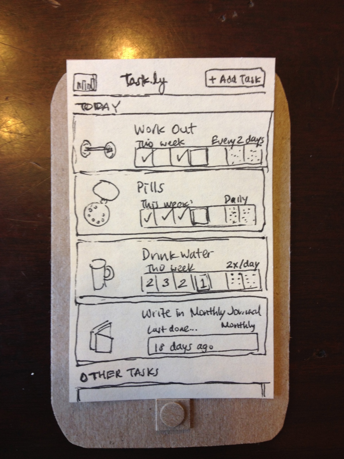
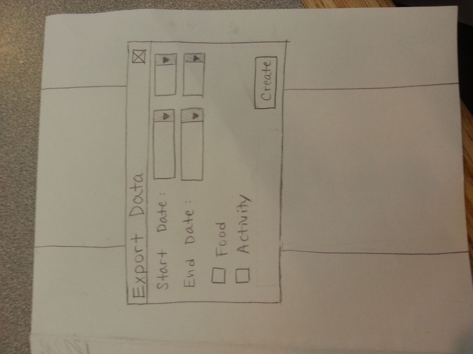
Prototype Description

Since our device does not have a visual user interface, we decided to use the lo-fi prototypes to perform further tests on its usability and functionality. With this in mind, we will have two iterations of our lo-fi prototype. In the first iteration, motors will be placed in a band of tape that can be tightly attached to the users body with the motors contacting the user around the spine. This will allow us to test if the motors (and modulation of their intensity) properly replicate the sensation we found users feel in P2. The second portion of our prototype will implant these motors in a loose-fitting sweater. This will allow us to test our form factor- hopefully the jacket offers the user the appropriate level of sensation, but it is possible a tighter-fit will be needed in order to achieve the desired level of intensity.

Use of Prototype in Testing

In P2, we identified the following key tasks of our users:

  • Experience/listen to music without disturbing the quiet environment of the people around you (in the library while studying, in lab, etc.)

  • Experience/listen to music while being mobile (walking to class, in the gym, etc.)

  • Experience/listen to music without disturbing residential neighbors (roommates, suitemates, etc.)

These tasks have informed the characteristics our system needs: proper replication of physical sensations felt from loud speakers and portability. From these characteristics, we’ve determined two fundamental questions we will answer in P4:

  1. Can the vibrating motors replicate the feeling of powerful bass tones from speakers?

  2. Does the form factor of wearing the motors in the jacket produce the proper sensations?

To answer these two questions, we’ll explore user’s responses to the intensity of the motors and the comfort and wearability of motors worn on a loose fitting jacket. Since the differences in our three tasks are linked with the user’s usage environment, and do not differentiate between the actual design of the device, we decided to use P3 to build a prototype that allows us to test the comfort and wearability of the device, as well as test how users feel about the physical locations of the motors in the jacket. This will help us better understand how and where users want to feel the sensations.

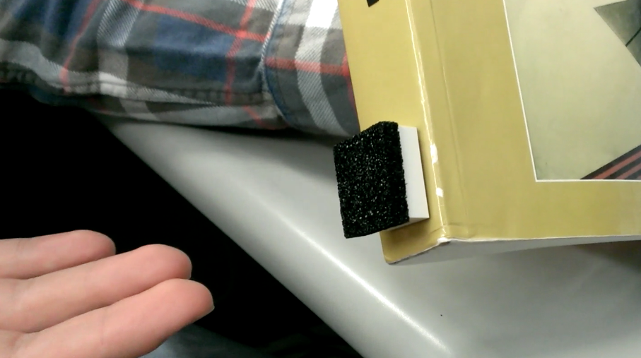
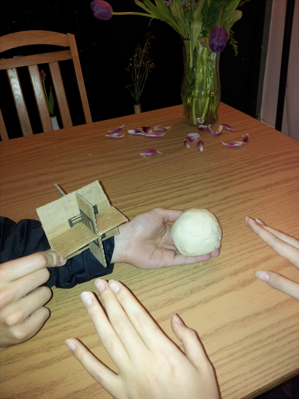
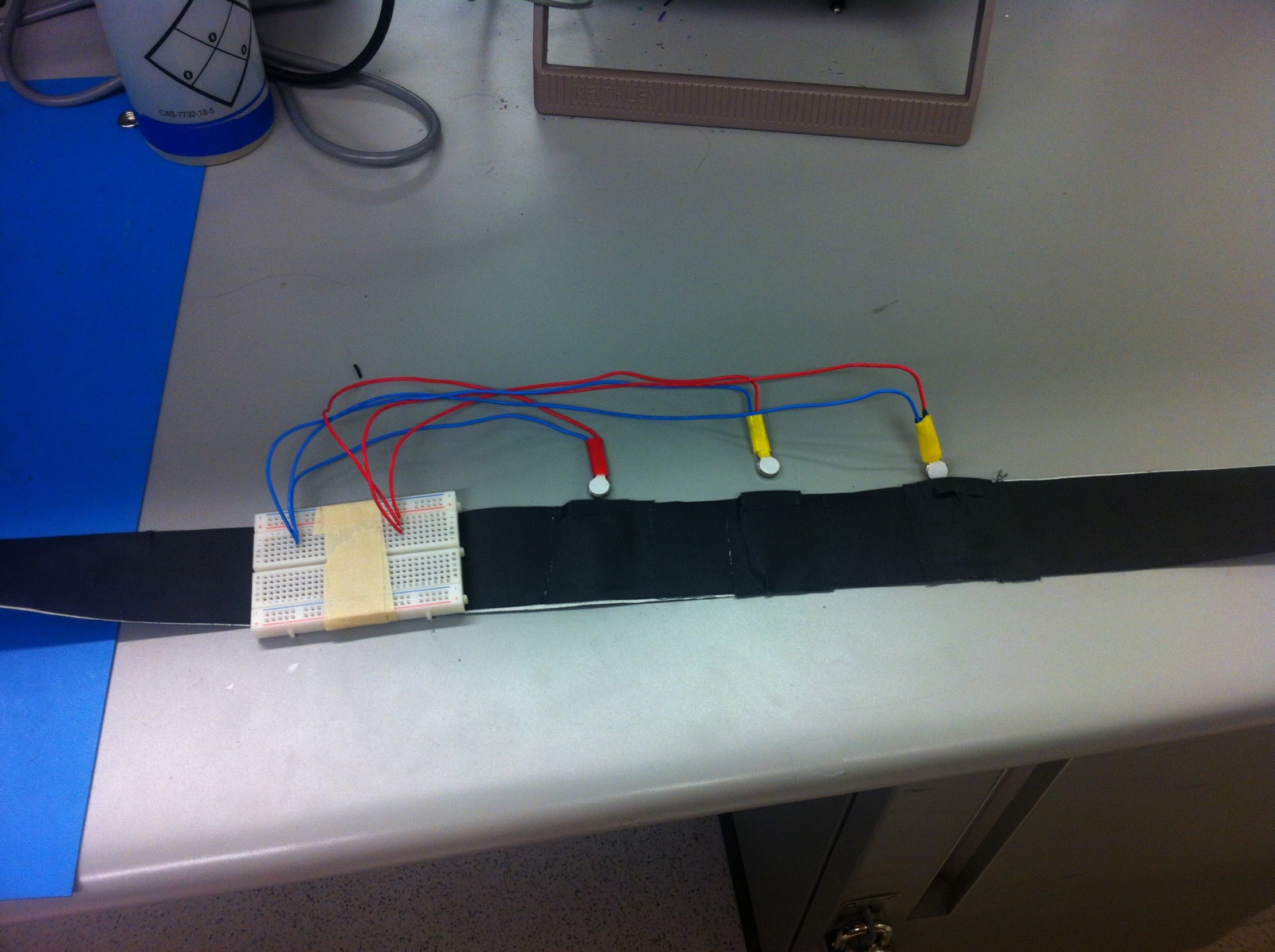
As our mission is heavily dependent on these sensations, a paper prototype or otherwise non-functioning system would not allow us to test anything that would help us see if our proposed system would properly accomplish our mission. At its core, our prototype will have three motors.

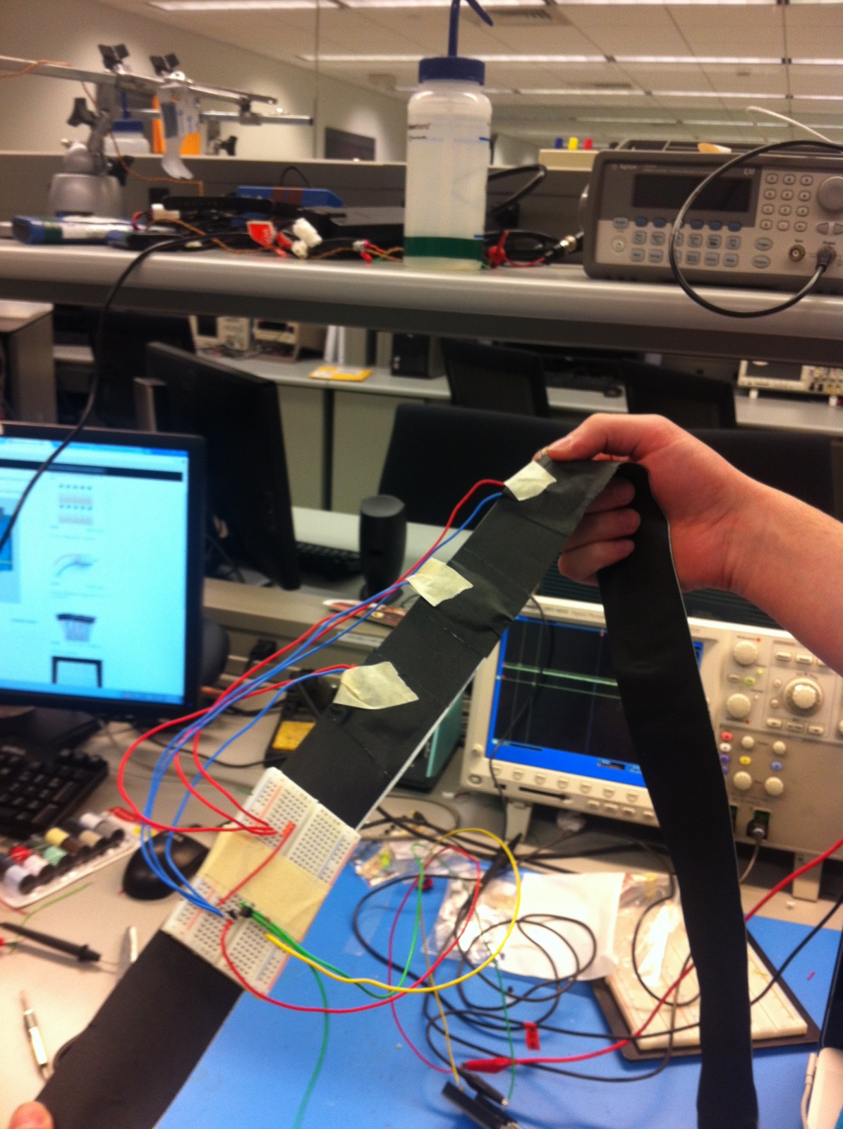
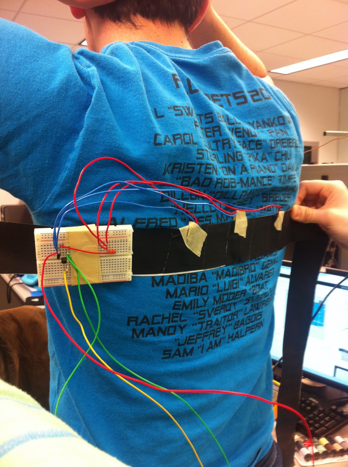
For the first iteration, we will see how strongly the vibrations are conducted through the motors when attached closely to your spine via a tight band. It will allow us to understand how comfortable users are with these vibrations and whether they feel it accurately replicates the live music sensation. In the second iteration, we will attach the motors to a jacket, which will allow us to test for fit, comfort and wearability, which is key to every task we listed above.

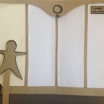
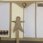
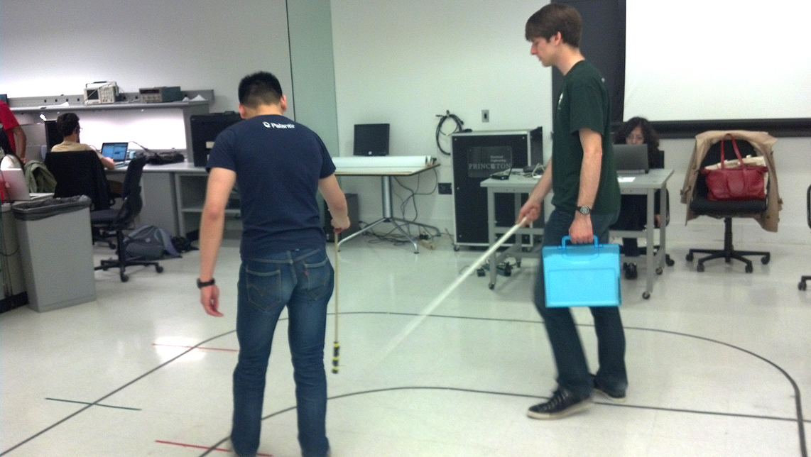
Basic Prototype Demo

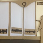
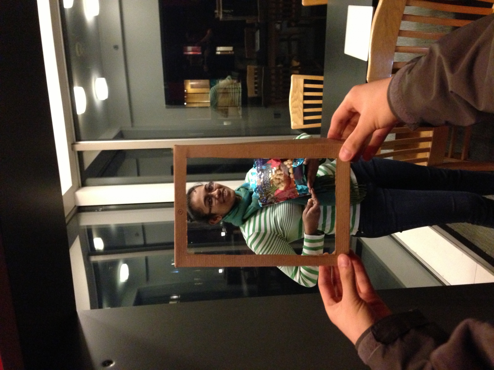
A Closer Look at the Prototype

IMG_2031

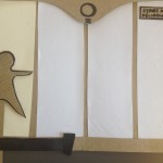
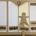
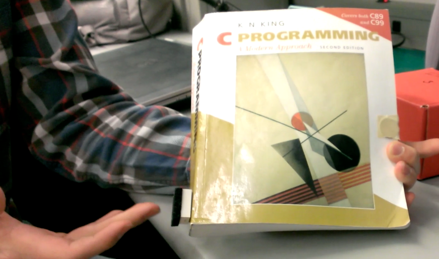
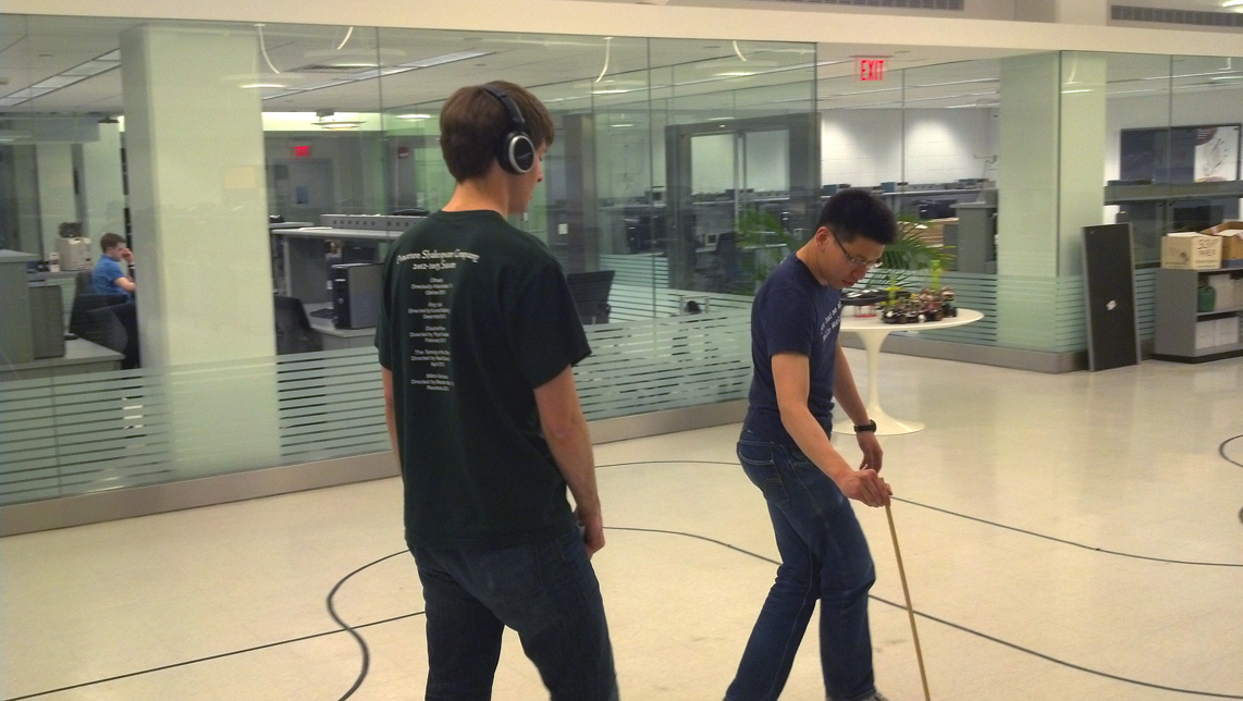
Testing the basic fit of the prototype

IMG_2032

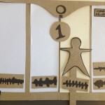
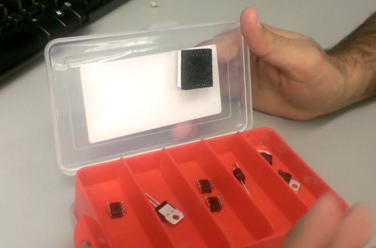
Our prototype – understanding how the motors fit in

IMG_2042

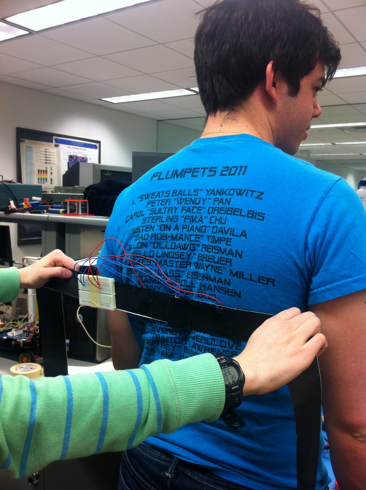
Our prototype – attaching the motors to the band

IMG_2045

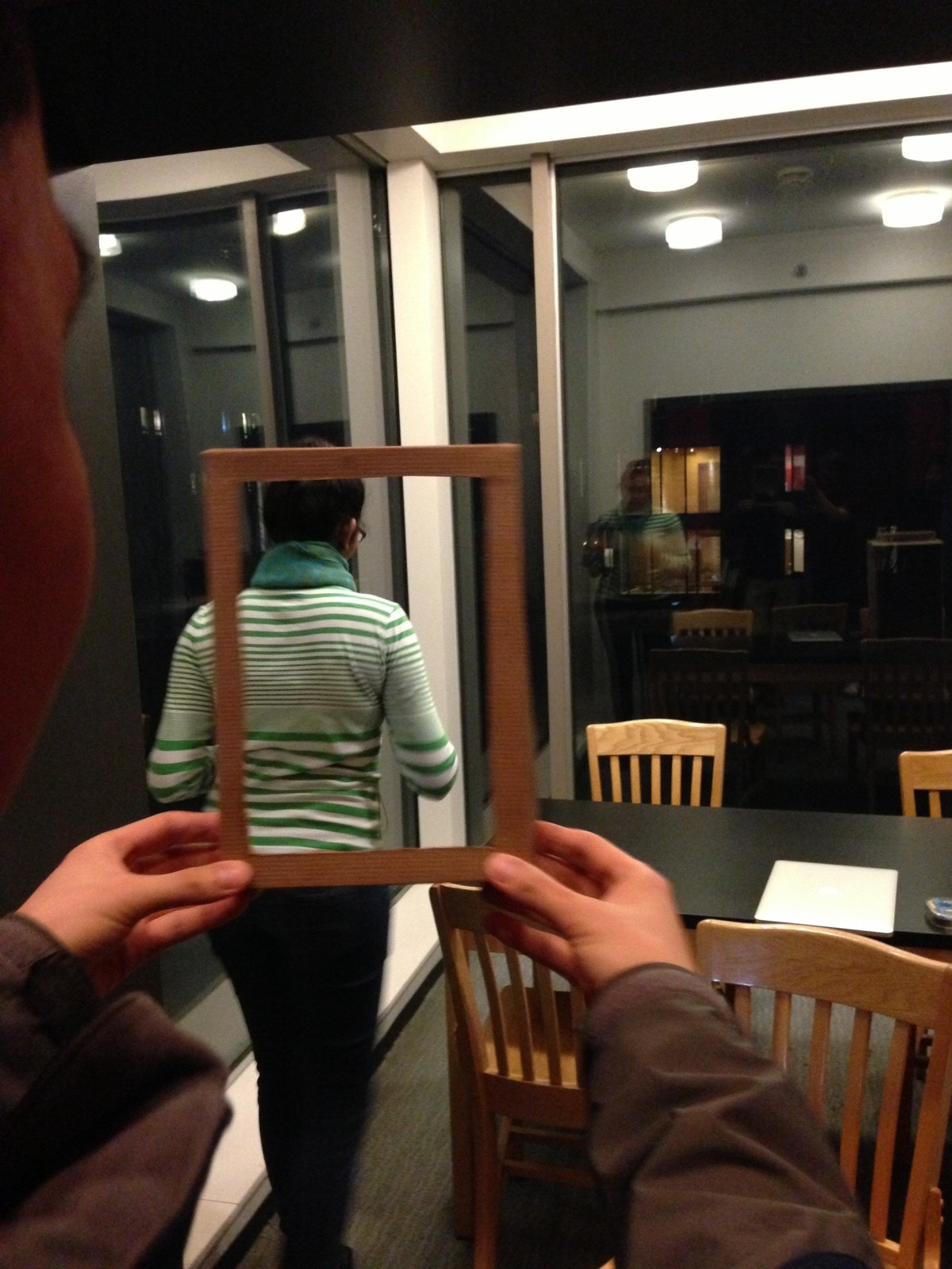
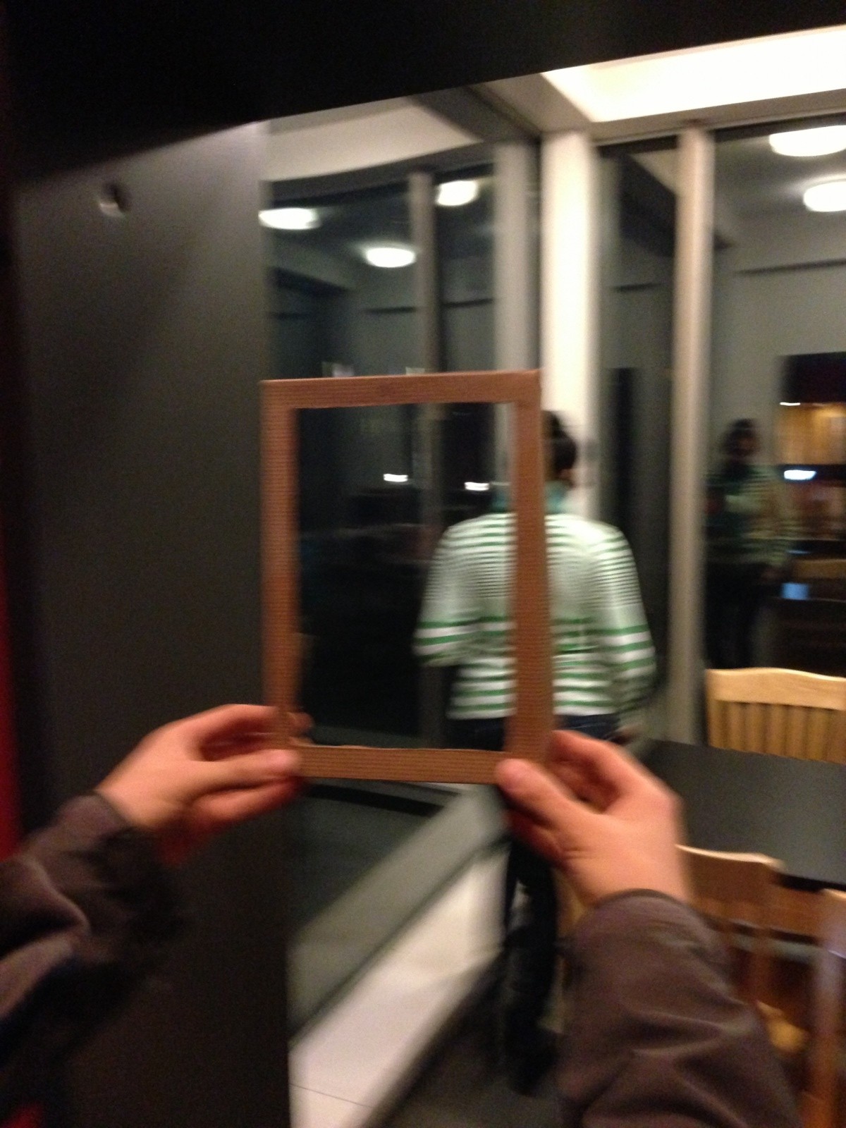
Fitting the prototype across the back to test sensations

IMG_2046

Fitting the prototype over the spine to test sensations

IMG_2049

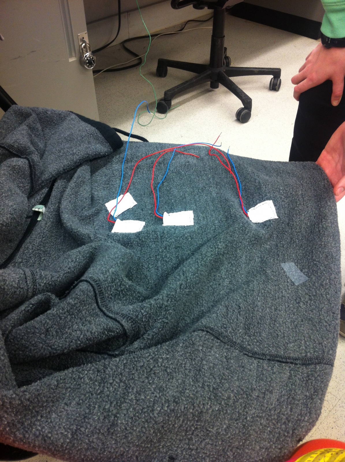
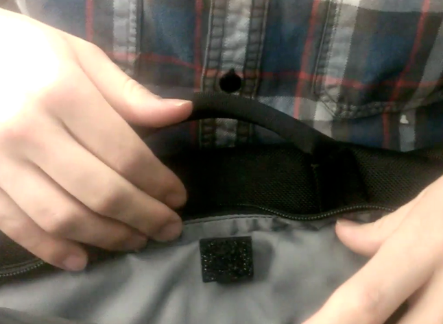
Adding motors to the jacket to test wearability

IMG_2051

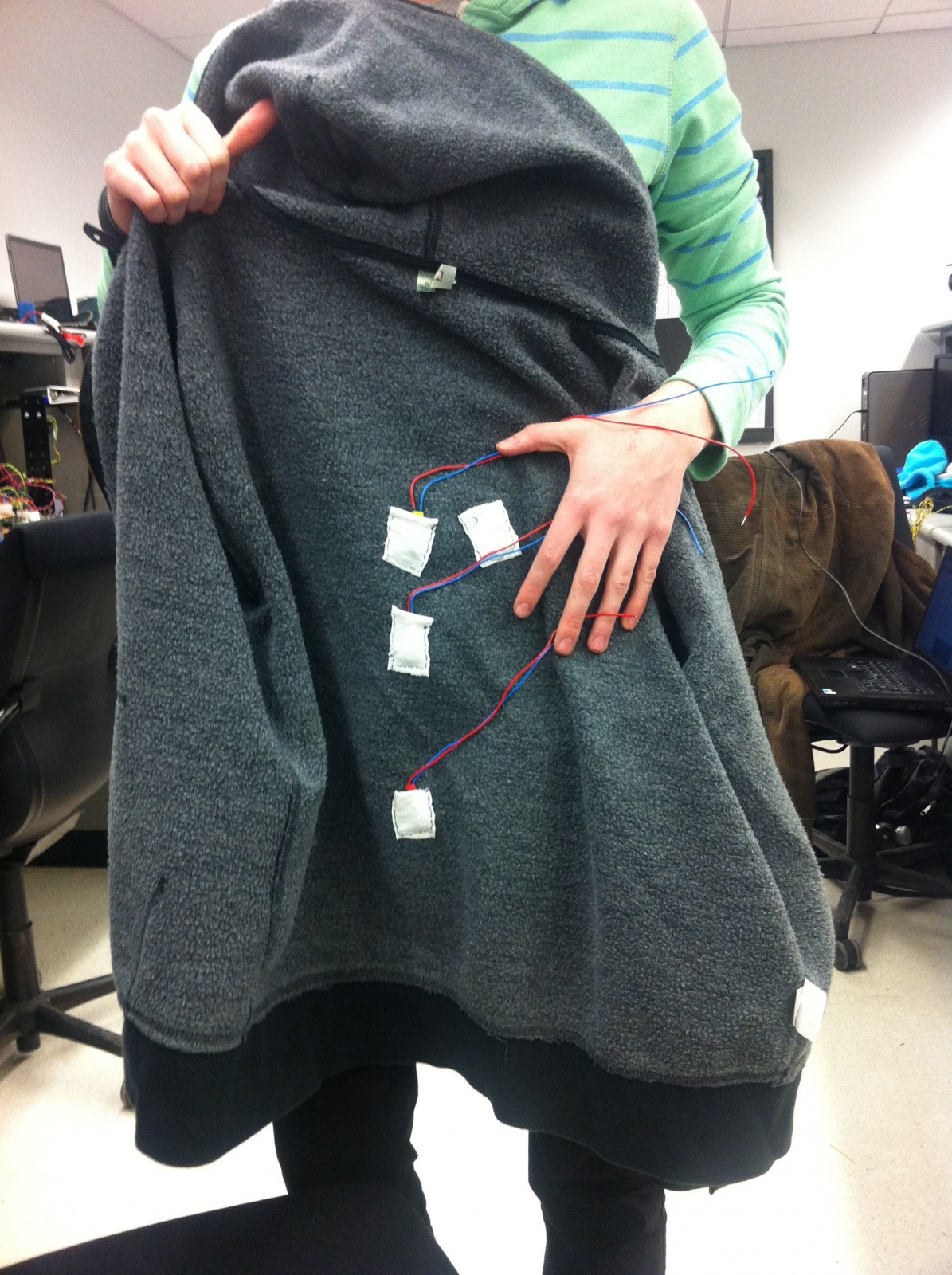
Second iteration of the prototype – testing comfort and usability with a hoodie

 Prototype Discussion

Our prototypes required us to implement three of our motors- there is no lower-fidelity method to test our system. We want to test if the vibrating motors at all replicate the feeling users get in going to concerts. Our desired system should also be as ubiquitous as possible. An ideal final product would have the user simply plug their “music-feeling jacket” (or whatever form the product takes) into their iPod, with no interface required at all. This led us to conclude that a paper prototype would not offer us the ability to properly evaluate our system, leading to our implementation of several of our motors.

This made our prototyping process a bit more difficult than we had originally anticipated, since it required us to concentrate more on technical questions that might not otherwise be appropriate at this stage of prototyping (but that we have deemed necessary). For one, how we would power the motors in our prototype became an issue, since it might not be possible to power the motors off of the arduino board due to current limitations. It is these sort of questions that we were forced to wrestle with at an early stage of our prototype. On the bright side, it has forced us to think more practically about what we are hoping to build towards with our prototype.

P3 Brisq – The Cereal Killers

cereal_logo
Be brisq.

Group 24

Bereket Abraham babraham@
Andrew Ferg aferg@
Lauren Berdick lberdick@
Ryan Soussan rsoussan@

Our Purpose and Goals

Our project intends to simplify everyday computer tasks, and help make computer users of all levels more connected to their laptops. We want to give people the opportunity to add gestures to applications at their leisure, in a way that’s simple enough for anyone to do. We think there are many applications that could benefit from the addition of gestures, such as pausing videos from a distance, scrolling through online cookbooks when the chef’s hands are dirty, and helping amputees use computers more effectively. In our demos, we hope to get a clearer picture of people interacting with their computers using the bracelet. Brisq is meant to make tasks simpler, more intuitive, and most of all, more convenient; our demos will be aimed at learning how to engineer brisq to accomplish these goals.

Mission Statement

Brisq aims to make common computer tasks simple and streamlined. Our users will be anyone and everyone who regularly uses their computers to complement their day to day lives. We hope to make brisq as simple and intuitive as possible. Enable Bluetooth on your computer and use our program to easily map a gesture to some computer function. Then put the brisq bracelet on and you’re ready to go! Shake brisq to turn it on whenever you’re in Bluetooth range of your computer, then perform any of your programmed gestures to control your laptop. We think life should be simple. So simplify your life. Be brisq.

Our LEGENDARY Prototype

These pictures show our lo-fi prototype of the bracelet itself. Made from some electrical wire twisted together and bound with electrical tape, this allows testers the physical experience of having a bracelet on their wrist while going about the testing procedures.

solo_bracelet[1]

on_hand_bracelet[1]

These pictures shows our paper prototypes of the GUI for the brisq software. This software is used as the central program which maps gestures to commands, and remains running as a background process to process the signals sent from the brisq bracelet.

IMG00096-20130329-2112

IMG00097-20130329-2114

IMG00098-20130329-2114

IMG00099-20130329-2114

IMG00100-20130329-2114

IMG00101-20130329-2115

IMG00102-20130329-2115

IMG00103-20130329-2115

IMG00104-20130329-2117

Brisq in use…three tasks


This first video depicts an anonymous user in the kitchen. He is attempting to cook food from an online recipe. Brisq helps to simplify this task by letting him keep one of his hands free, and keeping his distance from his computer, lest disaster strike!


This second video depicts another anonymous user lounging on his couch at home. He is enjoying a movie, but wants to turn up the volume on his computer and is too comfortable to get up. Brisq allows him to stay in his seat and change the volume on his laptop safely, without taking any huge risks.


The last video shows a third anonymous user who has broken her hand in a tragic pool accident. These types of incidents are common, and brisq makes it simple and easy for her to still use her computer, and access her favorite websites, even with such a crippling injury.

Reaching our goal

For the project, we have split the work into 2 main groups: the part concerning the hardware construction and gesture recognition, and the part concerning the creation of the brisq software for key-logging, mouse control, and gesture programming. Bereket and Ryan are going to take charge of the first group of tasks, and Ferg and Lauren will be taking charge of the second. Our goals for the final prototype are as follows: we hope to have a functioning, Bluetooth-enabled bracelet with which we can recognize 4 different gestures, and an accompanying GUI that is capable of mapping these 4 gestures to a recorded series of key-presses or mouse clicks. We think that, with some considerable effort, these are realistic goals for the end of the semester.

P3 — VAHN (Group 25)

Group 25 — VAHN

Vivian (equ@), Alan (athorne@), Harvest (hlzhang@), Neil (neilc@)

1. MISSION STATEMENT

Our mission is to create a recording software solution by combining the true-to-life sound quality of live performance with the ease of gesture-control. The project will give a capella singers quick, fun, and easy-to-use interface to make music complete songs themselves.


  • Vivian: the artistic guru of the group. She directed most of the design efforts of the prototyping process, drawing and cutting the prototype.
  • Alan: made sure the group has all the necessary tools to get the job done, and wrote the majority of the blog post.
  • Harvest: the resident music expert and he formulated the interactions (gestures) with and helped build the prototype.
  • Neil: the hardware specialist and gave insight on how the kinect would interface with the user, as well as recorded the videos and took photos.

2. PROTOTYPE

We hope to uncover any inconsistencies in our ideas about how the software should behave and features we want to implement.  In the prototyping process we hope to refine the interface so that:

  • Our core functionality is immediately recognizable and intuitive.
  • We achieve a “minimalist” look and feel.
  • Secondary and advanced functionality is still accessible.
  • The learning curve is not so steep

Here’s a video of a girl using a complicated hardware sequencer to make an a capella song. We’d like to make this process easier — http://www.youtube.com/watch?v=syw1L7_JYf0

Our prototype consists of a paper screen (which would be the projector/TV). The user data (taken by the kinect) is shown as a paper puppet which can be moved around from panel to panel. Each panel represents a horizontal span of space. Users can move from between panels by moving horizontally in front of the kinect.

The following gestures manipulate the prototype:

  • Raise both hands: start/stop the master recording
  • Raise right hand: record a clip which will be saved in the panel that the user is standing in
  • Move side-to-side: switch between panels in the direction of movement
  • Both arms drag down: bring down settings screen
  • Both arms drag up: close the settings screen up
  • Touch elbow and drag horizontally: remove a sound clip on screen.

3. 3 TASKS

Task #1: Recording a simple master track.

This task is similar to hitting “record” on a traditional recording application — it just records one sound clip. The following video shows how the user would interact with the prototype:

The user raises both arms to start the recording. The user then sings the song into a microphone or directly to some sound-recording device. To finish recording, the user raises both arms again. Then a menu drops down which asks if the user wishes to save their recording. The user would indicate with their arm the choice to save or cancel the recording.

This task worked well with our paper prototype we built.

Task #2: Recording multiple clips and overlaying them.

This task involves the user moving between panels and recording clips of a specified length (ex. 16 beats). The bar on the bottom of the screen will indicate the user how much time they have left in the sound clip. After the clip is recorded in one panel, it will repeatedly play. The user can record multiple clips in each panel. All the clips will be playing at the same time.

The user raises their right arm to start the recording in one panel. The user then sings the song into a microphone or directly to some sound-recording device. The bar at the bottom of the screen shows how much time is left in the sound clip (ex. 16 beats total, 5 beats left). When time runs out, recording stops and a track appears in the panel. To switch between screens, the user moves horizontally into another panel. All the recorded clips are being played back repeatedly at the same time.

This task was hard to show because in our final project, once a sound clip is recorded it will continually loop and play back. When users add additional sound clips, they will simultaneously play back. This was hard to show because we had no sound playback in our paper prototype!

One issue we realized we had to consider after making this prototype is how to sync recording for each individual sound clip. We may have to add a countdown similar to the master recording, but for each sound clip.

Task #3: Recording multiple clips and combining them into one master recording.

The user may have no clips or some clips already recorded in each panel. The user starts recording the master track and all the clips on screen (currently repeating together). The user can also add more clips into the panel they are standing in. The user can remove clips from the panel they are standing in. Settings can also be adjusted by bringing down the menu and changing EQ and overall recording volume.

User raises both arms to start master recording. User can now move between panels and record individual clips (adding extra clips to the sound) like in Task #2. Point arm to elbow and drag horizontally outwards to remove the sound clip in current panel. User can also use both arms, dragging down, to pull down the settings menu. When users are finished they can drag both arms up to close the settings menu.

Similar difficulties as in task #2.

4. DISCUSSION

We made our prototype with paper, glue, cardboard, and markers. Since our system is gesture based, we also made little paper puppets to simulate usage in a more streamlined way than jumping around ourselves and panning a camera back and forth. The only real difficulty we encountered was determining precisely how to realize our conceptual ideas about the software, especially because paper does not express screen position (of the person) like we would like the kinect to do. To fix this, we created a little “puppet” which represented the user’s position on the screen. We think we were moderately successful at capturing the user-screen interaction, however in the future we would like to reflect gestures on screen to better teach users how to use our interface.

The main thing which the paper prototype could not show was the audio feedback, since the sound clips would be playing repeat after the user records it. In this way, paper prototyping was not good at giving an accurate representation of the overall feel of our system. However, it was paper prototyping was good at forcing us to simplify and streamline our interface and figure out the best gestures to interact with it. Paper prototyping forced us to answer the following questions precisely: what should and should not be on the screen? Should we prototype every single little scenario or just a representative cross-section? For which functions should we switch to mouse control?  We ended up prototyping representative actions and did not show some of the settings (such as beat count, represented by the bar on the bottom of the screen) which we assumed in the current prototype would already be set. Showing the separate screens for each standing position of the user worked really well. The status for recording the master track could be more visible (by having the screen turning a different color, for example), so we would improve on this in the future.

P3

Team TFCS: Dale Markowitz, Collin Stedman, Raymond Zhong, Farhan Abrol

Mission Statement

In the last few years, microcontrollers finally became small, cheap, and power-efficient enough to show up everywhere in our daily lives — but while many special-purpose devices use microcontrollers, there are few general-purpose applications. Having general-purpose microcontrollers in things around us would be a big step towards making ubiquity of computing and would vastly improve our ability to monitor, track, and respond to changes in our environments. To make this happen, we are creating a way for anyone to attach Bluetooth-enabled sensors to arbitrary objects around them, which track when and for how long objects are used. Sensors will connect to a phone, where logged data will be used to provide analytics and reminders for users. This will help individuals maintain habits and schedules, and allow objects to provide immediate or delayed feedback when they are used or left alone.

Because our sensors will be simple, a significant part of the project will be creating an intuitive interface for users to manage the behavior of objects, e.g. how often to remind the user when they have been left unused. To do this, Dale and Raymond designed the user interface of the application, including the interaction flow and screens, and described the actual interactions in the writeup. Collin and Farhan designed, built, and documented a set of prototype sensor integrations and use cases, based on the parts that we ordered.

Document Prototype

We made a relatively detailed paper prototype of our iOS app in order to hash out what components need to go in the user interface (and not necessarily how they will be sized, or arranged, which will change) as well as what specific interactions could be used in the UI. We envision that many iOS apps could use this sensor platform provided that it was opened up; this one will be called Taskly.

Taskly Interface Walkthrough

Taskly Reminder App

Below, we have a created a flowchart of how our app is meant to be used. (Right-click and open it in a new tab to zoom.)

Here we have documented the use of each screen:

IMG_0630

When a user completes a task, it is automatically detected by our sensor tags and pushes the user an iPhone notification–task completed!


IMG_0617

User gets a reminder–time to do reading!

IMG_0618

More information about the scheduled task–user can snooze task, skip task, or stop tracking.

IMG_0619

Taskly start screen–user can see today’s tasks, all tracked tasks, or add a new task

IMG_0620

When user clicks on “MyTasks”, this screen appears, showing weekly progress, next scheduled task, and frequency of task.

IMG_0621

When user clicks on the stats icon from the My Tasks screen, they see this screen, which displays progress on all tasks. It also shows percent of assigned tasks completed.

IMG_0622

User can also see information about individual scheduled tasks, like previously assigned tasks (and if they were completed), a bar chart of progress, percent success at completing tasks, reminder/alert schedules, etc. User can also edit task.

IMG_0623

When user clicks, “Track a New Action”, they are brought to this screen, offering preset tasks (track practicing an instrument, track reading a book, track going to the gym, etc), as well as “Add a custom action”

IMG_0627

User has selected “Track reading a book”. Sensor installation information is displayed.


IMG_0629

IMG_0625

User can name a task here, upload a task icon, set reminders, change sensor notification options (i.e. log when book is opened) etc.

IMG_0624

Here, user changes to log task when book is closed rather than opened.

IMG_0628

When a user decides to create a custom task, they are brought to the “Track a Sensor” screen, which gives simple options like “track light or dark”, “track by location”, “track by motion”, etc.

IMG_0626

Bluetooth sensor setup information

Document Tasks

Easy: Our easy task was tracking how often users go to the gym. Users put a sensor tag in their gym bags, and then our app logs whenever the gym bag moves, causing the sensor tag’s accelerometer to note a period of nonmovement followed by movement. We simulated this with our fake tags made out of LED timer displays (about the same size, shape of our real sensors). We attached the tags to the inside of a bag.

Our app will communicate with the tag via Bluetooth and log whenever the tag’s accelerometer experiences a period of nonmovement followed by movement (we’ve picked up the bag!), nommovement (put the bag down at the gym), movement (leaving the gym), and nonmovement (bag is back at home). It will use predefined thresholds (a gym visit is not likely to exceed two hours, etc.) to determine when the user is actually visiting the gym, with the visit starting when the bag remains in motion for awhile. To provide reminders, the user will configure our app with the number of days in a week they would like to complete this task, and our app will send them reminders via push notification if they are not on schedule, e.g. if they miss a day, at a time of day that they specify.

Accelerometer Sensor for Gym Bags

Screen shot 2013-03-29 at 10.38.35 PM

Sensor is placed in a secure location in a gym bag, Its accelerometer detects when the bag is moved.

Medium: Our medium difficulty task was to log when users take pills. We assume that the user’s pillbox is typically shaped, i.e. a box with a flip-out lid and different compartments for pills (often labeled M, T, W, etc.). This was exactly the same shape as our Sparkfun lab kit, so we used it and had integrated circuits represent the pills. We attached one of our fake tags (LED timer display) to the inside of the box lid.

Our app connects to the tag via bluetooth and detects every time the lid is opened, corresponding to a distinct change of about 2 g’s in the accelerometer data from our tags. To provide reminders, the user sets a schedule of times in the week when they should be using medication. If they are late by a set amount of time, or if they open the pillbox at a different time, we will send them a push or email notification.

Magnetometer Sensor for Pill Containers

Screen shot 2013-03-29 at 10.40.00 PM

This “pillbox” is structurally very similar to the pillbox we imagine users using our product with (we even have IC pills!). A sensor is placed on the inside cover, and its accelerometer detects when the lid has been lifted.

Hard: Our hard task was to track how frequently, and for how long, users read tagged books. Users will put a sensor on the spine of the book they wish to track. They will then put a thin piece of metal on the inside of the back cover of the book. Using a magnetometer, the sensor will track the orientation of the back cover in reference to the book’s spine. In other words, it will detect when the book is opened. Our iPhone app will connect to the sensor via bluetooth and record which books are read and for how long. It is important to note that this system is most viable for textbooks or other large books because of the size of the sensor which must attach to the book’s spine. Smaller books can also be tracked if the sensor is attached to the front cover, but our group decided that such sensor placement would be too distracting and obtrusive to be desirable.

This is the most difficult hardware integration, since sensors and magnets must fit neatly in the book. (It might be possible for our group to add a flex sensor to the microcontroller which underlies the sensors we purchased, thus removing the issue of clunky hardware integration in the case of small books. In that case, neatly attaching new sensors to the preexisting circuit would likely be one of the hardest technical challenges of this project.)

To track how often books are read, the user will set a threshold of time for how long the book can go unused. When that time is exceeded, our app will send them reminders by push notification or email. The interface to create this schedule must exist in parallel to interfaces for times-per-week or window-of-action schedules mentioned above.

Magnetometer Sensor for Books

Screen shot 2013-03-29 at 10.37.26 PM

User attaches sensor to spine of a book. The magnetometer of the sensor detects when the magnet, on the cover of the book, is brought near it.

Screen shot 2013-03-29 at 10.37.42 PM

Sensor on spine of book.

Our Prototypes

How did you make it?:

For our iPhone app, we made an extensive paper/cardboard prototype with 12 different screens and ‘interactive’ buttons. We drew all of the screens by hand, and occassionally had folding paper flaps that represented selecting different options. We cut out a paper iphone to represent the phone itself.

For our sensors, we used an LED seven-segment display, as this component was approximately the correct size/shape of the actual sensor tags we’ll be using. To represent our pillbox, we used a sparkfun box that had approximately the same shape as the actual pillboxes we envision using our tags with.

Did you come up with new prototyping techniques?:

Since our app will depend upon sensors which users embed in the world around them, we decided that it was important to have prototype sensors which were more substantial than pieces of paper. We took a seven-segment display from our lab kit and used that as our model sensor because of its small box shape. Paper sensors would give an incorrect sense of the weight and dimensions of our real sensors; it is important for users to get a sense for how obtrusive or unobtrusive the sensors really are.

What was difficult?

Designing our iPhone app GUI was more difficult than we had imagined. To “add a new task,” users have to choose a sensor and ‘program’ it to log their tasks. It was difficult for us to figure out how we could make this as simple as possible for users. We ultimately decided on creating preset tasks to track and what we consider to be an easy-to-use sensor setup workflow with lots of pictures of how the sensors worked. We also simplified the ways our sensors could work. For example, we made sensor data discrete. Instead of our accelerometers to track acceleration, we allow users to track movement or no movement.

What worked well?

Paper prototyping our iPhone app worked really well because it allowed us, the developers, to really think through what screens users need to see to most easily interact with our app. It forced us to figure out how to simplify what could have been a complicated app user interface. Simplicity is particularly important in our case, as the screen of an iPhone is too small to handle unnecessarily feature-heavy GUIs.

Using a large electronic component to represent our sensors also worked well because it gave us a good sense of the kinds of concerns users would have when embedding sensors in the objects and devices around them. We started to think about ways in which to handle the relatively large size and weight of our sensors.

P3 – Life Hackers

Group 15: Prakhar Agarwal (pagarwal@), Colleen Carroll (cecarrol@), Gabriel Chen (gcthree@)

Mission Statement

Currently there is no suitable solution for using a touch screen phone comfortably in cold weather. Users must either resort to using their bare hands in the cold or using unreliable “touchscreen compatible” gloves that often do not work as expected. Our mission is to create an off the screen UI for mobile users in cold weather. In our lo-fi prototype testing we hope to learn how simple and intuitive the gestures we have chosen for our glove really are for smartphone users. In addition to the off the screen UI, there is a phone application that lets you set a password for the phone.

We are all equally committed to this project, and we plan on dividing the roles evenly. Each member of our group contributed to portions of the writing and prototyping, and while testing the prototype we split up the three roles of videotaping, being the subject, and acting as the “wizard of Oz.”

Document the Prototype

This slideshow requires JavaScript.

Because our user interface is a glove with built-in sensors, we decided to prototype using a leather glove and cardboard. The cardboard is a low fidelity representation of the sensors, and was intended to simulate and test whether the sensors would impede the motion or ability to make gestures using the actual glove. For the on-screen user interface, we decided that since most of the functionality that we want the glove to work with is already built into their phone. For this reason, we decided that we would simply have test users interact with their phone while a “wizard of Oz” performed the “virtual” functionality by actually touching the phone screen. In addition, since the application for setting one’s password using our device has not yet been developed, we sketched a paper prototype for this functionality. By user-testing this prototype we hope to evaluate the overall ease of use of our interface.

Task 1: Setting the Password/Unlocking the Phone (Hard)

This slideshow requires JavaScript.

This is a task that needs to be performed before using the other applications that we have implemented, therefore it is important that it is possible to do with the gloves, so that users do not have to unlock their phone in the cold before each of our other tasks. The password is set using an onscreen interface in conjunction with the gesture glove. A user follows onscreen instructions – represented in the prototype with paper. They are told that they can only use finger flexes, unflexes, and pressing fingers together. Then they are told to hold a gesture on the glove then press a set button (with the unwired glove.) The screen print out what it interpreted as the gesture (for example, “Index and Middle finger flexed”.) When the user is satisfied with the sequence of characters they can press Done Setting button on screen. This task is labeled as hard because it involves a sequence of gestures mapping to a single function or action. In addition, users setting their gesture sequence need to interact with the application on screen.

Task 2: Picking up and Hanging Up the Phone (Easy)

This slideshow requires JavaScript.

One of the most common tasks to perform outside while walking is to talk on the phone, so it is a perfect interface to reinvent for our glove. Picking up and hanging up the phone have standard gestures as opposed to the user-determined gestures of setting a password. They use a gesture that is a familiar sign for a picking up a phone, as in the photo that shows the thumb to the ear and pinky to the mouth with the rest of the fingers folded. This is the easiest of the three tasks that we have defined. The user simply needs to perform the built-in gesture of making a phone with his or her hand and moving it accordingly.

Task 3: Play, Pause, and Skip Through Music (Medium)

This slideshow requires JavaScript.

From our contextual inquiries with users during the past assignment, we found that listening to music is one of the most common actions for which people use their phone while in transit. However, currently one needs to have specialized headphones in order to play/pause/change the music they are listening to without touching their screen. This would provide users with another simple interface to do so. For playing music, users will simply need to make the rock and roll sign as shown in the photo. To pause the music, the users must hold up their hand in a halt sign. To skip forward a track, users point their thumb to the right, while to pause they point their index finger to the left.

Discuss the Prototype

We made our prototype by taping the cardboard “sensors” to the leather glove for the gesture-based component of our design. The phone interface was made partially by paper prototyping and paritally by using the actual screen. We simulated virtual interaction by using the “wizard of Oz” technique described in the assignment specifications. Using this, we found a couple things that worked well in our prototype. Our gestures were simple in that they mapped one-to-one with specific tasks. We believe the interface (for setting passwords specifically) proved simple, while hopefully conveying enough information for the user to understand it. The system relies on many gestures that are already familiar to the user – the rock and roll sign, and telephone sign. We also saw that when we were wearing the glove, we could generally complete most everyday tasks, even off the phone (i.e. winding up a laptop charger cord), without added difficulty.

There were, however, definitely some things that prototyping helped us realize that we could improve also. We realized that we will need to consider the sensitivity of the electrical elements in the glove and it’s fragility when we are constructing it. When Prakhar opened a heavy door, one of the cardboard pieces of the protoype became slightly torn, helping us realize just how much wear and tear the glove will have to be able to withstand to be practical for daily use. We also realized that we will need to have different gloves for lefties and righties, since only one hand will have the gesture sensors in it and right handed users will have different preferences than left handed users. The app will be configured to recognize directional motions based on whether a righty or lefty user is wearing the glove. For example, the movements for skip forward and skip backward would likely be different for lefties and righties because of the difference in orientation of the thumb and the forefinger on either hand. Another thing we realized is that instead of having the gesture control be in the dominant hand as we initially supposed, we should consider the benefits of having gesture control in the non-dominant hand, freeing up the dominant hand for other tasks. This was especially noticeable when testing the functionality to set the password, which required users to simultaneously use the phone and the glove. In doing so, it would be easier to do gestures with the non-dominant hand while using the phone with the dominant.

P3: Group 8 – The Backend Cleaning Inspectors

Group Number and Name
8 – The Backend Cleaning Inspectors

Members

  • Tae Jun Ham (tae@)
  • Peter Yu (keunwooy@)
  • Dylan Bowman (dbowman@)
  • Green Choi (ghchoi@)

Mission Statement
We the Back­end Clean­ing Inspec­tors believe in a bet­ter world in which every­one can focus on the impor­tant things with­out the distraction and stress from mundane chores. This is why we decided to make our “Clean Safe” laundry security system. Stressing over laundry is by far one of the most annoying chores, and our “Clean Safe” laundry system will rescue students from that annoyance. Now Princeton students will be able to work with­out hav­ing to worry about the safety of their laundry.

Description of Our Prototype

Our prototype consists of two parts: 1) the user interface with a keypad and an LCD screen, 2) the lock. The user interface is where the two users, the Current User and the Next User, interact with the lock and with each other. It has a 4-by-4 keypad, three LED lights and a black-and-white LCD screen. The lock consists of two parts. One will be mounted on to the door of the washing machine, and the other on the body of the machine next to the door. There is a dowel that connects the two parts and acts as the lock. Also, there is a servo motor inside one of the parts that will lift/lower the dowel to release/lock. The servo motor will be controlled by the user interface.

Description of Tasks

  1. Lock­ing the machine (Current User)
    Our project lets the current laundry machine user to lock the laundry machine right after starting the laundry process. This task is three step process : (1) User inputs his student ID into keypad (on unlocked machine) (2) User press the “Enter” button on the keypad (3) User confirms his identity on screen by pressing the “Enter” button again.


    As shown in the picture above, our prototype mimics user operations on our module with keypad and lcd screen. “Enter” button is located on the right bottom side of the keypad.

    Above video shows testing process of this task with our prototype. As you can see, it is very simple to lock the laundry machine for added security.

  2. Send­ing mes­sage to cur­rent user that laun­dry is done and some­one is wait­ing to use the machine (Next User)
    This task lets next laundry user to send a message to the current laundry machine user. This task is very simple. User simply press button “Alert” to send the message to current user and the screen would show that the message is successfully sent.


    As shown in the picture above, our prototype mimics user operations on our module with keypad and lcd screen. User simply press the “Alert” button on the right side of the keypad.

    Above video shows testing process of this task with our prototype. Our system allows an easy for the two users to interact with each other.

  3. Unlock the machine (Current User)
    This task lets the current laundry machine user to open the laundry machine with his student ID. This is three step process : (1) User inputs his student ID into keypad (on locked machine) (2) User press the “Enter” button (3) User confirms his wish to unlock the machine by pressing the “Enter” button.


    As shown in the picture above, our prototype mimics user operations on our module with keypad and lcd screen. This task is very similar to the Task 1 except that this task is done on the already loc
    ked machine. This similarity makes our user interface more intuitive.

    Above video shows testing process of this task with our prototype. As shown in the video, it is very simple to unlock the door and retrieve the laundry. Also, with the extra security provided by our machine after the laundry is done, it will be unlikely for the Current User to lose any of his/her laundry.

Discussion of Prototype
We made our prototype using cardboard paper and the plain white paper. Cardboard paper forms the base of our prototype and white paper pieces work as components on the base. In general, making the prototype was a straightforward process. However, we had to modify few parts of the prototype (e.g., LCD screen interface) to make our prototype intuitive enough for someone to test it without too much explanations. After modifications, many testers were satisfied with the prototype and we now believe our low-fidelity prototype does its job effectively.

P3 – Epple (Group 16)

Group 16 – Epple

Member Names
Saswathi: Made the prototype & part of the Final document
Kevin: Design Idea & Part of the Final document
Brian:  Large part of the Final Document
Andrew: Created the Prototype environment & part of the Final Document

Mission Statement

The system being evaluated is titled the PORTAL. The Portal is an attempt at intuitive remote interaction, helping users separated by any distance to interact in as natural a manner as possible. Current interaction models like Skype, Google Hangouts, and Facetime rely entirely on users to maintain useful camera orientation and affords each side no control of what they are seeing. We intend to naturalize camera control by implementing a video chatting feature that will use a Kinect to detect the orientation of the user and move a remote webcam accordingly. Meanwhile, the user looks at the camera feed through a mobile viewing screen, simulating the experience of looking through a movable window into a remote location. We hope to learn in our first evaluation of our prototype ways to make controlling the webcam as natural as possible. Our team mission is to make an interface through which controlling web cameras is intuitive.

Description of Prototype

Our prototype uses a piece of cardboard with a cut out square screen in it as the mobile viewing screen. The user simply looks through the cut out square to view the feed from a remote video camera. From the feed, the user can view our prototype environment. This consists of a room with people that the user web chats with. These people can either be real human beings, or in some cases printed images of human beings that are taped to the wall. We also have a prototype Kinect in the room that is simply a decorated cardboard box.

Prototype in use. User keeps a subject in the portal frame by moving their own body.

Prototype in use. User keeps a subject in the portal frame by moving their own body.

Cardboard Kinect. Tracks user's motion and moves the remote webcam accordingly.

Cardboard Kinect. Tracks user’s motion and moves the remote webcam accordingly.

Stand-in tablet. The portal through which the user views the remote location's webcam feed.

Stand-in tablet. The portal through which the user views the remote location’s webcam feed.


Three Tasks

Task 1 : Web chat while breaking the restriction of having the chat partner sit in front of the computer

Difficulty: Easy

Backstory:

A constant problem with web chats is the restriction that users must sit in front of the web camera to carry on the conversation; otherwise, the problem of off-screen speakers arises.  If a chat partner moves out of the screen with our system, we can eliminate the problem of off-screen speakers through simply allowing the user to intuitively change the camera view to follow the person around. The conversation can then continue naturally in this situation.

How user interacts with prototype to test:

We have the user look through the screen to look and talk to a target person.  We have the person move around the room.  The user must move the screen to keep the target within view while maintaining the conversation.

Saswathi is walking and talking. Normally this would be a problem for standard webcam setups. Not so for the Portal! Brian is able to keep Saswathi in the viewing frame at all times as if he were actually in the room with her, providing a more natural and personal conversation experience.


Task 2 : Be able to search a distant location for a person through a web camera.

Difficulty: Medium

Backstory:

Another way in which web chat differs from physical interaction is the difference in the difficulty of initiation. While you might seek out a friend in Frist to initiate a conversation, in web chat, the best you can do is wait for said friend to get online. We intend to rectify this by allowing users to seek out friends in public spaces by searching with the camera, just as they would in person.

How user interacts with prototype to test:

User plays the “Where is Waldo” game , there are various sketches of people taped on the wall. The user looks through the screen and moves it around until he is able to find the Waldo target.

After looking over a wall filled with various people and characters, the user has finally found Waldo above a door frame.


Task 3 : Web chat with more than one person on the other side of the web camera.

Difficulty: Hard

Backstory:

A commonly observed problem with web chats is that even if there are multiple people on the other end of the web chat, it is often limited to being a one on one experience where chat partners wait for their turn to be in front of the web camera or crowd together to appear in the frame. Users will want to use our system to be able to web chat seamlessly with all the partners at once. When the user wants to address another web chat partner, he will intuitively change the camera view to face the target partner. This allows for dynamic, multi-way conversations not possible through normal web camera means.

How user interacts with prototype to test:

We have multiple people carrying a conversation with the user. The user is able to view the speakers only through the screen. He must turn the screen in order to address a particular conversation partner.

The webcam originally faces Drew, but Brian wants to speak with Kevin. After turning a bit, he finally rotates the webcam enough so that Kevin is in the frame.


 Discussion

The prototype is mainly to understand the user’s experience so we have a portable display screen that resembles an iPad made from a cardboard box with a hole for a screen cut out. One can walk around with the mobile display and also look through it at the environment. The Kinect is also modeled as a cardboard box with markings on it and placed in a convenient location as a real kinect that is detecting user movement would be placed. The prototype environment is made from printouts of various characters so that one can search for “Waldo”.

In creating our prototype, we found that the standard prototyping techniques of using paper and cardboard was plenty multi-purpose for our needs. It was difficult to replicate the feature of the camera following a scene until we hit upon the idea of simply creating an iPad “frame” which we would just use to pretend to be remotely viewing a place. Otherwise, the power of imagination made our prototype rather easy to make. We felt that our prototype worked well because it was natural, mobile, easy to carry, and enhance our interactions well (since there was literally nothing obstructing our interaction). Even with vision restricted to a frame, however, we found that our interactions were not in any way impaired.

P3 – Runway

Team CAKE (#13) – Connie (demos and writing), Angela (filming and writing), Kiran (demos and writing), Edward (writing and editing)

Mission Statement

People who deal with 3D data have always had the fundamental problem that they are not able to interact with the object of their work/study in its natural environment: 3D. It is always viewed and manipulated on a 2D screen with a 2 degree-of-freedom mouse, which forces the user to do things in very unintuitive ways. We hope to change this by integrating a 3D display space with a colocated gestural space in which a user can edit 3D data as if it is situated in the real world.

With our prototype, we hope to solidify the gesture set to be used in our product by examining the intuitiveness and convenience of the gestures we have selected. We also want to see how efficient our interface and its fundamental operations are for performing the tasks that we selected, especially relative to how well current modelling software works.

We aim to make 3D modelling more intuitive by bringing virtual objects into the real world, allowing natural 3D interaction with models using gestures.

Prototype

Our prototype consists of a ball of homemade play dough to represent our 3D model, and a cardboard 3D coordinate-axis indicator to designate the origin of the scene’s coordinate system. We use a wizard of oz approach to the interface, where an assistant performs gesture recognition and modifies the positions, orientations, and shapes of the “displayed” object. Most of the work in this prototype is the design and analysis of the gesture choices.

Prototype

Discussion

Because of the nature of our interface, our prototype is very unconventional. It requires two major parts: a comprehensive gesture set, and a way to illustrate the effects of each gesture on a 3d object or model (neither of which is covered by the standard paper prototyping methods). For the former, we considered intuitive two-handed and one-handed gestures, and open-hand, fist, and pointing gestures. For the latter, we made homemade play dough. We spent a significant time discussing and designing gestures, less time mixing ingredients for play dough, and a lot of time playing with it (including coloring it with Sriracha and soy sauce for the 3D painting task). In general, the planning was the most difficult and nuanced, but the rest of building the system was easy and fun.

Gesture Set

We spent a considerable amount of time designing well-defined (for implementation) and intuitive (for use) gestures. In general, perspective manipulation gestures are done with fists, object manipulation gestures are done with a pointing finger, and 3D painting is done in a separate mode, also with a pointing finger. The gestures are the following (with videos below):

  1. Neutral – 2 open hands: object/model is not affected by user motions
  2. Camera Rotation – 2 fists: tracks angle of the axis between the hands, rotates about the center of the object
  3. Camera Translation – 1 fist: tracks position of hand and moves camera accordingly (Zoom = translate toward user)
  4. Object Primitives Creation – press key for object (e.g. “C” = cube): creates the associated mesh in the center of the view
  5. Object Rotation – 2 pointing + change of angle: analogous to camera rotation
  6. Object Translation – 2 pointing + change of location: analogous to camera translation when fingers stay the same distance apart
  7. Object Scaling – 2 pointing + change of distance: track the distance between fingers and scale accordingly
  8. Object Vertex Translation – 1 pointing: tracks location of tip of finger and moves closest vertex accordingly
  9. Mesh Subdivision – “S” key: uses a standard subdivision method on the mesh
  10. 3D Painting – “P” key (mode change) + 1 pointing hand: color a face whenever fingertip intersects (change color by pressing keys)

Display

Our play dough recipe is simply salt, flour, and water in about a 1:4:2 ratio (it eventually hardens, but is sufficient for our purposes). We use a cardboard cutout to represent the x, y, and z axes of the scene (to make camera movements distinct from object manipulation). Lastly, for the sake of 3D painting, we added Sriracha and soy sauce for color. We did not include a keyboard model for selecting modes, to avoid a mess – in general, a tap on the table with a spoken intent is sufficient to model this.

To represent our system, we have an operator manually moving the object/axes and adding to/removing from/stretching/etc. the play dough as the user makes gestures.

Neutral gesture:
[kaltura-widget uiconfid=”1727958″ entryid=”0_5cywalwv” width=”260″ height=”206″ addpermission=”-1″ editpermission=”-1″ /]

Perspective Manipulation (gestures 2 and 3):
[kaltura-widget uiconfid=”1727958″ entryid=”0_plcklhja” width=”260″ height=”206″ addpermission=”-1″ editpermission=”-1″ /] [kaltura-widget uiconfid=”1727958″ entryid=”0_zkjrl2oe” width=”260″ height=”206″ addpermission=”-1″ editpermission=”-1″ /]

Object Manipulation (gestures 4-8):
[kaltura-widget uiconfid=”1727958″ entryid=”0_ectbev0x” width=”260″ height=”206″ addpermission=”-1″ editpermission=”-1″ /] [kaltura-widget uiconfid=”1727958″ entryid=”0_3c4tjcus” width=”260″ height=”206″ addpermission=”-1″ editpermission=”-1″ /] [kaltura-widget uiconfid=”1727958″ entryid=”0_pas35w52″ width=”260″ height=”206″ addpermission=”-1″ editpermission=”-1″ /] [kaltura-widget uiconfid=”1727958″ entryid=”0_kq3doena” width=”260″ height=”206″ addpermission=”-1″ editpermission=”-1″ /] [kaltura-widget uiconfid=”1727958″ entryid=”0_uqb8zyft” width=”260″ height=”206″ addpermission=”-1″ editpermission=”-1″ /]

3D Painting (gesture 10):
[kaltura-widget uiconfid=”1727958″ entryid=”0_mzod6bp3″ width=”260″ height=”206″ addpermission=”-1″ editpermission=”-1″ /]

Not shown: gesture 9.

Task Descriptions

Perspective Manipulation

The fundamental operation people perform when interacting with 3D data is viewing it. To be able to understand a 3D scene, they have to be able to see all sides and parts of it. In our prototype, users can manipulate the camera location using a set of gestures that will always be available regardless of the editing mode. We allow the user to rotate and translate the camera around the scene using gestures 2 and 3, which use a closed fist; we also allow for smaller natural viewpoint adjustments by moving their head (to a limited degree).

Object Manipulation

For 3D modelling, artists and animators often want to create a model and define its precise shape. One simple way of object creation is starting with geometric primitives such as cubes, spheres, and cylinders (created using gesture 4) and reshaping them. The user can position the object by translating and rotating (gestures 5 and 6), or alter the mesh by scaling, translating vertices, or subdividing faces (gestures 7-9). These manipulations are a combination of single finger pointing gestures and keyboard button presses. Note that these gestures are only available in object manipulation mode.

3D Painting

When rendering 3D models, we need to define a color for every point on the displayed surface. 3D artists can accomplish this by setting the colors of vertices or faces, or by defining a texture mapping from an image to the surface. In our application, we have a 3D painting mode that allows users to define the appearance of surfaces. Users select a color or a texture using the keyboard or a tablet, and then “paint” the selected color/texture directly onto the model by using a single finger as a brush.

P3: Lab Group 14

a) Group Information: Group #14, Team Chewbacca

b) Group Members

Karena Cai (kcai@) – in charge of designing the paper prototype
Jean Choi (jeanchoi@) – in charge of designing the paper prototype
Stephen Cognetta (cognetta@) – in charge of writing about the paper prototype
Eugene Lee (eugenel@) – in charge of writing the mission statement and brainstorming ideas for the paper prototype

c) Mission Statement

The mission of this project is to create an integrated system that achieves the goal of helping our target users take care of their dog in a non-intrusive and intuitive way. The final system should be almost ready for consumer use, excepting crucial physical limitations such as size and durability.  The purpose of the system is to aid busy dog-owners who are concerned about their dogs’ health but who must often spend time away from their household due to business, vacation, etc. Our system does so by giving the user helpful information about their dog, even when they are away from home. It would help busy pet-owners keep their dogs healthy and happy and give them greater peace of mind.  By helping owners effectively care for their pets, it might even reduce the number of pets sent to the pound, where they are often euthanized.  In our first evaluation of the prototype system, we hope to learn about what users consider the most crucial part of the system. In addition, we will learn to what extent the information about their dog should be passively recorded or actively notified to the user. Finally, we will try to uncover as many flaws with our current design as possible at this early step. This will prevent us from using our limited time on a feature that does not actually provide any benefit to the user.

d) Description of prototype

Our prototype includes three components: a paper prototype of the mobile application, a prototype of the dog bowl, and a prototype of the dog collar.  The mobile application includes the home screen and screens for tracking the dog’s food intake, tracking its activity level, and creating a document that includes all pertinent data (that can be sent to a vet).  The dog bowl includes an “LED” and a “screen” that shows the time the bowl was last filled.  The collar includes an “LED”.

20130329_162734

A prototype for the dog bowl (Task 1)

20130329_162527

Prototype for the dog collar (Task 2)

photo (2)

Notification set-up for the application

20130329_162806

Main page for the app, where it shows exercise, diet, time since last fed, a picture of the dog (would go in the circle), edit settings, and exporting the data.

20130329_162952

Exercise information for the dog, shown over a day, week, or a month. (Task 2)

20130329_162852

Diet information for the dog, where it shows the bowl’s current filled amount, and the average information for the dog’s intake. (Task 1)

  20130329_163011

The function for exporting data to the veterinarian or other caretakers for the dog. (Task 3)

e) Task Testing Descriptions

Task 1: Checking when the dog was last fed, and deciding when/whether to feed their dog.

The user will have two ways to perform this task. One, they may look at the color of an LED on the dog bowl (which indicates how long it has been since the bowl was filled), or look at the exact time of the last feeding, which is also displayed on the bowl. Alternatively, they can look at the app, which will display the time the bowl was last filled.

If no feeding has been detected for a long time, the user will receive a direct alert warning them that they have not fed their dog. We intend for our prototype to be tested using both the bowl alone and using both the mobile application and the bowl.  The “backstory” for the bowl alone is that the owner is at home and wishes to see if they should feed their dog, and/or whether someone else in their family has already fed their dog recently. The “backstory” for the mobile application + bowl prototype test is that the owner has gotten a notification that they have forgotten to feed their dog, and they check the mobile application for more information and subsequently go to fill their dog’s bowl.

Task 2: Checking and regulating the activity/healthiness of your dog

The user can check the activity level of his or her dog by looking at its collar – a single LED will only light if the dog has lower levels of activity than usual (for the past 24 hours). The user can also find more detailed information about their dog’s activity level by looking at the app, which shows the dog’s level of activity throughout the day, week, or month, and assigns a general “wellness” level according to the dog’s activity level that is displayed on the home screen as a meter. This prototype should be tested in two ways — using the collar alone or just the mobile application.  The backstory for testing only the collar prototype is that the owner has just arrived home from work and wants to know whether the dog needs to be taken on a walk (or whether it has received enough physical activity from being outside during the day when the owner was not home) — using the LED on the collar, the owner can make a decision.  The backstory for testing only the mobile prototype is that the owner has recently changed their work schedule and wishes to see whether this has adversely affected their ability to give their dog enough physical activity — they can check this by looking at the week/month views of the mobile app.

Task 3: Generate, view, and share a summary of your dog’s health over a long period of time.

The user can generate, view, and share a summary of their dog’s health over a long period of time by using the “Export data” button on the application, which also has the option of sending the information to someone else (probably a veterinarian).  This mobile application prototype will be tested by having users interact with the relevant prototype screens.  The backstory for testing is that the user has a veterinarian appointment the next day, but does not remember exactly how much they have been feeding their dog/how much activity it has gotten, and would not be able to tell the vet much from memory.  Using the prototype, they can automatically send detailed information straight to the vet.

Video of the tasks here: https://www.youtube.com/watch?v=KIixVJ21zQ0

f) Discussion of Prototype

We started the process of making our prototype by first brainstorming the most convenient ways that a user could perform these tasks. Continuous revisions were made until we believed we had streamlined these tasks as much as possible within our technological limitations. Afterwards, we created an initial design for the application, and quickly created prototypes for the mobile application, collar, and bowl.  While not particularly revolutionary, we used a physical bowl (made out of paper) to simulate the usage of the bowl. While we were considering including some surrogate imitation of a dog, we decided against it, as all of our ideas (hand puppets, images, video, etc) were considered too distracting for the tester. Because the collar is an interface ideally out of the hands of the user, we decided to simply show them a prototype of what they would see on the collar, as well as their data updating on the application.

Perhaps the most difficult aspect of making the prototype was figuring out how we could make the user “interact” with their dog, without actually bringing in their dog.  It was also difficult to design prototypes that had minimal design (i.e. tested all of the relevant tasks, while not distracting the user with “flashy” icons or features).  We found that the paper prototypes worked well to help us envision how the app would look, and how it would be improved. The prototypes for the bowl and collar were also helpful in helping us identify exactly what information the user would need to know and what was superfluous.  Using very simple prototype materials/designs for the bowl and collar were helpful to our thinking/design process. While the paper prototypes submitted in this assignment were created through multiple revisions, the prototype will probably continue to be revised for P4.

P3: Prototyping the BlueCane

Mission Statement

Our mission is to improve the autonomy, safety, and overall level of comfort of blind users as they attempt to navigate their world using cane travel. Our system will accomplish this by solving many of the problems users face when using a traditional long, white cane. Specifically, we will allow users to interact with their GPS devices without having to dedicate their only other free hand to its use by integrating Bluetooth functionality into the cane itself, and our system of haptic feedback will allow users to receive guidance that is perfectly clear even in a noisy environment and does not distract them from listening to basic environmental cues. In addition, the compass functionality we add will allow users to always have an on-demand awareness of their cardinal orientation, even indoors where their GPS does not function. Finally, because we recognize the utility that traditional cane travel techniques have come to offer, our system will perform all of these functions without sacrificing any of the use or familiarity of the standard cane.

Description of tasks
1. Navigating an Unfamiliar Path While Carrying Items:
We will have our users perform the tests while carrying an item in their non-cane hand. To replicate how the task would actually be performed from start to finish, we will first have the user announce the destination which they are to reach aloud (as they would using hands-free navigation), and then via “Wizard of Oz” techniques we will provide the turn-by-turn directions.

We did a few test-runs in the ELE lab and found that it was necessary to dampen the extra noise created by our wizardry. The video below is a quick example of the method we will use when testing the prototype with users.

And the same method while carrying an item in the other hand:
free hand 1

2. Navigating in a Noisy Environment:
An important aspect of the design was to eliminate the user’s dependence on audio cues and allow them to pay attention to the environment around them. Likewise, we recognized that some environments (e.g. busy city streets) make navigating with audio cues difficult or impossible. In order to simulate this in our testing, we will ask the user to perform a similar navigation task as in Task 1 under less optimal conditions: the user will listen to the ambient noise of a busy city through headphones.
headphones 2

3. Navigating an Unfamiliar Indoor Space:
When navigating a large indoor space without “shorelinable” landmarks, the user uses the cane to maintain a straight heading as they traverse the space, and to maintain their orientation as they construct a mental map of the area. With our prototype, the user will be told that a landmark exists in a specific direction across an open space from their current location. They will attempt to reach the landmark by swinging their cane to maintain a constant heading. A tester will tap the cane each time the user swings it past geographic north, simulating the vibration of a higher-fidelity prototype. The user will also have the option to “set” a direction in which they’d like the tap to occur by initially pointing their cane in a direction, and will be asked to evaluate the effectiveness of the two methods. The user will be asked to explore the space for some time, and will afterwards be asked to evaluate the usefulness of the cane in forming their mental map of the area.

Description of prototype
Our prototype consists of a 4ft PVC pipe, and a padded stick meant to provide tactile feedback without giving additional auditory cues. The PVC pipe is meant to simulate the long white cane used by blind people. The intended functionality of the product is to have the cane vibrate when the user swings the cane over the correct direction (e.g., north). To simulate vibration of the cane when it passes over a cardinal direction, we use the padded stick to tap the PVC pipe when it passes over the intended direction.

How did you make it?
The PVC pipe is used as-is. The padded stick is just a stick with some foam taped to its end as padding.

Other prototyping techniques considered
We considered taping a vibrating motor to the PVC pipe and having a tester control the vibration of the motor through a long wire when the user is swinging the PVC pipe. However, we realized it would not work well since the user would be swinging the pipe quite quickly, and it would be hard for the tester to time the vibration such that the pipe vibrates when it’s pointing in the right direction.

What was difficult?
This prototype was really simple to build.

What worked well?
The foam padding worked well to provide tactile feedback without giving additional auditory feedback.

Group Members: Joseph Bolling, Jacob Simon, Evan Strasnick, Xin Yang Yak