P6 — Epple

Group Number 16: Epple

Andrew, Brian, Kevin, and Saswathi

Summary:
Our project is an interface through which controlling web cameras can be as intuitive as turning one’s head.

Introduction:
Our system uses a Kinect to monitor a person’s head orientation and uses this to remotely control the angle of a servo motor on top of which a web camera is mounted.  This essentially allows a user to remotely control the camera view through simple head movements.  The purpose of our system is to enable the user to intuitively and remotely control web cameras and thus engage in a realm of new web chat possibilities.  Normally web chat sessions end up being one-on-one experiences that fall apart once a chat partner leaves the view of the camera.  With our system, we aim to allow for more dynamic web chat sessions in which there may be multiple chat partners on the other side of the camera, and these partners can move freely.

Continue reading

P4–Epple Portal

a. Your group number and name

Group 16 – Epple

b. First names of everyone in your group

Andrew, Brian, Kevin, Saswathi

c. A one-sentence project summary

Our project is an interface through which controlling web cameras can be as intuitive as turning one’s head.

d. A description of the test method you used. (This entire section should take up no more than roughly 1 page of text, if you were to print the blog with a reasonable font size.) This includes the following subsections:

i. A few sentences describing your procedure for obtaining informed consent, and explaining why you feel this procedure is appropriate. Provide a link to your consent script text or document.

To obtain consent, we provided prospective users with a consent form, detailing our procedure and the possible privacy concerns. We felt this was necessary since we intended to record the participants’ verbal interaction and wanted to relieve any fears that may prevent them from interacting in an honest manner.
[LINK]

ii. A few sentences describing the participants in the experiment and how they were selected. Do not include names.

Participants were selected based on how frequently they use video chat either to talk to family or friends. We chose people by selecting amongst our friends people who engaged in web chats at least once a week and were comfortable with participating in our experiment. All the selected participants are Princeton undergraduate students who fit this criteria. All three had family in distant states or countries and web-chatted frequently with them.

iii. A few sentences describing the testing environment, how the prototype was set up, and any other equipment used.

Our prototype uses a piece of cardboard with a cut out square screen in it as the mobile viewing screen. The user simply looks through the cut out square to view the feed from a remote video camera. From the feed, the user can view our prototype environment. This consists of a room with people that the user web chats with. These people can either be real human beings, or in some cases printed images of human beings that are taped to the wall and spread about the room. We also have a prototype Kinect in the room that is simply a decorated cardboard box.

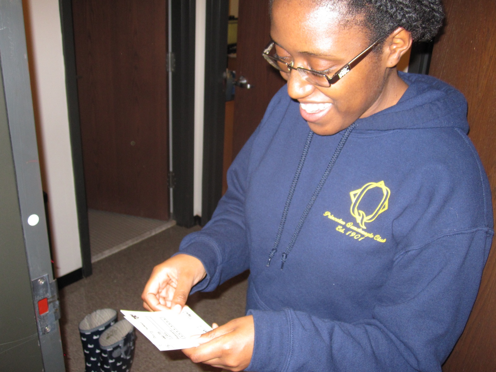
iv. Describe your testing procedure, including the roles of each member of your team, the order and choice of tasks, etc. Include at least one photo showing your test in progress (see above). Provide links to your demo and task scripts.

We divided our work very evenly, and everyone was involved in each part.
Andrew: Worked on script, post, and demo
Brian: Worked on script, post, and demo
Kevin: Worked on script, post, and demo
Saswathi: Worked on script, post, and demo

Demo script:

Hello, you have been invited to test our prototype for an interface for web camera control. The purpose of our interface is to allow a user to intuitively control a web camera through simple body movements that will be viewed by a Kinect. You will be given a mobile screen through which you can view the feed of a web camera with. Just imagine this is an iPad, and you are using Facetime with it. You can naturally move this screen, and the camera view will change correspondingly. Here we will demo one task so that you can better understand our system. This is Brian. He is your friend, who I am trying to webchat with. We share many fond memories together, but he has a habit of frequently leaving in the middle of your conversation. He is a bit strange like that, but as he is my friend, I bear with him. Sometimes, he’ll leave for up to ten minutes to make a PB&J sandwich, but he expects me to continue the conversation while he is making the sandwich. When he does this, I intuitively move the mobile viewing screen to follow Brian around so that he doesn’t become an off-screen speaker. I can then continue the conversation while he is within the camera’s view.

Task Script 1: Brian get’s a PB&J sandwich

The first task that we want you to do is to web chat while breaking the restriction of having your chat partner sit in front of the computer. With a typical interface, this scenario would just cause your partner to go off screen, but with our interface, you can now simply move the screen to look and talk to a target person as he moves. In the task, the person may move around the room but you must move the screen to keep the target within view while maintaining the conversation.

Task Script 2: Brian asks you to find Waldo

The second task is to be able to search a distant location for a person through a web camera.

While you might seek out a friend in Frist to initiate a conversation, in web chat, the best you can do is wait for said friend to get online. We intend to rectify this by allowing users to seek out friends in public spaces by searching with the camera, just as they would in person.

You will play the “Where’s Waldo” game. There are various sketches of people taped on the wall and you need to look through the screen and move it around until you are able to find the waldo target.

Task Script 3: Brian and family including bolt the dog!

The third task is to web chat with more than one person on the other side of the web camera.

A commonly observed problem with web chats is that even if there are multiple people on the other end of the web chat, it is often limited to being a one on one experience where chat partners wait for their turn to be in front of the web camera. We will have multiple people carrying a conversation with you, and you will be able to view the speakers only through the screen. You can turn the screen in order to address a particular conversation partner. When you hear an off-screen speaker, you may turn the screen to focus on him.

e. 1–2 paragraphs summarizing your results, as described above. Do not submit your full logs of critical incidents! Just submit a nicely readable summary.

    The prototype we constructed was simple enough for our users to quickly learn how to use it with only minimal verbal instruction and demonstration. Overall, the response was positive from the users when asked if Portal would be a useful technology to them. There were some issues brought up that were specific to the tasks given to the users. For example, in the first task we asked users to move and keep the user on the camera side in view as he ran around. One user commented that this was a bit strange and tedious, and that it might be better to just have the camera track the moving person automatically. In the second task, we asked the user to find a picture of “Waldo” hidden somewhere in the room amongst other pictures of people. Two of the users noted that our prototype environment was not an accurate representation of a crowd of people in a room as just having pictures taped to the wall cannot easily capture factors such as depth perception, crowd density, and people hidden behind other people. In the third task we ask the user to move the screen to bring an offscreen speaker into view. This was easy with our prototype because two of our users noted that they could use their peripheral vision and binaural hearing to cheat and determine the direction in which they should turn to face any offscreen speaker. However, peripheral vision and audio cues will not actually be present when using our working implementation of the product, so this is another inaccuracy of our prototype. They did note that they could still pick up on the movements of the person they were watching to determine which direction to turn.

f. 1–2 paragraphs discussing your results, as described above. What did you learn from the experiment? How will the results change the design of your interface? Was there anything the experiment could not reveal?

We obtained much useful input about our prospective design. For example, we found that using something like an iPad would be useful for the mobile screen because it would allow users to rotate the screen to fit more horizontal or vertical space. We may or may not implement this in our prototype but it is something that would be worthwhile if we chose to mass produce our product. Another possible change (depending on time constraints and difficult) is the possibility of adding capacity for 3D sound input. We recognize the possible need for this change due to our users mentioning that audio cues help identify where to turn for facing offscreen speakers. 3D sound would enable users to use their binaural hearing to assist in determining the location of an offscreen speaker with ease and precision. We could also implement a way for users to get suggestions on which way to turn the screen based on sound detection on the camera side.  The possible changes brought up are, however, nonessential.

The experiment, being limited in fidelity, allowed the user to sometimes “cheat” in accomplishing some tasks (using peripheral vision when finding waldo, for example), limiting the accuracy of our feedback. Thus, our experiment did not reveal how users would perform without the use of sound and peripheral vision cues to be able to turn the camera in the correct direction. Also, it did not provide an accurate representation of how users would search for friends in a crowd due to the limitations inherent with using paper printouts in place of people. Finally, we could not simulate a rotating camera in front of users, and thus did not see how users would react to a camera in their room being controlled remotely.  However, overall, the experiment revealed that there are no fundamental flaws present with our system design that would stop us from proceeding with building a higher fidelity prototype.

g. A 1–2 paragraph test plan for subsequent testing, or a statement that you are ready to build a higher-fidelity prototype without further testing.

We are ready to build a higher-fidelity prototype without further testing. We feel we have received sufficient input from users and will not gain any more information that would necessitate major usability changes by doing further testing on our low-fidelity prototype. We also noted that many of the main points that users made had to do with the inaccuracy of the prototype but did not point out any major, fundamental flaws with our system design that would prevent us from moving on to a higher fidelity prototype.  The flaws pointed were mainly either cosmetic and nonessential or would require a higher-fidelity prototype to gain accurate feedback from.

A3–Transloc

Group Members: Brian Huang, Krithin Sitaram, Prerna Ramachandra`

What were the most severe problems with the app/site? How do these problems fit
into Nielsen’s heuristic categories? What are some suggestions to fix the UI, and
how do your proposed changes relate to the heuristic categories?

  • No easy way to check when the next bus arrives (Android)–H7
    • After the first half hour we found such functionality does exist, but it involves clicking on a marker in the overlay that disappears when the screen is touched

→ Fix by having show/hide option

  • When multiple routes are selected, the map is too confusing to navigate–H8

→ Fix by displaying a message warning the user about cluttering the map

→ Having a legend to tell the user what each color code stands for.

  • Colour codes for routes not listed on the map–H6
    • And toggling to the routes list to figure out the colours takes too long because of data loading time

→ List color codes on the map

  • Cluttered UI, because current locations of buses always displayed (Android)–H8
    • This is distinct from the second criticism, but certainly is exacerbated. This is concerned with the fact that the large pins (representing buses) also clutters the interface.

→ Have an option to show/hide bus pins so map can be more easily navigated

  • No list of stops for each route (Android)–H6
    • Not what you’d expect of a transit app; it requires that you know which route you need before you use the app, which is detrimental to first-time users of the transit system.

→ Add list of stops when route is tapped on

  • ‘No route selected’ when you open the app / switch between agencies
  • No one uses Transloc to look at no routes, so this default is counterintuitive.

→ Use a smarter default, like displaying all routes

ii. Which problems, if any, were made easier to find (or potentially easier to correct)
by the list of Nielsen’s heuristics? (That is, if we had asked you to perform a
usability evaluation of the app/site without first discussing heuristics, what might
you have overlooked?)

  1. Flexibility and Efficiency of Use (H7): Transloc by default displays no routes on the map.  In order to view the status of any buses, the user must manually select them all (and on the Android does not even have a “select all” button).  This problem was easily recognized and corrected in light of the concern of H7 with efficiency of use by means of good defaults.
  2. User Control and Freedom (H3): Forcing the user to switch between route list and map reduces user control on the map and was made more obvious through H3
  3. Aesthetic and Minimalist Design (H8): Thinking about signal-to-noise ratios helped us realize that the clutter from displaying all routes was detrimental to the overall design and the efficiency of information communication.

iii. Did anyone encounter usability problems that seemed to not be included under
any of Nielsen’s heuristics? If so, what additional heuristics might you propose
for this type of application or site?

This was more of a general observation, in which some of the UI problems arose from have smaller buttons to click on, and not having an intuitively navigable interface. The problem of size of buttons, etc. seem to be specific to touchscreen interfaces like the iPhone/Android and having a heuristic specific for that might be helpful.

A useful heuristic for cross-platform applications (Transloc is available on Android, iPhone, and on the web) might ask whether features are consistent between platforms.  With respect to the Transloc app, the iPhone version seemed to be much more refined than the Android version, and both had some significant differences from the desktop version

iv. What might be some useful class discussion questions—or final exam questions—
related to heuristic evaluation?

Certain systems are aimed at a large body of users that are uninterested in reading documentation (example: Microsoft Word).  In such a case, what are some clever ways to embed documentation without giving the user a large body of text (that he/she will likely not read), while still conveying relevant information?

Individual Links:

Prerna Ramachandra (pramacha):
https://www.dropbox.com/s/as8qh90xtaz23vn/HCI_A3.pdf
Brian Huang (bwhuang):
https://www.dropbox.com/s/qeel7yige967898/HCI%20A3.pdf
Krithin Sitaram (krithin):
http://www.princeton.edu/~krithin/hci/A3.html

Assignment 2–Brian Huang

I did my observations before SOC 204 lecture (TTh10:00am) in Frist, ANT 303 seminar (TTh1:30pm) at Bobst Hall, and in Frist at 11am on Tuesday (the former two were done last Thursday).

Observations:

  • Subject 1 (student)
    • Student is early to lecture
    • Sitting in back of lecture hall checking facebook
      • There are other students here, but no interaction; they are all on phone or computer, decidedly ignoring each other
    • Steps out to go to bathroom
      • Leaves laptop in seat (is this safe?)
        • Says that Princeton students are pretty trustworthy (honor code)
    • When returns, someone has taken the seat next to him
      • Takes backpack (was on other side) and switches seats with it (now sitting in aisle seat)
        • Classroom is pretty full, but students seem to not want to sit right next to each other
        • Possible space concerns when taking notes/working on laptop
    • Eats a granola bar
      • Skipped breakfast because he woke up at 9:30 and didn’t have time to stop by dining hall for a proper meal.
  • Subject 2 (professor)
    • Passes by early students
      • No interaction; only enters a couple minutes early and busies himself getting ready for class
    • Actually, he had some trouble finding parking out here
      • Prospect ave. has many cars parked along.  Finding closest parking spaces often requires doubling back
        • In intervening time, spot might get taken?
      • Equad parking is too far away to be worth the walk
    • Throws away coffee (it has grown cold and it’s mostly gone anyway)
      • Always gets coffee before coming to class; sometimes finishes it, sometimes doesn’t, but it gets him going
      • Coffee may drip through trash lining, but nowhere to pour coffee out
        • Bathroom? Maybe too far to be worth it. Where is the closest one?
  • Subject 3 (late student)
    • Rushed through Frist; no one is in the way—pretty much everyone else needs to be somewhere at this point anyway
      • Is the student taking the most efficient route up?
    • Takes stairs two at a time while rummaging around in his backpack
      • Not much we can do to improve stairs, but can we organize backpack better?
        • What is in backpack that he needs? < homework due
      • Need a way to keep paper unwrinkled but easily accessible
    • Quietly slipped into class; found a seat in the back
      • Doors still make noise, and people still turn
      • Floor is creaky, announcing every moment student is not seated
      • Back-of-the-room seats build up, forcing later students to move up

Brainstorming:

  1. Mobile/online print release to allow people to print and pick up papers right before class
  2. Anonymous student/professor forum for interaction before/after class
  3. Classroom interest-related livewire for giving professor real-time student feedback on class (intended to spark conversation between class and de-stigmatize speaking w/ profs)
  4. Restroom occupancy checker to check for nearest restroom with vacancy to expedite before class restroom runs
  5. Redesign desks to have desks in front, rather than by arm (off center workspace is a problem for laptops)
  6. Mounted display and keyboard (in front of seats in lecture, but low enough not to obstruct view) for students to jack laptops into to avoid awkward laptop positioning
  7. Parking locator for professors who drive to efficiently find parking spaces
  8. Carpooling system for professors and driving students to reduce parking load.
  9. Mobile phone system for ordering “to-go” breakfast or lunch to allow students to eat and still make it to class in time.
  10. Student/professor check-in/introduction interface for de-stigmatizing student/professor relationships (could generate conversation starters based on interests of present people).
  11. Mobile app for reserving seats in lecture halls
  12. Lecture seating organizer that allows students to state preferred seating locations, but also ensures that students sit forward, leaving rear seats open for latecomers
  13. Mobile Princeton campus map app with efficient route locator
  14. Mobile game that allows students to gain points for discovering bits of trivia about professors (to encourage professors and students to get to know each other)
  15. Mobile Princeton facial recognition scanner (for professors and students who forget other professors/students’ names).
  16. Mobile app to allow students to check in and find friends in large lectures (for acquaintance-level friendships)

Choices:

  1. (Mobile print release): students often need to print things out right before class, but waste time waiting for things to print at release clusters.
  2. (Mobile app for ordering “to-go” meals to allow students to grab food before class and still make it to class in time): students often skip meals before classes, but this could be avoided with to-go meals being more easily obtained (current interface is a form filled out a meal before)

Paper Prototypes:

Mobile “to-go” meals:

IMG_0114IMG_0112 IMG_0113

Mobile Print Release:

IMG_0115 IMG_0117IMG_0116

Feedback:

User 1 (Ben Arar)

IMG_0106

  • Liked the idea
  • Need more food options (pickings are somewhat slim
    • May need options to change quantity/size of meal

User 2 (Elizabeth Liu)

IMG_0107

  • Would like to use this now
  • Want ability to switch out items (if someone doesn’t like orange juice, for example, need ability to change to, say, apple juice)

User 3 (Amma Awusu-Akyaw)

IMG_0108

  • Need additional special concerns (not just eating restrictions, someone might really like bacon, for example, or want a hot breakfast–user really wants to see bacon)
    • Rephrase “special concerns” to something more general like, “specifications”
    • Perhaps also include a text box for any other things that we may not think of
  • User also seemed to think that certain combinations of items were just not good (orange juice and soy milk, for example, “just don’t go together”)
    • Perhaps allow for feedback on experience

Major Insights:

  • Users want a great deal more customization of meals (the main draw of a dining hall, I suppose)
  • Users need to be able to communicate with meal makers, and not just with our restrictive interface.  We can’t anticipate all needs.
  • Feedback on meal combinations is advisable, especially if food may be wasted.  Users may also want specific things (like bacon) and want to be able to recommend that cooks make these more often, or dislike certain things (orange juice + soy milk) and want to advise cooks against these.
  • GUI buttons need to be more carefully named.  “Order” was misleading, and people were surprised to see a “confirm” page after