P4: Testing the BlueCane Prototype

Group 17 – BlueCane
Members: Joseph Bolling, Jacob Simon, Evan Strasnick, Xin Yang Yak

Project Goal
Our project goal is to improve the auton­omy, safety, and over­all level of com­fort of blind users as they attempt to nav­i­gate their world using cane travel by augmenting the traditional cane with haptic and touch-based feedback.

Test Methods
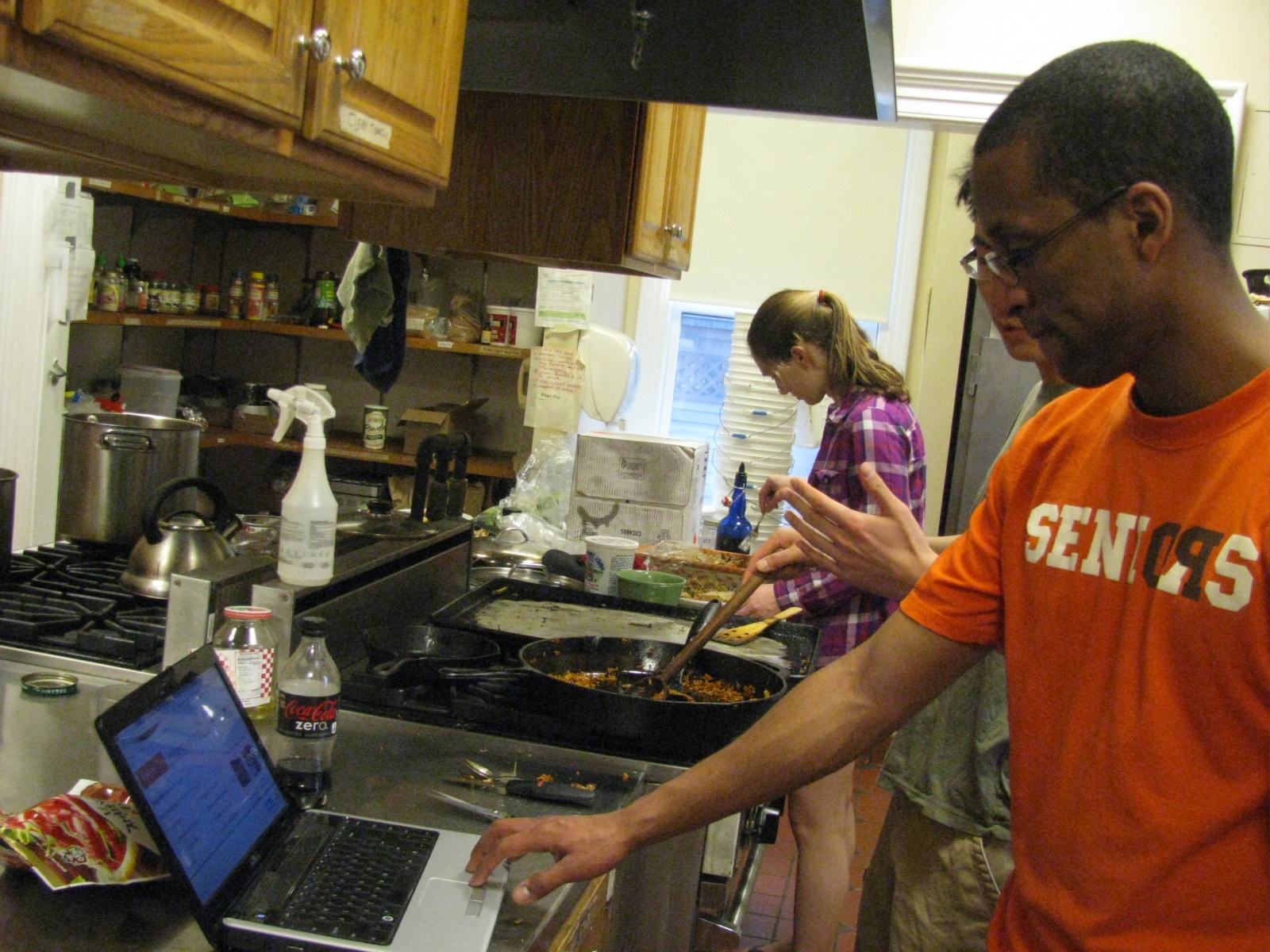
When conducting a test with a volunteer user, we first had them read and sign our consent form. We also verbally reiterated the information contained on the form, including the fact that the user would be asked to move while blindfolded and wearing headphones. We explained that we would be taking pictures during the testing process, but that the user would not be identifiable from the pictures. We assured the user that we would verbally, and, if necessary, physically warn them before they ran into any objects, if it appeared that they would. Before continuing, we ensured that the user was comfortable with the test and that they had no unanswered questions. Participants were selected among students at Princeton according to availability and were all equally (un)familiar with blind navigation. None had extensive prior knowledge about the project.

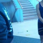
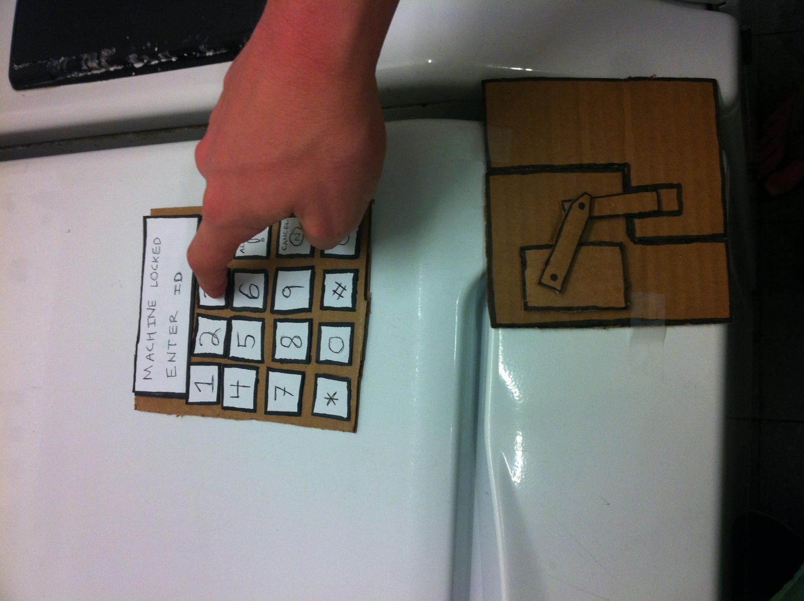
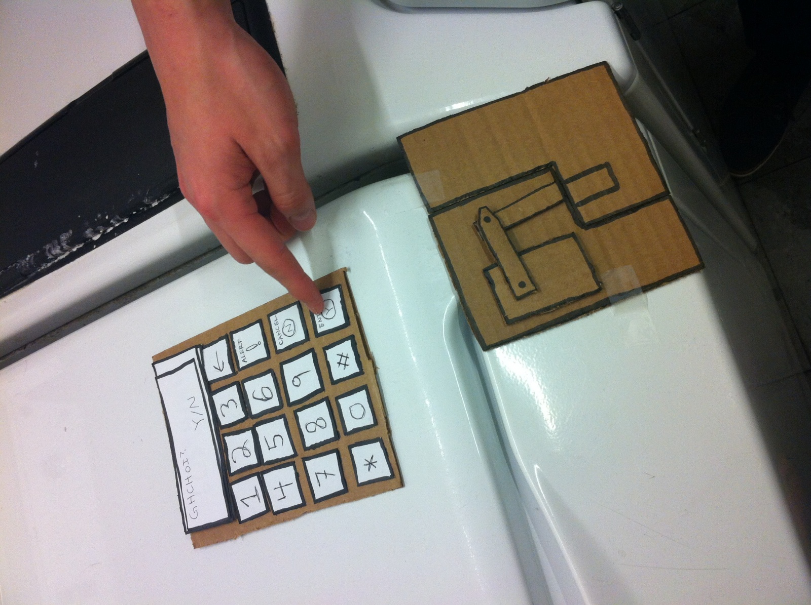
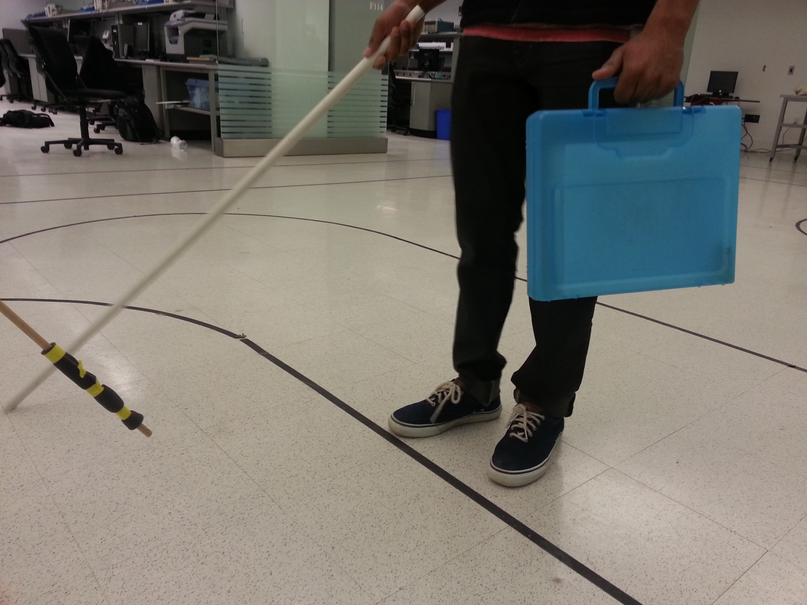
We used the electrical engineering laboratory as our experimental environment. It provided an expansive area for the participant to walk around freely, and the existing floor markings adapted quite well to our use. We first had participants watch an instructional video on cane navigation and practice proper technique, then we had them perform the three tasks that we described earlier—navigation while carrying an item, navigation in a noisy environment, and indoor navigation with a static reference direction. We randomized the order of the tasks to reduce the chance that user feedback was skewed by learning effects. (scripts here)

participant

Results
Generally, all the users found cane travel unfamiliar, and tended to seek tactile feedback before taking a bigger step. There was a significant learning effect, as the users became more used to being blindfolded and traveling with a cane. One user walked very slowly, which allowed him to following the directions closely, while the other two users took bigger steps, leading them to occasionally veer off the path. All three users found tasks 1 and 2(following navigation directions) easier than task 3(walking in a cardinal direction). Users did not notice any additional difficulties from carrying an object in one hand or from the lack of auditory cues from the ambient environment, which shows that our generally approach works well with users having to carry extra items on one hand and in noisy environments.

Tasks 1 and 2: at sharp turns (more than 5 times), the cane swing is not wide enough to ‘hit’ the direction where the tactile feedback will be given, and the user is left wondering where he/she is supposed to go. One user compensated by walking with very wide cane swings (more than 180 degrees), but we think that this is unrealistic as blind users are unlikely to make such wide swings. Then it takes some time for the user to swing the cane wide enough before the user gets some tactile feedback. If there are obstacles in the direction where the tactile feedback is given, this can be annoying. So we also tapped the user on the shoulder to simulate the raising of the ridges when there is a sharp turn ahead, but this was confusing, since the indication happens even though the user is walking in the same direction as where the tactile feedback is given (making the user also think that she is walking in the correct direction). Users also tend to become quite reliant on the tactile feedback after a while, and became disoriented once the tactile feedback is no longer given.

Task 3: One of the users also mentioned that the prototype would need a way for the user to know which mode the cane is in (whether it is navigating or just acting as a compass). Two of the users often veered off significantly from the desired direction, sometimes by more than 30 degrees, even when a reference cardinal direction is given. This happened about 4 times. Another thing mentioned by a user is that indications of cardinal directions other than the north would be useful, since the user would have to swing all the way back to check bearings if the user wants to head south. With the task where the user is allowed to set a direction, one user mentioned that once the cane is set to an incorrect direction, the direction will continue to be incorrect and would cause the user to veer off in the wrong direction consistently.

Discussion
In general, our three participants confirmed the basic elements of the design. With no prior experience in sightless navigation, they were still able to navigate the experimental space, albeit at a slower pace than blind users would. The users agreed that navigating in the “noisy environment” task was not more difficult, which supports our belief that haptic feedback is a useful mechanism for navigation.

One of the most important questions left unanswered by our first prototype is whether our observations can be generalized to blind users. Because we used blindfolded students as participants in our experiment, we can only learn so much about the effectiveness of the prototype. Furthermore, these participants lack some of the navigational skills that blind people obtain through experience, and they may rely instead on navigational heuristics that come from visual knowledge. We tried to mitigate these effects by teaching participants how to use a cane for navigation and allowing them to practice, but a longer-term study might have done a better job of ruling out these confidence-related issues altogether.

We would also like to determine if the experimental environment can be extrapolated to the real world. Users completed the three tasks without real buildings, roads, or other common obstacles. In later tests, we would like to simulate these conditions more accurately. For the purposes of this test, however, it was important to verify that the prototype was functional without added difficulties and variables.

Our findings led us to several possible improvements on our original design. Firstly, because subjects did not clearly understand when to execute a turn relative to when the cue to do so was given, we have given additional consideration to how we can clearly convey the distance of an upcoming turn. Most of these solutions are software based; for example, we can warn about an upcoming turn by using a flicker of the raised indicator in that direction, and only when the turn is actually to be made will the indicator stay raised. In addition, we noted that, at least for our seeing test subjects, navigation at some point became reliant on the cues that we provided, raising the question of what might happen when the system fails (e.g. the battery runs out). As one of our original interviewees pointed out, it is more difficult for the blind to recognize, diagnose, and fix unforeseen errors. Thus, we are discussing plans to include a battery indicator that cues the user to change the power source. Finally, we were asked multiple times how to differentiate between the different “modes” of the cane (route guidance vs. cardinal reference), which has led us to consider the most minimal type of cue that can elucidate this distinction for the user.

Testing plan
We will continue to search for a blind user to get feedback from, but in the meantime, we will begin to work on a higher-fidelity prototype based on the feedback obtained during this round of experimentation.

Group 10 – P4

Group 10 – Team X

Group Members

-Junjun Chen (junjunc)

-Osman Khwaja (okhwaja)

-Igor Zabukovec (iz)

-av)

One Sentence Project Summary

A “Kinect Jukebox” that lets you control music using gestures.

Test Method

i. We read the informed consent script to the users and asked for verbal consent. We felt that this was appropriate because the testing process did not involve any sensitive or potentially controversial issues, and because the only photos we took did not reveal the participants’ identities, avoiding any issues with that. LINK

ii. One of our participants was a participant that we had conducted previous research on, and therefore we felt that it was appropriate to see how she interacted with a prototype that her feedback had played a part in developing. The other two were new: a man and a woman who have a more amateur interest in dance than our previous testers. We decided to use them because they had previously expressed interest in using the system, but also would provide a slightly different perspective from the much more experienced subjects that we had used before.

iii. The testing environment was in Alejandro’s room, because he had a large clear area for the dancers, as well as a stereo for playing the music. The prototype setup was mostly just a computer (with software for slowing down and playing music) connected to a stereo. We also had some paper prototypes for configuration. One person was behind the computer, controlling the audio playback. The placement of the computer also represented the direction the Kinect was pointing in.

iv. For testing, we had each user come into the room and do the tasks. Osman made the scripts, Alejandro was the “Wizard of Oz”, and Junjun and Igor observed/took notes. First we read the description script to the user, then showed them a short demo. We then asked if they had any questions and clarified any issues. After that, we followed the task scripts in increasing order of difficulty. We used the easiest task, setting and using pause and play gestures, to help the user get used to the idea. This way, the users were more comfortable with the harder tasks (which we wanted the most feedback on).

Links: DEMO. TASK 1. TASK 2. TASK 3.

Results

All of our users had little trouble using our system once we explained the setup. They were a little confused about what the “system” actually was at the beginning, as our prototype was basically just wizard of oz. However, after doing the first task, they quickly became comfortable with the setup.

For two of our users, we had to explain the field of view of the kinect and that it wouldn’t be able to see gestures if they were obscured. For our real system, there would be less confusion about this, as users would be able to see the physical Kinect camera. When we visualized our gestures, we thought of them as being static (“holding a pose”). However, all of our users used moving gestures instead, which suggests that that may be more natural. Additionally, the first gestures our users selected were dramatic, and as one user later commented on, “not very convenient”, suggesting that they did not exactly understand what the gestures would be used for (that they would have to repeat it every time to play/pause, etc). Their later gestures were more pragmatic. Our second user asked for several additional functionalities during the test, such as additional breakpoints and more than one move for “follow mode”. He also commented on how the breakpoints  task would be useful in a dance studios and for dance companies.

Discussion

The Kinect field of view problem was something we knew about, but we had not considered this a major issue before now. However, the fact that two of our testers tried to set gestures that including moving a hand behind their body suggests that this may be an issue. We had originally thought to use static gestures, which would be easier to capture, but since all of our users used moving gestures, it may be best to allow that. We had originally thought that allowing only one breakpoint would be enough, but after testing that task with our second user, he immediately asked about how to set more than one. This suggests that we should include the ability to set multiple breakpoints in our system. For follow mode, all of our users were confused when we asked them to perform only one single move, and they felt awkward repeating that move many times. In the words of user two, “You can’t just isolate one move.” Ideally, we would be able to follow a series of moves, but the implementation of this may prove difficult. Therefore, we are considering changing this functionality to just allow a gesture for fast forwarding/slowing down.

Plan

Given that the usability of our prototype would depend on what functionality the Kinect can give us, we feel that it would be best to start building a higher-fidelity prototype with the Kinect.

Images of Testing

[kaltura-widget uiconfid=”1727958″ entryid=”0_vd25l755″ width=”400″ height=”360″ addpermission=”0″ editpermission=”0″ /]

P4 – NavBelt Lo-Fidelity Testing

Group 11 – Don’t Worry About It
Daniel, Krithin, Amy, Thomas, Jonathan

The NavBelt provides discreet and convenient navigational directions to the user.

Testing Discussion
Consent
We had a script which we read to each participant, which listed the potential risks and outlined how the device would work. We felt that this was appropriate because any risks or problems with the experiments were made clear, and the worst potential severity of accidents was minimal. In addition, we gave our participants the option of leaving the experiment at any time.
Scripts HERE.

Participants
All participants were female undergraduates.

Since our target audience was “people who are in an unfamiliar area”, we chose the E-Quad as an easily accessible region which many Princeton students would not be familiar with, and used only non-engineers as participants in the experiment. While it would have been ideal to use participants who were miles from familiar territory, rather than just across the road, convincing visitors to Princeton to allow us to strap a belt with lots of wires to them and follow them around seemed infeasible.

  1. Participant 1 was a female, senior, English major who had been in the E-Quad a few times, but had only ever entered the basement.
  2. Participant 2 was a female, junior, psychology major.
  3. Participant 3 was a female, junior, EEB major.

We selected these participants first by availability during the same block of time as our team, and secondly by unfamiliarity with the E-Quad.

Prototype
The tests were conducted in the E-Quad. We prepped the participants and obtained their consent in a lounge area in front of the E-Quad cafe. From that starting point, there were hallways and a staircase that the participants had to traverse in order to reach the final destination which was a courtyard. The prototype was set up using a belt with vibrating motors taped to it. Each had alligator clips that could be connected to a battery in order to complete the circuit and cause it to vibrate. A pair of team members would trail each tester, closing circuits as needed in order to vibrate a motor and send the appropriate direction cue to the tester.

This setup represents a significant deviation from our earlier paper prototype, as well as a significant move away from pure paper and manual control to include some minimal electrical signaling. We feel however that this was necessary to carry out testing, since the team members who tested our original setup, where one team member physically prodded the tester to simulate haptic feedback, reported feeling their personal space was violated, which might have made recruiting testers and having them complete the test very difficult. To this end we obtained approval from Reid in advance of carrying out tests with our modified not-quite-paper prototype. However, the simulated mobile phone was unchanged and did not include any non-paper parts.

Procedure
Our testing procedure involved 2 testers (Daniel and Thomas) following the participant and causing the belt to vibrate by manually closing circuits in a wizard-of-oz manner. Another tester (Krithin) videotaped the entire testing procedure while 2 others took notes (Amy and Jonathan). We first asked the participants to select a destination on the mobile interface, then follow the directions given by the belt. In order to evaluate their performance on task 3 we explicitly asked them to rely on the buzzer signals as opposed to the map to the extent they were comfortable.

Scripts HERE.

Video of Participant 1

Video of Participant 2

Video of Participant 3

Results Summary
All three participants successfully found the courtyard. The first participant had trouble navigating at first, but this was due to confusion among the testers who were manipulating the wizard-of-Oz buzzers. Most testers found inputting the destination to be the most difficult part, and once the belt started buzzing, reported that the haptic directions were “easy” to follow. Fine-grained distinctions between paths were difficult at first, though; Participant 1 was confused when we arrived at a staircase which led both up and down and was simply told by the belt to walk forward. (In later tests, we resolved this by using the left buzzer to tell participants to take the staircase on the left, which led down.) Finally, all participants appeared to enjoy the testing process, and two of the three reported that they would use it in real life; the third called it “degrading to the human condition”.

One of the participants repeatedly (at least 5 times) glanced at the paper map while en route to the destination, though she still reported being confident in the directions given her by the belt.

One aspect of the system all the participants had trouble with was that they were not sure when the navigation system kicked in after they were done inputting the destination on the phone interface.

Results Discussion
Many of the difficulties the participants experienced were due to problems in the test, and not in the prototype itself. For instance, Participant 1 found herself continually being steered into glass walls, while the testers in charge of handling the alligator clips tried to figure out which one to connect to the battery; similarly, while testing on Participant 3, one of the buzzers malfunctioned, leading her to not correctly receive the three-buzzer end of journey signal.
Two participants preferred directions to be given immediately when they needed to turn; one participant suggested that it would be less confusing if directions were given in advance, or some signal that a direction was forthcoming was given, because a vibration was easy to imagine when nonexistent or, conversely, it was easy to get habituated to a constant vibration and cease to notice it.

The difficulty in using the paper prototype for the phone interface was probably caused at least in part by the fact that only one of the participants regularly used a smartphone; in hindsight we might have used familiarity with google maps on a smartphone or GPS units as a screening factor when selecting participants. The fact that some participants glanced at the map seems unavoidable; while relative, immediate directions are all that one needs to navigate, many people find it comforting to know where they are on a larger scale, and we cannot provide that information through the belt. However, using the map as an auxiliary device and the navigation belt as the main source of information is still a better method than the current standard navigation method of relying solely on a smartphone.

To address the fact that users were not sure when the navigation system had started, we might in the actual product either have an explicit button in the interface for the user to indicate that they are done inputting the destination, or have the belt start buzzing right away, thus providing immediate feedback that the destination has been successfully set.

Higher-Fidelity Prototype
We are ready to build without further testing.

P4 – Team TFCS

Group Number: 4
Group Name: TFCS
Group Members: Farhan, Raymond, Dale, Collin

Project Description:  We are making a “habit reinforcement” app that receives data from sensors which users can attach to objects around them in order to track their usage.

Test Method:

  • Obtaining Consent: 

To obtain informed consent, we explained to potential testers the context of our project, the scope, duration, and degree of their potential involvement, and possible consequences of testing, with a focus on privacy and disclosing what data we collected. First, we explained that this was an HCI class project, and that we were developing a task-tracking iPhone app using sensors to log specified actions. We explained how we expected the user to interact with it during the experiment: they would use a paper prototype to program 3 tasks, by indicating with their finger, while we took photographs of the prototype in use. We also though it was important to tell participants how long the experiment would take (10 minutes), but most importantly, how their data would be used. We explained that we would take notes during the experiment which might contain identifying information, but not the user’s name. We would then compile data from multiple users and possibly share this information in a report, but keep user’s identity confidential. Finally, we mentioned that the data we collected would be available to users after on request.

Consent Script

  • Participants:

We attempted to find a diverse group of test users representing our target audience, including both its mainstream and fringes. First, we looked for an organized user, who uses organizational tools like to-do lists, calendars, perhaps even other habit-tracking software. We hoped that this user would be a sort of “expert” on organizational software who could give us feedback perhaps on how our product compares to what he/she is currently using and what works well in other comparable products.

We also tested with a user who wasn’t particularly interested in organization and habit-tracking. This would let us see if our system was streamlined enough to convince someone who would otherwise not care about habit-tracking to use our app. We also hoped it would expose flaws and difficulties in using our product, and offer a new perspective.

Finally, we wanted an “average” user who was not strongly interested nor opposed to habit-tracking software, as we felt this would represent how the average person would interact with our product. We aimed for a user who was comfortable with technology and had a receptive attitude towards it, so they could represent a demographic of users of novel lifestyle applications and gadgets.

  • Testing Environment:

The testing environment was situated in working spaces, to be natural for our testers. We used a paper-prototype of the iPhone app to walk the user through the process of creating and configuring tasks. For the tags, which are USB-sized bluetooth-enabled sensor devices, we used a small cardboard box the same size and shape of the sensor and gave three of these to the user, one for each task. We also had a gym bag, a pill box and a sample book as props for the tasks.

  • Testing Procedure:

After going through our consent script, we used our paper iPhone prototype to show the user how to program a simple task with Task.ly. We had a deck of paper screens, and Raymond led the user through this demo task by clicking icons, menu items, etc. Farhan changed the paper screen to reflect the result of Raymond’s actions. We then handed the paper prototype with a single screen to the test user. Farhan continued to change the paper screens in response to the user’s actions. When scheduling a task, the user had to set up a tag, which was described above.

The first task we asked users to complete was to add a new Task.ly task, “Going to the gym.” This involved the user navigating the Task.ly interface and selecting “Create a preset task.” We then gave the user a real gym bag, and the user had to properly install the sensor tag in the bag.

The second task we asked our user to do was track taking pills. This also required the user to create a new Task.ly preset task, and required the user to set up a phone reminder. Then, the user was given a pencil box to represent a pill box, and the user had to install a sensor tag underneath the lid of the pencil box.

Finally, the user had to add a “Track Reading” Task.ly task, which was the hardest task because it involved installing a sensor tag as well as a small, quarter-sized magnet on either covers of a textbook. The user was given a textbook, a cardboard sensor tag, and a magnet to perform this task.

While the user was performing these tasks, Farhan, Collin, and Dale took turns flipping the paper screens during each task and taking notes, while Raymond took continuous and comprehensive notes on the user’s experience.

<a href =”https://www.dropbox.com/s/f46suiuwml8qclv/script.rtf”>Script</a>


IMAG0086

User 1 tasked with tracking reading

IMG_20130408_160528IMG_20130408_214935

Results Summary:

All three users managed to complete each task, though they each had difficulties along the way. During the first task, tracking trips to the gym, our first respondent looked at the home screen of our app and remarked that some of the premade tracking options seemed to be subsets of each other (Severity: 2). When he tried to create a new task, he was frustrated with the interface for making the weekly schedule for the task. Our menu allowed him to choose how many days apart to make each tracking checkpoint, but he realized that such a system made it impossible for him to track a habit twice a week (Severity : 4). Respondent #2 noted that he liked the screens explaining how the bluetooth sensors paired to his phone, though he thought these should be fleshed out even more. Once he had to attach the sensor to his gym bag, however, he again expressed confusion when following our instructions (Severity: 4). He said that he thought the task was simple enough to forego needing instructions.

Of the three tasks, our users performed the best on tracking medication. Note, however, that this was not the last task we asked them to do, indicating that their performance was not merely a product of having greater familiarity with the app after several trials. Respondent #3 remarked that tracking medication was the most useful of the precreated tasks. All three users navigated the GUI without running into new problems unique to those experienced during the first task. All users attached the sensor tag to our demo pill box based on the directions given by the app; all performed the job as expected, and none expressed confusion. However, during the third task, tracking the opening and closing of books, new problems emerged with the sensor tags. Though two users navigated the GUI quickly (as they had during the second task), one respondent did not understand why there was a distinction made between tracking when a book was opened and tracking when a book was closed. He thought that the distinction was unnecessary clutter in the GUI. We judge this a problem of severity 2, a cosmetic problem. None of the users attached the sensor to our textbook in the way we expected. We thought that the sensor should be attached to the spine of the book, but users attached the tags to the front or back covers, and one even tried to put the sensor inside the book. Users were also confused by the necessity of attaching a thin piece of metal to either inside cover (severity: 3).

f. Results, Insights, Refinements

Our testers uniformly had problems while setting task schedules. There was no calendar functionality in the prototype; it only let the user set a number of times a task should be performed, over a certain time interval, so we are immediately considering changing this to a pop-up week/day selector, where the user highlights the day/times they want to do the task. Also, testers were confused by the sensors. The informational screens we provided to users to guide them through sensor setup were not complete enough, suggesting that we should make the sensor attachment instructions better phrased, visual, and possibly interactive. Because one user was confused by our having multiple sensor attachment pictures on one screen, we will instead offer the user a chance to swipe through different pictures of sensors being attached. Testers were also confused by the number of options for what the sensor could track, including in particular the option of being notified when a book is either open or closed. We can simply remove that choice.

Our users found the process of creating tasks to be cumbersome. Thus, we will simplify the overall process of creating a task, pre-populating more default information for general use cases, as that was the purpose of having presets in the first place. Then, we will remove the text options to choose how a sensor may be triggered. We will increase the emphasis on preset options, as above. Furthermore, we can accept feedback from the user each time he/she is reminded about a task (e.g. remind me in two days?/dont remind me for a month) to learn about how they want to schedule the task, instead of asking them to set a schedule upfront. This is a more promising model of user behavior as it distributes the work of setting a schedule over time, and lets our users be more proactively engaged. Finally, while considering how to streamline our interface, we also observed that the behavior of our system would be much more predictable to users if the reminder model was directly exposed. Rather than letting the user set a schedule, we observed we could use a countdown timer as a simpler metaphor, so that for each sensor, the user would only have to set a minimum time between triggers. If the time is exceeded, they would then receive reminders. This would be useful e.g. to provide reminders about textbooks that one leaves lying on the floor. Users may often forget about simple, low-difficulty tasks like taking vitamins, and this would make remembering to complete such tasks easier. Finally, this could be combined with deferring setting a schedule as discussed above.

g. Going Forward –  Refinements

With a low-fidelity prototype, we plan on testing two parts of our app in the future. The first part will test if the the design changes that we make from the lo-fi prototype help users navigate the app better. This specifically pertains to the process of creating a task, including improvements regarding simpler presets, deferring setting a schedule, and exposing the reminder system as a countdown, and the test will focus on if creating a task has been made substantively easier. The second major redesign to test is our sensor setup pages, since we will need to validate that increased interactivity and changes in copy allow users to better understand how to attach their sensors.

With the high-fidelity prototype, we will test the interaction of the user with the reminder screens and the information charts about their progress on different habits. This part can only really be tested with the high-fidelity prototype with data about certain tasks and hence, we will move this testing to after we have the hi-fi prototype ready. We also noticed that we couldn’t get a very good idea of actual daily usage of the app, including if a user would actually perform tasks (or not) and respond to notifications. That part of our project will be easier to test once we have a working prototype, to gather actual usage and reminder data.


Group 8 – The Backend Cleaning Inspectors

a. Your group number and name

Group 8 – The Backend Cleaning Inspectors

b. First names of everyone in your group

Peter Yu, Tae Jun Ham, Green Choi, Dylan Bowman

c. A one-sentence project summary

Our project is to make a device that could help with laundry room security.

d. Description of test method

We approached to people who were about to use the laundry machine in dormitory laundry room. We briefly explained them that we want to conduct usability test for our low-fi prototype and asked if they are interested. When they said yes, we gave them the printed consent form and asked them to read very carefully. We started our testing procedure when they signed to the form and we kept the form for records.

The first participant was a female sophomore. She was selected randomly by picking a random time (during peak laundry hours from 6-8pm) from a hat to check the laundry room in the basement of Clapp Hall. The student was using two machines to wash her impressive amount of laundry. She claimed to have waited until the previous user had claimed his clothes to use the second machine.

The second participant was a male sophomore. He was selected in a similarly random fashion using a drawn time within the heavy traffic time. The student was using one machine to wash his laundry, which he claimed was empty when he got there. This was strange, as the spare laundry bins were all full.

The third participant was a male freshman. He was selected in the same manner as the previous two subjects. The student was using one machine to dry his laundry, and claimed that he had no problems with people tampering with his things, although there was in fact someone waiting to use his machine.

The testing environment was set up in the public laundry room in the basement of Clapp Hall in Wilson College on Thursday, April 4th from 6-8pm, which we projected to be the peak time for laundry usage. The low-fi prototype components were set up in their respective places on one of the laundry machines– the processor was attached to the top, while the lock was fastened to the doors. Other equipment used consisted of the laundry machine itself. No laundry machines were harmed in the making of this test.

We first introduce ourselves to the participant and what we are trying to accomplish. After obtaining his/her informed consent and going through our demo script presented by Tae Jun, Dylan will give the system to the participant and explain the first task he/she has to perform for our test, using our first task script. The first task will be to load the laundry machine and lock it using our product. We then observe the user attempting task one. Upon completion, Peter then explains the second task. For the second task, the participant has to switch his/her role to that of the Next User trying to access the locked machine and send a message to the “Current User” of the machine. We all observe the participant attempting task two. Green will finish it up by explaining the last task to the participant, and we all again observe and take notes. The third and last task will involve the participant assuming the role of the Current User again and unlocking the laundry machine once their laundry is done. During all three tasks, we will rotate who is actually managing the changing of the screens of our product, so that we all get a chance to record notes on the different tasks. We then thank the user for his/her participation.

Consent Form: Link
Demo Script: Link

e. Summary of results

Overall, our results were quite positive. Users generally found no trouble in following the prompts, with the exception of a few minor things that they thought could be made more clear. The users often commented on the usefulness of the idea, citing their past negative experiences with people tampering with their laundry. They appreciated the simplicity of the keypad interface, as well as the “grace period” concept and other minor details explained to them. The only issues that came up (which we agreed to be Grade 3 Minor Usability Problems) were with the wordings of the prompts, which the participants would occasionally confirm with the tester.

f. Discussion

The results of our tests were very encouraging. We found that our idea was very well received and that the users were very enthusiastic about seeing it implemented. Despite the minor kinks in wordage and syntax, our lcd output prompts elicited the correct responses from our users and got the job done. In fact, the users’ enthusiasm for a possible laundry solution well overcame any potential problems with a minor learning curve, as all users expressed this implicitly or explicitly at one point in their testing. That being said, the exact wording, order, or nature of the prompts can always be changed in our software. In this testing, we confirmed that our product has a strong demand, an adequately simple interface, and an anticipating audience.

g. Future Test Plan

We believe that we are prepared to begin construction of a higher-fidelity prototype. Our physical components and interface design seem to be adequately simple and readable to begin building, and any issues that presented themselves involved the lcd output prompts or commands, which can easily be refined at virtually any stage in development. Thus, we believe our next course of action will be to begin the assembly and configuration of our hardware components in higher fidelity.

P4: Group 24

Brisq: P4

The Cereal Killers, Group 24

Group members: Bereket, Ryan, Andrew, Lauren

Brisq is a special gesture control bracelet, that allows you to perform user set functions on your laptop with simple arm motions.

Testing Methods

Consent Script:
This device is meant to allow “hands-free” usage of your computer, allowing you to perform some pre-determined functions on your laptop with simple motions. To participate in this study, you will be required to perform a simple task while wearing a small bracelet. Several computer functions you wish to perform will be done by a live assistant, in place of our (non-working) prototype. Do you consent to perform an experiment with our prototype? Do you consent to be videotaped. The video of you will be used solely for our project and will not be distributed or sold. Would you like to remain anonymous?

Participants
We chose our participants to fit each task group as well as possible. The TV user was chosen because he watches TV and movies from his computer a lot. The cooking user was chosen because he is a member of a vegetarian food co-operative, and therefore cooks for several people twice a week. The final user currently is handicapped by a collarbone injury, and therefore perfectly fits the our model for a disabled computer user.

Environment
Our prototype consisted of a simple bracelet and a human assistant to perform the gestures. The testing environment was chosen to match the task. For example, the cooking task took place in the coop kitchen and the TV task happened in the Quad TV room. The only equipment was a laptop to perform the computer functions.

Procedure
One member of the team was the assistant who watched for the gestures and inputted them into the computer. Another member read the consent and demo scripts. That member, in addition to a third member, would observe the scene and take notes. Finally, a fourth member would take photos or video.

Link for [Demo Script] and [Task Script]

Cooking Pictures
IMG_3338

IMG_3339

IMG_3340

IMG_3341

TV Picture
tv_scene

Disabled Photos
Photo Apr 08, 7 52 49 PM

Disabled Video

Results Summary

Everyone seems to like the device, and we received satisfaction numbers of 4, 4, and 5. The range of prices people were willing to pay for our device was between $15-50. In some cases, users had trouble coming up with computer commands they wanted to map to gestures. The disabled user case was probably the most difficult because the user needed to use the entire range of computer functions, not just play/pause or scrolling. All of the users were not put off by the potential requirement to have special start and stop gestures to initialize their commands. Users did not think that they would wear the bracelet at all times, only carry it around and wear it when they needed it. Finally, participants all had interesting ideas for the design of the device, including watches and rings.

Discussion

Because participants had trouble picking functions, we could suggest some of them to maximize their experience. For example, our disabled user had a great idea to gesture for shift and ctrl while his good hand completed the click combo. We could also have a few simple, easy to remember gestures that were pre-programmed, to help people overcome the steep learning curve. Our cooking user made a good comment about how his desire to use the product depends on how well the sensor was calibrated (thus how well we could detect his gestures). Thus, our primary focus should be the machine learning algorithm. Also, our algorithm would be much more robust if we were able to use a list of pre-programmed, instead of user defined, gestures.

Test Plan

We wish to continue testing in order to answer two important and highly specific questions. The first one is how to enter gesture recognition mode. We want the method to be both convenient and unobtrusive. The second question is whether to have a series of pre-programmed gestures for users to map commands to, or to have user-defined ones. The advantage of pre-programmed gestures that we foresee is that it would create a simple way to get started with the device, and would provide a way to avoid the issue of users creating overly-complex gestures that are both hard for them to remember, and hard for the algorithm to recognize.

P4 – AcaKinect

Group 25 — Deep Thought

(Vivian, Neil, Harvest, Alan)

I. PROJECT SUMMARY 

Aca-Kinect is a gesture based music recording software that interfaces with an Xbox Kinect, using gesture-based controls to allow on the fly track editing, recording, and overlaying.

II. DESCRIPTION OF TEST METHOD

i. Describe your procedure for obtaining informed consent, explaining why you feel this procedure is appropriate. 

We decided to use a modified adult consent form which includes an overview of the procedure, confidentiality, risks, and benefits. By signing, the user agreed to participate, and also optionally agreed to be filmed/photograph for our future reference. We felt the consent form worked well in covering all the concerns for the prototype testing process and was a good physical record of the testing. For the procedure itself, we first helped the participant understand what was on the consent form by providing a description of our project and giving a summary of each section on the consent form; then we gave the participant a hard copy of the consent form to read and sign. This process took around 3-4 minutes.

Here’s a link to our consent form.

ii. Describe the participants in the experiment and how they were selected. 

Participant 1 was selected for her experience with various singing groups. She has little recording experience but plenty of experience singing and arranging for live performance. She was selected partly for her expertise in singing and lack of recording experience.

Participant 2 has a lot of experience singing in several a cappella and choir groups on campus. She has been involved in music composing and arranging processes and uses existing recording software. She was selected for her knowledge of existing recording software and familiarity with a capella music-making.

Participant 3 was an electrical engineer that has had someone background with the XBox Kinect, so gesture based actions shouldn’t be a problem. He also has had no experience with singing, music, or recording. This allowed us to capture the other end of our user-group, while compensating that with experience with gesture-based software.

iii. Describe the testing environment, how the prototype was set up, and any other equipment

The testing environments were a bit less than ideal. Both locations (Frist 100 level, ELE lab) had the necessary space for gestures and adequate lighting. However, neither space was an actual stage or recording space, as it would have been difficult to secure a stage space, and a recording studio would be prohibitively small. Both locations had some background noise and the occasional passerby but ultimately suited our needs well. The paper prototype was set on a table a few feet from where the participant was standing. For any future testing, we would aim to find spaces that better simulate recording environments.

iv. Describe your testing procedure, including roles of each member of your team (order and choice of tasks, etc). Include at least one photo showing your test in progress. Provide links to your demo and task scripts.

Our testing procedure was as follows:

  • Team member describes the project, prototype, and testing procedure
  • Participant reads and signs consent form.
  • Gives the participant a demo (using the demo script) of how the system works. Asks if the participant if they have any further questions.
  • Read all of the first task instructions. Wait and observe the participant completing the task, prompting them if necessary.
  • Repeat for the second and third task. Since the tasks are increasing in order of difficulty, instructions for the last two tasks are read one-by-one for the participant to follow.
  • Ask for any further feedback/feelings from the participant.

Vivian introduced the project, walked the participant through the consent form, gave them time to sign the consent form, and ran through the demo script. Harvest wrote and read the tasks script with Vivian assisting (moving the prototype pieces). Alan took pictures and video during the testing process. Neil transcribed and took notes on the process, outcomes, interesting observations, etc.

Here’s a link to the demo script and the tasks script.

III. SUMMARY OF RESULTS

In general users performed well on each task. The main issue was whether the participants fully understood the concepts of master recordings and loop recordings. The third participant asked a question about this and we explained it to him in great detail, so he was able to easily complete the three tasks. On the other hand, the first two participants were slightly confused on the third task, when they were instructed to make a master recording and then record a loop in a specific panel while the master recording was going on. The concerns were twofold — the first participant didn’t understand the difference between (or remember the gestures for) the master recording and a loop recording. The second participant didn’t understand why someone wanted to do a loop recording during a master recording, when there was an option of doing it before. Therefore there was a minor usability problem in the first case, and a usage question in the second. With the second participant, we spent approximately 5 minutes discussing the reasons for doing the third task the way we framed it and the real-world applications. Besides the question of motivation, there was no problem with usability since she was quickly able to complete the task.

The participants all thought the prototype was simple and easy to use — they used words like “cool,” “easy and fun” and jokingly “a workout.” Some of the participants seemed a little embarrassed singing in front of a paper prototype or got tired by the end and just said words instead of simulating music-making — perhaps as we evolve our project into a higher-fidelity prototype the participants will be more engaged and interested because of the addition of audio feedback. Additionally, the second participant asked about volume control on each individual panel — this is a feature we will need to make more explicit in future iterations of our project! There was also a question about why we had four panels — this is a cosmetic problem and may require us to suggest to the user to organize their recordings into different sections (percussion, bass, tenor, alto, etc).

IV. DISCUSS RESULTS

A major result of the testing was confirmation that the workflow is fundamentally fairly accessible to musicians or otherwise who have no prior experience with recording music using tools ranging from Garageband to loop machines. The lack of the steep learning curve, expense, and complicated setup that comes with more advanced and more capable tools like a dedicated loop machine means that this Kinect application can introduce more people to at least basic music production with some interesting looping and multitrack features; those who outgrow this application will probably develop an interest in the more advanced tools that do offer much more functionality.

However, we also discovered that some parts of this product remain slightly confusing to users who had never encountered recording tools before; there was a little terminology confusion surrounding the meaning of “master recording” and “loops,” and it was very difficult to impress upon the users the fact that all the loops would be playing simultaneously on top of each other. This is a fundamental issue with paper prototyping an application like this, and a high-fidelity prototype that actually provides accurate audio feedback would go a long way to making the experience much more understandable. As such, the experiment also cannot reveal much about what kind of music users would actually create using this product, since we only simulated the loops. It would be instructive and useful to see the complexity of music that users would produce, whether they actually use various pieces of functionality or not, and so on, but we don’t know at this point since we are not fully simulating the generation of a piece of music with many parts.

V. PROPOSED SUBSEQUENT TESTING

We feel that our paper prototype demonstrated its purpose. We aimed to explore functionality and see how users interacted with the ability to control features via gestures. The biggest issue we discovered stemmed from the lack of audio feedback. It’s difficult for a user to have an idea of what he/she is doing in recording software without the ability to record/listen. The confusion our users had in the tests was not an interfacing problem, but rather an understanding that we feel will be evidently resolved when users interact with a higher-fidelity project.

P4: Team Chewbacca

Group number and name

Group 14, Team Chewbacca

Group members

Eugene, Jean, Karena, Stephen

Project Summary

Our project is a system consisting of a bowl, dog collar, and mobile app that helps busy owners take care of their dog by collecting and analyzing data about the dog’s diet and fitness, and optionally sending the owner notifications when they should feed or exercise their dog.

Description of test method

Procedure for obtaining informed consent

We gave a an informed consent page to peruse and sign before the test began. This consent page was based off of a standard consent page template. We believe this is appropriate because the consent form covers the standards for an experiment.  The consent form can be found here.

Participants

The participants in the experiment were all female college students who have dogs at home. They were selected mainly because they have experience actually caring for a dog, which allowed them to give valuable insight into how useful it would be. They were also busy, as they were in college, and away from their pet, making them optimal test subjects, as this app is particularly useful for busy pet owners who stay away from home for long periods at a time.

 Testing environment

The testing environment was always an empty study room. Two users were tested in a study room in the basement of Rockefeller College, and one in a study room in Butler College. We do not believe the environment had any specific impact on the subjects. In addition, using the same environment may have been problematic, as it would have felt familiar to two of the subjects, but unfamiliar to the third.

The prototype was set up as a metallic dog bowl and a bag of Chex Mix (as dog food) that sat on the table in front of the user. The “homepage” of the paper prototype was placed in front of the user, with the remaining slides set down as users interacted with the prototype.

Testing procedure

The scripts for each task can be found here.

Eugene introduced the system and read the scripts for each task.  He also asked the general questions we had prepared for the end of the testing procedure. Jean handled the paper prototype, setting down the correct mobile app slides and drop-down menus as users interacted with the app.  She also handled updating the “LED” and time display on the dog bowl after users filled the bowl.

Stephen completed the “demonstration” task using the mobile app prototype.  He also asked more user-specific questions at the end of testing, following up on critical incidents or comments the users had made during testing.  Karena served as a full-time scribe and photographer during the testing.

The tasks were performed in the following order:

1. Interaction with the Dog Bowl Over Two Days

2. Checking Activity Information and Choosing to Walk the Dog

3. Sending Data to the Vet

These tasks were chosen to loosely cover the entirety of the system (bowl, collar, and app), and to obtain specific information. They were completed in order of decreasing frequency of real-life use (we imagine that users will use this system primarily for feeding their dog/getting notifications when they forget to feed their dog, somewhat less frequently for checking its activity level, and occasionally for sending data to the  vet).  Task 1 was used to obtain user opinion on the dog bowl interface, the front page of the app, and the importance of notifications. Task 2 was used to obtain user opinion on the collar interface, the data panes of the app, navigation through the app, and how important they found this task in real life.  Task 3 was to obtain user opinion on the data exporting page of the mobile app.

hci_photo_1

User 1 completing task 1 with the prototype

hci_photo_2

User 2 completing task 2 with the prototype

hci_photo_3

User 3 completing task 1 with the prototype

Results summary

We noticed that there were several instances where the user did not know what to do with the data so they would just stare at the app. Most users thought there should be additional information explicitly recommending what they should do based on the data that was collected. Because they all eventually figured out what to do, this could be categorized as a minor usability problem. This occurred for two users when they looked at the line graph that mapped the activity level of the dog. Two users who were uncertain of what the LED on the dog bowl indicated; this can be categorized as a minor usability problem, as just the color of the LED was not enough to convey information to the user. In addition, users were always able to find the ‘time last fed’ information they were looking, but most tended to take unnecessary steps, as the information was right on the front page. This is a minor usability problem. There was a major usability issue with exporting data to the veterinarian. Two users expressed not knowing whether an e-mail or text message was sent to the veterinarian, and whether or not the information was sent at all. One user was confused by the fact that the export data button said “Create” instead of “Send” (when the task was to send the data to the veterinarian).  A minor usability problem was the fact that two out of three users did not see that the “time last fed” was on the homepage, and instead navigated to the “diet” page of the mobile app when we asked them to complete the feeding task.  One major usability issue that one user pointed out was that the “total health score” displayed on the app was just a number, and she didn’t know what scale it was on (it was out of 100, but that was not written on the app).  There were no significant usability issues with the dog collar — most users found the interface intuitive.

Discussion of results

The biggest takeaway from user testing was that the users wanted digestable bits of data. They didn’t want static information that told them how much their dog was walking, but rather a recommendation that would tell them exactly how much they should walk their dog based on its activity level. Because of this feedback, we will most likely redesign our interface to include fewer numbers and line graphs and more direct recommendations.  Furthermore, we also became more aware of the variability in our users. We found that our first user would be very comfortable with getting notifications that their dog had not been fed or was getting lower amounts of activity than usual, while our second user would not want to constantly be bothered by such notifications. This gave us the idea of introducing a settings feature which would allow users to choose whether they wanted notifications or not. From our observations, we also noticed that it would be a good idea to give the user confirmation that tasks were achieved–especially in the case of exporting data to the veterinarian.

Some small changes we will make as a result of our user tests is that we will redesign our “export data” page so that it is primarily geared toward sending the data to a veterinarian (with a “Send” button).  We will also use a more intuitive metric for the total health of the user’s dog (possibly a score out of 100).  In addition, because two out of three of the users found the LED on the dog bowl confusing, and the remaining user told us that the LED was redundant because of the time display, we will be getting rid of this feature on the dog bowl.   In addition, because our project goal is to create a useful but unintrusive system, we feel that getting rid of the LED would align with both the project goals and our test observation.  However, we will be keeping the time display, because one user said it was very useful.  We will be keeping the dog collar’s design the same, as the users did not have a problem with it.

Subsequent testing

We feel that we are ready to proceed without subsequent testing.  Two out of three parts of our system (the dog bowl and the collar) did not show any major issues during our tests.  The only usability issue that we encountered was that the LED on the dog bowl was confusing and redundant, so we will be removing that from our high-fidelity prototype.  However, none of the three users expressed any other problems with these two components of the system, so we feel comfortable proceeding to the high-fidelity prototypes.  In addition, we feel that that we are ready to proceed to a high-fidelity prototype of our mobile application, as all users seemed to have problems for the same parts of the mobile app, and the feedback we got in this initial round of testing gave us a clear plan for how to redesign our mobile app.  Finally, all of the problems that users faced were minor usability issues, and we think that they can all be fixed in our high-fidelity prototype.


P4 – BackTracker

Group #7: Colonial Club

David, John and Horia

Project Summary

We are making a system that helps users to maintain good posture while sitting.

Test Method

Obtaining informed consent

We obtained informed consent by providing a form for our test-users to form.  Here is the link: https://dl.dropbox.com/u/8267147/Consent%20Form.doc

Selecting participants

Participants were selected based on how we felt they would fit with the target-user group.  If we saw the person as someone who did not sit at a desk for extended hours, then we wouldn’t use them as a test user.  The people we picked were generally people who were known to sit at desks for extended hours and enjoy using technology to improve their lives.

Testing Environment

Our testing environment was set up essentially the same as described in P3.  We had a desk with a computer and a desk chair with good back support.  The paper prototype of the desktop application was placed on the screen.  The paper prototype of the back device was placed on the user’s back.

Testing Procedure 

  1. John greeted the test user and gained informed consent.
  2. David generally described the system and its purpose.
  3. David read the script to the demo while John acted out the demo.
  4. David read the task scripts while John gave functionality to the paper prototypes.
  5. John thanked the participant
  6. The group discussed the notes taken about the participant’s actions

Demo Script:

We are eval­u­at­ing a sys­tem that makes users aware of bad pos­ture dur­ing extended hours of sitting.  We want our sys­tem to quickly alert peo­ple in the event that they have bad back pos­ture so that they can avoid its asso­ci­ated neg­a­tive long term effects.

Here is a short example of our prototype in use.  The user first puts the prototype onto their back, taking note of the labeled top and bottom sections.  The user then opens up the desktop application that interacts with the prototype.  This application dis­plays rel­e­vant back pos­ture infor­ma­tion and sta­tis­tics to the user.


Task #1 Script

For the first task, you will be setting the desired back posture through the desktop application that you hope to maintain.  This should be a healthy back posture.

Task #2 Script

For this task, you will deviate your back posture from your desired back posture.  You will then respond to the feedback generated by the prototype to correct your back posture.

Task #3 Script

For this last task, you will look at how your back posture changed over time. Additionally, view how your posture has changed for each of the three specific regions of your back.

photo 1

photo 2

photo 3

Results

We found that our users were generally well-capable of performing the first two tasks. However, one subject was confused when asked to set the default back posture, and was unsure whether to complete this task through the GUI or the device itself. In regards to the second task, all three subjects readjusted their posture back to its original position in response to the vibration feedback provided.

Our third task produced a great deal of critical problems, many of which were common throughout all three test trials. All three subjects felt that the graph needed information, including the units for time and posture deviance. They also found it difficult to differentiate between graphs and often missed the legend in the top left until the end of the experiment. One subject proposed using a diagram of the spine to display problematic areas when appropriate (i.e. glow red in areas where the user has poor posture.) Another user swiped their finger across the graph to see if any information would result; additionally, they tried right-clicking to bring up a menu / additional choices.

Discussion of Results

In future iterations, it may be beneficial to include more beginning-phase orientation, including explicit on-screen step-by-step instructions that guide the user through the putting on the device and setting the default posture. Having a diagram of the back can help easily demonstrate both the site and degree of poor posture, either in real time or as the user is scrubbing over the data with their cursor. Additionally, we learned that our graphs must become more readable, and could benefit from explicit units and differentiable, potentially color-coordinated, plots corresponding to each region of the back.

Subsequent Testing

Although our low-fidelity prototype made transparent several areas of improvement, we feel as though these issues are not pressing enough to justify an additional round of low-fidelity prototyping. These adjustments are relatively minor and are so easily implementable in code that an additional low-fidelity prototype may be redundant. Additionally, after considering the our timeline for both constructing and debugging the high-fidelity prototype, we unanimously agree that it should be our priority to begin this development as soon as possible, so that we may quickly test its usability.

P4 – Name Redacted

Group 20 – Name Redacted

Brian, Matt, Ed, and Josh

Project Summary: Our goal is to teach students the fundamentals of computer science without the need for expensive and elaborate hardware or software.

Description of the Test Method:

Consent Form:

To obtain consent, we explained the three tasks to the participants.  We made sure that they understood that their participation was completely voluntary and that at any moment they could stop participating.  We asked the participants to sign a simple consent form that can be found here.

Participant Selection:

Since the user group of our project are students with limited computer science background, we got three participants who had only take introductory computer science courses.  One of our participants had taken COS 109, and the two other participants have taken COS 126 only, and are in non technical majors.  We wanted our participants to have some experience with computer science so that we would not need to teach TOY in a thirty minute block, but also not enough experience to have learned assembly language.

Testing Environment:

We tested our project in a classroom setting.  All four group members helped go through our written scripts and watched as the user interacted with our system.  We  only have one participant at a time to make the participants feel more comfortable.  We attached pieces of tape to the AR Tags so that the participants could tape the tags onto the board.  We used a blackboard to emulate a projector and we drew the output.

Testing Roles:

Matt led the discussion and task on binary, Ed led the discussion and task on the TOY Program, and Brian led the discussion and task for the tutorial.  Leading the task included saying our scripts as well as “being” the projector and drawing the appropriate output on the board.  Josh said the demo script and obtained consent from each of the participants.  He also recorded notes during the testing phase.  We all helped with the write up and discussion after the testing.  Here is a link to our demo and task scripts.

Summary  of Results:

We ran our demos with three separate users who each had little experience with computer science. Overall the demos went very smoothly, and after our introductory explanation of each task, users had little trouble interacting with our system. We also were able to get good feedback from our users on things that work well in addition to things that could be improved.

In general, users thought the interface was simple and intuitive, and they were easily able to use it after being given a brief block of instruction. In both the binary and toy program demos, users said that they would like to see feedback as to what is actually going on when the program is running or how the numbers are being converted. Some users were also confused about where exactly they were supposed to place the data cards in relation to each other. In the toy program, some users were unsure if the results of the instructions were supposed to be displayed immediately or after the run data card was put up.


Discussion of Results:

We gained some very valuable insights from testing our tasks with three different users.  Firstly, all three of the users would like a more in depth number base lesson.  All three suggested outputting how to get from binary from a decimal number (i.e. 1 + 2 + 8 = 11 for 1011).  Before these testers, we did not really consider changing the binary lesson, and we think that we can make some great improvements in the future with our binary lesson.  Looking back on our introductory CS days, these testers are absolutely correct in terms of how to think about changing numbers between different bases.  For our tutorial task, none of our testers could really provide too much insight in terms of learning how to teach students but they did like the level of detail that we provided the teacher in terms of learning about TOY.  In fact, one of the testers suggested that a similar level of detail be output when the students are coding.

Going along with this, there was some confusion about what the arguments should be for each command.  It is also a pain to write out the code for a program and then find out that the commands are all wrong.  We might be able to add a component to our program that outputs the various arguments for the six commands.  One of our testers asked if it is “mov src dest” or “mov dest src” which is not at all obvious even for computer science majors (since there are different standards).  Since we are accustomed to the intel format, we just assumed that everyone would see the command as “mov src dest”, but that is not a good assumption.

Future Test Plan:

It is time to start building the higher-fidelity prototype.  Our idea requires a significant amount of coding, computer vision, and design decisions for the output of the projector.  It is thus very important that we start creating our actual prototype if we hope to finish before Dean’s Date.  Some of the difficult design decisions will come from the coloring scheme that we use and our display of error messages.  In the future, we will test our prototype with an actual projector  and then we can get valuable feedback about how we display information.  Also, since we want our product to appeal to middle school students, it is important that our project looks nice, and we cannot provide a good visual reference for testers if we are just drawing on a whiteboard.

We have already made significant progress on reading the tags from a webcam and projecting an image.  In the next couple weeks we will show the projected images to other students to receive aesthetic feedback as well as feedback on the overall design decisions.  We will be a good place then to make these changes to the projected output.