A3 — Blackboard

Jeff Snyder
Clayton Whetung
Peter Grabowski
Tae Jun Ham (tae)

  1. Most Severe Problems
    1. H8. Aesthetic and minimalist design / H7. Efficiency of use
      1. There is too much useless information on nearly every page. Consider, for example, the home page. There are links in the form of tabs across the top of every page (BookBag, EdTech services, etc.) that are rarely or never used by most users. Most of the screen real-estate is devoted to blank space or non-Blackboard links. In order to find desired information (course grades), the user must click through several long menus with many non-functional and useless options. We suggest removing unnecessary/rarely used information from the UI to enhance signal-to-noise ratio.
    2. H3. User Control and Freedom
      1. Blackboard presents the user with several situations where it is hard to exit or return to where you want to be. For example, when you start watching a video on video reserves, the back arrow (mysteriously) reloads the page.
    3. H4. Consistency and Standards
      1. There is no clear convention on where specific course items should be located, causing important information to be located in different locations for each course. For example it is very unclear where lecture slides should be posted on the course page, and their location varies from class to class. This makes it very difficult to find what is needed on the course page. In many situations, this results in a system where finding what you need consists of basic guess-and-check. On the video reserves page, Blackboard displays “start, end, and duration” with an unlabelled number after them. The purpose of this number is unclear — we believe it’s the amount of time in seconds for each of the categories.
  1. How did the heuristics help you?
    1. The heuristics were a useful guide throughout the process. We began by reading the list of heuristics, and used it as a “cheat sheet” of common design mistakes to watch out for. The heuristics helped frame our search for design mistakes, and gave us a common language with which to discuss them.
    2. There were also situations where we knew some element of the UI was frustrating to use, awkward, or poorly designed, yet we couldn’t find the words to describe exactly why. The heuristic categories helped us define the issues in a manner that is much easier to communicate to others (potentially including the site’s designers)


  1. Usability problems that didn’t fit into his heuristics
    1. Some basic errors were difficult to categorize. For example, in some places on the site (such as the course guide), there’s broken javascript. The “+” indicator will occasionally simply disappear. Similarly, the “back button” was broken on the video reserves page. Instead of taking you back to the last page, it simply reloaded the page. These could be potentially “jammed’ into one of the above heuristics, but in many cases were too simple a mistake to fit cleanly into a category.
    2. In many cases, the Blackboard interface allows users to customize the interface, hiding and showing certain parts, changing the appearance of objects, and adding and removing widgets. The amount of options provided to the user is large, but the changes made have minimal effect.


  1. Useful class discussion questions
    1. Is there ever a case where having copious text on the screen is useful? Compare craigslist vs. blackboard.
    2. Users may use their browser’s find function (Ctrl+F) to locate desired information. Should we incorporate this consideration when designing interfaces?
    3. Do these heuristics have a high enough fidelity? That is, do they represent specific enough categories for UI problems, or should they be more refined in order to effectively communicate problems? Is the opposite true, i.e. are they too specific?
    4. The disabilities information is displayed front and center for all students. This may be useful for blind students, as many web browsers offer the capability to read the web page to the user. However, this information occupies valuable screen real estate for all other users. Is this a good design decision? In general, do large benefits for a small group of users outweigh minor inconveniences for large groups of users? Is there another way this could have been designed that would optimize the experience for all users?
    5. What would make the best UI for class website / class blackboard page?
    6. How much customization is too much? At what point does giving the user interface options become problematic or lazy design?
    7. How can you make it clear to users what customization options are available?
    8. How do you strike the right balance between too little customization options and way too many?


Links to PDFs of each person’s individual heuristic evaluation

Tae Jun Ham : https://www.dropbox.com/s/ncysr627gnrh0s7/A3_TaeJunHam.pdf

Jeff Snyder : https://dl.dropbox.com/u/22057334/a3%20notes.pdf

Clayton Whetung : https://www.dropbox.com/s/4crnmhifsvxgl4y/Clayton%20Whetung%20-%20Heuristic%20Evaluation.pdf

Peter Grabowski : https://www.dropbox.com/s/4ncswkd8zvyqvsl/HCIA3.pdf


HCI Lab 2 — Do you even lift?

Names
Andrew, Peter, Adam, Matt

Group Number
12

What we built

We built a “magic wand,” similar to a conductor’s baton. We attached an accelerometer to the end of the wand to detect the downbeat, which triggered playing a note. We included our potentiometer prototype to allow the conductor to control what note will be played. We believe our project achieved a fair degree of success — it was intuitive enough that Adam was able to play “Twinkle Twinkle Little Star,” the “ABC’s”, and “Baa Baa Black Sheep”” with only three minutes of practice. Originally, our prototype played notes at a constant interval with no rests, so the introduction of the wand to control the timing of the notes was a large improvement. The wand interface worked well, and there’s little we would change about it. However, the potentiometer was difficult to use to control pitch, and sometimes resulted in the wrong note being played. This is the same for any musical instrument, but a better interface may have made it easier to play.

Prototype

1 — Simple Potentiometer. We built a simple circuit to assess how easily a potentiometer could be used to control pitch (and by extension, a flex sensor, a soft potentiometer, etc.) The arduino played a note of fixed duration at a fixed time interval

2 — Light Flute. We built a cardboard housing with three LEDs inside, and two slots insert cards into. When cards were inserted, they blocked the light, changing the amount of light that fell on the photosensor, which determined the pitch.

3 — Light Flute, version 2. We weren’t happy with having the notes be fixed duration. We included a flex sensor, where the amount of flex controls the duration of the note. We also added semi-transparent cards, to allow a broader array of notes to be played.

Video

You can see Adam playing “Twinkle Twinkle Little Star”. The downbeat of the wand controls when the note is played, and the position of the potentiometer controls the pitch.

Parts List

  • Breadboard
  • Wires
  • Arduino
  • Accelerometer
  • Rotary Potentiometer
  • Buzzer
  • Cardboard
  • Tape


Instructions

  1. Roll cardboard into tube. Mount breadboard and accelerometer on end of wand. Make sure the wire is long enough to allow for a free range of motion. Connect accelerometer to arduino with wires. (see tutorial here, but plug Vin to 5V instead of A0) Reinforce with tape.
  2. Attach buzzer to arduino (see tutorial here, connect to pin 8)
  3. Attach potentiometer to arduino (see tutorial here, connect to A0)
  4. Send below code to arduino


Code

(see code here)


HCI A2

OBSERVATIONS

I conducted two sets of observations. The first was a preliminary test, to see how the prototypes would work and practice my observation/testing techniques. The test was conducted at Terrace in the evening with Olivia, a senior EEB major. I believed a senior would be most likely to understand the potential value of the system, after many years of classes. EEB was a good major to test with, as there’s a range of question types, from memorization based to conceptual and mathematical. Finally, I chose Terrace because it provided a more casual environment, allowing us to take the time we needed (especially for me to practice my technique) without any rush.

Here are the observations I made, along with direct quotes from Olivia:

DIRECT QUOTES

  • “I thought the interface was intuitive”
  • “Why does it have to be on a phone instead of a computer? why not make it either or, like you can access blackboard either on a computer or a phone?”
  • “Maybe you could link it with blackboard and have it send you an email update of how many points you have (3-4x/semester)”
  • “Make rewards more frequent — maybe once before midterm, once before final”
  • Can you have an interface where you can participate in it, but you won’t be scored for class. Can you save the questions for later, to help you study?
  • “I like the projector idea, more engaging”
  • “What about kids who don’t bring laptops or phones to class?”
  • “Strive to answer a certain number of questions, then base reward on percent correct with minimum number to answer in the first place. This would equalize it if people can’t make every class”
  • “Offer students a chance to opt-in/opt-out at beginning a year. Some people might not be able to show up on time (class right before is far away). “
  • “I like that it’s not extra credit for the class — more fair. $10 to Starbucks is good — everyone likes Starbucks”
  • “I like phone/laptop interface — a dedicated device would get stolen too fast”
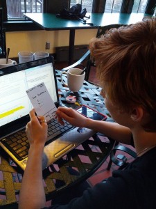
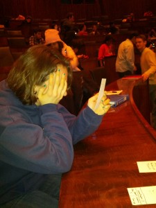
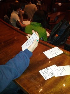
Olivia uses one of the projector cards as a phone. Next time, I should make it more clear

Olivia uses one of the projector cards as a phone. Next time, I should make it more clear

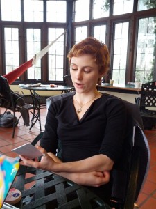
Olivia is engaging with the  asked question

Olivia is engaging with the asked question

OBSERVATIONS:

  • Immediately knew how to interact with phone/touch based interface. Big, easy to read buttons were good
  • Could accurately guess what each button would do on the screen. Having only few buttons made things simple
  • Tried to hold the “projector” cards as if they were a phone — next time, make it more clear that projector cards are up on the screen
  • Seemed to appreciate the idea, and recognize the potential for making better use of the time between classes

The second set of observations was with a group of Freshman before a NEU 259 lecture (11 am) in Robertson Auditorium. I tried to find a group with a wide variety of intended majors, including EEB, COS, and ENG, to see how the system would be perceived by people with different academic interests. I was glad to also be able to find another EEB major, to be able to compare their responses with Olivia’s. I met with Katie, Allister, and Amanda. The practice observation session paid off, as I was able to move through the real observation quickly, making the best use of the limited amount of time between classes. Again, I recorded direct quotes as well as my own observations

DIRECT QUOTES

  • “I liked the idea of it being a question that I might be able to get a better question to in lecture”
  • “Only having 15 seconds might make me more stressed than it would be helpful”
  • “I’m ambivalent about being compared to other people in the class — that could make me feel really stupid, or that other people are really smart, or that I’m ahead of other people because they haven’t been playing — I just don’t know”
  • “I don’t like it as a mandatory thing that I have to do”
  • “I suppose it’s alright that it’s competitive, because it might be a good metric of how I’m doing in the class”
  • “Definitely have score anonymous”
  • “What about extra credit — but some people can’t be here early, so maybe not?”
  • “Ten seconds is too little time”

OBSERVATIONS

  • Was visibly stressed when she couldn’t figure out the question in 10 seconds (even though the clock wasn’t actually counting down)
  • Younger students were more focused on their score being anonymous and whether they might get class credit. Older student (Olivia) was more focused on sharing feedback with professor, to get more out of lecture
  • Seemed to be still rooted in high school class mentality — asked why didn’t we just ask the professor, instead of designing a big interface for it.
  • Enjoyed the competitive nature of it — had “mock” competition of how quickly they could respond. Perhaps it could be good to play up the fun/competitive side of it?
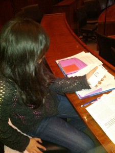
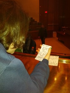
Amanda immediately understand how to interact with the device

Amanda immediately understand how to interact with the device

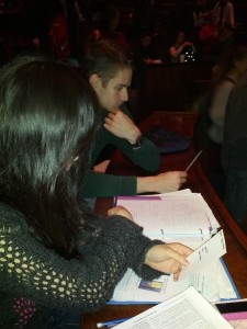
Amanda and Allister begin to become a little competitive

Amanda and Allister begin to become a little competitive

Katie is visibly stressed by the time limit

Katie is visibly stressed by the time limit

Katie immediately understands how to use the prototype

Katie immediately understands how to use the prototype

Katie considers the question

Katie considers the question

BRAINSTORMING — worked with Clay Whetung, Andrew Callahan, Mario Alvarez

  1. Soothing and/or energetic patterns to get you in the mood for lecture
  2. Collaborative game for all to play
  3. Survey about what you want to see in the lecture
  4. Slideshow of interesting topics in news or inspirational videos related to the topic of the class (presumably curated by the professor).
  5. Guided meditation to relax people before class
  6. Organized back massages. Odd rows give massages to even rows, then the reverse.
  7. Summary of previous content in lecture
  8. Physical art supplies, and the class together creates a communal piece of art
  9. Digital doodle-board — let people draw together
  10. Digital collaborative music – something like .http://www.earslap.com/projectslab/otomata
  11. Parallelizable puzzles/challenges/problems for people to solve together. Multiple choice or free-form, and people in class vote for answer. Precepts compete against each other
  12. Anonymously ask questions for the lecturer to answer, Piazza-style. Vote on questions you especially want answered
  13. Aggregate websites that people are looking at (voluntarily, of course). Like this, you can see what everyone’s looking at and potentially provoke discussion
  14. 10 minute lesson series (potentially related to course material, or not at all). Could be student taught or prof taught. Consider 10 minute html, 10 minute css, 10 minute knitting, etc
  15. Performance of lecture relevant material — consider a music course, where many students are in the orchestra. One (or more) of the students could play a piece before class that would then be discussed in lecture
  16. Interactive quiz show on lecture material beforehand. Correct answers win extra fun
    1. Correct answers win starbucks gift card
    2. Correct answers load kidbleach.com (cute pictures)

TOP TWO IDEAS

  1. Interactive quiz show on lecture material beforehand. Correct answers win extra fun
    1. Potentially win Starbucks gift card — good to solve sleep problem
    2. Potentially load kidbleach.com (cute animals) — who doesn’t love cats
    3. iPhone/laptop based — people are already engaging extensively with their iPhones/laptop
    4. Allows people to review their notes on previous lectures in a guided and fun fashion
    5. Gives feedback to professor on what needs to be covered
  2. Anonymously ask questions for the lecturer to answer, Piazza-style. Vote on questions you especially want answered
    1. Professors will like it — allows them to focus their lecture
    2. iPhone/laptop based — people are already engaging extensively with their iPhones/laptop
    3. Allows people to ask a question that comes up while they’re reviewing their notes

1 — This idea incentivizes people to come to class early, but doesn’t penalize those who can’t, and allows people to engage with their mobile devices while reviewing their notes in a fun way.

2 — This idea is less fun but still provides valuable feedback to the professor and allows people to use their laptops/mobile devices, which are likely already ready to go

PROTOTYPES

FIRST IDEA

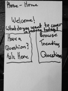
Simple home screen. Users can pick to either ask a question or browse trending questions

Simple home screen. Users can pick to either ask a question or browse trending questions

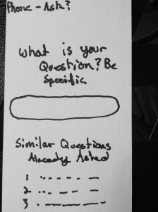
On this screen, users can ask a question. Similar questions are displayed below (stack overflow style) to cut down on redundant questions

On this screen, users can ask a question. Similar questions are displayed below (stack overflow style) to cut down on redundant questions

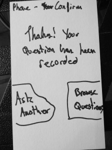
The user's submission is acknowledged, and they're given the option of what to do next

The user’s submission is acknowledged, and they’re given the option of what to do next

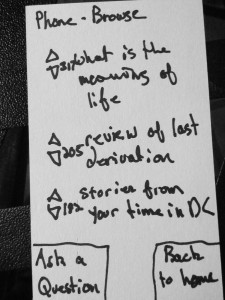
Here, the user can browse existing questions and answers, as well as upvote or downvote them

Here, the user can browse existing questions and answers, as well as upvote or downvote them

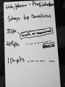
The professor's customized display, which shows the top questions for the upcoming lecture

The professor’s customized display, which shows the top questions for the upcoming lecture


SECOND IDEA

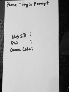
Users can log in using their NetID

Users can log in using their NetID

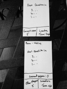
Users see this image on both the projector and their phone in between rounds

Users see this image on both the projector and their phone in between rounds

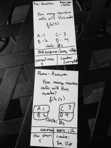
The question is displayed on both the phone and the projector, with a real time count down clock

The question is displayed on both the phone and the projector, with a real time count down clock

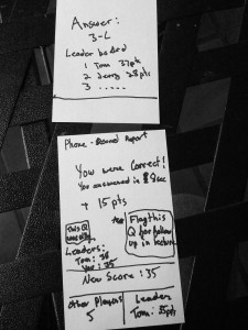
After students submit an answer, they can see if they were correct, and have an opportunity to flag the question as "silly" or "confusing", for later followup with the professor

After students submit an answer, they can see if they were correct, and have an opportunity to flag the question as “silly” or “confusing”, for later followup with the professor

Users see this image on both the projector and their phone in between rounds

Users see this image on both the projector and their phone in between rounds

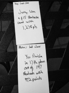
At the end of the semester, users can see how they did overall. The top score is announced, and wins a prize

At the end of the semester, users can see how they did overall. The top score is announced, and wins a prize


INSIGHTS

  • Users of all ages and majors seemed to like the mobile interface, and immediately understood how to use it. Olivia made the good point that many people don’t have smartphones, and a laptop based interface might also be appreciated
  • Competition is fun. People like to compete with each other, and enjoy it. This should be leveraged in future iterations
  • Privacy matters, even if situations where you think it shouldn’t. People were worried about other people seeing their score, and either being jealous of a high score, or thinking badly of them for a low score
  • Age matters, even on a small scale (4 years). Freshman were more worried about privacy and their score, while seniors were focused on how it could improve lecture quality. Freshmen tended to become more stressed about the time, while seniors didn’t care
  • Age can influence privacy concerns. The freshman I spoke with were significantly more focused on privacy concerns than the seniors.
  • Having a small number of big, clearly labelled buttons was very well received. No one had any trouble predicting what the buttons would do, or predicting how a given task would be accomplished. No screens were ambiguous