1.) Initial Observations
I conducted observations before, after, and between almost all of my classes for a few days. Since much of my class time is spent in the CS department, I mostly saw people using their computers or talking to friends.
2.) Ideas
Here’s a list of ideas I came up with:
– Mini-game server for Princeton campus
– Interactive Princeton trivia screens
– Quick view of important daily information
– Coordinate local upcoming events with friend’s plans
– Quick facts/tips site about various things related to classes
– A minimal e-mail client: for speed over functionality
– Restroom/ snack/ coffee location database w/ map
– Route planner: route efficiency, avoid road blocks and congestion
– List of upcoming deadlines: What’s due when?
– School resource usage info (location based. for laundry, printers, funding even??)
– Quick view of menus / where friends are eating
– Random entertainment generator (like stumble upon but optimized for quick, transient browsing)
3.) Prototypes
I chose to flesh out both my 2nd and 3rd ideas. The 3rd I’ve affectionately called “Nutshell”
Princeton Trivia Network:
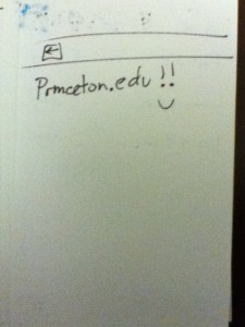
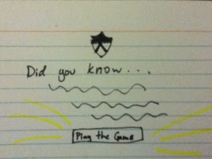
– Place large screens all over campus which display various photos and trivia about Princeton
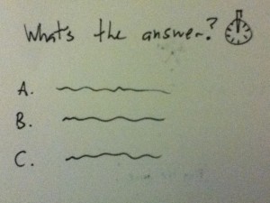
– Play Jeopardy-like quiz games with a few contestants, possibly all over campus
– Waiting time is spent connecting with the school and cheering on friends
I chose this idea to prototype because it seemed like the kind of fun thing that would make people feel more connected to the University.
Nutshell:
– Bring important information into one mobile app:
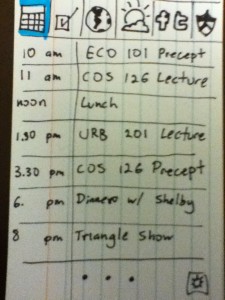
– Schedule (list view)
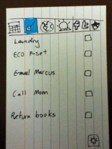
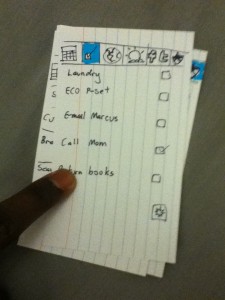
– To-do list
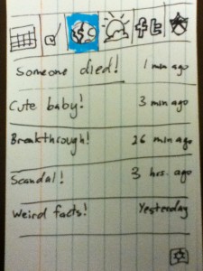
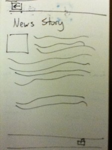
– News headlines (with links to relevant stories on mobile site)
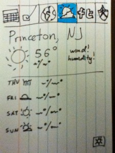
– Weather (linked to weather.com or similar service)
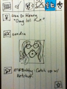
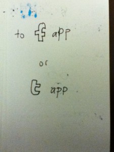
– Facebook and twitter feeds (linked to respective apps)
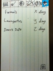
– Upcoming Important dates (From University calendar)
I chose to prototype this idea because I know it’s something I would use, and it also seems to be a recurring theme in software development (iGoogle anyone?) so it felt like a natural starting point.
4.) Prototype pictures
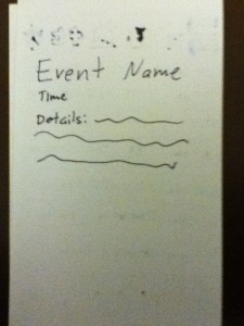
Nutshell:
Princeton Trivia Network:
5.) Usage Observations
Nutshell: User testing went very smoothly. There was almost no confusion about anything, and on the whole, it seemed like a pleasant experience for everyone involved. There were two unexpected events:
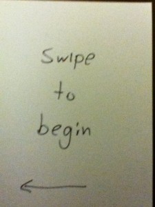
– I envisioned using a swiping gesture between categories, but no one picked up on that.
– One tester swiped the home screen with his whole hand. It was weird.
Princeton Trivia Network: Again, everything was pretty straightforward for the users. There are only 6 buttons in the whole interface so it was easy to figure out. I got a few “Really? THIS is what you came up with?” looks. In retrospect i have to agree with them.
6.) Insights
The quotations are from user testing
General:
– Buttons are quite intuitive. Swiping is less so.
Nutshell:
– Weather by the hour would have been nice
– There needs to be a back button. Always
– Adding a reminder/alarm feature to the calendar would be helpful
– People value consolidation
– “Where are the games?” People want to be entertained while they wait?
– People want to easily “flip” from one information source to the next
Princeton Trivia Network:
– Not so great…
– “Cute”
– Maybe the answers could “lead to another game”
– “You should tell people how many people got it wrong.”
– “You should have different levels, like easy, medium, and hard.”

