Observation Notes:
I conducted my observations before my MUS 220 lecture (after arriving early), at Frist in the computer cluster/printer area from 1:20-1:30pm, and walking from Wu Dining Hall to the Friend Center between 7:20-7:30pm.
Student 1: MUS 220 lecture
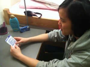
Student 1 read a book for the ~5 minutes she had left before lecture started. The flags in the book made it likely that she was working on class-assigned reading. The student was very focused on the book, and continued reading until after the professor opened the class. She then hurriedly stored away the reading without using a bookmark, took out her laptop, logged in, opened up a word document, and started taking notes.
Student 2: Frist Printer
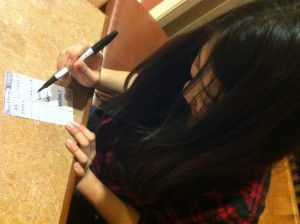
Student 2 arrived at the Frist 100-level printer around 1:20. There were already a couple students at the printer, and he went to use one of the cluster computers to print his document. When he was done sending the document to the printer, there were 2 students in the line for the printer. He asked the student immediately in front of the printer how many pages she had left to print, and when she didn’t have a definite answer, he asked, “More than 5 pages?”, and she said that was probably the case. Instead of waiting, he ran toward the stairs, presumably to use the 200- or 300-level printer instead.
Student 3: Walking to the Friend Center
I walked with student 3 to the Friend Center from Wu Dining Hall. After finishing dinner at a little after 7:20, we were pretty rushed. While we walked, he took out his iPhone to check his emails, and quickly flipped through Facebook and some urban planning/architecture websites. When I asked him, he said that he usually flips through the same few websites when he’s on his way to class (mostly Facebook and the Civil Engineering websites he was flipping through, and sometimes online news blogs). Though after long breaks like lunch and dinner he is sometimes late to class, the rest of his classes are pretty close together, so he usually gets to class early. He said he works on problem sets in that extra time, and actually makes pretty good progress on them throughout the course of the day.
Observation Insights
Observing these students helped me to identify some possible design focuses. I thought that it was interesting that two of the students I observed did schoolwork between classes — I thought that the changing period would be too short to get anything done. However, especially for Student 1, I thought that the work seemed to be disjointed, and the students might have problems remembering where they were and refreshing themselves before starting work. Maybe an app to “bookmark” their work for quick review would be helpful. Student 2’s experience with printing was also similar to bad experiences I’ve had with printing, so I thought that this was a possible design opportunity. Finally, Student 3 showed me what I initially thought most students would do — looking at websites and email. I was surprised that he regularly visited civil engineering websites, and it made me think “outside the box” in terms of web browsing (I had previously thought of apps to only integrate Facebook and Gmail, etc).
Brainstorming
1. An app for printing documents for classes quickly and finding the nearest printer.
2. An app that learns over time how long it takes to walk to your classes, then gives you approximate times to help you avoid being late.
3. An app that helps you find where your friends are sitting in large lecture halls, possibly with an interactive map
4. An app for late students, that provides a transcript or notes on the first few minutes of lecture
5. An app that shows what you’ve missed on social media/news sites during the previous class
6. An app that allows teacher/student or student/student interaction after classes for questions and answeres
7. An app that keeps track of the distance, speed, and calories you burn walking to classes
8. An app that suggests easy ways to get more exercise out of your between-class walk (speed-walking, walking backwards, etc)
9. An app that suggests people to call and keeps track of how long/often you talk
10. An app for pre-lecture preparation: the professor can upload study questions or notes
11. An app that stores the questions of psets you are working on and allows you to think about them while walking
12. An app that keeps track of the number of people in different libraries and study spaces, allowing you to decide where to go
13. An app that combines sound bytes of breaking world news that plays for 10 minutes.
14. An app that lets you know which coffee machines on campus are empty.
15. An app where you can input your food/drink preferences, and it suggests places with menus you would like.
16. Consolidates events on campus that you would be interested in (you set the filters)
Prototyped Ideas
– “Quick-Printer” — I chose this idea because I’ve been frustrated by trying to print between classes many times, and I thought it was an idea that would appeal to many students and be very practical, allowing them to be more prompt and prepared for class.
Captions:
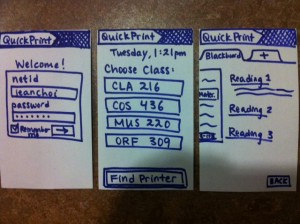
1. From left to right: The welcome screen for QuickPrint, which uses netid and password to sync with ICE and BlackBoard; The personal “home” screen, which lists your classes (from ICE) in the order of closeness to the current time and a button to the “find printer” map and interface; the Blackboard course materials list, which is the default location when the user picks one of his/her classes.
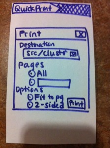
2. The print pop-up window that meets users every time they print a document. The options are similar to the options that come up when one tries to print a document from Blackboard using a normal internet browser.
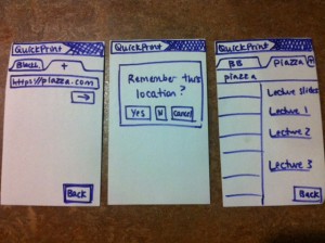
3. The sequence of screens that faces a user trying to obtain documents from a website other than Blackboard. From left to right: The user types the URL into the new tab (with the + sign); a pop-up window allows users to select whether they want that link to be “remembered” by that class (for example, remembering the COS 226 course website to print out lecture notes); the new website, with the printable links.
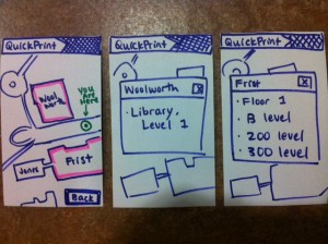
4. The screens related to the map part of the application. From left to right, the main map screen that uses the user’s GPS location; the popup window with printer locations for Frist (accessed when the user presses on the picture of Frist on the map); the popup window with printer locations for Woolworth.
– “World News in 10 minutes” — I chose this idea because I’m often concerned about how little I hear about world events while in the Orange Bubble, and this app would not only be very informative, but also make my usually boring walks more interesting.
Captions:
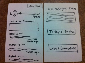
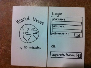
1. The home page and login page for “World News in 10 Minutes”. Login can also be synced with Facebook.
2. Left: The main page that includes the 10-minute podcast and allows users to comment. Right: Options for people who want to learn more: links to the original news stories, photos, and expert opinions.
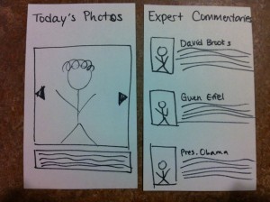
3. The pages for the extra options: A slideshow of pictures from around the world from that day, and expert commentary on the news stories that are mentioned.
Paper Prototypes
“QuickPrint”
QuickPrint is a mobile application that makes printing between classes faster and less frustrating. Using data from ice, it finds which classes you are enrolled in and which ones you are most likely to want to print documents for at a certain time. It allows you to navigate to these classes’ Blackboard Course Materials page at the click of a button, or go to another website (e.g. Piazza or a course website) where documents are located, then print the documents there. It “learns” the links of web pages other than Blackboard that contain class documents so it will be easy to print documents from that location at a later time. Finally, it uses data from your phone’s GPS to locate the nearest buildings containing printers, then displays the locations of those printers.
World News in 10 Minutes
This is an application that makes a 10-minute summary of world news every day, for students to listen to on their way to class. It has a simple interface with a 10-minute story that updates every day. Students can listen through their phones or iPods. There is also a comment features that lets listeners express their opinions and engage more actively with the news.
User Testing
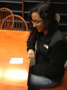
Rishita Patlolla testing my prototype. She found navigation fairly intuitive, but sometimes looked for back buttons where I had not implemented them. She also suggested that I add a “home” button, or make the top bar with the “logo” a link to the homepage.
Rishita Patlolla:
Rishita navigated through the user interface very quickly, and did not have many problems using the application. She tried to click on the printer options, which I had not accounted for in my paper prototype. She made the suggestion that it be able to sync automatically with various library printers, which are not on the same network with the rest of the campus printers. She also suggested that I include a “recently printed” link on the homepage in case a user wants to print a certain documents (or different sections from the same document) multiple times. A very immediate change that she suggested was that I add a “successful printing” popup window to confirm that users had printed a certain document. Finally, we talked about whether or not it would be useful to make an internet browser accessible on the homepage (so you don’t have to first click on a class to access the internet) — we thought that though it was a useful feature, it would be good to think about where to draw the line with internet accessibility (at what point does it become too much like a regular web page?)
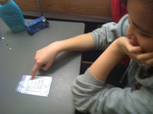
Yolanda navigates the popup windows from the map, which list the locations of the printers. She thought they were clickable, and suggested that I make them clickable with the printers’ status.
Yolanda starts to use my prototype
Yolanda Yeh:
Yolanda had many useful suggestions and insights about the prototype which gave me many ideas for future improvement. She asked why I had a back button on certain screens and not others (such as the popup window for the locations of printers), and pointed out that Android apps automatically have back buttons built in, so I would only need to do this for an iPhone app. She also said that it would be very helpful to let the user know whether certain printers were broken, as is done by the Point app currently implemented for Princeton. Maybe I could sync my app with Point to add this feature. In addition, Yolanda commented on her experience with accessing Blackboard from her iPhone. Blackboard is often slow and has a frustrating sign-in process, and the process it has for opening and printing documents is not very user-friendly. I might want to find a different way to implement this for my app instead of just using Blackboard’s functions. Finally, she asked if I had considered adding a print preview to the documents, and we talked about how feasible this would be given the small size of smartphone screens. I think this is an important trade-off that comes up in mobile apps — more information vs more cluttered interface — and I think I should spend some time putting more thought into how I make this decision in my app. A couple non-intuitive things about my interface that I noticed as she navigated was the setup of the tabs on each class page. She seemed confused about what the tabs actually were (she asked if they were just internet browsers), and wasn’t sure what it meant when the app asked her if she wanted to “save” that location. This made me think again about how similar/different my app is from a web browser (a similar issue as the one that came up when Rishita tested my prototype). In addition, on the second page (Pick class, or find printer), she thought that the classes were “options”, and the “Find Printer” button was the only real button, when actually they are all buttons that lead to new pages. I might want to make that more clear in my prototype.
Karena using my prototype. She found the alternation between “back” buttons and x boxes confusing, and tried to slide screens I had not expected would slide.
Karena Cai:
Karena also pointed out many opportunities for improvement in my app. She said that though my app might make it faster for students to send documents to the printer and find close printers, sometimes the real problem occurred when the student actually got the printer and found a line of students there. She suggested that I make a feature on my app that sees how busy each printer is. She also asked how my app would deal with different types of documents (word documents, pdfs, etc), and whether it would show the document before printing. This had also come up when Yolanda tested my prototype, so it’s definitely a part of my app that I should think about. Some things I noticed during my observations was that she used the “slide” feature of iPhones frequently, and I had not built it into some of my screens. She also did not see some of the x boxes on the popup windows, and was looking for “back” buttons instead — I think I should be more consistent in using x boxes vs back buttons.

 3.
3. 
 2.
2. 