
Group number and name
Group 14, Team Chewbacca
Group members
Eugene, Jean, Karena, Stephen
Project Summary
Our project is a system consisting of a bowl, dog collar, and mobile app that helps busy owners take care of their dog by collecting and analyzing data about the dog’s diet and fitness, and optionally sending the owner notifications when they should feed or exercise their dog.
Description of test method
Procedure for obtaining informed consent
We gave a an informed consent page to peruse and sign before the test began. This consent page was based off of a standard consent page template. We believe this is appropriate because the consent form covers the standards for an experiment. The consent form can be found here.
Participants
The participants in the experiment were all female college students who have dogs at home. They were selected mainly because they have experience actually caring for a dog, which allowed them to give valuable insight into how useful it would be. They were also busy, as they were in college, and away from their pet, making them optimal test subjects, as this app is particularly useful for busy pet owners who stay away from home for long periods at a time.
Testing environment
The testing environment was always an empty study room. Two users were tested in a study room in the basement of Rockefeller College, and one in a study room in Butler College. We do not believe the environment had any specific impact on the subjects. In addition, using the same environment may have been problematic, as it would have felt familiar to two of the subjects, but unfamiliar to the third.
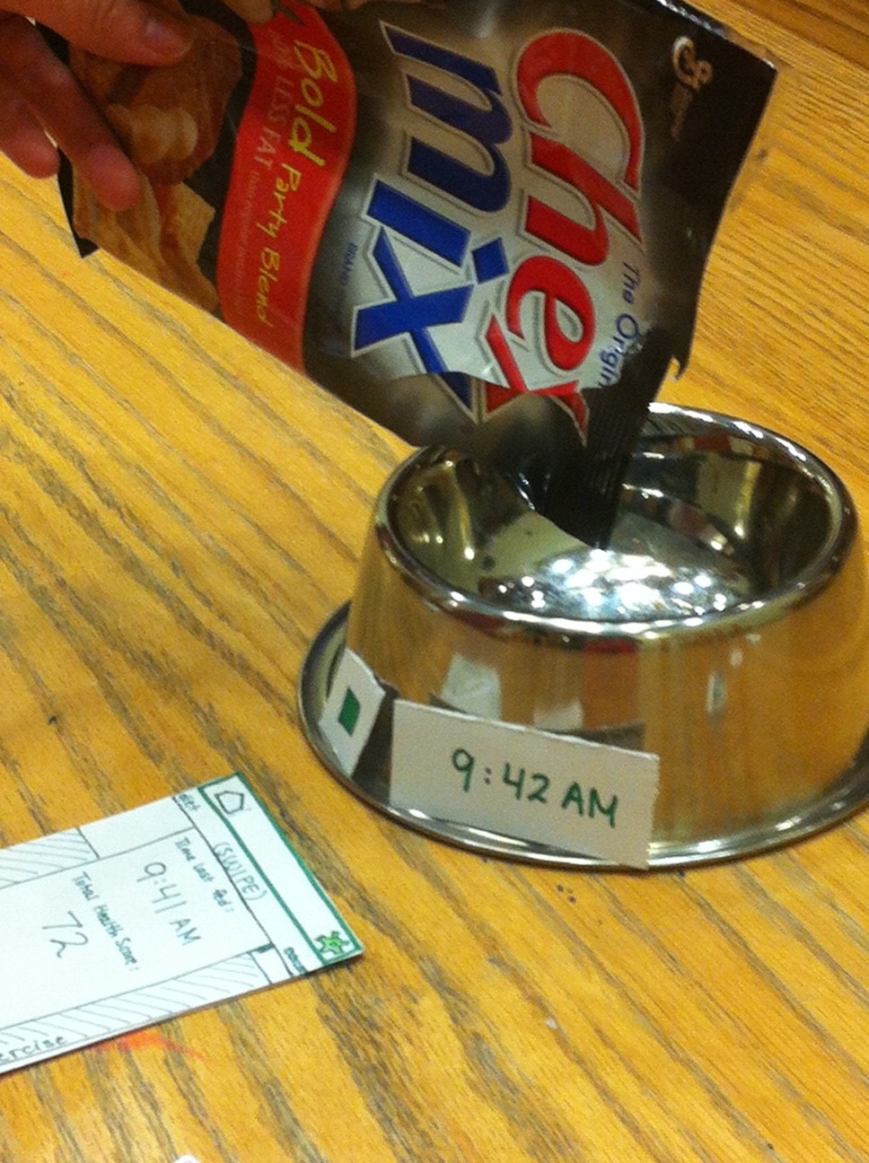
The prototype was set up as a metallic dog bowl and a bag of Chex Mix (as dog food) that sat on the table in front of the user. The “homepage” of the paper prototype was placed in front of the user, with the remaining slides set down as users interacted with the prototype.
Testing procedure
The scripts for each task can be found here.
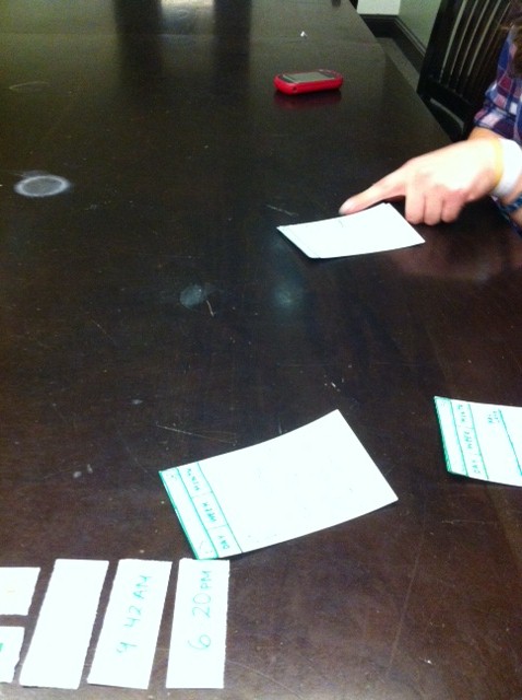
Eugene introduced the system and read the scripts for each task. He also asked the general questions we had prepared for the end of the testing procedure. Jean handled the paper prototype, setting down the correct mobile app slides and drop-down menus as users interacted with the app. She also handled updating the “LED” and time display on the dog bowl after users filled the bowl.
Stephen completed the “demonstration” task using the mobile app prototype. He also asked more user-specific questions at the end of testing, following up on critical incidents or comments the users had made during testing. Karena served as a full-time scribe and photographer during the testing.
The tasks were performed in the following order:
1. Interaction with the Dog Bowl Over Two Days
2. Checking Activity Information and Choosing to Walk the Dog
3. Sending Data to the Vet
These tasks were chosen to loosely cover the entirety of the system (bowl, collar, and app), and to obtain specific information. They were completed in order of decreasing frequency of real-life use (we imagine that users will use this system primarily for feeding their dog/getting notifications when they forget to feed their dog, somewhat less frequently for checking its activity level, and occasionally for sending data to the vet). Task 1 was used to obtain user opinion on the dog bowl interface, the front page of the app, and the importance of notifications. Task 2 was used to obtain user opinion on the collar interface, the data panes of the app, navigation through the app, and how important they found this task in real life. Task 3 was to obtain user opinion on the data exporting page of the mobile app.
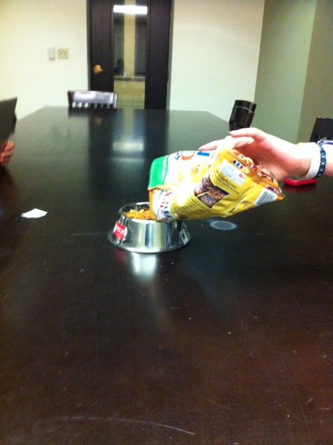
User 1 completing task 1 with the prototype
User 2 completing task 2 with the prototype
User 3 completing task 1 with the prototype
Results summary
We noticed that there were several instances where the user did not know what to do with the data so they would just stare at the app. Most users thought there should be additional information explicitly recommending what they should do based on the data that was collected. Because they all eventually figured out what to do, this could be categorized as a minor usability problem. This occurred for two users when they looked at the line graph that mapped the activity level of the dog. Two users who were uncertain of what the LED on the dog bowl indicated; this can be categorized as a minor usability problem, as just the color of the LED was not enough to convey information to the user. In addition, users were always able to find the ‘time last fed’ information they were looking, but most tended to take unnecessary steps, as the information was right on the front page. This is a minor usability problem. There was a major usability issue with exporting data to the veterinarian. Two users expressed not knowing whether an e-mail or text message was sent to the veterinarian, and whether or not the information was sent at all. One user was confused by the fact that the export data button said “Create” instead of “Send” (when the task was to send the data to the veterinarian). A minor usability problem was the fact that two out of three users did not see that the “time last fed” was on the homepage, and instead navigated to the “diet” page of the mobile app when we asked them to complete the feeding task. One major usability issue that one user pointed out was that the “total health score” displayed on the app was just a number, and she didn’t know what scale it was on (it was out of 100, but that was not written on the app). There were no significant usability issues with the dog collar — most users found the interface intuitive.
Discussion of results
The biggest takeaway from user testing was that the users wanted digestable bits of data. They didn’t want static information that told them how much their dog was walking, but rather a recommendation that would tell them exactly how much they should walk their dog based on its activity level. Because of this feedback, we will most likely redesign our interface to include fewer numbers and line graphs and more direct recommendations. Furthermore, we also became more aware of the variability in our users. We found that our first user would be very comfortable with getting notifications that their dog had not been fed or was getting lower amounts of activity than usual, while our second user would not want to constantly be bothered by such notifications. This gave us the idea of introducing a settings feature which would allow users to choose whether they wanted notifications or not. From our observations, we also noticed that it would be a good idea to give the user confirmation that tasks were achieved–especially in the case of exporting data to the veterinarian.
Some small changes we will make as a result of our user tests is that we will redesign our “export data” page so that it is primarily geared toward sending the data to a veterinarian (with a “Send” button). We will also use a more intuitive metric for the total health of the user’s dog (possibly a score out of 100). In addition, because two out of three of the users found the LED on the dog bowl confusing, and the remaining user told us that the LED was redundant because of the time display, we will be getting rid of this feature on the dog bowl. In addition, because our project goal is to create a useful but unintrusive system, we feel that getting rid of the LED would align with both the project goals and our test observation. However, we will be keeping the time display, because one user said it was very useful. We will be keeping the dog collar’s design the same, as the users did not have a problem with it.
Subsequent testing
We feel that we are ready to proceed without subsequent testing. Two out of three parts of our system (the dog bowl and the collar) did not show any major issues during our tests. The only usability issue that we encountered was that the LED on the dog bowl was confusing and redundant, so we will be removing that from our high-fidelity prototype. However, none of the three users expressed any other problems with these two components of the system, so we feel comfortable proceeding to the high-fidelity prototypes. In addition, we feel that that we are ready to proceed to a high-fidelity prototype of our mobile application, as all users seemed to have problems for the same parts of the mobile app, and the feedback we got in this initial round of testing gave us a clear plan for how to redesign our mobile app. Finally, all of the problems that users faced were minor usability issues, and we think that they can all be fixed in our high-fidelity prototype.