P4: Dohan Yucht Cheong Saha

Group # 21 : Dohan Yucht Cheong Saha

  • David Dohan

  • Miles Yucht

  • Andrew Cheong

  • Shubhro Saha

Oz authenticates individuals into computer systems using sequences of basic hand gestures.

Test Method Description

Click here to view our informed consent document. We obtained informed consent by having prospective participants read our informed consent document. Then we orally reiterated two of the most important points of the document: that the participants may stop at point in the study if they wish, and we check whether they are OK with being photographed and/or videotaped during the study, including identifiable features like their face.

We selected our participants from the Princeton student body around Frist Campus Center. We had two male students and one female students. One of the students also happened to be left-handed.

The tests took place in Frist Campus Center, just footsteps away from the television-viewing area. We set up a laptop computer on a folding table across from the study booths, then asked passersby if they would be willing to participate in a 5-minute study. Our LEAP motion device was placed inside a small cardboard box situated within hand’s reach next to the laptop.

Click here to view the demo script. Shubhro Saha began the our prototype testing by prompting the users to the informed consent script. After obtaining consent, Shubhro then explained the Oz prototype to the user and the functionality that this product entails. After this brief introduction, Andrew Cheong instructed the participants for each task they completed. The first task that Andrew prompts the user for is the profile selection with a following handshake. The next task was the facial recognition followed by the handshake. The last task asked for the user to reset their handshake by following the interface’s provided instructions. As the participants interact with Oz, Shubhro served as the interactive interface. David Dohan was in charge of recording, videotaping, and taking photos of the testing. Miles Yucht was the scribe and recorded user’s interactions, responses, questions, and behaviors during the testing procedure.

Results

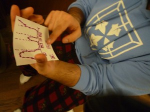
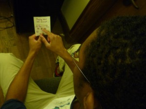
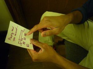
Our first test subject was a left-handed male student.   He was initially confused by the paper prototype and was unsure whether to simulate using a mouse or tap the prototype.   After a brief explanation, however, he had no problem using the rest of our interface to select a user profile and enter his handshake without additional prompting.  He also has no problems using facial recognition to select a profile (except for confusion that he needed to select “Login with Handshake” to initiate it).  At the end of logging in, our subject said “Nice!  That was easy!”  He also had no trouble going through the handshake reset.

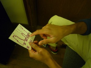
Our second test subject was a right-handed male student. He expressed great confusion when prompted to tap the interface. After minor guidance he understood that this prototype was entirely touch-oriented and completed the following tasks easily. He later explained that he would be very willing to try such a product in the future.

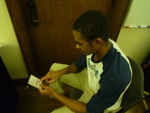
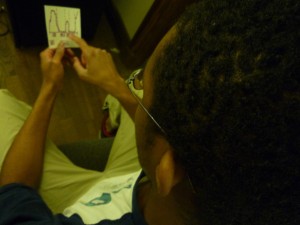
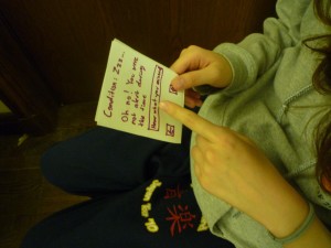
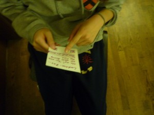
Our third subject was a female student, and seems to have tried entering her hand gesture at the user profile selection instead of when prompted to do so in the subsequent screen. The test subject smiled with a sense of accomplishment when the second task was completed.

First subject conducts handshake.

Third user logs in through Oz.

Discussion

Problem: Subjects misunderstood touch interface.  Rating 3

Our results are, for the most part, quite straightforward. Every one of our test subjects successfully authenticated with the Oz handshake system. A common theme across the participants was confusion regarding “tapping the screen” to proceed through the study. We believe this confusion is characteristic only of our paper prototype and would not impact our final system. This is because, in the real environment, touch or mouse-based interaction would be as familiar since these systems are ubiquitous today. One area where the test might have been improved is in not glossing over the email confirmation link sequence for the password reset task. We felt that included the email screen in the paper prototype would be a distraction from the focus of this study, and we do not foresee any problems in this area.  Additionally, we should test the usability of initially creating a handshake. This will include verifying the handshake entered during the reset process is correct by having them re-enter it.

Subsequent Testing / High Fidelity Prototype

Despite the touch screen interface confusion, we believe that we are ready to construct a higher-fidelity prototype. Our friends, classmates, and subjects have all expressed interest in an alternative method of authenticating their computer accounts. Because the Oz product is validated primarily through the actual technology (verifying actual hand gestures), implementing a higher-fidelity prototype is necessary. The current interface and design itself appears to be easy to navigate by random users which suggests that no major changes are necessary to the prototype.  Further useful information such as how competitive this method is versus typing in a password requires testing with working hardware to record data about entry times and error rates.

 

Assignment 2 – Andrew Cheong

Observations

When examining the behavior of students between lecture, I focused during two times, the ten minute period prior to an 11 AM class on a Wednesday as well as a ten minute period prior to a 3 PM course on Thursday. Some of the behavior I noticed from the students include talking with friends, browsing the web, checking Facebook, eating a sandwich, looking for the bathroom, and reading sheet music. Of the people examined, the most common activity for an individual during this time period is talking with his/her friends.

Brainstorm:

  1. Alertness: Examine your alertness in your previous lecture. (provide recommendations)
  2. BrushUp – pulls from piazza, blackboard, etc different sources that the student might need for the upcoming lecture.
  3. Diary2Go – makes it easier to jot down a mini diary of what’s happening during your day
  4. Puzzler – provides small engaging puzzles to stretch the mind
  5. HealthChecker – provides health statistics based on that day’s steps walked, number of minutes sitting, etc.
  6. InTidbits – Pulls from your immediate problem sets that are due soon and spits out one problem for you.
  7. Time4Break – After pulling data from ICE, uses the distance to your next class and the nearest bathrooms and/or food locations to check if you have time for a break.
  8. Notes4You – records the previous lecture and pulls what it thinks as key parts of the lecture, then the user can engage with these notes accordingly.
  9. EnRoute – If friends sign up for this app, it checks to see if the route they are taking may intersect with yours.
  10. PeskyReminders – Constantly reminds you of upcoming psets, projects, exams, until you finish them
  11. VocabRefresher – Provides new words as well as quiz past words.
  12. Reviewer – go over past slides pertaining to the upcoming class and reviews you.
  13. CreationKit – Provides little origami/mini crafts/and cute projects to conduct.
  14. AggregateUpdate – Provides updates from different sources with accounts such as facebook, email, youtube, etc.
  15. MoodRecorder – provides few questions and maps your mood throughout the day.

The two ideas that will be prototyped are Alertness and MoodRecorder.

Falling asleep in class tends to be a problem for certain individuals and Alertness serves to help those who are unfortunate to learn what they missed during their lack of alertness.

I think MoodRecorder is interesting because to some sense, it is equivalent to a diary for the day but the data recorded is more rich because it keeps track of your mood rather than recording the different events that occur during the day.

Alertness:

P1070488

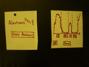
Here are two screens: left screen allows the user to enter the analysis screen. right screen is the analysis screen that provides a graph on the individual’s alertness in his/her previous class. Has buttons to allow closer analysis of the data as well as the option to save or go to home page.

P1070490

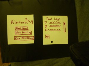
Left: this is the home page. Allows user to start a new log, view a past saved log, or examine the most recent log. Right: The list with past logs.

P1070491

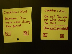
Left: This shows the that the user’s condition was “alert” during this period. Right: This shows that the user’s condition was “not alert.” They have to option to hear segments of the lecture that he/she might have missed.

P1070492

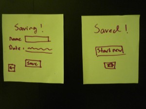
Left: The form where user inputs data before saving. Right: Shows that the log has been saved.

P1070493

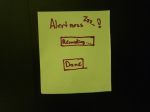
This screen shows that the app is running and recording the surrounding ambient data.

P1070494

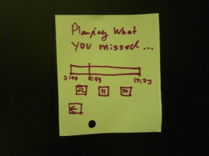
This is the playback process. Users can check to hear what the missed during their “sub-alert” state.

MoodRecorder:

P1070495

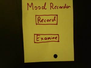
User has two option to examine record of moods or record their current mood.

P1070497

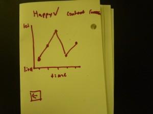
While looking at the happiness tab, the user can examine their levels of happiness throughout the day.

P1070496

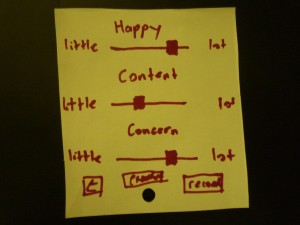
The user is able to toggle the bar to place an accurate depiction of their happiness, content, and concern levels. They can then record these values or examine past values.


Testing and Feedback: Arthur Phidd, Jamie Chong, Parth Parihar

Here are some photos to show how my users interacting with Alertness.P1070487

P1070479 P1070480 P1070481 P1070482 P1070483 P1070484 P1070485

Things I noted and insights generated:

  • The buttons under the diagram seem unclear
  • Users seems to click the actual diagram.
  • The save button captures too much attention during the analysis screen thus influencing the user to save before examining the data.
  • After saving a log, users tend to be lost for a bit and eventually click the home button. It would appear that they want to go back to the data. Providing an option back to analysis may be appropriate.
  • The user tends to mindlessly save whenever they have the chance. Maybe tamper with location or provide more awareness how much data might be stored with each save.
  • Users tend to get lost for a bit when they start a new log. I noticed that they seemed confused that it records immediately. It may be necessary to have an intermediate screen where the user can understand that the next press will begin the recording process.

Feedback:

  • The navigation of the app was relatively straightforward
  • There is more potential for the data that can be recorded and used
  • More contextual recording would be nice. Immediate recording for when you are not alert is too out of context.
  • Immediate recording can be hard to deal with and comprehend.
  • The ability to redirect to home for most screens made it easier to navigate the app.