P6 User Testing of Gesture Glove

Group 15 : The LifeHackers

Prakhar Agarwal, Gabriel Chen, and Colleen Carroll

The Gesture Glove in a Sentence

Our project is a glove that allows us to con­trol (sim­u­lated) phone actions by sens­ing various hand gestures.

Our System

The system being evaluated was a system that simulated commonly used functions of a phone that could be performed by users off the screen using the Gesture Glove that we built in the previous assignment. The sensor readings that mapped to built-in gestures let users perform 3 tasks (see the Tasks section under Method). The purpose was to see if different users would be able to easily and intuitively perform the 3 tasks, and to look for potential improvements that could be implemented in future iterations of our system. The rationale of the experiment was that if any of the users had difficulty with any of the tasks, then improvements would need to be made in order to let all users interface with the system comfortably and conveniently.

Implementation and Improvements

Our submission for P5 can be found here: http://goo.gl/DB4Sq. Since P5, we left the general structure of the prototype the same for P6. A couple of quick changes were made to the interface, though:

  • We changed the threshold values for a number of the in built in gestures to better match the different hand sizes and maneuverability of different people.
  • We lowered the delay between cycles of glove readings to allow for higher sensitivity.

Method

Participants

Our users were chosen out of students in public places. We tried to vary gender and technical background. The first was a 20 year old male named Josh who was studying in Brown Hall, and is a computer science major. The second was a 21 year old female named Hannah who is a Chemical and Biological Engineering major with a certificate in the Woodrow Wilson School. She was using her iPhone in Frist. Lastly, we chose a  20 year old male named Eddie who was studying in Frist. He is an Economics major who owns an iPhone.

Apparatus

We conducted our test in a secluded corner in Frist campus center. Our equipment was our laptops, one of which was used for the phone simulator, and the Gesture Glove. Two members of our team recorded critical incidents, while the other read the demo script to the user.

Tasks.

The first and eas­i­est task we imple­mented is pick­ing up a phone call. A user sim­ply puts his hand into the shape of a phone to pick up a call and then can do the ‘okay’ hand motion in order to end the call. This was the easiest task.

Our sec­ond task is more dif­fi­cult as there are more com­mands and ges­tures to be rec­og­nized. This task allows users to con­trol a music player with the glove. By using a pre­set set of hand motions, a user can play and pause music, nav­i­gate between a num­ber of tracks and adjust the vol­ume of the music that is play­ing.

Finally, our last task involved allow­ing users to set a cus­tom pass­word rep­re­sented by a series of three cus­tom hand ges­tures, which the user can then use to unlock his phone. This is the most dif­fi­cult task as it involves set­ting ges­tures oneself, then remembering the sequence of gestures that were previously set so that a user could unlock a phone.

Procedure

Users were chosen from public areas and asked if they would be able to spare 5 minutes for our project study.The study was focused on 3 main tasks which the users had to complete as described above. One team member prompted the user to complete these tasks using the following demo script. http://tinyurl.com/cqwktog The users wore the Gesture Glove and interacted with a simulated smartphone screen on the computer, while two members noted the critical incidents of the testing session.

Test Measures

The bulk of our study was on qualitative measures because of the nature of the tasks that we asked the users to complete. Picking up the phone and hanging up take a trivial amount of time. The users were asked to experiment with the music player, which implied any amount of time could be used. Lastly unlocking the phone took exactly 9 seconds each time a user attempted to unlock. For these reasons we did not measure time per task.

The following metrics were studied:

  • number of attempts to successfully unlock the phone
  • qualitative response to the system based on a Lichert scale (sent to the users as a questionnaire at the following link : http://tinyurl.com/p6questionnaire with these results: http://tinyurl.com/p6likert )
  • general feedback during study – positive or negative
  • observations of how users made gestures during session
  • time to set password

Results and Discussion

Some of the most common user feedback was that unlocking the screen was hard to do.Our original implementation has users enter a gesture, hold it for 3 seconds until a green dot shows up on screen, and then move on to the next gesture. The purpose of this was to keep the password secure. If the program told you as soon as you made one right or wrong gesture, a thief could eventually unlock your phone by process of elimination. However, we received feedback that unlocking took too long, too short, or should not require looking at the screen. It was apparent that for security we were sacrificing usability. We also realized that on current unlocking systems different people choose between a more complex password for security or a simple password for convenience.  Considering all of the design trade-offs involved, we decided to leave it up choose a middle road. We will provide some basic security, but let the system be flexible enough for users to be able to make and use a password according to their preferences.

Almost everyone had issues using the thumb sensors. Even our team, who by this point are very used to using the system, occasionally has issues with it. Upon closer observation during the usability testing, we realized that users don’t always press the same part of the thumb. This varies even for a particular individual. They may sometimes press the very tip, sometimes the middle of the area between the tip and the knuckle, and sometimes very close to the knuckle. What is even harder than just hitting the thumb on the right spot (without looking at it) is to get the forefinger and thumb sensors right on top of each other in order to activate both at once. Our conclusion is that the thumb needs larger pressure sensors. With proper equipment, we could imagine getting a sensor that covers the entire surface of the part of the thumb above the knuckle. Because the thumb is critical in a lot of gestures (it is used to activate the pressure sensors of the other fingers), we believe this would be a very important fix in future iterations.

The interface for setting a password obviously needed more instruction. The main problems with this were that the users did not realize that they needed to press set before making the gesture and then pressing save. This could be fixed with a simple line of instruction at the top. A more complicated problem is that of the visualization of the gesture that the system registers the user making while they are setting the password. We had a user whose gesture was not quite registering what he was intending to do. This was apparent from the visualization for us, but he did not notice. This could have resulted in the user setting a password that they think is one sequence of gestures, while the machine thinks it is something else, resulting in the user’s unlocking hardly, if ever being successful. This tells us that we may want a visualization that is even easier for a user to understand, for example, a visualization of a hand doing the gesture that the machine is registering the user doing. We also had a user who made his password, and then couldn’t remember what he had done for the password and made a simpler one instead. This again tells us that he couldn’t read the visualization easily enough to quickly recall what he had done. This is just further justification for a more intuitive visualization.

Overall, the system got some very positive reactions. Though we definitely have a number of improvements to make, we got comments throughout user testing, like “This is sick!” and “Awesome!” These recommendations for improvement as well as the positive reactions are reflected through the responses we got from the questionnaire we had participants submit after testing the interface (link to results can be found in the Appendix). Along with asking for subjective feedback, we had users rank how much they agree with certain statements on a Lichert Scale where 1 represented “Strongly Disagree” and 5 represented “Strongly Agree.” The average results are shown in the table below. As we see, users had the most amount of trouble using the password interface. Through testing, we found that the reasons why users had difficulty was sometimes just technical glitches (the wiring got unplugged) and other times because of the issues we discussed above. We have tried to address these concerns as well as possible in the discussion above.

It was easy to use the gesture glove to pick up and end phone calls.

4.67

It was easy to use the glove to control the music player.

3.67

The interface to set a password with the glove was intuitive and easy to use.

4.33

The interface to unlock the phone with the glove was intuive and easy to use.

3

The gestures chosen for built in functionality made sense and would be easy to remember.

4

Appendices

Materials given to or read to users :

  • consent form and demographic info : http://tinyurl.com/p6consent
  • task script: http://tinyurl.com/cqwktog
  • post-interview questionnaire: http://tinyurl.com/p6questionnaire
  • demo script:   We didn’t demonstrate our system before letting users test it; instead, we demonstrated the built-in gestures that we wanted to exhibit before each task, while the user had the glove on. This way, the gestures could be explained more efficiently and the users could use them right away.

Raw Data


Group 15 : P5 Working Prototype

Group 15 – Lifehackers

Prakhar Agarwal, Colleen Carroll, Gabriel Chen

Project Summary:

Our project is a glove that allows us to control (simulated) phone actions by sensing various hand gestures.

Tasks Supported:

The first and easiest task we implemented is picking up a phone call. A user simply puts his hand into the shape of a phone to pick up a call and then can do the ‘okay’ hand motion in order to end the call. Our second task is more difficult as there are more commands and gestures to be recognized. This task allows users to control a music player with the glove. By using a preset set of hand motions, a user can play and pause music, navigate between a number of tracks and adjust the volume of the music that is playing. Finally, our last task involved allowing users to set a custom password represented by a series of three custom hand gestures, which the user can then use to unlock his phone. This is the most difficult task as it involves setting gestures oneself.

Task Changes:

For the most part, our tasks have stayed the same as they were in the lo-fi prototyping stage. From talking to users during testing, we found that these seemed to be among the simple functions that users would like to be able to control while walking outside in the cold with gloves. Also, these three tasks gave us a nice range of implementation and usability difficulty to play with. One change we did make was setting the number of gestures required for a password to three. We found that allowing the user to add more gestures made both implementation and usability for the end user more confusing.

photos of the working prototype:

This slideshow requires JavaScript.

Revised Interface Design:

We decided to make a number of changes to our system based on feedback from P4. We decided to put the flex sensors on the back of the glove rather than in the palm. During P4, we found that finger flexibility was a problem for some users because the cardboard “sensors” limited range of motion; this proved to be even more of a problem when we  used the real sensor which came with an additional mess of wires, and so we decided to change our design slightly. Of course, these physical changes also mean that a number of the gestures we had previously proposed changed. The updated gestures for in built functions are shown below:

This slideshow requires JavaScript.

We also imagine that the glove would in the future be wireless and the hardware would be small and secure enough to fit on the glove. In this iteration, we decided not to have an accelerometer on the glove. We found that there was enough flexibility in the number and types of gestures that we could make without one, and adding the accelerometer made the glove very clunky and difficult to use. For future iterations, we have considered using the built in accelerometer in smartphones to add to the variety of gestures that can be issued with the glove. Even our built in gestures could have motion (as pictured below).  We also have one task that we left off of this project, but was in our original plan, the voice command. This gesture, which we imagine to be a “V” with the index finger and middle finger (as pictured below) would initiate the voice command on the smartphone so that a user has access to tasks such as sending texts,making a call, or setting reminders, without having to take off the gloves.

sketches of unimplemented features:

This slideshow requires JavaScript.


Below are the new storyboards that we picture for the three tasks implemented:

story board for picking up phone:

This slideshow requires JavaScript.

story board for playing music:

This slideshow requires JavaScript.

story board for unlocking phone:


This slideshow requires JavaScript.


New Prototype Description:

We decided to implement all three tasks on mockup apps made through Processing. The recognition of gestures results in transitions between screenshots, which represent what would happen on an actual phone. Controlling calls and the unlocking process on one’s phone requires jailbreaking of a phone and hacking into its native functionality. This is possible (as seen by the existence of iPhone applications such as CallController which uses the accelerometer to control calls) but potentially dangerous to the phone if incorrectly implemented. So for the sake of the being able to instead concentrate on the user-interface, as opposed to details of the demo app, we implemented the program for desktop.

Using separate sketches in Processing, we implemented each of the three tasks described above. The phone call sketch has implemented functionality for answering and hanging up a call.

video of picking up a phone call:


The music playing sketch has implemented functionality for transitioning between songs, changing volume, pausing, and playing.

video of playing music:


The password setting and unlocking sketches have implemented functionality for setting a 3-gesture password, as well as method for recognition of the password.

 video of setting a password:


video of unlocking phone:


The functionality that we did not implement in this prototype include the accelerometer and the voice command. The accelerometer was left out because it made the glove too clunky and was unnecessary, as explained above. The voice command was left out because, though it was useful, we found that it was one of the least complicated, and we would like to make sure that the more difficult tasks were possible as proof that our entire concept would work. In addition, with the voice command, the issue of user interface primarily falls on the voice recognition software in the phone, as opposed to our glove.

Each task in our prototype works without the aid of a wizard of oz. For now, to go to a different task, a wizard must run the right sketch in Processing. Though we have minimal human interference, our prototype is not a fully functional smartphone app. As stated above, neither Android nor iOS allow a 3rd party app to access functions like answering a call, probably because the app could break that feature if it is built incorrectly. However, we could still imagine the program being issued by the makers of the various smartphone OS’s as a built in tool, much like voice is currently.

Here is a link to all our code: https://www.dropbox.com/sh/b6mnt5mg4vafvag/yIBTTAcZ6t. We referenced Processing tutorials for making buttons: http://forum.processing.org/topic/simple-button-tutorial, as well as Processing tutorials for connecting to Arduino.

Group 15: P4 Lo-Fi User Testing

Prakhar Agarwal (pagarwal), Colleen Carroll (cecarrol), Gabriel Chen (gcthree)

Project Summary

We are developing a glove that uses a variety of sensors to detect off-screen hand movement and link these to a variety of tasks on one’s cell phone.

Obtaining Consent

When obtain informed consent, our first priority was to make sure that users had the time and were willing to participate in our prototype testing. Additionally, we made sure that the users were okay with being in a video or picture to be published on the blog. We also gave the user a consent form (http://goo.gl/oYzug) to look over, and overall it was a smooth process. There wasn’t much else to warn users about for our testing, so we feel that a verbal and visual description of it was sufficient. We paraphrased from the following script: http://goo.gl/rjlmu

Participants

Our participants were selected by surveying a public area and looking for people who seemed to have free time to participate in the study. We happened to choose one person in the class, but also managed to find two strangers. All participants fell into our target group of people who use or have used their phones while walking outside.

Testing Environment

Testing was conducted at a table in Frist. We used the same low fidelity prototype we had built in the previous assignment, and had users try it on in order to conduct our tests. We used one of our phones to mount the paper prototype of our UI for ease of interaction. The phone was also used to simulate one of the tasks. This way, we were able to achieve a realistic feel of interacting with a phone while using our prototype.

Testing Procedure

For the testing procedure, Prakhar was the wizard of Oz, and fulfilled all the actions on the phone that users prompted using our prototype. Both Gabe and Prakhar paraphrased the scripts and informed users about the tasks they would be doing. Colleen observed and was primarily in charge of taking notes on the interactions between the user and the system. She also called the phone during the task where the user had to answer a phone call. Gabe recorded a few videos and took pictures throughout testing.

After demoing key features of the system, we presented tasks to our users. We chose to give our users the tasks in order of increasing difficulty, so they could grow accustomed to the system. The first task was just to answer a phone call and then hang up using built in gestures. The second task was interacting with the music player using built in gestures. The third task was by far the most difficult, and involved setting a string of gestures as a password using the user interface. See the scripts for details: http://goo.gl/F6OPY

A User on the Setup Screen

Using the Setup Screen

User Testing the Music Player

Summary of Results and Most Catastrophic Incidents

The most glaring critical incidents from our testing, with all three users, occurred in the setup screen. First of all, users did not understand the context in which the gloves would be useful from the information in our prototype alone. Instead, we had to interrupt our testing each time to explain it because they were too confused to move forward otherwise. Secondly, all of the users misunderstood how to use the password setting screen. They were not sure which buttons to press, in which order, and what they were going to achieve by the end of the task.

Other than the setup screen, all of the users had issues with the gesture necessary for picking up a phone call. Two of the users found it awkward to use their nondominant hand to do the setup while their glove was on the dominant hand. All three held both the glove and their hand in shape of a phone up at the same time, which was not necessary. One user actually tried to speak into the glove instead of their phone, though the gesture is intended only as a replacement to pressing the answer key, then the user should still talk into their actual phone. With the music player, two of the users tried to use the gestures for forward and back in the opposite direction as was intended. Finally, one of our users could hardly refrain from repeating how stupid the gestures were during testing.

Discussion of Results

Judging by the catastrophic failure of our setup screen we need to thoroughly rethink our design for introducing a user to the system. It is clearly a very new idea that does not even make sense without the “cold weather” context, and this needs to be conveyed more clearly, perhaps through a demo video showing the system in use. The process for setting up a password also needs to be redone with more explanation and/or a more intuitive UI. Our original design seemed to be too cluttered and users were not able to discern the step-by-step process to setting up a new password.

It seems that our initial choice of gestures will require more user testing to get right. Firstly, many of the users laughed at or felt embarrassed by the gestures when the first tried them. Referring to our “rock out” gesture for playing music, one user actually asked “What if I want to play a mellow song?” Also it was brought to our attention that pausing the music player might be mistaken for a very dorky high-five. The gestures overall need to be more discreet. In addition, we will have to be careful not to choose gestures that may confuse the user into using it differently intended by changing the conventions of the gesture, which may, for example, cause a user to lift their hand in the shape of a phone and trying to talk into the glove.

Plan for Subsequent Testing

As discussed above, while we validated the general usefulness of our system to certain users, we also realized a number of issues with our system through the testing procedure. One recurrent problem was a result of the fact that the prototype had users use the gesture glove with their dominant hand, leading to confusion when using the phone in their other hand. We recognized two solutions to this problem. One, we recognized that we should have users wear the smart glove on their non-dominant hand, and two, we decided that it would be useful to have users watch an introduction video before they initially set up their glove. It would definitely be fruitful to conduct lo-fi testing once again so that we could gauge if implementing these changes will make use of the system more intuitive.

It would also be useful to once again conduct lo-fi testing for the application to set one’s password. The way we had buttons set (i.e. having both a “Set” and “Edit” button visible at all time) made the interface quite confusing. Based on user feedback, we have discussed some simple ways to make the interface easier to use, but the fact that having a series of hand gestures act as an unlock password is an entirely new concept makes this quite difficult to represent in paper prototyping. It may actually be useful to quickly code up a dummy application that implements just the user interface and have users test the application with this as a simple prototype.


Assignment 2

How I conducted my Observations

On Tuesday February 19, I watched another student in HCI, sitting behind them, as they came into the lecture hall until class started.  My second observation was during a COS 448 class in the COS 104 classroom on Wednesday February 20 . This time I watched a student sitting behind me as they came into class and then spoke to a student behind them.

The third observation is actually a set of many. I took notes in Frist Gallery and outside Sherrard Hall on Wednesday February 20(typing on my phone to look like I was texting – I didn’t want to weird people out and change their behavior) and took notes on people as they went to class. Because most of the time in between class is spent walking to and from class, I thought this would be a useful place to observe. Most people were in a rush, so I was not able to stop and talk to them, but could observe trends in the crowd.

Lastly, I spoke to a student on Wednesday February 20 who had been late to a 10am COS 461 class earlier in the day, and took notes on the interview, as well as some notes on their entrance into the class

Observation Notes

Obs 1

  • getting a seat – everyone is on the edge and want a seat in the middle
  • check email – as a side note, many other people in the room are checking their email as well
  • looking over slides for this class
  • needs to move in repeatedly for other students coming in later
  • facebook
  • seems to be clicking through tabs as thinks of them, no real agenda

Obs2

  • talking to another student
  • turned around in seat
  • kind of awkwardly looking at the other student
  • the person they are talking to is leaning over their computer

Obs 3

-this last category is a large collection of small observations from many people.

  • Frist
  • diagonally on stairs
  • up one side of the stairs over at the gap in between the rails and up the other side
  • talking to friends
  • multiple steps at a time
  • walking quickly
  • heavy bags
  • average pace of passerby increases with the proximity of the next class time
  • so does the number of people in the area
    • creates traffic
    • dodging around people
    • stuck behind slower walkers
    • almost a collision!
      • one person walking with food from gallery, another with a backpack about to run up stairs
      • the one walking with food was distracted looking for a table
      • the one with backpack was only looking at the top of the stairs – their destination
  • In front of Sherrard
    • down Prospect Street
    • some come from over grass in front of Robertson
    • some walk behind Sherrard
    • in front of woody wu
    • sprinting
    • hold their head down to keep the wind out
    • fast walk
      • hand pumping at sides
      • head straight forward toward destination
      • legs reaching out as far as possible
      • swinging backpack – problem for moving quickly?
      • bulky jackets, tight jeans, bad shoes – “
      • walk across grass
      • quick nod to friends
        • what if they think it is rude – way to say hey later?
        • fighting the wind
        • bikes and people running close together – almost accident

Late student

  • Observations:
    • Rushes in, but tries not to make noise
    • looks for a free  iClicker (used for answering questions during lecture)
    • takes a middle row seat, walking past two people who have to get up and lift their desks
    • takes off all their jacket and scarf
    • opens laptop
    • opens notes
    • searches online for the slides and pulls them up
  • are you often late?
    • yes
  • why do you think this happens?
    • the last professor runs late
    • long distance to travel
    • run into a friend in between (I talk a lot)
    • getting up late
    • take too long at lunch
  • what made you late today?
    • got up late
  • what made you late at the last class you were late to?
    • the last professor had run overtime
  • what could improve your time in between classes?
    • printing reading, hws
    • sometimes i have to print out reading, slides, lectures
    • context of lecture
    • having notifications of what the class topic will be about  – based off of syllabus
    • more time
    • guest lecture – look him up

General Insights from Observations

When I was watching people in between class, I noticed overall that everyone seemed to have their own route, even if they were going to the same place. This makes sense for those taking different modes of transportation – bikes or skateboards. But it doesn’t make sense that there should be so many ways to get to one place. There was also a lot of efficiency lost with people and bikers swerving in and out trying to avoid each other or figure out how to not run into each other at junctions in the sidewalk.  Even indoors people ran into these problems, like in Frist where two students actually almost ran into each other.

Much of the problems of getting to and from class seemed to do with hurried people trying to navigate the physical world around them– from bikes, to stairs, to other people, to seating.

Once they were sitting down, students seemed to do mostly one or more of the following: settle in, check email/facebook/course sites, talk to their neighbor. The specific people I chose to observe mostly did these things, and I noticed that many around them seemed to be as well. It is hard to tell whether these activities are helping with productivity or relaxing between class or whether they are simply filling the time in which they would otherwise be bored.

I boiled my observations down to a set of problems that I thought would be interesting to address and focused my brainstorm around them.

Brainstorm

– organized by problems addressed

Avoiding Collisions

  • A device that beeps when you are too close to a person/object
  • Control traffic with lanes and lights installed in the sidewalk
  • Each person gets a signal in headphones telling them how to avoid congestion
  • Chairs that can move themselves in Frist so that there is a better arrangement for the flow of traffic
  • Sky-lifts for students going to class
  • Beeping sound from bike that tells you you’re going to run into something.

Late to class

  • Sensor to tell you how much faster you need to quicken your pace to get to class on time
  • Google glass app that tells you how to get to class efficiently
  • Extra loud/ annoying alarm clock to wake up in time for class
  • Variable time alarm clock to keep you guessing about what time it actually is
  • Google glass app that shows you slides and summaries of readings for today’s lecture
  • Alarm shoes that make noise and start walking away until you have put your feet inside them.

Boredom While Waiting

  • Smart desks in every classroom preloaded with games and quizzes on the material
  • Random dance party or flashmob event in between classes, coordinated by a computer

Seating

  • Smart seating that tells the best places for many students to sit

Looking through Email

  • A 3D filesystem for email.


Prototypes

1. Lecture Prep App

Why : I chose to do prototype an app that summarizes the class you are walking to with slides and summaries of readings for the day because it is a new way to prep for class in only a few minutes, a useful activity as you are running late to class and will probably not get a chance to orient yourself when you sit down.

Description :

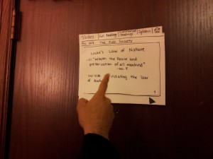
This app will be displayed on google glass for mobility, combined with a source for taking video and processing the images of the user’s hands make simple interactions with the space around them, including swipes, grabs, and reaching to certain locations.

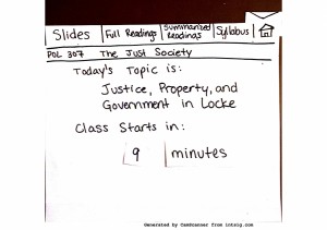
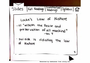
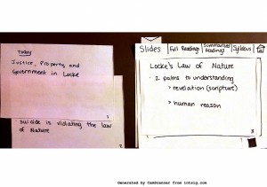
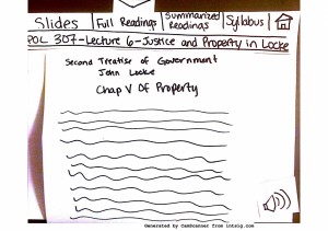
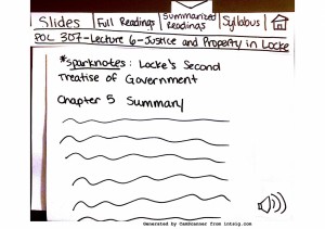
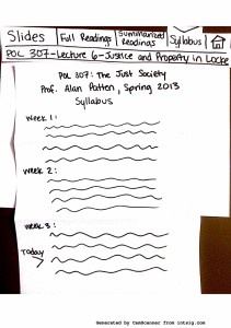
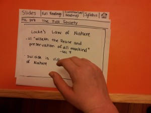
The app itself gives the user the option of viewing the syllabus, slides, readings and summaries drawn from Blackboard, Sparknotes, and course sites, all while walking to class.

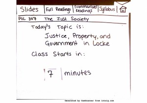
The app also alerts the user to how much time is left until class begins. The UI is meant to be used easily with simple swipe (to move slides) and grab (to select) gestures.

page-0 page-1 page-2 page-3 page-4

page-5

page-6


2. Efficient Class Navigation

Why : I chose to make prototype for a Google glass app that efficiently get you to class(a Google glass app again, because of the superiority of the interface for mobility)because it seemed to be the biggest problem with getting to class on time –how to do it efficiently—and there is no existing definitive answer for it.

Description:

2013-03-01 23.46.02

The app has a very minimal UI in order to give the user maximal visibility of where they are going.

2013-03-01 23.38.54

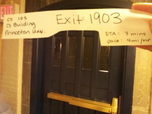
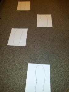
Footsteps on the ground show the user exactly where to step (whether it is cutting across a lawn or going at an angle on the stairs).

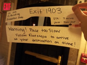
The footsteps adjust for both the user’s pace and the minimal pace for the user to arrive at their destination on time.

2013-03-01 23.48.07

If the user is going too slow, the app alerts them and the footsteps adjust to help the user quicken their pace appropriately.


User Testing – Lecture Prep App

User 1

What they did while using app

  • just looked at the screen and wondered what it was for — > I need a welcome screen
  • swipe for ppt slides not intuitive, down makes more sense
  • “swipe to remove text” not clear what to do
  • no way to get text back

User comments/suggestions

  • There’s no annotation!
    • If I’m reading I want to be taking notes, highlighting
    • I would like it linked to my notes
    • It would be useful for quick review before precept etc
    • Syllabus would be helpful – I would use that feature
      • link calendar- put in assignments, meetings –> from syllabus
      • Pop out words while the app is reading them out loud
      • Use Wikipedia instead of Sparknotes
      • Could go to syllabus, “grab” a word and wiki it

2013-03-01 23.55.11

User 1 tries to change slides by swiping down instead of the intended swipe to the left.


User 2

What they did while using the app

  • tried to  move slides with one finger right to left
  • did not use autoplay feature on slides (probably did not notice it)
  • did not reach as far as expected to “grab” their selection
  • clicked through tabs in order then went back to home
  • surprised/confused that he had to “grab” to select

User comments/suggestions

  • full readings are not necessary
  • Syllabus is unnecessary – I only need to know the section for today
  • I would like the first thing I see to be the paragraph from the syllabus that is related to today – not just the topic
  • I would expect grab to make the object go away, not to select it
  • grab is very vague, maybe pinch instead

2013-03-01 23.53.00

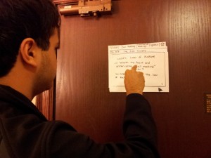
User 2 is confused by the “grab” to select gesture.

2013-03-01 23.53.30

User 2 tries to change swipe slides with one finger instead of the intended whole hand.


User 3

What they did while using the app

  • also tried to move the slides down
  • looked for a scroll bar with the text
  • thought the button to turn the speaking feature off would just mute it, wanted a way to pause it -> I should differentiate between the two

User comments/suggestions

  • I mostly look at my calendar on the way to class, you should integrate that
  • I wouldn’t use the full readings, they wouldn’t fit in the 10 minutes in between class
  • I would be afraid of bumping into things, can you make it more transparent
  • maybe make it more transparent as I get closer to running into an object


Insights From Feedback

The user feedback was extremely helpful. If I were to go forward with this design I would first look at the interactions that I have created for the user. It was not clear to them exactly how to use the app.  This may be partly because it is a new form of display but also because there are many conventions for the tasks the user may try to accomplish (such as flipping through slides). There is not any standard way to do these actions, which are usually done on  a desktop or mobile, in a 3D space, and what I thought was intuitive – sliding the hand from left to right to change slides—was not for one user who thought that they should be pushed down. (It is important to note that the exact mechanism for taking user input from gestures is not determined yet, as this would likely affect the final gestures available for interaction.)

I would also spend more time testing the way that users actually use the features. It is possible, as several of them suggested that showing any text would only distract from walking. Or that certain features would be useless, such as full readings, and others would be helpful, such as the ability to search online about a given topic.

I liked the “grab and search” idea that one user mentioned. I might want to convert the project into a way to search easily using only hand gestures and a head mounted display and camera. For example, I would like to test a system that allows users to reach out to “grab” a word from given text and pull it in a certain direction indicating that they would like to search for the word on wikipedia or google it. This would make common internet searches very simple in an interface without any clear easy way to type words explicitly. This could even involve being able process text in front of them in the physical world and allowing a user to search for a word in the text recognized. This could allow users an easy way to interact with text around them without having to use inconvenient mobile UIs for internet searches.