%eiip – P4 (Usability Testing)

a. Group number and name

Group number: 18

Group name: %eiip

b. Member names

Erica (eportnoy@), Mario (mmcgil@), Bonnie (bmeisenm@), Valya (vbarboy@)

c. Project summary

Our project is a smart bookshelf system that keeps track of which books are in it.

d. Test method

i. Obtaining informed consent

We are obtaining informed consent by having the participants sign a form adapted from the standard consent form template. We feel this procedure is appropriate because it informs them of the ways in which their identifying information will be used. Our consent document is located here:

https://docs.google.com/document/d/1l1k40exeedEf5zZ_EZQEhIP4xqquLzfmiFmbWMpXawA/edit?usp=sharing

ii. Participants

Participant A is an undergraduate student that we selected because she was doing work in a public place with multiple books next to her. Participant B is a graduate student in mathematics that we selected because he is precisely in our target user group. Participant C is a professor of computer science that we selected because he is precisely in our target user group.

iii. Testing environment

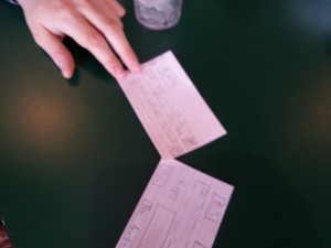
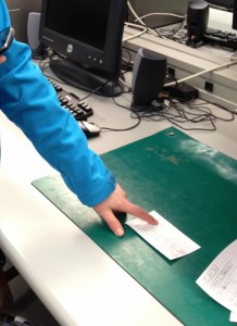
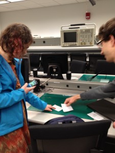
We performed a “Wizard-of-Oz” test, using our low-fidelity prototype bookshelf and mockup interface screens. For each test, we placed the bookshelf on a hard, table-height surface in a quiet area. The tests were performed using several (real) paperback books.

iv. Testing Procedure

When testing our prototype, Bonnie ran the paper prototype, Erica greeted the participant and obtained consent, Valya read through the demo and task scripts with the participant, and Mario and Erica were the primary note-takers. Our first task was having the user input an entire new collection, which we rated as difficult. Our second task was having the user add a new book to the system, which we rated a moderate task. Our final task was finding a book on the bookshelf, as well as searching for a non-existent book which we rated as easy. We chose this order because because it captures a more realistic use-scenario/workflow. Our demo and task scripts are located here:

https://docs.google.com/document/d/1GJH9i-mSwuxtb6rsPU5xBE3FU6XHx5Xq0bRYqmR4KCQ/edit?usp=sharing

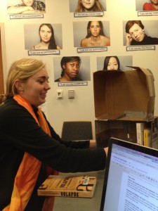
Usability testing with Participant A

e. Results

We noticed various usability issues that definitely need to be addressed. Most importantly, two out of three users placed the books directly on the bookshelf without going through the software system. Even after realizing that they needed to go through the mobile app, they had trouble figuring out how to begin adding books to the system; for instance, some were unable to easily find the plus button for adding new books. Two participants were annoyed with the length of the book insertion process and expressed a desire to streamline it. They were angered with the length of time it takes, so we will definitely have to address this issue. One user was uncomfortable switching back and forth between using the phone and handling the books. One user mistakenly believed that the ordering of books displayed in the app’s search screen matched the ordering of books on the bookshelf. On the plus side, users experienced a moment of joy seeing the bookshelf light up when they tapped the book on the app. Additionally, after adding their first book to the shelf, two of our testers seemed to adapt quickly to the process and added the remaining books with relative speed, which seems to indicate that this system could be a practical solution.

f. Discussion

Our tests revealed some consistent problems with the interface as it currently stands. One issue is that users were confused about how to add books to the system; also, some users complained that the process of adding books to the system is too cumbersome. At a minimum, we want to remove the “edit/verify book data” step (step 3) and the requirement that users photograph the book cover. We also want to tweak the UI to make the “add books” button more clear. We’ve also discussed alternative ways of identifying books to the system (such as having the user photograph the spine of each book and using character-recognition to get the book’s information) that would allow users to add books to the shelves in a more streamlined way. It seems like users really want to be able to just add books to the shelf without going through a lengthy process; we need to understand how we can minimize the work they have to do. For example, if we tap into an API such as GoodReads, we could remove the “take a photo of the cover” step by matching the ISBN number to a book cover from the database, combining three steps on the user’s end into one. Since users were not sure how to add a new book, we will color the plus button green, and we will add the text “add new book” on the “no books found” empty collection screen, with an arrow pointing to the plus button. In “Subsequent Testing” we present some other ideas for redesigning the book addition process to be more obvious and intuitive to the user. Also, if we present the system to the user as primarily software with a hardware component attached (as opposed to a normal bookshelf with some extra software added on), users may be more inclined to enter the books into the system rather than merely placing them on the shelf.

One limit of our experimental process was that we only tested the bookshelf with a limited number of books. This meant that, for example, some users simply grabbed a book off the shelf instead of testing the book retrieval functionality of the mobile interface. So, it’s possible that, when dealing with many books, problems with our interface might arise that we haven’t yet discovered. We noticed that because all the books could fit on a single screen of the interface, for example, that one user didn’t use the search or scrolling functionality.

g. Subsequent testing

User testing showed us that our prototype is somewhat confusing and tedious to use, though overall users seemed to like it. We want to try to fix these issues and run further testing before making our high-fidelity prototype. In particular, we want to re-design our mobile interface to make the buttons and their functions clearer. For example, when first asked to add books, all the users were confused, and clicked around until they were able to find the correct button. We want to make the first introduction to our application easier for the user, so that they don’t have to play guessing games. To do this, we would need to change the design of our paper prototype, adding more text, labeling the buttons, etc. We plan to make a few different versions of the clearer paper application, and to test it on users within the next week, to figure out what changes will make the screen easiest to use and most understandable. We will then incorporate these findings as we make our high-fidelity prototype.

Our second issue was that adding books to our system is somewhat tedious and annoying. Some users clearly got sick of doing it, even when tested on only a few books. To fix this, we want to see what we can feasibly do to streamline the process of adding books. This would involve testing the RFID sensors for range, and testing different ways to physically attach the RFID tags to books. Moreover, we want to look at image recognition, to see if we can gather book information solely from taking photos of spines, or even just the cover. We plan on doing this during lab next week. Then, once we identify potential improvements, we will adapt our low-fidelity prototype to reflect a few potential simplifications of the system. Moreover, in our user tests, we ordered the tasks in the order in which they would be most likely to perform them in practice. Instead of doing that, we want to run tests that will first allow our users to add a single book (moderate task), to check if they can figure out how to add a book to our system. We would then provide them with many books, to see how tedious they find the process (difficult task). Finally, we would present them with a bookshelf full of books they did not add, to see if they can find a book using the system (easy task). We will conduct these tests within the next week to figure out what is the minimal-effort system that will make our users the happiest.


%eiip – P2 (Interviews)

Group Number: 18

Names:

Mario Alvarez ’14, Valya Barboy ’15, Bonnie Eisenman ’14, Erica Portnoy ’15.


Problem and Solution Overview:

Organizing books, finding them, and remembering where specific books are can be difficult. It becomes exceedingly difficult as the number of books grows, and as people begin using books both for work and pleasure. Moreover, people who have multiple locations that contain books (multiple rooms, home and office, etc.) have trouble remembering which books are where, and continually end up needing a book that is inaccessible. Our solution is a bookshelf that has an RFID scanner on it. Each book on the shelf has an RFID tag placed on it. The shelf knows which books it contains, and can inform the user that a book is on it when a user queries a software system. An important aspect of our system is that it doesn’t require the user to make lasting modifications to their books, which was a concern of most of the potential users we interviewed.


Descriptions of Users Observed:

The tar­get user group we ended up inter­view­ing were researchers who own a lot of books. The idea behind this tar­get user group was to have peo­ple who use books in mul­ti­ple ways, and could there­fore have more spe­cific orga­ni­za­tional needs. Moreover, these users tended to have mul­ti­ple loca­tions for stor­ing books — at home, in the office, study car­rels — and tended to also have bor­rowed books, which would need to be returned. This makes it more prob­lem­atic if they lose or mis­place books. We ended up inter­viewing some grad­u­ate stu­dents, in math­e­mat­ics and physics, and some pro­fes­sors of com­par­a­tive lit­er­a­ture, Eng­lish, and com­puter sci­ence. We wanted to see how peo­ple in dif­fer­ent dis­ci­plines use books. For example, we noticed that those in the arts tended to have sig­nif­i­cantly larger num­bers of books (by orders of mag­ni­tude), and there­fore were forced to already have estab­lished orga­ni­za­tional systems. Addi­tion­ally, users in tech­ni­cal fields favored e-books for plea­sure read­ing, but avoided them for research due to imprac­ti­cal­ity; the users we inter­viewed in the arts and human­i­ties expressed extreme dis­like for e-books. Based on this, we real­ized that our sys­tem would be bet­ter for a tar­get audi­ence of peo­ple who own no more than a few hun­dred books.


CI Interview Descriptions:

We observed two mathematics graduate students in their respective offices. They both kept their math books in the office, and their pleasure reading at home. The first student had some problems remembering which of her books were at home and which were in her office. The second graduate student had everything perfectly organized — fiction was organized by what he had or hadn’t read and then by author; mathematics was organized by subject — and knew exactly where everything was. He generally can locate a book without a problem (and demonstrated this by finding any book we asked for), but sometimes forgets he has certain books and buys multiple copies. Both used e-books only when the material was otherwise inaccessible, or when traveling, but preferred to do their reading using physical copies. Both also kept their library books on a separate bookshelf, so as not to misplace them. Finally, both said that an organizational system would be nice to have, especially to remember which books are where, but that they do not want to take the time to scan or otherwise document every book they own.

We also observed a professor of Visual Arts who has thousands of books. He had them organized by topic, language, and time period. He could find any given book within seconds. He also had an expansive library at home, which he used for research and for pleasure. The books he kept in his office were those that could be relevant to the classes he teaches. A problem he acknowledged having was moving books from one location to another (i.e. from his house to his office), but he was very good at remembering where his books were. He also never borrows books, and keeps his library books separate from everything else. Next, we observed an English professor in his home, where he keeps his largest collection of books (he has several personal libraries across his residences and offices). He keeps his books using a loose, informal system of organization, with books roughly organized by topic, and books he is currently using stacked on or near his desk. His book collection is so important to him personally – and he spends so much time with it – that he is more or less able to keep track of where everything is. This is a feat, since he estimates he has a few thousand books in his home alone. This system appeared to work well for him: for instance, after he mentioned Turing in passing, we asked him if he could find a book about Turing for us, and he was immediately able to show us where the book had been, as well as recall that he had moved it to one of his offices some time ago. He feels that strict organizational schemes “demystify” the process of finding books, and that the serendipity of finding a book different from the one he was originally looking for is important to his research.

We also went to the Princeton Public Library and observed people trying to find books on the shelves. They would look up a book on a computer, look along the edges of the bookshelves to find the section, and walk along the aisle until they found the right first number, and then they would look more closely once they were nearby. In order to find the specific book, people looked very closely at the titles and numbers on the shelves. We then observed people shopping at CVS, and noted that they had a very similar tactic: they would look at the aisle sections to determine which aisle to go to, and then look more closely once there. One thing we noticed was that when people look for things they tend to physically run their fingers along the spines, shelves, or objects. If they don’t want to touch the objects, they’ll hover next to them, scanning physically as well as visually.


Answers to Eleven Task Analysis Questions:

1. Who is going to use the system?

Our system could be used by anyone with a personal collection of books. However, we envision it being most useful to people who use physical books for research in technical fields. There is very little chance that people who already have thousands of books will catalog all of them, so they would be less likely to use our system; our system will likely be more amenable to a medium-size collection (up to a few hundred books) than to an extremely large collection anyhow. Though we are designing the system with researchers in mind, it will likely be useful to those outside research fields as well.

2. What tasks do they now perform?

Our target group performs a few key tasks while interacting with their book collections. They search for books that they know are in their collection (though they may not know the books’ exact location). After they are done using a book, they need to be able to return it to their collection. They sometimes need to go through their collection to determine whether they own a particular book. Finally, they need to be able to add new books to their collection. All of these tasks generally operate within the frame of a particular organizational scheme; therefore, implicit in each action is that the user should be able to do it while maintaining the invariants necessary to keep their organizational scheme usable. If they do not do this, the tasks of finding books become difficult.

3. What tasks are desired?

Essentially, the users desire to perform the same set of tasks more efficiently. It can take a long time for a user to determine whether they already own a book, since, without a comprehensive catalog of their collection, they need to examine all their books to determine that they do not have a particular one. Additionally, users need to be able to find books consistently and efficiently; as mentioned above, this is not always the case. Finally, researchers tend to have their book collections spread across multiple locations (for example, their home and their office), so determining which books are in which locations is another important task (this was particularly true of the English professor we interviewed).

4. How are the tasks learned?

Currently users employ some combination of two complementary strategies in order to keep their books organized (i.e., learn and remember where books are). First, they can impose a formal system of organization, grouping books together based on commonalities (as the film professor we interviewed did). In an extreme case, they might use an industrial-strength system such as Dewey Decimal. Second, they can use spatial memory, connecting these groups of books to the parts of the space in which they are stored for more rapid retrieval. Both have drawbacks: maintaining a formal system requires discipline and an investment of time each time a book is stored or retrieved, while using spatial memory effectively requires an intimate familiarity with one’s collection and the space that collection occupies, which can take years to develop.

5. Where are the tasks performed?

Wherever the users keep their book collections – so the home and office, at a minimum; possibly other locations for users whose collections are spread across other locations.

6. What’s the relationship between user & data?

In this case, the data is the set of books the user owns, and where those books are. Users have an expectation of privacy for their book collections, as these can be highly personal in nature. Though sharing the full list of books users own will not be required, users may want to be able to share certain information about their collections with friends (for instance, if their friends want to borrow a book from their collection). Users should be able to access data about their own collections remotely – for example, if a user is at a bookstore, she should be able to look up whether she already owns a copy of a book before buying a new one.

7. What other tools does the user have?

The user currently has standard bookshelves. The user may also have software applications to aid in cataloging, such as BookCrawler, but as the film professor we interviewed mentioned, their utility is questionable because they are not tightly integrated with the physical locations of the books like our system is. Additionally, the user may use a traditional cataloging system (such as Dewey Decimal) in order to precisely specify the correct location for each book; however, this requires knowledge of the system and a large amount of effort to maintain, with the result that few actually use such systems.

8. How do users communicate with each other?

Users may borrow books from each other and lend books to each other. Additionally, they must negotiate with others who share their space to ensure that their system of organization is maintained properly. In the case of the home, this may be with other family members who share shelf space (and who may share the collection, making them users as well). In the case of the office, this may be with co-workers or colleagues (researchers in particular often have shared office space.) Communication tends to be informal, verbal, and in-person.

9. How often are the tasks performed?

This varies greatly from user to user and from collection to collection, depending on the user’s habits and the purpose of the collection (for instance, whether it serves as an archive of old, seldom-used material or an active repository for currently-relevant research). Generally, the tasks of storing and retrieving books already in the collection are performed more frequently (several times a day to a couple of times a week) than adding books or checking whether a book is in the collection (a couple of times a week to a few times a year).

10. What are the time constraints on the tasks?

There are no time constraints per se, but if it takes too long to find a book, the individual may give up (although some, like the English professor we interviewed, value the experience of finding a different book than one originally sought). Doing research efficiently depends on finding research materials quickly, so time is likely most important for professional researchers, who want to free up time to do actual research rather than looking for books.

11. What happens when things go wrong?

If the system is used and then stops working (or stops being used), the user’s book collection may become extremely disorganized. As a result the user may not be able to find her books any longer. This is not a catastrophic result, but may make it difficult for the user to do her job if she is a researcher. The user may also lose books if their organizational system loses track of them. This is a potential problem with our system: since it does not require a particular physical layout of books, if users rely on our system and no longer organize their book collection in conventional ways, their collections will be left in a state of disarray if our system stops working.


Description of Three Tasks:

1. Retrieving a book from the collection

The difficulty of this task currently depends on a number of factors, such as how many different places the user keeps books. None of the users we talked to used a strict organizational scheme, though many had their books roughly sorted based on whether or not they were for research, as well as by topic or by time period. With such a scheme, most users are able to find books with moderate difficulty.

Under our proposed system, the user would be able to simply query our system for the book, which would then indicate its physical location. Our system would therefore make it easy to perform this task.

2. Shelving a new book, or returning a book to the collection

Currently, the difficulty of this task is proportional to both the user’s number of books and the strictness of their organization system. If their system is lax and flexible it might be easy to file a book – but this will make retrieving books difficult. If their system is strictly organized, keeping it organized requires significant effort and planning on the user’s part. On average, this tends to be a moderately difficult task.

Our system would keep track of where each book is, so you can put them wherever you like – either maintaining a conventional organizational scheme on top of BiblioFile, or not. The task becomes easy.

3. Determining if you own a book, or if a borrowed book is in your possession

Currently, if you do own a book, determining that you do own it is as easy as retrieving it – that is, of moderate difficulty. However, if you don’t own the book, you have to go through your entire collection to make sure that it is not in your collection at all, as opposed to simply being present but out of place. In this case, the task becomes hard.

With our system, once a user has entered all her books into the system, she can know with confidence whether or not she already owns a book, simply by looking that book up using our interface. This task is now easy.


Interface Design:

Provide a text description of the functionality of your system. What can a user do with it, and how?

Our system keeps track of a user’s books and their locations. A user can ask the system for the approximate location of a book, and the system will indicate where on the shelf it can be found. Additionally, a user could ask the system whether or not they own a particular book. We envision the user interacting with our system through a web application that lets them search for books as well as view all books in the collection. To add a book to the bookshelf system, we envision the user adding a physical “tag” to the book, which will then allow the book/tag combo to be automatically registered via our website.

2. What benefits does the application offer to the user? What is the scope of functions offered? How will your idea differ from existing systems or applications?

Our application allows the user to quickly find their books and determine what books they own without using rigid cataloging systems. Traditional organizational schemes are hard to maintain, and even harder to reconfigure. Our system allows users to place their books in any configuration within the special bookshelf, which gives the users more flexibility. Existing systems require the user to either adhere strictly to an organizational scheme such as Dewey Decimal, or to perform some specific action each time a book is moved (such as scanning a barcode).

3. Provide 3 storyboards. Each one should show how someone would use your system to accomplish one of the three tasks you chose above. Show motivation for using the system, as well as steps the users will go through to accomplish the task.
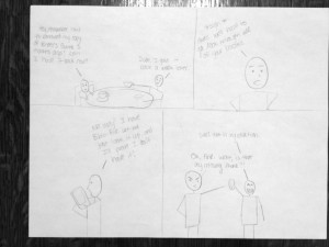
Photo Mar 10, 4 21 30 PM

Thanks to his Biblio-File system, this user is easily able to find and return his friend’s copy of Ender’s Game.
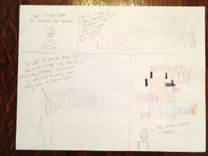
Photo Mar 10, 4 21 18 PM

Freed from the constraints of a rigid organizational system, this user lets his imagination run wild!
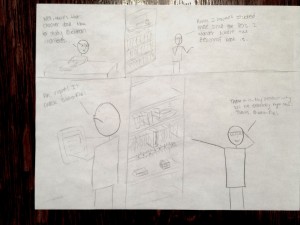
Photo Mar 10, 4 20 49 PM

Using his Biblio-File system, this scholar is able to quickly find the esoteric works he needs to conduct his research productively.

4. Provide a few sketches of the system itself. What might it look like? How might a user interact with it?

Hardware – Shelving: Our system will consist of one or more stacked modular shelves. Each shelf will contain an RFID sensor that will detect books contained within in, and transmit that information to the central server. It will also contain LED lights that will light up when a user selects a book in the software.
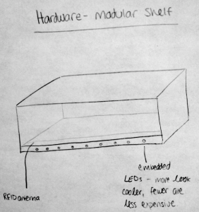
A modular shelving unit for BiblioFile

Hardware – RFID Stickers: The books’ presence will be sensed via RFID stickers that can be placed either inside a book (if the user owns the book) or on a bookmark that is placed inside the book (if the user does not own the book). These RFID tags can be disassociated with books after they are permanently removed from the collection and reused with other books.
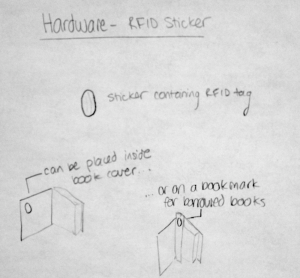
Usage of the RFID stickers


Software – Lookup: Using an interface similar to that of Music on iOS, users will be able to search the collection or browse by any of several types of metadata that the system tracks for each book. When they find the book they want, they tap its title, and its shelf will light up underneath its approximate location. To edit the collection (delete books), users tap the edit button.

Software – Adding a Book: The system will initially try to use OCR to get the book’s information from the cover, after which the user will have the opportunity to edit or add information. The user then places the book on the shelf, so that the system knows which book is associated with which tag.
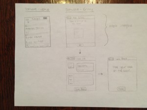
Interface mockup for looking up a book and for adding a new book to the collection

Software – Locating a Book: When a user taps on the book from the Lookup screen, she will be taken to a page containing the book’s information and tags associated with the location of the shelf that it is currently on. If the user desires, she may tap the illuminate button to have the shelf light up.
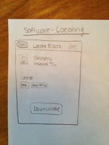
Interface mockup for locating a book in the collection



Assignment 2

Part 1: Observing

In order to conduct my inquiry into the behavior of students before class, I performed a mix of passive observation – i.e., simply watching students before class, and noting the actions they performed and their apparent motivations – and active contextual inquiry; that is, interviewing students to try to get a sense for what it would be like to be in their shoes. By watching first, I was able to get a general sense for the general kinds of activities students seemed to perform most often. I then conducted three focused interviews, informed by the task-oriented knowledge I’d gained.

1. Interview: I conducted my first interview with a student whom I had observed playing a game on her iPhone. Talking to her, I learned that she was playing the popular game Temple Run, saying that she found it so addictive that she found herself playing it whenever she had a short break or waiting period conducive to playing a phone game. She told me that she had arrived early to ensure that she got a good seat for the lecture, but that otherwise she had no reason to be in the classroom before the start of lecture, and felt that she had nothing better to do than to play Temple Run. I let her get back to her game, and observed that she was quite disengaged from the activity going on around her (other students coming in, etc.)

Design Opportunity: Many, if not most, students, seek out entertainment while waiting before class. Often they do this in a solitary, non-academically-inclined way: playing videogames, browsing their favorite subreddits and microblogs, etc. Perhaps there’s a way to entertain students while bringing them back to the classroom, engaging them with each other and with the academic content of the course? It seems like a shame that the students – all of whom are bright and have a common knowledge of and interest in the course – don’t collaborate in a meaningful way to entertain themselves during this time. Entertainment value is key, though: students would resent being required to participate in an activity before class; and a boring, voluntary activity could never compete with Temple Run.

2. Interview:  I had observed my second “victim” reading what looked like a pdf of something on his MacBook. I asked him about the reading – it turned out it was course-reading for a completely unrelated class – and he mentioned that he often tries to read between classes, particularly when he gets behind on his work. However, whenever he tries to read before lectures he is much less productive than he could otherwise be, because the environment is so distracting. This, he mentioned, is a source of frustration for him; he wishes everyone would just be quiet, though he knows that’s not realistic.

Design Opportunity: Some students want to use the lecture hall as a space to study before class starts. However, with people coming, going, and talking amongst themselves, the lecture hall at this time is a busy, loud, distracting environment that is not conducive to productivity. Similar to interview 1, I wondered if the students could in some way be brought together to engage in something academic. Perhaps students would be willing to cooperate in some kind of collective studying or problem-solving process? This could turn the lecture hall from a studying-hostile to a studying-friendly environment, and might – again – help reinforce students’ understanding of the material. I asked the subject about this, and he stressed the importance of it being voluntary: students are busy enough just getting between classes, and would resent the extra burden.

3. Interview: My third and final subject appeared to be carrying out a rather extended conversation with a friend over text-messages. This conversation lasted for several minutes; for this reason, it seemed to me to be a distinct kind of activity from the aimless browsing or e-mail checking a student like Subject 1 might do instead of playing a game. This was, more than anything, a social interaction. When I spoke with him, he mentioned that he and his friend were continuing a conversation they’d had before. He said that it’s hard to resist the urge to continue these kinds of digital social interactions, even during class, though (as he acknowledged) this is rude toward the professor. For him, the urge was more about having a conversation – being continuously socially engaged – than about the particular person he was conversing with; he mentioned that he might have started a text-message-based conversation with a different friend if he weren’t already in one.

Design Opportunity: The students that do reach out and communicate with others, ironically, often do so in a way that isolates them from the others in the room, and from the in-person social opportunities present during the time before the start of lecture. Perhaps there is a way to harness this social drive – the urge for a conversation and real-time communication – in an academically productive way, that does not interfere with the room as a place to study as well.

From these three interviews, the problem (or, at least, potential problem) of isolation appeared to be a trend. Students appeared to value pursuing solitary activities – gaming, reading, or texting, in these cases – to engaging with others in the room. This seems like a waste; the group setting provides many untapped opportunities for fruitful (and, in some cases, academically valuable) interactions.


Part 2: Brainstorming

For this part, I collaborated with Clay Whetung ’13, Peter Grabowski ’13, and Andrew Callahan ’13. We came up with the following ideas:

  1. Interactive quiz show on lecture material beforehand, just for fun.
  2. Correct answers win prizes?
  3. Correct answers load funny pictures/memes/pictures of cute animals
  4. Soothing and/or energetic audio-video patterns to get you in the mood for lecture
  5. Survey about what you want to see in the lecture (or future lectures)
  6. Slideshow of interesting topics in news or inspirational videos
  7. Guided meditation
  8. Organized, guided back massages
  9. Summary of previous course content
  10. Physical art supplies, so the class can create a communal piece of art
  11. Digital doodle-board (similarly, to create a communal piece of art)
  12. Digital collaborative music that’s easy to make – like this.
  13. Parallelizable puzzles/challenges/problems for people to solve together
  14. Collaborative game for all to play
  15. Anonymously ask and vote on questions for the lecturer to answer
  16. Aggregate websites that people are looking at and show popular articles
  17. 10 minute lesson series (potentially related to course material, or not at all).

Part 3: Selecting my favorites

First, I chose Idea 14, above (course-related games students can play while they wait), since it can potentially satisfy the needs of Subject 1 (a well-designed game could provide an engaging, challenging distraction for those who want it) and Subject 2 (since the game could tie into the course material.)

Second, I picked Idea 15 – (a way for students to submit questions) because it seemed like a powerful, real-time way for students to communicate about and collaborate around the course material, making it potentially appealing to socially-oriented students such as Subject 3 and more academically-focused students like Subject 2.


4. Rapid Prototyping

1. GameClicker! (Idea 14)

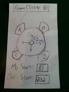
Inspired by the iClickers given to students in some introductory science labs, I decided to give each user of the system a clicker-like device, but one optimized for gaming. It also has small seven-segment LED screens for displaying your score, as well as the entire class’s score for cooperative games. The buttons on the device are labeled “A”, “B”, “C”, and “D”, making the device usable as a convenient replacement for a traditional clicker as well (i.e., students submitting answers to multiple-choice questions on the board).

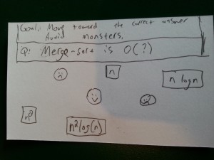
In addition to the clicker-controller, I also prototyped out an example game. It is a cooperative game that can be played by the entire class, using their clicker joysticks. The goal is to guide the person on the screen to the correct answer to the multiple-choice question shown, while avoiding enemies. The character moves according to the average of all the players’ inputs, making it a truly collaborative activity (and, to an extent, an exercise in group problem-solving!)

Here are some photos of this prototype (I used 3×5 index cards):

Allows students to play games and answer questions using a joystick and buttons. Roughly actual size; real device could probably be a bit smaller.

Allows students to play games and answer questions using a joystick and buttons. Roughly actual size; real device could probably be a bit smaller.

A game where the class works together to guide the character (smiley face) away from the bad guys (frowny faces) and towards the correct answer (n log(n)). Not actual size! This would be projected on the board for all students to see.

A game where the class works together to guide the character (smiley face) away from the bad guys (frowny faces) and towards the correct answer (n log(n)).
Not actual size! This would be projected on the board for all students to see.


2. Live Class Forum (Idea 15)

This product consists of two main parts – again, one that goes in the user’s hand (in this case, a smartphone app), and another that is projected onto the board. Live Class Forum enables a group of people gathered in a space to ask and answer questions in real time, with an emphasis on the in-person aspects of the situation. Used in a lecture hall before the start of lecture, it allows students to submit questions for everyone to view. Students can attempt to answer each other’s questions, as well as vote (up or down) on those that they think are the most interesting or important.

The professor also has access to this discussion, and can participate either by answering students’ questions directly within the system, or by designating some questions as “Professor’s Picks” that will be answered at the start of lecture. Having real-time access to the students’ inquiries can help professors tailor their classes toward what material the students are most interested in, and what material is most in need of review or re-explanation.

Here are some pictures of this prototype (again, I used 3×5 index cards):

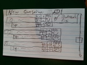
(1) Main Screen
The screen that shows up when users first open the app – and also the screen that gets projected onto the board for everyone to see. Students using devices can scroll to see the questions others have asked, and the top reply for each question. The screen also shows each question’s upvotes and downvotes.
Clicking on a “+” or “-” upvotes or downvotes, respectively, the question or reply they are next to. Clicking on a question will focus the question (screen 2). Clicking a “reply” link will take the user to the compose-reply screen (screen 3). Finally, clicking “new question” will take the user to the compose-question screen (screen 4).

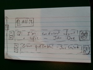
(2) Focusing on a Question
Students can scroll to see all the replies for their chosen question (not just the top one reply, as on the main screen). They can up-vote or down-vote the question and each of its replies, as well as writing a reply of their own by clicking a reply link (which will bring them to screen 3). Clicking the “All ?s” link returns the user to the main screen (screen 1).


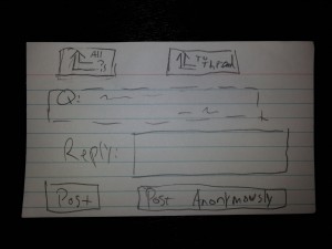
(3) Compose a Reply On this screen, students can use an on-screen keyboard (not shown) to enter a reply to the question shown above. They can choose to post or post anonymously, which will add their reply to the thread with or without their name attached, and bring them back to the screen "focusing" on their original question (screen 2). Clicking "To Thread" at the top will also return to this "focus" screen, but without making a post. Clicking "All ?s" at the top returns users to screen 1.

(3) Compose a Reply
On this screen, students can use an on-screen keyboard (not shown) to enter a reply to the question shown above. They can choose to post or post anonymously, which will add their reply to the thread with or without their name attached, and bring them back to the screen “focusing” on their original question (screen 2). Clicking “To Thread” at the top will also return to this “focus” screen, but without making a post.
Clicking “All ?s” at the top returns users to screen 1.

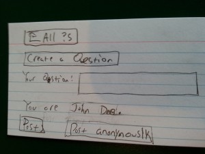
Students on this page can enter a new question (using an onscreen keyboard, not shown). The page displays the user’s name. The user can click on “Post”, or “Post Anonymously”, to submit the question and return to the main screen (1). Users can also return to the main screen (without submitting) by clicking “All ?s” at the top.


5. Rapid Feedback

To get feedback, I chose to use the Live Class Forum because, of the two, it seemed like the better-defined idea, as well as the idea more easily captured by paper prototypes and Wizard-of-Oz style simulation.

1. Bonnie Eisenman ’14

This was my first test, so it was a little rough around the edges. Bonnie’s main suggestion for improvement was to make better use of the mobile UI libraries and “look-and-feel” that Android, iOS, and similar provide (for instance, overlays that slide on top of the main window for the compose screens), because this would make the application look more polished and behave in a way mobile users expect. She also pointed out that the main screen was somewhat cluttered, and that it wasn’t especially clear which regions were clickable (for instance, tapping on a question in the main screen takes you to a different screen; tapping on a question on the “focused question” screen does nothing).

Some photos:

Testing with BO

Testing “Create a Reply” with Bonnie

Testing

Testing the main screen -> create a reply workflow with Bonnie

2. Max Botstein ’14

Max had no issues with the interface itself – other than that it was a bit tight and cluttered, but not much more so than most mobile UIs that only have a small screen to work with. However, he pointed out that the question-and-answer format that this product sets up – in which the questions are factual in nature and have a clear “best” answer – tends to work better in “hard” scientific or quantitative classes than in the humanities or social sciences. As a history major, Max couldn’t picture any of the professors in his department using this product, though he does think it could work better in a department like COS. Like Bonnie and Valya, he was somewhat caught off guard by the lack of clear instructions, but figured out the gist of things pretty quickly.

Some photos:

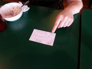
Testing the reply screen with Max


Testing the focus screen -> reply workflow with Max

3. Valya Barboy ’15

Valya’s main comment was that the main screen was too confusing, and needed to be simplified – perhaps by removing or hiding the reply, up-vote, and down-vote buttons on the main screen, and leaving them on only the “focused” screen. She also was not convinced that students would use the product even if the UI were improved – she said that it seemed too unnatural and inorganic, and that inertia would draw students to doing whatever they normally do between classes, because there are seldom questions to be asked that are so compelling students will break out of their usual routines to write or vote on them.

Some photos:

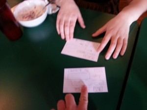
Testing the “all threads” button from the “focused” screen with Valya

Wizard-of-Oz simulations can be challenging! Here I'm fumbling with the cards while testing on Valya

Wizard-of-Oz simulations can be challenging! Here I’m fumbling with the cards while testing on Valya


6. Insights/Conclusion

  • Even when you think you understand the potential user, you probably still don’t, especially if you’ve spent only a comparatively small amount of time getting to know them. I thought I was designing a product that would appeal to students interested in deepening their knowledge of the course material, but in the the appeal was not as strongly compelling as I had thought it would be.
  • When designing for a device or UI form factor that already exists (e.g., desktop, mobile, facebook app, …), be aware of the UI conventions that exist and follow them. A source of confusion for the users I tested on was the fact that my product differed from how typical mobile applications work, in terms of transitions between screens, title bars, and text inputs.
  • Make extra sure you’re not making implicit assumptions about your user. Two of the lectures I went to to observe (as well as most of the lectures I attend in my day-to-day life) were COS lectures; as a result, my thinking about what a typical Princeton lecture looks like was excessively influenced by what a typical Princeton COS lecture looks like. This caused me to make unconscious assumptions about who I was designing for, and I ended up designing a product that might not find many uses outside of COS classrooms.
  • It’s impossible to avoid having a learning curve for your product, but it’s important to understand why the curve exists in your particular case. Simply giving my prototype to the users to experiment with without any explanation was immensely helpful – it was a form of brutal honesty that revealed many of the un-intuitive features of my UI, such as the clutter on the main screen making it difficult to navigate, and the ambiguity in the presentation of question-and-response threads (such as only the top answer for each question being presented on the main page.)

In conclusion, if I were to continue to iterate on and revise this product, I would first reduce the clutter on the main screen; in particular, I would remove the reply and upvote/downvote buttons, keeping them only on the “focused on a thread” screen. I would also retool this thread-focus screen, to make it more clear exactly how it fits into the main screen’s big-picture view of the questions (perhaps by using overlays or other fancy mobile UI elements). I might also consider more fundamental redesigns of the product’s functionality and interface – after all, this is still the early stage of the design process where many different ideas can be explored without too much cost.

This was definitely a humbling experience. I knew that getting UIs right was difficult, but I wasn’t expecting to my interface to have so many flaws, in spite of the fact that I tried to take my users’ specific needs and situation into account. This assignment really demonstrated to me the importance of prototyping, testing, iterating, and failing fast in UI design.