A2 — Raymond Zhong

Observations

It’s not hard to find food or caffeine on campus, and the problems that do arise — finding a study room, booking a place to meet, or even exchanging meals in the eating club system — seem to be largely policy concerns rather than design or technology problems. So I took a slightly different approach…

The Princeton undergraduate experience is distinctive (elite school, eating clubs, isolated suburban area) and many students have strong opinions about Princeton social life which they express in publications, comments, or candid conversations. I sought to isolate some of those distinguishing characteristics, and use them as inspiration on how to build immersive technologies that students can use recurrently in the opportune time between classes. To do this, I observed several types of Princeton classes as well as a graduate seminar:

A comparative literature seminar (East Pyne, 12 students)

  • The attitude was very laid back; the professor arrived over ten minutes late but students seemed not to notice, with waiting time proceeding as before.
  • Most people interacted sparsely with each other, preferring to keep to themselves and avoiding interacting with anyone else’s gaze.
  • I observed a pair of students who were talking sporadically and seemed to anticipate each others’ reactions, suggesting that they were close friends. (Both male, same ethnicity.)
    • They recognized and said hello to some other students in the class, but focused on interacting with each other for the remainder of the waiting time.
    • They talked both about the class material, periodically making references to the readings in front of them, and also talking about other things, glancing around the room and often outside.

An introductory class on urban studies (Architecture, 75 students)

  • I observed a graduate student who was TAing the class.
    • She observed the class largely nonchalantly, without a specific target or intention.
    • She got out her laptop and reviewed readings, which we later reviewed in precept.
    • She seemed to have segmented her waiting time, dedicating it towards preparing for this specific class.
    • She was also browsing news websites that seemed related to the class material.
  • I observed an undergraduate who was sitting towards the back of the lecture hall.
    • He was on GMail writing messages relating to a student group.
    • Messages seemed to be formal, with complete sentences, etc.
    • Many other students had email open. Fewer students were communicating via text message or chat, and those who did seemed to be using heavyweight programs to do so (Web Messenger for Facebook, or full-featured Mac chat clients).
  • Social behavior was analogous to COM301, but at a larger scale.

A computer science systems lecture (Lecture hall, 50 students, mostly sophomores/juniors)

  • The student I chose to observe was (like most others) checking email.
    • It was early in the morning and energy and her energy level seemed low.
    • She was not very engaged in reading or responding to emails and did not respond to many.
    • At some point she stopped and stared off into space.
  • Overall very similar to Urban Studies lecture above.

A graduate architecture seminar on design theory (Architecture, 7 students)

  • One GS was discussing summer plans with the other students. They came from different ethnic backgrounds and discussed their experiences before Princeton, and shared experiences and programming here including a spring break trip.
  • Two characteristically quieter students still seemed engaged, nodding and reacting to whoever was speaking. The whole seminar was active, with everyone engaging in a slightly different way which reflected their personality.

My overall observations:

  • The most common activities (75%+) were email, browsing Facebook, browsing Reddit, browsing PrincetonFML, calendaring, staring off into space, chatting intermittently.
  • Energy level was very important; at low energies people interacted with their devices and each other more mindlessly, often just staring off into space. This seemed to vary largely by time of day.
  • Some people brought food to class.
  • Social behavior was very limited in variety.

Ideas

After making these observations, I generated lists of ideas inspired by undergraduate social life and by the functions and duties of graduate students and TAs. I tried to be extra cautious to avoid ideas that discourage organic social interaction, after recognizing that it happens more often in smaller classes and graduate classes.

Undergrad:

  • Mobile application showing names and shared interests of people around you.
  • Web application mapping clusters of commonalities that form as people enter and situate themselves. (Students could use this to find seats next time they come to class, or to move around during waiting time.)
  • Chat room that senses which room you are in
  • Mindless web/mobile games you play with other people in the room
  • Map on which people [anonymously] broadcast how they are feeling with short phrases or emoticons
  • Map showing people the closest food source, menus, and wait time for round trip
  • Mobile application that collects annotations and highlighting on PDFs into a skimmable summary
  • Mobile digest of news relevant to each class
  • Academic personal assistant (dashboard with upcoming deadlines, todo items, profiles of authors of readings/guest lecturers, etc.)
  • App that plays relaxing music and blocks Facebook, email notifications, etc.
  • App showing upcoming events, but only within a few hours and within a certain distance (encouraging exploration)
  • App for quoting and retweeting quotes
  • App that clusters students present in a room, putting them in random groups based on commonalities (ostensibly for group projects)
  • App that displays Twitter/RSS digest on one topic per class period (chosen based on nearby people, allowing them to discuss the topic)

GS/TA:

  • App to track students’ attendance
  • App for short pre-class surveys

Favorite Ideas

  1. Map which lets people broadcast sentiments and intentions anonymously or to friends. Chosen because it has a low-energy mode of engagement which is good between classes, and because it has a couple of other compelling uses: finding a friend to eat with when hungry, and mapping events around campus in real time.
  2. Mobile digest of news relevant to each class. Chosen because I would definitely use this in classes where discussing current events is part of the participation grade.

Prototypes

Ansible, an application for broadcasting intentions (going to eat, feeling bored, etc.) anonymously and to friends.

Studyfeed, a news aggregator that aggregates readings for your next class.

EDIT: Right-click and select “view image in new tab” to see the prototypes in full size.

I tested the broadcasting application because it seemed like a more substantial subject of examination. Studyfeed was a great idea, but there were so many ways to expand upon it (adding to-do lists, syllabi, readings, etc.) that in a preliminary discussion, the interviewee was talking about plans for the app rather than the interface itself.

User Testing

BC, ECO ’13:

  • Definitely found the app most useful for finding meals with friends.
  • Would use this app if it enables other meaningful interactions.
  • Slightly confused by the anonymity aspect. Was not clear about the privacy of own posts, and if using the app would broadcast own location. This seemed like the largest concern.
  • Chat seemed to be of marginal benefit, but this was not obvious – what if the user was bored? It was hard to tell from this study.

AF: CBE ’14:

  • Really cool landing page. Intentionality was unclear, and it took a while to figure it out (partly because of low fidelity of prototype).
  • Chat was intuitive. Selecting what to broadcast was also very intuitive; comparison was made to Instagram.
  • Seemed very interested in using the app to chat with random people. It would be a useful distraction when bored.
  • Profiles for anonymous users seemed a slightly creepy, yet very compelling feature.


BT: COS ’13

  •  Has seen many apps of this kind. Most were not launched on college campuses. This made the interview interesting and different from previous interviews.
  • Navigated through interface quickly.
  • Was most likely to find individual features useful, like finding food around, or broadcasting intention to go to dinner, but did not seem like a strong pull.
  • From a task analysis perspective, app did not seem to fulfill a strong need for this user.

Insights

  • Privacy and identity concerns are important for a substantial portion of the population.
  • Building a complex landing page was a great starting point that made the app feel much more substantial and useful, but it was hard to prototype on paper. This diminishes the effectiveness of paper prototyping for complex applications, although it is still a useful method for prototyping workflows consisting of multiple, simple screens (as in Studyfeed).
  • Using gradients or white-on-black features for contrast was difficult and should be avoided.
  • While paper prototyping is useful, many of its limitations were immediately obvious (not having the user in appropriate affective states, not being immersed in an appropriate environment, etc.). However the prototyping strategy was shown to be very useful for testing out user experience flows at the macro level.

EDIT: Right-click and select “view image in new tab” to see the prototypes in full size.

Avneesh Sarwate A2

OBSERVATIONS

  1. Student 1 was observed in Frist, sitting in a long (>10 minutes) gap between classes. He was browsing the internet on his laptop. When asked what he generally did between class in short periods (10 minutes), he said he only had time to walk to classes. When asked what he did during long periods, he said he generally tried to get homework done.
  2. Student 2 was observed in Frist, sitting in a long (>10 minutes) gap between classes. She was reviewing class notes. When asked about activity during long breaks, she said she tried to do classwork. When asked about short breaks, she said she didn’t have time to do much, but would sometimes try to look over notes before a precept.
  3. Student 3 was observed in a long break before classes. He seemed to be walking around looking for people to talk to. When asked about what he did during long breaks, he generally said he went back to his room to either work or hang out. When asked about short breaks, he said he only ever had time to go to class.
  4. Student 4 was observed in a long break in Frist. He was reading over notes for a class. When asked about long breaks, he said he generally tried to get school work done. During short breaks, he said he didn’t have time to do anything except get from class to class. He also added that during “mid-length” breaks (~30 minutes), he struggled to find anything productive to do.

All students, when asked about what they did during the short period, seemed to be mildly surprised by the idea of actively trying to get any errand or task done during the short interclass period. All also mentioned that it was sometimes a struggle just to get from class to class, much less attempt anything during that time. During long breaks, all students observed seemed to have a plan to be productive, but during short breaks, there was no attempt. All students said that concentration was an issue in the long breaks. The salient problem for long breaks seemed to be keeping students productive and focused within that limited time frame, while the salient problem during short breaks seemed to be simply getting students from class to class on time while allowing them to do anything else.

BRAINSTORMING

  1. An app that counts the number of people in the lecture hall of your next class, letting you know if you have to rush to get a seat.
  2. An app that lets you know how far your professor is from the lecture hall, letting you know whether you need to run to class (helpful in small classes/seminars).
  3. An app that, given two classes and a destination that must be reached in between, gives the shortest path.
  4. An app that allows you to access the notes for your next class with a single button click, and updates itself without user action between classes.
  5. An app that displays your upcoming homework due dates graphically
  6. An app that shows you the number of people waiting at different coffee vendors around campus.
  7. An app that lets you know whether your friends are in your next class or not (so you can skip and get their notes)
  8. An app that, given a syllabus at the start of the semester, updates you on the readings/lecture topics each day.
  9. An app that lets mail services know you are coming for a package so they can find it for you (sort of like a fast-track line)
  10. An app with games to warm up your fingers on cold days.
  11. An app that maps your activities for the whole day (classes, meals, extra curriculars)
  12. An app with an “on the way” signal that is sent to you professor when you are close to the lecture hall (so the professor can decide whether to wait for stragglers).
  13. An app that gives you a spot to meet friends so you can walk to your next class together.
  14. An app with an onscreen arrow that points in the direction of your next class.
  15. An app that signals when you pass close to a coffee vendor so you don’t forget to get a cup in a rush.

PROTOTYPES

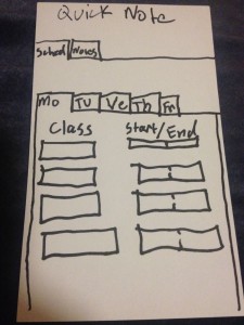
QuickNote – This idea was chosen because 10 minutes is plenty of time to review notes on the way to a class, but current tools don’t make note-viewing on the go instantly accessible.

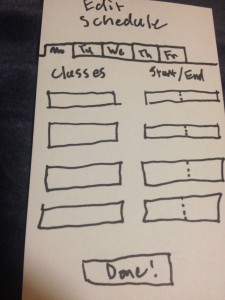
The schedule editing screen.

The schedule editing screen.

The schedule editing screen (accessible on phone or web) allows users to enter their class schedule into the app. Since the app knows when the users classes are, it can provide the notes for the next class without user prompting, ideal for note access on the go.

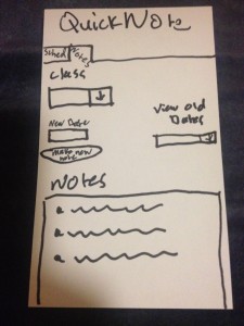
Note entry screen

Note entry screen

The note entry screen (accessible by phone or web) allows you to add notes to the app to display later. Accessibility by computer allows you to easily take notes on the computer and copy and paste them into the app. Extensions for a desktop application could be made that would automatically read a directory, parse the files contained in the subdirectories, and update the notes on the app.

Users first select the class they want to add notes for, create a new note and give it a date,  and enter the note. They can also view older notes for a class and edit them.

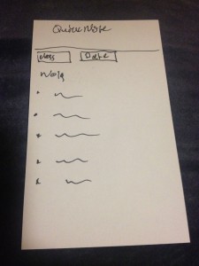
Note viewing screen.

Note viewing screen.

The note viewing screen (the default screen on the mobile app) automatically updates to show the notes for the upcoming class. Since the app knows your schedule, opening the app from a phone will automatically bring you to the notes for your next class first, thus minimizing use time. Users can also select notes by class and date if they do not want to view the notes of the upcoming class.

——————————

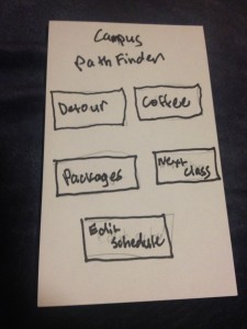
PathFinder – This app combined the various map based ideas from brainstorming to create a tool that could allow students to get from class to class quicker, while giving them the information that would allow them to efficiently perform simple errands (such as stopping by a different building, getting coffee or picking up packages) in between.

Home screen

Home screen

The home screen allows the user to pick what service they want. They can

  1. Edit their schedule
  2. find the shortest path from class to class while detouring through another location
  3. find the fastest place to get coffee
  4. see wait times for picking up a package and join the “fastpass” package line
  5. and find the shortest path from class to class normally.
Schedule editor

Schedule editor

This screen lets you edit your schedule.

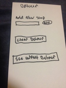
Detour editor

Detour editor

This screen lets you add a new stop to your detour path, and the app can reorder the stops to have the shortest path. It also allows you clear the detour path you have set. If you navigate away from the screen and come back, you can see what detour path you are currently on. After reaching a class, the detour path automatically clears itself.

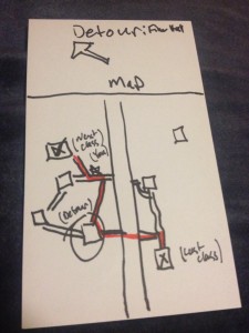
Detour map

Detour map

On the top of the screen is an arrow that gives you the straight line direction to your next destination. This feature is for those people who like to go off the normal paths and find shortcuts through campus.

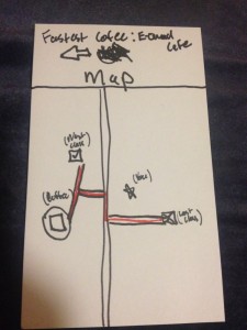
Coffee finder

Coffee finder

The coffee finder screen takes two things into account when finding the fastest coffee location. The deviation from the path to your next class, as well as the number of people in line at the coffee vendor. Taking into account these two variables, the coffee finder function provides the location that will provide the minimum delay. It also has the shortcut arrow at the top of the screen.

Package Picker Upper

Package Picker Upper

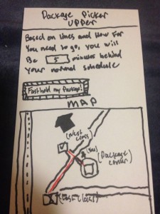
Like the coffee finder, the package picker upper calculates the time you will be delayed in picking up a package by looking at the deviation from the path to your next class and the number of other people using the app that have said they are picking up packages. If you decide to pick up your package, you can notify the mail staff and they can take your package out of the stacks ahead of time, and you could be served by an express line. It also displays the shortcut arrow to your destination.


Next class map

Next class map

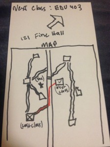
The simplest feature, it shows you the path (and shortcut arrow) to your next class without any distractions.

TESTING AND FEEDBACK

User testing was conducted in Frist. Temperature and unwillingness of test subjects prevented the tests from occurring outside while walking from place to place. Instead testing took place in Frist, and I attempted to recreate the situation of moving from class to class by giving situational “events” (i.e. “you’re leaving your class. Do you want to get coffee?” or “Is there anything in another building you need to pick up.”)

The user felt confused by the choice of the word "detour"

The user felt confused by the choice of the word “detour”


The user found the arrow functionality helpful, preferring to follow it instead of the map.

The user found the arrow functionality helpful, preferring to follow it instead of the map.


The user suggested coffee should have a wait time display.

The user suggested coffee should have a wait time display.

Five users were tested. All said without prompting that if such an app were to exist, they would use it, with three encouraging me to either make the app or propose it to the USG.

Insights:

Users differed in whether they were more likely to follow the arrow or the map, with 3 users preferring the map and 2 preferring the arrow. Care should be taken to present the arrow and map as complementary, so that users do not feel like the two are presenting conflicting information. In an app specifically designed to minimize decision making in stressful times, forcing an unexpected choice (whether to follow the arrow or map) introduces a huge inefficiency.

The choice of the word “detour” was confusing to some users, with one thinking it was a function that would provide a pastime to users with time to kill. The “add detour” wording was also confusing to some users, with some users being unsure whether pressing add would add a new stop along the path or create a new path entirely. In an app designed with a minimal interface for maximum intuitiveness/inefficiency, a few extra words could go a long way towards clearing up use (i.e. “add new stop to current path” instead of “add new stop”.)

User suggestions:

The class/time schedule, with locations coming from the registrar, could have problems when class locations are changed. Instead, the schedule should be location/time, so class changes could be easily fixed, and the app could generalize to all activities for the entire day instead of just classes.

Instead of just having a shortcut for just coffee and packages, a “common detours” menu should be available that would also include libraries and food vendors (dining halls, convenience stores, etc).

A time estimate display similar to that on the package menu should be added for the coffee finder.

An explicit back button and help/instruction menu should be added.

Assignment 2–Brian Huang

I did my observations before SOC 204 lecture (TTh10:00am) in Frist, ANT 303 seminar (TTh1:30pm) at Bobst Hall, and in Frist at 11am on Tuesday (the former two were done last Thursday).

Observations:

  • Subject 1 (student)
    • Student is early to lecture
    • Sitting in back of lecture hall checking facebook
      • There are other students here, but no interaction; they are all on phone or computer, decidedly ignoring each other
    • Steps out to go to bathroom
      • Leaves laptop in seat (is this safe?)
        • Says that Princeton students are pretty trustworthy (honor code)
    • When returns, someone has taken the seat next to him
      • Takes backpack (was on other side) and switches seats with it (now sitting in aisle seat)
        • Classroom is pretty full, but students seem to not want to sit right next to each other
        • Possible space concerns when taking notes/working on laptop
    • Eats a granola bar
      • Skipped breakfast because he woke up at 9:30 and didn’t have time to stop by dining hall for a proper meal.
  • Subject 2 (professor)
    • Passes by early students
      • No interaction; only enters a couple minutes early and busies himself getting ready for class
    • Actually, he had some trouble finding parking out here
      • Prospect ave. has many cars parked along.  Finding closest parking spaces often requires doubling back
        • In intervening time, spot might get taken?
      • Equad parking is too far away to be worth the walk
    • Throws away coffee (it has grown cold and it’s mostly gone anyway)
      • Always gets coffee before coming to class; sometimes finishes it, sometimes doesn’t, but it gets him going
      • Coffee may drip through trash lining, but nowhere to pour coffee out
        • Bathroom? Maybe too far to be worth it. Where is the closest one?
  • Subject 3 (late student)
    • Rushed through Frist; no one is in the way—pretty much everyone else needs to be somewhere at this point anyway
      • Is the student taking the most efficient route up?
    • Takes stairs two at a time while rummaging around in his backpack
      • Not much we can do to improve stairs, but can we organize backpack better?
        • What is in backpack that he needs? < homework due
      • Need a way to keep paper unwrinkled but easily accessible
    • Quietly slipped into class; found a seat in the back
      • Doors still make noise, and people still turn
      • Floor is creaky, announcing every moment student is not seated
      • Back-of-the-room seats build up, forcing later students to move up

Brainstorming:

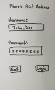
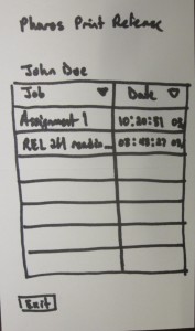
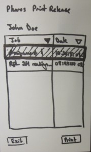
  1. Mobile/online print release to allow people to print and pick up papers right before class
  2. Anonymous student/professor forum for interaction before/after class
  3. Classroom interest-related livewire for giving professor real-time student feedback on class (intended to spark conversation between class and de-stigmatize speaking w/ profs)
  4. Restroom occupancy checker to check for nearest restroom with vacancy to expedite before class restroom runs
  5. Redesign desks to have desks in front, rather than by arm (off center workspace is a problem for laptops)
  6. Mounted display and keyboard (in front of seats in lecture, but low enough not to obstruct view) for students to jack laptops into to avoid awkward laptop positioning
  7. Parking locator for professors who drive to efficiently find parking spaces
  8. Carpooling system for professors and driving students to reduce parking load.
  9. Mobile phone system for ordering “to-go” breakfast or lunch to allow students to eat and still make it to class in time.
  10. Student/professor check-in/introduction interface for de-stigmatizing student/professor relationships (could generate conversation starters based on interests of present people).
  11. Mobile app for reserving seats in lecture halls
  12. Lecture seating organizer that allows students to state preferred seating locations, but also ensures that students sit forward, leaving rear seats open for latecomers
  13. Mobile Princeton campus map app with efficient route locator
  14. Mobile game that allows students to gain points for discovering bits of trivia about professors (to encourage professors and students to get to know each other)
  15. Mobile Princeton facial recognition scanner (for professors and students who forget other professors/students’ names).
  16. Mobile app to allow students to check in and find friends in large lectures (for acquaintance-level friendships)

Choices:

  1. (Mobile print release): students often need to print things out right before class, but waste time waiting for things to print at release clusters.
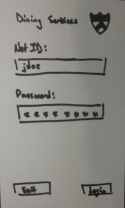
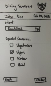
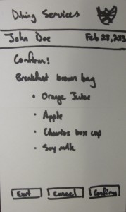
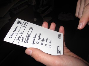
  2. (Mobile app for ordering “to-go” meals to allow students to grab food before class and still make it to class in time): students often skip meals before classes, but this could be avoided with to-go meals being more easily obtained (current interface is a form filled out a meal before)

Paper Prototypes:

Mobile “to-go” meals:

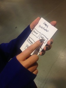
IMG_0114IMG_0112 IMG_0113

Mobile Print Release:

IMG_0115 IMG_0117IMG_0116

Feedback:

User 1 (Ben Arar)

IMG_0106

  • Liked the idea
  • Need more food options (pickings are somewhat slim
    • May need options to change quantity/size of meal

User 2 (Elizabeth Liu)

IMG_0107

  • Would like to use this now
  • Want ability to switch out items (if someone doesn’t like orange juice, for example, need ability to change to, say, apple juice)

User 3 (Amma Awusu-Akyaw)

IMG_0108

  • Need additional special concerns (not just eating restrictions, someone might really like bacon, for example, or want a hot breakfast–user really wants to see bacon)
    • Rephrase “special concerns” to something more general like, “specifications”
    • Perhaps also include a text box for any other things that we may not think of
  • User also seemed to think that certain combinations of items were just not good (orange juice and soy milk, for example, “just don’t go together”)
    • Perhaps allow for feedback on experience

Major Insights:

  • Users want a great deal more customization of meals (the main draw of a dining hall, I suppose)
  • Users need to be able to communicate with meal makers, and not just with our restrictive interface.  We can’t anticipate all needs.
  • Feedback on meal combinations is advisable, especially if food may be wasted.  Users may also want specific things (like bacon) and want to be able to recommend that cooks make these more often, or dislike certain things (orange juice + soy milk) and want to advise cooks against these.
  • GUI buttons need to be more carefully named.  “Order” was misleading, and people were surprised to see a “confirm” page after


Assignment 2 — John O’Neill

Observations

Person #1: Thursday, February 21st, in McCosh 46 right before a 10am POL 307 lecture.

The student, like most of the other students waiting for lecture, was using their laptop, and, like many other students with laptops out, where going through the morning ritual of checking emails. Every seat in the lecture hall has its own old, wooden desk which is angled slightly upward, and because of the angle, the laptop was gradually sliding toward the student; this forced the student to either 1. constantly shift the laptop back towards the top of desk, or 2. prevent the laptop from sliding further by stopping it with their chest, causing the student to hunch over their keyboard.

Person #2: Monday, February 25th, in Colonial Eating Club, slightly before 10am

The individual was eating a quick breakfast before leaving for a 10am lecture. They arrived fairly late, so they were eating quickly, and they focused on their food more than speaking to others at their table. They placed their phone on the table so that they could quickly check the time / ensure that they weren’t running late. Rather than hanging up their coat and placing their backpack in the coat room, this individual hung their coat on the back of their chair and placed their backpack underneath the table. As they were leaving, they quickly made a cup of coffee, which they carried with them to class.

Person #3: Tuesday, February 26th, in a Corwin Hall classroom, right before a 1:30pm precept

This person was one of the only students in the room using a laptop. They divided their time between email and a last-minute skim over the electronic version of the reading materials,  occasionally talking with a few other students in the room. The individual appeared extremely focused, keeping fairly constant eye contact with their laptop even when they were talking to the other students around them.

Idea Headlines

1. Quiz on quotes from reading
2. Guessing game of professor arrival time
3. Simple, personal, single-question, cross-classes questionnaire
4. Quiz that asks students to generate possible test questions / paper topics
5. Email blast that reminds students to retain good posture & other friendly reminders
6. Email-based game of mafia among waiting students, where story is automatically generated
7. Email-based game of rock, paper, scissors among waiting students
8. Easily ask friends who are already getting food to prepare you a plate
9. Phone buzzes more and more rapidly as lecture approaches, letting you know how much time you have left to eat
10. Each person waiting shares something funny or interesting (e.g. op-ed article, gif, etc.) to everyone else, vote on best
11. Uses your calendar to easily show the pockets of free, suggests things to schedule (e.g. lunches, time to read, etc.)
12. A reminder to call your mom
13. Takes the surveys from Psychology students (who are in desperate need for thesis data) and disperses out to anyone who is bored
14. A virtual game of duck duck goose, where someone “catches up” to another person by tapping their phone faster than the other person
15. Helps you find people to walk with to class with
16. Helps you find people who are free and would also want to talk on the phone / chat online
17. A collaborative way to sum of the reading, the only way to enter is to contribute something useful, which is to be determined by a moderator that is anonymous and randomly assigned before each precept

Prototype Rationale

2. Guessing game of professor arrival time, Price-Is-Right style
This would offer a really fun, engaging way to get students interacting with one another, and has the added benefit of involving the professor.

16. Helps you find people to walk with to class with
I really enjoyed the idea of finding individuals that are walking in the same direction and having them meet up – who doesn’t enjoy some company on the way to class?

Photos / Descriptions of Prototypes

Prototype #1: Guessing when the professor will arrive

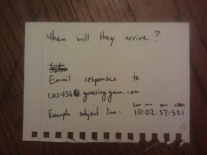
A prompt for the guessing to begin, either projected in class or sent via email.

A prompt for the guessing to begin, either projected in class or sent via email.

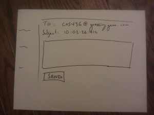
Students submit guesses for when they think the professor will arrive.

Students submit guesses for when they think the professor will arrive.

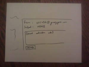
Professor replies to email to set his/her arrival time. In this email, originally set to the professor, is a secret code used to confirm that he/she is in fact the professor.

Professor replies to email to set his/her arrival time. In this email, originally set to the professor, is a secret code used to confirm that he/she is in fact the professor.

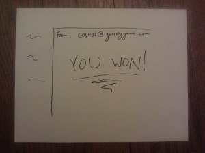
If a user guesses the time that is closest to the professor's arrival time without going over, they win.

If the user guesses the time that is closest to the professor’s arrival time without going over, they win.

Prototype #2: Finding people to walk with to class

ENIMAGE1362194854515

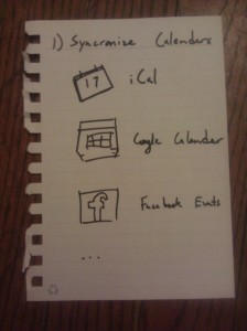
Ask user to synchronize their calendars so app knows of their whereabouts.

ENIMAGE1362194865985

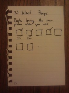
Choose which friends you want to know about if they are in the surrounding area.

ENIMAGE1362194884830

Confirmation message

ENIMAGE1362194894787

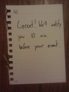
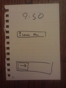
User is notified that it is time to leave

ENIMAGE1362194903973

The user is also notified of who should also be in the surrounding area and is prompted to send them all a message

ENIMAGE1362194920473

Don’t get left behind!

Photos / Notes from User Testing

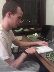
User chooses to synchronize facebook events to app.

User chooses to synchronize facebook events to app.

Observations for User 1

  • Proper confirmations need to be made for synchronizing various folders
  • User finds transition from screen #2 (people selection) to screen #3 unclear
  • Enjoyed the tone of the text
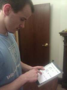
User unlocks phone to examine notification

User unlocks phone to examine notification.

Observations for User 2

  • Wished there was a way to see who is actually in proximity (using GPS?), not just those individuals who should be
  • Unsure if leaving screen should automatically select all individuals by default
  • Moved fairly quickly from screen to screen
User chooses who they want to message

User chooses who they want to message

Observations for User 3

  • Noted that screen #3 should have exit route
  • User also finds transition from screen #2 to screen #3 unclear
  • Noted that notification could let you know where you’re going and how many people are around you

List of Insights from Testing

  • Next iteration would use actual location of individuals. One reason this wasn’t considered for the original design is because constant monitoring of location 1) raises privacy concerns and 2) doing so dramatically drains battery / is thus far impractical
  • Should be able to set the amount time between notification and arrival time (10 minutes by default, but should be able to customize based on location)
  • A variation of the previous post: calculate time needed to walk from location to location and send notification at the corresponding time

A2- Dale

Observations

1. Got to Phi203 Lecture about 5 minutes early. It’s a ~100 person class. The girl next to me is checking her email on her laptop, someone in front of me is checking on his iPhone. At least 40% of people here with computers are checking Facebook. Someone to the left of me is setting up the headings for the notes he’s going to take in this class. Lots of people are bringing up this week’s readings. Calendar-checking and updating is also popular. Students who walk into the classroom now are searching for their friends. Some of them are awkwardly squeezing past rows of people to get to middle-row seats.

2. My roommate, at 8:00 AM, getting ready to go to her first class. Me in bed, wishing she weren’t so loud because I don’t have class until 10. She is getting all of her books from the bookshelf, unzipping her backpack (which is really loud), stuffing in books and papers, trying to figure out if she forgot anything. She checks the weather and sees it’s raining, grabs her umbrella. Grabs her helmet, key to bike lock, and runs out the door.

3. Math 217, I just got to class. Professor is writing the first ten minutes of class on the board. He writes an outline of what we are going to learn, and also puts up a short description of what we covered last week in class. Math is a special lecture because professors need chalkboards or whiteboards (a projector isn’t good enough because they need to write math problems and solutions which is easier to do with a pen/chalk). Is there a way we could save him the time of writing all this preliminary info? He writes things on the chalkboard from his written notes, so there is no digital copy, and no way for students who missed lecture to get notes online.

Brainstormed Ideas

  • GeoTask – an app that alerts users to complete certain tasks based not on time or date but on location. Passing Frist? It will remind you to pick up that package you received.
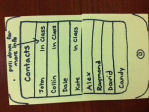
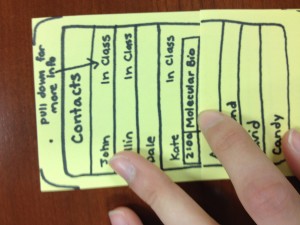
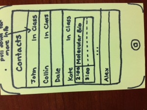
  • InClass – never text your friends in class again. This app augments your phone’s contact list with “In Class” or “Not in Class” next to each contact’s name, and also offers a drop-down class schedule option.
  • 5 minute language-learning app that will present users a 5-minute lesson on a single word in a foreign language. Presents user with spelling/pronunciation challenges plus in-context use of word.
  • ClassFM – lectures are sent live over campus radio, so that when students are running late to class, they can tune in to the first few minutes on any radio receiver.
  • ClassCall – small seminars start the first 10 minutes of their class as conference calls, so that if you’re going to be ten minutes late, you can phone-in and be involved in the discussion
  • NoteInit – a note-initializing app that saves you the trouble of making a new word document each time you want to take notes in class. Auto-creates a file with proper heading, date, class, lecture topic, etc.
  • Food-ordering app. Order food from Frist from your iPhone, pay from your iPhone, and specify when you’ll pick it up. Then when you pass Frist, all you have to do is grab your food and go.
  • PathUnPack – GPS-enabled app that tells you the best path to take from class A to B by considering how crowded they are. Especially useful for bikers who don’t want to be stuck behind walls of walkers.
  • BikePath – bike-optimized GPS app, that tells you the best path to take from A to B without encountering steps.
  • Laptop-battery vending machine. Check out laptop batteries from vending machines with PUID for a small fee, return them within 24-hours. Useful for when you forgot to charge your laptop before lectures.
  • App that maximizes the amount of energy you can expend while getting from class A to B, i.e. suggests the path with hills, steps, etc. Suggests easy, 5-minute workout routines users can do along the way.
  • Interval Alarm – alarm that not only alerts users not only at the time scheduled but also gives users distinct 15 minute, 10 minute, and 5 minute warnings distinguished by ringtone (for use, say, when you wake up and are getting ready for class and want to know when you have to speed up)
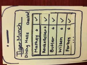
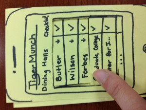
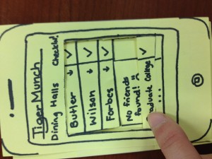
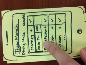
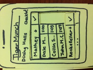
  • TigerMunch – Check by dining hall where your friends are eating. Displays friends PUID swipe-in times for different dining halls.

2 Favorite Ideas

I like TigerMunch because sometimes I don’t necessarily want to text/call my friends to coordinate lunch in between classes, but I definitely might choose to go to one dining hall over another if I know lots of people there.

I like InClass because sometimes my friends will call me 2+ times while I’m in class to, say, ask me to have lunch, thinking that I’m simply ignoring them when really I just can’t answer because I’m in a small precept. If I could have my friends’ class schedules on-demand, it would be much easier to figure out when I should meet up with people/contact them/make lunch plans with them.

Prototypes

Photo Mar 01, 11 05 37 PM

Tiger Munch launch screen

Photo Mar 01, 11 05 59 PM

Scroll down to see who’s eating in Mathey

Photo Mar 01, 11 06 07 PM

Friends in Mathey, with sign-in times

Photo Mar 01, 11 06 38 PM

Who’s eating in Forbes today?

Photo Mar 01, 11 06 57 PM

Nobody. That is surprising.

Photo Mar 01, 11 07 25 PM

InClass launch screen in contacts list

Photo Mar 01, 11 07 32 PM

Scroll down to see more info.

Photo Mar 01, 11 07 49 PM

Kate’s class schedule, for the next few hours

User Testing

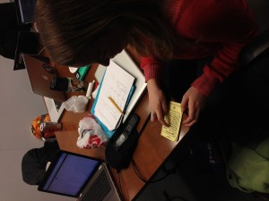
None of my users had a particular problem with figuring out the user interface or how they were supposed to use the app, but they did have really awesome ideas for how to extend TigerMunch. Originally I thought that users would “check in” when they get to a dining hall, but my friend David suggested it would be cooler if you could automatically be checked in when you swipe your PUID at a dining hall. This made me wonder if auto-check-in with GPS would be useful. Another user suggested I connect TigerMunch with Princeton’s TigerApp that pulls dining hall menus, so users could choose dining halls based on both friends and food. Photo Mar 01, 11 09 23 PMUser seems to get the interface…
[kaltura-widget uiconfid=”1727958″ entryid=”0_7f8wgh2h” width=”400″ height=”360″ addpermission=”” editpermission=”” /]

Assignment 2 – David Dohan

Observations

I observed students and professors before class over a two week span, focusing on MUS103, SOC204, and COS340.

  • MUS103 lecture
    • Most people on laptops – lots of email clients open
    • People beeline to clusters of friends / just talk
    • Others read over the class handouts for the day
    • See several reddit windows open
    • Handful of people shuffling through handouts from past weeks
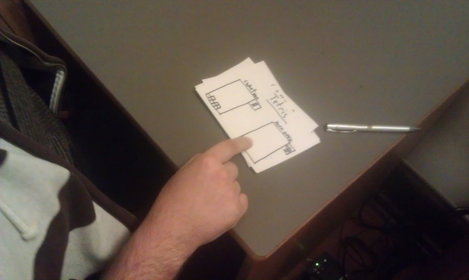
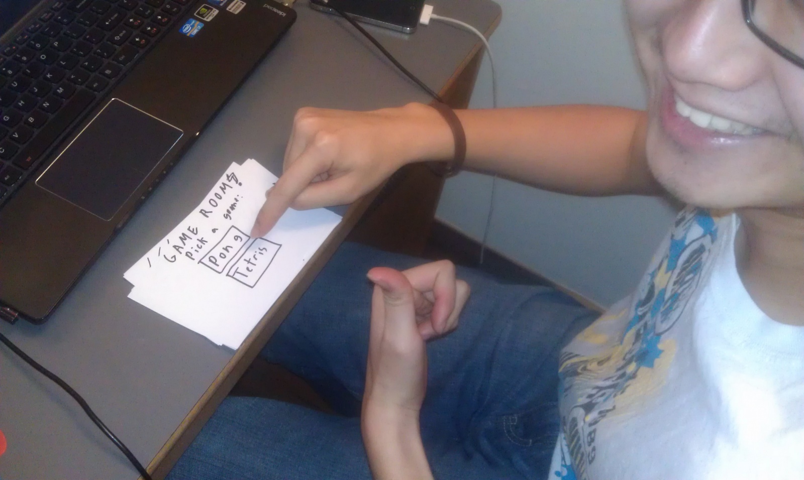
    •  Observed one student playing Tetris, another was reading manga
  • COS340
    • Extremely sparse until 5 minutes before class – most people talking to friends
    • Many people discussing pset with their group / talking with friends
  • SOC204 – 10am class – few people arrive early
    • Very few people arrive early for morning class
    • See two people reading news
    • One on a kindle reading a book
    • Several attempting to cram the assigned reading
    • Professor arrives about 5 minutes early. Lays out folders to collect homework. Spends remaining time setting up laptop, chatting with preceptors, and generally standing at front of room
  •  General observations
    • Reading over/reviewing past lecture slides/notes
    • Snacking – generally sandwiches
    • Lots of people looking at their phones. Seems to be little interaction outside friend groups.
    • See a few people napping right before some classes (primarily in afternoon classes)
    • Lots of community auditors in the back of classes
    • One or two students usually go ask the professor a question before class
    • See PFML pop up a few times
    • Talking to a few students showed that many were rushing between classes and did not have much free time for large blocks of the day

Brainstorming

With Shubhro Saha and Andrew Cheong

  1. Pair people up to review each other briefly before class
  2. Spaced repetition learning with flashcards tailored to collaborative card creation within a class.
  3. Competitive quiz app for students who arrive early.
  4. Class todo list that pulls due dates and readings from blackboard or course websites and presents in order of due date.
  5. Competitive games (e.g. speed chess/checkers/etc.) with others inside the classroom
  6. Order food so it is ready to pick up on way to class
  7. Guided meditation app tailored to time you have before class begins.
  8. Workout app tailored to time before class begins.
  9. Collaborative playlist app for students who are in the class early. Could optionally interface with classroom speakers.
  10. Complete psych studies a few minutes at a time instead of going in for blocks of time.
  11. App that takes in the free food listserv and lets you know if there is anything along your way to class
  12. News summary app to catch up with the outside world
  13. Local chatroom for students in the class
  14. Campus wide virtual whiteboard for chat and other interactions. Provides a forum other than pfml.
  15. Students can give mini lectures on topics before class (not necessarily related to class).
  16. Collaborative puzzles for the classroom (crosswords etc.)
  17. App to facilitate students answering each others questions during the time before class, and the teacher starts class with any remaining questions.

Favorite Ideas

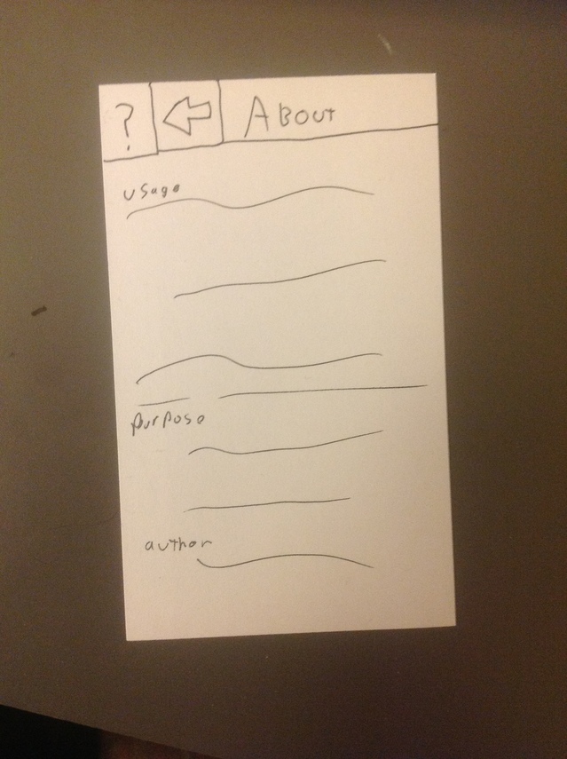
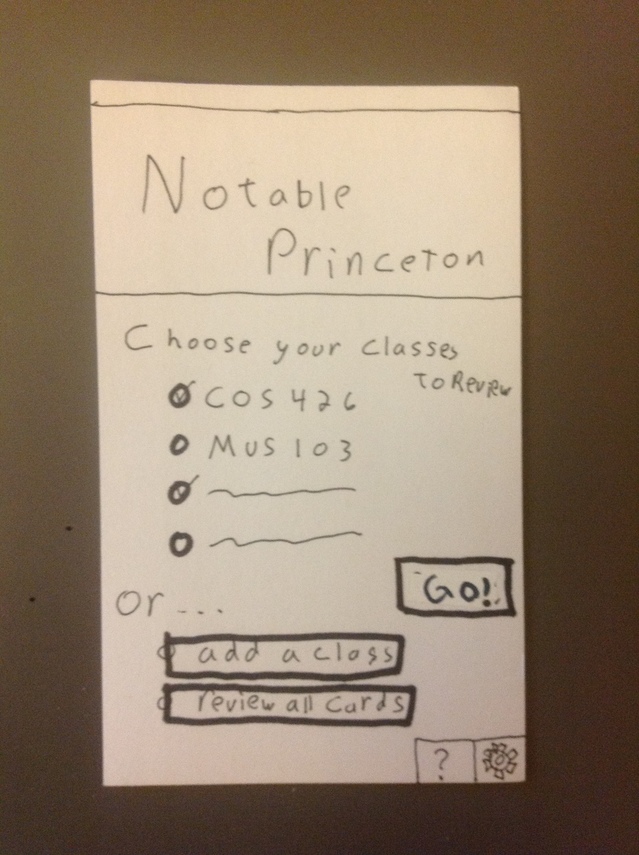
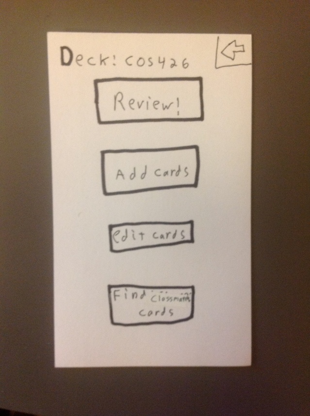
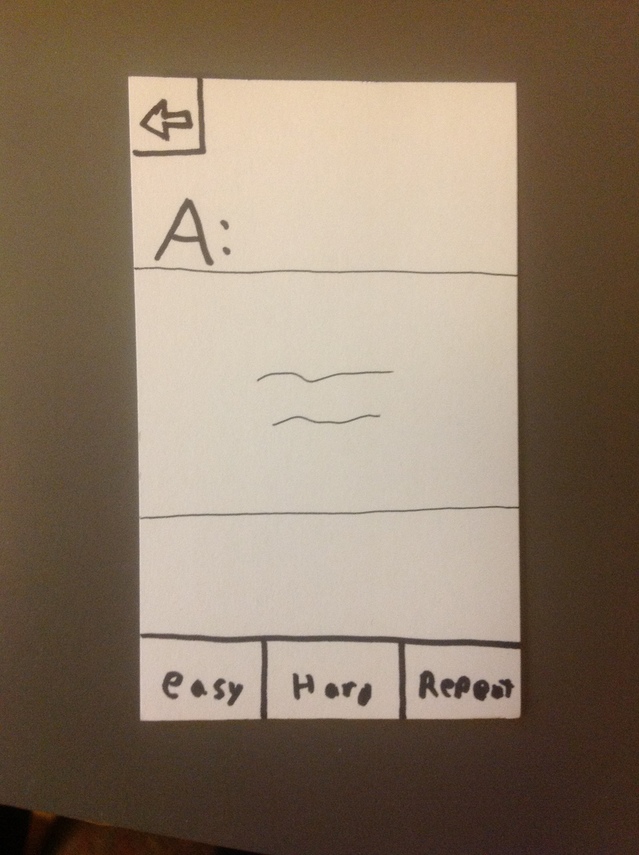
  • Notable – a class review app
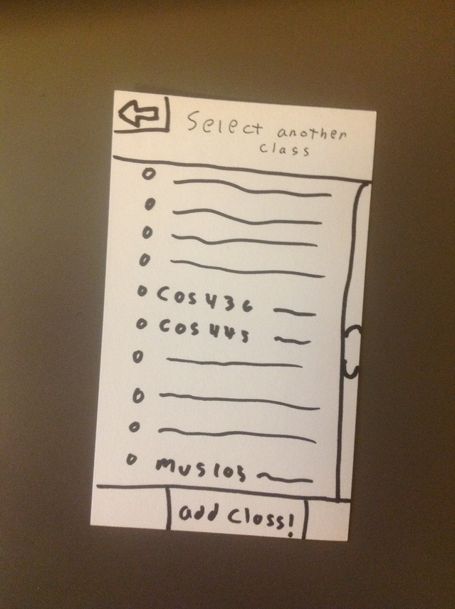
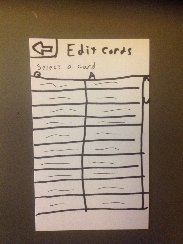
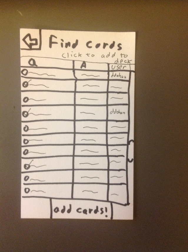
    • A spaced repetition notecard app that makes it very easy to collaborate on cards within a class. Should be simple to find cards other people in the class created and share your own.
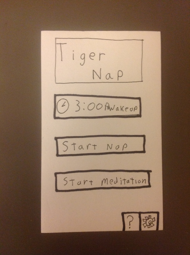
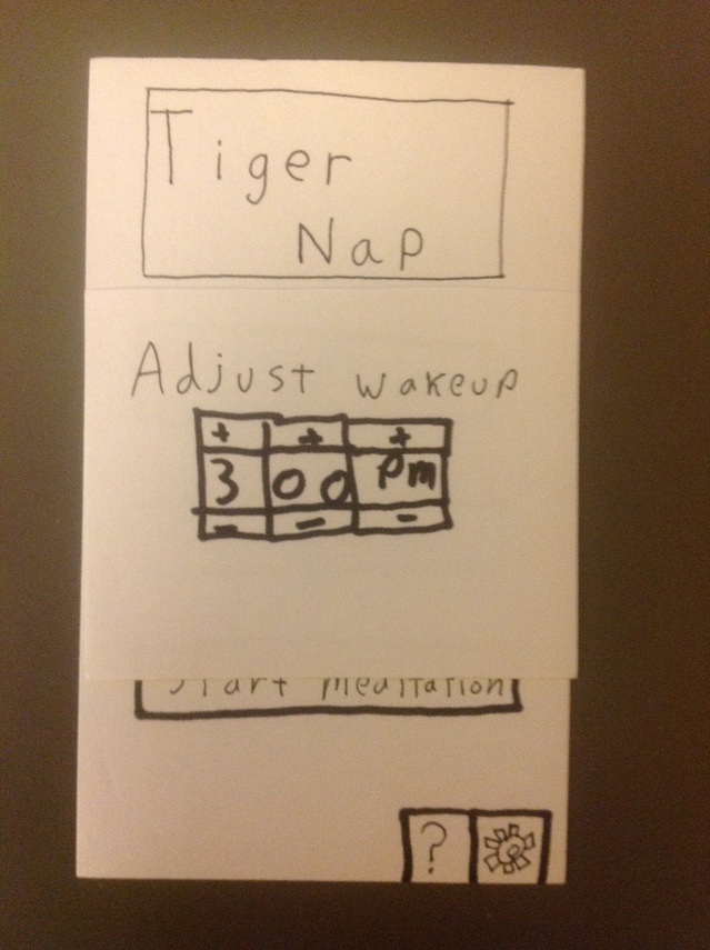
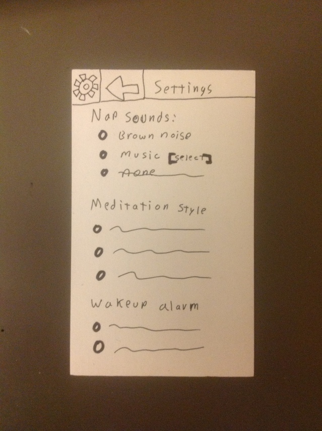
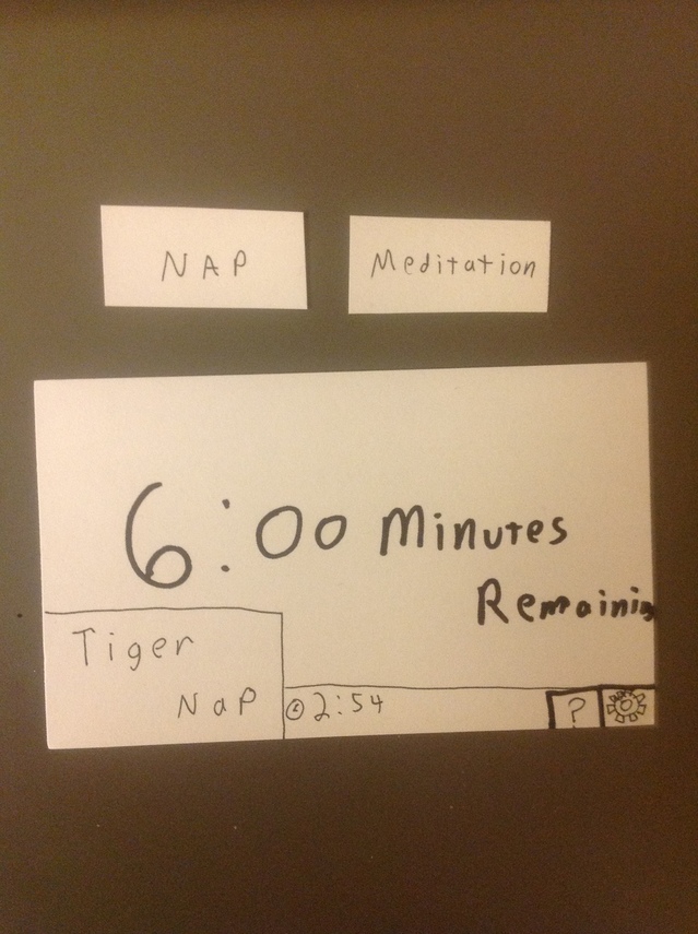
  • Tiger Nap – a guided meditation app
    • The app provides audio for guided meditation that lasts until the class begins and slowly wakes you up. Also has a nap mode that can generate sound to drown out distracting noises. Should be as simple as possible – only needs a single button to start nap/meditation.

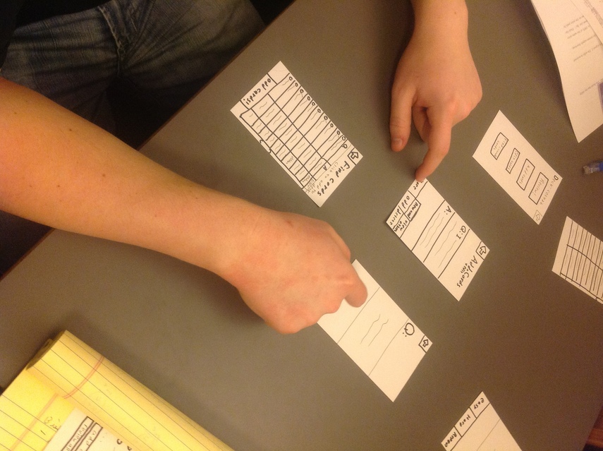
Prototype Pictures

TigerNap:

This slideshow requires JavaScript.


Notable:

This slideshow requires JavaScript.

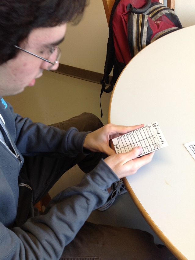
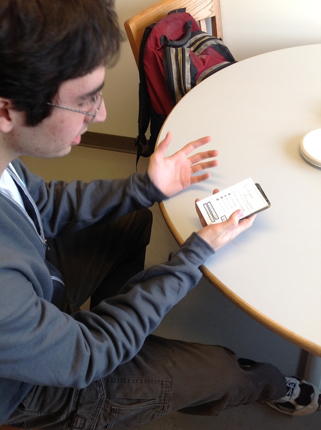
Feedback

This slideshow requires JavaScript.

  • David Bieber – COS ’14
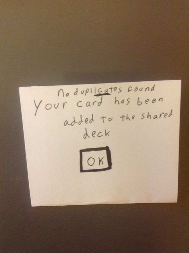
    • Left out back button on the “deck” page [now added]
    • Need to make it clear how checks behave after going back – do they clear? Do they hold previous state?
    • On the find cards page, make it clear what each column does. Does clicking the user column list all cards from a user or just select that card?
    • Make it clear what a shared deck is
    • Add an option to cram certain cards by categories/topic/when they were added
    • Don’t mix metaphors – the Q and A on the quiz page don’t match with all card types
    • Possibly auto generate cards from notes and/or syllabus
    • Need a web/computer interface to make typing in cards easier if auto generation is not possible. Typing on a phone is tedious
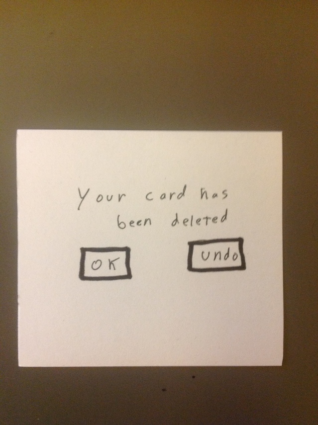
    • Add a simple way to delete cards/decks [now added]
  • Harry Cape – CHM ’15
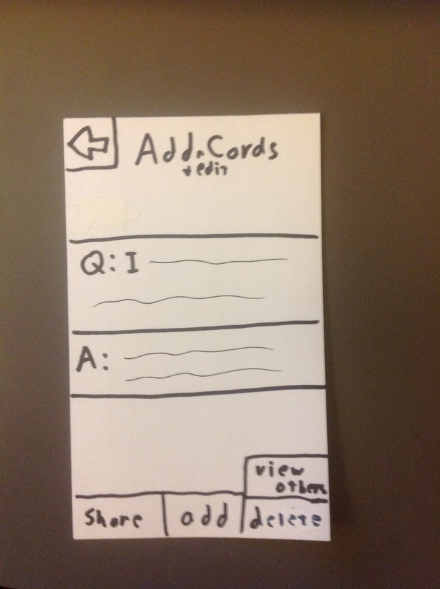
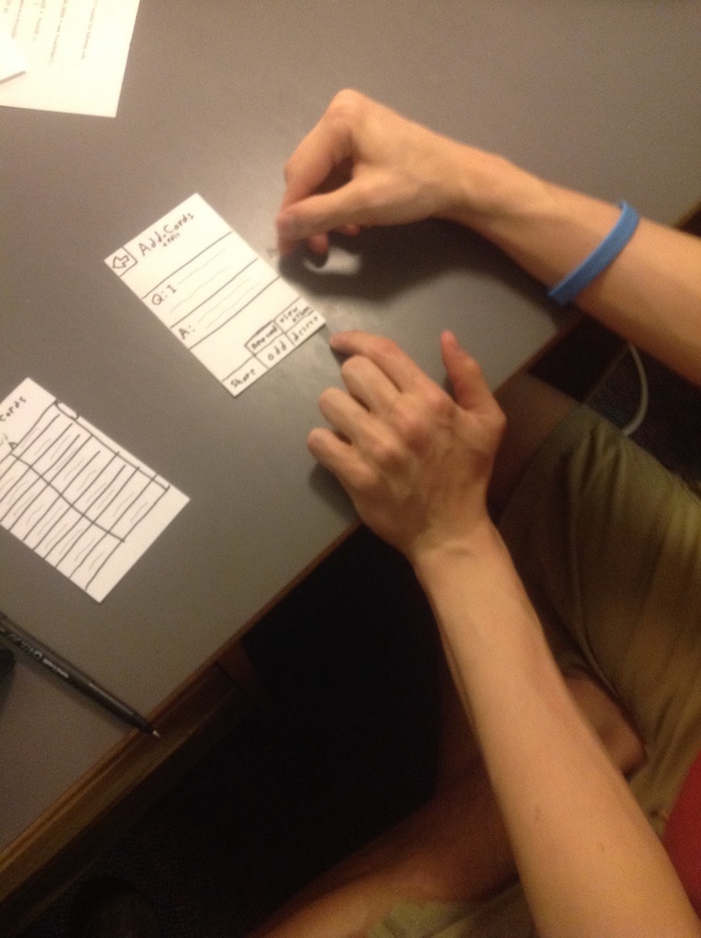
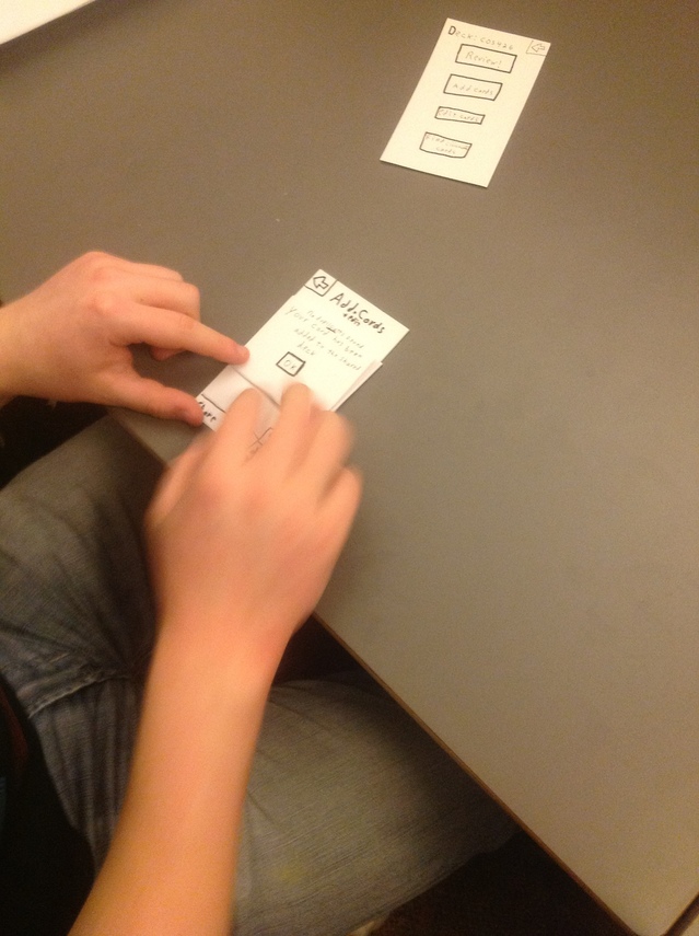
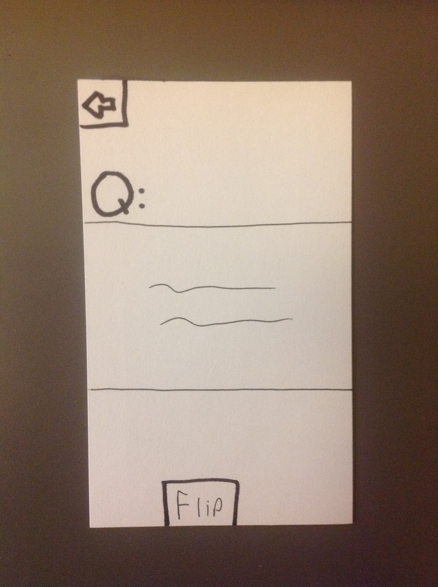
    • Confusion about buttons on the add/edit page. Does share share the current card? Does adding add the current card then bring up a blank card?
    • Easy/Hard/Repeat makes sense immediately
    • There are multiple ways to reach some pages, which can make it very confusing.
    • Find card page should allow user to ‘zoom into’ a card (pop it up in a larger size)
    • Allow to sort by username on find page
    • Way to share multiple cards at once
  • Clayton McDonald- MAT ’15
    • Like Harry, thought Easy/Hard/Repeat made intuitive sense
    • The back button on “add/edit” and edit card list should always go back to the deck page. Currently defined it in such a way that loops are possible, so a user could have to press back many times to return to deck page.
    • Combine add/edit into a single listing
    • Review all – Should go directly to card review page instead of to deck page
    • Should have a clear button on the add/edit page to immediately clear current card
    • Add the ability to tag cards by keyword. This allows searching by keyword when trying to study a specific topic or finding cards from other people.

Insights

The major insight from testing is that I need to simplify my design whenever possible. While most of the buttons make sense, having multiple ways to reach the same page can be confusing for the user. Users are also conflicted in exactly what they want. Harry liked the combined add/edit pages, while Clayton suggested separating them.  The 5 buttons on the add/edit page were especially confusing since there are many possible behaviors that make sense.

One feature that I would definitely want in the next iteration is the ability to tag cards and cram by tag and age. It is great to use spaced repetition techniques for people who do a little bit of studying every day (which is the main use case of the app), but the ability to concentrate studying is definitely helpful.

Assignment 2 Karena Cai

Student 1: Curious Student

After my Fluid Dynamics class was let out, this one particular student seemed to debate whether or not to approach the professor about questions he had about the course material. He was extremely rushed and kept glancing at the clock. In the end, he decided to quickly ask the professor one question, and then hurriedly left the classroom. When I later interviewed this student, he said that he frequently felt rushed to get to the next class, but always wanted to clarify concepts that were confusing to him and his friends. An application that allowed students to easily convey their confusion would be helpful in this situation so that the professor could address the topic in the next class.

Student 2: the Precept-Preparing Student

I also started to notice how students who had a humanities precept following the lecture would frantically finish the rest of their reading, and try to jot down some notes about the things they would say during precept. An app that either combined their lecture notes and reading notes so they could easily flip through material in one location would be useful. In this situation, an app that also helped summarize the reading (via a website like Sparknotes) would also be especially useful given the time limitations.

Student 3: the student confused by a PSET problem

When I got a seat my Engineering Dynamics class early, I noticed that most students would communicate to each other by yelling across the classroom. In their discussions with each other, they would often be talking about specific questions on the problem set, and making plans for working on them later. During these discussions, however, the professor would cut them off as he/she began lecturing. Since most students had a class following the lecture, they wouldn’t be able to finish their conversations unless via text later. It would be useful if there was an app that facilitated some type of mobile conversation between all the students in the classroom. This would also allow the professor an easier time to begin class without having to quiet everyone down.

Student 4: The Student Engrossed in her Phone

I observed that the most common things students did between classes were: e-mail checking, browsing through blogs, and occupying their time with a game on their phone. Other than chatting about the latest pset problem, there was little interaction between the students. Most of the time was spent as alone time. I think an app that cultivated some discussion between students, or acted as some type of convenient way to meet new people would be useful to facilitate conversation and make the waiting time a time to allow people to communicate face-to-face. Furthermore, when people walk from class-to-class will often-times walk with the same people, or nobody at all.

What I gathered from interviews with fellow classmates (Rishita Patlolla, Richard Cheng, and April Liang):

– Students wanted more time to approach professor and ask some clarifying questions
– Access to food on the way to classes would be extremely useful
– The walk is sometimes impossible to make in the given time
– There isn’t enough time to make lunch plans so students normally end up eating with the same people
– Printing is very difficult between classes
– Planning what to say in precept normally occurs during this time
– The time in between classes is generally hurried and slightly stressful

Brainstorming ideas (collaborated with Jean Choi)

  1. Seat-finder for the late student: helps a student who has walked into the classroom a few minutes late, find a good seat without interrupting the lecture
  2. Optimized route finder for the biker: calculates the best path for a student on a bike to take to get to his/her next path (based on congestion of people, traffic, weather, etc.
  3. Printing cluster optimizer: helps student find the most convenient and least congested printer in between classes
  4. Mindful meditation application: allows student to practice a few minutes of mindful meditation in between classes to relieve stress
  5. Social app: helps students find walking buddies, coordinate lunch and meet new people 
  6. Trivia game for class materials: review the material that was just taught during lecture
  7. Reminder app: helps student remember which classes to go to and what meetings they have for the rest of the day
  8. Precept discussion preparation app: pulls up all lecture and reading notes pertaining to the discussion that student is preparing for
  9. Device that syncs students mobiles who are currently in the classroom so that they can communicate about concepts or problems they are confused about and find a time to work on the problem sets together
  10. Exercising application: app that records how many calories being burnt during the trek across campus in-between classes
  11. Professor-alert: allows professor to immediately gain the attention of all the students and notify them that he/she is starting lecture; prevents class from ending later
  12. Blogging integrator: coalesces the most popular or funniest posts from every blogging website so student doesn’t have to scroll through the unfunny post
  13. A things-to-do app that can be imported to different devices (phone, computer, etc.)
  14. Coffee stands that allow students access to coffee between classes
  15. Application that allows students to access transcribed lecture notes so that the late student can know what he/she missed
  16. Fun brain game app: helps quickly stimulate thinking so student is more likely to pay attention during class
  17. Music-syncing device: if you want to walk with someone and listen to music, the app lets you and your walking buddy share the same music without sharing headphone2 Favorite ideas (1-sentence explanation for each of why you chose that idea)

Two Favorite Ideas

  1. Social app: helps students find walking buddies, coordinate lunch and meet new people
  • I chose this idea because a lot of people were complaining about not being able to socialize and meet new people after sophomore year, but this app helps optimize the waiting time between classes by allowing them to easily coordinate walking and lunch buddies who share the same interests (or at least the same paths to class)

2. Device that syncs students mobiles who are currently in the classroom so that they can communicate about concepts or problems they are confused about and find a time to work on the problem sets together

  •  I chose this idea because a lot of the time students are trying to coordinate working on problem sets before and after class begins, and students could more effectively and more discretely communicate by using this type of communication which involves the syncing of mobile devices.


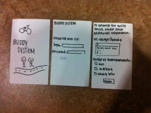
Left: The app cover; Middle: Where the user logs into the ICE network so that the app can access the user's schedule information; Right: Additional information the user should enter for optimal search results

Left: The app cover; Middle: Where the user logs into the ICE network so that the app can access the user’s schedule information; Right: Additional information the user should enter for optimal search results

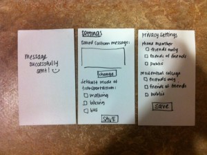
Left: message indicating that the text message was sent successfully; Middle: settings page that user can alter; Right: privacy settings that user can change to make app access less or more of the information they inputted

Left: message indicating that the text message was sent successfully; Middle: settings page that user can alter; Right: privacy settings that user can change to make app access less or more of the information they inputted

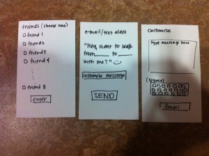
Left: screen allows user to choose a friend that they want to meet up with; Middle: default text message that is sent if user does not customize the screen; Right: option for user to customize the text message they send to friend/new person

Left: screen allows user to choose a friend that they want to meet up with; Middle: default text message that is sent if user does not customize the screen; Right: option for user to customize the text message they send to friend/new person

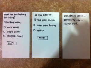
Left: user has the choice of what type of buddy he/she wants for the day; Middle: user has the choice of either meeting new people or meeting with their friends; Right: page that indicates what app is doing after the data has been inputted

Left: user has the choice of what type of buddy he/she wants for the day; Middle: user has the choice of either meeting new people or meeting with their friends; Right: page that indicates what app is doing after the data has been inputted

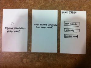
Left: screen that pops up as the device is syncing all user inputted information; Middle: screen that indicates that all the information has been saved successfully; Right: the home screen for the app with the main features

Left: screen that pops up as the device is syncing all user inputted information; Middle: screen that indicates that all the information has been saved successfully; Right: the home screen for the app with the main features

User-Testing

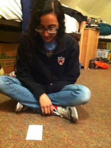
Rishita begins using my social app prototype!

Rishita begins using my social app prototype; she doesn’t immediately know what to do with the title page

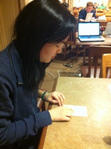
Jean wants a lunch buddy so she selects that option

Jean wants a lunch buddy so she selects that option but does not find the appropriate default text message afterwards

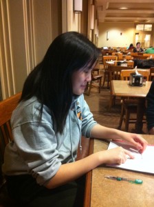
Yolanda wants to meet new people so she selects the find new friends button

Yolanda wants to meet new people so she selects the find new friends button; the page is a little wordy so she spends some time on the page

Second Prototype

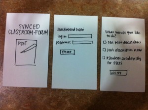
Left: the title page of the app; Middle: user must log into Blackboard so app has user's class information; Right: main features included in the app

Left: the title page of the app; Middle: user must log into Blackboard so app has user’s class information; Right: main features included in the app

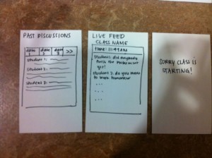
Left: the screen that allows the user to look through the past conversations; Middle: allows user to engage in live conversation with other students in the classroom; Right: interaction screen that pops up as soon as class is scheduled to start

Left: the screen that allows the user to look through the past conversations; Middle: allows user to engage in live conversation with other students in the classroom; Right: interaction screen that pops up as soon as class is scheduled to start

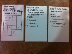
Left: asks user to put in the days and hours that the user is most available to work on problem sets; Middle: app lists all the different students that have similar preferences; Right: using information from Blackboard, the app relays some of the student's relevant contact information

Left: asks user to put in the days and hours that the user is most available to work on problem sets; Middle: app lists all the different students that have similar preferences; Right: using information from Blackboard, the app relays some of the student’s relevant contact information

Insight

I chose to test my buddy system social app with three different users. Every user testing offered some new insight into how I could change the interface for the app. When Rishita tested the application, she would struggle whenever she decided that she wanted to return to the home page and edit the information that she already entered. I realized the importance of making each stage of the app connect to the rest of the screens; this type of setup would allow for a lot more flexibility in accessing old information. Finally, she would often select options that I realized did not need additional pages in the application and in some cases, I had redundant pages (like asking the user their mode of transportation twice). I realized the importance of having relevant information and avoiding redundancy. When Jean tested my interface, she was sitting down to test my prototype. I noticed that the app was actually pretty time consuming, and the process itself took around 1-2 minutes. With respect to the waiting time (10 minutes), 1-2 minutes was actually already pretty time-consuming. This made me wonder whether it was really necessary to add the features where the app would tell the user when something was successfully completed. Again, the idea of redundant information came up. Finally, when Yolanda tested the app, I realized the importance of order. For instance, the text message should be customizable as opposed to set as a default message. This made me start realizing that the order of succession of screens should be very rational and easy to intuitively follow. What I took away from the experience, is that watching users interface with the prototype was extremely useful in understanding the flaws of the app; it also helped me better understand what types of interfaces are more intuitive. If I were going to actually develop an app, I would definitely engage in this prototyping process first.

Assignment 2: Jean Choi

Observation Notes:

I conducted my observations before my MUS 220 lecture (after arriving early), at Frist in the computer cluster/printer area from 1:20-1:30pm, and walking from Wu Dining Hall to the Friend Center between 7:20-7:30pm.
Student 1: MUS 220 lecture
Student 1 read a book for the ~5 minutes she had left before lecture started.  The flags in the book made it likely that she was working on class-assigned reading.  The student was very focused on the book, and continued reading until after the professor opened the class. She then hurriedly stored away the reading without using a bookmark, took out her laptop, logged in, opened up a word document, and started taking notes.
Student 2: Frist Printer
Student 2 arrived at the Frist 100-level printer around 1:20.  There were already a couple students at the printer, and he went to use one of the cluster computers to print his document. When he was done sending the document to the printer, there were 2 students in the line for the printer.  He asked the student immediately in front of the printer how many pages she had left to print, and when she didn’t have a definite answer, he asked, “More than 5 pages?”, and she said that was probably the case.  Instead of waiting, he ran toward the stairs, presumably to use the 200- or 300-level printer instead.
Student 3: Walking to the Friend Center
I walked with student 3 to the Friend Center from Wu Dining Hall.  After finishing dinner at a little after 7:20, we were pretty rushed.  While we walked, he took out his iPhone to check his emails, and quickly flipped through Facebook and some urban planning/architecture websites.  When I asked him, he said that he usually flips through the same few websites when he’s on his way to class (mostly Facebook and the Civil Engineering websites he was flipping through, and sometimes online news blogs).  Though after long breaks like lunch and dinner he is sometimes late to class, the rest of his classes are pretty close together, so he usually gets to class early.  He said he works on problem sets in that extra time, and actually makes pretty good progress on them throughout the course of the day.
Observation Insights
Observing these students helped me to identify some possible design focuses.  I thought that it was interesting that two of the students I observed did schoolwork between classes — I thought that the changing period would be too short to get anything done.  However, especially for Student 1, I thought that the work seemed to be disjointed, and the students might have problems remembering where they were and refreshing themselves before starting work. Maybe an app to “bookmark” their work for quick review would be helpful.  Student 2’s experience with printing was also similar to bad experiences I’ve had with printing, so I thought that this was a possible design opportunity.  Finally, Student 3 showed me what I initially thought most students would do — looking at websites and email.  I was surprised that he regularly visited civil engineering websites, and it made me think “outside the box” in terms of web browsing (I had previously thought of apps to only integrate Facebook and Gmail, etc).
Brainstorming
1. An app for printing documents for classes quickly and finding the nearest printer.
2. An app that learns over time how long it takes to walk to your classes, then gives you approximate times to help you avoid being late.
3. An app that helps you find where your friends are sitting in large lecture halls, possibly with an interactive map
4. An app for late students, that provides a transcript or notes on the first few minutes of lecture
5. An app that shows what you’ve missed on social media/news sites during the previous class
6. An app that allows teacher/student or student/student interaction after classes for questions and answeres
7. An app that keeps track of the distance, speed, and calories you burn walking to classes
8. An app that suggests easy ways to get more exercise out of your between-class walk (speed-walking, walking backwards, etc)
9. An app that suggests people to call and keeps track of how long/often you talk
10. An app for pre-lecture preparation: the professor can upload study questions or notes
11. An app that stores the questions of psets you are working on and allows you to think about them while walking
12. An app that keeps track of the number of people in different libraries and study spaces, allowing you to decide where to go
13. An app that combines sound bytes of breaking world news that plays for 10 minutes.
14. An app that lets you know which coffee machines on campus are empty.
15. An app where you can input your food/drink preferences, and it suggests places with menus you would like.
16. Consolidates events on campus that you would be interested in (you set the filters)
Prototyped Ideas
 
– “Quick-Printer” — I chose this idea because I’ve been frustrated by trying to print between classes many times, and I thought it was an idea that would appeal to many students and be very practical, allowing them to be more prompt and prepared for class.
Captions:
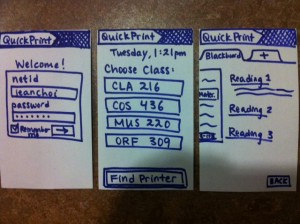
1. From left to right: The welcome screen for QuickPrint, which uses netid and password to sync with ICE and BlackBoard; The personal “home” screen, which lists your classes (from ICE) in the order of closeness to the current time and a button to the “find printer” map and interface; the Blackboard course materials list, which is the default location when the user picks one of his/her classes.
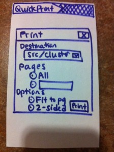
2.  The print pop-up window that meets users every time they print a document.  The options are similar to the options that come up when one tries to print a document from Blackboard using a normal internet  browser.
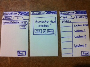
3. The sequence of screens that faces a user trying to obtain documents from a website other than Blackboard. From left to right: The user types the URL into the new tab (with the + sign); a pop-up window allows users to select whether they want that link to be “remembered” by that class (for example, remembering the COS 226 course website to print out lecture notes); the new website, with the printable links.
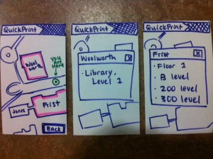
4.  The screens related to the map part of the application. From left to right, the main map screen that uses the user’s GPS location; the popup window with printer locations for Frist (accessed when the user presses on the picture of Frist on the map); the popup window with printer locations for Woolworth.
1.Print_1 2. Print_4 3. Print_3 4.Print_2
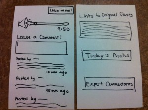
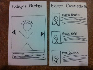
– “World News in 10 minutes” — I chose this idea because I’m often concerned about how little I hear about world events while in the Orange Bubble, and this app would not only be very informative, but also make my usually boring walks more interesting.
Captions:
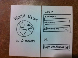
1. The home page and login page for “World News in 10 Minutes”.  Login can also be synced with Facebook.
2. Left: The main page that includes the 10-minute podcast and allows users to comment. Right: Options for people who want to learn more: links to the original news stories, photos, and expert opinions.
3. The pages for the extra options: A slideshow of pictures from around the world from that day, and expert commentary on the news stories that are mentioned.
1.  News_1 2. News_2_better 3. News_3
Paper Prototypes
“QuickPrint”
QuickPrint is a mobile application that makes printing between classes faster and less frustrating.  Using data from ice, it finds which classes you are enrolled in and which ones you are most likely to want to print documents for at a certain time.  It allows you to navigate to these classes’ Blackboard Course Materials page at the click of a button, or go to another website (e.g. Piazza or a course website) where documents are located, then print the documents there. It “learns” the links of web pages other than Blackboard that contain class documents so it will be easy to print documents from that location at a later time.  Finally, it uses data from your phone’s GPS to locate the nearest buildings containing printers, then displays the locations of those printers.
World News in 10 Minutes
This is an application that makes a 10-minute summary of world news every day, for students to listen to on their way to class. It has a simple interface with a 10-minute story that updates every day.  Students can listen through their phones or iPods.  There is also a comment features that lets listeners express their opinions and engage more actively with the news.
User Testing
 
Rishita
Rishita Patlolla testing my prototype. She found navigation fairly intuitive, but sometimes looked for back buttons where I had not implemented them.  She also suggested that I add a “home” button, or make the top bar with the “logo” a link to the homepage.
Rishita Patlolla:
Rishita navigated through the user interface very quickly, and did not have many problems using the application.  She tried to click on the printer options, which I had not accounted for in my paper prototype.  She made the suggestion that it be able to sync automatically with various library printers, which are not on the same network with the rest of the campus printers.  She also suggested that I include a “recently printed” link on the homepage in case a user wants to print a certain documents (or different sections from the same document) multiple times.  A very immediate change that she suggested was that I add a “successful printing” popup window to confirm that users had printed a certain document.  Finally, we talked about whether or not it would be useful to make an internet browser accessible on the homepage (so you don’t have to first click on a class to access the internet) — we thought that though it was a useful feature, it would be good to think about where to draw the line with internet accessibility (at what point does it become too much like a regular web page?)
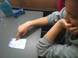
Yolanda_1
Yolanda navigates the popup windows from the map, which list the locations of the printers. She thought they were clickable, and suggested that I make them clickable with the printers’ status.
Yolanda_2
Yolanda starts to use my prototype
Yolanda Yeh:
Yolanda had many useful suggestions and insights about the prototype which gave me many ideas for future improvement.  She asked why I had a back button on certain screens and not others (such as the popup window for the locations of printers), and pointed out that Android apps automatically have back buttons built in, so I would only need to do this for an iPhone app.  She also said that it would be very helpful to let the user know whether certain printers were broken, as is done by the Point app currently implemented for Princeton.  Maybe I could sync my app with Point to add this feature. In addition, Yolanda commented on her experience with accessing Blackboard from her iPhone.  Blackboard is often slow and has a frustrating sign-in process, and the process it has for opening and printing documents is not very user-friendly.  I might want to find a different way to implement this for my app instead of just using Blackboard’s functions.  Finally, she asked if I had considered adding a print preview to the documents, and we talked about how feasible this would be given the small size of smartphone screens.  I think this is an important trade-off that comes up in mobile apps — more information vs more cluttered interface — and I think I should spend some time putting more thought into how I make this decision in my app.  A couple non-intuitive things about my interface that I noticed as she navigated was the setup of the tabs on each class page.  She seemed confused about what the tabs actually were (she asked if they were just internet browsers), and wasn’t sure what it meant when the app asked her if she wanted to “save” that location.  This made me think again about how similar/different my app is from a web browser (a similar issue as the one that came up when Rishita tested my prototype).  In addition, on the second page (Pick class, or find printer), she thought that the classes were “options”, and the “Find Printer” button was the only real button, when actually they are all buttons that lead to new pages.  I might want to make that more clear in my prototype.
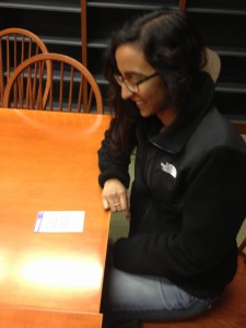
Karena
Karena using my prototype. She found the alternation between “back” buttons and x boxes confusing, and tried to slide screens I had not expected would slide.
Karena Cai:
Karena also pointed out many opportunities for improvement in my app.  She said that though my app might make it faster for students to send documents to the printer and find close printers, sometimes the real problem occurred when the student actually got the printer and found a line of students there. She suggested that I make a feature on my app that sees how busy each printer is.  She also asked how my app would deal with different types of documents (word documents, pdfs, etc), and whether it would show the document before printing.  This had also come up when Yolanda tested my prototype, so it’s definitely a part of my app that I should think about.  Some things I noticed during my observations was that she used the “slide” feature of iPhones frequently, and I had not built it into some of my screens.  She also did not see some of the x boxes on the popup windows, and was looking for “back” buttons instead — I think I should be more consistent in using x boxes vs back buttons.

A2 Shubhro Saha

Conducting Observation Description

I caught three students from my MAE 305 class as we were walking out of the Computer Science building and towards our next class. The prototype I tested was for a mobile app that asks users questions for psychology studies in return for monetary compensation when studies a completed over the course of a week. During the interviews, I noted that all the users navigated the user interface quite easily. Each screen flowed to the next, and most users had no problem understanding the questions. Two of the users suggested the application intelligently draw data from the mobile device’s behavior over the course of a day. For example, it should send notifications only when it knows the student has a free class schedule. In addition, it can draw from information like dining halls and geolocation to infer best responses and suggest them to make getting through the pscyh study much easier. The final user suggested I add colors to the application to inrease the appeal factor with end users.

Idea Brainstorm — Collaborated with Andrew Cheong and David Dohan

  1. Students should complete psychology studies in a piecemeal fashion to earn monetary compensation
  2. Late students should lose money to charity every time they’re late to class, creating concrete motivation to be on time
  3. Students should play a game of memory on the projector to pass the boredom
  4. Teachers should play review questions on the projector in the same way movie theaters show previews before the feature film
  5. Students should play laser tag across the classroom with their iPhones to solve boredom
  6. The Daily Prince should conduct polls to everyone in the classroom, especially if they’re tring to target a certain demographic of the student population
  7. Students should have questions related to the class answered by their peers, and the teacher should kick off with the ones the students could not answer amongst themselves
  8. Local restaurants should come give sample food to passers by students to promote their wares and excite the student customer base
  9. Students should stand up in front of the classroom and be student ambassadors for corporate brands like Microsoft, and convince their peers to adopt the company’s services
  10. Teachers should have a lounge where they socialize in between classes
  11. The dining hall should provide free samples to get student feedback on new dishes
  12. Campus Fitness should conduct free exercise activities while students are waiting for class to begin. Nothing like Zumba to get the mind ready for class
  13. Students should give each other job interview questions so they’re better prepared for their upcoming interviews
  14. Students should give mini-lectures in the time before class begins to share interesting things they’ve discovered about the class subject
  15. The teacher should conduct a game of Jeopardy to review class material


2 Favorite Ideas

  1. Students should complete psychology studies in a piecemeal fashion to earn monetary compensation. I like this idea because it kills two problem birds with one stone: student boredom and the struggle to elicit responsive psychology study subjects
  2. The teacher should conduct a game of Jeopardy to review class material. Similarly, this idea helps to review class material and kills student boredom at the same time.


Photos & Descriptions of Prototypes

In this first prototype, we see a sample user workflow for a mobile app that asks psychology study questions to students waiting in between classes. The app asks for the student’s mood, eating, and energy levels at the moment.

In the second prototype, we see the user experience for a student sitting in class, where the teacher conducts a game of Jeopardy on the board to review previous class material.

Photos & notes from user testing

A live test subject using my prototype!


  • Initially, my first user didn’t understand the context of the application, so I started to give background information about what this study was for and what this prototype intended to model
  • After initial background information, users navigated the prototype’s flow quite easily
  • When asked, all of them responded that they would be willing to complete these short studies in-between class for monetary compensation. One out of the three said they would do it for free.


Insights From Testing


  • Give more background information on the home screen to set up users for what they’re about to do
  • Perhaps take advantage of the phone’s geolocation abilities to customize responses to the psych study questions
  • Monetary compensation seems to be a requirement for user engagement

Assignment 2 – Clay Whetung

Oberservations

I preformed two rounds of observation, one was performed in the ten minutes before a precept for URB201 and the other was performed in the ten minutes before URB201 lecture. I decided that it would be beneficial to observe the two primary class “types” at Princeton and also consider any observations that appeared in both. URB201 lecture occurs at 1:30pm on Tuesdays and URB201 precept occurs at 1:15pm on Thursdays. During lecture I observed my professor (the lecturer) and two students, one who had a laptop and another who had not brought theirs to class. I observed the following:

URB201 Lecture:

Professor:

  • Spent a brief amount of time (~ 2 minutes) preparing the PowerPoint presentation for lecture
  • After the projector was prepared, the professor spent about ~5 minutes conversing casually with students seated in the front rows
    • This was particular interesting as students who were not in the first few rows did not have contact with the professor
    • The remaining time was spent talking with the present preceptor
    • After the professor had set up her lecture slide, the first slide was present on the screen, allowing students to view the start of the lecture
    • Before the start of class the professor closed the main entrance to the lecture room

Laptop Student:

  • Student spent the entirety of pre-lecture time on their laptop
  • They performed simple procrastination tasks, (I,e, Facebook, ESPN etc.)
  • They were seated far from the front row (the very last row)
  • No contact was made between the professor (or the preceptor) and the student

Non-Laptop Student:

  • This student appeared to be doing readings for a class  before lecture (unsure of whether it was for URB201 or not
  • He also spent a brief time conversing quietly with a another student who sat next to him
  • Student checked their phone periodically

In the URB201 precept observations, I took noted on the actions of the preceptor and one other student.

URB201 Precept

Preceptor:

  • Preceptor spent ~2 minutes organizing papers, silently
  • She then began to engage some of the students in some brief discussions about the class (i.e. is this blog post due time working)
  • The remaining time before precept was spent engaging students in casual conversation

Student:

  • The student was on his laptop throughout the beginning of precept (and during)
  • Was procrastinating on the internet (Facebook, Reddit, etc.)
  • Did not converse with the preceptor

Overall Observations

  • Students seemed less inclinesd to engage others when their laptops were available
  • Professor and Preceptors seemed very willing to engage students when it was possible
  • Physical distant made communication between people much less likely to occur
  • The rooms were mostly quiet and speech tended to be hushed
  • Many students appeared to have smart phones available

Brainstorm


  1. A live forum, similar to Piazza, is projected in front of the class. Students can log in and ask questions that will be answered in real time by the professor.
  2. Chat room for the students in the class to procrastinate together. Large chat room to post pictures of cats, or discuss the class possibly.
  3. A web space where students can log on and make plans for their next meal (since students often meal exchange and classes usually occur before lunch or dinner). It will able to track email exchanges so students remember to take them
  4. An application that will allow students to mark e-mails that they didn’t have time to respond to, and reminds then to answer them when they have free time before class
  5. 1 vs 100 style game that students can log into before class starts. The game is played with trivia questions from the previous lecture. (basically a trivia game where those who answer the question incorrectly are eliminated). If the 1 player ( a random student) wins then they may be giving some reward.
  6. A twitter style feed where students can log in and post notifications to other students in the class. This can be used to post questions about the class, or to find study groups (i.e. “Hey, anyone want to work on this problem set Wednesday night? cwhetung@”)
  7.  An arcade system that students (and Professors) can log into from their laptops with their netIDs. There will a selection of simple game (light bikes, Tetris, Pong. Etc.) that students can play against each other.  Will have chat to help facilitate communication between players and help members of the class get to know each other
  8. A quick polling system that the professor can use to poll students 10 minutes before class. The poll will be between different short ~6 minute, non-class material lectures, the slides for the winner will be automatically shown and the professor will deliver the short lecture
  9. A Pokémon style game that can only be played against other students in the same class, each student is given a random starter Pokémon t the start of the semester. Since play is limited to the time before class, students are encouraged to arrive early to level their Pokémon
  10. System that students log into as they arrive to precept, a student who is at precept is randomly selected to give a brief analysis of their thoughts on the week’s readings before class begins.
  11. An application that selects a random passage from the week’s reading and projects it before the start of precept. Then students are encouraged to discuss that small slice of the week’s information
  12. A webpage that students can log into . It is a stream of webpage that other students in the class have found to be interesting, it operates as a passive Reddit, where the user doesn’t need to take action as the information is feed to them automatically
  13. An app that can calculate the time to walk between locations on campus quickly. Can be sued to ensure that you don’t arrive early to class and have to wait around!
  14. Before class begins, have last class’s lecture slides repeat on screen as a quick reminder to the students
  15. Digital doodle board that allows students to draw together
  16. Students can sign up online for an off-topic presentation before class (I.e. sing a short song, do a jig)
  17. Have an online poll that would allow students to say what they did/did not like about previous lectures for on the fly improvements

Chosen Ideas

Online Arcade: Gives students a way to have fun, relax and interact with each other easily before class.

Short Lecture Poll: A great way to learn more about a professor’s studies outside of the topic of the class.

Prototyping

Online Arcade:

This slideshow requires JavaScript.

Short Lecture Poll:

This slideshow requires JavaScript.


Feedback

Feedback was gathered from three testers, Paulius Paulaskas ’13 (ORFE), Mengou Zho ’13 (WWS) and Eric Penalver ’13 (CBE). I presented each of them with the welcome splash and informed that that it was an activity to be done in the ten minutes before class began. Below are some of them using the prototype:

This slideshow requires JavaScript.

  • It was unclear what the “Play Again” Button was for
  • It was unclear if it was a touch interface or a desktop interface
  • There were no instructions for the games
  • Users couldn’t log out, except for after a game
  • It would be useful to see my record other times as well
  • Users would like to be able to choose who to play in class
  • The ability to see the records of other classmates was highly requested
  • It was unclear why a class had to be selected
  • Users were unsure if they could leave a game in the middle
  • Users would like the ability to chat
  • Would enjoy a friendly form of procrastination before class

Insights:

  • It is extremely important to make it clear to your testers what they are experiencing
  • Students would like a chance to relax before class, rather than work
  • Users enjoyed the social  aspect, but would like it be more pronounced
  • There were aspects that users expected, such as a log out, or leave game button, that weren’t present
  • It would be beneficial to provide users with some analogue that represents the input tools they have available. Such as giving them a keyboard that isn’t attached top anything.
  • Users liked the competition aspect, but it should be made clearer to them who they are competing with, why they are competing with and where the completion stands