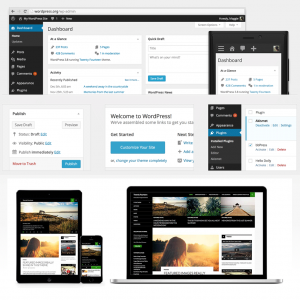
 The time between semesters is usually our opportunity to upgrade to major WordPress releases. This Tuesday morning will bring version 3.8, which includes a major overhaul to the admin interface. Light gray, low contrast is out; dark gray, higher contrast is in. Shadowed, multicolor icons are out; flat, scalable icons are in.
Using a responsive design, the interface is newly optimized for smaller device widths and higher resolution displays.
I will be adding a slightly modified version of the Twenty Fourteen magazine theme, as well.

You must be logged in to post a comment.