Your group number and name
Group 25 — Deep Thought
First names of everyone in your group
Neil, Harvest, Vivian, Alan
1-sentence project summary
AcaKinect is voice recording software that uses a Kinect for gesture-based control, which allows content creators to record multiple loops and beat sequences and organize them into four sections on the screen, which is a more efficient and intuitive way of presenting a music recording interface for those less experienced with the technical side of music production.
Introduction
We are evaluating the ability of musicians with various levels of technical and musical expertise to use the AcaKinect system to make music. AcaKinect’s functionality is a subset of what most commercial loop pedals and loop pedal emulators are capable of; it is intentionally designed to not provide a “kitchen-sink experience,” so that musicians – many of which are not also technicians or recording engineers – may easily jump in and learn how to use looping and sequencing without having to climb the steep learning curve involved in using commercially available looping products. Thus, this experiment is good for modelling what real users would do when faced with this system for the first time; we are much more concerned with allowing users to jump straight in and start making music than enabling experienced users to use advanced functionality.
Implementation and Improvements
The implementation can be found here. We have fixed several instabilities and exceptions that may cause the program to crash; we have also added prototype indicators so that the user knows how many loops are in each column.
Method
Participants:
Participant 1 is an English major who has some technical music production background, and has used Garageband and Audacity to record raps. Participant 2 is a literature major with formal classical training in violin and piano, but no prior experience in the technical aspects of music production. Participant 3 is an ORFE major with formal training in flute and piano and also no prior experience with technical music production. Participants 2 and 3 were chosen to be a baseline user; how well can musicians with no background in recording or producing music use this system without any prior training? Participant 1, who has some recording experience, allows us to determine whether a little bit of prior technical knowledge helps make the learning process much quicker.
Apparatus:
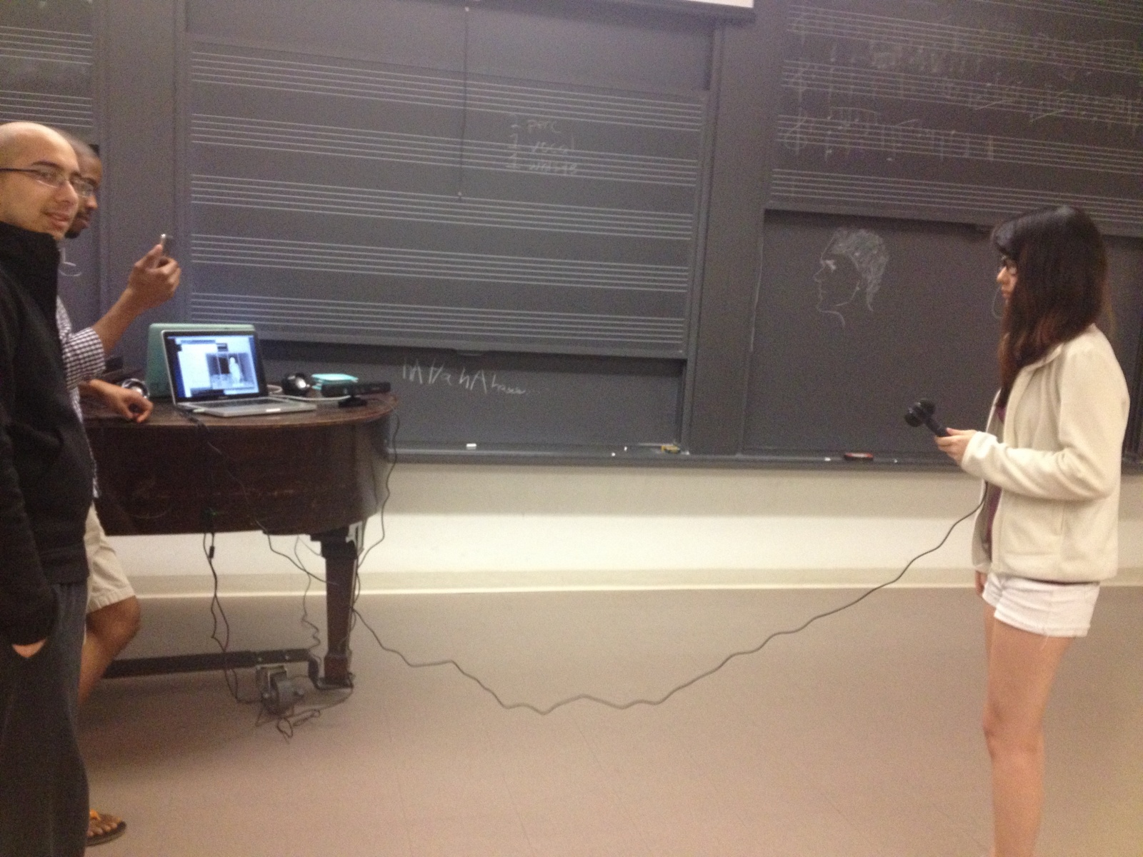
A laptop running Processing is connected to a Kinect and a microphone, and optionally a set of speakers; the user stands an appropriate distance from the Kinect and sings into the microphone. Note that the microphone should ideally be highly directional, such that the live-monitored output from the speakers does not generate feedback. Most ideally, the user would be monitoring the sound using a pair of headphones; this would eliminate the feedback issue. However, in our tests, we simply used the laptop’s speakers, which were quiet enough not to be picked up excessively by our microphone, which was an omni mic. Experiments were all conducted in a music classroom in Woolworth, so that testers could feel free to sing loudly.
Tasks:
Task 1: Record a simple loop in any one of the sections. It can have whistling, percussion, singing, etc. (This is meant to test the user’s ability to grasp the basic mechanics of recording music using this system; calibrating and then signaling to record a track are tested here.)
Task 2: Record any number of loops in three different sections and incorporate the delete feature. (This adds in the core functionality provided by the column abstraction; we would like to see if users structure their recordings by grouping similar parts into the same column. Deletion is added into the core gestures.)
Task 3: Create organization in the loop recording. For example, record two percussive sections in the first section, one vocal section in the second section, and maybe a whistling part in the third section. (This encourages users who may not have used columns to structure their recordings to do so; we want to see whether they pick up on this design choice or ignore it entirely.)
Procedure:
First, the users read and signed the consent form, and then filled out the questionnaire. We then demonstrated the main workings of the system, including the concept of columns and the requisite gestures to interact with the system. Next, we read the description of each task, and allow the user to try out the task uninterrupted; if the user has questions, we will answer the question, but we do not prompt if the user is struggling with some aspect of the task but has not explicitly asked for assistance. Finally, when the user has completed the tasks, we ask a few general questions about the experience to get overall opinions.
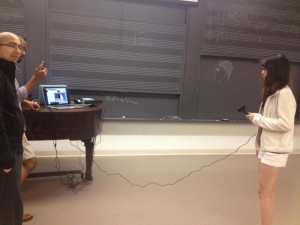
The test setup. Here, you can see the positions of the laptop, Kinect sensor, user, and microphone.
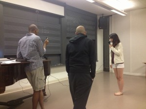
We tested in Woolworth music hall, to allow users to be loud in recording music.
Test Measures:
- Timestamps of significant events (e.g. starting and stopping recordings): we want to gain a general picture of the amount of time users spent in certain states of the system, to see if they are dwelling on any action or having trouble with certain parts of the system.
- Timestamps of significant observations (e.g. struggling with the delete gesture): we want to track how often and how long users have problems or otherwise interesting interactions with the system, so we can identify potential areas of improvement.
- Length of time needed to perform a “begin recording” gesture. Since this is one of the most fundamental gestures needed, we want to make sure that users are able to do this quickly and effortlessly; long delays here would be catastrophic for usability.
- Length of time needed to perform a “delete track” gesture. This isn’t quite as central as the recording gesture, but it is one that may still be frequently used, especially if users want to rerecord a loop that wasn’t perfect; we also want this to be fast and accurate, and if the user has to repeat the gesture multiple times, it will take too long.
Results and Discussion
-
We discovered that a primary problem was text visibility: users simply were unable to read and distinguish the various messages on the screen indicating when a recording was about to start, so in certain cases, when the screen read “get ready…”, the student would start singing immediately after the recording gesture. In some ways, this is a good problem to have, since it is fairly simply fixable by providing more contrast and possibly more prominent textual cues that are more visible against the background and the rest of the UI, so the users know exactly when to start recording. This also applies to the beat loops, which are currently just shown as numbers on the screen; once the block metaphor is implemented, this should be less of a problem as well.
- There were several issues with using the Kinect to interact with the system. We found that in order for gesture to be accurately recognized, the user must be standing reasonably upright and facing the Kinect; tilting of the body can cause gestures to not be recognized. While we do provide the skeletal outline onscreen, it seems that the users either did not recognize what it was, or just did not look at it to figure out whether gestures would be picked up or not; thus, some gestures were performed repeatedly (like deletes) in ways that would just not be picked up by the Kinect. We found that slow delete gestures worked much better than fast ones, but it did not seem that the users realized this immediately after a few attempts. In order to fix this, we could provide some indication that the Kinect saw some sort of gesture, but did not know what to make of it; a message on screen along the lines of “Sorry, didn’t catch that gesture!” might go a long way in helping the users to do gestures in a way that is more consistently recognizable. In addition, it seemed that users had some issues moving side to side through columns, as there is actually a considerable distance to move physically if the user is standing far enough back from the Kinect. We do not really consider this a problem, but rather just something that the user needs to acclimate to; perhaps clearer indication of which column the user is in would help in sending the message that recording in various columns is highly dependent on the user’s physical location, which also helps to reinforce the idea that different structural parts of the music belong in different spatial locations.
-
A more fundamental issue we have currently is that our code and gestures do not deal with the addition of the microphone properly; in this case, we didn’t use a mic stand (which is a reasonable assumption, since most home users who have never touched music recording software would probably also not have a mic stand). Thus, when the user holds the microphone naturally, the recording gesture is less intuitive to perform, but still possible, since it is a one-handed gesture; the two-handed delete gesture is by far much more difficult to perform while simultaneously trying to hold a microphone attached to a long cable. Thus, a reasonable idea would be to try to adapt the gestures to be one-handed such that one hand can always be holding the microphone in a reasonable location, and so that the presence of the hand holding a mic in front of a face does not confuse the Kinect’s skeleton tracking abilities.
-
We also have to work out some technical issues with the Kinect recognizing the user; one problem we saw was that the calibration pose can easily mistaken for a record gesture if the user has already calibrated. Similar problems also occur if the user ducks out of the frame and then reenters, or to a lesser extent when the user’s skeleton data is temporarily lost and then reacquired; however, these are purely technical issues, not design issues.
-
We believe that repeating these tests with a larger population of testers will not produce vastly different results, since most of the problem spots and observation we found were suggested by multiple users and were acknowledged to be potential areas for improvement. In addition, our test users approximated very well the type of users we want to be using this system, having a good amount of musical experience but very limited technical experience; their inputs were cross-corroborated with the other testers, which would suggest that their suggestions and problems are going to correspond fairly well with what we would have seen given a larger population.
Appendices:
Consent form:
PROTOTYPE TESTING CONSENT FORM
PRINCETON UNIVERSITY
TITLE OF PROJECT: Aca-Kinect
INVESTIGATING GROUP: Group 25 (Neil C., Harvest Z., Alan T., Vivian Q.)
The following informed consent is required by Princeton University for any research study conducted at the University. This study is for the testing of a project prototype for the class “Human Computer Interaction” (COS 436) of the Spring 2013 semester.
Purpose of Research:
The purpose of this prototype test is to evaluate the ease of use and the functionality of our gesture-based music recording software. The initial motivation for our project was to make simpler software for beat sequencing, allowing one person to easily make complex a capella recordings. We will be interviewing three students for prototype testing. You are being asked to participate in this study because we want to get more insight on usability and how to further improve our gesture-based system.
Procedures:
You will be asked to listen to our basic tutorial on how to use the gesture-based system and perform three tasks using the prototype. The tasks require that you sing and/or make noises to simulate music recording. We expect your participation to take about 10-15 minutes of your time, and you will not be compensated for your participation but will earn our eternal gratitude.
Confidentiality:
Your answers will be confidential. The records collected during this study will be kept private. We will not include any information that will make it possible to identify you (such as name/age/etc). Research records will be kept in my desk drawer and only select individuals will have access to your records. If the interview is audio or video recorded, we will destroy the recording after it has been transcribed.
Risks or Discomforts/Benefits:
The potential risks associated with the study include potential embarrassment if the participant is not good at singing, however we will not judge any musical quality. Additionally since we are using a gesture-based system, the participant may strain their muscles or injure themselves if they fall.
Benefits:
We expect the project to benefit you by giving the group feedback in order to create a simpler, more efficient system. Music users and the participant themselves will be able to use the system in the future. We expect this project to contribute to the open-source community for Kinect music-making applications.
I understand that:
A. My participation is voluntary, and I may withdraw my consent and discontinue participation in the project at any time. My refusal to participate will not result in any penalty.
B. By signing this agreement, I do not waive any legal rights or release Princeton University, its agents, or you from liability for negligence.
I hereby give my consent to be the participant in your prototype test.
______________________________________
Signature
______________________________________
Date
Audio/Video Recordings:
With your permission, we would also like to tape-record the interview. Please sign below if you agree to be photographed, and/or audio videotaped.
I hereby give my consent for audio/video recording:
______________________________________
Signature
______________________________________
Date
Demographic questionnaire:
Here’s a questionnaire for you.
Age _____
Gender _____
Education (i.e. Princeton) __________________
Major (ARC, FRE, PHI…) _________
Have you ever in your life played a musical instrument? (Voice counts) List the instruments you have played.
__________________________________________________________________________________________
Tell us about any formal musical training you’ve had or any groups you are involved in (private lessons, conservatory programs, Princeton music classes, music organizations on campus, etc).
__________________________________________________________________________________________
Have you ever used music recording or live performance software (Audacity, Garageband, Logic, ProTools, Ableton, Cubase, etc)? List all that you’ve used and describe how you’ve used them.
__________________________________________________________________________________________
Have you ever used music recording/performance hardware (various guitar pedals like loop/delay/fx, mixer boards, MIDI synthesizers, sequencers, etc)? List all that you’ve used and describe how you’ve used them.
__________________________________________________________________________________________
Are you a musical prodigy?
Yes ______ No ______
Are you awesome?
Yes ______
Demo script:
Your Job…
Using the information from our tutorial, there are a few tasks we’d like you to complete.
First, we’d like you to record a simple loop in any one of the sections. It can have whistling, percussion, singing, etc.
Next, we’d like you to record any number of loops in three different sections and incorporate the delete feature.
Finally, we’d like you to create an organization to your loop recording. For example, record two percussive sections in the first section, one vocal section in the second section, and maybe a whistling in the third section. The specifics don’t matter, but try to incorporate structure into your creation.
Additionally, we’d like you to complete the final task another time, to see how quickly and fluidly you can use our system. We’ll tell you exactly what to record this time: 2 percussive sections, 1 vocal (singing section), and 1 whistling section.
Post-task questionnaire:
AcaKinect Post Trial Survey
1. What is your overall opinion of the device?
2. How did you feel about the gestures? Where they difficult or confusing in any way?
3. Are there any gestures you think we should incorporate or replace?
4. What about any functionalities you think our product would benefit from having?
5. Do you feel that with practice, one would be able to fluidly control this device?
6. Any final comments or questions?
Raw data:
Lessons learned from the testing:
-
Main problem — text visibility! Need to make the text color more visible against the background and UI clearer, so the users know exactly when to start recording and can see the beat loops.
-
Realized our code did not deal with the addition of the microphone properly, such as how the user naturally holds the mic (interferes with the recording gesture), or the delete function (when holding the mic, hands do not touch)
-
Person’s head needs to be perpendicular to the Kinect or their gestures won’t record as well
-
People didn’t utilize the skeletal information displayed on screen, seems like they didn’t understand how the gestures translated
-
Slow delete gestures were best, compared to fast gestures which were hard to track by the system
-
Calibration pose mistaken for a record gesture if it is not the first time calibrating (user leaves screen and then returns), need to check for that.
-
We found out that the MINIM library we used requires us to manually set the microphone as audio input, so during the second subject test we determined that we were actually using the laptop’s built in mic, which accounted for the reduced quality of sound and feedback from previous loop recordings
Test Subject #1:
Demographics:
-
20
-
M
-
Princeton
-
English
-
Nope
-
N/A
-
Yes; garageband, Audacity (Recording Raps)
-
No
-
No
-
No
00.00 Begin reading of the demo script
00:13 Subject agrees current music recording interfaces are hard to use
02:30 Question about why there are different boxes. We explain that it is a way to organize music.
04:09 Begin testing for Task 1
04:25 Not clear about how to calibrate, asks a question
04:45 Tries to start singing before the recording starts, can’t see messages or numbers on the screen very well, doesn’t think the blue text color is visible
05:01 Begin testing for Task 2
05:37 Attempt to do the same delete feature six times. Subject thinks the delete function is hard to use. The quick motions of the subject are hard for the Kinect to track. Also, the subject was holding the mike so their hands were not perfectly together. This caused our gesture detection to not register the control request.
06:45 Subject says, “I can’t see when it’s recording” referring to the text. Color is hard to distinguish against the background.
06:50 Begin testing for Task 3
07:00 Gestures are harder to detect on edges, subject’s attempt to delete on the edge needs to be repeated several times
07:42 Recording did not register when holding the mike up at the same time. Need more flexibility with the gesture command.
Time testing (Recording tracks): 5s, 6s, 8s, 9s
Time testing (Deleting tracks): 20s, 10s, 15s, 11s,
Test Subject #2:
Demographics:
-
18
-
F
-
Rutgers
-
Literature
-
Yes; violin and piano
-
Private lessons
-
No
-
No
-
No
-
Yes
00:00 Begin reading of the demo script
02:26 Begin testing for Task 1
02:35 Ask about how to configure (get the Kinect to recognize their body)
02:48 Subject says that can’t see the information on the screen
03:28 Subject starts recording and begins singing immediately, because the “Countdown…” message was not clearly visible.
04:07 Subject repeats that the information on screen is hard to see
04:46 Begin testing for Task 2
05:03 Subject missed the start of the recording because they couldn’t see the on-screen text
05:17 Second attempt to record in the same column
05:46 Delete action was not successful
05:51 Delete succeeded
06:25 Begin testing for Task 3
07:44 Needed to stop and reconfigure because the Kinect lost tracking of body
09:32 The subject did not put their arm high enough so the recording command was not detected
Time testing (Recording tracks): 5s, 4s, 5s, 5s
Time testing (Deleting tracks): 7s, 10s, 15s, 11s,
Test Subject #3:
Demographics:
-
20
-
F
-
Princeton
-
ORFE
-
Yes; piano and flute
-
Private lessons, high school orchestra
-
No
-
No
-
No
-
Yes
00:00 Begin reading of the demo script
02:10 Begin testing for Task 1
02:11 Subject didn’t remember to calibrate before attempting to record
02:20 Calibration
02:22 Subject records
02:54 Begin testing for Task 2
03:30 Subject easily uses the delete command
03:41 All recorded tracks deleted
Summary: not much trouble, only calibration
04:42 Begin testing for Task 3
04:50 Records first (leftmost) section
05:11 Records second section
05:30 Records third section
05:56 Records fourth section. Problem in the last section because subject only used right hand to signal the recording command, but in the last section the right hand was off the screen. The hand was out of the image and not picked up, so after a few tries the subject had to switch to the left hand.
Time testing (Recording tracks): 7s, 8s, 8s, 8s
Time testing (Deleting tracks): 7s, 8s, 11s, 12s,