
Group Number: 4
Group Name: TFCS
Group Members: Farhan, Raymond, Dale, Collin
Project Description: We are making a “habit reinforcement” app that receives data from sensors which users can attach to objects around them in order to track their usage.
Test Method:
- Obtaining Consent:
To obtain informed consent, we explained to potential testers the context of our project, the scope, duration, and degree of their potential involvement, and possible consequences of testing, with a focus on privacy and disclosing what data we collected. First, we explained that this was an HCI class project, and that we were developing a task-tracking iPhone app using sensors to log specified actions. We explained how we expected the user to interact with it during the experiment: they would use a paper prototype to program 3 tasks, by indicating with their finger, while we took photographs of the prototype in use. We also though it was important to tell participants how long the experiment would take (10 minutes), but most importantly, how their data would be used. We explained that we would take notes during the experiment which might contain identifying information, but not the user’s name. We would then compile data from multiple users and possibly share this information in a report, but keep user’s identity confidential. Finally, we mentioned that the data we collected would be available to users after on request.
- Participants:
We attempted to find a diverse group of test users representing our target audience, including both its mainstream and fringes. First, we looked for an organized user, who uses organizational tools like to-do lists, calendars, perhaps even other habit-tracking software. We hoped that this user would be a sort of “expert” on organizational software who could give us feedback perhaps on how our product compares to what he/she is currently using and what works well in other comparable products.
We also tested with a user who wasn’t particularly interested in organization and habit-tracking. This would let us see if our system was streamlined enough to convince someone who would otherwise not care about habit-tracking to use our app. We also hoped it would expose flaws and difficulties in using our product, and offer a new perspective.
Finally, we wanted an “average” user who was not strongly interested nor opposed to habit-tracking software, as we felt this would represent how the average person would interact with our product. We aimed for a user who was comfortable with technology and had a receptive attitude towards it, so they could represent a demographic of users of novel lifestyle applications and gadgets.
- Testing Environment:
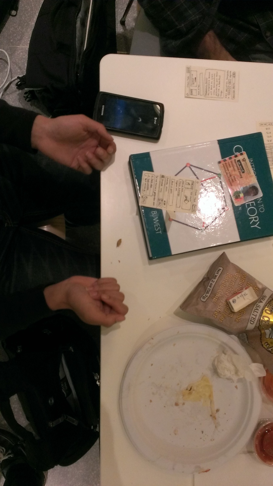
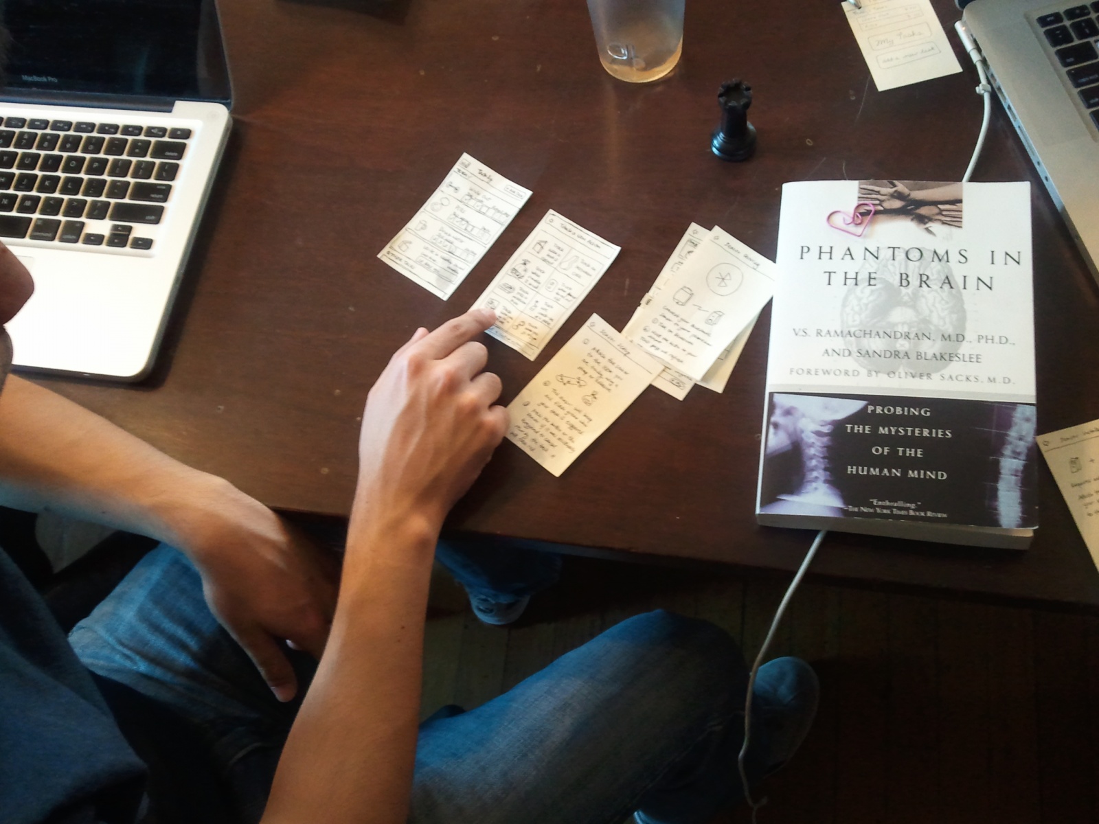
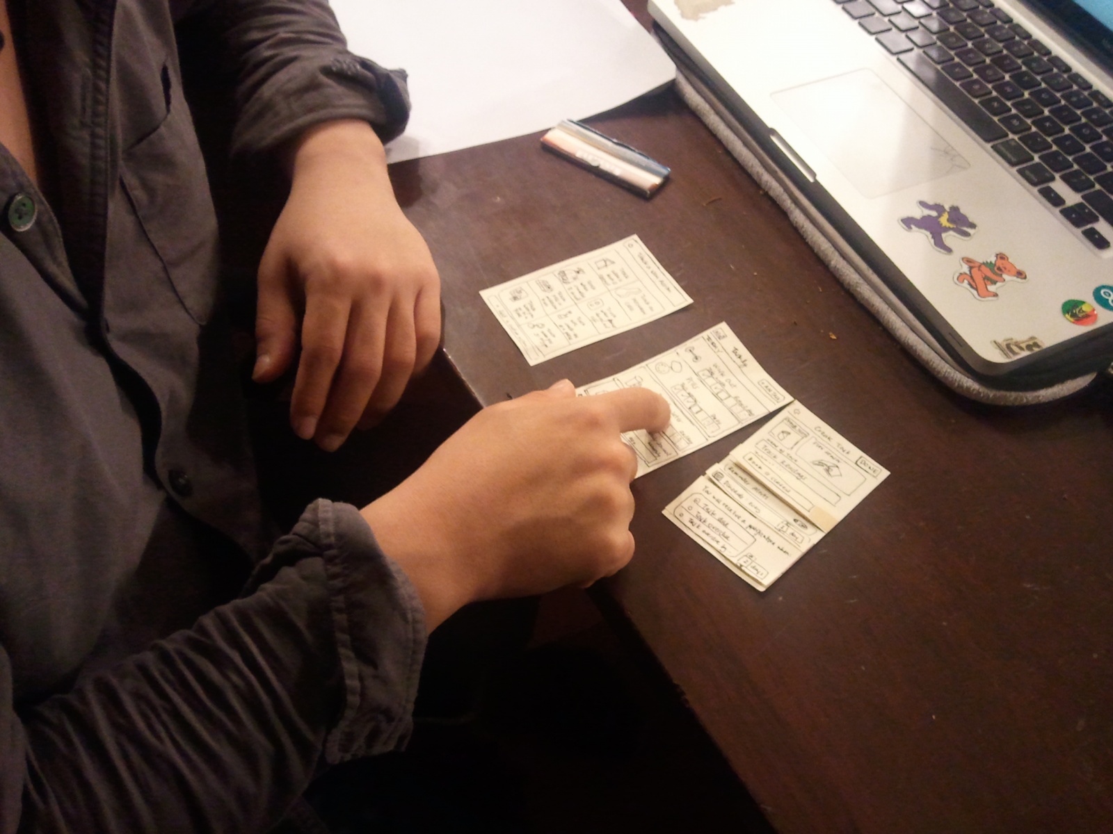
The testing environment was situated in working spaces, to be natural for our testers. We used a paper-prototype of the iPhone app to walk the user through the process of creating and configuring tasks. For the tags, which are USB-sized bluetooth-enabled sensor devices, we used a small cardboard box the same size and shape of the sensor and gave three of these to the user, one for each task. We also had a gym bag, a pill box and a sample book as props for the tasks.
- Testing Procedure:
After going through our consent script, we used our paper iPhone prototype to show the user how to program a simple task with Task.ly. We had a deck of paper screens, and Raymond led the user through this demo task by clicking icons, menu items, etc. Farhan changed the paper screen to reflect the result of Raymond’s actions. We then handed the paper prototype with a single screen to the test user. Farhan continued to change the paper screens in response to the user’s actions. When scheduling a task, the user had to set up a tag, which was described above.
The first task we asked users to complete was to add a new Task.ly task, “Going to the gym.” This involved the user navigating the Task.ly interface and selecting “Create a preset task.” We then gave the user a real gym bag, and the user had to properly install the sensor tag in the bag.
The second task we asked our user to do was track taking pills. This also required the user to create a new Task.ly preset task, and required the user to set up a phone reminder. Then, the user was given a pencil box to represent a pill box, and the user had to install a sensor tag underneath the lid of the pencil box.
Finally, the user had to add a “Track Reading” Task.ly task, which was the hardest task because it involved installing a sensor tag as well as a small, quarter-sized magnet on either covers of a textbook. The user was given a textbook, a cardboard sensor tag, and a magnet to perform this task.
While the user was performing these tasks, Farhan, Collin, and Dale took turns flipping the paper screens during each task and taking notes, while Raymond took continuous and comprehensive notes on the user’s experience.
<a href =”https://www.dropbox.com/s/f46suiuwml8qclv/script.rtf”>Script</a>
User 1 tasked with tracking reading
Results Summary:
All three users managed to complete each task, though they each had difficulties along the way. During the first task, tracking trips to the gym, our first respondent looked at the home screen of our app and remarked that some of the premade tracking options seemed to be subsets of each other (Severity: 2). When he tried to create a new task, he was frustrated with the interface for making the weekly schedule for the task. Our menu allowed him to choose how many days apart to make each tracking checkpoint, but he realized that such a system made it impossible for him to track a habit twice a week (Severity : 4). Respondent #2 noted that he liked the screens explaining how the bluetooth sensors paired to his phone, though he thought these should be fleshed out even more. Once he had to attach the sensor to his gym bag, however, he again expressed confusion when following our instructions (Severity: 4). He said that he thought the task was simple enough to forego needing instructions.
Of the three tasks, our users performed the best on tracking medication. Note, however, that this was not the last task we asked them to do, indicating that their performance was not merely a product of having greater familiarity with the app after several trials. Respondent #3 remarked that tracking medication was the most useful of the precreated tasks. All three users navigated the GUI without running into new problems unique to those experienced during the first task. All users attached the sensor tag to our demo pill box based on the directions given by the app; all performed the job as expected, and none expressed confusion. However, during the third task, tracking the opening and closing of books, new problems emerged with the sensor tags. Though two users navigated the GUI quickly (as they had during the second task), one respondent did not understand why there was a distinction made between tracking when a book was opened and tracking when a book was closed. He thought that the distinction was unnecessary clutter in the GUI. We judge this a problem of severity 2, a cosmetic problem. None of the users attached the sensor to our textbook in the way we expected. We thought that the sensor should be attached to the spine of the book, but users attached the tags to the front or back covers, and one even tried to put the sensor inside the book. Users were also confused by the necessity of attaching a thin piece of metal to either inside cover (severity: 3).
f. Results, Insights, Refinements
Our testers uniformly had problems while setting task schedules. There was no calendar functionality in the prototype; it only let the user set a number of times a task should be performed, over a certain time interval, so we are immediately considering changing this to a pop-up week/day selector, where the user highlights the day/times they want to do the task. Also, testers were confused by the sensors. The informational screens we provided to users to guide them through sensor setup were not complete enough, suggesting that we should make the sensor attachment instructions better phrased, visual, and possibly interactive. Because one user was confused by our having multiple sensor attachment pictures on one screen, we will instead offer the user a chance to swipe through different pictures of sensors being attached. Testers were also confused by the number of options for what the sensor could track, including in particular the option of being notified when a book is either open or closed. We can simply remove that choice.
Our users found the process of creating tasks to be cumbersome. Thus, we will simplify the overall process of creating a task, pre-populating more default information for general use cases, as that was the purpose of having presets in the first place. Then, we will remove the text options to choose how a sensor may be triggered. We will increase the emphasis on preset options, as above. Furthermore, we can accept feedback from the user each time he/she is reminded about a task (e.g. remind me in two days?/dont remind me for a month) to learn about how they want to schedule the task, instead of asking them to set a schedule upfront. This is a more promising model of user behavior as it distributes the work of setting a schedule over time, and lets our users be more proactively engaged. Finally, while considering how to streamline our interface, we also observed that the behavior of our system would be much more predictable to users if the reminder model was directly exposed. Rather than letting the user set a schedule, we observed we could use a countdown timer as a simpler metaphor, so that for each sensor, the user would only have to set a minimum time between triggers. If the time is exceeded, they would then receive reminders. This would be useful e.g. to provide reminders about textbooks that one leaves lying on the floor. Users may often forget about simple, low-difficulty tasks like taking vitamins, and this would make remembering to complete such tasks easier. Finally, this could be combined with deferring setting a schedule as discussed above.
g. Going Forward – Refinements
With a low-fidelity prototype, we plan on testing two parts of our app in the future. The first part will test if the the design changes that we make from the lo-fi prototype help users navigate the app better. This specifically pertains to the process of creating a task, including improvements regarding simpler presets, deferring setting a schedule, and exposing the reminder system as a countdown, and the test will focus on if creating a task has been made substantively easier. The second major redesign to test is our sensor setup pages, since we will need to validate that increased interactivity and changes in copy allow users to better understand how to attach their sensors.
With the high-fidelity prototype, we will test the interaction of the user with the reminder screens and the information charts about their progress on different habits. This part can only really be tested with the high-fidelity prototype with data about certain tasks and hence, we will move this testing to after we have the hi-fi prototype ready. We also noticed that we couldn’t get a very good idea of actual daily usage of the app, including if a user would actually perform tasks (or not) and respond to notifications. That part of our project will be easier to test once we have a working prototype, to gather actual usage and reminder data.