Final Blog Post: The GaitKeeper

Group 6 (GARP): The GaitKeeper

Group members:

Phil, Gene, Alice, Rodrigo

One sentence description:

Our project uses a shoe insole with pressure sensors to measure and track a runner’s gait, offering opportunities for live feedback and detailed post-run analysis.

Links to previous blog posts:

P1 – http://blogs.princeton.edu/humancomputerinterface/2013/02/22/team-garp-project-1/

P2 – http://blogs.princeton.edu/humancomputerinterface/2013/03/11/group-6-team-garp/

P3 – http://blogs.princeton.edu/humancomputerinterface/2013/03/27/gaitkeeper/

P4 – http://blogs.princeton.edu/humancomputerinterface/2013/04/08/gaitkeeper-p4/

P5 – http://blogs.princeton.edu/humancomputerinterface/2013/04/21/p5-garp/

P6 – http://blogs.princeton.edu/humancomputerinterface/2013/05/06/p6-the-gaitkeeper/

Pictures and Videos with Captions:

Pictures of the prototype – https://drive.google.com/folderview?id=0B4_S-8qAp4jyYk9NSjJweXBkN0E&usp=sharing .   These photos illustrate the basic use of the prototype, as well as its physical form factor.  You can see from them how the insole and wires fit in the shoe, and how they fit to the user’s body.  This was designed to make the product have a minimal effect on the user’s running patterns, so these aspects of the user interaction are especially important.

Video of computer-based user interface – Computer-Based UI .  This video (with voiceover) demonstrates the use of our user interface for saving and viewing past runs.

Video of live feedback based on machine learning – Live Feedback from Machine Learning .   This video (also with voiceover) demonstrates the live feedback element of the GaitKeeper, which tells the user if their gait is good or not.

Changes since P6:

  • Slightly thicker insole with a stronger internal structure – Thickness did not appear to be an issue for the testers, since the insole was made of a single sheet of paper.  We observed some difficulty in getting the insole into the shoe, however, and felt that making it slightly thicker would be useful in solving this issue.

  • Laminated insole – One of our testers had previously run that day, and his shoes were still slightly sweaty.  When taking off the insole, the sweat from his shoe and sock made the insole stick to him.  When removing it from his foot, the insole also was torn slightly.  We noticed that the tape part didn’t stick, and felt that making the entire insole of similar material would solve this issue.

  • Color changes in the UI heatmap – one of our testers noted that he found the colors in the heatmap to be visually distracting and different from traditional heatmaps.  This issue was corrected by choosing a new color palette.

  • Enhanced structural support for the Arduino on the waist – After user testing, we found significant wear and tear on the arduino box which is attached to the user with a waistband.  This was reinforced to make it more durable.  It was made slightly larger, which we felt was not an issue since users indicated that they found the previous implementation acceptably small and this change did  not significantly affect the form factor.

  • Ability to run without USB connection – This was an element which we had originally planned in the product, but were not able to fully execute for P6.  We used wizard of oz techniques at the time, and this replaced that.  Now, data can be imported into the computer from the arduino for analysis after a run.  Unfortunately, live feedback still requires a computer connection, but given further iteration could possibly be made mobile as well.

  • Wekinator training of live feedback during running – During testing, this was a wizard of oz element, where the lights went on and off for predetermined amounts of time to simulate feedback from the system.  This was replaced with true live feedback which is informed by the Wekinator’s machine learning abilities.

  • Ability to save and view saved data in the UI – User testing was done with a simulated run from our own testing data, rather than from actual saved runs.  We have added the ability for the user to save and view their own data imported from the arduino

  • Ability to import arduino data – User testing relied upon user simulation of the data upload process.  This is now fully implemented, and allows users to see the results of their running.

Explanation of goal and design evolution:

We began the semester with very little information about how a runner’s gait is actually assessed, but with the understanding that it was generally based on direct observation by a planned professional.  We originally planned to have a device which bridged the gait analysis demands of store employees, medical professionals, and runners themselves.  Over time, we realized that one of those three user groups had a very different set of needs, which resulted in us deciding to focus on just store employees and frequent runners.  Both user groups were considered by us to be well informed about running, and would be using the product to observe gait through a run for technique modification and product selection.  Our goals were then modified to better serve those user groups by focusing on the post-run analysis features, such as the ability to save and access old data.

Also, at the beginning of the semester, we had wanted to design the device to provide live feedback.  Over time, we came to realize that meaningful live feedback required a machine learning tool like Wekinator.  As a result, we were forced to maintain a computer connection for live feedback, which was a change from the fully mobile vision we had at the beginning.  This has slightly changed our vision for how the live feedback element of the product would be used; given the tethering requirement, live feedback would probably be most useful in a situation where the runner is on a treadmill and is trying to actively change their gait.  Other changes in design included a remake of the pressure-sensing insole, which our testers originally found to be sticky, difficult to place in a shoe, and overly fragile.  We moved from a paper-based structure to a design of mostly electrical tape, which increased durability without a significant cost in thickness.


Critical evaluation of project:

It is difficult to say whether this product could become a useful real-world system.  In testing, our users often found the product to be interesting, but many of the frequent runners had difficulty in really making use of the data.  They were able to accurately identify the striking features of their gait, which was the main information goal of the project.  One thing we observed, however, was that there were not many changes in gait between runs, with most changes occurring due to fatigue or natural compensation for small injuries.  That led us to conclude that the product might be better suited for the running store environment, where new users are seen frequently.  Given the relatively small number of running stores, we believe the most promising market for this product would be small, and focused on the post-run analysis features.  Live feedback was much less important to the running store employees, who were willing to tolerate a slight delay to get more detailed results.  We found that this space enjoys using technology already (such as slow motion video from multiple angles), and was quite enthusiastic about being able to show customers a new way to scientifically gather information about their gait and properly fit them for shoes.  Their main areas of focus on the product were reusability, the ability to fit multiple shoe sizes, accuracy of information, and small form factor.

We feel confident that further iteration would certainly make the product easier to use, also more focused on the running store employee user group, since they appear to be the ones most likely to purchase the product.  That being said, we are unsure that this device could progress beyond being more than a replacement for existing video systems.  Despite several conversations with running store employees, including contextual interviews while they met with actual customers, we were unable to identify any real information uses outside of the ones currently performed by the visual video analysis.  While our product is more accurate and takes a more scientific approach, achieving adoption would likely be a major hurdle due to the money such stores have already invested in video systems.

While the live feedback functionality is a quite interesting element of the project, it seems to have a less clear marketable use.  The runners we spoke to seemed to feel that live feedback was an interesting and cool feature, but not one that they would be willing to pay for.  Most (before testing) felt that their gait did not change significantly while running, and in surveys indicated that they already use a variety of electronics to track themselves while running.  These products include GPS, pedometers, and Nike+.  The runners consistently rated information feedback such as distance, location, pace, and comparison to past runs as more important than gait, running style, and foot pressure.  They also indicated an unwillingness to add additional electronic devices to their running, which already often involves issues of carrying a large phone or mp3 player.  As a result, one avenue which has some potential would be integration into an existing system.  The most likely option in this field would probably be Nike+, which is already built around a shoe.  Designing a special insole which communicates with the shoe (and through it, the iPod or iPhone) would be a potential way to implement the gait feedback device as a viable product for sale.  Clearly, this would have significant issues with licensing and product integration (with both Nike and Apple), but otherwise there does not appear to be a real opportunity.  As a result, we concluded that the product’s future would almost definitely require a stronger focus on the running store employee demographic.


Future steps if we had more time:

With more time, one of the things we would spend a great deal of time on would be the training of the arduino for live feedback.  Our users gave feedback several times that the two light system was not enough to really guide changes in gait, especially given that many changes in running style happen subconsciously over time as the runner gets tired.  The system did not give enough indication on how to fix the problem, only indicating the fact that a problem existed.  This could be solved through integration into a system like Nike+ or other phone apps, which would allow a heatmap gui to give directions to the runner.  Before implementing such a system, we would like to speak more with runners about how they would interact with this format of live feedback, as well as if they would want it at all.  Following that, more testing would be done about the most effective ways to convey problems and solutions in gait through a mobile system.

Although live feedback is likely the area which has the most opportunity for improvement in our prototype, our understanding of the targeted users indicates a stronger demand for the analysis portion for use in running stores.  Therefore, we would likely focus more on areas such as reusability and durability, to ensure that multiple users of different characteristics could use the product.  Furthermore, we would revisit the idea of resizing, which is currently done by folding the insole.  It is possible that multiple sizes could be made, but resizing is a more attractive option (if it is feasible) because it allows running stores to purchase only one.  This would likely involve more testing along the lines of what we already completed: having users of different shoe sizes attempt to use the product, either with or without instructions on resizing.  Additionally, for the running store application, we would seriously consider doing something to limit the amount of wires running along the user’s leg.  This could be done using a bluetooth transmitter strapped on the ankle, or through a wired connection to a treadmill.  While this is a significant implementation challenge, it seems that a feasible solution would likely exist.  Lastly, we found the machine learning tools to be quite interesting, and would also consider explore using a veteran employee’s shoe recommendations to train our device to select shoes for the runner.  This would allow the store to hire less experienced employees and save money.  Such a system would also likely require testing, in which we would gain a better understanding of how this would affect the interaction between the store employee and customer.  It would be very interesting to see if such a design undermined the authority of the employee, or if it made the customer more likely to buy the recommended shoe.


Source code and README zip file: 

 https://docs.google.com/file/d/0B4_S-8qAp4jyZFdNTEFkWnI2eG8/edit?usp=sharing


Third-party code list:

PDF Demo Materials:

https://docs.google.com/file/d/0ByIgykOGv7CCbGM3RXFPNTNVZjA/edit?usp=sharing


P6: The GaitKeeper

a) Group 6, GARP

b) Alice, Rodrigo, Phil, Gene

c) Our product, the GaitKeeper, is an insole pad that can be inserted into a shoe, and an associated device affixed to the user’s body, that together gather information about the user’s gait for diagnostic purposes.

d) The GaitKeeper can be placed inside a shoe and uses flex/pressure sensor throughout its surface to register data of a user’s gait. This information can be loaded into GUI and users can see a heat map of the pressure on the bottom of their foot changing with time. By making data collection and analysis simple, we intend to allow runners to observe the eccentricities of their own gait without the aid of more expensive devices. We also hope to make the analysis comprehensive enough that a running store operator can use it to better advise a customer or so a sports medicine practitioner can diagnose gait problems in patients. Our experiments are meant to test whether the prototype is simple enough to operate in all our intended use cases and whether the data analysis is comprehensive enough to be worthwhile.

e) The previous writeup can be found here: https://blogs.princeton.edu/humancomputerinterface/2013/04/21/p5-garp/

Here are the changes we have made since P5:

  • The sole is now connected to the Arduino. We have soldered all of the wires to the breadboard.

  • The Arduino and breadboard is now connected to the velcro band that will hold it up.

  • Basic Arduino code has been written to collect data, but it must be connected to a laptop and the data is not fully formatted.

  • The GUI has been tweaked and some of the buttons are now functional. The GUI still does not directly respond to data input from the prototype itself.

f) i. Participants:

The first participant was an employee at a local running store. We are envisioning the GaitKeeper as being used by employees at running stores to help with custom shoe fitting. This participant is one of our potential users and we wanted to see whether the product provided information that previous services have been unable to provide. Our second participant is an avid student runner who has run regularly for years. After hearing about our project, he volunteered to give it a try and provide useful feedback.

Our third participant was a less frequent runner, but tends to run for longer distances.  He had never been to a running store for gait analysis.  We considered him to be a typical running user, and a good indicator of whether the product might have a good market outside of the typical hard running group

ii. Apparatus:

To test the device, we asked users to place the device’s sole into their shoe. The wires go to the back of the sole, up the backside of the shoe and the leg, into the Arduino/Breadboard strapped to the back of the user’s waist. We asked users to put it on themselves to see if they had any trouble placing the sole. Then, we asked them to run around and see whether the device impaired their running in any way. In the case of the first participant, we conducted the test in the local running store’s treadmill. In the case of the other participants, we asked them to run around outside and we followed them with a laptop to collect data.

iii. Tasks:

In the first task (easy) the user looks at the dis­play of a past run to eval­u­ate their gait. They use the com­puter inter­face to exam­ine the heat map from an “ear­lier run” and see if the gait has any eccentricities. In this task, they must be able to recognize if any part of the gait stands out. They must also be able to navigate the data as it changes with time and understand what the information means. Ideally, this step should provide them with actionable intelligence that they can use on their next run.

The sec­ond task (medium) is a user putting on the device for the first time with minimal instruction. This will allow us to understand whether the device is simple enough for the average user to install. This will also allow us to observe whether the placement of wires is inhibiting the usability of the device. If the device is intended for use by the average runner, usability must be a very high priority for us.

Lastly, for the third task (hard), the user goes for a run with the device on. We need to know whether the device is placed in such a way that it will not affect their gait. Feedback on the device’s weight and comfort are very important in this task. To complete this task, the user must plug the device into the com­puter at the end of their run and input the data using the UI.

iv. Procedure:

For the first task, we asked users to look at our mock GUI and explore it. We asked them if they could tell us anything interesting from this example person’s gait. In the second task, we asked them to sit down, install the device’s sole in their shoe to the best of their abilities and strap on the device to their waist. In the last task, we asked the user to run with the device and connect it to a computer for data input.

g) Test Measures

  • In the first task, we simply measured how long it took for the user to make an observation about the person’s gait. We felt that this was directly dependent on the usability of the GUI.

  • In the second task, we measured how long it took for the user to install the device correctly. If it was complicated, we expected the user to take a long time.

  • In the third task, we took sample data from the user. This is important for further development of the heatmap of the GUI.

h) Results and Discussion

The running store employee gave us some very useful feedback. She mentioned that there was a fair amount of bunching of wires at her toes, which was caused by the prototype crumpling as it was put into the shoe. The employee suggested that removing the insole of the shoe might be a good idea. While putting on the device the employee needed help. The velcro straps were difficult to manage alone. Said that it felt similar to a field belt and was an acceptable weight. When the ankle strap was not velcroed the wires flopped around and were almost stepped on. The extra velcro helped, but required our explanation as to how it should be used. When asked about actually using the device she said that she could definitely run for a short amount of time normally, which is all that is needed for a store fitting, but the wires might make going for an actual run with the device difficult.

Our second user did not think the sole’s thickness was uncomfortable. He thought the material was a little sticky and was caught on the adhesive we used to keep the device together. The resizing system of the sole was not used, but the user easily understood its worth and how to potentially use it. He liked the idea of having live feedback on his gait and picked up the GUI easily. Lastly, this user would have preferred to have another sole so he would not have to take it off to measure his other foot.

The third user found the thickness to be acceptable, and did not mention the wires.  When asked, he said that he noticed the feeling of the wires, but did not find them irritable.  He had large feet, and did not make use of the resizing system.  He enjoyed the UI a lot, although he had some difficulty with understanding the forwards/backwards navigation through screens.  He thought the heat map was interesting, but asked for a scale to indicate how much the pressure was (as a science major, he felt that it would be nice to see how much pressure there was).  He had some difficulty interpreting the results, and asked us what sort of shoe we would recommend based on the results which were simulated.

If we can, we would like to make a thinner but more rigid foot pad so as to prevent the amount of bunching in the toe that the first user mentioned. It might also be a good idea to have something to attach the velcro to so that the device does not get tangled up when put away in storage (which happened between tests!). We also hope to complete our interface and tweak a few buttons to make it more understandable.

i) Appendices

This is the demo script: https://docs.google.com/document/d/1lhKJ_DIPd-ytAH5JQWKngYscE7y46kkFy9fNnUEut2c/edit?usp=sharing

This is the user consent form: https://docs.google.com/document/d/1BLw8CSQ7SaTtjhxvk9GwS88LrsquEdwAS13M1yFo5j0/edit?usp=sharing

This is the user questionnaire: https://docs.google.com/document/d/1WERwLGZSJTUI0_e95mPIFo-oXCknQVvQ5wQgmq-U2ZE/edit?usp=sharing


Pictures and videos from testing:

https://docs.google.com/file/d/0B4_S-8qAp4jyaWNVd0VpTWlMbm8/edit?usp=sharing

https://docs.google.com/file/d/0B4_S-8qAp4jyNTdyTS1DVTljM3c/edit?usp=sharing

https://docs.google.com/file/d/0B4_S-8qAp4jyc1FMUzF3VERlaU0/edit?usp=sharing

https://docs.google.com/file/d/0B4_S-8qAp4jyaWRET01oZkZWc1E/edit?usp=sharing

https://docs.google.com/file/d/0B4_S-8qAp4jyaWNVd0VpTWlMbm8/edit?usp=sharing


A2: Class Panorama – Philip Oasis

Part 1: Observations

Who: Megan Karande

When:  1:10pm Tuesday

Where: Beginning at Frist, outside Café Viv

  • Megan was working on her thesis at the tables outside of Café Viv and talking to friends who were sitting with her.  She got up, and went to tower quickly to get tea.
  • On the way to tower, she checked her phone while waiting for the walk signal at the stop light on Washington Rd.  She said that she checks her phone a lot before her studio class at 1:30, because she can’t look at her phone during class.
  • When she was getting tea, she realized that she needed to print something for a meeting after class, and sat down to get her laptop out and print it.  She then asked me if I thought the Campus Club printer was working, because it had been broken for the past few days.
  • She printed her sheet, and went to Campus Club to print it out.  The printer was working, so from there she started walking down Washington Rd. towards Nassau St.  She checked her phone again, and started to walk quickly when she realized that she only had 5 minutes to get there (her class was in the Lewis Center at 185 Nassau).
  • She checked her phone again as she got to the building, realizing that she was just going to make it on time.  She checked her texts and emails one last time, then went in to class.


Who: Sam Zeluck, Paige Tsai, and Megan Karande

When:  1:20pm Wednesday

Where: Beginning at Tower (eating club)

  • Sam went upstairs after lunch to get her 2 coats (she said that she occasionally wears 3 when it is really cold) and her backpack.
  • She checked her phone for texts from Megan (who she usually walks to class with), but didn’t have any, so she went downstairs to look for her.
  • She met Megan and Paige on her way down the stairs – they were coming up to leave after getting tea.  Paige had met Megan while they were getting tea, and decided to walk with her because they were going in a similar direction.
  • They left Tower, and walked across Prospect Ave. to Robertson Hall.  None of them had class there, and they said that they were going through there because it was warmer to walk through a building and it didn’t add time to the walk.
  • They were talking about me observing them, and how Paige had been following her New Years’ resolution to drink more water and was carrying a water bottle
  • They walked out the opposite door of Robertson, onto the plaza there, and then towards Washington Rd.
  • They briefly walk down Washington Rd., and then Paige splits off at Green hall to go to her psychology class.
  • Megan and Sam continue to walk down Washington Rd.  Sam checks her phone to see the time and see if she has any texts.  They speed up a little bit because they only have 2 minutes left before class.
  • They enter the building (Aaron Burr Hall), and start talking about the next assignment they have due for the class (Imagined Languages).  They get to class at almost exactly 1:30.


Who: Gene Merewether and Alice Fuller

When:  7:20pm Wednesday

Where: Beginning at Tower (eating club)

  • I went downstairs to wake him up from a nap before class, since he had asked me to do that earlier.
  • He got up, went to the coatroom for his coat and backpack, and met Alice there while she was looking for her coat.  I asked if they planned to meet before going to class, and Gene said that they usually just see each other in the coat room, but that if he didn’t see Alice he would have assumed that she left already.
  • They left tower, and walked down Prospect Ave. towards lab.  They talked about the lab writeup and senior pub night on the way.  Both mentioned how cold it was outside.
  • Gene checked his texts and emails briefly during the conversation.
  • Just as we were turning down the road towards the EQuad, we saw Rodrigo (our other group member) coming from Charter.  We hadn’t coordinated to meet him on the way, but just got lucky in seeing him.
  • Gene used his prox to open the door of the EQuad, which was locked because it was night.
  • Gene was walking at the front of the group, and almost led us in the wrong direction.  Alice corrected him and we went downstairs to lab.

Part 2: Brainstorming (with Gene Merewether):

  1. Walkshare – find out which of your friends are going to which locations and arrange to walk with them
  2. An app to find out which printers are working, or the hours of campus buildings
  3. An app to find out routes to your classes which go through buildings in order to stay warm.
  4. A watch / ring / other device which changes color depending on how long you have to get to class
  5. An app that tells you if you have time to get water / print something / get tea before class, and tells you where to go
  6. An app which displays friends on a map, if they want others to be able to see where they are
  7. An app which provides you a to-do list before class
  8. Time-updated frequently texted list – shows your contacts based on when you usually text them and what time it is now.
  9. An app that displays menus for eating clubs and dining halls, and helps friends coordinate where to go
  10. Easy automatic responses to emails/texts saying that you are in class
  11. A device that notifies you automatically when friends are nearby or are walking in a similar direction
  12. A way to place a lunch order while going to lunch, in order to minimize time waiting
  13. A calendar that gives you reminders automatically before you have things scheduled (so notifications come before class)
  14. An app which tells you which of your friends is in class, at lunch, etc. so you can coordinate large groups without texting
  15. An app which presents easily accessible syllabi and assignments pages for classes and compiles them into a calendar
  16. An app by which you can easily track and make record of your progress on assignments
  17. Surveys for students waiting before class about the
  18. Flashcards or review tests for students before the next class
  19. Shared reading notes for students to fill in gaps before class/precept

Part 3: Idea Selection 

I am selecting ideas 1 and 5 for paper prototyping.  I have selected idea 15 because people I was observing tended to discuss coming assignments, and several times people did not know when things were due.  I chose idea 5 because it also appeared to be a major issue in my observations; the people I watched wanted to do things like get coffee or print before class, and didn’t know if they had time to make it.

Part 4: Paper Prototypes

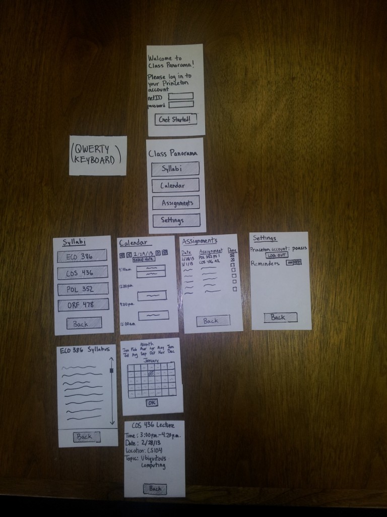
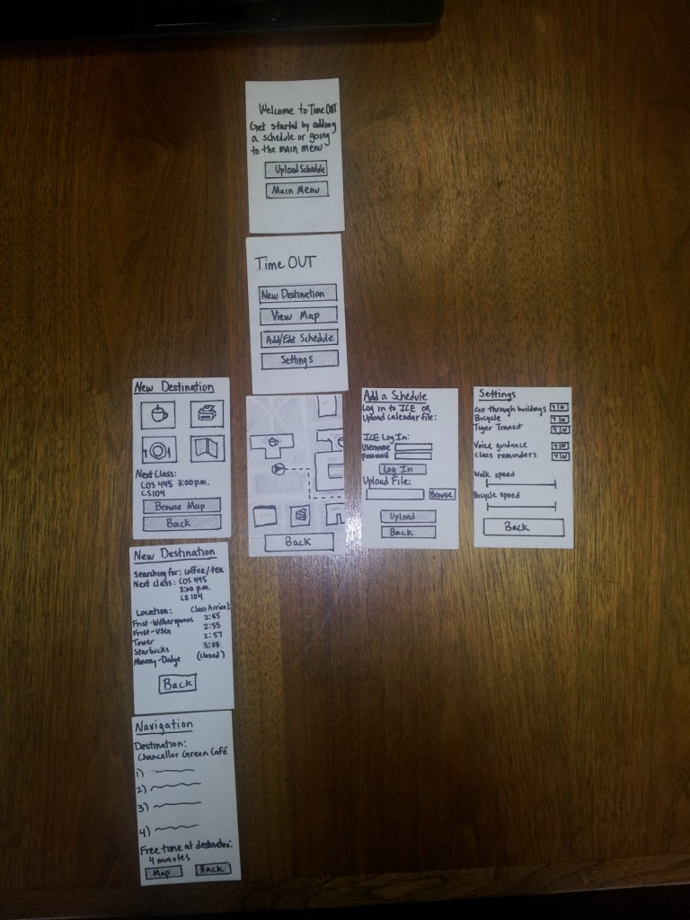
These are ordered hierarchically, so that the flow of navigation is from the top to the bottom.

Idea 15


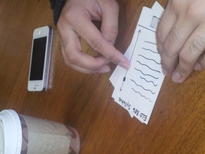
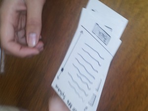
Note that the top screen is only seen on the first use, or when you are not logged in to a Princeton account.  The two screens below “Calendar” are meant to be overlays, which disappear when Ok or Back is selected.  The first is triggered by hitting the “Select Dates” button, and the second is triggered by touching one of the blocked off calendar events.  The keyboard appears at the bottom of the screen when a text entry box is touched/selected.


Idea 1:


Again, the first screen only appears if the user has not logged in before, or is not currently logged in.  Otherwise, they will start from the Main Menu.  The top New Destination screen buttons signify (clockwise from top left) coffee/tea, printers, food, and libraries.  The next New Destination screen is then customized based on the item selected (the prototype just includes the screen for coffee/tea, since other options will have similar layouts and interactions.  The Navigation screen can be accessed by selecting one of the options in the second New Destination screen.  If Map is selected from there, it will take you to the View Map screen, which is shown under the main menu, but with the route highlighted by a dotted line.  In Settings, speeds are manipulated by dragging sliders.

Part 5: Prototype Testing/Observations

Who: Tejas Sathe

When: 2:20pm Thursday

Where: Thesis room of Tower

  • He navigated relatively smoothly through the main menu, selecting Calendar first.  He pressed on one of the event blocks, and was happy to see that more details came up.  He then tried to click on the location of the event, and mentioned that he would have liked a Google Maps option.  After I told him I hadn’t included it in the prototype, he said he was looking for how he could change reminders from inside the calendar interface.  He went back (dismissing the event screen), and did not see any way to add/edit reminders from the calendar screen either.  Finally, he mentioned that the times displayed seemed arbitrary.
  • He next went to the assignments page (after going back to the main menu).  He tried to click on an individual assignment, and I had not included any functionality for that in the prototype.  When I asked what he was trying to access by clicking there, he said that he was hoping for a link to the actual assignment.
  • He mentioned that it would be nice if he could sync it with his dropbox, where he keeps his notes.  I asked what he would like if he didn’t use dropbox, and he said that  it would be difficult to view class notes if they weren’t already in the cloud.
  • He suggested that the assignments page include grades for assignments which were done, and responded positively when I asked if he would like a separate page for looking at past assignments
  • When asked about a social aspect -such as the ability to email/text friends in the same class from inside the app, the ability to look at a friend’s schedule, or the ability to directly email a preceptor or preceptor from inside the app, he said it wasn’t necessary for a good experience (and might hurt its navigation) but that it would be a positive addition if executed well.
  • When looking at the main menu, he questioned how the organizational layout, asking if there was any way to view on a class basis rather than on a topic basis.  In other words, he wanted to be able to view all of the information for a single class in the same place.  He suggested being able to change it on the main menu itself, but also responded positively when I asked if he would also like it in settings.
  • He navigated through the interface quickly, saying that it felt like a simple organization to pick up on (aside from the above comment).  After the trial, he said that the ease of use was one of the main successes, and focused much of his energy on talking about additional functionality.  At the same time, he suggested integration with services such as Piazza and Coursera in order to make it easy to get help directly.

Who: David Asker

When: 12:20pm Friday

Where: Dining room of Tower

  • He picked up on the navigational style relatively quickly, and went to the Assignments page first.  On that page, he attempted to click on the individual assignments.  When I asked what he was looking for, he said that he’d like some overview of the assignment, or possibly a link to the assignment page itself.
  • He asked about a touch interface, such as swiping left and right when viewing syllabi to move between classes, or using a three-fingered closing motion to go back to the main menu.  Unlike the other two testers, he was unconcerned by the lack of a back button on the Calendar, and tried to use the Apple closing gesture to move back to the main menu.
  • He suggested the inclusion of a way to directly view the most urgent assignments and calendar appointments, in order to make it easier to find the most important tasks to accomplish.
  • He did not have any difficulty switching days, and liked the ability to select a day from a calendar or just move forward and backward by increments.
  • He suggested the ability to email or text for help from inside the Syllabus page for a class, or from the Assignments page.
  • At the end of testing, he was looking for an option to log off of his Princeton account. He did not find it intuitive that it was placed in settings, but mentioned that he would be OK with that if it was on his phone.  If it was on a computer or a website, he would prefer the ability to log off from the main page.

Who: Emma Fernandez

When: 1:20pm Friday

Where: Thesis room of Tower

  • She wasn’t immediately sure what account she was logging in to on the first screen, and was later wondering how the app was getting her class information
  • Again, when navigating to the assignments page, she requested a way to get more information about an individual assignment.  She suggested that the assignment page from blackboard be shown, or drawn from the syllabus into an easily readable form.
  • Again, she noticed the lack of a back button on the calendar, which created a bit of a dead end within the interface.
  • She attempted to find a way to alter the calendar format to display more than one day’s information, even going back to the Main Menu to look at the Settings page.  She then suggested that I include the ability to look at multiple days or even a month to make planning easier.  She also suggested the ability to include a list of the next 20 or so events on the calendar, noting that she tends to only put very important deadlines and events on the calender so hers tends to be relatively sparsely populated.
  • She requested the ability to look just at your course schedule for the week, in a format to what is currently provided on ICE (tigerapps).
  • Like David, she also tried to log out at the end of the trial, and had similar feelings about the location of the button.  As a mobile app it was acceptable, but given other access modes she would prefer that logging out was easier and didn’t require navigation away from the Main Menu.

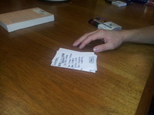
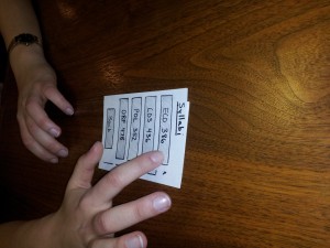
Pictures from testing:


 (David)


(Tejas)

(Emma)

Part 6: Reflections and Insights

  • The calendar page needs a back button – this is absolutely necessary
  • All users mentioned that they would like the ability to look deeper into assignments from the assignments page.  In future revisions, I would likely explore the ability to view the assignment sheet, or at least some information parsed from the syllabus.  Additionally, the ability to set reminders from the assignments and calendar pages would be nice – all of the users felt that that feature’s inclusion on the settings page was somewhat strange.
  • One of the biggest successes for me was the navigation – the three users all seemed to have a very quick handle on how the menus and functions were laid out, and how to move between them.  That being said, I was very interested by Tejas’ suggestion to include the ability to sort by class.  If that could be included without making the interface messy, it would probably have a positive impact on the user experience.
  • If this is being used on anything other than a personal mobile device (like a phone or iPad), it would require a logout button that is significantly easier to access.
  • All user interactions were relatively quick, lasting around 5 minutes on average.  This appears to be acceptable for the inter-class period, although Tejas was slightly rushed.  In a real interaction, they would likely only be using one of the features at once (not exploring all of them), which could cut down on use time.
  • While a social element is not crucial, it might be beneficial to integrate Piazza and Coursera support, or at least the ability to email teachers/preceptors.  Since questions are likely to arise when looking at assignments and other due dates, this would be a useful addition.
  • In any revisions, it would be good to keep a similarly simple layout, since that made it especially easy for users to access information quickly and efficiently.
  • Gesture support would likely be a nice addition for touch screens, and could even replace back buttons.
  • On the whole, the users felt that the app accomplished most of what it set out to do; It seems that the basic functionality is useful to users (and they enjoyed it), and that revisions should focus on adding a few new features along with the ability for a user to change the organizational style

Sensor-Based Authentication

1) Names: Philip Oasis, Alice Fuller, Gene Merewether, and Rodrigo Menezes
2) Group Number: 6
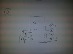
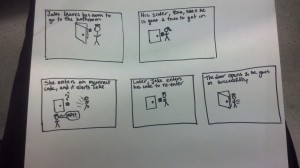
3) We built a sensor-based authentication system. The idea behind it is that you enter in a code the first time, and then on subsequent uses you have to enter in the same code. We had three sensors: two potentiometers which had to be turned the correct degree and one slide sensor which had to have your finger placed in the correct position. The end result was really great. The correct position, given a small amount of error could be found again, but a knowledge of the initial code was still needed. When you got the code correct a green light went off, and when you got it wrong a buzzer went off. I enjoyed the fact that you had to have your finger in the correct position on the sensor while you pushed the button, the multiple tasks reminds me of cool authentication systems that you see in movies. It might have been nice to have things in a prettier display; we could have obscured the wires better, had the sensors further apart to improve ease of movement, had written instructions. This would have also been much better if there was an actual lock to unlock.

4)

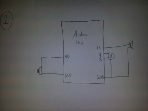
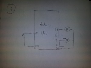
This is a simple reaction game in which the buzzer sounds, the user hits the button as quickly as possible, and the LED then lights up to give them feedback on how quickly they reacted.


This is a memory game in which the user hits buttons to recreate the order the LED’s flashed, and the sequence gets one light longer for each round the user gets correct.


This is a racing reaction game in which the LED flashes red, yellow, and green and then the user tries to hit the button as soon as possible after a green.  The buzzer would go off in the event of a false start, and the LED would light up with a color to indicate the reaction time.

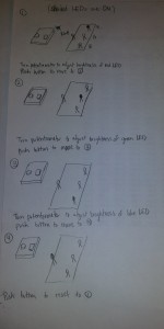
5) Storyboard:

6) Demo Video: Lab 1

7) Parts List

  • 2 potentiometers
  • 1 slide sensor
  • 1 button
  • 1 buzzer
  • 1 green LED
  • 2 bread boards
  • 1 arduino
  • 2 330Ω resistor
  • 1 10kΩ resistor

8) Directions

Attach these all on one breadboard:
Attach one potentiometer to pin 0 on the arduino, the other to pin 1. Attach the button to pin 2, the buzzer to pin 3, and the led to pin 5. There should be a 330 ohm resistor attached with the led and the buzzer, and a 10k ohm to the button. The two potentiometers should be next to each other at the front, the button should be just behind them, and the buzzer and led are at the back of the breadboard. On the separate smaller breadboard place the slide sensor and connect it to pin 2.

9) Source Code

const int potentialPin1 = 0;
const int potentialPin2 = 1;
const int slidePin = 2;

const int buttonPin = 2;
// pull-down resistor; LOW is not pressed
const int buzzerPin = 3;
const int ledPin = 5;

const int tolerance = 64;
const int buzzerTone = 20;

int lock1 = -1;
int lock2 = -1;
int lock3 = -1;

void setup()
{
pinMode(buttonPin, INPUT);
pinMode(buzzerPin, OUTPUT);
pinMode(ledPin, OUTPUT);
Serial.begin(9600);

while (digitalRead(buttonPin) == LOW) // wait until button is pressed
{
delay(100);
}

// enter in lock code
lock1 = analogRead(potentialPin1);
lock2 = analogRead(potentialPin2);
lock3 = analogRead(slidePin);
digitalWrite(ledPin, HIGH);
Serial.print(“Potentiometer1 = “);
Serial.println(lock1);
Serial.print(“Potentiometer2 = “);
Serial.println(lock2);
Serial.print(“Slide sensor = “);
Serial.println(lock3);
}

void loop()
{
int buttonState = digitalRead(buttonPin);
int potentialState1 = analogRead(potentialPin1);
int potentialState2 = analogRead(potentialPin2);
int slideState = analogRead(slidePin);

Serial.print(“Potentiometer1 = “);
Serial.println(potentialState1);
Serial.print(“Potentiometer2 = “);
Serial.println(potentialState2);
Serial.print(“Slide sensor = “);
Serial.println(slideState);

if (buttonState == HIGH) // pressed
{
if ((potentialState1 < (lock1 + tolerance)) &&
(potentialState1 > (lock1 – tolerance)) &&
(potentialState2 < (lock2 + tolerance)) &&
(potentialState2 > (lock2 – tolerance)) &&
(slideState < (lock3 + tolerance)) &&
(slideState > (lock3 – tolerance)))
{
digitalWrite(ledPin, HIGH);
delay(1000);
}
else // not correct code
{
digitalWrite(ledPin, LOW);
analogWrite(buzzerPin, buzzerTone);
delay(1000);
}
}
digitalWrite(ledPin, LOW);
analogWrite(buzzerPin, 0);
}

Color Mixer

i. Group: Philip Oasis, Gene Merewether, Alice Fuller, Rodrigo Menezes

ii. We built a color mixer, in which the user turns a potentiometer to adjust the brightness of red, green, and blue LEDs, and then observes the mixed output of the three hues on a single RGB LED.  The purpose for the user is to observe how RGB colors are mixed, as well as a fun way to try making new colors.  The tissue paper diffuser is meant to spread out the light and make it easier to view.  We feel that it is successful in achieving these goals, and that the interface is relatively easy to understand and operate.  We enjoyed using the final product and trying to make interesting colors.  We might have liked to use more LED’s to make the panel brighter and easier to see.

iii. Sketches of possible designs

20130213_201102

A reaction game where the user tries to hit the push button after the final LED is lit.

rgb-two-step-memory-game


A memory game in which the user uses a button to select the LED which was lit a certain number of lights ago.

20130206_210759 20130206_220008


A color mixer in which the user selects brightness of red, green, and blue LED’s and then observes the combination of those hues.

iv. Video of the system in action

http://www.youtube.com/watch?v=RQmMFz5ngmM

v. Parts list

  • (1) Red LED
  • (1) Green LED
  • (1) Blue LED
  • (1) Tricolor LED
  • (1) 10k trimpot
  • (4) 330 ohm resistor
  • (2) Breadboard

vi. Instructions to recreate design

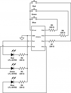
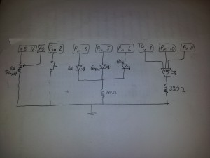
  1. Connect potentiometer to analog pin A0, powered by 5v
  2. Connect push button to digital pin 2, powered by 5v, with a 330Ω resistor.
  3. Connect red, green, and blue LED’s to digital pins 3, 5, and 6 (respectively), all powered by 5v and each with a 330Ω resistor.
  4. Connect the rgb LED to digital pins 9, 10, and 11, again powered by 5v, and with 330Ω resistors.
  5. (optional) Cover the LED’s with a tissue paper diffuser

vii. Source code

const int sensorPin = 0;
const int buttonPin = 2;
const int redPin = 3;
const int greenPin = 5;
const int bluePin = 6;
const int ledRedPin = 9;
const int ledGreenPin = 10;
const int ledBluePin = 11;
 
const int RED_STATE = 0;
const int GREEN_STATE = 1;
onst int BLUE_STATE = 2;
 
int prevButtonState;
int systemState;
int redValue;
int greenValue;
int blueValue;
void setup() {
    Serial.begin(9600);
    pinMode(buttonPin, INPUT);
    pinMode(redPin, OUTPUT);
    pinMode(bluePin, OUTPUT);
    pinMode(greenPin, OUTPUT);
    pinMode(ledRedPin, OUTPUT);
    pinMode(ledGreenPin, OUTPUT);
    pinMode(ledBluePin, OUTPUT);
 
    prevButtonState = HIGH;
    systemState = RED_STATE;
    redValue = 0;
    greenValue = 0;
    blueValue = 0;
}
 
void loop() {
    int buttonState = digitalRead(buttonPin);
    int sensorValue = analogRead(sensorPin)/4;
    Serial.println(sensorValue);
 
    if (buttonState == HIGH && prevButtonState == LOW)
    {
        systemState = systemState + 1;
        if (systemState == 3)
        {
            systemState = 0;
        }

    }
    prevButtonState = buttonState;
    switch (systemState)
    {
         case RED_STATE:
             redValue = sensorValue;
             analogWrite(redPin, redValue);
             analogWrite(greenPin, 0);
             analogWrite(bluePin, 0);
             break;
         case GREEN_STATE:
             greenValue = sensorValue;
             analogWrite(redPin, 0);
             analogWrite(greenPin, greenValue);
             analogWrite(bluePin, 0);
             break;
         case BLUE_STATE:
             blueValue = sensorValue;
             analogWrite(redPin, 0);
             analogWrite(greenPin, 0);
             analogWrite(bluePin, blueValue);
             break;
         }

analogWrite(ledRedPin, redValue);
analogWrite(ledGreenPin, greenValue); 
analogWrite(ledBluePin, blueValue); 
}