A2 – Junjun Chen

Observations:

I did most of my observations before COM 313, Monday 1:30. I arrived 15 minutes early, to an empty classroom. The first person arrived around 1:20. She got out her tablet and checked her email for a couple minutes. Then, she opened the readings we had for this class, and flipped through that for the rest of the time. More people started arriving around 1:25. (A couple students arrived with headphones on.) One girl got out her laptop, and continued a readings she had open. She would occasionally switch tabs to browse the web: facebook, tumblr. Another girl had her calendar open (as well as many other windows). After checking her schedule, she opened a reading for another class, then switched to her email. She started writing an email, referencing her schedule occasionally.

Several other people also checked email/schedules, then opened up their notes for this class, started a new heading, and waited. Several read back over readings they had for this class, as well as the notes they had taken from last week. Most students arrived within a couple minutes of 1:30, which seems in line with what most people I’ve talked to have told me: that there is really not much time between classes, and it often takes the whole 10 minutes to get from one class to the next.

The professor came in right around 1:30 and passed out notes. Then he started an attendance sign-in sheet.

Brainstorming:

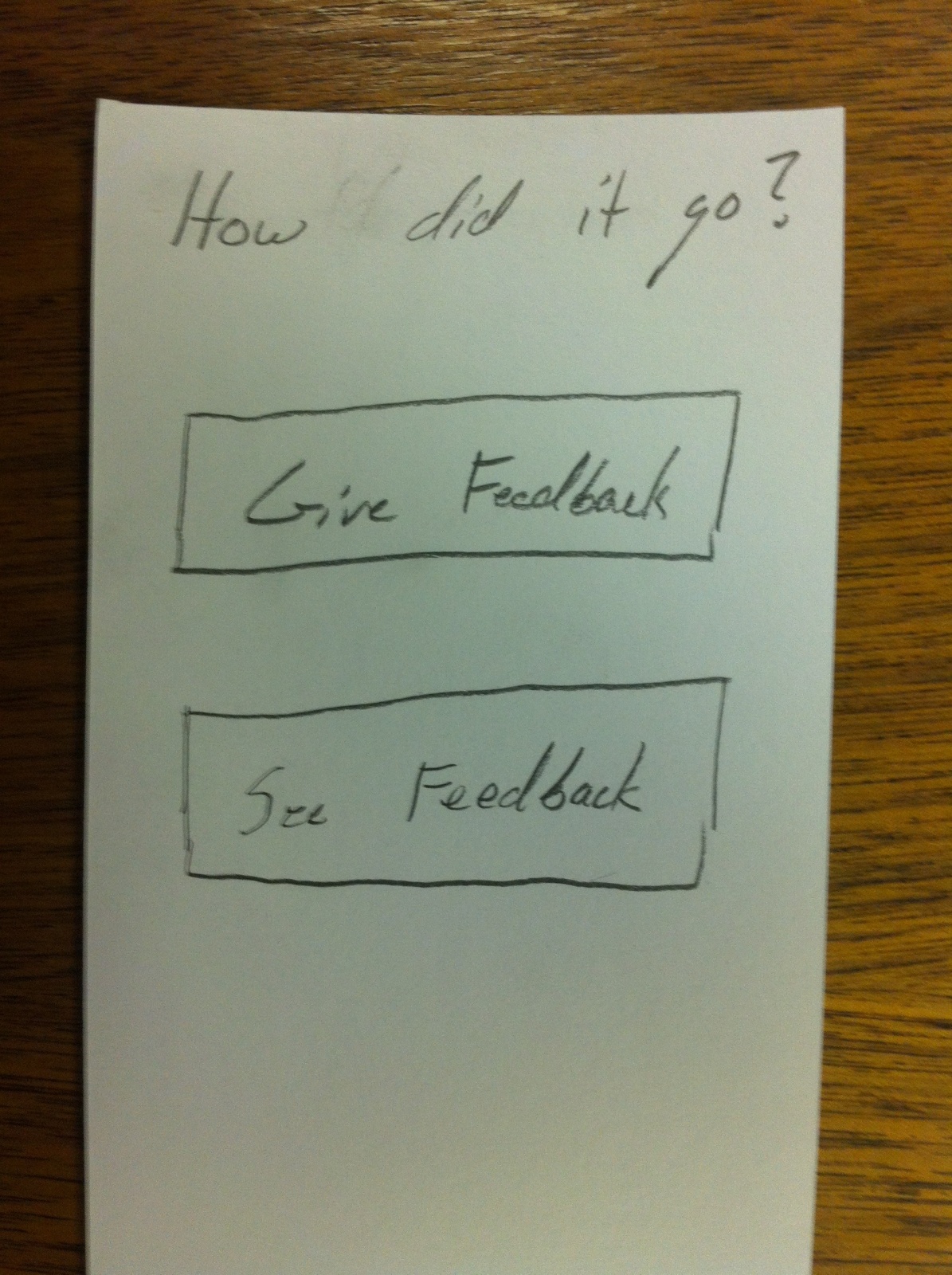
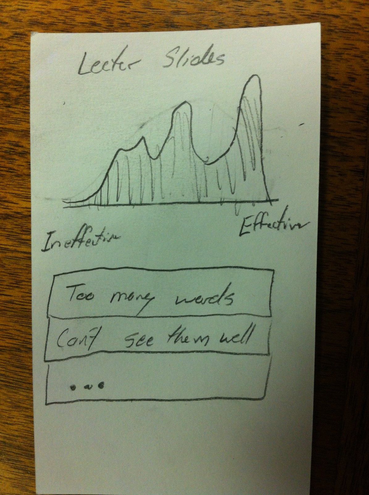
  1. An app to submit comments/questions on the lecture to the professor.
  2. An app that shows highlights from the previous lecture.
  3. A way to help organize windows/notes/browser tabs for a class and open/close them together.
  4. An app that breaks readings into small chunks that you can read in spare minutes.
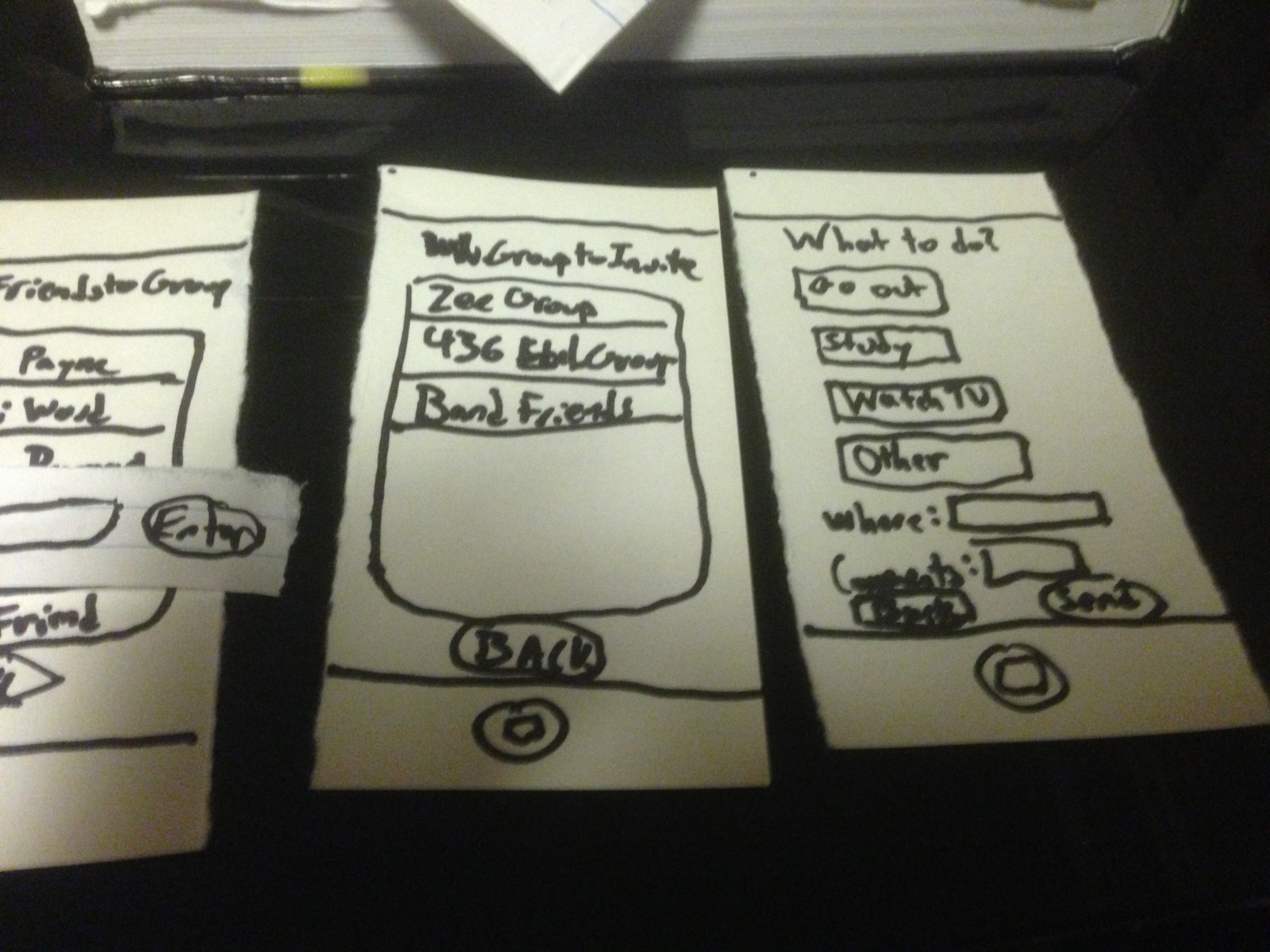
  5. An app that makes group scheduling easier/more automatic by syncing with your calendar.
  6. An app that helps that tells you which friends are in classes close by so you can get together for lunch.
  7. App for ordering food from late meal.
  8. An app that calculates the time it would take to get from your current location to your next class, and tells you when it’s time to leave.
  9. An app to find an open seat (least disruptive) for the late student.
  10. An app that finds the shortest path to class from current location.
  11. A way for professors to save their settings for lights/projector.
  12. An app that lets you check in to class for attendance/sign in.
  13. An app that plays 5 minute clips of audio to learn a foreign language on the way to class (Alex Zhao).
  14. An app that reads your readings to you (text to speech), so you can listen as you’re walking to class.
  15. An app that makes it easier to add events from your email to your calendar.

Favorite Ideas:

1. Number 8: There are a lot of people who are early to class and don’t have anything to do, as well as late to class, suggesting that it is difficult for some people, including myself, to judge how long it takes to get from one location to another.
2. Number 14: It takes advantage of the time students spend walking to class (which takes up most of the 10 minutes), and breaking down a week’s readings into 10 minute segments helps prevent procrastination.
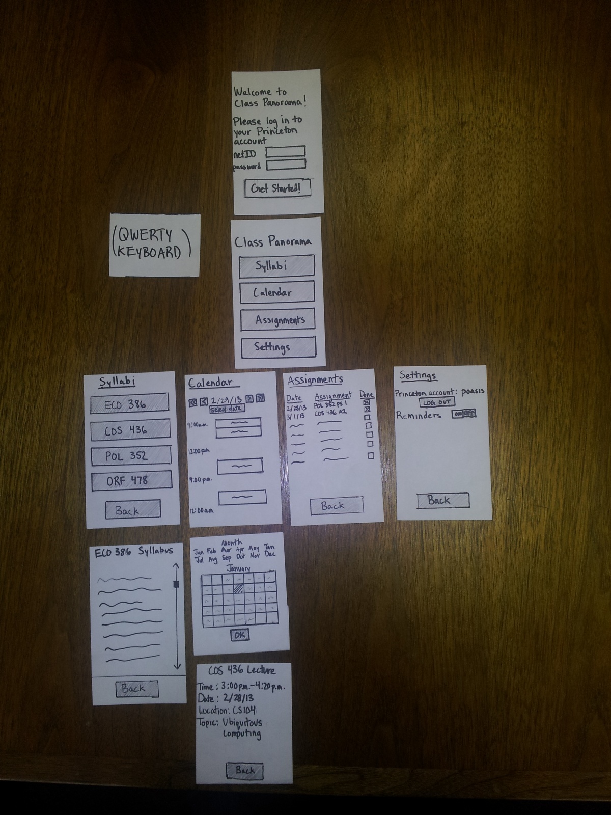
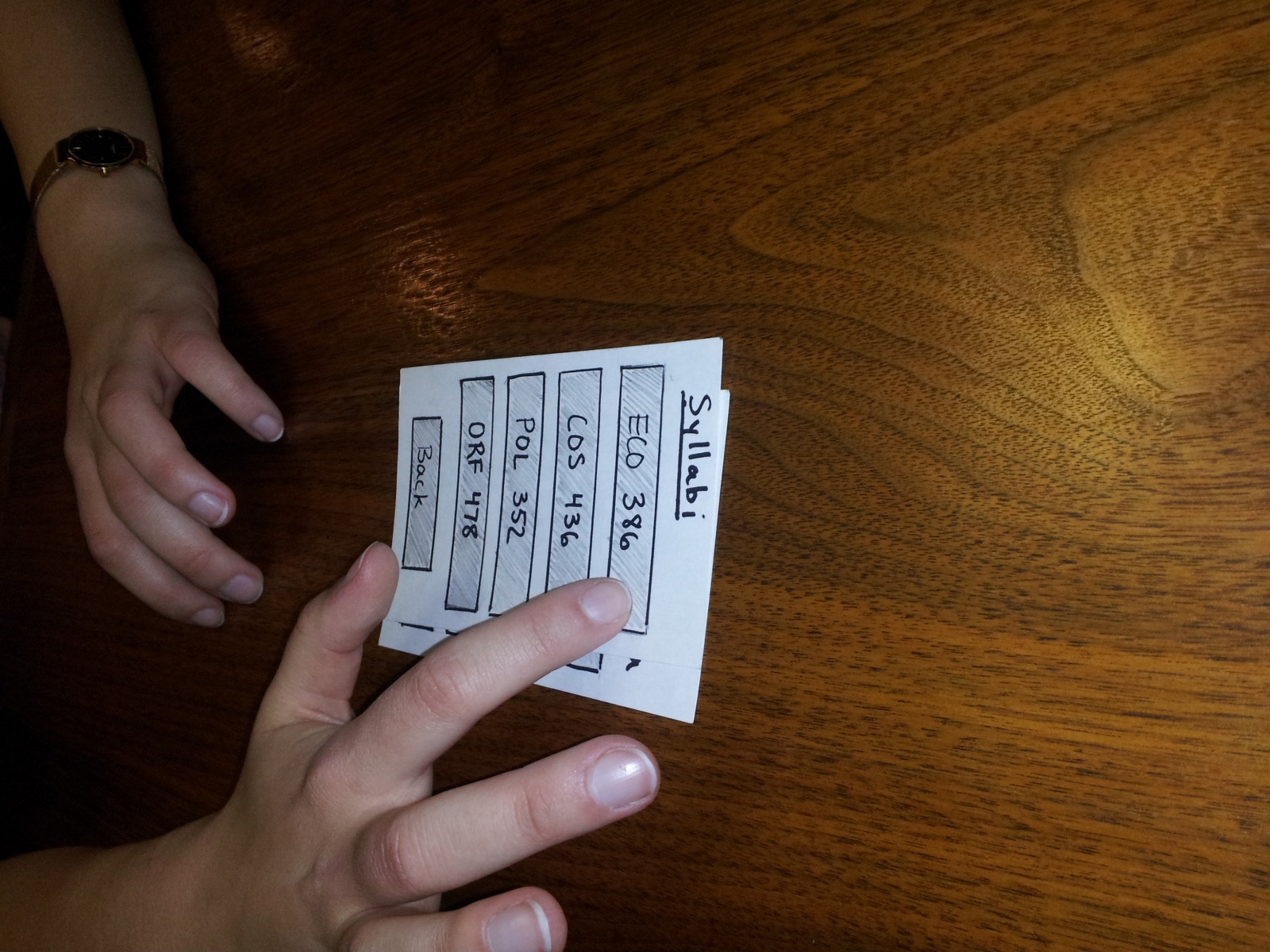
Prototypes:

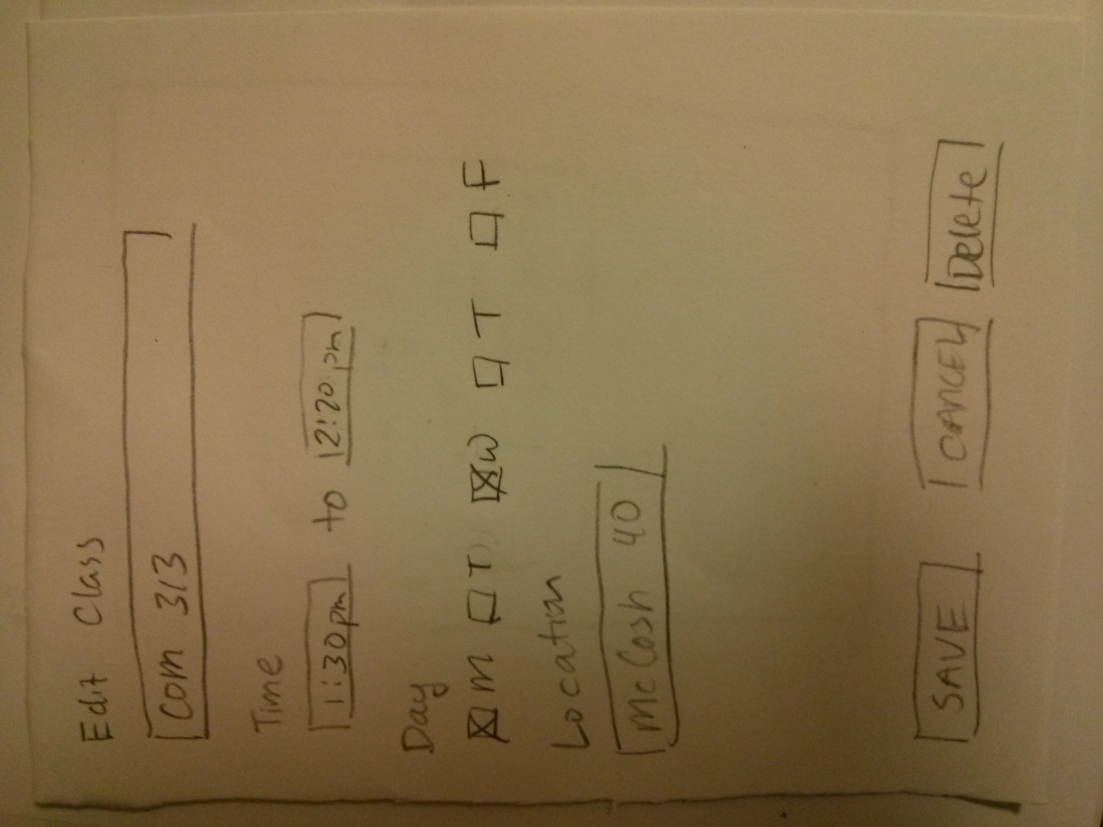
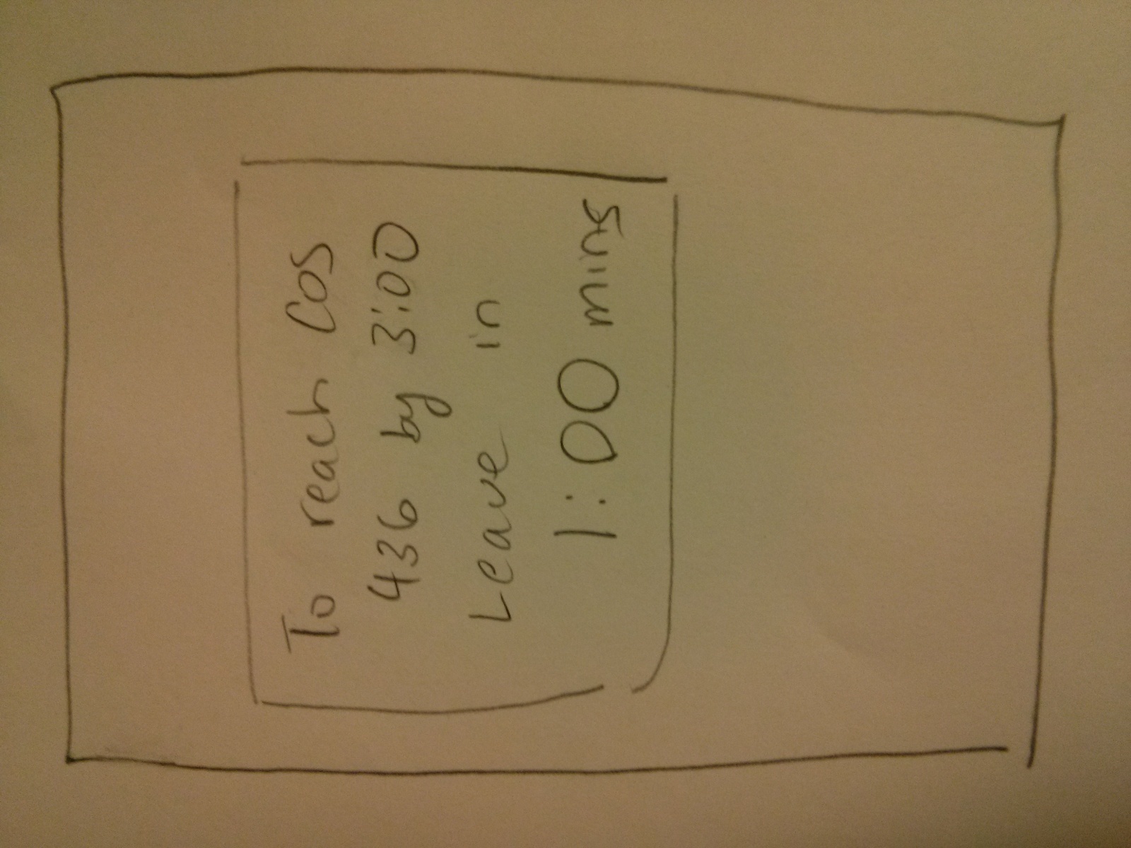
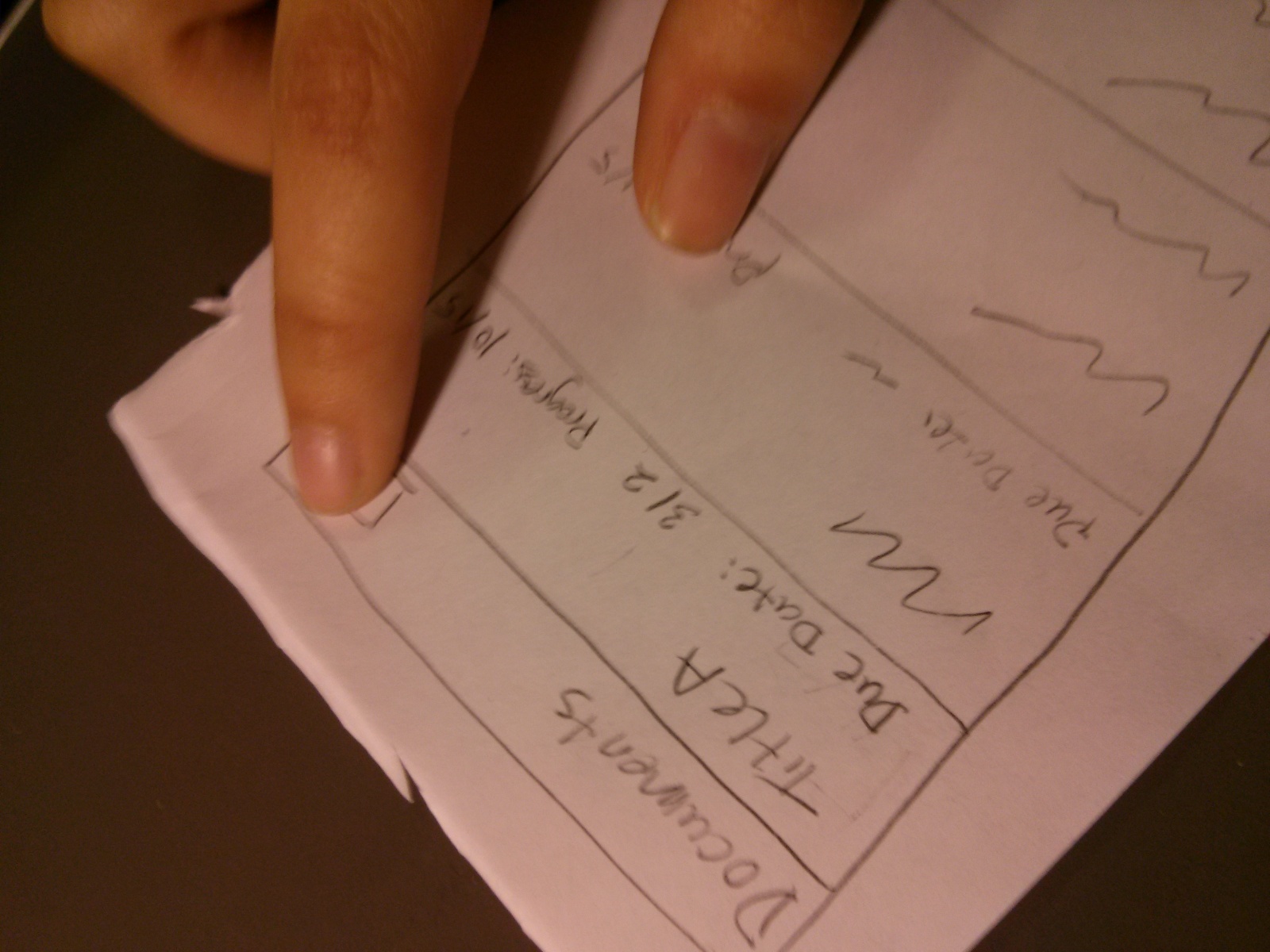
Number 8: An app that calculates the time it would take to get from your current location to your next class, and tells you when it’s time to leave.

A screen showing your classes.

IMG_20130301_162018

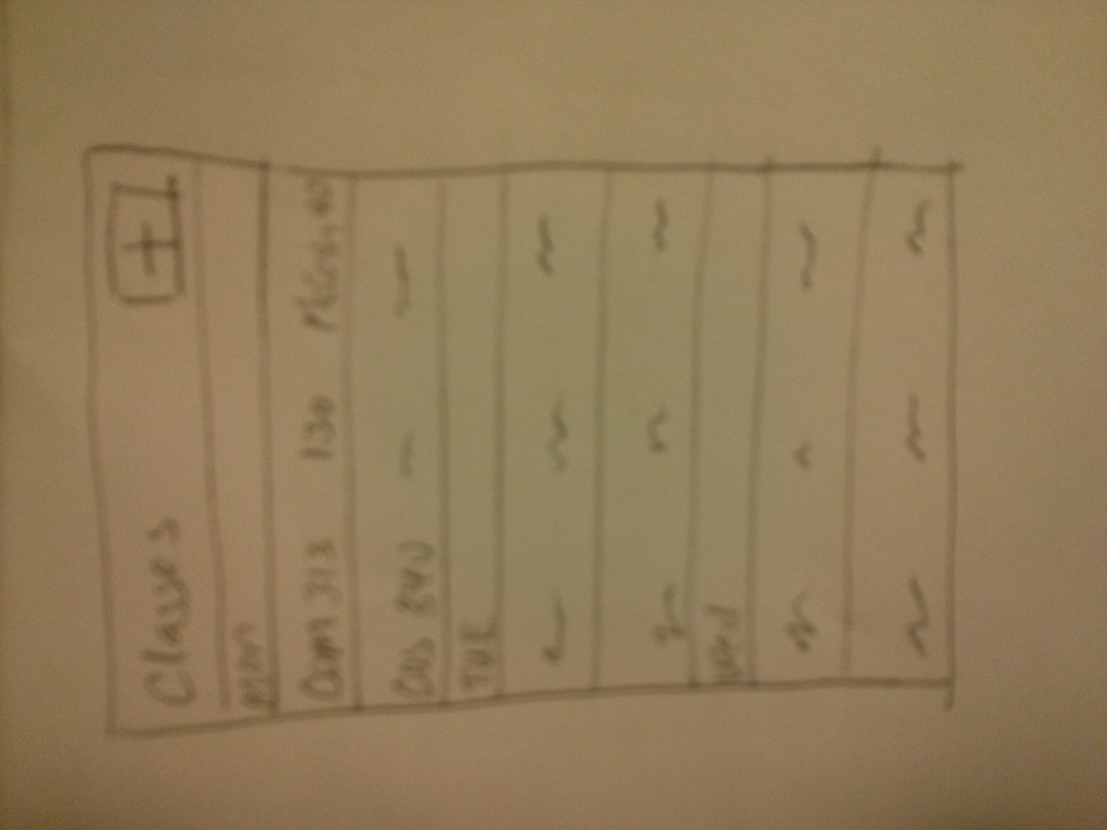
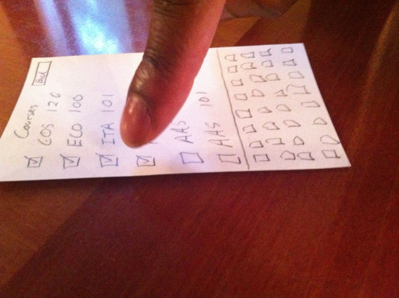
Add a class: Class Name, Date, Time, Location.

IMG_20130301_162033

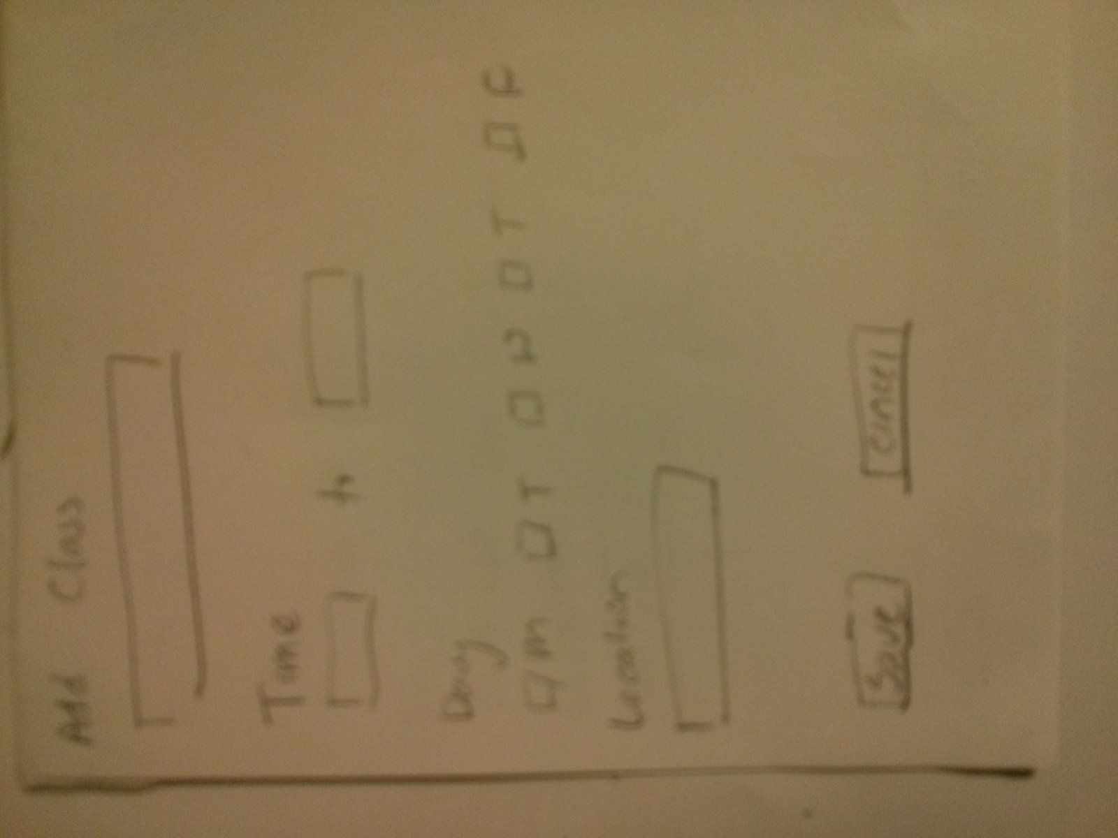
Edit a class: Class Name, Date, Time, Location.

IMG_20130301_162044

An alert will show up on your phone when it’s time to go.

IMG_20130301_162053

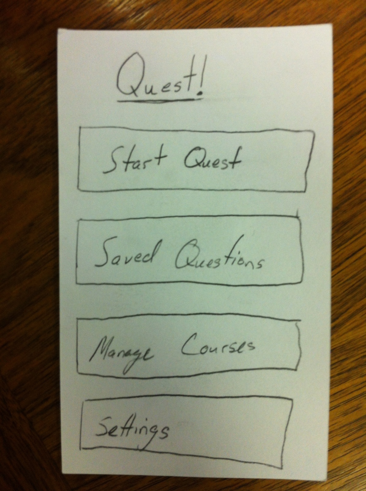
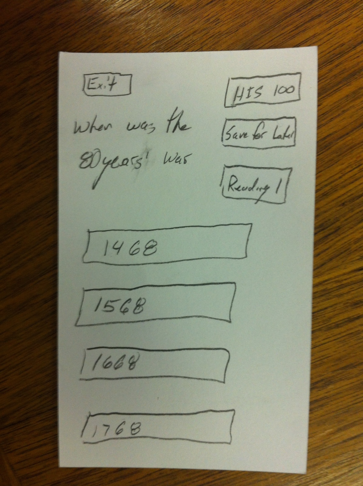
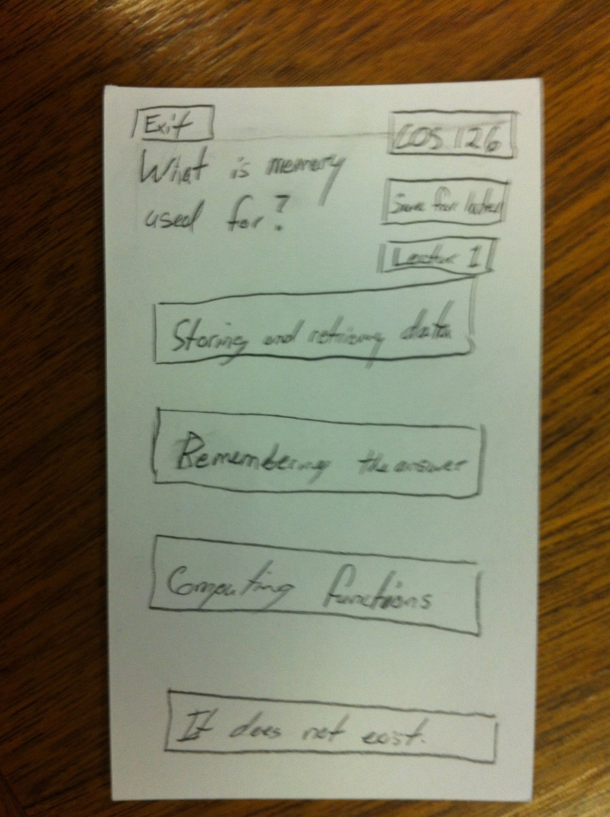
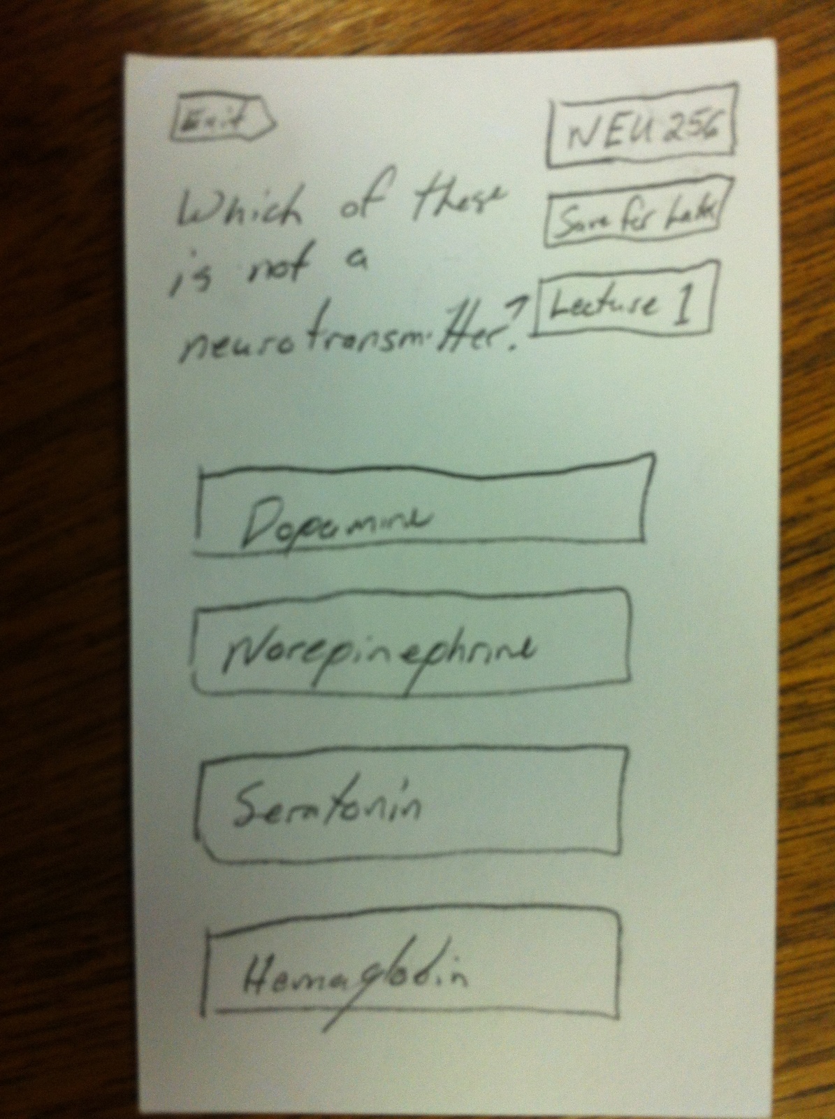
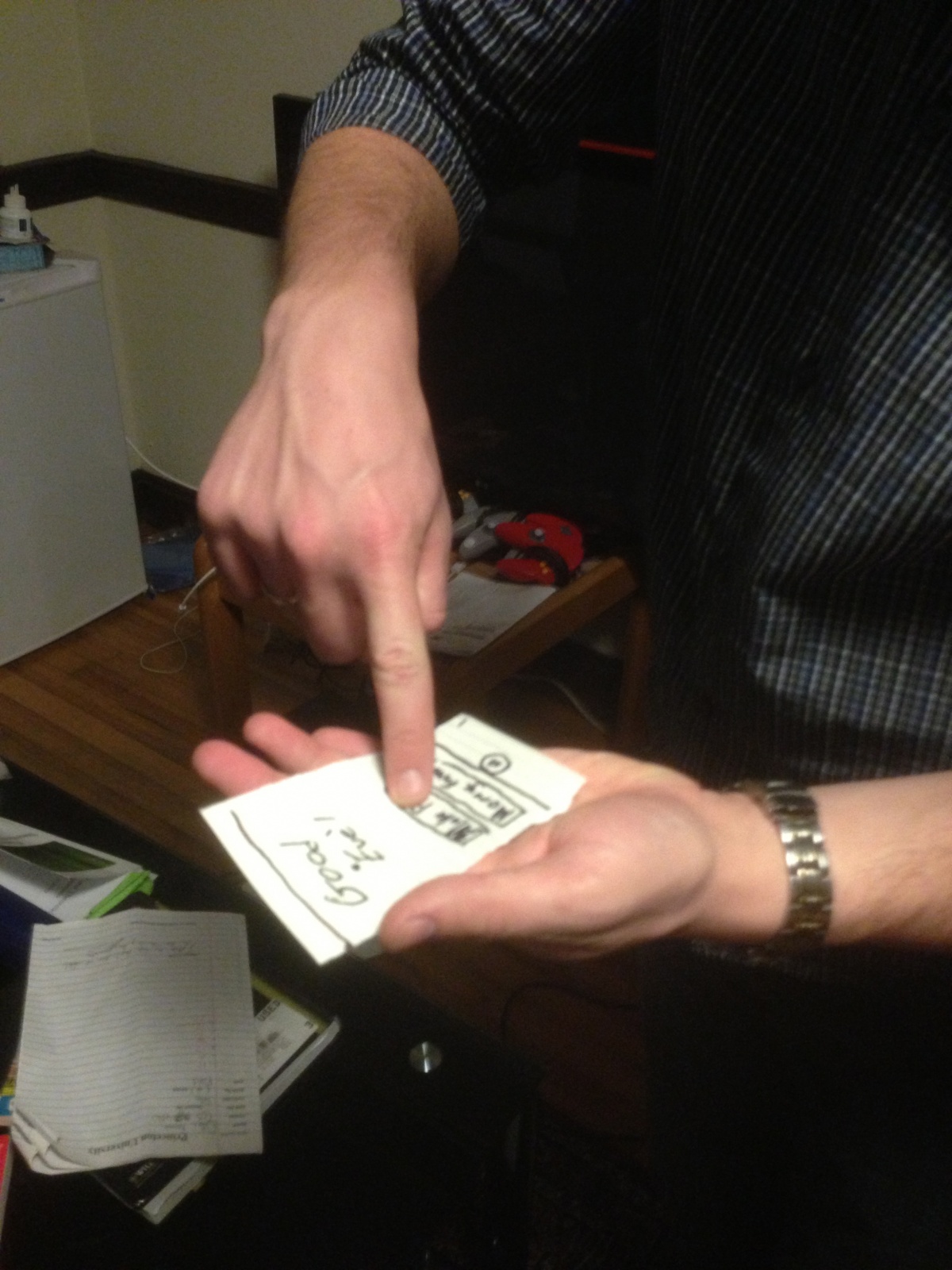
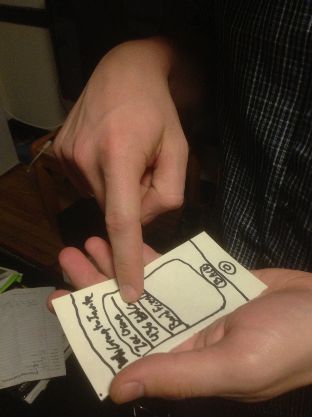
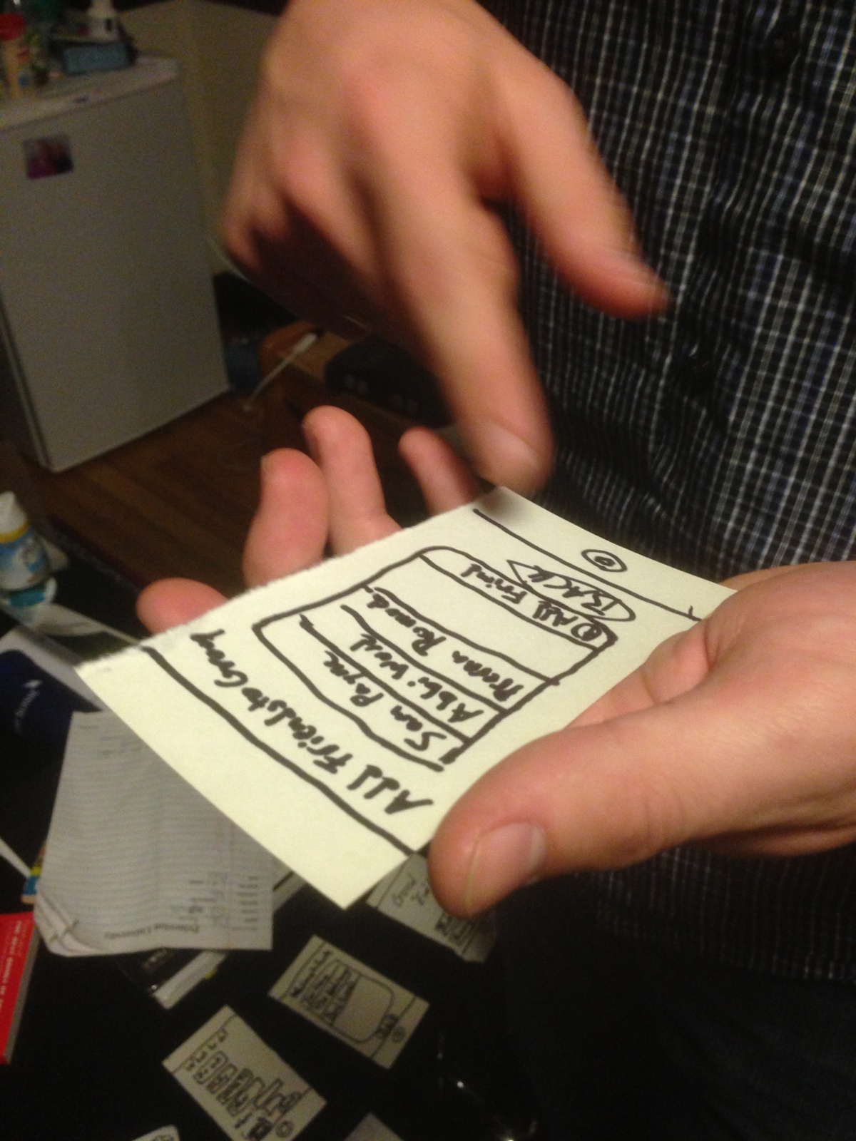
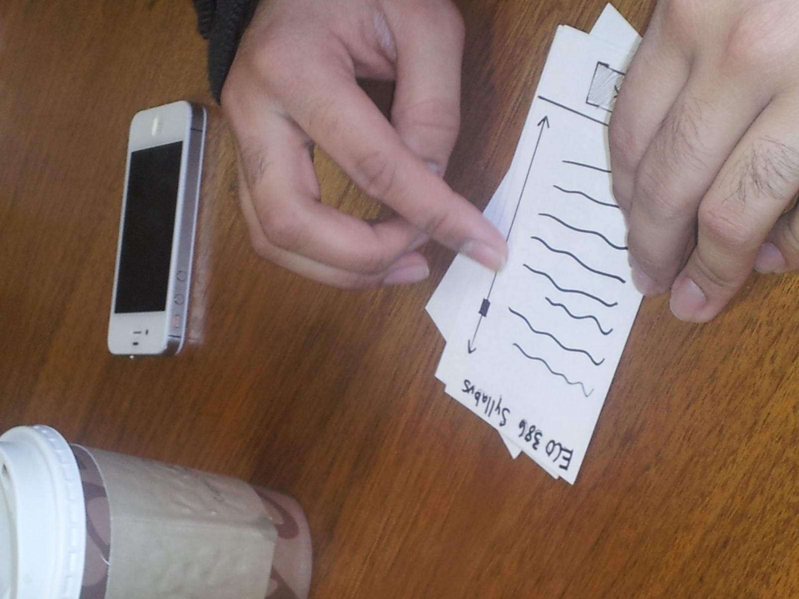
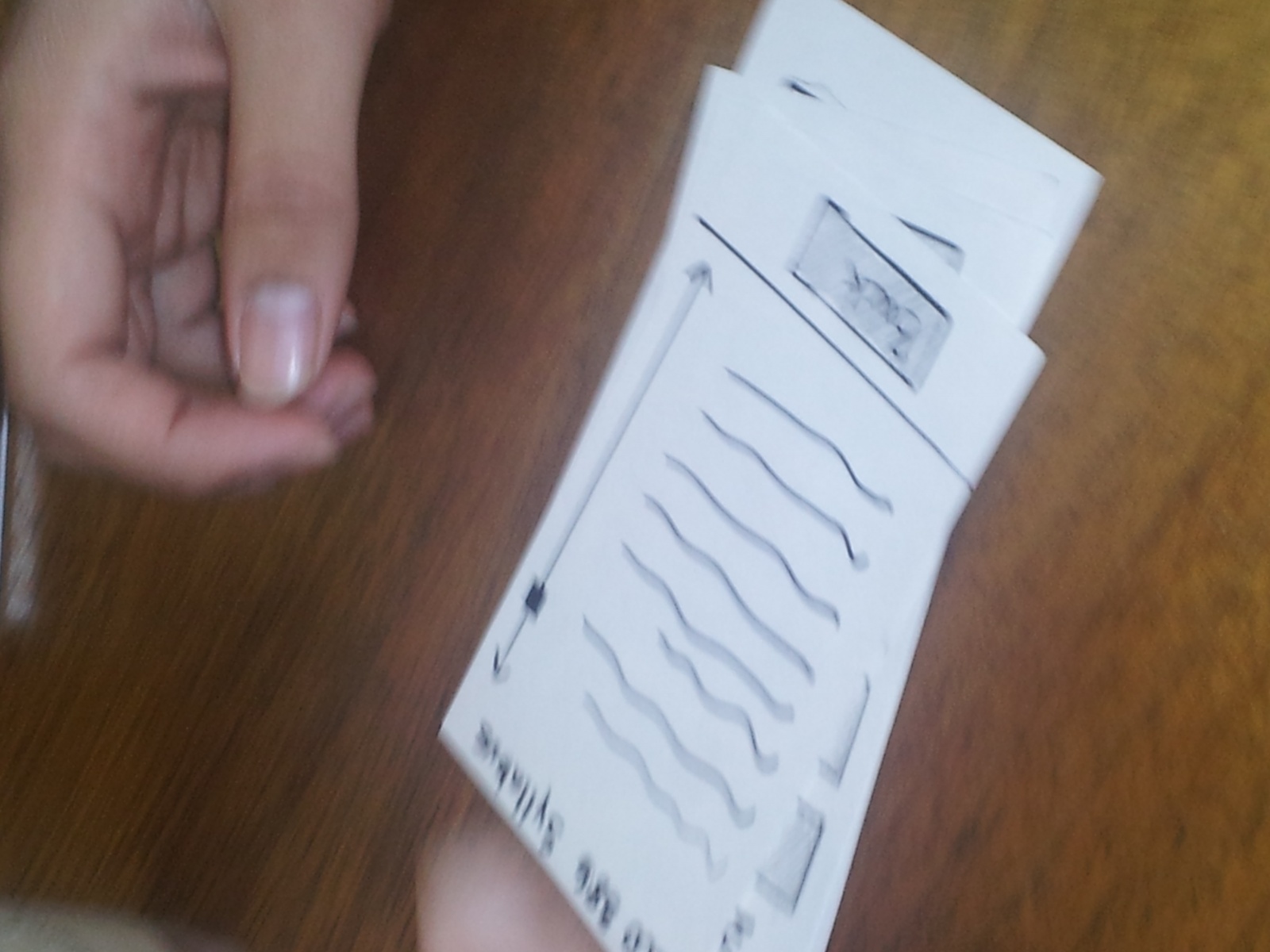
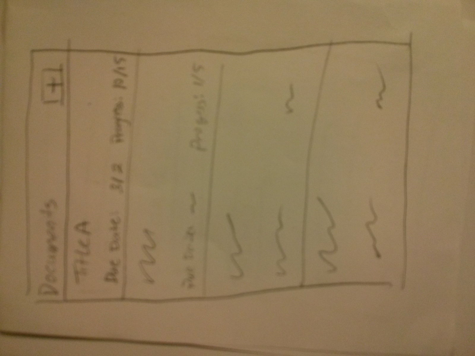
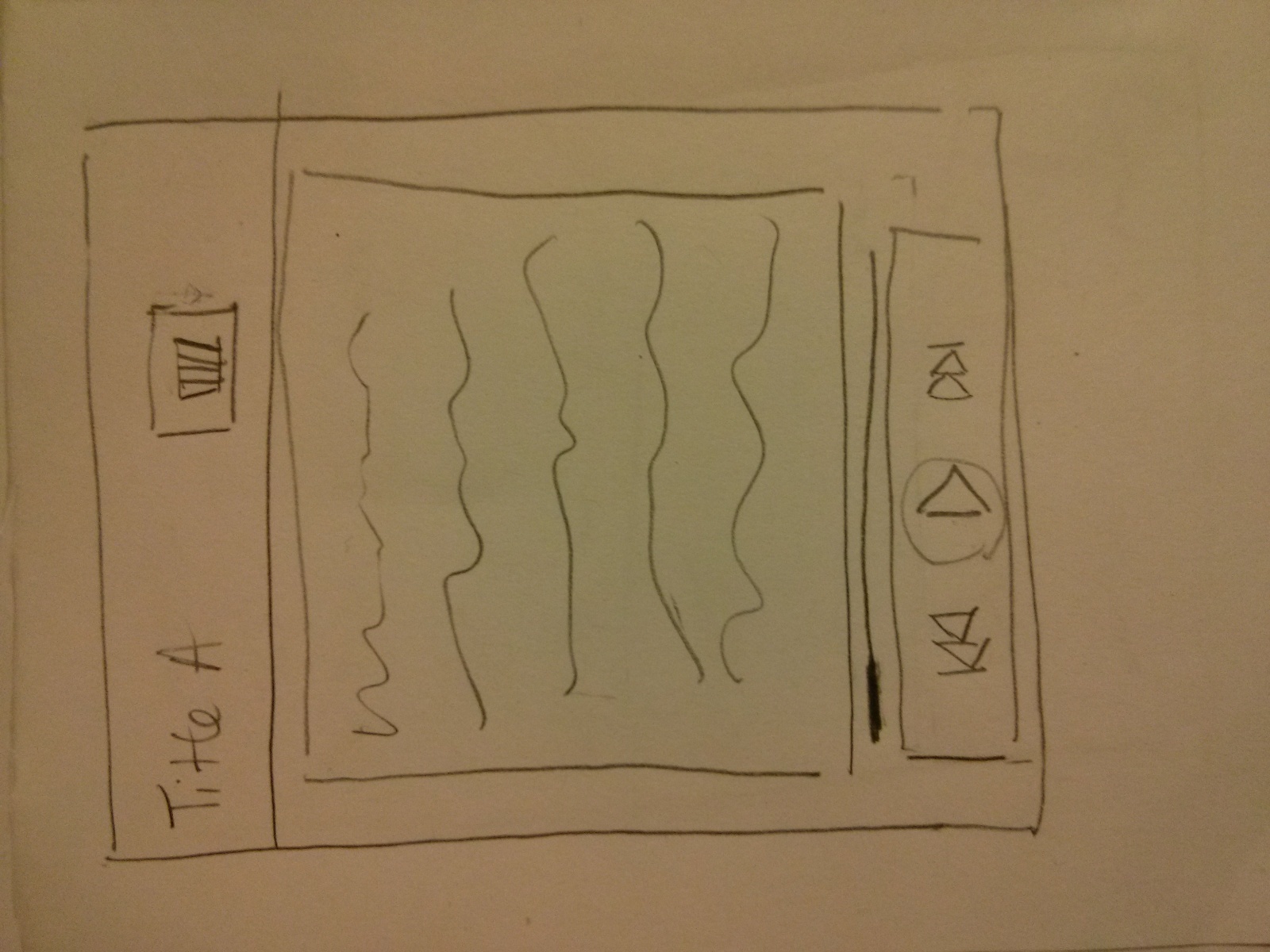
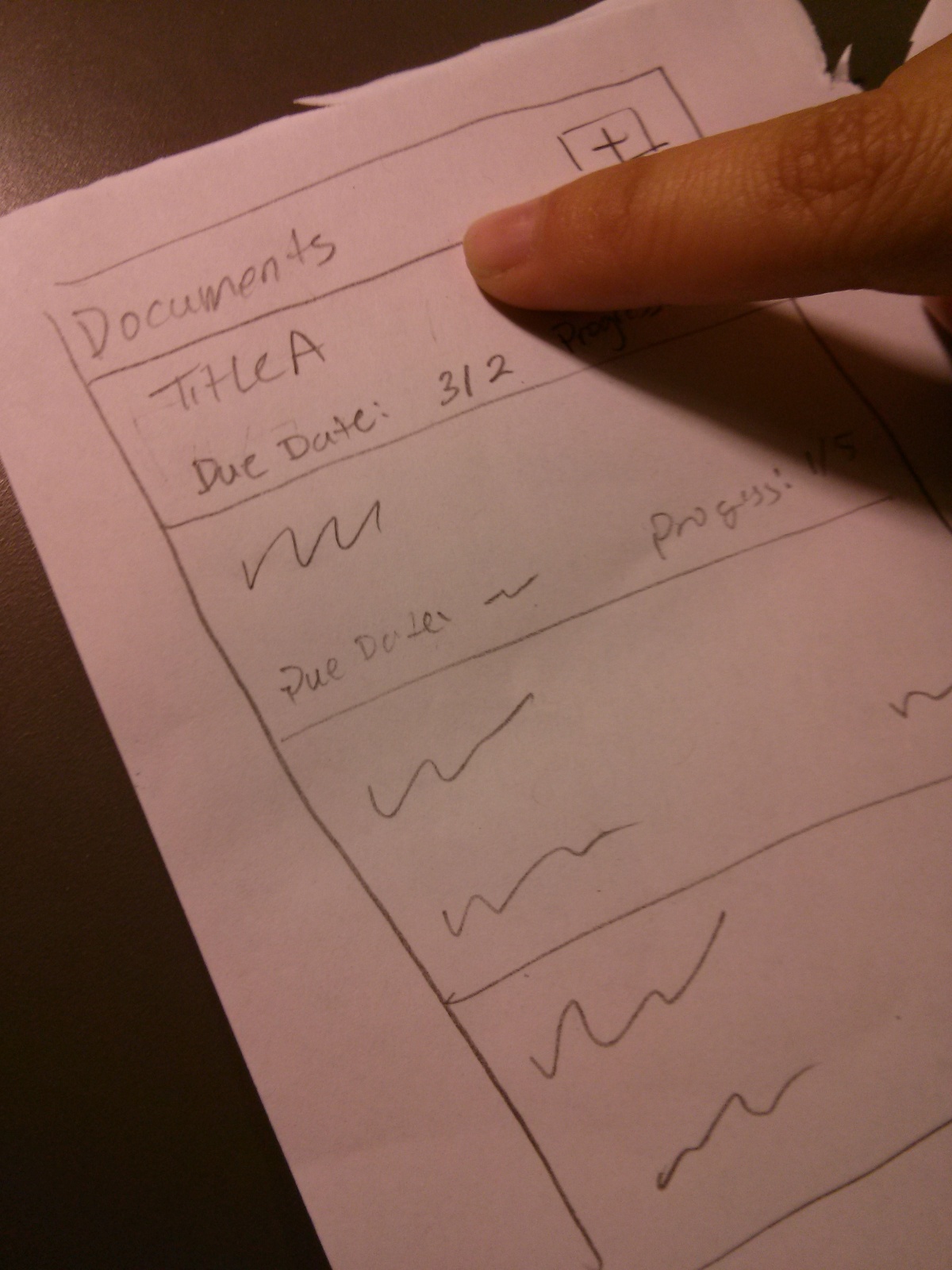
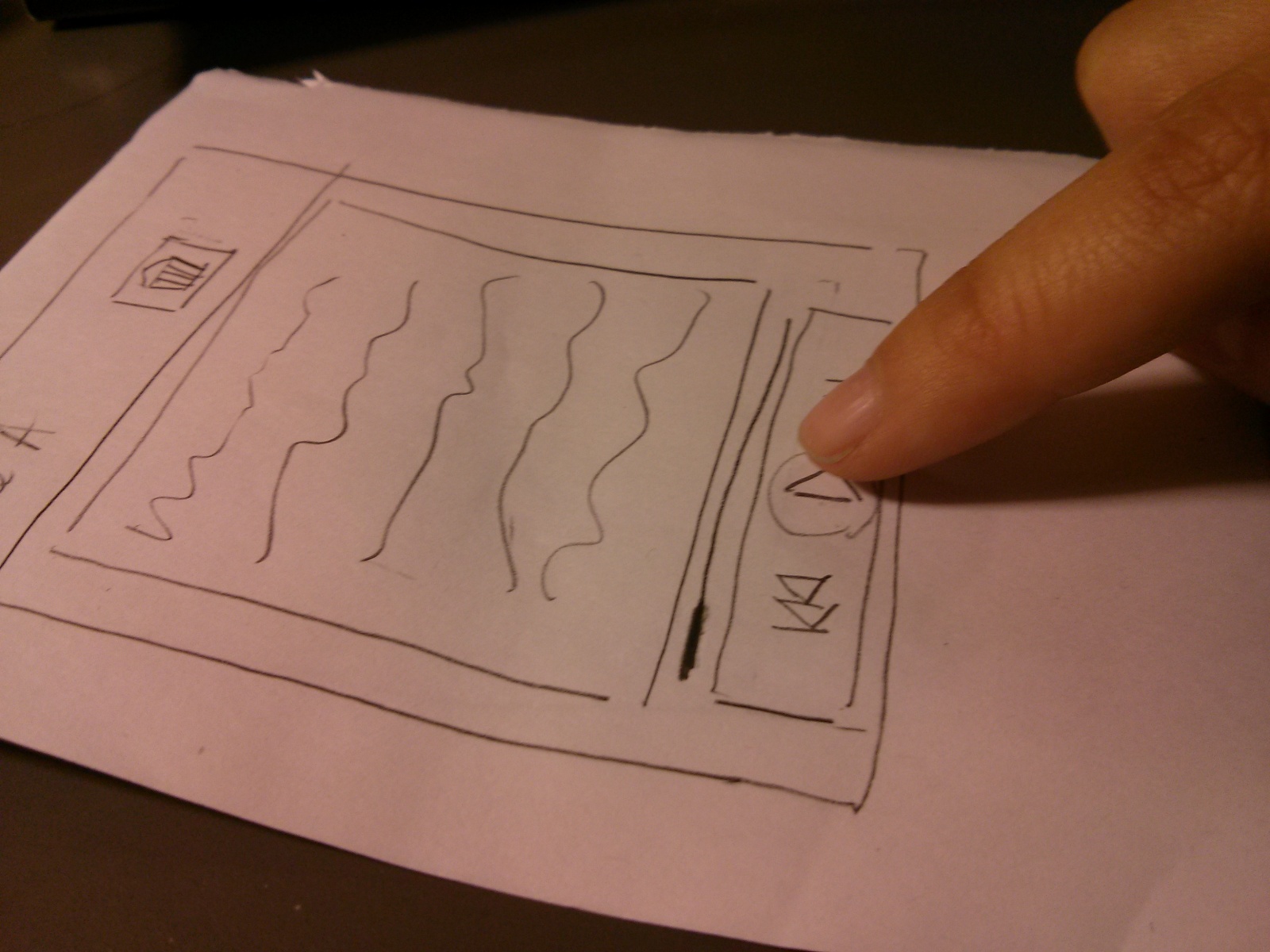
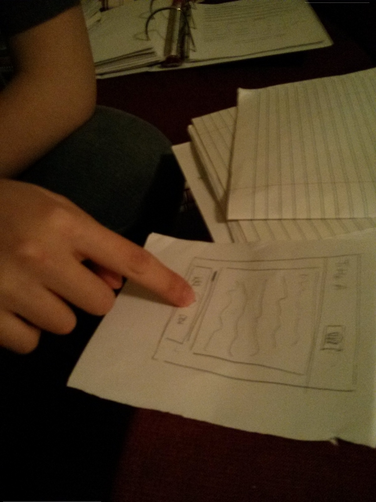
Number 14: An app that reads your readings to you (text to speech), so you can listen as you’re walking to class.

A screen of your current documents. (Main page)

IMG_20130301_161954

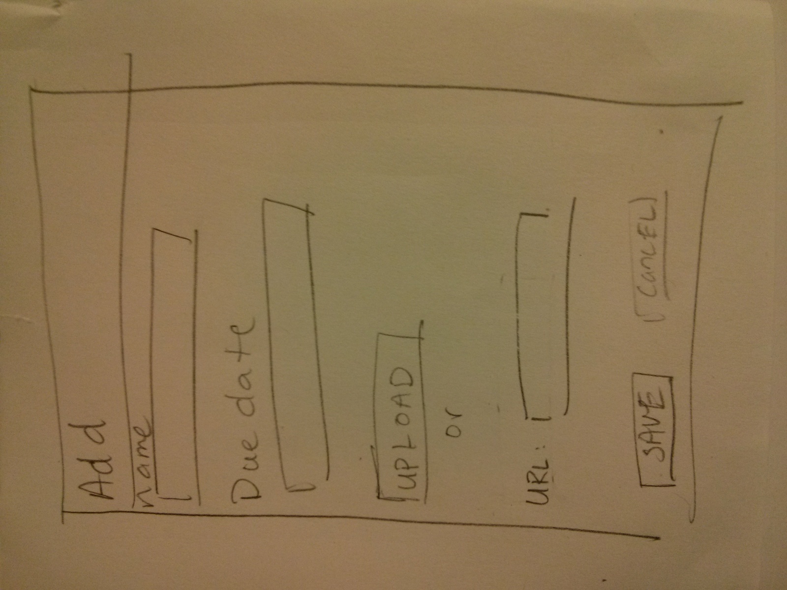
Add a new document. (New Document page)

IMG_20130301_162003

Choose one to read. (Page 2)
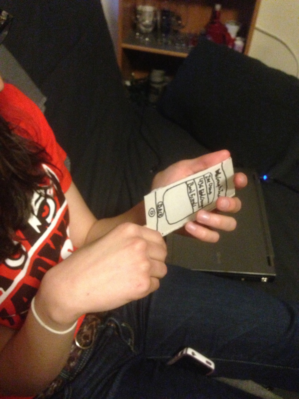
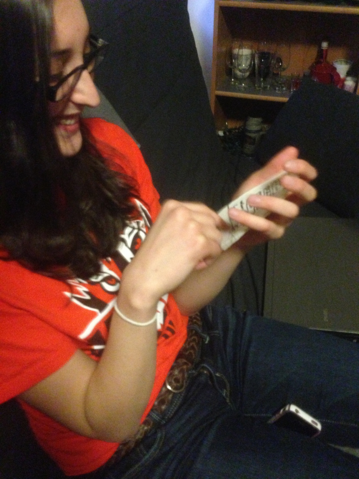
IMG_20130301_161943

Testing/Feedback:

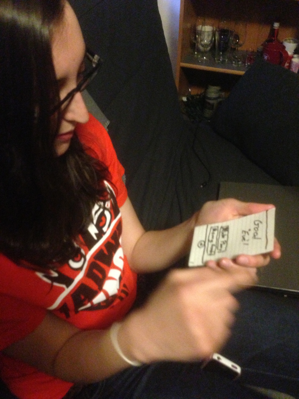
I tested the prototype for idea #14 on three students. I first gave each user the prototype (starting on the Main page), explained the purpose of the app, and had them navigate freely through the app. Then, I asked each of them complete the following tasks on the prototype: 1. Select a document and play it. 2. Skip to the next section. 3. Add a new document. 4. Delete a document. I observed that all of the users had little trouble completing most of the tasks, and their feedback confirmed this.

Select reading (users 2 and 3):

IMG_20130301_202306 IMG_20130301_220555

Play the current selection (users 2 and 3):

IMG_20130301_202430IMG_20130301_220612

Add a new paper/document (user 2):

IMG_20130301_202545

The first thing I realized with the first user was that I needed a back button from Page 2 back to the Main page. I added this before testing with users 2 and 3. Before I gave them specific tasks, only one user pressed the ‘+’ button on the Main page; the others just clicked on an individual document, which took them to Page 2.

Insights:

The delete button placment: The second user had some trouble deleting a document, as she didn’t see the delete button. The third user also commented on the delete button placement as not what she expected. Perhaps having a delete button on the Main page (instead of having it on Page 2) would be more intuitive. Also, the delete button should have a prompt, asking if the user really wants to delete the document.

Some general points:

Adding a document may be difficult, if the users don’t have it on their phones (and they are not very likely to). It would be a hassle to download the paper onto the phone or find the url of the paper. Perhaps it would be better to have a web interface for managing papers.

The first student, a psychology major, brought up the point that many scientific papers come with graphs/pictures, which the current prototype wouldn’t handle very well. It would be better if the graph was shown on the screen when it is reference.


Assignment 2 – Valya Barboy

1) Observations
I conducted my observation by writing down what people did before classes. I also asked about seven people (one of whom was a professor, to see how the responses differed) the following questions:

  • What do you do between classes
  • What do you wish you could do between classes

The notes from my observations and interviews are below:
Activities (observed):

  • Lots of people talk with their friends
    • Comment: sometimes professors need to take a minute to get them to settle down and get back into class mode, creates a delay
  • People loitering outside of class
  • Listening to music (as walking to and from class)
  • Walking (often rushing) to their next class

Activities (reported):

  • It’s a good time to call home — can talk for a little bit but not too long, can check it but don’t have to have a long, detailed conversation
  • Read articles online
  • “I don’t schedules classes one right after the other, because I want time to think about the material, schedule my homework, organize my life, and do my readings”
  • Professor activities:
    • Set up technology
    • Talk to students
    • I like to watch the students walk in
  • “Sometimes I just sit there awkwardly waiting for class to start, and I feel like I’ll be judged for going on facebook so I’m bored and have nothing to do”
  • “I first look at my watch, realize that my professor let me out 7 minutes late, and then I walk to my next class and then everyone looks at me weird”

Desires:

  • On first days of classes often classes are distinctly silent, because it’s a little awkward and you don’t know people and how they’ll react, can we fix the awkwardness?
  • Printing in between classes
  • Food in between classes
  • Coffee
  • Often the ten minutes are just enough time for the walk — if you get out of class late, you won’t be able to make it, and you’ll be late, fix that?
  • Charge electronics
  • Do something for the next class (there’s rarely enough time to)
  • Have the registrar calculate average waiting time (or expected waiting time) to optimize the transition, and make a more efficient schedule
  • Aggregate all of the class preferences and all of the professors’ availability times and make schedules for people
  • When scheduling, get information about what tends to run late, etc. so that you have better information with scheduling

2) Brainstorming (with Erica Portnoy)

  1. PuppyFinder: Tells you where puppies are, so you can pet them on your way to class
  2. TextSafe: Warns you if you’re about to crash into something, to make using your phone on the way to class safer
  3. ReadMe: Finds interesting things for you to read based on pervious activity
  4. EatQuick: Tells you how to optimize your meal experience based on distance to dining hall, crowdedness, and friend location/preferences
  5. BathroomBreak: Tells you how you can detour in between classes (most efficiently) to stop by a bathroom
  6. PrinterPass: Tells you where you can get your work printed in between classes (taking into account outages and popularity)
  7. FreeFood: Tells you the nearest free food, to grab on your way to class
  8. PathFinder: Optimizes how to get to class (taking into account stairs, or no stairs for bikes, as well as avoiding crowded areas)
  9. MealPlan: Connects to friends, get their schedules, and optimizes planning for meals
  10. SchedRight: Gets data on what classes run late, how long it takes to get from one place to another at different times in the day, and then gives the data to the registrar for optimal schedule creation
  11. TrafficJam: Looks at crowdedness in different areas on campus, and tries to redo scheduling/move around rooms, to minimize mobs and make the traffic approximately uniform around campus
  12. VideoIn: Opens a video conference after class ends, so that students rushing off to their next class can still ask the professor questions
  13. DryAlarm: Waterproof alarm clock for inside the shower, which sends reminders, to make sure that you can get to class on time/don’t miss anything
  14. BookGloves: Allow you to read on your way to class, possibly digital to interact with ebooks, iPads, etc.
  15. MomCall: Makes and ends phone calls based on your class schedule (to call your parents in between classes, but make sure you’re not late), and sends polite texts upon hanging up to apologize
  16. GroupMusic: Play music collaboratively (some sort of shared playlist that anyone can add to), in the time before lecture starts

3) Ideas for Prototyping
I chose to prototype ideas 2 (TextSafe) and 4 (EatQuick), because they’re the applications that I would want to use the most. EatQuick was one of a few applications to do with food, and I chose it because I got a lot of concerns from the people I talked to about meal scheduling/eating in between classes. I think TextSafe is useful because it would make people able to go some of the things that they want to get done in between classes (texting, checking emails, facebook, etc), while doing so safely and not getting hit by cars. Some of the other applications, I also liked, but did not choose because they were less interactive than I wanted. They also helped with things like scheduling beforehand, which would definitely optimize the Princeton waiting time, but in a different way. Such applications would also be harder to test – really, only time could see if they were working well.

4) Prototypes
This is TextSafe, prototyped:

This slideshow requires JavaScript.


And here’s EatQuick:

This slideshow requires JavaScript.

5) User Testing
I chose to test EatQuick, because it’s more interactive, and there are more things you can do with it, so user testing would be more useful with it. This is the first test of my app:

This slideshow requires JavaScript.


Notes:

  • “It tells me where I should eat and then it tells me where my friends are, if I select try here it gives me some likelihood that people are in there and how long it’s going to take for me to eat there.”
  • “It probably gets its information from the places my friends have eaten previously, ICE, and friends on ICE”
  • You should show me what friends I’m likely to see there so I can make a better decision

This is the second test:

This slideshow requires JavaScript.


Notes:

  • “It helps me figure out where to eat based on distance, or time, or where my friends are, or a combination”
  • “You probably get distance from the GPS, time from the line/queue (using the card swiper?), and can see what your friends have chosen to do”
  • It should give you more actual data, not just a suggestion as to where to go
  • Or make that information optional?
  • She wanted a button to give you more data
  • The map is confusing, it was unclear that the red dot was a dining hall, didn’t know what to do

This is the last test:

This slideshow requires JavaScript.


Notes:

  • Map is confusing
  • Make the features, and the things you can do more clear
  • Tell me which friends are there, and which friends you’re telling to go there
  • I was multitouch options
  • Can I have a select all button?

6) Insight and Future
I learned that in the future, I really should work on improving the map feature. As indicated in the notes above, it’s really unclear what to do with it, so some kind of instructions would make it better. In general, the best way to do it would probably be to have some sort of pop-up with information. Some additional features that people wanted were:

  • Shortcuts – select all, get some info quickly, without going through so many steps
  • Instructions
  • More specific information on friends (not how many, but specifically who)
  • Possibly add in food quality/menus
  • The ability to get more information – the app calculates things for you, but it would be good to know why it decided that, maybe see how it prioritized the different features you selected, or let you decide what’s more important to you
  • People tended to like the idea but want it more flushed out, want more information, want more features

A2

Gallery

This gallery contains 9 photos.

Alice Fuller Observations Student 1: I observed this particular student by arriving early to one of my lectures. Here is what she did Rush into class, choose seat, set stuff down Rush out of classroom again Wander back in at a slower … Continue reading

Assignment 2 – Matthew Dolan

Observations:

Student 1: This student was observed from the completion of one course until the beginning of his following course.  Both course were CS course and were in the same building so there was very little transport time.  At the completion of the first course, the student walked to the front of the lecture.  He waited in line to ask a question of the professor about an upcoming problem set.  The student was engaged in the professors conversation even when he wasn’t asking his question and waited while other students asked questions in order to hear the answers given.  After everyone had asked their questions, the student packed up their belongings and walked the short distance to the next class.  In the next classroom, he found a seat toward the back of the following lecture, removed a laptop from his backpack and opened up to the assignment for that he had asked his question on.  He looked through that assignment until class began

Professor 1: This professor was observed at the beginning of giving a lecture.  He arrived about 5 minutes before lecture was scheduled to begin.  This lecture has a technical assistant who runs the presentations so he did not need to prepare anything for the lecture.  He instead took the opportunity to have a conversation with a preceptor for the course.  Many of the preceptors gathered around the professor.  Topics of conversation ranged from course material to casual digressions.

Professor 2: This professor was observed at the beginning of a precept.  She was in the classroom prior to my arrival about 8 minutes before class.  She was checking something on her phone.  She then got out a sheet of handwritten notes from her bag and began to translate them to the blackboard behind her.  As each of the students walked into the classroom, she engaged them.  Asking a specific question and saying “good evening” to them by name

Student 2 and 3: Two students were observed leaving a class at 11 AM.  They packed up their bags together and walked back from Frist toward prospect avenue.  While walking, they talked casually.

Brainstorm:

Social: Students use the 10 minutes as an opportunity to catch up with friends.


  • An application that schedules and connects you with friends for a 10 minute phone conversation.
  • An application that facilitates the organization of text messages from the previous hour.
  • Application that organizes campus news for the past hour and uses social sharing.
  • Better content delivery system for campus notifications from administration replacing mass emails.
  • Mapping application that helps friends in nearby class connect and walk together.

Mental: Students use that 10 minute to debrief the previous class and get ready for the next one.

  • Trivia game that juxtaposes content from many course: acting like a mental palate cleanser.
  • Reminder platform that helps your organize thoughts about previous class to remember later.
  • Application that jogs your memory about readings you did and homework assignments to be brought in.

Student – Professor Interaction:

  • Allow students who have to run to class the opportunity to ask questions while they walk of professors and get immediate answers.
  • Students ask questions before entering the class which can be read and answered in the first 5 minutes of class.
  • Professors can give a short notes page that can be read by either students or preceptors to prepare them for class.
  • Platform for anonymous feedback on the lecture and readings for the class.

Break: Students take the opportunity to take a mental break between draining classes.

  • Short games that tell stories in the small provided time: bringing the student out of reality for a break.
  • Mapping application that maps your route to the next class through a nearby coffee spot.
  • Short video clips that help you get to know a student group or activity going on that week.
  • Application that uses social and genre matching to connect you with a new song to listen to.
  • Make the walk a game: give students incentives to perform actions or make a friend.

Shortlist:

  • Platform for anonymous feedback on the lecture and readings for the class.
    • I choose this idea because I think that constructive feedback from lectures is missing in Princeton education and the current system only allows for feedback at the end of the year.
  • Trivia game that juxtaposes content from many course: acting like a mental palate cleanser.
    • I liked the idea of a mental palate cleanser because it seemed very original but at the same time, I felt it would have appeal for Princeton students.

Prototype:

Quest:

photo 13

Opening screen:

This is the screen the user sees when first opening the application.  It allows them to do four different major tasks: Start a new quest, review questions that they marked “save for later,” manage the courses they are in, and manage other settings.

photo 14photo 16photo 4

Question Screen:

I created 3 different examples of questions.  Each has the same structure.  The question is at the top, results are shown.  (I started with just multiple choice questions however you could imagine this extending to more complex answers.)  Each question is assigned not only to a specific course but also a specific lecture, reading, seminar, or precept within that course.  Questions can be saved for later.

photo 5


photo 9

Feedback Screen:

This feedback screen gives the user a natural break after each question.  They can choose how they want to deal with the previous question and even if they want to move on.
photo 11

Saved Questions:

This screen is designed to help you find the different categories of saved question that you might want.  The groupings include questions you answered correctly, questions you answered incorrectly, sorting by course, and sorting by date (for example today’s lectures and readings for all courses).

photo 10

Manage Courses:

This screen helps you to manage the courses for a given semester.  It is a scrollable list of all course.  The courses you have selected are at the top (with checked checkboxes).  Below are all other courses.  By typing on the keyboard you can narrow the list to just courses that start with those letters.  This helps the user find courses easily.

How Was It?:

photo 12

Home Screen:

This is the first screen the user sees when the application opens.  It shows the two main workflows of the application: giving feedback to instructors and seeing the feedback given.

photo 8

Courses:

After selecting either of those two options, the user must then select the course they are interested in.

photo 17

Feedback Units:

After choosing a course, they must then select which reading, seminar, lecture, assignment, or reading they are interested in.

photo 18 photo 20 photo 21
Feedback Screen:

To give back, students are asked a series of questions in order.  They are given a slider to in order to indicate their attitude toward the given area.  I provided three example areas: “Engagement,” “Length of Material,” and “Quality of the Lecture Slides.”

photo 2
Comment Section:

After providing slider feedback, evaluations are given the opportunity to give comments on their feedback.  They can skip this if they wish with the button in the upper, right-hand corner.

photo 1

See Feedback:

Finally, this is a screen that can be used to see the feedback provided.  The top section is a graph the shows how the students felt about the given area.  It is a area map where the height of the line represents the number of students that gave that value.  Further the the right is better.  Finally, below is the list of written comments provided.

Feedback:

photo 7


photo 3


photo 15

User Testing 1:

The first user tested started by going through a complete “Quest.”  He didn’t save any questions.  He found the questions simple to understand and was motivated to go forward.  At the end of each question, he was pleased by the feedback.  He then went into that “Manage Courses” pages and confused by the mechanics of the UI.  He didn’t understand the scrolling capability of the course list.  He also didn’t understand the use of the keyboard.  He also didn’t understand the ordering the courses.

User Testing 2:

The second user tested also began with going through a complete “Quest.”  She found the quest itself intuitive.  She tried to save a question for later.  When that brought her to the next question automatically, she was confused by the mechanic.  She hadn’t necessarily wanted to go on to the next question.  She had similar difficulty as the first user trying to add courses.

User Testing 3:

The final user tested went also through a complete “Quest.”  After finished the “Quest,” he went to the “Saved Questions” section.  He found that section a little intimidating.  He said that having to select a category before even seeing any saved questions was a barrier to him going any further.

Insights:

  • Utilized Existing Paradigms: The “Quest” section of my assignment was much more intuitive than the “Course Management” section because it was something everyone was used to doing.  Quiz apps have been around for a while and everyone has used it.  This is the power behind the existing desktop metaphor.  It is so ubiquitous that its intuitive.  New UIs must be informed and shaped by their predecessors.
  • Make Simple Actions Explicit: The experience must be a simple as possible for a first time user.  My “Course Management” system was powerful but unintuitive.  I need to make the simple act of adding or dropping course more explicit (maybe by adding section headers or a search bar).
  • Bake Complex Actions Deeper: If you want to add layers on top of the explicit simple actions, keep that away from the casual user.  I liked the “float to the top model” for course selection but it threw too much at the user.  It is better to hide complexity.
  • Get Users To Data Fast: In my “Saved Questions” section, I created too much of a barrier between the user and the data they want.  I should have gotten them to the questions directly.  One there, I could add features like filter to get the user to the exact data set they need but have the imediate access would have been better.
  • Always Think About All Possible Outcomes: When users saved their questions in my platform, I assumed they would want to go directly to the next question.  That might be true for a majority of the users but not necessarily everyone.  To make a successful UI, you need to go through all of the possible user scenarios.

Assignment 2- Dillon Reisman

Observation:

Before describing specific class observations, I would like to comment on a few general trends that I found fairly surprising. First, more people outwardly appeared to be “doing nothing” than I would have thought. By “doing nothing” I mean that a number of people took their seats, pulled out their notebooks, and simply stared straight ahead or down at a blank sheet of paper.

In general I can divide the majority of people observed into three groups- these people who had nothing in front of them (nor were they interacting with anyone), people engaged with their smart phones, and students with laptops out (both of which were doing a diverse numbers of things on said devices). For the following specific observations I looked at three distinct classes and one specific student within each class: a Thursday 1:30 PM “Social Networks” precept with junior “Dan,” my Imagined Languages class on Wednesday at 1:30 PM with junior “Nikitas”, and COS 340 on Wednesday at 3:00 PM with sophomore  “Nicky.” I also conducted an outside-of-class interview with a junior student named “Wendy.” The following are my notes:


-Dan and Wendy, along with several other observed students, use the time before class to catch-up on emails that are missed over the course of the day (the average student receives tons of emails, that can often go unread). While people could conceivably check their phones for emails this appears to be done more often on laptops, the option taken by Dan and Wendy.

-A minority of people who spend their time before class on laptops do it in activities other than email- one big one I saw was shopping. It did not appear to me that people on laptops often review their notes before lecture.

-Students who had out smart phones (a large portion of students outside of students on laptops) were often texting friends in outside classes. Only in a minority of cases were people playing phone games (of the “Temple Run,” “Angry Birds” variety).

-Nicky was a rare student in that he had pulled out his physical notebook and was looking over notes from the previous class. In “Imagined Languages” with Nikitas, the professor opens up every class by asking what we did in the last class. No one ever answers quickly.

-In big lecture halls it is often a problem that people do not move into the middle of a row of seats, making it difficult for someone who came late to class to find a good seat to sneak into. Perhaps there’s something there that could be done to encourage people to “clump” towards the middle of a row for more efficient seating.

-Very, very few people actually spoke to their neighbors. It would be nice to get people to interact more.


Brainstorming:

  1. ClassChat: Web-based app to open a pre-class chatroom to all members of a class, discuss past lecture or upcoming assignments.
  2. ClassCompanions: Pre-class chatroom open to your friends in other classes, also waiting for class to start (alternative to texting with only one friend).
  3. KnowYourProfessor: Phone-based trivia questions about your professor
  4. Class-a-sketch: A phone/web-based sketchpad for a cooperative doodle between members of a class.
  5. Anony-notes: Phone-based: Leave a message of your thoughts, random musings, etc. to the person who will sit in your same seat in the next class.
  6. QuickReview: Web-based game that takes prior lecture’s notes, creates fill-in-the-blank style quiz to help student review past lectures.
  7. Email Attack!: A game that displays your emails one at a time on your laptop and demands either an ‘ignore’ or a ‘reply’ in a set amount of time for points.
  8. Study Snacks:  Order snacks (cookies, muffins, etc.) for pick-up at food carts situated around campus on your way to class- all charged to your University account.
  9. Questioner: App to solicit questions from the class before class starts, to be displayed on the projector and addressed by the professor at the start of lecture.
  10. Icebreakers!: App that takes in the name of a neighbor and returns your closest mutual friend (based on Facebook activity).
  11. “I can’t remember!”: App takes your iCal/calendar information and tests your memory of your upcoming commitments.
  12. iKartoj: Phone-based Esperanto flash-cards/exercises for learning new Esperanto root words in your free time.
  13. Musical Roulette: Each member of the class proposes a song to play in lecture before class, one of which is selected at random as that lecture’s song.
  14. Good eve’: An app that lets you coordinate previously unscheduled evening plans with friends in your free time during the day.
  15. The Amazon Games: App that lets you choose one product from Amazon everyday- at end of week, lets you eliminate items in round-robin to determine best item you found that you might want to buy.


Two Favorite Ideas:

7. Email Attack!: The desire in a lot of people to use the free time productively was strong, and this app can make a mundane but important task fun and even more efficient.

14. Good eve’: Throughout the course of a busy day it might be difficult to plan recreational time with friends in the evening before it is too late, so this app could help people organize their often-unscheduled night plans early in the day.


Paper Prototypes for both:

Good Eve’ Paper Prototype:


Good Eve' paper prototype 1

Welcome screen, friend group management screen, and “Add friends to group…” screen shown. These all flow from the “Manage Friends” button on the welcome screen


Good Eve' Paper Prototype 2

When you select the “Make Plans” option on the welcome screen, you are taken to a screen where you select a group to send a plan out to, and then a screen where you select a category of plans and add a location and comments.

Email Attack! Paper Prototype:

Email Attack! Paper Prototype 1

Game starts when selected in email. You are shown an email and you can either ignore or reply. There is a timer to the right of the screen showing how much time is left.


Shows reply screen.

When you select reply a separate window pops up for you to type your reply, and send. When you hit send you go the next email.

Game over

When the timer on the left runs out, the game ends.

User Testing:

Ballard Metcalfe, User 1:

Ballard making evening plans with friends

Ballard making evening plans with friends

Ballard selecting group to invite

Ballard selecting group to invite

Ballard managing his groups

Ballard managing his groups

Ballard adding a friend to a group.

Ballard adding a friend to a group.

Here, Ballard was a bit confused about the nature of the names he was adding. Were they users on Facebook? Contacts on his phone? Other users in this service?

Karenna Martin, User 2:

Karenna testing 1 Karenna testing 2 Karenna testing 3 Karenna testing 4

Karenna had similar questions, but otherwise the flow of the screens seemed logical. She also pointed out that several very obvious options were missing, such as when an event was to be planned.


Insights:

-The friend menu, Ballard pointed out, had failed to implement a “remove friend” option. I imagine that it would look like most menus of this type on the iPhone, where you can swipe across a name and a “delete” button will appear on the name.

-I should have a menu in which you can add contacts, or sync the app to Facebook. That way messages can be sent out fairly naturally to a large array of users who may not even have this app necessarily

-I had envisioned a push notification on your phone when another user sends you plans, but it might be smarter to just have it sent through Facebook messages or a mass-text for non-Facebook users.

– A calendar-esque format might help for making plans further in advance.

-Rather than only have the ability to send to an entire group, future revisions should have the ability to invite multiple groups, or to only select certain members of a group.

-With multiple friend groups you should have the ability to view past plans made with a group, or manage multiple plans at a time with different groups. A “plan manager” menu should be added in which plans are treated as separate objects that can be moved around and edited with other members of the group.

-Might want to implement something akin to a scheduler that can coordinate meeting times between multiple people as a part of the app.

A2: Class Panorama – Philip Oasis

Part 1: Observations

Who: Megan Karande

When:  1:10pm Tuesday

Where: Beginning at Frist, outside Café Viv

  • Megan was working on her thesis at the tables outside of Café Viv and talking to friends who were sitting with her.  She got up, and went to tower quickly to get tea.
  • On the way to tower, she checked her phone while waiting for the walk signal at the stop light on Washington Rd.  She said that she checks her phone a lot before her studio class at 1:30, because she can’t look at her phone during class.
  • When she was getting tea, she realized that she needed to print something for a meeting after class, and sat down to get her laptop out and print it.  She then asked me if I thought the Campus Club printer was working, because it had been broken for the past few days.
  • She printed her sheet, and went to Campus Club to print it out.  The printer was working, so from there she started walking down Washington Rd. towards Nassau St.  She checked her phone again, and started to walk quickly when she realized that she only had 5 minutes to get there (her class was in the Lewis Center at 185 Nassau).
  • She checked her phone again as she got to the building, realizing that she was just going to make it on time.  She checked her texts and emails one last time, then went in to class.


Who: Sam Zeluck, Paige Tsai, and Megan Karande

When:  1:20pm Wednesday

Where: Beginning at Tower (eating club)

  • Sam went upstairs after lunch to get her 2 coats (she said that she occasionally wears 3 when it is really cold) and her backpack.
  • She checked her phone for texts from Megan (who she usually walks to class with), but didn’t have any, so she went downstairs to look for her.
  • She met Megan and Paige on her way down the stairs – they were coming up to leave after getting tea.  Paige had met Megan while they were getting tea, and decided to walk with her because they were going in a similar direction.
  • They left Tower, and walked across Prospect Ave. to Robertson Hall.  None of them had class there, and they said that they were going through there because it was warmer to walk through a building and it didn’t add time to the walk.
  • They were talking about me observing them, and how Paige had been following her New Years’ resolution to drink more water and was carrying a water bottle
  • They walked out the opposite door of Robertson, onto the plaza there, and then towards Washington Rd.
  • They briefly walk down Washington Rd., and then Paige splits off at Green hall to go to her psychology class.
  • Megan and Sam continue to walk down Washington Rd.  Sam checks her phone to see the time and see if she has any texts.  They speed up a little bit because they only have 2 minutes left before class.
  • They enter the building (Aaron Burr Hall), and start talking about the next assignment they have due for the class (Imagined Languages).  They get to class at almost exactly 1:30.


Who: Gene Merewether and Alice Fuller

When:  7:20pm Wednesday

Where: Beginning at Tower (eating club)

  • I went downstairs to wake him up from a nap before class, since he had asked me to do that earlier.
  • He got up, went to the coatroom for his coat and backpack, and met Alice there while she was looking for her coat.  I asked if they planned to meet before going to class, and Gene said that they usually just see each other in the coat room, but that if he didn’t see Alice he would have assumed that she left already.
  • They left tower, and walked down Prospect Ave. towards lab.  They talked about the lab writeup and senior pub night on the way.  Both mentioned how cold it was outside.
  • Gene checked his texts and emails briefly during the conversation.
  • Just as we were turning down the road towards the EQuad, we saw Rodrigo (our other group member) coming from Charter.  We hadn’t coordinated to meet him on the way, but just got lucky in seeing him.
  • Gene used his prox to open the door of the EQuad, which was locked because it was night.
  • Gene was walking at the front of the group, and almost led us in the wrong direction.  Alice corrected him and we went downstairs to lab.

Part 2: Brainstorming (with Gene Merewether):

  1. Walkshare – find out which of your friends are going to which locations and arrange to walk with them
  2. An app to find out which printers are working, or the hours of campus buildings
  3. An app to find out routes to your classes which go through buildings in order to stay warm.
  4. A watch / ring / other device which changes color depending on how long you have to get to class
  5. An app that tells you if you have time to get water / print something / get tea before class, and tells you where to go
  6. An app which displays friends on a map, if they want others to be able to see where they are
  7. An app which provides you a to-do list before class
  8. Time-updated frequently texted list – shows your contacts based on when you usually text them and what time it is now.
  9. An app that displays menus for eating clubs and dining halls, and helps friends coordinate where to go
  10. Easy automatic responses to emails/texts saying that you are in class
  11. A device that notifies you automatically when friends are nearby or are walking in a similar direction
  12. A way to place a lunch order while going to lunch, in order to minimize time waiting
  13. A calendar that gives you reminders automatically before you have things scheduled (so notifications come before class)
  14. An app which tells you which of your friends is in class, at lunch, etc. so you can coordinate large groups without texting
  15. An app which presents easily accessible syllabi and assignments pages for classes and compiles them into a calendar
  16. An app by which you can easily track and make record of your progress on assignments
  17. Surveys for students waiting before class about the
  18. Flashcards or review tests for students before the next class
  19. Shared reading notes for students to fill in gaps before class/precept

Part 3: Idea Selection 

I am selecting ideas 1 and 5 for paper prototyping.  I have selected idea 15 because people I was observing tended to discuss coming assignments, and several times people did not know when things were due.  I chose idea 5 because it also appeared to be a major issue in my observations; the people I watched wanted to do things like get coffee or print before class, and didn’t know if they had time to make it.

Part 4: Paper Prototypes

These are ordered hierarchically, so that the flow of navigation is from the top to the bottom.

Idea 15


Note that the top screen is only seen on the first use, or when you are not logged in to a Princeton account.  The two screens below “Calendar” are meant to be overlays, which disappear when Ok or Back is selected.  The first is triggered by hitting the “Select Dates” button, and the second is triggered by touching one of the blocked off calendar events.  The keyboard appears at the bottom of the screen when a text entry box is touched/selected.


Idea 1:


Again, the first screen only appears if the user has not logged in before, or is not currently logged in.  Otherwise, they will start from the Main Menu.  The top New Destination screen buttons signify (clockwise from top left) coffee/tea, printers, food, and libraries.  The next New Destination screen is then customized based on the item selected (the prototype just includes the screen for coffee/tea, since other options will have similar layouts and interactions.  The Navigation screen can be accessed by selecting one of the options in the second New Destination screen.  If Map is selected from there, it will take you to the View Map screen, which is shown under the main menu, but with the route highlighted by a dotted line.  In Settings, speeds are manipulated by dragging sliders.

Part 5: Prototype Testing/Observations

Who: Tejas Sathe

When: 2:20pm Thursday

Where: Thesis room of Tower

  • He navigated relatively smoothly through the main menu, selecting Calendar first.  He pressed on one of the event blocks, and was happy to see that more details came up.  He then tried to click on the location of the event, and mentioned that he would have liked a Google Maps option.  After I told him I hadn’t included it in the prototype, he said he was looking for how he could change reminders from inside the calendar interface.  He went back (dismissing the event screen), and did not see any way to add/edit reminders from the calendar screen either.  Finally, he mentioned that the times displayed seemed arbitrary.
  • He next went to the assignments page (after going back to the main menu).  He tried to click on an individual assignment, and I had not included any functionality for that in the prototype.  When I asked what he was trying to access by clicking there, he said that he was hoping for a link to the actual assignment.
  • He mentioned that it would be nice if he could sync it with his dropbox, where he keeps his notes.  I asked what he would like if he didn’t use dropbox, and he said that  it would be difficult to view class notes if they weren’t already in the cloud.
  • He suggested that the assignments page include grades for assignments which were done, and responded positively when I asked if he would like a separate page for looking at past assignments
  • When asked about a social aspect -such as the ability to email/text friends in the same class from inside the app, the ability to look at a friend’s schedule, or the ability to directly email a preceptor or preceptor from inside the app, he said it wasn’t necessary for a good experience (and might hurt its navigation) but that it would be a positive addition if executed well.
  • When looking at the main menu, he questioned how the organizational layout, asking if there was any way to view on a class basis rather than on a topic basis.  In other words, he wanted to be able to view all of the information for a single class in the same place.  He suggested being able to change it on the main menu itself, but also responded positively when I asked if he would also like it in settings.
  • He navigated through the interface quickly, saying that it felt like a simple organization to pick up on (aside from the above comment).  After the trial, he said that the ease of use was one of the main successes, and focused much of his energy on talking about additional functionality.  At the same time, he suggested integration with services such as Piazza and Coursera in order to make it easy to get help directly.

Who: David Asker

When: 12:20pm Friday

Where: Dining room of Tower

  • He picked up on the navigational style relatively quickly, and went to the Assignments page first.  On that page, he attempted to click on the individual assignments.  When I asked what he was looking for, he said that he’d like some overview of the assignment, or possibly a link to the assignment page itself.
  • He asked about a touch interface, such as swiping left and right when viewing syllabi to move between classes, or using a three-fingered closing motion to go back to the main menu.  Unlike the other two testers, he was unconcerned by the lack of a back button on the Calendar, and tried to use the Apple closing gesture to move back to the main menu.
  • He suggested the inclusion of a way to directly view the most urgent assignments and calendar appointments, in order to make it easier to find the most important tasks to accomplish.
  • He did not have any difficulty switching days, and liked the ability to select a day from a calendar or just move forward and backward by increments.
  • He suggested the ability to email or text for help from inside the Syllabus page for a class, or from the Assignments page.
  • At the end of testing, he was looking for an option to log off of his Princeton account. He did not find it intuitive that it was placed in settings, but mentioned that he would be OK with that if it was on his phone.  If it was on a computer or a website, he would prefer the ability to log off from the main page.

Who: Emma Fernandez

When: 1:20pm Friday

Where: Thesis room of Tower

  • She wasn’t immediately sure what account she was logging in to on the first screen, and was later wondering how the app was getting her class information
  • Again, when navigating to the assignments page, she requested a way to get more information about an individual assignment.  She suggested that the assignment page from blackboard be shown, or drawn from the syllabus into an easily readable form.
  • Again, she noticed the lack of a back button on the calendar, which created a bit of a dead end within the interface.
  • She attempted to find a way to alter the calendar format to display more than one day’s information, even going back to the Main Menu to look at the Settings page.  She then suggested that I include the ability to look at multiple days or even a month to make planning easier.  She also suggested the ability to include a list of the next 20 or so events on the calendar, noting that she tends to only put very important deadlines and events on the calender so hers tends to be relatively sparsely populated.
  • She requested the ability to look just at your course schedule for the week, in a format to what is currently provided on ICE (tigerapps).
  • Like David, she also tried to log out at the end of the trial, and had similar feelings about the location of the button.  As a mobile app it was acceptable, but given other access modes she would prefer that logging out was easier and didn’t require navigation away from the Main Menu.

Pictures from testing:


 (David)


(Tejas)

(Emma)

Part 6: Reflections and Insights

  • The calendar page needs a back button – this is absolutely necessary
  • All users mentioned that they would like the ability to look deeper into assignments from the assignments page.  In future revisions, I would likely explore the ability to view the assignment sheet, or at least some information parsed from the syllabus.  Additionally, the ability to set reminders from the assignments and calendar pages would be nice – all of the users felt that that feature’s inclusion on the settings page was somewhat strange.
  • One of the biggest successes for me was the navigation – the three users all seemed to have a very quick handle on how the menus and functions were laid out, and how to move between them.  That being said, I was very interested by Tejas’ suggestion to include the ability to sort by class.  If that could be included without making the interface messy, it would probably have a positive impact on the user experience.
  • If this is being used on anything other than a personal mobile device (like a phone or iPad), it would require a logout button that is significantly easier to access.
  • All user interactions were relatively quick, lasting around 5 minutes on average.  This appears to be acceptable for the inter-class period, although Tejas was slightly rushed.  In a real interaction, they would likely only be using one of the features at once (not exploring all of them), which could cut down on use time.
  • While a social element is not crucial, it might be beneficial to integrate Piazza and Coursera support, or at least the ability to email teachers/preceptors.  Since questions are likely to arise when looking at assignments and other due dates, this would be a useful addition.
  • In any revisions, it would be good to keep a similarly simple layout, since that made it especially easy for users to access information quickly and efficiently.
  • Gesture support would likely be a nice addition for touch screens, and could even replace back buttons.
  • On the whole, the users felt that the app accomplished most of what it set out to do; It seems that the basic functionality is useful to users (and they enjoyed it), and that revisions should focus on adding a few new features along with the ability for a user to change the organizational style