1. Observations:
All of my observations were from my history course in McCosh, taken on three separate days.
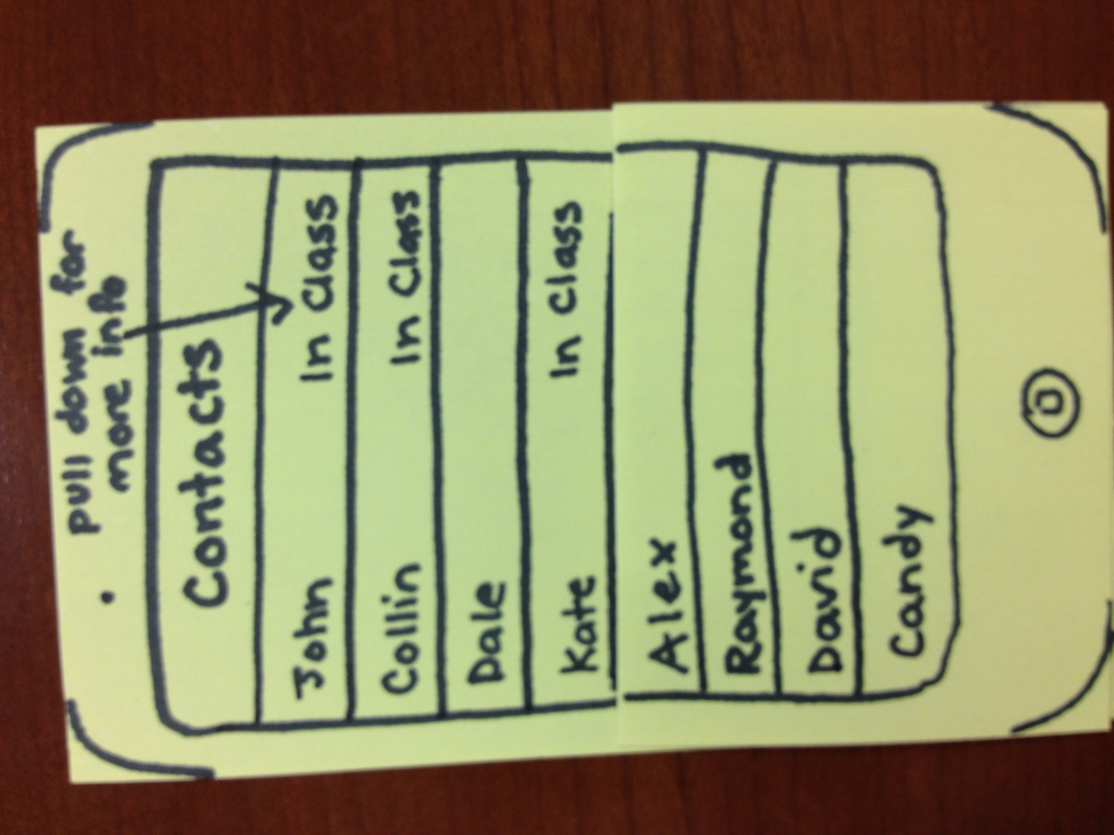
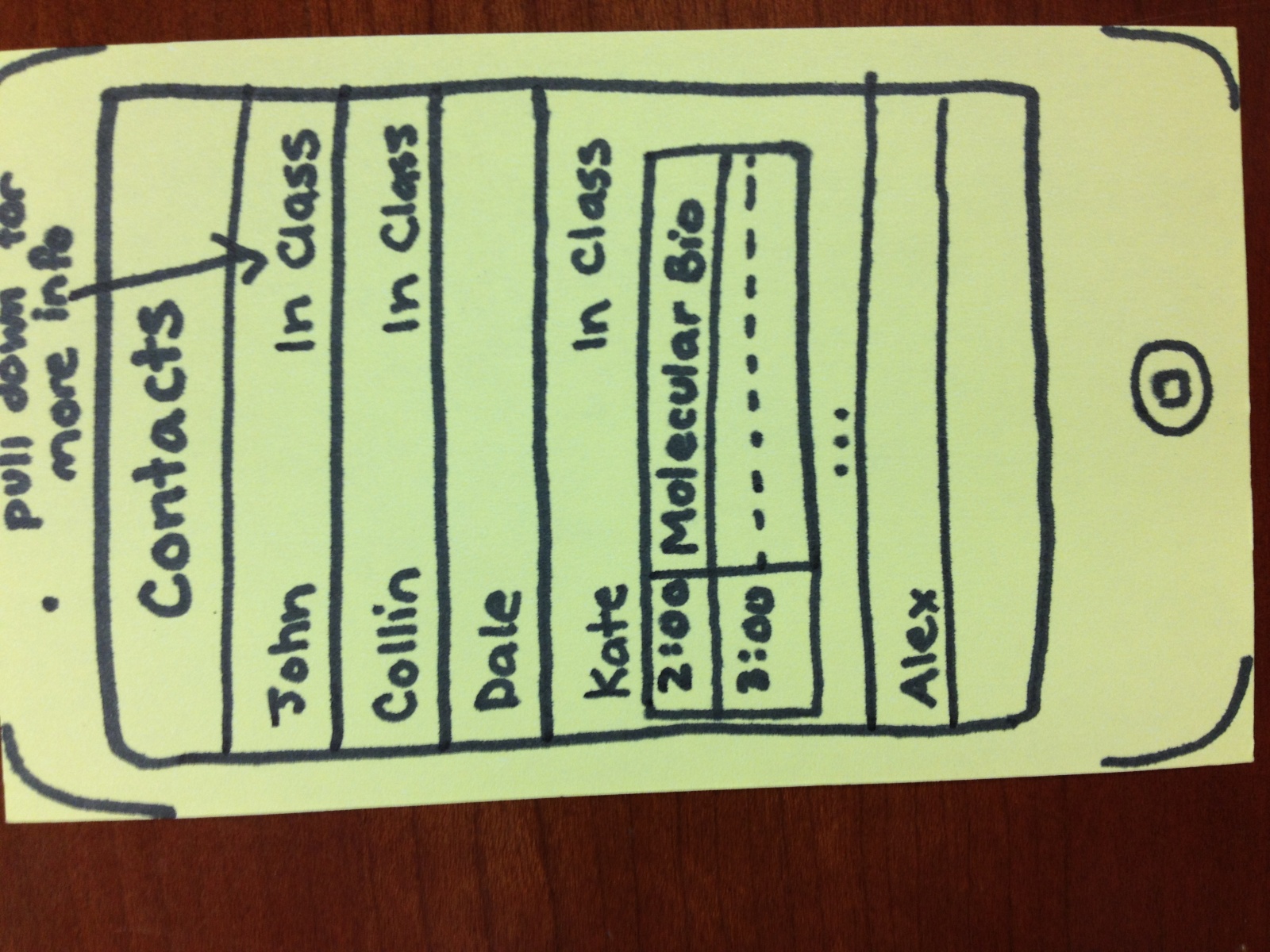
a. I first interviewed a senior girl when class ended, and got permission to interview her when she got to class before lecture. She got to class five minutes early, and spent her time chatting and playing with her iphone. She was sitting next to a friend, and played angry birds until lecture started.
b. My second interview was with a junior male. He got to class six minutes early, and went over the course syllabus for a minute, before checking facebook and espn on his computer for the rest of the time.
c. My last interview was with a sophomore male. He got to class two minutes before lecture and prepared a word document for class notes. He waited the last minute silently for the teacher to start lecturing.
From my observations and questions I gathered the following:
– most students arrived before lecture started, and roughly half the class was there with 3-5 minutes until lecture.
– many people spent time on computers and iphones
– people sitting quietly with notebooks out
– small percentage chatting
– lots of people looking around
Generally, people were either waiting for lecture, chatting with friends, or using a smartphone/computer to surf the web, check email, and use Facebook.
From my questions:
a) Do you have anything specific you like to do before lecture?
– “I like to play games on my Iphone, and review notes for class”
– “it’s a good time to check email”
– “Not really, just unwind between classes”
b) Do you have a smartphone or computer to use?
” I don’t bring my computer to class, but I have an Iphone”
“Yes, I like to take notes on my computer.”
” I carry my computer to class, I don’t use my smartphone much except for texts though”
c) Would you like something else to do before class?
“Yes, it can be a nice time to be productive but I am generally unoccupied for a decent amount of time”
” I don’t know, it’s not really that long, but maybe, it depends on what it was”
” Mmm, possibly, Facebook normally does the trick though.”
From my observations I got the feeling that people kept themselves happy before lecture, but had time for something else. Many students have internet access, and classes generally tended to be divided between boredom, productivity, and entertainment. From this, I decided to make ideas with utility and entertainment, while not being too intensive so students can relax before lecture.
2. Ideas
I brainstormed with Bereket Abraham, Andrew Ferg and Lauren Berdick.
We came up with the following list:
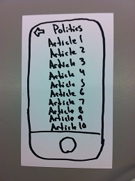
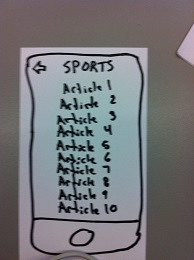
1. A name game to get to know your neighbors
2. A talent show with students performing as they wish
3. Q and A with professor based on student’s questions and a voting system to choose the questions asked
4. A joke telling contest with students rotating telling jokes before class
5. An application video of what is going to presented during the lecture to give people an overview and draw interest
6. Crowdsourced music making, with each student getting to contribute a beat to a song that builds up until lecture starts
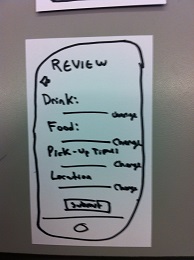
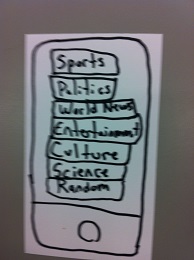
7. Current events shown that are related to the class, such as campus speakers, new books, important findings, etc
8. One tough problem that everyone collaborates on and if they get it then the entire class gets extra credit
9. Crowdsourced, collaborative art project that everyone contributes to until the semester ends
10. A personal blog for the class where students can post and view other posts as they wish
11. Professor or preceptor gets to prepare a story to tell the class during the day
12. Professor gives a brief summary / update of his current research or the state of his research field.
13. Riddle of the day that the class works together to solve
14. Professor/preceptor gives potential interview questions for jobs or graduate school related to the field
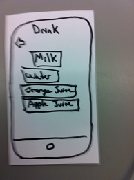
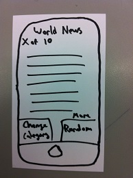
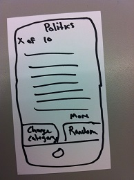
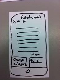
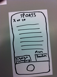
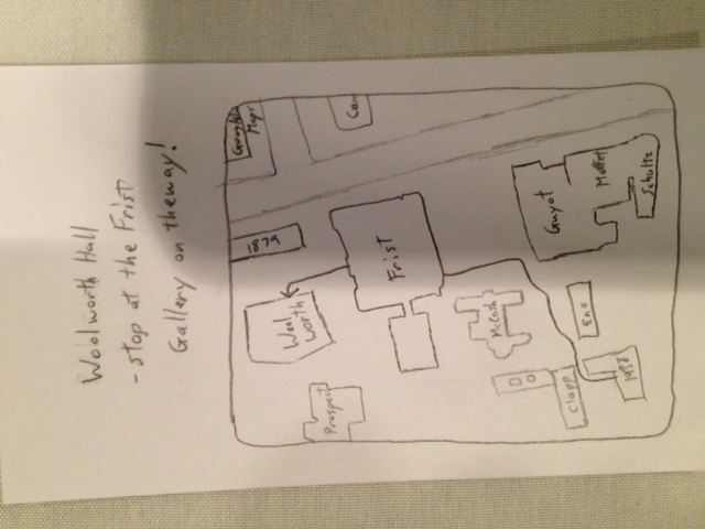
15. Map application that shows shortest path to your next class from your current location, with a stop for food along the way
16. App for perpetually late students that provides a live audio broadcast of the first 10 minutes of large lectures
3. Favorite Ideas
My two favorite ideas were the question and answer session with the professor, and the collaborative art project. I chose the Q and A idea because it let students pick whether they wanted to be productivity or entertainment based on their questions, and did not require all of the students to participate so others could carry on activities they enjoyed more. I chose the collaborative art project for similar reasons, since only interested students needed to participate, and because I thought having a final project that many people had worked on would be a neat touch to a course.
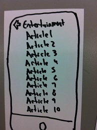
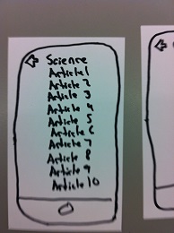
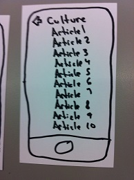
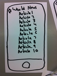
Pictures:
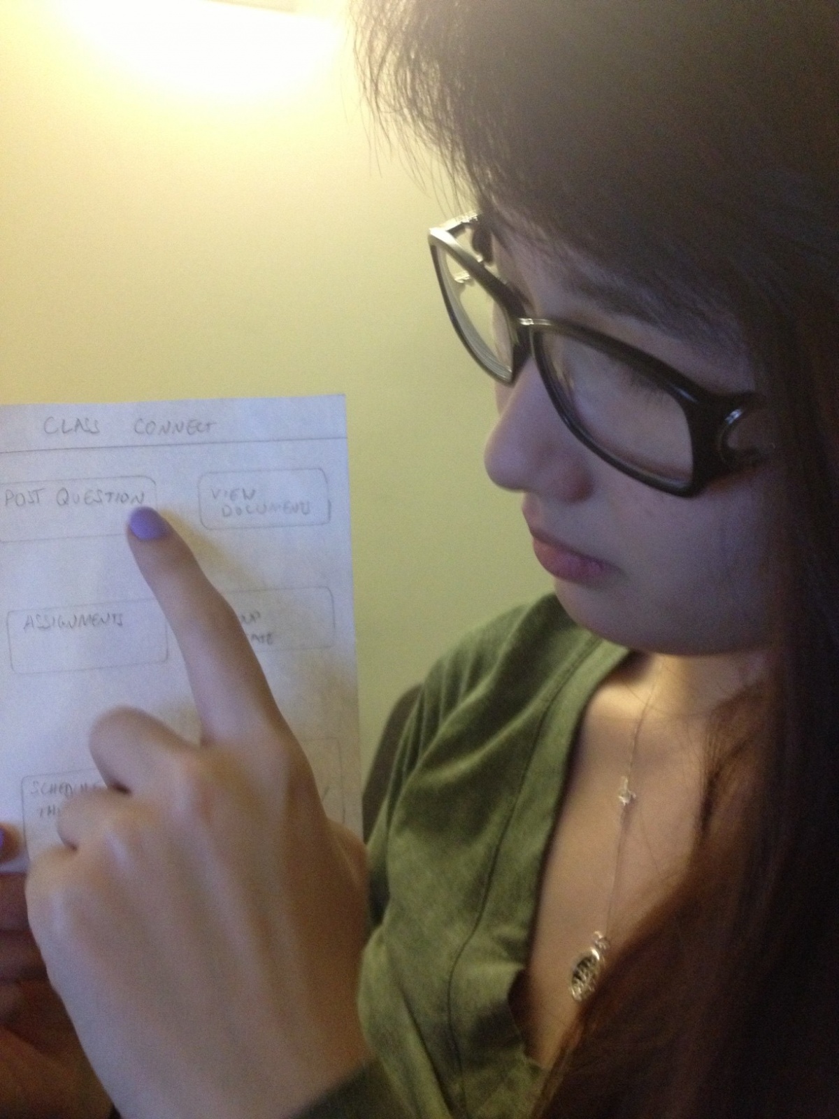
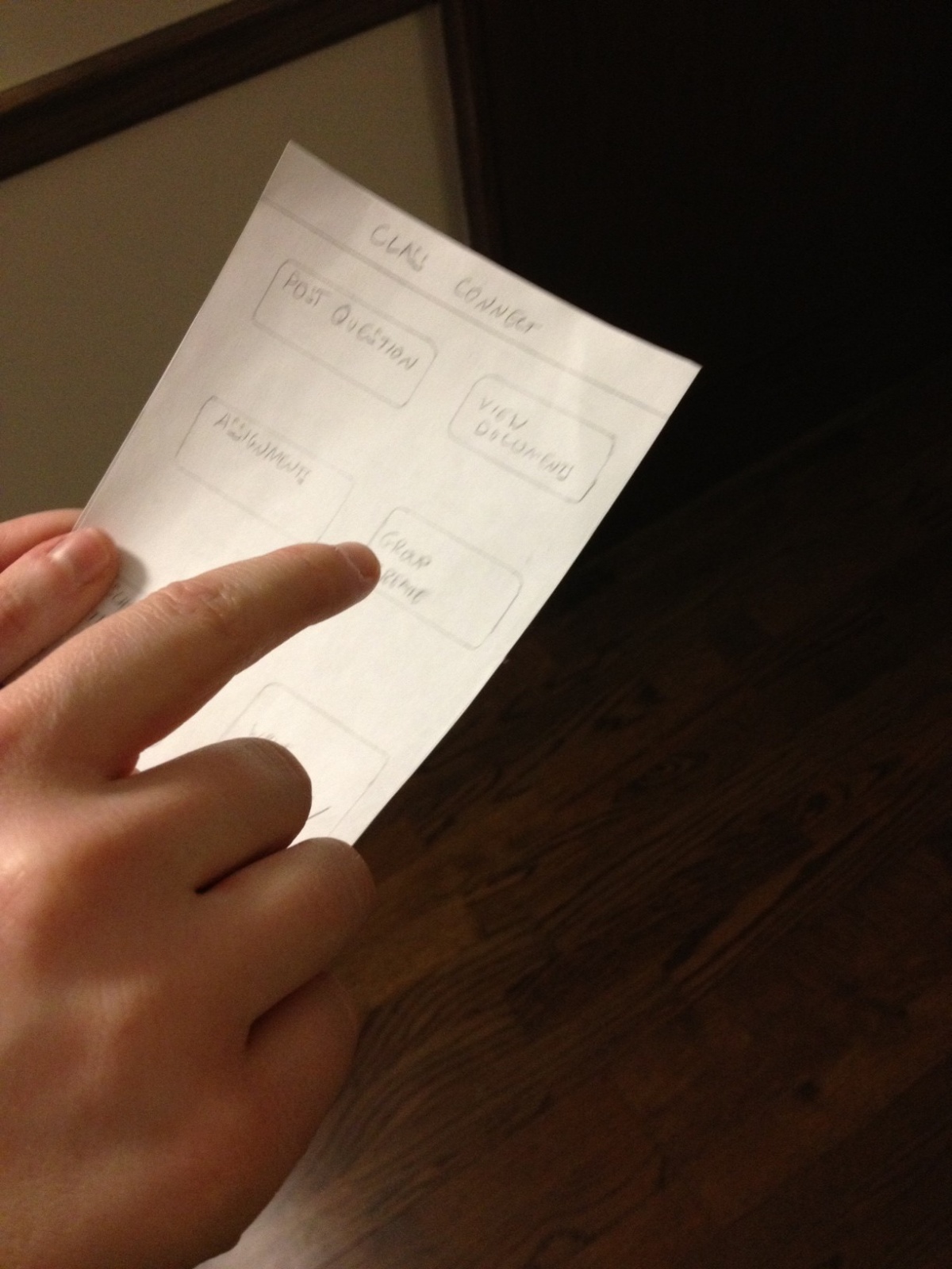
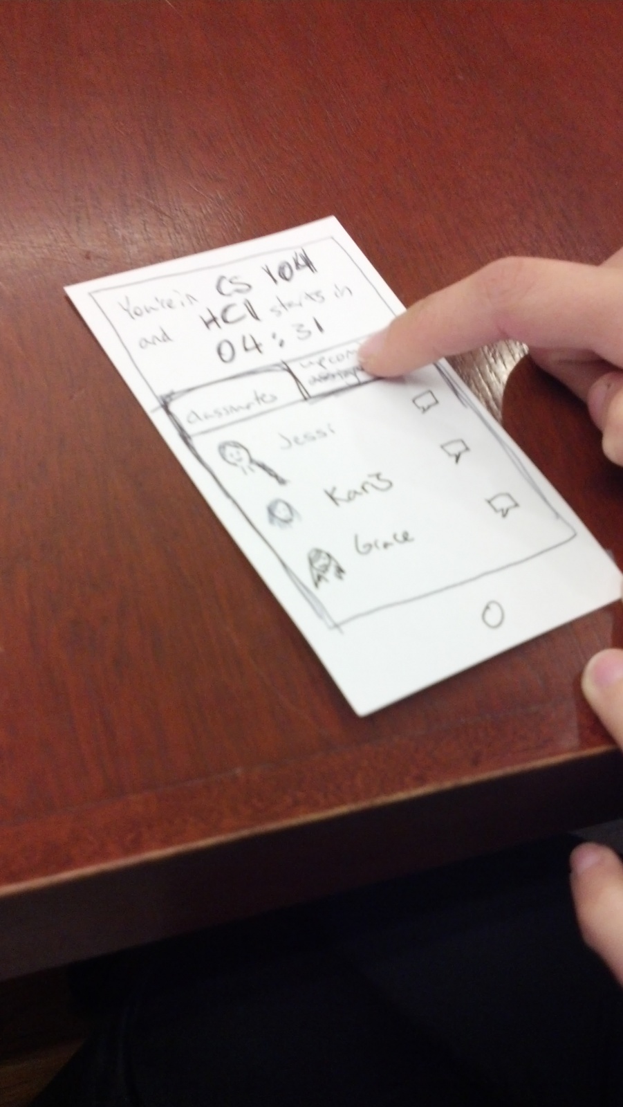
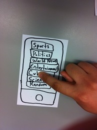
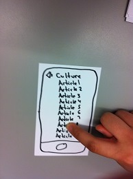
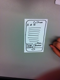
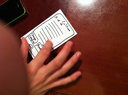
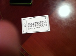
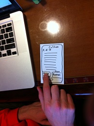
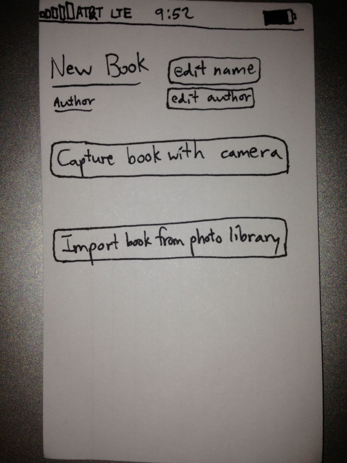
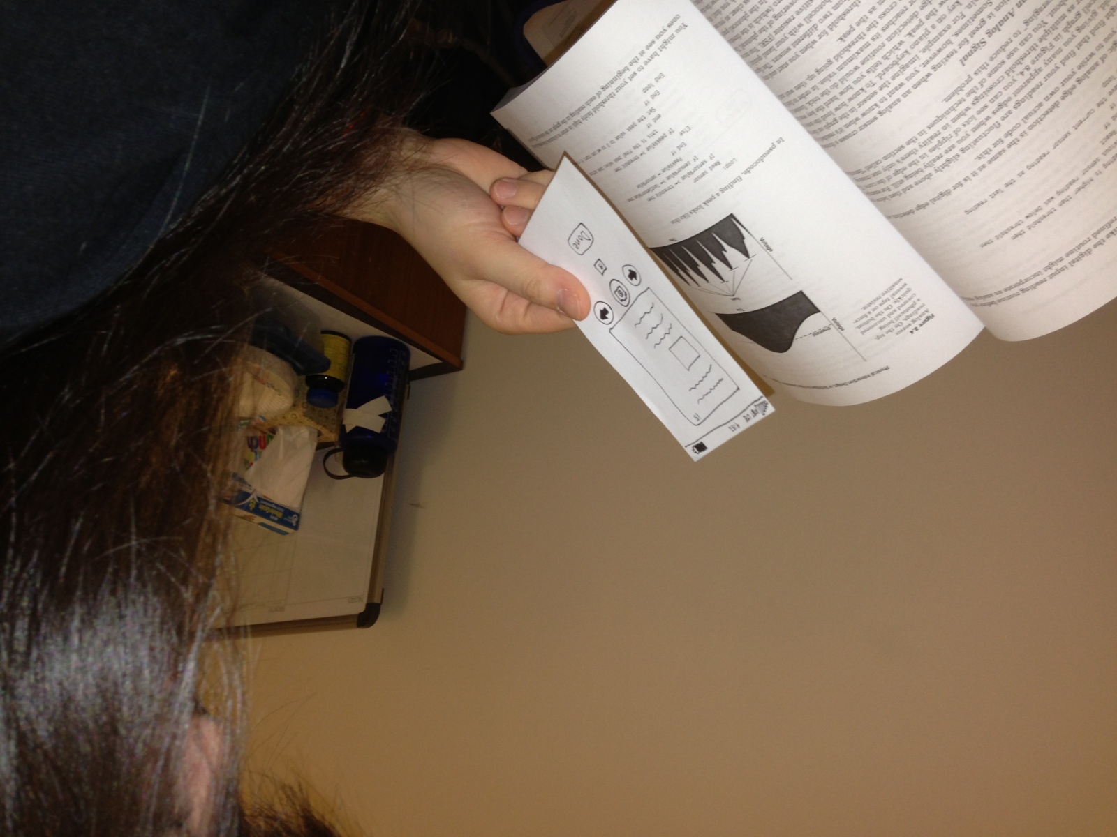
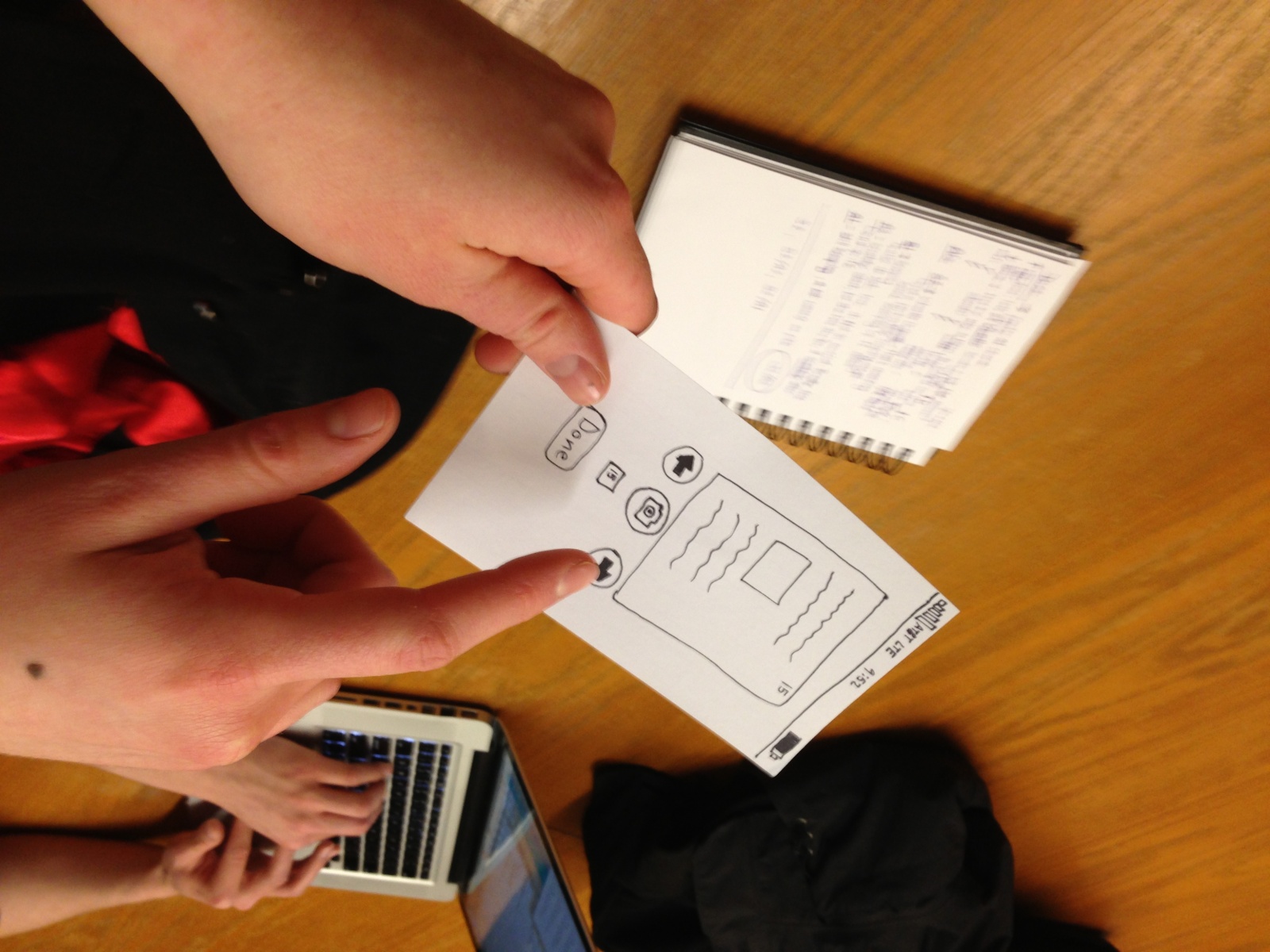
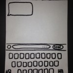
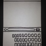
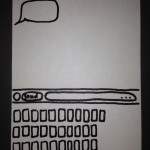
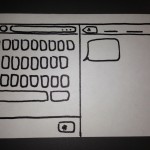
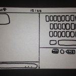
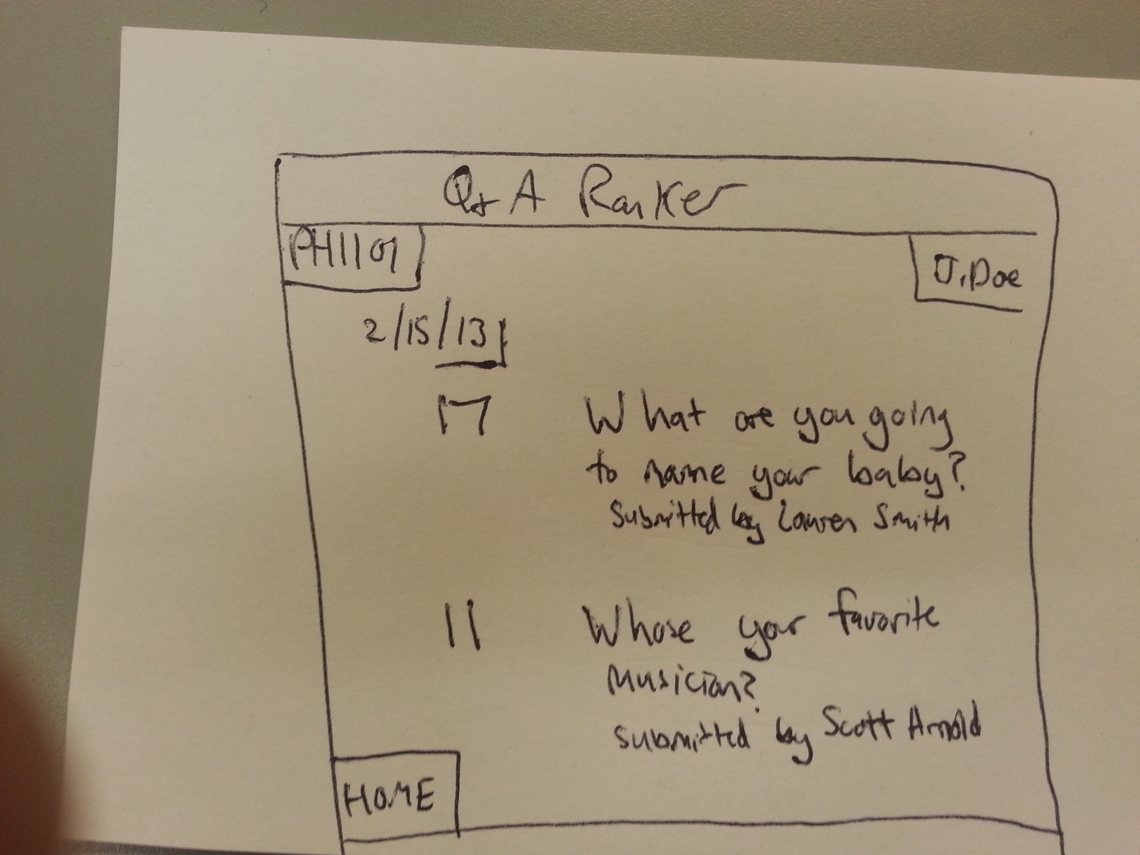
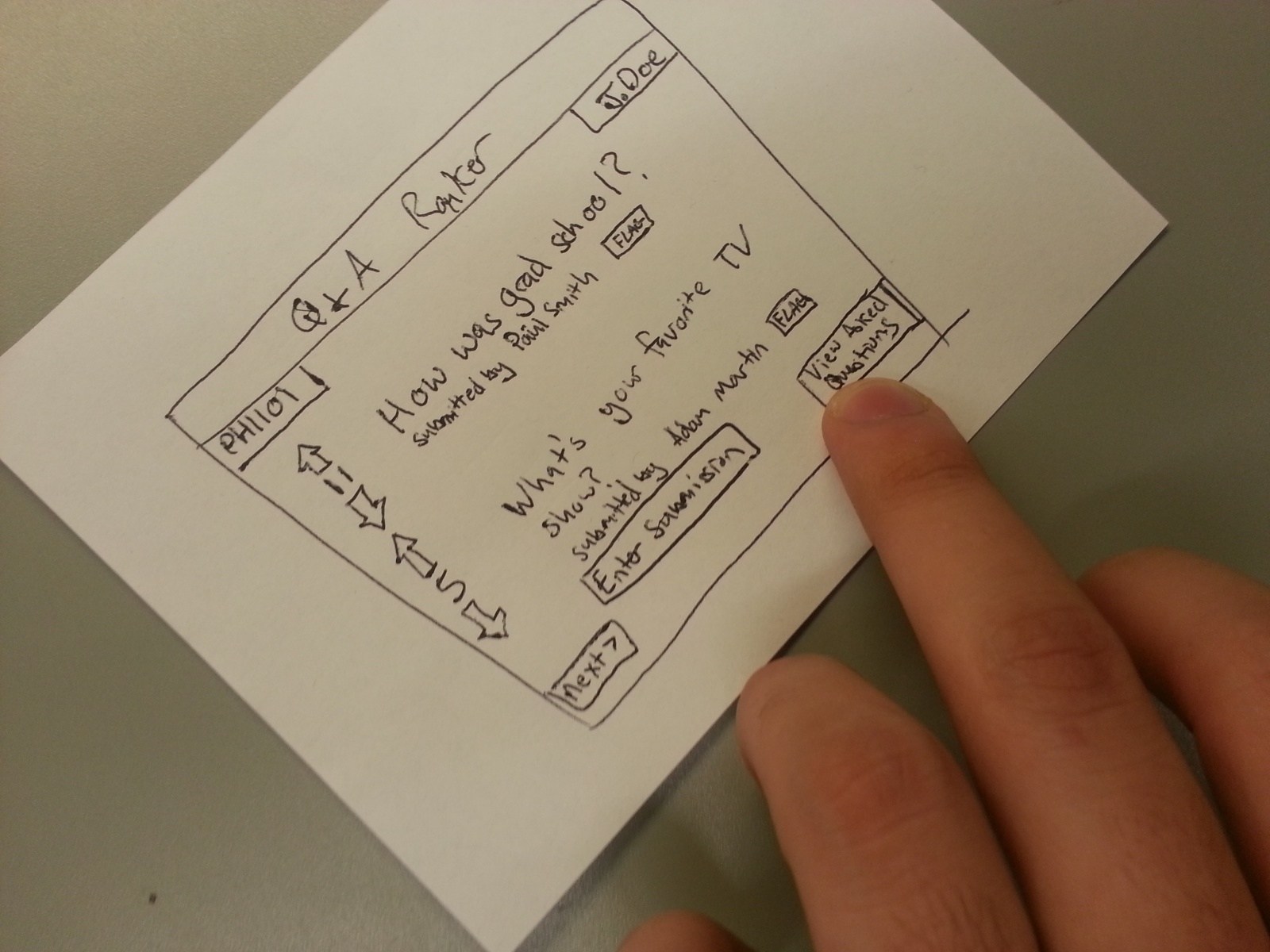
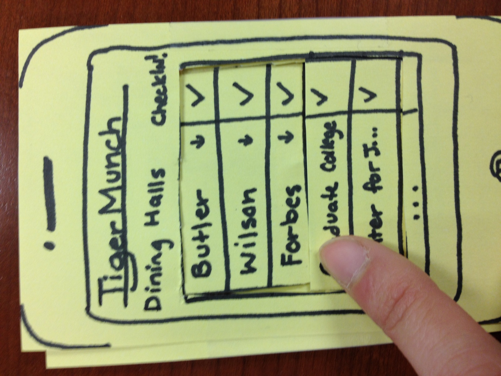
Q and A Ranker:

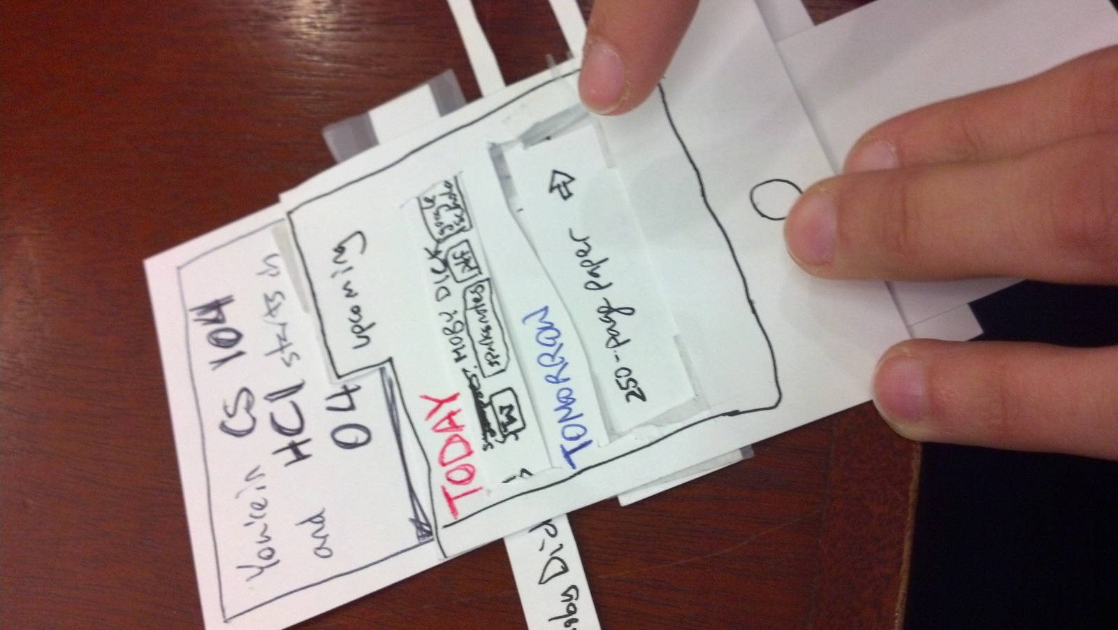
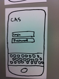
Q and A Homepage
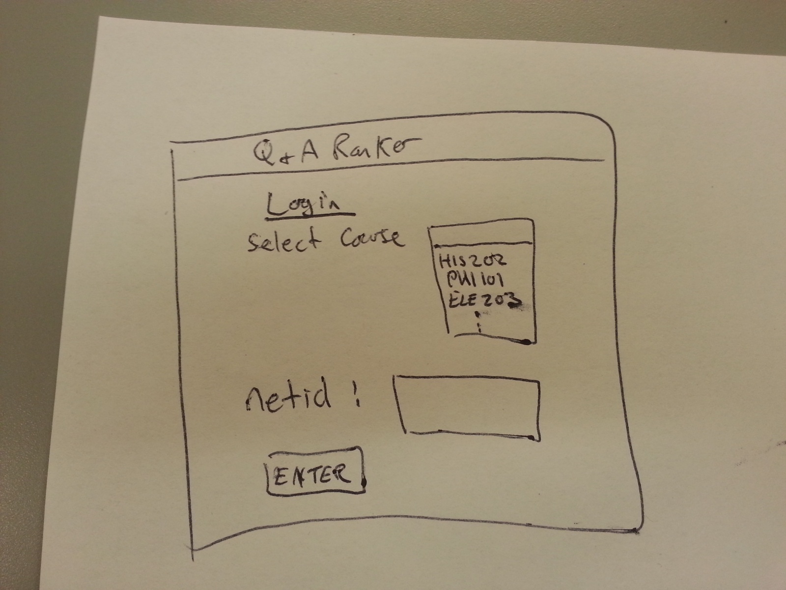
Q and A Login
Q and A Past Questions

Q and A Question Submission
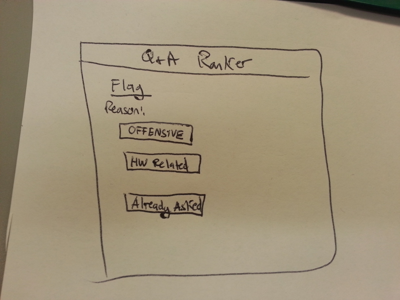
Q and A Flag Submission
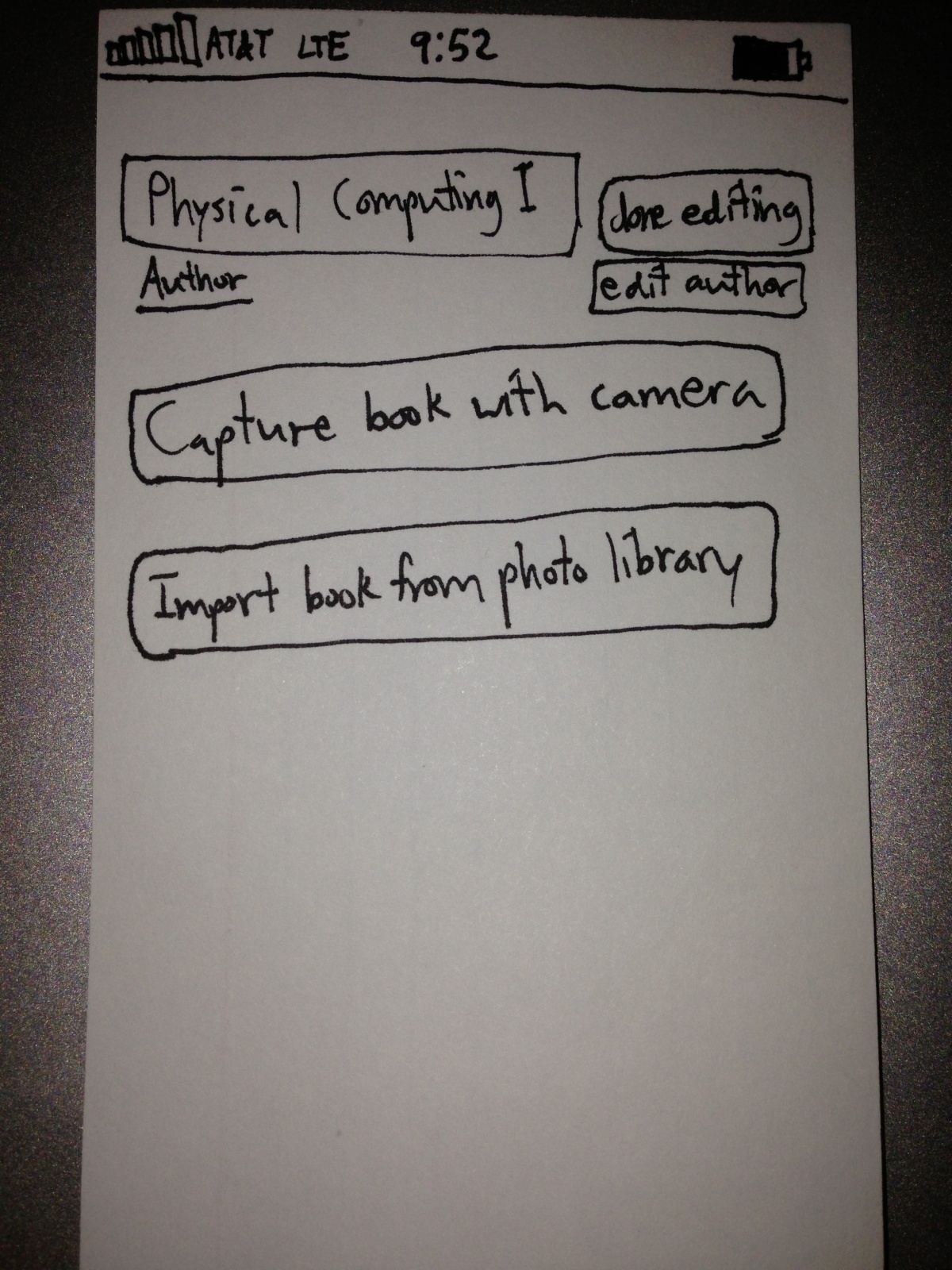
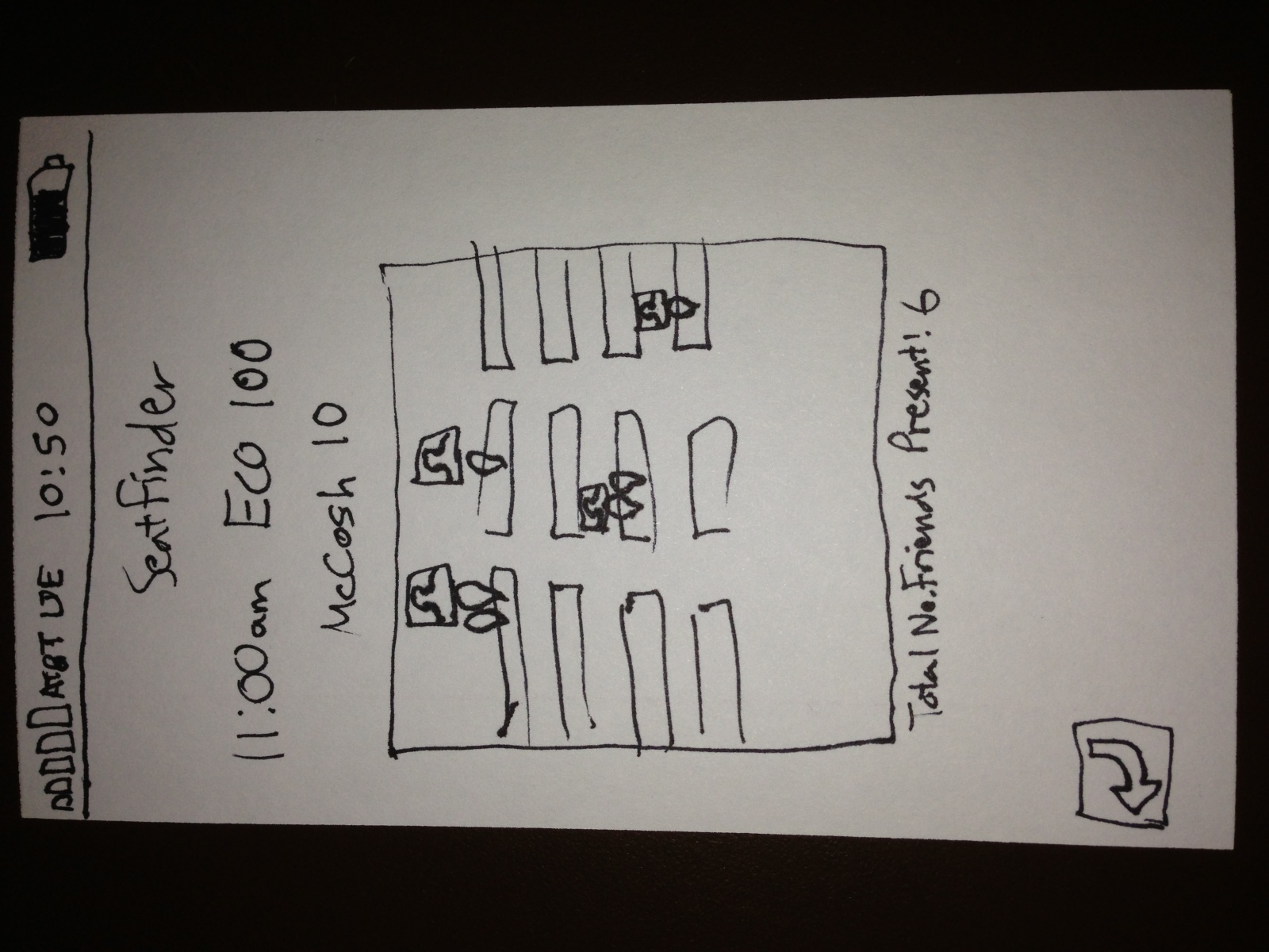
The Q and A Ranker was made as a website. Students enter their netID, and select their course to go to the course’s Q and A page. From here, students use a reddit-style system to submit their own questions for their Professor, upvote and downvote other questions, and flag posts. Posts can be flagged if they are offensive, already asked, or related to homework. This is designed to keep questions interesting and make the session not turn into a homework session. As well, students are listed next to their submissions to prevent offensive/or rude material.
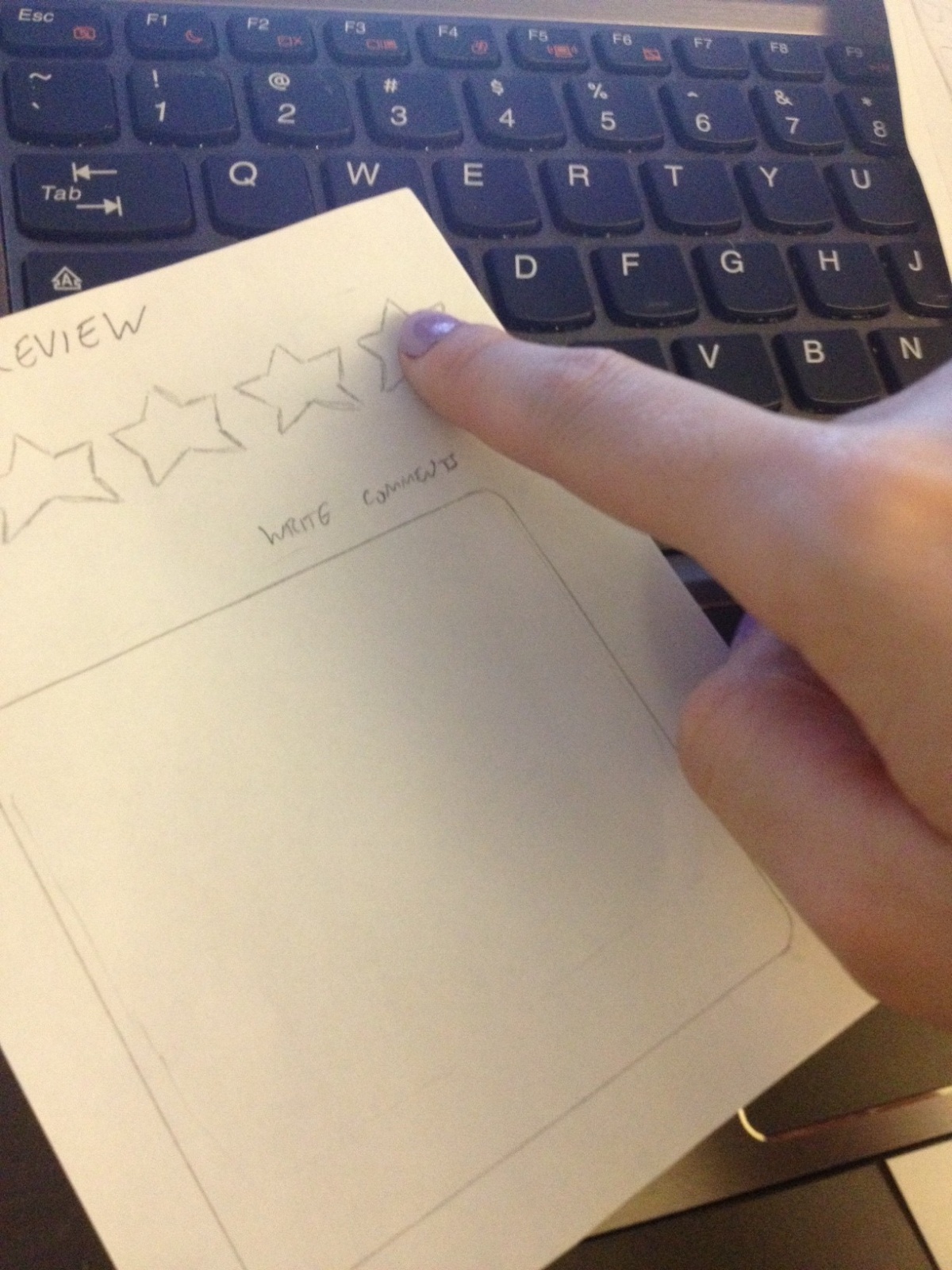
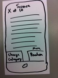
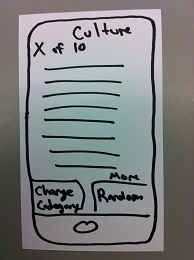
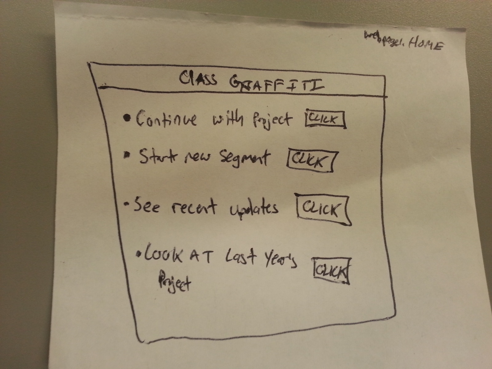
Class Graffiti:
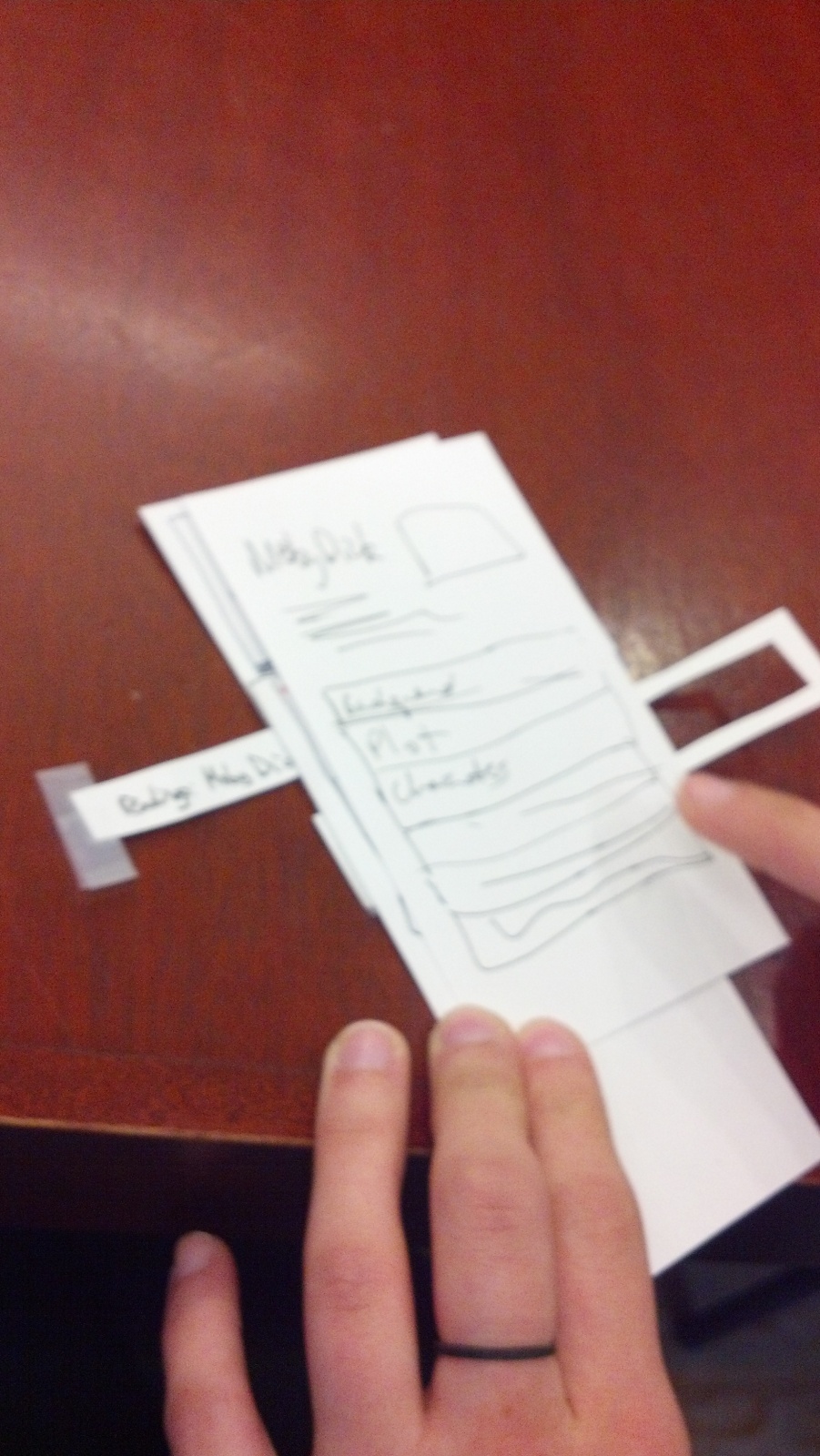
Class Graffiti Homepage

Class Graffiti Draw Page
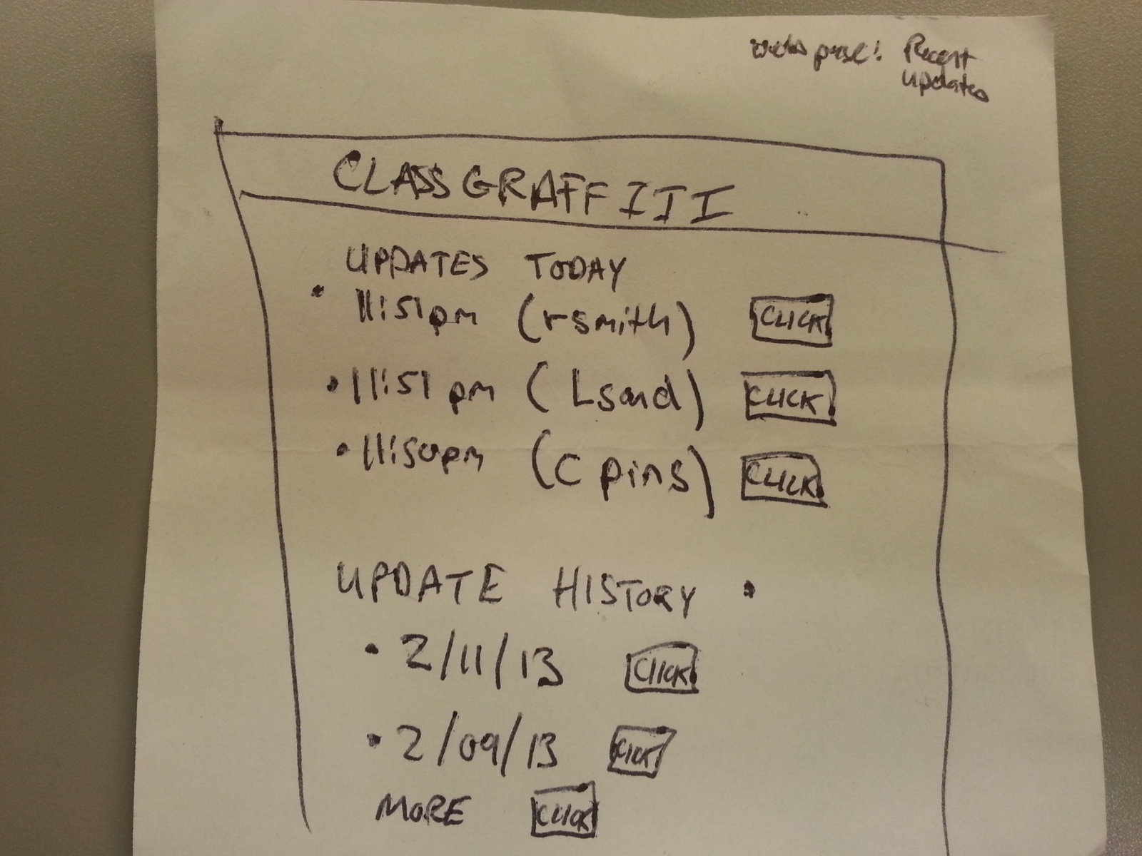
Class Graffiti Update/History
The class graffiti idea is also a website, and students travel to the homepage for their course to work on a drawing project. Students can contribute to the art, look at other’s recent submissions, and view the last year’s final work. The drawing panel allows the student to pick colors and brush sizes from a panel, and add to the drawing wherever they want.
Testing:
For testing, I decided to go with the Q and A ranker website.
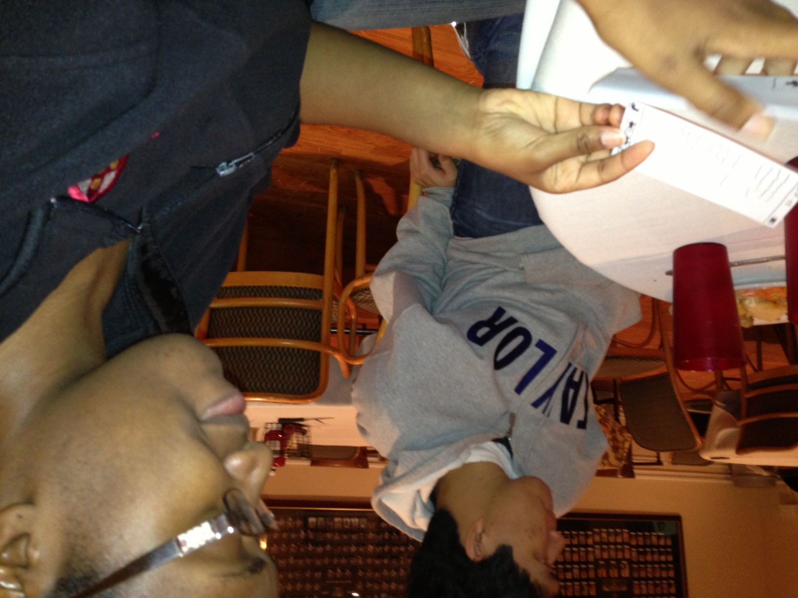
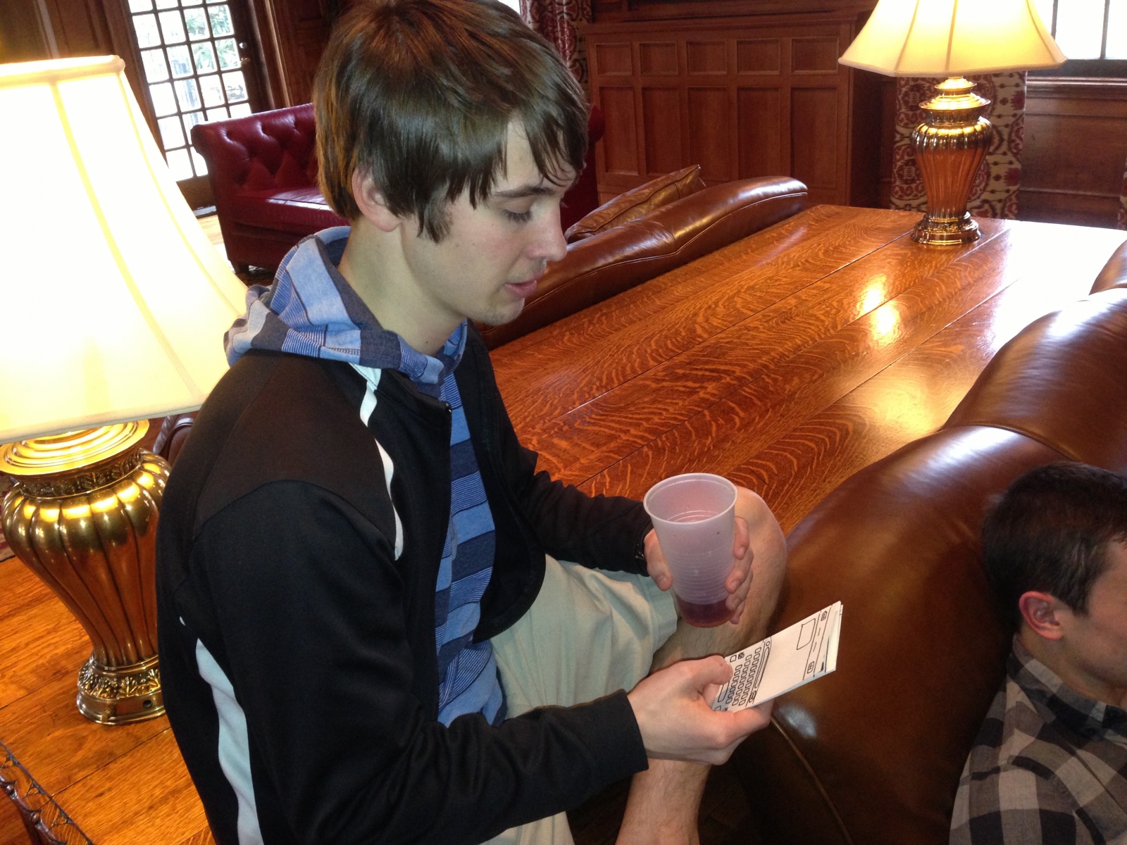
I first tested with a male student. I gave him the login page and he followed that, and acted like he pick his course. He then went to the homepage (which I gave him), and was initially confused, and wasn’t sure what to make of the arrows and questions. He clicked on submission, and pretended to make his own submission. He then went back to the homepage and looked at the questions again. He clicked on an arrow, and realized it was a voting machine. He than viewed the already asked questions.
When I asked him if he liked the website, he told me he thought it was a neat idea, but wasn’t sure if the Professor would have time to answer the questions. He liked that people’s names were linked to questions, and also worried that it would turn into a homework session (I then showed him the flag option, and he agreed this would help prevent that). He overall found that it could be useful for some classes, and agreed that he might use it if he got to class early.
For my next tester, I gave hime the login and then homepage, and he recognized the similarities to reddit. He upvoted two posts and downvoted one and laughed, and then went to view older questions. He then returned to the homepage and made his own submission. Again, the user did not click the flag option. When I asked what he thought of the site, he said he liked it and called it a “reddit site”. He though he would use it, but was worried questions would get out of hand (I then showed him the flag option). Overall, he found the site a little silly, but agreed it could be a nice way to pass time and commented that he would enjoy asking some of his Professors some questions. He wasn’t sure Professors would agree to participate, or might be busy setting up for class, but said if they weren’t he could see it being a nice addition to the 10 minute break in between classes.
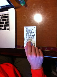
My last tester also drew comparisons to reddit, and was excited to use the site. He logged in, laughed at the class selection, and went right to upvoting and downvoting posts. He asked if he could click on the posts, and said that it might be neat to allow the user to submit information on what motivated them to ask the question to help convince others to up or downvote it. He liked that he could see the net results of the vote next to the post. He then went to view the past questions. He went back to the homepage, and pressed flag, but then said that he didn’t think the post was flag worthy, so he tried to submit his own post instead.
The user enthusiastically felt that the site would be useful, and began to brainstorm questions he would ask his professors. He said the site was simple and suited the idea, and he would use it for classes if he had time and wasn’t running late.
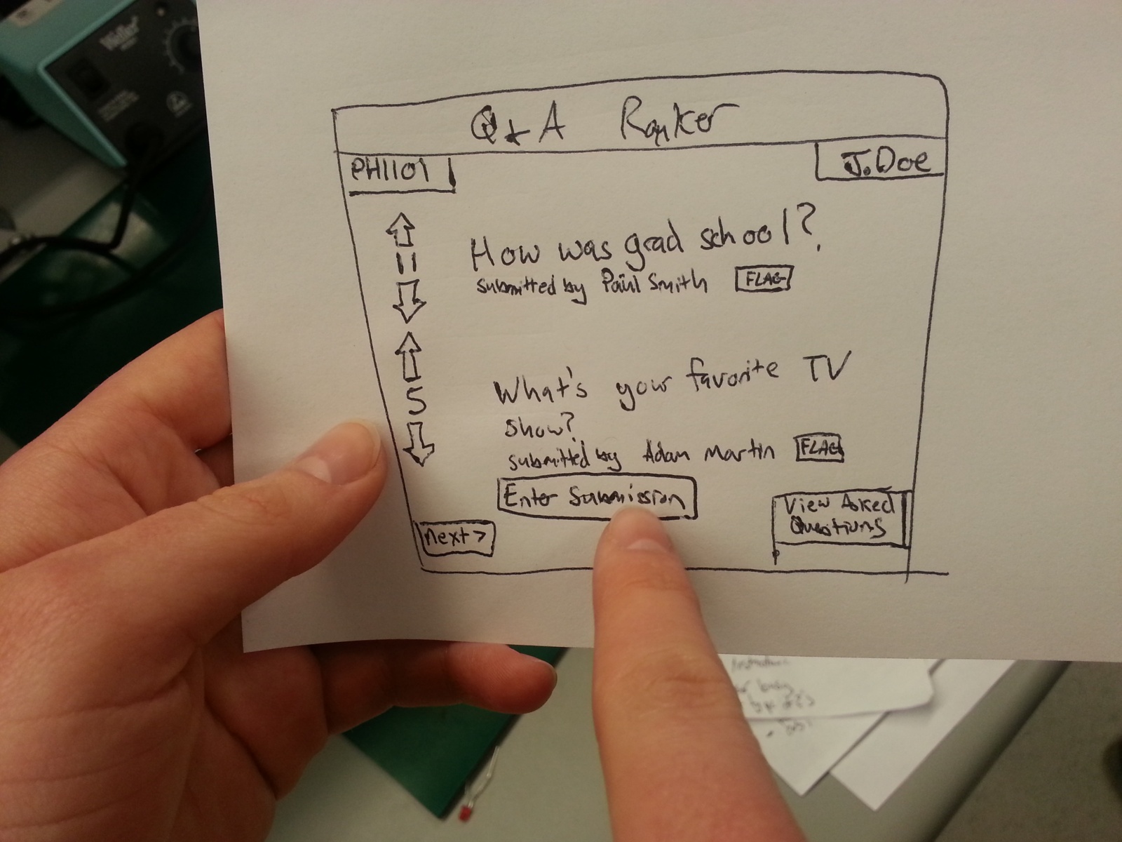
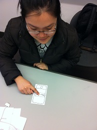
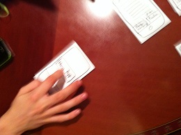
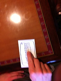
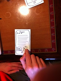
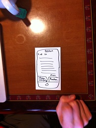
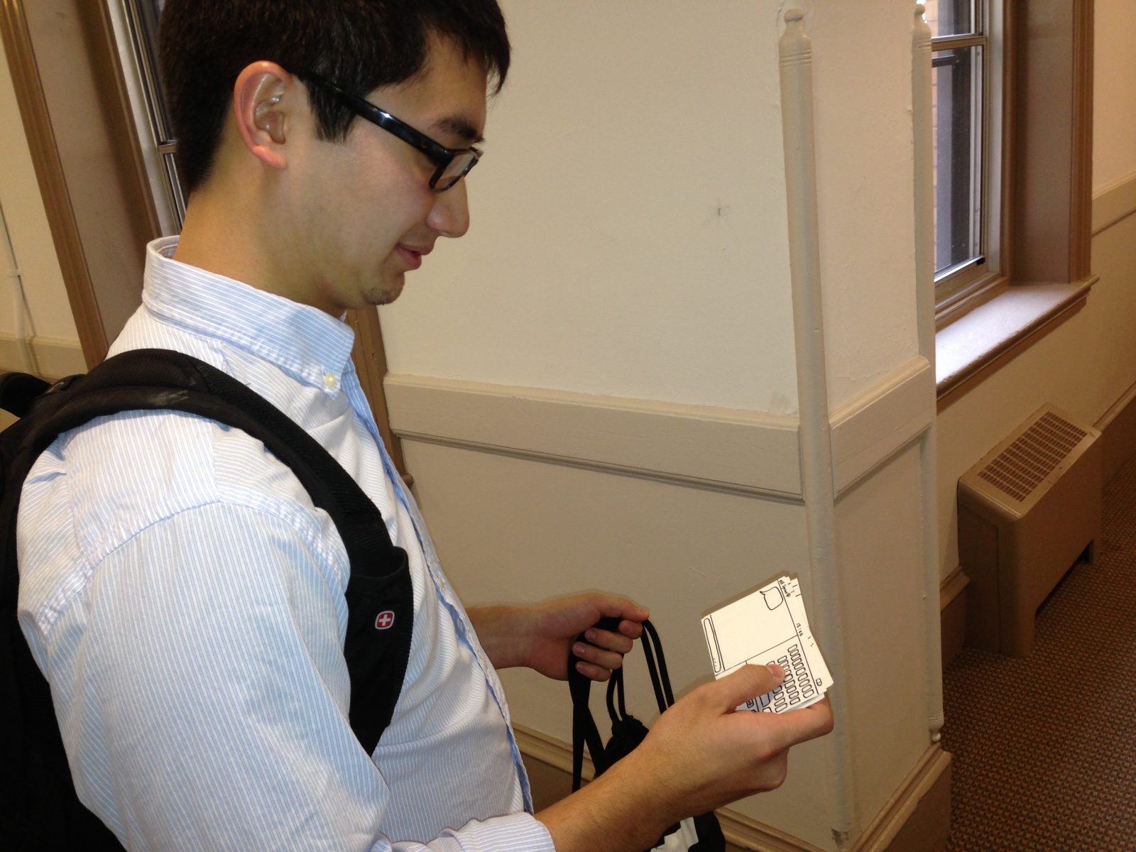
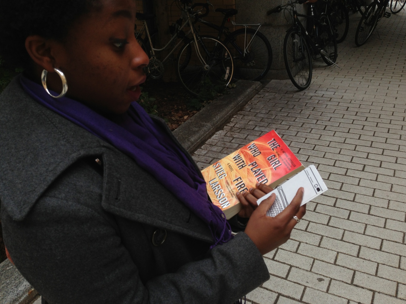
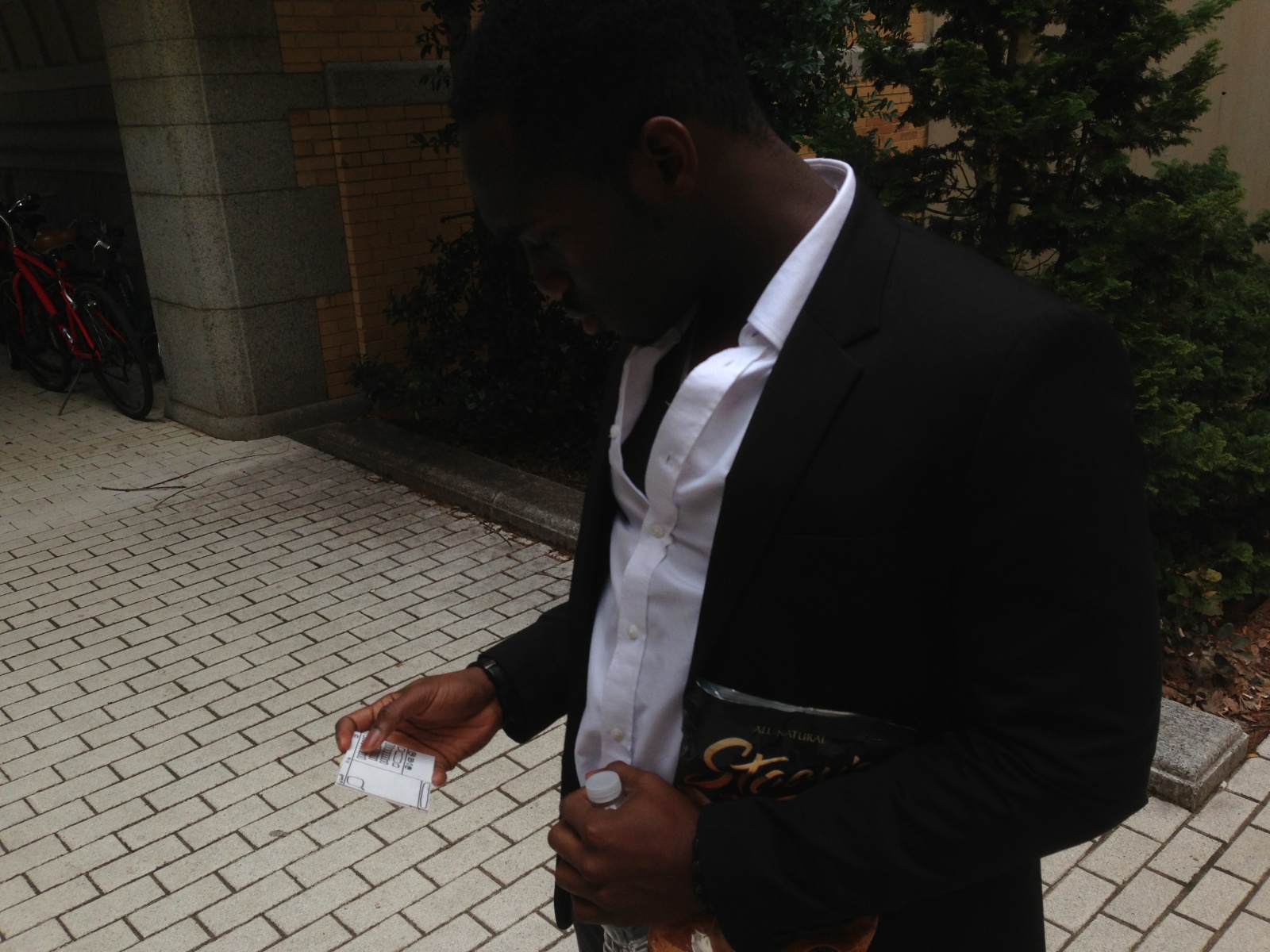
Tester submitting their post
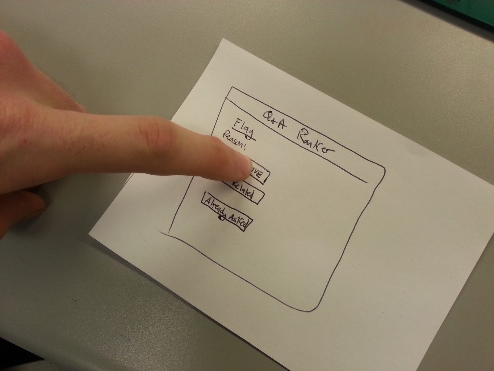
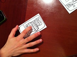
Tester flagging a post for being offensive
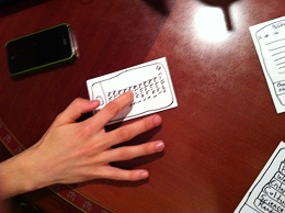
Tester clicking to view already asked questions
Insights:
From my testing, I realized that there needs to be a way to make sure the Professor is on board with the website and answering questions before implementing the website. This could come in the form of asking them what types of questions they are comfortable with and only allowing submissions of those, and giving the Professor an overriding power to delete posts before they can even be viewed for consideration by students. Additionally, there may need to be more instructions for using the arrows. Users who had frequented sites such as reddit immediately knew what to do when given the prototype, however other users were not sure how the voting system worked. Colors would help make things more clear, but additionally more instructions or a help section on the website could be provided to help users unfamiliar with the format. Another option could be to add the ability to provide text/a paragraph which motivated a users submitted question, that would be linked from the submitted question. This would help students pick questions, and make up their minds if they are torn or ambivalent. Testers seemed to like the ability to ask professors questions, and it appears that this website could be a viable option for the ten minute break in between classes.
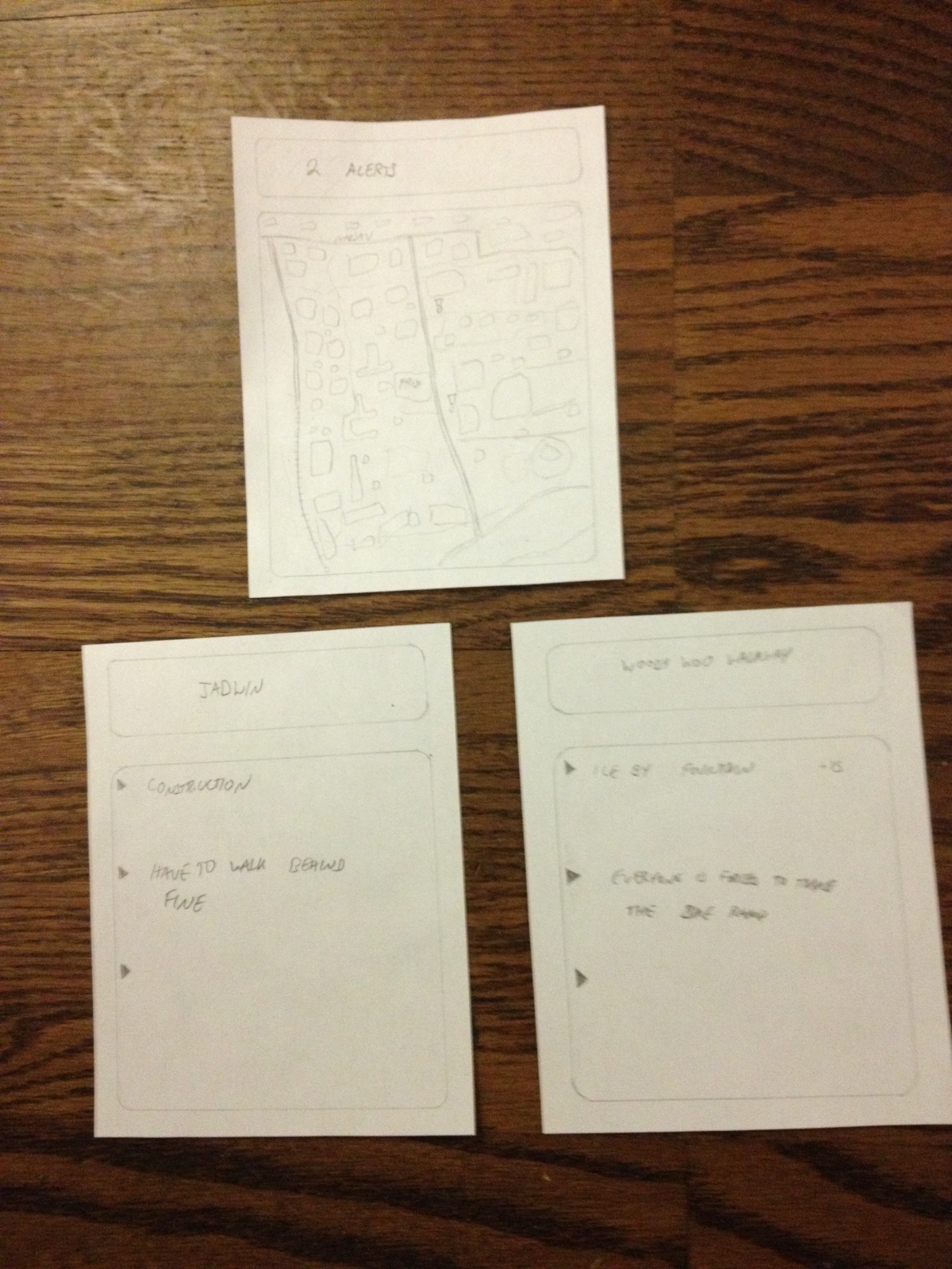
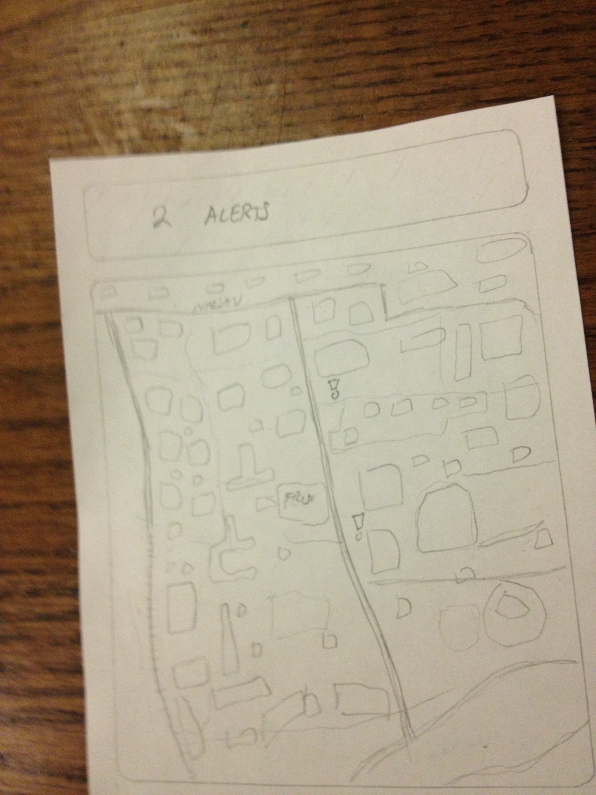
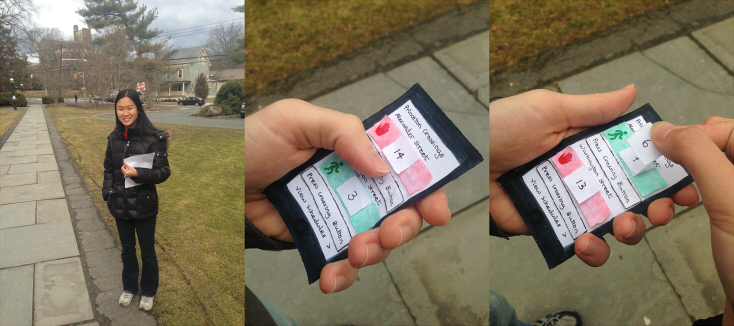
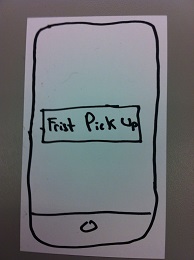
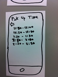
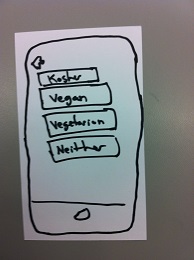
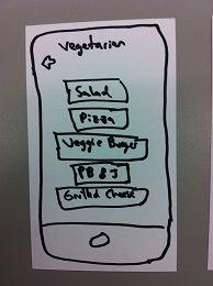
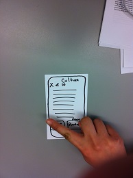
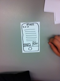
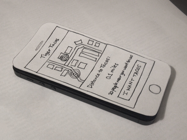
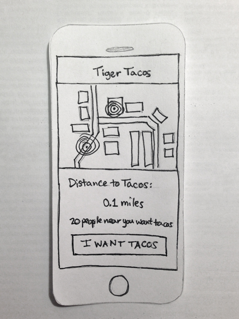
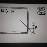
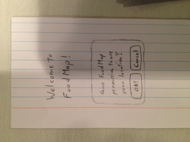 This is the title screen of Prototype 1, FoodMap
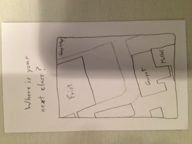
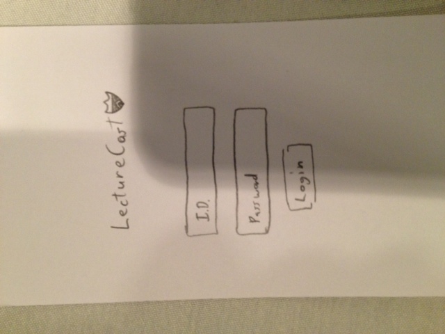
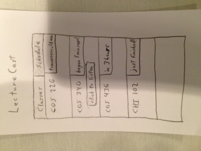


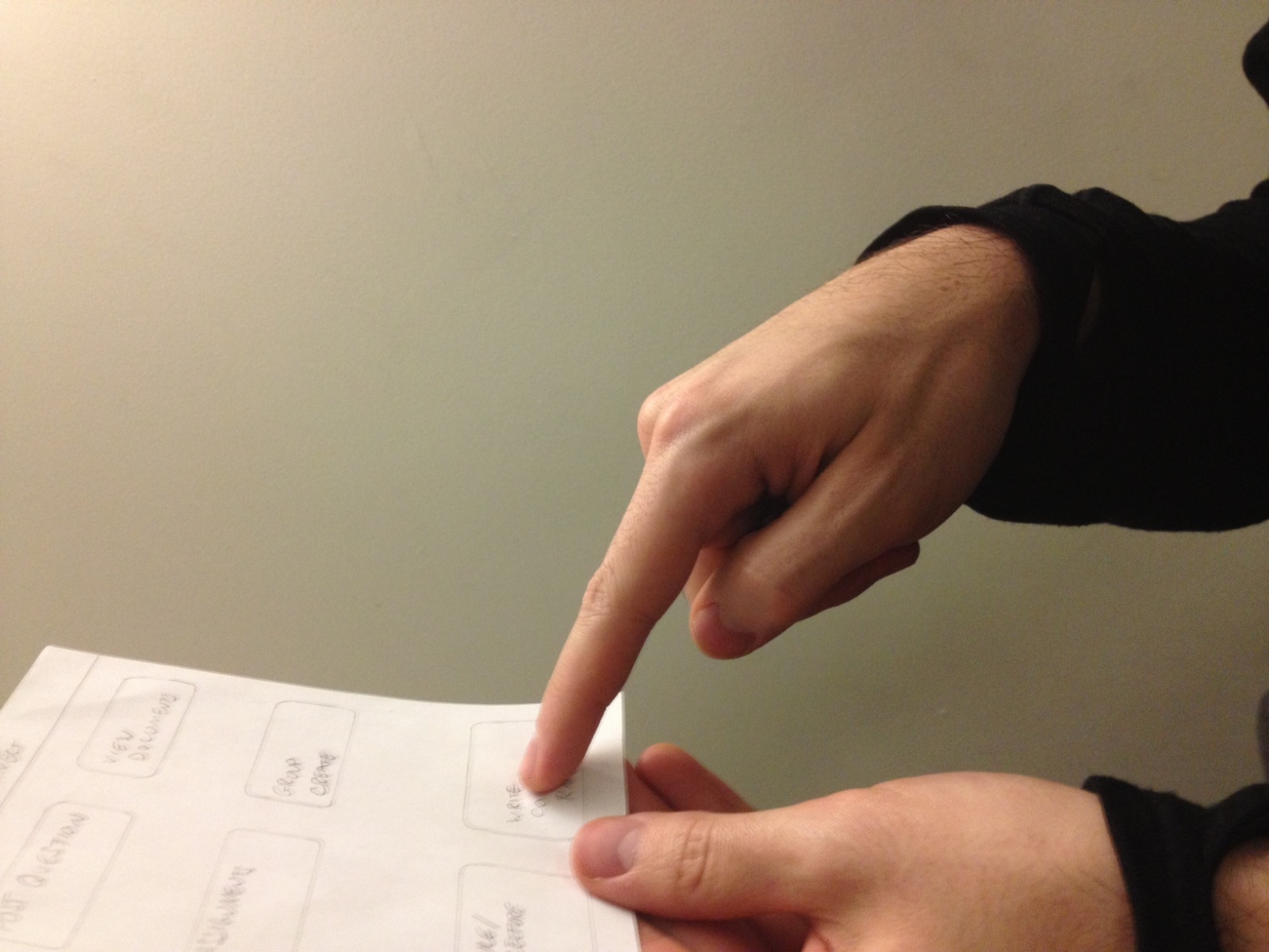
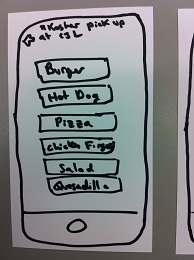
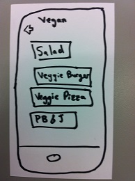
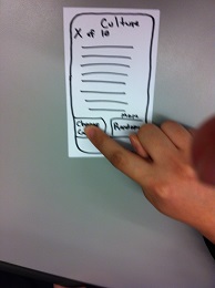
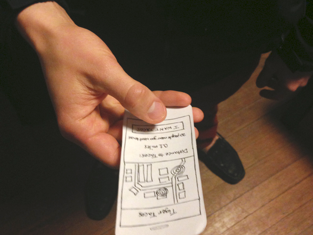
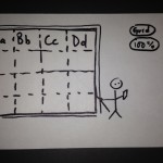
 User seems to get the interface…
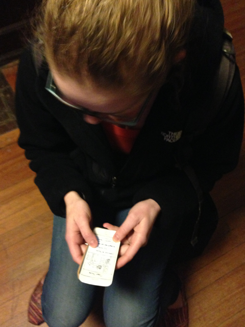