P2 – Life Hackers

Group Number:
15

Group Members:

Prakhar Agarwal (pagarwal@)
Gabriel Chen (gcthree@)
Colleen Carroll (cecarrol@)

We all worked together or equally on all parts of the assignment. Each member did one contextual interview and storyboard, and we worked together on the other parts for a balanced effort.

Problem and Solution Overview:

The problem we have chosen to address is the difficulty of interacting with one’s phone when it is cold outside. Specifically, when we are wearing gloves, using a phone requires that we take them off because they block capacitive sensing and are clunky in such a way that pressing buttons is rather difficult. Our solution is to develop a glove with a variety of strategically placed motion and flex sensors that would recognize hand movements and gestures and translate these to perform simple tasks on the phone such as picking up the phone or changing the music playing.

Description of Users:

Our target user group consisted of people who were walking around campus, wearing gloves and holding or using a smartphone. On campus, we specifically looked for younger users as these are the most likely to be technologically connected and dependent. For further observation of possible users outside of campus, we could definitely look at urban professional and commuters also. However, for the campus demographic, we chose young users as they are more technologically connected; in fact, we tried to interview an older man, and he said that he didn’t even own a cell phone. The first person whom we interviewed was on her way back from class; she was wearing knit white gloves and held a pink iPhone. From talking to her, we learned that she was from Georgia and preferred warmer weather, and wore gloves quite often in chillier weather. Her priority was functionality, and she seemed most interested in being able to use her phone effectively and conveniently. Our second interview was with a girl from California. She wore leather gloves, and used an old school smartphone with a very small screen. Her priority was cost, and because of this, she was skeptical of the necessity for touch sensitive gloves. She also mentioned that she didn’t especially dislike the cold. The third interviewee was chosen as a control. This person was inside using their phone as they would if they did not have the hassle of cold weather and gloves. They were asked to do many of the same basic tasks and notes were taken on the speed and comfort level of performing these tasks.

Contextual Inquiry:

For our contextual interview, we stood outside of Frist on a cold afternoon, and looked for users who fit the description above that we were looking for. Once we found someone who fit the description and was willing to answer a few question, we asked them about their phone usage and asked them to perform several tasks on the phone. We were most interested in what they did in order to bypass the inconvenience of having to wear gloves, and made observations on their strategies. The third interviewee was asked to perform the same tasks and was observed as a standard for the level of difficulty for those tasks in warm conditions compared to those asked to perform them outside.

The tasks generally performed by the people we observed and interviewed were pretty standard and common. All interviewees had similar habits in terms of what they used their phones for while walking; the most common functions were phone calls, text, music and email. Each of these tasks was often preceded by the unlocking of the phone, although not all of our contextual inquiry subjects had this function enabled. In addition, a common theme amongst all interviewees was that each of them admitted that cold weather deters them from interacting with their phones in certain situations. For comparison, the  the interviewee inside used their phone so often and easily that they were almost distracted from the interview. Between completing the tasks, the interviewee would check their email and search things online. Switching between tasks was extremely simple and the user seemed almost not to notice it. From this we can conclude that the user needs to have an even simpler way to switch between tasks with glove to match the ease of use in warm conditions.

The interviewees differed in the strategies they used in order to cope with cold weather and phone usage. The first girl we interviewed used a method where she took off enough of her glove to expose her thumb, but left the rest of her glove on. In addition, if she could use her phone with one hand, she would leave the other glove completely on. The second girl took off both of her gloves in order to use her small smartphone. Perhaps the size of her phone required her to hold it with both hands. The third interviewee often switched between using one finger or hand to using several, with different orientations depending on the task that they were performing. Again, it was much easier for the user indoors to use their hands in whatever way they wanted than for those outside.

Task Analysis:

Part A

  1. Who is going to use system?
    Our system is a glove that lets people perform simple tasks on their phone when it is cold outside without actually touching their phone. The target user base is mobily connected individuals who need to walk outside in colder climates. Those who want to wear gloves to keep their hands warm but do things on their phones at the same time would benefit from this system. We also found that it was more likely for younger people to use the system. When we tried to do a contextual interview with an older man we saw wearing gloves, we found that he didn’t even own a cell phone. On the other hand, younger people are generally more technologically connected.
  1. What tasks do they now perform?
    The users currently perform a number of tasks on their phones. From the contextual interviews, we found that the most common activities performed with smartphones while walking outside are texting and checking emails. Some people also suggested that they enjoy listening to music on their phones while they are walking to and from class for which they will generally only perform simple tasks such as playing/pausing/skipping songs en route. Users who we talked to for contextual interviews also mentioned that they don’t generally talk to others on the phone, with texting and email being much more common alternatives. However, for communicating with family or for professional purposes, they said that phone calls are the communication medium of choice. At the moment, users have to take off their gloves or use “Smart Touch” gloves, which work on touch screens, to perform these tasks.
  1. What tasks are desired?
    During cold weather, people usually try to stay bundled up rather than interact with their phone too much. While on a nice day, someone may do more complicated tasks while walking, people generally want to get from point a to b as quickly as possible, performing only essential tasks, when it is cold. The simpler, essential tasks that people do want to perform are picking up phone calls, responding to texts, turning on their phone, etc without having to fumble clumsily with their phone or taking off their gloves.
  1. How are the tasks learned?
    Smartphone interactions are usually learned by what is on screen. An effective smartphone UI is either intuitive or has written instructions. Many, particularly the tasks we are interested in implementing, rely heavily on convention for users to learn them. For example, the keyboard is standard across all applications of the phone so sending a message or typing a search term is the same across the phone. Most keyboards resemble the qwerty desktop keyboard, there is considerable variation on how to type special characters. Picking up a phone is usually pressing or swiping a green button, with a possibly with a slightly different interaction for picking up when the phone is locked. This relates back to the standard on landline phone answer buttons. Music players rely on the play, pause, and skip symbols established in many of the earliest digital playback systems. However, unlocking varies greatly from keyboard to numberpad to the android unlocking grid, with either visual or haptic feedback.
  1. Where are the tasks performed?
    The tasks can be performed in transit on a mobile device in the cold (really, anywhere).
  1. What’s the relationship between user & data?
    An intuitive or easy to learn UI is usually a positive user experience, in the sense that the interactions go mostly unnoticed and require little effort to remember and accomplish. Users are interested in their end goal such as answering the phone or listening to music, not the interaction. Therefore these tasks should be easy to perform and remember so that they disappear into the background.
  1. What other tools does the user have?
    As the most obvious solution, the user can take take off the gloves. Using fingers in the cold is the core problem we are trying to solve, though. Using a headset is one possible solution to this problem, but it is inconvenient in noisy rooms and uncomfortable in most public areas (such as outside where this glove is intended to be used.) The other option is to use “Smart Touch” gloves which work on touch screens, but are clunky and definitely make it difficult to press small buttons or links on the screen in comparison to not wearing gloves.
  1. How do users communicate with each other?
    Using our system, users experience improved communication, as they can send messages more conveniently and answer calls more easily.
  1. How often are the tasks performed?
    People are frequently in motion, and the tasks are intended to be performed every time they need to use their mobile devices. As people only need to wear gloves during the winter, the device might not be completely useful outside of the winter season. This means that the system could potentially be performed only seasonally.
  1. What are the time constraints on the tasks?
    Unlocking the phone should be performed rapidly, but can vary depending on the length of a password. Picking up a phone call or bringing up the voice recognition command for messages should be instantaneous. Interactions with the music player should be performed using a single gesture and should also be instant.
  1. What happens when things go wrong?
    When things go wrong with unlocking a password, such as a misused/unrecognizable gesture, the user should just attempt to unlock the password as they normally would or try again using the gestures. With communication and music, the same logic applies. In any case, the user would not be terribly inconvenienced by these events outside of being frustrated that the glove didn’t work as advertised.

Part B (Description of Three Tasks):

  1. Unlocking phone
    Current Difficulty: Medium
    Proposed Difficulty: Medium
    Unlocking a phone has considerable limitations currently. For one, the phone has limited space and users generally use only one or two fingers, so long,complicated passwords are even more cumbersome than they are on a desktop keyboard. Because users are limited in the speed that they can enter passwords in an onscreen character based password system, even a secure password (based on randomness of characters) can be more easily observed by an onlooker. The android unlocking grid is perhaps more convenient to use with one finger but it is even more easily observed than the character-based passwords. Cold weather and stiff fingers make unlocking even more difficult to perform. The task needs to be quick and simple to learn and perform, as it will be used often and users (based on our CI) seem to rate convenience first when choosing passwords. In addition, the system should have at least the potential to be hidden, such as by keeping the glove in your pocket, for security.
  1. Communication
    Current Difficulty: High
    Proposed Difficulty: Medium
    A task that users commonly face themselves with is the task of communicating with other mobile phone users. In transit, communication commonly takes on two forms: phone calls and text messages. The interactive tasks associated with phone calls are answering the call, rejecting the call, and hanging up the call. Each of these tasks can be performed pretty easily as is, but removing the dependency on a touch screen can make things even easier, as gesture accuracy and ease are reduced when limited to pointing on a screen. The second task, which is sending text messages, can be quite complicated for mobile phone users. They need to deal with typing out a message and then sending it. As an alternative, users can currently select the voice recognition command, which is a tiny button on the messages screen. With the system, users can easily select the voice recognition command with a gesture away from the screen. As another function, gestures can be set to map to characters that can string into a message.
  1. Music
    Current Difficulty: Medium
    Proposed Difficulty: Low
    Another tasks users may choose to perform while out in the cold is listening to music as this is generally a more passive activity. There are a couple of tasks they might want to perform while doing so including changing the volume and controlling music (play, pause, switch songs). Currently, the iPhone is compatible with special headphones with a “control capsule” that performs similar tasks, but users with other phones do not have this option. We would provide a gesture based means to do this. Users may pinch their fingers and move their hand up or down to change the volume. Flicking one’s wrist to the left or right may switch to the next or previous song. Other similar simple gestures may pause and play. This would be become a relatively simple interface for users. The simplicity and limited number of tasks that users need to perform in interacting with music would make this relatively easy from the design side. As with the other tasks, we would need to establish a way by which we get the glove to start recognizing gestures (maybe a switch or a location on the glove to press and hold), and then we could recognize these simple commands.

Interface Design

Description

Users can use our product to interact with their smartphone in cold weather. Rather than ineffective smartphone gloves which attempt to let you interface with the smartphone screen with conductive fingertips, our gloves are an interface themselves. With small, simple gestures such as bending a finger or squeezing two fingers together, combined with a headset for voicing message text, users can accomplish the essential tasks that one might have to make while on the go in the winter. We will implement locking and unlocking the phone, answering the phone, sending a message, and playing music. Our design does not have the frustrating problems of fit and surface area that existing smartphone gloves have, nor does it put the user in the awkward situation of using voice commands constantly. By creating a winter-weather interface for smartphones, we can a provide a simple, useful experience for smartphones users in the cold.

Storyboards
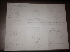
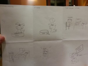
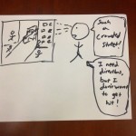
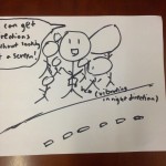
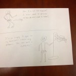
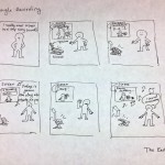
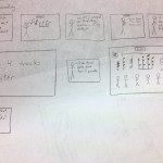
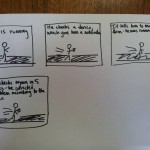
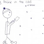
This story board shows the ease of picking up and then ending a phone call while wearing the smart gloves.

This story board shows the ease of picking up and then ending a phone call while wearing the smart gloves.

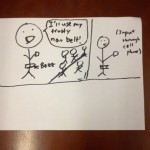
Toggling music is another action that would become much easier in the cold using the glove.

Toggling music is another action that would become much easier in the cold using the glove.

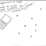
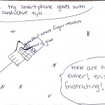
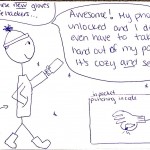
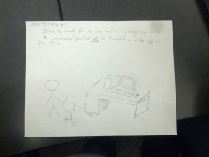
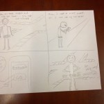
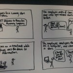
The final storyboard shows how the system could be used for the last task described, unlocking the phone.

System Sketches:
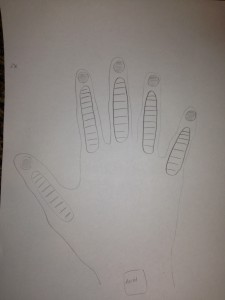
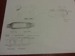
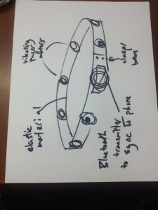
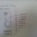
The glove contains flex and force sensors on each of the fingers and an accelerometer at the wrist in order to make it easy to read a variety of actions.
The glove contains flex and force sensors on each of the fingers and an accelerometer at the wrist in order to make it easy to read a variety of actions.

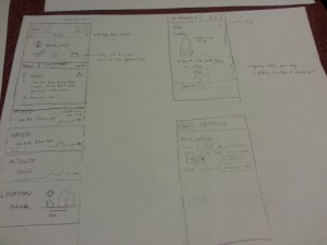
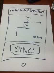
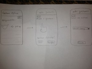
The glove could be controlled by an application on the phone that allows users to map gestures to tasks on the phone. Certain tasks would be premapped. Also, certain simple gestures would be preloaded as suggested gestures for users to map to functionality they may desire in order to deal with user concern about the difficulty of coming up with usable gestures.

The glove could be controlled by an application on the phone that allows users to map gestures to tasks on the phone. Certain tasks would be premapped. Also, certain simple gestures would be preloaded as suggested actions for users to map to functionality they may desire in order to deal with user concern about the difficulty of coming up with usable gestures.
P2 – Group 14 (Chewbacca)

Lab 14

Stephen: wrote up the descriptions of the interviewed users and most of the contextual inquiry sections were planned here. Helped conduct interviews.
Karena: drew the 3 different story boards, helped with the task analysis questions, worked on writing up the interface design questions
Jean: helped conduct interviews, contextual inquiry writeups, also wrote up the tasks for the users
Eugene: drew the pictures and answered the task analysis questions, helped conduct the interviews

Problem and solution overview
We are addressing the problem of taking care of a dog, which involves tasks that are often shared between multiple people, completed/monitored by routine and memory, and sometimes entrusted to others when owners leave their dogs for extended periods of time.  These tasks, the most important of which are feeding, exercising, and monitoring a dog’s location, are currently done through imprecise measures, cannot be monitored over long periods of time, and are periodically forgotten.  We propose a system that involves a device that can be attached to a dog’s food and water bowl and a separate device that can be put on its collar, which detects the dog’s food and water intake, how much exercise or activity it has gotten, and its location, and aggregates this data for viewing on a mobile device.  The devices alert the owner when the dog has not been fed according to schedule and, tracks whether the dog has gotten enough activity over time, and shows its location, so owners can check up on it when they are not home.

Description of users you observed in the contextual inquiry

Our target user group is dog-owners who are concerned about their dogs health and who must spend time away from their household due to business, vacation, etc. They might share responsibility for the dog with others, and when they leave their house they must leave their dog alone in their house with either a neighbor or a paid caretaker to watch after the dog.We chose this target group because they would benefit the most from our idea, and have a currently strong need that must be resolved. Our first interviewee was a high-school student who owns a beagle. She shares the responsibilities for the dog with her sister, and says she forgets to feed her dog about every two weeks. When she travels with her family, they usually ask her neighbor. Our second user is a graduate student who lives on campus with his dog.  He is its primary caretaker, but he has to leave it inside while he teaches classes and does work in the lab.  He says his lab schedule is often unpredictable and runs over time, so he cannot follow a regular routine and is concerned his dog doesn’t get enough activity. Our last interviewee was a stay-at-home mother whose kids have all moved out of the house. She owns a dog (and two cats) and is its primary caretaker. She usually completes all of the tasks involved in taking care of her dog right before and right after work.  She is very routine-driven and rarely forgets to take care of her dog, but she becomes extremely stressed when she is away from home because she worries if it is ok.  This makes it hard for her to visit her kids or go on vacation for extended periods of time.

CI interview descriptions

We conducted several interviews, in a variety of different locations. Our general approach was twofold: we observed and eventually approached dog-owners while they walked around campus with their dog, and we asked owners who were at home with their dog. Our approach was to observe the owners as they went by with their dogs on campus, and take notes of our observations. We asked some preliminary questions to people we knew who have dogs at home, and then asked if we could talk to the primary caretakers in their family.  The graduate student who we interviewed was someone that we had observed walking their dog around our dorm room, and who we approached and asked questions.

All of our users definitely cared deeply about their dog’s well being and felt that their dog was important to them in their life. All of users were also busy and reported forgotting to feed their dog at least periodically. The high-schooler we interviewed was unique in that she was the only person who shared responsibility for her dog. She also mentioned that her dog often has other medical needs that need to be done on a recurring schedule, which suggested additional functionality for our interface, such as another button that would allow for checking up on personalized activities like giving medicine.  The graduate student we interviewed was unique because he had a more unpredictable schedule than the other users, and had the most trouble following a routine, and would probably benefit the most from a mobile device. The stay-at-home mom we interviewed was unique in that she didn’t really have many issues with feeding or exercising with her dog. She was also unique in how anxious she said she got when she was away from her dog.  She said that this is actually a constraint for how long she can leave the house, so this feedback would allow her to feel more relaxed during holidays/on vacations. It makes sense that all of the owners we interviewed cared about their dog and were interested in improving their dog’s lifestyle for the better. However, it is clear that different lifestyles/ages (students or working adults) lead to different issues in taking care of a pet.

Answers to 11 task analysis questions
1. Who is going to use the system?
Our target user group – dog-owners who have a vested interest in the well-being of their dog yet are too busy to sufficiently do so.

2. What tasks do they now perform?
Our current target user group feeds the dog, gives the dog water, walks the dog, and must make sure the dog stays within the appropriate boundaries (by putting up fences, etc.). If the dog owner must leave for vacation, they must make arrangements with someone for their dog to be taken care of while they are gone.

3. What tasks are desired?
One desired task is to set reminders for the user to feed the dog, or allow multiple people to feed a dog with little overlap. Another task would be to check up on the dog to know if they are getting sufficient exercise and staying healthy, relative to what they are eating. Also, it would be helpful to easily transition between users, so that if a user is going away for vacation, their dogsitter can easily know when to feed the dog, while the user can know if their dog is being taken care of appropriately.

4. How are the tasks learned?
The tasks are very visual, and therefore, easy to learn. The system is automated and serves as a friendly reminder to perform tasks. As soon as the user becomes familiar with how the reminders/updates about his/her dog work, he/she will learn how to respond to them, and therefore, learn the tasks.

5. Where are the tasks performed?
The tasks are mainly performed within the household – feeding the dog, giving the dog water, or walking outside around the house. The task of checking up on your dog while away from the household is done in any location.

6. What’s the relationship between the user and data?
The user will receive data about their dog (charts about fitness level and dietary intake), and the location of their dog through a mobile app connected to the bowl-collar system. The user can also receive alerts if any of these levels are outside a reasonable range. Given certain data, the user may change their behavior (giving less food, exercising more, etc.)

7. What other tools does the user have?
Users will also most likely have mobile phones that they can use in conjunction with this system. They will probably also have calendars, either electronic or not, that will be used to schedule important events for their dog. We can facilitate interaction amongst these devices by having the mobile phone, email, etc. all connecting to this app.

8. How do users communicate with each other?
The users of the system communicate implicitly with one another. For instance, the job of feeding the dog becomes a shared task under this system; if one person forgets, all the owners of the dog will get notified about the dog being hungry, and they can respond to this reminder. Thus, the responsibility of feeding the dog becomes a shared responsibility.

9. How often are the tasks performed?
Two of the tasks are performed on a daily basis. The activity monitor that senses the motion of the dog, and how active it has been, occurs in real-time. Meanwhile, the food reminders occur whenever the user has forgotten to feed the dog; this will vary from user-to-user. Finally, the task that serves to ensure the user that the dog has gotten fed when the owner is away, will be performed when the user has left for an extended period of time; this also varies depending on the user. The GPS tracking system will be used as frequently as the dog escapes from the backyard.

10. What are the time constraints on the tasks?
The time constraints on the tasks are not extremely relevant. As long as the reminder that the dog has not been fed is sent in a timely fashion (within 1 hour), the system should be useful to the user. When the user is getting updates (while on vacation) about the well-being of his/her dog, timing might be a little more relevant. Still, the data can be sent with a 1-2 hour grace period.

11. What happens when things go wrong?
When things go wrong–perhaps the weighing system is not calibrated well enough and the food is constantly setting alerts or maybe the activity monitor is not outputting the relevant data– the user will get unreliable data that could harm the pet, or rather, simply annoy the user.. Also, if the collar were to be removed by accident, it may omit important data to the user (the user wouldn’t be able to locate where the dog is, etc.)

Description of three tasks

Task 1: Checking who last fed the dog and when, and deciding when/whether to feed their dog.

Currently, this task is done mainly through routine and memory.  Dog owners typically have some kind of system set up with family members/apartment-mates, etc, where they split up responsibility for feeding their dog.  They have a routine for how much, how many times a day, and at what times they feed their dog, and they remember to do this task by habit (maybe feeding their dog when they eat). An owner might feed their dog twice a day in the same amount (a measuring cup), once in the morning and once in the evening. If multiple people share responsibility for feeding the dog, they might communicate orally or by texting, etc, to ask each other whether they have fed the dog.  This task is currently not very difficult, as it becomes habitual over time, but coordinating with multiple family members may pose intermittent problems, and most users report periodically forgetting to feed their dog.  Using our proposed system, coordinating this task with multiple people would be much easier, as the user would only need to check the dog bowl to see whether it is necessary to feed their pet.  In addition, the number of times the user forgets to feed their dog would be reduced, as the system would ping their mobile device when the usual feeding schedule has not been followed.

Task 2: Checking and regulating the activity of your dog

Currently, dog-owners check and regulate their dog’s activity through routine, memory, and some measure of guesswork.  This is a moderately difficult task.  Owners usually have a routine of how many times per day or week they take their dog on a walk, and they might adjust this according to their schedule (taking a shorter route when they are busier, etc). If they leave their dog outside for extended periods of time, they might guess how much activity they have gotten and use this time in lieu of other forms of activity such as walking.  In addition, activity is monitored and adjusted using relatively recent remembered “data”, such as whether the dog got less activity on a certain day or week (it is harder to remember long-term activity levels and trends).  This might lead a pet to get less activity than needed over an extended period of time and lead to weight gain, etc.  Using our proposed system, checking and regulating a dog’s activity would be much easier, as owners would not have to be reliant on memory.  They would not have to guess how much activity a dog gets when it is left alone outside, and thus would have a more accurate holistic view of their activity.  In addition, users could easily access long-term data about their dog’s activity level, and therefore see trends from over a period of several weeks or months and adjust their schedule accordingly to avoid giving their pet excessive/insufficient exercise.

Task 3: Taking care of your dog when you are away from home for extended periods of time.

Currently, users deal with this problem using a variety of methods.  Typically, they leave their dog in the care of someone they know, usually a neighbor, friend, or family member.  They might give their dogsitter a key to their house so that they can go in every day to feed/walk/check up on their dog, or they might have the dogsitter take the dog to their own home to take care of it.  They usually leave written or oral instructions about how much/how often to feed their dog, how often to let it out, and how much/how often to exercise it.  These dogsitters might have varying experience taking care of pets/dogs, and the owner might check up on the status of their dog by calling or texting the dogsitter periodically.  Overall, this is currently a difficult and stressful task, as many owners worry whether their dog is being taken care of correctly, and they might not know how responsible or trustworthy their dogsitter is.  Using our proposed system, this task would become much easier for both the owner and whoever has responsibility of the dog while the owner is away.  Owners would be able to check the status of their dog remotely, and easily see whether their pet has eaten, been let outside, and walked.  In addition, even dogsitters with very little experience taking care of dogs would find it easier to complete this task, as they would easily be able to see when the dog has not been fed enough, and when they are deviating from its usual schedule.  With mobile pings, they would also be notified when they forget to feed the dog, which might be helpful because it is not part of their regular schedule and is thus not habitual.

Interface Design
1. Text description of the functionality of system

The pet-care system has several functions. It is a system with three main components: a dog water and food bowl with weight sensors and an LED system, a motion-detecting sensor on the collar of the dog which includes a GPS tracking system, and an interface that allows the users to get data and reminders from the system. The weight sensor tracks how much the dog has been fed, and the user will get notified when the user has forgotten to feed the dog, or when their dog has not been eating. The user can also use the system to monitor how often the dog has been exercising, and give a ratio of food that is proportional to the dog’s exercise. When an owner leaves his or her dog in the care of a neighbor or a friend, the system allows the user to get updates about the dog’s activities. The GPS system attached to the collar of the dog will notify the user of the dog’s location. The system that ensures that the dog is cared in all respects, and ensures the safety, health, and attention that a dog needs from its owner. The current device that resembles this system is called Tagg. Tagg, however, features the GPS tracking system and does not have the additional functionality of ensuring that the user’s dog is fed and getting sufficient exercise. Furthermore, our system is fully automated through the bowl and collar devices. This allows the system to cause little interference in the pet-owner’s life, and makes it easy to use.

2. 3 StoryBoards

20130312_223752 20130312_223738 20130312_223802


3. A few sketches of the system itself

20130312_220224

A schematic of the actual device, showing the weight-sensing bowl and the text display. It also shows the components: switch button, text display, accelerometer, microprocessor, battery, magnetic charging point, and a bluetooth receiver.


20130312_220852

Shows a potential interface for the mobile app that would come associated with the device. The functionality is shown above.


P2

Group 7 Members

David Lackey

Conducted an hour and a half of observations.  Led the blogging / project managed.

John O’Neill

Conducted an hour of observations and thirty minutes of interviews.  Led user-casing / user tasking.

Horia Radoi

Conducted 40 minutes of observations and interviews and was the primary story-boarder.

Overview

The problem that we are addressing is bad sitting posture with students who are working at desks.  Our proposed solution is a wearable posture detector in the form of an under armor shirt.  This solution addresses the problem because we can gather all of the necessary information about the user’s back posture and alert them through the device that they’re wearing.  It can be easily embedded in the user experience without taking too much away from the task at hand.

Description of Observations

Our target user group includes people who study at desks and who are concerned with their sitting posture.  Additionally, these people need to be comfortable with the idea of technology helping their well-being.  We could have focused on posture in other realms, such as weight-lifting, etc, but we wanted to focus on an application of posture where many people spend a great deal of time.  Also, back problems associated with sedentary life styles is quite common.

See Appendix for thorough collection of observations.

User 1

User number 1 is a female undergraduate who has a history of back-related problems and has to spend a majority of their day in front of a laptop. They often enjoy using their computer for non-work activities, including watching videos, but dislike how using a laptop often requires you to look down / crane your neck. One of their greatest priorities is being able to focus in on their laptop work for hours at a time. They are a great candidate, given their applicability to our target user group (undergraduates who work at desks,) their history of dealing with back issues, and their laptop-heavy workflow.

User 2

We were unable to conduct an interview with user 2, but, based on the hour and fifteen minutes that we observed her for, we were able to extract a lot of important information about long-term seating habits for a relevant target user.

She was studying scientific books in the Friend Engineering Center Library, meaning that it is very likely that she is some sort of engineering student.

User 3

Our third user does not study in libraries that often.  She does, however, study in a chair at a desk in her room.  Without the scrutiny of others, it’s harder for her to force herself to not slouch.  Her priorities include making her room a productive, but healthy place to study.  She likes to study in her room more than the library.

Observations

To observe people, we would sit towards the edges of large seating areas in libraries.  This allowed us to pinpoint students who seemed to be a part of the target user group.  We identified these students by their noticeably bad seating posture.

Each of our users were clearly dealing with discomfort from long periods of sitting.  To deal with it, they would often stretch their backs, change to another position, or rub their necks.  See the Appendix A for the minute by minute observations of user 2.  Many of the observed mannerisms (such as those discussed in the above paragraph) were present in our observations of other users as well.

We found user 3’s note about the scrutiny of others to be very interesting.  Being scrutinized by others actually has an impact on your posture.  Being able to impose this scrutiny artificially through the device could prove to be beneficial.

A unique thing about user 1 is that she had back problems earlier in life, so back posture is especially important.

In terms of workflow, users 1 and 2 both appreciated long periods of time to focus on work.  User 3, however, approached work with a more off and on approach.  User 3 said that this made it a little easier to maintain proper back posture, since it was for shorter periods of time.

Task Analysis

  1. Who is going to use the system?

Undergraduate students who are concerned with their back posture while working and wish to improve it through the use of technology. Can be adapted to fit general people who are concerned about their posture while doing office work, or people who need a specific form for an athletic activity.

  1. What tasks do they now perform?

Working at desks with improper back, neck, and wrist posture, often for extended periods of time (over 15 minutes in a single posture). This causes problems in the long run. A specific target group would be young adults, who are at the end of their growth period, and for whom a poor posture can have long-lasting health effects.

  1. What tasks are desired?

To maintain proper posture while working at a desk.

  1. How are the tasks learned?

An extremely basic, printed walkthrough will accompany the hardware. This manual will explain how a user sets a “default” / “base” posture, and what will happen when one deviates from the base posture. At the same time, a doctor can set up a desired position during a consultation, and the user will have the choice to move between his personal mode or the doctor suggestion.

  1. Where are the tasks performed?

Wherever a student is working at a desk (the library, their room, etc.) or doing an activity that would put the back in a non-ideal position.

  1. What’s the relationship between user & data?

The user can interact with the data and set up an ideal back position, can switch between two modes (one of which is considered to be a physician’s recommendation). The analysis and alerting will be done automatically.

  1. What other tools does the user have?

None. He will interact with the computer through SET and CHANGE buttons, and will need to wear the hardware in order for it to function.

  1. How do users communicate with each other?

They don’t. This is an individual product. Different modes can be loaded using the USB cable.

  1. How often are the tasks performed?

It is recommended for users to wear the device every time their back will be in the same position for a long period of time (ie. while working, doing homework, working out etc.)

  1. What are the time constraints on the tasks?

There will be no time constraints except for the battery life of the device.

  1. What happens when things go wrong?

If things go wrong, the system may be encouraging bad back habits, which is counterproductive.

Description of Three Tasks

Task #1: Set up a desired back position.
The user must designate the “default” or “base” posture that will function as the user’s desired posture. This can be done by the user (or, for use cases outside of those we are studying, by a medical professional.) The user chooses a good posture and presses a button on the device to set the base;
the system will memorize this ideal position in order to record how far away the user deviates from it.

Difficulty Analysis

Finding a desirable posture requires no hardware or software – just an acute attention to how your body is feeling when undergoing certain postures. This means that our task is easy when performed using pre-existing tools and applications. Under a system, however, a “desired back position” has a specific definition and requires calibration, thus the level of difficulty is moderate.

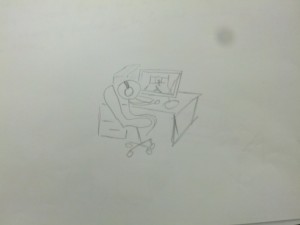
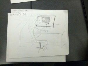
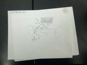
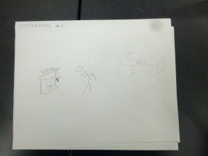
Task #2: Alert user if back position / posture deviates too far from desired posture. Small motors in the system (ideally along the back / along the area of bad posture) will vibrate to notify the user that they have bad posture. We need to test whether we notify the user after a certain threshold of deviance (slouches too much,) if an improper posture is held for too long a duration (slouching for too long,) or some combination of the two.

Difficulty Analysis

One can currently ask another person to monitor their own posture, but this requires an additional person who is watching at all times, making this difficulty-level moderate. However, the device alerts the user automatically / without volition of the user, making this task difficulty easy.

Task #3: Monitor how their posture changes. User can optionally plug the wearable device into the laptop, which will record the readings of the resistors. We can use this data to show the users – in a nice, visual format – how often and how much they deviated from their ideal posture.

Difficulty Analysis

There may be some medical device that quantifies / provides feedback on a patient’s posture, but we are unaware of such things. This high barrier is why we are monitor this task as difficult. However, with this device, the user only needs to plug in the device, which is why we label this task as moderate.

Interface Design

Description

The system is a wearable device that helps users maintain good posture. It monitors the user’s back posture and alerts them when it deviates from a desirable position, and can optionally provide the user with data on when and by how much they deviate from their desired posture. In form, the device is similar to underarmor; this is because the slim fit allows the sensor to more accurately monitor changes in the user’s posture. If the user has a chance to plug the device into a laptop, a program can extract readings from the device, allow the user to view changes in their posture over time. Ideally, such a system would encourage healthier habits in regards to posture. To our knowledge, there is currently no wearable system is dynamically monitors and provides feedback for bad posture.

Storyboards

Colonial (8)  Colonial (6) Colonial (5) Colonial (4) Colonial (3)

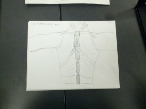
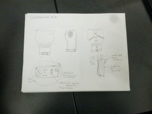
System Sketches

Colonial (2) Colonial (1)

Appendix A – Minute by Minute Observations of User 2

  • Where: Friend Library 2nd Floor
  • When: 12:00 PM on 3/8/12
  • Girl in green jacket sits and gets comfortable
    • Puts jacket around chair
    • Has a small world coffee
  • First sits on edge of her seat and uses smartphone
  • Stands up and starts to pull items out of backpack
    • Pulls out Windows computer
  • Sits back down and rolls back sleeves
    • Ties back hair
    • Cleans glasses
  • Looks out the window
  • Immediate posture
    • Edge of seat
    • One foot on ground
    • Kind of hunched over computer
  • Gets up and takes a photo of the snow with smartphone through window
  • Sits back down
    • Feet all over the place
    • Upper body pretty steady
      • Both elbows out resting on the table
      • Head forward over keyboard
      • Shoulders close together
  • After 5 mins, sits up tall briefly
    • Adjusts hair and maintains position for a few seconds
  • Returns to a position with a lesser posture
    • Head is more forward and lower
    • More slumped over computer in general
  • Slowly gravitates to original position over the course of several minutes
  • When: 12:15 PM
  • Legs reach a somewhat consistent form of being crossed
  • Head gets lower again
  • When: 12:21
  • Rubs neck with left hand
  • Rolls up sleeves and returns to work
  • Reaches the new posture
    • Elbows still resting on table
    • Left hand on neck
    • Right hand using computer
  • Puts on big green jacket
  • Goes to original posture
  • When: 12:40
  • Hunched more forward
  • Hunches over her phone every once in a while to send a text
  • When: 12:45
  • Leans more on right side
  • Sits up tall and puts elbows close together as a stretch
  • Almost back to original posture, elbows slightly more in
  • Elbows out again, more slump
  • Leans way forward with arms on lap and stays with this new posture
  • Leans back in chair after brief back twist stretch
  • Leans forward again
  • Gets up and throws coffee away
  • When: 12:50
  • Arms on lap, hunched forward
  • leaning forward on right arm
  • Sits tall and scoots chair forward so that her back is flush to the back of the chair and she’s close to desk
    • Arms on lap
  • When: 1:00
    • Left elbow on chair’s left arm
    • Leans
  • When: 1:10
  • Shift from elbow to elbow on chair’s arms
  • Looks uncomfortable
  • When 1:15
  • Stretches back backwards over chair
  • Leans forwards again with arms on lap

P2 – The Backend Cleaning Inspectors

Group Number
8

Members and Their Tasks

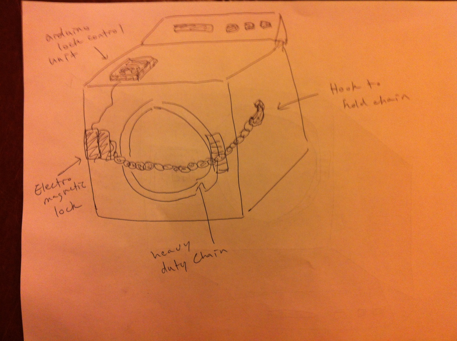
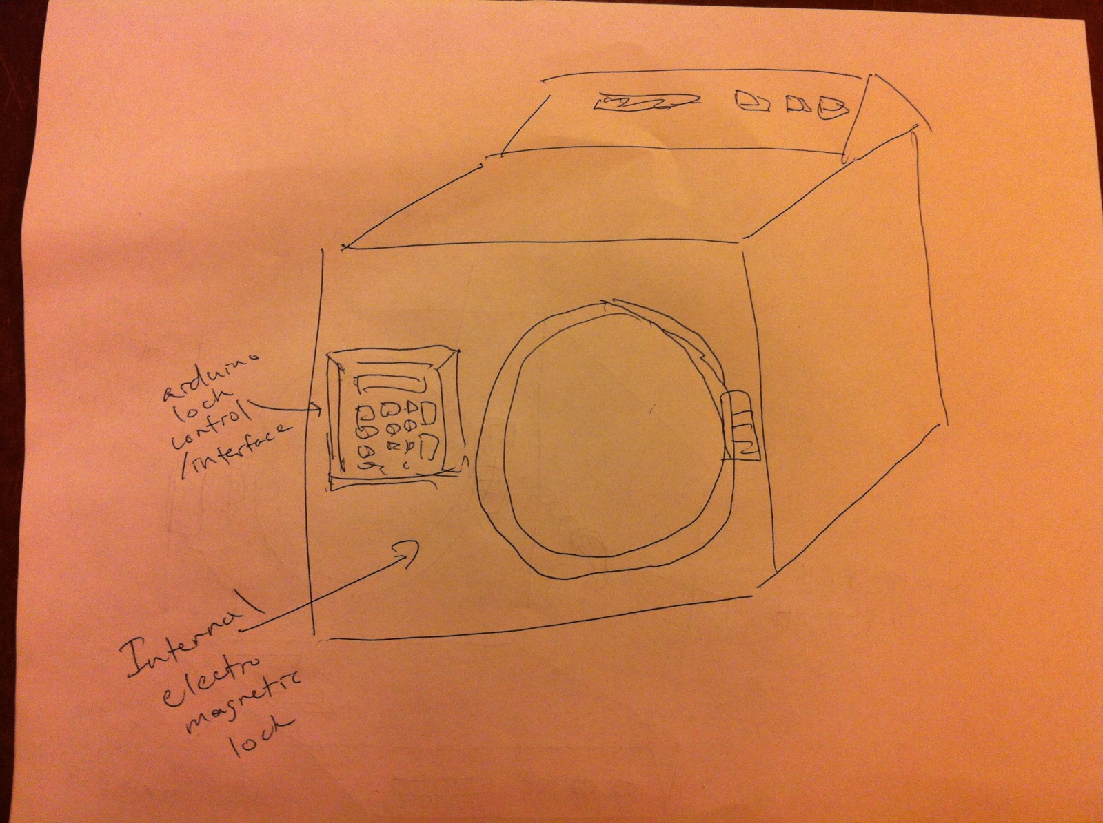
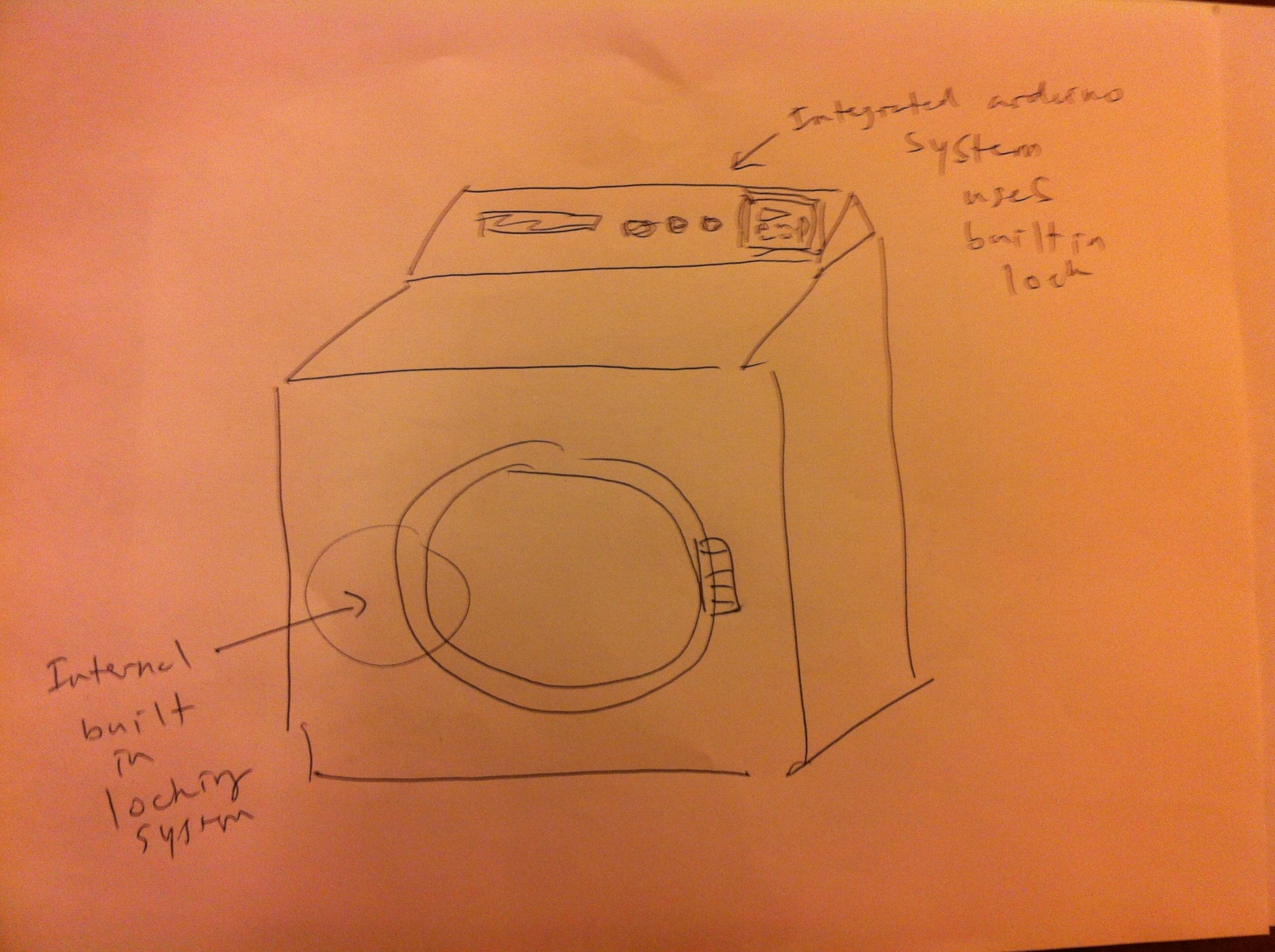
  • Tae Jun Ham (tae@): Designed the lock system.
  • Peter Yu (keunwooy@): Conducted an interview, helped with the design and the write-up.
  • Dylan Bowman (dbowman@): Conducted an interview, helped design the product and answer questions.
  • Green Choi (ghchoi@): Conducted an interview, drew the sketches and helped with the write-up.

All members contributed pretty much equally.

Problem and Solution Overview
Our idea addresses the common problem at Princeton of strangers tampering with, moving, or even stealing other peoples’ laundry that is left in the machine after the cycle. Our solution is to build a locking system to provide security. It will take Princeton NetID from the user and lock the machine until the grace period (10 minutes or so after the end of the cycle) is over. The user will be notified about the status of the machine via email. Other users who are waiting to use the machine can inquire the current user when he/she will retrieve the laundry by pressing a button on our device. By providing security and enabling the communication between users, our system can effectively prevent theft and tampering with laundry.

Description of Interviewees

  1. Male, 21, Junior, Econ Major, from Pennsylvania. Varsity soccer player. Normal/preppy style. Laundry every three weeks
  2. Male, 21, Senior, Architecture Major from Boston. Normal/preppy style. Laundry every month
  3. Female, 19, Freshman, No major yet from San Diego, California. Athletic style. Laundry once every month.

We chose these people, because they were doing their laundry or waiting to do their laundry in the laundry rooms on campus. These people are perfect candidates for our CI interview as they are our target users.

CI Interview Description
We waited in the laundry rooms of various locations on campus to interview people who came to do their laundry. We would then politely ask them to participate in a short interview, and we would ask them questions about their laundry process and related things. We kept things focused on specific things they did during their laundry process and what specific things were important or not important to them during that process. Some example questions we asked during our interviews: Describe your typical laundry routine in as much detail as possible. Do you stay while your laundry is running, or do you go do other things in the meantime? Do you usually retrieve your laundry as soon as it’s done or do you wait a certain amount of time (either accidentally or on purpose) before you do? Have you or your roommates ever had any problems with people taking your laundry out of the machines before? When d you usually do your laundry? And many more…

One theme that was common in our interviews was that people did not wait in the laundry room for their laundry to be done. They would usually return to their rooms or another place on campus to do work or other activities and return to get their laundry once it was done. This would imply that most people on campus do not wait around while their laundry is running. This is pretty easily explainable: Most people at Princeton are incredibly busy. Students have school work, real work, job applications, sports practices, musical practices, social activities, etc. They need to use any possible time they have to do these things and waiting around for their laundry to finish is not an option really unless they are doing work while they wait (which is what one of our subjects actually does). However, most people prefer to do their work in their rooms or a library rather than in a laundry room, and thus most people do not remain around to watch their clothes.

Another theme that was common in our interviews was that they seldom came back on time to retrieve their laundry, usually coming back 15 to 30 minutes late. Again, people are busy doing things and sometimes those things don’t end exactly when their laundry ends. Or sometimes people just forget their laundry is running. Both explanations have a hand in this effect, and our product can help with both. Only a few differences were observable. First, the subjects all had different levels of how far they would go when dealing with another person’s laundry. One said that he would take out a person’s laundry from either a washer or dryer if it was done running. Another said that he would only take it out of the dryer. This is interesting, but the fact still exists that people do take things out of machines when people don’t want them to and that’s where our product comes in. One last difference is the interview with the girl revealed concerns about the privacy of her clothes. We think this is fairly straightforward in that girls are more conscious about their clothes being seen or touched by other people. We feel that this feeling is in the majority among girls at Princeton.

Answers to 11 Questions
1. Who is going to use system?
– There are two parties involved in the laundry rooms on campus: people who are using the washing machines (the Current User) and people who are waiting to use the washing machines (the Next User). Let’s assume laundry thieves are included in the second group.

2. What tasks do they now perform?
– As of now, the Current User simply brings his/her laundry to the laundry room, puts the laundry in the machine, goes back to whatever he/she was doing, and then comes back to retrieve the laundry.
– The amount of time between when the laundry is done and when the student retrieves his/her laundry varies widely, and it’s one of the main causes of the temperament of laundry and theft.
– The Next User, when there is no available laundry machine, usually takes finished laundry out of the machine to use the machine. Thieves will steal the laundry that has been taken out of the machine.

3. What tasks are desired?
– As for the Current User, protection from other students taking their stuff out of the machines or steal it without knowledge of the user is desired. The task that we will provide with our product will be to prevent potential thieves or laundry miscreants from messing with or stealing the user’s clothes, something that is very personal and meaningful to most students.
– As for the Next User, a channel to communicate with the Current User of the laundry machine is desired. It could be a button that will send the Current User of the machine a message that someone wants to use the laundry machine. The Current User can also send a notification back to the device when he/she will be back. This way, the Next User knows when the Current User will be back and is less likely to take the laundry out, thereby preventing theft and temperament.

4. How are the tasks learned?
– Instructions will be emailed to student residential listserves
– Instruction placards or flyers will be posted in laundry rooms and on machines
– Instruction manual will be included with the product.

5. Where are the tasks performed?
– In public laundry rooms across campus with wifi connections

6. What’s the relationship between user & data?
– We deal with few data which include laundry machine status and user’s Princeton NetID. For laundry machine status, we will let all users to see it in remote location via separate website. For user’s Princeton NetID, as this information is private,

7. What other tools does the user have?
– Virtually all users will have access to constant communication through email. Our product will take advantage of this by emailing the user when certain actions occur, such as their laundry being done, or when someone waiting to use the machine presses a warning button on the locking unit during the wash cycle or during the waiting period.

8. How do users communicate with each other?
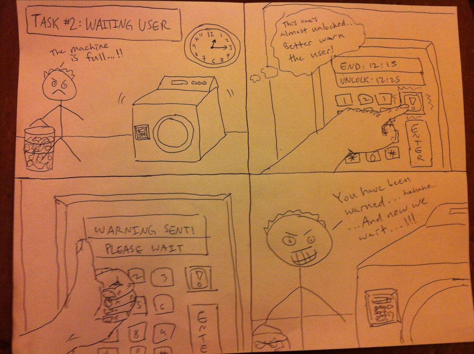
– One important way our product will facilitate important communication between users is through the use of a certain button that serves the following purpose: Our user’s laundry machines will remain locked by our product for a certain period of grace time after the laundry is done. If someone is waiting to do their laundry and all of the machines are taken, they can press the button once at any time during the cycle. Our product will then send a quick email to the user alerting them that someone is waiting to use their machine and that they should retrieve their laundry as soon as possible after its done. This is an important way that the users of our product will communicate with each other.

9. How often are the tasks performed?
– Per individual user: Anywhere from once a week to once every 3 weeks.
– Campus-wide: Frequency depends on the time of the day and the day of the week. Students tend to do their laundry in after-class hours, later at night, and on the weekends.
– It is here noted that the late night hours are often used to avoid the very problem of laundry tampering that we are trying to solve.

10. What are the time constraints on the tasks?
– Users washing their clothes have the time constraint of the laundry cycle time, plus the varying time constraint of the grace period time that is determined based on the laundry room traffic at given times or days of the week. This grace period may be determined by survey or dynamically as users use our machines.

11. What happens when things go wrong?
– When the grace period is over, our product will automatically unlock. This means that anyone can get to the current user’s laundry. This isn’t exactly “things going wrong” as the product was designed this way. This situation would be more of the user’s fault. One thing that could wrong is our product malfunctions and either: 1) unlocks when it shouldn’t and allows things to be stolen. Hopefully our code can have some fallback mechanism to at least alert the user that their laundry is no longer locked. 2) remains locked when it shouldn’t be. This is a bit more difficult to deal with as there really is no other way to fix this other than physically breaking into the lock. Thus, we must be extremely careful to not allow this to happen in our product.

Description of Three Tasks
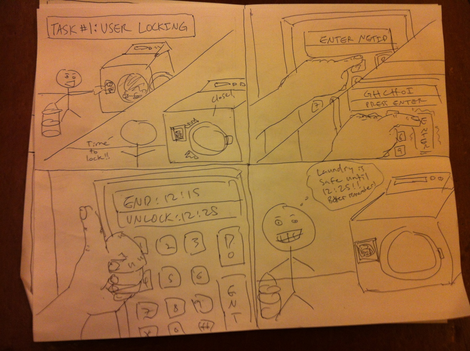
1. Current User: Locking the machine:
– User inputs netID into locking unit keypad. This netID is used as the password for unlocking the machine, as well as the email address used to send warning messages by the locking unit (and the next user).

2. Next User: Sending message to current user that laundry is done and someone is waiting to use the machine:
– The next user waiting for the machine (when no other machines are open) can press a button at any time during the cycle. When the button is pressed (only once per cycle), our product will send an email to the current user saying that someone is waiting to use their machine after they are done and that they should go retrieve their laundry as soon as possible after it is done.
– Current Difficulty with current technology/tools: Close to impossible. There is almost no way to tell who is using which machine and just as hard to contact them even if you do know who is using it (assuming you’re not friends with that person).
– Difficulty with our Product: Easy. Literally as easy as pressing a button.

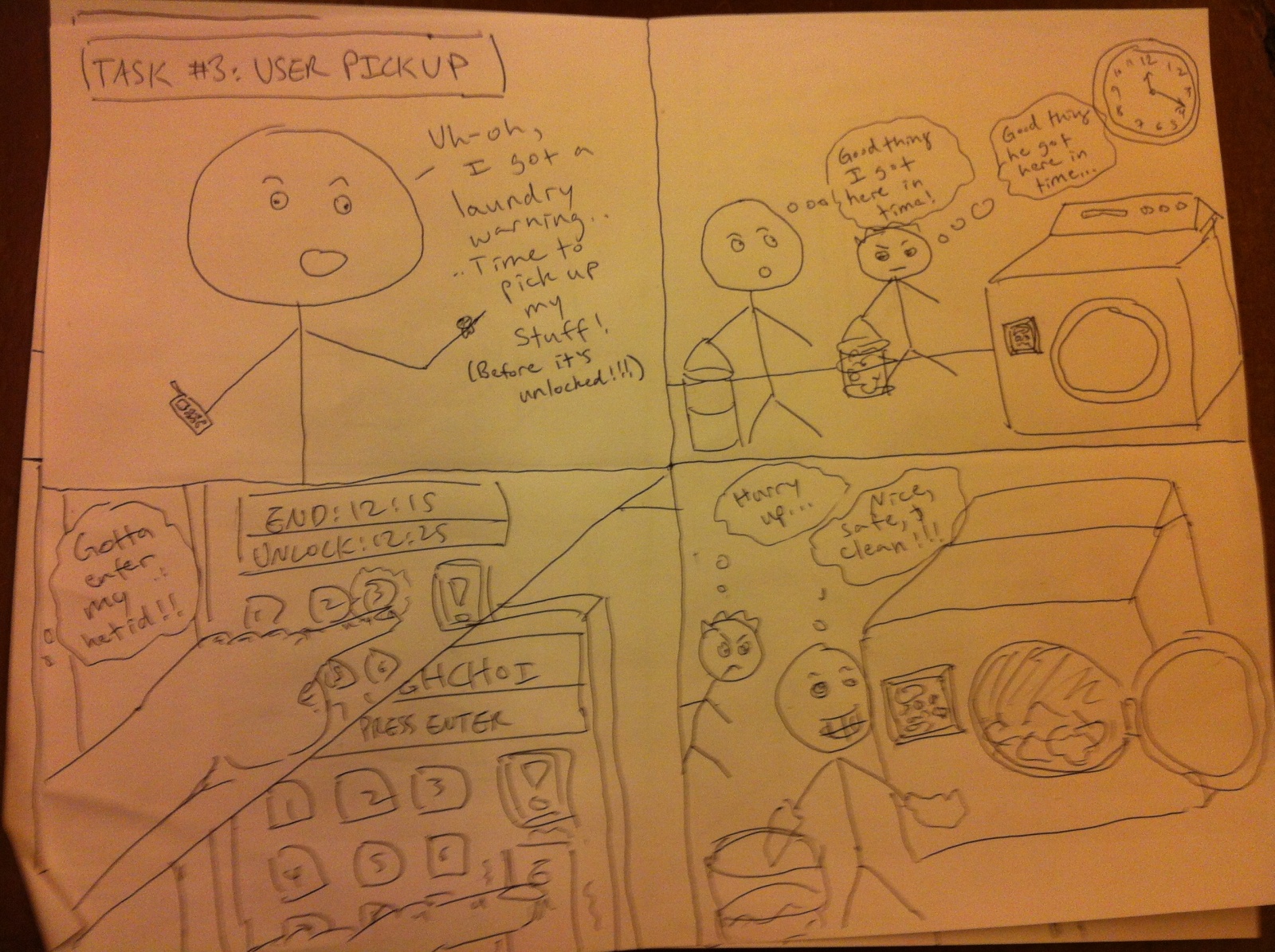
3. Current User: Unlock the machine:
– If the machine is currently locked (during the grace period), the current user must input his netID to unlock the door and extract his laundry.

– Current Difficulty with current technology/tools: Very easy. Just open the door of the machine…
– Difficulty with our Product: Easy/Moderate. The user will simply input his netID during the grace period after the wash cycle, unlocking the door and allowing him to take out his pristine, un-tampered-with laundry. The only difficulty with this step is the user forgetting, ignoring, or failing to comply with the warning messages and not unlocking the unit on time. This will result in the automatic unlocking of the door and the giving up of the laundry’s sanctity and innocence to the winds of fate.

Interface Design
Our system provides the user with extra security for his/her laundry and better means of communication between users. After starting the laundry machine, the user will lock it with our device by entering the NetID. Our device gives the user a short grace period after the laundry is finished. During this time, the Next User can send the Current User an email by simply pressing a button on our device, thereby notifying the Current User that there is a person waiting to use the machine. This will prompt the Current User to retrieve his/her laundry. If the Current User needs more time, he can simply reply to the email to let the Next User know when he/she will be retrieving the laundry.

This slideshow requires JavaScript.

This slideshow requires JavaScript.

P2 – Group 11 – Don’t Worry About It – NavBelt

Krithin Sitaram (krithin@) – Krithin conversed with people in contextual interviews, and wrote about contextual interviews descriptions and task descriptions.
Amy Zhou (amyzhou@) – Amy drew a storyboard, conversed with people in contextual interviews, and wrote about user descriptions and task descriptions.
Daniel Chyan (dchyan@) – Daniel drew a storyboard, wrote about the interface design, observed interviewees during contextual interviews, and wrote about task descriptions.
Jonathan Neilan (jneilan@) – Jonathan took notes during contextual interviews, and took pictures of the design sketches.
Thomas Truongchau (ttruongc@) – Thomas drew a storyboard, wrote about task descriptions, and took pictures of all the storyboards.

Essentially, each person addressed different problems when they arose.

Problem and solution overview
Smartphone map apps are useful but very demanding of the user’s visual attention, and still require the user to be able to read a map. Our proposed solution is to outfit a belt that the user will wear with a number of buzzers; this will interact with a user’s smartphone to determine the user’s location and bearing and vibrate the appropriate motor to indicate the direction the user should walk.

Description of users you observed in the contextual inquiry
Our first target user group includes travelers in an unfamiliar area who want to travel hands-free. Our rationale behind choosing this user group is because they tend to have their hands full and need a solution that will help them quickly move from place to place without referring to a map or phone.
Our second target user group includes people searching in Firestone library. Actual tourists are hard to find this time of year, so we chose students attempting to locate things in Firestone as an approximation. They have the problem of making their way around an unfamiliar environment. This allowed us to gather insight into how they use the same tools that people use when navigating a larger scale unfamiliar environment, like a city.

Persons observed in contextual interviews
At the transit center:
1. Two female adults, probably in their mid-20s, who were very outgoing and excited about traveling. They were primarily occupied with getting where they were going, but also wanted to have fun along the way! They were good target users because they were new to the area, having just arrived from the airport, and also had a distinct destination they wanted to get to; they also did not want to expose electronics to the rain, so they fit in the category of travelers who would have liked to have hands-free navigation.
2. Two women, probably in their early 20s, weighed down by shopping bags and a small child. They were fairly familiar with transit in general, but not with this particular transit center. Their top priority was not getting lost. They were good observation candidates because they were in a hurry but were having trouble using existing tools — they were uncertain whether they were on the right bus, and waited for several minutes at the wrong bus stop.

At Firestone:
1. Female student searching for a book in the B level, then looking for the way back to her desk. She does not know Firestone well, and was using a map of the library on her laptop to get around.
2. Male student searching for his friend in the C level of Firestone. He knew the general layout of that part of the library, but did not know precisely where his friend would be. It seemed time was less of a priority for him than convenience, because he was content wandering around a relatively large area instead of texting his friend to get a more precise location (e.g. call number range of an adjacent stack) and using a map to figure out directions to that location.
3. The official bookfinder on the B-level of Firestone provided some information about the way people came to her when they needed help finding a book. Although she was not part of our user group herself (since she was trained in finding her way around the library) she was a useful source because she could draw on her experience on the job and tell us about the behaviors of many more people than we could practically interview.

CI Interview Descriptions
We carried out interviews in two different settings. Firstly, we observed people attempting to find their way around using public transit who were waiting at the Santa Clara Transit Center, while it was dark and raining, immediately after a bus had arrived from the airport, thus carrying many people who had just arrived in the area. Secondly, we observed people in Firestone library as they attempted to find books or meet people at specific locations in the library. In addition to direct observations, we also interviewed a student employed as a ‘bookfinder’ in the library to get a better sense of the users we expected would need help finding their way around. We approached people who were walking near the book stacks or disgorged from the elevator; asked them what they were looking for, and followed them to their destination. One person recorded observations by hand while another talked to the participant to elicit explanations of their search process.

One common problem people faced was that even with a map of the location they were uncertain about their exact position, and even more so about their orientation. This is understandable because it’s very easy to get turned around, especially when they are constantly looking from side to side. Recognizable landmarks can help people identify where they are on a map, but it is harder to figure out their orientation from that. Another problem is that people are often overconfident in their ability to navigate a new area. For instance, at the transit center, one informant was sitting at a bus stop for quite some time, apparently very confident that this was the correct bus stop, only to run across the parking lot several minutes later and breathlessly exclaim “We were waiting at the wrong bus stop too!” The first student we interviewed in Firestone also told us that she knew the way back to her desk well (even though she admitted to being “bad with directions”), but nevertheless had to keep looking around as she passed each row in order to find it.

One Firestone interviewee revealed another potential problem; he was looking for a friend in the library but only knew which floor and which quadrant of the library his friend was in, and planned to wander around till the friend was found. This indicates that another task here is the mapping between the user’s actual goals and a physical location on the map; we expect however that this should be easier for most users of our system, since for example the transit passengers and the students in search of books in the library had very precise physical locations they needed to go to. Even when users are following a list of directions, the map itself sometimes has insufficient resolution to guide the user. For instance, at the transit center, all the bus stops were collectively labeled as a single location by Google Maps, with no information given as to the precise locations of the bus stops within that transit center.

Answers to 11 Task Analysis Questions
1. Who is going to use system?
Specific target group:
People who are exploring a new location and don’t want to look like a tourist.
2. What tasks do they now perform?
Identify a physical destination (e.g. particular location in library) that they need to go to to accomplish their goal (e.g. get a certain book).
Harder to define for some goals (‘looking for a friend in the library’)
Determine their own present location and orientation
E.g. Transit passengers try using GPS; inside library people look at maps and landmarks.
Identify a route from their location to their destination, and move along it.
As they proceed along the route, check that they have not deviated from it.
e.g. the transit passengers
3. What tasks are desired?
Identify a physical destination that they need to get to.
Receive information about next leg of route
Reassure themselves that they are on the the right path
4. How are the tasks learned?
Users download a maps application or already have one and figure it out. They usually do not need to consult a manual or other people.
Boy Scouts orienteering merit badge
Trial and error #strug bus
Watching fellow travelers
5. Where are the tasks performed?
Choosing a destination can happen at the user’s home, or wherever is convenient, but the remainder of the tasks will happen while travelling along the designated route.

6. What’s the relationship between user & data?
Because each person has a unique path, data will need to cater to the user. Privacy concerns are limited, because other people will necessarily be able to see the next few steps of the path you take if they are physically in the same location. However, broadcasting the user’s complete itinerary would be undesirable.
7. What other tools does the user have?
Google maps
Other travelers, information desks, bus drivers, locals…
Physical maps
Signs
Compasses
8. How do users communicate with each other?
Verbally
Occasionally, text messaging
9. How often are the tasks performed?
When the user is in an unfamiliar city, which may happen as often as once every few weeks or as rarely as on the order of years, depending on the user, the user will need to get directions several times a day.
10. What are the time constraints on the tasks?
Users sometimes have only a few minutes to get to a location in order to catch a bus, train, or plane, or have to get to their destination within a few minutes.
11. What happens when things go wrong?
In the case of system failure, users will be able to use preexisting tools and ask other people for directions.

Description of Three Tasks
1. Identify a physical destination that they need to get to.

Currently, this task is relatively easy to perform. On the web, existing tools include applications like Google Maps or Bing Maps. Users generally input a target destination and rely on the calculated path in order to get directions. However, the task becomes moderately difficult when consulting directions on the go. Users inconvenience themselves when they need to take out their phone, refer to the map and directions, and then readjust their route accordingly.
Our proposed system would make the task easier and less annoying for users who are physically walking. After the user identifies a physical destination, the navigation belt will help guide the user towards the target. Our system eliminates the inconvenience of constantly referring to a map by giving users tactile directional directions. This is discrete and inconspicuous.

2. Receive information about immediate next steps

Determine in what direction the user should be walking. This can be moderately difficult using current systems, because orientation is sometimes difficult to establish at the start of the route, and the distance to the next turn is usually not intuitive. For example, users of current mapping systems may have to walk in a circle in order to figure out a frame of reference to determine the correct direction because a user must orient the mobile phone. With our proposed system, the direction will be immediately obvious, because the orientation of the belt remains stable. Our proposed system will make this task relatively easier.

3. Reassure themselves that they are on the the right path

The user often wants to know whether they are still on the right track, or whether they missed a turn several blocks ago. The user attempts this task once in a while if they are confident, but if they are in a confusing area they might want this information very often or even continuously. Currently, checking whether the user is still on the right path is not very difficult but rather annoying, since it requires pulling out a map or phone every few minutes to gain very little information. With our proposed system, it would be extremely simple, because as long as the front panel is vibrating, the user knows that he or she is walking in the right direction.

Interface Design
The system provides users with the ability to orient themselves in a new environment and receive discreet directions through tactile feedback. A user can ask for directions and the system will vibrate in one of 8 directions to guide the user through a series of points towards a destination. Benefits of the system include discrete usage and providing an additional sense of direction beyond the current maps provided by Google and Microsoft. Reliance on a tactile system also reduces the demand on visual attention which allows users to focus more on his or her surroundings. The scope of functions will encompass orienting towards points of interest and providing directions to those points. No longer will users need to stare at a screen to find their way in unfamiliar locations or spin in a circle to find the correct orientation of directions.

Storyboard 1:


Storyboard 2:
Storyboard 3:

Design of NavBelt
belt2

Design of Mobile Application Interface
belt

P2 — VAHN

GROUP NUMBER: 25
GROUP NAME: Deep Thought
GROUP MEMBERS: Vivian Qu, Neil Chatterjee, Harvest Zhang, Alan Thorne

All four group members conducted contextual interviews. All four worked on answering task analysis questions and interface design together, organizing a meeting and collaborating on a google docs.

Harvest, Alan, and Vivian drew sketches and final storyboards for the 3 defined tasks. Neil and Vivian compiled the blog post information to publish on the website.

PROBLEM SOLUTION AND OVERVIEW:

VAHN (pronounce vain) is Microsoft Kinect project that allows on-the-fly, gesture-controlled, audio editing for musical performers and recorders. Skeleton data allows the manipulation of recording software that includes features such as overlaying audio, playback, EQ modulation, and editing. Suppose you want to know what your a cappella performance is going to sound like, or you’re creating a one man a cappella song — stand in one location, use gestures, sing, record and edit. Physically move to the next location (simulating multiple singers). Use gestures, sing, record, and edit. Move to another location, realize you don’t want a middle of a snippet, and use gestures to remove that snippet. Finish the third section, and finally overlay them together. VAHN provides a cheap solution for gesture-controlled audio recording and editing.

DESCRIPTION OF USERS YOU OBSERVED IN THE CONTEXTUAL INQUIRY:

Our target users are amateur musicians with high level of skill and therefore need more music recording functionality, but who may not have much technical ability, and may lack familiarity with or access to complicated audio recording systems. This is a reasonable target user group because we imagine our system being a lightweight, simple tool which lowers the barrier to creating and enjoying music.

Interviewees were students who are deeply involved with playing and creating music. The majority consisted of students in a cappella groups and a member of Princeton University Orchestra ( PUO). Priorities included arranging music, improving their music skills, and the ability to experiment. In terms of technical skills, one was tech-savvy singer, two non-technical singer, one non-technical instrumentalists — all agreed they wanted a simpler way to record music and disliked the complicated interfaces of usual digital audio workstations where users are often limited by the fact that they don’t even know many functionalities exist.

CI Interview Descriptions

When conducting our interviews we followed this process:

  • We shared general idea of our project and asked why he would or wouldn’t use it.
  • Asked what the users would like to see in an interface (ideas without prompting).
  • Posed our ideas for interfaces to get their feedback, likes and dislikes.

We interviewed the users in their rooms or in public spaces such as coffee shops and dining halls. The process of recording music is generally isolated in a quiet spaces (usually with easy accessible software, such as those that come by default on computers), so the environment itself was not important for understanding the music-making and recording process.

Common suggestions included ease of operation, gesture control while recording, and a general expansion of features to incorporate as much functionality as possible as a recording studio. The “undo” functionality is very important for any music editing software, and needs to be intuitively integrated in the system. Editing should be able to happen in real time and be fine-tuned, so users can be precise how they edit the tracks and cut out segments on the fly. Overall, this should include all the features of high tech recording software, but maintains the simplicity of any kinect gesture software.

Suggestions from singers included the need for visual indication of loop position (like the start and finish of tracks), visual indications of beats/pulse, recommended auto-tune mode and various sound effects such as compressors and EQs. This product concept is extremely appealing to singers because other available software (Musescore, Sibelius, Finale, etc) all have electronically-generated MIDI files which doesn’t correspond to how parts will sound together in real life.

Feedback from a instrumentalist included the need to address handling of gestures — its weird to give gestures while playing an instrument. It would be useful to have different “modes” (switch from skeleton data input for kinect to depth perception data), allowing the musician to add notes. A timer countdown before recording starts would also be useful. Really like the concept of using spatial location to have different tracks.

Users also suggested that a video component would be valuable to the music-making process, especially if users could see multiple visual recordings at the same time.

ANSWERS TO 11 TASK ANALYSIS QUESTIONS:

1. What are unrealized design opportunities?

We would like people who can sing and play well (serious instrumentalists) to have an affordable pick-up-and-play recording and mixing system. Technology available is either too simplistic or too expensive and with complicated interfaces. Gesture-controls for the kinect are a new concept that can be integrated during performances or recordings. This allows people of all levels of technical skills to do a lot with the product without touching the computer.

2. What tasks do they now perform?

For music recording, our target user group uses freely available, bare-bones recording equipment instead of professional systems which are too expensive and complicated. For example, GarageBand is relatively easy to use, but still complicated for non-technical people and many often don’t recognize the power it has, and attribute undeserved limitations in sound quality because of lack of knowledge. Additionally, the editing and recording process takes many hours, at least 4 hours minimum to produce a do-it-yourself quality recording. Results are similarly for other digital audio workstations like ProTools, LogicPro, etc. Users may also use tools not intended for music recording (such as Photobooth on Mac computers) simply because they are easy and quick to use, though the quality is bad. There seems to exist a trade-off between time investment and quality with ease of use.

3. What tasks are desired?

Users would like to have a simple recording process that allows you to quickly and dynamically create music content alone or possibly collaboratively. This is allows them to improve their skills and quickly share the music, often useful in situations where others need to learn (such as new arrangements, where people would like to hear the balance of the overall blend). In particular, users want an easy interface allows musical people to take advantage of sound manipulation techniques and mixing/layering tracks without a technical tech background.

4. How are the tasks learned?

Trial-by-fire — trying to muddle through and figure out the functionalities. Our interviewees said they learned by asking people who already know how to do them, so they could never learn themselves how to make things work. There are no formal classes that they can take. Documentation online exists for these systems but they can sometimes be hard to understand — some say they don’t know where to start.

5. Where are the tasks performed?

Task performed in quiet environments (usually home, dorm room, practice room, recording spaces) and open areas. No influence of environment except for the impact on sound quality. It’s important to pay attention to how recording equipment is positioned. For example, a cappella groups sing in circular formations, which is hard to capture with a single one-directional mic, so a 360 degree mic is invaluable to capturing a recording that best matches a live performance. There is no effect due to bystanders, usually recording alone or with people who you are comfortable working with musically.

6. What’s the relationship between user & data?

Handling of data should be local, because recording music often results in catastrophic failure (the song sounds bad, the singer is off-key, etc) so you don’t want to broadcast bad recordings to others over the internet. The recordings should be private with the option to share with others. Not much of a privacy issue because the system is offline.

7. What other tools does the user have?

Laptop, home PC, cell phone, musical instruments, microphones, speakers. Microphones are extremely important to guarantee quality of sound, which might be useful to integrate into our system. There are mobile recording and mixing applications, but they are intended for casual interaction and have no ability to edit.

As mentioned before, currently available digital audio workspaces includes GarageBand, ProTools, LogicPro, and musicians even use PhotoBooth to record music.

8. How do users communicate with each other?

Not relevant for tasks related to music recording. Users often upload their recordings onto websites and youtube to share it with a larger audience.

9. How often are the tasks performed?

The tasks are performed whenever the urge to record and mix music occurs, which could be daily or once in long spans of time. Music recording is estimated to take a minimum of 4 hours, which become longer is significant editing time is taken into account. However, the time can be broken up into different chunks and worked on across an extended period of time. Therefore, it’s necessary to allow saving the workspace so users can later return to pick up where they left off.

10. What are the time constraints on the tasks?

No time constraints for the tasks, used whenever. If our device is used for live performance and collaborative music making, need minimal amounts of time to set up.

11. What happens when things go wrong?

Delete and start over again. Editing should be available on a very fine-grained scale and undos are very important.

DESCRIPTION OF 3 TASKS:

  1. Single recording — If you wanted simple gesture based recording and editing, one voice role could easily be performed this way. This would involve the performer recording with the kinect. Afterwards or during recording, the performer could edit different sections using gestures. The performer would spend minimal time interfacing with the computer this way and more time focusing on the actual performance/recording.
  2. A capella recording (“intro version”) — combining multiple tracks into one recording. This would be the “intro version” of recording because the performer would use default settings for everything (autotune on, equalizers set, beatbox helper).
  3. Real-time mixing and recording — The performer could manipulate sound properties while recording, including dubstep, EQs, and other sound processing features. This would mean that the performer has full control over every aspect of recording, much like the functionalities available in complex recording systems but with an easier, simpler interface.

INTERFACE DESIGN:

Text Description: 

The device focuses on real-time recording music with smooth playback and simple, intuitive interface allowing for many different functionalities for sound manipulation. It will allow easier and more intuitive forms of recording compared to digital audio workstations, and a more quality alternative to rock band. Users can separately record multiple tracks and combine them into one recording, adjusting sound levels on each track individually. Can add filters and change other sound properties. Body gestures would facilitate the recording and editing process. The main innovation is using spatial location of the person’s body to detect which “part” they are recording (for a capella, would correspond to soprano, alto, tenor, and bass voice parts). This would be easier for the user to understand the multiple track layering since they have to physically move to start a new track.

STORYBOARDS:

SKETCHES:

P2: Group Epple (# 16)

Names & Contribution
Saswathi Natta — Organized Interview form & Questions. Did one interview
Brian Hwang – Writing
Andrew Boik – Did one Interview. Writing
Kevin Lee – Did one Interview, Finalized document [editing, combining interview descriptions, task analysis, user group narrowing]

Problem & Solution Overview
People cannot remotely explore a space in a natural way. When people watch feed from a web chat, they have no way to move the camera or change the angle, they only have the view that the “cameraman” decides to give them when recording.  They may send signals to the camera through keyboard controls or maybe have verbally command the cameraman to change the viewing angle; however, these are terrible interfaces for controlling the view from a remote camera. The goal of our project is thus to create an interface to make controlling remote viewing of an environment in the web chat setting more intuitive.  We aim to improve the situation by replacing mouse, keyboard, and awkward verbal commands to the cameraman with Kinect-based head tracking used to pan around the environment.  The image of the environment based on the change in head angle will then be displayed on a mobile display, which is always kept in front of the user.  This essentially gives a user control over the web camera’s viewing angle through simply moving his head.

Description of users you observed in the contextual inquiry.
Our target user group are students at Princeton that web chat with others on a routine basis.  We choose this target group as our project aims to make the web chat experience more interactive through providing intuitive controls for the web camera viewing angle; thus, students who routinely webchat are the ideal target users.

Person X

  • Education: Masters Candidate at Princeton University
  • Likes: Being able to web chat anywhere through mobile interface and easily movable camera.
  • Dislikes: Web chatting with people that are off-screen.
  • Priorities: No interruptions in the web chat, which might arise from poor connection quality or having to wait for a person to get in front of the camera.  Good video/audio quality.
  • Why he is a good candidate: X is a foreign student from Taiwan.  He routinely web chats with his family who live in Taiwan.

Person Y

  • Education: Undergraduate at Princeton University
  • Likes: multitasking while Skyping
  • Dislikes: bad connection quality
  • Priorities: keeping in touch with parents
  • Why he is a good candidate: Y is from California and communicates with her family regularly.

Person Z

  • Education: Undergraduate at Princeton University studying Economics
  • Likes: being able to see her dogs back in india.She wants to be able to talk to her whole family at once and watch her dogs run around.
  • Dislikes: the connection issues on skype. Does not want camera to be able to rotate all the time for privacy issues
  • Priorities: time management, keeping in touch with family.
  • Why she is a good candidate: Z is from India and communicates with her family every 2 weeks via skype.

CI interview descriptions

We arranged to visit X’s office where he was going to web chat with his family for us to see.  He shares his office with 5 other people in a large room.  The office consists of six desks with computers and books on each.  He occupies one of the desks.  We arranged to visit person Y in her dorm room when she was going to communicate with his parents.  The interview was conducted in a standard issue dorm room where Y lives alone.  We interviewed Z in the student center, a public place, to talk both about how she webchats with her family but also about searching for friends remotely. Before each web chat contextual inquiry interview, we asked the participants some questions to gain some background context.  We learned that person X web chats with his family in Taiwan once a week. The web chats are just routine check ups between the family members that can last from 15 minutes, if not much has happened in the week, to an hour, if there is an important issue.  These web chats are usually on Friday nights or the weekend when he is least busy.  He always initiates the web chats because his family does not want to interrupt him. Person Y usually calls her parents who live in California  multiple times per week, with each session lasting from 20 minutes to an hour. Person Z webchats with her family from her dorm room, sitting at a desk. She talks to both her parents and her grandparents who live in the same house in addition to her dogs via skype. She expressed interest in being able to to talk to her family all at once with a rotating camera as well as being able to see her dogs as they run around with a rotating camera. Person Z also experienced the need to find a friend in a public location such as Frist and found that a being able to check remotely would be useful, though she felt that the camera might be an invasion of privacy if users did not want to be seen both in a home or in a public place.

After gaining context through questions, we then proceeded with the actual web chats.  X used Facetime on his iPhone to web chat with his family who were also using an iPhone. Y, on the other hand, used Skype on their laptops to web chat with their parents.  At the beginning of each web chat, we briefly introduced ourselves to the web chat partners and then allowed the web chat to flow naturally while observing as per the Master-Apprenticeship partnership model.  We briefly interrupted with questions every so often to learn more about habits and approaches to tasks.  We sometimes asked also asked questions to understand their likes/dislikes/priorities regarding the current web chat interface, the results of which are listed with the descriptions of the users.  We found that the theme of each web chat was largely just discussion of what recently happened.  Each interview also shared an interesting common theme where the participant would most of the time engage in a one on one conversation with one family member at a time.  We reason that this theme exists due to the limitations of the web camera technology.  The camera provides a fixed scope that is usually only enough to view one person through.  To engage in intimate conversation, both chat partners need to be looking directly at each other; thus, there is no room for natural, intimate conversation with more than one family member at a time.  To deal with this, our participants instead engage in intimate conversations with each family member individually.  Indeed, at one point Person X’s father was briefly off-screen while speaking to the Person X, creating a fairly awkward conversation situation.  Person X started off by speaking to his mother, then asked his mother to hand the iPhone to his father so he could speak with him.  Person Y similarly began speaking with her mother, and later the father swapped seats in front of the camera with the mother when it was his turn.  Thus, a common task that was observed across each interview was where the participant requested to speak with another member through verbal communication.  The task was then fully accomplished by the web chat partners on the other side complying with the request by ending the conversation and handing off the camera or swapping locations with another chat partner.  We reason this common task exists because there is no natural way for the participants to actually control the web camera viewing angle to focus on another person.  Instead they must break the conversation and verbally express a request to switch web chat partners.  This request can then only be completed through moving around of partners on the other side of the web chat due to the limitations of the web chat interface.

An interesting difference that we found across the interviews is that Person X largely told his father the same things that he told his mother regarding events that happened in the past week.  However, the subjects of the conversations between Person Y and her two parents differed.  We reason that this was observed because of differences in relationships with the participants and the other chat members.  Person Y feels uncomfortable discussing certain topics with her father while being able to discuss them with her mother and vice versa.  Person X, however, is equally comfortable about talking with his parents about all matters.  Person Y also multitasked by surfing the web while chatting with her parents while Person X did not.  This difference could have arised because of a difference in technological capabilities, as iPhone is a single-foreground-application device while laptops are not.  Person X, however, had a laptop in front of him but did not surf the web with it.  We reason that this is because Person X is more engaged in the web chat sessions partly because he web chats only once a week with his family while Person Y web chats multiple times a week. For person Z regarding webchat, she also talked to her parents one at a time and found that she could not communicate with her dogs at all because they would not stay in front of the camera for a very long time. Regarding finding friends in a public location, Person Z would text a friend to ask where they were before leaving her room to meet them. She would also just walk around the building until she found them, or just sit in one location and wait for the friend to find her. This took considerable time if the friend was late or texted that they were in one location but had moved. A simple application to survey a distant room would have helped with this coordination problem.

Answers to 11 task analysis questions
1. Who is going to use system?
Identity:
People who want to web chat or remotely work with others through similar means such as video conferencing will use our system.  People who want to search a distant location for a person through a web camera can also use the system.  Our user also needs to physically be able to hold the mobile viewing screen.
Background Skills:
Users will need to know how to use a computer enough to operate a web chat application, how to use a web camera, and how to intuitively turn their head to look in a different direction.

2. What tasks do they now perform?
Users currently control web chat camera viewing through:
-telling the cameraman, the guy on the other end of the web chat, to move the camera to change the view onto somewhere/someone else as with Person X.
-telling the guy on the other end of the web chat to swap seats with another guy as with Person Y.
-ask who is talking when there are off-screen speakers.

3. What tasks are desired?
Instead, we would like to provide a means of web chat control through:

  • Controlling web chat camera to look for a speaker/person if he is not in view.
  • Controlling web chat camera intuitively just by turning head instead of clicking arrows, pressing keys, or giving verbal commands.

4. How are the tasks learned?

Tasks of camera control are learned through observation, trial and error, verbal communication, and perhaps looking at documentation.

5. Where are the tasks performed?
At the houses/offices of two parties that are separated by a large distance.
Meetings where video conferencing is needed.

6. What’s the relationship between user & data?
User views data as video/audio information from web camera.

7. What other tools does the user have?
Smartphone, tablet, web camera, kinect, laptop, speakers, microphone.

8. How do users communicate with each other?
They use web chat over the internet through web cameras and laptops.

9. How often are the tasks performed?
-Video conferencing is weekly for industry teams.
-People missing their friends/family will web chat weekly.

10. What are the time constraints on the tasks?
A session of chat or a meeting generally will last for around one hour.

11. What happens when things go wrong?
Confusion ensues when speakers are out of view of web camera.  This often causes requests for the speaker to repeat what was just said and readjustment of camera angle or swapping of seats in front of the camera.  This is awkward and breaks the flow of the conversation.  Instead of facing this problem constantly, our interview participants have one on one individual conversations with their web chat partners.

Think about the tasks that users will perform with your system. Describe at least 3 tasks in moderate detail:
– task 1 : Web chat while breaking the restriction of having to sit in front of the computer

  • – Allow users to walk around while their chat partner intuitively controls the camera view to keep them in view and continue the conversation
  • -Eliminate problems of off-screen speakers.
  • – current difficulty rating: difficult
  • – difficulty rating with our system: easy

– task 2 : Be able to search a distant location for a person through a web camera.

  • – Allow user to quickly scan a person’s room for the person.
  • – Can also scan other locations for the person provided that a web camera is present.
  • – current difficulty rating: difficult – impossible if you’re not actually there
  • – difficult rating with our system: easy


– task 3 : Web chat with more than one person on the other side of the web camera.

  • – Make web chat more than just a one on one experience. Support multiple chat partners through allowing the user to intuitively change camera view to switch between chat partners without breaking the flow of the conversation.
  • – current difficulty rating: difficult
  • – difficult rating with our system: moderate


Interface Design
Text Description:
With our system, users will be able to remotely control a camera using head motion which is observed by a Kinect and mapped to the camera to change the view in a corresponding direction. The user will keep a mobile screen in front of them so as to always view the video feed from the camera.  This provides a more natural method of control than other webcam systems and allows a greater amount of flexibility in camera angles, as well as an overall more enjoyable experience.  Our system thus offers the sole functionality of camera control through intuitive head movement.  Current systems either require using a physical device as a controller or awkward verbal commands to control a remote camera angle while our system allows users to simply turn their heads to the turn the camera, similar to how a person would turn their head in real life to view anything that is not in their vision. The system will essentially function like a movable window into a remote location.

Storyboards:

Task 1 – Able to move around while video chatting

Task 2: Searching for a friend in a public place

Task 3: Talking to multiple people at once

Sketches:

View user would have of the mobile screen and Kinect in the background to sense user rotation

Example of user using the mobile screen as a window into a remote location

Group #6 Team GARP

Contributions:
Gene – writeup
Alice – interviewed physical trainer, runner, some writeup
Rodrigo – got fitted for shoes at a running store, editing
Phil – some writeup, storyboards, sketches, & interface design
All – interviewed running store employees, interviewed sports doctor

Problem and solution overview:

Runners frequently get injuries. Some of these injuries could be fixed or prevented by proper gait and form. The problem is how to test a persons running form and gait. Current tools for gait analysis do not provide a holistic picture of the user’s gait. Insole pressure sensors fail to account for other biomechanical factors, such as leg length differences and posture. We will build a system that integrates pressure sensors, gyros, accelerometers, and flex sensors to measure leg and foot position. By combining foot pressure and attitude information with joint positions of the lower body, our system will capture the necessary information as one package.

Description of users you observed:

Our target group is high-end amateur runners, and the support system of running store employees and physical trainers who cater to them. The popularity of upmarket running stores that employ video gait analysis show the size of the market and the desire for such systems.

User 1: Sports physician
This physician holds a biology degree, and has completed training in internal and sports medicine. She has worked as a consultant for the NCAA, and as a team physician for US National teams. Her priorities are a holistic view of sports health, minimizing injuries and their effects, and recommending appropriate strength training and/or orthotics. We chose a sports physician, because we believe that our system could be used by physicians trying to help runners with their injuries.

User 2: Avid amateur runner
This undergraduate student ran on his varsity team in high school, and continues to run 6 times a week. Injuries have kept him from running on a team in college. His priorities are staying healthy while running at a highly competitive level. We chose him because he belonged to our target group of people who are actually running and going to either have people use our technology for him or even potentially use it himself.

User 3: Running company manager
This person ran on a varsity college team, and continues to run avidly. He also manages a running company. His priorities are providing an enjoyable customer experience and selling shoes. He was a good candidate to interview because we think that a company like his might be interested in using our sensor system to help with picking out the correct shoes for clients.

User 4: Customer 1
This customer had plantar fasciitis, and needed a new pair of shoes. His priority was buying a pair of the same shoes he had.

User 5: Customer 2
This customer wanted to purchase orthotics for her shoes. Her priority was comfort.

CI interview descriptions:

When possible, we visited the interviewee in his or her usage environment. Both the sports physician and the running company manager emphasized the difficulty and importance of considering the whole picture when trying to improve running health. They consider foot positioning and pressure, joint position, body type and proportions, and stature, as well as type and environment of activity. We also repeatedly encountered the opinion that comfort promotes good health. The running company manager disagreed with a commonly advocated theory: that reducing cushioning causes improper gaits to become more painful. The manager advocated strength training as a means of improving gait, and argued for shoes that make the runner comfortable. The sports physician also strongly advocated for strength training.

Both the physician and the running company manager indicated that gait can be related to injuries. They both said that the first thing the look at is the person’s foot to get a sense of the structure of the foot itself. From there, the two diverge. The physician engages more with the person’s body. She checks for issues of flexibility, muscle imbalance and asymmetry. The running company manager was clearly aware that those were factors, but he chooses to ask clients to run on a treadmill, which he videotapes and then plays back in slow motion to see how the client is running. The avid runner said that he can tell a little bit about his pronation by looking at the bottom of his shoes. For the most part, he bases things more on how he feels than through quantifiable information. He has gone in for professional gait and form consultation before.

To interview the sports physician (user 1), we visited her workplace. Unfortunately, due to patient privacy concerns, we were unable to observe her at work with a patient. Still, we asked her to go into detail about how she would work with a hypothetical patient in order to accomplish a successful contextual interview.

To interview the avid runner (user 2), we chose not to run along, because we did not think we could keep pace. If the runner slowed his pace to match ours, the situation would be artificial. However, we asked him to illustrate various elements of technique, and how he currently assesses his running style.

To interview the running company manager and customers 1 & 2 (users 3-5), we visited the running company. We observed the running company staff at work with customers. Also, Rodrigo got fitted for a pair of shoes, including slow motion video analysis on a treadmill.

Task Analysis questions:
1. Who is going to use the system?
We envision two main groups of users: relatively high-end runners (who do significant amounts of running regularly), and those who work to support them (running store employees, physical trainers, and sports doctors). Those in the second group will be utilizing the system for the benefit of the first group, but members of the first group who are especially concerned with their gait could also purchase and use their own unit.
2. What tasks do they now perform?
Currently, runners mainly analyze their gait and manner of running mostly when purchasing shoes or after injuries. As we learned from our interview with a frequent runner, he had his gait analyzed after being injured. In order to analyze gait in a running store, they currently use a slow-motion camera and muscle receptors. Also, the runner we spoke with mentioned that he occasionally pays attention to his form while running to make sure he is moving efficiently.
3. What tasks are desired?
One desired task is a way of analytically determining the mechanics of an individual’s gait and movement – either to fit orthotics or to adjust the runner’s technique. Additionally, it is desired for a runner to be able to determine (while running) how their form has changed with fatigue and environment (running differently on different surfaces, for example).
4. How are the tasks learned?
Runners often go to running stores or personal trainers to learn more about gait and proper running technique. Specialty running shoes are typically tested and viewed at running stores, where analysis of gait occurs. After injuries, athletic trainers and sports doctors also might assess one’s gait, having the user run on a treadmill in a training room to observe their form.
5. Where are the tasks performed?
The tasks are performed in three distinct areas: on a run (wherever the run is happening), in a running store, and in a training room or doctor’s office. The tasks performed in the first location tend to be less analytic and more subjective, while the other two locations tend to perform tasks with specialized observation of the runner.
6. What’s the relationship between user & data?
The running user has very little access to data – they are entirely dependent on their own perception of their form while running. This perception can be rather inaccurate, especially if the runner is fatigued. In a running store or training room, the runner’s support user (either a trainer, sport doctor, or store employee) is analyzing the data of the runner’s gait and technique, and then presenting it in a manageable format to the runner, possibly with a recommendation of shoe type or technique modifications.
7. What other tools does the user have?
The runner will often have an electronic device with them, such as an iPod or mobile phone, which may also have GPS capabilities. This presents a useful opportunity for live updates of gait and technique information. In a running store, there is likely to be a treadmill, video cameras, and a computer for accessing information. Thus, the type of tools available to the user is highly dependent on the setting.
8. How do users communicate with each other?
The runner communicates with other support users when buying shoes or after an injury, which are both times in which they feel there is potential for serious modifications to technique and gait. In these situations, they often try to offer information from their experiences running, and the areas where they feel pain or discomfort to the expert, who then gathers data from observation and makes a recommendation of a type of running shoe or a technique change.
9. How often are the tasks performed?
The task of observing one’s technique while running happens at irregular time intervals; according to the runner we spoke to, he thinks about it especially frequently when he becomes fatigued during a run. He runs 6 times a week, and would reevaluate his form several times on each run. Also from our discussions with him and the running store employee, we found that running shoes are typically replaced every 400 miles or so. If the shoe is working properly, the task of getting an expert opinion isn’t performed and a similar shoe is purchased. If the user has developed an injury or some discomfort, however, they then perform the task of consulting an expert.
10. What are the time constraints on the tasks?
While running, the user does not have much time or focus to devote to evaluating gait while still moving normally. Feedback on technique should be relatively immediate in this environment, since it is much less relevant to the user how they were running several minutes ago. Especially if the user begins to feel discomfort during the run, live feedback is needed. In the setting of a running store or training room, the time constraint is limited by the customer/user’s comfort. In the running store, the typical interactions we viewed were on the order of 20-30 minutes for purchasing new shoes and evaluating gait.
11. What happens when things go wrong?
If a runner isn’t sure about their technique, and think it might lead to an injury, they will usually stop running or at least shorten their run. In a running store, the employee mentioned that the ideal way to test a user would be to have them run for at least 30 minutes and then test them in a fatigued state. He said that viewing someone when they are fully rested (and aware that they are being observed) can be problematic and can sometimes lead to errors. The store had a 15 day trial policy for their shoes so that users could return if the analysis turned out to be incorrect.

Description of three tasks:

Task 1:
While running, assess gait and technique. Currently this is done by mentally taking check of body position. Thinking about one’s body is simple, but getting accurate results is very difficult. With our proposed system this will involve the initial setup of placing the sensor in your shoe and connecting any other necessary equipment, and selecting the settings that you wish to have during the run. Ideally once the person is on the run this task will involve no more than pushing a button on the watch/iphone to get feedback. We could either have the system provide automatic updates, alerting the runner while they are running that they are pronating or striking too hard on their heels, or it could be manual and the user could push a button to get feedback in their current gait.

Task 2:
After an injury, evaluate what elements of gait can be changed in order to prevent recurrence. Currently this is a very difficult task. An official gait analysis that is done by specialty places involves a lot of money, stop motion analysis, and electrical equipment. More frequently people figure out what is hurting, examine the person’s body type and peculiarities, and does a number of exercises to test flexibility and musculature, from that they can approximate what might be wrong with the current gait. Ideally with our system this would be a simple to moderate level of difficulty. There will still be a fair amount of sensors that will need to be attached to the person’s body and shoe, as well as some analysis of what the data is showing. Once set up, our system will display what is happening to the persons weight on their feet as they run as well as displaying other characteristics of the persons running technique. Ideally our display will be clear and intuitive enough that the analysis should not be too difficult.

Task 3:
When buying running shoes, determining what sort of shoe is most compatible with your running style. This is currently a moderate level task. This involves doing an initial examination of the person’s foot and leg structure, as well as measuring for size. After that it involves trying on a variety of shows and running with them on a treadmill. More shoes are tried until one both feels comfortable enough to the runner and the form looks decent when the person is videotaped running and is played back in slow motion. Our solution might be about the same level of difficulty, but will hopefully be more precise. Mutiple shoes will likely need to be tried on and the user will still need to run on a treadmill. Sensors will need to be attached as well but this will not be too difficult. The analysis will be far more precise than just viewing the person’s feet and will ideally lead to better fittings, and potentially allow for quicker selection of the correct shoe.

Description of User Interface:

We envision our system working on both desktop and mobile interfaces in order to properly serve all of the tasks we are considering, Individual runners would benefit most from a mobile interface which could be operated from a phone, since it would enable them to get live updates. This is a major departure from existing systems, which either require the user to be in a lab or do not provide feedback in real-time. For the users who will use it to support runners, however, we feel that a desktop interface would be useful, because it would be easy to navigate. These support users would require more information than a runner who is using the device for live feedback – medical diagnoses and shoe selection are more sensitive to information. For the live interface, the functions would be to track the distance and pace of the runner, while also giving them advice on form. While the first two functions are commonly available, the third is not currently offered to consumers. In the desktop interface, the doctor or store employee would be able to view animated pressure heat maps of the user’s feet, as well as gyroscopic information of how the foot is moving through the air. Current analysis by film accomplishes these tasks, but in a much less precise way. Furthermore, the user could take the device and go for a typical run on their usual surface, gaining more realistic data for the support user. The main improvement offered by the system would be the ability to gain precise data in a more realistic setting for the runner.

Storyboards

Sketches of the screen

P2 – Dohan Yucht Cheong Saha

Group # 21

Group Members & Contributions

  • Shubhro Saha — Blog Post, Interviews
  • Andrew Cheong — Blog Post, Interviews
  • Miles Yucht — Blog Post
  • David Dohan — Blog Post


Problem & Solution Overview


The problem we aim to solve is that of computer user authentication: verifying credentials when logging into a database, a web application, or a touch-screen cash register, for example. The prevailing solution has been to prompt users for a username/password combination. But such a solution, while dominant, is limited to keyboard-based human-machine interaction. As interfaces gradually migrate to touch-screen and voice-based interactions, the keyboard is becoming less important as an input device. From an accessibility point of view, some individuals find learning to type on a keyboard extremely difficult. Security-wise, passwords can be cracked by brute force input methods. Our solution is to authenticate by means of a combination of hand gestures performed in a “black box”, detected by LEAP motion. This solution is more difficult to hack by algorithmic methods because it requires a human hand, and is more natural and potentially a faster method of authenticating than typing into a keyboard.


Description of Contextual Inquiry Users


Our target user group would be composed of individuals are are required to sign in and out of accounts on a regular basis. Usually, signing in and out requires the user to type in their username or swipe a card to verify their id and then they follow that up with typing in a password or a providing a user PIN number. The student uses her laptop for many different reasons such as academic studies or social purposes. Being at a university, the student tends to carry her laptop around in public. While she expressed irritability for complex passwords for internet accounts that she visits less frequently,  she appears to be content with her current passwords. She expressed concern for public acceptance of carrying a box for verification or to provide hand gestures at a computer. This provides insight into why HandShake might be appropriate for stationary computers. For a cashier, they use an id card to swipe into a cash register. Her primary concern was to ensure the security of the register and that only people allowed can access the register. She expressed concern about keeping track of her id card since it is so valuable for her work. HandShake removes the necessity of maintaining a physical key/card while ensuring the security by identifying one’s hand as well as the gestures.  Even from a librarian standpoint, who must access the library network frequently when checking in/out books as well as including new resources to the library, they must provide long passwords to authenticate themselves each time. Handshake helps remove the necessity to memorize long passwords and eases the tasks in hand for the librarian.
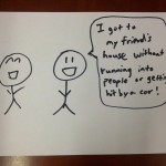
 

Contextual Inquiry Interview Descriptions

Procedure. In pairs, we scouted out interviewees in their “natural habitats”. Generally, we asked them all the following questions to understand their experiences and openness to the idea of alternative authentication schemes:


  1. On a day-to-day basis, how often do you login into a computer system?
  2. Do you find keyboards logins annoying?
  3. Do you find it annoying that passwords require so many special characters?
  4. Would you consider an alternative approach to logging in?
  5. In the ideal world, how would YOU like to login to such a system
  6. Would you appreciate coming up to the computer system and it logging in for you automatically?
  7. Go into talking about our product being a derivative of that
  8. Do you see problems in using our product?
  9. Would you feel comfortable using the product?
  10. Would you find a handshake easier to remember than a text password?


Common themes. Most of our interviewees found text passwords in the status quo to be frustrating when they require a set number of letters and symbols. They all value speed of authentication, and were all willing to consider alternative methods like HandShake. However, some common concerns included uniqueness of the handshakes generated.
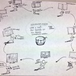
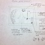
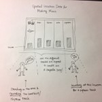
Student: The most common purpose for the student to sign in or out of an account is when she uses her laptop and when signing into internet accounts such as Facebook. She estimates that she signs into her laptop approximately three times a day and signs into a total of three different internet accounts. When asked about current day username/password approach and the complexities of special characters, numbers, and cases, she did mention that it annoying especially when she signs up for accounts that she enters less frequently and often forgets the password. She also explained that she would be totally open and willing to try a simpler technique to signing into an account. When describing the hand gesture approach, she initially expressed concern about the unusualness to make gestures at one’s computer but was comforted that the individual would do these gestures inside a box thus providing more security as well as not being out of place. While transportability and use of HandShake while on the go proves to be a problem for a student, she believes that this could be very appropriate for stationary desktop accounts such as home computers.

Cashier : She has her own ID card that she can use to swipe into her cash register. She does it at least three times a day during her 8-hour daily shift. Her manager gave permissions for her to access that register and no other registers in Frist. She feels “50-50” about the responsibility of having to carry a card. While she understands the security protocol, she sometimes worries about losing it and being “written up” for a replacement. When asked about her openness to alternative authentication schemes, she gave a positive response. With regards to gesturing to a cash register to authenticate, she was OK with it as long as the hand could be recognized specifically. Specifically regarding the idea of HandShake, she liked the idea as long as the system identifies individuals reliably. Reliability seems to be a dominant theme. When asked about other concerns regarding HandShake, she stated she said she had none and that she would find hand gestures easier.

Librarian. We spoke to biological sciences librarian. She purchases science materials, speaks to students one-on-one and primarily to support research and learning. In this effort, she does find herself having to login to resources often, but anything that the library owns or the university subscribes to are automatically authenticated based on access through the Princeton University network. She finds it annoying to find passwords of a longer length, as they are harder to remember. She would definitely consider alternative methods of authentication. Anything not requiring numbers or symbols is great– she loves using a phrase in her textual passwords. When presented with the idea of HandShake, she was open to the idea, but had concerns about the uniqueness of passwords created. From her perspective, there’s “only so many gestures you can make”.

Answers to 11 Task Analysis Questions


  1. Who is going to use system?

    • HandShake would be used by individuals who are required to sign in and out of accounts frequently such as librarians, cashiers, as well as student to access public computer accounts.

  2. What tasks do they now perform?

    • Most if not all forms of signing and out require individuals to enter a username and password pair and the system would verify accordingly.

  3. What tasks are desired?

    • We want to device an approach that allows users of this product to sign in and out with less time, less effort, and more security. After identifying that the user is the correct user (either through facial recognition or selecting an option) HandShake allows the user to present different hand gestures inside a blackbox as his/her password. This requires no typing of a password, clicking, just simple hand motions. Hand gestures are so primal and innate that humans had such gestures since way back when. This innate behavior may facilitate a common practice such as signing in and out of an account.

  4. How are the tasks learned?

    • When HandShake is adopted, rather than simply presenting the username and password text file, they can be prompted to identify themselves by either selecting from a list of ids and prompted to insert their hand inside HandShake and provide the necessary gestures to verify themselves. A simple tutorial can be provided for first time users and the tutorial will no longer appear for users who are comfortable with the tasks.

  5. Where are the tasks performed?

    • The tasks are performed in front of systems where authentication is required. This depends on the user, but for our focused cases: a librarian might authenticate at a computer to access a database, a cashier would authenticate at a register, and a student would authenticate at a computer cluster terminal.

  6. What’s the relationship between user & data?

    • Anyone with potential access to the system should be able to submit a handshake (ie, they have a valid username). The username can be selected by tapping on-screen (works well for a list of recent users on the same computer) or facial recognition can identify the individual when he/she approaches HandShake, and issue a handshake prompt to authenticate.

    • The data the users access after authenticating is outside the scope of our problem. We’re concerned up to the point of successful authentication. Indeed, much of the data and privileges obtained after authentication may be sensitive and/or personal.

  7. What other tools does the user have?

    • Users usually have cell phones and PCs. The PC is probably what is going to be authenticated into. The cell phone would be a useful tool in the handshake reset verification process (see below.)

  8. How do users communicate with each other?

    • In the authentication process, users usually do not communicate with one another.

  9. How often are the tasks performed?

    • Users might perform the same tasks multiple times a day, depending on how often he/she authenticates with the systems concerned. For example, a cashier needs to authenticate with his/her employee credentials every time he/she changes registers. On the other hand, a student logs into Facebook much less frequently because the system leaves the user authenticated for some period by default.

  10. What are the time constraints on the tasks?

    • Usually, users are authenticating a system to obtain privileged access to data and actions. Authentication should take no more than 10 seconds– ideally, performing a handshake is faster than typing in a username and password

  11. What happens when things go wrong?

    • If the user forgets his/her handshake, the system provides a means of “resetting” the handshake after authenticating a different way (Mother’s maiden name, text message confirmation, etc.)

    • If the correct handshake is performed, but the system does not recognize it, the user should reset their handshake to a clearer one.


Description of Three Tasks


The three tasks users might perform are the following (in ascending order of difficulty):


Current method for first two tasks: users currently authenticate by typing a username/password combination. The current difficulty level of this varies widely by individual and application device. For example, new computer users find difficulty typing into a keyboard, so authentication takes some time. On the other hand, most mobile phone users could probably relate to the annoying experience of authenticating into mobile apps and web sites with a tiny keyboard.


  1. User Profile Selection / Handshake Authentication — In this scheme, most applicable to students at a university computer cluster, the user approaches the system and selects the user profile he/she wishes to authenticate into. This can happen in one of two different ways: (a) the profile is automatically detected by facial recognition, or (b) the profile is selected from a list of possible/recent users on the screen. Then, the user proceeds to perform his/her secret handshake sequence in a “black box” of sorts that contains a LEAP motion detector. If the handshake is correct, the system will login. Otherwise, the user will be given another try. We anticipate that performing a secret handshake will be easier and faster for users, especially for new computer users and individuals on mobile devices.

  2. Card Swipe / Handshake Authentication — As an alternative to user profile selection from the screen, some contexts might find it appropriate to select user profiles by swiping an identification card. This is especially true and supermarkets and convenience stores where users already have such cards to perform common authentication tasks around the store. As a means of confirming the cardholder’s identity, the user can proceed to perform a secret handshake as described in Task #1 above. From the cashier’s perspective, we anticipate the authentication process will be faster with a handshake– time is of the essence when serving other customers in this context.

  3. Handshake Reset — In this task, the user reset his/her secret handshake sequence for one of usually two reasons: (1) they forgot their previous handshake or (2) they seem to remember the handshake, but the system is not recognizing it correctly. For both of these cases, the user must proceed to reset the handshake by verifying their identity through other means. For example, the user might receive a text message containing a secret code they should type into the system. Or, the user will be asked for personal information previously set during the user creation process (mother’s maiden name). A combination of these secondary authentication schemes would be the best solution. Though seemingly cumbersome, we want this reset process to be as robust as possible. These procedures are something users are already familiar with from using other web applications.


Interface Design

Text Description of System Functionality
When the user uses the system, it will be able detect the identity of the user who approached the system by facial recognition. Then, it will confirm this identity by presenting the propose the identity, offering the user to change it, and asking the user to enter his/her handshake. If the handshake is correct, the system authenticates. Otherwise, the user can try another handshake for a limited number of times. This idea differs from existing systems because, for many people, a hand gesture can be easier to remember, and it’s also more secure than existing text passwords because it cannot be broken by brute-force algorithms. Other security systems have different modes of verification such as inserting a physical key, using biometrics, or providing a password of some sorts. By allowing a sequence of hand gestures, it combines the concept of a physical key as well as incorporating one’s biometrics. Physical keys are often difficult to manage because one must always carry it around, while it can be safely assumed that most people will have hands. Password have become difficult to manage with increasing safety precautions requiring more complex passwords with special characters, both cases, and numbers.

Three Storyboard for Our User Tasks

Sketches of System Itself


P2

GROUP NUMBER: 12
GROUP NAME: Do you even lift?
GROUP MEMBERS:

All of us observed people in Dillion Gym. We worked collaboratively on a google doc as we sat together in the same room so we overlapped on basically every task.

Adam Suczewski: Final story board sketches, interface sketch descriptions, 3 task descriptions, interface text description, compiled blog…
Andrew Callahan: Drew final interface sketches, wrote problem overview, contextual inquiry, task analysis, rewrote many parts to improve coherence…
Matt Drabick: Drafted story boards and interface sketches, interviewed people in Dillion gym, task analysis questions, interview transcripts…
Peter Grabowski: Interviews in Dillion gym, task analysis questions, storyboard idea compilation…

PROBLEM AND SOLUTION OVERVIEW:

Many people lift weights to build fitness and good health. Some lifts are difficult to do correctly, and errors in form can make those lifts ineffective and dangerous. Some people are able to address this by lifting with an experienced partner or personal trainer, but many gym-goers do not have anyone knowledgeable to watch their form and suffer from errors as a result. We aim to solve this problem by having a computer with a kinect watch trainees as they perform lifts, and point out errors in form and potential fixes.

DESCRIPTION OF USERS YOU OBSERVED IN THE CONTEXTUAL INQUIRY:

Our target user group is the gym-goer with an interest in lifting or learning how to lift. This seems like a valid choice, as we envision our system serving as an instructional tool for lifters of all skill levels.

We started out our contextual inquiry by going to the weight room in Dillon Gym and watching students lift weights, paying attention to how they and their friends monitored their form. Most people were all at the gym for personal gains (i.e. they were not compelled to be there by a team). These personal gains varied among people but included goals like losing weight or building muscle mass. People ranged in apparent expertise from beginners to very advanced, and were in groups of 1-3 (i.e. some were alone). More details about users are given below in the CI Interview Descriptions.

CI INTERVIEW DESCRIPTIONS:

We conducted interviews with acquaintances that we encountered while lifting at Dillon Gym. We asked a short list of questions about their history in weightlifting, whether they went alone or in groups, and how they went about keeping their form correct. We found that people sometimes lifted on their own, or sometimes with friends. People find going with friends useful for motivation, for getting feedback on form, and for spotting in certain exercises. However, this comes with the downside of having to change weights more frequently and of finding a mutually agreeable time to meet.

People lifting with friends will sometimes get feedback on their form from the partner, depending on their relative expertise at the lift (as well as how vocal the partner is). This will usually come in the form of the friend giving cues in the middle of a set (“keep the back in!”) or more detailed feedback after the set is over, often with friend attempting to demonstrate with their body what the problem was and how it should look instead. Trainees lifting by themselves do not get this feedback, and self-report ignoring minor problems in form, and noticing more severe problems when they sense discomfort/pain.

The biggest difference we noticed was that people who lifted alone were much less likely to be concerned about form than those that went in groups. It might be that people lift in groups because they want to be careful about their form, and people who are less concerned just lift alone. It could also be that not having friends around nagging you about subtle problems leads people to just let subtle problems persist.

We also interviewed people in Dillon who do not lift but use the machines and cardio equipment. We were interested in asking these people why it is that they do not lift. We found that the main reasons were that they do not know how to lift, they are afraid of getting too big (particularly girls), or they found free weights intimidating. Most people said that they would lift if they had someone to teach them.

ANSWERS TO 11 TASK ANALYSIS QUESTIONS:

1. Who is going to use system?
People lifting weights will use the system. Lifters of all experience levels can use the system to provide cues and feedback while lifting, and people new to a specific lift could receive a full guided tutorial from the system on that lift. Lifters encountering the system will range from eagerly seeking and heeding the advice of the system to ignoring and even being annoyed by cues from the system (preferring their conception of how the lift should be executed). We need to strike a balance in presenting crucial information to lifters while noticing when they want the system to stay out of the way.

2. What tasks do they now perform?
Users can be split into two groups – those who lift alone and those who lift in pairs/groups or with a dedicated trainer. Users who are alone do not receive any feedback on their form, and will either ignore their form, or look at themselves in a mirror when available to check their form. Lifters in a group will sometimes receive cues from their friends when their form is flawed. However, having a partner is no guarantee of useful feedback – partners are observed and self-report sometimes being too inexperienced, distracted, or misinformed to help.

3. What tasks are desired?
We would like trainees to be able to confidently achieve good form and know when they’ve made mistakes, even if they’re lifting alone. We would also like these users to be able to track their performance over time in detail, including being able to watch video of them doing a set from any point in the past.

4. How are the tasks learned?
Currently, our potential user receives instructions from a knowledgeable trainer, who will demonstrate a lift and then provide feedback about how their form was. Personal trainers are often very expensive, so users sometimes have friends teach them lifts. The friends might not have perfect form or be very critical of the user, so bad habits can develop from the beginning. Our system display will provide instructions for the user. Users will follow the prompts from the system to select the exercise they want to perform. The system will give accurate feedback and keep track of it between sessions. Lifters often learn to keep track of lifts in a notebook or on a website from others.

5. Where are the tasks performed?
The lifts we are focusing on are usually performed in a school, team, or commercial gym. Lifts are performed in various dedicated stations in the gym, and are usually done with few interruptions. We could have a system at each station dedicated to the lift, or place one or more systems on a movable cart that the user could position. Lifts can also be done in the home, if the user has the right equipment. Our system will be an addition to their home gym set-up.

6. What’s the relationship between user & data?
The system will collect data from the user’s lifts, including their repetitions, weights, date and time of workout, as well as any flaws in the users form. The system (if the user elects to pay for an account) will upload it to a companion site, and provide a detailed record of their history and flaws, as well as allowing the user to watch a wireframe.
Privacy may be a user concern, although information about users weight-lifting habits is certainly less sensitive than their health (HIPAA) or education (FERPA) data. Of course, there are always exceptions (such as professional weightlifters, who may want to keep their training data private), but a simple username/password system with basic encryption should provide more than enough security for online access. A more basic approach might be to have users log into the kiosk by holding their gym card up to the camera (combined with face matching). Users can share their data with other users at their discretion.

7. What other tools does the user have?
Users currently have few options available to them for acquiring reliable, high quality feedback on their weightlifting form. Methods include watching themselves in a mirror (although the very process of twisting their head to watch may negatively affect form). Users can also ask peers for feedback, although as mentioned above, users may be hesitant to ask strangers for help. Finally users think about their own body mechanics, although this method is far from accurate. The user can also take notes about their lifts and keep track of that as well as their reps and weights. Several applications make that easy, such Fitocracy, which has additional space for the user to enter notes relevant to the workout, although Fitocracy does not monitor your form.

8. How do users communicate with each other?
Many users go alone, in which case it’s unlikely they communicate with anyone else. From time to time, one user may ask another to spot them during a set, but it’s very rare for one user to ask a stranger to provide feedback on their form. If users go with a partner, they’ll occasionally provide spoken feedback to one another, either during or after a set. However, this feedback is of unknown quality. Users may also engage with trainers, whom they pay to provide feedback. In this case, the trainer provides frequent spoken feedback of high quality after every set, but the service is very expensive.

9. How often are the tasks performed?
As often as the user goes to the gym to lift. This could be anywhere from once a week to every day. Our “Just Lift” mode addresses those users who are in a rush, and allows them to get and out of the gym quickly, while still identifying major flaws and providing feedback. Our “Teach Me” mode provides more feedback to those users who need it, whether they use the system more infrequently or have more time to spend at the gym. Users can switch between each mode seamlessly, allowing them to pick the one that best suits that day’s needs. Users might look back over old workouts every month or two months in order to decide how to adjust their workouts or to make a whole new workout plan. This process might take a 15 to 20 minutes or as much as a few hours depending on how focused the user is on lifts.

10. What are the time constraints on the tasks?
As long as the user wants to spend at the gym. There are no set time constraints across all users, but each individual user may have their own constraints depending on their schedule. An average session at the gym is about 90 minutes, although this could range anywhere from 30-120 minutes depending on the user. Frequent constraints seen among users are needing to get to work/class on time (if lifting beforehand), or not wanting to get home too late (if lifting in the evening). As a result, the same task could be hurried or possibly wait, depending on the individual users time frame. There’s no timing relationship between tasks — users pick one of the available tasks, and complete it in their preferred order.

11. What happens when things go wrong?
Serious injuries across the entire body are some of the more grave potential problems, but bad form can also lead to reduced performance in lift. The only backup system would be a spotter that can “rescue” the lifter if they cannot complete the lift by helping them drop the weight safely. This is especially important in a bench press, where user can stand above and take some of the weight off the lifter. In an squat, the lifter is more responsible for being able to drop the weight and step away if it is necessary.

DESCRIPTION OF 3 TASKS:

Our first task is to provide users feedback in their lifting form. We will do this by capturing their lifts with a kinect, processing the data associated with their movements, and outputting the result. We expect this to be moderately difficult, but we are confident that we will be able to figure the kinect out and build an accurate, useful device.

Our second task is to track users between sessions. The idea here is that users will be able to log in by holding their id card up to the kinect camera. The system will then associate that user’s data with that user so it can track lifting history. Users who log in will likewise be able to log in to a web interface at home and view their lifting data. We expect this to be challenging but believe that getting the core functionality down should not be a problem. It may be hard to develop our entire system and then build a web interface on top of it, but it should not be a problem to incorporate some sort user recognition/history into the system.

Our third task is to create a full guided tutorial for new lifters. Here, we plan to show the user pictures, videos, and text descriptions of the exercise We will then encourage the user to try the lift themselves while we monitor there movements with the kinect and provide realtime feedback. After implementing the first task, we don not forsee too much difficulty with this one. It seems to only involve creating instructional content as well as creating a user experience better suited to a first time lifter.

Details of the implementations of these 3 tasks are described below.  

INTERFACE DESIGN:

Text Description:

Our system is an implementation of the 3 tasks stated above. Using a touch screen display, users will choose to either get feedback on their lifts or learn how to lift. Likewise, they will choose whether or not we will keep their data for future access by choosing whether or not to log in. Once they have selected what they want to do, they will either perform their lifts, or follow our tutorial on how to lift. This is the core functionality and the scope of the system. The benefit of this system is that we intend for it give the kind of advice people typically get from a personal trainer. By providing users with this advice, we can help them maximize their health by maximizing their workouts and helping them avoid injuries associated with bad form. There do not seem to be an similar automated systems in existence. While our system may not initially have the credibility of a human trainer, it has the advantage that it is always available to an person using the piece of equipment it is integrated with, gives objective feedback, and tracks user progress.

Story Boards:

1) Monday? More Like Squat Day!
2) Squats! All Right!
3) ?How’d I Do?
4) Monitor: Good… but you look like you’re leaning back a bit
5) Ahhhh. Thanks.
6) I’ll nail it in the next set. (Next set starts in 1:29).

1) Bob Here!
2) Kinect: Woah! You’re leaning back!
3) Later… What did I do today? Oh yeah! I had sploppy curls.
4) Better do my stretches!
5)Kinect: Hey Bob! Watch out for lean back on those curls today! Bob: Gosh! Thanks!
6) Kinect: Great Bob!

1) I want to lift but I don’t know how 🙁
2) Monitor: Learn to Lift!
Guy: !?What could it be?!
3) Woah! It’s teaching me!
4)1 month later… I feel so fit! So healthy!


Sketches:

We envision our system consisting of a kinect, a computer for processing, and a touch screen display. Our touch screen display will be the only component with which users physically interact. If we do not have a touch screen computer for our prototype, we wil substitute an ordinary laptop computer.

This is our proposed startup page. From this page, users can select the exercise which they are about to perform. They also have the option to click the “What is This?” button which will give them information about the system.
After selecting an exercise, users can enter either “Quick Lift” mode or “Teach Me” mode. In “Quick Lift, “our system will watch users lift weights and then provide technical feedback about their form at the end of each set. In “Teach Me” mode, the system will give the user instructions on how to perform the lift the selected. This page of the display will also have a live camera to show users that the system is interactive.

In the top right corner of the display too, users can see that they have the option to log in. If they log in, we will track their progress so that they can view it in our web interface and so the system can remember their common mistakes for future workouts.
In “Quick Lift” mode, users have the option of receiving audio cues from our system (like “Good Job!” or “Keep your back straight!”). Users will then start performing the exercise (either receiving audio cues or not). Once they are finished with a set, we will show a screen like the one below. On the screen we will show users our analysis of each repetition in their previous set of exercises. We will highlight their worst mistakes and will allow them to see a video of themselves in action. This screen will also allow to see their result from previous sets. Likewise, if a user was logged in, this information would be saved so that they could later reference it on a web interface.

If a user selects “Teach Me”, they are taken to a screen like the one below. This screen gives a text description, photos, and a video of the exercise. After reading the page, the user can press the “Got it!” button. The system will then encourage the user to try the exercise themselves using the unweighted bar. After the user successfully performs the exercise a number of times, the system will prompt the user to try that exercise in “Quick Lift” mode.