P2 Grupo Naidy

Group Number: 1

Group Mates: Kuni Nagakura, Avneesh Sarwate, Yaared Al-Maheiri, Joe Turchiano, John Subosits. All group members were involved with the interviews and design. Avneesh and John worked on the task analysis questions, Kuni worked on the sketches and storyboard, and Yaared and Joe answered the Contextual Inquiry.

Problem and Solution Overview:

Servers and restaurant staff tend to be over tasked at busy times, which leads to unhappy customers, overworked staff, and decrease in revenue. Our solution a system that passively gathers low-level information (ex. Status of food, drinks, etc.), and displays it in a way that allows the restaurant staff to make high level decisions more quickly and effectively.

Description of Users in Contextual Inquiry:

As our system affects both patrons and servers in restaurants, we decided to focus primarily on the servers for the majority of our interviews. We made this decision because putting more control in the hands of the patrons may exacerbate the issue of overworked waiters. Focusing on the servers, we concluded, would not only decrease their workload and reduce any inefficiency, but it would also improve the quality of service for the patrons. Thus, our target user group for our system is servers and restaurant staff (waiters, bus boys, managers, etc.). We observed and interviewed four different users from this target group. Our first user was a middle-aged waitress at Zorba’s Restaurant, who served us while we ate lunch. When we interviewed her, she had no major complaints and seemed satisfied with her job. Our second user was a young waiter at Zorba’s Restaurant, who had just gotten off his shift. He emphasized the teamwork that is necessary in an effective waiting staff and complained about large parties that demand all available staff. Our third user was a Princeton student who has waitressed for numerous summers at an upscale Country Club.  Our final user was a young manager at Triumph. As a manager, she focuses on efficiency and customer satisfaction of the whole restaurant, not simply specific sections or tables.

Contextual Inquiry Interview Descriptions:

We prepared a set of questions before each interview. The first set of interviews/observations was performed while our group sat down to eat lunch at Zorba’s Restaurant on Nassau St. We spent most of our meal observing and taking down notes on the movement/activities of the waiting staff. Afterwards, we interviewed two waiters—one that was directly serving us, and another who had just gotten off his shift. We asked them both about the range of tasks that they perform and how they perform it on a daily basis. The interview with the student was performed in an informal setting, and we asked her to recount her past summer experiences as a waitress. We met with a manager at Triumph at around 5:00 before the bar got too busy. She was still on her shift but was able to answer our questions for a couple minutes.

Most of the people we spoke to agreed that time management and balance, especially during busy hours, was the key to good service. Teamwork and covering for each other’s tasks also seemed to be a prominent component of making it work.  It seemed that the tasks themselves were not especially difficult, but during peak hours, the sheer number of simple tasks to be completed and the difficulty of organizing those tasks led to poor service. Most of our interviewees mentioned that a key part of the job was balancing the ability to provide for patrons as soon as possible but without being overbearing. We found that in all three settings, there was a clear division of labor in place between management, service, and bus boys, but there was usually some degree of overlap between the positions.

In each interview, we did pick up a few pieces of unique information that other interviews did not provide. Our first two interviews took place at Zorba’s Restaurant on Nassau Street, a small family restaurant. We interviewed both the waitress who served us and another waiter on staff at the time. These two emphasized the need to always be keeping an eye on every table they were staffing; in retrospect this sort of tactic is probably only possible at a smaller restaurant like Zorba’s. Otherwise, they seemed to have very little to complain about.  Next, we interviewed a student waitress in an informal setting. She, by virtue of having worked at a country club, had a different experience from the rest. The focus of her customers tended to be on alcoholic beverages (especially wine), and her major problems arose from trying to coordinate bringing out food for one table while having to refill drinks at another. She also mentioned that it was difficult to determine when to take food or drinks away when different people at the same table ate and drank at different paces. She also mentioned that, because the country club was divided into several segments, she was not always able to check on all tables as she moved around the floor. She also mentioned that not letting food get cold while refilling drinks was another big issues that she often faced. The final interview was with a manager at Triumph Bar, also on Nassau Street. Our questions for her were therefore more geared toward a management perspective rather than that of small-scale waiting. Since Triumph is a large establishment with multiple levels and a bar, the manager stressed that coordination and division of labor was especially important to her success. We found that the Triumph staff had been using a service called Digital Dining – which didn’t work especially well and actually turned into a bottleneck-point when waiters had to manually input orders to the service after first writing them up.

11 Task Analysis Questions:

1. Who is going to use system?

Servers, managers, and kitchen staff at large/busy sit down restaurants would be
the target users of our system. Servers would be the primary users, and would
benefit most using it during “rush” periods where many parties come in, or during
times where particularly large parties unexpectedly come in. The kitchen staff
would use the system to provide information to the servers to make their work
more efficient.
2. What tasks do they now perform?

Servers must (roughly in order of increasing difficulty) refill drinks, clear plates,
refill condiments/coffee/napkin dispensers, bring food from the kitchen in a
timely manner, take and send orders to the kitchen, bring the bill at the right time,
determine what order to perform the previous tasks.
3. What tasks are desired?

Waiters want an efficient way to transfer orders from waiter to kitchen and would
like to know when food is ready in the kitchen. They would also like to know when
tables are “antsy” and impatient. They would like a way that helps them minimize
mistakes in taking down and delivering orders. They’d also like to know when
customers’ drinks are low.
4. How are the tasks learned?

Waiters either learn tasks by serving as a busboy first, or shadowing another waiter
for a day. More experienced waiters are given more tables to handle, while less
experienced waiters are given fewer tables.
5. Where are the tasks performed?

The tasks occur mainly on the restaurant floor and the “waiter’s area” where the
waiters pick up food from the kitchen or congregate for other tasks.
6. What’s the relationship between user & data?

Users must be attentive in collecting data themselves and must make real time/
online decisions on how to act. There is a lack of quantitative data – the only well-
specified type of data is orders and check amounts; everything else must be guessed
or estimated. The sharing of data between servers and kitchen is fairly structured
(notes passed about what orders to cook), and there is some sharing of data
between servers to help each other out, but this is incidental and always verbal.
7. What other tools does the user have?

Paper and notepad are used to remember orders, which are often written in
shorthand. Some (very few) use mobile devices for this instead. There are
sometimes computer-scheduling systems, but not often. At Triumph, “Digital
Dining” is used, a system that supposedly helps waiters perform some of the
previously mentioned activities (but the waiters are dissatisfied with it).
8. How do users communicate with each other?

Servers communicate almost exclusively verbally, some body language/implicit
communication or inference occurs when a server tries to discern a customer’s
mood. Between the servers and the kitchen, communication is generally written,
maybe with verbal emphasis for some unusual aspect.
9. How often are the tasks performed?

Each waiter can be assigned up to 5-6 tables at the same time. Tasks in general are
being performed all the time, it depends on server how they are ordered/scheduled.
10. What are the time constraints on the tasks?

There are no explicit time limits on tasks, but in general all individual tasks are
completed as fast as possible and the “optimization” comes with deciding what
order to perform tasks in as to minimize “lateness” across the entire set of tasks.
11. What happens when things go wrong?

This depends on how wrong things go. For small delays, customers may simply
shrug it off, or become slightly grumpy. For larger delays customers may cut back
on the tip or complain to a manager. For meal mix-ups, users may again complain to
a manager or cutback tip. Depending on how angry customers are, they may refuse
payment. In some restaurants, servers are granted authority to make concessions to
customers (i.e, free deserts) to make up for mistakes.

Description of 3 tasks:

1. Checking customer status
This task involves checking to see what tables have drinks that need refilling, what
tables are waiting on orders, and what tables are requesting attention. Currently
this task is of medium difficulty, but can be quite difficult when things are busy.
Some information, such as how long tables have been waiting for food, are not at all
currently available. Using our system, this task should be very easy, as the server
would only have to look at a screen to see the status of all their tables.
2. Determine task order
This task involves deciding what to do first, for example, whether to make a
round of filling drinks before checking the kitchen to see if food is out. This task is
currently the hardest task for servers because of the lack of information available
in making the decision. Servers do not always know the status of all of their
tables and generally do not have data on whether their orders to the kitchen are
finished or not. Combined with the solution to task 1, incorporating kitchen data
into the system makes this task much easier, as with a single glance servers will
have customer data and kitchen data, which will help servers determine the most
“urgent” tasks to complete.
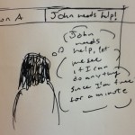
3. Signal for help
This task is generally easy, but during busy times it can become difficult. Servers
generally verbally ask other servers/busboys nearby for help if they need another
hand to bring food or quickly fill a glass. However, during really busy times it might
be the case that a server can’t immediately find a free hand for a task. In this case,
pressing a button or sending some signal to a central area could alert all servers that
a free hand is needed in a certain area.

Interface Design:

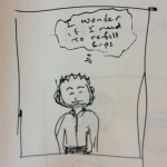
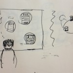
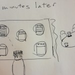
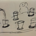
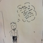
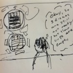
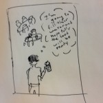
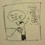
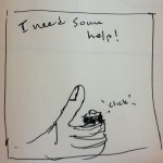
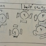
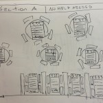
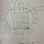
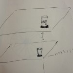
Our system works over two “layers” of interaction. The interaction between the waiters and the customers, and the interaction between the waiters and the kitchen. The central unit of the system is a set of screens in the waiter’s area that displays the floorplan of the restaurant and displays the status of each table. For each table, the screen lists the number of empty, half empty, and full cups, the list of dishes ordered by that table, and how long it has been since the table placed their order (if the table has their food delivered, the time display shows the text DELIVERED, if the table is not occupied, the time display shows EMPTY). Each screen represents a section of the restaurant that a waiter or small group of waiters is responsible for. On the table, there are pressure sensitive coasters that can detect how full a glass is. These send the information on the state of the glasses to the main screens. Waiters also have a “help” button on their belts. If a waiter cannot solicit help from a nearby waiter, they can press their help button, causing their section’s screen in the waiter’s area to flash, alerting any free waiters that assistance is required in a particular section.The screen displays the list of food items that have been ordered by each table. Each item in the list is displayed in red, and its color changes to green when it is finished by the kitchen. If a finished item has been sitting for some specified amount of time (which can be set for the user) the table that ordered it flashes red as a warning that an item at that table may be getting cold, and the table should be served.

Storyboards

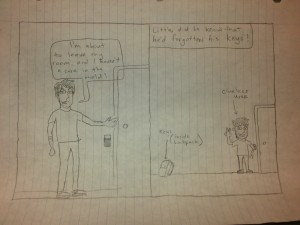
Task 1: Checking customer status

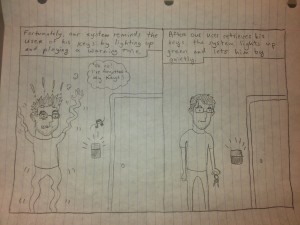
Task 2: Determine task order

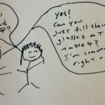
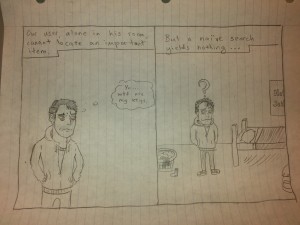
Task 3: Signal for help

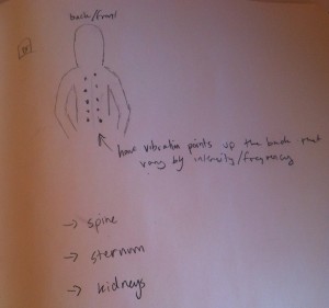
Sketches of System:

P2 – Name Redacted

Group Number: 20

Members:

Brian conducted one interview on his own and partnered for another interview and helped write the paragraphs on the interviews.

Matt conducted one interview on his own and partnered for another interview and helped write the paragraphs on the interviews.

Josh answered the 11 task analysis questions and helped Ed write the three storyboards and answer the interface design questions.

Ed helped Josh answer the 11 task analysis questions and wrote the three storyboards and answered the interface design questions.

Problem and Solution Overview
Currently, there is very little teaching of computer science fundamentals taught in middle school and high schools. Often, schools are prevented from teaching CS because they have insufficient computer resources to provide each student with a computing environment. Even in college, some students have difficulty learning the basic concepts such as binary number representation, memory, and recursion. The barrier of entry to learning CS is just too high. We are hoping to create an interactive method for teaching the fundamentals of computer science that does not rely on coding software on a computer. We wish to extend the idea of whiteboard programming. Using computer vision and a projector, we want to let users place “blocks” of code on the board and our tool will return visual feedback. Our solution could provide a low cost and interactive interface that could revolution technology teaching to the masses.
Description of Users Observed
Our target user group is divided into two main groups: teachers using our tool for pedagogy and students learning from our tool. We decided to select three users across both of these groups to get the most balanced perspective.

  • The first user that we observed created and teaches an introductory CS course targeted at students with almost no technical background (often students from humanities departments). We think that he was a good choice for a user group not only because he has had years of teaching experience, but also because he is often recognized by his students as being an extremely effective and engaging educator. He is extremely interested in CS education although his background and interest tend to be focused on a slightly older age group than we are targeting.
  • The second user that we interviewed was a student who took the above course. He had no technical background for the course and had a heavily humanities background. We thought he was a good user to interview because we were able to talk to him about the frustrations and confusions of learning the most simple CS. Also, we were able to compare his interview with the above interview readily.
  • Our final interviewee was a member of the school board of a large suburban district near Los Angeles. He is been extremely interested and involved in education reform. We thought he would provide an interesting insight into the backend of education. He helped us to understand how teachers might adopt and use this technology from an institutional standpoint.
CI Interview Description
Our first interview was conducted in the office of the user. We started out by explaining a little about who we were and what the goals of our project was. We then asked him to walk us through a couple of his extremely early lessons to help us get a picture of what current teaching practices are. Our second interview was conducted in a classroom with a student who had taken the aforementioned introductory computer science course. The student is concentrating in a nontechnical field but took the computer science course to fill in a distribution requirement and learn some fundamental computer concepts. We asked the student to walk through some of his previous code in the course, explaining what he did in the assignment. Our final interview took place in a common space. This interview was tricky to take the perspective of contextual interview. As we will discuss later, professional development for teachers is extremely individual and therefore hard to observe. We therefore made sure to talk about specifics from a more distant perspective.
Our first user, the professor, provided us with an outline of the first few weeks of lectures, and discussed how he explains various concepts ranging from binary to memory to logical loops. Our second user, the student, talked briefly about what he liked and disliked about the introductory computer science class he took. In particular, he liked learning about internet security issues as well as computer coding. However, the coding portion of the class was the most difficult for this student to learn. As part of the interview, I asked the student to go through some of his code from the computer science class that he took. When going through the HTML code that he written, he noted in many places where he had to fix syntactical errors. Most of his errors in this particular program came from omitting the ‘/’ character from the end tags. Similarly, his JavaScript errors were almost entirely syntactical, usual because of a missing or extra ‘}’ character. Both the professor and the student agreed that binary was a very hard concept to teach/learn. In particular, the student suggested that most students struggle with the concept of how many decimal numbers can be represented by n bits. Both also agreed that a very difficult concept in computer science is how all computers are actually equivalent, and how languages can all do the same computation. The professor also mentioned that most students have an incredibly difficult time understanding the abstractions of the computer process. In particular, the student had trouble understanding compiling, assembling, and linking because the concepts were too abstract. However, the professor and student disagreed on some issues. Firstly, the professor believed that students struggled most on the idea of memory and more specifically the actual holding of memory. While the student admitted that memory was difficult, he believed that more students had trouble with binary representations of numbers. The student also emphasized that he was most frustrated by the syntax problems that he encountered while coding.
After having looked into a teaching lesson itself, we wanted to take a step back and gain more perspective on what it’s like to be a teacher. This is where we turn to our last interview. Our final interviewee, as a member of a school board, has a big picture knowledge of what fundamentally it is like to learn how to teach. The main takeaway we got from the interview is that current pedagogical education is extremely individual. He walked us through all of the professional development activities that a teacher does in a given year (including professional development conferences and school events). They were very few of them (~5 days per year) and individually focused. Teachers make their own lesson plans and learn new technological tools on their own. He talked us through the process of integrating iPads into his district and how poorly they are used by many teachers. This individuality contradicts our first interview slightly. Our first user actually published the notes of his class in a book so other teachers could use them to shape their lessons. I would explain that difference as being the difference between K-12 and college education. Ultimately, I think that for the context of our project, we have to understand that K-12 teachers wouldn’t have much support in learning how to use our tool. It must be self-contained, self-teaching, and extremely foolproof if we hope to gain traction with this audience.

Task Analysis Questions
1. Who is going to use the system?
Our target audience is the typical classroom. We envision the product being used with about 20 students and a single teacher. The students don’t need to have any background in CS or experience coding.

2. What tasks do they now perform?
Current CS education tends to be done with “whiteboard coding.” This is the practice of writing code on a whiteboard to demonstrate the features. Other practices commonly used is simple lecture style and for certain concepts, teachers use abstract drawings. For example, when students first learn about memory, it is often represented with a box to be filled with data. These abstractions of data are very important, as students can quickly get confused when exposed to the more complicated principles that lie under them.

3. What tasks are desired?
Typically, educators are looking for a tool to help boost the understanding of their students in a classroom setting. Having the ability to present basic concepts of CS to students in a way that is easy to visualize, grasp, understand, and interact with is very desirable. Additionally, having a teaching tool that students can use and get feedback from without need to have the teacher on hand to always give direct instructions is very useful as it allows students to continue to learn on their own and at their own pace.

4. How are the tasks learned?
Currently, teaching is an extremely self-taught process. Teachers individually come up with their own lesson plans. In our system, tasks could be learned through a simple tutorial lesson that would introduce the students to the basic operations and principles behind our system. Concepts would be introduced one at a time and the interactions between could be demonstrated as students make progress.

5. Where are the tasks performed?
Classrooms with a projector and whiteboard. Only a few computers for a lot of students. Our system could potentially operate on any smooth surface to which ID tags could be easily attached and moved around.

6. What’s the relationship between user & data?
Users could potentially have personal profiles that track their progress throughout the lessons. When using the system in a group setting, the system could controlled by the teacher to set up lessons and track the progress of the class as a whole.

7. What other tools does the user have?
Textbooks, the internet, Toy programming languages (e.g. Scratch)

8. How do users communicate with each other?
Teachers communicate with their students in a classroom setting. The Teachers can give their students guidance and instructions as they use the system, and the students can freely ask questions about the current lesson.

9. How often are the tasks performed?
Students would go through a lesson about 2-3 times a week. Multiple lessons could potentially be completed in one class session if they are short.

10. What are the time constraints on the tasks?
Class session usually last about an hour. This should be plenty of time to go through most lessons. However, more difficult and complex tasks may need to be broken up into multiple lessons spanning multiple days.

11. What happens when things go wrong?
Ideally, any errors encountered would be a result of improper set up by the user, not flaws in the code itself. If something does go wrong such as the project getting out of alignment in the whiteboard or the camera has trouble reading the ID tags, users could simply tell the system to recalibrate. All data and current lesson progress would be saved. Data should be saved periodically regardless to ensure that if the system fails completely, the users’ current progress is still preserved.

Description of Four Tasks
Tutorial – How to Teach a Lesson (Storyboard not included)
This purpose of this lesson would be to provided a ground work for the teacher and students to build and to teach them the basic principles of using our system. This lesson could include walk throughs of specific lessons they should be teaching. Highlighting blocks and stepping them through each part of the process. Currently, this is an individual learning task done by teachers. They read textbooks and compile a lesson plan. We would hope to significantly reduce the difficulty of this process.

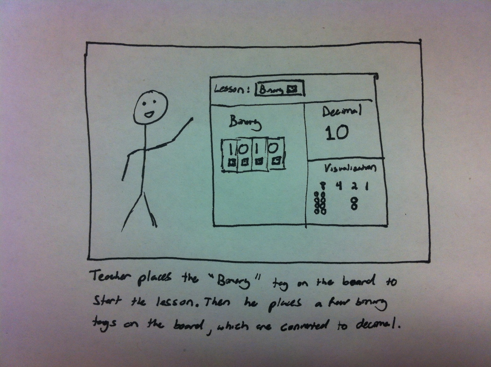
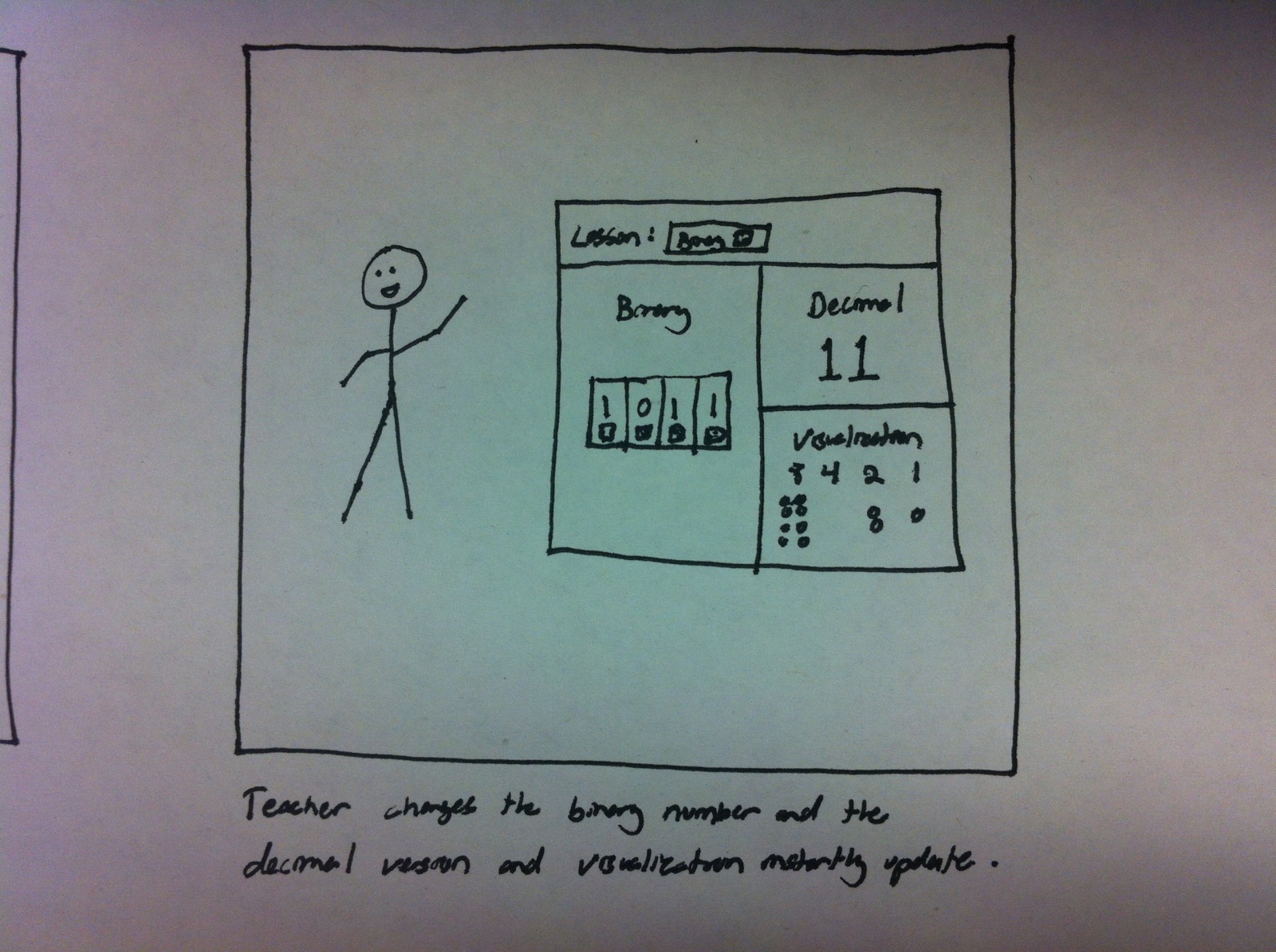
Teaching Number Base (e.g. Decimal, Binary, Octal, Hex)
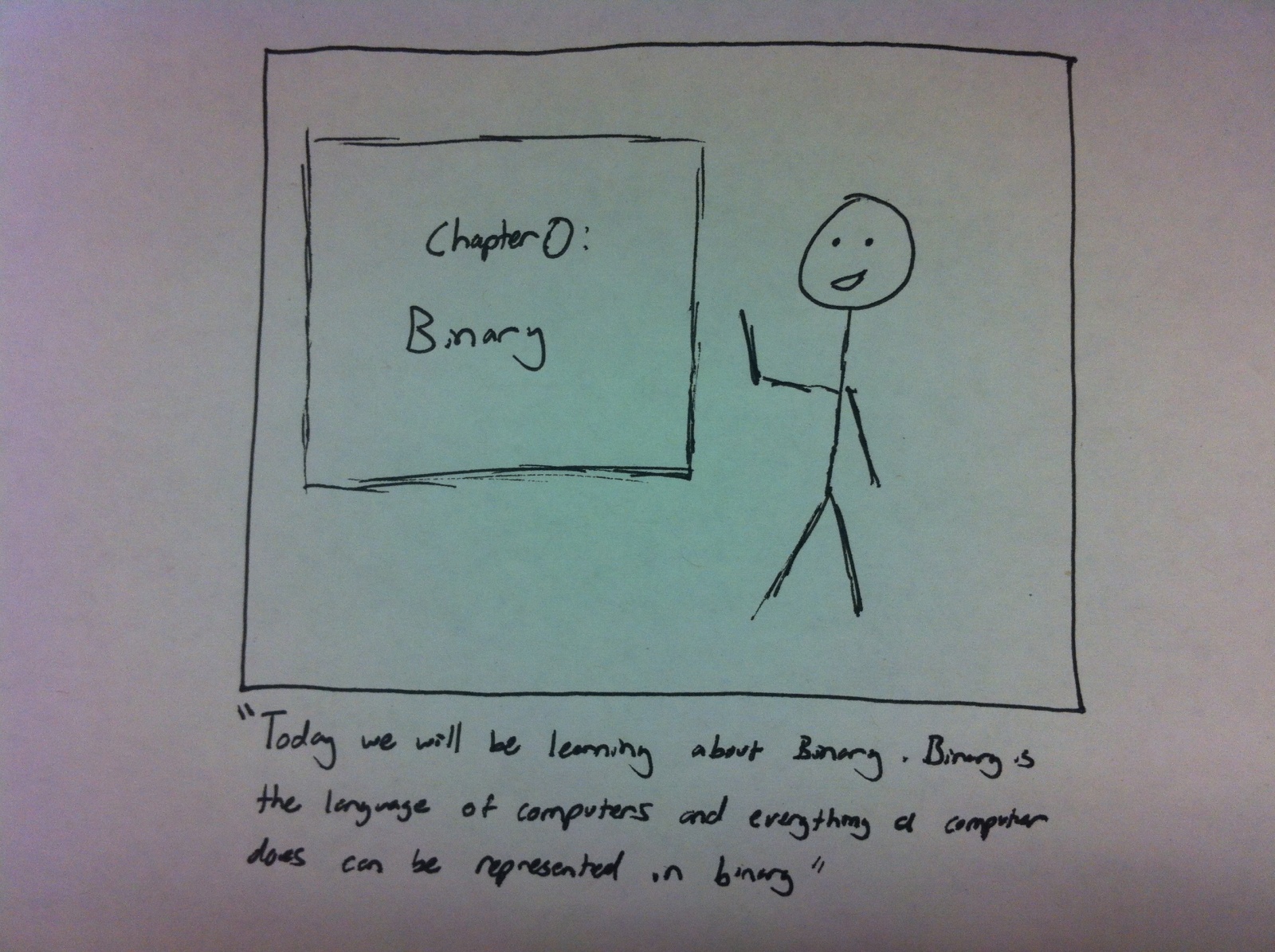
Our first two interviews both said that one of the hardest things for early tech students to learn is binary. This is something that is fundamental to CS but can be conceptually very challenging to students. We hope to help the students to better understand number base through visualization. We imagine they would place Binary/Octal/Hex/etc. tiles on the board. They would then see how different number systems represent numbers. This would be a moderately difficult task to perform with our system but one that is currently very hard.

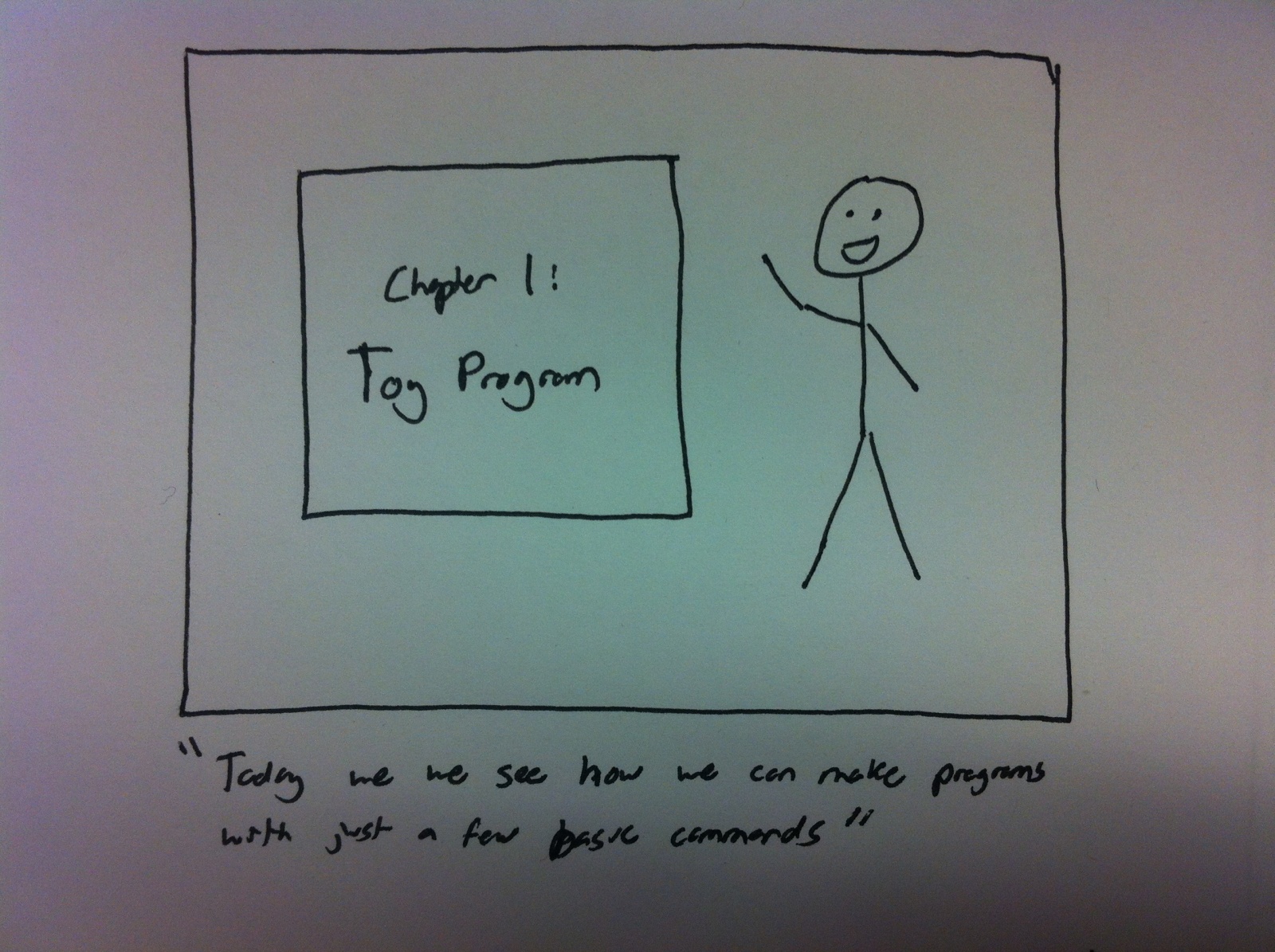
Teach First Toy Program (I/O and intro looping)
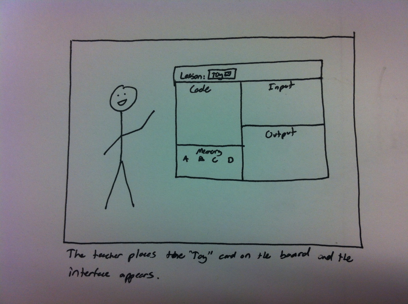
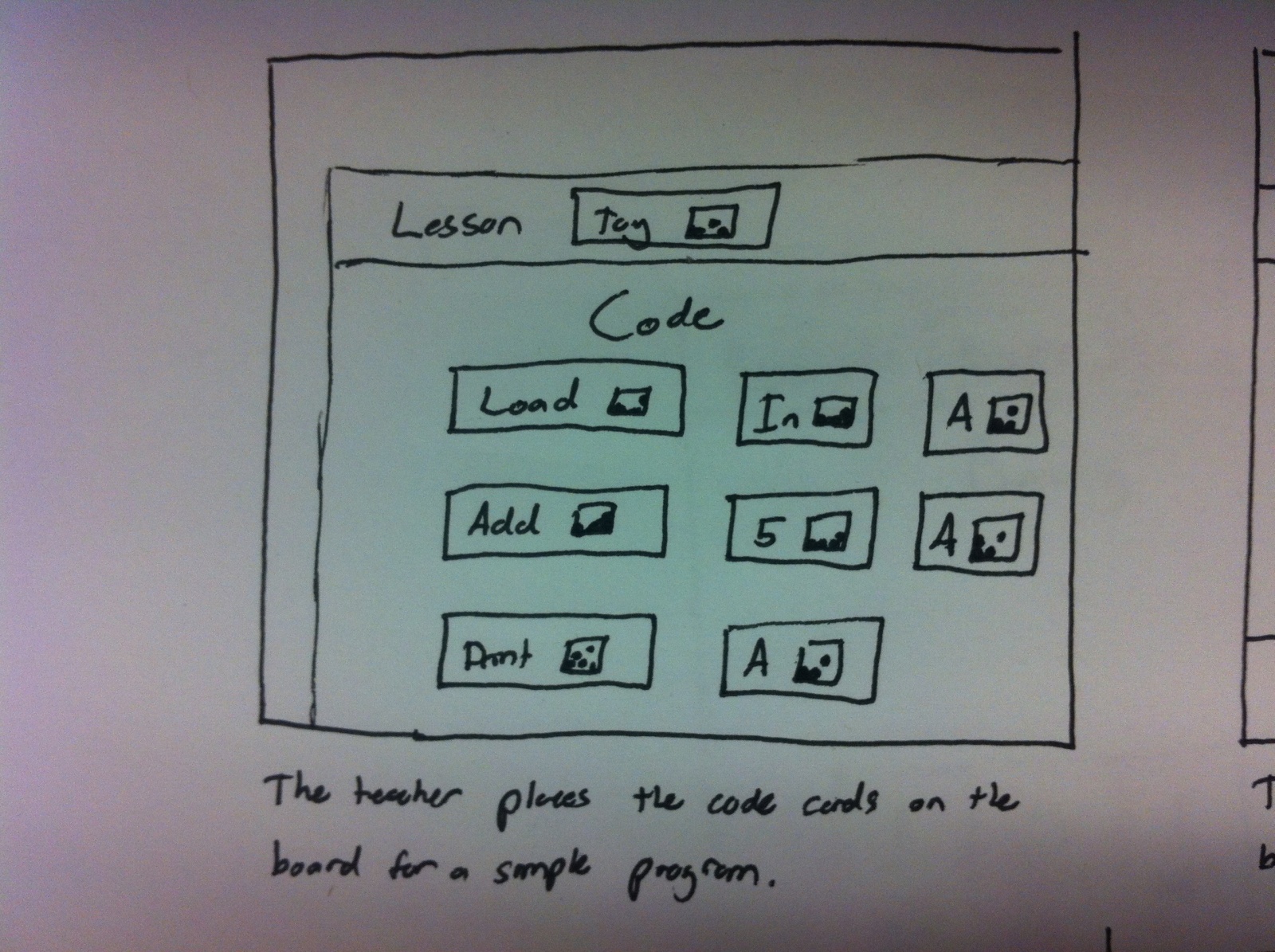
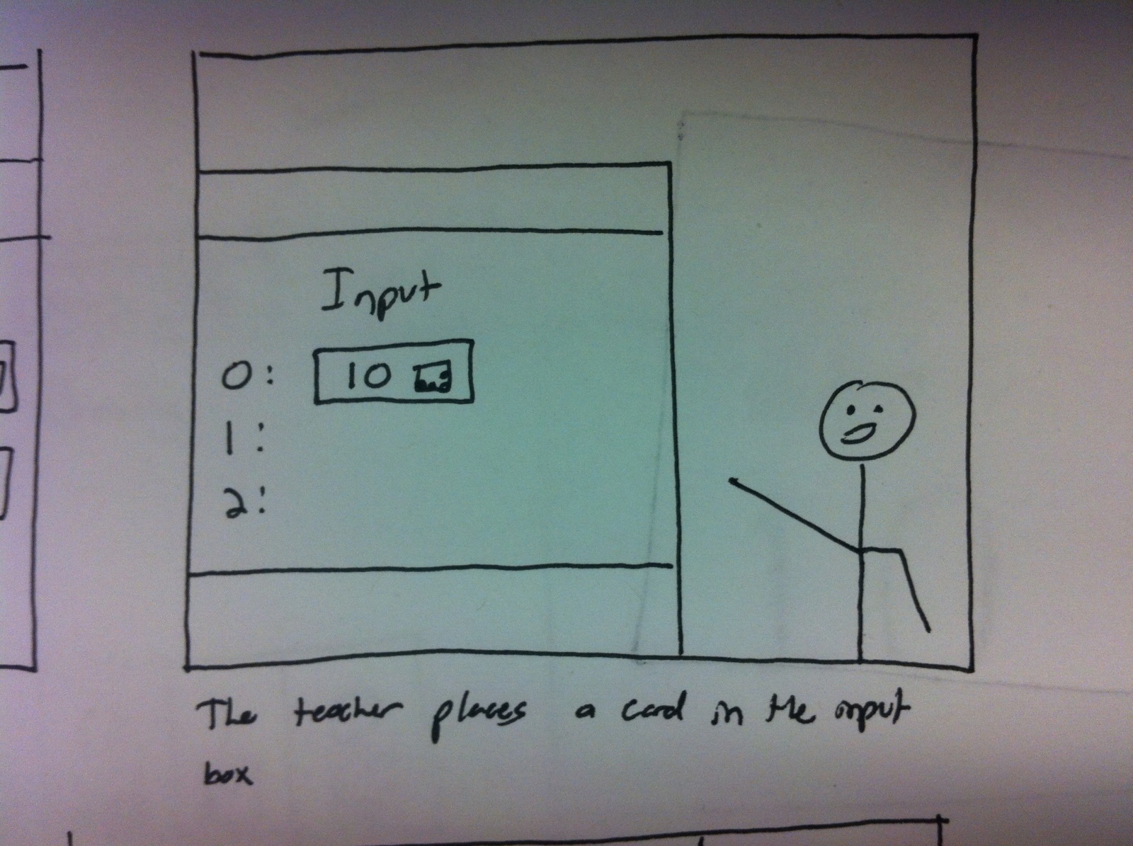
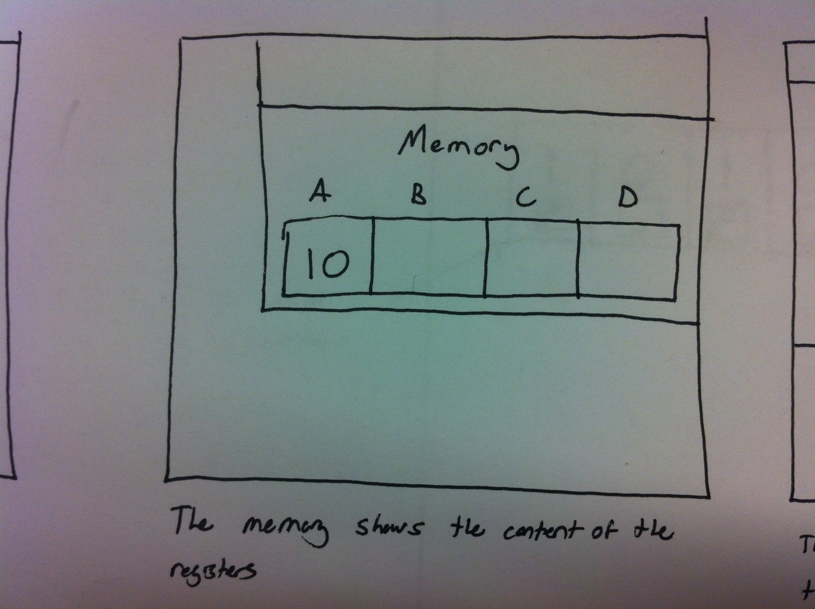
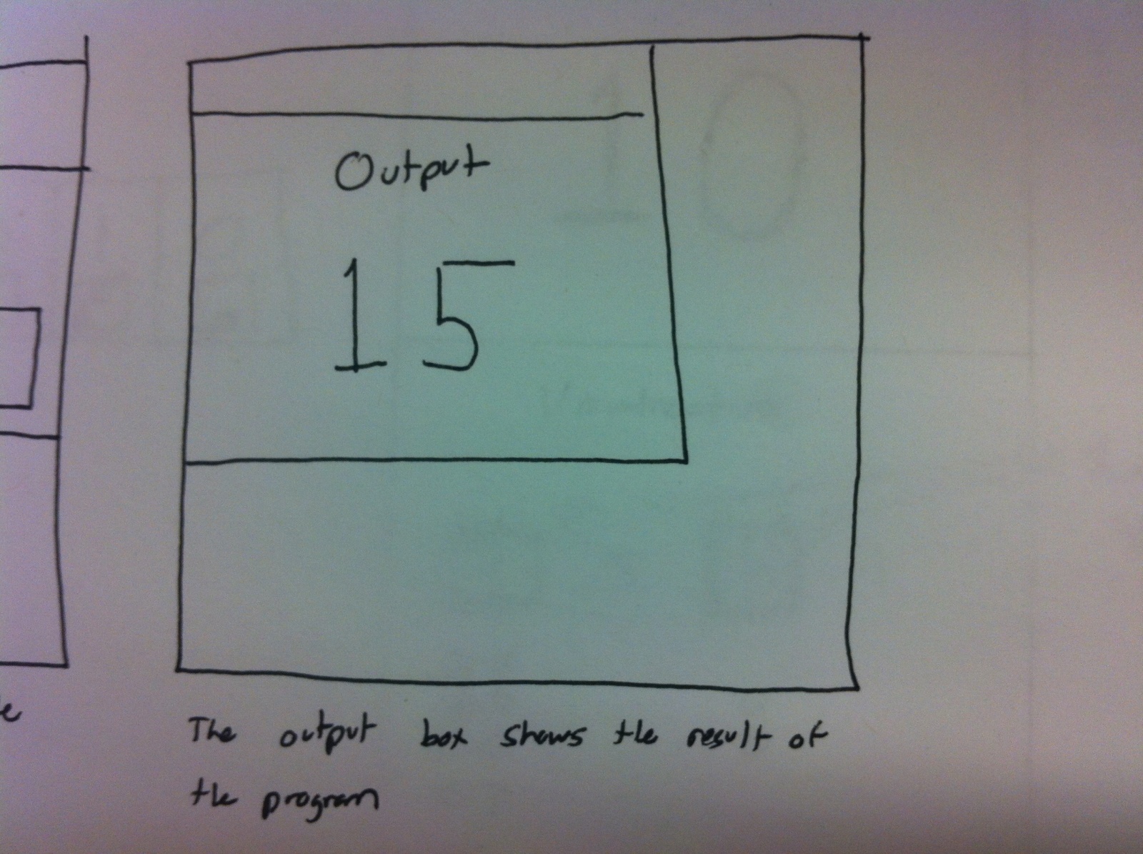
Another suggested teaching example from our interviews was an extremely simple toy programing lesson. The lesson essentially works through each of the fundamental parts of a computer and provides a simplified example:

Read in a number from input and print (intro. to I/O)
Read in a number from input, do an operation, and print (intro. to processing)
Read in two numbers from input, print the product (intro. to memory)
Read in numbers from input until a 0 is given. Calculate the sum and print (intro. to loops)
We would create these programs with simple code put on the board and inputs placed on the board as well. This lesson (especially memory) is something that is currently difficult to teach and learn but we hope to reduce that difficulty.

Simplified Turtle Graphics
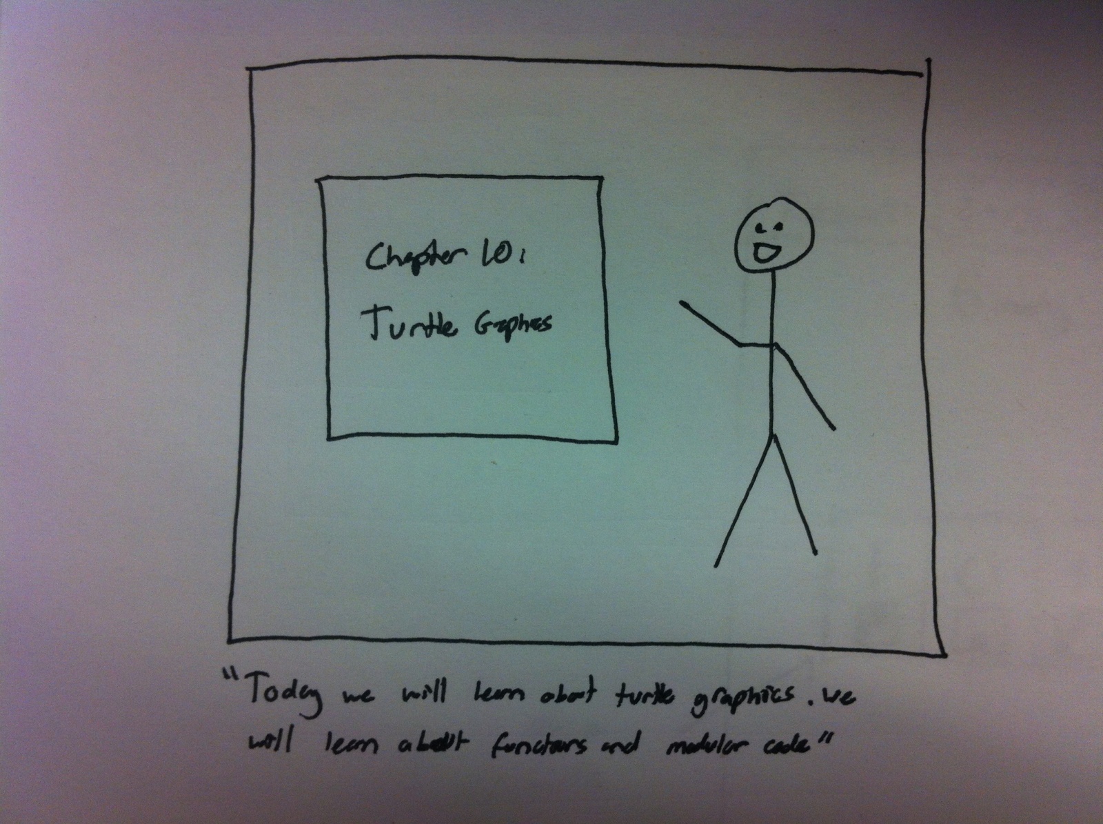
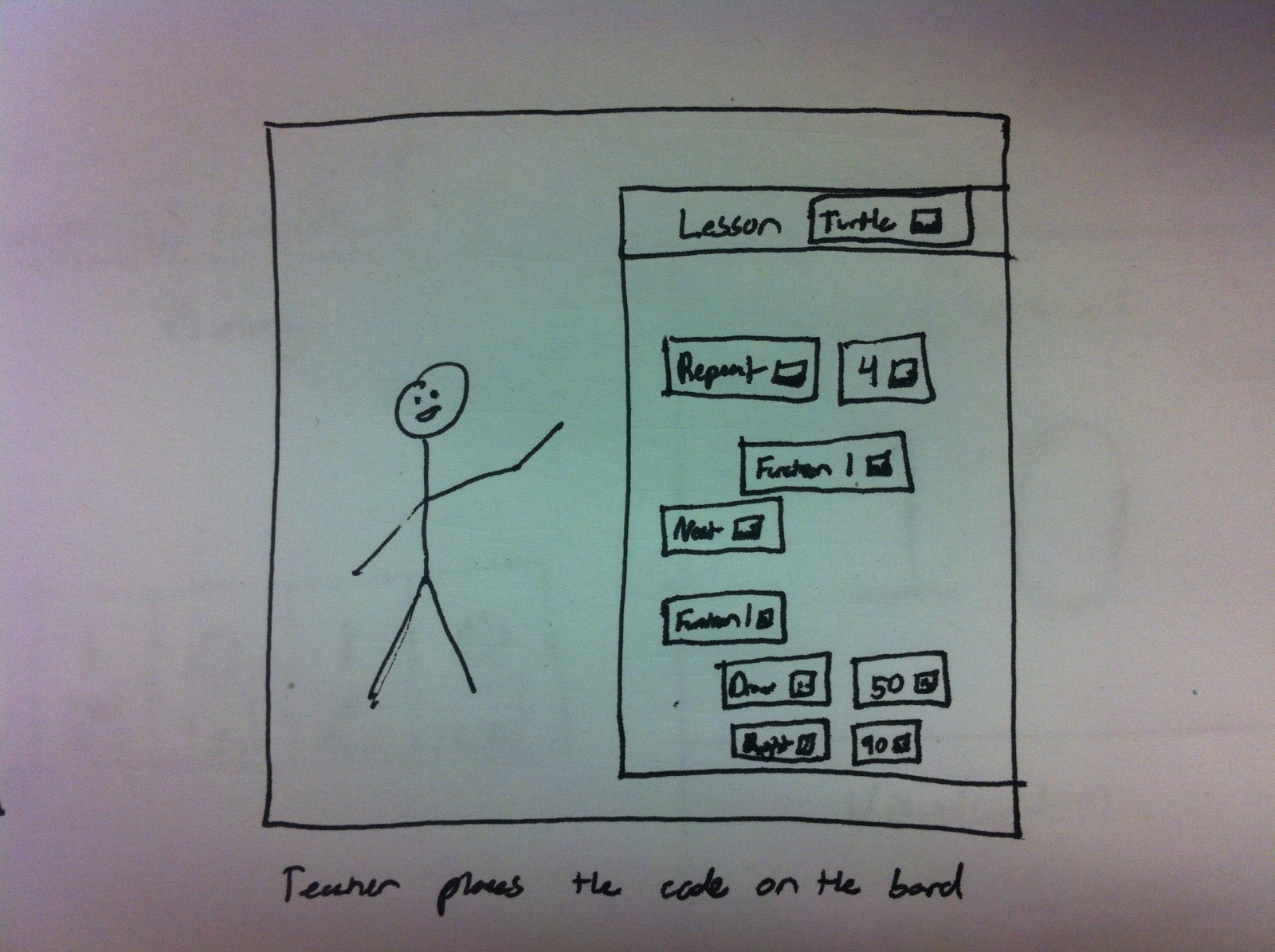
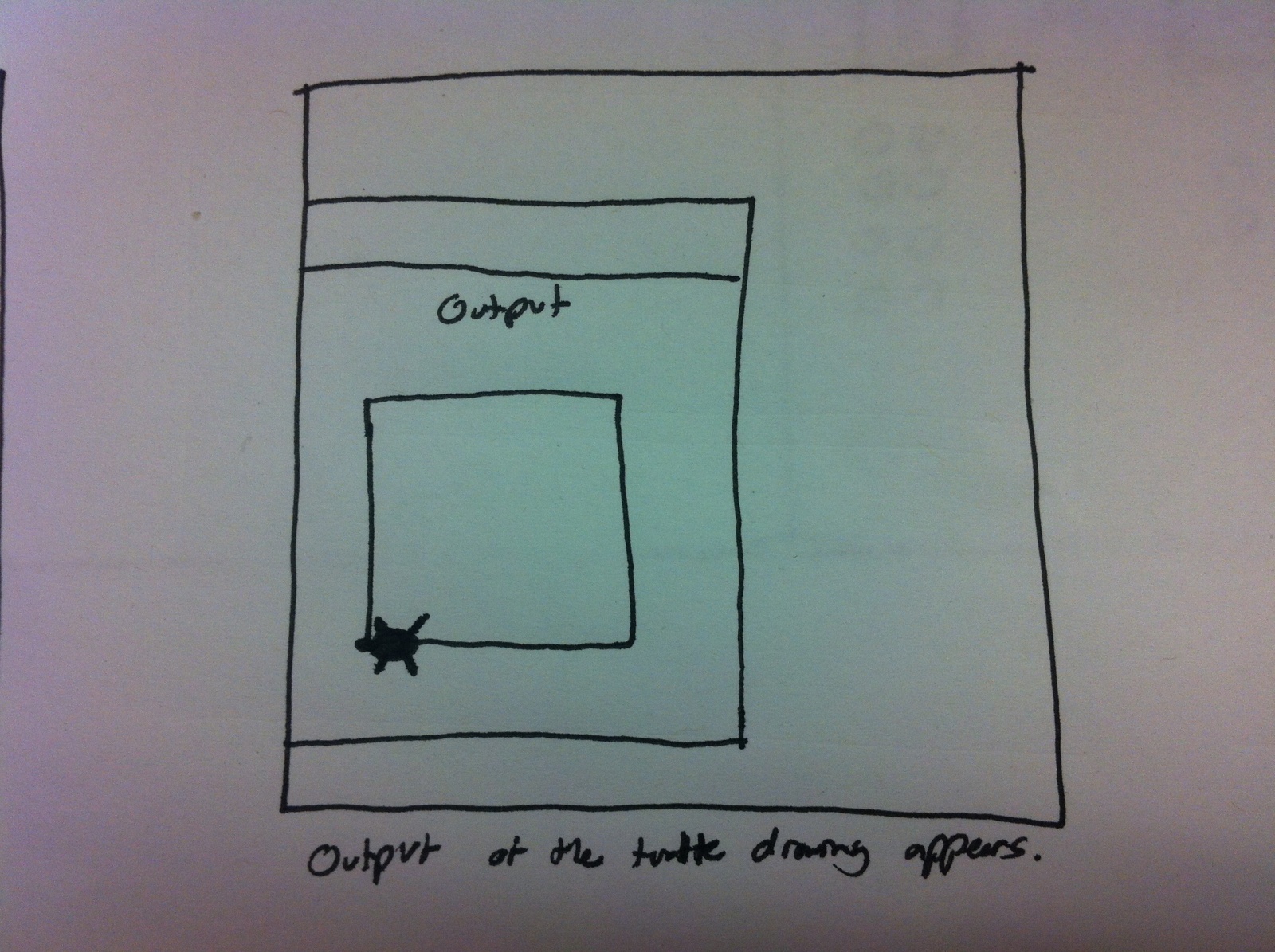
Our final lesson is the most complex. We want to create a tactile version of the Logo programming language library. Users could control the movement of a virtual turtle and see how his path changes as they change various part of code on the board. This would be a great way to introduce functions and show the execution of the program in a visual manner. It would use:

Create “Function” cards that would allow users to define custom operations
Only uses a basic set of commands, such as forward, turn, and pen color.
This language is well established a good way to teach new students about programming but the difficulty is it often requires a computer for each student. We plan to reduce that difficulty by adapting the program to our tool, requiring only one computer per classroom.

Interface Design
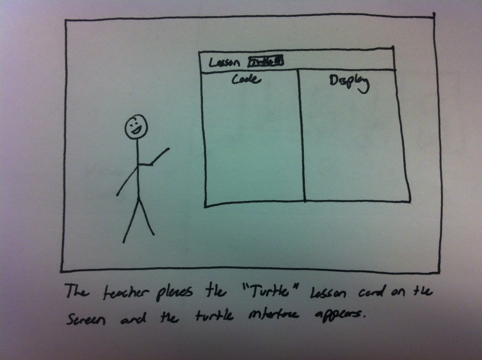
The user can teach and interact with a variety of lessons on computer science topics. By placing a “lesson” card on the board, the system reacts and projects the interface for that lesson. Then, the user can add physical cards to the board in the relevant areas (eg. Binary values, Code, Input, etc..) and the system will react by showing the execution and output of the program. Unlike any current solution, our system allows a teacher or professor to visually demonstrate to an entire class these computer science topics. The interactivity of our system allows the teacher to make quick, visual changes to the program or input to demonstrate how the output will change. We believe that this will be an engaging, fun, and flexible way to teach students important topics in CS.

Storyboards
Teaching Number Base

This slideshow requires JavaScript.

Teach First TOY Program (I/O and intro looping)

This slideshow requires JavaScript.

Simplified Turtle Graphics

This slideshow requires JavaScript.

Sketch of the System

Photo 2013-03-11 04.46.49 PM

P2 — Elite Four

Group Name and Number: The Elite Four; Group 24

Names and Contributions: Clay Whetung, Jae Young Lee, Jeff Snyder, Michael Newman

Clay conducted one of the interviews and helped answer many of the questions, especially regarding contextual inquiry.
Jae conducted one of the interviews and helped answer many of the questions, especially regarding contextual inquiry.
Jeff conducted one of the interviews and helped answer many of the questions, especially regarding task analysis and interface design.
Michael drew up the storyboards and sketches and helped answer many of the questions, especially regarding task analysis and interface design.

Problem and Solution Overview

We are addressing the problem of people (especially students) leaving important items (e.g., keys, wallet, phone) behind when they leave their rooms/buildings. This can lead to various further problems, like being locked out, being unable to start one’s car, or being unable to send/receive texts or voice calls. Our proposed solution is a system that uses proximity sensors to detect when a user is attempting to leave a room without their keys/phone/wallet and alerts them (visually or audibly) before it’s too late. Our sensors can also help a user find missing items around the house or even out in the world. This addresses the problem by both preventing and dealing with the aftermath of user forgetfulness.

Description of Users Observed in Contextual Inquiry

Our target user group includes all people who leave important items behind. Specifically, we are focusing on rooms/buildings with self-locking doors, since the consequences of forgetting something are often more severe. A great example of this user group is college students. We also have easy access to these students and can make first-hand observations without much trouble. The first user we observed lives in a quad in Brown Hall. He is a junior in the COS department who describes himself as fairly organized. He spends a large amount of time in his room since it is one of his main places for studying and doing work. The second user we observed was a CBE senior living in a triple in 1903 Hall. He was generally organized, but his room had become quite messy in the past few weeks as his thesis workload increased. He often leaves his room to work, go to the gym, do laundry, and attend various extra-curriculars. He would like to be able to ensure that he is completely prepared when he leaves the room, with minimal effort on his part. The third user we interviewed lives in a quad in Little Hall. She is a senior in the PSY department and described herself as organized, though her room was somewhat messy. She would like a solution to help prevent expensive lock-outs.

Contextual Inquiry Interview Descriptions

We interviewed the three users in the environment that our system would be employed — their dorm rooms. Each of the three was observed leaving their rooms. We logged the habits that they had formed for preparing to leave their room. Afterwards we discussed with each participant their routine in detail and how they thought their current system could be improved. We also asked them what they were willing to sacrifice for an entirely new system and provided them with some of our initial ideas for our project in order to help focus and guide the discussion.

There were several common experiences that each user shared. They all commented on the habits that they used to ensure they were ready to leave their room. This universally involved checking pockets/bags for wallets, phones and keys. However, these systems fail catastrophically when key items are missing from the wallet, or items are mistaken for each other. For example, users would remove their prox from their wallets to do laundry or go to the gym, and when they forgot to place it back into their wallet they were locked out. Along with this, they would lock themselves out if they felt their phone in their bag, but mistook it for their wallet. These were by far the most common lockout cases. They also commonly propped their doors to prevent lockouts, but this could lead to fines by fire safety. Two of our users also expressed interest in a device that would help them find lost items. Such a device would preferably be stationary, such that it does not become lost as well. Interviewees also stated they they would only use a system that was easy to install and did not change the form factor of their necessities very much.

Interestingly, one of the users that we had interviewed had investigated permanent solutions to the door locking problem. They had set up a variety of systems in their room to allow access without their prox, so they could never be locked out. However, this was a massive security issue and they were fined multiple times for their efforts. One user was willing to go to great ends for this system, even briefly considering total room overhauls for an optimal system. However, they did express that such changes may be unfeasible.

Answers to Task Analysis Questions

1. Who is going to use the system?
We’re focusing the system on students, but it’s usable by pretty much anyone who lives in a house/dorm/apartment and owns keys, a phone, a wallet, a purse, or other important items.

2. What tasks do they now perform?
Currently, users are simply forced to remember everything they need to bring when they leave home. When they want to find missing items, they must perform either an inefficient sweep over their entire room(s) or a slightly better search of possibly incorrect “last seen” locations. Finding missing items outside of one’s home is pretty much a hopeless task.

3. What tasks are desired?
Ideally, users wouldn’t have to rack their brains for missing items every time they leave the home. Instead, they will be automatically reminded if they’re about to leave something behind. Searching for missing items, particularly in one’s own home, should be faster and easier than simply looking everywhere.

4. How are the tasks learned?
These tasks are mostly learned by habit; they are performed several times a day every day by users. Most users develop strategies for finding lost items early in life, though they may not confront the problem of remembering important items until they live on their own for the first time.

5. Where are the tasks performed?
A user will generally attempt to determine if he has all necessary items immediately before leaving their abode, usually when close to the exit. Searching for missing items can occur anywhere, both inside the home and out.

6. What’s the relationship between user & data?
We don’t collect personalized information about the data or create a centralized data store; therefore privacy concerns are minimal/nonexistent. The only data we collect is proximity data  (e.g., are the user’s keys nearby?), which doesn’t need to be stored.

7. What other tools does the user have?
The user’s memory is their primary tool, both for remembering not to leave things behind and for trying to find missing items. However, the memory is a fickle and unreliable tool. For finding one’s phone in particular, there do exist apps that use GPS or other mechanisms to track the missing phone. However, these tools may not work in all situations — for example, if the phone is powered off. For remembering items and being let back into a room after being locked out, a roommate might be a useful “tool.” Many users use hacked solutions — makeshift door stops, door mechanism modifications, or others — to prevent their doors from ever closing.

8. How do users communicate with each other?
When locked out, Princeton students will call Public Safety with their phone, if they have it. If phoneless, they will generally attempt to borrow a phone from a neighbor or kind stranger. Roommates who are locked out may contact each other via cell-phone or email to borrow each other’s proxes. If users realize they have forgotten other important devices while away from their rooms, they may contact their roommates or significant others and request that they meet up and bring the forgotten devices.

9. How often are the tasks performed?
Leaving a room is done multiple times per day. Finding missing items (hopefully) is done less frequently, depending on the forgetfulness of the user. On average, the users interviewed and our group members get locked out on the order of once every 2-3 months.

10. What are the time constraints on the tasks?
There isn’t really a “time constraint” on not forgetting to take one’s keys/wallet/phone out of the room, although usually this is a process that occurs within just a few seconds. On the other hand, finding lost items (especially for important things like phones) is a task that is best accomplished within a short time frame — such as a half-hour to a couple of hours. If a user ends up locked out, they may need access within a short time frame if they have left necessary items in their abode, such as completed assignments.

11. What happens when things go wrong?
At worst, a user will be locked out of their room (potentially wearing nothing but a towel) with no way to call someone else for help. Less drastic scenarios include simply being locked out, being unable to start a car, being unable to open a door or a bike lock, being unable to make calls or send texts, and/or being unable to purchase things. Some of these scenarios could be seriously problematic; others are merely annoying.

Description of Three Tasks

Task 1: Being reminded to take keys/phones/wallet along when leaving a room.
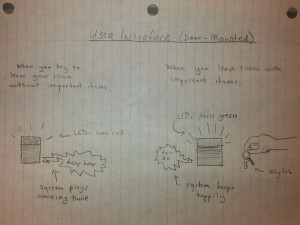
Our system will have a proximity sensor and be located (by default) near the door. When a user opens the door to leave their room, our system will flash red LEDs and play a warning melody if certain items (e.g., keys, phone) are not detected. If these items are present, the system will light up green (and may also play a happy tune).
Current difficulty: Easy
Proposed difficulty: Trivial

Task 2: Being able to use the proximity detector in one’s house to find missing items.
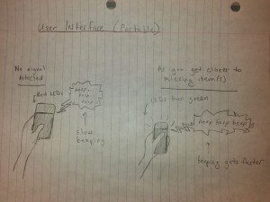
Though our system will typically be located near the door, users will also be able to carry it around (with some kind of battery pack) in order to detect important items in their home. Since the area being searched is relatively small and confined, it should be relatively easy to find objects simply using proximity sensing. The device will have an “item-detecting” mode that the user can activate, and it will light up green and beep more quickly as it gets nearer to the missing item(s).
Current difficulty: Moderate
Proposed difficulty: Easy

Task 3: Using the proximity sensors to find missing items out in the world.
This task is very similar to the previous task in that it involves detection of missing items; however, finding missing items outside of the home environment is far more difficult due to the increased size of the area being searched. For this, the user will need to have a general sense of where their item(s) might be; unlike in the previous task, a broad sweep over the entire searchable area will not be feasible. Battery life and detection range are also more of a consideration for this task; we may need to use sensing devices with a longer range than (for example) RFID tags.
Current difficulty: Hard
Proposed difficulty: Moderate

Interface Design

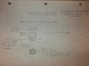
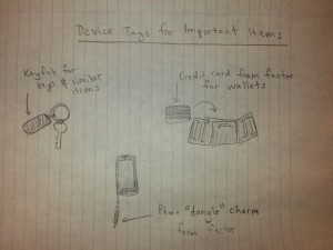
Our system consists of several parts: tags of various form factors that users can attach to important items and a door-frame mounted sensor to check for items when leaving the room that can also be detached and used as a handheld proximity sensor to locate lost items. The sensor will have a Li-On battery, rechargeable over USB, so it can be used as a portable device. We believe that for wallets, a credit-card form factor tag would be minimally intrusive, whereas for keys and cell phones, a small fob (about the size of a quarter) would be more appropriate. Each of these tags would contain a battery and an antenna. Our system alerts users when they attempt to leave their room or abode without every item they’ve tagged using our system by playing an alert noise and flashing red LEDs. When a user leaves the room with important items, the system plays a happy noise and flashes green LEDs. To add a new item to the set tracked by our system, the user presses a button on the door sensor and holds the new tag up to it until the sync completes. A user can also remove an item from this set by a similar process.  The visual and audible reminder provided by our system will help even users in an altered mental state remember their important items. The system can handle multiple users by maintaining separate device profiles for each inhabitant. It will alert a user leaving if it does not detect a complete set of devices. Users can separately add and remove devices. By removing the sensor from its door frame mount, the system will automatically switch to proximity sensing mode so that it can be used to locate missing objects — both in the user’s room and elsewhere. When no device tags are detected the system will flash red and beep slowly; as the user nears the missing item(s), the system will flash green and beep with increasing frequency. As far as we know, no other system grants this kind of functionality to a user — at best, there exist ways to find lost phones using GPS, but only when the phones are powered on. Our system is far more versatile than that, especially since it implements preventative as well as remedial solutions to the problem of forgetting important items.

Storyboards

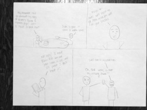
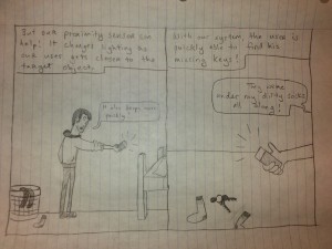
Task 1: Being reminded to take keys/phones/wallet along when leaving a room.

A clueless user about to leave his room without his keys.

A clueless user about to leave his room without his keys.

Our system notifies the user that he has forgotten his keys.

Our system notifies the user that he has forgotten his keys.

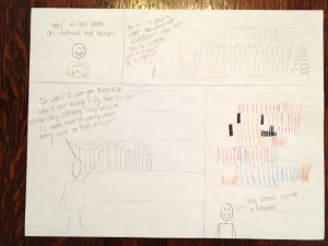
Task 2: Being able to use the proximity detector in one’s house to find missing items.

A sad user unable to find his keys.

A sad user unable to find his keys.

Our system can be used as a proximity sensor to help locate the missing keys.

Our system can be used as a proximity sensor to help locate the missing keys.

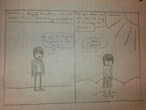
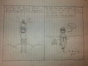
Task 3: Using the proximity sensors to find missing items out in the world.

A helpless user who has just realized that he lost his phone at the beach.

A helpless user who has just realized that he lost his phone at the beach.

Our system can be used as a proximity detector anywhere to find the missing phone.

Our system can be used as a proximity detector anywhere to find the missing phone.

Design Sketches

A sketch of the proximity sensing device.

A sketch of the proximity sensing device.

How different items would be tagged by the device.

How different items would be tagged by the device.

The portable user interface.

The door-mounted user interface.

The portable user interface.

The portable user interface.


%eiip – P2 (Interviews)

Group Number: 18

Names:

Mario Alvarez ’14, Valya Barboy ’15, Bonnie Eisenman ’14, Erica Portnoy ’15.


Problem and Solution Overview:

Organizing books, finding them, and remembering where specific books are can be difficult. It becomes exceedingly difficult as the number of books grows, and as people begin using books both for work and pleasure. Moreover, people who have multiple locations that contain books (multiple rooms, home and office, etc.) have trouble remembering which books are where, and continually end up needing a book that is inaccessible. Our solution is a bookshelf that has an RFID scanner on it. Each book on the shelf has an RFID tag placed on it. The shelf knows which books it contains, and can inform the user that a book is on it when a user queries a software system. An important aspect of our system is that it doesn’t require the user to make lasting modifications to their books, which was a concern of most of the potential users we interviewed.


Descriptions of Users Observed:

The tar­get user group we ended up inter­view­ing were researchers who own a lot of books. The idea behind this tar­get user group was to have peo­ple who use books in mul­ti­ple ways, and could there­fore have more spe­cific orga­ni­za­tional needs. Moreover, these users tended to have mul­ti­ple loca­tions for stor­ing books — at home, in the office, study car­rels — and tended to also have bor­rowed books, which would need to be returned. This makes it more prob­lem­atic if they lose or mis­place books. We ended up inter­viewing some grad­u­ate stu­dents, in math­e­mat­ics and physics, and some pro­fes­sors of com­par­a­tive lit­er­a­ture, Eng­lish, and com­puter sci­ence. We wanted to see how peo­ple in dif­fer­ent dis­ci­plines use books. For example, we noticed that those in the arts tended to have sig­nif­i­cantly larger num­bers of books (by orders of mag­ni­tude), and there­fore were forced to already have estab­lished orga­ni­za­tional systems. Addi­tion­ally, users in tech­ni­cal fields favored e-books for plea­sure read­ing, but avoided them for research due to imprac­ti­cal­ity; the users we inter­viewed in the arts and human­i­ties expressed extreme dis­like for e-books. Based on this, we real­ized that our sys­tem would be bet­ter for a tar­get audi­ence of peo­ple who own no more than a few hun­dred books.


CI Interview Descriptions:

We observed two mathematics graduate students in their respective offices. They both kept their math books in the office, and their pleasure reading at home. The first student had some problems remembering which of her books were at home and which were in her office. The second graduate student had everything perfectly organized — fiction was organized by what he had or hadn’t read and then by author; mathematics was organized by subject — and knew exactly where everything was. He generally can locate a book without a problem (and demonstrated this by finding any book we asked for), but sometimes forgets he has certain books and buys multiple copies. Both used e-books only when the material was otherwise inaccessible, or when traveling, but preferred to do their reading using physical copies. Both also kept their library books on a separate bookshelf, so as not to misplace them. Finally, both said that an organizational system would be nice to have, especially to remember which books are where, but that they do not want to take the time to scan or otherwise document every book they own.

We also observed a professor of Visual Arts who has thousands of books. He had them organized by topic, language, and time period. He could find any given book within seconds. He also had an expansive library at home, which he used for research and for pleasure. The books he kept in his office were those that could be relevant to the classes he teaches. A problem he acknowledged having was moving books from one location to another (i.e. from his house to his office), but he was very good at remembering where his books were. He also never borrows books, and keeps his library books separate from everything else. Next, we observed an English professor in his home, where he keeps his largest collection of books (he has several personal libraries across his residences and offices). He keeps his books using a loose, informal system of organization, with books roughly organized by topic, and books he is currently using stacked on or near his desk. His book collection is so important to him personally – and he spends so much time with it – that he is more or less able to keep track of where everything is. This is a feat, since he estimates he has a few thousand books in his home alone. This system appeared to work well for him: for instance, after he mentioned Turing in passing, we asked him if he could find a book about Turing for us, and he was immediately able to show us where the book had been, as well as recall that he had moved it to one of his offices some time ago. He feels that strict organizational schemes “demystify” the process of finding books, and that the serendipity of finding a book different from the one he was originally looking for is important to his research.

We also went to the Princeton Public Library and observed people trying to find books on the shelves. They would look up a book on a computer, look along the edges of the bookshelves to find the section, and walk along the aisle until they found the right first number, and then they would look more closely once they were nearby. In order to find the specific book, people looked very closely at the titles and numbers on the shelves. We then observed people shopping at CVS, and noted that they had a very similar tactic: they would look at the aisle sections to determine which aisle to go to, and then look more closely once there. One thing we noticed was that when people look for things they tend to physically run their fingers along the spines, shelves, or objects. If they don’t want to touch the objects, they’ll hover next to them, scanning physically as well as visually.


Answers to Eleven Task Analysis Questions:

1. Who is going to use the system?

Our system could be used by anyone with a personal collection of books. However, we envision it being most useful to people who use physical books for research in technical fields. There is very little chance that people who already have thousands of books will catalog all of them, so they would be less likely to use our system; our system will likely be more amenable to a medium-size collection (up to a few hundred books) than to an extremely large collection anyhow. Though we are designing the system with researchers in mind, it will likely be useful to those outside research fields as well.

2. What tasks do they now perform?

Our target group performs a few key tasks while interacting with their book collections. They search for books that they know are in their collection (though they may not know the books’ exact location). After they are done using a book, they need to be able to return it to their collection. They sometimes need to go through their collection to determine whether they own a particular book. Finally, they need to be able to add new books to their collection. All of these tasks generally operate within the frame of a particular organizational scheme; therefore, implicit in each action is that the user should be able to do it while maintaining the invariants necessary to keep their organizational scheme usable. If they do not do this, the tasks of finding books become difficult.

3. What tasks are desired?

Essentially, the users desire to perform the same set of tasks more efficiently. It can take a long time for a user to determine whether they already own a book, since, without a comprehensive catalog of their collection, they need to examine all their books to determine that they do not have a particular one. Additionally, users need to be able to find books consistently and efficiently; as mentioned above, this is not always the case. Finally, researchers tend to have their book collections spread across multiple locations (for example, their home and their office), so determining which books are in which locations is another important task (this was particularly true of the English professor we interviewed).

4. How are the tasks learned?

Currently users employ some combination of two complementary strategies in order to keep their books organized (i.e., learn and remember where books are). First, they can impose a formal system of organization, grouping books together based on commonalities (as the film professor we interviewed did). In an extreme case, they might use an industrial-strength system such as Dewey Decimal. Second, they can use spatial memory, connecting these groups of books to the parts of the space in which they are stored for more rapid retrieval. Both have drawbacks: maintaining a formal system requires discipline and an investment of time each time a book is stored or retrieved, while using spatial memory effectively requires an intimate familiarity with one’s collection and the space that collection occupies, which can take years to develop.

5. Where are the tasks performed?

Wherever the users keep their book collections – so the home and office, at a minimum; possibly other locations for users whose collections are spread across other locations.

6. What’s the relationship between user & data?

In this case, the data is the set of books the user owns, and where those books are. Users have an expectation of privacy for their book collections, as these can be highly personal in nature. Though sharing the full list of books users own will not be required, users may want to be able to share certain information about their collections with friends (for instance, if their friends want to borrow a book from their collection). Users should be able to access data about their own collections remotely – for example, if a user is at a bookstore, she should be able to look up whether she already owns a copy of a book before buying a new one.

7. What other tools does the user have?

The user currently has standard bookshelves. The user may also have software applications to aid in cataloging, such as BookCrawler, but as the film professor we interviewed mentioned, their utility is questionable because they are not tightly integrated with the physical locations of the books like our system is. Additionally, the user may use a traditional cataloging system (such as Dewey Decimal) in order to precisely specify the correct location for each book; however, this requires knowledge of the system and a large amount of effort to maintain, with the result that few actually use such systems.

8. How do users communicate with each other?

Users may borrow books from each other and lend books to each other. Additionally, they must negotiate with others who share their space to ensure that their system of organization is maintained properly. In the case of the home, this may be with other family members who share shelf space (and who may share the collection, making them users as well). In the case of the office, this may be with co-workers or colleagues (researchers in particular often have shared office space.) Communication tends to be informal, verbal, and in-person.

9. How often are the tasks performed?

This varies greatly from user to user and from collection to collection, depending on the user’s habits and the purpose of the collection (for instance, whether it serves as an archive of old, seldom-used material or an active repository for currently-relevant research). Generally, the tasks of storing and retrieving books already in the collection are performed more frequently (several times a day to a couple of times a week) than adding books or checking whether a book is in the collection (a couple of times a week to a few times a year).

10. What are the time constraints on the tasks?

There are no time constraints per se, but if it takes too long to find a book, the individual may give up (although some, like the English professor we interviewed, value the experience of finding a different book than one originally sought). Doing research efficiently depends on finding research materials quickly, so time is likely most important for professional researchers, who want to free up time to do actual research rather than looking for books.

11. What happens when things go wrong?

If the system is used and then stops working (or stops being used), the user’s book collection may become extremely disorganized. As a result the user may not be able to find her books any longer. This is not a catastrophic result, but may make it difficult for the user to do her job if she is a researcher. The user may also lose books if their organizational system loses track of them. This is a potential problem with our system: since it does not require a particular physical layout of books, if users rely on our system and no longer organize their book collection in conventional ways, their collections will be left in a state of disarray if our system stops working.


Description of Three Tasks:

1. Retrieving a book from the collection

The difficulty of this task currently depends on a number of factors, such as how many different places the user keeps books. None of the users we talked to used a strict organizational scheme, though many had their books roughly sorted based on whether or not they were for research, as well as by topic or by time period. With such a scheme, most users are able to find books with moderate difficulty.

Under our proposed system, the user would be able to simply query our system for the book, which would then indicate its physical location. Our system would therefore make it easy to perform this task.

2. Shelving a new book, or returning a book to the collection

Currently, the difficulty of this task is proportional to both the user’s number of books and the strictness of their organization system. If their system is lax and flexible it might be easy to file a book – but this will make retrieving books difficult. If their system is strictly organized, keeping it organized requires significant effort and planning on the user’s part. On average, this tends to be a moderately difficult task.

Our system would keep track of where each book is, so you can put them wherever you like – either maintaining a conventional organizational scheme on top of BiblioFile, or not. The task becomes easy.

3. Determining if you own a book, or if a borrowed book is in your possession

Currently, if you do own a book, determining that you do own it is as easy as retrieving it – that is, of moderate difficulty. However, if you don’t own the book, you have to go through your entire collection to make sure that it is not in your collection at all, as opposed to simply being present but out of place. In this case, the task becomes hard.

With our system, once a user has entered all her books into the system, she can know with confidence whether or not she already owns a book, simply by looking that book up using our interface. This task is now easy.


Interface Design:

Provide a text description of the functionality of your system. What can a user do with it, and how?

Our system keeps track of a user’s books and their locations. A user can ask the system for the approximate location of a book, and the system will indicate where on the shelf it can be found. Additionally, a user could ask the system whether or not they own a particular book. We envision the user interacting with our system through a web application that lets them search for books as well as view all books in the collection. To add a book to the bookshelf system, we envision the user adding a physical “tag” to the book, which will then allow the book/tag combo to be automatically registered via our website.

2. What benefits does the application offer to the user? What is the scope of functions offered? How will your idea differ from existing systems or applications?

Our application allows the user to quickly find their books and determine what books they own without using rigid cataloging systems. Traditional organizational schemes are hard to maintain, and even harder to reconfigure. Our system allows users to place their books in any configuration within the special bookshelf, which gives the users more flexibility. Existing systems require the user to either adhere strictly to an organizational scheme such as Dewey Decimal, or to perform some specific action each time a book is moved (such as scanning a barcode).

3. Provide 3 storyboards. Each one should show how someone would use your system to accomplish one of the three tasks you chose above. Show motivation for using the system, as well as steps the users will go through to accomplish the task.

Photo Mar 10, 4 21 30 PM

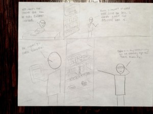
Thanks to his Biblio-File system, this user is easily able to find and return his friend’s copy of Ender’s Game.

Photo Mar 10, 4 21 18 PM

Freed from the constraints of a rigid organizational system, this user lets his imagination run wild!

Photo Mar 10, 4 20 49 PM

Using his Biblio-File system, this scholar is able to quickly find the esoteric works he needs to conduct his research productively.

4. Provide a few sketches of the system itself. What might it look like? How might a user interact with it?

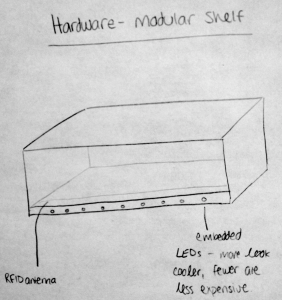
Hardware – Shelving: Our system will consist of one or more stacked modular shelves. Each shelf will contain an RFID sensor that will detect books contained within in, and transmit that information to the central server. It will also contain LED lights that will light up when a user selects a book in the software.

A modular shelving unit for BiblioFile

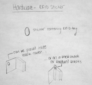
Hardware – RFID Stickers: The books’ presence will be sensed via RFID stickers that can be placed either inside a book (if the user owns the book) or on a bookmark that is placed inside the book (if the user does not own the book). These RFID tags can be disassociated with books after they are permanently removed from the collection and reused with other books.

Usage of the RFID stickers


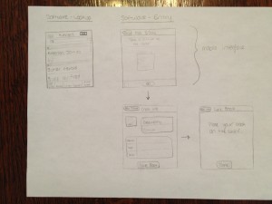
Software – Lookup: Using an interface similar to that of Music on iOS, users will be able to search the collection or browse by any of several types of metadata that the system tracks for each book. When they find the book they want, they tap its title, and its shelf will light up underneath its approximate location. To edit the collection (delete books), users tap the edit button.

Software – Adding a Book: The system will initially try to use OCR to get the book’s information from the cover, after which the user will have the opportunity to edit or add information. The user then places the book on the shelf, so that the system knows which book is associated with which tag.

Interface mockup for looking up a book and for adding a new book to the collection

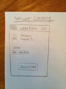
Software – Locating a Book: When a user taps on the book from the Lookup screen, she will be taken to a page containing the book’s information and tags associated with the location of the shelf that it is currently on. If the user desires, she may tap the illuminate button to have the shelf light up.

Interface mockup for locating a book in the collection


P2 – Runway

Team 13 – CAKE

Connie (task description, interface design, blog post), Angela (task analysis, interface design), Kiran (contextual inquiries, interface design), Edward (contextual inquiries, task description)
(in general, we collaborated on everything, with one person in charge of directing each major component)

Problem/Solution

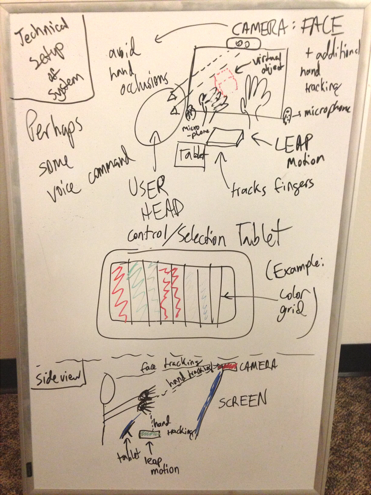
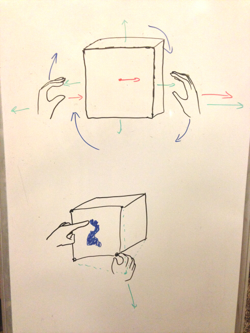
3d modeling is often a highly unintuitive task because of the disparity between the 3d work space and the 2d interface used to access and manipulate it. Currently, 3d modeling is typically done on a 2d display, with a mouse that works on a 2d plane. This combination of two 2d interfaces to interact with a 3d one (with the help of keyboard shortcuts and application tools) is hard to learn and unintuitive to work with. A 3d, gesture-based interface for 3d modeling combines virtual space and physical space in a way that is much more natural and intuitive to view and interact with. Such a system would have less of a learning curve and facilitate more efficient interactions in 3d modeling.

Contextual Inquiry

Users

Our target user group is limited to individuals who regularly interact with 3d data and representations, and who seek to manipulate it in some way that depends on visual feedback. These are the people who would find the most practical use out of our system, and who would benefit most in their workflow.

Our first user was a professor in Computer Graphics. He has been doing 3D graphics for many years and has some experience with many different programs and interfaces for manipulating 3D data. However, he stated that he didn’t personally do heavy 3D tasks anymore (at least with the interface he showed us); however, he often shows new students how to use these interfaces. He likes exploring applications of 3D graphics to the humanities, such as developing systems for archaeological reconstruction. He does not focus much on interfaces, as he believes that a good spatial sense is more useful than an accessible interface (though for the applications that he develops, he is happy to alter the interface based on user feedback).

Our second user was a graduate student in Computer Graphics who has been at Princeton for several years. He has experience in 3D modelling using Maya, and his primary research project related to with designing interfaces for viewing and labelling 3D data. Because of his research and undergraduate background, he had a lot of background in basic 3D viewing manipulations and was very adept at getting the views he wanted. His priority for his interfaces was making them accessible to other, inexperienced users; this was because his research is supposed to be used for labelling objects in point clouds (which could be outsourced). In terms of likes and dislikes, he stated that he did not really get into modelling because it required too much refinement time and effort.

Our third interviewee was an undergraduate computer science student from another university. He has experience in modelling and animation in Maya, and did so as a hobby several years ago. He has taken courses in graphics and game design, and has a lot of gaming experience. However, his experience with Maya was entirely self-taught, and he acknowledged that his workflows were probably very unlike those of expert users. Because of this, his priorities were not speed or accuracy of tasks, but being able to create interesting effects and results. He was happiest when experimenting with the sophisticated, “expert” features.

Interviews

We observed our first two CI subjects in their offices, with their own computers, monitors, mice, and keyboards. They were usually alone and focused on their task while using their systems. The last user did his modelling in his home or dorm room, generally alone or working with friends. We asked our subjects to show us the programs that they used to do 3D manipulation/modelling, and perform some of the tasks that they normally would. Following the master-apprentice model, we then asked them to go over the tasks again, and explain what they were doing as if they were training us to perform the same things. After this, we tried to delve a bit deeper into some of the manipulations that they seemed to take for granted (such as using the mouse to rotate and zoom) and have them try to break down how they did it, and why they might have glossed over it. Finally, we had a general discussion about their impressions about 3D manipulation in general, especially focusing on other interfaces they had used in the past and the benefits/downsides compared to their current programs.

The most common universal task was viewing the 3D models from different perspectives – each user was constantly rotating the view of the data (much less frequently panning or dollying). Another fairly common task was selecting something in the 3D space (whether a surface, a point, or a model). After selection, the two common themes were some sort of spatial manipulation of the selected object (like moving or rotating it), or non-spatial property editing of the selected object (like setting a label or changing a color). It seems that the constant rotation was helpful for maintaining a spatial sense of the object as truly 3D data, since without the movement it could simply look like a 2D picture of it (this is especially true because you can translate or zoom a single 2D image without gaining any more 3D information, whereas rotation is a uniquely 3D operation).

Essentially all of the operations we observed being performed fell into the categories mentioned above.

Our first user’s program was used for aligning several 3D scans to form a single 3D model; his operations involved viewing several unaligned scans, selecting a single one, and moving/rotating it until it was approximately aligned with another model. We noted that he could not simultaneously change views and move the scans, so he often had to switch back and forth between changing views and manipulating the object.

Our second interviewee showed us his research interface for labeling point cloud data. The point cloud data labeling application was really primarily about viewing manipulations: the program showed the user a region of a point cloud, and the user would indicate whether it was a car, streetlight, tree, etc. The user only really had to rotate/pan/zoom a little bit if necessary to see different views of the object under consideration, and sometimes select pre-segmented regions of the point cloud.

The Maya workflow was far more complex. For example, the skinning process consisted of creating a skeleton (with joints and bones), associating points on the model surface with sections of the skeleton, and then moving the joints. The first part was very imprecise, since it involved repeatedly creating joints at specific locations in space. After creating a joint, the user had to carefully drag it into the desired position (using the top, side, and front views). The user thought this was rather tedious, although the multiple views made it easy to be very precise. He did not go into much detail about the skinning process, using a smart skinning tool instead of “painting skinning weights” on the surface (which basically looked like spray-painting the surface with the mouse). Finally, joint manipulation just involved a small sphere around the joint that had to be rotated using the mouse. He also described how the advanced features generally worked (but didn’t actually show them) and described them as generally involving selecting a point and dragging it elsewhere, or setting properties of the selected object.

Task Analysis

  1. Who is going to use the system?
    Our system can be used in 3D Modelling: Game asset designers, film animators/special effects people, architectural designers, manufacturing, etc. More generally, we can use our system for basic 3D Manipulation and viewing – Graphics research, medical data examination (e.g. MRI scans), biology (examining protein/molecular models), etc. People in these fields generally are college educated (since the application fields are in research, industrial design or media), and because of the nature of the jobs they will probably have experience with software involving 3D manipulation already. They certainly must have the spatial reasoning abilities to even conceptualize the tasks, let alone perform them. It may be common for users to have more artistic/design background in non-research application contexts. We imagine that there is no ideal age for our system; because of the scope of the tasks we expect that the typical user will be teenaged or older. Additionally, our system requires two functioning eyes for the coupling of input-output spaces to be meaningful.
  2. What tasks do they now perform?
    In 3D modeling, they take 3D scans of models and put them together to form coherent 3D models of the scanned object. They also interact with 3D data in other ways (maps, point cloud data representations of real life settings), create and edit 3D objects (models for feature films and games: characters, playing fields), define interactions between 3D objects (through physics engines, for example, define actions that happen when collisions occur), and navigate through 3D point-clouds (that act as maps, of, say a living room: see floored.com).
  3. What tasks are desired?
    On a high level, the desired tasks are the same as the tasks they now perform; however, performing some of these tasks can be slow or unintuitive, especially for those who are not heavy users. In particular, manipulation of perspective is integral to all of the tasks mentioned above, and manipulating 3D space with 2D controls is not intuitive and often difficult to learn so that operations run smoothly.
  4. How are the tasks learned?
    Our first interviewee highlighted the difference between understanding an interface (getting it) and being good at using it intuitively (grokking it). The first of these involves learning how things work: right click and drag to translate, click and drag to rotate, t for translation tool, etc. These facts are learned through courses, online training and tutorials, and mentorship. The second part can only be done through lots of practice and actual usage to achieve familiarity with the 3D manipulations. Our first interviewee noted that, after learning gaining the spatial intuition for one type of interface, other such tasks and interfaces often become much easier to grok.
  5. Where are the tasks performed?
    Tasks are performed on a computer, typically in offices, as they are often a part of the user’s job. Animators generally work in very low lighting, to simulate a cinematic environment. People are free to stop by to ask questions, converse, etc. — which interrupts the task at hand, but does not actively harm it, just as with other computer-based tasks. Also some people might design at home for learning, or personal app or game development.
  6. What’s the relationship between user & data?
    The user wants to manipulate the data (view, edit, and create it). Currently, most 3D data is commercial, and the user is handling the data in the interests of a company (e.g. animated models for films), or for research purposes with permission given by a company (e.g. Google Streetview data). Some of it can be personally acquired, e.g. with kinect. Some users create the data: for example, designing game objects in video games, or 3D artwork for films.
  7. What other tools does the user have?
    Manipulation of 3D data requires tools with computing ability — with a computer, there are other interfaces, such as through the command line, to select and move objects (specifying exact locations). With animation, animators can use stop-motion animation, moving actual objects incrementally between individually photographed frames. In general, a good, high-resolution display is a must. Most users do their input via mouse and keyboard. There are some experimental interfaces that use specialized devices such as trackballs, 3D joysticks, and in-air pens. Many modellers also use physical models or proxies to approximate their design, e.g. animators might have clay models and architects might have small-scale paper designs.
  8. How do users communicate with each other?
    Users communicate with each other both online and in person (depending on how busy they are, how close they are located) for help and advice; they also report to managers with progress on their tasks. (for instance there are developer communities for specific brands of technology http://forum.unity3d.com/forum.php?s=23162f8f60e0b03682623bf37fd27a46 for example ).
    In general, modelling has not been a heavily collaborative task. 3D modellers might have to discuss with concept artists on how to bring their ideas into the computer. Different animators might be working on different effects on the same scene in parallel, such as texturing and animating, or postprocessing effects.
  9. How often are the tasks performed?
    Animators undertake 3D manipulation jobs daily — for almost the entire day (and during this time, continually manipulating view and selecting objects to create and edit the 3D data). Researchers, on average, tend to perform the tasks less frequently. The professor we interviewed rarely manipulates the 3D data himself (except for demos); the graduate student still interacts with the data daily, as his research project is to design an interface that involves 3D interaction. In terms of individual tasks, the functions that are performed most frequently are by far changing the perspective. This happens essentially continuously during the course of the 3D manipulation session, almost such that it doesn’t feel like a separate task. Next most common is selecting points or regions, as these are necessary for most actual manipulation operations.
  10. What are the time constraints on the tasks?
    As changing perspective is such a common task, required for most operations, it is a task which users will not want to spend much time on (given that their goals are larger-scale operations). For operations which they are aware require a significant amount of time (e.g. physical simulations, rendering), they are willing to wait, but would certainly prefer them to be faster — they are also more willing to wait for something like a fluid simulation if they are aware of what the end result will generally be like (which is another problem).
  11. What happens when things go wrong?
    Errors in modelling can generally be undone, as the major software keeps track of change history for each individual operation. Practical difficulties may arise in amount of computer resources required to create a model of high resolution.

Task Descriptions

  1. (Easy) Perspective Manipulation
    This task classically involves rotating, panning, and zooming the user’s view of the scene to achieve a desired perspective or to view a specific part of the scene/model. Perspective manipulation is a fundamental, frequent task for every user we observed. It seems to serve the dual purpose of preserving the user’s mental model of the 3D object, as well as presenting a view of the scene where they can see/manipulate all the points necessary to complete their more complex tasks.
    Currently, this task has a large learning curve, but once people are used to it, it becomes easy and natural; the only hurdle is that with current interfaces, it is not possible to change this while performing another mouse-based task. With our proposed interface, we first propose to separate the two purposes of preserving spatial sense and presenting manipulable views. With a stereoscopic, co-located display, we make preserving spatial sense almost a non-issue with no learning curve, especially with head-tracking. We also believe that using a gestural, high degree-of-freedom input method can allow for more intuitive camera control, equating to an easier learning curve. We also note that using gestural inputs will allow users to perform perspective manipulation simultaneously with other operations, which to us is more in line with how the users conceive of this (as a non-task, rather than a separate task).
  2. (Medium) Model Creation
    This task is to create a 3D mesh of some desired appearance. Depending on the geometry of the desired model, it can be created by starting off by combining and editing some simple geometry (spheres, ellipsoids, rectangular prisms), or modelled off of a reference image, from which an outline of the model can be drawn, extruded, and refined to create a model. The task involves object (vertex, edge, face) selection, creation, and movement (using perspective manipulation to navigate to the location of the point of interest), and typically involves many iterations to achieve the desired look or structure.
    Game designers and movie animators perform this task very often, and a current flaw of the system is that the creation of a 3D shape happens in a 2D environment. We anticipate that creating a 3D model in 3D space will be much more intuitive.
  3. (Hard) 3D Painting
    Color and texture on 3D models gives a sense of added style and presence. Many artists use existing images to texture a model, e.g. an image of metal for the armor of a model of a medieval knight, as it is relatively easy and efficient. However, when existing images do not suffice for texturing an object, an artist can paint the desired texture onto the object. Such 3D painting is a very specialized skill, as painting onto a 3D object from a 2D plane is very different from traditional 2D painting (many artists who are skilled in 2D painting are not in 3D painting, and vice versa) and can be unintuitive. Major platforms for 3D painting project a 2D image onto the object, which can cause unexpected distortions for those unfamiliar with the sense of operation. In our interface, we intend for users to be able to paint onto an object in 3D space with their fingers.

Interface Design

Functionality

We intend to include functionality for most basic types of object manipulation (rotation, translation, scale), which will be mapped to specific gestures, typically with both hands and arms. We also want to allow for more precise manipulation such as selection/distortion and 3d painting, which involve gestures using specific fingers in more precise movements. To add control and selection capabilities, we hope to incorporate a tablet or keyboard, perhaps to change interaction modes or select properties such as colors and objects. Together, these will encompass a considerable portion of the functionality that basic 2d interfaces provide currently, while making the interaction more intuitive because it is happening in 3d space.

Storyboards

Easy task: Perspective Manipulation

Easy task: Perspective Manipulation


Medium task: Model Creation

Medium task: Model Creation


Hard task: 3D Painting

Hard Task: 3D Painting

System Sketches

Top: Front view of the system, including all component devices. Middle: Tablet (or keyboard) for additional selection and control, like mode or color change. Bottom: Side view of system, showing the devices and basic form of interaction.

Top: Front view of the system, including all component devices. Middle: Tablet (or keyboard) for additional selection and control, like mode or color change. Bottom: Side view of system, showing the devices and basic form of interaction.

Top: basic ways for the user to interact with the system using hand gestures. Bottom: More precise gestures and interactions that require greater accuracy. (Not shown: control mechanisms such as a tablet or keyboard to switch between them, or provide extra choices for functionality)

Top: basic ways for the user to interact with the system using hand gestures. Bottom: More precise gestures and interactions that require greater accuracy. (Not shown: control mechanisms such as a tablet or keyboard to switch between them, or provide extra choices for functionality)

P2 – Feel the Music!

Group Name: VARPEX

Group Members and Contributions: Abbi Ward, Dillon Reisman, Prerna Ramachandra, Sam Payne

Dillon recorded participant answers and wrote up information about our participants/people we observed and their responses and gathered test subjects.
Sam provided the music and music equipment, recorded the answers to the task analysis questions and gathered test subjects.
Abbi drew some of the sketches and wrote up information about the contextual interviews.
Prerna drew the storyboards, gathered some of the test subjects and helped with conducting interviews and compiled the blog post.

Group Number: 9

Problem and Solution Overview

We are addressing the problem that the concert experience can only be replicated by expensive, non-portable hardware. Further, these systems cause noise pollution in tight-living quarters. We will create an article of clothing worn on the torso that will use vibrating motors to generate stimulus similar to that created by loud bass – that is, a vibrating sensation on the skin. Our solution is portable, relatively inexpensive, and avoids the noise pollution problem.

Description of Users Observed in Contextual Enquiry

The target group of users we observed were students aged 18-22. They all have enjoyed listening to music at eating clubs on weekends or going to the occasional concert. They do these things, however, for a variety of different reasons. Some go to clubs for the social aspect of it (their friends are there, their friends are performing, etc.). Most, however, find the act of listening to the music enjoyable in its own right. The observed users enjoy many forms of music, and for most that includes some form of electronic music, though they had varying opinions on the quality of dubstep specifically. It helps that what is played in clubs is mostly of this type, as opposed to rock or other genres.

Contextual Inquiry Interview Descriptions

We invited six individuals to Sam Payne’s room on a Saturday afternoon. Sam has a good quality subwoofer which we used to experiment with different bass frequencies. We invited individual participants to the room at different times. We introduced ourselves and described the class and the purpose of the questions we were going to ask. For each participant, we walked through a series of questions about their music-listening habits and tried to get a feel for how, when, and why these students are listening to music. We then played a series of frequencies for them (from 110 Hz down to 50Hz) while they stood next to the subwoofer. We asked them to describe the sensation and where they felt it. We then put a foam chair near the subwoofer and had them listen to the tones again. We asked them to describe the sensations again, where they felt it, and how they liked it.

As participants answered our questions, we recorded their answers in this form, which gives a basic outline of the sorts of questions we asked.

Most of our users primarily listen to music in their dorms with laptop speakers. If they go outside, they’ll typically use headphones. These headphones are generally low-quality earbuds rather than slightly higher quality over-the-ear headphones. Many students will listen to music on speakers in whatever lab they’re working in. The participants we interviewed enjoyed a variety of genres, from dubstep and electronica to pop and opera. Even if the participants did not report that electronica or dubstep was very high on their list of favorable genres, they often at the very least appreciated it for its diverse and interesting sound and the “intense” sensation they often got from it.

Users felt the vibrations in very different locations. Some of this difference may have been due to different body types. The tall, thin men we interviewed felt vibrations very strongly in the top of their chest but other participants did not feel these vibrations as strongly. Another area where sensations were strongly felt was in the mid-back, along the spine. Users enjoyed the chair, as opposed to just feeling the vibrations in the air. The chair produces a more intense diffusion of vibration. People likened this feeling to a massage of the back and legs. This suggests that users enjoy the intensity of response and the similarity to the raw air experience may not be as important.

Answers to Task Analysis Questions

1. Who is going to use system?
This system would be for people ages 16-34 who enjoy concerts. They enjoy concerts because of the sensation derived from loud music, and would like to have this same sensation when they listen to music at home.

2. What tasks do they now perform?
They go to concerts when they can, and they play loud music in their home (if they can). Some individuals, such as college students living in dormitories, must listen to music through headphones due to noise pollution.

3. What tasks are desired?
Users would like the concert experience on-the-go and without disturbing their neighbors.

4. How are the tasks learned?
Users already know how to use their headphones and feel music. Our system would be an extension of simply plugging in your headphones.

5. Where are the tasks performed?
People feel music at concerts, parties and in dorms/apartments, if they have good speakers. People listen to music everywhere.

6. What’s the relationship between user & data?
Feeling music is a subjective experience, so our data is the reported experience of users. There may be some loss of data if users cannot describe or are not aware of factors that affect their experience.

7. What other tools does the user have?
Depending on the situation, the user may have headphones or speakers and subwoofers. They also have music-playing devices, such as iPods, computers. This equipment varies in expense.

8. How do users communicate with each other?
At concerts, people communicate through gesture and yelling.

9. How often are the tasks performed?
How often tasks are performed varies between individuals because it depends on the type of equipment they have. Those without subwoofers only feel music at concerts so they may feel music a few times per year. Those with subwoofers may feel music on a daily basis.

10. What are the time constraints on the tasks?
At a concert, the time of the concert constrains when users can listen and feel music. For those with good speakers and subwoofers, the constraint may be the time it takes for your neighbors to call public safety.

11. What happens when things go wrong?
If the concert is cancelled, the police are called, or your speaker breaks, you don’t listen and feel your music.

Descriptions of the Three Tasks

1. Many times, people want to listen to music at a loud volume in their room while     roommate is studying, or without disturbing their neighbors. Many students will listen to music on headphones. However, the physical sensation of listening to music is lost while listening on headphones. This product would allow people to feel that sensation without disturbing those around them. The task of listening to music loudly in your room is easier than the other tasks, but it becomes more difficult as you take into consideration the possibility of disturbing your neighbors.

  • Users working outside of their rooms often listen to music while working. The portability of this device allows users to feel music while studying without disturbing those around them.

2. Many students listen to music while walking to class. This of course is done on headphones since speakers are not portable. However, again, the physical sensations of listening to music are lost while listening on headphones. The portability of this product would allow students to listen and feel their music in any setting, and on the go. The task of listening to loud music while moving is difficult, and is even more difficult when you take into consideration the possibility of disturbing other persons.

3. While at concerts, many people enjoy the feeling of music, and some songs are even written to promote these sensations. While producing music, artists could use this product to feel their music and gauge how their music will feel in a concert setting. Attending concerts is difficult due to availability and cost.

Storyboards

Storyboard 1 

storyboard 1

Listening to music while walking to class and getting the live music experience

Storyboard 2

storyboard 2.1

Listening to music in the library or lab while doing work

storyboard 2.2

Getting the live music experience while doing work!

Storyboard 3

storyboard 3

Listening to music in your room, and getting the live music experience without disturbing your roommate

 Design Sketches

photo 16-54-30

Overview of the jacket, fit and spot to place iPod

photo (1) 16-54-30

Front and back of jacket, and sketch of the motors

photo (2)

Parts of the body affected by the jacket

Interface Design Description

Since our system will be wearable, it will grant the user a lot of freedom over where and when they can ‘feel’ their music. Ideally it will also look inconspicuous in its function; a user should be comfortable simply wearing it as a jacket or other article of clothing. It will still enable the user to simply listen to music should they wish, as they did before, but with the added ability to activate the more immersive ‘feeling’ system through vibrating motors. Currently this ability is not offered by any product on the market- headphones do not offer users the concert-going experience of ‘feeling music’.