Lab 3: Motor Control

Lab 3: Motor Control

Bereket Abraham
Lauren Berdick
Ryan Soussan
Andrew Ferg

Group #24: The Cereal Killers

Z Flipper

We built the Z-Flipper, a robot designed to flip over itself multiple times. It was made out of 3 panels connected by servo motors at the joints. The construction was good, but our servo motors were too weak to lift the entire weight of the robot. The second robot we constructed, the Wormotrom, moved like an inchworm. The robot moved at a slow but steady pace, and put less strain on the motors. However, we were unable to control the direction the robot moved in. In the future, we would remember to consider the strength of our motors during the brainstorming and idea selection process.

12 Robot Ideas

1. 2 servos on either side of a piece of styrofoam and have it crawl along.

2. 2 DC motors attached to wheels on either side of a piece of styrofoam with a passive trailing wheel. A 3 wheel cart. You could turn by spinning one side faster than the other.

3. Put a piece of styrofoam on a 3-wheeled tripod. Attach a DC motor on the back as a fan. Blows across the table.

4. 2 servos attached to a ribbon. The servos turn in opposite directions, causing the ribbon to contract and expand. Much like a worm.

5. One servo with a gripper claw attached. The motor sweeps from 0 to 30 deg slows, and then back quickly. The robot claws it way across the table. Perhaps you would need two trailing legs for stability.

6. The same thing as above except now we have 2 gripper claws on either side. This configuration could also be used to climb as well as crawl.

7. Attach tiny helicopter blades to the DC motor. The robot flies into the air with a burst of speed, then glides over to the other side of the table.

8. Two DC motors attached to wheels and connected by some kind of thick rubber band or track. The motors are fixed together and the track rotates around them, like a really basic tank.

9. Create a hollow cylinder with a DC motor at the central axis. Attached to the motor is a weighted rod, or a pendulum. As the motor turns, it shifts the cylinder’s center of mass, causing it to turn.

10. A four legged robot with a rotating hip. One servo would control the hip and one DC motor would control the front two legs. The back legs would be passive / wheeled. The front legs would be 180 degrees out of phase, so that as the hip turned one leg would be in the air and the other would be pulling the robot forward.

11. The entire path has a track or ladder. The robot simply has a DC motor that pulls itself along the track.

12. Cover the table in a few inches of water. Make a small boat and with 2 paddles connected to servo motors. Or a DC motor connected to a propellor.

13. 3 flat plates in the shape of a “Z”. At each joint is a servo motor. The plates open up, causing the robot to flip over. The robot moves forward by flip over and over in the right direction.

Final Idea: #13

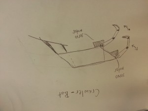
At first, we thought about doing the crawler, #6.

crawler

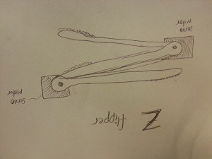
But then we decided on the “Z Flipper”, #13.

zflipper

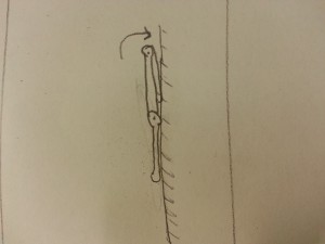
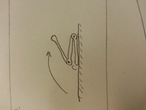
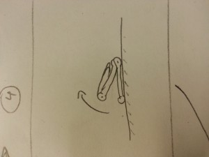
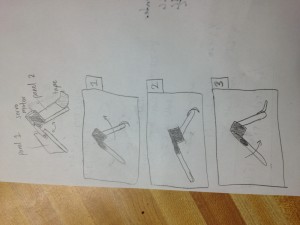
Here is a diagram on how the Z Flipper would move.

gait

pic1

pic2

pic3

pic4

Parts List

3 Cardboard plates made from gum packaging.
2 stepper motors
1 arduino microcontroller
2 long, stiff wires for attaching the motors
tape
jumper wires

Instructions

First construct the flipper. Attach the motors to the plates using tape and wires. At a joint, the motor body connects to one of the plates using tape. The motor arms connect to the other plate. This connection is much weaker and needs the wire to reinforce it. When that’s done, use the jumper cables to connect the motors to the arduino. Finally, upload the code and let it go. The code is designed to turn the motor, wait a set amount of time, and then turn the other motor. And so on.

Testing


Video of the Z-Flipper. We were able to construct the flipper mechanism, but the motors were too weak to move unaided.

In order to salvage a workable robot, we stripped off the second joint, leaving only 2 panels connected by a servo motor. Now the robot was basically a hinge that could open and close. Instead of flipping over itself, the robot would now move using an inch-worm type motion. To create forward motion, I covered the back panel in smooth electrical tape and put a flap of scotch tape on the front panel. When bending open, the flap would curl under itself and slide forward. When bending close, the sticky side would catch on the table and pull the rest of the robot forward. I call it the Wormotron. Check out our new diagrams and video.

wormotron_diagram
Diagram


Wormotron in action.

Arduino Code

/*
Lab 3, COS 436
Z Flipper Robot
Group 24: The Cereal Killers
*/

#include  

int jointPinA = 9;
Servo servoA;
int angleA = 0;
int steps = 10;
int on = 1;
 
void setup() {
  servoA.attach(jointPinA);
  
  Serial.begin(9600);
  Serial.println("Ready");
}
 
 
void loop() 
{   
  if(on == 1) {
    for(int i = 0; i < steps; i++) 
    {
      openJointA();
      delay(15);
      closeJointA();
      delay(15);
    }
    on = 0;    
    servoA.detach();
  }
}

void openJointA() {
  // scan from current position to 180 degrees
  for(; angleA  0; angleA--)  
  {
    servoA.write(angleA);
    delay(15);
  }
}


A3 – TransLoc App

Stephen Cognetta
Jean Choi
Karena Cai

1. Most Severe problems with the app/site?
a. Error Prevention
When clicking too many lines/routes, the app will freeze and subsequently crash. This happened for over 10 lines. This is clearly within heuristic 5 – this error could have been prevented by the app. A suggestion for fixing this problem would be either to alert the user if they have picked too many lines, or to allow the app to accept a greater number of lines without crashing. This would therefore prevent users from picking too many bus lines than they should.
b. Consistency and Standards (H4)
The symbols are not very intuitive and do not allow the user to understand what functionalities correspond to the symbols. For instance, the magnifying glass shows the user the stops as opposed to some button that says: show stops. Also, the less than and greater than sign <> takes you back to your previous screen (after you have altered the map in some way). The user has no idea of the button’s functionality until he/she clicks on the button. There are also many useful functionalities of the app, but the features are not well documented and do not abide by standards of most interfaces, and thus can easily go unnoticed and unused. A solution to this problem might be introducing some legend or using short words and phrases that allow the user to have a better understanding of the functionalities of different buttons. These changes would introduce a standard for the application, and thus, fall under the consistency and standards heuristic. 

2. The biggest issue was the consistency and standards. Oftentimes throughout using the app, there would be an inconsistency with the use of symbols and characters. This problem is elaborated on above, in section 1b, and we probably would not have paid such close attention to this if we hadn’t kept the Nielsen standards in mind. One additional error that we would not have found otherwise would be the error that we found – that when adding too many lines, the app crashed. We wouldn’t have known to add so many lines if it weren’t for the heuristic of error prevention. Keeping this heuristic in mind, we tried to generate errors throughout our use of the app, and uncovered this important flaw.

Furthermore, we all knew in a broad sense why the app was pretty faulty, but Nielsen’s heuristics gave us a means to evaluate the website and pinpoint exactly what regions the app was lacking in. For instance, we all knew the app was pretty hard to use, but by looking through Nielsen’s heuristics, we could determine the reason why it was hard to use. Therefore, Nielsen’s heuristics gave us a criteria we could use to evaluate the app.


3. a. How accessible is an application to different people– are certain demographics excluded from the functionality of the app? (no wifi, no bluetooth, etc.)
b. How accessible is an application to people with limitations – such as color-blindness, deaf people, etc.

4. Useful Class Discussion Questions
– What are different methods you can use to improve violations of Nielsen’s heuristics?
– What are the particular problems associated with different platforms in meeting Nielsen’s heuristics? (i.e. mobile, computer, etc.)
– In which cases can the heuristics be violated? Perhaps there are situations where implementing the heuristics prove to be unnecessary/incorrect?
Exam questions:
– Given a particular interface, name five or more different issues with the Neilsen heuristics for the given interface.
– Rank the severity of several given heuristic violations

– Karena Cai: https://dl.dropbox.com/u/85418085/Cai_KarenaA3.pdf
– Jean Choi: https://dl.dropbox.com/u/85418085/JeanChoiHeuristicEvaluation.pdf
– Stephen Cognetta: https://dl.dropbox.com/u/15039217/CognettaAssignment3.pdf


A3: SCORE

Kevin Lee
Collin Stedman

i. Most severe problems:
-There is little consistency and high redundancy with navigation options.  Score presents you with an array of different links, tabs, dropdown menus, buttons, and expandables as navigate options.  Some two navigation options lead to the same page.  We even found a page that had two buttons that led to the same page.  Other pages are exclusively opened through a single navigation option.  Some links open pages while others open pop-ups.  The meaning of various buttons was frequently unclear, as the designers of SCORE would often fall back on such options as “OK” and “Cancel” when more expressive options were appropriate. The result is an extremely confusing experience due to violation of H4, consistency and standards, and frequent cases of nonessential, redundant features due to violation of H8, aesthetic and minimalist design.
-It is very hard to find what you want in Score.  This is because, in addition to issues with navigation options as previously mentioned, some features are often hidden or placed in very unintuitive places.  This is terrible design and a violation of H7, which calls for designing with efficiency of use in mind.  There are also frequent cases of mismatch between the users’ language and Score’s chosen vocabulary.  It, for example chooses terms such as “quintile ranking” and “BIP,” thus a violation of H2.  This problem is magnified with the lack of any useful help and documentation which is a violation of H10.  Ultimately, SCORE relies on its users to remember how to navigate through its unintuitive interface, thus violating H6.

Fixes:
-Place features in intuitive places.  It would be much easier to navigate Score if cases like GPA being in “course history” instead of “grades” did not happen.  This would improve the website based on H7, efficiency of use.
-Change the text of various buttons in SCORE to make their functionality more immediately obvious. This would improve the website based on H1, visibility of system status, as well as H4, consistency and standards.
-Warn the user that the system will automatically log out of SCORE before it does so. Include a timer which counts down to the logout. This would improve the website based on H1, visibility of system status.
-Change the interface to fill the browser screen. This change should make SCORE much easier for the user to read and navigate. This would improve the website based on H8, aesthetic and minimalist design.

ii. Problems made easier to find through Nielsen’s heuristics:
-Would not have even thought of looking for help or documentation if it was not for Nielsen’s heuristics since usually interfaces are good enough to survive without this.
-Would not have thought of looking for mismatches between user’s language and system’s language either since terms that I don’t understand seem to be an everyday occurrence. It also wouldn’t have occurred to me that button labels need to be more expressive than “OK” and “Cancel.”
-Would not have occurred to me to critique the website for its lack of minimalist design. I see confusing interfaces all the time, but I am taught to justify their complicated nature by expecting that it is an unavoidable side-effect of complicated functionality. For example, people who use GIMP likely ignore the poor interface because they know that GIMP is very powerful and rich in features.

iii. Problems that are not included in Nielsen’s heuristics:
-Availability is an important system heuristic that Nielson does not cover.  Score is not available from 2AM to 7AM and often has certain pages returning a “This page is no longer available” message.  Log in problems are also notoriously common with Score.

iv. Discussion Questions:
-Can somebody make the perfect interface just by following these Nielsen’s heuristics, or is there something else that is important?
-What is the priority ranking of each of Nielsen’s heuristics?
-What would Nielsen make of systems and interfaces which intentionally hide expert-level features and implementation details from the user? Think of command-line tools for databases with GUIs.

Exam Questions:
-Provide an example violation of a heuristic and ask the student to categorize the violation.
-Give three suggestions for how to improve the interface seen below.

PDF’s:
Kevin:
http://dl.dropbox.com/u/801068/Kevin%20A3.pdf
Collin:
http://dl.dropbox.com/u/52417178/Collin%20Stedman%20A3.pdf

P2 – Life Hackers

Group Number:
15

Group Members:

Prakhar Agarwal (pagarwal@)
Gabriel Chen (gcthree@)
Colleen Carroll (cecarrol@)

We all worked together or equally on all parts of the assignment. Each member did one contextual interview and storyboard, and we worked together on the other parts for a balanced effort.

Problem and Solution Overview:

The problem we have chosen to address is the difficulty of interacting with one’s phone when it is cold outside. Specifically, when we are wearing gloves, using a phone requires that we take them off because they block capacitive sensing and are clunky in such a way that pressing buttons is rather difficult. Our solution is to develop a glove with a variety of strategically placed motion and flex sensors that would recognize hand movements and gestures and translate these to perform simple tasks on the phone such as picking up the phone or changing the music playing.

Description of Users:

Our target user group consisted of people who were walking around campus, wearing gloves and holding or using a smartphone. On campus, we specifically looked for younger users as these are the most likely to be technologically connected and dependent. For further observation of possible users outside of campus, we could definitely look at urban professional and commuters also. However, for the campus demographic, we chose young users as they are more technologically connected; in fact, we tried to interview an older man, and he said that he didn’t even own a cell phone. The first person whom we interviewed was on her way back from class; she was wearing knit white gloves and held a pink iPhone. From talking to her, we learned that she was from Georgia and preferred warmer weather, and wore gloves quite often in chillier weather. Her priority was functionality, and she seemed most interested in being able to use her phone effectively and conveniently. Our second interview was with a girl from California. She wore leather gloves, and used an old school smartphone with a very small screen. Her priority was cost, and because of this, she was skeptical of the necessity for touch sensitive gloves. She also mentioned that she didn’t especially dislike the cold. The third interviewee was chosen as a control. This person was inside using their phone as they would if they did not have the hassle of cold weather and gloves. They were asked to do many of the same basic tasks and notes were taken on the speed and comfort level of performing these tasks.

Contextual Inquiry:

For our contextual interview, we stood outside of Frist on a cold afternoon, and looked for users who fit the description above that we were looking for. Once we found someone who fit the description and was willing to answer a few question, we asked them about their phone usage and asked them to perform several tasks on the phone. We were most interested in what they did in order to bypass the inconvenience of having to wear gloves, and made observations on their strategies. The third interviewee was asked to perform the same tasks and was observed as a standard for the level of difficulty for those tasks in warm conditions compared to those asked to perform them outside.

The tasks generally performed by the people we observed and interviewed were pretty standard and common. All interviewees had similar habits in terms of what they used their phones for while walking; the most common functions were phone calls, text, music and email. Each of these tasks was often preceded by the unlocking of the phone, although not all of our contextual inquiry subjects had this function enabled. In addition, a common theme amongst all interviewees was that each of them admitted that cold weather deters them from interacting with their phones in certain situations. For comparison, the  the interviewee inside used their phone so often and easily that they were almost distracted from the interview. Between completing the tasks, the interviewee would check their email and search things online. Switching between tasks was extremely simple and the user seemed almost not to notice it. From this we can conclude that the user needs to have an even simpler way to switch between tasks with glove to match the ease of use in warm conditions.

The interviewees differed in the strategies they used in order to cope with cold weather and phone usage. The first girl we interviewed used a method where she took off enough of her glove to expose her thumb, but left the rest of her glove on. In addition, if she could use her phone with one hand, she would leave the other glove completely on. The second girl took off both of her gloves in order to use her small smartphone. Perhaps the size of her phone required her to hold it with both hands. The third interviewee often switched between using one finger or hand to using several, with different orientations depending on the task that they were performing. Again, it was much easier for the user indoors to use their hands in whatever way they wanted than for those outside.

Task Analysis:

Part A

  1. Who is going to use system?
    Our system is a glove that lets people perform simple tasks on their phone when it is cold outside without actually touching their phone. The target user base is mobily connected individuals who need to walk outside in colder climates. Those who want to wear gloves to keep their hands warm but do things on their phones at the same time would benefit from this system. We also found that it was more likely for younger people to use the system. When we tried to do a contextual interview with an older man we saw wearing gloves, we found that he didn’t even own a cell phone. On the other hand, younger people are generally more technologically connected.
  1. What tasks do they now perform?
    The users currently perform a number of tasks on their phones. From the contextual interviews, we found that the most common activities performed with smartphones while walking outside are texting and checking emails. Some people also suggested that they enjoy listening to music on their phones while they are walking to and from class for which they will generally only perform simple tasks such as playing/pausing/skipping songs en route. Users who we talked to for contextual interviews also mentioned that they don’t generally talk to others on the phone, with texting and email being much more common alternatives. However, for communicating with family or for professional purposes, they said that phone calls are the communication medium of choice. At the moment, users have to take off their gloves or use “Smart Touch” gloves, which work on touch screens, to perform these tasks.
  1. What tasks are desired?
    During cold weather, people usually try to stay bundled up rather than interact with their phone too much. While on a nice day, someone may do more complicated tasks while walking, people generally want to get from point a to b as quickly as possible, performing only essential tasks, when it is cold. The simpler, essential tasks that people do want to perform are picking up phone calls, responding to texts, turning on their phone, etc without having to fumble clumsily with their phone or taking off their gloves.
  1. How are the tasks learned?
    Smartphone interactions are usually learned by what is on screen. An effective smartphone UI is either intuitive or has written instructions. Many, particularly the tasks we are interested in implementing, rely heavily on convention for users to learn them. For example, the keyboard is standard across all applications of the phone so sending a message or typing a search term is the same across the phone. Most keyboards resemble the qwerty desktop keyboard, there is considerable variation on how to type special characters. Picking up a phone is usually pressing or swiping a green button, with a possibly with a slightly different interaction for picking up when the phone is locked. This relates back to the standard on landline phone answer buttons. Music players rely on the play, pause, and skip symbols established in many of the earliest digital playback systems. However, unlocking varies greatly from keyboard to numberpad to the android unlocking grid, with either visual or haptic feedback.
  1. Where are the tasks performed?
    The tasks can be performed in transit on a mobile device in the cold (really, anywhere).
  1. What’s the relationship between user & data?
    An intuitive or easy to learn UI is usually a positive user experience, in the sense that the interactions go mostly unnoticed and require little effort to remember and accomplish. Users are interested in their end goal such as answering the phone or listening to music, not the interaction. Therefore these tasks should be easy to perform and remember so that they disappear into the background.
  1. What other tools does the user have?
    As the most obvious solution, the user can take take off the gloves. Using fingers in the cold is the core problem we are trying to solve, though. Using a headset is one possible solution to this problem, but it is inconvenient in noisy rooms and uncomfortable in most public areas (such as outside where this glove is intended to be used.) The other option is to use “Smart Touch” gloves which work on touch screens, but are clunky and definitely make it difficult to press small buttons or links on the screen in comparison to not wearing gloves.
  1. How do users communicate with each other?
    Using our system, users experience improved communication, as they can send messages more conveniently and answer calls more easily.
  1. How often are the tasks performed?
    People are frequently in motion, and the tasks are intended to be performed every time they need to use their mobile devices. As people only need to wear gloves during the winter, the device might not be completely useful outside of the winter season. This means that the system could potentially be performed only seasonally.
  1. What are the time constraints on the tasks?
    Unlocking the phone should be performed rapidly, but can vary depending on the length of a password. Picking up a phone call or bringing up the voice recognition command for messages should be instantaneous. Interactions with the music player should be performed using a single gesture and should also be instant.
  1. What happens when things go wrong?
    When things go wrong with unlocking a password, such as a misused/unrecognizable gesture, the user should just attempt to unlock the password as they normally would or try again using the gestures. With communication and music, the same logic applies. In any case, the user would not be terribly inconvenienced by these events outside of being frustrated that the glove didn’t work as advertised.

Part B (Description of Three Tasks):

  1. Unlocking phone
    Current Difficulty: Medium
    Proposed Difficulty: Medium
    Unlocking a phone has considerable limitations currently. For one, the phone has limited space and users generally use only one or two fingers, so long,complicated passwords are even more cumbersome than they are on a desktop keyboard. Because users are limited in the speed that they can enter passwords in an onscreen character based password system, even a secure password (based on randomness of characters) can be more easily observed by an onlooker. The android unlocking grid is perhaps more convenient to use with one finger but it is even more easily observed than the character-based passwords. Cold weather and stiff fingers make unlocking even more difficult to perform. The task needs to be quick and simple to learn and perform, as it will be used often and users (based on our CI) seem to rate convenience first when choosing passwords. In addition, the system should have at least the potential to be hidden, such as by keeping the glove in your pocket, for security.
  1. Communication
    Current Difficulty: High
    Proposed Difficulty: Medium
    A task that users commonly face themselves with is the task of communicating with other mobile phone users. In transit, communication commonly takes on two forms: phone calls and text messages. The interactive tasks associated with phone calls are answering the call, rejecting the call, and hanging up the call. Each of these tasks can be performed pretty easily as is, but removing the dependency on a touch screen can make things even easier, as gesture accuracy and ease are reduced when limited to pointing on a screen. The second task, which is sending text messages, can be quite complicated for mobile phone users. They need to deal with typing out a message and then sending it. As an alternative, users can currently select the voice recognition command, which is a tiny button on the messages screen. With the system, users can easily select the voice recognition command with a gesture away from the screen. As another function, gestures can be set to map to characters that can string into a message.
  1. Music
    Current Difficulty: Medium
    Proposed Difficulty: Low
    Another tasks users may choose to perform while out in the cold is listening to music as this is generally a more passive activity. There are a couple of tasks they might want to perform while doing so including changing the volume and controlling music (play, pause, switch songs). Currently, the iPhone is compatible with special headphones with a “control capsule” that performs similar tasks, but users with other phones do not have this option. We would provide a gesture based means to do this. Users may pinch their fingers and move their hand up or down to change the volume. Flicking one’s wrist to the left or right may switch to the next or previous song. Other similar simple gestures may pause and play. This would be become a relatively simple interface for users. The simplicity and limited number of tasks that users need to perform in interacting with music would make this relatively easy from the design side. As with the other tasks, we would need to establish a way by which we get the glove to start recognizing gestures (maybe a switch or a location on the glove to press and hold), and then we could recognize these simple commands.

Interface Design

Description

Users can use our product to interact with their smartphone in cold weather. Rather than ineffective smartphone gloves which attempt to let you interface with the smartphone screen with conductive fingertips, our gloves are an interface themselves. With small, simple gestures such as bending a finger or squeezing two fingers together, combined with a headset for voicing message text, users can accomplish the essential tasks that one might have to make while on the go in the winter. We will implement locking and unlocking the phone, answering the phone, sending a message, and playing music. Our design does not have the frustrating problems of fit and surface area that existing smartphone gloves have, nor does it put the user in the awkward situation of using voice commands constantly. By creating a winter-weather interface for smartphones, we can a provide a simple, useful experience for smartphones users in the cold.

Storyboards

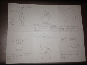
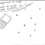
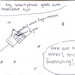
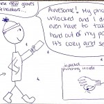
This story board shows the ease of picking up and then ending a phone call while wearing the smart gloves.

This story board shows the ease of picking up and then ending a phone call while wearing the smart gloves.

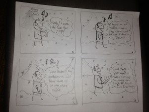
Toggling music is another action that would become much easier in the cold using the glove.

Toggling music is another action that would become much easier in the cold using the glove.

The final storyboard shows how the system could be used for the last task described, unlocking the phone.

System Sketches:

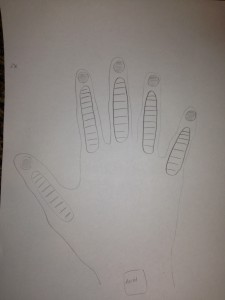
The glove contains flex and force sensors on each of the fingers and an accelerometer at the wrist in order to make it easy to read a variety of actions.

The glove contains flex and force sensors on each of the fingers and an accelerometer at the wrist in order to make it easy to read a variety of actions.

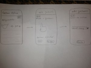
The glove could be controlled by an application on the phone that allows users to map gestures to tasks on the phone. Certain tasks would be premapped. Also, certain simple gestures would be preloaded as suggested gestures for users to map to functionality they may desire in order to deal with user concern about the difficulty of coming up with usable gestures.

The glove could be controlled by an application on the phone that allows users to map gestures to tasks on the phone. Certain tasks would be premapped. Also, certain simple gestures would be preloaded as suggested actions for users to map to functionality they may desire in order to deal with user concern about the difficulty of coming up with usable gestures.

Assignment 3: Craigslist

Michael (menewman@)
Neil (neilc@)
Andrew (acallaha@)

Site being evaluated: Craigslist

i. Most severe problems, how they fit into Nielsen’s heuristic categories, suggestions to fix UI, and how suggestions are related to heuristic categories

Craigslist’s functionality is based on a user’s ability to search for old posts and create new posts. Unfortunately, for both searching and posting, there is a lot of noise (H8). Users might find it difficult to find what they want when sifting through verbose postings. There are hints on how to post, but one has to actively seek them out in the help section. Additionally, there aren’t really any suggestions on how to search. If your search gets 0 hits, there aren’t really any recommendations on how to improve or alter your search — it’s a very binary response, matches or no matches. Between inefficient searching and confusing posting, the site can be difficult for a user to navigate.

Most of the searching problems fall under H7 and H8, with users frequently unable to filter out postings that are useless to them. For example, a user searching for an apartment cannot restrict basic categories, such as specific neighborhood, size, number of bedrooms/bathrooms, and lease terms/duration. A user searching for a job likewise cannot filter for even basic categories like expected salary. Craigslist could greatly accelerate the process of finding what you’re looking for by including feature lists specific to the category you’re browsing. This is something Amazon does very naturally: http://imgur.com/cGls5vK

In addition to the obvious aesthetic problems with the site, we took issue with the error messages received when trying to submit a post without certain required fields. There is apparently a minimum description length, but even after getting an error message the site didn’t specify how long the description needed to be for the post to get through. This violates not only Nielsen’s H9 (help users recognize, diagnose, and recover from errors), but also H5 (error prevention), since the site does not give prior warning that those fields are necessary to submit a post. A better way to handle this would be to explicitly spell out mandatory field requirements to users when they’re typing up their posts — and if a user does leave out a field or type an overly short post, Craigslist should be more specific about what needs to be corrected before the post can go through.

ii. Problems that were made easier to find/correct by list of Nielson’s heuristics

We believe that Nielson’s heuristics prepared us to find problems with aesthetics and error prevention/messages in particular. In general, the list of heuristics definitely allows a systematic approach to finding errors. H8, for example, provides insight into a fundamental usability concern of any system — reducing noise. The heuristics help you look for fundamental errors by creating broad and easily understandable categories for different types of problems.

iii. Usability problems not included under any of Nielsen’s heuristics, and proposed additional heuristics

Search functionality isn’t specifically included under any of the heuristics (more generally, the ability to find things on the site), although obviously the heuristics are broad enough to encompass the general idea. A new, more specific heuristic might be something like “ability to search intuitively and specifically for content.”

Also, the problem of terrible posts (expired, weird, incomprehensible) due to lack of oversight/moderation doesn’t fall neatly into a specific heuristic — perhaps there should be a heuristic for the curating of user-submitted content.

iv. Useful class discussion/final exam questions related to heuristic evaluation

Are some of the heuristics more intrinsically important than others? (On Craigslist, for example, it seems that aesthetics violations are by far the worst offenders, but does that mean that aesthetics are more important than, say, error prevention or similarity to the real world?)

Does the number of heuristics violated predict the usability (or lack thereof) of a site? (That is, if a site violates a bunch of different heuristics, but only slightly, is that better or worse than a different site that violates a single heuristic but violates it very badly?)

Links to individual heuristic assessments:
Neil:
https://docs.google.com/file/d/0BxcDocSdJf-JT1lZS2t3c0hJTm8/edit?usp=sharing

Michael:
https://docs.google.com/file/d/0B-Bz7iQadqOFZmlYOW0ybGRVZUU/edit?usp=sharing

Andrew:

Click to access P3.pdf

A3–Transloc

Group Members: Brian Huang, Krithin Sitaram, Prerna Ramachandra`

What were the most severe problems with the app/site? How do these problems fit
into Nielsen’s heuristic categories? What are some suggestions to fix the UI, and
how do your proposed changes relate to the heuristic categories?

  • No easy way to check when the next bus arrives (Android)–H7
    • After the first half hour we found such functionality does exist, but it involves clicking on a marker in the overlay that disappears when the screen is touched

→ Fix by having show/hide option

  • When multiple routes are selected, the map is too confusing to navigate–H8

→ Fix by displaying a message warning the user about cluttering the map

→ Having a legend to tell the user what each color code stands for.

  • Colour codes for routes not listed on the map–H6
    • And toggling to the routes list to figure out the colours takes too long because of data loading time

→ List color codes on the map

  • Cluttered UI, because current locations of buses always displayed (Android)–H8
    • This is distinct from the second criticism, but certainly is exacerbated. This is concerned with the fact that the large pins (representing buses) also clutters the interface.

→ Have an option to show/hide bus pins so map can be more easily navigated

  • No list of stops for each route (Android)–H6
    • Not what you’d expect of a transit app; it requires that you know which route you need before you use the app, which is detrimental to first-time users of the transit system.

→ Add list of stops when route is tapped on

  • ‘No route selected’ when you open the app / switch between agencies
  • No one uses Transloc to look at no routes, so this default is counterintuitive.

→ Use a smarter default, like displaying all routes

ii. Which problems, if any, were made easier to find (or potentially easier to correct)
by the list of Nielsen’s heuristics? (That is, if we had asked you to perform a
usability evaluation of the app/site without first discussing heuristics, what might
you have overlooked?)

  1. Flexibility and Efficiency of Use (H7): Transloc by default displays no routes on the map.  In order to view the status of any buses, the user must manually select them all (and on the Android does not even have a “select all” button).  This problem was easily recognized and corrected in light of the concern of H7 with efficiency of use by means of good defaults.
  2. User Control and Freedom (H3): Forcing the user to switch between route list and map reduces user control on the map and was made more obvious through H3
  3. Aesthetic and Minimalist Design (H8): Thinking about signal-to-noise ratios helped us realize that the clutter from displaying all routes was detrimental to the overall design and the efficiency of information communication.

iii. Did anyone encounter usability problems that seemed to not be included under
any of Nielsen’s heuristics? If so, what additional heuristics might you propose
for this type of application or site?

This was more of a general observation, in which some of the UI problems arose from have smaller buttons to click on, and not having an intuitively navigable interface. The problem of size of buttons, etc. seem to be specific to touchscreen interfaces like the iPhone/Android and having a heuristic specific for that might be helpful.

A useful heuristic for cross-platform applications (Transloc is available on Android, iPhone, and on the web) might ask whether features are consistent between platforms.  With respect to the Transloc app, the iPhone version seemed to be much more refined than the Android version, and both had some significant differences from the desktop version

iv. What might be some useful class discussion questions—or final exam questions—
related to heuristic evaluation?

Certain systems are aimed at a large body of users that are uninterested in reading documentation (example: Microsoft Word).  In such a case, what are some clever ways to embed documentation without giving the user a large body of text (that he/she will likely not read), while still conveying relevant information?

Individual Links:

Prerna Ramachandra (pramacha):
https://www.dropbox.com/s/as8qh90xtaz23vn/HCI_A3.pdf
Brian Huang (bwhuang):
https://www.dropbox.com/s/qeel7yige967898/HCI%20A3.pdf
Krithin Sitaram (krithin):
http://www.princeton.edu/~krithin/hci/A3.html

A3 – SCORE

Bereket Abraham, Horia Radoi, Thomas Truongchau, David Lackey, Jonathan Neilan

A3 – SCORE analysis

—————————————————–

i. Most severe problems with the site and which Nielsen’s heuristic it violates:

1 – problem: H9 – Informs of error, but no solution offered/ no information provided on how to fix it.

solution: Explain in more detail (like a question mark option) or inform the student of who to go to for more information/help

2 – problem: H2 – Difficulty in differentiating between pages: “Student Center” and “Main Menu” are two different pages, though for a student, the “Student Center” is treated like the main page. Also, the titles of the drop-down menus are non-intuitive.

solution: Have clearer links, and fewer options on the “main” page (offer question mark buttons that explain what the page is for)

3 – problem: H7 and H8 – Drop down menus have similarly named options that perform different tasks, but they all lead to the same page/link, and students have to continue to hunt and search. Also, there is no separation or marking between the most commonly used features and the rarely used features; all options are thrown together, and in small font to fit on one page.

Solution: Layout, place common options at top of page, and rare ones at bottom or not on main page at all, on another page/menu

4 – problem: H5 – Redundant “Enroll: Swap” option is unnecessary, and causes an error and has no error prevention for classes with conflicts or having less than 3 classes.

Solution: Better course enrollment design in general, just scrap the whole system and build from the ground up to be honest.

————————————————

ii. Problems made easier to find with Nielsen’s heuristics:

– We already knew what was annoying, but did not how to classify or quantify it.

H2: The “mismatch” between language from the system, and more intuitive language from the real world.

H1: We didn’t have any problems with this, but we would not have thought of it as an interesting issue without the heuristics list.

H8: We had a problem with the aesthetics, but hadn’t thought of the “minimalist” design concept as a way to improve visibility for a user.

H6: Recognition vs Recall is a good way to differentiate and classify problems we recognized with the system, we would otherwise not have known  how to effectively list.

——————————————-

iii. Usability problems not mentioned in Nielsen’s heuristics:

– Navigation of the website. More specifically, we consider the order and number of links one has to go through to hit a desired page or option is important enough to be its own heuristic.

————————————–

iv. Useful class discussion points and/or potential final exam questions:

– What heuristics matter more (or less) based on the different interactive systems being used (e.g. a college student management site like SCORE versus a video game)?

– To what extent does the severity of certain heuristics matter based on differing interactive systems?

– How do people react when a system is changed, particularly if they have adjusted to and gotten used to the “bad” form of the interactive system (i.e. if we changed SCORE right now, how would seniors react)?

————————————————–

Individual Posts:
Thomas – https://www.dropbox.com/s/ou7l44v6nrx0dpd/A3.pdf
David – https://www.dropbox.com/s/v8s5aayipqlku66/A3.pdf
Jonathan – https://www.dropbox.com/s/qogq09tvbea0heu/A3-Jonathan_Neilan.pdf
Horia – https://docs.google.com/document/d/10NysepSQYJACR_i5cTPeL6IomexX9agLb1gqmAr2WXw/edit
Bereket – https://www.dropbox.com/s/l9snfj5xhl6uvfl/severity.pdf


A3 – SCORE is the worst…

Individual Evaluations

Phil

Gene

Rodrigo

Most severe problems:

  • Login process – there are a variety of errors and options which can lead to dead-ends and complicated error messages from the system.  Most severe is the issue which tells the user that they are not authorized to login, and provides no exit from the page.  Error messages tend to be cryptic and unrelated to the actual error committed by the user.
  • Navigation issues – design hierarchy is frequently unclear, some features are very difficult to find (quintile rank). The layout is often misleading; for example, some academic features are not in the “My Academics” section.
  • Many problems involved a design that was neither aesthetic nor minimalist (H8). In order to fix these problems, SCORE designers should eliminate all non-essential menus, and streamline the page to be one top menu (easily hidden), and one layout panel that could display as a list, icons, etc., just like a file browser.


Problems made more apparent by list of Nielsen’s Heuristics:

  • Issues with being able to move back to a real main menu – made more apparent by H3.  Without this heuristic, a tester might not have thought to attempt an accidental navigation mistake that requires correction.
  • Issues with dismissing modals was made clear with H2-4. Most modals on the internet have an “X” button in the top right corner to dismiss it. In Score, you can only dismiss a modal by interacting with its contents.
  • H-9 Vague error messages, often with no way to go back
    • Some error messages offer multiple possible reasons for the error
    • Many times, there is no “Return to Home” button to allow the user to continue using the software normally.  Even when there is, the labeling is unclear and often leads the user to a menu other than the one they intended to navigate to.


Problems not listed under Neilsen’s Heuristics:

  • Good choice of general categories for navigation – for example, the user task of viewing an unofficial transcript could possibly fit under several menu options: “Academic Requirements”, “Course History”, “Grades”, or “View My Academic Record.”  Choosing good menu headings is essential to the design, as it enables simple navigation by the user.


Useful class discussion questions related to heuristic evaluation

  • Which heuristics seem the most important to user experience?
    • H-9 could be one possible answer – if the user cannot recover from an error, than it would cripple the usability of the product.
    • However, with respect to usability, H-3 appears especially important.  Having a muddled interface which is difficult to navigate will have a major negative effect on the user’s ability to benefit from the product.
  • Which heuristics are the easiest to violate?
    • H-7 could be very easily violated as more features are built.
    • H-10 could be violated frequently because it is easy to forgot to make a “help” page.
    • H-4 is very easy to violate, especially if there is a large product team.  Maintaining a consistent interface with unchanging standards can be quite difficult.
  • Which heuristic violations are the hardest to catch?
    • Anything involving errors, such as H-5. Some errors are very difficult to catch.  Along those lines, H-9 is difficult because the developers can have trouble predicting the errors a user will face.  Even after product testing, it is hard to predict what might go wrong, making it difficult to assist the user in those situations.

MTA website Heuristic Evaluatio

Names:

  • Dylan Bowman (dbowman)
  • Kiran Vodrahalli (knv)
  • Andrew Boik (aboik)
  • Avneesh Sarwate (asarwate)
  • Kuni Nagakura (nagakura)

Discussion:

  • We encountered several severe problems in our evaluation.  First, the home page is pretty cluttered with links and images that are not all entirely relevant.  This belongs to H8, as it is a aesthetic issue.  Another major problem was that there was no real help for using the website.  There was a section of FAQ’s but it was basically a list of question and answer pairs on what to do in specific real world situations riding MTA transportation. There was no real help beyond this. This belongs to H10.  One last severe problem was that there were multiple links labelled “schedule” on the home page that did not necessarily lead to the same information.  This is highly confusing.  This belongs to H4.  These could pretty easily be fixed by removing unnecessary interfaces on the home page, adding help documentation, and making the links more descriptive in what they access.
  • Problems that have to do with Help and Documentation (H10) were made more obvious having seen Nielsen’s Heuristics. As experienced users of basic websites, we don’t really require any documentation on how to actually use the website efficiently, however this is actually necessary for users with less experience on the internet.
  • One heurisitic we would propose to be added would be some kind of metric to determine how appropriate an interface is for a desired action or information.  For our system, some of the schedule links simply gave us a static table of times for all weeks and weekends that is extremely cluttered and difficult to read.  Another heuristic we want to propose would be the accuracy or correctness of the actual information.  In our situation, the pdf timetables for each transit line is not accurate–the table doesn’t account for local delays, etc.
  • Possible discussion/test questions: Matching a heuristic to a problem. Prioritizing different heuristic violations and justifying why you chose to focus on this problem and not another

Links:

Dylan – https://www.dropbox.com/s/34yylen10hgotsk/A3.pdf

Kuni – http://dl.dropbox.com/u/62526404/Heuristic%20Evaluation.pdf

Kirin – https://dl-web.dropbox.com/get/MTA_HeuristicEvaluation_cos436.pdf?w=AAB5dUrwPdc3JlGrq5JXS_dnEXtLfnQ8sq37-Pc8d_csIQ

Andrew – https://docs.google.com/file/d/0B9Qj9O_Quv4pempKRzlWLWZBa28/edit?usp=sharing

Avneesh – https://dl.dropbox.com/u/30768213/MTA_Review_Avneesh.pdf


A3 – Score


Names: Adam Suczewski, Matt Drabick, Eugene Lee, Green Choi
I.

  • “Other Academics”
    • This seems like a violation of “recognition rather than recall.” This principle states that the interface should minimize the user’s memory load by making information visible. The “other academics” tab contains some of the most important on the page yet it is extremely difficult and unintuitive to find.
    • One way to fix this would be to rearrange the home page in order to showcase the most important information. Making important links for grades and enrollment more prominent would improve
  • Information overly pagified
    • This is a severe Efficiency of Use issue, information is broken up into too many pages, and in a non intuitive way. It’s seems like information such as grades or quintile information would intuitively be found on the “My Academics” tab. Instead it is a link on the enrollment->term information tab. The ‘term information’ subtab is not visible when the user is on the “My Academics” tab, where they would expect to find such information
    • Tabs could be merged together to display more information at once. For example, the ‘My Academics’ tab is just a single page, while ‘Enroll’ has several subtabs. Therefore, all of these tabs could be placed in one row, with My Academics highlighted to show its greater importance
    • Term information and My Academics could also be merged together. They are closely related by purpose.
    • While minimalism is important, it is equally important to not hide relevant information
  • Favorites doesn’t work
    • When you click the ‘add to favorites’ button (located in two places), on a subpage of the Student Center, it adds the Student Center main page to favorites.
    • Making pages like ‘My Grades’ able to be linked from favorites would provide a quick way to provide increased navigation efficiency without changing the underlying design.
  • “My Class Schedule”
    • The user is not given access to their own course schedule, while the front page shows a list of classes and times.
    • This seems to violate H9: Help users recognize, diagnose and recover from errors
    • It seems like the only way to fix this would be to actually allow access to the class schedule it shows during an enrollment period.
  • Enrollment appointments
    • When you click “View my enrollment dates” on “Term Information” in “Enroll” is displays an error message “You do not have access to enrollment at this time.”
    • This would again be a violation of H9: Help users recognize, diagnose and recover from errors
    • Instead it could actually tell you your valid enrollment dates or direct you to a Princeton website that shows when you can enroll in classes.


  • Lack of User Control and Freedom/Recovering from Errors
    • SCORE very frequently lacked simple, intuitive options for returning to previous menus or the main “Student Center” menu, especially when user interaction flow came to a halt in the case of errors or invalid requests.
      • This could be easily solved with simple “Return” or “Back” buttons on error screens or halts in user interaction stages.

II. Nielsen’s Heuristics

– The Help and Documentation problem was made much easier to find by Nielsen’s heuristics. We would probably not have thought to analyse this aspect were it not for Nielsen’s guidelines. We are all very accustomed to seeing unclear error messages on Score so we may not have second guessed them.


– Nielsen’s heuristics on Error Prevention as well as Recognition, Diagnosis, and Recovery in handling errors addressed issues that we may have easily overlooked, such as the ease of recovering from an error or issue on the site and the ease returning to normal interaction.

III. Non-Nielsen Problems
Privacy of information did not seem to really fall under any of the 10 heuristics. It seems like sensitive information (like SSN) was displayed on pages where the user would not expect that type of information to be displayed.

Likewise, the fact that Score is closed every night between 2am and 7am is not something a user should expect from a convenience store, not a website.

The site often has trouble allowing users to log in, giving the error message: “You are not authorized to log in to PeopleSoft HCM/CS”. This doesn’t seem to fit into an exact category, as one expects a website to give them consistent results when they try to log in and they are authorized.

IV. Useful Heuristic Questions
– A discussion of the most common and the most easy to fix heuristic problems may be useful. It may be useful to compile a sort of FAQ document for website projects, etc.
– A good final exam question may be to provide a screenshot of a website/app with some obvious and not-so-obvious heuristic errors, allowing students to highlight and explain them using Nielsen’s heuristics.
– Non-Nielsen problems may also be added for additional credit.
– A final exam question may be to provide improvable examples of interfaces and to ask for easy or creative ways to improve them given background knowledge of the user base and the nature of the service.

Links to our blogs:
Adam Suczewski: www.princeton.edu/~asuczews/A3.pdf
Green Choi: https://dl.dropbox.com/u/34418361/greenheuristics.pdf
Matthew Drabick: https://www.dropbox.com/s/8ozjibpzpdzq9y1/mdrabick%20-%20A3.pdf
Eugene Lee: http://www.princeton.edu/~eugenel/eugenel_A3.pdf