A3 – TransLoc App

Stephen Cognetta
Jean Choi
Karena Cai

1. Most Severe problems with the app/site?
a. Error Prevention
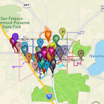
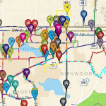
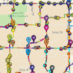
When clicking too many lines/routes, the app will freeze and subsequently crash. This happened for over 10 lines. This is clearly within heuristic 5 – this error could have been prevented by the app. A suggestion for fixing this problem would be either to alert the user if they have picked too many lines, or to allow the app to accept a greater number of lines without crashing. This would therefore prevent users from picking too many bus lines than they should.
b. Consistency and Standards (H4)
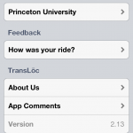
The symbols are not very intuitive and do not allow the user to understand what functionalities correspond to the symbols. For instance, the magnifying glass shows the user the stops as opposed to some button that says: show stops. Also, the less than and greater than sign <> takes you back to your previous screen (after you have altered the map in some way). The user has no idea of the button’s functionality until he/she clicks on the button. There are also many useful functionalities of the app, but the features are not well documented and do not abide by standards of most interfaces, and thus can easily go unnoticed and unused. A solution to this problem might be introducing some legend or using short words and phrases that allow the user to have a better understanding of the functionalities of different buttons. These changes would introduce a standard for the application, and thus, fall under the consistency and standards heuristic. 

2. The biggest issue was the consistency and standards. Oftentimes throughout using the app, there would be an inconsistency with the use of symbols and characters. This problem is elaborated on above, in section 1b, and we probably would not have paid such close attention to this if we hadn’t kept the Nielsen standards in mind. One additional error that we would not have found otherwise would be the error that we found – that when adding too many lines, the app crashed. We wouldn’t have known to add so many lines if it weren’t for the heuristic of error prevention. Keeping this heuristic in mind, we tried to generate errors throughout our use of the app, and uncovered this important flaw.

Furthermore, we all knew in a broad sense why the app was pretty faulty, but Nielsen’s heuristics gave us a means to evaluate the website and pinpoint exactly what regions the app was lacking in. For instance, we all knew the app was pretty hard to use, but by looking through Nielsen’s heuristics, we could determine the reason why it was hard to use. Therefore, Nielsen’s heuristics gave us a criteria we could use to evaluate the app.


3. a. How accessible is an application to different people– are certain demographics excluded from the functionality of the app? (no wifi, no bluetooth, etc.)
b. How accessible is an application to people with limitations – such as color-blindness, deaf people, etc.

4. Useful Class Discussion Questions
– What are different methods you can use to improve violations of Nielsen’s heuristics?
– What are the particular problems associated with different platforms in meeting Nielsen’s heuristics? (i.e. mobile, computer, etc.)
– In which cases can the heuristics be violated? Perhaps there are situations where implementing the heuristics prove to be unnecessary/incorrect?
Exam questions:
– Given a particular interface, name five or more different issues with the Neilsen heuristics for the given interface.
– Rank the severity of several given heuristic violations

– Karena Cai: https://dl.dropbox.com/u/85418085/Cai_KarenaA3.pdf
– Jean Choi: https://dl.dropbox.com/u/85418085/JeanChoiHeuristicEvaluation.pdf
– Stephen Cognetta: https://dl.dropbox.com/u/15039217/CognettaAssignment3.pdf


A3: SCORE

Kevin Lee
Collin Stedman

i. Most severe problems:
-There is little consistency and high redundancy with navigation options.  Score presents you with an array of different links, tabs, dropdown menus, buttons, and expandables as navigate options.  Some two navigation options lead to the same page.  We even found a page that had two buttons that led to the same page.  Other pages are exclusively opened through a single navigation option.  Some links open pages while others open pop-ups.  The meaning of various buttons was frequently unclear, as the designers of SCORE would often fall back on such options as “OK” and “Cancel” when more expressive options were appropriate. The result is an extremely confusing experience due to violation of H4, consistency and standards, and frequent cases of nonessential, redundant features due to violation of H8, aesthetic and minimalist design.
-It is very hard to find what you want in Score.  This is because, in addition to issues with navigation options as previously mentioned, some features are often hidden or placed in very unintuitive places.  This is terrible design and a violation of H7, which calls for designing with efficiency of use in mind.  There are also frequent cases of mismatch between the users’ language and Score’s chosen vocabulary.  It, for example chooses terms such as “quintile ranking” and “BIP,” thus a violation of H2.  This problem is magnified with the lack of any useful help and documentation which is a violation of H10.  Ultimately, SCORE relies on its users to remember how to navigate through its unintuitive interface, thus violating H6.

Fixes:
-Place features in intuitive places.  It would be much easier to navigate Score if cases like GPA being in “course history” instead of “grades” did not happen.  This would improve the website based on H7, efficiency of use.
-Change the text of various buttons in SCORE to make their functionality more immediately obvious. This would improve the website based on H1, visibility of system status, as well as H4, consistency and standards.
-Warn the user that the system will automatically log out of SCORE before it does so. Include a timer which counts down to the logout. This would improve the website based on H1, visibility of system status.
-Change the interface to fill the browser screen. This change should make SCORE much easier for the user to read and navigate. This would improve the website based on H8, aesthetic and minimalist design.

ii. Problems made easier to find through Nielsen’s heuristics:
-Would not have even thought of looking for help or documentation if it was not for Nielsen’s heuristics since usually interfaces are good enough to survive without this.
-Would not have thought of looking for mismatches between user’s language and system’s language either since terms that I don’t understand seem to be an everyday occurrence. It also wouldn’t have occurred to me that button labels need to be more expressive than “OK” and “Cancel.”
-Would not have occurred to me to critique the website for its lack of minimalist design. I see confusing interfaces all the time, but I am taught to justify their complicated nature by expecting that it is an unavoidable side-effect of complicated functionality. For example, people who use GIMP likely ignore the poor interface because they know that GIMP is very powerful and rich in features.

iii. Problems that are not included in Nielsen’s heuristics:
-Availability is an important system heuristic that Nielson does not cover.  Score is not available from 2AM to 7AM and often has certain pages returning a “This page is no longer available” message.  Log in problems are also notoriously common with Score.

iv. Discussion Questions:
-Can somebody make the perfect interface just by following these Nielsen’s heuristics, or is there something else that is important?
-What is the priority ranking of each of Nielsen’s heuristics?
-What would Nielsen make of systems and interfaces which intentionally hide expert-level features and implementation details from the user? Think of command-line tools for databases with GUIs.

Exam Questions:
-Provide an example violation of a heuristic and ask the student to categorize the violation.
-Give three suggestions for how to improve the interface seen below.

PDF’s:
Kevin:
http://dl.dropbox.com/u/801068/Kevin%20A3.pdf
Collin:
http://dl.dropbox.com/u/52417178/Collin%20Stedman%20A3.pdf

Assignment 3: Craigslist

Michael (menewman@)
Neil (neilc@)
Andrew (acallaha@)

Site being evaluated: Craigslist

i. Most severe problems, how they fit into Nielsen’s heuristic categories, suggestions to fix UI, and how suggestions are related to heuristic categories

Craigslist’s functionality is based on a user’s ability to search for old posts and create new posts. Unfortunately, for both searching and posting, there is a lot of noise (H8). Users might find it difficult to find what they want when sifting through verbose postings. There are hints on how to post, but one has to actively seek them out in the help section. Additionally, there aren’t really any suggestions on how to search. If your search gets 0 hits, there aren’t really any recommendations on how to improve or alter your search — it’s a very binary response, matches or no matches. Between inefficient searching and confusing posting, the site can be difficult for a user to navigate.

Most of the searching problems fall under H7 and H8, with users frequently unable to filter out postings that are useless to them. For example, a user searching for an apartment cannot restrict basic categories, such as specific neighborhood, size, number of bedrooms/bathrooms, and lease terms/duration. A user searching for a job likewise cannot filter for even basic categories like expected salary. Craigslist could greatly accelerate the process of finding what you’re looking for by including feature lists specific to the category you’re browsing. This is something Amazon does very naturally: http://imgur.com/cGls5vK

In addition to the obvious aesthetic problems with the site, we took issue with the error messages received when trying to submit a post without certain required fields. There is apparently a minimum description length, but even after getting an error message the site didn’t specify how long the description needed to be for the post to get through. This violates not only Nielsen’s H9 (help users recognize, diagnose, and recover from errors), but also H5 (error prevention), since the site does not give prior warning that those fields are necessary to submit a post. A better way to handle this would be to explicitly spell out mandatory field requirements to users when they’re typing up their posts — and if a user does leave out a field or type an overly short post, Craigslist should be more specific about what needs to be corrected before the post can go through.

ii. Problems that were made easier to find/correct by list of Nielson’s heuristics

We believe that Nielson’s heuristics prepared us to find problems with aesthetics and error prevention/messages in particular. In general, the list of heuristics definitely allows a systematic approach to finding errors. H8, for example, provides insight into a fundamental usability concern of any system — reducing noise. The heuristics help you look for fundamental errors by creating broad and easily understandable categories for different types of problems.

iii. Usability problems not included under any of Nielsen’s heuristics, and proposed additional heuristics

Search functionality isn’t specifically included under any of the heuristics (more generally, the ability to find things on the site), although obviously the heuristics are broad enough to encompass the general idea. A new, more specific heuristic might be something like “ability to search intuitively and specifically for content.”

Also, the problem of terrible posts (expired, weird, incomprehensible) due to lack of oversight/moderation doesn’t fall neatly into a specific heuristic — perhaps there should be a heuristic for the curating of user-submitted content.

iv. Useful class discussion/final exam questions related to heuristic evaluation

Are some of the heuristics more intrinsically important than others? (On Craigslist, for example, it seems that aesthetics violations are by far the worst offenders, but does that mean that aesthetics are more important than, say, error prevention or similarity to the real world?)

Does the number of heuristics violated predict the usability (or lack thereof) of a site? (That is, if a site violates a bunch of different heuristics, but only slightly, is that better or worse than a different site that violates a single heuristic but violates it very badly?)

Links to individual heuristic assessments:
Neil:
https://docs.google.com/file/d/0BxcDocSdJf-JT1lZS2t3c0hJTm8/edit?usp=sharing

Michael:
https://docs.google.com/file/d/0B-Bz7iQadqOFZmlYOW0ybGRVZUU/edit?usp=sharing

Andrew:

Click to access P3.pdf

A3 – SCORE

Bereket Abraham, Horia Radoi, Thomas Truongchau, David Lackey, Jonathan Neilan

A3 – SCORE analysis

—————————————————–

i. Most severe problems with the site and which Nielsen’s heuristic it violates:

1 – problem: H9 – Informs of error, but no solution offered/ no information provided on how to fix it.

solution: Explain in more detail (like a question mark option) or inform the student of who to go to for more information/help

2 – problem: H2 – Difficulty in differentiating between pages: “Student Center” and “Main Menu” are two different pages, though for a student, the “Student Center” is treated like the main page. Also, the titles of the drop-down menus are non-intuitive.

solution: Have clearer links, and fewer options on the “main” page (offer question mark buttons that explain what the page is for)

3 – problem: H7 and H8 – Drop down menus have similarly named options that perform different tasks, but they all lead to the same page/link, and students have to continue to hunt and search. Also, there is no separation or marking between the most commonly used features and the rarely used features; all options are thrown together, and in small font to fit on one page.

Solution: Layout, place common options at top of page, and rare ones at bottom or not on main page at all, on another page/menu

4 – problem: H5 – Redundant “Enroll: Swap” option is unnecessary, and causes an error and has no error prevention for classes with conflicts or having less than 3 classes.

Solution: Better course enrollment design in general, just scrap the whole system and build from the ground up to be honest.

————————————————

ii. Problems made easier to find with Nielsen’s heuristics:

– We already knew what was annoying, but did not how to classify or quantify it.

H2: The “mismatch” between language from the system, and more intuitive language from the real world.

H1: We didn’t have any problems with this, but we would not have thought of it as an interesting issue without the heuristics list.

H8: We had a problem with the aesthetics, but hadn’t thought of the “minimalist” design concept as a way to improve visibility for a user.

H6: Recognition vs Recall is a good way to differentiate and classify problems we recognized with the system, we would otherwise not have known  how to effectively list.

——————————————-

iii. Usability problems not mentioned in Nielsen’s heuristics:

– Navigation of the website. More specifically, we consider the order and number of links one has to go through to hit a desired page or option is important enough to be its own heuristic.

————————————–

iv. Useful class discussion points and/or potential final exam questions:

– What heuristics matter more (or less) based on the different interactive systems being used (e.g. a college student management site like SCORE versus a video game)?

– To what extent does the severity of certain heuristics matter based on differing interactive systems?

– How do people react when a system is changed, particularly if they have adjusted to and gotten used to the “bad” form of the interactive system (i.e. if we changed SCORE right now, how would seniors react)?

————————————————–

Individual Posts:
Thomas – https://www.dropbox.com/s/ou7l44v6nrx0dpd/A3.pdf
David – https://www.dropbox.com/s/v8s5aayipqlku66/A3.pdf
Jonathan – https://www.dropbox.com/s/qogq09tvbea0heu/A3-Jonathan_Neilan.pdf
Horia – https://docs.google.com/document/d/10NysepSQYJACR_i5cTPeL6IomexX9agLb1gqmAr2WXw/edit
Bereket – https://www.dropbox.com/s/l9snfj5xhl6uvfl/severity.pdf


A3 – SCORE is the worst…

Individual Evaluations

Phil

Gene

Rodrigo

Most severe problems:

  • Login process – there are a variety of errors and options which can lead to dead-ends and complicated error messages from the system.  Most severe is the issue which tells the user that they are not authorized to login, and provides no exit from the page.  Error messages tend to be cryptic and unrelated to the actual error committed by the user.
  • Navigation issues – design hierarchy is frequently unclear, some features are very difficult to find (quintile rank). The layout is often misleading; for example, some academic features are not in the “My Academics” section.
  • Many problems involved a design that was neither aesthetic nor minimalist (H8). In order to fix these problems, SCORE designers should eliminate all non-essential menus, and streamline the page to be one top menu (easily hidden), and one layout panel that could display as a list, icons, etc., just like a file browser.


Problems made more apparent by list of Nielsen’s Heuristics:

  • Issues with being able to move back to a real main menu – made more apparent by H3.  Without this heuristic, a tester might not have thought to attempt an accidental navigation mistake that requires correction.
  • Issues with dismissing modals was made clear with H2-4. Most modals on the internet have an “X” button in the top right corner to dismiss it. In Score, you can only dismiss a modal by interacting with its contents.
  • H-9 Vague error messages, often with no way to go back
    • Some error messages offer multiple possible reasons for the error
    • Many times, there is no “Return to Home” button to allow the user to continue using the software normally.  Even when there is, the labeling is unclear and often leads the user to a menu other than the one they intended to navigate to.


Problems not listed under Neilsen’s Heuristics:

  • Good choice of general categories for navigation – for example, the user task of viewing an unofficial transcript could possibly fit under several menu options: “Academic Requirements”, “Course History”, “Grades”, or “View My Academic Record.”  Choosing good menu headings is essential to the design, as it enables simple navigation by the user.


Useful class discussion questions related to heuristic evaluation

  • Which heuristics seem the most important to user experience?
    • H-9 could be one possible answer – if the user cannot recover from an error, than it would cripple the usability of the product.
    • However, with respect to usability, H-3 appears especially important.  Having a muddled interface which is difficult to navigate will have a major negative effect on the user’s ability to benefit from the product.
  • Which heuristics are the easiest to violate?
    • H-7 could be very easily violated as more features are built.
    • H-10 could be violated frequently because it is easy to forgot to make a “help” page.
    • H-4 is very easy to violate, especially if there is a large product team.  Maintaining a consistent interface with unchanging standards can be quite difficult.
  • Which heuristic violations are the hardest to catch?
    • Anything involving errors, such as H-5. Some errors are very difficult to catch.  Along those lines, H-9 is difficult because the developers can have trouble predicting the errors a user will face.  Even after product testing, it is hard to predict what might go wrong, making it difficult to assist the user in those situations.

MTA website Heuristic Evaluatio

Names:

  • Dylan Bowman (dbowman)
  • Kiran Vodrahalli (knv)
  • Andrew Boik (aboik)
  • Avneesh Sarwate (asarwate)
  • Kuni Nagakura (nagakura)

Discussion:

  • We encountered several severe problems in our evaluation.  First, the home page is pretty cluttered with links and images that are not all entirely relevant.  This belongs to H8, as it is a aesthetic issue.  Another major problem was that there was no real help for using the website.  There was a section of FAQ’s but it was basically a list of question and answer pairs on what to do in specific real world situations riding MTA transportation. There was no real help beyond this. This belongs to H10.  One last severe problem was that there were multiple links labelled “schedule” on the home page that did not necessarily lead to the same information.  This is highly confusing.  This belongs to H4.  These could pretty easily be fixed by removing unnecessary interfaces on the home page, adding help documentation, and making the links more descriptive in what they access.
  • Problems that have to do with Help and Documentation (H10) were made more obvious having seen Nielsen’s Heuristics. As experienced users of basic websites, we don’t really require any documentation on how to actually use the website efficiently, however this is actually necessary for users with less experience on the internet.
  • One heurisitic we would propose to be added would be some kind of metric to determine how appropriate an interface is for a desired action or information.  For our system, some of the schedule links simply gave us a static table of times for all weeks and weekends that is extremely cluttered and difficult to read.  Another heuristic we want to propose would be the accuracy or correctness of the actual information.  In our situation, the pdf timetables for each transit line is not accurate–the table doesn’t account for local delays, etc.
  • Possible discussion/test questions: Matching a heuristic to a problem. Prioritizing different heuristic violations and justifying why you chose to focus on this problem and not another

Links:

Dylan – https://www.dropbox.com/s/34yylen10hgotsk/A3.pdf

Kuni – http://dl.dropbox.com/u/62526404/Heuristic%20Evaluation.pdf

Kirin – https://dl-web.dropbox.com/get/MTA_HeuristicEvaluation_cos436.pdf?w=AAB5dUrwPdc3JlGrq5JXS_dnEXtLfnQ8sq37-Pc8d_csIQ

Andrew – https://docs.google.com/file/d/0B9Qj9O_Quv4pempKRzlWLWZBa28/edit?usp=sharing

Avneesh – https://dl.dropbox.com/u/30768213/MTA_Review_Avneesh.pdf


A3: Heuristic Analysis of SCORE

Group: Joseph Bolling, Evan Strasnick, Jacob Simon, Farhan Abrol

Individual Analyses:
Jacob Simon and Evan Strasnick
Farhan Abrol
Joseph Bolling

i. Most Severe Problems

1. Login Failure, Login Hours, and Login Timeout

  • Heuristics violated: H1, H3, H5, H9
  • Description: We identified two related problems with the SCORE login process. First, users frequently have trouble signing in at all, it throws an error message or open up another window with the same signin screen without any prompts. Secondly , the login is restricted to certain hours, and the error message given is just “invalid signon time” which conveys no information about the reason why it is an invalid time.
    Timeout when navigating to see classes – Information about classes is scattered between Registrars page,Score, and course reviews. In the time it takes to navigate back and forth, SCORE times out the session and you need to sign in again
  • Suggestions: Simplify the login process with more detailed error messages, and navigation links to more information about them. When SCORE signs out automatically, it should have a link to sign in again, instead of a CLOSE WINDOW button.

Screen Shot 2013-03-12 at 3.48.31 PM

2. Navigation

  • Heuristics violated: H3, H4, H7, H8
  • Description: There are multiple kinds of navigation available. There are dropdown menus for going to grades etc. There is the top menu bar that has navigation links that don’t necessarily make any sense (Self Help?)
  • Suggestions: Unify navigation into one consistent format (dropdowns/navigation bar) so that information has a logical flow.

ii. Problems made easier to find 
Problems involving H5 and H9 were made easier to find. From first glance, it is hard to recognize where errors might occur. Similarly, H1 is not always thought about but equally important because it emphasizes the usefulness of feedback to the user. If you think about problems that users are likely to have beforehand, it makes easier to identify weak spots in the interface.

iii. Problems not identified through Neilen’s heuristics 
We listed the “Invalid Logon Time” error as a significant problem above, but another issue we had with the logon time restrictions was the fact that SCORE is locked down for a slightly longer period on Wednesdays. We find this issue confusing and inconveniencing, but since it pertains more to the behavior of SCORE itself rather than the usability of the interface, we had difficulty classifying it with the interface heuristics.

Similarly, we had difficulty classifying other features that were annoying, but which stemmed from fundamentally necessary security concerns-the 15 minute timed logoff is inconveniencing and very annoying, but it was implemented regardless of this fact because it makes SCORE more secure. The same is true of the convoluted sign-on process that requires at least three pieces of user information. While we understand the need for such features and don’t see a way to solve them using mere corrections to SCORE’s interface, we wonder if perhaps there is a change that could be implemented on a more fundamental level that would make them unnecessary. For now, we have difficulty fitting them within the framework of Nielson’s heuristics.

Possible discussion questions

  • differentiate between similar heuristics
  • classify problems with a system as either UI problems (fitting under the heuristics) and functionality/system problems
  • propose changes to an example violation of each heuristic

A3 – Score

Names:

Osman Khwaja, Jae Lee, Prakhar Agarwal

Links to Individual Posts

Jae Lee – Jae’s Notes

Osman Khwaja – Osman’s Notes

Prakhar Agarwal – Prakhar’s Notes

Discussion:

Question 1:
– Menu system is convoluted and not representative to the high volume usage. The most often used thing (the pulldown menu) takes up very little space whereas things that one almost never considers (contact info, hold, more services) takes up a larger majority of the screen.

– Navigation is wacky. The student center is listed under multiple spots (Favorites, self service, and main menu, and has its own link). It is extremely redundant and not intuitive to try to navigate through this site without practice.

– Fix the display usage problem. The pull down menu (which is used most of the time) should be displayed prominently on the screen while things like holds and campus connections should be minimized or something.

– Clean up the navigation by including a top-level menu which is highlighted. It would allow you switch into categories that makes your sub-options easier to find. For example, you should be able to select Courses which would then let you select add, swap, and drop. You should also be able to switch into Payroll, which would give you access to the variety of options that are currently hard to find.

– Get rid of the home page, and potentially make the Student Center the home page, after making some UI updates.

Question 2
For the most part, we found issues which we then matched to Nielsen’s heuristics. However, in some cases it did help to have the list in front of us. In particular, I only thought of the problem with the error message in the add/drop/swap section after reading about how a proper error message should be constructed.

Question 3
The standards are pretty solid, but we would have some improvement for those. Some of the heuristics are pretty general, and they apply to a wide variety of different errors. For example, the consistency and standards is a pretty broad option. One way to break it down would be to make new heuristics that say “Follows current, successful trends for layouts of presented options” as well as a “Presented options operate as described” to replace the “Consistency and Standards” one.

Question 4
– Does the heuristics system properly describe all the errors of all systems or do the nature of some application interfaces correspond only to a certain set of issues?

– Do you think the heuristics are too broad or too specific? Explain.

Assignment 3 – SCORE – Mario Alvarez, Dillon Reisman, Abbi Ward

Names: Mario Alvarez, Dillon Reisman, Abbi Ward

NetIDs: mmcgil, dreisman, aaward

Interface: SCORE

Links to Individual Posts:

Question 1 Most severe problems:

  • You don’t know where to find information and finding it is not natural
    • Division between “Enroll” and “Academics” headings doesn’t make very much sense
    • Quintile rank is under “term information” subheading
    • GPA and Quintile rank are NOT under grades information
    • H2
      • The SCORE navigation organization doesn’t match what people would think it should be.
  • Fixes
    • Information should be consolidated. It is unnecessarily spread out in arbitrary categories and these divisions are not necessary.
      • For example, quintile rank and GPA could be combined with all other grade information.
    • Information should not be unnecessarily redundant
      • For example, the information under “General Education Requirements” and “Academic Requirements” is partially the same. General Education Requirements is not necessary.
  • SCORE is ugly
    • It uses only a small portion of the screen.
      • H8
    • It doesn’t allow customization nor does it automatically give easy access to information people usually want
      • H8
    • There are no icons, so users have to rely on recall and this is also non-standard because most programs and sites use icons.
      • H6
    • Menus are used inconsistently. They’re normally used to select something but here they’re used as a link
      • H4
  • Fixes
    • Redesign the interface (There is no easy fix here!)
    • Use icons
      • For example, a picture of a B+ could symbolize grades
    • Stop using weird combinations of drop-down menus that are also links
    • Use menus and links consistently (H4)

Question 2

SCORE’s help and documentation information does in fact exist! However, it is very difficult to find, is all textual, and contains no screenshots. We would not have found this if we didn’t have these heuristics (H10) guiding us. We also found an error in viewing Academic records. (To replicate the error, go to View My Academic Record, generate a report, click the back button in the browser, and then go view it again. SCORE takes you to a page that says “This Page is Not Available”). If we hadn’t been exploring the various paths in SCORE’s interface and considering H5, we might not have considered this an unnecessary error.

Question 3

We were mostly able to categorize usability problems under one of these heuristics. The redundant information problem on SCORE doesn’t really fall under a category easily, and generally these heuristics may miss some aspects of organizing content. Our additional heuristic might be “minimalist content”. Additionally, we feel that it should be easy to have a mental model of the how the interface works. This might be a sub-heuristic of H2; content should be displayed and organized in a natural way and in a way that aligns with how people organize information in their heads.

Question 4

  • Can we create general rules for creating hierarchies of content?
    • How deeply nested can an informational website be before it becomes cumbersome? Why?
  • Exam question: Give an example interface and have students evaluate it according to a smaller set of heuristics
  • Break down a given heuristic into sub-heuristics.
  • Prioritize the heuristics based on the severity of problems typically associated with them
    • For instance, H2 may be more important than H10 in many cases

A3: Heuristic Evaluation

Names: Colleen, Vivian, Alan

1. What were the most severe prob­lems with the app/site? How do these prob­lems fit into Nielsen’s heuris­tic cat­e­gories? What are some sug­ges­tions to fix the UI, and how do your proposed changes relate to the heuris­tic categories?

  • Most severe problems:
    • No documentation (or tutorial) for how to use it
    • Not intuitive (have to switch between tabs)
    • No consistency across different platforms (Android/iPhone)
    • Can’t choose a stop and have to choose a route
    • Not useful for planning travel, can only pick one transit system
    • Really hard to figure out stops (on Android, can’t even see route intially, don’t know you can click on it)
    • Multiple routes were in the same color.
  • This application violates almost all Nielson’s categories except:
    • Doesn’t violate “Aesthetic design and Simplicity” (H8) but the simplicity comes at a sacrifice of functionality and instruction.
    • Also doesn’t violate “Match between system and real world” (H2) because its mostly based off of conventions from other technologies, and it relies on understood icons used already in Google maps and other technologies.
    • Did not violate “Help users recognize, diagnose, and recover from errors” (H9) because there were no error messages.
  • Suggestions to fix UI:
    • Make stops more visible (H6/H7)
    • Make specific stops searchable (H7)
    • Have all the routes initially selected so that the user doesn’t have to click and extra button when the map loads and nothing shows up (iPhone version) (H7)
    • Some sort of tutorial about how to get important information (H10)
    • Make sure routes are all different colors (H4) and that the routes are clearly distinguishable (H5)
  • Make changing the transit system easier, instead of needing to switch to the “Settings” tab (iPhone) (H3)
  • Doesn’t save previous states (which routes already selected) when switching between tabs or transit systems (H6/H7)
  • Doesn’t notify user when the times until the bus arrives at stop are updated (H1)
  • Announcements aren’t reflected in the route data or on the map (H5/H7)

2. Which problems, if any, were made easier to find (or potentially easier to correct) by the list of Nielsen’s heuristics?

  • Would not noticed the problems with loading data looking error (H5) and wouldn’t have been as bothered by lack of documentation (H10). Overall, the problems with the interface were pretty obvious and glaring. Without Nielson’s heuristics, probably would not have tried to access other transit systems (maybe would have just looked at Princeton ones) which helped identify user control and freedom (H3), recognition and recall (H6), and consistency and standards (H4).

3. Did anyone encounter usability problems that seemed to not be included under any of Nielsen’s heuristics? If so, what additional heuristics might you propose for this type of application or site?

  • Speed factor (each tab needs to load) is not included in the user heuristics but is kind of annoying for the user and definitely affects your experience (esp. on Android). For any time-relevant application, need to consider performance time.
  • For mobile, efficiency of interaction space (phone is considerably smaller than desktop) and should be considered. For example, choosing all routes clutters small screen with many colors/dots/icons (confusing). Can be considered part of Aesthetics (H8), but maybe should be a separate heuristic.

4. What might be some useful class discussion questions—or final exam questions— related to heuristic evaluation?

  • What would be most important heuristics to prioritize?
  • Would the important heuristics change depending platform (mobile vs. computer)?
  • Would the way you evaluate these heuristics differently depending on the time period (now vs. 1980)?
  • Should there be any heuristics added (like speed of interface)?

Individual Heuristic Evaluation:

View Vivian’s observations here.

View Colleen & Alan’s (worked together due to lack of computer) observations here.