Group 11: Don’t Worry About It
Amy
Daniel
Jonathan
Krithin
Thomas
A one-sentence description of your project:
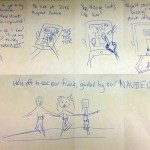
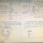
The NavBelt will help navigating around unfamiliar places safer and more convenient.
Hyper-links to all previous project assignment blog posts:
P1 – http://amyzhou.ca/wordpress/?p=5
P3 – http://blogs.princeton.edu/humancomputerinterface/2013/03/27/p3-navbelt/
P4 – http://blogs.princeton.edu/humancomputerinterface/2013/04/08/p4-navbelt-lo-fidelity-testing/
(also with P5) – http://www.youtube.com/watch?v=dc86q3wBKvI&feature=youtu.be
P6 – http://blogs.princeton.edu/humancomputerinterface/2013/05/07/p6-navbelt-pilot-usability-test/
Video Demo:
– http://www.youtube.com/watch?v=NJAR1AaNVUA&feature=em-share_video_user
Bullet list of changes since P6:
-
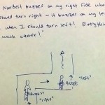
We changed the signalling protocol between the phone and the the Arduino
-
We used to signal 8 discrete desired heading, at 8 different specific frequencies, but have changed that to a continuous mapping between heading and frequency.
-
This allows the app to specify directions much more accurately.
-
-
We added a compass calibration routine, activated via a button in the phone UI.
-
This turned out to limit the accuracy of the directions we produced earlier.
-
How and why our goals/design evolved over the semester:
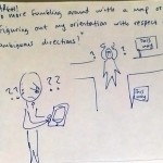
Our overall goal — to allow the user to navigate without constantly looking at a phone screen — has remained the same. However, we realized in the course of our testing that it is better for us to aim to complement the use of a visual map on the phone screen than to completely replace it. This is because some users still would like the map for information about their absolute position and the remaining distance to their destination, which is not easily learned through a tactile interface. In addition, we changed our final task from “reassure user that they’re on the right path” to “know when you’ve arrived”, because this was more concrete and far more measurable.
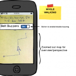
We have also made some concessions to practicality over the course of the semester. For instance, while we originally intended to use a BlueTooth connection between the Arduino and the phone, using an audio cable proved to be feasible and cheaper, and after realizing how much work installing each vibrating motor was going to involve, we ended up using only four buzzers instead of eight.
We also flirted with a few changes that we did not stick with. For a while we considered building a web app rather than an Android app, an idea which we discarded because of the difficulty in playing audio from a web page on the fly with low enough latency. We also considered building a induction coil for bidirectional communication between the Arduino and phone, but this turned out to be both impractical and unnecessary.
Critical evaluation of our project:
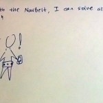
With further iteration, the NavBelt can definitely be a useful real-world system. There is a clear use case for this device, as it provides directions to a user while being less demanding of the user’s attention, and our testers appreciated that aspect of the system. Users testing the last iteration of our prototype were able to follow its directions with just a few seconds of explanation and very minimal intervention from us, indicating that we have tackled most of the major usability hurdles at this point. One of the as-yet untested aspects of the system is whether users will be able to put on and take off the belt themselves, since we always helped them with this in testing, but we expect that with a slightly more robust version of the belt users will be able to quickly learn to do this right.
In addition, we were able to build this very cheaply, even though we were building a first prototype and therefore were prioritizing speed of prototyping over budget. The main expenses are the compass and the Arduino; if we were to produce this commercially we could use a simpler (and cheaper) chip than the Arduino. With economies of scale, we would probably be able to produce this for under $50, which is not bad for cool new tech.
We have learned several things about the application space as a result of this project. One thing we learned is that obtaining accurate geo-location data is a challenge, as the resolution of the co-ordinates obtained through tools like Google maps is only good enough for navigation in a vehicle, not fine-grained enough to give accurate turning directions for a user on foot. We had to manually measure the coordinates of our waypoints using a phone GPS to get around this.
From the user testing of our implementations and our post-testing evaluations, we learned that the users tended to rely purely and completely on the belt readings. Perhaps because of the haptic nature of the belt, some users tended to treat its directions as though there were absolutely no uncertainties in the readings. We found this led to somewhat bizarre behavior, such as users wondering if they should go into or through a hedge bush versus an adjacent walking path, simply because the belt signaled them to turn slightly early – even though if they had been verbally told to turn right they would have applied a little more common sense and walked along the path. We believe this should be surmountable with both more highly accurate direction signaling and some habituation on the users’ part as they learn to interpret the signals from the belt.
Specific proposals for moving forward:
If we had more time, we would consider setting up more buzzers on the NavBelt, to provide more fine-grained turning directions to the wearer. Of course, we would require further testing with users to determine whether or not this design would improve usability. Repeating our tests and data analysis from P6, which involved analyzing the completion times, the amount of time spent paused, and the number of navigation errors made, we are confident we would be able to easily gauge whether having more buzzers on the NavBelt would improve usability or not.
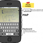
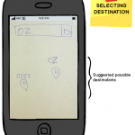
We also have the leftover challenge of implementing a slick map user-interface, one with a simple design and intuitive enough for anyone to learn and use quickly with ease. Ideally, a user would input a target destination in this interface, which would then generate a route towards the target. Currently, we hardcoded a series of waypoints, but a more complete design would calculate any path to any location in real-time. We plan to use Bing Maps API to implement turn-by-turn navigation and to use those coordinates as waypoints for the NavBelt. With further user testing we could observe and definitively test how long it takes user-testers to input a destination, start the belt, and begin the trek.
Link to .zip file – source code + readme file:
– https://github.com/cadaeib/navbelt/archive/master.zip
– https://github.com/munkeeboi/arduinoNavBelt/archive/master.zip
Third-party code used:
- FFT code on the Arduino – to receive and translate tones from the Android
~ From the provided library
- Sound-generating code [the genTone function] – for transmitting tones to the Arduino
~ From StackOverflow website: http://stackoverflow.com/questions/2413426/playing-an-arbitrary-tone-with-android
- Arduino calibration code – for calibrating:
~ CALIBRATION SOURCE: http://forum.arduino.cc/index.php?topic=117046.0
~ (datasheet) https://www.sparkfun.com/datasheets/Components/HMC6352.pdf
Links to PDF versions of all demo-session printed material:
PDF of poster: http://www.princeton.edu/~amyzhou/evolution_of_the_navbelt.pdf