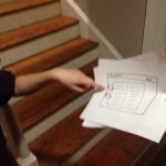
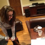
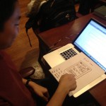
GaitKeeper P4

a) Group 6 – GARP

b) Rodrigo, Alice, Gene, Philip

c) Our product, the GaitKeeper, is an insole pad that can inserted into a shoe, and an associated device affixed to the user’s body, that together gather information about the user’s gait for diagnostic purposes.

di) To get informed consent, we attempted to be as open to our participants as possible in the informed consent script. We told them how long the tests would take, the purposes that they would be used for and that they could leave at any time. We made sure to tell them the tests would be confidential and after telling them about any risks (inbalance, etc), we made sure to ask them again if they wanted to try it on. The consent script we used can be found here:

https://docs.google.com/document/d/15_Pr3GMbCt_wpIf99z1IczYtpQ5kbLyjgGjK6-hTLoo/edit?usp=sharing

dii) Our first participant is an avid runner and friend. He was selected because we know his passion for running. Also, we could easily schedule an observation time for the test.

Our second participant is also an avid runner, who competed on  his high school running team. He also has computer science experience, and therefore can help us evaluate our user interface.

Our third participant is an avid marathon runner. She has experience with injuries from running.

diii) The testing environment for the first task, the first half of the second task, and the entire third task is Stephens Fitness Center. We selected a time of low-use, to make sure we could communicate easily without an excess of noise and distractions. We will be using a treadmill for these portions.

The testing environment for the analysis portion of the second task will be a desk in a classroom or dorm room where we will place the “computer” for connection to the GaitKeeper.

For the third task, we will bring several pairs of our own shoes of the appropriate sizes.

div) First, Rodrigo read out the informed consent script. Then, Gene read out the demo script and the tasks script. In the second task, Alice played the role of the injured athlete and in the third task, Philip played the role of the shoe customer.

Demo Script:

https://docs.google.com/document/d/1qdcM1-UMU7VAQ6O4MlqqTKEbhYnxkzGOEwVxUrn7HJA/edit?usp=sharing

e) One of the biggest pieces of feedback we received is that the prototype is a little obtrusive for running. Some runners already remarked that having weight on one leg, but not the other, would impede with their running and skew our results. All participants noted that having the main bulk of the device on their waist, with wires to the soles, may be less obtrusive than having the device on the ankle. One mentioned that having the wires built into tights would be nice, another mentioned that having the device rest around the hip near the tailbone would be good.  Another also mentioned that having a sole in only one shoe, slightly increasing its height, may also interfere with natural running behavior. This participant suggested replacing the sole of the shoe with our device. A fake sole of the same height or an opposite GaitKeeper may solve this problem. Lastly, one participant noted that our prototype was slightly the wrong size for his feet and caused discomfort.  This is a major problem for us in creating a prototype, since we would ideally like to produce one prototype which would work for multiple users.  Doing this would also make the product more cost effective for doctors and running stores, since it would allow them to have one product to serve all clients rather than multiples. Two participants noticed that there were no sensors on in the arch of the foot and said that that was an extremely important place to have sensors.

Besides these issues, most participants said that they found our prototype to be very usable for tasks 2 and 3. The GUI was easy to interpret and the heat map was highly praised. We were told that it didn’t take much understanding of running or feet to be able to interpret the data given, but they would like a recommended amount of time of data collection to ensure that the data would be useful. However, some participants questioned the utility of task 1. Most noted that they would not need the information often enough to use the wristband all the time when running. One suggested that this would be useful as the running store employee because you could ask customers to run outside and with the device and thus get a more authentic running gait. When being the doctor one participant said that this was a great idea given that the best way currently to do foot analysis is with a high powered camera, which is far more expensive and less practical. All three participants were very excited by our product especially for their individual use.

f) These results are relatively expected. These results show us that  people would be legitimately excited about our product.

g) With these results, we feel we have gained enough feedback to make a high-fidelity prototype. We think that these experiments have given us the necessary feedback to further simplify our product – we want to focus on tasks 2 and 3 and not task 1. That alone has made it a worthwhile use of time. It was also very useful to learn that we want to focus on make it unobtrusive and useable for different shoe sizes.

Pictures can be viewed here:

https://drive.google.com/folderview?id=0B4_S-8qAp4jyQTVCN3pUUUhpR2M&usp=sharing

GaitKeeper

a) Group number and name

Group 6 – GARP

b) Group first names and roles

Gene, Alice, Rodrigo, Phil

Team Member Roles:
Gene – Editor, D.J.
Alice – Writer, Punmaster
Rodrigo – Idea man/Photographer
Phil – Artiste/Builder

c) Mission Statement

Run­ners fre­quently get injuries. Some of these injuries could be fixed or pre­vented by proper gait and form. The prob­lem is how to test a per­son’s run­ning form and gait. Cur­rent tools for gait analy­sis do not pro­vide a holis­tic pic­ture of the user’s gait. Insole pres­sure sen­sors fail to account for other bio­me­chan­i­cal fac­tors, such as leg length dif­fer­ences and pos­ture. While running, users have very lit­tle access to data — they are entirely depen­dent on their own per­cep­tion of their form while run­ning. This per­cep­tion can be rather inac­cu­rate, espe­cially if the run­ner is fatigued. We will build a system that solves these problems while causing minimal alteration to natural running movements. We hope to develop our plans for sensor placement, location of wearable components, and data visualization. We hope to discover whether or not people think this has enough or too many components. We will evaluate our product for comfort based on the intended size, weight, and shape. We will evaluate the effectiveness of depictions of the recorded data.  Our mission is to build a low-impact gait-analysis system that generates a more meaningful representation of data than the existing systems. These metrics will facilitate sports medicine and the process of buying specialized athletic footware.

d) Prototype Description

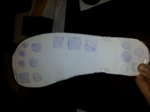
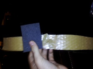
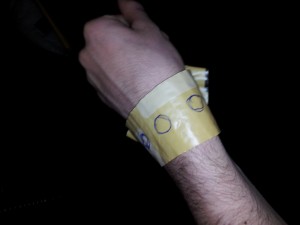
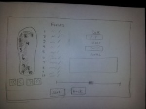
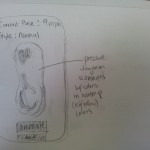
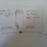
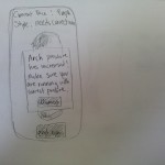
We implemented a basic version of the foot sensor, the ankle device, the wrist display, and the screens for the computer once the device has been hooked up. The foot sensor is made out of cardboard and is about the size and thickness that our insert will be. We drew on top the general layout of where the sensors will likely be. The ankle device is made out of foam, some weights, and material from a bubble wrap envelope as the strap.The foam and weights were used to create a similar sized and feeling device to an arduino with a battery pack and accelerometer.The wrist display is just three circles drawn onto a strap, again made from bubble wrap envelope. The circles represent LEDs that will light up to indicate correct, so-so, and bad gait (tentatively chosen as green, yellow, and red). For the screens we have mapped out a welcome screen which can take you to either load new data or view past analyses. Selecting to load new data will first take you to a waiting screen.  Once the device is connected, the listed device status will change to connected and the progress bar will begin to fill. From there it will go to the page that displays the analysis tools. We have depicted a heat map image of the foot showing the pressure, and information about each sensor, the runner, the data, and any additional notes the user wants to input. Selecting history from the welcome screen will take you to a page with a list of users. You can either scroll through them or select the top text bar to type in a name to narrow down the results. Clicking on a user will open a drop down menu for dates, selecting a date will take you to the analysis from that day, which is basically the same page as the one you go to after loading new data, but will load any previously made notes or user input.

The foot pad for GaitKeeper

The ankle holder for our prototype.

e) Prototype Testing Tasks

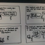
TASK 1: While running, assess gait and technique.

The motivating story for this test is the story of a runner who is worried that their form while running is unhealthy, placing them in danger of injuring themselves.

We will have the athlete install the system on themselves to determine the intuitiveness of placement of the various components. To facilitate testing, the subject will run on a treadmill. One member of our group will perform real-time gait analysis of our subject based on the evaluator’s personal running experiences. Another member will change the color of the simulated LED accordingly. The group member in charge of gait analysis will observe the runner for gait alterations. We will weigh the prototype components to the approximate weight of each component, and observe the prototype’s stability and attachment during running. Also, we will interview the user about the comfort of the system.

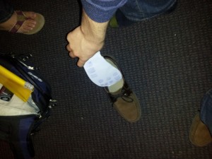
The athlete puts the foot pad in their shoe

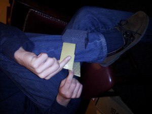
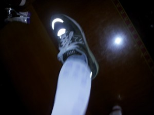
The athlete straps the prototype on their ankle

The athlete runs on the treadmill

During the workout, the LEDs change color depending on the health of the gait

TASK 2: After an injury, evaluate what elements of gait can be changed in order to prevent recurrence.

The motivating story for this test is the story of a runner who has injured themselves while running. The injury may or may not be gait-related. They are working with a specialist in biomechanics and/or orthopedic medicine to alter their gait to reduce the chance of exacerbating the injury or re-injuring themselves.

We will attempt to find a runner with a current injury, and interview them about the nature of their injury ahead of time. Specialists in biomechanics have extensive demands on their time, so one group member will play that role instead, including brief research into prevention of the injury in question. After assisting the runner in placing and securing the system, we will have the runner run on a treadmill. After the run, we will simulate plugging the device into the computer, and will show simulated running data.

After the workout, the device is plugged into a computer.

The data is shown and aspects of the gait can be identified. Using the data, the doctor can see whether the gait has unhealthy characteristics and can suggest exercises that would help improve the gait for the athlete.

TASK 3: When buying running shoes, determine what sort of shoe is most compatible with your running style.

The motivating story for this test is the story of a customer who is going to a running store and looking for the perfect shoe for their gait. Even if the store allows the user to test the shoe on a treadmill in the store, it is difficult to find the right shoe from feel alone (we know this from personal experience after a team member bought a shoe in P2). A quantitative process would be less error-prone and would allow the in-store specialists to give more substantial advice to customers.

The shoe pad fits into various shoe models of the same size

A gait window for each shoe is opened on a computer in front of the treadmill. The user can see the results of the sensors as they run and the specialist, by the treadmill, can see it as well.

f) Prototype Discussion

i. How did you make it?

The prototype was constructed from found and brought materials in an ad-hoc manner. We worked to simulate the weight and feel of the actual system.

ii. Did you come up with any new prototyping techniques to make something more suitable for your assignment than straight-up paper?

Yes. Our prototype involves fewer interface screens than the projects we contemplated for the individual paper prototyping assignment. We used materials in a three-dimensional manner to model how they will fit on the body of the user.

iii. What was difficult?

It was difficult coming up with names for buttons and functions that would be intuitive for a user.

Building a simulation of physical objects is difficult because the feel of the objects is more important than the visual appearance. We couldn’t think about this physical shape and feel prototyping the same way we did about the paper prototyping we did for the individual assignment.

It was also difficult to determine the layout of the screens.  Specifically, designing the main analysis screen was a challenge because we wanted it to be as informative as possible without being cluttered.  This is clearly a central challenge of all data analysis tools, as it required us to really consider our distinct user groups and how each of them will interact with the data differently.  After a good deal of discussion, we decided that it would be effective to have a single desktop interface that all user groups interact with.  Our main concern here was that runners might be overwhelmed by the information that doctors or running company employees would want to see for their analysis.  However, we concluded from our previous interviews that the running users who would use this product would probably be relatively well informed, almost to the level of running store employees.

iv. What worked well?

We let group members who were immediately excited about prototyping and began building components without prompting continue with prototyping for the duration of the assignment. This produced prototyping material quickly, and let good ideas flow.

By connecting the intended uses of the tasks together, we were able to make an interface that addresses the multiple needs of each task simultaneously. This simplified our product and allowed us to make it more understandable and applicable to use cases we weren’t even thinking about.

The design of the physical device was also a success, as we found through testing that it did not significantly affect how we ran.  The weights added, which we made comparable to an Arduino with batteries, were not excessive.  The form factor was also acceptable, even in a context with a good deal of movement.

Group GARP – L3

Gene Mereweather
Philip Oasis
Alice Fuller
Rodrigo Menezes

Group #6

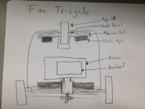
We built a tricycle that used three rolls of tape as wheels and wooden dowels as axles. One DC motors powered a cardboard fan that pushed the tricycle. We consider the prototype a success, but it definitely is not the most efficient mode of transportation! We tried to keep the tricycle as compact as possible, as weight played a very large part in its motion.

Brainstormed Ideas

  1. Continuous treads (like a tank!). Use rolls of aluminum foil for wheels and aluminum foil as the treads.
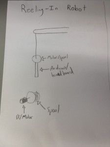
  2. Reeling-in robot with thread attached to motor and other end fixed
  3. Balls instead of wheels – allows for more directions (makes parallel parking a breeze!). Servo motors can change the direction of the DC motors.
  4. Hover car – fans on the bottom for hovering and fan on the top for direction
  5. Use two servo’s with wooden extensions to act as legs, with another “leg” trailing behind to keep it balanced
  6. Put an off-center weight on the DC motor, then set the whole assembly on top of angled toothbrush heads
  7. Use one servo to scoot the robot forward, and a DC motor for rotary
  8. Use the servo motor to change direction in the front two wheels and the DC motor for acceleration in the back two wheels.
  9. “parachuter” attach piece of cloth to catch wind, then use two servos to tug on the cloth so as to change motion
  10. Attach a magnet to the servo arm, secure another large magnet to the floor, and change the servo angle to attract or repel that other magnet
  11. have a little stone attached to a string. The servo will “throw” the ball out, the DC motor which has the string attached to it will pull on it to pull itself forward (the rock would have to be heavy enough)
  12. There will be two servos acting as breaks/balancers they will both lift up briefly then the DC motor which will be in the back will engage and move the robot forward, then the servos will lower to the ground to balance the robot again while the DC is stopped.
  13. Put it on wheels, but have a DC motor to power a fan.
  14. Attach three wheels that are on unpowered axels, have the robot moved forward by a fan that is attached to the back and is connected to a dc motor.
  15. Place a motor on top of a piece of metal and have it move at as fast a speed as possible so as to heat up the small piece of metal. Have a fan at the back. Place to whole thing over a piece of wax or ice. The thin hot metal will melt the wax and the flan will propel it forward. To change the direction you could place the dc fan on top of a structure that is attached to a servo.

Design sketches


Parts

– 3 rolls of tape of roughly the same diameter

– Cardboard, cut into hubs for the wheels, a base for the car and for the fan

– Wooden dowels for axles

– Aluminum foil, to hold the axles in place

– Tape, to keep everything together

– Arduino, breadboard and wires

– 1 DC motors

– 1 330 Ohm resistors

– 1 1N4001 diode Diodes, 1 PN2222 transistor

Instructions

– Cut out the cardboards so you have sturdy hubs for the wheels of tape and so you have a comfortable base for your tricycle.

– Fit the cardboard into the tape rolls and use the wooden dowels as axels. Tape aluminum foil to the base so that the axles can still rotate within the foil, but still keep the base up.

– Choose the smallest breadboard possible (to conserve weight), and use the diode/transistor/resistor to connect the DC motors to the fan on the base.

– Secure the arduino and breadboard on the base with tape.

– Turn on the robot and watch it move (slowly)

Video

video480

In the final version, we ended up separating the breadboard from the rest of the car to make it lighter.

Source

We used Adafruit’s default DC motor code:


/*
Adafruit Arduino - Lesson 13. DC Motor
*/


int motorPin = 3;
 
void setup() 
{ 
  pinMode(motorPin, OUTPUT);
  Serial.begin(9600);
  while (! Serial);
  Serial.println("Speed 0 to 255");
} 
 
 
void loop() 
{ 
  if (Serial.available())
  {
    int speed = Serial.parseInt();
    if (speed >= 0 && speed <= 255)
    {
      analogWrite(motorPin, speed);
    }
  }
} 

Group #6 Team GARP

Contributions:
Gene – writeup
Alice – interviewed physical trainer, runner, some writeup
Rodrigo – got fitted for shoes at a running store, editing
Phil – some writeup, storyboards, sketches, & interface design
All – interviewed running store employees, interviewed sports doctor

Problem and solution overview:

Runners frequently get injuries. Some of these injuries could be fixed or prevented by proper gait and form. The problem is how to test a persons running form and gait. Current tools for gait analysis do not provide a holistic picture of the user’s gait. Insole pressure sensors fail to account for other biomechanical factors, such as leg length differences and posture. We will build a system that integrates pressure sensors, gyros, accelerometers, and flex sensors to measure leg and foot position. By combining foot pressure and attitude information with joint positions of the lower body, our system will capture the necessary information as one package.

Description of users you observed:

Our target group is high-end amateur runners, and the support system of running store employees and physical trainers who cater to them. The popularity of upmarket running stores that employ video gait analysis show the size of the market and the desire for such systems.

User 1: Sports physician
This physician holds a biology degree, and has completed training in internal and sports medicine. She has worked as a consultant for the NCAA, and as a team physician for US National teams. Her priorities are a holistic view of sports health, minimizing injuries and their effects, and recommending appropriate strength training and/or orthotics. We chose a sports physician, because we believe that our system could be used by physicians trying to help runners with their injuries.

User 2: Avid amateur runner
This undergraduate student ran on his varsity team in high school, and continues to run 6 times a week. Injuries have kept him from running on a team in college. His priorities are staying healthy while running at a highly competitive level. We chose him because he belonged to our target group of people who are actually running and going to either have people use our technology for him or even potentially use it himself.

User 3: Running company manager
This person ran on a varsity college team, and continues to run avidly. He also manages a running company. His priorities are providing an enjoyable customer experience and selling shoes. He was a good candidate to interview because we think that a company like his might be interested in using our sensor system to help with picking out the correct shoes for clients.

User 4: Customer 1
This customer had plantar fasciitis, and needed a new pair of shoes. His priority was buying a pair of the same shoes he had.

User 5: Customer 2
This customer wanted to purchase orthotics for her shoes. Her priority was comfort.

CI interview descriptions:

When possible, we visited the interviewee in his or her usage environment. Both the sports physician and the running company manager emphasized the difficulty and importance of considering the whole picture when trying to improve running health. They consider foot positioning and pressure, joint position, body type and proportions, and stature, as well as type and environment of activity. We also repeatedly encountered the opinion that comfort promotes good health. The running company manager disagreed with a commonly advocated theory: that reducing cushioning causes improper gaits to become more painful. The manager advocated strength training as a means of improving gait, and argued for shoes that make the runner comfortable. The sports physician also strongly advocated for strength training.

Both the physician and the running company manager indicated that gait can be related to injuries. They both said that the first thing the look at is the person’s foot to get a sense of the structure of the foot itself. From there, the two diverge. The physician engages more with the person’s body. She checks for issues of flexibility, muscle imbalance and asymmetry. The running company manager was clearly aware that those were factors, but he chooses to ask clients to run on a treadmill, which he videotapes and then plays back in slow motion to see how the client is running. The avid runner said that he can tell a little bit about his pronation by looking at the bottom of his shoes. For the most part, he bases things more on how he feels than through quantifiable information. He has gone in for professional gait and form consultation before.

To interview the sports physician (user 1), we visited her workplace. Unfortunately, due to patient privacy concerns, we were unable to observe her at work with a patient. Still, we asked her to go into detail about how she would work with a hypothetical patient in order to accomplish a successful contextual interview.

To interview the avid runner (user 2), we chose not to run along, because we did not think we could keep pace. If the runner slowed his pace to match ours, the situation would be artificial. However, we asked him to illustrate various elements of technique, and how he currently assesses his running style.

To interview the running company manager and customers 1 & 2 (users 3-5), we visited the running company. We observed the running company staff at work with customers. Also, Rodrigo got fitted for a pair of shoes, including slow motion video analysis on a treadmill.

Task Analysis questions:
1. Who is going to use the system?
We envision two main groups of users: relatively high-end runners (who do significant amounts of running regularly), and those who work to support them (running store employees, physical trainers, and sports doctors). Those in the second group will be utilizing the system for the benefit of the first group, but members of the first group who are especially concerned with their gait could also purchase and use their own unit.
2. What tasks do they now perform?
Currently, runners mainly analyze their gait and manner of running mostly when purchasing shoes or after injuries. As we learned from our interview with a frequent runner, he had his gait analyzed after being injured. In order to analyze gait in a running store, they currently use a slow-motion camera and muscle receptors. Also, the runner we spoke with mentioned that he occasionally pays attention to his form while running to make sure he is moving efficiently.
3. What tasks are desired?
One desired task is a way of analytically determining the mechanics of an individual’s gait and movement – either to fit orthotics or to adjust the runner’s technique. Additionally, it is desired for a runner to be able to determine (while running) how their form has changed with fatigue and environment (running differently on different surfaces, for example).
4. How are the tasks learned?
Runners often go to running stores or personal trainers to learn more about gait and proper running technique. Specialty running shoes are typically tested and viewed at running stores, where analysis of gait occurs. After injuries, athletic trainers and sports doctors also might assess one’s gait, having the user run on a treadmill in a training room to observe their form.
5. Where are the tasks performed?
The tasks are performed in three distinct areas: on a run (wherever the run is happening), in a running store, and in a training room or doctor’s office. The tasks performed in the first location tend to be less analytic and more subjective, while the other two locations tend to perform tasks with specialized observation of the runner.
6. What’s the relationship between user & data?
The running user has very little access to data – they are entirely dependent on their own perception of their form while running. This perception can be rather inaccurate, especially if the runner is fatigued. In a running store or training room, the runner’s support user (either a trainer, sport doctor, or store employee) is analyzing the data of the runner’s gait and technique, and then presenting it in a manageable format to the runner, possibly with a recommendation of shoe type or technique modifications.
7. What other tools does the user have?
The runner will often have an electronic device with them, such as an iPod or mobile phone, which may also have GPS capabilities. This presents a useful opportunity for live updates of gait and technique information. In a running store, there is likely to be a treadmill, video cameras, and a computer for accessing information. Thus, the type of tools available to the user is highly dependent on the setting.
8. How do users communicate with each other?
The runner communicates with other support users when buying shoes or after an injury, which are both times in which they feel there is potential for serious modifications to technique and gait. In these situations, they often try to offer information from their experiences running, and the areas where they feel pain or discomfort to the expert, who then gathers data from observation and makes a recommendation of a type of running shoe or a technique change.
9. How often are the tasks performed?
The task of observing one’s technique while running happens at irregular time intervals; according to the runner we spoke to, he thinks about it especially frequently when he becomes fatigued during a run. He runs 6 times a week, and would reevaluate his form several times on each run. Also from our discussions with him and the running store employee, we found that running shoes are typically replaced every 400 miles or so. If the shoe is working properly, the task of getting an expert opinion isn’t performed and a similar shoe is purchased. If the user has developed an injury or some discomfort, however, they then perform the task of consulting an expert.
10. What are the time constraints on the tasks?
While running, the user does not have much time or focus to devote to evaluating gait while still moving normally. Feedback on technique should be relatively immediate in this environment, since it is much less relevant to the user how they were running several minutes ago. Especially if the user begins to feel discomfort during the run, live feedback is needed. In the setting of a running store or training room, the time constraint is limited by the customer/user’s comfort. In the running store, the typical interactions we viewed were on the order of 20-30 minutes for purchasing new shoes and evaluating gait.
11. What happens when things go wrong?
If a runner isn’t sure about their technique, and think it might lead to an injury, they will usually stop running or at least shorten their run. In a running store, the employee mentioned that the ideal way to test a user would be to have them run for at least 30 minutes and then test them in a fatigued state. He said that viewing someone when they are fully rested (and aware that they are being observed) can be problematic and can sometimes lead to errors. The store had a 15 day trial policy for their shoes so that users could return if the analysis turned out to be incorrect.

Description of three tasks:

Task 1:
While running, assess gait and technique. Currently this is done by mentally taking check of body position. Thinking about one’s body is simple, but getting accurate results is very difficult. With our proposed system this will involve the initial setup of placing the sensor in your shoe and connecting any other necessary equipment, and selecting the settings that you wish to have during the run. Ideally once the person is on the run this task will involve no more than pushing a button on the watch/iphone to get feedback. We could either have the system provide automatic updates, alerting the runner while they are running that they are pronating or striking too hard on their heels, or it could be manual and the user could push a button to get feedback in their current gait.

Task 2:
After an injury, evaluate what elements of gait can be changed in order to prevent recurrence. Currently this is a very difficult task. An official gait analysis that is done by specialty places involves a lot of money, stop motion analysis, and electrical equipment. More frequently people figure out what is hurting, examine the person’s body type and peculiarities, and does a number of exercises to test flexibility and musculature, from that they can approximate what might be wrong with the current gait. Ideally with our system this would be a simple to moderate level of difficulty. There will still be a fair amount of sensors that will need to be attached to the person’s body and shoe, as well as some analysis of what the data is showing. Once set up, our system will display what is happening to the persons weight on their feet as they run as well as displaying other characteristics of the persons running technique. Ideally our display will be clear and intuitive enough that the analysis should not be too difficult.

Task 3:
When buying running shoes, determining what sort of shoe is most compatible with your running style. This is currently a moderate level task. This involves doing an initial examination of the person’s foot and leg structure, as well as measuring for size. After that it involves trying on a variety of shows and running with them on a treadmill. More shoes are tried until one both feels comfortable enough to the runner and the form looks decent when the person is videotaped running and is played back in slow motion. Our solution might be about the same level of difficulty, but will hopefully be more precise. Mutiple shoes will likely need to be tried on and the user will still need to run on a treadmill. Sensors will need to be attached as well but this will not be too difficult. The analysis will be far more precise than just viewing the person’s feet and will ideally lead to better fittings, and potentially allow for quicker selection of the correct shoe.

Description of User Interface:

We envision our system working on both desktop and mobile interfaces in order to properly serve all of the tasks we are considering, Individual runners would benefit most from a mobile interface which could be operated from a phone, since it would enable them to get live updates. This is a major departure from existing systems, which either require the user to be in a lab or do not provide feedback in real-time. For the users who will use it to support runners, however, we feel that a desktop interface would be useful, because it would be easy to navigate. These support users would require more information than a runner who is using the device for live feedback – medical diagnoses and shoe selection are more sensitive to information. For the live interface, the functions would be to track the distance and pace of the runner, while also giving them advice on form. While the first two functions are commonly available, the third is not currently offered to consumers. In the desktop interface, the doctor or store employee would be able to view animated pressure heat maps of the user’s feet, as well as gyroscopic information of how the foot is moving through the air. Current analysis by film accomplishes these tasks, but in a much less precise way. Furthermore, the user could take the device and go for a typical run on their usual surface, gaining more realistic data for the support user. The main improvement offered by the system would be the ability to gain precise data in a more realistic setting for the runner.

Storyboards

Sketches of the screen

Sensor Wonderland

Group #6: Gene Mereweather, Alice Fuller, Phillip Oasis and Rodrigo Menezes

Our final instrument used a whammy pedal and a slide sensor to modify the pitch and length of each buzz on our buzzer. The user would control the whammy pedal with their feet and the slide sensor with their finger on the desk. We were pretty satisfied with the overall results, especially with the functionality of the whammy pedal. If we put more effort into it, we would try to find a more natural way to change the time between buzzes.

Prototype 1: Whammy Pedal

This prototype used an empty box, a whiteboard eraser, a light sensor, a big spring and a buzzer to create a “whammy pedal”. When the box is pressed down, the light sensor recognizes that there is less light in the box. The code in the prototype uses the change in light to modify the tone and frequency of the buzzing. We used both a Piezo sensor and buzzer for sound.

Prototype 2: Light-ccordian

To continuing playing around with the light sensor, we put holes in a rectangular box down the center. The less light received by the light sensor, the smaller the pitch of each buzz emitted by the buzzer.

Prototype 3 and Final Instrument: Slide Pitch + Whammy Pedal

We added an additional touch sensor to prototype 1 and re-worked the software, so that the light sensor would control the length of each buzz and the slide potentiometer would control the pitch. It worked really well and we were able to perform with it, so we chose this to be our final instrument. We kept adapting the code until we were satisfied with the musicality. In the following video, Gene performs with our final instrument:

List of parts used

  • Arduino, wires, two breadboards
  • Slide potentiometer
  • Buzzer + 330 Ohm resistor
  • Piezo sensor
  • Light sensor + 10k Ohm resistor
  • Box, whiteboard erase marker, spring and duct tape (for the whammy pedal)

How to build it

We put the spring on the whiteboard erase marker using duct tape, and placed it within a small square box. The light sensor was placed with the 10k Ohm resistor in one breadboard within the box. Wires connected this to our analog reads. We put the slide potentiometer, piezo sensor and buzzer on the other bread board. The buzzer required a 330 Ohm resistor and was connected to a digital pin. The slide potentiometer was in another analog pin and the piezo sensor was connected to another digital pin.

View post on imgur.com

View post on imgur.com

View post on imgur.com

Source code

const int lightAnalogPin = 0; // FSR is connected to analog 0
const int slideAnalogPin = 1;
int slideReading;    // the analog reading from the slide pot
int lightReading;    // the analog reading from the light resistor divider

const int piezoPin = 9;
const int buzzerPin = 5;

int duration; // time that each note lasts
const int betweenNotes = 0; // time between notes

void playTone(int tone, int duration) { // adapted from Arduino tutorials
  for (long i = 0; i < duration * 1000L; i += tone * 2) {
    digitalWrite(piezoPin, HIGH);
    delayMicroseconds(tone);
    digitalWrite(piezoPin, LOW);
    delayMicroseconds(tone);
  }
}

void setup(void) {
  pinMode(piezoPin, OUTPUT);
  pinMode(buzzerPin, OUTPUT);
  Serial.begin(9600);
}

void loop(void) {
  lightReading = analogRead(lightAnalogPin);
  slideReading = analogRead(slideAnalogPin);
  Serial.print("Analog reading = ");
  Serial.println(slideReading);

  duration = map(lightReading, 0, 1023, 500, 10); // low light = shorter note

  // adapted from Arduino tutorials
  int buzzerValue = map(slideReading, 0, 1023, 16, 7902); // low light = low pitch
  tone(buzzerPin, buzzerValue, 100);
  int piezoValue = map(slideReading, 0, 1023, 1915, 956); // low light = low pitch
  playTone(piezoValue, duration);
  delay(duration);
}

Individual Design Exercise

Observations

My COS583 professor, before class, arrives to the classroom ten minutes early. She prepares for the class by writing everything she wants to be on the board to use during class discussion. Looking at her notes, she sees all the diagrams and illustrations she wants to copy on the board.

To prepare for class, my ENG321 preceptor has several pages of printed notes of where to lead the precept in conversation. Before class, she reviews her notes and greets everyone into the class. She almost always seems very prepared and only gives her notes a very cursory glance.

Before lecture in COS 436, very few people are reviewing notes. The majority of people, including one senior I observed, simply try to kill time by talking to the people sitting next to them or browsing the internet. This senior in particular was reading TechCrunch, Facebook and Reddit. A few people pull up assignments from other classes or prepare their word processor for the lecture.

That’s a big change from a precept style class. In COS583, students are asked to read a seminal paper of computer science and discuss it in class. Before class, half the participants (including another senior I observed) will flip through the assigned paper and review the highlighting/notes they scribbled on the side of the paper. Some of these people are reviewing it to be studious and others simply haven’t read the paper and are trying to catch up. The other half of the class will kill time by talking to others or browsing the internet.

Talking to students who review their notes before class reveals that they often prepared for class a long time ago. Some of them read the paper a couple days back and need a refresher on the material.

Another interesting observation: students who come late have a harder time than you would expect finding a seat with certain classroom layouts. If either the layout was improved or if students were encouraged to sit more efficiently, this problem would be avoided.

Brainstormed ideas

1. Attach sensors and lights to seats to make sure students choose the most efficient seating pattern in lecture.
2. A platform for prepared students to sell summaries of readings to unprepared students.
3. Placards that allow students to find seats more easily and that allow the teacher to more adequately control discussion.
4. Integrate word processors inside desks to make sure no students are using their computers for the wrong purposes.
5. Allow teachers to upload a layout to a board with the click of a button
6. Allow student computers to take screenshots of what will be on the board/slides before class
7. A door to the lecture hall that locks from the outside immediately when class is supposed to start.
8. A web application that gives students a one-minute refresher of the last lecture to prepare them.
9. A mobile application that knows when you should leave for your next appointment based on the distance you must cover
10. A class instant message board, that allows students to ask questions to others or the lecturer before/during class.
11. A desktop application that will prepare your other desktop applications for class (open word processor, browser to certain tabs, etc.).
12. A mobile application that will tally up the total minutes of class missed by being late and donate money to charity proportional to that amount
13. An e-book platform that crowdsources highlighting and sidenotes.
14. A quick survey for students to show which topic they want the lecture to cover
15. A big screen in lecture that will show the faces of late students
16. Make the projector in lecture play the same games of an NBA big screen before class (find the people, kiss cam, etc).

Ideas Chosen

In this project, I will be exploring ideas 9 and 13. Idea 9 would be very useful to me personally, because I have a very bad sense of how long it takes me to get to places and truly smart alarm clocks should take distance to destination into consideration. Idea 13 would be a more natural way of having discussion in a book – as you read the content, you see what other people thought was important and what insights they may have.

SmartGo

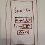
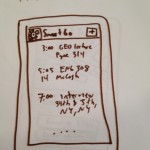
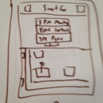
For idea 9, I envision an app named SmartGo. SmartGo starts off very simple and allows users to import calendars from different sources (Google, Apple, etc). This events are then visible in a simple list “home screen” that is the default view for the app.

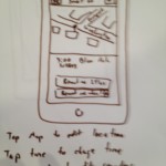
Each event can be opened by touching its row in the list. Once in the event view, users can edit the information of the event and when they should be reminded to leave. Users can drag/tap the map to change location or click the magnifying glass to search for a completely different map segment.

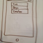
Adding an event is very simple – only three fields are needed in the beginning: time, description and location. Once a location is entered, a map is generated to allow the user to specify the exact destination of the event.

The app routinely checks the background to see the user’s location and once it realizes that the user needs to leave to arrive in a destination at the right time, it sends a push notification. Simple map APIs can allow the app to accomplish this.

CrowdNotes

CrowdNotes is a simple browser based eBook platform that allows users to share eBooks with groups and allow others to comment/highlight them. The home screen is very simple and consists of only an upload button. Ideally, the uploader would accept various types of eBook file extensions and PDFs.

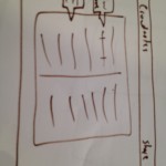
Next, users can share the file with the friends by clicking the share button in the top bar. Ideally, users can share with email addresses or social media and they can even share by giving the URL away. Visitors can see the notes of previous readers and the most highlighted phrases within the book.

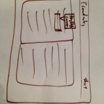
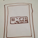
When users highlight a portion of the text with their cursor, a tooltip appears with two options: sidenote and highlight. Sidenotes appear in the margin of the screen once inputted and highlights are simply highlights.
User testing

For the most parts each of the three testers enjoyed the apps they saw. The majority of their confusion resulted from my poor handwriting, but the “flow” of both GUIs seemed to work fine. Many of them requested new features to make the apps more useful to them.

Our first tester enjoyed the SmartGo app, but believed it would be arduous to update the app regularly. While she appreciated that the application would have live updates from other calendar applications, she did not like that she needed to choose parameters like “mode of transportation” every time. She requested that the app’s settings page allow her to choose defaults like “remind me so I will get to my events five minutes before starting time” and “I have a car that I can use to get there”.

This tester also liked CrowdNotes, saying “it could be useful for reading heavy classes”. However, she had some concerns about the usability of the app once it had a large number of people sharing one document. She wants to see what person made what comment to be able to determine its relevancy and the reliability of the commenter. Highlighting with the cursor was also not explicitly obvious, so maybe a first-run tutorial would be useful for users.

Our second tester is a designer herself. She appreciated the purpose of SmartGo, but commented that she “never really uses calendars anyway”. The biggest insight I got from this test was that the dynamically updating add event view was confusing to some because the submit button only appeared when the user filled out the other fields. Users want to immediately understand how something will work and having the submit button there, even if it is not a valid submission yet, reassures the user.

This user also had scaling concerns with CrowdNotes, asking me how text will appear if multiple people highlight the same text. There are only so many colors to assign, so perhaps there needs to be a better way to see the most highlighted text. Her suggestion was to highlight only the most overall highlighted text and when a user clicks it, they can see each user that used it.

Our last tester is an avid calendar user and appreciates the purpose of SmartGo. The import functionality was complimented because this tester uses Google Calendars religiously. They asked if they can add the location of an event via Google Calendars, so they could avoid using the app as much as possible – I didn’t know the answer to that question. Alternatively, this tester suggested that SmartGo could sync with Google Calendar so the updating could go in both directions. This tester had difficulty choosing when the application should remind them about the event and how they could edit those options.

This tester had the same problems with highlighting the text in CrowdNotes. It was not implicit that highlighting with the cursor would lead to comments and that would be made more easily understandable.

Insights

For SmartGo, I had the following insights:

  • Default settings are important. The app should take into consideration whether a user has a car, whether they like taking public transportation and how early they like to go to events.
  • It is important for a user to clearly understand the flow of submissions – hiding the submission button until the submission is valid is an easy way to confuse users.
  • The app shouldn’t just import to other calendar applications – it should sync to make it more useful.
  • “Tap to edit” should be written somewhere if it’s true.
  • My handwriting is terrible.

For CrowdNotes, I had the following insights:

  • An actual user authentication system would be useful to more accurately share eBooks with others. Sharing just a URL may not be private enough.
  • It is difficult to show how many people highlighted an area given how few colors can be used for it. A number near the highlighting may be used to do that, or even better, the highlighting can be brighter for the larger the ratio of people who saw it and highlighted it.
  • Some people highlight the dumbest things. Eventually, with enough users, anything could be highlighted. It would be good for the application to discern what was and what wasn’t highlighted.
  • Making the platform browser based would get the most users, but platforms with touch capabilities – tablets, phones, etc. – would provide a better user experience.
  • The margins will get cluttered from number of sidenotes. A reputation system or Facebook integration to heavily weigh the submissions of friends could increase relevancy.

I was pleasantly surprised at the quality of feedback received. The majority of collected responses resulted in actionable information to make the products more intuitive and easily understood.