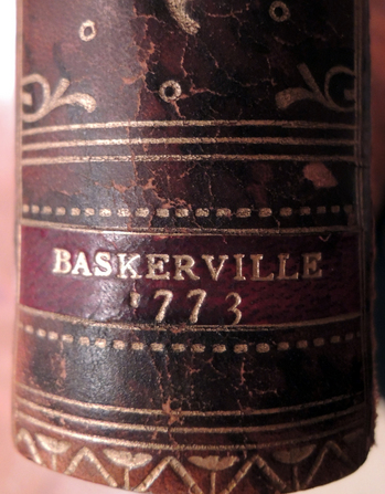
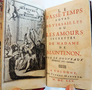
Lodovico Ariosto (1474-1533),
Orlando Furioso [Mad Orlando] (Birmingham, Datorchi di G. Baskerville, per P. Molini e G. Molini, 1773). 4 v. Printed by John Baskerville (1706-1775). Provenance: Formerly owned by Augustus Henry Fitzroy Grafton, 1735-1811. Graphic Arts Collection (GAX) Baskerville 1773b
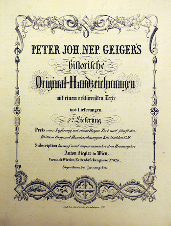
Rare Books also owns a copy of the original prospectus in
Prospectuses and Announcements from Italian, French, and English printers, Booksellers, and Publishers, 1736-1830. (Ex) Z338 .P76q
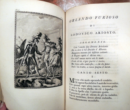
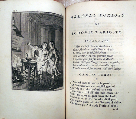
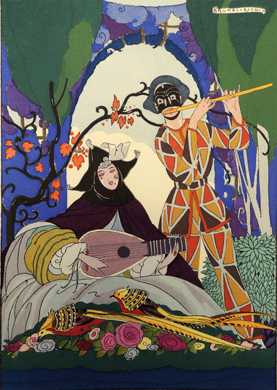
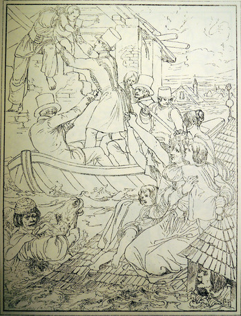
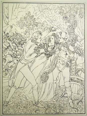
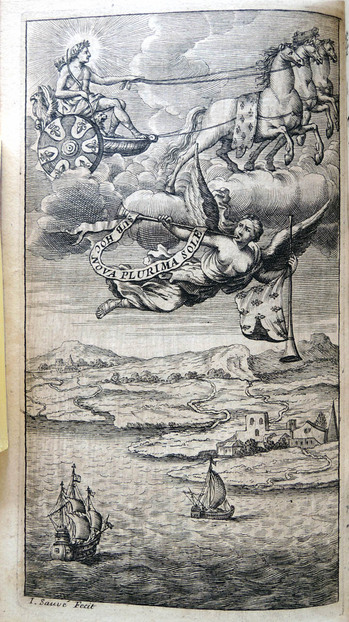
Late in his career, John Baskerville printed an edition of
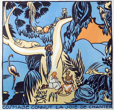
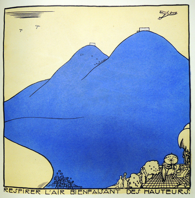
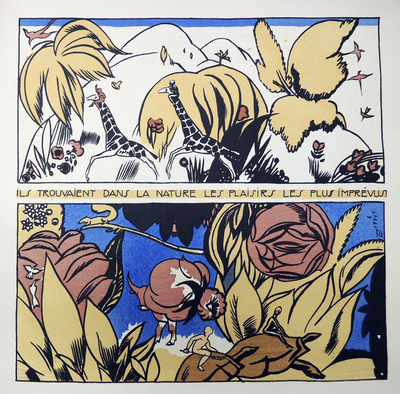
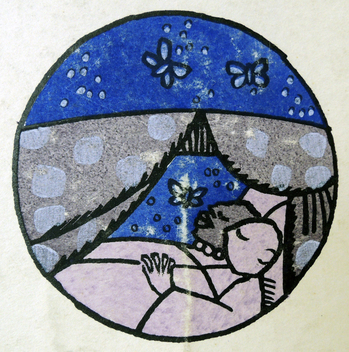
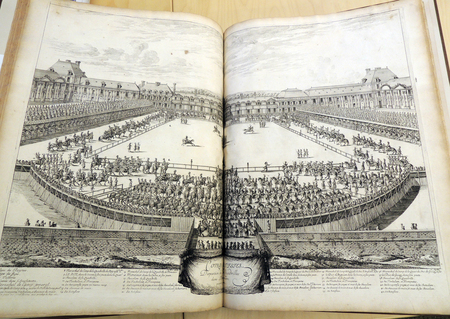
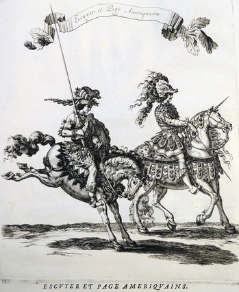
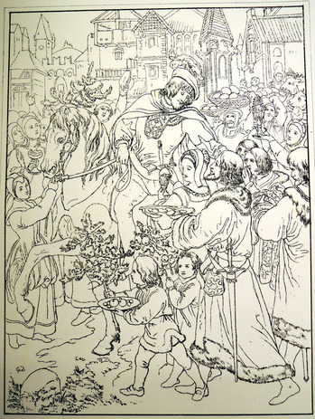
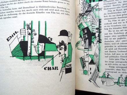
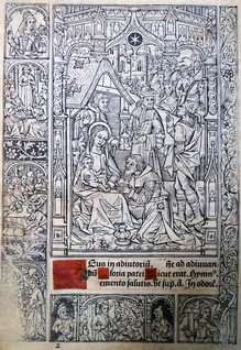
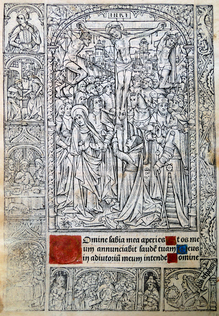
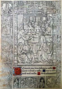
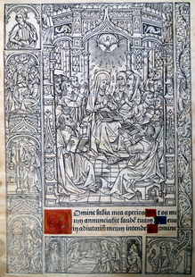
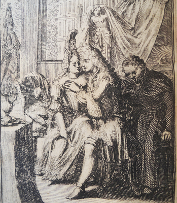
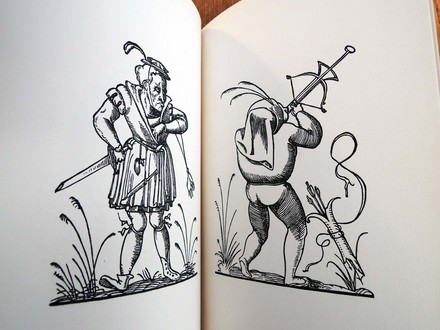
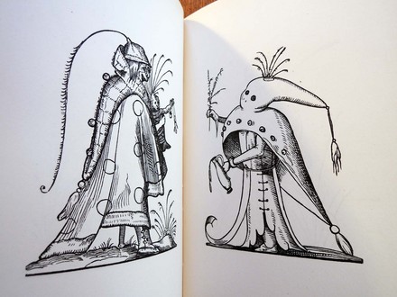
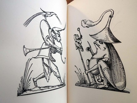
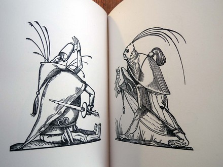
Orlando Furioso for the Molini brothers, an Italian printing firm based in Paris. This beautiful four-volume set of Ariosto’s 50,000 line poem is illustrated with forty-six engraving (plus a frontispiece), designed by some of the most celebrated artists of that time. A new engraving begins each new episode of the author’s work and the artists appear to have been given much freedom in their designs. The twenty-one artists don’t often get credit and so, here’s the complete list.
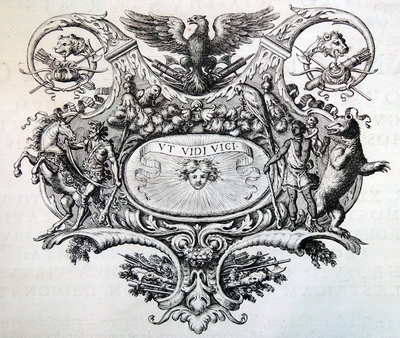
Frontispiece portrait is after a painting by Titian (ca. 1485/90?-1576), drawn by Charles Dominique Joseph Eisen (1720-1778) and engraved by Etienne Ficquet (1719-1794).
The plates were designed by Giovanni Battista Cipriani (1727-1785); Charles Nicolas Cochin II (1715-1790); Charles Dominique Joseph Eisen (1720-1778); Jean-Baptiste Greuze (1725-1805); Charles Monnet (1732-after 1808); Jean-Michel Moreau the Younger (1741-1814).
The engravings were cut by Francesco Bartolozzi (1728-1815); Pierre Philippe Choffard (1730-1809); Antoine Jean Duclos (1742-1795); Emmanuel Jean de Ghendt (1738-1815); Isidore Stanislas Henri Helman (1743-?1806/9); Benott Louis Henriquez (1732-1806); Nicolas de Launay (1739-1792); Joseph de Longueil (1730-1792); Pietro Antonio Martini (1738-1797); Jean Massard (1740-1822); Jean-Michel Moreau, the Younger (1741-1814); Nicolas Ponce (1746-1831); Benoit Louis Prevost (1747-ca. 1804); and Jean-Baptiste-Blaise Simonet (1742-after 1813).
The prospectus states: “The Brothers Molini have undertaken to present an Edition which will satisfy the desires of the Public, and correspond with the reputation of this great man. They have used the presses of the famous Baskerville, whose master-pieces of printing all the world knows and admires.”
Dibdin said, “The Baskerville edition of Orlando Furioso with the cuts of Bartolozzi is more exquisite than the splendid edition of Zatta. I never see, or even think of, the lovely edition of Baskerville, of 1773 … without the most unmixed satisfaction. Paper, printing, drawing, plates—all delight the eye, and gratify the heart, of the thorough-bred bibliomaniacal Virtuoso. This edition has hardly its equal, and certainly not its superior, in any publication with which I am acquainted.”
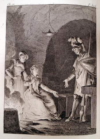
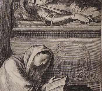
This might be the most interesting note: “The engraver Bartolozzi grew weary of the delays of the publisher of these beautiful volumes, who one day in a passion called him an ass, a poltroon, an animal. The artist made no reply; he was working at the moment on the plate of the 43d Chant; without turning from his task, he lightly traced these three words upon the tomb which was engraved upon that plate,—d’asino, de poltrone, d’animale.” —Josiah Henry Benton, John Baskerville (Updike, 1914)
Someone must have caught this and scraped it off, since our plate doesn’t include these words:
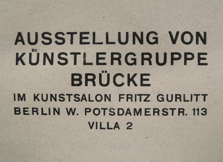
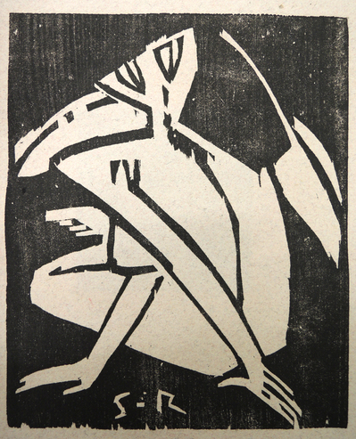 Karl Schmidt-Rottluff (1884-1976)
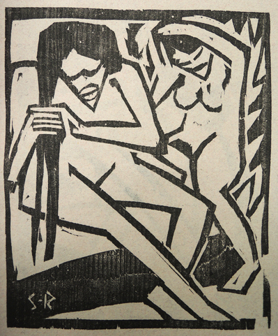 Karl Schmidt-Rottluff (1884-1976)
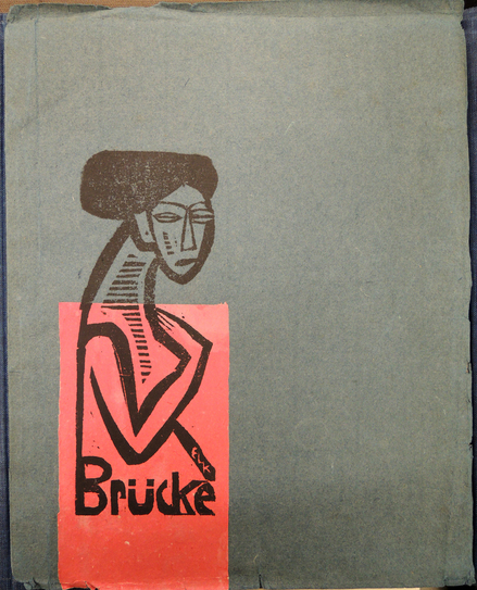
 E.L. Kirchner (1880-1938)
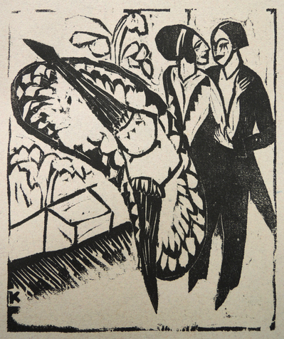 E.L. Kirchner (1880-1938)
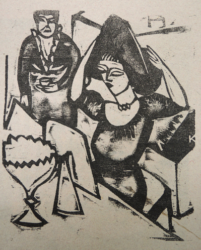
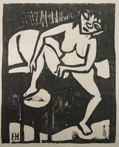 Erich Heckel (1883-1970)
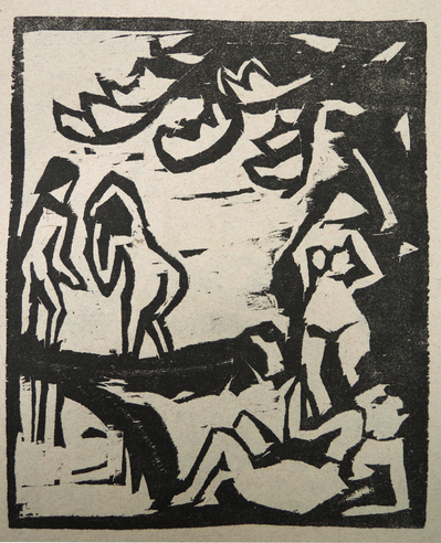 Otto Mueller (1874-1930)
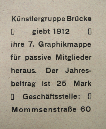


Recent Comments