BlueCane Final Project Report

Group 17 Members: Evan, Jacob, Joseph, Xin Yang

Project Sum­mary: Our prototype is a navigational device for blind users that enables them to receive route-guided instructions via Blue­tooth and cardinal directions using hap­tic feedback.

Previous Project Posts
P1 — Brainstorming
P2 — Interviews and Storyboards
P3 — Prototyping!
P4 — User Testing
P5 — Working Prototype!
P6 — Testing with Target Users

Video

Changes to the Prototype

  • Added accelerometer: In order to get more accurate compass readings, we made use of an accelerometer to compensate for tilt of the magnetometer. With these changes, we are able to provide a more predictable experience for the user in the compass and navigation modes.

Evolution

The drastic evolution of our designs reveals a humbling lesson in the importance of truly understanding one’s users and their tasks before attempting to propose a solution. Our first design took the form of a “sonar glove” which would use distance detection to help the blind navigate their environments. Though we guessed that asking the blind to set aside their familiar canes to adopt such a system would require a fair amount of adjustment on their parts, we hardly began to understand the actual problems that they faced. Thus, when we finally got the chance to study cane travel and speak with blind users, we realized that the few advantages sonar could provide paled in comparison to the benefits that the standard cane already provided. Once we better understood the all issues that new technologies could address, we poured over our options and eventually to focus on enhancing cane travel both with and without GPS navigation.

Surprisingly, though the form and function of our design changed a great deal in a short time, our overall goal did not. We chose our first design idea because it seemed like a “cool” project, yet once we delved into user interviews and task analysis, we found that we had instead grown attached to the possibility of helping this group of people who so desperately needed better technologies to improve their quality of life. Thus, even when it seemed like we needed to throw out all of our ideas and start over, we remained true to the original intent of the project.

Critical Evaluation

Through the process of prototyping and receiving feedback on our device this semester, we definitely learned a lot about the problem we set out to solve. After talking with blind people in the community, it became clear that there’s room for improvement in the space of blind navigation technology. The people with whom we talked were especially concerned about affordable devices, since most existing technology comes in the form of highly-priced standalone hardware or software—little to none of which is covered by health insurance. On the other hand, we were surprised to learn that many blind people have taken to using smartphone apps. In its ideal form, our product would interact with the user’s phone and accomplish what neither an app nor a standalone piece of hardware could do by itself. In this sense, we believe our prototype could lead to a real-world, practical product and fill a substantial gap in the current market.

That being said, we have concerns about how accurately the prototype could deliver navigation instructions in its present form, and whether the current interface between phone and cane can be improved. Given that the iPhone and similar devices have built-in accelerometers, magnetometers, and vibration capability, we could feasibly develop a cane that attaches and holds the user’s phone instead of creating a redundant piece of hardware. This would be more affordable and provide a more reliable connection than Bluetooth has shown to provide. It would also allow the user to receive audible feedback in addition to tactile directions, which some users indicated that they would prefer. If we were to continue developing the product, we would explore these alternative designs and form factors to create the most flexible and accessible device for blind users.

Moving Forward

Moving forward, we’d focus on further refining the way information is transmitted through the ridges on the cane. Much of our feedback indicates that the two ridges the cane currently has are inconveniently located, making it easy to miss a turn signal. While we feel that ridges or a similar touch-based system can be an effective navigation aide, more work is required to determine an arrangement that is both ergonomic and informative. Reaching this configuration would require further testing with users, since we’d need an accurate indication of how the average blind user holds their cane. We’d need a larger number of test subjects to get an accurate cross-section of the blind population, and would likely need to test several different arrangements in parallel.

We’d also work on developing an intuitive GPS interface for the iPhone that would use our cane, and eventually an API that could be used by third party application and GPS developers. These could largely be based on existing GPS apps, but would still require some amount of user testing. Mechanically, we’d need to research further whether the device would work better as an integrated component of a full cane or as an attachment to other cane devices. Business and distribution models would probably play prominently in this decision, but we’d also need feedback from users to determine what they would prefer. This would likely take a form similar to our testing so far, but on a larger scale.

Codebase

Dropbox Link

Libraries Used
• ADXL345 Library-used to communicate with accelerometer: https://github.com/jenschr/Arduino-libraries/tree/master/ADXL345
• Arduino Servo Library-used to command servo for ridges: http://arduino.cc/en/Reference/Servo
• Magnetometer example code-used to communicate with magnetometer: http://dlnmh9ip6v2uc.cloudfront.net/datasheets/BreakoutBoards/Mag3110_v10.pde
• Arduino Wire Library-used to communicate with magnetometer: http://arduino.cc/de/Reference/Wire
• Bluetooth Shield example code-used to communicate with Bluetooth shield: http://www.seeedstudio.com/wiki/Bluetooth_Shield
• Arduino SoftwareSerial Library-used to communicate with Bluetooth shield: http://arduino.cc/en/Reference/SoftwareSerial
• Tilt compensation example code-used in tilt compensation calculations for compass: https://www.loveelectronics.co.uk/Tutorials/13/tilt-compensated-compass-arduino-tutorial
• Arduino Math Library-used in tilt compensation calculations for compass: http://arduino.cc/en/Math/H?from=Reference.Mathh

Poster Material
Dropbox Link

P4: Testing the BlueCane Prototype

Group 17 – BlueCane
Members: Joseph Bolling, Jacob Simon, Evan Strasnick, Xin Yang Yak

Project Goal
Our project goal is to improve the auton­omy, safety, and over­all level of com­fort of blind users as they attempt to nav­i­gate their world using cane travel by augmenting the traditional cane with haptic and touch-based feedback.

Test Methods
When conducting a test with a volunteer user, we first had them read and sign our consent form. We also verbally reiterated the information contained on the form, including the fact that the user would be asked to move while blindfolded and wearing headphones. We explained that we would be taking pictures during the testing process, but that the user would not be identifiable from the pictures. We assured the user that we would verbally, and, if necessary, physically warn them before they ran into any objects, if it appeared that they would. Before continuing, we ensured that the user was comfortable with the test and that they had no unanswered questions. Participants were selected among students at Princeton according to availability and were all equally (un)familiar with blind navigation. None had extensive prior knowledge about the project.

We used the electrical engineering laboratory as our experimental environment. It provided an expansive area for the participant to walk around freely, and the existing floor markings adapted quite well to our use. We first had participants watch an instructional video on cane navigation and practice proper technique, then we had them perform the three tasks that we described earlier—navigation while carrying an item, navigation in a noisy environment, and indoor navigation with a static reference direction. We randomized the order of the tasks to reduce the chance that user feedback was skewed by learning effects. (scripts here)

participant

Results
Generally, all the users found cane travel unfamiliar, and tended to seek tactile feedback before taking a bigger step. There was a significant learning effect, as the users became more used to being blindfolded and traveling with a cane. One user walked very slowly, which allowed him to following the directions closely, while the other two users took bigger steps, leading them to occasionally veer off the path. All three users found tasks 1 and 2(following navigation directions) easier than task 3(walking in a cardinal direction). Users did not notice any additional difficulties from carrying an object in one hand or from the lack of auditory cues from the ambient environment, which shows that our generally approach works well with users having to carry extra items on one hand and in noisy environments.

Tasks 1 and 2: at sharp turns (more than 5 times), the cane swing is not wide enough to ‘hit’ the direction where the tactile feedback will be given, and the user is left wondering where he/she is supposed to go. One user compensated by walking with very wide cane swings (more than 180 degrees), but we think that this is unrealistic as blind users are unlikely to make such wide swings. Then it takes some time for the user to swing the cane wide enough before the user gets some tactile feedback. If there are obstacles in the direction where the tactile feedback is given, this can be annoying. So we also tapped the user on the shoulder to simulate the raising of the ridges when there is a sharp turn ahead, but this was confusing, since the indication happens even though the user is walking in the same direction as where the tactile feedback is given (making the user also think that she is walking in the correct direction). Users also tend to become quite reliant on the tactile feedback after a while, and became disoriented once the tactile feedback is no longer given.

Task 3: One of the users also mentioned that the prototype would need a way for the user to know which mode the cane is in (whether it is navigating or just acting as a compass). Two of the users often veered off significantly from the desired direction, sometimes by more than 30 degrees, even when a reference cardinal direction is given. This happened about 4 times. Another thing mentioned by a user is that indications of cardinal directions other than the north would be useful, since the user would have to swing all the way back to check bearings if the user wants to head south. With the task where the user is allowed to set a direction, one user mentioned that once the cane is set to an incorrect direction, the direction will continue to be incorrect and would cause the user to veer off in the wrong direction consistently.

Discussion
In general, our three participants confirmed the basic elements of the design. With no prior experience in sightless navigation, they were still able to navigate the experimental space, albeit at a slower pace than blind users would. The users agreed that navigating in the “noisy environment” task was not more difficult, which supports our belief that haptic feedback is a useful mechanism for navigation.

One of the most important questions left unanswered by our first prototype is whether our observations can be generalized to blind users. Because we used blindfolded students as participants in our experiment, we can only learn so much about the effectiveness of the prototype. Furthermore, these participants lack some of the navigational skills that blind people obtain through experience, and they may rely instead on navigational heuristics that come from visual knowledge. We tried to mitigate these effects by teaching participants how to use a cane for navigation and allowing them to practice, but a longer-term study might have done a better job of ruling out these confidence-related issues altogether.

We would also like to determine if the experimental environment can be extrapolated to the real world. Users completed the three tasks without real buildings, roads, or other common obstacles. In later tests, we would like to simulate these conditions more accurately. For the purposes of this test, however, it was important to verify that the prototype was functional without added difficulties and variables.

Our findings led us to several possible improvements on our original design. Firstly, because subjects did not clearly understand when to execute a turn relative to when the cue to do so was given, we have given additional consideration to how we can clearly convey the distance of an upcoming turn. Most of these solutions are software based; for example, we can warn about an upcoming turn by using a flicker of the raised indicator in that direction, and only when the turn is actually to be made will the indicator stay raised. In addition, we noted that, at least for our seeing test subjects, navigation at some point became reliant on the cues that we provided, raising the question of what might happen when the system fails (e.g. the battery runs out). As one of our original interviewees pointed out, it is more difficult for the blind to recognize, diagnose, and fix unforeseen errors. Thus, we are discussing plans to include a battery indicator that cues the user to change the power source. Finally, we were asked multiple times how to differentiate between the different “modes” of the cane (route guidance vs. cardinal reference), which has led us to consider the most minimal type of cue that can elucidate this distinction for the user.

Testing plan
We will continue to search for a blind user to get feedback from, but in the meantime, we will begin to work on a higher-fidelity prototype based on the feedback obtained during this round of experimentation.

P3: Prototyping the BlueCane

Mission Statement

Our mission is to improve the autonomy, safety, and overall level of comfort of blind users as they attempt to navigate their world using cane travel. Our system will accomplish this by solving many of the problems users face when using a traditional long, white cane. Specifically, we will allow users to interact with their GPS devices without having to dedicate their only other free hand to its use by integrating Bluetooth functionality into the cane itself, and our system of haptic feedback will allow users to receive guidance that is perfectly clear even in a noisy environment and does not distract them from listening to basic environmental cues. In addition, the compass functionality we add will allow users to always have an on-demand awareness of their cardinal orientation, even indoors where their GPS does not function. Finally, because we recognize the utility that traditional cane travel techniques have come to offer, our system will perform all of these functions without sacrificing any of the use or familiarity of the standard cane.

Description of tasks
1. Navigating an Unfamiliar Path While Carrying Items:
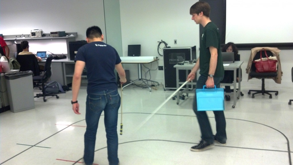
We will have our users perform the tests while carrying an item in their non-cane hand. To replicate how the task would actually be performed from start to finish, we will first have the user announce the destination which they are to reach aloud (as they would using hands-free navigation), and then via “Wizard of Oz” techniques we will provide the turn-by-turn directions.

We did a few test-runs in the ELE lab and found that it was necessary to dampen the extra noise created by our wizardry. The video below is a quick example of the method we will use when testing the prototype with users.

And the same method while carrying an item in the other hand:
free hand 1

2. Navigating in a Noisy Environment:
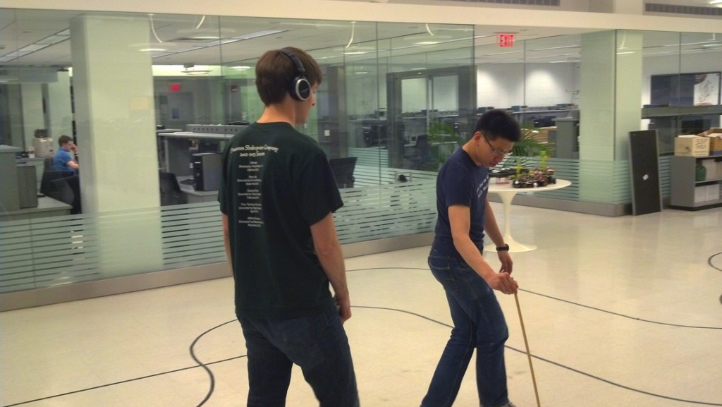
An important aspect of the design was to eliminate the user’s dependence on audio cues and allow them to pay attention to the environment around them. Likewise, we recognized that some environments (e.g. busy city streets) make navigating with audio cues difficult or impossible. In order to simulate this in our testing, we will ask the user to perform a similar navigation task as in Task 1 under less optimal conditions: the user will listen to the ambient noise of a busy city through headphones.
headphones 2

3. Navigating an Unfamiliar Indoor Space:
When navigating a large indoor space without “shorelinable” landmarks, the user uses the cane to maintain a straight heading as they traverse the space, and to maintain their orientation as they construct a mental map of the area. With our prototype, the user will be told that a landmark exists in a specific direction across an open space from their current location. They will attempt to reach the landmark by swinging their cane to maintain a constant heading. A tester will tap the cane each time the user swings it past geographic north, simulating the vibration of a higher-fidelity prototype. The user will also have the option to “set” a direction in which they’d like the tap to occur by initially pointing their cane in a direction, and will be asked to evaluate the effectiveness of the two methods. The user will be asked to explore the space for some time, and will afterwards be asked to evaluate the usefulness of the cane in forming their mental map of the area.

Description of prototype
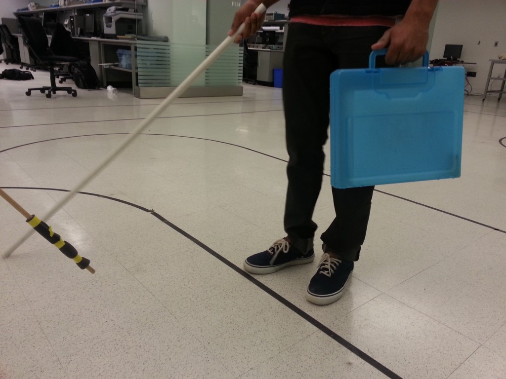
Our prototype consists of a 4ft PVC pipe, and a padded stick meant to provide tactile feedback without giving additional auditory cues. The PVC pipe is meant to simulate the long white cane used by blind people. The intended functionality of the product is to have the cane vibrate when the user swings the cane over the correct direction (e.g., north). To simulate vibration of the cane when it passes over a cardinal direction, we use the padded stick to tap the PVC pipe when it passes over the intended direction.

How did you make it?
The PVC pipe is used as-is. The padded stick is just a stick with some foam taped to its end as padding.

Other prototyping techniques considered
We considered taping a vibrating motor to the PVC pipe and having a tester control the vibration of the motor through a long wire when the user is swinging the PVC pipe. However, we realized it would not work well since the user would be swinging the pipe quite quickly, and it would be hard for the tester to time the vibration such that the pipe vibrates when it’s pointing in the right direction.

What was difficult?
This prototype was really simple to build.

What worked well?
The foam padding worked well to provide tactile feedback without giving additional auditory feedback.

Group Members: Joseph Bolling, Jacob Simon, Evan Strasnick, Xin Yang Yak

A3: Heuristic Analysis of SCORE

Group: Joseph Bolling, Evan Strasnick, Jacob Simon, Farhan Abrol

Individual Analyses:
Jacob Simon and Evan Strasnick
Farhan Abrol
Joseph Bolling

i. Most Severe Problems

1. Login Failure, Login Hours, and Login Timeout

  • Heuristics violated: H1, H3, H5, H9
  • Description: We identified two related problems with the SCORE login process. First, users frequently have trouble signing in at all, it throws an error message or open up another window with the same signin screen without any prompts. Secondly , the login is restricted to certain hours, and the error message given is just “invalid signon time” which conveys no information about the reason why it is an invalid time.
    Timeout when navigating to see classes – Information about classes is scattered between Registrars page,Score, and course reviews. In the time it takes to navigate back and forth, SCORE times out the session and you need to sign in again
  • Suggestions: Simplify the login process with more detailed error messages, and navigation links to more information about them. When SCORE signs out automatically, it should have a link to sign in again, instead of a CLOSE WINDOW button.

Screen Shot 2013-03-12 at 3.48.31 PM

2. Navigation

  • Heuristics violated: H3, H4, H7, H8
  • Description: There are multiple kinds of navigation available. There are dropdown menus for going to grades etc. There is the top menu bar that has navigation links that don’t necessarily make any sense (Self Help?)
  • Suggestions: Unify navigation into one consistent format (dropdowns/navigation bar) so that information has a logical flow.

ii. Problems made easier to find 
Problems involving H5 and H9 were made easier to find. From first glance, it is hard to recognize where errors might occur. Similarly, H1 is not always thought about but equally important because it emphasizes the usefulness of feedback to the user. If you think about problems that users are likely to have beforehand, it makes easier to identify weak spots in the interface.

iii. Problems not identified through Neilen’s heuristics 
We listed the “Invalid Logon Time” error as a significant problem above, but another issue we had with the logon time restrictions was the fact that SCORE is locked down for a slightly longer period on Wednesdays. We find this issue confusing and inconveniencing, but since it pertains more to the behavior of SCORE itself rather than the usability of the interface, we had difficulty classifying it with the interface heuristics.

Similarly, we had difficulty classifying other features that were annoying, but which stemmed from fundamentally necessary security concerns-the 15 minute timed logoff is inconveniencing and very annoying, but it was implemented regardless of this fact because it makes SCORE more secure. The same is true of the convoluted sign-on process that requires at least three pieces of user information. While we understand the need for such features and don’t see a way to solve them using mere corrections to SCORE’s interface, we wonder if perhaps there is a change that could be implemented on a more fundamental level that would make them unnecessary. For now, we have difficulty fitting them within the framework of Nielson’s heuristics.

Possible discussion questions

  • differentiate between similar heuristics
  • classify problems with a system as either UI problems (fitting under the heuristics) and functionality/system problems
  • propose changes to an example violation of each heuristic

A2: Tiger Tacos

Tacos

Observations
As someone who is five minutes late to everything, I thought it would be informative to arrive early to some of my classes and observe the foreign concept known as ‘waiting’. Professors Adam Finkelstein and Yael Niv offered interesting and unique examples of what can be done to improve the Princeton waiting time.

Adam Finkelstein, computer science

  • shows an entertaining video before lecture as people are walking in
  • people who are late don’t miss important material but early students aren’t bored
  • gives a five minute break in the middle of class and ends five minutes early
  • throws candy during class to people who ask or answer questions

Yael Niv, neuroscience

  • in every class, she invites five students to coffee with her.
  • ends class ten minutes early and takes those students to coffee before the next class
  • reviews previous material at beginning of class
  • frequent technical trouble with projector or mic could be addressed

Juan Albanell, sophomore

  • says that ten minutes is the “perfect amount of time if teachers end class on time”
  • suggestion: Make students ask questions at the beginning of class

Motivating Thoughts

“The constraints in a system are the rate-limiting step … and they ought to be the providers. In a private practice, things can only move as fast as the doctor-patient relationship.”

– Shortening Waiting Times: Six Principles for Improved Access, IHI.org

Though the above quote addresses the healthcare system and not education, there are some informative similarities and differences. The teacher-student relationship is still the rate-limiting step, but different constraints and liberties are placed upon the system. For one, classes are scheduled to begin and end at a certain time. Doctor’s appointments (except, say, psychiatrists) do not have this same endtime prescribed. Students struggle to arrive to class on time for a number of reasons, including the time at which the teacher of their previous class lets them out.

This establishes a sort of indirect relationship between teachers. If one professor’s lecture is running over, it causes students to be late to the next class, which causes that class to run over, and so on. Even if classes do not run over their allotted time slot, it is often the case that class is cut short of completion due to time limitations, and useful material is left uncovered or rolled over into the next lecture.

This is not to place blame on teachers for students’ being late—but it is an appropriate pain point to address. Like doctors, teachers are the “providers” of education, so changing the format of lectures could do more than changing students’ habits. In other words, students who are always late would not benefit long-term from any technology. Like the alarm clock, these technologies are quickly silenced and doomed to become stressful reminders rather than helpers. Teachers, on the other hand, can adopt simple changes and preparations that make better use of students’ time.

For example, if a teacher covers important logistical material at the beginning of class, some people will miss it and the material will eventually need to be repeated. It’s better to recap the last lecture or let students talk among themselves about the material while people come in. Maybe an optional self-quiz or group activity could be designed that encourages students to talk to people sitting around them.

At the same time, it’s important to address the quality of the teacher-student relationship, not just efficiency. Yael Niv’s solution is to end class systematically early and invite some students out to coffee every week. This means less time to go over lecture material, but more time spent with individual students. It also gives the rest of the students a larger break until their next class. Since the students she chooses are often ones that participate in class, it encourages students to come to lecture and speak up.

Brainstorm
In discussing the problem with other students and faculty, several types of solutions appeared. The first type of solution is to optimize the class selection process to reduce waiting and walking distance between classes. The second type addresses how teachers could work better within class time limits. The third is to improve the wait time vis-a-vis better teacher-student relations. The fourth is to provide new services that cater to students’ busy schedules.*

1. An upgraded scheduling system with travel time between classes to improve course selection and classroom assignment for both the registrar and students.

2. A modified presentation clicker that tells the teacher how many lecture slides they still have to go present, as well as how much time is left in class.

3. A heads up display on their laptop screen that performs the same role as above.

4. An app that allows teachers to push the remaining notes to students’ phones on the way out of lecture which they can view later in the day or while waiting for their next class.

5. A website called “Take a Teacher to Lunch” that helps students and teachers go to lunch before or after class.

6. A way for students to submit questions or discussion prompts to the teacher before class while they are waiting

7. A class-wide Wiki that students can update throughout the semester with their notes and comments. The entire class could collaborate to create a study guide or ‘course manual’ with help from instructors.

8. A study group app that helps you schedule times to meet with other people in your class and review material.

9. Just make the time between classes 15 minutes.

10. An app that tells you the closest dining hall to eat between classes.

11. An on-demand taco truck that will drive to meet students between classes at the location with the most requests made by phone during the last class.

Favorite Ideas
Ultimately, I decided to develop ideas #2 and #11. The improved presentation clicker is a simple idea with a tangible result, applicable in situations outside of just education. The crowdsourced taco truck, on the other hand, would integrate many different technologies at once and generate a lot of energy around campus—and provide an opportunity for classmates and teachers to grab a bite together after class.

Prototypes

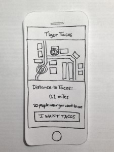
I quickly designed a wireframe for a mobile app that would allow students to request the taco truck at their current location.

angle

The design shows a map with the user’s location, the taco truck’s location, and a single large button. The truck would be instructed to head to the location on campus with the most requests at the moment.
front

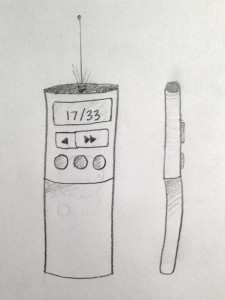
Below is the second design considered, a redesigned presentation clicker with a visual indicator showing how many slides are left in a presentation.
presenter

Testing 

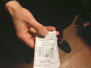
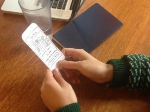
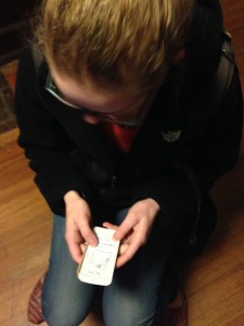
IMG_0807IMG_0571 IMG_1698I brought the Tiger Tacos prototype to several students to get their feedback. 

It was clear from testing that people “got” the idea, but several important assumptions were challenged nonetheless.

When I presented the prototype to Gavin Cook, he proceeded to enact a scenario in which he called a friend and invited them to get tacos after leaving class, only afterward pressing the “I want tacos” button in the app. The other testers were likewise wary of how they would have time to pick up tacos between classes if they had to wait for a truck to come.

This is informative: it means that the design did not convey how the app would work in reality—the user would likely have to send a request during class so that the taco truck has time to relocate. This could be better conveyed in future designs. Overall, though, feedback was positive and encouraging.

* Collaboration included discussion with Momchil Tomov, Shompa Choudhury, Nathan Eckstein, and Professor Zschau.

Lab 0: RGB Whack-a-Mole


We designed an RGB version of the ever-popular Whack-a-Mole game using a single multicolor LED, some buttons, and good old Arduino. We wanted to create something entertaining and interactive, that similarly allowed us to explore coding on the Arduino. At first, we envisioned a game with multiple LED’s, but then decided that playing the game in response to different colors in a single light was much more interesting than responding to the turning on or off of lights. Our second revision imagined the multicolor LED starting out as fully lit (white light), and then having components of the light drop out with the player having to press buttons to restore those color components. We liked the dual challenge both of reacting quickly and having to determine which color component was missing, but when playtesting we found that this latter aspect of the challenge was more frustrating than enjoyable for the player. Our final version lights up the LED with one of the three colors behind the diffusion screen and rapidly begins to dim. If the player either fails to respond in time or presses the wrong button, the light will go white, signaling GAME OVER! We are overall quite happy with how the game turned out, and how it helped us play around with the Arduino. The game is fun and completely customizable in just about every parameter. However, we had very few materials with which to construct the physical exterior of the game, so the prototype itself is somewhat of an eyesore.

Team Members: Joseph Bolling, Evan Strasnick, Aleksey Boyko, Jacob Simon

List of Parts:

  • Arduino Uno
  • Pushbutton style switches (3)
  • Tri-color RGB LED
  • 330Ω resistors (3)
  • Wire jumpers
  • Prototyping Breadboards (2)
  • Cardboard
  • Scotch tape

Instructions:

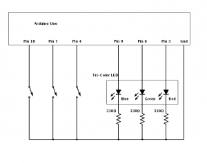
To create your own RGB Whack-a-Mole game, take a look at the circuit included above as a reference.  For the switches, use basic push-buttons.  Note that we chose to place our buttons on a separate breadboard from our tri-color LED, so that we would have a rudimentary controller and output device setup.  Connect the button that you’d like to correspond to the red color to pin 4 of the Arduino, the button that you’d like to use for blue to pin 7, and the button that you’d like to use for green to pin 10.  The red, green, and blue led leads should connect to pins 3, 6, and 9, respectively.

Label your buttons with the color they control, and make a cover for your LED so that the wiring is protected and hidden.  We used simple cardboard and some scotch-tape to make a window for our LED.  Then, upload our code to your Arduino and have fun!

Diagrams:

RGB Whack-a-Mole Circuit — This is the idea we implemented.

WhackAMole

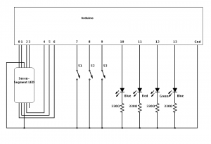
Binary Calculator Circuit — This would allow the user to perform simple arithmetic.

BinaryCalculator

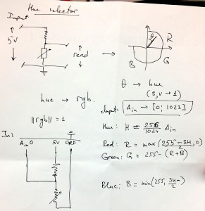
Color Selector Circuit — This would allow the user to create any color by selecting its RGB components.

Sketch 3 - Color scaler

Arduino Program:

// :::::::::::::::::::::::
// Lab 0
// COS436 / ELE469
// Trichromatic Whack-a-Mole / Color Blindness Reflex Test
// Group participants: jbolling, jasimon, estrasni, aboyko
// :::::::::::::::::::::::

// :::::::::::::::::::::::
// INPUT PINS
// :::::::::::::::::::::::
int r_but = 4;
int g_but = 7;
int b_but = 10;

// :::::::::::::::::::::::
// OUTPUT PINS
// :::::::::::::::::::::::
int r_pin = 3;
int g_pin = 6;
int b_pin = 9;

// :::::::::::::::::::::::
// INITIAL COLOR VALUES
// :::::::::::::::::::::::
int r_v = 0;
int g_v = 0;
int b_v = 0;

// :::::::::::::::::::::::
// DIMMING PARAMETERS
// :::::::::::::::::::::::
boolean dim_on = false;
int dim_delta = 0;
float dim_factor = 1;
int dim_ch = 0;
int counter = 1;
int score = 0;

// :::::::::::::::::::::::
// SETUP FUNCTION
// :::::::::::::::::::::::
void setup() {

Serial.begin(9600); // Terminal output

// Input settings
pinMode(r_but, INPUT);
pinMode(g_but, INPUT);
pinMode(b_but, INPUT);

digitalWrite(r_but, HIGH);
digitalWrite(g_but, HIGH);
digitalWrite(b_but, HIGH);

// Output settings
pinMode(r_pin, OUTPUT);
pinMode(g_pin, OUTPUT);
pinMode(b_pin, OUTPUT);

Serial.println(“Set up complete”);

reset_state();

}

// :::::::::::::::::::::::
// MAIN LOOP
// :::::::::::::::::::::::
void loop() {
// If no dimming is happening, try to initiate
if (!dim_on) {
Serial.println(“Dim is not on”);
dim_on = initiate_dimming();
}

int io_code = factor_input();
if (dim_on) {
Serial.println(“Dim is on!”);

// see if input stops dimming
if (io_code != 0) {
// no user input
dim_more();
} else {
// correct input
counter++;
reset_state();
}
} else {
reset_state();
}

// set the diffuser output
analogWrite(r_pin, r_v);
analogWrite(g_pin, g_v);
analogWrite(b_pin, b_v);

delay(100);
}

void reset_state() {

// Reset color values
r_v = 0;
g_v = 0;
b_v = 0;

// Turn dimming off
dim_ch = 0;
dim_on = false;
}

boolean initiate_dimming() {

// Choose a random color
dim_ch = random(0, 3);

// Turn that color on, full brightness
switch (dim_ch) {
case 0:
analogWrite(r_pin, 255);
r_v = 255;
break;
case 1:
analogWrite(g_pin, 255);
g_v = 255;
break;
case 2:
analogWrite(b_pin, 255);
b_v = 255;
break;
default:
break;
}

// New dimming factor
dim_factor = 1.0 – (counter) / 20.0;

// Terminal output
Serial.print(“\tDimming channel “);
Serial.print(dim_ch);
Serial.print(” with factor “);
Serial.println(dim_factor);

return true;
}

int factor_input() {

// read KEY_DOWN events
boolean r_pressed = (digitalRead(r_but) == LOW);
boolean g_pressed = (digitalRead(g_but) == LOW);
boolean b_pressed = (digitalRead(b_but) == LOW);
// encode input with one value
int in_code = (r_pressed?1:0) + (g_pressed?2:0) + (b_pressed?4:0);

// if any was down wait until all keys are released
while (r_pressed || g_pressed || b_pressed) {
delay(100);
r_pressed = (digitalRead(r_but) == LOW);
g_pressed = (digitalRead(g_but) == LOW);
b_pressed = (digitalRead(b_but) == LOW);
}

// Encode dimming channel in the same way as buttons
int out_code = 0;
if (dim_on)
out_code = 1 << dim_ch;

// Difference between input and output
int input_factor = out_code – in_code;

// If user’s input doesn’t match correct input…
if (input_factor != 0 && in_code != 0) {
failure(); // Fail and reset
}

return input_factor;
}

void dim_more() {
if (!dim_on) return;

switch(dim_ch) {
case 0:
//r_v += dim_delta;
r_v *= dim_factor;
if (r_v < 10) failure();
break;
case 1:
//g_v += dim_delta;
g_v *= dim_factor;
if (g_v < 10) failure();
break;
case 2:
//b_v += dim_delta;
b_v *= dim_factor;
if (b_v < 10) failure();
break;
default:
break;

}

}
void failure() {
digitalWrite(r_pin, 255);
digitalWrite(g_pin, 255);
digitalWrite(b_pin, 255);
Serial.print(“Game over! Score = “);
Serial.print(score);
Serial.println(” Try again…?”);
score = 0;
counter = 1;
dim_on = false;
delay(3000);
}

void light_correct() {
score++;
reset_state();
}