P5 – Name Redacted

Group 20 – Name Redacted

Brian, Ed, Matt, and Josh

Summary: Our group is creating an interactive and fun way for middle school students to learn the fundamentals of computer science without the need for expensive software and/or hardware.

Description of the tasks:

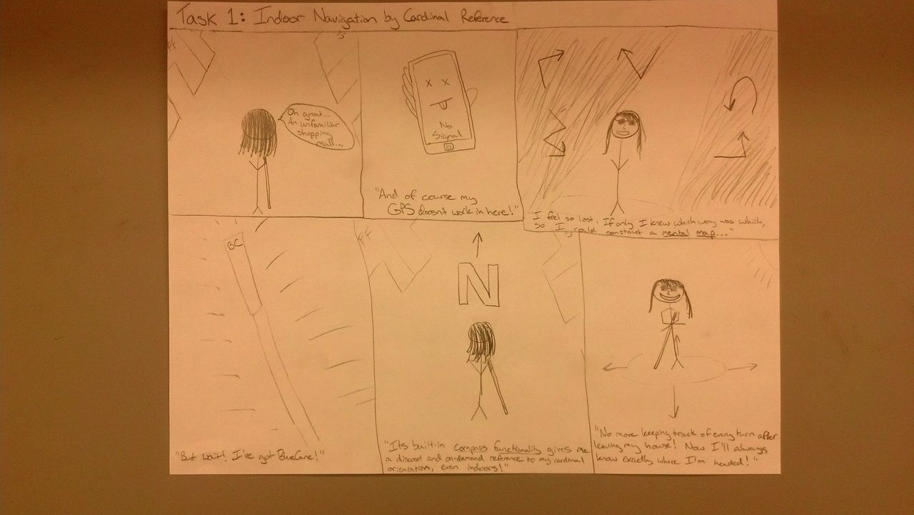
Binary: In this task, users will be introduced to number systems and learn how to convert between them. Users will be able to make numbers in binary, hexadecimal, octal, or decimal and see the number converted in real time into the other number systems.  The program will shows the users how the octal, hexadecimal, and binary numbers are created (i.e. 2^0 * 1 + 2^1 * 1 = 3).

Tutorial: In order to introduce teacher to the basic of the TOY programming interface, they will be guided through a basic tutorial teaching them how to use the features of the system while making a simple program. Users will be guided through the process via on screen text, drawings, and animations that will explain what the onscreen information means, what to do next, and how to interact with the system.

TOY Program: In the TOY programming environment, users (primarily students) will be free to make and experiment with their own programs. Users create programs by placing instruction tags in the correct position and sequence on the whiteboard. The program can then be run, executing instructions in sequence and providing visual feedback to users to help them understand exactly what each instruction does.

Program Initialization: There is also a fourth task that we have created while developing our working prototype.  This task is the initialization of the program that requires the users to initialize the webcam and projector space.  This task also includes key commands that allow the users to debug their own code, by showing them which lines are grouped together as rows.  Part of the idea from the task came from an expansion of the Tutorial feedback, since the tutorial should really begin when the program is first loaded on the teachers laptop.

Choice of the tasks:

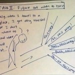
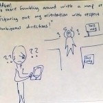
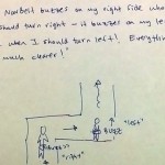
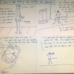
We decided not to change our tasks significantly from P4 to P5.  Starting with P2, we received feedback from students and an instructor suggesting that binary and visualizing memory were the two hard (and very important) concepts when first learning computer science.  There was a general consensus that binary was easier than visualizing memory and coding in TOY.  Thus, we really want our tasks to include these two concepts from computer science.  Our third task is focused on the teachers who will use our project.  This is a logical last task since our user group is both students and teachers.  Teachers will need to learn TOY before teaching their students, and thus we need to provide a simple interface to teach them the main concepts in the TOY language.  We also cannot assume that every teacher will have an advanced computer science background, so the tutorial has to be simple enough and yet still explain the details of TOY.  However, we created a fourth task given the feedback from P4 and the information gained while building the prototype.  We are going to provide a simple interface for teachers to learn how to initialize our system.  This is very simple, and just requires the teacher to push “i” to map the webcam space to the projector space, but is still very important nonetheless.  It will also require telling the teacher how to put tags on the board to switch between TOY Programming, the tutorial, and binary.

Revised Interface Design:

The big push of our work this week was to try and fit the design aspiration of the projects to the realities of the technologies.  At the core of our project is a fundamental platform we created that allows developers to write applications on top of it.  Before talking about the specific applications that we implemented, I want to touch on the design choices that we had to make for the platform itself.  These are design choices that we couldn’t have conceived of while doing the paper prototype because the reality of the technology did not exist.  Our fundamental platform interface is this: Users boot the program on a computer attached to a monitor.  Two visualizations are rendered on the screen.  The first is the projector space.  This is where applications can write.  The second is the monitor space.  This is where the camera image is displayed.  The camera is then pointed at the projector and the “i” key is pressed.  This starts our “initialization mode,” where we align the projector coordinates with the camera coordinates and calculate the appropriate translation.  After the system has been initialized, you can then press the “u” key to display debug information on the projector.  When tags are placed on the screen, their corners are highlighted by the projector showing that it is properly aligned.  Also, when tags are organized into rows, those rows are highlighted to show that they tags are semantically connected.  The debugging information is a UI that we expose to Applications developers so they can see visually, how the framework is interpreting the images on the screen.

Moving on to some of our applications, the first application that we implemented is assembly.  We stuck with the same general layout as our paper prototype.  We had iterated through where we were going to place the “code,” “output,” and “registers” sections previous to the final paper prototype.  Given the feedback that we received during prototype testing, we felt that this final layout (code on the left, registers and output on the right) was the most effective.  We did play around with various output types.  This is again something that didn’t come up as much during the paper prototyping phase.  Now output needs to scroll.  We also dealt with the clearing of the output field when programs were re-launched because that was something that our testers had found confusing.

Our second application that we implemented with our number base conversion application (We call it “Binary”).  This is where the user can see how different number representations might display the same numerical value.  Our paper prototype was very free-form and allowed for users to place the tags anywhere on the board.  This lead to confusion, where users would either place too many tags on the board or place tags in the same row when they did not mean to.  We therefore altered our design so it was more constructive.  We created a grid that the users could populate with values.  This suggests to them that they need to separate the rows spatially and also helps them to understand that they should only fill in a single field at a time.

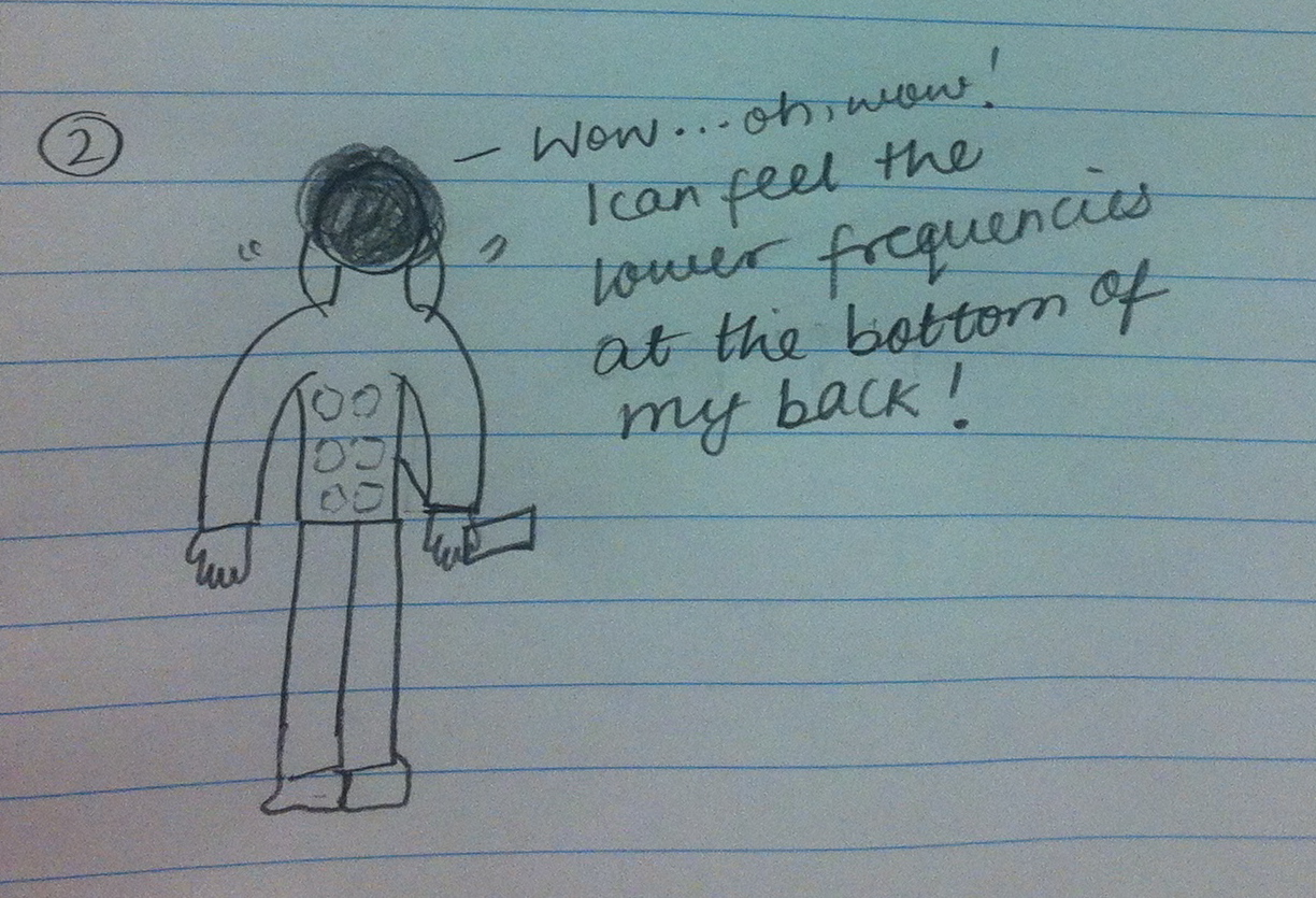
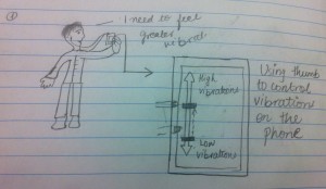
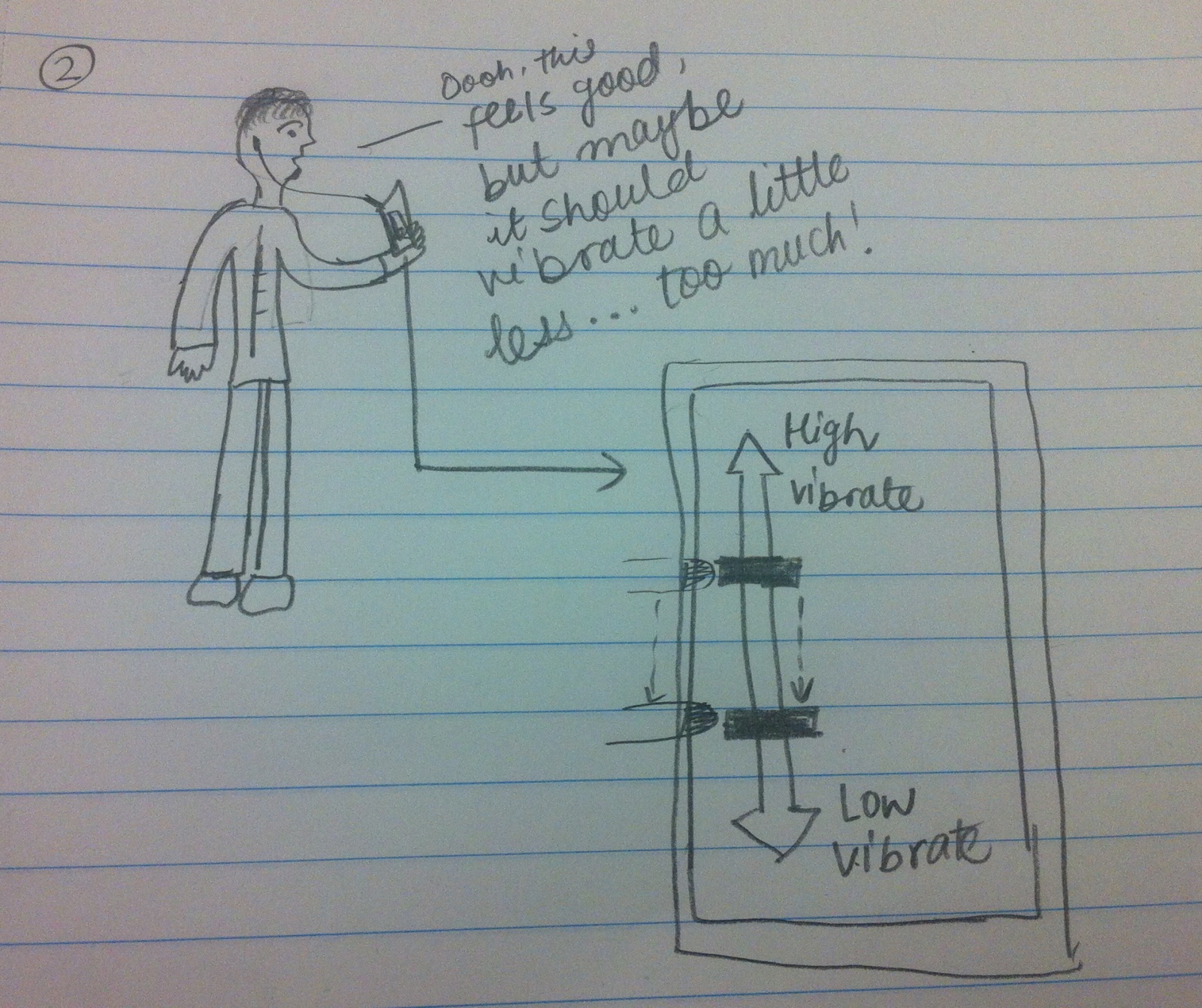
Moving forward, we have a couple of interesting features we have yet to implement.  I think the biggest place where UI design will have to play a role is error messaging.  With the complexity of our Assembly application, we saw that users are already prone to creating erroneous and nonsensical programs.  This is not a problem with our application.  Some of the greatest “teachable moments” in computer science come not out of writing correct programs but realizing why a given program is incorrect.  We therefore want to make sure that the user gets the most informative UI possible when an error is received.  This will include syntax highlighting and visual feedback.  We have created a few sketches of possible designs in the slideshow below.

This slideshow requires JavaScript.

Overview and Discussion of Prototype:

i) Implemented Functionality

Our  project can read in the AR Tags with a webcam, and apply the correct homography translations to map the webcam space to the projector space.  This allows us to circle tags with the projector that are on the wall.  We used this functionality to create our debugging API which allowed us to get the extensive backend code fully operating.  Our debugging API also gave us greater insight into the limitations of AR Tags.  Namely, AR Tags on a screen must be unique.  There are 1024 different possible AR Tag combinations, and so we are in the process of creating multiple tags for register names, TOY labels, and integer literals.  We also have a TOY to Java compiler and interpreter that allows any sequence of the commands to be read and executed.  The debugging API that we have been using for development will evolve into a debugging API for the students using the program, where incorrect syntax will be highlighted and errors shown on the output side.  The big hurdles when creating the backend and preliminary front end interfaces were getting familiar with Processing, determining the limitations of Processing and AR Tags, and creating a suitable abstraction that will allow for easy proliferation of tasks.  We have created a very simple abstraction that would allow programmers to easily create new applications, as well as allow us to create new applications.  No matter what the frontend application, we have created an interface that the backend can interact with, so that a new application would require no new backend programming.  Overall, both the frontend and backend code together are more than 1300 lines of code, almost all of which we wrote (tutorials borrowed from listed below).  We wanted to talk extensively about the backend functionality because it required a lot of work and hours, but it enabled us to create an interface that will make finishing the project much simpler.  Although the frontend programming is not completely done (and most of the “wow” factor comes from the frontend features), the backend is certainly the hardest part of the assignment and it is nearly complete for the project.  The TOY Program is also nearly complete, and the binary program should not take much more time given the interfaces and abstractions that we created.  The Tutorial is just an extension of the TOY Program.

ii) Left Out Functionality

We decided to leave out the error messages that the TOY Program generates for a few reasons.  Firstly, all of the code is there to implement the feature, but we are currently focusing on our debugging and thus we have made the output images projected help us rather than a potential future user.  However, the red boxes seen in the images in the next section are essentially the same as the error messages that users will see in the final product, but for now we were more concerned with debugging the back end and extensive tag libraries that we had to write.  In a similar fashion, we left out some of the messages that will appear during the tutorial, but the messages will appear in the output section of the TOY Program, which is already set up to print the desired tutorial messages.  In the meantime, however, we wanted to use this section for our own debugging purposes.  Now that we have basically finished the backend, we can start specializing these parts of the code to focus on the user.  The functionality that we decided to leave out is very easy to add, but for the time it is more important to create a debugging framework.

iii) Wizard-of-Oz Techniques

There are no wizard-of-oz techniques for the TOY Program.  However, the output for the binary program is hard coded in for now, while we further develop that individual program.  We are also going to accept the advice of our paper prototype testers and put more information about how we calculate the binary output.  Also, at the time we only have one tag corresponding to each command and number.  By the final prototype we are going to have multiple tags for each command and number so that the programs can be more complete.  We only have one tag corresponding to each number since it took so much coding on the backend and the debugging API to be completed before realizing that limitation of the AR Tag library.  We decided to have the output for binary hard coded in for now since we wanted to really finalize the backend of the application with a layer of abstraction that would make coding the rest of the binary program very easy.  Thus, we decided to focus much more on getting the backend complete than on the frontend applications.  This makes sense, since the frontend could not run without the backend basically completed.

v) Documented Code

For the AR tag detection, we are using the NyARToolkit, a Java implementation of the ARTooKit Library, available at http://nyatla.jp/nyartoolkit/wp/. For calculating homography, we are using the homography library created by Anis Zaman Keith O’Hara, available at https://code.google.com/p/the-imp/source/browse/src/PCLT/src/edu/bard/drab/PCLT/Homography.java?r=7a9657a65e976ac38b748b35fa7b36806326011d. We used a Processing and ARToolKit tutorial to get started, but only small elements of this tutorial remain in our current code. This tutorial is available at http://www.magicandlove.com/blog/research/simple-artoolkit-library-for-processing/.

Documentation


Testing setup.


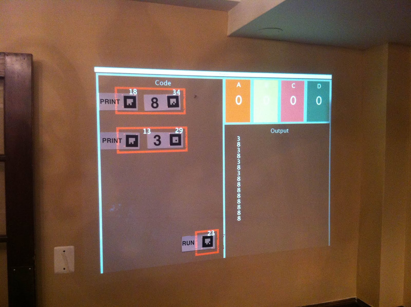
Toy Program. The red boxes are for debugging, showing that the homography is working and the tags are correctly identified. The output correctly shows the results of the program (which has been run multiple times).


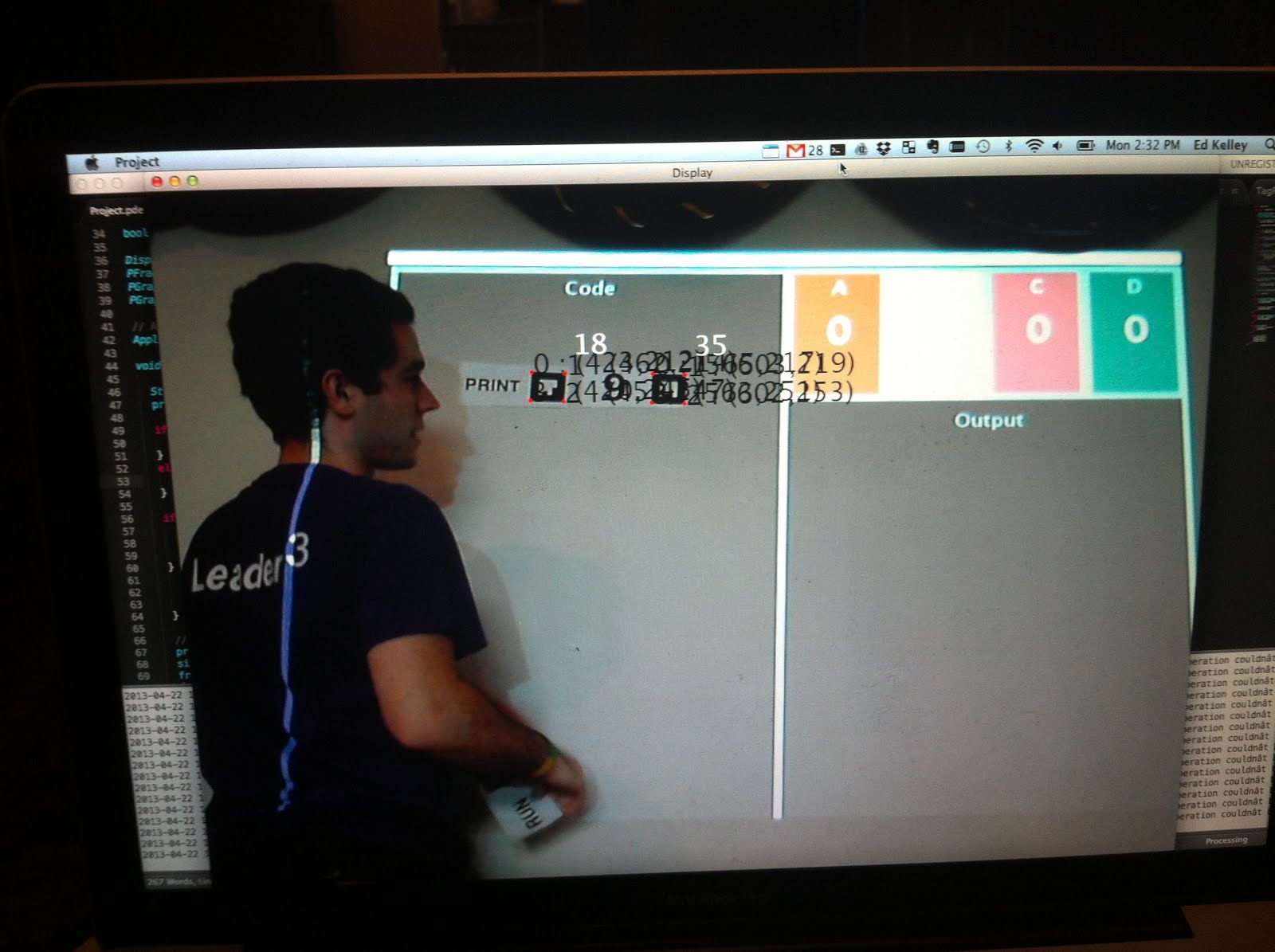
Monitor display. Shows tag debugging information and camera view.


Testing system on a projector screen.


Example of the Binary program. Currently hard-coded values used. However, building the application in our framework will be a relatively simple task.


Do You Even Lift?- P5

a. Group Information

Group 12
Do You Even Lift?

b. Group Names

Adam, Andrew, Matt, Peter

c. Project Summary.

Our project is a kinect based system that watches people lift weights and gives instructional feedback to help people lift more safely and effectively.

d. Project Tasks

Our first task is to provide users feedback in their lifting form. In this prototype, we implemented this in the “Quick Lift” mode for the back squat. Here, the user performs a set of exercises and the system will give them feedback about their performance on each repetition. Our second task is to Create a full guided tutorial for new lifters. In this prototype, we implemented this in the “Teach Me” mode for the back squat. Here, the system takes the user through each step of the exercise until the user demonstrated competence and is ready to perform the exercise in “Quick Lift” mode. Our third task is to track users between sessions. For our prototype, we implemented this tasking using the “wizard of oz” technique for user login. Our intention is to allow users to login so that they can reference data from previous uses of the system.

e. Changes in Tasks

We originally intended to allow users to log in to a web interface to view their performance from previous workouts. We thought there were more interesting interface questions to attack with the Kinect though, so we decided to forgo creating the web interface for our initial prototype. For now, we will use “Wizard of oz” techniques to track users between sessions but intend to develop a more sophisticated mechanism in further iterations of the system prototype.

f. Revised Interface Design Discussion

We revamped the design of the TeachMe feature to include user suggestions. Nearly all of the users who tested our system suggested that an interactive training portion would be useful, as opposed to the step by step graphics we had originally incorporated. We have implemented the interactive TeachMe feature, and are very pleased with it’s turnout. The previous testing was very helpful in reimagining the design.

Other small changes were made as well. We changed much of the text throughout the system, again based on feedback provided by the users. For example, we switched the text to read “Just Lift”, instead of “Quick Lift,” which we believe better describes the functionality offered by the accompanying page. Similarly, we changed “What is this?” to “About the system”, again resulting in a clearer description of what the resulting page does.

Original Sketches can been seen here: https://blogs.princeton.edu/humancomputerinterface/2013/03/11/p2/

And our new interface can be seen below.

Updated Storyboards of 3 Tasks

Just Lift

1) OH YEAH! Squats today!
2) Haven’t lifted in a while…I hope my form’s OK…
3) Guy: WOAH!, System: Virtual Lifting Coach
4) Guy: Wow! It’ll tell me about my form!, System: Bend Lower!
5) How great!! (victory stars appear everywhere to help our friend celebrate.)


Teach Me

1) I want to lift weights!
2) But I don’t know how 🙁
3) And everyone here is soooo intimidating….
4) Guy: WOAH! System: Learn to Lift!
5) What a great intro to lifting!


User Tracking

1) January (some weight)
2) February (more weight)
3) March (even more weight)
4) If only I knew how I’ve been doing…
5 Guy: Just what I needed! System: Your progress


Sketches For Unimplemented Portions of the System

We still have to implement a mechanism for displaying a user’s previous lifting data. In our prototype we did login using “wizard of oz” techniques. We intend though, once the user is logged in, to have a “History” page that would display summary data of a user’s performance in a graph or in a table like the one below.


Additionally, we would like to go even further with the idea of making the “Teach Me” feature of the system more of a step by step interaction. We found in our personal tests of the system, that it was not very fun to read large blocks of text. We want to present users with information in small bits and then have them either wave their hand to confirm that they read the message or have them demonstrate the requested exercise to advance to the next step of the tutorial.

System gives user a small bit on information. User waves hand after reading.

System tells user to do some action 3 times. User does that action 3 times.

After doing the action 3 times, user waves hand to go to next step of tutorial.

g. Overview and Discussion of New Prototype

As described above, we radically changed the TeachMe section of the prototype. We originally implemented a presentation-style interface, with static images accompanied by text that the user read through. In the second revision of the prototype, we adopted a much more interactive style, where the steps are presented one at a time. After the presentation of each step, the user is then allowed to practice the step, and cannot progress until they have perfected their technique. We believe this style more engaging as well as more effective, and has the added benefit of not letting users with poor techniques (whether through laziness or lack of understanding) slip through the cracks. This emphasis on developing strong technique early on is important when safety is a factor; users can be severely injured if they use incorrect technique.

We have also implemented the Just Lift feature. The interface has been refined from the previous iteration to the current one, including streamlined text. We are pleased with how the interface has developed. The system automatically tracks and grades your reps, with sets defined by when the user steps outside of the screen. There was no precedent for this interface decision, but we believe we made a fairly intuitive choice: after watching how people lift in Dillon, we noticed that they will frequently step aside to check their phone or get a drink after a set.

As described above, we decided not to implement the web interface, and instead adopted an advanced user login feature. The web interface, because it required a new modality (web), would have required a lot of groundwork for a relatively small return. Additionally, we believe the user login feature (OCR recognition of gym card or prox) offers the chance to explore significantly more interesting and novel interface decisions than the web based interface would allow. We will include a “History” page in the Kinect system, to take the place of the web interface and allow user’s to see summary data of previous workouts.

For now, the OCR user login will be implemented using wizard of oz techniques. We are investigating into OCR packages for the Kinect, including open source alternatives. Again, this is a feature that’s a prime candidate for wizard of oz techniques. It provides a rich space to explore what “interfaces of the future” might look like, keeping in line with the spirit of the Kinect. OCR packages exist, but they may be difficult to connect with the Kinect. Until we have time to further explore the subject, the wizard of oz technique is a great way to allow us to explore the interface possibilities without being bogged down by the technology. In addition to login, our audio cues were generated with “wizard of oz” techniques. We typed statements into google translate and had them spoken aloud to us. We “wizard of oz-ed” this functionality because we believed it was non-essential for the prototype, believe that audio cues will not be too difficult to implement with the proper libraries, and wanted to tie in some of the audio cues with the system login, which is also yet to be implemented.

References/Sources

To get ourselves set up, we used the sample code that came with the Kinect SDK. Much of this sample code remains integrated with our system. We did not use code from sources outside of this.

h. Video and Images of prototype 

System Demo

*Note in the video we refer to “Just Lift” as “Quick Lift.” This is an error. We were using the old name which has been updated after feedback from user testing.

The first screen the user sees: Select and Exercise

The user then chooses between “Just Lift” and “Teach Me.”

“Teach Me” takes the user through a step by step tutorial. Instructions update as the user completes tasks.

The “Just Lift” page keeps track of each of the user’s repetitions. For each repetition, it dynamically adds an item to the list with a color corresponding to the quality of that repetition. When the user clicks each repetition, the interface displays feedback and advice to help the user improve. When the user exits and re-enters the view of the camera, the system creates a new set.

P5 – Group 10 – Team X

Group 10 – Team X

Junjun Chen (junjunc), Osman Khwaja (okhwaja), Igor Zabukovec (iz), Alejandro Van Zandt-Escobar (av)

Summary:

A “Kinect Jukebox” that lets you control music using gestures.

Supported Tasks:

1 (Easy). The first task we have chosen to support is the ability to play and pause music with specific gestures. This is our easy task, and we’ve found through testing that it is a good way to introduce users to our system.

2 (Medium). The second task is being able to set “breakpoints” with gestures, and then use gestures to go back to a specific breakpoint. When a dancer reaches a point in the music that they may want to go back to, they set a breakpoint. Then, they can use another gesture to go back to that point in the music easily.

3 (Hard). The third task is to be able to change the speed of the music on the fly, by having the system follow the speed of a specific move. The user would perform the specific move (likely the first step in a choreographed piece) at the regular speed of the music, to calibrate the system. Then, when they are ready to use this “follow mode” feature, they will start with that move, and the music will follow the speed at which they performed that move for the rest of the session.

Changes in tasks and rationale

Our choices of tasks has not changed much over P3 and P4. We thought Not changing the first task was an easy decision, as it is simple, easy to explain to users and testers, and easy to implement. This makes it a good way to introduce users to the system. We’ve also learned from testing that starting and stopping the music is something dancers do a lot during rehearsal, so it is also an useful feature. Our second and third tasks have morphed a little (as described below), but we didn’t really change the set of tasks, as we thought that they provided a good coverage of what we wanted the system to do (to make rehearsals easier). Being able to go back to specific points in the music, and have the music follow the dancers were tasks that were well received in both our initial interviews with dancers as well as P4 testing.

Revised Interface Design

Our first task didn’t change, but our second task has morphed a little from P4. We had originally planned to allow only one breakpoint, as it was both easier to implement and simpler to explain, which was ideal for a prototype. However, since one of our users said that he would definitely want a way to set more than one, we are including that in our system. Our third task has also changed slightly. We had thought that the best way to approach our idea, which was to have the music follow the dancer as they danced, was to have it follow specific moves. However, it did not seem feasible for us to do that for a whole choreography (as it would require the user to go through the whole dance at the “right” speed first for calibration), we decided to follow only one move in P4. However, this did not seem to work well, as dancers do not just isolate one move from a dance, even during practice. So instead, we’ve decided to follow one move, but use that one move to set the speed for the whole session.

Updated Storyboards:

Our storyboards for the the first two tasks are unchanged, as we did not change those tasks very much. We did update the storyboard for the third task:

Sketches of Unimplemented Features:

A mockup of our GUI:

Some other sketches of our settings interface can be found on our P3 blog post (https://blogs.princeton.edu/humancomputerinterface/2013/03/29/group-10-p3/) under the “Prototype Description” heading.

Overview and Discussion:

Implemented functionality:

We implemented the core functionality of each of our three tasks, which includes recognizing the gesture using the Kinect, and generating the appropriate OSC messages that we can then pick up to process the music. As seen in the pictures, with the software we’re using (Kinect Space), we’re able to detect gestures for pausing, playing, setting a breakpoint, as well as detect the speed of the gesture (Figures A1 and A2). We are then able to process and play music files using our program (Figure B1), written in Max/MSP. As show in the figure, we are able to change the tempo of the music, set breakpoints, as well as pause and play the music.

Functionality Left Out:

We decided to leave out some of the settings interface (allowing users to check and change customized gestures), as we believed that this is would not affect the functionality of our prototype too much. Also, the software we are using for gesture recognition includes a rudimentary version of this, which is sufficient for testing (Figure A3). We also realized that we are not able to change the playback rate of an .mp3 file (because it’s compressed), so we need to use .wav files. It should be simple to include (as part of our system), a way for users to convert their .mp3 files into .wav files, but we’ve decided to leave this out for now, as we can do user testing just as well without it (it would just be more convenient for users if we supported mp3 files).

Wizard of Oz Techniques:

Our prototype is essentially two parts: capturing and recognizing gestures from the Kinect, and playing and processing music based on signals we get from the first part. The connection between the two can be done using OSC messages, but we need the pro version of the software we are using to recognize gestures for this to work. We’ve been in contact with the makers of that software, who are willing to give us a copy if we provide them a video of our system as a showcase. For now, though, we are using wizard-of-oz to fake this connection. Figure B2 shows the interface between our music manipulation backend, GUI, and the Kinect program.

Code from Other Sources

We are using the Kinect Space tool for gesture recognition (https://code.google.com/p/kineticspace/). For now, we are using the free, open source version, but we plan to upgrade to the Pro version (http://www.colorfulbit.com).

Images:

Figure A1 (The Kinect Space system recognizing our “breakpoint” gesture.)

Figure A2 (The Kinect Space system recognizing our “stop” gesture. Note that it also captures the motion speed (“similar” for this instance), which we are using for task 3).


Figure A3 (We are able to set custom gestures using Kinect Space.)


Figure B1 (A screenshot of our backend for audio manipulation, made with Max/MSP).

Figure B2 (A screenshot of interface between the different parts of our system. This is how people will control it, and it also shows communication with the kinect program.)


P5 – Team BlueCane (Group 17)

Group 17 – BlueCane

Team Members: Evan Strasnick, Joseph Bolling, Xin Yang Yak, Jacob Simon

Project Summary: We have created an add-on device for the cane of a blind user which integrates GPS functionality via bluetooth and gives cardinal and/or route-guided directions via haptic feedback.

Tasks Supported in this Prototype: Our first, easiest task arises whenever the user is in an unfamiliar space, such as a shopping mall or store.  As they mentally map their surroundings, it’s imperative that the user maintain a sense of direction and orientation. Our cane will allow users to find and maintain an accurate sense of north when disoriented, increasing the reliability of their mental maps. Our second and third tasks both confront the problems that arise when a user must rely on maps constructed by someone else in order to navigate an unfamiliar space, as is the case with navigation software and GPS walking guidance. In the second task, (medium difficulty) our cane would assist users on their afternoon walk by providing haptic and tactile GPS directions, allowing users to explore new areas and discover new places. In our third and most difficult task, our cane alleviates the stress of navigation under difficult circumstances, such as frequently occur when running errands in an urban environment. In noisy, unfamiliar territory, the BlueCane would allow users to travel unimpaired by environmental noise or hand baggage, which can make it very difficult to use traditional GPS systems.

How Our Tasks Have Changed Since P4: As our tests in P4 were conducted on seeing users who are not familiar with cane travel, we hesitate to generalize our findings to our target user group. Now that we’ve managed to find blind people in the community to volunteer to test our next prototype, we can be more confident that our findings from P6 can be better generalized. The aim of our testing procedure remains largely the same – we still want our users to be able to navigate with one hand free while being able to pay attention to other auditory cues. Since our previous round of tests did not give us much useful insight, we decided to keep most of the tasks the same. For example, seeing users found the task of walking-in-a-cardinal-direction-given-North challenging, but we expect blind users to perform better at this task, since they already have to orient themselves relative to a known direction without visual cues. Thus, the feedback that blind users give while performing this task would still be useful, and we are not changing this task. Also, blindfolded seeing users walked slowly while being heavily reliant on tactile feedback for guidance as they performed the task of follow-the-direction-of-the-tactile-feedback, which is unrealistic. We expect blind people to walk much faster than blindfolded seeing people, and this would lead to a different set of challenges for our system. As such, we are not changing this task either. However, we also recognize that cane users also make use of a great deal of tactile feedback in normally getting around obstacles. Thus, for the task where the user is given auditory distractions, we are modifying the task by adding obstacles along the users’ path in order to simulate a more challenging use case and to check if the cane vibration would be too distracting.

Revised Interface Design:  Obviously, because we were only able to locate seeing participants for our first round of user testing, we were hesitant to drastically change aspects of our design in ways that may not actually be relevant to blind users. Most notably, our prototype now currently takes the form not of a cane itself but as a simple add-on which can be placed on a cane. This design was chosen because we wanted to test the usability of our system without the confound of the additional learning a blind user would have to do simply to get used to a new cane. With our prototype, the user can test with their own familiar cane, adding only the slight weight and form factor of the device. As noted in the discussion of our P4 blog post (http://blogs.princeton.edu/humancomputerinterface/2013/04/09/p4-bluecane/), we wanted to make it very clear to the user which of the navigation “modes” the cane was currently in. Thus, we added a simple switch which alternates between the two modes and has braille markings on either side to make the distinction quite clear.

Updated Storyboards:

Task 1

Task 2

Task 3

Elements Still to Be Added:

The Eventual Smartphone App

Overview and Discussion of the New Prototype:

i. For our first working prototype, we used our magnetometer, bluetooth Arduino shield, and vibration motor to implement the important features of our final design. Rather than constructing or modifying an entire cane, though, we decided to make the prototype as lean as possible by attaching it to the user’s existing cane. The prototype is capable of telling users when they are pointing in a particular cardinal direction (i.e. magnetic north) using haptic feedback. It is also capable of sending and receiving receiving data wirelessly over bluetooth, which can be used for providing turn-by-turn navigation in conjunction with a GPS-equipped device.
ii. There are some notable limitations to our prototype that we hope to address in future refinements. We hope to develop a more sophisticated mapping from the magnetometer that will allow us to send, receive, and store specific directional bearings. We may use some degree of machine learning to calculate the desired range of magnetometer values. We would also like to refine the bluetooth interface by developing a simple Android app that can communicate with the cane. Our emphasis for this prototype was to build a reasonable proof-of-concept, though, so we have left these advanced functions on the back burner until we get more feedback. Finally, we are still discussing having our final product take the form of an actual cane.
iii. We wizard-of-oz’ed some of the cane’s navigation features. For example, to give the user directions and turns, we wrote a Processing program that uses keyboard input to send commands to the cane in real-time. This is a functional substitute for a phone and GPS application would do in the real world. Simulating these features without the complication of third-party hardware/software allows us to test features quickly, debug connection problems, and maintain control over the testing procedure.
iv. The code for the bluetooth functionality was written with guidance and examples from the manufacturer’s documentation and Arduino tutorials. We also utilized some of the example code that came from the SparkFun page for our magnetometer.
Videos and Images:
The Cane Add-On
The Processor and Other Hardware
Attached to a “Cane”
The Prototype in Action

P5 – Group 16 – Epple

Group 16 – Epple

Andrew, Brian, Kevin, Saswathi

Project Summary:

Our project is to use Kinect to make an intuitive interface for controlling web cameras through using body orientation.

Tasks:

The first task we have chosen to support with our working prototype is the easy-difficulty task of allowing for web chat while breaking the restriction of having the chat partner sit in front of the computer.  A constant problem with web chats is the restriction that users must sit in front of the web camera to carry on the conversation; otherwise, the problem of off-screen speakers arises.  With our prototype, If a chat partner moves out of the screen, the user can eliminate the problem of off-screen speakers through intuitive head movements to change the camera view. Our second task is the medium-difficulty task of searching a distant location for a person with a web camera.  Our prototype allows users to seek out people in public spaces through using intuitive head motions to control the search of a space via web camera, just as they would in person.  Our third task is the hard-difficulty task of allowing web chat with more than one person on the other side of the web camera.  Our prototype allows users to web chat seamlessly with all the partners at once. Whenever the user wants to address a different web chat partner, he will intuitively change the camera view with his head to face the target partner.

Task changes:

Our set of tasks has not changed from P3 and P4.  Our rationale behind this is that each of our tasks was and is clearly defined and the users testing our low-fi prototype did not have complaints about the tasks themselves and saw the value behind them. The comments and complaints we received were more about the design of our prototype environment, such as placement of paper cutouts, and inaccuracies with our low-fi prototype, such as the allowance of peripheral vision and audio cues with it.

Design Changes:

The changes we decided to make to our design based on user feedback from P4 were minimal. The main types of feedback that we received, as can be seen on the P4 blog post, were issues with the design of the low-fidelity prototype that made the user experience not entirely accurate, suggestions on additional product functionality, and tips for making our product more intuitive. Some of the suggestions were not useful in terms of making changes to our design while other suggestions were very insightful but we decided that they were not essential for a prototype at this stage. For example, in the first task we asked users to keep the chat partner in view with the screen as he ran around the room. The user commented that this was a bit strange and tedious, and that it might be better to just have the camera track the moving person automatically. This might be a good change, but it changes that intended function of our system from being something that the user interacts with, as if peering into another room naturally, to more of a surveillance or tracking device. This kind of functionality change is something that we decided not to implement.

Users also commented that their usage of peripheral vision and audio cues made the low-fi prototype a bit less realistic, but that is an issue that arose due to inherent limits of a paper prototype rather than due to the design of our interface. Our new prototype will inherently overcome these difficulties and be much more realistic, as we will be using a real mobile display, and the user will only be able to see the web camera’s video feed.  The user can also actually use head motions to control the viewing angle of the camera. We did gain some particularly useful feedback, such as the suggestion that using something like an iPad would be useful for the mobile screen because it would allow users to rotate the screen to fit more horizontal or vertical space. This is something that we decided would be worthwhile if we chose to mass produce our product, but we decided not to implement this in our our prototype for this class as it is not essential to demonstrate the main goals of the project.  We also realized from our low fidelity prototype that the lack of directional sound cues from their speakers’ audio would make it hard to get a sense of which direction an off-screen speaker’s voice is coming from. We realized that implementing something like a 3D sound system or a system of providing suggestions on which way to turn the screen would be useful, but again, we decided that it was not necessary for our first prototype.

One particular thing that we have changed going from the low-fidelity prototype to this new prototype is the way that users would interact with the web camera. One of the comments we got from P4 was that users felt that they didn’t get the full experience of how they would react to a camera that independently rotated while they were video chatting. We felt that this was a valid point and something that we overlooked in our first prototype as it was low-fidelity. It is also something that we felt was essential to our proof of concept in the next prototype, so we have the web camera attached to a servo motor to rotate in front of the chat partner with our new prototype as show below.

-Web Camera on top of a servo motor:

Web Camera on Servo motor

Storyboard sketches for tasks:

Task 1- web chat while breaking the restriction of having the chat partner sit in front of the computer:

Task 1 – Chat without restriction on movement – Prototype all connected to one computer

Task 2 – searching a distant location for a person with a web camera:

Task 2 – Searching for a Friend in a public place – Prototype all connected to one computer

Task 3 – allowing web chat with more than one person on the other side of the web camera:

Task 3 – Multi-Person Webchat – Prototype all connected to one computer

Unimplemented functionality – camera rotates vertically up and down if user moves his head upwards or downwards:

Ability of camera to move up and down in addition to left and right.

Unimplemented functionality – Kinect face data is sent over a network to control the viewing angle of a web camera remotely:

Remote camera control over a network

Prototype:

We implemented functionality for the web camera rotation by attaching it to a servo motor that turns to a set angle given input from an Arduino.  We also implemented face tracking functionality with the Kinect to find the yaw of a user’s head and send this value as input to the Arduino through Processing using serial communication over a USB cable. The camera can turn 180 degrees due to the servo motor, and the Kinect can track the yaw of a single person’s face accurately up to 60 degrees in either direction while maintaining a lock on the person’s face. However, the yaw reading of the face is only guaranteed to be accurate within 30 degrees of rotation in either direction. Rotation of a face in excess of 60 degrees usually results in a loss of recognition of the face by the Kinect, and the user must directly face the Kinect before their face is recognized again. Therefore the camera also has a practical limitation of 120 degrees of rotation.  This is all shown in image and video form in the next section.

The parts of the system that we decided to leave unimplemented for this prototype are mainly parts that we felt were not essential to demonstrate the basic concept of our idea. For example, we have a servo motor that will rotate the webcam horizontally left and right, but we decided that it was not essential to, at this stage, have another servo motor rotating the camera vertically up and down, as it is a similar implementation of code and usage of input signals, only in a different direction. The usage cases for moving the camera up and down are also lacking as people usually do move vertically.  We also decided not to implement network functionality to transmit kinect signals to the arduino remotely at this stage. We intend to implement this functionality in a future prototype, but for the moment, we feel it is nonessential, and that it is sufficient to have everything controlled by one computer and simply divide the room using potentially a cardboard wall to keep the kinect side of the room and the web camera side of the room separated.  The one major Wizard-Of-Oz technique that we will use when testing this prototype is to thus pretend that the user is remotely far from the web chat partners, when in reality, they are in the same room, and we are using a simple screen to separate the two sides of interface.  This is because, again, the kinect and the arduino-controlled-webcam will be connected to the same computer to avoid having to send signals over a network, which we do not have the implementation for.  We will thus only pretend that the two sides of the video chat are far apart.for the purpose of testing the prototype.

We chose to implement the core functionality of our design for this prototype. It was essential that we implement face tracking with the Kinect, as this makes up half of our design. We also implemented control of the camera via serial communication with the Arduino. We decided to only implement yaw rotation and not pitch rotation because that would require two motors, and this prototype adequately demonstrates our proof-of-concept with only horizontal left-right rotation. We thus chose to implement for breadth rather than depth in terms of degrees of control over the web camera.  We also worked on remote communication between the Kinect and Arduino/camera setup, but have not finished this functionality yet, and it is not necessary to demonstrate our core functionality for this working prototype.  We thus, again chose to implement for breadth rather than depth at this stage in deciding serial communication with Arduino over a USB cable was enough.  By choosing breadth over depth, we have enough functionality with our prototype to test our three selected tasks, as all three essentially require face tracking control of the viewing angle of a web camera.

We used the FaceTrackingVisualization sample code included with the Kinect Development Toolkit as our starting point with the Kinect code.  We also looked at some tutorial code for having Processing and Arduino interact with each other at: http://arduinobasics.blogspot.com/2012/05/reading-from-text-file-and-sending-to.html

Video/Images:

A video of our system.  We show Kinect recognizing the yaw of a person’s face and using this to control the viewing angle of a camera.  Note that we display on the laptop a visualizer of Kinect’s face tracking, not the web camera feed itself.  Accessing the web camera feed itself is trivial through simply installing drivers:

Video of working prototype

Prototype Images:

Kinect to detect head movement

Webcam and Arduino

Kinect recognizing a face and it’s orientation

Kinect detecting a face that is a bit farther away


P5 – Team VARPEX

Group Number: 9

Group Name: VARPEX

Group Members: Abbi, Dillon, Prerna, Sam

One-Sentence Project Summary:

We have designed a jacket that connects to your iPod/other music-playing device to allow users to feel the low bass present in music wherever they are.

Task Descriptions – What we Chose to Support in this Working Prototype

Our working prototype supports the following tasks: first, we want our prototype to help users experience music without disturbing their neighbors at home. We call this task “easy,” since its primary requirement is proper transformation of bass to vibration. It doesn’t need to be portable, very quiet, or inconspicuous. Second, we want to enable users to experience/listen to music in a quiet environment (such as in a library, or on a public bus) without disturbing people around them. We would evaluate this as a “medium-level” task, as it requires us to incorporate a compact, relatively portable and inconspicuous design into our prototype. The third and last task, however, is for our users to be able to walk in public with this jacket while still receiving the full “concert sensation” experience. This task will be hardest, since the jacket must effectively replicate the desired sensation while being inconspicuous, quiet, and completely portable. If our jacket too obviously appeared to be of some value, this would pose a safety risk to the user who might become a target of crime.

Fit Back

Discrete fit on the back. Cannot tell the motors are in there.

Did our Choice of Tasks Change from P3 and P4?

Our tasks did not change much as a result of P3/P4, since P3/P4 focused more on our efforts to see if we could properly replicate the sensation of low bass using vibrating motors. While our results from P4 influenced the design of our jacket, the results reinforced our ability to have our jacket fulfill the tasks we had already envisioned; we found the motors to be effective in replicating the feeling, and our system sound. We will describe in the next section how P4 influenced our design.

The Revised Interface Design

1. Changes from P3/P4 – Motor Placement

Perhaps the largest discovery we made as a result of our first iteration of prototyping was the importance of motor placement on creating sensation. We had earlier theorized that bone conductivity could be an asset in replicating the low bass sensation. Upon testing motor placement in P4 however, we discovered that users responded negatively to having the vibration right up against their bones. The focus of the motors, we saw, should be on more muscular regions of the body. This influenced our placement of the pockets containing motors in our jacket.

Photo Apr 20, 2 58 17 PM

The P4 Jacket (left) and the P5 Jacket (right), showing differences in motor placement

2. Changes in Form Factor

We also showed our participants in P4 and asked them about the likelihood of their using our system through the form factor of the hoodie jacket. Most participants responded that while they would consider wearing the jacket, they felt pleasurable sensations most when the motors were in as close contact with their body as possible. This would have to be achieved through some sort of undershirt or thinner material. We ultimately decided that we were comfortable with the jacket for this iteration of our prototype- the jacket we’ve used is made of relatively thin cotton, and since it will come complete with 12 motors we expect the sensation of twelve motors to be strong enough to compensate for thicker material (in P4, we only tested the sensation of three motors on the body). This jacket is also a tighter fit than the one we showed users in P4.

front fit

Tighter form fit, plug-and-play design


P5 Pic2

Motors are now on the inside, discretely placed at locations where sensations are most pleasurable on the back

3. Changes in Technical Approaches

The original design plan for this project was the analyze music using software. Two Arduinos were required for this task since we needed more timers for the application than could be provided by a single Arduino. The first Arduino would accept audio, using 64 samples taken over a window, the arduino would use a Fast Hartley Transform to determine the magnitude of all frequencies below 200 Hz (divided into 32 bins). The frequency bin and magnitude of the largest frequency would be sent to the second arduino which controls the motors. This process is repeated constantly as the audio plays.

The second Arduino, using the information passed from the first, would control the motors in the jacket using a pulse width with a duty cycle oscillating in a sinusoidal pattern. The frequency and magnitude of the sinusoid would reflect the frequency and magnitude of the dominant frequency calculated by the first Arduino.

Links to Arduino Codes:
Code 1
Code 2

It is important to note that the audio fed into the first Arduino would have to be passed through a low pass filter since higher frequencies would alias due to the low sampling frequency. This kind of problem would cause high frequency vocals or symbols to be interpreted as low bass.

This system works, however, the time necessary for the first arduino to obtain 64 samples and calculate a FHT would cause motor actuation to occur after a .21 second delay. Since this would cause a noticeable delay between hearing and feeling the music, it was important for this delay to be eliminated. Two options existed for us:

First, we could build a delay circuit which would delay audio by .21 seconds before it enters the headphones. This would require ordering of a particular chip and a number of accurately valued resistors and capacitors to tune this circuit.

The second option, which we chose was to build comparators after the low pass filter to replace the arduinos. This system would generate a digital signal from the bass tones above a certain threshold, therefore performing the same functionality of the arduino’s software in hardware. We chose this solution since it would in fact be cheaper and even produce a more desirable feel in the motors.

Overview and Discussion of our New Prototype

1. Ease of Use

Our current iteration of our prototype has implemented the fundamental feature of our system- the actuation of vibrating motors to replicate the feeling of low bass in music. The circuit performing this function is implemented and stored inside of a box that allows the user to simply plug in their phone to experience the bass of whatever music they desire. We have discovered that this works well across a variety of devices (from Samsung Galaxy S3s to iPhone 5s). Once plugged in the user can still control regular sound volume on their headphones as before, but from a dedicated knob on the circuit (the voltage output from the device must remain constant).

Otherwise the system displays true “plug-and-play” functionality. Since no general microcontroller like an Arduino was required, our system will be even easier for the user to set up. The motors are likewise completely removable from the jacket- a desirable feature, since we want our jacket to be machine washable.

P5 Pic1

The connecter which plugs into the arduino which controls the motors

2. No “Wizard of Oz”

Technical aspects of the jacket aside, we also wanted to test if the jacket can be worn comfortably while the system is in use. Unfortunately, the box containing the circuit used to implement the audio signal filter is a bit bulky. For the purposes of prototyping, this can be held off to the side while a user tests the wearing of the jacket. In future iterations of the prototype (or in the jacket’s final form), we could order printed circuit boards so we can have a sleeker design, but that is infeasible and too permanent given the scope of our current prototyping phase. Otherwise, our prototype requires no “wizard of oz” techniques to simulate our systems function. With the frequency filtering implemented, and the motors connected to the jacket, the user should have access to all of the basic functionality we expect them to have at this stage of prototyping.

nutter butter

Box containing the circuit

Usage Description Video

A close up of the vibrating Motors

Features not Included in this Prototype

One feature we did not implement in this prototype was the variation of sensation location on the body. We have considered the possibility that something like a lower bass frequency might feel more pleasurable on the lower part of the back while something higher might be felt on the upper part of the back. This would have to be confirmed in further user testing, and for this iteration we want the user to get the experience of this jacket at “full power” before beginning to vary the sensation by location on body. Therefore, we decided to leave off this feature.

Storyboards for Unimplemented Features

1. Different Sensations on Different Parts of the Body

P6 SB 1-1

SB 1-2

Low frequencies on the lower back

SB 1-3

High frequencies on the higher back

2. A Phone Interface that Allows the Wearer to Control the Frequencies for their Own Comfort

P6 SB 2.1

Sliding interface allows the user to control frequencies

P6 SB 2.2

Can change the frequencies based on comfort and situations

P5: Expressive NavBelt – Working Prototype

Group 11: Don’t Worry About It

Krithin, Amy, Daniel, Thomas, Jonathan

1-Sentence Project Summary:

The NavBelt will help navigating around unfamiliar places safer and more convenient.

Supported Tasks in this Working Prototype

Task 1. Hard: Choose the destination and start the navigation system. It should be obvious to the user when the belt “knows” where they want to go and they can start walking.

Task 2. Medium: Figure out when to turn. This information should be communicated accurately, unambiguously and in a timely fashion (within a second or two)

Task 3. Easy: Know when you’ve reached the destination and should stop walking.

Rationale for Changing Tasks

We replaced Task 3 (Reassure user is on the right path [without looking at the phone]). Our lo-fi testers trusted the belt but kept referring to the map to know their absolute position. This is unnecessary for our system but users like to know this and we do not want to force them to modify their habits for our system. The task is replaced with “know when you’ve reached the destination”, a more concrete task that will be completed often.

We’ve kept our second task unchanged, because it is clearly an integral part of finding your way around.

We thought Task 1 (choosing the destination) would be the easiest, but our user tests showed otherwise. All three test users were confused with the phone interface and how to choose a destination. Users had no idea if the phone accepted the destination or if the belt had started giving directions. As a result, Task 1 is now our hardest task.

Revisions to Interface Design

Originally, we intended to use 8 buzzers, spaced evenly around the user’s waist. After testing in P4, however, where we simulated having just three buzzers, we decided that implementing four buzzers would be enough for this prototype. Four buzzers are sufficient for signaling forward motion, right and left turns, and reverse motion (for when the user has gone too far forward); this is enough to cover the majority of our use cases, so we decided that adding the four additional buzzers for intermediate turns was not worth the additional complexity it would bring to the prototype at this stage.

A second change we decided to make was to have the phone interface have an explicit switch to turn the belt navigation system on and off, in the form of a toggle button constantly displayed on the same screen as the route map. By default, the belt will start buzzing – and this switch on the display will indicate that fact – as soon as the user selects a destination and the route to it is computed. This at once overcomes an explicit problem that users told us about during P4 testing, where they were not sure whether the belt navigation system was supposed to have started buzzing, and an implicit problem where users might occasionally want to temporarily turn the buzzing off even while en route to a destination.


Updated Storyboards for 3 Tasks


Sketches for Still-Unimplemented Portions of the System, and Changes to Design

There are two key elements that are as yet unimplemented. The first of these is the map interface on the phone. We envision having an interface on the phone where the user will select a destination, observe the computed route to that destination, and if necessary toggle the vibration on the navbelt. We chose not to implement that yet at this stage, mostly because writing a phone UI is something more familiar to us as a team of CS majors than working with hardware, so we wanted to get the harder problem of the phone-Arduino-buzzer signaling out of the way first. We do however have a detailed mockup of how this UI will look; see the pictures of this UI in the following gallery:

Another key functional element not yet implemented is the correction for user orientation. We envision that this would be done using an electronic compass module for the Arduino, with the Arduino computing the difference between the absolute heading it receives from the phone and the direction the user is facing (from the compass reading) to determine the direction the user needs to move in and the appropriate buzzer to activate. An alternative way of implementing this would be to have the phone itself compute the direction the user needs to move in based on its internal compass and send the appropriate signal to the Arduino. We chose not to implement this at this stage because we have these two possible ways of implementing this functionality, and the latter of them, though possibly less accurate, should be relatively easy for us to do.

Overview and Discussion For New Prototype

We have thus far imple­mented a belt with four buzzers along it, each of which is con­nected to an output pin on an Arduino con­troller. These four buzzers all share a common ground, which is sewn to the inside of the belt in a zig-zag shape in order to allow it to expand when the belt stretches. This elasticity allows the belt to accommodate different waist sizes without repositioning the buzzers, as well as holding the buzzers tightly against the user’s body so that they can be felt easily.

As mentioned above, we decided to drop the number of buzzers from eight to four, as it reduces complexity. For the most part this does not affect the users, as receiving directions from four buzzers is practically as easy as receiving directions from eight buzzers.

The Arduino is con­nected to an Android phone through an  audio cable, and on receiv­ing sig­nals from the phone, causes the appro­pri­ate buzzers to vibrate. We also imple­mented a phone inter­face where we can press but­tons to gen­er­ate audio sig­nals of dif­fer­ing fre­quen­cies that match what the Arduino expects as input. We can thus use the phone inter­face to con­trol indi­vid­ual buzzers on the belt, and have tested that this works cor­rectly (see video at http://youtu.be/dc86q3wBKvI). This is a much quicker and more efficient method of activating the buzzers than our previous method of attaching/detaching separate wires to the battery source.

Video of Belt Being Worn by User

Wizard-of-oz techniques needed so far are to have a user press buttons corresponding to the directions of motion on a phone interface to cause the appropriate buzzer to start vibrating.

We used example code posted on StackOverflow at http://stackoverflow.com/questions/2413426/playing-an-arbitrary-tone-with-android by Steve Pomery to generate arbitrary tones on Android.


P5, GARP

a) Group Name: Group 6 – GARP

b) Members: Gene, Phil, Rodrigo, Alice

c) Summary:

Our product, the GaitKeeper, is an insole pad that can be inserted into a shoe, and an associated device affixed to the user’s body, that together gather information about the user’s gait for diagnostic purposes.

d) 3 Tasks:

In the first task (easy) the user will look at the display of a past run to evaluate their gait. They will use the computer interface to examine the gait heat map from an “earlier run”. The second task (medium) is a runner live checking how their gait is. The user will need to put on the GaitKeeper then go for a run and check the GaitKeeper display at their hip periodically. For the third task (hard) the user will go for a run with the device on, at the end of their run they will plug the device into the computer and check how their run went by using the UI.


e) Changes from the previous tasks:

We decided that some of our previous tasks were a little bit too broad for accurately getting an idea of how this prototype will worke. We are using the same basic idea of the previous tasks but we broke them down into the true individual components. Task 1 is the main functionality that both the running store employer and doctor will be interested in. Two of our previous tasks involved this task, we decided to pull this out as its own task as it is the easiest and most important user element to test. The second task is pretty much the same task we had in previous testings. This is still a component that needs to be tested and consists of one basic task. The third task is the full set of actions that would be required for either a runner to examine their own gait or a doctor or running store clerk to examine a client’s gait. This is essentially the same task as the tasks 2 and 3 from the previous testing, except that we realized that live heat mapping that we had hoped for in the previous task 3 was not possible, meaning that both the doctor’s and the store clerk’s needs would be very similar and this task captures what all users will ultimately need to do with the GaitKeeper to use it.


f) Changes to Prototype:

i) We changed the layout of the sensors. previously we had sensors on the front of the foot, the outer edge, and the heel. We have added sensors to the arch because several users commented that the arch was one of the most important places to have sensors, that way the user can check for internal pronation. We also had several sensor on the bottom of the foot (InsertInShoe.JPG) we now have only 2 sensors at the heel and 4 at the ball of the foot. This was due to the size of the sensors. We only had 4 smaller sensors and decided that more nuanced input would be better at the ball of the foot.

We changed the box containing the arduino to a hip box instead of an ankle box (Running2.JPG). This was because all testers said that that would be far more comfortable. We also decided to attach the real time display to the hip box instead of to the wrist. This was change was made due to the practicality of actually implementing the device. A wrist band would require have more wires run from the hip box to the wrist. Users commented on the potential discomfort of wires and having the display connected with the hipbox means adding no extra external wires to the device. The last change is that there is now a small ankle strap containing a breadboard, this was to minimize the number of wires that will need to run up a user’s leg. Users remarked that the ankle strap was irritating but we think that this will be small enough that it will not be too irritating.

ii) Storyboards: https://docs.google.com/file/d/0B6XMC9ryo5M5djFuYU5RVGFYZFU/edit?usp=sharing,

https://docs.google.com/file/d/0B6XMC9ryo5M5MXN3Y0JVMm9uQkk/edit?usp=sharing

https://docs.google.com/file/d/0B6XMC9ryo5M5TURJUHJMQXJXSE0/edit?usp=sharing

iii) Sketches: https://docs.google.com/file/d/0B6XMC9ryo5M5a041MFBWcnVmQ2M/edit?usp=sharing


g) New Prototype

i) implemented functionality: We have a simple user interface that has buttons for importing data and saving data. There is also a depiction of the insole with the sensors. There is a play and a pause button that will change the insole display based on the the pressures on the sensors over time. The display can also be changed based on a time slider. We have an insole prototype as well. This prototype has all of the sensors attached and was constructed so as to be able to change its size depending on the user’s shoe size. The insole is connected to both and ankle strap breadboard and a hip box containing the arduino. As part of the hip box there is a simple read green led display implemented for “live tracking”.

ii) We decided to leave out several screens from the ui. We left out the login system as well as the user and/or date selector. We did this because those pages were not necessary for the core functionality that we are interested in testing. Those would be ideal for an actual product, but are concepts that most people are familiar and do not really need to be tested. We also did not cover up the arduino. Eventually we want it to be in a nice little box with 2 leds sticking out, we did this so that we can easily access the arduino and breadboard to do more work on it in the future.

iii) The actual data that is displayed on the UI has been wizarded as has the “live tracking” that decides whether the green or the red led should be lit up.  We decided to wizard the actual data because the functionality and understanding of the product is testable without real data. We wanted to make sure that the UI and device were well designed and something that users would be happy with before actually implementing the data collection and analysis. A change in our basic design could render any data reading and analysis we implemented useless. We wanted to create something that would provide us with good feedback while still not limiting any future design changes that might require.

iv) See previous sections for rational of what to prototype and what not to prototype.

v) The code for the UI makes use of the CP5 library, but was otherwise constructed by our group. The current code for the lighting up of the leds for the “live tracking” is a modified version of the code from Lab 1.


h) UI design: http://youtu.be/izl5lIuC3zQ

Prototype Pictures: https://docs.google.com/file/d/0B6XMC9ryo5M5WVpId1dJVTJ4ODQ/edit?usp=sharing

https://docs.google.com/file/d/0B6XMC9ryo5M5RHpMekhsWk9kaW8/edit?usp=sharing

Prototype Movie: https://docs.google.com/file/d/0B6XMC9ryo5M5WUY4THBTZlpFMFk/edit?usp=sharing