Part 1: Observing
In order to conduct my inquiry into the behavior of students before class, I performed a mix of passive observation – i.e., simply watching students before class, and noting the actions they performed and their apparent motivations – and active contextual inquiry; that is, interviewing students to try to get a sense for what it would be like to be in their shoes. By watching first, I was able to get a general sense for the general kinds of activities students seemed to perform most often. I then conducted three focused interviews, informed by the task-oriented knowledge I’d gained.
1. Interview: I conducted my first interview with a student whom I had observed playing a game on her iPhone. Talking to her, I learned that she was playing the popular game Temple Run, saying that she found it so addictive that she found herself playing it whenever she had a short break or waiting period conducive to playing a phone game. She told me that she had arrived early to ensure that she got a good seat for the lecture, but that otherwise she had no reason to be in the classroom before the start of lecture, and felt that she had nothing better to do than to play Temple Run. I let her get back to her game, and observed that she was quite disengaged from the activity going on around her (other students coming in, etc.)
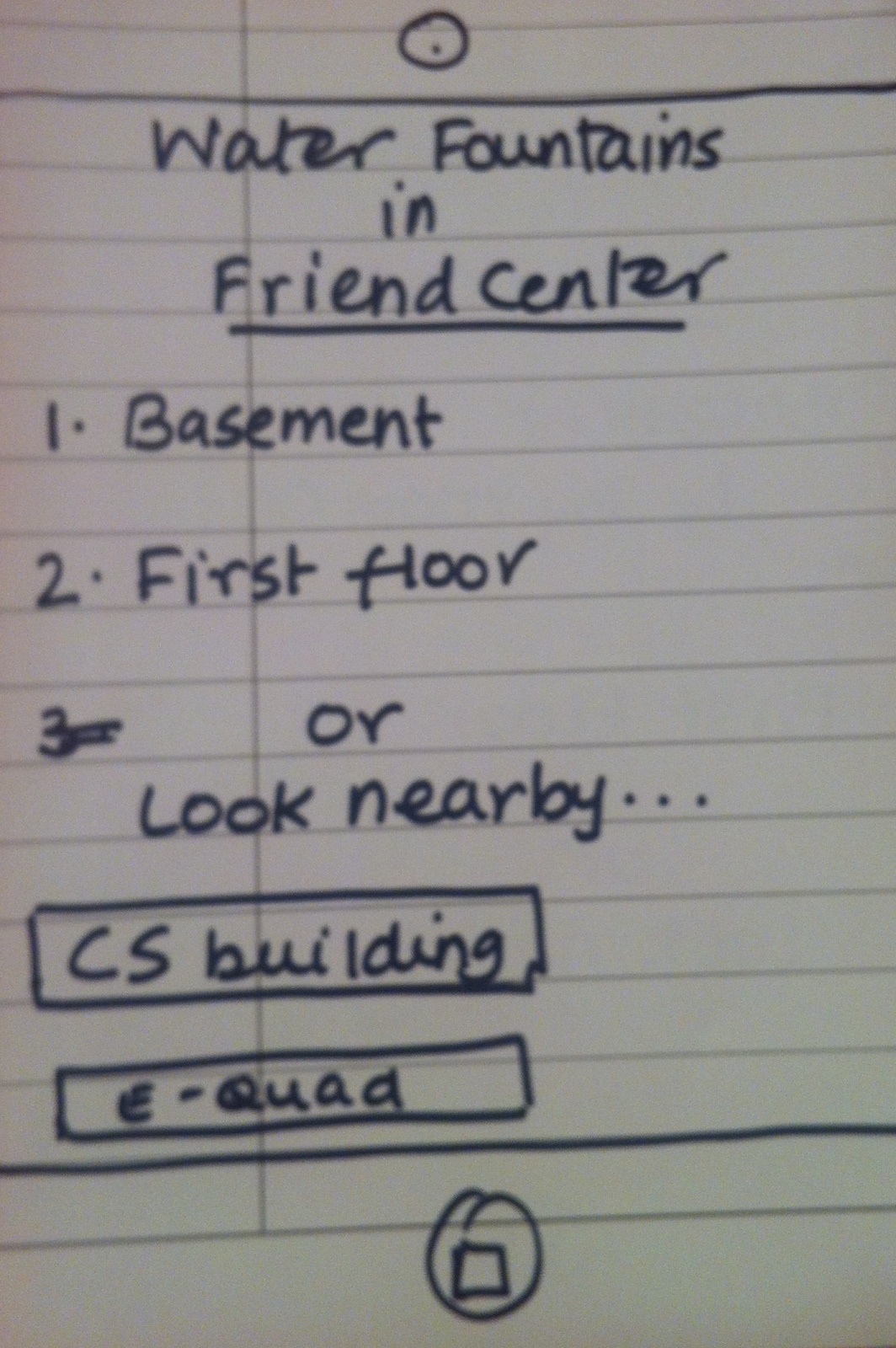
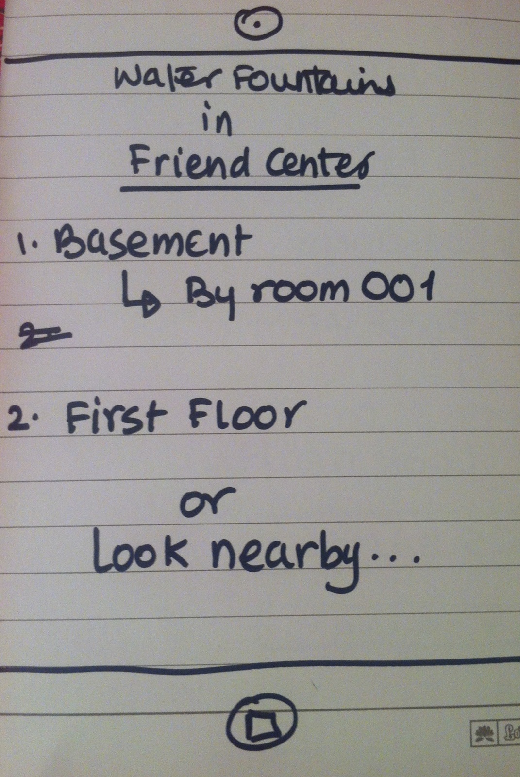
Design Opportunity: Many, if not most, students, seek out entertainment while waiting before class. Often they do this in a solitary, non-academically-inclined way: playing videogames, browsing their favorite subreddits and microblogs, etc. Perhaps there’s a way to entertain students while bringing them back to the classroom, engaging them with each other and with the academic content of the course? It seems like a shame that the students – all of whom are bright and have a common knowledge of and interest in the course – don’t collaborate in a meaningful way to entertain themselves during this time. Entertainment value is key, though: students would resent being required to participate in an activity before class; and a boring, voluntary activity could never compete with Temple Run.
2. Interview: I had observed my second “victim” reading what looked like a pdf of something on his MacBook. I asked him about the reading – it turned out it was course-reading for a completely unrelated class – and he mentioned that he often tries to read between classes, particularly when he gets behind on his work. However, whenever he tries to read before lectures he is much less productive than he could otherwise be, because the environment is so distracting. This, he mentioned, is a source of frustration for him; he wishes everyone would just be quiet, though he knows that’s not realistic.
Design Opportunity: Some students want to use the lecture hall as a space to study before class starts. However, with people coming, going, and talking amongst themselves, the lecture hall at this time is a busy, loud, distracting environment that is not conducive to productivity. Similar to interview 1, I wondered if the students could in some way be brought together to engage in something academic. Perhaps students would be willing to cooperate in some kind of collective studying or problem-solving process? This could turn the lecture hall from a studying-hostile to a studying-friendly environment, and might – again – help reinforce students’ understanding of the material. I asked the subject about this, and he stressed the importance of it being voluntary: students are busy enough just getting between classes, and would resent the extra burden.
3. Interview: My third and final subject appeared to be carrying out a rather extended conversation with a friend over text-messages. This conversation lasted for several minutes; for this reason, it seemed to me to be a distinct kind of activity from the aimless browsing or e-mail checking a student like Subject 1 might do instead of playing a game. This was, more than anything, a social interaction. When I spoke with him, he mentioned that he and his friend were continuing a conversation they’d had before. He said that it’s hard to resist the urge to continue these kinds of digital social interactions, even during class, though (as he acknowledged) this is rude toward the professor. For him, the urge was more about having a conversation – being continuously socially engaged – than about the particular person he was conversing with; he mentioned that he might have started a text-message-based conversation with a different friend if he weren’t already in one.
Design Opportunity: The students that do reach out and communicate with others, ironically, often do so in a way that isolates them from the others in the room, and from the in-person social opportunities present during the time before the start of lecture. Perhaps there is a way to harness this social drive – the urge for a conversation and real-time communication – in an academically productive way, that does not interfere with the room as a place to study as well.
From these three interviews, the problem (or, at least, potential problem) of isolation appeared to be a trend. Students appeared to value pursuing solitary activities – gaming, reading, or texting, in these cases – to engaging with others in the room. This seems like a waste; the group setting provides many untapped opportunities for fruitful (and, in some cases, academically valuable) interactions.
Part 2: Brainstorming
For this part, I collaborated with Clay Whetung ’13, Peter Grabowski ’13, and Andrew Callahan ’13. We came up with the following ideas:
- Interactive quiz show on lecture material beforehand, just for fun.
- Correct answers win prizes?
- Correct answers load funny pictures/memes/pictures of cute animals
- Soothing and/or energetic audio-video patterns to get you in the mood for lecture
- Survey about what you want to see in the lecture (or future lectures)
- Slideshow of interesting topics in news or inspirational videos
- Guided meditation
- Organized, guided back massages
- Summary of previous course content
- Physical art supplies, so the class can create a communal piece of art
- Digital doodle-board (similarly, to create a communal piece of art)
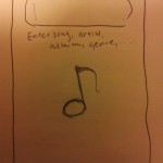
- Digital collaborative music that’s easy to make – like this.
- Parallelizable puzzles/challenges/problems for people to solve together
- Collaborative game for all to play
- Anonymously ask and vote on questions for the lecturer to answer
- Aggregate websites that people are looking at and show popular articles
- 10 minute lesson series (potentially related to course material, or not at all).
Part 3: Selecting my favorites
First, I chose Idea 14, above (course-related games students can play while they wait), since it can potentially satisfy the needs of Subject 1 (a well-designed game could provide an engaging, challenging distraction for those who want it) and Subject 2 (since the game could tie into the course material.)
Second, I picked Idea 15 – (a way for students to submit questions) because it seemed like a powerful, real-time way for students to communicate about and collaborate around the course material, making it potentially appealing to socially-oriented students such as Subject 3 and more academically-focused students like Subject 2.
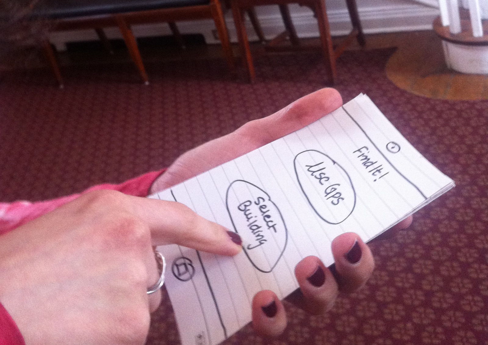
4. Rapid Prototyping
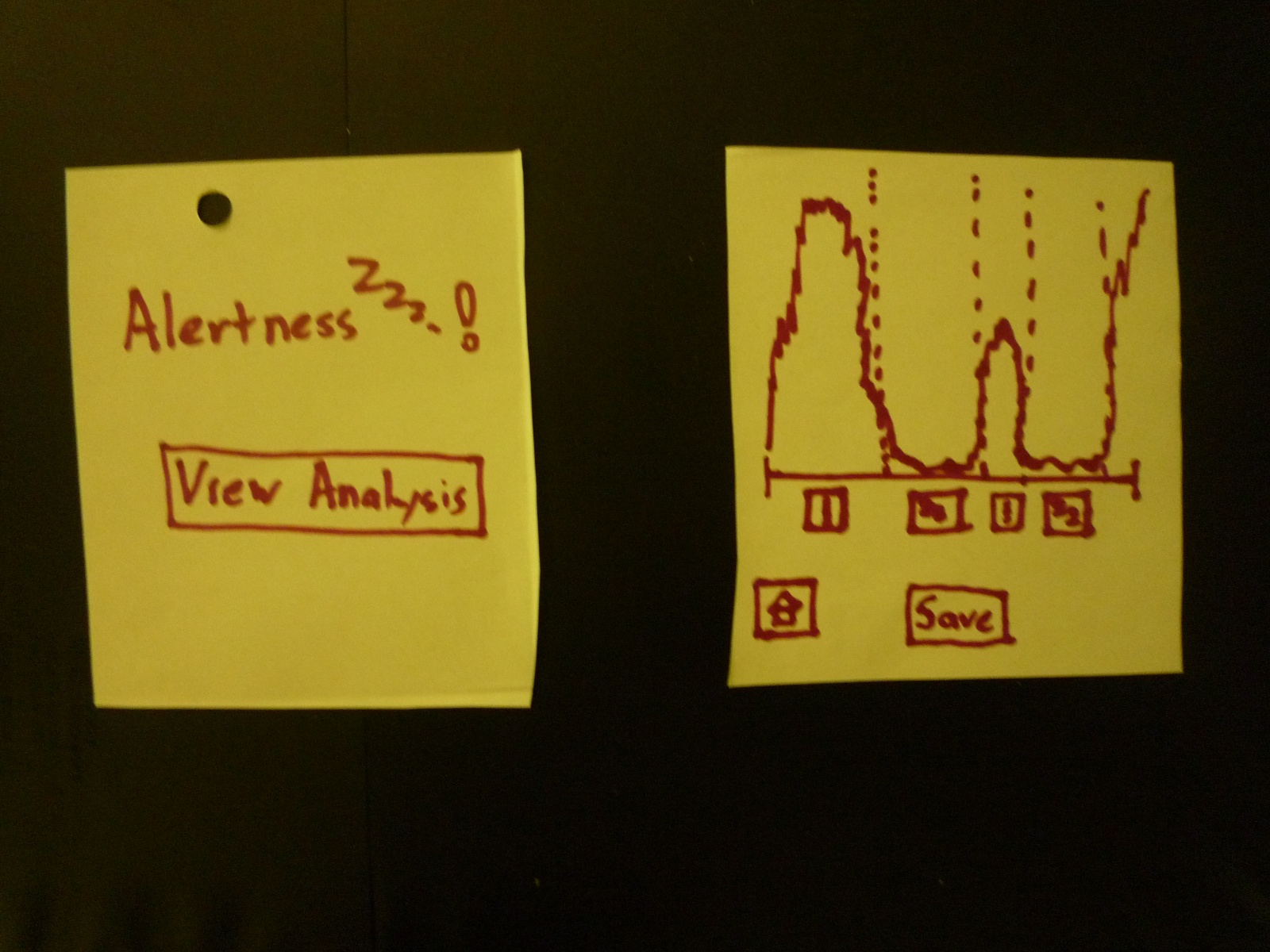
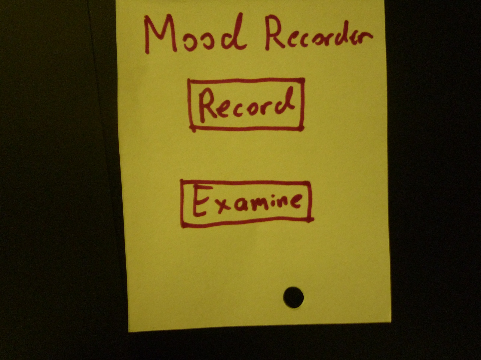
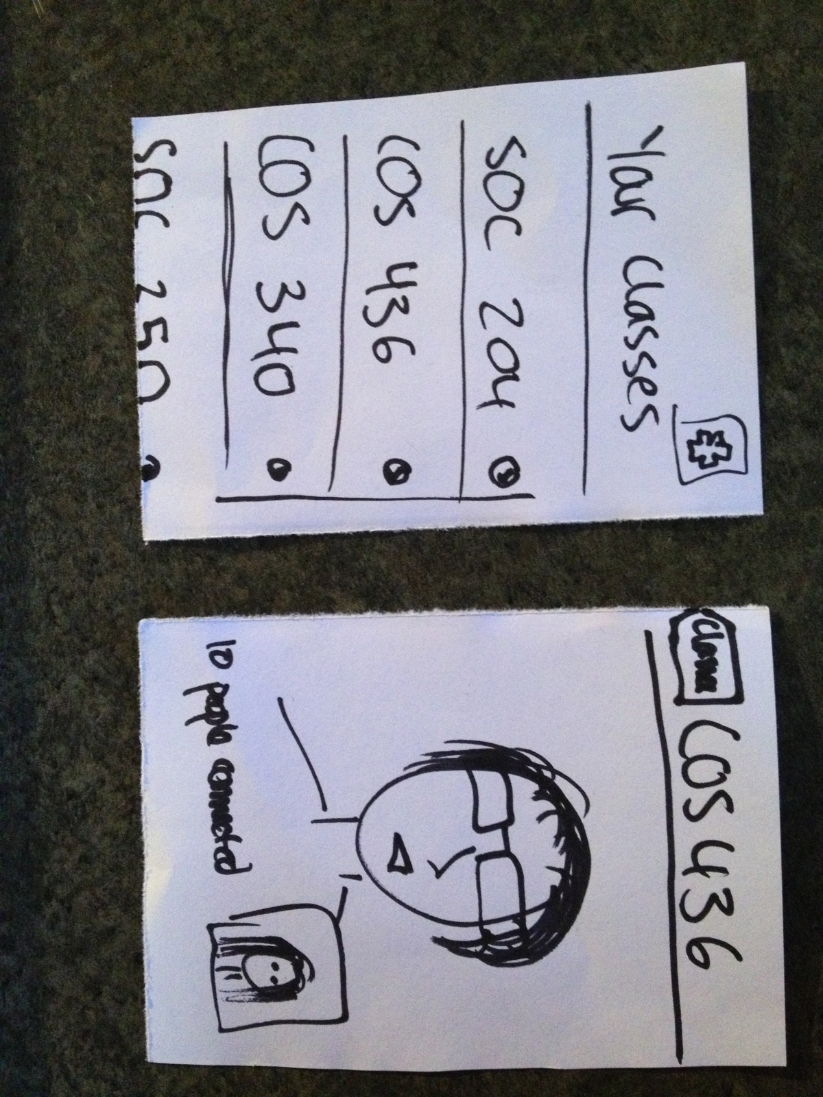
1. GameClicker! (Idea 14)
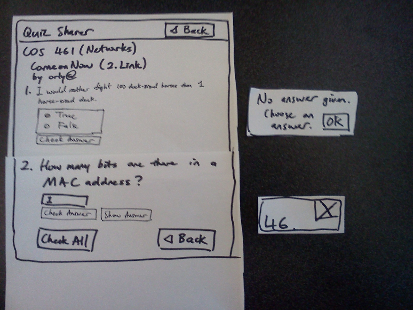
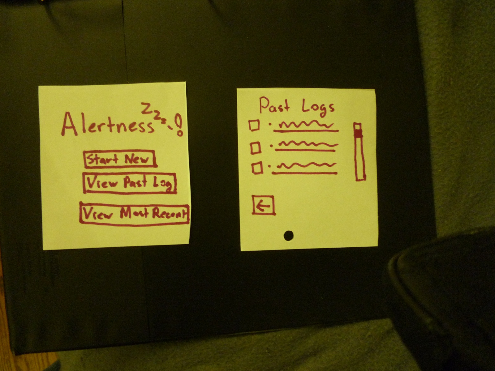
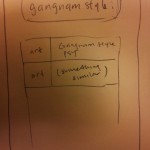
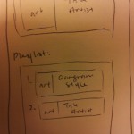
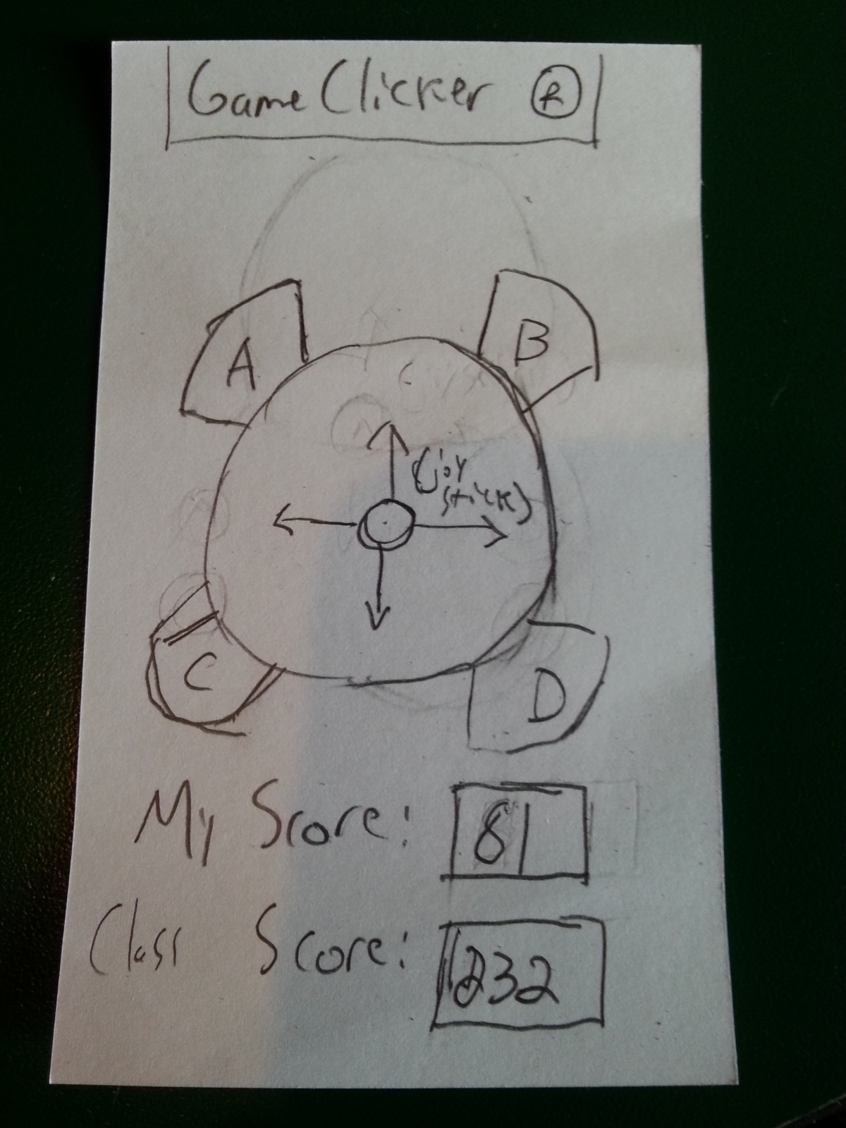
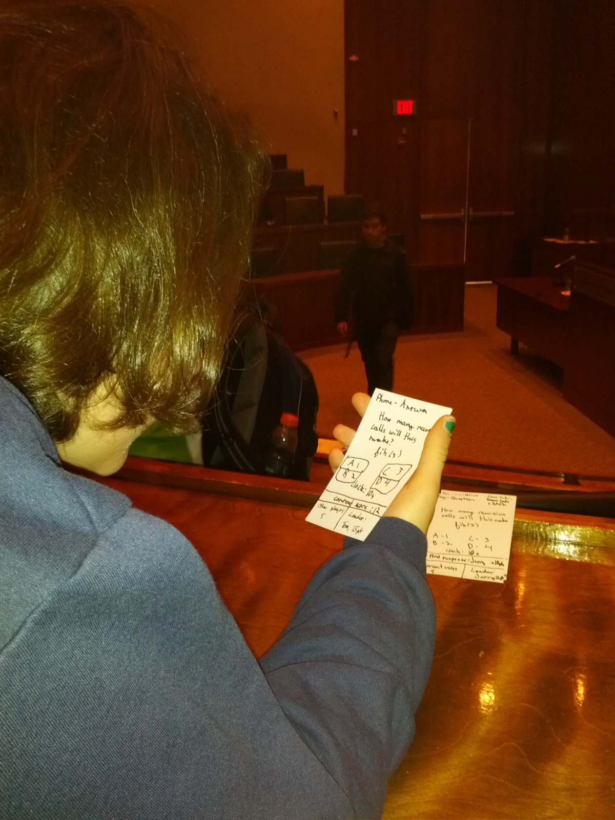
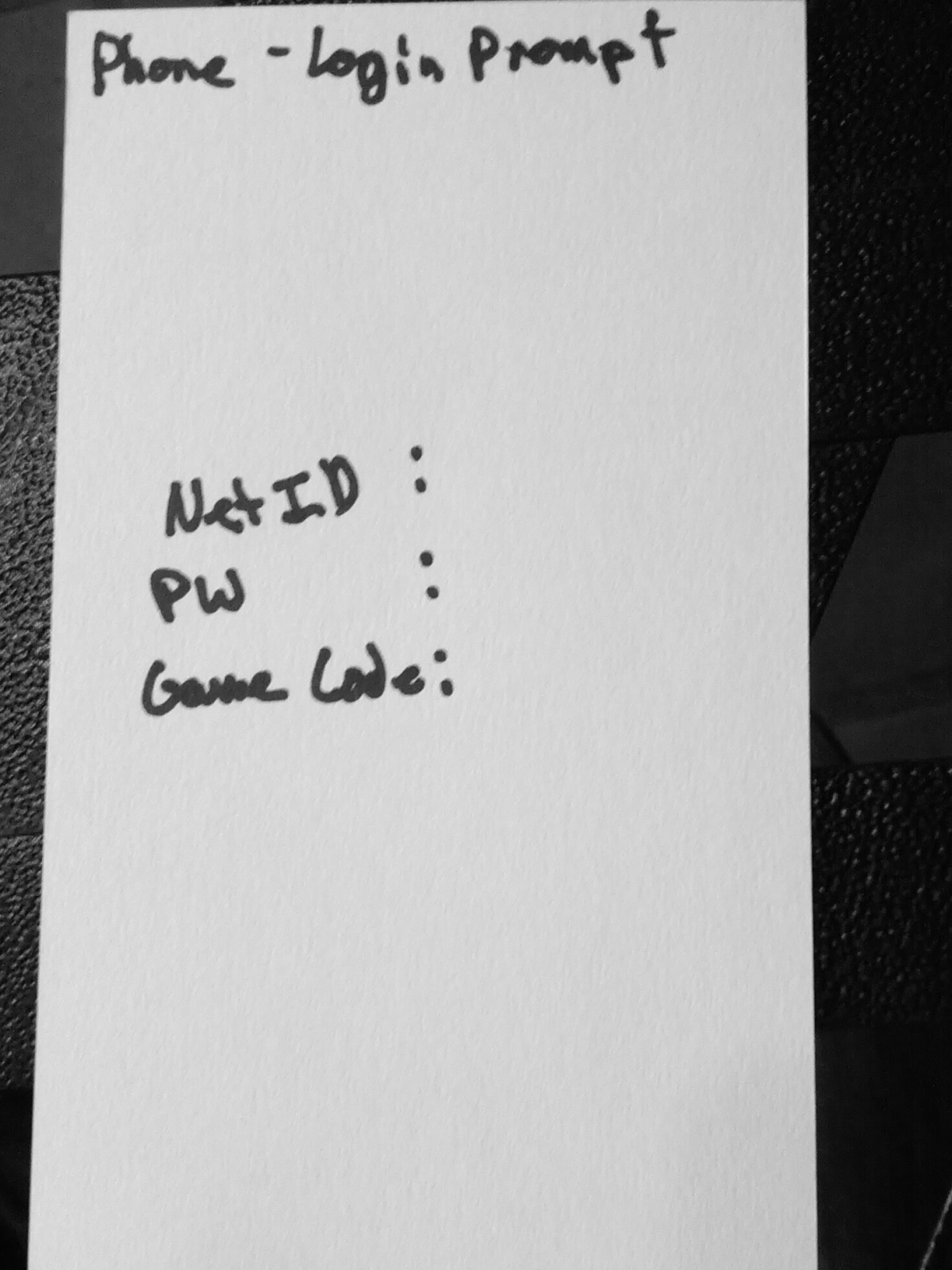
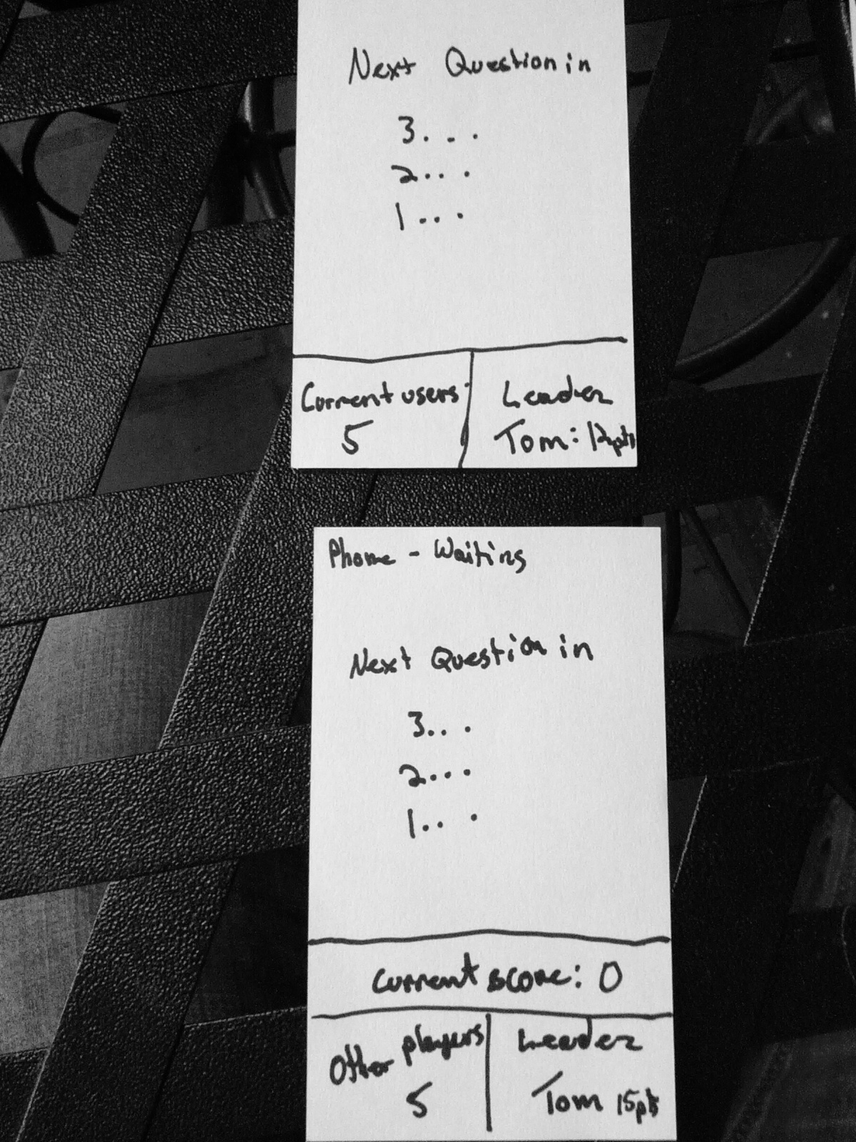
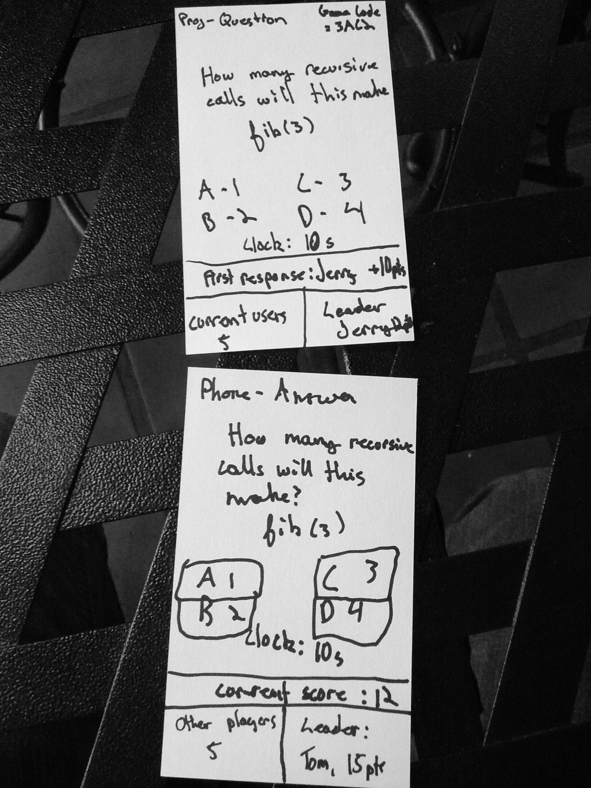
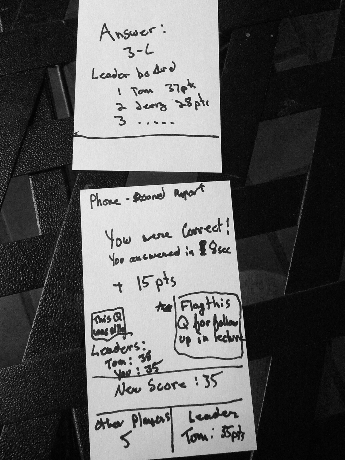
Inspired by the iClickers given to students in some introductory science labs, I decided to give each user of the system a clicker-like device, but one optimized for gaming. It also has small seven-segment LED screens for displaying your score, as well as the entire class’s score for cooperative games. The buttons on the device are labeled “A”, “B”, “C”, and “D”, making the device usable as a convenient replacement for a traditional clicker as well (i.e., students submitting answers to multiple-choice questions on the board).
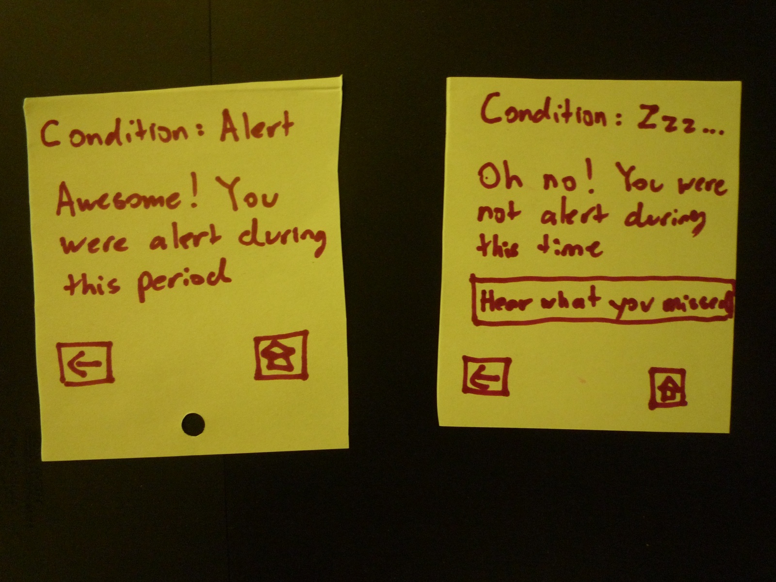
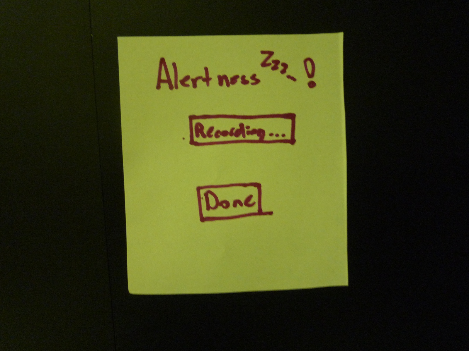
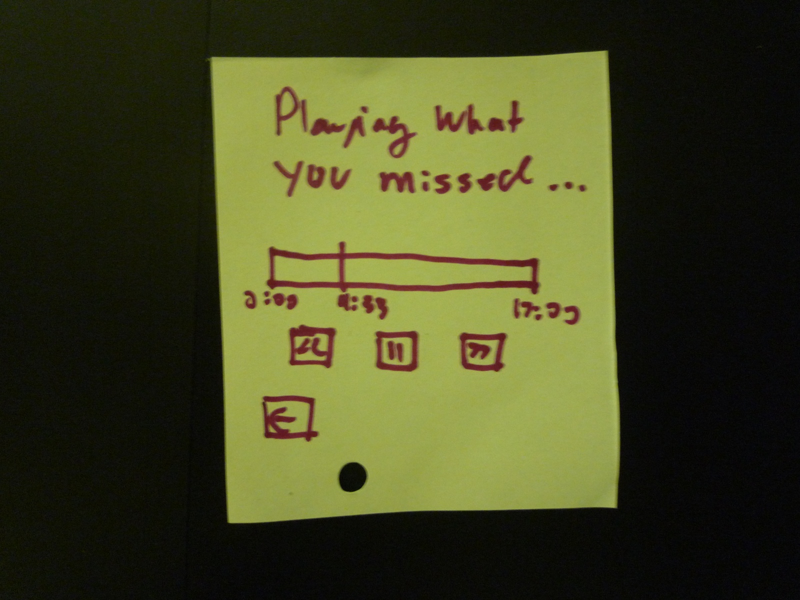
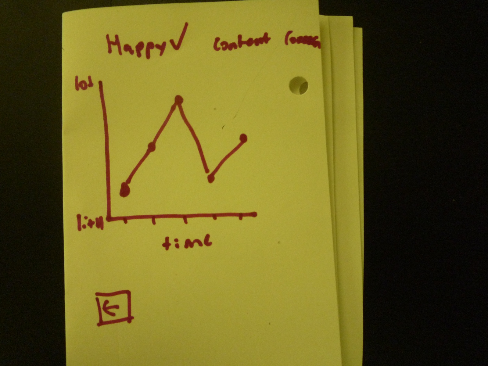
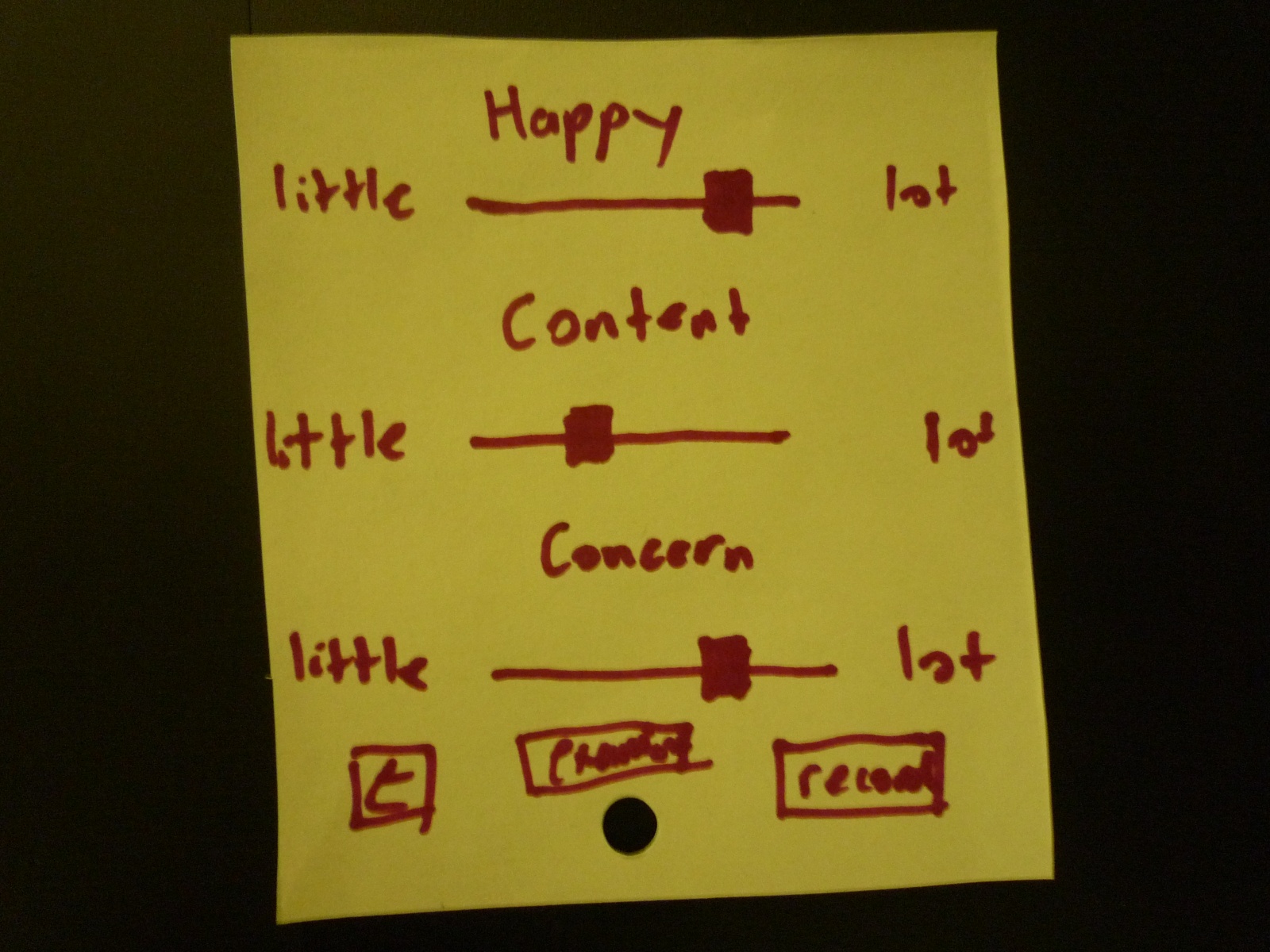
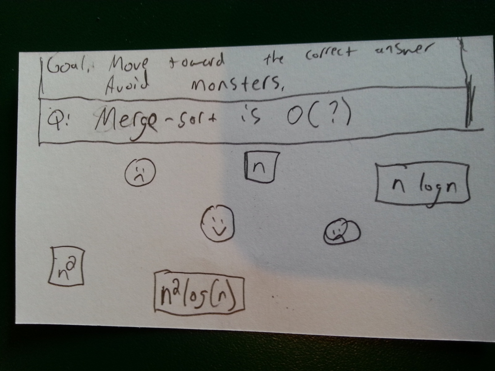
In addition to the clicker-controller, I also prototyped out an example game. It is a cooperative game that can be played by the entire class, using their clicker joysticks. The goal is to guide the person on the screen to the correct answer to the multiple-choice question shown, while avoiding enemies. The character moves according to the average of all the players’ inputs, making it a truly collaborative activity (and, to an extent, an exercise in group problem-solving!)
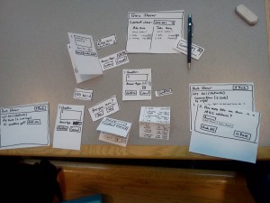
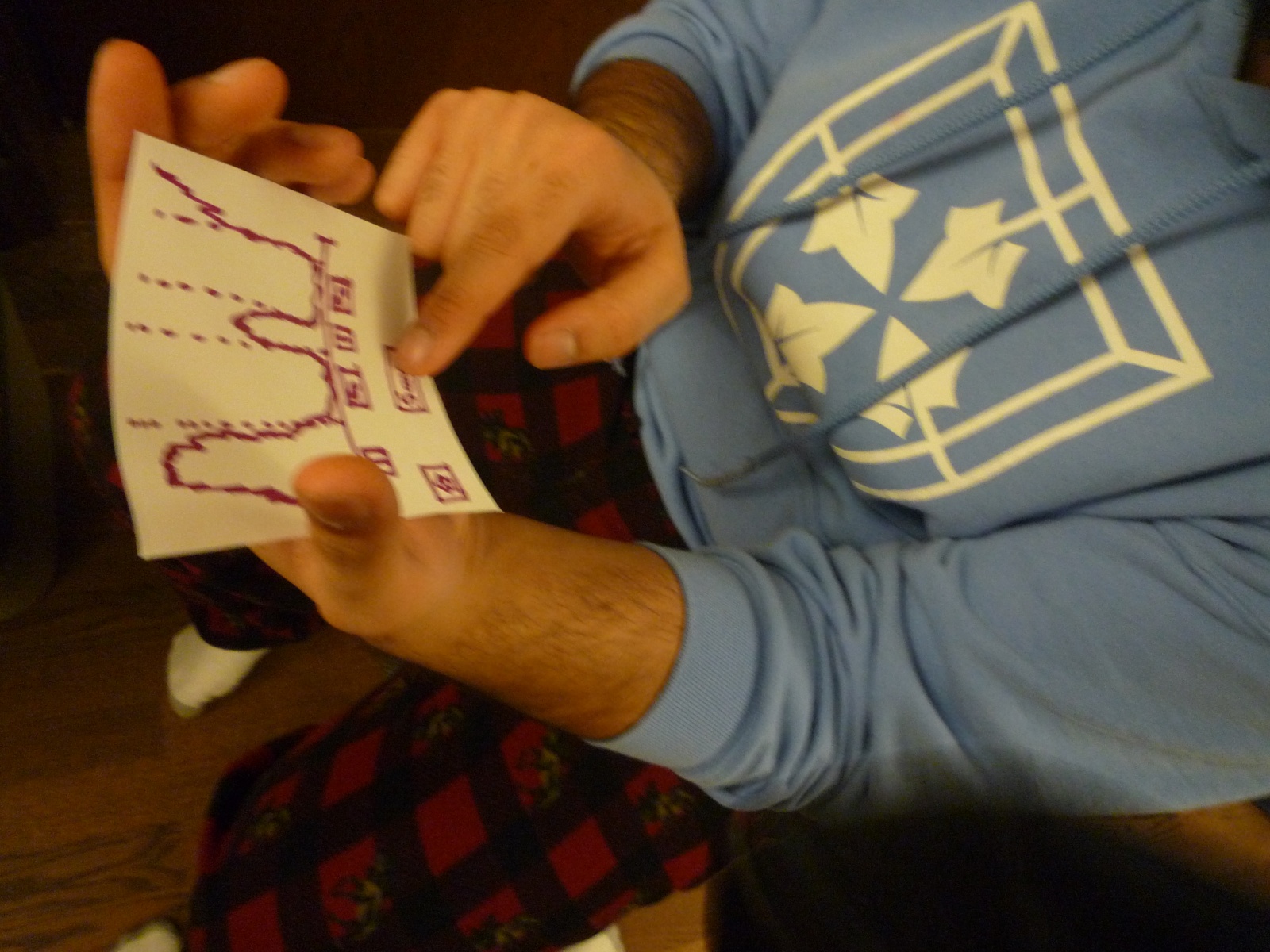
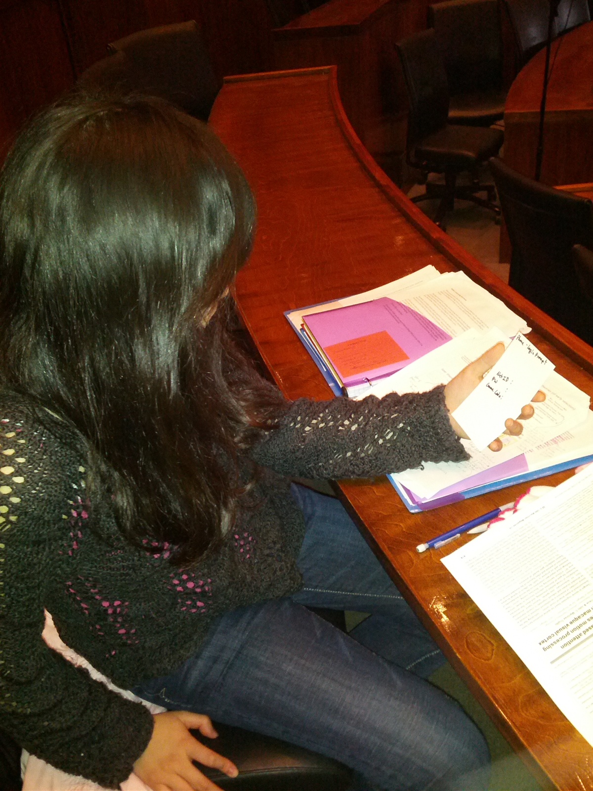
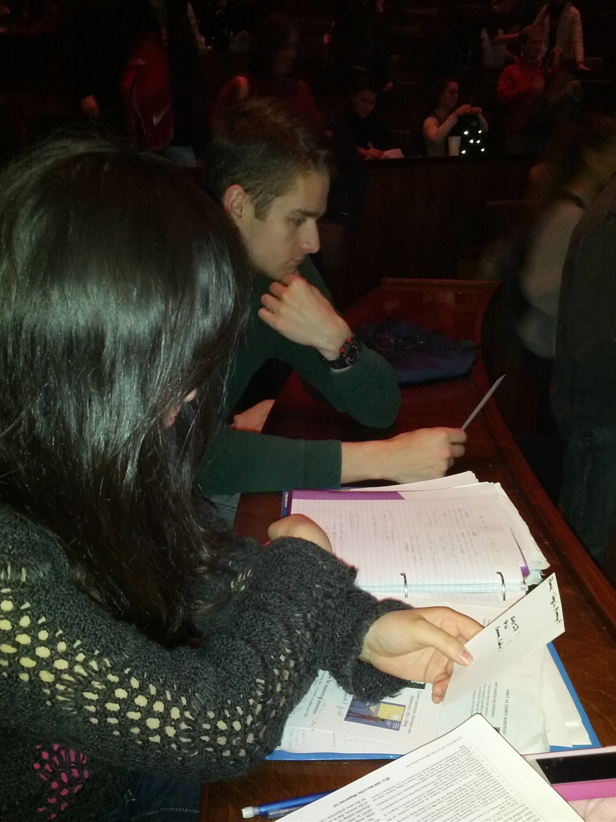
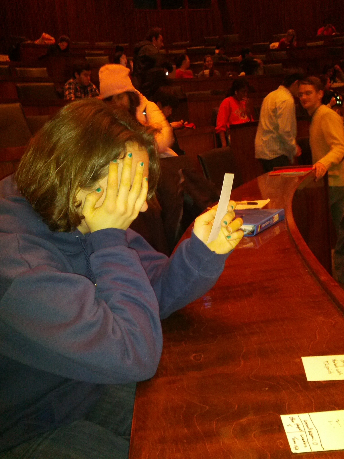
Here are some photos of this prototype (I used 3×5 index cards):

Allows students to play games and answer questions using a joystick and buttons. Roughly actual size; real device could probably be a bit smaller.
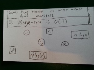
A game where the class works together to guide the character (smiley face) away from the bad guys (frowny faces) and towards the correct answer (n log(n)).
Not actual size! This would be projected on the board for all students to see.
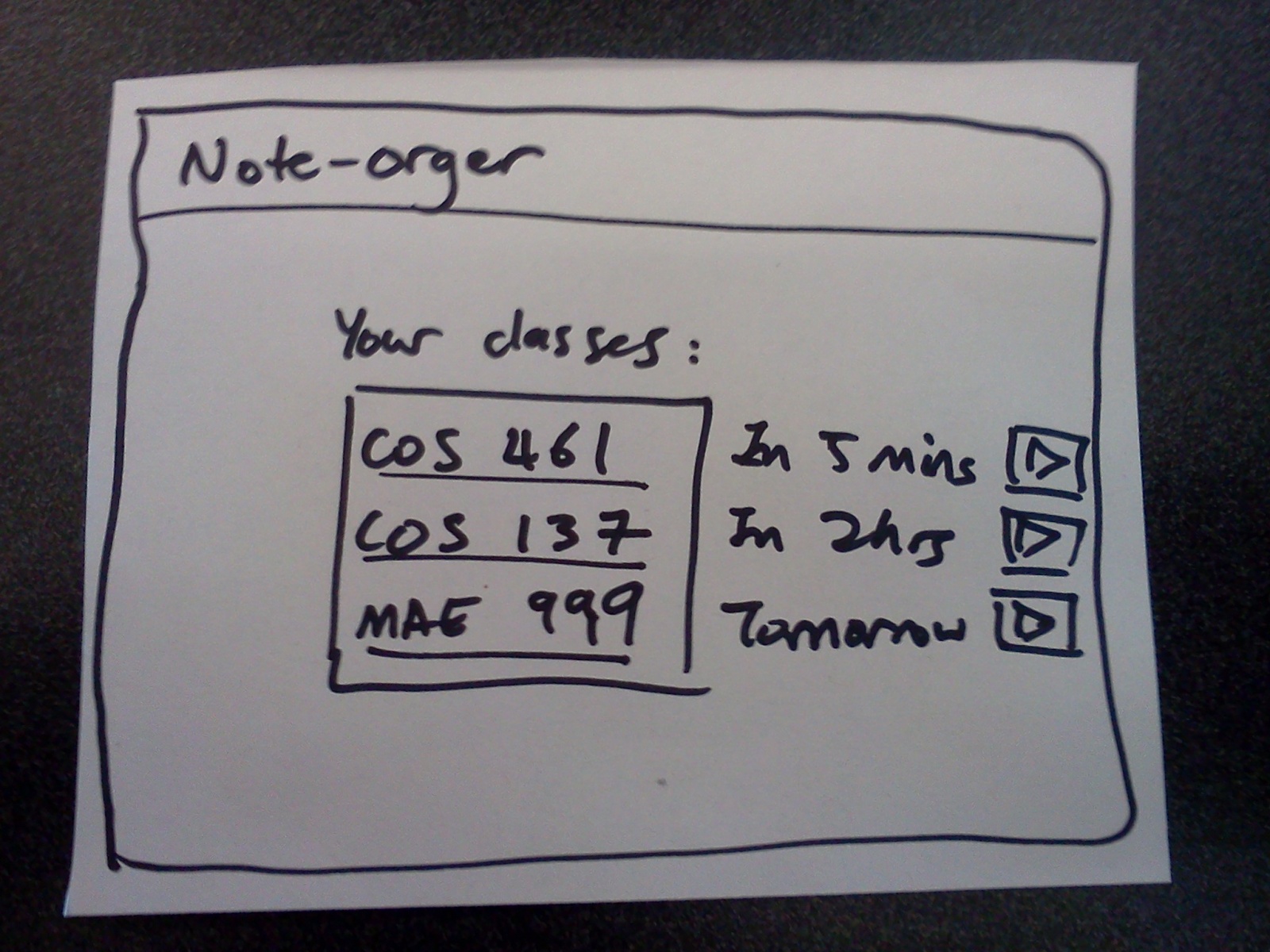
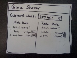
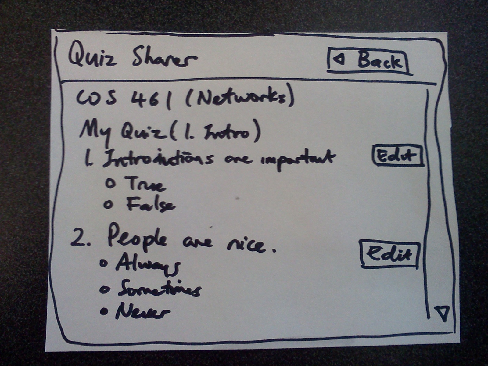
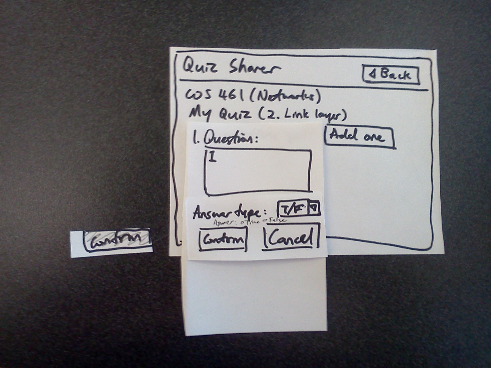
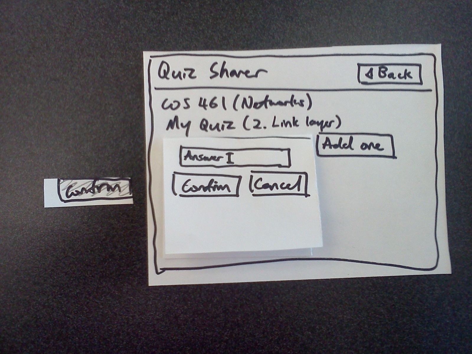
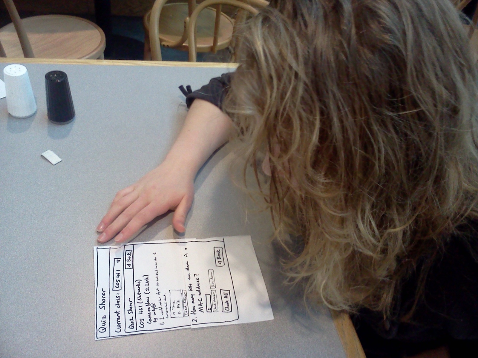
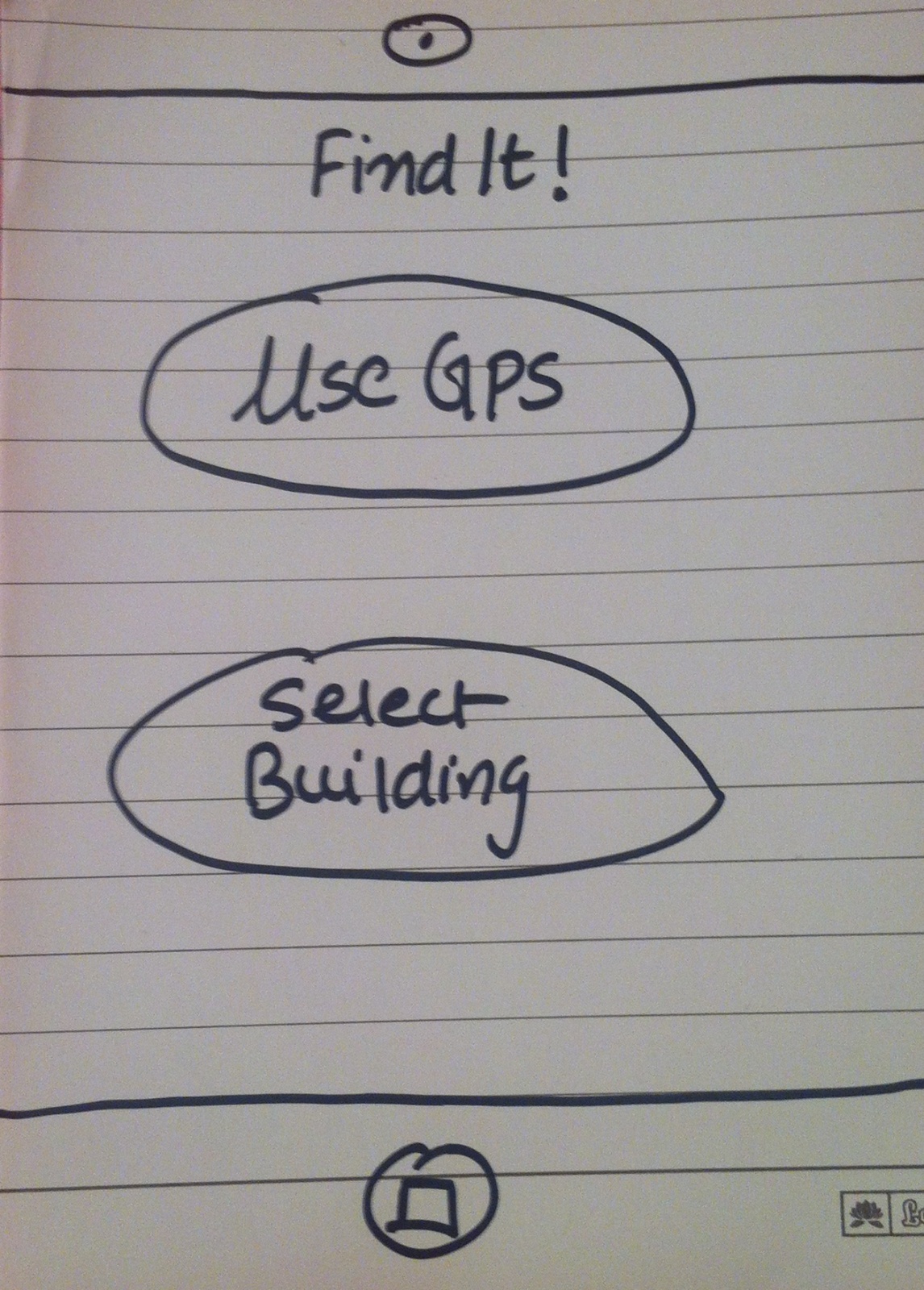
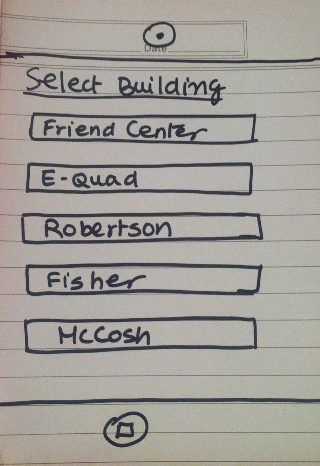
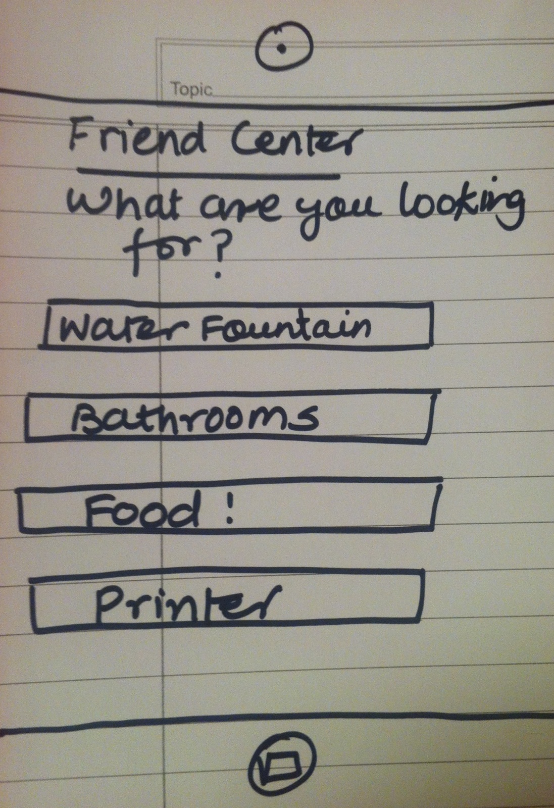
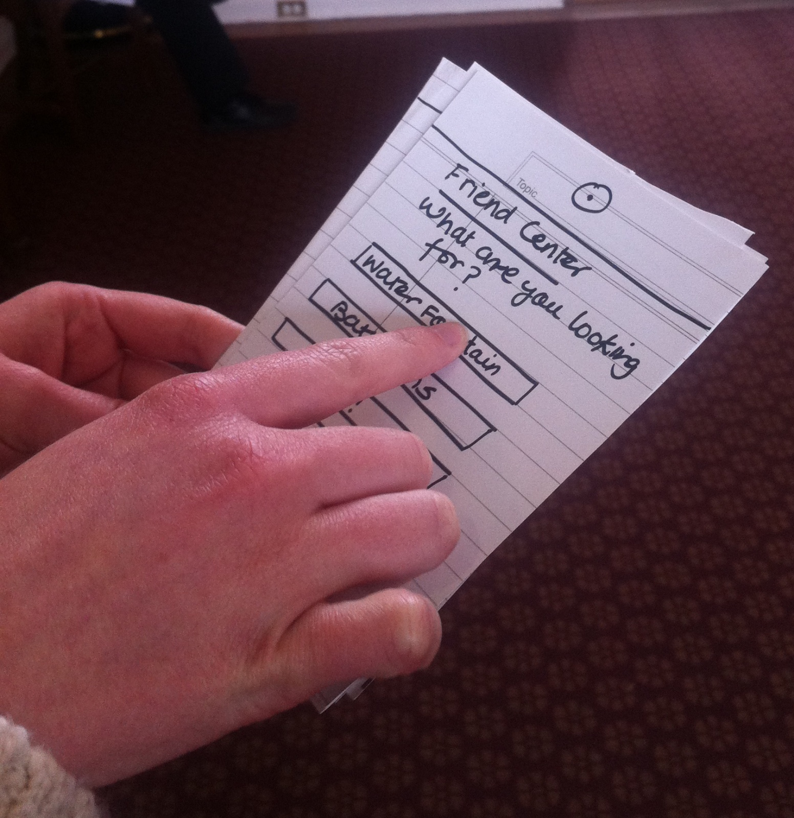
2. Live Class Forum (Idea 15)
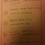
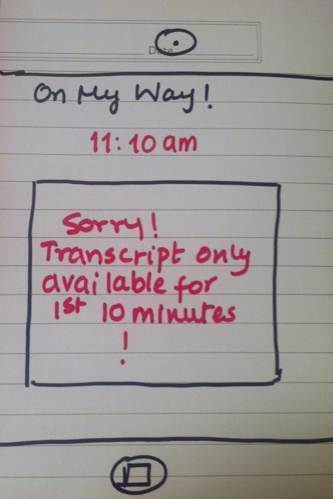
This product consists of two main parts – again, one that goes in the user’s hand (in this case, a smartphone app), and another that is projected onto the board. Live Class Forum enables a group of people gathered in a space to ask and answer questions in real time, with an emphasis on the in-person aspects of the situation. Used in a lecture hall before the start of lecture, it allows students to submit questions for everyone to view. Students can attempt to answer each other’s questions, as well as vote (up or down) on those that they think are the most interesting or important.
The professor also has access to this discussion, and can participate either by answering students’ questions directly within the system, or by designating some questions as “Professor’s Picks” that will be answered at the start of lecture. Having real-time access to the students’ inquiries can help professors tailor their classes toward what material the students are most interested in, and what material is most in need of review or re-explanation.
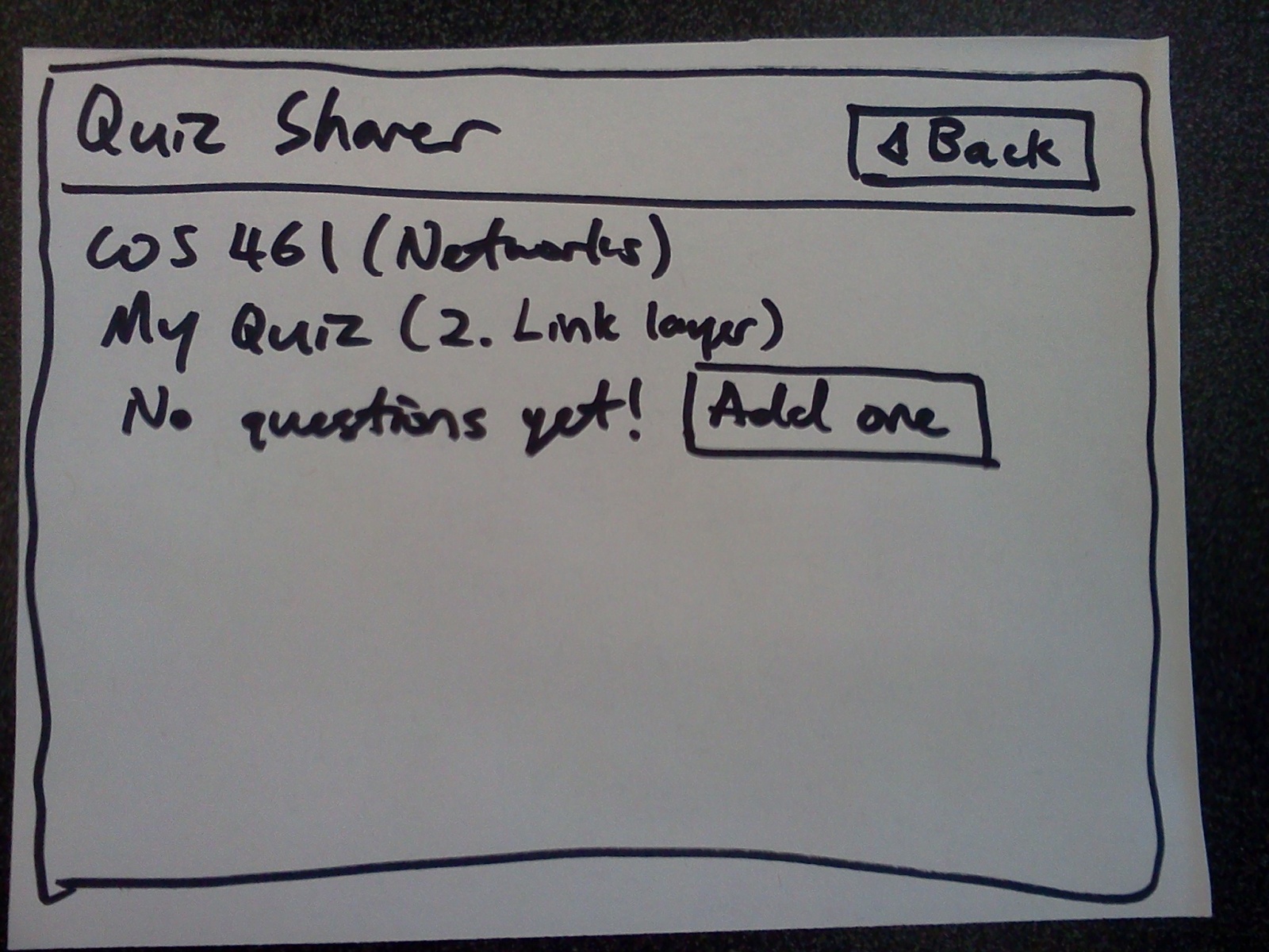
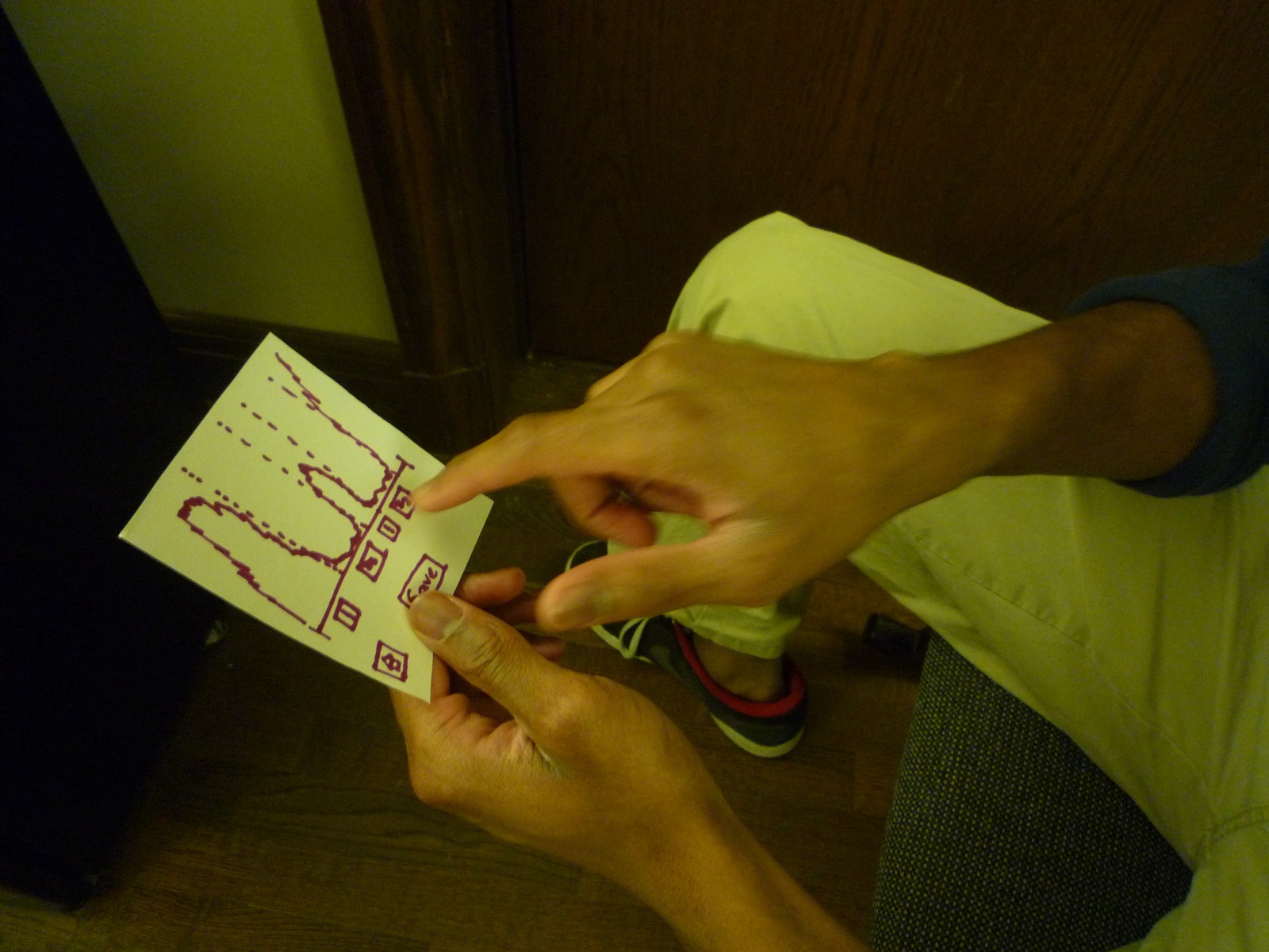
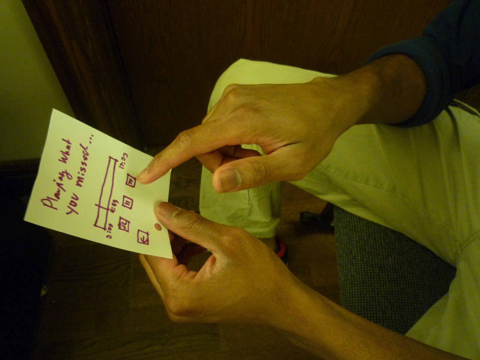
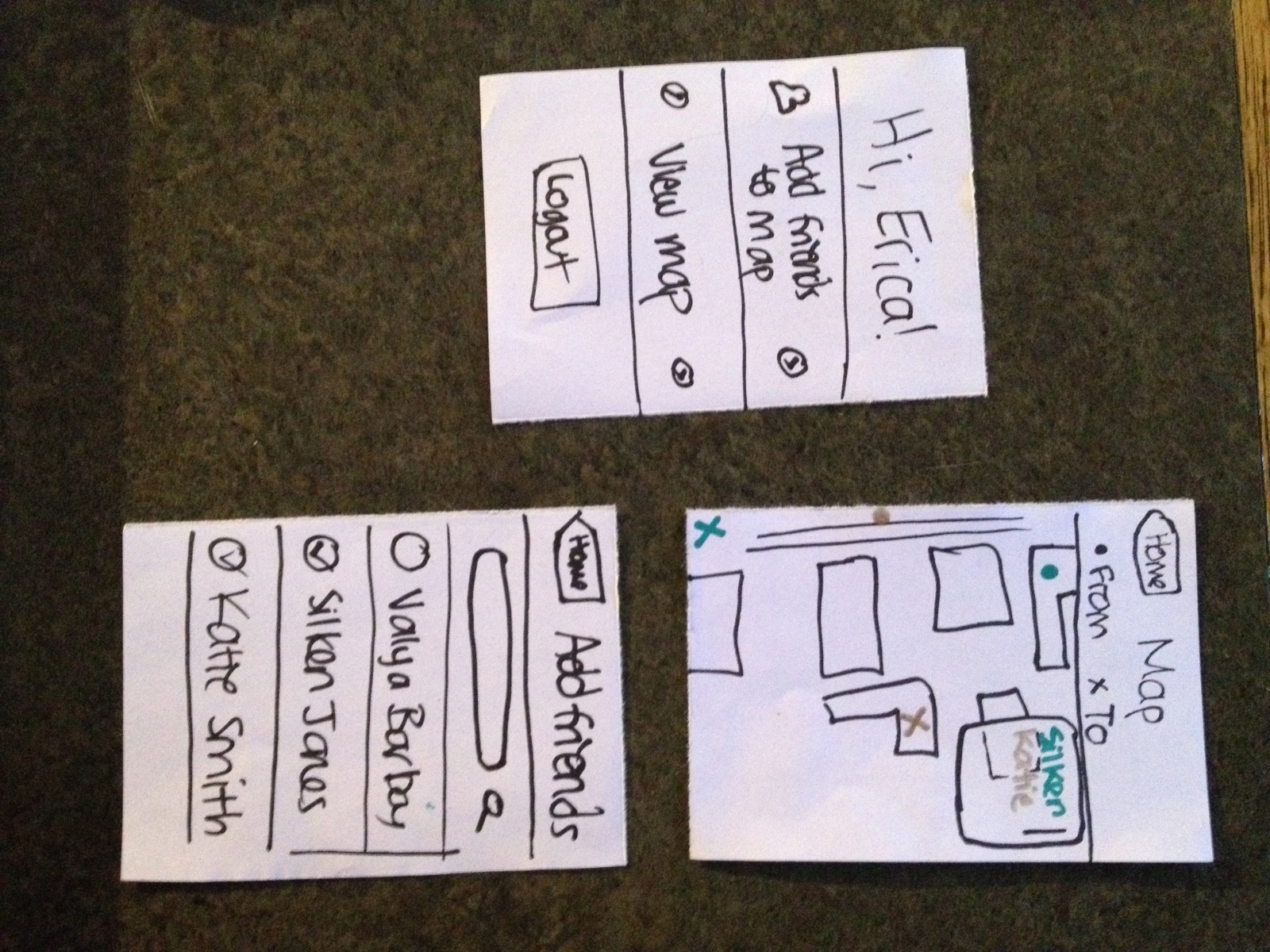
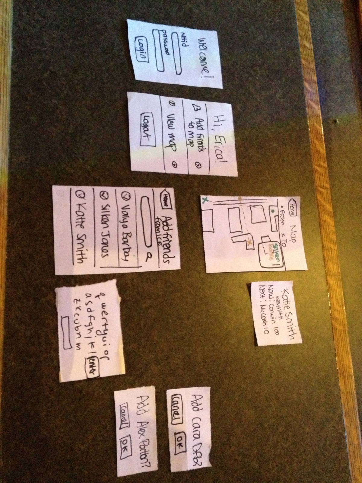
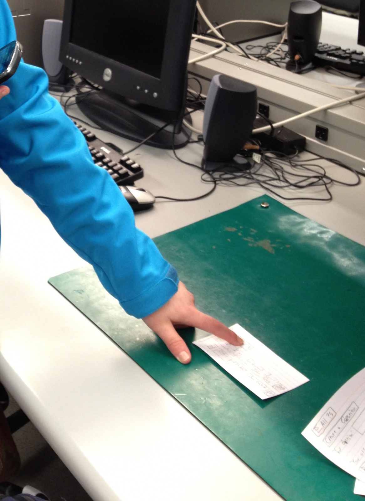
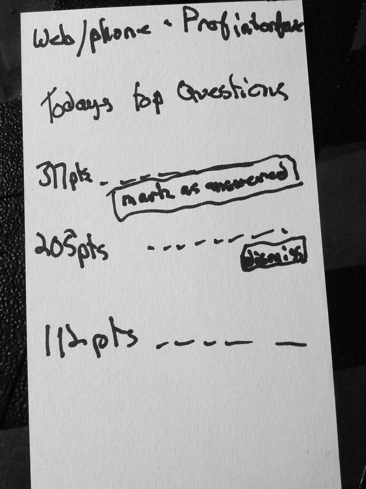
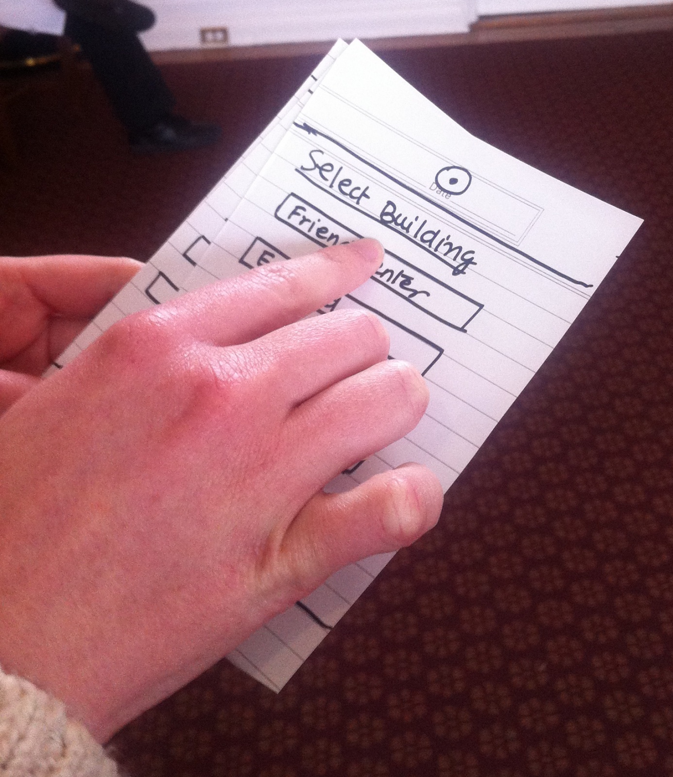
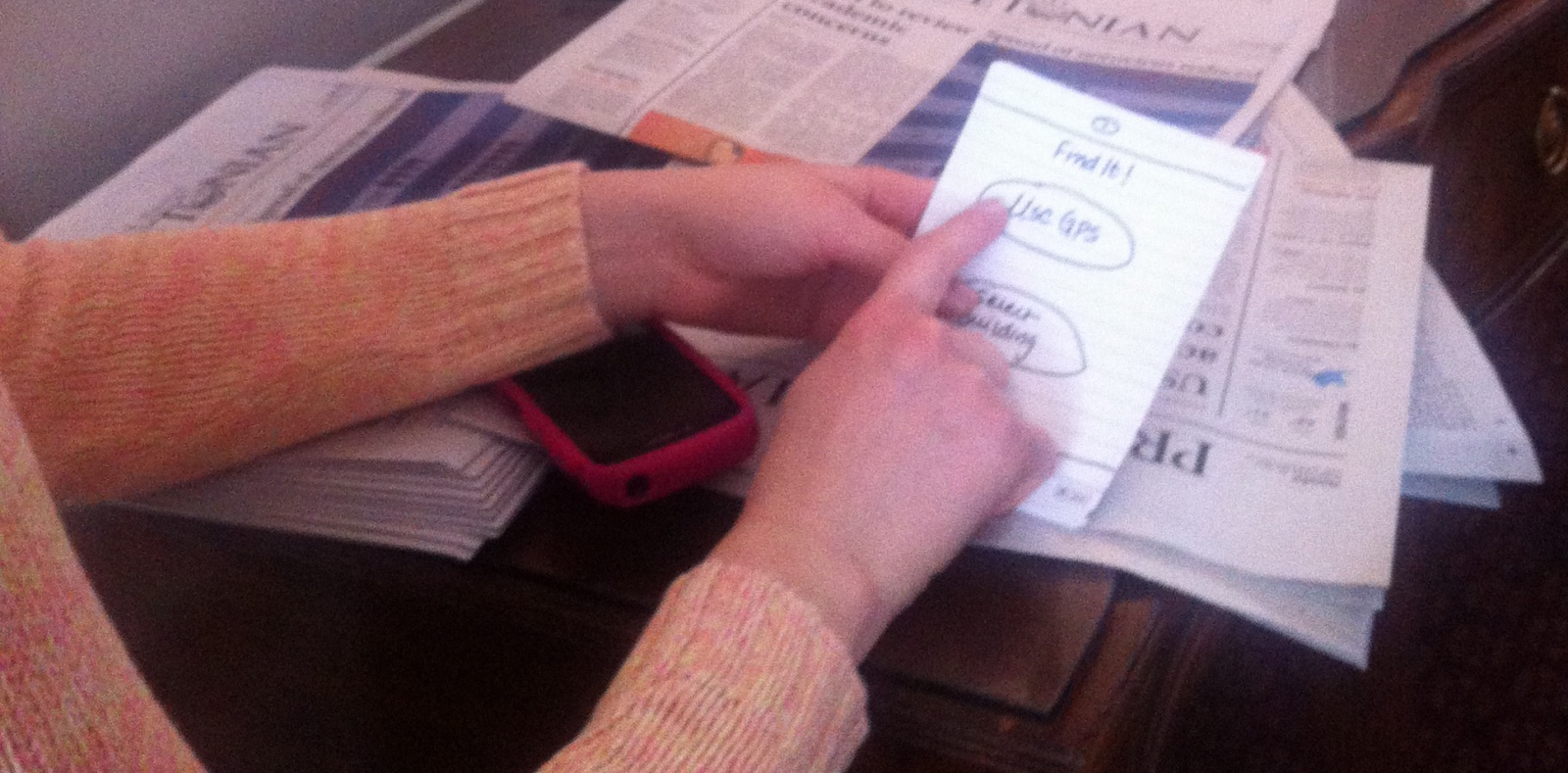
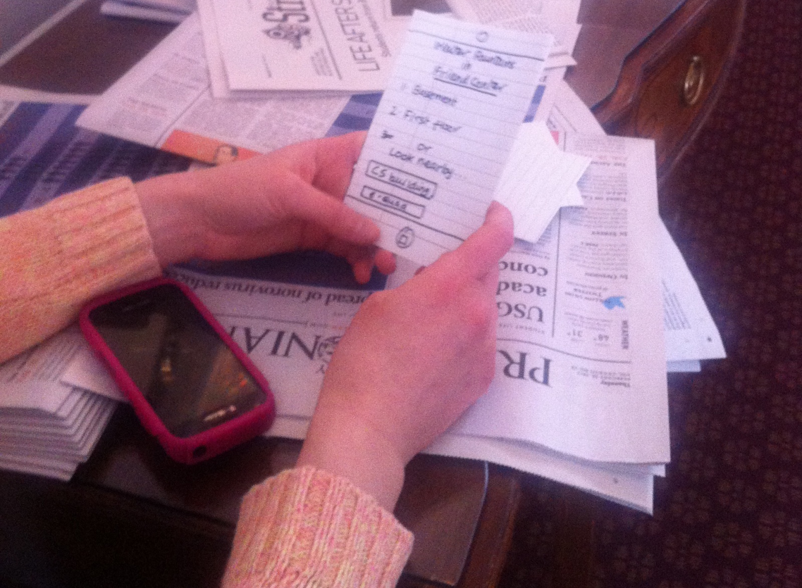
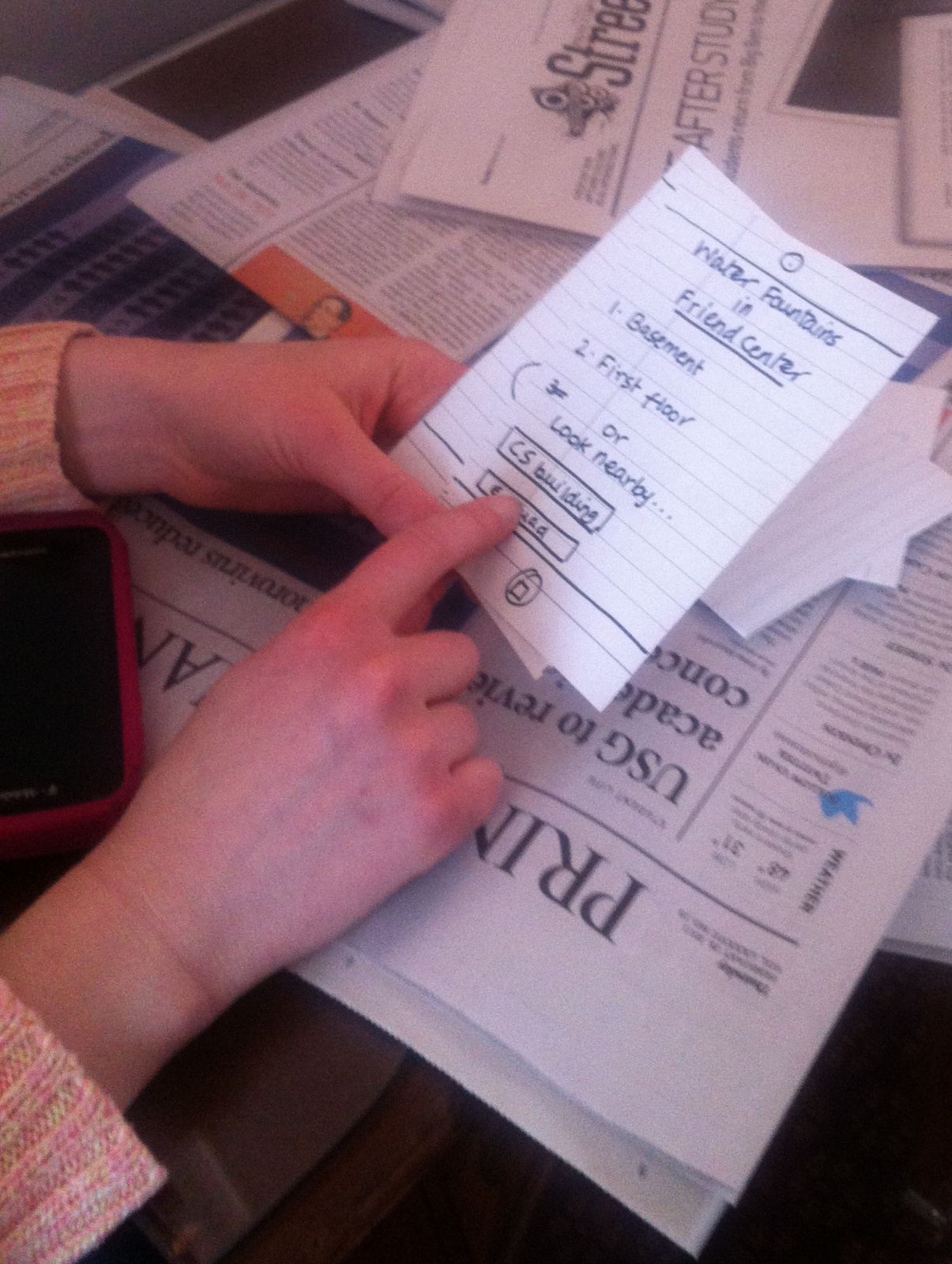
Here are some pictures of this prototype (again, I used 3×5 index cards):
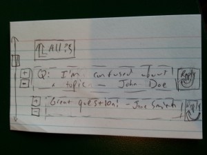
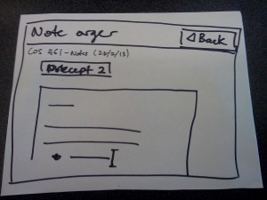
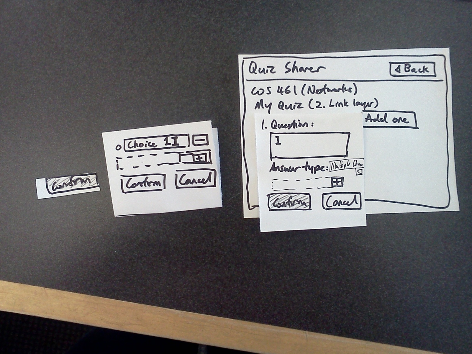
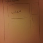
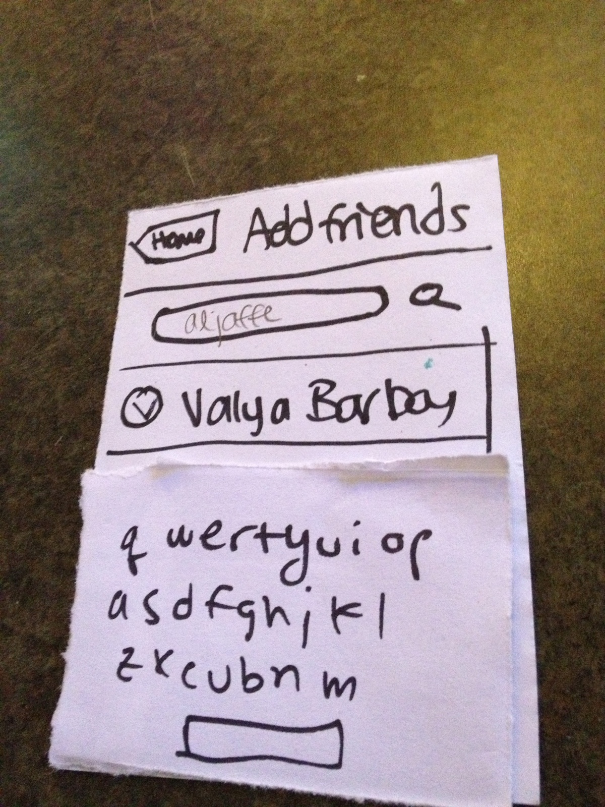
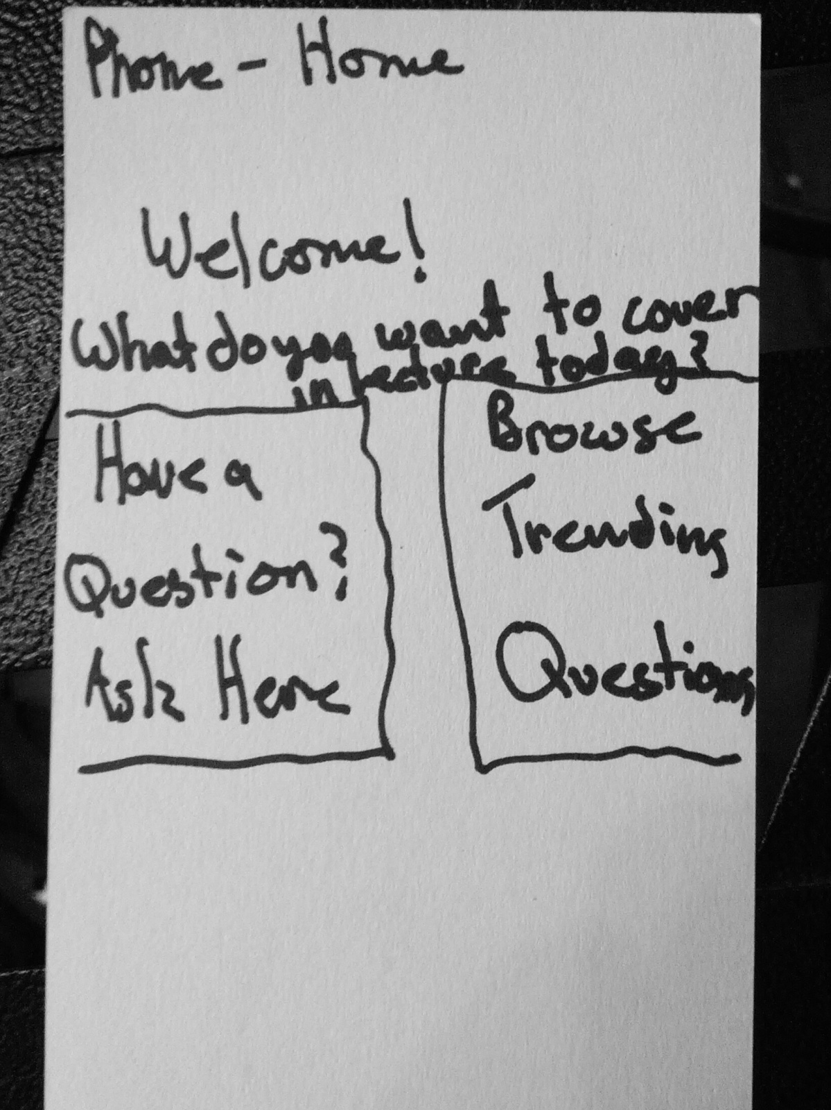
 Main Screen")
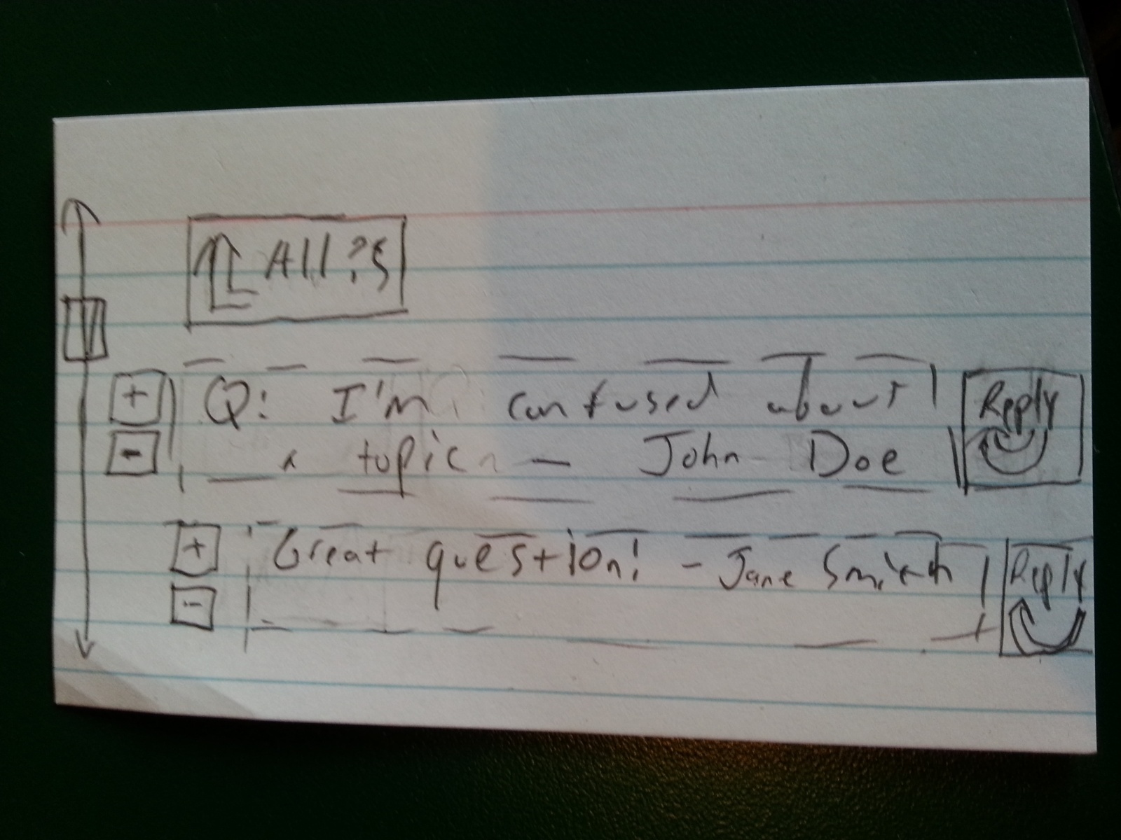
(1) Main Screen
The screen that shows up when users first open the app – and also the screen that gets projected onto the board for everyone to see. Students using devices can scroll to see the questions others have asked, and the top reply for each question. The screen also shows each question’s upvotes and downvotes.
Clicking on a “+” or “-” upvotes or downvotes, respectively, the question or reply they are next to. Clicking on a question will focus the question (screen 2). Clicking a “reply” link will take the user to the compose-reply screen (screen 3). Finally, clicking “new question” will take the user to the compose-question screen (screen 4).
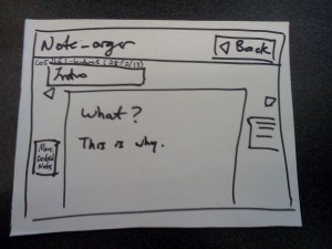
(2) Focusing on a Question
Students can scroll to see all the replies for their chosen question (not just the top one reply, as on the main screen). They can up-vote or down-vote the question and each of its replies, as well as writing a reply of their own by clicking a reply link (which will bring them to screen 3). Clicking the “All ?s” link returns the user to the main screen (screen 1).
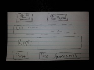
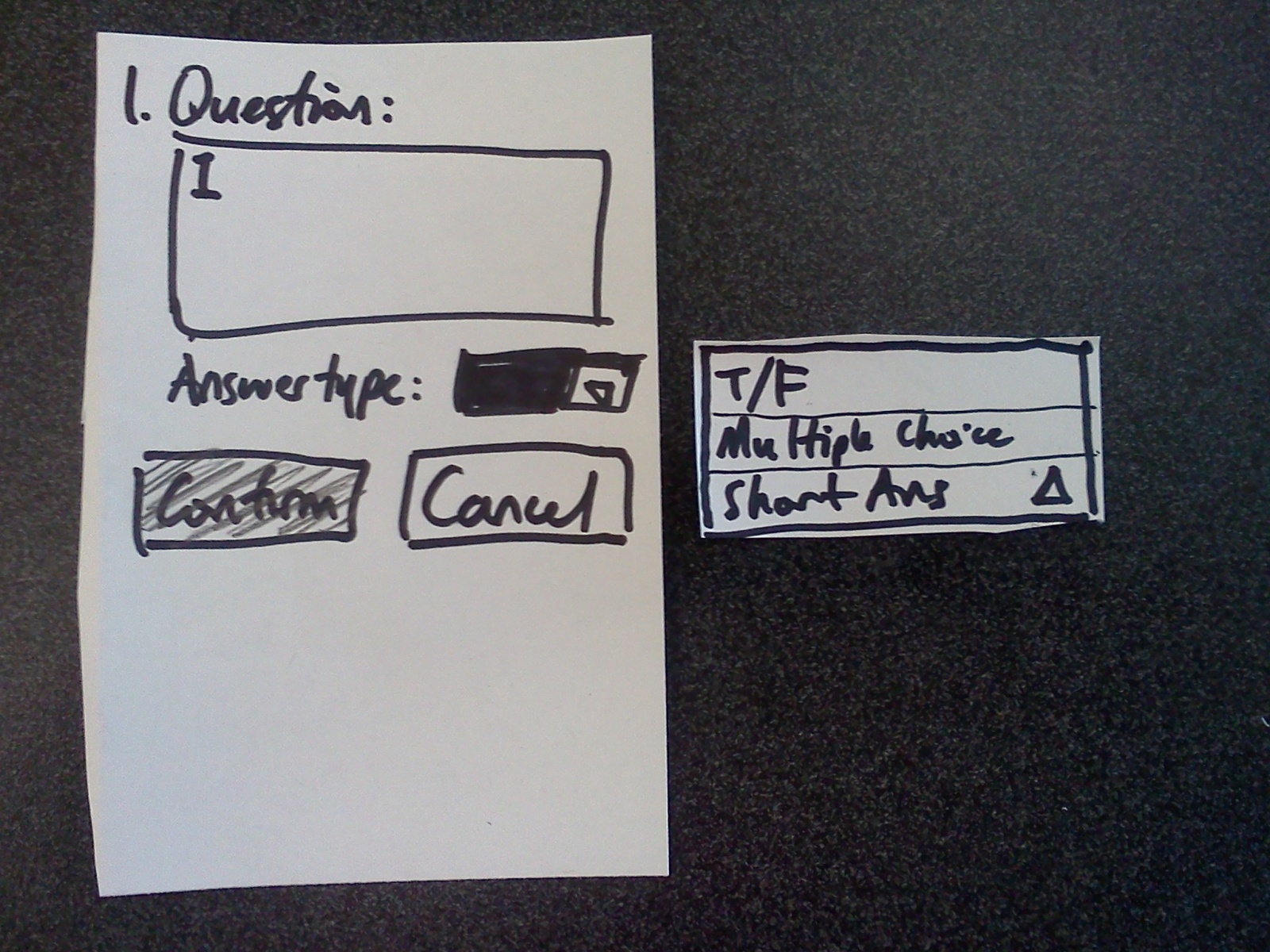
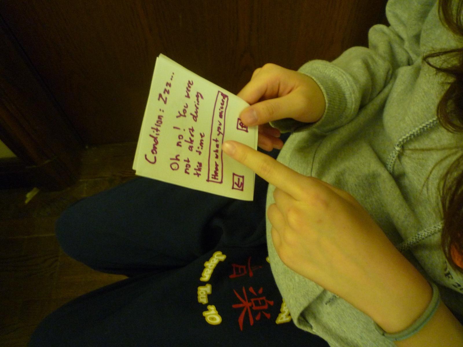
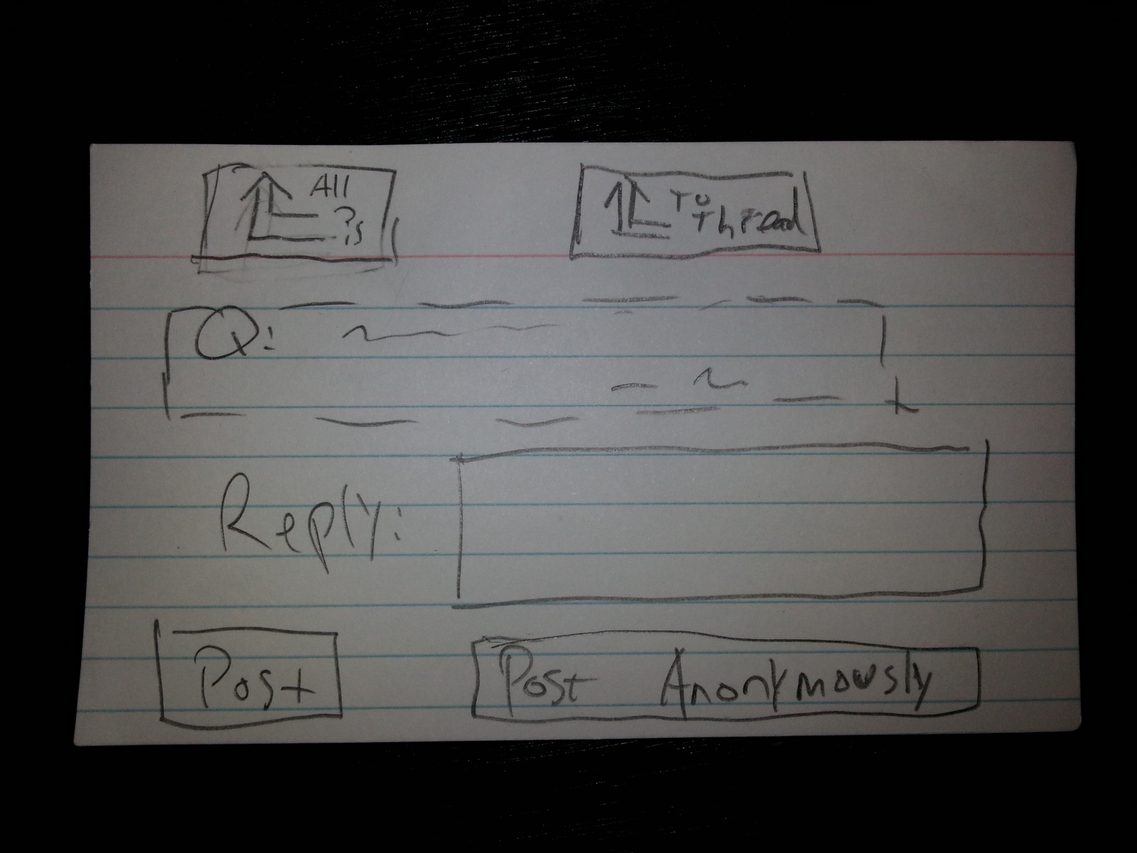
(3) Compose a Reply
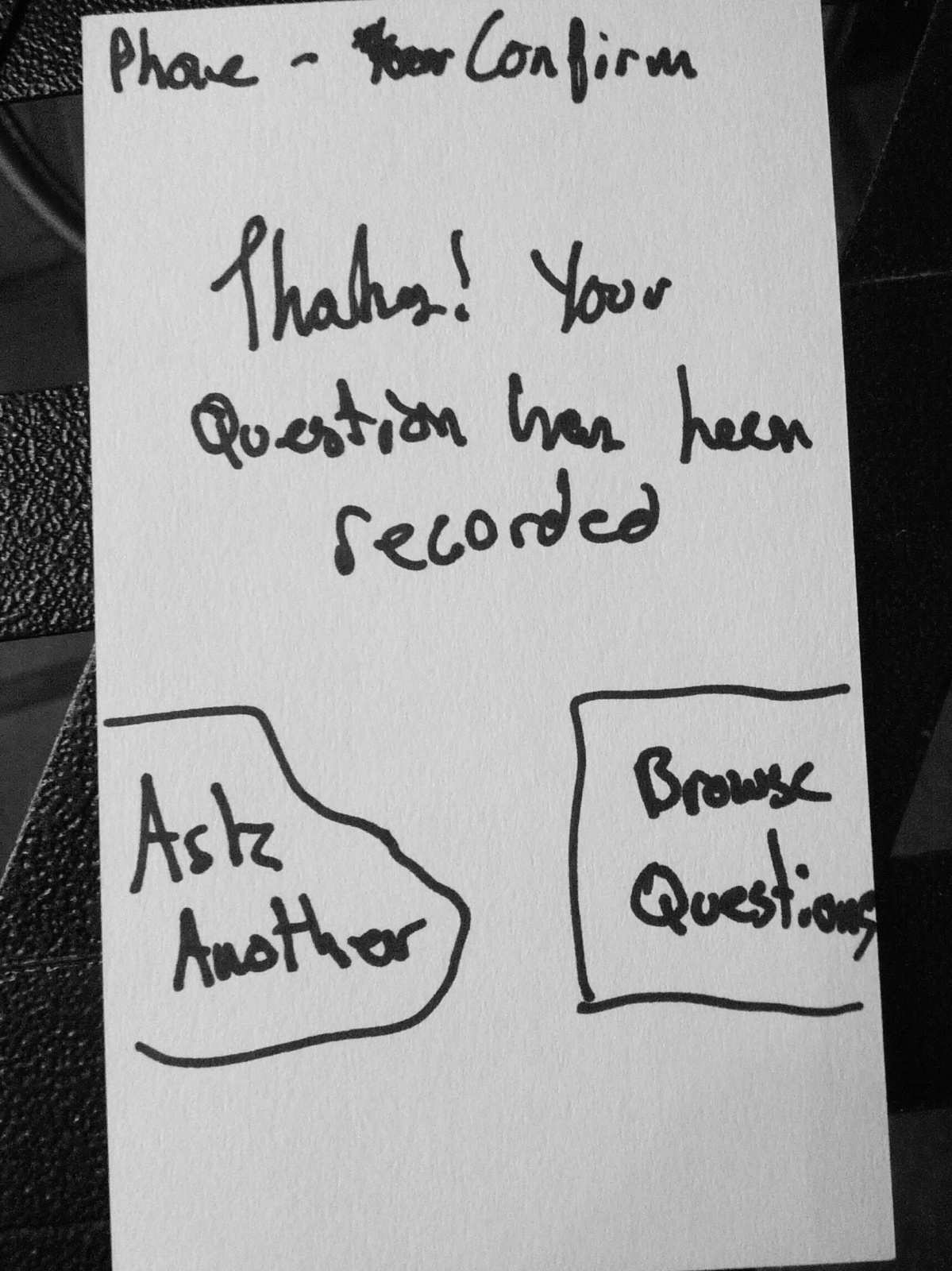
On this screen, students can use an on-screen keyboard (not shown) to enter a reply to the question shown above. They can choose to post or post anonymously, which will add their reply to the thread with or without their name attached, and bring them back to the screen “focusing” on their original question (screen 2). Clicking “To Thread” at the top will also return to this “focus” screen, but without making a post.
Clicking “All ?s” at the top returns users to screen 1.
")
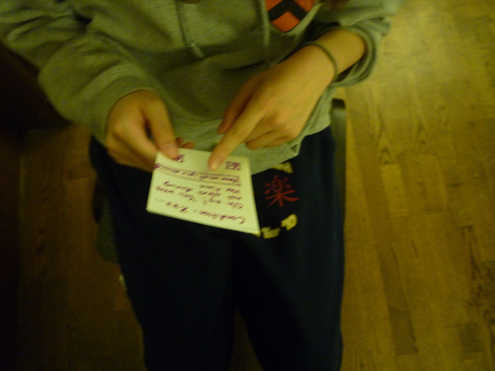
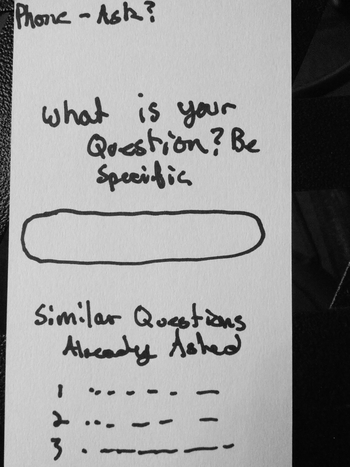
Students on this page can enter a new question (using an onscreen keyboard, not shown). The page displays the user’s name. The user can click on “Post”, or “Post Anonymously”, to submit the question and return to the main screen (1). Users can also return to the main screen (without submitting) by clicking “All ?s” at the top.
5. Rapid Feedback
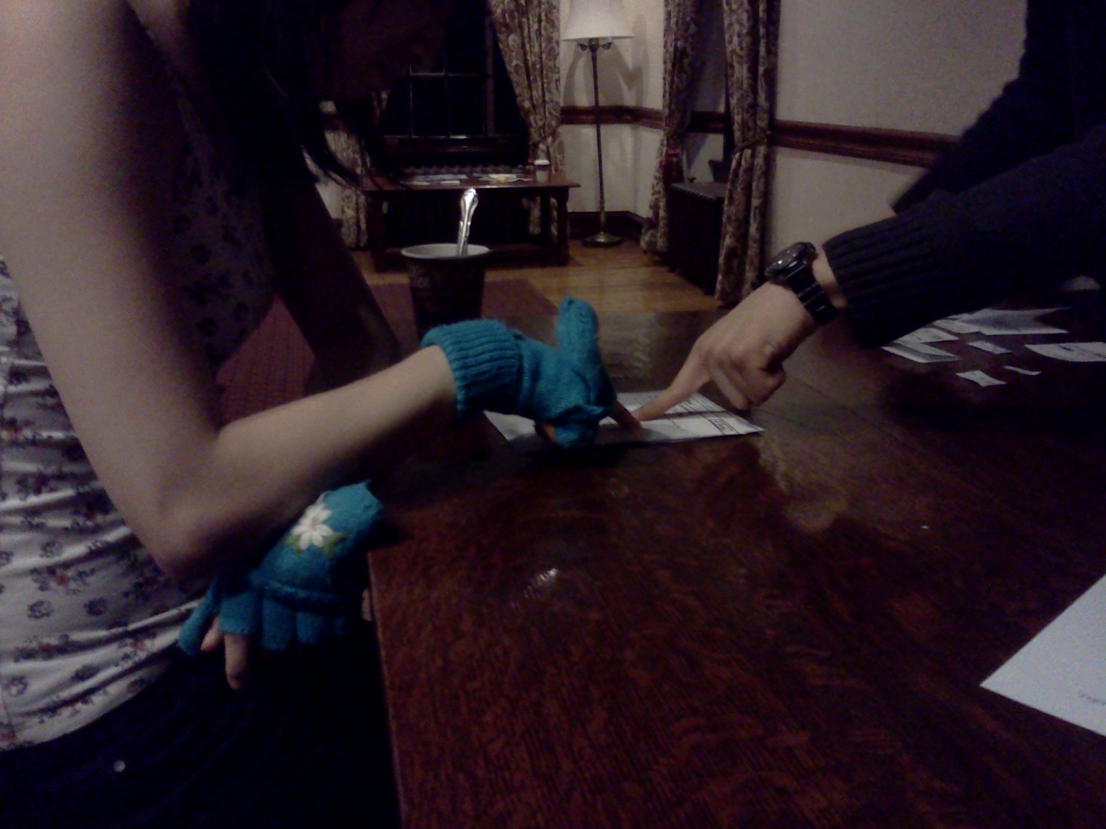
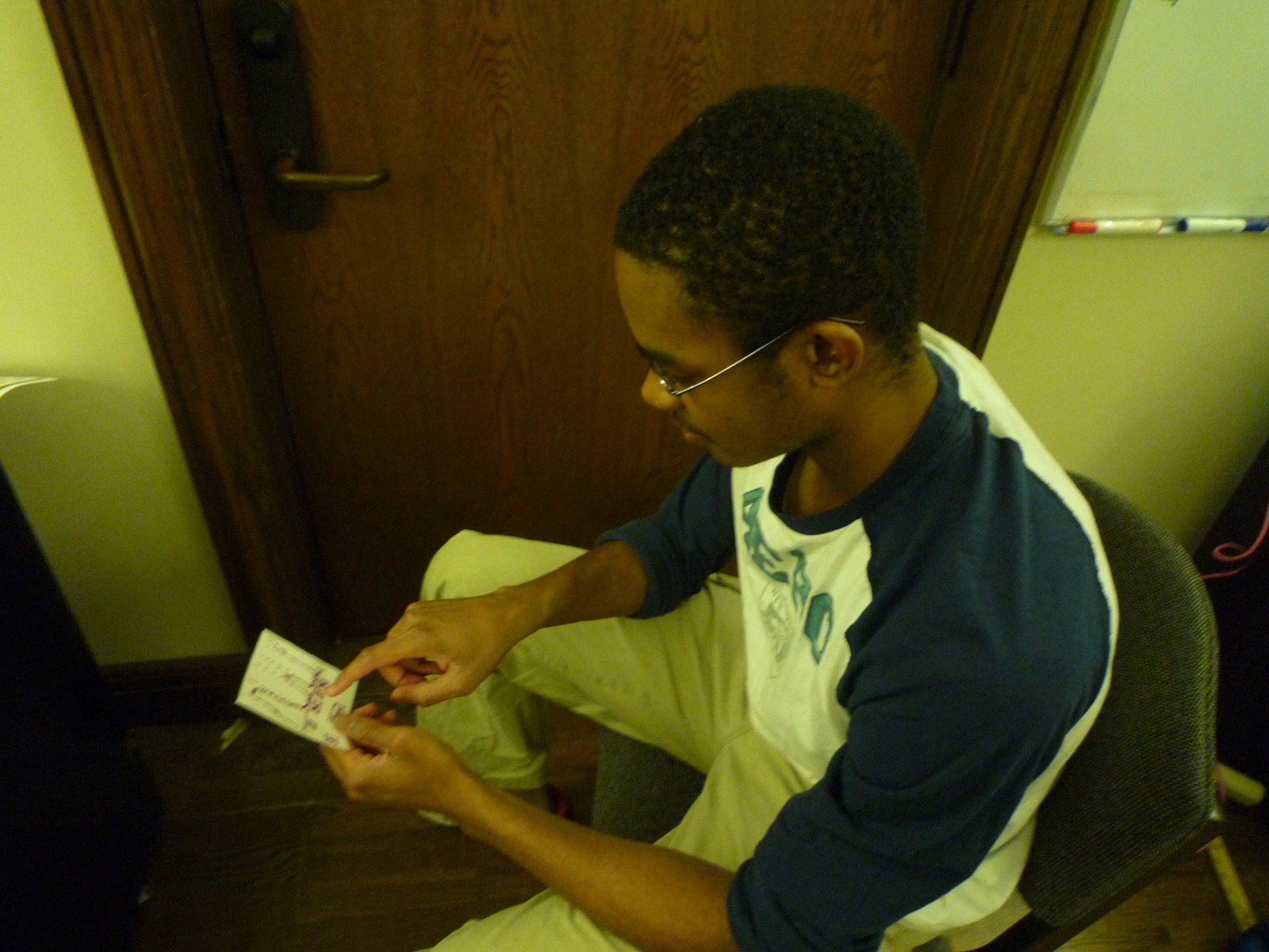
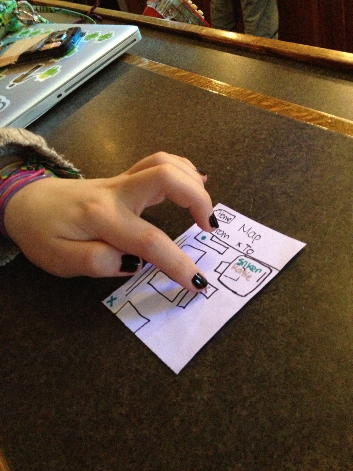
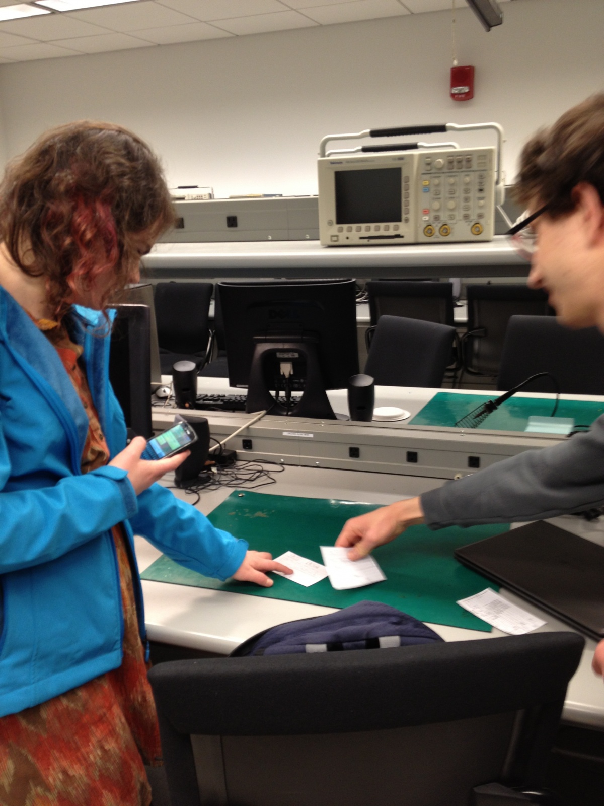
To get feedback, I chose to use the Live Class Forum because, of the two, it seemed like the better-defined idea, as well as the idea more easily captured by paper prototypes and Wizard-of-Oz style simulation.
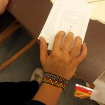
1. Bonnie Eisenman ’14
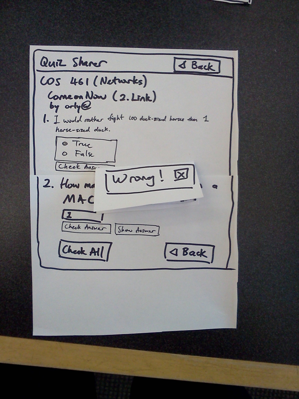
This was my first test, so it was a little rough around the edges. Bonnie’s main suggestion for improvement was to make better use of the mobile UI libraries and “look-and-feel” that Android, iOS, and similar provide (for instance, overlays that slide on top of the main window for the compose screens), because this would make the application look more polished and behave in a way mobile users expect. She also pointed out that the main screen was somewhat cluttered, and that it wasn’t especially clear which regions were clickable (for instance, tapping on a question in the main screen takes you to a different screen; tapping on a question on the “focused question” screen does nothing).
Some photos:

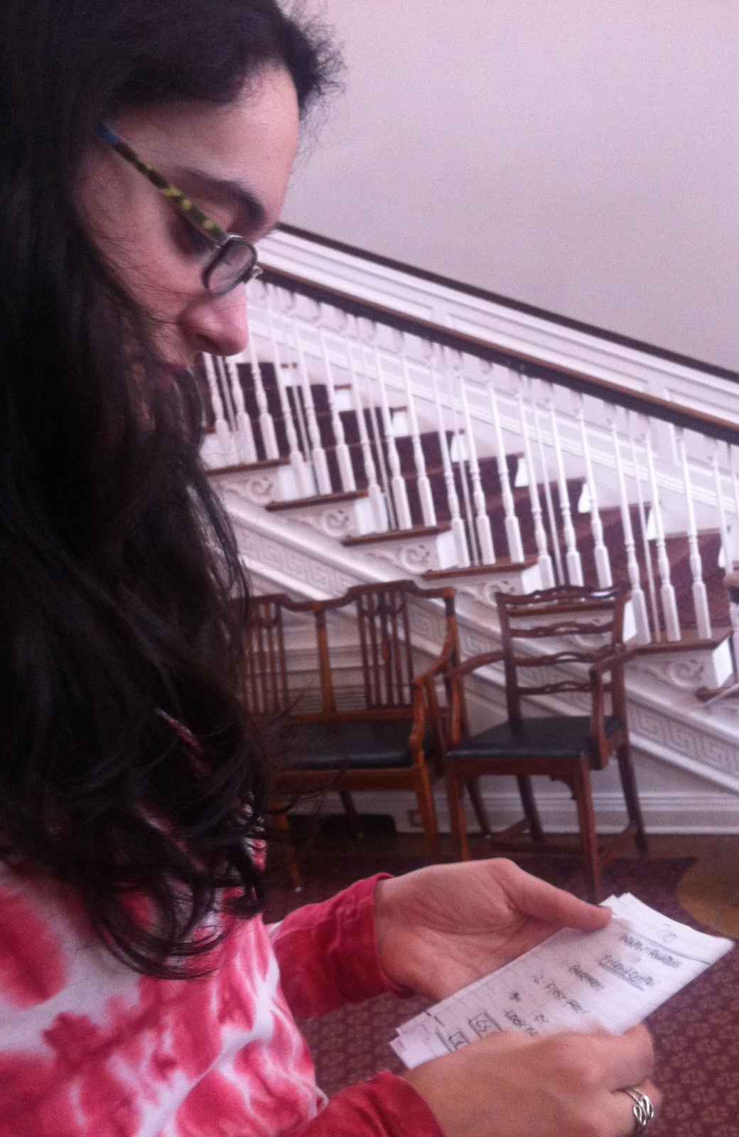
Testing “Create a Reply” with Bonnie

Testing the main screen -> create a reply workflow with Bonnie
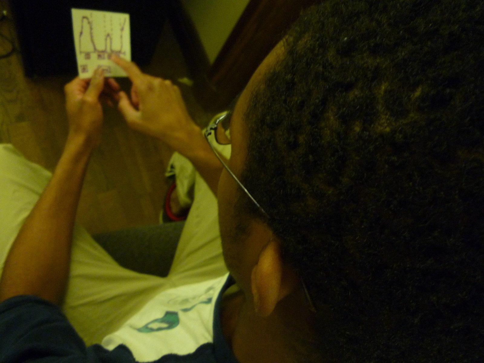
2. Max Botstein ’14
Max had no issues with the interface itself – other than that it was a bit tight and cluttered, but not much more so than most mobile UIs that only have a small screen to work with. However, he pointed out that the question-and-answer format that this product sets up – in which the questions are factual in nature and have a clear “best” answer – tends to work better in “hard” scientific or quantitative classes than in the humanities or social sciences. As a history major, Max couldn’t picture any of the professors in his department using this product, though he does think it could work better in a department like COS. Like Bonnie and Valya, he was somewhat caught off guard by the lack of clear instructions, but figured out the gist of things pretty quickly.
Some photos:

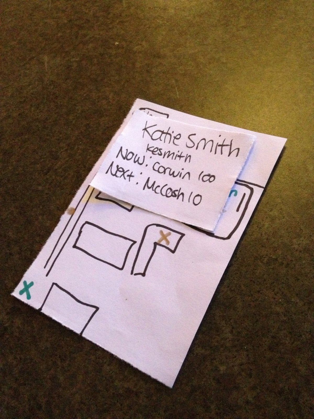
Testing the reply screen with Max
Testing the focus screen -> reply workflow with Max
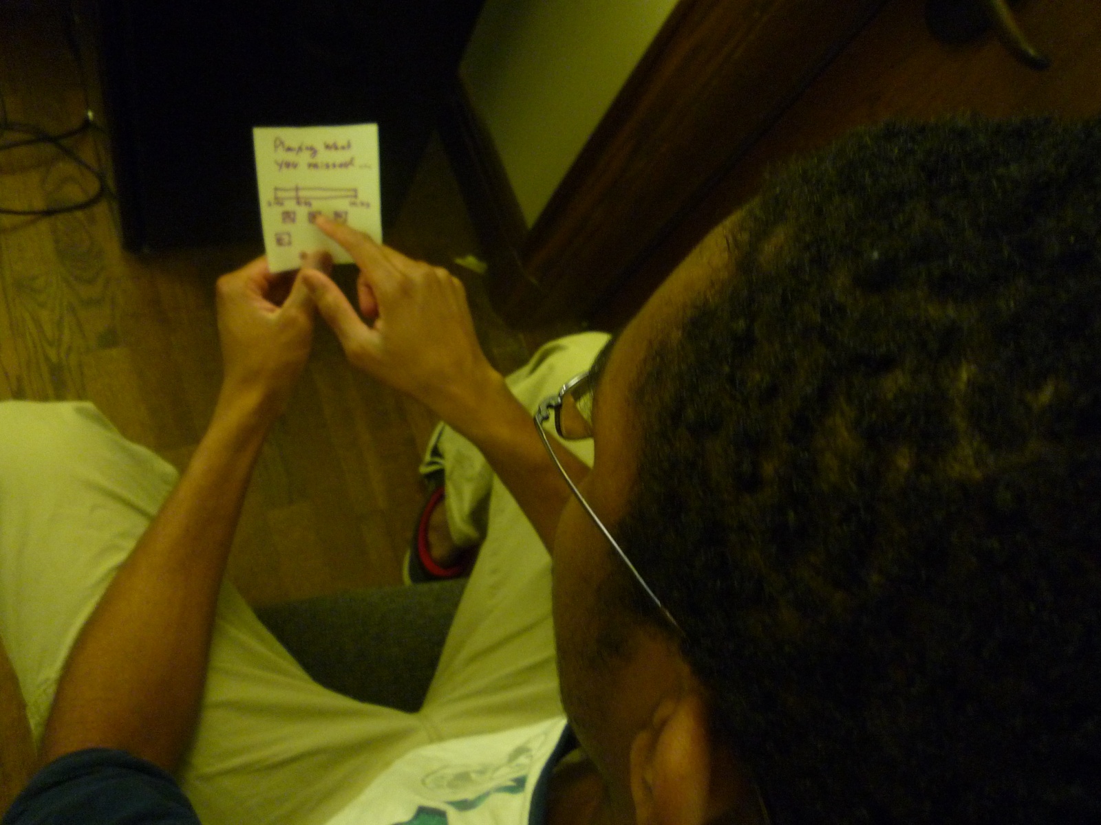
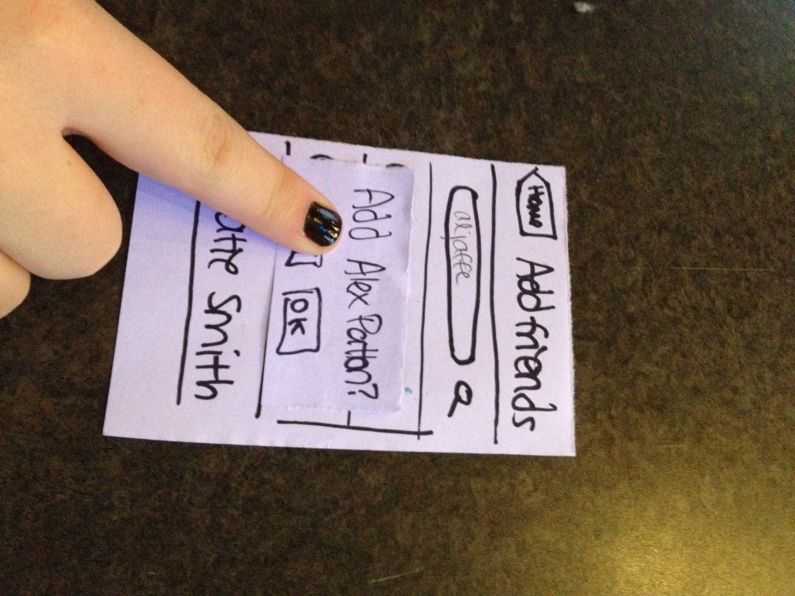
3. Valya Barboy ’15
Valya’s main comment was that the main screen was too confusing, and needed to be simplified – perhaps by removing or hiding the reply, up-vote, and down-vote buttons on the main screen, and leaving them on only the “focused” screen. She also was not convinced that students would use the product even if the UI were improved – she said that it seemed too unnatural and inorganic, and that inertia would draw students to doing whatever they normally do between classes, because there are seldom questions to be asked that are so compelling students will break out of their usual routines to write or vote on them.
Some photos:

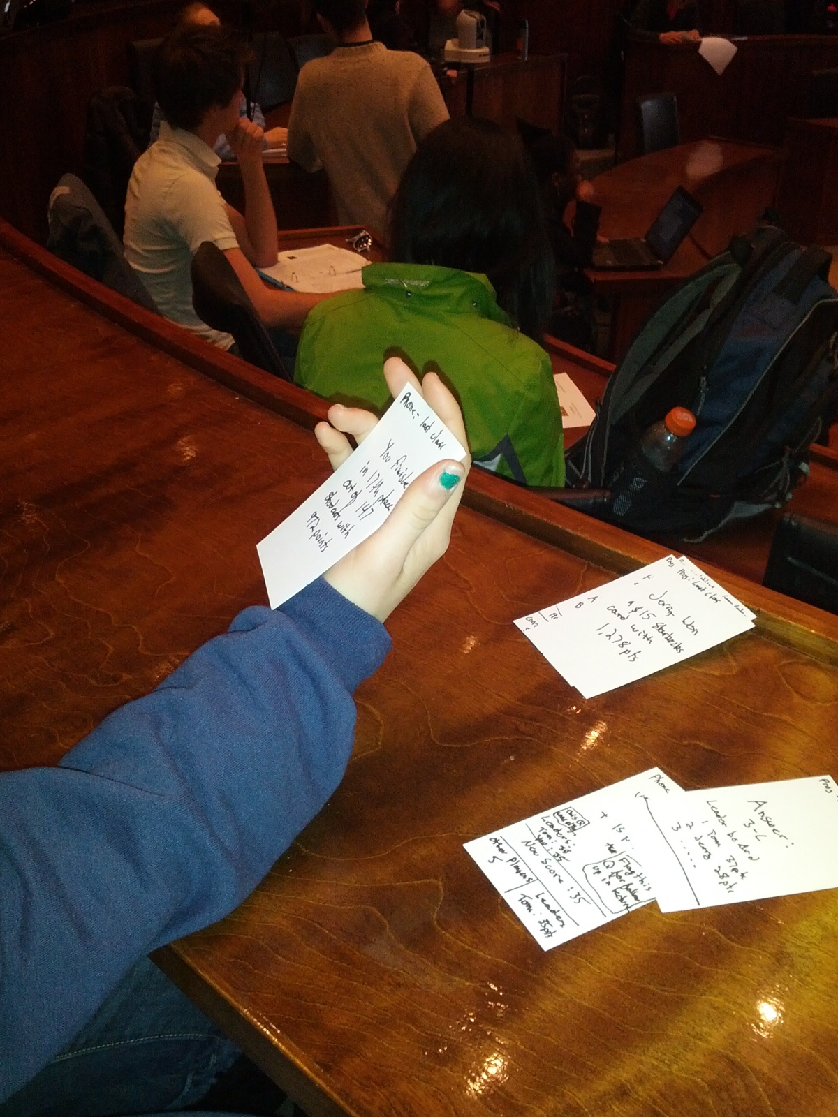
Testing the “all threads” button from the “focused” screen with Valya

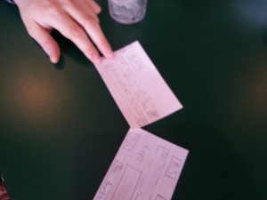
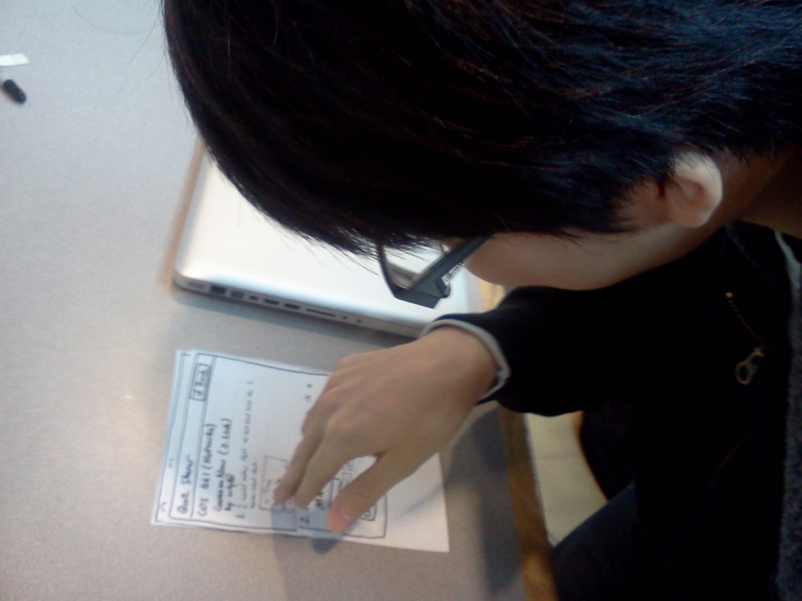
Wizard-of-Oz simulations can be challenging! Here I’m fumbling with the cards while testing on Valya
6. Insights/Conclusion
- Even when you think you understand the potential user, you probably still don’t, especially if you’ve spent only a comparatively small amount of time getting to know them. I thought I was designing a product that would appeal to students interested in deepening their knowledge of the course material, but in the the appeal was not as strongly compelling as I had thought it would be.
- When designing for a device or UI form factor that already exists (e.g., desktop, mobile, facebook app, …), be aware of the UI conventions that exist and follow them. A source of confusion for the users I tested on was the fact that my product differed from how typical mobile applications work, in terms of transitions between screens, title bars, and text inputs.
- Make extra sure you’re not making implicit assumptions about your user. Two of the lectures I went to to observe (as well as most of the lectures I attend in my day-to-day life) were COS lectures; as a result, my thinking about what a typical Princeton lecture looks like was excessively influenced by what a typical Princeton COS lecture looks like. This caused me to make unconscious assumptions about who I was designing for, and I ended up designing a product that might not find many uses outside of COS classrooms.
- It’s impossible to avoid having a learning curve for your product, but it’s important to understand why the curve exists in your particular case. Simply giving my prototype to the users to experiment with without any explanation was immensely helpful – it was a form of brutal honesty that revealed many of the un-intuitive features of my UI, such as the clutter on the main screen making it difficult to navigate, and the ambiguity in the presentation of question-and-response threads (such as only the top answer for each question being presented on the main page.)
In conclusion, if I were to continue to iterate on and revise this product, I would first reduce the clutter on the main screen; in particular, I would remove the reply and upvote/downvote buttons, keeping them only on the “focused on a thread” screen. I would also retool this thread-focus screen, to make it more clear exactly how it fits into the main screen’s big-picture view of the questions (perhaps by using overlays or other fancy mobile UI elements). I might also consider more fundamental redesigns of the product’s functionality and interface – after all, this is still the early stage of the design process where many different ideas can be explored without too much cost.
This was definitely a humbling experience. I knew that getting UIs right was difficult, but I wasn’t expecting to my interface to have so many flaws, in spite of the fact that I tried to take my users’ specific needs and situation into account. This assignment really demonstrated to me the importance of prototyping, testing, iterating, and failing fast in UI design.


 Main Screen")
")


