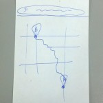
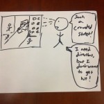
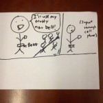
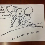
P4 – NavBelt Lo-Fidelity Testing

Group 11 – Don’t Worry About It
Daniel, Krithin, Amy, Thomas, Jonathan

The NavBelt provides discreet and convenient navigational directions to the user.

Testing Discussion
Consent
We had a script which we read to each participant, which listed the potential risks and outlined how the device would work. We felt that this was appropriate because any risks or problems with the experiments were made clear, and the worst potential severity of accidents was minimal. In addition, we gave our participants the option of leaving the experiment at any time.
Scripts HERE.

Participants
All participants were female undergraduates.

Since our target audience was “people who are in an unfamiliar area”, we chose the E-Quad as an easily accessible region which many Princeton students would not be familiar with, and used only non-engineers as participants in the experiment. While it would have been ideal to use participants who were miles from familiar territory, rather than just across the road, convincing visitors to Princeton to allow us to strap a belt with lots of wires to them and follow them around seemed infeasible.

  1. Participant 1 was a female, senior, English major who had been in the E-Quad a few times, but had only ever entered the basement.
  2. Participant 2 was a female, junior, psychology major.
  3. Participant 3 was a female, junior, EEB major.

We selected these participants first by availability during the same block of time as our team, and secondly by unfamiliarity with the E-Quad.

Prototype
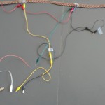
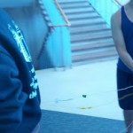
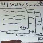
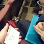
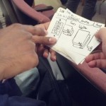
The tests were conducted in the E-Quad. We prepped the participants and obtained their consent in a lounge area in front of the E-Quad cafe. From that starting point, there were hallways and a staircase that the participants had to traverse in order to reach the final destination which was a courtyard. The prototype was set up using a belt with vibrating motors taped to it. Each had alligator clips that could be connected to a battery in order to complete the circuit and cause it to vibrate. A pair of team members would trail each tester, closing circuits as needed in order to vibrate a motor and send the appropriate direction cue to the tester.

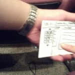
This setup represents a significant deviation from our earlier paper prototype, as well as a significant move away from pure paper and manual control to include some minimal electrical signaling. We feel however that this was necessary to carry out testing, since the team members who tested our original setup, where one team member physically prodded the tester to simulate haptic feedback, reported feeling their personal space was violated, which might have made recruiting testers and having them complete the test very difficult. To this end we obtained approval from Reid in advance of carrying out tests with our modified not-quite-paper prototype. However, the simulated mobile phone was unchanged and did not include any non-paper parts.

Procedure
Our testing procedure involved 2 testers (Daniel and Thomas) following the participant and causing the belt to vibrate by manually closing circuits in a wizard-of-oz manner. Another tester (Krithin) videotaped the entire testing procedure while 2 others took notes (Amy and Jonathan). We first asked the participants to select a destination on the mobile interface, then follow the directions given by the belt. In order to evaluate their performance on task 3 we explicitly asked them to rely on the buzzer signals as opposed to the map to the extent they were comfortable.

Scripts HERE.

Video of Participant 1

Video of Participant 2

Video of Participant 3

Results Summary
All three participants successfully found the courtyard. The first participant had trouble navigating at first, but this was due to confusion among the testers who were manipulating the wizard-of-Oz buzzers. Most testers found inputting the destination to be the most difficult part, and once the belt started buzzing, reported that the haptic directions were “easy” to follow. Fine-grained distinctions between paths were difficult at first, though; Participant 1 was confused when we arrived at a staircase which led both up and down and was simply told by the belt to walk forward. (In later tests, we resolved this by using the left buzzer to tell participants to take the staircase on the left, which led down.) Finally, all participants appeared to enjoy the testing process, and two of the three reported that they would use it in real life; the third called it “degrading to the human condition”.

One of the participants repeatedly (at least 5 times) glanced at the paper map while en route to the destination, though she still reported being confident in the directions given her by the belt.

One aspect of the system all the participants had trouble with was that they were not sure when the navigation system kicked in after they were done inputting the destination on the phone interface.

Results Discussion
Many of the difficulties the participants experienced were due to problems in the test, and not in the prototype itself. For instance, Participant 1 found herself continually being steered into glass walls, while the testers in charge of handling the alligator clips tried to figure out which one to connect to the battery; similarly, while testing on Participant 3, one of the buzzers malfunctioned, leading her to not correctly receive the three-buzzer end of journey signal.
Two participants preferred directions to be given immediately when they needed to turn; one participant suggested that it would be less confusing if directions were given in advance, or some signal that a direction was forthcoming was given, because a vibration was easy to imagine when nonexistent or, conversely, it was easy to get habituated to a constant vibration and cease to notice it.

The difficulty in using the paper prototype for the phone interface was probably caused at least in part by the fact that only one of the participants regularly used a smartphone; in hindsight we might have used familiarity with google maps on a smartphone or GPS units as a screening factor when selecting participants. The fact that some participants glanced at the map seems unavoidable; while relative, immediate directions are all that one needs to navigate, many people find it comforting to know where they are on a larger scale, and we cannot provide that information through the belt. However, using the map as an auxiliary device and the navigation belt as the main source of information is still a better method than the current standard navigation method of relying solely on a smartphone.

To address the fact that users were not sure when the navigation system had started, we might in the actual product either have an explicit button in the interface for the user to indicate that they are done inputting the destination, or have the belt start buzzing right away, thus providing immediate feedback that the destination has been successfully set.

Higher-Fidelity Prototype
We are ready to build without further testing.

P3: NavBelt

Group 11 – Don’t Worry About It
Krithin, Amy, Daniel, Jonathan, Thomas

Mission Statement
Our purpose of building the NavBelt is to make navigating cityscapes safer and more convenient. People use their mobile phones to find directions and navigate through unfamiliar locations. However, constantly referencing a mobile phone with directions distracts the user from safely walking through obstacles and attracts unwanted attention. From our first low-fidelity, we hope to learn how best to give feedback to the user in a haptic manner so they can navigate more effectively. Such will include how long to vibrate, where to vibrate, and when to signal turns.

Krithin Sitaram (krithin@) – Hardware Expert
Amy Zhou (amyzhou@) – Front-end Expert
Daniel Chyan (dchyan@) – Integration Expert
Jonathan Neilan (jneilan@) – Human Expert
Thomas Truongchau (ttruongc@) – Navigation Expert

We are opening the eyes of people to the world by making navigation safer and more convenient by keeping their heads held high.

The Prototype
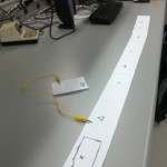
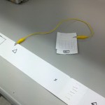
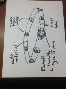
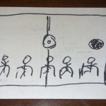
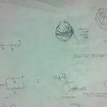
The prototype consists of a paper belt held together by staples and an alligator clip. Another alligator clip connects the NavBelt prototype to a mock mobile phone made of paper. The x’s and triangles mark where the vibrating elements will be placed. For clarity, the x’s mark forwards, backwards, left, and right while the triangles mark the directions in between the other four.

The Tasks
1. Identifying the correct destination (Easy Task)
2. Provide information about immediate next steps. (Hard Task)
3. Reassure user is on the right path. (Moderate Task)

Method
1. The user types his destination into his mobile phone, and verifies using a standard map interface that the destination has been correctly identified an appropriate route to it has been found.

2. One of the actuators on the NavBelt will constantly be vibrating to indicate the direction the user needs to move in; we simulated this by having one of our team repeatedly poke the user with a stapler at the appropriate point on the simulated belt. Vibration of one of the side actuators indicates that the user needs to make a turn at that point.

The following video shows how a normal user would use our prototype system to accomplish tasks 1 and 2. Observe that the user first enters his destination on his phone, then follows the direction indicated by the vibration on the belt.

http://www.youtube.com/watch?v=oeiPrTMWa0c&edit=vd

The following video demonstrates that the user truly can navigate solely based on the directions from the belt. Observe that the blindfolded user here is able to follow the black line on the floor using only feedback from the simulated belt.
http://www.youtube.com/watch?v=2ByxGkh11FA&edit=vd

3. In order to reassure the user that he or she is on the correct path, the NavBelt will pulsate in the direction of the final destination; if the actuator at the user’s front is vibrating that is reassurance that the user is on the right track. Again, a tester with a stapler will poke at one of the points on the belt to simulate the vibration.
http://www.youtube.com/watch?edit=vd&v=cH1OzO-7Swc

Discussion
We constructed the prototype from strips of paper and alligator clips to hold the belt together and to represent the connection between the mobile phone and the NavBelt. We also used a stapler to represent the vibrations that would direct the user where to walk. We encountered no real difficulties and the prototype was effective for guiding a user between two points.

P2 – Group 11 – Don’t Worry About It – NavBelt

Krithin Sitaram (krithin@) – Krithin conversed with people in contextual interviews, and wrote about contextual interviews descriptions and task descriptions.
Amy Zhou (amyzhou@) – Amy drew a storyboard, conversed with people in contextual interviews, and wrote about user descriptions and task descriptions.
Daniel Chyan (dchyan@) – Daniel drew a storyboard, wrote about the interface design, observed interviewees during contextual interviews, and wrote about task descriptions.
Jonathan Neilan (jneilan@) – Jonathan took notes during contextual interviews, and took pictures of the design sketches.
Thomas Truongchau (ttruongc@) – Thomas drew a storyboard, wrote about task descriptions, and took pictures of all the storyboards.

Essentially, each person addressed different problems when they arose.

Problem and solution overview
Smartphone map apps are useful but very demanding of the user’s visual attention, and still require the user to be able to read a map. Our proposed solution is to outfit a belt that the user will wear with a number of buzzers; this will interact with a user’s smartphone to determine the user’s location and bearing and vibrate the appropriate motor to indicate the direction the user should walk.

Description of users you observed in the contextual inquiry
Our first target user group includes travelers in an unfamiliar area who want to travel hands-free. Our rationale behind choosing this user group is because they tend to have their hands full and need a solution that will help them quickly move from place to place without referring to a map or phone.
Our second target user group includes people searching in Firestone library. Actual tourists are hard to find this time of year, so we chose students attempting to locate things in Firestone as an approximation. They have the problem of making their way around an unfamiliar environment. This allowed us to gather insight into how they use the same tools that people use when navigating a larger scale unfamiliar environment, like a city.

Persons observed in contextual interviews
At the transit center:
1. Two female adults, probably in their mid-20s, who were very outgoing and excited about traveling. They were primarily occupied with getting where they were going, but also wanted to have fun along the way! They were good target users because they were new to the area, having just arrived from the airport, and also had a distinct destination they wanted to get to; they also did not want to expose electronics to the rain, so they fit in the category of travelers who would have liked to have hands-free navigation.
2. Two women, probably in their early 20s, weighed down by shopping bags and a small child. They were fairly familiar with transit in general, but not with this particular transit center. Their top priority was not getting lost. They were good observation candidates because they were in a hurry but were having trouble using existing tools — they were uncertain whether they were on the right bus, and waited for several minutes at the wrong bus stop.

At Firestone:
1. Female student searching for a book in the B level, then looking for the way back to her desk. She does not know Firestone well, and was using a map of the library on her laptop to get around.
2. Male student searching for his friend in the C level of Firestone. He knew the general layout of that part of the library, but did not know precisely where his friend would be. It seemed time was less of a priority for him than convenience, because he was content wandering around a relatively large area instead of texting his friend to get a more precise location (e.g. call number range of an adjacent stack) and using a map to figure out directions to that location.
3. The official bookfinder on the B-level of Firestone provided some information about the way people came to her when they needed help finding a book. Although she was not part of our user group herself (since she was trained in finding her way around the library) she was a useful source because she could draw on her experience on the job and tell us about the behaviors of many more people than we could practically interview.

CI Interview Descriptions
We carried out interviews in two different settings. Firstly, we observed people attempting to find their way around using public transit who were waiting at the Santa Clara Transit Center, while it was dark and raining, immediately after a bus had arrived from the airport, thus carrying many people who had just arrived in the area. Secondly, we observed people in Firestone library as they attempted to find books or meet people at specific locations in the library. In addition to direct observations, we also interviewed a student employed as a ‘bookfinder’ in the library to get a better sense of the users we expected would need help finding their way around. We approached people who were walking near the book stacks or disgorged from the elevator; asked them what they were looking for, and followed them to their destination. One person recorded observations by hand while another talked to the participant to elicit explanations of their search process.

One common problem people faced was that even with a map of the location they were uncertain about their exact position, and even more so about their orientation. This is understandable because it’s very easy to get turned around, especially when they are constantly looking from side to side. Recognizable landmarks can help people identify where they are on a map, but it is harder to figure out their orientation from that. Another problem is that people are often overconfident in their ability to navigate a new area. For instance, at the transit center, one informant was sitting at a bus stop for quite some time, apparently very confident that this was the correct bus stop, only to run across the parking lot several minutes later and breathlessly exclaim “We were waiting at the wrong bus stop too!” The first student we interviewed in Firestone also told us that she knew the way back to her desk well (even though she admitted to being “bad with directions”), but nevertheless had to keep looking around as she passed each row in order to find it.

One Firestone interviewee revealed another potential problem; he was looking for a friend in the library but only knew which floor and which quadrant of the library his friend was in, and planned to wander around till the friend was found. This indicates that another task here is the mapping between the user’s actual goals and a physical location on the map; we expect however that this should be easier for most users of our system, since for example the transit passengers and the students in search of books in the library had very precise physical locations they needed to go to. Even when users are following a list of directions, the map itself sometimes has insufficient resolution to guide the user. For instance, at the transit center, all the bus stops were collectively labeled as a single location by Google Maps, with no information given as to the precise locations of the bus stops within that transit center.

Answers to 11 Task Analysis Questions
1. Who is going to use system?
Specific target group:
People who are exploring a new location and don’t want to look like a tourist.
2. What tasks do they now perform?
Identify a physical destination (e.g. particular location in library) that they need to go to to accomplish their goal (e.g. get a certain book).
Harder to define for some goals (‘looking for a friend in the library’)
Determine their own present location and orientation
E.g. Transit passengers try using GPS; inside library people look at maps and landmarks.
Identify a route from their location to their destination, and move along it.
As they proceed along the route, check that they have not deviated from it.
e.g. the transit passengers
3. What tasks are desired?
Identify a physical destination that they need to get to.
Receive information about next leg of route
Reassure themselves that they are on the the right path
4. How are the tasks learned?
Users download a maps application or already have one and figure it out. They usually do not need to consult a manual or other people.
Boy Scouts orienteering merit badge
Trial and error #strug bus
Watching fellow travelers
5. Where are the tasks performed?
Choosing a destination can happen at the user’s home, or wherever is convenient, but the remainder of the tasks will happen while travelling along the designated route.

6. What’s the relationship between user & data?
Because each person has a unique path, data will need to cater to the user. Privacy concerns are limited, because other people will necessarily be able to see the next few steps of the path you take if they are physically in the same location. However, broadcasting the user’s complete itinerary would be undesirable.
7. What other tools does the user have?
Google maps
Other travelers, information desks, bus drivers, locals…
Physical maps
Signs
Compasses
8. How do users communicate with each other?
Verbally
Occasionally, text messaging
9. How often are the tasks performed?
When the user is in an unfamiliar city, which may happen as often as once every few weeks or as rarely as on the order of years, depending on the user, the user will need to get directions several times a day.
10. What are the time constraints on the tasks?
Users sometimes have only a few minutes to get to a location in order to catch a bus, train, or plane, or have to get to their destination within a few minutes.
11. What happens when things go wrong?
In the case of system failure, users will be able to use preexisting tools and ask other people for directions.

Description of Three Tasks
1. Identify a physical destination that they need to get to.

Currently, this task is relatively easy to perform. On the web, existing tools include applications like Google Maps or Bing Maps. Users generally input a target destination and rely on the calculated path in order to get directions. However, the task becomes moderately difficult when consulting directions on the go. Users inconvenience themselves when they need to take out their phone, refer to the map and directions, and then readjust their route accordingly.
Our proposed system would make the task easier and less annoying for users who are physically walking. After the user identifies a physical destination, the navigation belt will help guide the user towards the target. Our system eliminates the inconvenience of constantly referring to a map by giving users tactile directional directions. This is discrete and inconspicuous.
2. Receive information about immediate next steps

Determine in what direction the user should be walking. This can be moderately difficult using current systems, because orientation is sometimes difficult to establish at the start of the route, and the distance to the next turn is usually not intuitive. For example, users of current mapping systems may have to walk in a circle in order to figure out a frame of reference to determine the correct direction because a user must orient the mobile phone. With our proposed system, the direction will be immediately obvious, because the orientation of the belt remains stable. Our proposed system will make this task relatively easier.
3. Reassure themselves that they are on the the right path

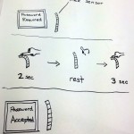
The user often wants to know whether they are still on the right track, or whether they missed a turn several blocks ago. The user attempts this task once in a while if they are confident, but if they are in a confusing area they might want this information very often or even continuously. Currently, checking whether the user is still on the right path is not very difficult but rather annoying, since it requires pulling out a map or phone every few minutes to gain very little information. With our proposed system, it would be extremely simple, because as long as the front panel is vibrating, the user knows that he or she is walking in the right direction.

Interface Design
The system provides users with the ability to orient themselves in a new environment and receive discreet directions through tactile feedback. A user can ask for directions and the system will vibrate in one of 8 directions to guide the user through a series of points towards a destination. Benefits of the system include discrete usage and providing an additional sense of direction beyond the current maps provided by Google and Microsoft. Reliance on a tactile system also reduces the demand on visual attention which allows users to focus more on his or her surroundings. The scope of functions will encompass orienting towards points of interest and providing directions to those points. No longer will users need to stare at a screen to find their way in unfamiliar locations or spin in a circle to find the correct orientation of directions.

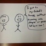
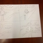
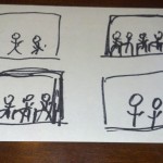
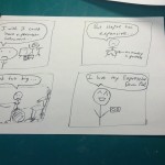
Storyboard 1:


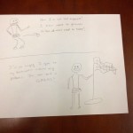
Storyboard 2:
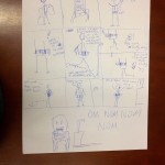
Storyboard 3:

Design of NavBelt
belt2

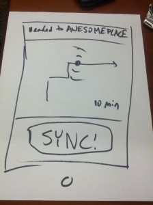
Design of Mobile Application Interface
belt

L2: Expressive Chaos

Krithin Sitaram (krithin@)
Amy Zhou (amyzhou@)
Daniel Chyan (dchyan@)
Jonathan Neilan (jneilan@)
Thomas Truongchau (ttruongc@)

Group 11

Expressive Chaos
Video Link
We built an instrument that combines multiple sensors that provides a unique experience for a performer to produce multiple sounds. We decided upon this design in order to challenge ourselves to use every sensor on the parts list and we believe we were successful in constructing this instrument. The final product does look a bit messy and it would be better if we had an enclosure in order to have a more pleasant looking instrument.

Instructions to Build:
Use 2 breadboards. On one breadboard, put flex sensor on the other breadboard, place the slide sensor, light sensor, and the button. The flex sensor, light sensor, and button are connected through pull-down resistors of 10k Ohms, 330 Ohms, and 330 Ohms respectively. Each are connected to an analog input pin.

Source Code:

const int INPINS[] = {A0, A1, A2, A3};
const int MAXVALUES[] = {950, 400, 1023, 320};
const int MINVALUES[] = {610,0,0,140};
const int BUZZER = 8;

void setup() {
  pinMode(BUZZER, OUTPUT);
  Serial.begin(9600);
}

void loop() {
  for (int i = 0; i < 4; i++) { // hardcoded len(INPINS);
    double outtone = (analogRead(INPINS[i]) - MINVALUES[i]) * ((double)1000/(MAXVALUES[i] - MINVALUES[i])) + 440;
    tone(BUZZER, outtone, 100);
    Serial.println(analogRead(INPINS[i]));
      Serial.println(outtone);
    delay(130);
    noTone(BUZZER);

  }
  Serial.println();
  Serial.println();

}

Prototype 1: Expressive Maraca
Video Link
This instrument simulates a maraca electronically using an accelerometer and buzzer.

Source Code:

#include <Math.h>

const int groundpin = A2; // analog input pin 2
const int powerpin = A0; // analog input pin 0
const int xpin = A5; // x-axis of the accelerometer
const int ypin = A4; // y-axis
const int zpin = A3; // z-axis 
int BASELINE; // baseline for accelerometer

void setup()

{
 Serial.begin(9600);

 pinMode(groundpin, OUTPUT);
 pinMode(powerpin, OUTPUT);
 digitalWrite(groundpin, LOW); 
 digitalWrite(powerpin, HIGH);
 BASELINE = analogRead(xpin);

}

void loop()
{

 Serial.print(analogRead(xpin));  // print the sensor values:
 Serial.print("\t");  // print a tab between values:
 Serial.print(analogRead(ypin));
 Serial.print("\t");   // print a tab between values:
 Serial.print(analogRead(zpin));
 Serial.println();
 delay(5); // delay before next reading:

 double diff = fabs(analogRead(xpin) - BASELINE);
 if (diff > 150) {
    tone(10, 440);
    delay(10);
    noTone(10);
 }

}

Prototype 2: Expressive Siren
Video Link
This instrument produces a siren sound with an accelerometer and buzzer.

Source Code:

#include <Math.h>

const int groundpin = A2; // analog input pin 2
const int powerpin = A0; // analog input pin 0
const int xpin = A5; // x-axis of the accelerometer
const int ypin = A4; // y-axis
const int zpin = A3; // z-axis 
int YBASELINE; // baseline for accelerometer
int XBASELINE; 

void setup()

{
 Serial.begin(9600);

 pinMode(groundpin, OUTPUT);
 pinMode(powerpin, OUTPUT);
 digitalWrite(groundpin, LOW); 
 digitalWrite(powerpin, HIGH);
 XBASELINE = analogRead(xpin);
 YBASELINE = analogRead(ypin);
}

void loop()
{
 double xchange =  fabs(analogRead(xpin) - XBASELINE); 
 double ychange =  fabs(analogRead(ypin) - YBASELINE); 
 double diff = sqrt(xchange*xchange + ychange*ychange);

 double ytone = (analogRead(xpin) - 272) * (440/137) + 440;
 Serial.println(ytone);
 tone(10, ytone);

}

int roundToTenth(double a) {
  double t1 = a / 10;
  double t2 = floor(t1) * 10;
  Serial.print(t2);
  Serial.println();
  return t2;

}

Prototype 3: The Metronome (which becomes Expressive Chaos)
Video Link
This metronome turns into our Expressive Chaos instrument.

Source Code:

const int INPINS[] = {A0, A1, A2, A3};
const int MAXVALUES[] = {950, 1023, 1023, 320};
const int MINVALUES[] = {610,0,0,140};
const int BUZZER = 8;

void setup() {
  pinMode(BUZZER, OUTPUT);
  Serial.begin(9600);
}

void loop() {
    tone(BUZZER, 440, 100);
    delay(1000);
    noTone(BUZZER);

}

Parts List for Expressive Chaos
– 1 Flex Sensor
– 1 Slide Sensor
– 1 Photocell
– 2 Resistors – 330 Ohms
– 1 Resistor – 10k Ohms
– 1 Buzzer
– 1 Button
– 2 Breadboards
– Arduino

A2 – Daniel Chyan

Observations
Over the course of 30 minutes before a lecture, I sat in the back of the hall and took notes on the various activities that students engaged in after entering the hall while paying special attention to the transitions between different tasks. Out of the 25 students I observed entering the hall, I took an interest in three students taking reviewing their notes from their paper notebooks for the course before the professor had arrived. Almost everyone else was on their laptops or conversing with each other. The people using laptops mainly used them to check email or to use Facebook. Otherwise, students talked among themselves before class started. It did strike me odd that students would not take the time before class to prepare for the lecture that would come ahead. Yet, the students that used their notebooks to review notes before class did not do so on their computers, but rather through paper.

During a period of time before another class, I observed a professor reviewing printed, letter-sized pictures of students in class while writing down names next to each student. He had taken pictures before a previous lecture and was trying to match the faces to the pictures found on Blackboard. However, it appeared tedious and inconvenient to print the pictures and write down each person’s name.

Brainstormed Ideas
Worked with Thomas Troungchao
1. Taking notes from students and converting them to flash cards for review
2. A seamless interface for reading other people’s discussion posts on Blackboard
3. A mobile/tablet application for professors to learn names of their students with pictures
4. A tool for students to input pressing questions for the professor before class
5. An app to remind when to leave for class based on where you are
6. Notification of when/where your next class is
7. Class-wide tron
8. Automate web-browsing/email-checking routine
9. App for summarized versions of class readings
10. Listening to transcribed notes while walking to class
11. After class, lecture rating system
12. An app that provides a bio for guest lecturers
13. Showing pictures of Princeton
14. Encouraging messages
15. Provide showtimes

The 2 Prototypes
– (3) The mobile/tablet application for professors to learn the names of their students provides a better solution to a current problem found during observations.
– (9) Students do not use laptops to prepare for class during the ten minutes before class, but having an app that provides summarized versions of the readings provides eases the process of preparation for class while reducing the potential to get distracted.

Class Name Tool
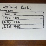
This mobile/tablet application helps professors learn their students names by having a picture-tagging ability that combines information from Blackboard with pictures of students during class. The professor would take pictures before lecture and later associate each face with a name. Professors also have the ability to take notes about the students.

Class Prep Tool
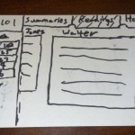
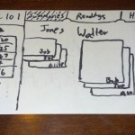
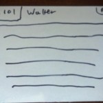
This web application provides an easier way for students to prepare for class by reducing the friction of doing the readings encouraging students to write summaries of assigned readings for the entire class. Doing assigned readings would be simplified by having all the readings in a series sliding panels versus the old clunky method of navigating multiple depths of URLs. This is meant to serve people who prefer the convenience of paper, but also to provide a better solution to laptop users for preparing for class.

User Testing
I tested the prototype with 3 students either before or after their classes. At the beginning of user testing, I explained the premise of the project, described the purpose of the prototype, and asked the user to interact with my prototype. In order to avoid biasing the testing, I explicitly avoided telling the user what he or she could or could not touch.

Insights from User Testing
– Make clear the distinction between the readings’ authors and the students writing the summaries
– Clarify or rework the interface for scrolling among the summaries of the readers
– One user was against the idea of having the announcements on the homepage of the app as it hinted that it was too similar to Blackboard.
– Make sure there’s a clear distinction between the app and Blackboard. It’s supposed to be complementing Blackboard, not replace it.
– Expand or change the date format of the class date menu in order to prevent confusion over usage.

L1: Expressive Drum Pad

Krithin Sitaram (krithin@)
Amy Zhou (amyzhou@)
Daniel Chyan (dchyan@)
Jonathan Neilan (jneilan@)
Thomas Truongchau (ttruongc@)

Group 11

Expressive Drum Pad

We built a drum pad that can play a range of pitches controlled by a softpot (touch sensitive slide), along with a range of amplitudes controlled by a FSR. The harder a performer strikes the FSR, the louder the buzzer sounds. Sliding towards the right will cause an increase in pitch, while sliding towards the left will cause a decrease in pitch. Combining the two controls, a performer can play a variety of virtuosic pieces that require a single voice. We decided to build the Expressive Drum Pad because we all appreciate music creation and wanted to contribute to the creative musical process. The Expressive Drum Pad turned out nicely as it allows the performer to control pitch and amplitude rather effectively through an intuitive, yet unpolished interface. Future improvements would include having an enclosure to hold down the sensors.

http://www.youtube.com/watch?v=VD8VC3npgwg

Parts Used
– 1 Arduino
– 1 FSR
– 1 softpot (touch-sensitive slide)
– Buzzer (replaced by computer speakers for additional volume)
[Reid approved this substitution.]

Connect the softpot to 5V, Ground, and an Arduino analog input pin. Connect the buzzer (computer speakers) in series with the FSR as part of the circuit from an Arduino digital output pin to ground. Angle the breadboard such that the softpot and FSR lie flat on a table.

Source Code:

int OUTPUTPIN = 3;
int FSRPIN = 5;
int SOFTPOTPIN = 0;
int MINSOFTPOT = 0;
int MAXSOFTPOT = 1024;
int MINPITCH = 120;
int MAXPITCH = 1500;

void setup() {
pinMode(OUTPUTPIN, OUTPUT);
Serial.begin(9600);

}

void loop() {
int frequency = map(analogRead(SOFTPOTPIN), MINSOFTPOT, MAXSOFTPOT, MINPITCH, MAXPITCH);
tone(OUTPUTPIN, frequency);
delay(2);
Serial.println(analogRead(FSRPIN));
}

Expressive Cyborg Glasses

Krithin Sitaram (krithin@)
Amy Zhou (amyzhou@)
Daniel Chyan (dchyan@)
Jonathan Neilan (jneilan@)
Thomas Truongchau (ttruongc@)

Expressive Cyborg Shades:

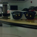
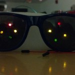
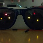
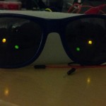
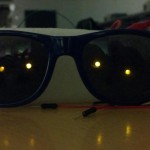
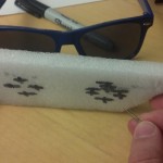
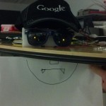
We positioned four LED lights on each lens and mimicked four emotions: evil (\ /), happy (^ ^), surprised (o o), and sleepy (v v). The emotions depend on ambient light (i.e. Bright ambient light evokes “happy”, a lack of ambient light evokes “evil” or “sleepy”). When the cyborg is turned on, it is happy. When ambient light is below a certain threshold, the cyborg becomes evil. As soon as light strikes above the threshold, the cyborg becomes surprised for two seconds, and then gets happy. We were inspired by evil animated furbies that have scary eyes. We also wanted to mimic human emotions in response to darkness and light, in a way in which the emotion matched the level of ambient light. Overall, we believe the project was a resounding success! Our cyborg responds well to varying ambient light levels. However, it is currently not wearable. What we like the most in our final result is that it responds and interacts with us well, inspiring great joy in us all. In the future, we will need more LED’s to get more expressive emotions and more variety of emotions. We can also use more compact circuitry using transparent circuit boards.

Photos/Videos & Captions

http://www.youtube.com/watch?v=FpNOg5XWXrA

Parts Used:
– Arduino
– 1 photocell
– 8 LED lights
– 1 100 Ohm resistor
– 1 variable resistor
– 1 long grounding wire
– 5 alligator clips
– Wires
– Styrofoam
– Sunglasses

Instructions for Recreating:

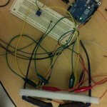
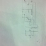
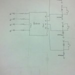
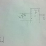
We first cut the styrofoam to fit behind the glasses, and poked the legs of the LEDs through. All the LEDs were connected in parallel. The ground pins of the LEDs were bent to make them flush with the surface of the styrofoam, and a single bare copper ground wire was hooked around them all and connected to a ground pin on the Arduino. Then the other pins of the LEDs were hooked up to the Arduino in pairs, with one light from each eye connected to a single analog output pin on the Arduino as indicated in the diagram.

The light sensor was connected in series with a fixed 100 Ohm resistor and an appropriately tuned potentiometer, and the 3.3V output of the Arduino was set across these. A tap was connected to measure the potential difference across the light sensor at analog input A0 of the Arduino.

Source Code:

/***
Pin numbers for left and right eye

   3      3
 5   6   6  5
   9      9
*/

int lightsensor = 0;
int threshold = 150;
int surprisedcounter = 0;
int surprisedlength = 2;
int sleepiness = 0;
int sleepaftertime = 10;

void setup() {
  Serial.begin(9600);
  happy();
}

void happy() {
  analogWrite(3, HIGH);
  analogWrite(6, HIGH);
  analogWrite(5, HIGH);    
  analogWrite(9, LOW);
}
void evil() {
  analogWrite(5, HIGH);
  analogWrite(9, HIGH);
  analogWrite(3, LOW);    
  analogWrite(6, LOW);
}
void surprised() {
  for (int i = 1; i < 14; i++) {
    analogWrite(i, HIGH);
  }
}
void sleep() {
  analogWrite(9, LOW);
  analogWrite(6, HIGH);
  analogWrite(5, HIGH);    
  analogWrite(3, LOW);
}

void loop() {
  Serial.println(analogRead(lightsensor));
  if (analogRead(lightsensor) < threshold) {
    sleepiness = 0;
    if (surprisedcounter > 0) {
      surprised();
      surprisedcounter--;
    } else {
      happy();
    }
  } else {
    if (sleepiness > sleepaftertime) {
      sleep();
    } else {
      sleepiness++;
      surprisedcounter = surprisedlength;
      evil();
    }
  }
  delay(1000);
}