Assignment 2 – Bereket Abraham

Assignment 2
Bereket Abraham

1. Saw the IDEO video.

2. Observed 3 people before CS 436 lecture on Tuesday. There were two guys that looked like COS majors sitting next to each. The third person was a girl sitting by herself (unknown major). I noticed that most people either talked to their friends or procrastinated on their computers. By procrastinating I mean they were checking their email, facebook, reddit, etc. I figure that between smartphones and laptops, most people in class are internet connected. This opens the door to class wide apps and online collaboration. Sometimes the professor was busy preparing for class and not necessarily available to engage in a group activity. The last reminding group of people is students arriving late. I think it would be hard to help this group, because most of them are hurrying from other classes across campus. Even if they had smartphones, most of them are probably too busy rushing to engage in some kind of activity.

3. Brainstorming group members: Bereket Abraham, Andrew Ferg, Ryan Soussan, Lauren Berdick

Note: For late people, we can’t have anything mandatory or that affects your grade at all. We want something relatively fun and relaxed, as a break between two mentally intensive lectures / class periods.

1. name game, get to know your neighbor

2. talent show

3. professor story time

4. joke telling contest

5. applications/videos of what you’re are going to learn in order to generate interest

6. crowdsourced music making. everyone gets to contribute a beat to a song, entire thing gets compiled

7. Current events related to the class. Example, speakers, new books, important figures, etc

8. One tough problem that everyone collaborates on and if they get it then the entire class gets extra credit

9. Crowdsourced, collaborative art project that everyone contributes to

10. Personal subreddit for the class.

11. Class votes on interesting questions for the professor, i.e. about his work or life experiences

12. Professor gives a brief summary / update of his current research or the state of his research field.

13. Riddle of the day, Google interview questions

14. class wide scrabble game

4. Top Two

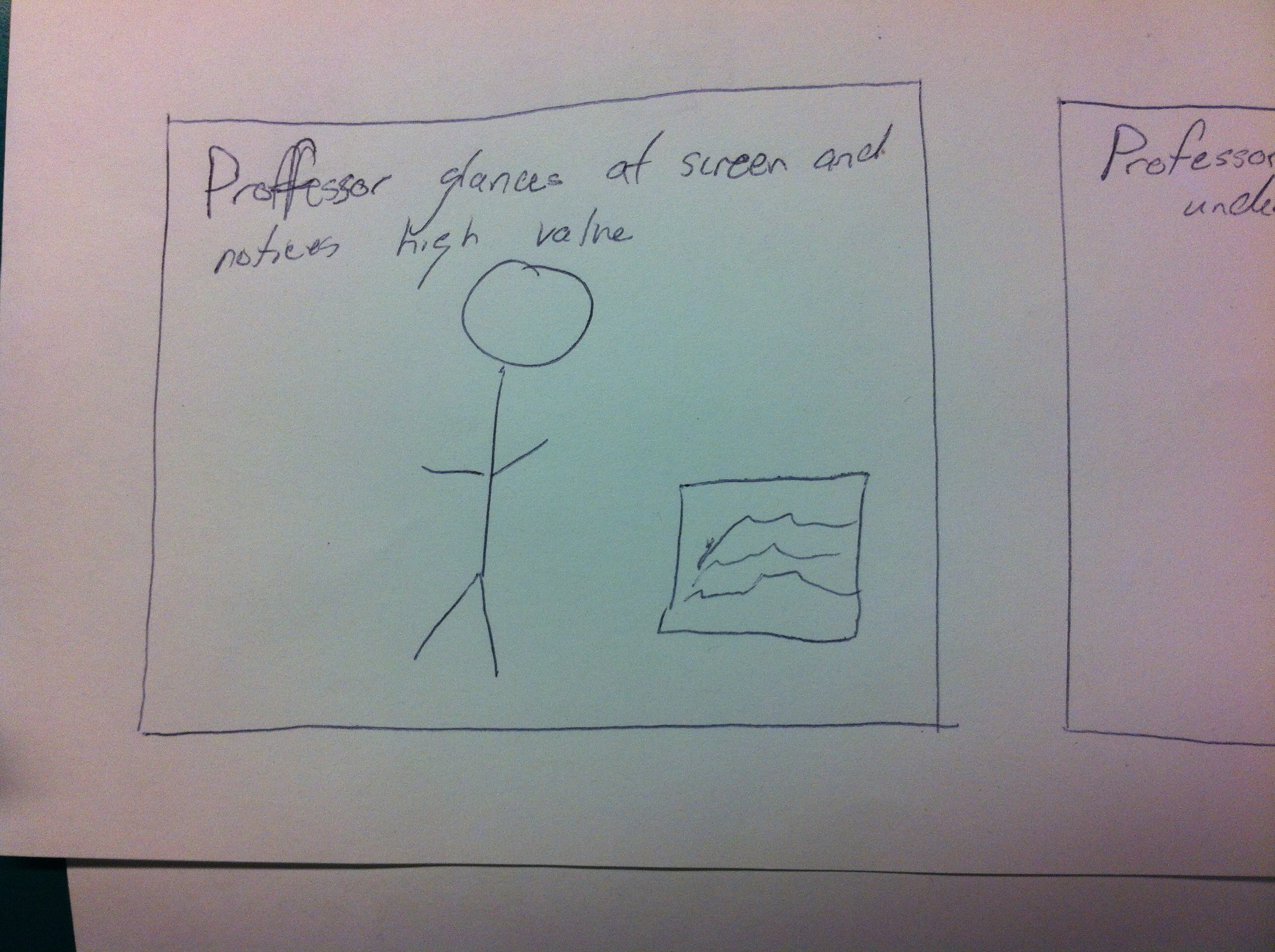
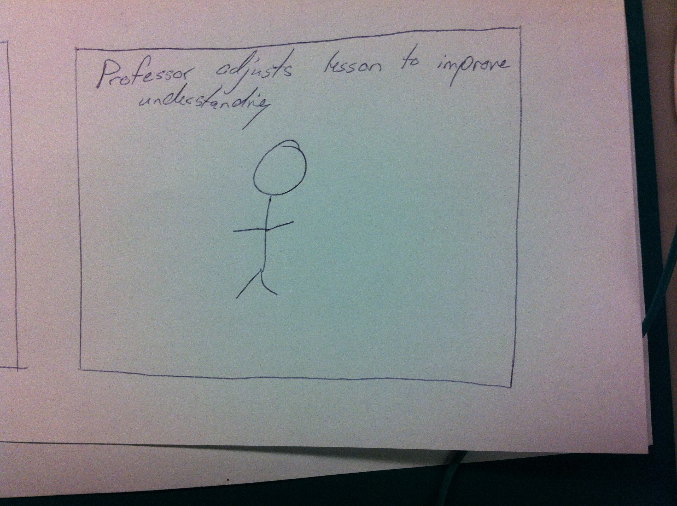
1. Professor gives a brief summary / update of his current research or the state of his research field.
Description: A scheduled time when the Professor talks with the students about cutting edge research in the subject, possibly as simple as a brief description or a demo.

Something that points curious students in the right direction. One thing people always say about Princeton is that our professors are the best in their field. However, if you are in an intro class it hard to find out more about the more complicated / interesting stuff. Also, this is probably what interests the professor most. Finally, most grant seeking professors had a wealth of advertising or informational material about their work.

2. applications/videos of what you’re are going to learn in order to generate interest
Description: Over the course of the semester, students post and rank cool, class-related videos, links, news articles, and research papers.

Less motivated or interested students can browse the reddit-like aggregator before class. The problem here is that most students learn how to do something, but not why it is done. Giving real world examples will motivate them and give purpose to their work. The professor or TA will have to moderate the links, and students will post under their real names.

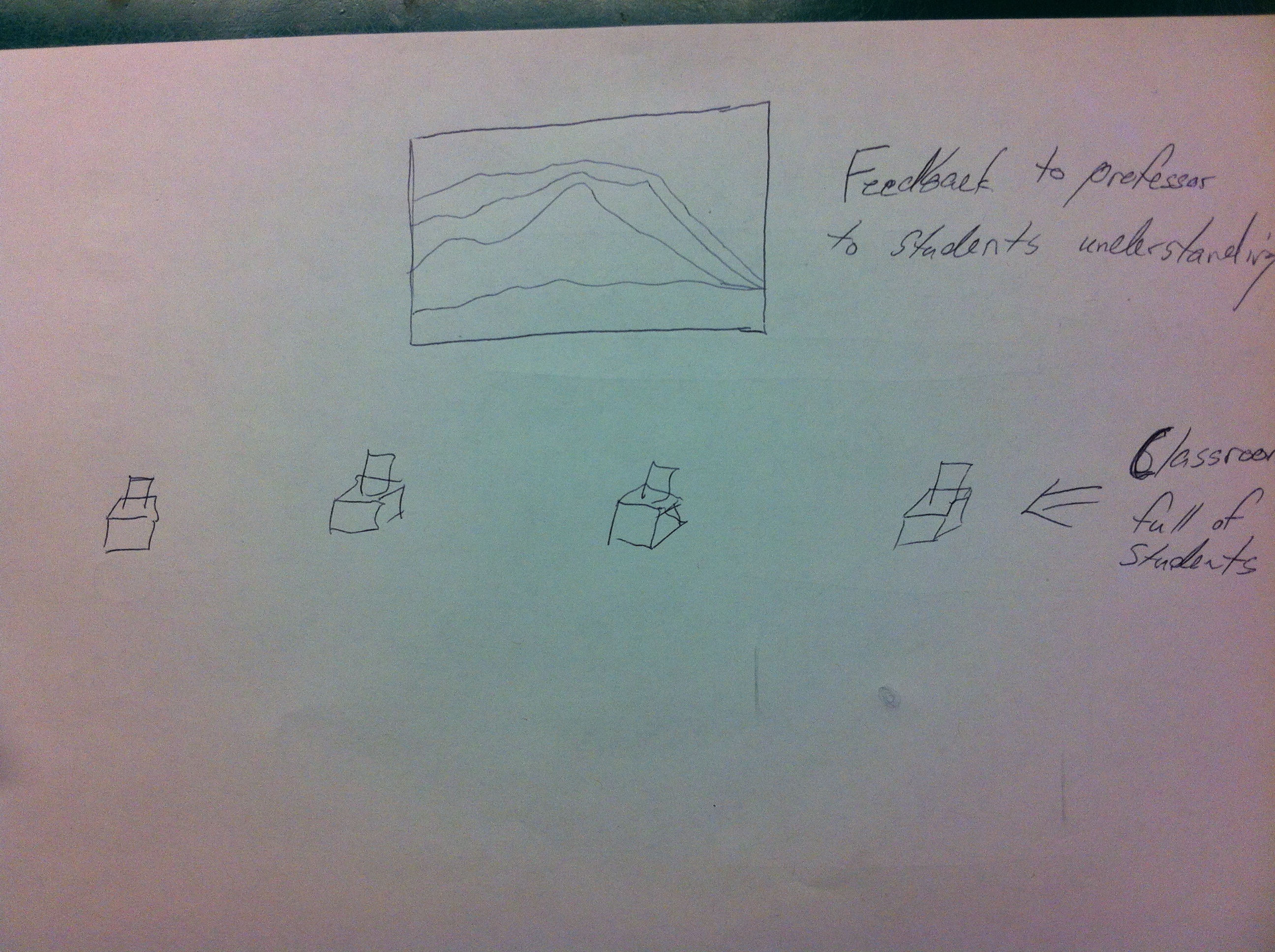
5. Picked #2 (course-related social aggregator)
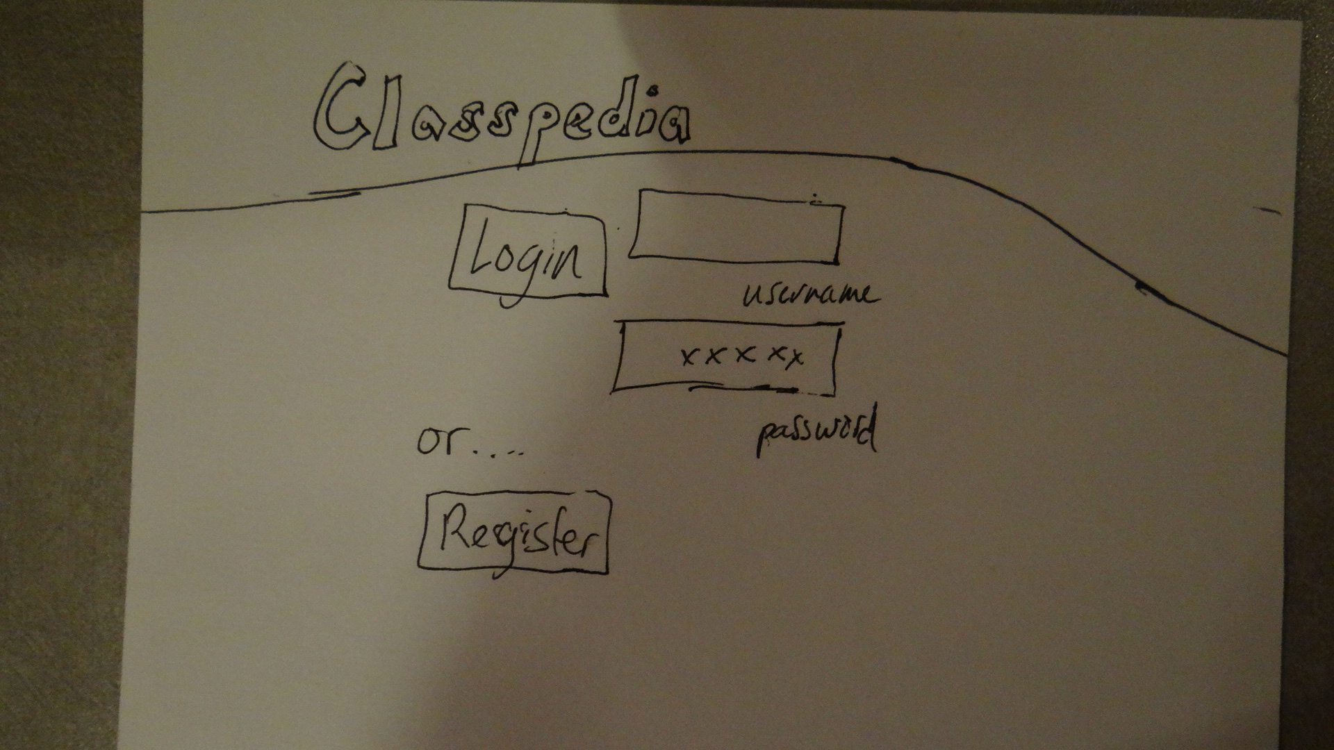
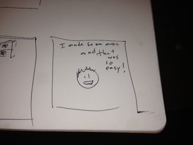
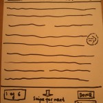
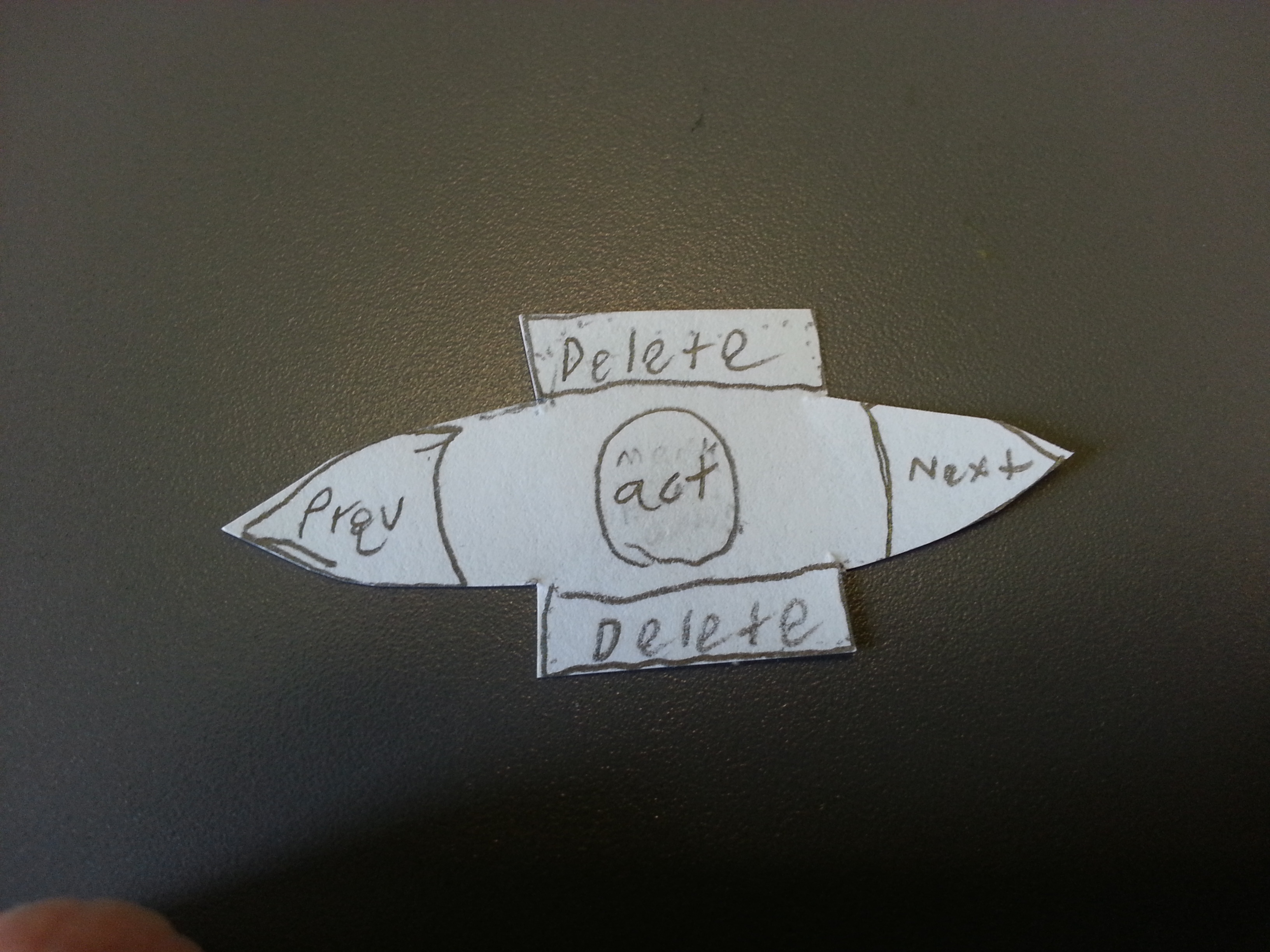
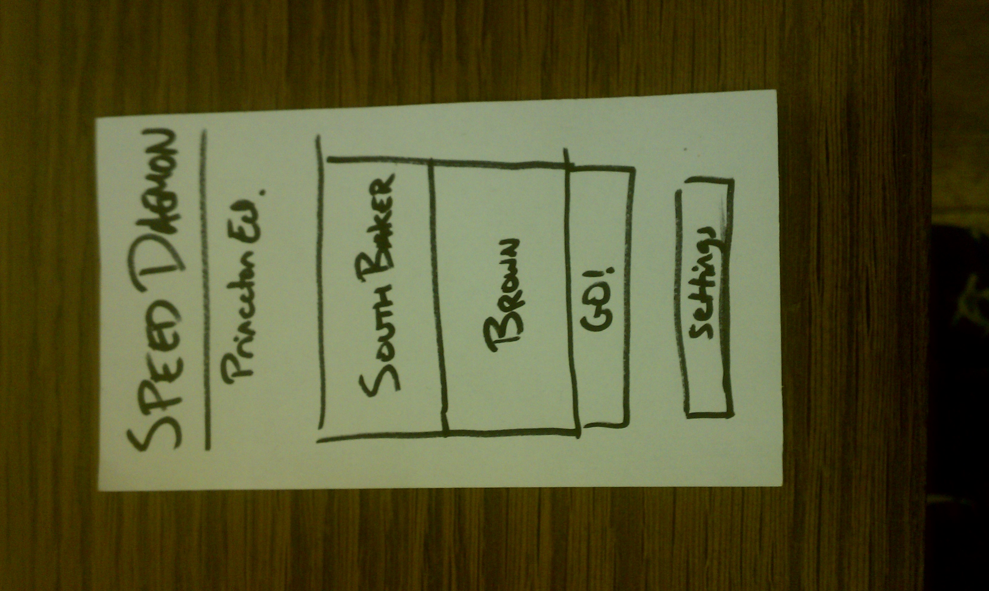
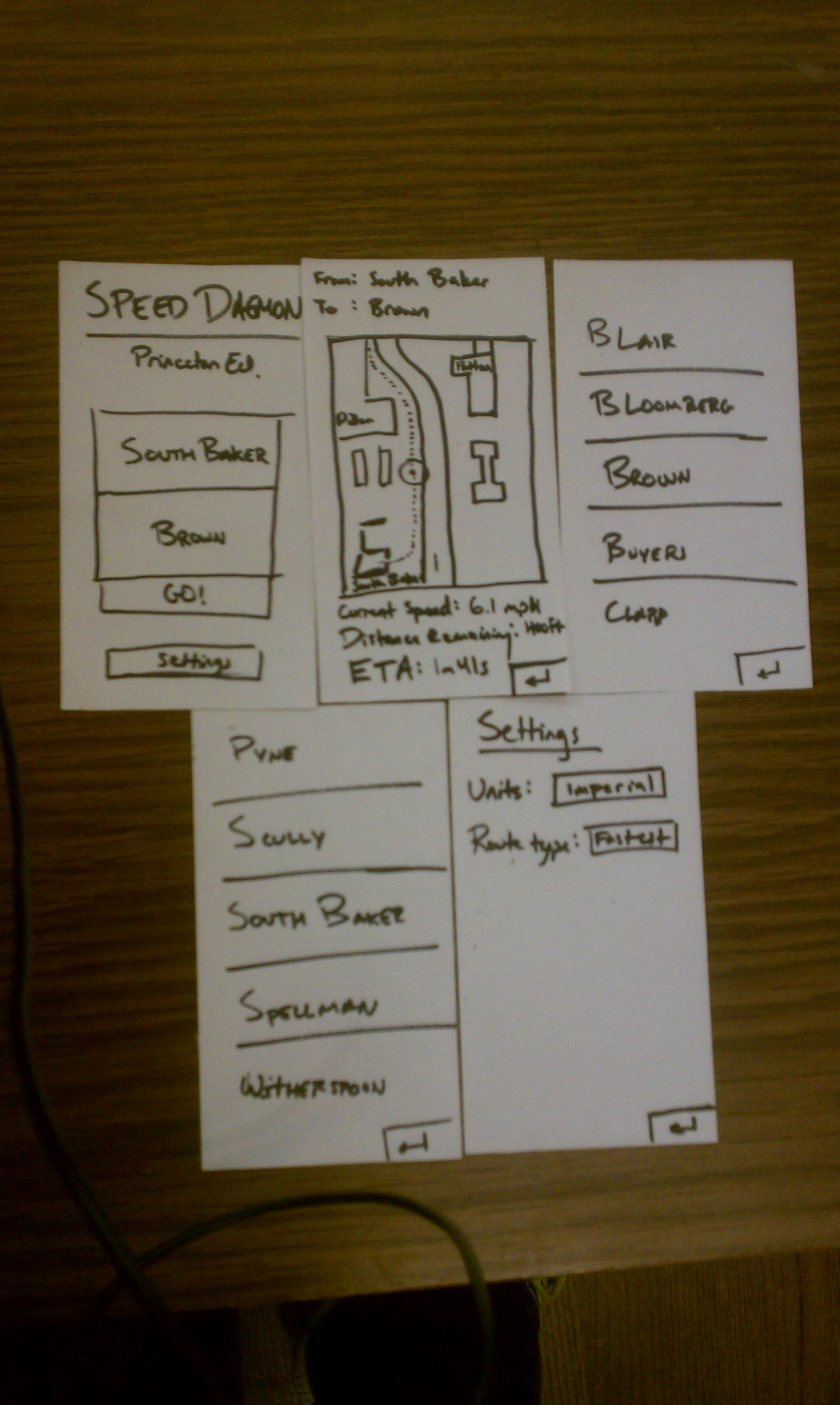
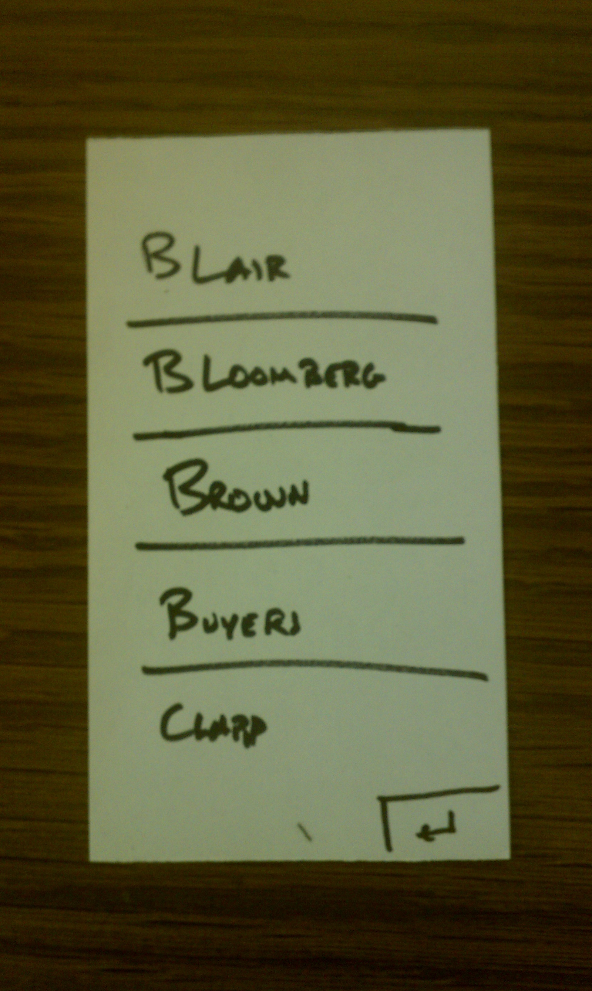
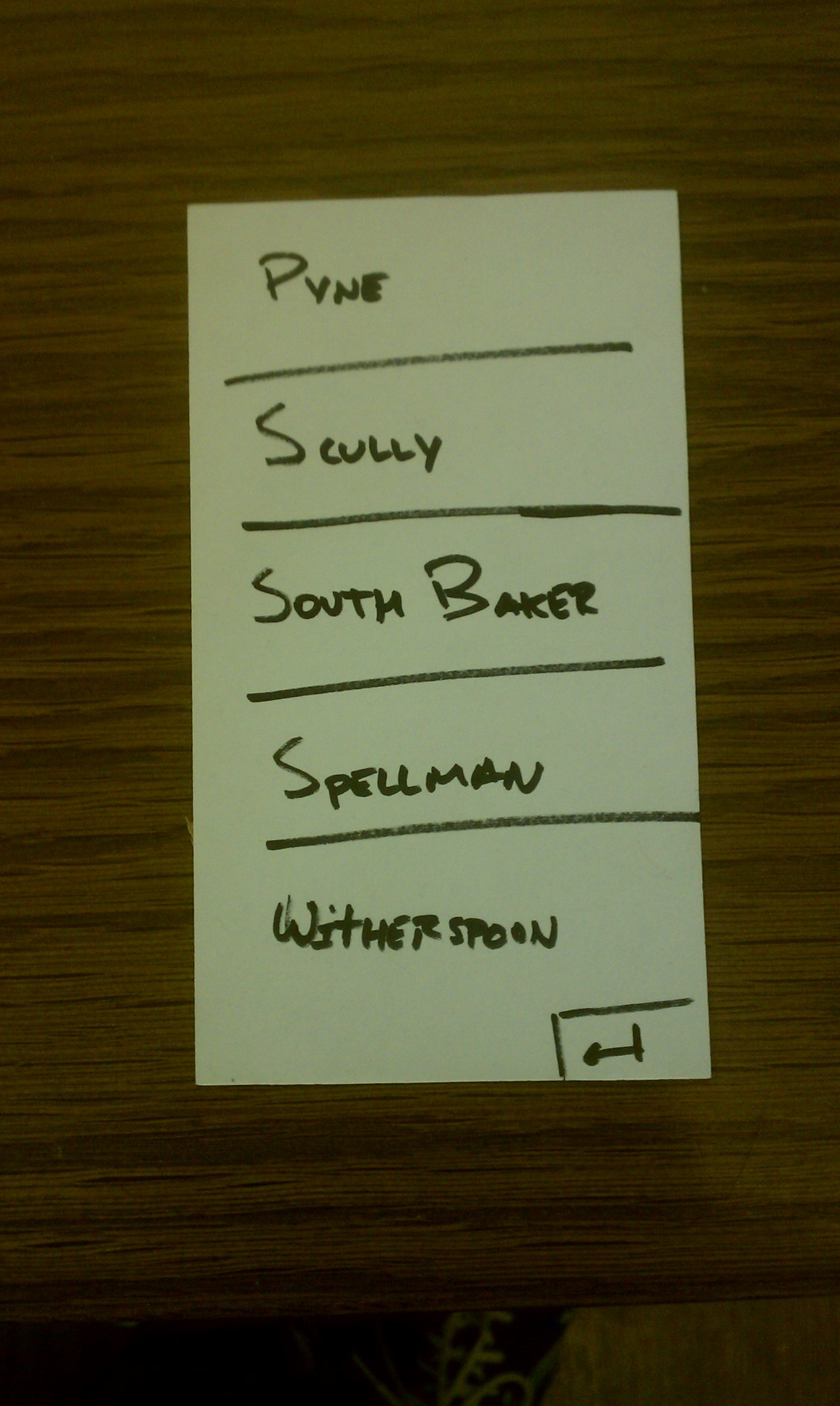
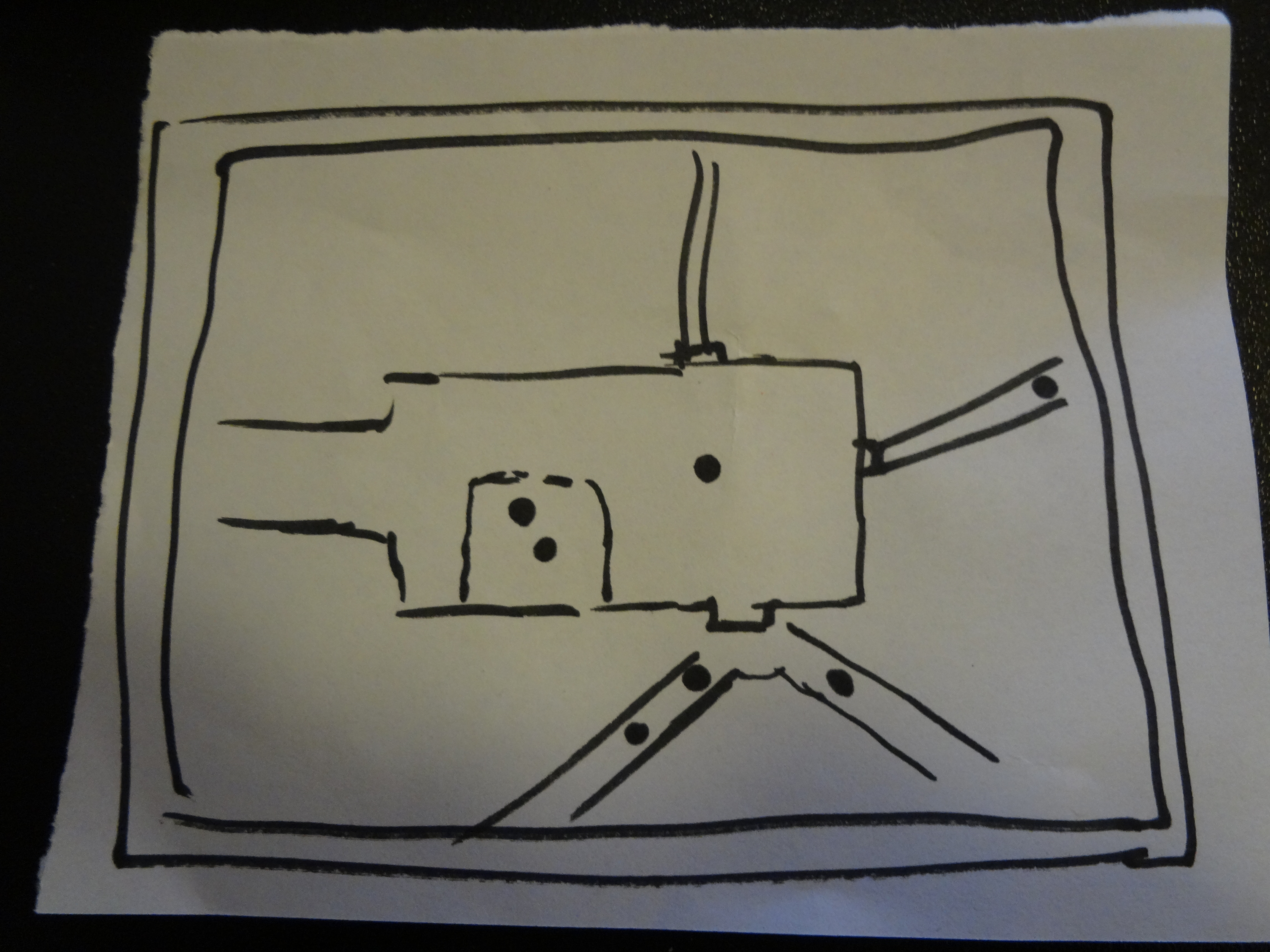
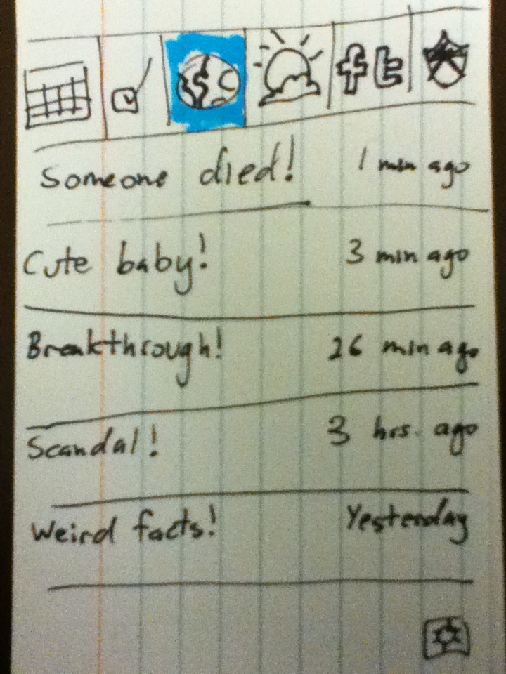
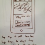
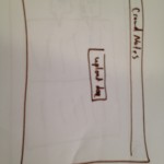
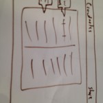
DSC00657
Card 1: frontpage

DSC00646
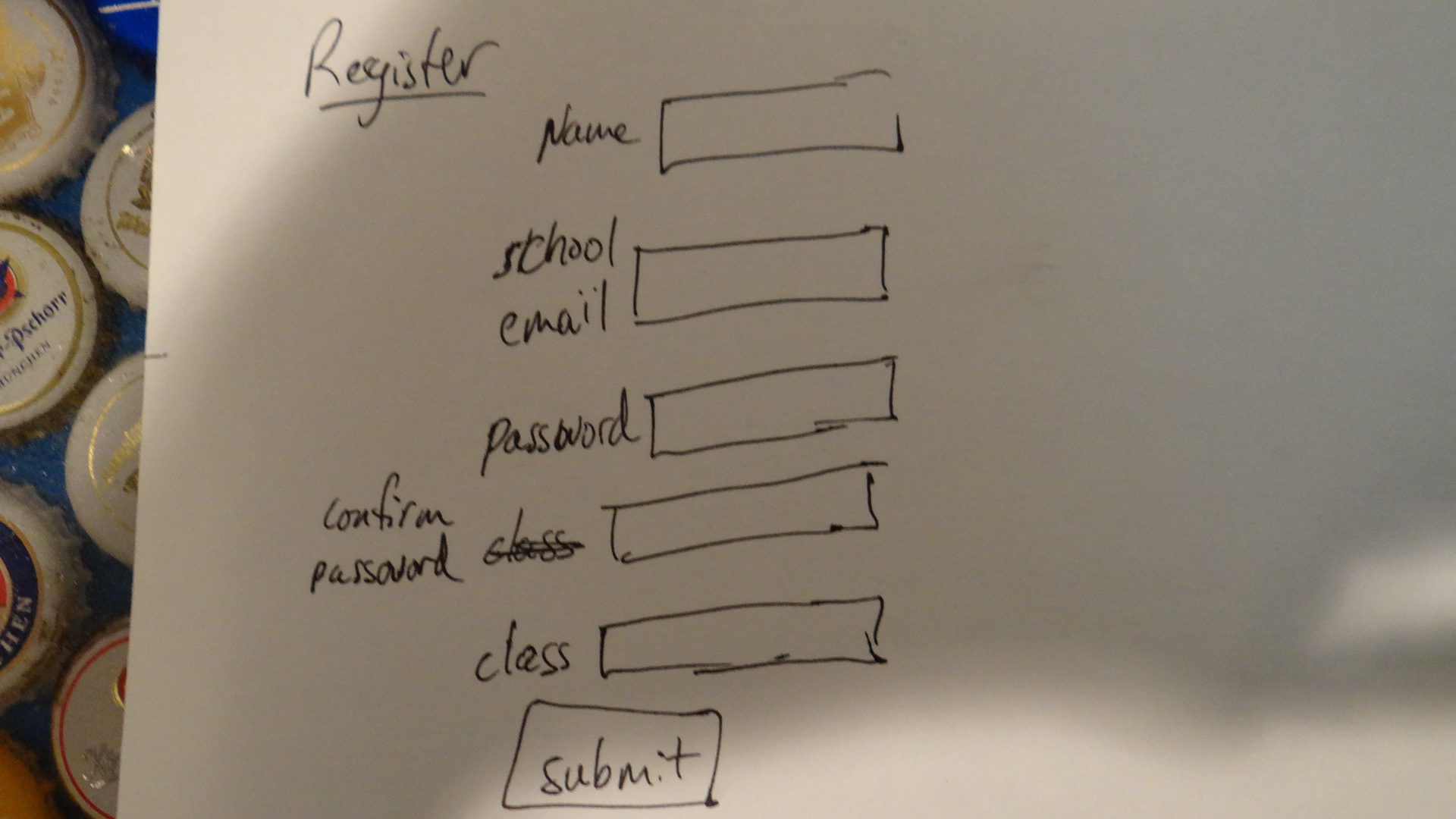
Card 2: registration page. Added for realism.

DSC00647
Card 3: Menu of links

DSC00648
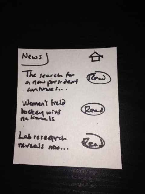
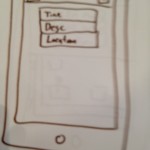
Card 4: List of scholarly papers.

DSC00649
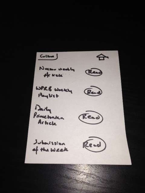
Card 5: List of cool videos

DSC00650
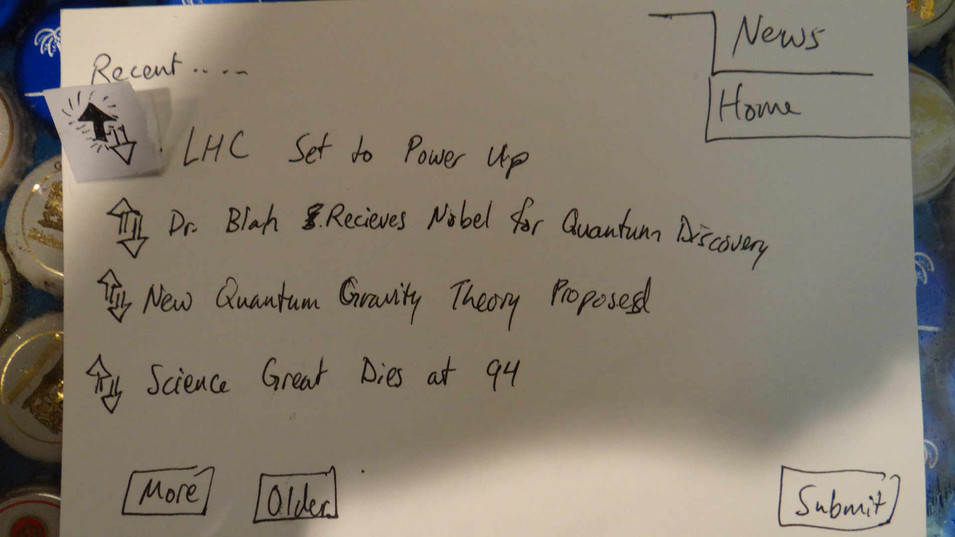
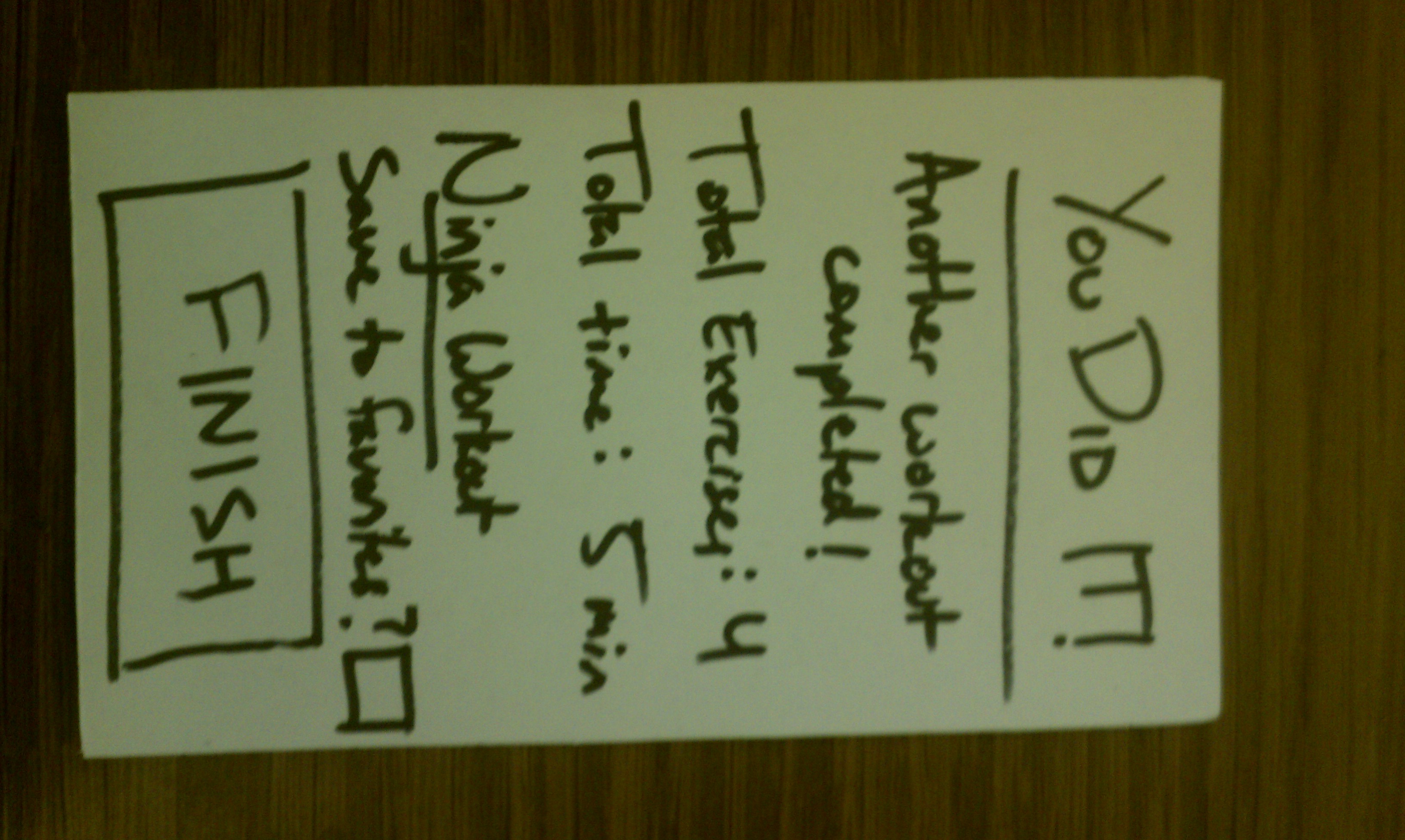
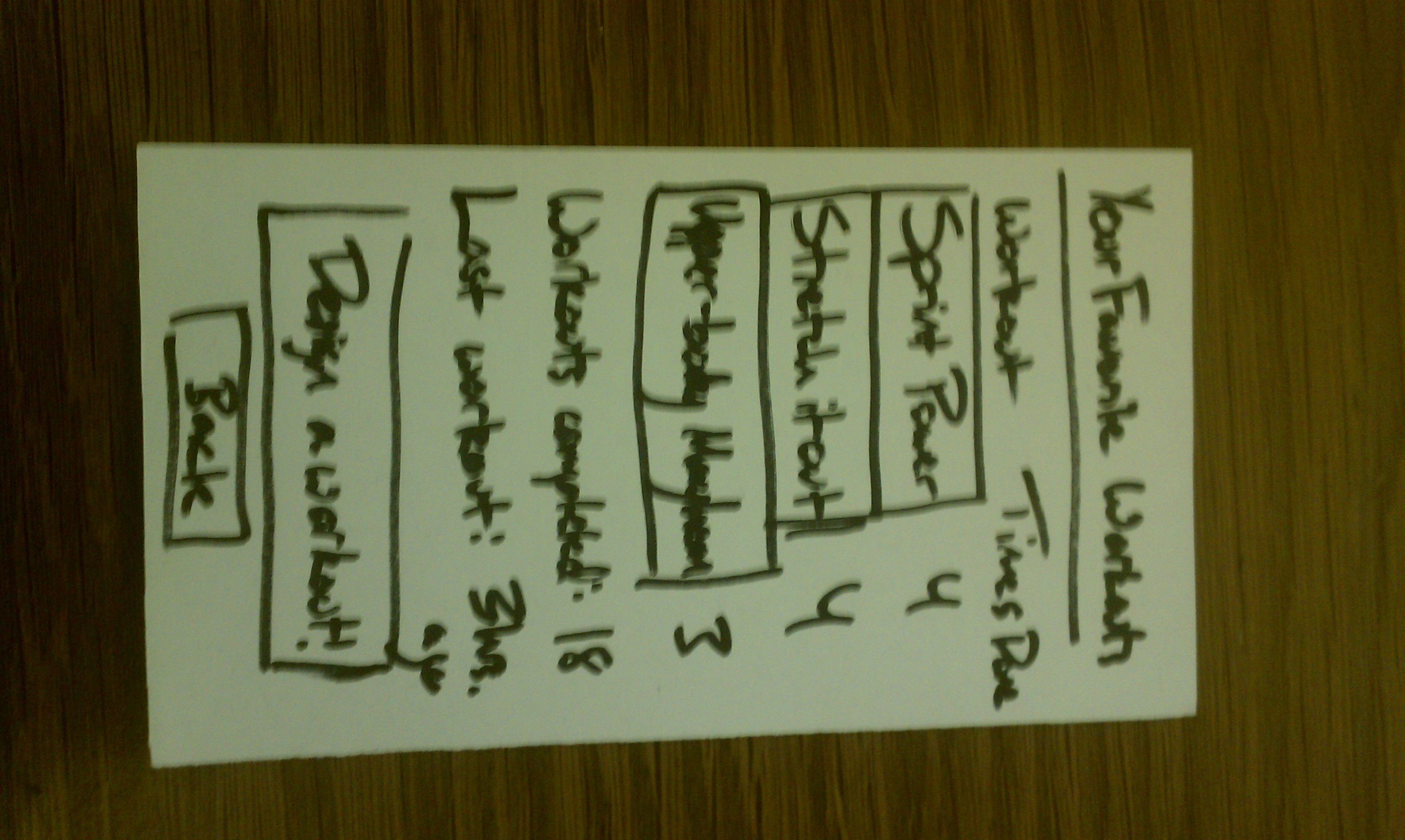
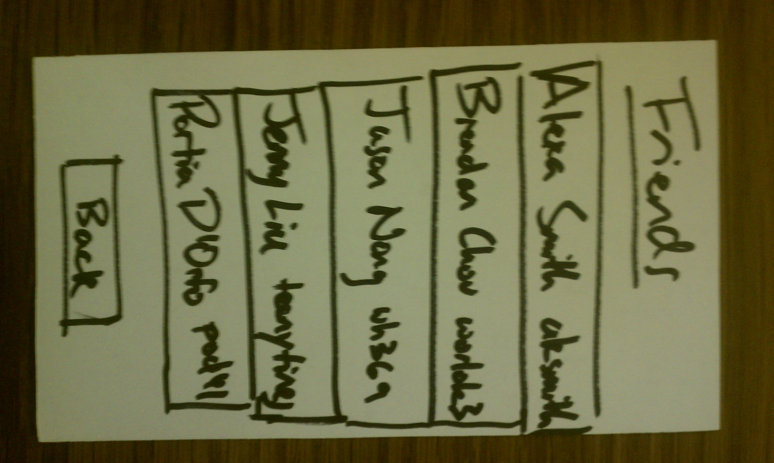
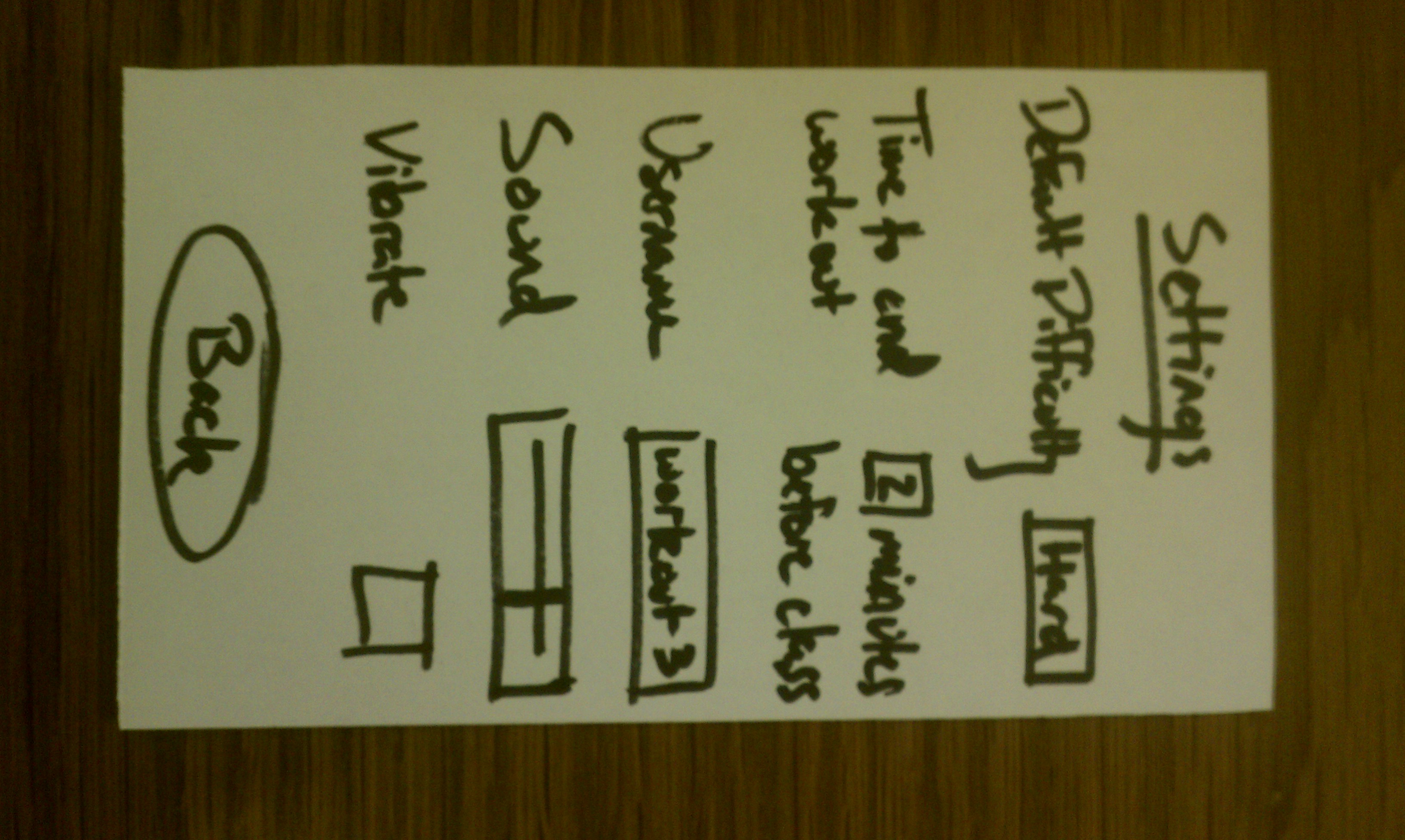
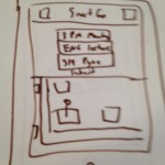
Card 6: List of related news articles. Like / dislike functionality is shown.

DSC00651
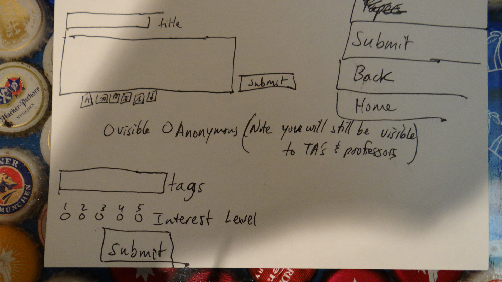
Card 7: Submit window for a new link.

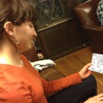
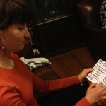
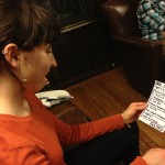
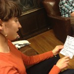
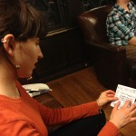
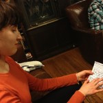
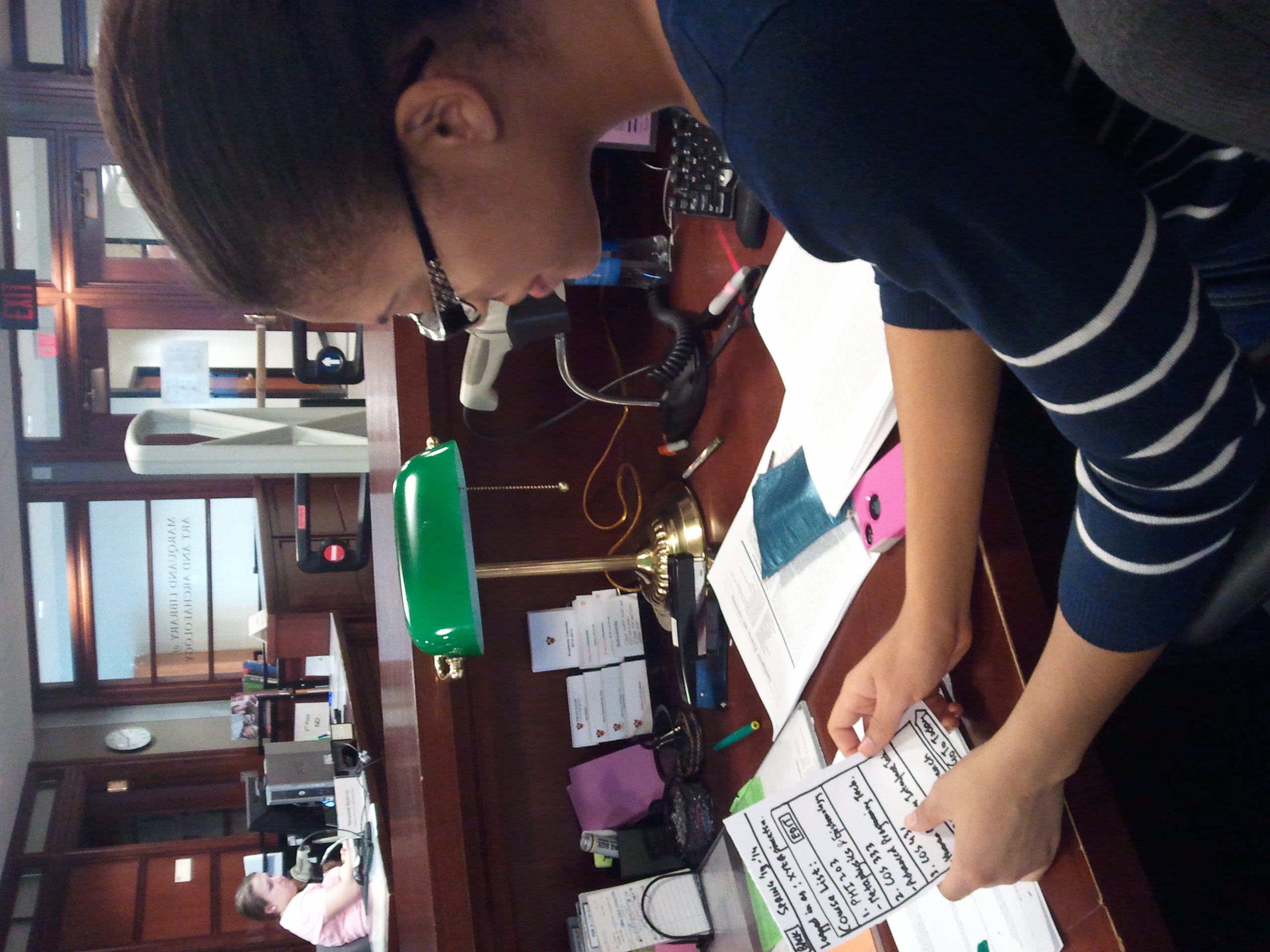
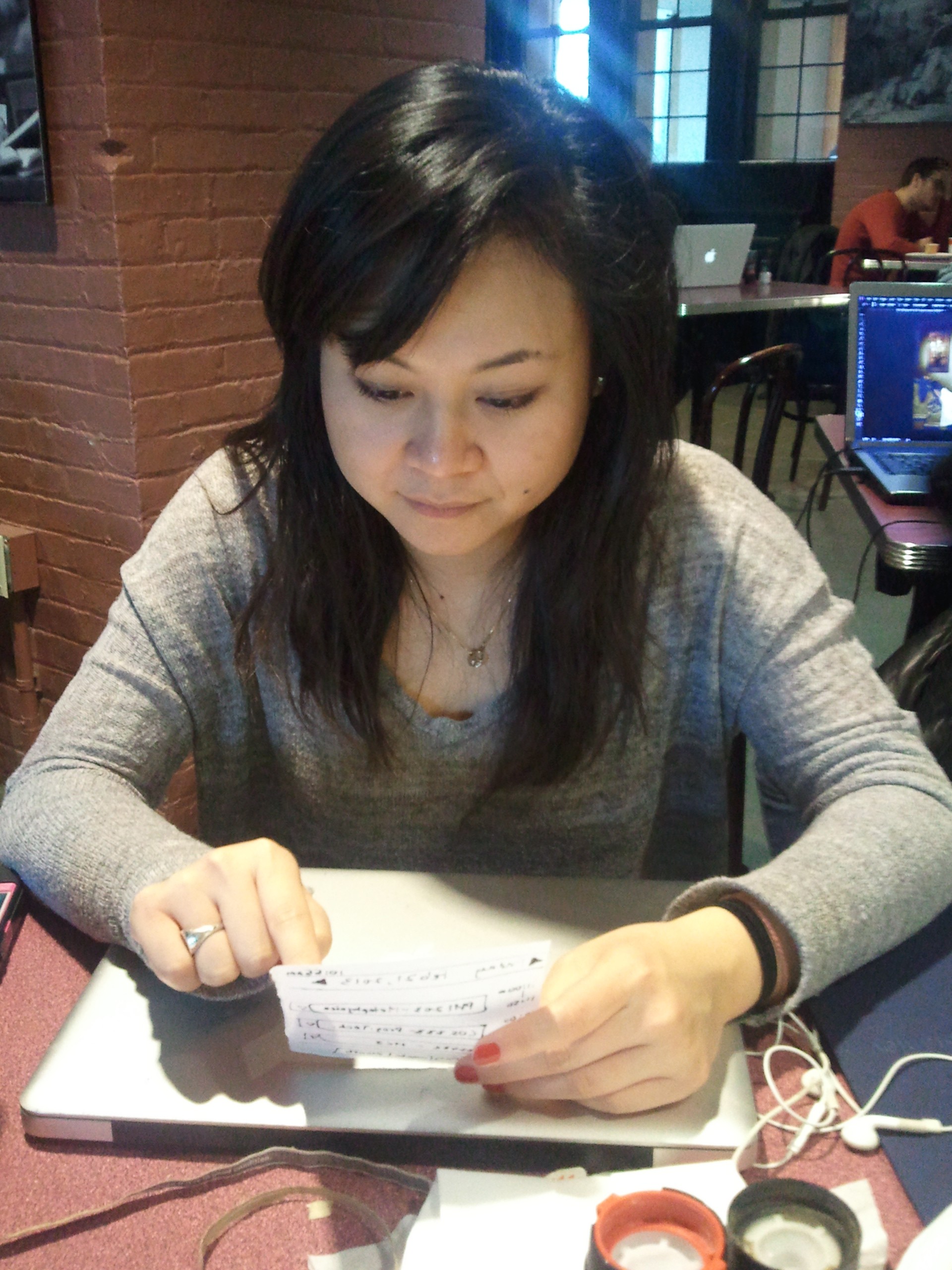
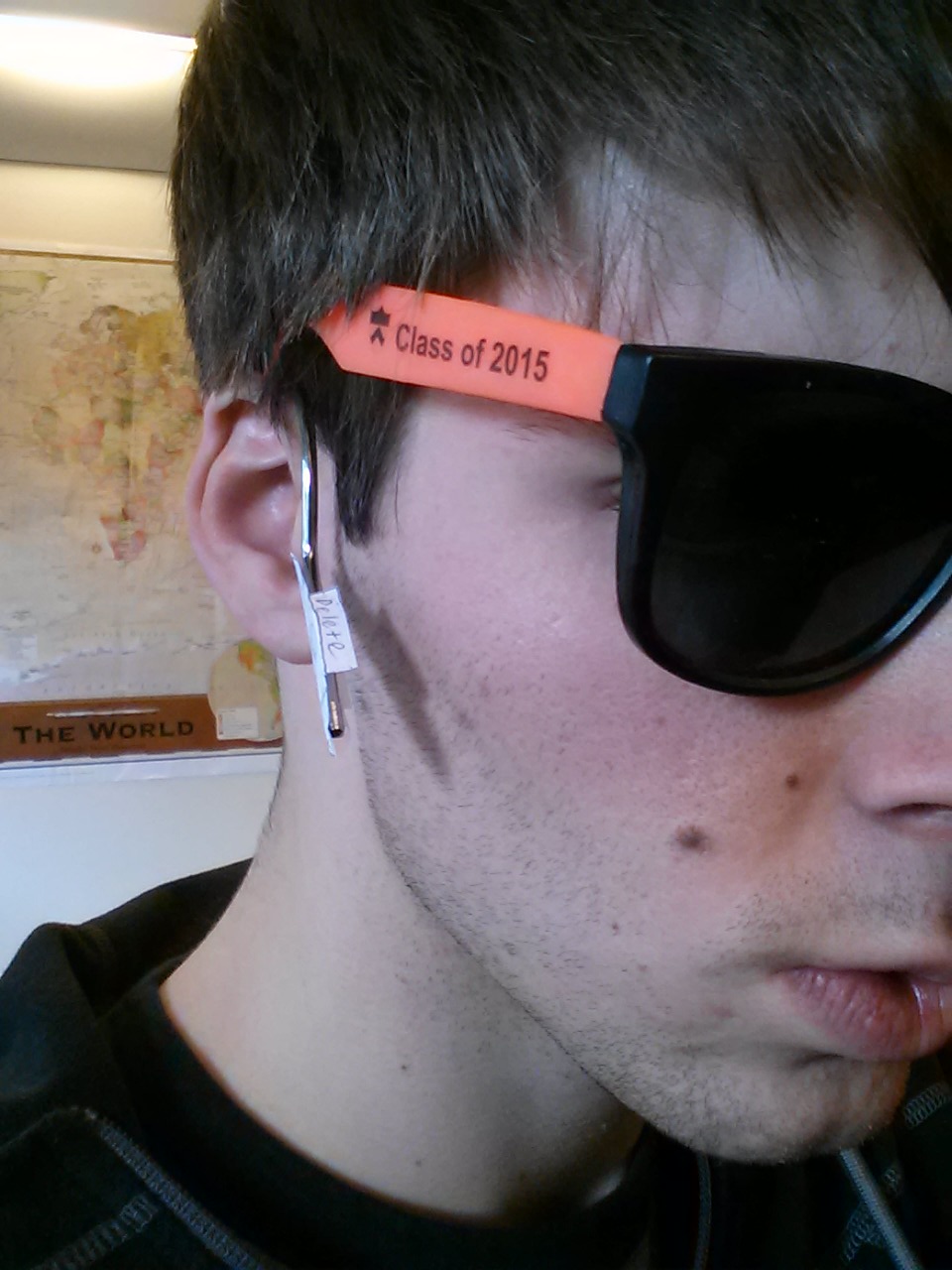
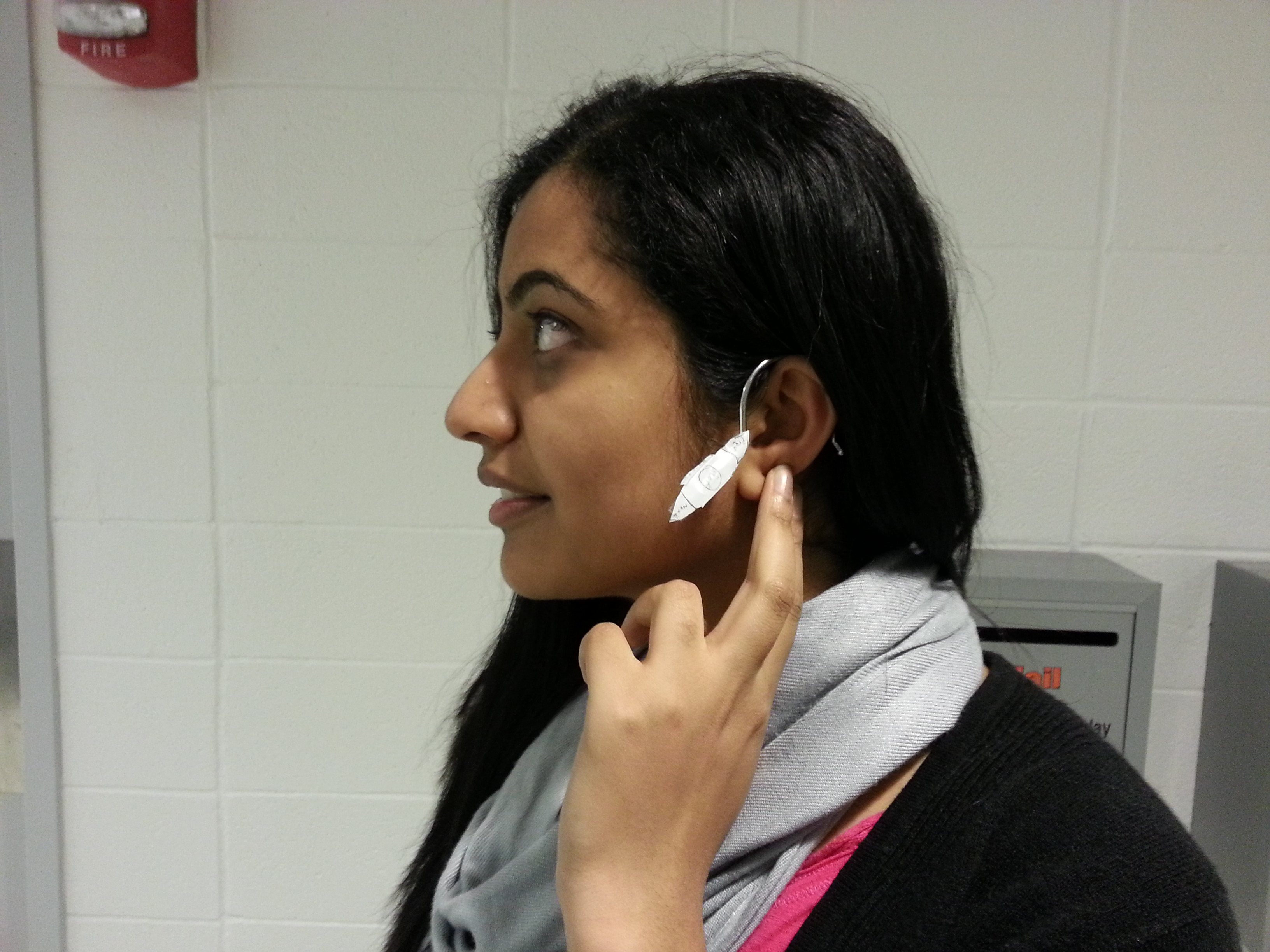
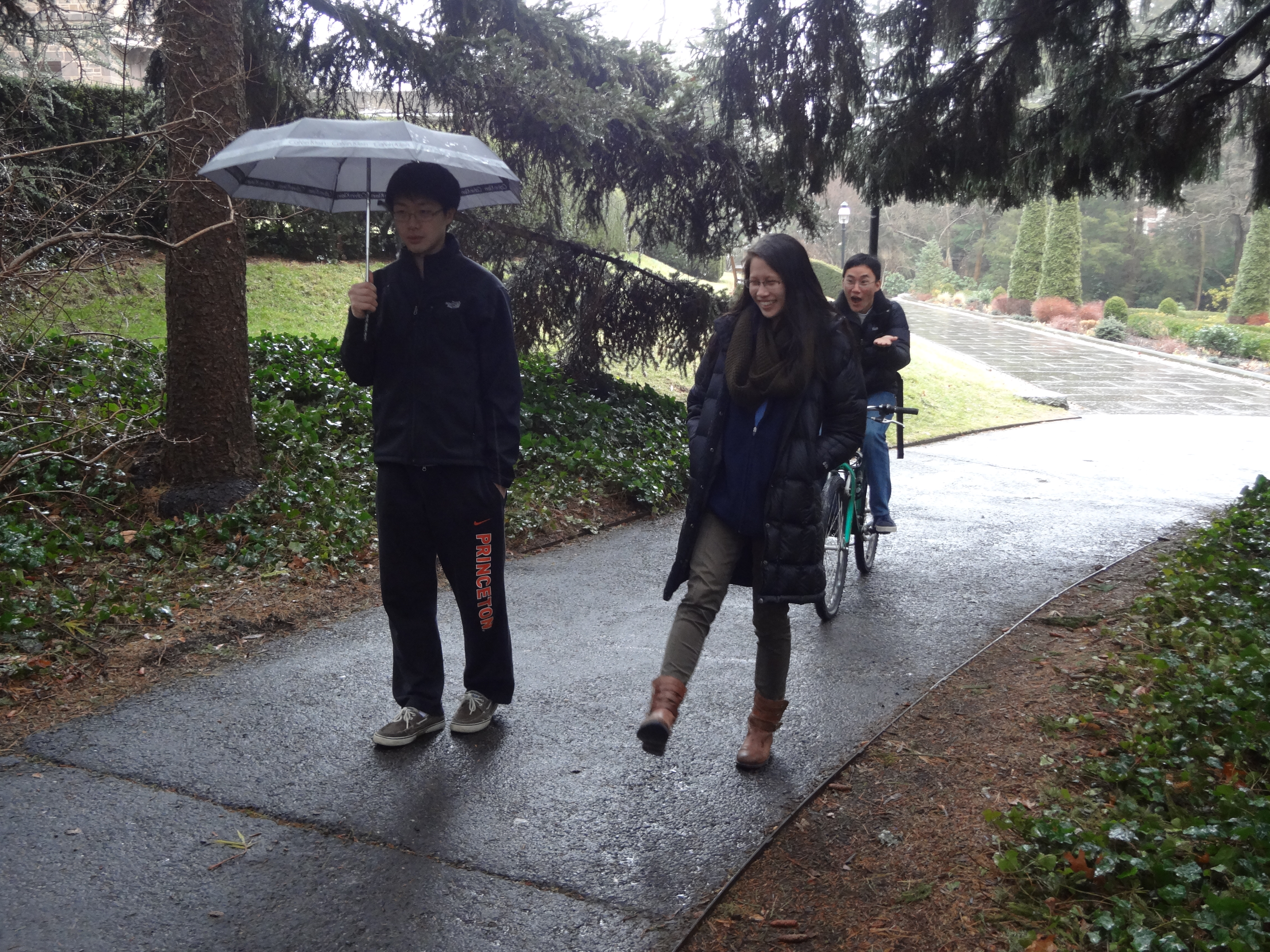
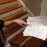
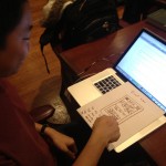
6. Tested prototype on 4 people. They included Ryan Soussan, Brandon Lewiston, Katie Knorr, and Sherene Agama.
Ryan instantly understood the interface and commented that he was familiar due to his experience with reddit.
Sherene got pretty far but didn’t realize that content was user-generated. She was also worried about trolls.
Brandon (a politics major) dully flipped through the links, but expressed interest in a version for his American politics class.
Katie (a lit major) also was un-interested in physics links, and wasn’t sure how the site could be adapted for a literature based class.

DSC00654
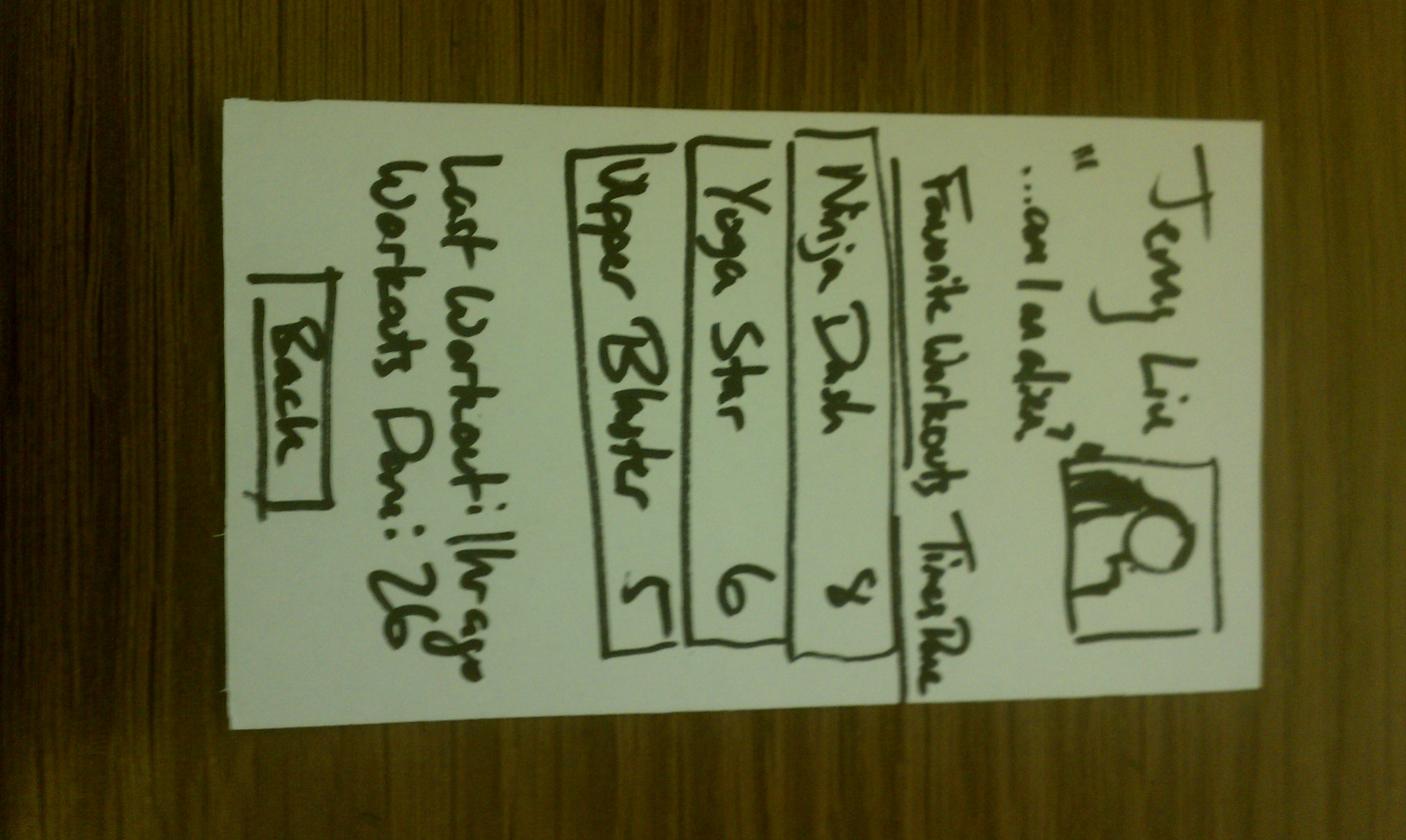
Image of Ryan Soussan, one of my test subjects.

7. Feedback

The feedback I received is divided into two camps: what I saw people doing wrong and what I they told me about their experience.
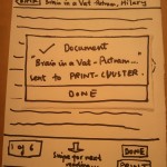
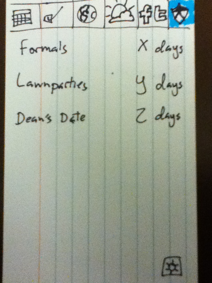
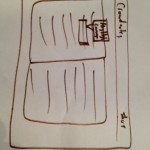
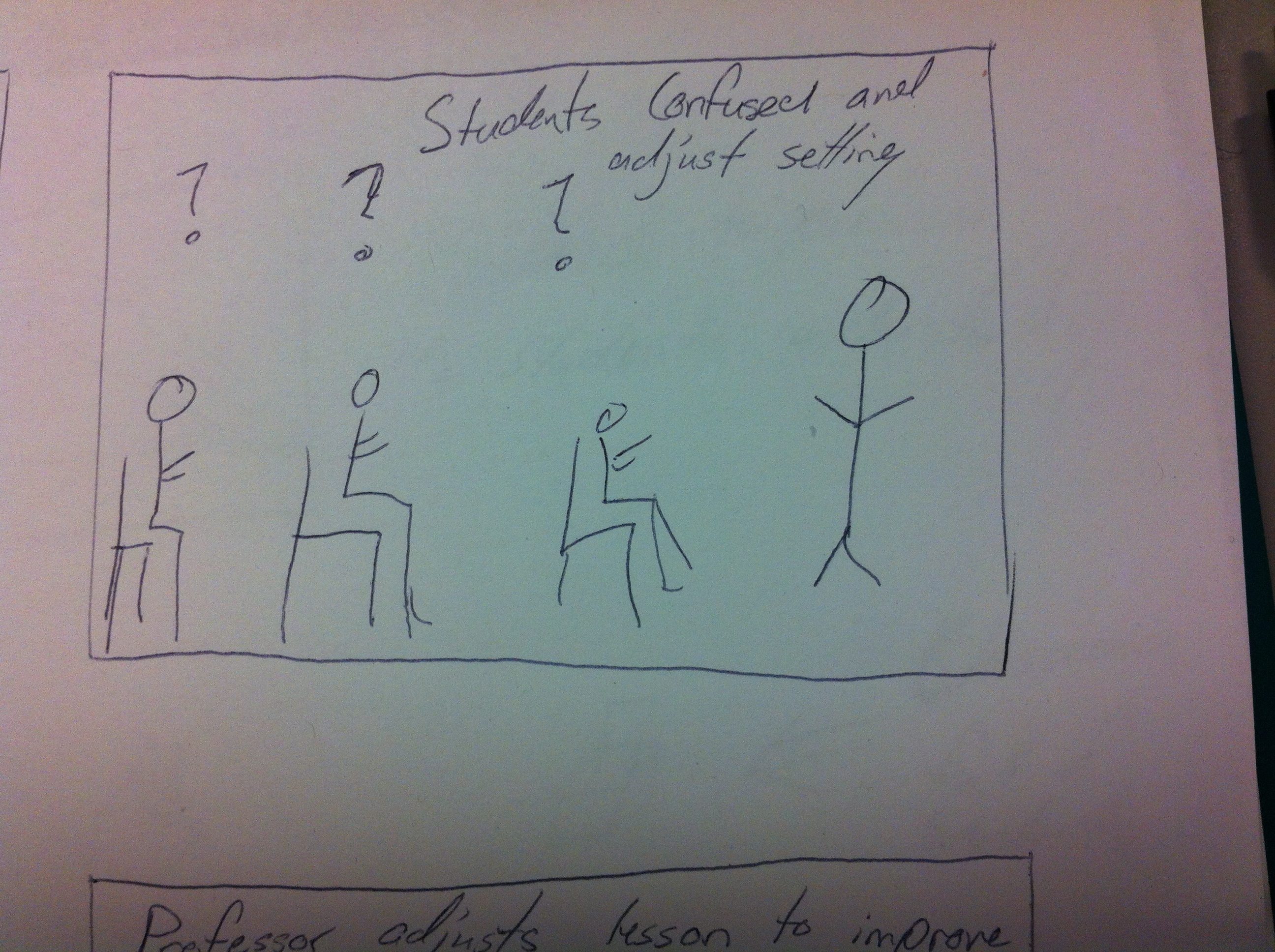
When I handed people my cards, everyone was able to register, login, and navigate through the various menu options. However, the finer points of the website were lost on most people (3/4). Most people knew it was a links / news aggregator, but few of them realized that the content was meant to be student-generated. Thus, only 2 people understood what the submit button was for, probably because they were familiar with reddit. As a result, I added cards 8 and 9. Card 8 occurs when you’re clicking the more button and finally run out of links. It asks you to submit more links to share with your classmates. I also redesigned the submit button into one that says Add a Link with a big plus sign (Card 9). Hopefully that is more self-explanatory.
The other thing I noticed is that very few people used the like/dislike arrows, even when they had clicked on the link. 3 out of 4 said they knew what they were for, either from reddit, princetonfml, or facebook. They all suggested color coding the like vs dislike option, and showing how many votes each link had. That would probably help with the 1 person who didn’t know what they were for.
Finally, one person cited lack of interest in the links. To be fair, my example person was in intro physics and had only physics related links. Everyone expressed interest in links related to their area of expertise, but were a bit blasé about other areas. On the plus side, everyone wanted to post stuff related to their own major. Also, everyone at least wanted to click on fun stuff like the videos.
One person brought up the fact that trolls might create fake email accounts to sign up and post ridiculous content. However, I pointed out that the system would be like piazza, where you’re email address determines what classes you can sign up for. People have to sign in with their real name and the TA or professor will probably moderate.

DSC00655
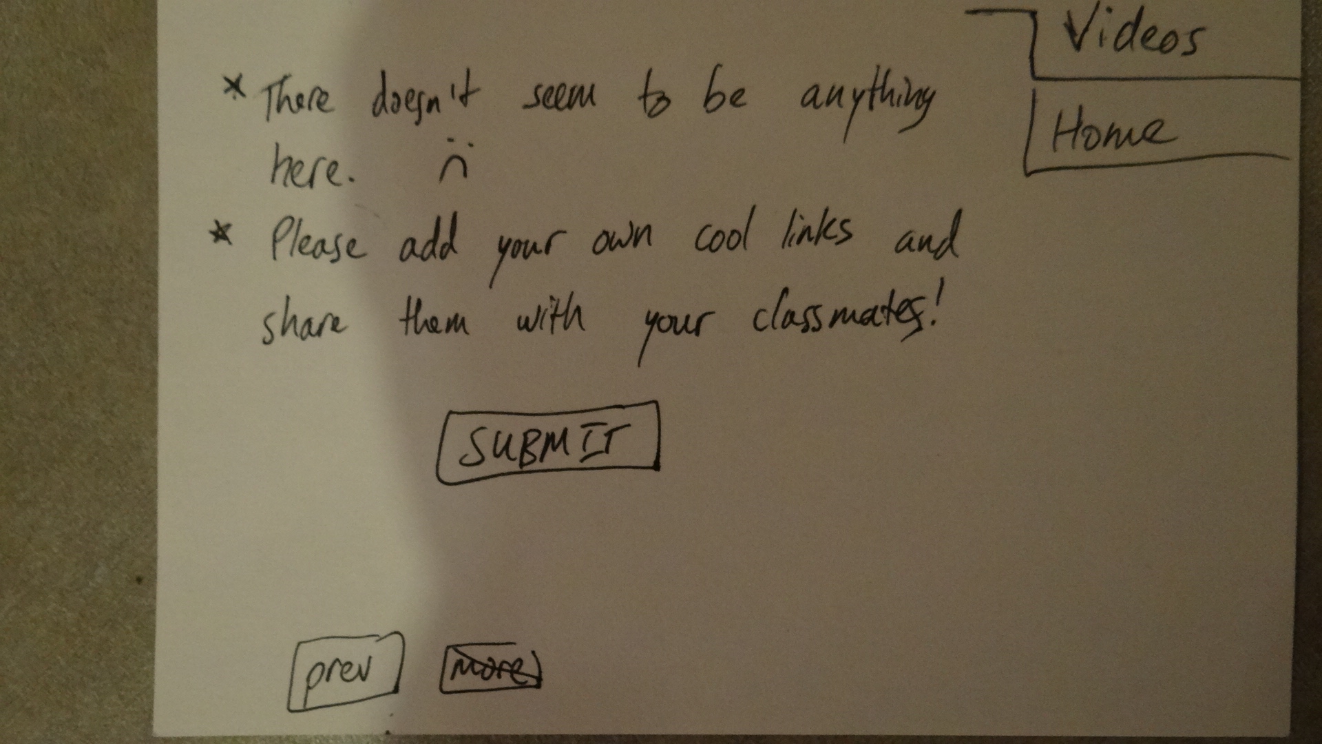
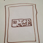
Card 8: New more page. Highlights the fact that content is user-generated.

DSC00656
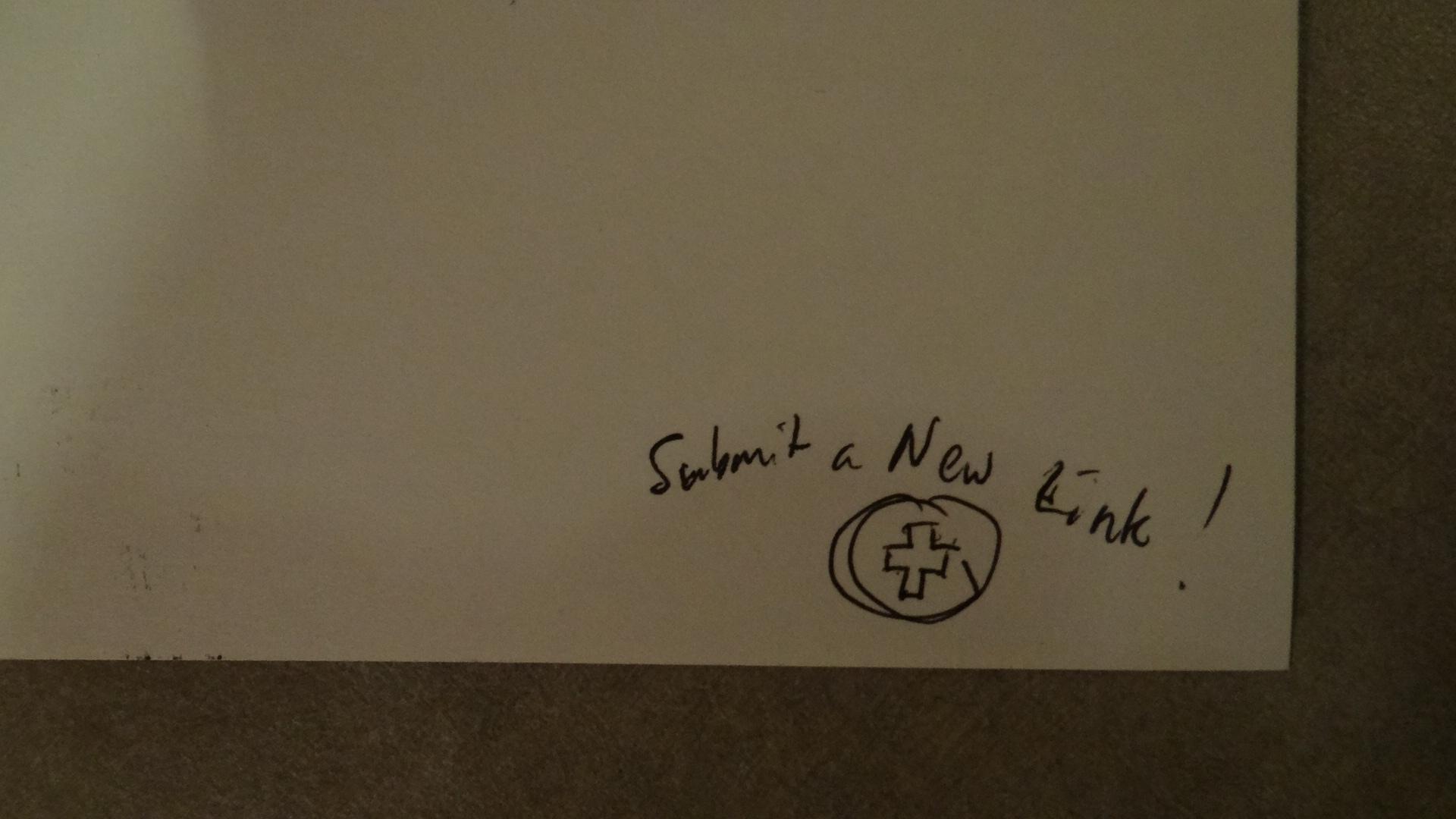
Card 9: New submit button. More clearly communicates its purpose.

L1 – SoundBox

Group #1

  • Avneesh Sarwate (asarwate@)
  • John Subosits (subosits@)
  • Joe Turchiano (jturchia@)
  • Kuni Nagakura (nagakura@)
  • Yaared Al-Mehairi (kyal@)

Ideas and Sketches

  1. Squat Coach – Detects the depth of your squats and assesses your form.

    Flex sensor is positioned to run up the back of knee joint

    Flex sensor is positioned to run up the back of knee joint

  2. Etch-A-Sketch – Arduino version of Etch-A-Sketch game.

    Users control stylus with 2 rotational potentiometers

    Users control stylus with 2 rotational potentiometers

  3.  Adaptive Lighting – LED changes brightness depending on lighting of room.

    Photo cells connected to LED vary brightness of light emission based on surrounding light

    Photo cells connected to LED vary brightness of light emission based on surrounding light

  4. SoundBox – Musical instrument with a simple interface for intuitive interaction and immediate results.

    Users can control amplitude with FSR (force sensing resistor) and pitch with slider

    Users can control amplitude with FSR (force sensing resistor) and pitch with slider

We decided to choose idea #4. While we liked our other ideas, we felt creating a SoundBox would be the most feasible and rewarding endeavor.

Project Description

We built a musical instrument, called the “SoundBox”. The “SoundBox” allows users to create notes by applying pressure to a force sensing resistor. The amount of pressure applied determines the volume of the note and users can control the pitch of each note they create with a SoftPot Membrane Potentiometer (slider). When users create notes, a python program reads the incoming signals from the USB port (which the Arduino is speaking to). Our python program then feeds these signals to ChucK, an audio programming language, which then creates the sounds you hear. We are definitely pleased with the result of our project. The intuitive and simple nature of the “SoundBox” interface allows any user to create a variety of sounds and patterns. Thus, in giving the gift of music (albeit limited) to users, we feel that our project is successful. One thing we could certainly improve is the limited functionality of our “SoundBox”. For example, we could add a switch to the Arduino which would enable users to toggle through ChucK instruments (as of now the default instrument is the mandolin). Furthermore, we could add multiple sliders to enable users to play multiple notes at once. What’s more, we could speak to any MIDI receiving Audio Software, such as Ableton Live or Logic (which have extensive sound libraries), to fashion sounds out of user input. As such, there is definitely a lot of room for improvement in our design, which would seriously enhance the functionality of the “SoundBox”.

SoundBox

SoundBox

Storyboard

Loves music but can't play any instruments

I love music but I can’t play any instruments

This instrument is really easy to play!

This instrument is really easy to play!

'Making music'

‘Making music’

Wow, that was so easy!

Wow, that was so easy!

Photos and Video

SoundBox interface closeup

SoundBox interface closeup

SoundBox interface connections

SoundBox interface connections

Arduino setup

Arduino setup

Breadboard setup

Breadboard setup

Arduino and breadboard

Arduino and breadboard

Whole system

Whole system

Movie on 2013-02-26 at 21.36

Evaluation

The FSR was quite effective at picking up varying pressures and gave a
pretty convincing and natural feeling “pluck” that was sensitive to
tap intensity. The Softspot was adequate, but would sometimes behave a
bit unpredictably. We weren’t sure whether this was because of
hardware issues or simply our own clumsiness with a controller that
required very precise motions. Regardless, it was very intuitive to
use. Next time, we would have possibly added some kind of visualizer
to see what note you are at on the Softspot, or maybe added the
functionality to “bend” notes by sliding on the Softspot after
pressing the FSR to “pluck” a note.

List of Parts

  1. Arduino
  2. Breadboard
  3. Force Sensing Resistor
  4. Soft
  5. 10 kΩ Resistor
  6. Wires
  7. Alligator Wires
  8. Cardboard Box (to mount resistance)
  9. Electrical Tape

Circuit

"SoundBox" Circuit Diagram

“SoundBox” Circuit Diagram

Instructions

  1. Place sensors on cardboard box at comfortable distance and clip the alligator clips onto the ends. Use electrical tape to hold down the wires to the box. 
  2. Connect SoftPot Potentiometer to 5V port on one end and ground on the other. Input goes to Port A0 on the Arduino. (follow pictures and circuit diagram)
  3. Connect Force Sensing Resistor in series with 10kΩ resistor. Input to Port A2 on the Arduino. (follow pictures and circuit diagram)

Code

SimpleMidi.ino

#include <MIDI.h>

/* FSR simple testing sketch.

Connect one end of FSR to power, the other end to Analog 0.

Then connect one end of a 10K resistor from Analog 0 to ground

For more information see www.ladyada.net/learn/sensors/fsr.html */
int sliderPin = 0; // the FSR and 10K pulldown are connected to a0
int fsrPin = 2;

int sliderReading; // the analog reading from the FSR resistor divider
int fsrReading;
int pitch;
int velo;

void setup(void) {
// We’ll send debugging information via the Serial monitor
MIDI.begin(0);
Serial.begin(9600);
}

boolean touched = false;

void loop(void) {

sliderReading = analogRead(sliderPin);
fsrReading = analogRead(fsrPin);
pitch= map(sliderReading, 0, 1023, 0, 20);
velo = map(fsrReading, 0, 1023, 0, 127);
// the raw analog reading

if(velo > 5 && !touched) {
MIDI.sendNoteOn(pitch,velo,0);
//Serial.print(“FSR reading = “);
Serial.print(velo);
Serial.print(” “);
Serial.println(pitch);
touched = true;
}
if(velo <= 5) touched = false;
// if (MIDI.read()) {
// // Send a Note (pitch 42, velo 127 on channel 1)
// Serial.println(“YO!”);
// delay(1000); // Wait for a second
// MIDI.sendNoteOff(42,0,4); // Stop the note
// }

delay(5);
}

run.py

import serial
import OSC
import time

ser = serial.Serial(‘/dev/tty.usbmodemfa141’, 9600)

client = OSC.OSCClient()
client.connect( (‘127.0.0.1’, 6449) )
vel = OSC.OSCMessage()
vel.setAddress(“vel”)
pitch = OSC.OSCMessage()
pitch.setAddress(“pitch”)

while 1:
line = ser.readline()
# line = “50 13″
# print line
if ” ” in line:
print line
vel.append(int(line.split(” “)[0]))
pitch.append(int(line.split(” “)[1]))
client.send(vel)
client.send(pitch)
vel.clearData()
pitch.clearData()
# time.sleep(1)

chuckOSC.ck

// create our OSC receiver
OscRecv recv;
// use port 6449
6449 => recv.port;
// start listening (launch thread)
recv.listen();
// create an address in the receiver, store in new variable
recv.event(“vel, i”) @=> OscEvent vel;
recv.event(“pitch, i”) @=> OscEvent pitch;

Mandolin m => dac;

[0, 2, 4, 5, 7, 9, 11] @=> int scale[];

40 => int root;
3 => int octaves;
int pitches[octaves * scale.size()];
for(0 => int i; i < octaves; i++) {
for(0 => int k; k < scale.size(); k++) {
root + i*12 + scale[k] => pitches[i * scale.size() + k];
}
}

while(true) {
vel => now;
vel.nextMsg();
vel.getInt() => int v;
pitch => now;
pitch.nextMsg();
pitch.getInt() => int p;
<<<v, pitches[p]>>>;
v / 128.0 => float v2;
p + 60 => int p2;
Std.mtof(pitches[p]) => m.freq;
v2 => m.noteOn;
}


Princeton Waiting Time – Farhan Abrol(fabrol@)

Observations:

The first thing I realized when I was trying to think of whom to interview was that Computer  Science undergrads are not the typical end-users and most of the Princeton undergraduate population that has Princeton Time to spare isn’t from this specific demographic. So I decided to interview people in other disciplines and majors – Economics, EEB, Politics to get a better understanding of how they utilize this time.

  • Christine – At the end of previous class, find people who are in last class/who are going to similar place to walk over with. Like to get to class early , mostly play games on my phone and respond to urgent emails if I have any. More mindless the games the better.
  • Estelle – Browse facebook on the walk between classes, like getting to class on time. In class, Use the time to check email for managing schedule for rest of day – tutoring students, meeting for club, dinner with friends. No facebook in class.
  • Russell – On the phone while walking to class, reads news, emails (only reads, does not respond to any on my phone) Tries to find coffee/tea to pick up Get announcements/slides and reading for next lecture.When in class, respond to urgent emails, no facebook
  • Adoley – Chat/text friends to relax and disengage with class for a bit. Go to the bathroom and freshen up. Try and get reading/slides in order for the next lecture, take out notebook, pdf’s, pencils, silence my phone. Get prepped and in the zone for class

These interviews gave me an idea of the kind of users and the problems that they face. I also made independent observations of people in classes –

  • Reading today’s lecture, reviewing past notes
  • Bringing up slides of the lecture on their computer and their note taking program, lot of people would go to the course web page/blackboard, and the syllabus, and then find what they needed for this lecture.
  • Listen to music
  • Browsing Facebook, Reddit, news (no active creating of content)
  • Check calendars and schedule appointments
  • Browse email. Not many people were actually writing emails
  • Eating/drinking (mostly coffee)
  • Chatting with friends in class
  • Looking at flyers
  • Relaxing with their eyes closed
  • Playing games on cell phone or computer
  • Doing homework for other classes
  • Go to the restroom

Based on these interviews and observations I think i want to design an interface for the organized student who tries to prepare for lecture. I want to help this user be better prepared and organized for lecture. This is deliberately broad since this can be approached in many different ways, which will be explored in the next section –

Brainstorm Ideas: (with Kuni Nagakura)

  1. Meditation Helper: An application that plays soothing and calming songs to help students meditate and prepare for the class
  2. Brown noise emission that blocks out sounds so you can take a nap, and wakes up before lecture.
  3. Food/Coffee based path generator – Finds routes to next class which have coffee/free food places on the way so you can pick up on the way to class.
  4. Best Path Finder: Maps out the best route to the next class, looking for diversions etc. on the way
  5. Flashcard generating app for reviewing the material covered in last lecture and preview of concepts coming up.
  6. Class organizer: A simple lists of tasks you need to do before each class – call someone, open certain pdf’s, silence your phone, check laptop battery.
  7. Syllabus condenser – App that generates a list of all the readings for a day from the syllabi of different classes and let’s you access them quickly in one location without having to go through other places. Also print them.
  8. PrePrinter – Be able to send the readings for the next class to a printer cluster right at the end of the current class, and then show the nearest cluster where you can pick them up. Use 10 minutes to get your readings on the way to class.
  9. Outline reader – Professors create quick outlines that early students can access from mobile app.
  10. Survey for research, paid -Fill out quick 5-7 minute surveys and even split longer surveys across different Princeton Times and get paid for taking them.
  11. QuickMeetup – Find friends in other classes around you, and in your class, to walk together to your next class.
  12. 10 minutes around the world. an app that shows you a different country every time you’re early to class
  13. MealPlanner – Easily coordinate lunch/dinner plans for the week from one location with easy input for people you meet on the way and say that you should catch-up and get a meal sometime.
  14. Language Learner – 10 minute lessons. Listen to conversations/ lessons on handheld while waiting. Served in small bits so doesn’t get boring and still has good retention.
  15. Estimated Travel Time Calculator – Pools in information from number of people in class around you, construction/diversions and calculates the estimated time it will take to get to the next class. Includes maps for display
  16. Turntable.fm for class – Have classroom playlists that people can access and play the music on the class speakers before lecture as a community builder to meet people, and encourage not sitting with personal headphones.
  17. InTouch – Reminds people how much time they have gone without calling specific members of their family and helps them use the 10 minutes between class to stay in better touch with people back home.

Ideas chosen to Prototype:

  1. MealPlanner – This solves a very frustrating problem faced by many students, including myself and this scenario is one of the most commonly faced during the 10 minutes between class.
  2. Syllabus Condenser – Widespread use-case across all majors and disciplines which drastically improves and speeds up access to information used on a daily basis.

Prototypes:

Meal Planner

Syllabus Condenser

User Testing:

User 1: Eleanor

User 2 - Danielle -> Could not understand the reason for other sources besides Blackboard. -> Got confused about what to do after setup. Pressed the new of the class and not the Go To Today button. -> Tried to swipe down for next page.

User 2 – Danielle
-> Could not understand the reason for other sources besides Blackboard.
-> Got confused about what to do after setup. Pressed the new of the class and not the Go To Today button.
-> Tried to swipe down for next page.

User 3 - Megan  -> Could not understand the options for adding courses, and faltered in choosing. -> The Upload text option was unclear -> Asked if " Choose Source " meant "import from" -> Flicked page down to go to next page. -> Tried to find the other readings from the current reading by looking for a small list in the botton left.

User 3 – Megan
-> Could not understand the options for adding courses, and faltered in choosing.
-> The Upload text option was unclear
-> Asked if ” Choose Source ” meant “import from”
-> Flicked page down to go to next page.
-> Tried to find the other readings from the current reading by looking for a small list in the botton left.


Insights:

  • On the overall all users felt like the app solved a problem that they faced on a daily basis.
  • There was a concern raised by some people about the source of information for the app. Some classes don’t have strict syllabi on blackboard, but a website where the professor posts readings. Revision could use webpage-scraping as well as a source for the readings instead of just Blackboard.
  • The “Choose Source” page was a problem for many users. They found it hard to understand what the various choices represented since the idea of the syllabus is inherently only linked to Blackboard. The original design idea was to source the syllabus and readings from Blackboard, the schedule from ICE or SCORE, and allow for an option for the user to upload the PDF or text file for courses that didn’t have it up on the web. User feedback suggests that I should redesign this page to have a “import syllabus from” label which has Blackboard/Course Website/upload file, and a separate “import schedule from” label which has ICE/SCORE/Google Calendar option.
  • On the View Courses page that comes next, one user got stuck and did not understand that the next step was to click “Go To Today”, and clicked on the class. In the revision, clicking on the class should go to the next occurrence of the class in the calendar.
  • Most users (All of whom were Iphone owners and very used to the Iphone style of navigation) intuitively swiped down to go the next page of the reading. The current mapping has that swipe for going between readings and should be modified to match user intuition which has left-right swipe for navigation between documents and up-down swipes for going between pages.
  • Some users also were seeking a way to jump to a certain reading when viewing another reading. The revision could have a simple pop-up list that shows the list of readings with the current reading highlighted and easy one-click navigation to any reading.

Yaared Al-Mehairi – Assignment 2

Netid

  • kyal@

Observations

I conducted my observations during the 10 minutes before COS 333 (11:00 – 12:20pm) on Tuesday February 19th, PHI 322 (1:30 – 2:50pm) on Thursday February 21st, and COS 340 (3:00 – 4:20pm) on Monday February 25th. I arrived early to these classes on said days and noted the behavior of my fellow students and professors. In the process, I was able to interview a number of students.

General Activities

  • Students talking amongst themselves
  • Professor playing classical music and taking pictures (B.W.K.)
  • Students checking and responding to email
  • Professors trying to set up equipment/distribute materials for lecture
  • Students getting out notebooks and pens for lecture
  • Students sleeping
  • Students staring into space (i.e. relaxing)
  • Students listening to music
  • Students texting/making phone calls
  • Students doing/reviewing homework
  • Students surfing the web (on laptops and phones)
  • Students shopping online (mostly female students)
  • Students and professors reading (academic/non-academic materials)
  • Students drinking coffee/eating snacks
  • Students eating meals (mostly graduate students)
  • Students charging phones/laptops
  • Students checking dining hall/eating club menus
  • Students playing games (on laptops and phones)

Subject Interviews

  • Student 1 arrived early to COS 333. When I asked Student 1 what he/she did during 10 minutes before class, he/she indicated, “Not much apart from checking emails and surfing the internet.”
  • Student 2 arrived late to PHI 322. When I asked Student 2 (after lecture) what he/she did during 10 minutes before class, he/she indicated, “Nothing, usually it is hard to utilize the 10 minutes before 1:30 class because it is lunch time, there is much dining hall/eating club traffic and it takes some time to get from dining halls/eating clubs to class buildings.”
  • I passed Student 3 (whom I know is in COS 340) on the way to COS 340. Student 3 was a smoking a cigarette outside the lecture building. When I asked Student 3 what he/she did during 10 minutes before class, he/she indicated, “I usually require the 10 minutes to get to my next class, but sometimes I smoke a cigarette on the way.”

Review

From these observations, it is evident that people like to spend the 10 minutes before lecture in one of three ways: socializing, entertaining themselves, or working (in some fashion). Therefore, my design should look to cater to those who are looking to socialize, those who are simply bored, and those who are trying to be productive. Furthermore, my design should improve their lives by enhancing such kinds of activities.

Brainstorm Ideas (collaborated with Kuni Nagakura and McLean Shaw)

  1. “Tracktor” – An app that integrates with your music library and chooses a customizable playlist, whose duration is less than or equal to a specified length of time (perfect for your walk to/wait for class).
  2. “CourseView” – An app that integrates with ICE and offers students high-level summaries of past lectures/materials and upcoming course deadlines.
  3. “PitStop” – An app that finds food/drink (e.g. coffee shops, fast-food restaurants, vending machines) on your way to class based on tank status, which is user specified.
  4. “The Outside Initiative” – A proposal to introduce more outdoor social spaces on campus. A greater number of benches and trash cans outside (of which there are very few) on campus, for example, would allow more opportunity for socializing outside the classroom (something that is pretty tough to do in the school week).
  5. “Flag-A-Friend” – An app that integrates with ICE and your contacts so that users can let their friends know when and where they get out of class, thus enabling you to run into your friends even when swamped with class.
  6. “Docket” – An interactive device with both multiple sockets and screen interfaces that serves as both a charging dock for mobile devices (e.g. cell phones, laptops) and an info center for campus activities and schedules (e.g. dining hall/eating club menus, facility closing times, conference times, social events, student performances and so on).
  7. “BrownSound” – An app that generates brown noise (deep ambient rumble) that serves as a sleeping aid for those looking to catch some shut-eye before class.
  8. “Achilles” – An app that finds the most efficient routes from source to destination on campus including routes through buildings taking into account any congestion.
  9. “LunchBag” – An app that allows you to order meals-to-go from dining halls/Frist food gallery/eating clubs for pickup at a user specified time for students in a rush.
  10. “CampusLife” – An app that serves an info center for campus activities and schedules (e.g. dining hall/eating club menus, facility closing times, conference times, social events, student performances and so on).
  11. “ResourceFinder” – An app that finds the nearest restrooms, printers, scanners, computer clusters, convenient stores, coffee shops, vending machines, prox scanners (for updating prox privileges) and so on.
  12. “PrincetonTrivia” – A gaming app that quizes users on Princeton trivia.
  13. “PresenterFace” – An intuitive presentation interface for lecturers and preceptors that allows hassle-free pre-lecture/precept setup.
  14. “GymTime” – An app that offers 5-10 minute simple workouts that can be done in any environment.
  15. “CourseQuiz” – An app that integrates with ICE and offers multiple choice quiz questions on course material.

Favorite Ideas

My favorite ideas were “LunchBag” and “CampusLife” (#9 and #10 respectively).  I chose “LunchBag” because I think, based on my observations not only for this assignment, but also in general, a to-go food service at dining halls and eating clubs would greatly benefit students. Due to large queues and limited time, it is hard for a lot of students to get meals and to class on time. Students shouldn’t have to make this choice (especially when the majority of meal plans are paid upfront). I chose “CampusLife” because I think such an app would both serve as an extremely useful centralized resource for students and faculty alike and help to instill a greater sense of community on campus, since if people are aware of what’s going on, people are more likely to get together. Furthermore, both these apps can benefit from the student prox/netid system, thus making them rather simple to implement.

Prototypes

LunchBag

LunchBag homepage

LunchBag homepage

LB - DHalls

Dining halls page

LB - Eating Clubs

Eating clubs page

LB - Frist

Frist food gallery page

Butler menu page

Butler menu page


LB - Terrace

Terrace menu page (check box to select)

LB - Mexican

Mexican menu page

LB - Order

Order page (where user specifies pick up time)

CampusLife

CL - HomepageToStudent

CampusLife homepage (integrates with LunchBag)

CL - Culture

Culture page (daily/weekly student articles)

CL - Facilities

Facilities page (daily hours of operation)

CL - News

News page (University news)

CL - StreetPage

The street page (what’s open tonight + passes required)

CL - Student

Student performance page (on this week)

CL - Tigers

Tigers page (sports events on this week)

Feedback

I completed user testing with 3 different people.

LunchBag Photos

LB - HomepageToFrist

Home to Frist food gallery

LB - FristToMexican

Frist to Mexican menu

LB - MexicanToHome

Mexican menu to home

LB - HomeToEatingClubs

Home to Eating clubs


Eating clubs to Terrace

Eating clubs to Terrace menu

LB - TerraceToOrder

Terrace menu to Order

LB - OrderTest

Specify pick up time and submit order


CampusLife Photos

Home to The street

Home to The street

The street page

The street page

CL - StreetToHome

The street to home

Home to Student performances

Home to Student performances

Student performances page (on this week)

Student performances page

Users who tested “LunchBag” and “CampusLife” found the interfaces extremely simple and very easy to use. One user at first was unsure of how to go back a page on “CampusLife”, but shortly after discovered the “home” button (prototype is one level deep). Users in general remarked that they thought both apps would be extremely useful. Specifically, users indicated that “LunchBag” would be of great help to students in a rush and were confident that students would use it. In addition, users indicated that “CampusLife” could be the kind of fluid centralized service for campus activities and news in general that students are really looking for. Users also like the idea that “CampusLife” could integrate with “LunchBag”. One improvement suggested with regards to “CampusLife” was to allow users to purchase/reserve tickets for student performances and sports events. What’s more, generally users indicated that they would prefer more visually pleasing interfaces.

Insights

From the user testing, it is evident that clear layout and simple symbolization is key to the intuitiveness of a design, and therefore its accessibility. In general, users commented that both apps were successful because of their ease of use. Neither idea was particularly innovative, yet the ease of use coupled with clear organization of information seems to be of great value to the user.

Given the suggestion to allow users to purchase/reserve tickets for student performances and sports events through “CampusLife” (which I think is most definitely a good one), another point to take away from the user testing is to always remember who you are designing for. In my Brainstorm Ideas, I envisioned “CampusLife” being a kind of campus info center and as a result unknowingly narrowed the scope of the app’s functionality from an app that could provide users information and ways to use that information to an app that simply could provide users information. In any revision of “CampusLife, I would certainly add ticket purchase/reserve functionality for student performances and sports events.

Lastly, the user testing illuminated that even when using paper prototypes the aesthetics of an interface should not be completely ignored. People in general like to use things that are easy to use but also things that look nice. While, of course, when in the paper prototype stage, functionality is a designer’s primary concern, aesthetics is always a concern for the user.


A2-Joseph Bolling

I. Observation-I conducted my observations on three separate occasions before three different classes that I arrived early to.

A. Before HCI Lecture on Thursday 2/21, I observed two students speaking with each other as they unpacked their book bags and prepared for lecture. Their discussion focused on which classes they were both taking, since one had recently decided between two classes that he had been shopping. After they finished setting out their items for lecture (one had taken his computer out of his backpack, while the other had removed a pencil and paper), they sat down and continued discussing the weekend’s activities. Many people seem to use the time between classes socially like this pair. It’s possible that some method for facilitating communication would be helpful.

B. There’s a girl in my African Dance class who arrives at least 10 minutes early to every class and spends the time reading her organic chemistry textbook. I don’t actually know exactly when she arrives, but she is always sitting outside the room on a bench reading when I arrive at class. I observed her on Wednesday, 2/20, and saw that she was working on a problem from one of the chapters in her textbook. Since she is always studying the same subject, I would guess that her class schedule for orgo syncs up with our dance class such that she always has the same amount of time before her next orgo class when I see her. It’s not uncommon for students to spend their spare time between classes studying. There are, however, few assignments that lend themselves to the sort of burst studying-10minutes of work, 50 minutes of other activities-that the current class model encourages.

C. When I arrived in my COS 226 precept on Thursday, 2/21, the guy sitting in front of me had his laptop out and was clicking through emails, deleting and replying as necessary. Given the volume of email that arrives at the average Princeton.edu address each day, I would expect that checking email would be a major activity for the 10 minutes between classes. All of the subjects I observed had found useful things to do with the time between classes. This indicates to me that one way to improve the time might be to make more of it available to them, by shortening the time they spend traveling between classes.

II. Ideas:

  1. A phone application that tracks your fastest routes between classes
  2. A bike-sharing program tailored to high traffic times and areas
  3. An earpiece that lets you page through emails as you walk
  4. Recordings of textbooks that you could study as you walk
  5. Quiz questions that could be answered from the lecture hall or en route to class
  6. Concurrent lectures given in the same space using headphones for students
  7. An app that tracks your friends’ daily walking routes and plans intersections into your route
  8. An app that lets you know which of your friends are  in which dining/lecture halls
  9. A music player that selects a song based on the walking speed necessary for you to be on time
  10. A personal rapid transit network of autonomous golf carts
  11. A program that automatically downloads your lecture slides from blackboard
  12. A motorized system for carrying bikers and skateboarders to elevated parts of campus
  13. An app that tracks your sleep and recommends caffeine before classes as necessary
  14. An app that alerts you to leave based on average times to reach your classes
  15. A device that lets you review your notes as you walk

III. I chose to prototype my earpiece that pages through emails (#3), not because I felt it was my best idea, but because i had questions about the physicality of the device and how it would affect its usefulness.  I chose to prototype my app for tracking friends’ walking routes (#7), because  it seemed like the interface design would be important to the success of the app.

IV. Prototypes:

My prototype for idea 3 involved a broken coat hanger I had lying around and some paper buttons.  I tried to keep the interface as simple as possible, with only four buttons (aside from an assumed power switch).  I wanted to test whether a simple, intuitive, physical interface could still be valuable in an application that could be implemented as a phone app.

Paper cutout for prototype of idea 3.

Paper cutout for prototype of idea 3.

My creative materials source

My creative materials source

Completed prototype of idea 3

Completed prototype of idea 3

Fits like a glove.

Fits like a glove.

For Idea number 7, I prototyped by drawing up a very basic phone interface.  I went for a simple app that was designed to be used for 10 minutes at a time.

Splash screen, when user first opens app

Splash screen, when user first opens app

Friends page, which allows the user to pick a friend who is currently using the app and find them

Friends page, which allows the user to pick a friend who is currently using the app and find them

Map page.  The map displays the selected friend's location, as well as their predicted route based on their travel history at the current time of day.

Map page. The map displays the selected friend’s location, as well as their predicted route based on their travel history at the current time of day.

V. Testing

I tested my prototype for idea #3 on several students at different times:

A. Student 1 said she thought the earpiece would be useful, and complained about how much time she spent checking email each day.  She reported checking email quickly in between classes, as well as on her laptop in extended sessions.  She complained that the prototype fit loosely on her ear.  She felt that having a physical device was useful in that it would allow her to check her email intuitively on the move.

B. Student 2 said he didn’t see the point of the physical device, and felt he would prefer that the same functionality be implemented on his cellphone with a pair of headphones.  He agreed that having emails read to him via text to speech synthesis would be useful in checking email between classes, but didn’t see the use of a dedicated physical device. Student 2 said he felt “overwhelmed” by the daily volume of email he received, and did say that he would appreciate creative solutions to help him stay on top.

C. Student 3 said she thought the buttons were nice, but would probably not spend too much money to have a separate physical device when she could get the same functionality out of her phone.  When asked if she would consider using the device to write emails (via speech to text synthesis), she said that she probably would not because she would feel as if her privacy were not being protected if she had to speak her emails aloud in public.

D. Student 4 also felt overwhelmed by the amount of email she received each day. She reported checking email on her laptop between classes, in addition to spending roughly an hour each night checking her email at home. Student 4 was unique among the users tested in that she alone did not own a smart phone, and only used her laptop to check her email.  Tellingly, even she felt that the device would probably not be worth its cost when she could check her email on her laptop in class.

Student 4 examines the physicality of the prototype

Student 4 examines the physicality of the prototype

VI. Insights Gained from Testing

From my testing, I concluded that the physical headset is probably not worth the production cost in my model.  most users would prefer to use their phone and a pair of headphones.

The idea of synthesizing text to speech for email checking is sound, and could be valuable to users who like to check their email in short bursts.  Many users praised the simplicity of the interface, and said they would benefit from an application that would make it easier to check email while in transit. Thus, while the functionality of the tested design is sound, testing indicates it would be better implemented as a software application for a mobile phone.


Miles Yucht – Assignment 2

Observations:
The bulk of my observations were made in various classrooms before and after class, although I did devote some time to observing students in transit between classes. For the most part, the activities conducted by students were indicative of idleness, such as socializing and resting: which activity in particular depended primarily on the size of the group the student was in. In larger groups (3 or more students), students most often were chatting with friends. At one point or another, nearly every student that I observed took out materials to take notes for class beforehand; likewise, after class, people packed up their things. The activities of students in small groups (alone or with one other person) were much more varied, including texting, eating, playing games on their computer, and checking emails/social media. After class, students were observed standing up and stretching out, and infrequently students were asleep at the end of a lecture.

In between classes, the set of activities was even smaller, limited to things that could be accomplished on a mobile device or in person. Most often, students were simply walking with their bags, sometimes with a phone in hand. When asked, these people were most often checking Facebook or texting other friends. In groups, chatting (varying from somewhat quiet to quite raucous) was often conducted, typically with at most two members of the group using their mobile phones at one time. Additionally the occasional running student sought to make it to class before the bell rang on time.

In reflection, I decided to focus my brainstorming on ways to keep students more active during this intermediary time period. I postulated that being more active before/in between lectures would help students pay more attention during lecture and perhaps make them less likely to fall asleep during lecture.

Brainstorming:

The following are my one-line ideas for the brainstorming component of the project:

1. Remind yourself of assignments/projects/readings/etc. for classes
2. In real time analyze what people are talking about right after class
3. Check out what’s for lunch today at your respective dining hall/eating club
4. Calculate the fastest path between two classes for high efficiency walking
5. Sleepy tracker – monitor wakefulness during the day as a function of sleep/naps
6. Princeton trivia game – cool facts you never knew about Princeton
7. Fun music player – plays bassline/guitar/drums, and you can play along with it
8. Save the day’s lecture slides to your computer
9. Jeopardy-style game about lecture, featuring material covered in class
10. Reminder to make sure you don’t leave any of your belongings behind
11. The 5-minute trainer makes a short workout before siting down for an hour+
12. Add student events in the next three days to your calendar
13. Social game where you score points by interacting with classmates
14. Determine how many students are present so the teacher can begin lecture
15. Scavenger-hunt style game where you get points by going to places around campus

Ideas to prototype:
The ideas I’m picking to design prototypes for are ideas 11 and 4. The idea of
a small personal trainer is interesting because by nature of lecture, we often
spend a long time sitting down, and many people find they can stay more focused
for longer after exercising a bit. A mapping app would potentially help a student like those I observed running between classes get to class sooner and even allow them to see exactly how fast they need to go to make it to class on time.

Prototypes:

IMAG0033

For the workout prototype, I decided to use the smartphone form factor because it needs to be on a device that ideally is widely available and also extremely portable, and the smartphone fits both of these needs. When running the workout app prototype, the user is presented with a starting screen, from which they can start a random workout, check out their list of favorited workouts, see their friends’ usage of the app, and adjust their own personal settings. When pressing the random workout button, the user is immediately brought to a workout confirmation page notifying them about the duration and intensity of the workout, from which they can continue on to the workout. The workout duration is automatically calculated based on the starting time for the class and the current time. The workout screen presents one exercise at a time, showing the time remaining on the exercise and the workout and the number of exercises remaining in the workout. Upon finishing or cancelling the workout, the user is brought to the workout completion page, where the workout is logged and the user is given the option to favorite the workout.

IMAG0037 IMAG0036 IMAG0034IMAG0038

Additionally, the user can view their favorite workouts and the number of times they’ve completed their favorite workouts on the Favorite Workouts page. The user can start any of their favorite workouts, or he/she can design a new workout. When making a new workout, the user can rename the current workout, type in an exercise and a duration for the exercise, and add/remove exercises. The total time for the workout is tallied at the bottom of the screen.

IMAG0035

When clicking on the friends link on the home page, one is brought to a list of friends. Clicking on one of those friends brings up their profile, where one can view that friend’s favorite workouts, how many workouts they have completed, and the time of their last workout. Clicking on one of these workouts brings you back to the workout confirmation screen, enabling you to try one of your friends workouts.

IMAG0032 IMAG0031

Clicking on the settings button enables one to change their personal settings. These include: the default difficulty of the workout, the time to end the workout before lecture, the username, sound level, and whether to use vibrate.IMAG0030IMAG0040 IMAG0039 IMAG0029

————————————————————————————–

IMAG0022IMAG0021

For the mapping app, I decided to go with a much simpler layout, simply because the functionality of this program is quite a bit more limited. I figured that it ought to help a user accomplish the singular task of getting from point A to point B as quickly as possible. As such, picking points A and B should be a very easy task. On the home page, one can choose the starting point and the destination point by pressing on the corresponding buttons and immediately ask for directions or change settings for the app. The only settings that can be modified are the route type, which can take a value of “Fastest,” “Shortest distance,” or “Late Meal,” which directs the student towards Frist en route to the destination.

IMAG0024IMAG0025IMAG0026IMAG0027

Once requesting a path, a map screen is loaded, displaying the starting and ending locations, the path to follow, the current location of the user via GPS, the user’s current speed, remaining distance, and time to arrive at the destination.

IMAG0023

Evaluation:

I completed testing with three real users. For the mapping app, I introduced the app to the user as they were about to leave one hall en route to another; in one instance, I also introduced the app to a user to simply play around with the app and describe the experience of using the app rather than try to extract any useful information from it. Before each test, I mentioned to the user that every area of the screen with a black box around it was an interactive component, encouraging them to touch those points and see what happens. Nobody that I had asked to demo my prototype had ever used a paper prototype in the past, so they ended up needing an acclimatory period in which they became accustomed to the use of a paper prototype. After that short period, most people were able to navigate the interface with relative ease. However, some users felt like they had exhausted the possibilities of the app rather quickly and became pretty bored with it after a short period of time. One user suggested the possibility of viewing others on the map who were also using the application. Still, there was overwhelming appreciation for the “Late Meal” setting, which I meant to be more humorous than functional.

Insight:

I found that during the actual evaluation of prototypes, it was far more useful to give the user a task rather than simply letting the user play with the application, especially since both of these applications are designed to accomplishing a very specific task, as I found when I tried to give the one user the app without actually using it to find the shortest path between two places. Without a task, this user felt very undirected and said that he could see how the application would be useful for him but didn’t enjoy the experience of using it.

Additionally, most people left me with the impression that they walked away unsatisfied with what the app could have provided them. In the next redesign of the app, I would change the design in order to emphasize the final result of the calculated route. Perhaps because this app targets a very particular user space, the set of people who are interested in getting places efficiently, I might have been more likely to have picked people not in this group, so the reviews were more negative than I would have hoped. However, this does indicate to me that I’m going to have to make the app more enjoyable or useful for people beyond this group if I want to garner more interest in it.

Assignment A2: Osman Khwaja

Observations:

On Thursday, I stood inside and around the Friend Center for two different class change periods to observe how different people use the 10 minutes. Of the various people I saw, three particular people interested me and I took their actions and generalized them to groups of people for whom I could design a product.

Candidate 1: Hurried bicyclist

This speed demon is trying to bike as fast as he can through a bunch of people who crowd the walkways during class change. He gets stuck behind a crowd of people and is forced to slow down significantly which probably bothers him. His motivation is unclear (could be late to a class, forgot something somewhere, or just has the need for speed), but his frustration with slow pedestrians isn’t. The one I saw struggled to navigate the walkway between Fisher and Friend, got stuck behind a group of walkers, and nearly hit someone trying to weave through. Maybe I could design something that allows him to navigate crowds better.

Candidate 2: The Early Bird

This individual is the one you see trying to kill time outside the classroom. The one that I observed came out of the Friend Library, went downstairs to the tables, and pulled out his phone. Eventually two students walked into one of the classrooms, and then our subject followed them a minute or two later. My guess is that he didn’t want to be the first into the classroom (it might have been a little awkward to be alone with the professor). Maybe we could design something for this candidate that lets him kill time or even let’s him know if people are in the classroom.

Candidate 3: The Kobayashi (google it if you don’t know!)

This student is the one who unfortunately scheduled class such that she can’t enjoy a proper lunch break on certain days. Walking and eating quickly proves challenging as his person struggles to juggle the bunch of things in her hands. The one I saw walking into the Friend Center was trying to eat from a takeout tray, hold a water bottle against her side with her arm, and open the door. Needless to say, she had to wait until someone came by to get into the building. Maybe there’s some tool that will better enable her to enjoy her quick lunch or receive her lunch more quickly or better interact with her surroundings hands-free.

Brainstorm:

1. Real-time pedestrian traffic monitor and route suggester
2. Bike horn that sounds when it senses proximity to pedestrian
3. Pedestrian avoidance system with sensor and intelligent controller
4. Optimal path navigator based on location and end destination
5. A handle bar shrinking system to enable better weaving
6. Fellow class student locator to see if there’s an empty classroom
7. Refresher material application based on classroom proximity
8. A betting application based on which students arrive to class earliest
9. A scenic route suggesting app to kill time walking to class
10. An estimator app that predicts time to eat given meal
11. A app to order lunch for an eating to be picked up at a given time
12. An app that can suggest how to optimize how to hold your objects
13. An automated backpack zipper opener for handsfree opening/storing
14. A help signaler device that notifies people to help open doors
15. A food carrying tray that gently heats food as you walk

Favorite Ideas:

– I chose the pedestrian avoidance system (#3) because it has the most upside (help bikers everywhere, avoid accidents, etc.) and doable given current technology (see Google cars).

– I also chose the student locator (#6) because I thought it’s pretty neat and potentially doable given the prevalence of smart phones and OIT’s registered data base of devices

Quick Prototypes:

Pedestrian Avoidance

Description: The above picture shows the screen of the device that you’d attach to the front of your bike. The horizontal dashes with arrows shows the detected obstacles and their trajectories. You are represented by the arrow with your direction shown as the arrow. Using an intelligent system that takes in the velocities of the sensed obstacles, the device displays a suggested route through the crowd, signified by the dotted line.

DSC00451

Description: The above picture shows the app interface that you’d open on your phone. People, including yourself, are represented as dots against the map layout of the building or area that you are in. By looking at the map, you can see if anybody is in the classroom or on their way to the room. In this picture, two people are already in the classroom and 4 people are on their way to the building.

Testing and Feedback:

I chose to test the pedestrian avoidance system because it’s my personal favorite and I was really interested to see what people would think of it. I managed to catch up with three people who were extremely kind and gave me 5 minutes of their time.

– Person 1: Jason – I managed to meet up with Jason in the Prospect House garden. I put the device on his bike, as shown in Picture 1, and asked him what he thought he should do. He was a little confused at first, but after I told him to imagine the horizontal lines as people, he quickly figured out that he was the arrow and he go on the projected path. Clearly, the graphic wasn’t intuitive enough for him to pick up without a simple nudging. He also said, “It looks ugly. I would throw it away”.

– Person 2: Stephen – I managed to meet up with Stephen outside Brown Hall. I put the device on his bike and asked him how he would use it. Unlike Jason, Stephen immediately knew what to do and commented that he was familiar with this type of interface from GPS devices. Unfortunately, Stephen didn’t see the need for the device, saying something to the effect of  “why would I let the device guide me when I can do it better with my own eyes?” He also commented that it wasn’t pretty looking.

– Person 3: Roy – When I showed Roy the device and asked him to use it without telling how, he was initially confused. But soon figured out that he was the arrow, but couldn’t figure out what the horizontal lines were. Once I finally told him, he thought it was a cool idea and started telling me about how he could use it. He also asked some pretty insightful questions about safe this would be if multiple people were using it or whether or not this device promotes safety if it encourages weaving through traffic.

Pictures of Testing:

I took some pictures (some of them staged) of the user testing process to show how the testing was conducting and how the prototype was used.

Picture 2

This picture gets at the essence of the problem. Hurried bicyclists often struggle to navigate through pedestrians on walkways, especially when they’re crowded during class change. I designed a tool that I hoped would make that experience less frustrating.

Picture 1

This picture shows how I mounted the prototype to the bicycle for user testing. Typically, I had the tester sit on the bike and I held it there with my hand and asked them to interact with the device. They started to think through it, ask some questions, and eventually figured out how it worked. Then, I got their feedback.

Picture 3

Here’s the ideal usage of the prototype in action. Given a set of obstacles, the prototype maps out an optimal course through them in real-time, and the bicyclists follows the path until he clears the obstacles. When I had my users try out the prototype, I made sure we waited until the walkway was crowded and then asked them to use the bike with the prototype.

Insights:

– Using simple symbols to represent complex objects adds a layer of abstraction that can take away from the intuitiveness of your design. In my example, using horizontal lines to represent people or objects caused two of my users to initially struggle to figure out how to use the device. In my next iteration, I could create a representative symbol, like a stick figure, to show an incoming person, and something else to show an inanimate object. Horizontal lines, while easy to draw, received pretty negative feedback.

– Aesthetics are extremely important. As two of my users noted, my device was definitely not the prettiest interface they’ve ever seen. In my next iteration, I would look to create something much more enjoyable. Color-coded objects and a 3D looking arrow are just some of the things I could use to improve how my device looks.

– Provide something unique. As Stephen pointed out, my device simply does something that a conditioned human con do pretty easily. While there is some value in that, it isn’t as likely  to be as successful as a product that can produce something that humans can’t easily do. Maybe adding some small features to the device, like a flashlight, a speedometer, or a video camera to take some cool footage, could help push my device over the top. While that may stray away from the original purpose of the device, these changes could make it a great product.

Assignment A2: Alan Thorne

1.) Initial Observations
I conducted observations before, after, and between almost all of my classes for a few days. Since much of my class time is spent in the CS department, I mostly saw people using their computers or talking to friends.

2.) Ideas
Here’s a list of ideas I came up with:
– Mini-game server for Princeton campus
– Interactive Princeton trivia screens
– Quick view of important daily information
– Coordinate local upcoming events with friend’s plans
– Quick facts/tips site about various things related to classes
– A minimal e-mail client: for speed over functionality
– Restroom/ snack/ coffee location database w/ map
– Route planner: route efficiency, avoid road blocks and congestion
– List of upcoming deadlines: What’s due when?
– School resource usage info (location based. for laundry, printers, funding even??)
– Quick view of menus / where friends are eating
– Random entertainment generator (like stumble upon but optimized for quick, transient browsing)

3.) Prototypes
I chose to flesh out both my 2nd and 3rd ideas. The 3rd I’ve affectionately called “Nutshell”
Princeton Trivia Network:
– Place large screens all over campus which display various photos and trivia about Princeton
– Play Jeopardy-like quiz games with a few contestants, possibly all over campus
– Waiting time is spent connecting with the school and cheering on friends

I chose this idea to prototype because it seemed like the kind of fun thing that would make people feel more connected to the University.

Nutshell:
– Bring important information into one mobile app:
– Schedule (list view)
– To-do list
– News headlines (with links to relevant stories on mobile site)
– Weather (linked to weather.com or similar service)
– Facebook and twitter feeds (linked to respective apps)
– Upcoming Important dates (From University calendar)

I chose to prototype this idea because I know it’s something I would use, and it also seems to be a recurring theme in software development (iGoogle anyone?) so it felt like a natural starting point.

4.) Prototype pictures
Nutshell:
Home_Screen

List view of calendar

List view of calendar

View of an event when selected

View of an event when selected

To do list

To do list

News Headlines

News Headlines

Headlines link to relevant mobile websites

Headlines link to relevant mobile websites

Weather from an online source

Weather from an online source

Clicking on the weather will redirect to the web

Clicking on the weather will redirect to the web

Recent activity from Facebook and Twitter

Recent activity from Facebook and Twitter

Selecting a story goes to that story's app

Selecting a story goes to that story’s app

Lists important dates

Lists important dates

Dates link to princeton.edu

Dates link to princeton.edu

My roommate pressing stuff

My roommate pressing stuff

Princeton Trivia Network:

Shows random Princeton trivia. Changes every minute or so.

Shows random Princeton trivia. Changes every minute or so.

Asks people the answer to trivia questions on a timer.

Asks people the answer to trivia questions on a timer.

Tells them if they got it right or wrong relative to others.

Tells them if they got it right or wrong relative to others.

5.) Usage Observations
Nutshell: User testing went very smoothly. There was almost no confusion about anything, and on the whole, it seemed like a pleasant experience for everyone involved. There were two unexpected events:
– I envisioned using a swiping gesture between categories, but no one picked up on that.
– One tester swiped the home screen with his whole hand. It was weird.

Princeton Trivia Network: Again, everything was pretty straightforward for the users. There are only 6 buttons in the whole interface so it was easy to figure out. I got a few “Really? THIS is what you came up with?” looks. In retrospect i have to agree with them.

6.) Insights
The quotations are from user testing
General:
– Buttons are quite intuitive. Swiping is less so.

Nutshell:
– Weather by the hour would have been nice
– There needs to be a back button. Always
– Adding a reminder/alarm feature to the calendar would be helpful
– People value consolidation
– “Where are the games?” People want to be entertained while they wait?
– People want to easily “flip” from one information source to the next

Princeton Trivia Network:
– Not so great…
– “Cute”
– Maybe the answers could “lead to another game”
– “You should tell people how many people got it wrong.”
– “You should have different levels, like easy, medium, and hard.”

Individual Design Exercise

Observations

My COS583 professor, before class, arrives to the classroom ten minutes early. She prepares for the class by writing everything she wants to be on the board to use during class discussion. Looking at her notes, she sees all the diagrams and illustrations she wants to copy on the board.

To prepare for class, my ENG321 preceptor has several pages of printed notes of where to lead the precept in conversation. Before class, she reviews her notes and greets everyone into the class. She almost always seems very prepared and only gives her notes a very cursory glance.

Before lecture in COS 436, very few people are reviewing notes. The majority of people, including one senior I observed, simply try to kill time by talking to the people sitting next to them or browsing the internet. This senior in particular was reading TechCrunch, Facebook and Reddit. A few people pull up assignments from other classes or prepare their word processor for the lecture.

That’s a big change from a precept style class. In COS583, students are asked to read a seminal paper of computer science and discuss it in class. Before class, half the participants (including another senior I observed) will flip through the assigned paper and review the highlighting/notes they scribbled on the side of the paper. Some of these people are reviewing it to be studious and others simply haven’t read the paper and are trying to catch up. The other half of the class will kill time by talking to others or browsing the internet.

Talking to students who review their notes before class reveals that they often prepared for class a long time ago. Some of them read the paper a couple days back and need a refresher on the material.

Another interesting observation: students who come late have a harder time than you would expect finding a seat with certain classroom layouts. If either the layout was improved or if students were encouraged to sit more efficiently, this problem would be avoided.

Brainstormed ideas

1. Attach sensors and lights to seats to make sure students choose the most efficient seating pattern in lecture.
2. A platform for prepared students to sell summaries of readings to unprepared students.
3. Placards that allow students to find seats more easily and that allow the teacher to more adequately control discussion.
4. Integrate word processors inside desks to make sure no students are using their computers for the wrong purposes.
5. Allow teachers to upload a layout to a board with the click of a button
6. Allow student computers to take screenshots of what will be on the board/slides before class
7. A door to the lecture hall that locks from the outside immediately when class is supposed to start.
8. A web application that gives students a one-minute refresher of the last lecture to prepare them.
9. A mobile application that knows when you should leave for your next appointment based on the distance you must cover
10. A class instant message board, that allows students to ask questions to others or the lecturer before/during class.
11. A desktop application that will prepare your other desktop applications for class (open word processor, browser to certain tabs, etc.).
12. A mobile application that will tally up the total minutes of class missed by being late and donate money to charity proportional to that amount
13. An e-book platform that crowdsources highlighting and sidenotes.
14. A quick survey for students to show which topic they want the lecture to cover
15. A big screen in lecture that will show the faces of late students
16. Make the projector in lecture play the same games of an NBA big screen before class (find the people, kiss cam, etc).

Ideas Chosen

In this project, I will be exploring ideas 9 and 13. Idea 9 would be very useful to me personally, because I have a very bad sense of how long it takes me to get to places and truly smart alarm clocks should take distance to destination into consideration. Idea 13 would be a more natural way of having discussion in a book – as you read the content, you see what other people thought was important and what insights they may have.

SmartGo

For idea 9, I envision an app named SmartGo. SmartGo starts off very simple and allows users to import calendars from different sources (Google, Apple, etc). This events are then visible in a simple list “home screen” that is the default view for the app.

Each event can be opened by touching its row in the list. Once in the event view, users can edit the information of the event and when they should be reminded to leave. Users can drag/tap the map to change location or click the magnifying glass to search for a completely different map segment.

Adding an event is very simple – only three fields are needed in the beginning: time, description and location. Once a location is entered, a map is generated to allow the user to specify the exact destination of the event.

The app routinely checks the background to see the user’s location and once it realizes that the user needs to leave to arrive in a destination at the right time, it sends a push notification. Simple map APIs can allow the app to accomplish this.

CrowdNotes

CrowdNotes is a simple browser based eBook platform that allows users to share eBooks with groups and allow others to comment/highlight them. The home screen is very simple and consists of only an upload button. Ideally, the uploader would accept various types of eBook file extensions and PDFs.

Next, users can share the file with the friends by clicking the share button in the top bar. Ideally, users can share with email addresses or social media and they can even share by giving the URL away. Visitors can see the notes of previous readers and the most highlighted phrases within the book.

When users highlight a portion of the text with their cursor, a tooltip appears with two options: sidenote and highlight. Sidenotes appear in the margin of the screen once inputted and highlights are simply highlights.

User testing

For the most parts each of the three testers enjoyed the apps they saw. The majority of their confusion resulted from my poor handwriting, but the “flow” of both GUIs seemed to work fine. Many of them requested new features to make the apps more useful to them.

Our first tester enjoyed the SmartGo app, but believed it would be arduous to update the app regularly. While she appreciated that the application would have live updates from other calendar applications, she did not like that she needed to choose parameters like “mode of transportation” every time. She requested that the app’s settings page allow her to choose defaults like “remind me so I will get to my events five minutes before starting time” and “I have a car that I can use to get there”.

This tester also liked CrowdNotes, saying “it could be useful for reading heavy classes”. However, she had some concerns about the usability of the app once it had a large number of people sharing one document. She wants to see what person made what comment to be able to determine its relevancy and the reliability of the commenter. Highlighting with the cursor was also not explicitly obvious, so maybe a first-run tutorial would be useful for users.

Our second tester is a designer herself. She appreciated the purpose of SmartGo, but commented that she “never really uses calendars anyway”. The biggest insight I got from this test was that the dynamically updating add event view was confusing to some because the submit button only appeared when the user filled out the other fields. Users want to immediately understand how something will work and having the submit button there, even if it is not a valid submission yet, reassures the user.

This user also had scaling concerns with CrowdNotes, asking me how text will appear if multiple people highlight the same text. There are only so many colors to assign, so perhaps there needs to be a better way to see the most highlighted text. Her suggestion was to highlight only the most overall highlighted text and when a user clicks it, they can see each user that used it.

Our last tester is an avid calendar user and appreciates the purpose of SmartGo. The import functionality was complimented because this tester uses Google Calendars religiously. They asked if they can add the location of an event via Google Calendars, so they could avoid using the app as much as possible – I didn’t know the answer to that question. Alternatively, this tester suggested that SmartGo could sync with Google Calendar so the updating could go in both directions. This tester had difficulty choosing when the application should remind them about the event and how they could edit those options.

This tester had the same problems with highlighting the text in CrowdNotes. It was not implicit that highlighting with the cursor would lead to comments and that would be made more easily understandable.

Insights

For SmartGo, I had the following insights:

  • Default settings are important. The app should take into consideration whether a user has a car, whether they like taking public transportation and how early they like to go to events.
  • It is important for a user to clearly understand the flow of submissions – hiding the submission button until the submission is valid is an easy way to confuse users.
  • The app shouldn’t just import to other calendar applications – it should sync to make it more useful.
  • “Tap to edit” should be written somewhere if it’s true.
  • My handwriting is terrible.

For CrowdNotes, I had the following insights:

  • An actual user authentication system would be useful to more accurately share eBooks with others. Sharing just a URL may not be private enough.
  • It is difficult to show how many people highlighted an area given how few colors can be used for it. A number near the highlighting may be used to do that, or even better, the highlighting can be brighter for the larger the ratio of people who saw it and highlighted it.
  • Some people highlight the dumbest things. Eventually, with enough users, anything could be highlighted. It would be good for the application to discern what was and what wasn’t highlighted.
  • Making the platform browser based would get the most users, but platforms with touch capabilities – tablets, phones, etc. – would provide a better user experience.
  • The margins will get cluttered from number of sidenotes. A reputation system or Facebook integration to heavily weigh the submissions of friends could increase relevancy.

I was pleasantly surprised at the quality of feedback received. The majority of collected responses resulted in actionable information to make the products more intuitive and easily understood.

L1 – Name Redacted

Group Members:
Brian Matejek
Joshua Prager
Matt Dolan
Ed Kelley

Group Number: 20

Photo Sketches:

photo1

This is a picture of a memory game with different sensors. The Arduino would tell the user what order to interact with the sensors by turning on and off LED lights associated with each sensor.

photo2

This is a flex sensor connected to an Arduino that allows users to measure finger strength. Alternatively, one could create a game by trying to match the sensor output with a randomly generated number.

photo3

Our third idea is create a game of pong with different sensors. Competitors will use the sensors to move the paddles up and down on the screen.

photo4

Our last idea is to create some mechanism for students to provide real time feedback for teachers.

What We Built and Why:
We built an education utility that allows the students of a class to provide feedback, through potentiometers mounted in their desks, to a teacher or professor. This feedback is then amalgamated into a single graphic that allows the professor to get a reading of the class at a glance. Our project was definitely successful. We were able to produce a reasonably good graphical display from three simulated “students.” We also added lifetime min and max lines that help the teacher gauge the current confusion level of the class in comparison to the extremes. Going forward, we think there is huge potential for the idea. Possible extensions would be to allow students to provide different types of feedback, such as engagement and confusion. The real extension would be in how we could improve the display of the information to the professor. We are currently using a moving graph over time but added extensions like time decay and even adaptive learning algorithms might help the professor get a better snapshot of the class at a glance.

Storyboard:
photo5

photo6

photo7

photo8

In use:
photo9

Feedback nobs that students control

photo9a

Overall setup

photo9b

Display shown to teacher. Each color corresponds to the sensor readings from each individual student. The two red lines are the maximum and minimum levels of confusing in the frame.

http://www.youtube.com/watch?v=ZvxDd8jA7gs

Video

List of All Parts Used:
1 Arduino
Assorted Wires
1 Breadboard
3 Potentiometers

Directions:
The setup for our device is fairly simple. Take a potentiometer and connect the left pin to 5V, the middle pin to analog input A0, and the right pin to ground. Repeat this with two more potentiometers with their middle pins connected to analog inputs A1 and A2 respectively. The rest of the setup is done in software.

Code:

// Graphing sketch
//Adapted from http://arduino.cc/en/Tutorial/Graph 
 
 import processing.serial.*;
 
 Serial myPort;        // The serial port
 int xPos = 1;         // horizontal position of the graph

 int zero_pos;
 int one_pos;
 float max_pos;
 float min_pos;


 void setup () {
	 // set the window size:
	 size(1080, 720);
	 max_pos = height; 
	 min_pos = 0;       

	 // List all the available serial ports
	 // println(Serial.list());
	 // I know that the first port in the serial list on my mac
	 // is always my  Arduino, so I open Serial.list()[0].
	 // Open whatever port is the one you're using.
	 myPort = new Serial(this, Serial.list()[0], 9600);
	 // don't generate a serialEvent() unless you get a newline character:
	 myPort.bufferUntil('\n');
	 // set inital background:
	 background(224,228,204); 
 }
 void draw () {
 	// everything happens in the serialEvent()
 }
 
 void serialEvent (Serial myPort) {
	 // get the ASCII string:
	 String inString = myPort.readStringUntil('\n');

	 if (inString != null) {
		 // trim off any whitespace:
		 inString = trim(inString);

		if (inString.length() != 0) {
		 String[] sensor_strings = inString.split(" ");

		 if (sensor_strings.length < 3) {
		 	println("RETURN");
		 	return;
		 }

		float inByte = float(sensor_strings[0]); 
		inByte = map(inByte, 0, 1023, 0, height/3);

		float yPos = height;
		// draw the line:
		stroke(105,210,231);
		line(xPos, yPos, xPos, yPos - inByte);
		yPos -= (inByte + 1);

		inByte = float(sensor_strings[1]); 
		inByte = map(inByte, 0, 1023, 0, height/3);

		stroke(167,219,216);
		line(xPos, yPos, xPos, yPos - inByte);
		yPos -= (inByte + 1);


		inByte = float(sensor_strings[2]); 
		inByte = map(inByte, 0, 1023, 0, height/3);

		stroke(250, 105, 0);
		line(xPos, yPos, xPos, yPos - inByte);


		if ((yPos-inByte)  min_pos) {
			min_pos = yPos-inByte;
		}
		drawMax(max_pos);
		drawMax(min_pos);


		 // at the edge of the screen, go back to the beginning:
		 if (xPos >= width) {
			 xPos = 0;
			 max_pos = yPos-inByte;
			 min_pos = yPos-inByte;
			 background(224,228,204); 
		 } 
		 else {
		 // increment the horizontal position:
		 xPos++;
		 }
		}
	 }
 }

 void drawMax(float max_pos) {
 	stroke(255, 0, 0);
 	ellipse(xPos, max_pos, 2, 2);
 }

Future Development:
In the future we would like to have the student sensors interact with the teacher’s computer without connecting by wires. Each student would also have multiple nobs so that the students can express different emotions.