Recently in Acquisitions Category

Picturing the French Revolution

Collection complete des Tableaux historiques de la Révolution française, en deux volumes: … (Paris, de L’imprimerie de Pierre Didot L’Aîné An VI de la Republique française, 1798). 144 engravings. Graphic Arts GA2010- in process.


The French painter and draftsman, Jean Louis Prieur, the younger (1759-1795) is principally known for his drawings, a few shown here, of the French revolution. Engraved by Pierre Gabriel Berthault (ca. 1748-ca. 1819) these images were published by L’imprimerie de Pierre Didot in several editions under the title Collection complete des Tableaux historiques de la Révolution française. They sold originally in sets of two for six livres each and in 1802, a three-volume deluxe edition was published that included portraits.

Like Gardner’s Photographic Sketch Book of the Civil War in the next generation, Prieur and several other artists created these images from 1789 to 1792 as the revolution was taking place. In the final volumes, the engravings are each accompanied by extensive commentaries written by Sébastien Roche Nicolas de Chamfort and Abbé Claude Fauchet.

For more information, see Amy Freund, “The Legislative Body: Print Portraits of the National Assembly, 1789-1791,” Eighteenth-Century Studies 41, no. 3 (Spring 2008): 337-58.

Claudette Hould, L’Image de la Révolution française (Québec: Musée du Québec, 1989)

Charles J. Ross's Stipple Paper Company

| 2 Comments

Two scrapbooks documenting the hand stipple paper business of Charles J. Ross of Burlington County, New Jersey and Philadelphia. Graphic Arts GA 2010- in process.

The U.S. Geological Survey’s Preparation of Illustrations pamphlet (1920) suggests “For relief shading on small black and white maps Ross’s hand-stipple drawing paper may be used. By rubbing a black wax crayon or pencil over the surface of the paper the desired effect is produced in fine dots or in stipple, which may be varied in density of shade at the will of the draftsman.”

The inventor and distributor of these papers or scratch boards that helped commercial artists add shade and dimension to their illustrations was Charles J. Ross. According to Peterson’s Entomological Techniques (1953), “we find little on Ross’s company, which apparently operated in both New Jersey and at the “Ross House” in North Philadelphia. As late as 1959, we find that company was apparently still active servicing the medical illustrator/graphic artist community and operating as C.J. Ross at 1925 Fairmount Avenue, Philadelphia.”

These two scrapbooks, now in the graphic arts collection, provide a concentrated overview of Ross’s activities in the late 1880’s. Included is correspondence with artists, publishers, booksellers, lithographers, photography suppliers, zinc etchers, art stores, paper suppliers, and so on. There are also pricelists and paper samples demonstrating the variety of effects that were possible with variations of dots, horizontal lines, diagonal lines, and an overall pattern similar to an aquatint.

A U.S. government patent for his “relief stipple paper” was granted on October 3, 1882. In it Ross states “The object of my invention is the production of a drawing paper or equivalent material having a surface of fine uniform dotted stipple-points in relief, on which drawings in crayon or ink may be made, more especially for reproduction by photolithographic or phototypographic processes …”

He continued to work on new methods of drawing and reproducing images, such as these directions for the placing and management of the line-ruling machine below:

The Repeal, or The Funeral Procession of Miss Americ-Stamp

After Benjamin Wilson (1721-1788), The Repeal, or the Funeral of Miss Americ-Stamp, 1766. BM 4140 copy B. Engraving with etching and contemporary hand coloring. Graphic Arts GA 2010. in process.

The Stamp Act of 1765 generated intense opposition with the American colonists, who called for a boycott of British imports. Needing the revenue from American trade, the British Parliament voted to repeal the Stamp Act in 1766.

The Marques of Rockingham, only recently named Prime Minister, had the difficult job of convincing Parliament of the benefits of this repeal. To help sway public opinion, he commissioned the artist Benjamin Wilson (1721-1788) to draw two satirical prints. The first, published in February 1766, was titled The Tombstone and showed leading “hard liners” dancing on the tomb of the Duke of Cumberland. The second, seen here, was published on March 18, the day Parliament voted the repeal.

The main focus of the print is a funeral procession of Stamp Act supporters carrying a child’s coffin (the Act was only four months old). At the lead is William Scott or Anti-Sejanus, who reads from a sermon. Scott is followed by Solicitor-General Wedderburn and Attorney General Fletcher Norton, carrying flags that display the vote against the repeal; then George Grenville, Lord Bute, Lord Temple, Lord Halifax, and Lord Sandwich. They walk along a harbor that represents the Rockingham ministry with three ships labeled “Conway,” “Rockingham,” and “Grafton.”

Benjamin Franklin was a friend of Wilson and when he received a copy of the print, Franklin wrote, “I think he was wrong to put in Lord Bute, who had nothing to do with the Stamp Act. But it is the Fashion to abuse that Nobleman, as the Author of all Mischief.”

The Repeal quickly became “the most popular satirical print ever issued” according to R.T. Haines Halsey, “Impolitical Prints,” Bulletin of the New York Public Library 43, no.11 (Nov. 1939). Within three days the publisher issued an advertisement requesting patience because he could not keep up with all the orders he had received. Within the week other print sellers were issuing their own versions of Wilson’s scene.

According to the Dictionary of National Biography’s entry on Wilson, the print was titled “The Repeal; or, the Funeral of Miss Ame-Stamp. It was sold for one shilling and brought Wilson 100 pounds in four days. On the fifth day it was pirated, and two inferior versions produced at six-pence.” The British Museum’s catalogue identifies the original etching and six variant editions, A-F.

Graphic Arts recently acquired an excellent impression of copy B, a reduced, chiefly engraved version of Wilson’s print. Processional figures are reproduced on the same scale as the original but the background buildings and ships are altered to fit on a smaller sheet. A descriptive text, once sold separately, is here engraved below the image along with a slightly altered title, now “Americ-Stamp”.

See a copy of [An act for granting and applying certain stamp duties] (London: Printed by Mark Baskett, 1765). Rare Books, William H. Scheide Library (WHS) 16.5.9

E.P. Richardson, “Stamp Act Cartoons in the Colonies,” The Pennsylvania Magazine of History and Biography 96, no. 3 (July 1972).

Tableau des papiers monnoies

François Bonneville (active 1787-1810), Tableau des papiers monnoies qui ont eut cours depuis l’époque de la Révolution Française, Published Paris: François Bonneville, 1797. Hand-colored engraving. Graphic Arts GA 2009.01180

On February 19, 1796, a bonfire of money was built and then burned on Paris’s Place des Piques. The bills were assignat, the state bond used as the national currency since 1789. According to Richard Taws, the ritual incineration of the assignats “signaled a rupture … intended to register a self-conscious break with the past.” In the months following, a number of trompe l’oeil engravings of crumbled, old assignats began to circulate throughout Paris. The example shown here, both engraved and published by François Bonneville, shows a group of scattered bills, perhaps tossed in a gesture of despair at their worthlessness during that period of hyperinflation.

For more, see Richard Taws, “Trompe-l’Oeil and Trauma: Money and Memory after the Terror,” Oxford Art Journal 30, no. 3 (2007)

The British Bee Hive

One of the last copper plate etchings George Cruikshank completed was this taxonomy of British society in the form of a beehive. Originally drawn in 1840, Cruikshank did not etch the design until February 1867, self-publishing the print in March of the same year. Graphic arts holds not only the original copper plate but also one of Cruikshank’s first pencil sketches for the print.

According to George Reid, the print “represents English society as it exists, and the folly of interfering with such a noble structure by means of Parliamentary Reform. The section displays fifty-four ‘cells,’ with each class and trade represented, from the royal family to the omnibus conductor, and having for a foundation the army, the navy, and the volunteers; surmounted by the crown, with the royal standard on one side, and the union jack on the other.” If you look closely, you will find book sellers in the middle left section.

Cohn notes that the print was sold by William Tweedie for one pound, uncolored. It was subsequently issued printed on a double sheet of letterpress, entitled A Penny Political Picture for the People.


George Cruikshank (1792-1878), The British Bee Hive [Preliminary sketch], 1840. Cohn 957. Pencil on paper. Graphic Arts, Cruikshank collection.

George Cruikshank (1792-1878), The British Bee Hive [copper plate], 1867. Cohn 957. Signed and dated in plate, l.r.: ‘Designed in the // year 1840 by // George Cruikshank // and altered & etched by him // in Febr. 1867 - & pubd. In March/67.’ Graphic Arts GA 2009.01179

Mammoth magic book

Magic, 1400s-1950s (Köln: Taschen, 2009). Edited by Noel Daniel, introduction by Ricky Jay, essays and captions by Mike Caveney and Jim Steinmeyer. Written in English with parallel text in German and French.

Graphic Arts recently acquired this 650 page folio covering approximately 500 years of magic history and graphic ephemera. The book features reproductions of more than 1,000 posters, photographs, handbills, and engravings as well as paintings by Hieronymus Bosch and Caravaggio.


Here are biographies of the contributors as provided by the publisher:

Mike Caveney is a writer, collector, professional magician, and the publisher of over 50 books on the theory, practice, and history of magic. His biographical works include Kellar’s Wonders (2003) with Bill Miesel, and Carter the Great (1995). An avid collector and performer for over four decades, he has appeared onstage or on TV in more than 20 countries. http://www.mcmagicwords.com/

Jim Steinmeyer is the author of many books on magic history and practice, including Los Angeles Times bestseller Hiding the Elephant (2004) and The Glorious Deception (2006). He has created deceptions featured by magicians such as Doug Henning, David Copperfield, and Siegfried and Roy, and critically acclaimed illusions for Broadway hits Mary Poppins, Beauty and the Beast, and Into the Woods. http://www.jimsteinmeyer.com/

Ricky Jay is one of the world’s great sleight of hand artists, and a distinguished actor, historian, and best-selling author. His Learned Pigs & Fireproof Women and Jay’s Journal of Anomalies were both New York Times “Notable Books of the Year,” and he defined the terms of his art for The Cambridge Guide to American Theatre and Encyclopedia Britannica. http://www.rickyjay.com/

About the editor: Taschen editor Noel Daniel graduated from Princeton University, and studied in Berlin on a Fulbright Scholarship. She received a master’s in London and was the director of a photography art gallery before becoming a book editor. Her Tachen books include Magic 1400s-1950s (2009) and The Circus 1870-1950 (2008).

A Swedish Runic Almanac

Peter Planberg, Standig Ars Rakning, eller Almanach, inråttad ester Gregorianiske fórbåttrade Calendarium … (Stockholm: Johan Georg Lange, 1784). Graphic Arts GAX 2009- in process

The Swedish runic calendar or almanac is a medieval invention, based on the nineteen year long metonic cycle of the moon. The runic calendars had a revival in the eighteenth century, as seen here in our newly acquired 1784 almanac. Its foldout shows a Runic calendar translated to a modern alphabet. Special days like solstices, equinoxes, and celebrations were marked with additional lines of symbols.

According to Arild Hauge, “The runes could be written from left to right or right to left. They also could be written with the first sentence proceeding right to left and the second sentence proceeding left to right … The runes could be written in all kinds of directions and upon almost any kind of common material—as beautiful decorations or as a hidden, magic formula …”

Because this system needed nineteen runes to represent the nineteen golden numbers that stood for the nineteen years of the perpetual calendar’s cycle, three additional characters were added to the traditional runic alphabet of sixteen characters. A sixteen character set can be found here: http://www.arild-hauge.com/esruner.htm.

An earlier runic wood staff can be seen at http://rmc.library.cornell.edu/Paper-exhibit/runic.html.

Just for fun, writing your name in runes: http://www.pbs.org/wgbh/nova/vikings/runes.html.

Eighteenth-century broadside bibliography

[Artist unknown], Circonstances principales de la vie du R. P. Quesnel & ses principaux écrits (Principal Circumstances of the Life of the R.P. Quesnel & His Principal Writings), ([publisher unknown, ca. 1720]). Engraving. Graphic Arts GA 2009- in process

The next time someone asks you for a bibliography, you might consider the format seen here. This is a broadside depicting the Jansenist Pasquier Quesnel (1634-1719) at his desk, surrounded by a garland listing his published works. It may be an incomplete proof for a memorial to the author at his death. The only other copy we have located is in the Bibliothèque Nationale, but it is unclear whether that impression is also unfinished.

Princeton University Library owns eight of Quesnel’s books. To read more about him, see Joseph Anna Guillaume Tans, Pasquier Quesnel et le jansénisme en Hollande (Paris: Nolin, 2007). Firestone Library (F) BX4735.Q4 T36 2007

For the broadside, see Leon Vallée (1850-1919), Bibliographie des bibliographies (Paris: E. Terquem, 1883-87). Firestone Library (F) Z1002 .V18 (item 1588)

Delacroix's Faust

| 3 Comments
“Delacroix has surpassed my own vision.” This was Goethe’s response to Delacroix’s 1828 lithographs for his drama Faust.

Johann Wolfgang von Goethe (1749-1832), Faust, tragédie de M. de Goethe. Translated by Philipp Albert Stapfer (1766-1840). Illustrated with 17 lithographs by Eugène Delacroix (1798-1863), plus two variant issues of Delacroix’s portrait of Goethe and an added portrait of Delacroix by A. Masson (Paris: C. Motte [etc.], 1828). Front and rear original illustrated wrappers bound-in, design attributed to Achille Devéria (1800-1857). Purchased by Rare Book and Graphic Arts divisions, 2009- in process

Princeton University Library is fortunate to have acquired a superb copy of the 1828 illustrated edition of Goethe’s Faust, considered by most historians to be one of the finest publications of the nineteenth century. Gordon Ray calls Delacroix’s illustrations “the high point of Romantic book illustration,” and David Bland called the volume “one of the very greatest of all illustrated books.”

This copy survives in a particularly fine condition, with brilliant impressions of the lithographs printed on white, rose, blue, and light grey Chine collé. The individual prints are all second or third states (a complete description continues below).

“‘It must be admitted,” said Goethe (translated from Eckermann), “that I myself scarcely imagined the scene so perfectly! M. Delacroix is a great artist of exceptional talent, who has found in Faust precisely the subject that suits him.”


Loys Delteil writes in Delacroix, the Graphic Work: A Catalogue Raisonné (Marquand Library Oversize ND553.D33 D4613 1997Q) that

“Delacroix planned to have a portfolio of illustrations without text but Sautelet, one of the publishers, wished to reissue Stapfer’s translation, which he had first published in [1822]. The initial plan was for twelve plates, but this was later increased to seventeen plus the portrait of Goethe. Delacroix’s first idea for the project dated from 1824 when he had begun to share his friend Jean-Baptiste Pierret’s enthusiasm for Faust. He worked on it from mid-1825 until December 1827. The publication was announced in February 1828.”

The sequence of execution of all the plates has not been determined, but covered the period 1825-1827. It is known that Delacroix had finished “Méphistophélès in Auerbach’s Tavern” and “Faust and Méphistophélès galloping on Walpurgis Night” by the end of November 1826 since impressions of those prints were in Goethe’s possession by that time. “Méphistophélès introduces himself at Martha’s House” was completed about October 1827. The portrait of Goethe was not completed before December 1827.

In the letter to Burty, Delacroix mentioned a dramatic opera Faust in London in 1825 with the actor Terry as the greatest inspiration to his plates. He described that performance in a letter to Pierret June 18, 1825. The production Delacroix attended has been identified as the romantic melodrama Faustus by George Sonane and Daniel Terry with music by Bishop, Horn, and Cooke, which opened at the Duruy Lane Theater May 16, 1825.

Delacroix’s large, free lithographs met with a hostile reception. His stated purpose was “to astonish the middle class” and he conceived them as a deliberate act of aggression. Goethe said “The French public reproach him for an excess of savage force, but, actually, here it is perfectly suitable.” Delacroix’s Faust is seen here in relation to two other contemporary British and American publications, using the prevailing illustrative style of small, formal engravings.

top left: Book of Cuts, Designed for the Amusement and Instruction of Young People (New York: M. Day, 1828). Wood engravings by Alexander Anderson (1775-1870). Graphic Arts Collection (GAX) Hamilton 1439

and

bottom left: Pierce Egan (1772-1849), New Series of Boxiana: Being the Only Original and Complete Lives of the Boxers (London: George Virtue, 1828-1829). Rare Books off-site, 4276.325.2

Thackeray in the margins

Henry Mackenzie and others, The Mirror: A Periodical Paper (London: printed for A. Strahan and T. Cadell in the Strand…, 1787). Three volumes from the library of William Makepeace Thackeray (1811-1863) with twenty-four pencil drawings by Thackeray in the margins. Graphic Arts GAX 2009- in process

William Thackeray was not only a nineteenth-century writer but also a graphic artist with a talent for caricature. He owned these three volumes of The Mirror and was inspired to make twenty-four small drawings at the ends of chapters and in the margins of stories.

Thanks to the research of Christopher Edwards, we know that the volumes were mentioned in the short catalogue issued by Henry Sotheran in February 1879, as “Relics from the library of the late W.M. Thackeray, comprising books of no great value in themselves, but enriched by numerous characteristic drawings, executed with remarkable skill and taste.” These three small volumes and their marginalia were priced at two pounds, five shillings, one of the higher prices in the catalogue.

Thackeray’s volumes were eventually donated to University of Aberdeen by A.A. Jack (1869-1946), professor of English at the University, but have since been deaccessioned. Happily, they now reside in graphic arts and can be viewed Monday to Friday in our reading room.

See also: William Makepeace Thackeray (1811-1863), Album of sketches and drawings, [183-?], in the Robert H. Taylor collection of English and American literature, Rare Books Manuscripts Collection (MSS) RTC01 (no. 145)

The Edison Mimeograph

| 3 Comments


Before the laser printer, before the Xerox, and before the carbon copy, there was the mimeograph machine. In 1876, Thomas A. Edison (1847-1931) filed a United States patent for autographic printing by means of an electric pen. A second patent further developed his system to “prepare autographic stencils for printing.”

Albert Blake Dick (1856-1934) licensed the patent and began manufacturing equipment to make stencils for the reproduction of hand-written text. In 1887, the A.B. Dick Company released the model “0” flatbed duplicator selling for $12. It was an immediate success. Dick named the machine The Edison Mimeograph.

Dick’s hinged, wooden box, measuring 13 x 10 ¾ x 4 ½ inches, has a large stenciled label on the top reading “The Edison Mimeograph invented by Thomas A. Edison, made by A.B. Dick Company, Chicago, Ill.” A series of patents are noted on the label, the last dated 1890. Inside the box are a printing frame (missing the screen), inking plate, ink roller, a tube of ink, and a tube of waxed wrapping paper. One container is empty, perhaps for a stylus and/or other writing tools.

A description of the process reads: “To prepare a handwritten stencil, a sheet of mimeograph stencil paper is placed over the finely grooved steel plate and written upon with a smooth pointed steel stylus, and in the line of the writing so made, the stencil paper will be perforated from the under side with minute holes, in such close proximity to each other that the dividing fibers of paper are scarcely perceptible.” This stencil was placed in the frame and when inked, produced a copy of the hand-written text on paper below.

The Edison Mimeograph Machine (Chicago, Ill.: A.B. Dick Company, ca.1890). Gift of Douglas F. Bauer, Class of 1964. Graphic Arts GA 2009. In process

Jorge Luis Borges "His Last Prologue"

Jorge Luis Borges (1899-1986), El ultimo prologo de Jorge Luis Borges (Buenos Aires: Ediciones “Dos Amigos”, 1990). Graphic Arts Off-Site Storage. Oversize 2009- in process

“It has occurred to me that complete works are an error of commercial or academic origin,” wrote Borges in the prologue to this volume, “A man has a right to be judged by his brightest page, not by the distractions of his pen or his casual correspondence. I would like to be judged by the nine texts that follow or by the echo of those texts in memory.”

Eduardo Mayer published this trilingual edition in honor of the Argentine writer, essayist and poet. Borges chose the texts, which appear in Spanish, French, and English. Illustrations are by Josefina Robirosa (El Muerto), Rodolfo Ramos (Ulrico), Roberto Páez (La Espera), Norma Bessouet (La Muralla y Los Libros), Alica Scavino (La Intrusa), Gabriela Aberasturi (Fragmentos de un Evangelio Apócrifo), Vechy Logioio (La Luna), Julio Pagano (Utopía de un hombre que esta cansado), Libero Badii (Fue en Ginebra) and Luís A. Solari (Avelino Arredondo) The book concludes with an epilogue by Horacio Zorraquín Becú.

Washington Irving Footprints

Washington Irving Footprints. Text by Virginia Lynch. Drypoint etchings by Bernhardt Wall (New York: B. Wall, 1922). Rebound. Copy 116 of 250. Gift of David B. Long in honor of Gillett G. Griffin. Graphic Arts GAX in process

We are fortunately to have received the donation of another Bernhardt Wall (1872-1956) etched book, joining the eight already in rare books and special collections (see earlier post). It is a fine example of Wall’s publications, in which he not only drew the etchings for his books, but also printed and bound them.

Wall was an avid researcher of American history. He published biographies of several American presidents and various American writers, including Theodore Roosevelt, Warren Taft, Henry Coolidge, Sam Houston, Mark Twain, Thomas A. Edison, Abraham Lincoln, and Andrew Jackson. This is his biography of Washington Irving.

For more information on Wall, read Francis J. Weber, Following Bernhardt Wall: 1872-1956 (Austin, Tex: Book Club of Texas, 1994). Graphic Arts (GAX) Oversize 2005-0466Q

Heartfield's "Money Writes!" censored and uncensored

Upton Sinclair (1878-1968), Das Geld schreibt. Eine Studie über die amerikanische Literatur (Money Writes! A Study of American Literature, originally published 1927) (Berlin: Malik-Verlag 1930). Graphic Arts (GAX) 2009- in process

The German artist-activist John Heartfield (born Helmut Herzfelde, 1891-1968), created images in photomontage using labels, newspaper ads, photographs, and engravings. These were cut, assembled, and re-photographed (by Janos Reisman) for half-tone reproduction. Heartfield himself was not a photographer but a collage artist who prepared the work for commercial reproduction. George Grosz said he and Heartfield invented photomontage “in my South End studio at five o’clock on a May morning in 1916.” (George Grosz, “Randzeichnungen zum Thema,” Blätter der Piscatorbühne, Berlin 1928). Unlike other reproductive work, the published half-tones are usually bought and sold as Heartfield originals.

Heartfield joined the German Communist Party in 1918 and remained sympathetic to these ideals throughout his life. His younger brother, Wieland Herzfelde, founded the publishing house of Malik Verlag where leftist writers were championed, such as American Upton Sinclair who sought to expose social injustice and economic exploitation through his writing. Heartfield created many of the dust jackets for his brother’s publications.

Heartfield’s cover designs involved two images, one for the front cover and one the back, interrupted by a separate spine element. The two images for Sinclair’s Das Geld schreibt depict a group of writers as puppets of the state on the front and the family of German writer Emil Ludwig (1881-1948) on the back. Ludwig, who was himself persecuted by the National Socialist Party, threatened to sue Malik for defamation of character. As a result, the faces of the Ludwig family, including the dog, were punched out on all unsold copies. Princeton now owns both the censored and the original uncensored copies.

Heartfield was eventually forced to leave Germany in the 1930s but thanks in part to Berthold Brecht, was able to return in 1950 when he worked primarily in theater design.

Below, see two of the color variations Heartfield created for Oil! (Petroleum), Sinclair’s novel recently translated to film as There will be Blood, by Paul Thomas Anderson, starring Daniel Day Lewis. Heartfield tried the design both in green and in gold, representing both paper money and hard currency.

For more, try this volume on bindings and dust jackets of Berlin Publishing Houses: Blickfang: Bucheinbände und Schutzumschläge Berliner Verlage 1919-1933 by Jürgen Holstein (2005).

Magdalena Dabrowski, “Photomonteur: John Heartfield,” MoMA magazine no.13 (Winter/Sprint 1993): 12-15.

Peter Selz, “John Heartfield’s ‘Photomontages’,” The Massachusetts Review 4, no. 2 (Winter 1963): 309-36.

Calligraphy in its Entirety

Anton Kuchenreiter, Die Calligraphie in ihrem ganzen Umfange, geschrieben in Stein (Calligraphy in its entirety, written in stone) (Neuburg an der Donau, 1831). 35 x 51 cm.

This is the first and only edition of a German writing album containing thirty-three plates printed lithographically by Anton Kuchenreiter. It is a dedication copy for Princess Therese von Thurn und Taxis (1773-1839) and the bookplate bears the Thurn und Taxis arms. The dedication is signed “Anton Kuchenreiter lithograph.”

Kuchenreiter is not listed in any of the standard indexes to printmakers. However, there was a Swiss firm named Kuchenreiter known for their elaborately engraved firearms, led by Andreas Kuchenreiter I (1716-1795). It seems likely that Anton learned engraving from members of the family and incorporated the detail of the cut line with the ease of lithography.

The book was printed in Neuburg an der Donau (Neuburg on the Danube River), the capital of the Neuburg-Schrobenhausen district in the state of Bavaria, not far from the first quarries of Bavarian limestone, which was the favored stone of the earliest lithographers.

Princess Therese was born Duchess von Mecklenburg-Strelitz before marrying Prince Karl Alexander von Thurn und Taxis. Her younger sisters were Louise, Queen of Prussia; Duchess Charlotte von Saxe-Hilburghausen; and Princess Friedrike of Prussia. In the volume’s final plate, Kuchenreiter has drawn three names as though they were printed on top of each other: Louise, then Charlotte, and finally Therese. If you look closely, you will see additional words inside the letters of Therese’s name.


One more point of interest, the work is an example of lithographic engraving, or engraving on stone. A coating of grease-resistant gum arabic is painted on the stone and the artist scrapes away the text with a steel point. The exposed stone is inked and the rest is treated like lithography. This means that it would be written laterally reversed. For more, see Michael Twyman’s Early Lithographed Music (1996), p. 504. Mendel Music Library Ref SV ML112.T89 1996

British Officer's photography album, part two

In the previous post, we described the first section of a nineteenth-century photography album compiled by a British Army officer, attributed to be the Army surgeon Alexander Dudgeon Gulland, MD Edinburgh University. The second section of the album includes photographs of the Indian Northwest Frontier Hazara Campaign (1867-1870) and others taken in Malta, Ireland, Guernsey, Spain, and elsewhere.

After the Jamaica photography, the album moves on to India and includes 32 photographs of Kashmir and the Northwest Frontier, in particular 8 fine photographs of Kashmir by the British photographer Samuel Bourne (1834-1912). The Bournes are numbers 792, 805, 815 (prize-winning photograph Srinagaar a Bridge on the Margual Canal above), 782, 776, 261, 818, and one titled Glimpse through the Forest.

There are also group portraits of the Sixth Royal Regiment, all annotated with names, including one with Gulland as a blurred figure at the edge of the frame, perhaps suggesting he was the photographer and moved into the frame at the last minute? A two-part panorama of the camp of the Hazara Field Force includes notes on all the batteries and contingents of Sikh, Gurkha, and Punjabi troops as well as men from the Maharaja of Cashmere and the Nawab of Ulm. The British recognized that collaborating with native troops was an essential part of sustaining the campaigns they had to fight to keep India.

There are also two striking and unusual images: one is of Hill Men in chainmail armour; and the other of what is noted as The Attack on Mhunnah-Ka-Dhunnah showing a cannon ball arching through the air and landing on a hillside. The other areas included in the album are mainly ports and bases used by the British Army and Navy. Most of these photographs are by commercial studios, which indicates that Gulland, like many nineteenth-century tourists, bought photographs of the places he visited.

One of 5 views of Malta is by Giorgio Sommer (1832-1914) and taken around 1860-1865. Among the 20 of Ireland are 12 large blind-stamped views and 3 others by William Lawrence. One of the 19 views of Guernsey is a mammoth print of the Harbour and Castle Cornet, most unusual for the time, and the views of Gibraltar and Spain are from Francis Frith’s Series.

This album is still being processed but will soon be available for research in the reading room of Rare Books and Special Collections, Firestone Library. Special thanks go to Katherine Spears who did the majority of the research on this unique album.

On October 11, 1865, several hundred native Jamaicans marched into the town of Morant Bay, the capital of the predominately sugar-growing parish of St. Thomas, to demonstrate against injustices. Several members of the crowd, on both sides, were killed. In the days that followed, the British Army was called in and over 500 people were murdered along with hundreds wounded.

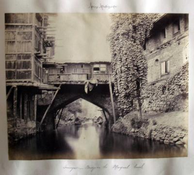
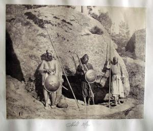
We recently acquired an album with 165 rare albumen photographs: 59 of the Morant Bay Rebellion in Jamaica (1865), 32 photographs of the Indian Northwest Frontier Hazara Campaign (1867-1870), and 64 others depicting Malta, Ireland, Guernsey, and elsewhere. The prints are primarily by unidentified amateur photographers, although there are 8 by Samuel Bourne, 5 by G. Sommer, 3 by William Lawrence, several by Francis Frith.


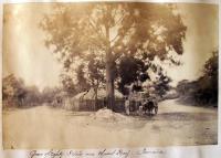
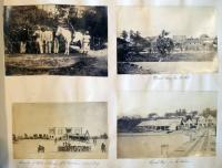
This post will describe the 59 photographs relating to the 1865 Morant Bay Rebellion and future posts will deal with the other sections. The album’s careful compilation includes detailed notes of the people, places, and dates relevant to each photograph. It may be the work of a surgeon in the British Army, Alexander Dudgeon Gulland, MD Edinburgh University, who appears in the album. Appointed Staff Assistant Surgeon in 1854, he served with the 6th Foot which was in Jamaica in 1865 and is listed as having been in China from 1860-62 and Hazara in the Northwest Frontier in 1868 (See: Hart’s Army Lists and Returns Relating to Medical Officers (Army) 1854). The Jamaica section of this album begins with photographs of the Morant Bay military base including a view from the Surgeon’s Quarters and general views of the area to set the scene.

My thanks to Dr. Mimi Sheller, Professor of Sociology, Director, Center for Mobilities Research and Policy Department of Culture and Communication Drexel University, for the following summary of these events.

The events at Morant Bay in 1865 followed on the heels a period of public meetings known as the Underhill Meetings, and peaceful expression of grievances through petitions. Complaints included a series of economic issues related to wages, land tenure, access to markets, and labor rights; political issues related to unfair taxation, no justice in the courts, and elite-biased government policies; and civil issues that included voting rights, and access to healthcare, education, and land. In that sense it was not a riot so much as a social movement, which was rejected by the Governor and finally turned to violence against the representatives of the local government.

Here is a basic description of the facts of what took place before the government sent in military reinforcements to “suppress” the rebellion. During a trial for trespass held in the Morant Bay Court House on the 7th of October 1865, James Geoghagan disrupted proceedings by shouting that the defendant should not have to pay the costs. He was ordered out of the court. When he did not go quietly the Judge ordered his arrest. However, his sister Isabella challenged the police, and when they got outside a “mob” including the Native Baptist deacon Paul Bogle and some of his followers from the hamlet of Stony Gut rescued him from the police. The following day the police went up to Stony Gut to arrest those involved, but the policemen were instead captured and made to swear an oath to “cleave to the black”. To continue reading Dr. Sheller’s description, click on the extended entry link below.

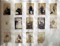
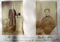
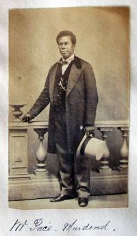
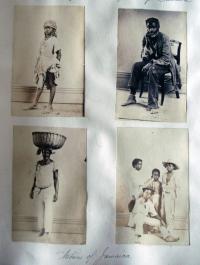
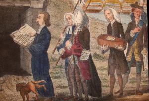
Portraits of key figures from the rebellion tell more of the story. Among them are a page of portraits of “The Victims of the Jamaica Rebellion of 1865”, a portrait of George William Gordon who is now considered a Jamaican national hero, portraits of unidentified Jamaican natives, and of British Army officers. Listed among the victims are not only those who were murdered but also those in the colonial government who were later tried for murder and acquitted.

It is probable that these portraits were gathered after the rebellion and some may have been taken by the only commercial studio we can identify in Jamaica at the time, run by Adolphe Duperly (1801-1865) and taken over by his son, Armond.

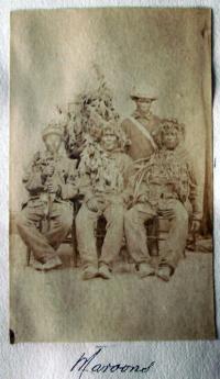
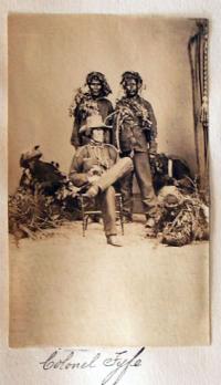
Two small photographs of Jamaican Maroons, including one of Maroons in camouflage with Colonel Fyfe, reflect an interesting social dynamic in the rebellion. Originally runaway slaves who set up communities that engaged in guerrilla warfare against the British, the Maroons eventually cooperated with the British authorities after they started to deport them and confiscate their land in 1796. Used to suppress slave revolts until 1838, they were also used to suppress the 1865 rebellion.

For more information, see “The Town of Morant Bay, Morant Bay, Jamaica,” Harper’s Weekly, December 23, 1865.

“Morant Bay, Jamaica, the Scene of the Negro Insurrection,” The Illustrated London News, November 25, 1865.

Gad Heuman, The Killing Time, The Morant Bay Rebellion in Jamaica (London: Macmillan, 1994) Firestone F1866.H48 1994b

Arvel B. Erickson, “Empire or Anarchy: The Jamaica Rebellion of 1865,” The Journal of Negro History, 44, no. 2 (April 1959): 99-122.

Henry Bleby, The Reign of Terror: a Narrative of Facts concerning Ex-Governor Eyre, George William Gordon, and the Jamaica Atrocities (London: s.n., 1868). Firestone HF 1569.E53

Japanese pochoir design

| 1 Comment

With many thanks to our Japanese bibliographer, Yasuko Makino, the literal translation of the title of this album is: New 100 Komon Designs Used in Kimono/Costumes Used in Ancient Court Ceremonies. Compiled by Sumiharu Suzuki (Kyoto: Maria Shobo, Showa 11 [1936]).

Komon literally means a small design scattered all over a kimono. http://umechiyo.ikiten.com/umechiyo-ZD-E287-14-sctg037.html Yasuko has also sent this URL to show a modern album. Below are a few more designs, printed by stencil and brush, (or to use the French term: pochoir).

Edward Orme's Transparent Prints

Jas. Hook, Outside of a Castle. To Lady Charlotte Campbell, this print from the original Transparent Drawing, 1798. Sold and published by Edwd. Orme, Conduit Street, London. Transparency etching.

Although the British engraver and publisher Edward Orme (1774-ca. 1838) always claimed to have invented transparent prints, Michael Twyman reminds us that Rudolph Ackermann (1764-1834) published 109 transparent etchings between 1796 and 1802, along with a book entitled Instructions for Painting Transparencies (1799). Even before Ackermann, the caricaturist Mary Darly published a few “humorous and transparent prints” in 1763.

However, it was Orme who made the genre popular in the early nineteenth century through his bilingual manual, An Essay on Transparent Prints and on Transparencies in General (1807) Graphic Arts Collection (GA) Oversize Rowlandson 8415q. The effect was created by taking a normal etching or engraving, painting large areas of color on back of the print and then, adding varnish to specific areas make the paper translucent when held up to a light. Scenes often included fire light, moon light, and other glowing illusions. Orme’s instructions suggest that transparent prints could be substituted for stained glass, in lanterns, lampshades, and fire screens.

W. Orme, A Glass House. From the Original Transparent Drawing, 1799. Sold & Published by Edwd. Orme, Conduit Street, London. Transparent etching.

The Tomb of Rosicrucious. A Blacksmith’s Shop, 1799. Sold & Published by Edwd. Orme, Conduit Street, London. Transparent etching.

Czech book design

Critic and designer Karel Teige said that the cover of a book must be like a poster advertisement. His work was part of the golden age of avant-garde Czech book design, begun in 1920 with the poets and artists of the Devetsil Artistic Union (DAU). Their designs appeared on trade books from many publishing houses and influenced a generation of graphic artists. Here are a few examples. For more, see the Cooper Hewitt’s exhibition website: http://www.sil.si.edu/ondisplay/czechbooks/intro.htm

Ludwig Renn (born Arnold Friedrich Vieth von Golsseneau, 1889-1979), Valka (Prague: Vaclav Petra, 1930). Wrapper design by Josef Kaplický (1899-1962). Graphic Arts (GAX) 2009- in process

Jaroslav R. Vávra (1902-1990), Petrolejáři (Oil): román z anglo-americké petrolejové války 1927 (Prague: Druzstevní práce, 1937). Wrapper design by John Heartfield (1891-1968). Graphic Arts (GAX) 2009- in process


F. Slang (pseud. for Fritz Hampel), Kriznik Potemkin. Povstani Namorniku Pred Odescu 1905 (Prague: Jan Fromek, 1926). Wrapper design by Karel Teige (1900-1951). Graphic Arts (GAX) 2009- in process

Milor Vitek, Mauthausen 1942 Dachau 1945 (Brno: Klub Kounicových Koleji, 1946). Cover design by Zdeněk Rossmann (1905-1984). Graphic Arts (GAX) 2009- in process


Hubert Renfro Knickerbocker (1898-1949), Rudy Obchod Hrozi (The Red Trade Menace)(Prague: Nakladem Ĉeska Graficke Unie, 1932). Wrapper design by Josef Hesoun. Graphic Arts (GAX) 2009- in process

Theodor Prochazka, V Předvečer Války (Prague: Melantrich, 1945). Cover design by Karel Teige (1900-1951). Graphic Arts (GAX) 2009- in process


Karel Schulz (1899-1943), Dama U Vodotrysku (Prague: Ladislav Kuncir, 1926). Wrapper design by the partnership of Jindrich Styrsky (1899-1942) and Toyen (born Marie Cerminova, 1902-1980). Graphic Arts (GAX) 2009- in process

Georges Le Fèvre, Jsem vyvrhel! (Prague: Knihy Litevny, 1931). Cover design by L. Hradsky. Graphic Arts (GAX) 2009- in process
1 2 3 4 5 6 7 8 9 10 11 12 13 14 15 16 17 18 19

Recent Comments

  • Howard Coblentz: I have a round seal shaped like a pear a read more
  • John Overholt: Wikipedia's entry for Sir Francis says: "Throughout Baring's lifetime his read more
  • Serge Rodrigue: It is a precious thing you have a book from read more
  • Colin Wicks: I have a copy of “A Round Game.” And it read more
  • Laurence Hilonowitz: I was a Customer, Friend of Bob Wilson. I Live read more
  • allen scheuch: Absolutely STUNNING! Those colors, those designs made my day! Thanks, read more
  • Olivier: Hello Diane, If you are still looking for an examplare read more
  • Stella Jackson-Smith: I have a framed picture by A.Brouet, signed with the read more
  • John Podeschi: I remember Dale fondly from my days at Yale (1971-1980). read more
  • Joyce Barth: I have some or all of this same poem. I read more