Recently in Acquisitions Category

Monografieën over Filmkunst, designed by Piet Zwart

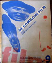
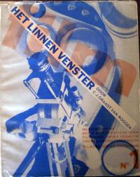
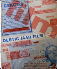
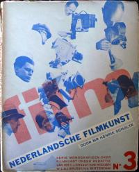
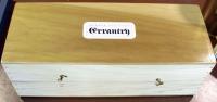
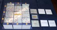
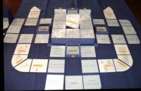
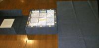
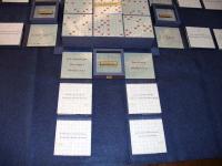
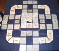
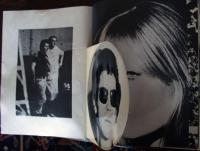
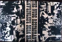
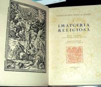
Monografieën over Filmkunst (Monographs on Art Films), edited by C.J. Graadt van Roggen (Rotterdam: W. & J. Brusse’s Uitgeversmaatschappij, 1931-1933). 10 vols. All in the original wrappers, designed by Piet Zwart (1885-1977). Graphic Arts (GAX) in process

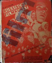
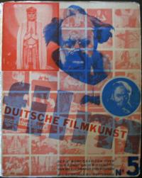
This set of monographs on early twentieth-century film is as important for the graphic design of the covers, as it is for the discourses on cinema inside. The individual volumes are:
1) C.J. Graadt van Roggen, Het Linnen Venster (The Linen Window), 1931.
2) J.L.J. Jordaan, Dertig Jaar Film (Thirty Years Film), 1932.
3) Henrik Scholte, Nederlandsche Filmkunst (Dutch Cinema), 1933.
4) Th.B.F. Hoyer, Russische Filmkunst (Russian Cinema), 1932.
5) Simon Koster, Duitse Filmkunst (Coastal German Cinema), 1931.
6) Elisabeth de Roose, Fransche Filmkunst (French Cinema), 1931.
7) J.F. Otten, Amerikaansche Filmkunst (American Cinema), 1931.
8) Menno ter Braak, De Absolute Film (The Absolute Film), 1931.
9) Constant van Wessem, De Komische Film (The Comedy Film), 1931.
10) Lou Lichtveld, De Geluidsfilm (The Sound Film), 1933.

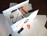
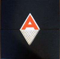
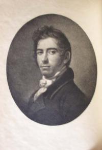
Each volume has a unique design created by the Dutch artist Piet Zwart, who had multiple careers as an interior designer, industrial design, commercial typographer, photographer, critic and lecturer. At the close of the twentieth century, Zwart was named ‘Designer of the Century’ by the Association of Dutch Designers.

He preferred the title of form technician to graphic designer. His innovative typography and jacket covers steal from De Stijl in his limited palette and geometric layout, without being weighed down by its rules. He flirted with Russian Constructivism and was one of the first designers to consider issues of ergonomics into his industrial projects. Structure, balance, and repetition are constants in his work, which often incorporated photographic images he shot himself. When this film series was complete, Zwart abandoned typographic projects to concentrate on industrial and furniture design.

For more information on Zwart, see: Arthur Allen Cohen, Piet Zwart, Typotekt (New York: Exlibris, [1980]). Marquand Library (SAPH): N6953.Z85 C654 1980

For informaton on Princeton University’s Film & Video Program, see: http://www.princeton.edu/arts/artsatprinceton/film/abouttheprogram/

Werner Pfeiffer


Werner Pfeiffer, Errantry (Red Hook, N.Y.: Pear Whistle Press, 2008). 29 x 830 cm. in box 16 x 46 x 16 cm. Copy 10 of 52. Graphic Arts (GAX) in process

The sculptor and book artist Werner Pfeiffer is currently installing an exhibition of his work down the road at the University of Pennsylvania, opening Thursday, September 17, 2009, at 5:30 p.m. http://www.library.
upenn.edu/exhibits/pfeiffer.html
. This seems like a good opportunity to mention two recent acquisitions of Mr. Pfeiffer’s work in the graphic arts collection at Princeton University.

Errantry is a scroll inspired by Der Triumphzug Kaiser Maximilians or The Triumphal Procession of the Emperor Maximilian (1515), a series of 130 woodcuts by Hans Burgkmair the Elder (1473-1531) and others. Pfeiffer has created his own militant parade of 20th-century violence and agression.

The title and text are based on a poem written by J.R.R. Tolkien in the 1930s, thought by many to be about war. The poem used in this scroll is an adaptation with only two or three lines directly quoting the original but with the syntax, rhyme, and meter of Tolkien’s writing.

The text and images are set against a chilling chronology of war, conflict, and genocide in the 20th century, printed digitally on a 27 foot long canvas. The scroll is housed in an actual 105 mm Howitzer artillery brass casting, manufactured for use in the M14 gun in 1943.

Werner Pfeiffer, Abracadabra: an homage to Hendrik Nicolaas Werkman; a set of typographic explorations (Red Hook, N.Y.: Pear Whistle Press, 2007).

Abracadabra is a book about magic,” writes Pfeiffer, “Not the illusory trickery of a conjuror, but the magic of an artist’s work.” It is an homage to Dutch graphic artist and resistance fighter Hendrik Nicolaas Werkman (1882-1945), who was executed by the Nazis in the waning days of World War II. In particular, it is a recognition of the inventive typographic works Werkman called drucksels. These unusual pieces combine letterforms with geometry and color. Pfeiffer has created a set of designs based on the letterforms of Abracadabra both in individual plates and in three flexagon structures that can be folded and flipped into multiple forms of fabulous visual geometry.

Louis Lafon

Louis Lafon (active 1870s), Marinoni Printing Press. Albumen silver print from wet collodion negative, 14-1/4 x 18-1/4 in. (362 x 464 mm), ca. 1880.

Very little is known today about the French photographer Louis Lafon. According to the Metropolitan Museum of Art, “He was based in Paris, photographed primarily industrial subjects, and won a medal for his submissions to the 1874 exhibition of the Société Française de Photographie.” The name does not appear in the standard biographies but a group of his prints is making their way into collections around the country and it will not be long before he is better understood.

Lafon made this mammoth photograph of one of Hippolyte Marinoni’s printing presses, also known as Presse Universelle. High speed, continuous paper printing on machines like this revolutionized the printing industry in the nineteenth century. A nice description of rotary printing can be found at http://chestofbooks.com/crafts/scientific-american/sup3/Marinoni-s-Rotary-Printing-Press.html.

If you want to see the press in action, there is a YouTube video of a Marinoni press similar to Lafon’s photograph at http://www.youtube.com/watch?v=rRjoOTFKZDw.

C. H. Perkins' Colored Concert Company

C.H. Perkins’ Original Virginia and Texas Colored Concert Company, ca. 1882. Lithographic poster. Graphic Arts GC2009- in process

In researching our new poster for The Colored Concert Company we found one article by Josephine Wright, “Songs of Remembrance” from the Journal of African American History 91:4 [Fall 2006] p.413-424rs that mentioned the group in a footnote:

Three other African American musicians besides Robert Hamilton compiled and published text and music anthologies of Negro spirituals in the early 1880s: M. G. Slayton, ed.. Jubilee Songs, as Sung by Slayton’s Jubilee Singers (Chicago, 1882), 14 songs; Marshall W. Taylor, comp., A Collection of Revival Hymns and Plantation Melodies, Composition by Miss Josephine Robinson… (Cincinnati, 1882), 64 plantation songs; and Jacob J. Sawyer, air., Jubilee Songs and Plantation Melodies (Words and Music), as Sung by the Original Nashville Students, the Celebrated Colored Concert Company (N.p., 1884), 12 songs. Jacob J. Sawyer served ca. 1882 as pianist for Slayton’s Jubilee Singe

Otherwise, this celebrated organization is not mentioned in any of the major newspapers or magazines of the period. Not mentioned in the International Index to Black Periodicals; African American Music Reference http://aamr.alexanderstreet.com/; African American Newspapers: The 19th Century (1827-1882); the archives of the Center for Black Music Research, Columbia College, Chicago, http://www.colum.edu/cbmr/; or the The Harvard Guide to African-American History.

We did however have luck with the dating by matching the clothing in the index: http://www.marquise.de/en/1800/index.shtml).

A Guide to Higher Learning

Julie Chen, A Guide to Higher Learning (Berkeley: Fishing Fish Press, 2009)


This latest bookwork “examines the experiential process of acquiring knowledge, on both academic and personal levels. The piece is comprised of 8 sections of rigid square pages that are hinged together in unexpected ways, giving the reader a physical reading experience that mirrors the complex meaning of the content,” writes Ms. Chen. “The book in its fully unfolded form reveals an intricate and fascinating visual pattern of information.”

Flying Fish Press was established in 1987 by Julie Chen and is dedicated to the design and production of books which combine the quality and craftsmanship of traditional letterpress printing with the innovation and visual excitement of contemporary non-traditional book structures and modern typography. For more information, see http://www.flyingfishpress.com/index.html

Asher B. Durand Extra-Illustrated or Grangerized?

Catalogue of the Engraved Work of Asher B. Durand. Introduction by Charles Henry Hart (1847-1918), (New York: Grolier Club, 1895). Graphic Arts (GAX) 2009- in process

In April of 1895, there was an exhibition held at the Grolier Club in New York City focused on the engravings of American artist Asher Brown Durand (1796-1886). 350 copies of the catalogue were printed in a large-paper edition in May of that year and circulated to the members of the Club.

A devoted fan of Durand’s work (as yet unidentified) took that catalogue and extra-illustrated it with all the original engravings he/she could acquire. This acquisition will provide Princeton researchers with not only a description of what Durand produced but also a copy of the actual print.

The term extra-illustrated refers to a book that has more prints or illustrations in it than when the book was published. These were usually added by trimming and tipping the prints onto extra pages (or sometimes right on top of the text) and then, rebinding the original text pages with the new plates.

The British term “Grangerizing” has a slightly different connotation, stemming from James Granger’s Biographical History of England (1769), which was published with blank leaves already provided for the reader to fill with prints. Grangerizing became a popular hobby in England and unfortunately, many other books were cut up to provide the extra prints for these homemade editions.

For more information on the difference between the two terms, and more history, see: H. J. Jackson, Marginalia: Readers Writing in Books (New Haven: Yale University Press, 2001). Firestone Library (F) Z1003 .J12 2001

A book in a cork

Suzanne Thomas, The Wine (Santa Cruz: the author, 2008). Edition of 150. Graphic Arts (GAX) 2009- in process
This miniature book includes a quotation from Homer’s Odyssey (Book XIV): “The wine urges me on / the bewitching wine/ which sets even a wise man to singing/ and to laughing gently/ and brings forth words / which were better unspoken.”

Harrild & Sons Printing Machinery

| 5 Comments

In 1813, printer Robert Harrild (1780-1853) joined the debated raging inside the London printing community as to the use of rollers rather than balls to ink a printing plate. The majority of hand-printers preferred inking balls but Harrild’s demonstration of his new roller was so successful that rollers became compulsory in every print shop throughout the city. Harrild established a company, located at 25 Farringdon Street, to manufacture the rollers and eventually all kinds of printing equipment.

His advertisements boasted: “Harrild and Sons’ Manufacture … have on sale every article connected with printing machinery; type, presses, machines…” Shortly before his death, Harrild’s rollers and Paragon platen press were exhibited in the Crystal Palace during the Great Exposition of 1851. His sons continued to run the company well into the twentieth century.

Graphic Arts recently acquired two of their equipment catalogues: Catalogue of Printing Machinery and Materials with Selected Type Specimens, ca. 1895, and Harrild & Sons’ Complete Illustrated Catalogue of Printers, Bookbinders’ & Stationers’ Machinery & Materials, 1892. Note in particular the machine to fold newspapers.

Thysiastērio tēs leuterias

| 1 Comment

Most Pitiful Kalavryta [a town in Peloponnesus]

Thysiastērio tēs leuterias [Altar of Freedom] (Athēnai: “Ho Rēgas” Ekdot. Organismos, 1945). Gift of the Program in Hellenic Studies with the support of the Stanley J. Seeger Hellenic Fund. Graphic Arts Off-Site Storage: Contact rbsc@princeton.edu, Oversize D766.3 .T48 1945f.

My sincere thanks to Dimitri H. Gondicas, Executive Director, Hellenic Studies, for finding this graphic depiction of Greece during World War II. Note the remarkable date of 1945. Thanks also to Jeffrey Roueche Luttrell, Leader, Western Languages Cataloging, for his translations.

Heroic Crete

Wretched Doxato [a town in northern Greece]

The Hanged People of Athens

Les metamorphoses du jour

The French artist Jean-Ignace-Isidore Gérard went by the name Grandville, which was the stage name his grandparents used. In the early nineteenth-century, Grandville created several hand-colored lithographic books to satirize the bourgeois middle class of Parisian society in the Romantic period. His best, and today the rarest, is Les metamorphoses du jour published in 1829.

The characters of the book have a human body and an animal face, exposing people for the beasts they really are. The preface comments that the artist was thereby able to encompass “both the living picture of social manners and the satire of institutions and prejudices. Truth can circulate with impunity under the very eyes of the men it attacks.”

J.J. Grandville (1803-1847), Les metamorphoses du jour (Paris: Chez Bulla…et chez Martinet, 1829). 73 lithographic plates drawn by Grandville, printed by Langlumé. Graphic Arts (GAX) 2009- in process

The first edition was a huge success and quickly went out-of-print. A new edition was prepared in 1854, this time using wood-engraved reproductions of Grandville’s original lithographs. It is unfortunate that most people only know the series through these poor copies.

Princeton’s Les metamorphoses is a complete set of hand-colored lithographs with the extra two plates issued in 1830 in Belgium and then censored. In addition, the book is extra-illustrated with four lithographs in the style of the series: La chasse et la Pêche (1830), La revanche ou le Français du Missouri (1829), Casse nationale sur les terres royales (1830), and Chasse aux ordonnances (1830?).

Princeton also holds a number of books illustrated by Grandville including Jonathan Swift (1667-1745), Voyages de Gulliver dans des contrées lointaines (Paris: H. Fournier ainé: Furne et Cie, 1838). Graphic Arts (GAX) 2005-2172N; along with an original preparatory drawing for Gulliver by Grandville in the Cotsen Collection, (CTSN) Framed Artwork 3976

Never a Day Without a Line

| 2 Comments
Crispijn [van] de Passe (1594-1670), La prima-[quinta] parte della luce del dipingere et disegnare, … (Ghedruckt t’ Amsterdam: Ende men vintse te koop by Ian Iantsz. … als mede by den Autheur selve … , 1643-1644). Five parts bound as one. Graphic Arts (GAX) 2009- in process

The frontispiece for Crispijn de Passe’s five volume manual for painters depicts Minerva as the patroness of the arts.

She is holding a torch to symbolize the light mentioned in the title of this volume. In her lap is an open book with the artist’s motto: Nulla dies sine linea (Never a day without a line). Behind her are eight Utrecht painters: Abraham Bloemaert, Gerard van Honthorst, two unidentified, Jan van Bronckhorst, Roelandt Saverij, Joachim Wtewael, and Paulus Moreelse. Apprentices sit at Minerva’s feet drawing.

The manual was meant for a wide audience and so, the text is printed in Italian, Dutch, French, and German. Part one is devoted to proportions; part two to drawing from the male nude; part three drawing from the female nude; part four to figure studies by famous contemporary master including Guercino, Jan Cousin, Abraham Bloemaert, and Roelandt Saverij; and part five focuses on the study of mammals, birds, fish, and insects.

There are only four other copies of this book in the United States. One is at the National Gallery of Art in Washington D.C., one at the Getty Research Institute, and two at the Museum of Fine Arts, Boston. Each copy is slightly different in the plates included, their sequence, and the altering of dates. The title pages of part 1-2 in Princeton’s copy have imprint: t’Amsterdam : By Crispijn de Pas, M.D.C.XLIV (altered with pen to M.D.C.LXIV), while the National Gallery of Art’s copy is altered similarly for parts 2-3. Princeton’s copy also has plate dates altered to reflect the addition of a number of prints.

Each of the five parts has its own title page, hence the combined title: La prima-[quinta] parte della luce del dipingere et disegnare, used for the single bound volume. The polyglot book is also known as Van ‘t Licht der teken en schilderkonst and Luce del dipingere et disegnare.

Most of the 225 plates in these volumes were engraved by Crispijn the Younger himself, although the years following the publication of this opus were troublesome for the artist. He had more and more trouble keeping up with demand for his work and in 1645, the artist was admitted to an asylum to be “cured of his insanity of mind.” Although he returned to work, this manual remains his most ambitious project.

The book is dedicated to the city of Utrecht, where his father Crispijn de Passe the elder, had moved for religious reasons. The entire family, father and four children, worked together as artists and print publishers. When the family estate was settled near the end of the 18th century, their work totaled more than 14,000 prints and around 50 print books or illustrated volumes. Princeton is fortunate to now hold 5 rare volumes with prints by Crispijn the younger, and 6 illustrated by Crispijn the elder.


The honour is immortal that remains
Of virtuous artists whose name shall never wither.
Just so with De Passe, the praise the Muses sing
In the vale of Pegasus, of all the wondrous marvels
That he disclosed with his needle,
By etching on the plate, of which Belgica boasts.
So skillfully done, stippled and boldly cut,
As can still be seen up to this very day.
The proof demonstrates the work’s deed to the master’s honour,
Aye, the hand may perish, but the spirit never dies.

Andy Warhol's Index Book

| 1 Comment
Andy Warhol (1928-1987), Andy Warhol’s index (book). With the assistance of Stephen Shore [and others] and particularly David Paul. Several photos by Nat Finkelstein. Factory fotos by Billy Name (New York: Random House, 1967). Graphic Arts Collection (GAX) GAX 2009- in process


This book was designed by Andy Warhol during the 1960s as “a children’s book for hipsters.” The volume, as originally published, included 10 interesting details that have broken or fallen out of many volumes and so, a complete book is extremely rare. These include a silver balloon; a pop-up Hines Tomato Paste can; a pop-up castle (reference to the house in Los Angeles where rock bands recorded); a folded geodesic dome (dodecahedron); a sheet of stamps to be placed in water (presumably tabs of LSD); a paper accordion; a multi-colored pop-up airplane; a paper disc with “The Chelsea Girls” in printed type on wire spring; a 45 R.P.M. flexi-disc with portrait of Lou Reed, which plays an otherwise unrecorded song by Nico and the Velvet Underground; and an illustration of a nose with two colored overlays on a double-folded page. Princeton’s copy is missing the airplane.

Princeton University Libraries hold nearly 200 books about Andy Warhol. To read about what he thought of this period, in his own words, see: I’ll Be Your Mirror: the Selected Andy Warhol Interviews: 1962-1987 / edited by Kenneth Goldsmith (New York: Carroll & Graf, 2004) Marquand Library (SA) N6537.W28 A5 2004

Anthony Morris Family Tree

| 3 Comments

Anthony Morris Family Tree, compiled by Anthony Saunders Morris, lithographed by L. Haugg, 1861. Graphic Arts division (GA) 2009- in process

Anthony Saunders Morris (1803-1885) must have had great interest in the history of his family because in the 1860s, he began compiling a complete Morris family tree. When he succeeded in documenting nine generations of male decedents, he hired lithographer Louis Haugg (1856-1894), one of Philadelphia’s leading printmakers, to draw the family tree in its entirety.

The result is this massive sixteen-plate panorama of an actual tree (approximately six by five feet), which holds all the names of the Morris family. Note that the men are the branches that continue the lineage and the women the foliage, only good for decoration.

Printed by F. Bourquin and Company on Chestnut Street, it is unclear how large an edition Morris commissioned. No other copy of this print is currently recorded.

A Legacy of Letters

Mark Argetsinger, A Legacy of Letters, An Assessment of Stanley Morison’s Monotype ‘Programme of Typographical Design’, with specimens of Centaur, Bembo, Poliphilus, Garamond, Van Dijck, Perpetua, Fournier, Baskerville, Bell, and Walbaum (Skaneateles, New York: Michael and Winifred Bixler, 2008). Edition of 80 copies. Graphic Arts GAX 2009- in process

If you love printed books, you need to move fast. This is a limited edition, scholarly text by the amazing book designer Mark Argetsinger, published by the press & letterfoundry of Michael and Winifred Bixler, concerning the life and legacy of the English designer and typographer Stanley Morison (1889-1967). It is a double treat, placing such interesting research into such an elegant package.

“The typefaces and ornamental material here printed sprang chiefly from the vision and taste of an extraordinary man, Stanley Morison” begins the preface. We all know the facts. Morison founded the Fleuron Society dedicated to typography, was a staff writer for the Penrose Annual, and a consultant for the Monotype Corporation, where he developed some new and revived some forgotten typefaces. He went on to consult for The Times of London, redesigning the whole paper in 1932.

But if you thought you knew the history of modern type design, think again. Argetsinger’s essay will change your mind about the development of letterform in our time and bring you up-to-date with the effect Morison’s legacy has on printers of today.

He writes

“As much as Morison sought to produce a new design, his achievement stands largely in the series of revivals born from his important scholarship. These classical faces, amounting in Morison’s tally to one or two permanent styles through the span of a century, have stood the years and they still stand today. Creation is a gift given by the gods to a few Promethean individuals. The gift is unsolicitable. Morison strove to be one of these persons, but in an odd modern way, by industrial proxy.”

The book was designed by Mark Argetsinger and Michael Bixler and bound by the Campbell-Logan Bindery in Minneapolis, Minnesota. Our copy is being catalogued and will be on the shelf for you to read next week.

The Court of Henry VIII

| 2 Comments

Edmund Lodge (1756-1839), Portraits of Illustrious Personages of the Court of Henry VIII (London: John Chamberlaine, printed by W. Bulmer, 1812). Graphic Arts (GAX) 2009- in process

This is the second edition of 84 stipple engravings reproducing drawings by Hans Holbein, the younger (1497-1543), with biographical and historical descriptions by Edmund Lodge. It was Queen Caroline (1683-1737), who found the Holbein originals in a bureau at Kensington Palace and asked Richard Dalton (Keeper of the King’s drawings and medals) to have them copied and published. When Chamberlain took over Dalton’s position he also inherited the project. Chamberlain edited and published a folio edition of Holbein’s work in 1792, printed and issued in parts over the next 8 years by William Bulmer and Company, Shakespeare Printing-Office.

For the 1792 edition, Chamberlaine called on Francesco Bartolozzi (1725-1815), to prepare a set of prints. Bartolozzi had developed his own technique of stipple engraving with printed color to reproduce the look of chalk drawings, such as Holbein’s. The folio edition of Illustrious Personages was such a success that a large quarto edition was prepared in 1812 (seen here), using additional engravers working in the style of the elderly Bartolozzi, including Bourlier, Cardon, Cheesman, Cooper, Facius, Knight, Meyer, Minasi, and Nicholls.


Of the 84 portraits, 68 are identified by name. The last 12 could not be identified and are grouped at the front of the book without description. A letterpress index is included in the 1812 edition, seen on the left. In addition, portraits of Holbein and his wife serve as frontispieces to both editions.

Paul Praetorius 1521-1565

Paul[um] Praetorius (1521-1564 or 5), Chronica darinnen der Römischen Keiser historien, vom ersten Keiser Julio, bis auff Carolum den fünfften, und ire Bieldnis gefunden werden (Wittenberg: durch Peter Seitz, aus Verlegung Christopheri Schram, 1561). 118 circular woodcut portraits (white on black). Graphic Arts GAX 2009- in process

The 1559 first edition of Praetorius’s history of the Roman Emperors was published in Latin without illustrations. For the first German edition, Praetorius added over one hundred woodcut portraits of the emperors described, taken from imperial coins and later commemorative medals.

The final portrait is that of Ferdinand I of Prague, who Praetorius met while on a diplomatic mission for the Archbishop of Magdeburg. This may have been a last minute substitute since the earlier text indicates the final portrait is to be Emperor Charles V.

Note the words in the woodcuts are printed white on a black background. It was easier to use a thin knife to cut out the letters than to cut around them. The large areas left in relief, printing black, make for a stronger block that would last through a large printing run. In fact, these same blocks were also used in Georgius Sabinus’ Catalogues Romanorum et Germanicorum Imperatorum in 1561.

L’art de dessiner proprement les plans, porfils [sic], elevations geometrales, et perspectives, soit d’architecture militaire ou civil… (Paris: Christophe Ballard, 1697). Graphic Arts GAX 2009- in process

Graphic Arts holds books with many types of bindings, including books bound in the skin of cows, pigs, sheep, and other mammals. Recently, we acquired a book described as bound in cat’s paw calf. A quick search revealed several other volumes in the stacks with similar cat’s paw bindings.

Happily, it turns out that “cat’s paw” is a descriptive term for the leather made from young cows not cats. This is a variation of Tree calf or Tree marbled calf. For such bindings, a light-colored calfskin has been treated with chemicals to represent a mottled tree trunk with branches or the marks made by a cat’s paw.

The leather is first paste-washed and the book hung between two rods, which keep the covers flat. The book is tilted so that it inclines upward towards it head. A small amount of water is applied to the center of both covers to form the trunk, then more water is thrown on the covers so that it runs down to the trunk and to a central point at the lower edge. Copperas (a green hydrated ferrous sulfate) is sprinkled in fine drops on the covers, followed by potassium carbonate, which causes the chemical reaction that etches the leather to form a permanent pattern in shades of gray.

This and other binding descriptions can be found in Etherington & Roberts’ Bookbinding and the Conservation of Books: A Dictionary of Descriptive Terminology available now online: http://cool-palimpsest.stanford.edu/don/dt/dt3574.html or on paper: Graphic Arts GA Oversize Z266.7 .R62q

Military Map Printing Case

This mapmaker’s printing case was designed to be used by a government sponsored cartographer when working in the field around the 1860s. The buckram-covered case holds sixty-three brass sorts with a selection of numbers and military symbols. There is an ink pad and twelve glass bottles of ink, some with the label of the Paris manufacturer Dagron & Compagnie.

Thanks for finding this new acquisition go to our map curator John Delaney, whose recent exhibition To the Mountains of the Moon can now be seen through the webpages: http://libweb5.princeton.edu/visual_materials/
maps/websites/africa/contents.html

Gatsby from an Architect's Perspective

F. Scott Fitzgerald (1896-1940), The Great Gatsby (San Francisco: Arion Press, 1984). Photo-engravings designed by Michael Graves. Graphic Arts Collection (GAX), Oversize GA2009- in process


Princeton libraries hold 83 copies of Fitzgerald’s Great Gatsby, beginning with the first edition in 1925 (not to mention Fitzgerald’s original manuscript). The most recently acquired is a 1984 edition designed and illustrated by Princeton architect Michael Graves, Robert Schirmer Professor of Architecture, Emeritus at Princeton University.

When Arion Press invited Graves to work on a fine-press edition of The Great Gatsby, he chose to focus on the objects of Gatsby’s world; those things that defined his life and social status. None of the illustrations Graves prepared include portraits of Tom or Nick, or the book’s other characters. Instead they depict Gatsby’s estate and grounds, the furniture, fixtures, landscaping, automobiles, telephones, cocktail glasses, the gas station, and pool.

Princeton’s copy is one of fifty housed in a clamshell box with a terra cotta bas-relief on the cover along with two original drawings by Graves.

Imatgeria Religiosa


Joan Amades and Josep Colomines, Imatgeria Religiosa (Barcelona: Gregori, 1947). Series: Col’leccio de Boixos Populars de Catalunya, I. Religious iconography of Spanish works held in Catalan collections. Graphic Arts (GAX) 2009- in process

1 2 3 4 5 6 7 8 9 10 11 12 13 14 15 16 17 18 19

Recent Comments

  • Howard Coblentz: I have a round seal shaped like a pear a read more
  • John Overholt: Wikipedia's entry for Sir Francis says: "Throughout Baring's lifetime his read more
  • Serge Rodrigue: It is a precious thing you have a book from read more
  • Colin Wicks: I have a copy of “A Round Game.” And it read more
  • Laurence Hilonowitz: I was a Customer, Friend of Bob Wilson. I Live read more
  • allen scheuch: Absolutely STUNNING! Those colors, those designs made my day! Thanks, read more
  • Olivier: Hello Diane, If you are still looking for an examplare read more
  • Stella Jackson-Smith: I have a framed picture by A.Brouet, signed with the read more
  • John Podeschi: I remember Dale fondly from my days at Yale (1971-1980). read more
  • Joyce Barth: I have some or all of this same poem. I read more