Recently in Acquisitions Category

Wharton Esherick's Graphic Novels

Walt Whitman, As I Watch’d the plovghman plovghing; mvsic by Philip Dalmas, woodcvts by Wharton Esherick (Philadelphia, 1927). Gift of David B. Long in honor of Gillett Griffin.

As I Watch’d the Ploughman Ploughing is one of ten books designed and printed by the arts and crafts inspired artist Wharton Esherick. A look at the museum that has been established in his honor can be found at http://www.levins.com/esh3.html

Trained as a traditional painter, Esherick had a brief career as an illustrator before he bought a Washington hand press and in 1920, began cutting and printing limited edition woodcuts. Around this time, he met Harold Mason, owner of the Centaur Book Shop in Philadelphia, who was interested in publishing fine press books. It was a good match. In 1924, the Centaur Press published its first book, Walt Whitman’s poem, Song of the Broad-Axe, with woodcuts by Esherick.

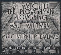
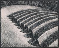
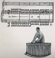
This led the artist to other commissions and other book projects, all printed with large-format woodcuts. In 1928, Esherick made a sequence of nine woodcuts for As I Watched the Ploughman Ploughing, a poem by Walt Whitman set to music by Philip Damas. The Franklin Printing Company issued in an edition of 200 copies and four of the woodcuts were reprinted in the February 1929 issue of Vanity Fair.

More information on Esherick can be found in an article by Henry Wessells, published in the February 22, 1999, issue of AB Bookman’s Weekly. A checklist of Esherick’s books can be found at: www.avramdavidson.org

Here is the complete text of the Walt Whitman’s poem:

As I watch’d the ploughman ploughing,
Or the sower sowing in the fields - or the harvester harvesting,
I saw there too, O life and death, your analogies:
(Life, life is the tillage, and Death is the harvest according.)

A Memorial to President James A. Garfield

| 2 Comments

James Meyer Jr. The Late Administration … Our National Prosperity. Education, Church & State. God Reigns and the Government at Washington Still Lives. A Memento of 1881. Dedicated to the Memory of Our Honored Dead President and His Faithful Cabinet. New York: E.G. Rideout & Co., 1881. Color lithograph. 41 x 58 cm.

The commercial designer James Meyer created a series of broadsides, such as this one, as memorials to President James A. Garfield who was assasinated in September 1881. A smaller scale print was also commissioned by E.G. Rideout & Company and included in an issue of Household Journal (also called Household Guest Magazine) that same year. This is possibly in response to the fear of a nation-wide panic over two presidents being killed in the short span of 16 years.

The First Published Illustration of Yosemite Falls

| 1 Comment
Thomas A. Ayres (1816-1858). The Yo-Hamite Falls [caption title]. San Francisco: James M. Hutchings, Printed by Britton and Rey, [October 1855]. Lithograph, 23¼ x 15 inches, with an additional attached upper margin, measuring 3½ x 15 inches, bearing the words: “Hutching’s Panoramic Scenes in California.”

Thomas Ayres, a native of New Jersey, was the first artist to create an image of California’s beautiful Yosemite Falls for publication. The print was commissioned by James Mason Hutchings, publisher of Hutchings’ California Monthly. Traveling with three other men, Ayres and Hutchings entered Yosemite in June 1855. The group stayed in the area for five days and Ayres completed a number of drawings. Later, Hutchings had the sketches transferred to stone by the San Francisco artists, Kuchel and Dresel, and the stones printed by Britton and Rey. This view of the high falls appeared for sale in October 1855.

Hutchings also produced a pictorial letter sheet called Hutchings’ Panoramic Scenes and it has been suggested by William Reese that this copy of the Yo-Hamite print may have been created as a promotional display to promote Hutchings’ letter sheet. The print’s text reads “This magnificent scene is situated in the Yo-Hamite Valley near the source of the middle fork of the River Merced, Mariposa County California. It is the highest waterfall in the world - rushing over the precipice, at one bold leap it falls 1,300 feet, & the whole hight [sic] from valley is 2,300 feet.”

The following year, Ayres made a second trip to Yosemite and wrote about it in the Daily Alta California: “Upon another occasion we rode down the valley some six miles, and crossing the picturesque ford where the Mariposa trail enters the valley, ascended the mountain, reaching a point on the trail some fifteen hundred feet above the river. From here the traveler obtains the most complete general view of the entire valley… . To the right descends the Cascade of the Rainbow in all its beauty, giving life and expression to the scene, while the Two Domes bound the dim distance. All, all is as Nature has made it, fresh and beautiful from the hand of the Creator. On the glorious Fourth we were treated to a salute from Nature’s artillery. The effect of a thunderstorm in the valley was such as words cannot describe.

From crag to crag / Leaped the live thunder— / Not from one lone cloud, / But every mountain then had found a tongue.

… The time passed like a dream, and it was with regret that we left the beautiful Valley of the Yohemity, bound on an exploring trip to its head waters, far among the snow-clad peaks of the Sierra Nevada, of which more anon.” —Thos. A. Ayres, “A Trip to the Yohamite Valley,” Daily Alta California, 7, no. 207 (August 6, 1856).

Ayres’s drawings were exhibited in New York City and he was hired by Harpers Weekly to illustrate several articles on California. Sadly, his career was cut short in 1858, when the schooner he was riding to San Francisco capsized and Ayres was drowned.

Norden's "Travels in Egypt and Nubia"

| 1 Comment

Frederick Lewis Norden (1708-1742). Travels in Egypt and Nubia. First English edition. Translated from the original and enlarged with observations from ancient and modern authors by Peter Templeman (1711-1769). London: printed for Lockyer Davis and Charles Reymers, 1757. 159 full page engravings by Marcus Tuscher (1705-1751). Provenance: John Cleveland (1734-1817). Purchased with matching funds provided by Rare Books and Special Collections, Maps Division, Rare Books Division, and Graphic Arts Division.

The Danish Naval Captain and explorer, Frederick Norden sailed to Egypt in 1737-38 to surveyed the architecture, agriculture, and other curiosities of the country. He was the first European to penetrate as far as Derr in Nubia, and produced the first coherent maps of the country. Seventeen years later, long after Norden’s death, his maps and drawings were published by the Royal Danish Academy of Sciences and Letters, under order of Frederick V of Denmark, as Voyage d’Egypte et de Nubie (1755). Two years later, the physician and naturalist Peter Templeman completed an English translation, which was published in two folio volumes.

Thanks to the combined resources of the Maps Division, Rare Books Division, and Graphic Arts Division of Rare Books and Special Collections, Norden’s seminal work in now part of the Princeton University Library collection.

Princeton Acquires William James Stillman's "Athens"

| 3 Comments

William James Stillman (1828-1901). Athens, ca. 1869. Portfolio containing 25 albumen prints, each approximately 7 ½ x 9 ½ inches (19.1 x 24.2 cm.) or the reverse, numbered sequentially in the negative (lacking no. 17), photographer’s initials and date in a few negatives; two trimmed with arched tops, mounted on card with printed title labels (some foxing to mount of plate 1, not affecting image) University College London, ink collection stamps (cancelled) on reverse of mounts; in original black morocco portfolio (rebacked and relined with ties replaced), titled and with photographer’s credit Photographed by W.J. Stillman in gilt on top flap, overall size 18 3/8 x 14 ½ inches (46.7 x 35.9 cm.).

Thanks to the support of the Friends of the Princeton University Library, the Graphic Arts collection is fortunate to have acquired Athens, a rare nineteenth-century portfolio of albumen photographs focused on the Acropolis in Athens, Greece. This scarce work by the American diplomat, journalist and photographer, William Stillman, is the product of a tragic, but artistically rich period in his life.

Following early careers as a painter associated with the Hudson River School and as founding editor of the art journal the Crayon, Stillman took up photography in 1859. Continuing as a journalist and travel writer abroad, Stillman put his skills as a photographer to use while serving as consul in Rome and Crete in the mid-1860s.

Stillman moved to Athens in 1868, where his young son died and his wife committed suicide. In response, Stillman devoted his life to his photography, executing this fine series of views of the Acropolis. A selection of 25 views from this series (with one small frontispiece image) was published in 1870 by the London firm, F. S. Ellis, printed in the carbon process by the Autotype Company. The title, as published, was The Acropolis of Athens: Illustrated Picturesquely and Architecturally in Photographs.

This portfolio pre-dates the publication of Acropolis and represents Stillman’s earliest work in attempting to capture both the history and the beauty of Greek architecture. As opposed to the 1870 publication, which was printed by the Autotype Company, these images are printed by Stillman himself using wet-collodion-on-glass negatives developed onsite and then, contacted printed to albumen-coated paper. The photographs themselves are at once documents of a civilization past and sublime elegies in light and shadow. They begin with distant views showing the imposing nature of the Acropolis within its city surroundings, and move closer with dramatic and picturesque studies of individual structures and sculptural details. The photographs include several figures, one of whom is thought to be Stillman himself.

See Andrew Szegedy-Maszak, “Athens. Photographed by W.J. Stillman,” Princeton University Library Chronicle, 70, no.3 (spring 2009): 399-432.

Penmanship in the Seventeenth Century

| 3 Comments

Top: Louis Senault, Livre d’écriture representant naïvement la beauté de tous les caracteres financiers mainten[an]t a la mode. Avec un traité, contenant les veritables moyens pour apprendre facilement à bien escrire, et parvenir en peu à la connoissance de cet art (Paris: chez N. Langlois, [1668]). Bottom: Louis Senault, L’écriture en sa perfection: representée naiuement dans tous caractères financiers et italiennes bastardes nouuellement à la mode (Paris: chés F. Poilly, [c. 1670?])

In the seventeenth and eighteenth centuries, “writing masters” would produce manuals of perfect calligraphic script that students would copy over and over until they had a perfect hand of their own. Often the masters would try to out-do each other with elaborate flourishes and decorative elements added to the standard alphabet. The engravers who produced these manuals were superb technicians, able to cut even the most complex italic curves with equal amounts of flamboyance and grace.

The graphic arts collection is fortunate to have acquired two early writing books engraved by Louis Senault. We can see the date 1668 in one plate from the top volume and so, date it accordingly. Senault engraved approximately ten similar books between 1660 and 1693. None of the writing books published under his own name are dated, and, as David Becker remarks in his wonderful reference source, The Practice of Letters, their bibliography is further complicated “by both the apparent interchangeable use of engraved writing samples in different publications and the existence of different engraved versions of writing samples having deceptively similar texts.”

Each of these volumes includes a complete alphabet, along with decorative grotesques and animal figures. The second edition above gives particular emphasis to “Italian bastarde,” the hand used in French archival documents from the sixteenth to eighteenth centuries, notable for the characteristic wavy, free lines of the letters.

Senault is also noted for producing a fully engraved and very decorative book of hours, first published around 1680, and also available at Princeton University.

To Serif or Not to Serif

This month New York City celebrates the 50th anniversary of Helvetica, the sans-serif typeface developed in 1957 by Swiss designer Max Miedinger, with the opening of Gary Hustwit’s font documentary on September 12 (film screenings sold out in London so get your tickets fast).

Here in Princeton we honor the serif and the English type designer William Caslon (1692-1766) with the acquisition of Caslon’s 1764 specimen book, the first to be issued in England.

William Caslon and Son. A Specimen of Printing Types (London: Printed by Dryden Leach, 1764). Bound in contemporary lightly speckled calf bordered in double rules in gold. Third issue of first edition, reimposed in quarto rather than octavo.

We are not alone in this. Benjamin Franklin used Caslon to set the U.S. Declaration of Independence and George Bernard Shaw famously insisted that all his books must be set in Caslon.

William Caslon was born in the village of Cradley, in Worcestershire, and apprenticed at the age of 13 with an engraving firm. In 1716, Caslon opened his own firm in London, specializing in the engraving of gun locks and barrels. In 1720, Caslon accepted a commission to create a typeface for a New Testament in Arabic and his subsequent Roman typeface was an instant success. Caslon expanded his business into Britain’s first major type foundry. His son, William Caslon (1720-1778), continued the business after his father’s death and the Caslon foundry operated at the same location until 1909.

"Your House" by Olafur Eliasson

| 3 Comments

Olafur Eliasson. Your House. New York: Library Council of The Museum of Modern Art, 2006. Copy 135 of 225.

“Reading a book is both a physical and a mental activity. It is like walking through a house, following the layout of the rooms with your body and mind: the movement from one room to another, or from one part of the book to another, constitutes an experiential narrative that is physical and conscious at the same time.” So begins Olafur Eliasson’s commentary in the prospectus for his 2006 book Your House, recently acquired for the graphic arts collection. This extraordinary artist’s book was published for the Library Council of the Museum of Modern Art in an edition of 225 and sold out within a week of its release.

The subject of the book is Eliasson’s home in Hellerup, Denmark. Each page of the book has been laser-cut to reproduce a vertical cross-section of actual physical space of the house on a scale of 85:1 (so that each leaf corresponds to 2.2 centimeters of the actual house). The interior of the volume forms a sort of reverse to the traditional three-dimensional architectural model—a non-dimensional model formed of negative space—as well as an inverse to the traditional pop-up book.

The physical volume is an oversize cube of perfect white paper. Outside of its colophon, the book’s 454 handbound leaves (908 pages) hold no words or printing, no color or inserted material; in fact, no images or marks of any kind. Only a complex series of holes cut into the paper, through which the reader looks. Unlike the tunnel books of the nineteenth century, there is no central image at the back that is the single focus of the book. With Eliasson’s volume every opening holds a unique view ahead into the coming pages and behind through the previous ones.

Newly Acquired Optical Print Shows 18th-Century Booksellers

| 1 Comment

This engraving was designed by Georg Balthasar Probst (1732-1801) to emphasize architectural perspective, so that when it was viewed through the lens of a zograscope the picture would appear to have great depth and dimension. Probst was famous for this kind of print, known as Vue d’Optique print or perspective print, and his Augsburg workshop produced more than 300 views, usually with captions in four languages.

The scene includes book binders, book illustrators, and book sellers juxtaposed with classical allegorical figures. Note in particular the ship in the distant center, ready to carry the finished volumes out into the world.

Georg Balthasar Probst, Mercurius, Planetarum Quartus, Ejusque Influentia (Augsburg: n.p., n.d.). Hand-colored engraving. Graphic Arts collection, Princeton University Library. GA2007.03748

Slave Market of America Broadside

| 3 Comments

Graphic Arts has acquired a large broadside “extra” printed in 1839 by the American Anti-Slavery Society’s official newspaper, Emancipator (GA2007.00285). The 27 ½ x 21 inch sheet was prepared in reaction to a resolution by the House of Representatives against passage of any bills to end slavery.

The resolution, written by a special committee chaired by Henry L. Pinckney of South Carolina, recommended: that all petitions, memorials, resolutions, propositions, or papers, relating in any way, or extent whatever, to the subject of slavery, or the abolition of slavery, shall without being either printed or referred, be laid on the table, and that no further action whatever shall be had thereon.” The resolution passed by a vote of 177 to 68.

A good text to read for further information: Dwight Lowell Dumond, Antislavery; the Crusade for Freedom in America (Ann Arbor: University of Michigan Press [1961]). Firestone Library 1083.313.2

Greenwich Village History in Etchings

Bernhardt Wall, Greenwich Village Types, Tenements & Temples (New York: printed by the author, 1921). Etchings. Graphic Arts collection, Princeton University. GAX Oversize 2006-0915Q

Bernhardt Wall, sometimes called the American William Blake, was born in Buffalo, New York on December 30, 1872. He worked as a commercial illustrator in New York and Buffalo, making a name for himself with a series of popular, comic postcards. In 1915 Wall took a trip to the Southwest and used the sketches he made to create a group of copper-plate etchings. Wall printed them in an edition of 50 and bound them into small volumes. He made the unusual choice of also printing the text from the copper-plates rather than letterpress, saving the need to print each sheet twice. The innovative volumes proved a great success and a turning point for his career.

Wall became not only author and artist, but designer, printer, binder, publisher and distributor of little books. Success allowed him to travel widely, in particular the American Southwest, and at the height of his career he kept working studios in New York, Houston (TX), Lime Rock (CT), and Sierra Madre (CA).

OCLC reports 141 books by Wall (Princeton University Library owns nine) including two completely etched magazines he attempted. This first, Wall’s Etched Quarterly, lasted through only three volumes in 1921. Later, when Wall moved to Lime Rock, Connecticut, he tried again with The Etched Monthly, which ran from 1928 to 1929. Wall’s neighbor in Lime Rock was the master printer and paper historian Dart Hunter, with whom Wall became great friends.

There are several issues of Wall’s Greenwich Village, each of the same set of images. The first appeared in 1918 in an edition of 100 copies. Online sources offer no evidence of a second edition, but in 1921 Wall published 50 copies of a “third state” (Princeton owns copy no. 7), using the fine art term to indicate that the plates had been slightly alerted. A third edition was released in 1947 limited to 50 copies. A complete bio-bibliography has been written by Francis J. Weber, entitled Following Bernhardt Wall (1974).

1 2 3 4 5 6 7 8 9 10 11 12 13 14 15 16 17 18 19 >>

Recent Comments

  • Howard Coblentz: I have a round seal shaped like a pear a read more
  • John Overholt: Wikipedia's entry for Sir Francis says: "Throughout Baring's lifetime his read more
  • Serge Rodrigue: It is a precious thing you have a book from read more
  • Colin Wicks: I have a copy of “A Round Game.” And it read more
  • Laurence Hilonowitz: I was a Customer, Friend of Bob Wilson. I Live read more
  • allen scheuch: Absolutely STUNNING! Those colors, those designs made my day! Thanks, read more
  • Olivier: Hello Diane, If you are still looking for an examplare read more
  • Stella Jackson-Smith: I have a framed picture by A.Brouet, signed with the read more
  • John Podeschi: I remember Dale fondly from my days at Yale (1971-1980). read more
  • Joyce Barth: I have some or all of this same poem. I read more