Recently in Acquisitions Category

stereocards8.jpg
stereocards5.jpg
French tabletop stereo viewer, ca. 1890. Graphic Arts (GA) 2011- in process
stereocards2.jpg

This Visionneuse (viewer) was discovered by Madame Nicole Canet and included in her 2009 exhibition Maison Closes (Brothels) at the Galerie Au Bonheur du Jour, Paris. The tabletop stereo viewer originally sat in the waiting room of a Paris brothel. Gentlemen would drop coins through the top slot and then, turn the right hand knob to view a series of paper stereo cards depicting the pensionnaires travaillant dans la maison (boarders working in the house). Our box holds two dozen cards on a wire frame linked together in a continuous loop. Each coin must have allowed for one sequence through the cards.

In her exhibition catalogue, Canet writes that she attempted “to re-open the doors to these secret houses and hotels, the bordellos and brothels of Paris, which for many years have remained stubbornly closed. The maisons closes are an integral part of the history of Paris from the Belle Époque to the first decades of the twentieth century.”

stereocards6.jpg
stereocards7.jpg

She continues “I opened Au Bonheur du Jour on 13 April 1999, exactly fifty-three years after the law was passed that meant the destruction of the national register of prostitutes and the closure of some 1,400 establishments, 180 of which were in Paris. Coincidentally, the gallery, at number 11 rue Chabanais, is situated just opposite a house, at number 12, where for many years one of the legendary bordellos of Paris operated: Le Chabanais.”

stereocards.jpg
stereocards3.jpg

Our unlabeled viewer, with its simple revolving wire chain, is a late nineteenth-century variation of the Alexander Beckers tabletop viewer. A trained Daguerreian, Beckers worked as a photographer in New York City for many years before he was sidetracked with his inventions. On April 7, 1857, he patented a revolving stereoscope with a metal belt that held up to 144 glass or 288 printed views. Since then, the many variations of his device are often referred to generically as “Beckers.”

Special thanks go to Rubén Gallo, Professor of Spanish and Portuguese Languages and Cultures; and Director, Program in Latin American Studies, for his patient assistance in the acquisition of this historic optical device.

Winslow Homer buried in advertising

homerill2.jpg
homerill3.jpg

At the same time that Winslow Homer (1836-1910) was drawing his most famous illustration for Harper’s Weekly, “A Sharp-Shooter on Picket Duty” (1862), he was also illustrating children’s books, including Bessie Grant’s Treasure (GAX Hamilton 1726) and Fred Freeland or The Chain of Circumstances.

Original wood engravings created after his designs for the stories were reprinted in numerous advertisements for these books. Boston publishers Walker, Wise & Co. ran sixteen pages of advertising in the back of Susan Lander’s Spectacles for Little Eyes (1862) (Graphic Arts GAX 2011- in process). Three Homer prints can be found in these back pages.

Thanks to donor Tom Lange for discovering these prints and delivering them to graphic arts where they take their place alongside the wood engravings of the Sinclair Hamilton collection.


homerill5.jpg

1559 Frontispiece Woodblock

colomboblock.jpg

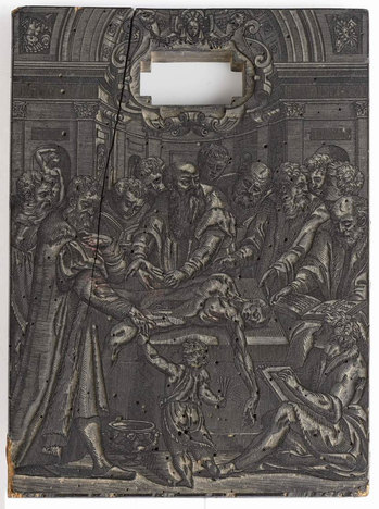
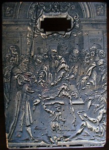
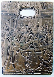
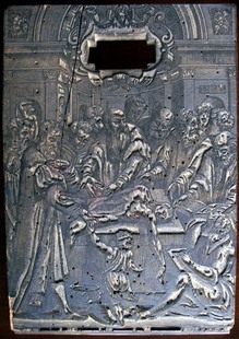
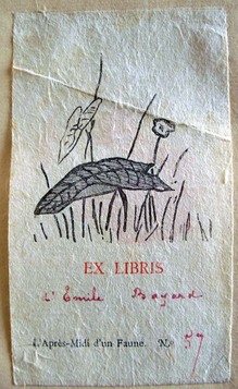
Realdo Colombo (ca. 1510-1559), Original woodblock for the frontispiece of Colombo’s De re anatomica libri XV (Venice: Vincenzo Valgrisi for Nicolai Bevilacqua, 1559). Pearwood block (291 x 205 mm), with cartouche cut-out at top for the title type inset. Purchased with funds donated by Ronald A. Brown, Class of 1972; G. Scott Clemons, Class of 1990; Dr. Eugene S. Flamm, Class of 1958; Professor Joshua T. Katz; Professor James H. Marrow; Vsevolod A. Onyshkevych, Class of 1983; Dr. Robert J. Ruben, Class of 1955; Mark S. Samuels Lasner; Terry I. Seymour, Class of 1966; W. Allen Scheuch II, Class of 1976; Bruce C. Willsie, Class of 1986; an anonymous donor; the 75th Anniversary Fund of the Friends of the Princeton University Library; and funds from the Princeton University Library. Graphic Arts GAX 2011- in process


woodblock4.jpg
woodblock8.jpg

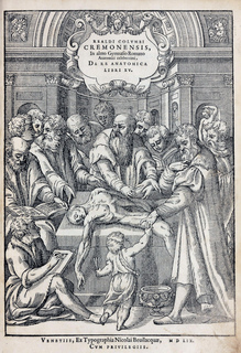
We have acquired the original woodblock for one of the most famous frontispieces in renaissance medical literature and Colombo’s only published work. In 1543, Colombo assumed the position held by Andreas Vesalius (1514-1564), as professor of medicine at the University of Padua and the imagery for Colombo’s frontispiece is a direct reference to the frontispiece of Vesalius’s De humani corporis fabrica libri septem (1543). The scene also has much in common with Donatello (ca. 1386-1466), The Heart of the Miser, in the arrangement of the students and the dangling arm of the cadaver: http://www.shafe.co.uk/crystal/images/lshafe/Donatello_ Miracle_of_ the_ Misers_ Heart_1450.jpg

Ruth Mortimer writes, “The names of Titian and [Giuseppe Porta] Salviati have been mentioned in connection with this cut. Titian, as a friend of Colombo’s. Salviati, by comparison with the title block that he designed on a similar scale for Marcolini’s Sorti in 1540. Salviati was further associated with Marcolini in 1552 and possibly 1556, and Bevilacqua was successor to Marcolini’s press.”

The suggestion that Titian (ca. 1488-1576) may have designed this frontispiece is not surprising, as the artist had many links with the world of Venetian publishing and was known to collaborate with block cutters in the production of prints, such as his vast multiblock Submersion of Pharaoh’s Army and his dynamic Saint Jerome in the Wilderness. In fact, it was one of his students, Jan Steven van Calcar (ca. 1499-ca. 1546), who designed the woodcuts for Vesalius’s anatomy book.

woodblock7.jpg
woodblock.jpg


However, the artist, whoever he was, would have known that he was second choice, since the book was meant to have been a collaboration between Michelangelo Buonarroti (1475-1564) and Realdo Colombo.

In 1548 Colombo moved to Rome and wrote to Duke Cosimo I de’ Medici to explain that he wanted to “pursue my dissections and supervise the painters.” He also mentioned his collaboration with the “greatest painter in the world” on a proposed book of anatomy. The work alluded to would be the De re anatomica libri XV, and the painter was Michelangelo, who planned to design the illustrations. Sadly, Michelangelo never completed the designs and Colombo died during the printing of his only book.

According to Andrea Carlino (“The Book, the Body, the Scalpel: Six Engraved Title Pages…,” RES, Anthropology and Aesthetics [1988]), the extant frontispiece offers several references to the intended collaboration. The doctor performing the dissection is unquestionably Colombo, and the man to the right (left in the block), taking the hand of the putto, bears a resemblance to numerous portraits of Michelangelo. The man with the book might be Vesalius with his Fabrica, which Colombo is trying to correct with this volume. The young artist on the floor might refer to whoever took over after Michelangelo.

Richard Lan writes, “For aesthetic as well as commercial motives, frontispieces in sixteenth-century books were objects of considerable importance, and significant effort and expense were lavished on them on the part of publishers: their two-fold purpose was to summarize the contents of the book in a graphically striking way, often with an allegorical element or a ‘concetto’ in the manner of an emblem book, and to ‘sell’ the book. In sum, illustrated title-pages frequently represent the summit of the graphic arts in the printed book, and have been so acknowledged in several exhibitions and anthologies.”

Little Topsy's Song


topsy.jpg

In the October 21, 1852, issue of Eliza Cook’s Journal, there is an extended article about Harriet Beecher Stowe’s new book Uncle Tom’s Cabin. “Wherever you go,” Cook wrote, “there is Uncle Tom’s Cabin for sale. … Mrs. Harriet Beecher Stowe, an American lady … has now become a household word. It is nearly as superfluous also to say anything about the story with which the people are so familiar…”

“It is said that the characters are exaggerated. … But it must be remembered that Mrs. Stowe, throughout her work, asserts that the Black race are peculiarly distinguished by active and tender emotions,

which render them more than ordinarily faithful and affectionate,—by great patience, which makes them long-suffering,— and by a sense of, and love for, the ludicrous, which keeps them light-hearted in the midst of suffering. We confess that we are disposed to agree with Mrs. Stowe in these opinions.”

The following year, sheet music for “Little Topsy’s Song” was published with words by Eliza Cook (1818-1896) and music by Asa B. Hutichinson (1823-1884). This edition of the broadside was issued in New York City around 1860.

Eliza Cook (1818-1896) , Little Topsy’s Song ([New York]: H. De Marsan, ca. 1860). Graphic Arts GA 2011- in process

Coming: Uncle Tom's Cabin

| 1 Comment
uncle tom.jpg
Coming: Uncle Tom’s Cabin [Broadside] ([United States]: Ora Martin, Inc., [ca. 1925]). Graphic Arts GA 2011- in process

On June 20, 1900, both the New York Times and the Chicago Tribune reported on a panic that occurred during a performance of Uncle Tom’s Cabin in Atlantic Highlands, New Jersey. A tent had been erected to hold an audience of 400 people but the play was so popular that an additional 200 people crowded into the temporary wooden seats.

Just as Little Eva was ready to do her big scene, a section of seating collapsed and forty people fell to the ground. Men pulled out their knives and cut holes in the tent to escape the panicking crowd. Dozens of women fainted and had to be carried out.

The actors attempted to continue the performance but the Captain of Police refused to allow it. Once quiet was restored, members of the audience were offered a refund but most preferred to receive tickets for the next evening’s performance.

That was a travelling company under the management of Orcott and Roberts. Uncle Tom’s Cabin continued to tour well into the 1920s, when this poster announced yet another performance under the management of Ora Martin, Inc.

Seeds on Hard Ground

waits3.jpg

There are 146 chapbooks noted online in Princeton’s Rare Books and Special Collections. Certainly there are many more without any special genre heading. Our newest addition is a chapbook by the musician Tom Waits entitled Seeds on Hard Ground (2011).

waits.jpg
waits2.jpg

Ours is a second edition. The first printing of 1,000 copies sold-out in a matter of minutes. The publishers state, “This will be the final printing and the last chance to purchase this limited edition chap book. The second printing will be limited

to 1000 copies in North America. The street date will be February 28th.” Ours came yesterday.

Tom Waits is releasing Seeds On Hard Ground in collaboration with his label Anti records to raise funds for homeless services in his region and to bring attention to a growing problem in today’s hard times. A book of photographs by Michael O’Brien and poetry by Waits entitled Hard Ground is scheduled for release later this year.

Tom Waits, Seeds on Hard Ground (San Francisco: X-Ray Book Co., 2011). Graphic Arts GAX 2011- in process

The Loss of the Whaling Brig William and Joseph

whaling2.jpg

Elisha Dexter, Narrative of the Loss of Whaling Brig William and Joseph, of Martha’s Vineyard, and the Sufferings of Her Crew for Seven Days, a Part of the Time on a Raft in the Atlantic Ocean: with an appendix, containing some remarks on the whaling business, and descriptions of the mode of killing and taking care of whales: with plates descriptive of some of the principal scenes. 2nd ed. (Boston: Charles C. Mead, 1848). Graphic Arts GAX 2011- in process

whaling4.jpg

According to Dexter, the whaling brig William and Joseph departed Holmes’ Hole on August 2, 1840 in search of sperm whales. They stopped briefly at the Azores and Capre Verde islands before sailing to the West Indies, where they stopped to restock the ship.

In September 1841, the William and Joseph set sail for Boston with 200 barrels of oil. A month later, they were caught in a storm and the ship first capsized and, ten minutes later, righted itself but with significant damage. Over the next week two sailors died and the cargo was lost.


Elisha Dexter had a financial interest in the ship and published this narrative to recoup his losses. OCLC notes only one institutional copy of Dexter’s first edition and ten of the second, enlarged and improved edition. This acquisition will make it eleven.

whaling1.jpg
whaling3.jpg

Sea Monster Spotted 1795

seamonster2.jpg
seamonster.jpg
seamonster3.jpg

Wahre Beschreibung des Seewunders oder Wassermanns, der im letzten Herbst im Venetianischen Meerbusen auf der dalmatischen Küste sich gezeigt hat, und zur Verwunderung und fast Ensetzen von vielen tausend Meschen gesehen worden (Nachrichten aus Italien, 1796). Graphic Arts GAX 2011- in process

This news pamphlet, illustrated with a large woodcut of a merman, gives an account of a sea monster, who supposedly appeared off the coast of Dalmatia near the city of Ragusa, present day Dubrovnik, in October 1795. He was a giant with long flowing hair who walked out of the water and spent time roaming the coast, all the while screaming and gesticulating. He was said to have eaten several young boys.

See also The Merman’s Diversion [harlequinade manuscript] (England. ca. 1776]). Cotsen Children’s Library (CTSN) Manuscripts 23903

Stenography

shorthand2.jpg
“This curious Art will teach you to take down,
The great Affairs of Government and Crown.”

shorthand5.jpg
James Weston (1688-1751), Stenography Compleated, or The Art of Short-Hand Brought to Perfection; Being the Most Easy, Exact, Lineal, Speedy, and Legible Method Extant … (London: Printed for the author, 1727).

shorthand6.jpg
shorthand3.jpg

James Weston (1688-1751) was a London teacher and practitioner of stenography. He published four books, here together in one volume, presenting his own geometrical system of short-hand.

Weston assures the reader that with his system words “can be joined in every sentence, at least two, three, four, five, six, seven, or more words together in one without taking off ye pen, in ye twinkling of an eye, and that by the signs of the English moods, tenses, persons, particles, &c., never before invented.”

He goes on to say, “By this new method any, who can but tolerably write their names in roundhand, may with ease (by this book alone without any teacher) take down from ye speaker’s mouth, any sermon, speech, trial, play, &c, word by word, though they know nothing of Latin. And may likewise read one another’s writing distinctly be it ever so long after it is written. To perform these by any other short-hand method extant is utterly impossible as is evident from ye books themselves.”

Shepherds' Almanac

almanac 15.jpg

almanac 14.jpg

Almanach des Bergers (Shepherd’s Almanac) pour l’année M.DCC.LIX (Liège: V. G. Barnabe, 1759). Graphic Arts GAX 2011- in process

almanac 13.jpg
almanac 16.jpg
almanac 12.jpg

According to the Cambridge History of English and American Literature (v. 18), the first Shepherds’ Calendar was printed in 1491 by Guyot Marchant, whose workshop was in the Latin Quarter of Paris. The work was entitled Kalendrier des Bergiers and it was the first illustrated French almanac.

In Honoré de Balzac’s 1843 novel Illusions Perdues (Lost Illusions), the Shepherds’ almanac plays a small role: “After rummaging round the workshop Eve discovered a collection of figures required for the printing of a so-called Shepherds’ Almanac, in which objects are represented by signs, pictures, and symbols in red, black, and blue. Old Séchard, illiterate as he was, had formerly made a lot of money by printing this little book intended for equally illiterate people. An almanac of this kind costs only a penny and comprises a hundred and twenty-eight pages of very small format. Delighted at the success of her broadsheets—the sort of production which is a specialty with small provincial presses—Madame Séchard decided to print the Shepherds’ Almanac on a large scale by putting her profits into it.” (translated by Herbert James Hunt).

This book comes bound with Almanach pour cette Année M. DCC. LIX. Supputé par Mtte Mathieu Laensbergh Mathematicien (Liege: G. Barnabe, 1759); and Pronostication particuliere pour l’an de notre Seigneur 1759. Par M. Mathieu Laensbergh, Mathematicien (Liege: Guil. Barnabe, 1759); and Continuation des choses les plus remarquables arrivées par toute l’Europe & autres parties du monde, depuis le mois de Septembre de l’An 1757. jusqu’audit mois de l’An 1758 (Liege: V. G. Barnabe, 1759).

Dieter Roth's Book AC

roth 5.jpg
roth 4.jpg
roth 2.jpg
roth 3.jpg

Dieter Roth (1930-1998), Book AC 1958-1964 ([New Haven, Conn.]: Ives-Sillman, 1964). 24 sheets of black and white cut paper. Copy 9 of 250. Graphic Arts GAX 2011- in process.

Book AC is a sequential cut-paper narrative in two-color squares that can be rotated and flipped in all directions. With each turn of the page, a new image is uncovered, offering each reader a unique visual narrative. It was while living in Iceland during the 1950s that Roth began creating handmade books, which can be divided into either fixed (bound) sequences or open architectures.

The Drama of Marinetti

marinetti4.jpg
Mikhail Karasik, The Drama of Marinetti or the Story of How the Leader of World Futurism Flopped in Russia. A Feature-Documentary-Compilatory-Comedy from the Life of Italian and Russian Futurism in Eleven Scenes (St. Petersburg, Russia: Karasik, 2008). Twelve plates with a combination of lithography and offset. Text printed in Russian with a separate English translation laid into a printed box. One of 15 copies. Graphic Arts GAX 2011- in process

marinetti6.jpg
marinetti5.jpg

Artist and historian Mikhail Karasik used old newspaper and literary sources to shed light on the legendary trip to Russia made by Filippo Tommaso Emilio Marinetti (1876-1944), the founder of Futurism.

Karasik writes: “The Triumph of Futurism was the title of a show planned by the director of the new mechanistic and urban movement in modern art. In Russia, however, the production unexpectedly underwent a change of genre, taking the director himself by surprise. The Russian performers—Futurist poets and artists—had been allocated technical walk-on parts.”

Instead of acquiring pupils and associates for his movement, Marinetti found himself up against sabotage and misunderstanding. The Russian Futurists not only refused to recognize Marinetti as their leader but sought to enlarge their own branch of Futurism.

marinetti3.jpg
marinetti2.jpg

It was only towards the end of Marinetti’s trip that the situation improved but the result was the realization that Russian and Italian Futurism had little in common. Italian Futurism promoted urbanism, the cult of technology and machines, and the destruction of tradition and old culture. Russian Futurism focused on folk culture and the Russian icon.

According to Karasik, after the October Revolution, Futurism’s political direction also changed. The Russian branch became Communist (Komfutu was a Communist Futurist organization led by Mayakovsky), while Italian Futurism turned to Fascism.

To see a video of the entire book, click below:

A Unique Book by Callum Innes and Colm Tóibín

conor2.jpg

This winter, the Sean Kelly Gallery in New York City mounted an exhibition of a collaborative project between an artist and a writer. Watercolors by the Scottish painter, Callum Innes, were exhibited alongside excerpts from the short story that inspired them, water | colour, by the Irish writer Colm Tóibín.


conor4.jpg

According to their press release, the gallery introduced Innes and Tóibín in February 2010. A long-time admirer of Innes’s work, Tóibín spoke at length with Innes about the artist’s watercolors during their initial meeting. The conversation was continued at Innes’s studio in Edinburgh last summer. As their creative connections became apparent and their friendship grew, the gallery asked Tóibín to write an essay in response to Innes’s works on paper, a request that led to Tóibín’s short story water | colour. After reading Tóibín’s text, Innes created a new body of watercolors based on it.

conor5.jpg
conor6.jpg

Tóibín’s text tells the story of Nora, a middle-aged housewife struggling with the recent death of her husband and its effect on her family. Tóibín elegantly weaves a poignant tale of loss, depression and, ultimately, the promise of healing, placed against the backdrop of the unique colors of the Irish shoreline.

Not only did the gallery produce an exhibition catalogue with the text and reproductions of the watercolors, but they also published ten unique livres d’artistes, with the complete short story and five original watercolors by Innes. Each of the deluxe, hand-bound books is named after one of the characters in the story. Graphic Arts is fortunate to have acquired conor.

conor3.jpg

Colm Tóibín and Callum Innes, conor, from the series water | colour (New York: Sean Kelly Gallery, 2010). Graphic Arts GAX 2011- in process.

Colm Tóibín is currently the Leonard L. Milberg ‘53 Visiting Lecturer in English and Creative Writing in the Lewis Center for the Arts, Princeton University. If you are a fan, another original story by Tóibín can be found in the current issue of the Princeton University Library Chronicle 72, no.1 (autumn 2010).

Sean Kelly Gallery exhibit: http://www.skny.com/exhibitions/2010-12-16_callum-innes-colm-toibin/

Stéphane Mallarmé and Édouard Manet

| 1 Comment
mallarme12.jpg

Stéphane Mallarmé (1842-1898). L’après-midi d’un faune. Églogue (The Afternoon of a Faun. Eclogue)… avec frontispice, fleurons & cul-de-lampe [par Édouard Manet]. Paris: Alphonse Derenne, 1876. Signed by Mallarmé. Copy 57 of 195. Purchased with funds provided by the Friends of the Princeton University Library. Graphic Arts GA 2011- in process.


In 1865, Stéphane Mallarmé composed a poem about the sensual experiences of a faun who wakes from an afternoon nap and recounts his encounter with several nymphs earlier in the day.

Originally titled Le Faune, intermède héroique (The Faun, a Heroic Intermezzo), Mallarmé submitted it to the Théâtre-Français, only to be rejected. Ten years later, the work was again rejected, under the title Improvisation d’un Faune, by Alphonse Lemerre, who had previously published Mallarmé work in Parnasse contemporain.

mallarme5.jpg
mallarme3.jpg

Mallarmé left Lemerre and found Alphonse Derenne, a publisher of medical books who wanted to expand his business. Under the title L’après-midi d’un faune, Mallarmé’s pastoral was finally published in April 1876. The text was printed in specially designed Elzevir type—175 copies on Van Gelder Holland paper and 20 on Imperial Japon—with particular attention to typography, spacing, and punctuation. His best friend, Édouard Manet (1832-1883), created four wood-engraved embellishments that were printed in black and hand tinted in pink by Manet himself to save money.

Princeton’s copy contains an ex libris with a vignette by Manet mounted on the blank leaf preceding the half title, inscribed with the name of the original owner, the French artist and draftsman Émile-Antoine Bayard (1837-1891). He is best known today for his illustration of Cosette from Les Misérables by Victor Hugo, reused for the Broadway musical by the same name.

mallarme9.jpg

Although Mallarmé is a seminal figure of our modern literary heritage, few editions of his own work were published during his lifetime. Princeton University Library holds 149 editions by Mallarmé but only five published before his death in 1898 and the majority of these are his critical studies of other artists. Rare Books and Special Collections owns the 1889 edition of Les poèmes d’Edgar Poe, translated by Mallarmé with illustrations by Manet. We also have the 1956 translation of L’après-midi d’un faune by Aldous Huxley and a German/French edition from 1975.

Mallarmé’s work would become the inspiration for many musical pieces, the most prominent of which was Claude Debussy’s Prélude à l’après-midi d’un faune (1894), a ten-minute tonal interpretation of Faune. Other composers who adapted the melodic aspects of Mallarmé’s poetry were Maurice Ravel in Trois poèmes de Stéphane Mallarmé (1913), Darius Milhaud with Chansons bas de Stéphane Mallarmé (1917), and Pierre Boullez, whose hour-long solo soprano and orchestra piece Pli selon pli (1957-62).


mallarme8.jpg
The poem also served as the basis for the ballet L’après-midi d’un faune, choreographed by Vaslav Nijinsky for the Ballets Russes and first performed in the Théâtre du Châtelet in Paris on May 29, 1912. Nijinsky danced the main part himself, which became a seminal moment in the history of dance. Faune also inspired ballets by Jerome Robbins and Tim Rushton.

Mallarmé’s poems are notoriously difficult to understand. Proust wrote: “How unfortunate that so gifted a man should become insane every time he takes up the pen.” Here is an excerpt first in the original French and then, in one possible English translation.

Non, mais l’âme
De paroles vacante et ce corps alourdi
Tard succombent au fier silence de midi :
Sans plus il faut dormir en l’oubli du blasphème,
Sur le sable altéré gisant et comme j’aime
Ouvrir ma bouche à l’astre efficace des vins !

Couple, adieu ; je vais voir l’ombre que tu devins.


No, but the soul
Void of words, and this heavy body,
Succumb to noon’s proud silence slowly :
With no more ado, forgetting blasphemy,
I must sleep, lying on the thirsty sand, and how I love
to open my mouth to wine’s celestial effect !

Farewell to you, both: I go to see the shadow you have become.

John Whiting's Brushes

whiting1.jpg
whiting2.jpg

John L. Whiting & Son, Sole Manufacturers of Whiting’s Celebrated Brushes [recto and verso] (Boston: Whiting & Son, printed by Donaldson Brothers, Five Points; no date [ca. 1880]). Graphic Arts ephemera collection, 2011- in process.
*Note, this piece contains offensive language.

Before the contemporary business card, small trade cards were printed to advertise merchandise and services of various businesses. These might be elaborately designed and printed, often with humorous pictures. Towards the end of the nineteenth century, multicolor lithographic printing allowed for beautiful images on these relatively small, ephemeral cards.

Whiting & Son, a Boston firm, went to the Donaldson Brothers printing company in lower east side of Manhattan for their cards because Donaldson specialized in this type of commercial lithography. Note the African American barber. The Whiting brushes are marketed to both black and white owned businesses. Other examples of Donaldson’s cards have been posted earlier on this blog.

For a complete history of John Whiting’s firm, see http://www.efn.org/~marves/en/projects/brush.htm or if this link does not work on your computer, just google John L. Whiting brushes and it will come up.

Platinotypes by William Willis

willis1.jpg
willis2.jpg
willis3.jpg
willis4.jpg

In the early nineteenth century, the American author Nathaniel Parker Willis (1806-1867) wrote a travelogue in the London Quarterly under the heading Pencillings by the Way, collected and published in 1835.

In 1873 William Willis (1841-1923) patented the photographic process he called platinotype and used the popular title for a series of his own pictorial travelogues. In this 1881 album, recently acquired by graphic arts, he writes, “The Pictures in this Book are Photographic Reproductions of Drawings printed in Platinotype and subsequently retouched with crayon by the Artist. The original Drawings were executed with black lead and chalk pencils in the years 1877-78 by W. Willis. Bromley, Kent, July 1881.”

willis5.jpg

William Willis (1841-1923), Willis’s Pencillings in Wales ([Bromley, Kent: Willis], 1881). Graphic Arts GAX 2010- in process

Platinotype is a photographic process using a finely precipitated platinum salt and an iron salt in the sensitizing solution to produce prints in platinum black. Mike Ware describes Willis’s invention in his site Alternative Photography: “Despite the best endeavours of the founders of photography in the 1840’s, nearly fifty years were to elapse before a viable platinum printing process was established by William Willis (1841-1923) who had himself devoted twenty years’ research to perfecting it.”

http://www.mikeware.co.uk/mikeware/Eighth_Metal.html

See also W.Willis, “A Recent Improvement in the Platinotype Process,” Journal of the Camera Club, 2, 47 (1888).

A Mesostic of Words

_HAM0123.jpg

At last week’s College Book Arts Association conference, graphic arts was fortunate to collect a broadsheet printed by artist Ann Hamilton in association with her permanent installation, Verse, at the William Oxley Thompson Memorial Library, Ohio State University. In conjunction with the renovation of their library, the Buckeye Reading Room has been installed with a 6080 square foot, two-color field of words set in relief on a cork floor.

The text is an alphabetic intersection of three different accountings of world history, which are arranged in a literary concordance. The spine along the north-south axis is composed of 299 words, A to Z, adapted from a White River Sioux story entitled The End of the World. The east-west lines intersect this story with prose fragments from A Little History of the World by E. H. Gombrich (1936) and Mirrors: Stories of Almost Everyone by Eduardo Galeano (2009).

According to the library’s press release, Verse in its form and woven organization is a reflection of how the reader intersects with and culls information and meaning from the library’s collection.

_HAM0341.jpg

As part of Hamilton’s continuing exploration of words and communication, the nearly 500 people attending her lecture joined in a communal phone call to the Pulitzer Foundation for the Arts in St. Louis. Hamilton’s work, stylus, is the Pulitzer’s first commissioned installation and the first multi-sensory exploration of Tadao Ando’s architecture.

Annhamilton.pulitzerarts.org explains how you can contribute your voice to the reverberations of stylus. Whether calling in a song, a call, or a story, your words become part of an archive, which over the course of the project, constitutes stylus’s vocal body. (314) 884-1553. Call and add your voice.

The Mind Unveiled

| 1 Comment
kerlin2.jpg
kerlin1.jpg

Dr. Isaac Newton Kerlin (1834-1893) was the Assistant Superintendent of the Pennsylvania Training School for Feeble-Minded Children from 1856 to 1862, first located in Germantown and then, Elwyn, Pennsylvania. After one year as a medic during the Civil War, Kerlin returned to serve as Superintendent until 1893.

As part of a fund-raising campaign in 1858, Kerlin published The Mind Unveiled, which Weston Naef called “the first photographically illustrated medical book published in the United States.” It is an unscientific chronicle of Kerlin’s early years working with twenty-two of the young adults living at his institution.

Copies of this book vary as to the images and number of plates that are included. A copy at the Houghton Library holds two photographic prints and Yale’s has none. The newly acquired copy at Princeton University has one varnished salt print taken by Philadelphia photographer Frederick Gutekunst (1831-1917).

According to Michael J. Brody, Director of the Marvin Samson Center for the History of Pharmacy, Gutekunst learned to make daguerreotypes from Robert Cornelius, founder of Philadelphia’s first photographic studio. In 1856, Frederick and his brother opened a studio of their own on Arch Street, which is where Kerlin came in 1858 to hire someone to illustrate his text.

kerlin4.jpg
kerlin3.jpg

Isaac Newton Kerlin (1834-1893), The Mind Unveiled; or a Brief History of Twenty-Two Imbecile Children (Philadelphia: U. Hunt & Son, 1858). Graphic Arts GAX 2011- in process

Mental Illness in 1876

dagonet2.jpg
dagonet7.jpg

Henri Dagonet (1823-1902), Nouveau traité élémentaire et pratique des maladies mentales, suivi de considérations pratiques sur l’administration des asiles d’aliénés (New Elementary and Practical Treatise on Mental Illness) (Paris: Bailliere, 1876). Graphic Arts GAX 2011- in process.


dagonet1.jpg

When Henry Dagonet (1823-1902) published his first textbook on mental illness in 1862, he didn’t bother with illustrations. Fourteen years later when a second edition was planned, Dagonet corrected this by contacting photographer J. Valette.

Valette created a series of photoglyptie or woodburytype portraits of Dagonet’s patients at Sainte Anne’s asylum in Paris. The images chosen to be published were meant to represent Dagonet’s classification of nine principle mental disorders: Manie (3 portraits); Lypémanie (4 portraits); Stupidité (5 portraits); Mégalomanie (3 portraits); Folie Impulsive (3 portraits); Démence, grouped with Paralysie Générale (5 portraits); Imbécillité-Idiotie (5 portraits); and Cretinismé (5 portraits).

dagonet6.jpg
dagonet5.jpg


dagonet4.jpg
dagonet3.jpg

Around the World or Around the Board

verne4.jpg

Le tour du monde en 80 jours d’après le roman de Jules Verne (Around the World in 80 Days after the novel by Jules Verne) (Paris: [Société Française de Jeux et Jouets, ca. 1915]). Chromolithographed board in the original box. Graphic Arts GAX 2011- in process

verne.jpg


verne3.jpg

If your New Year’s resolution is to follow Phileas Fogg’s attempt to circumnavigate the globe but you don’t have eighty days to spare, you could always play this board game. You begin with Fogg and his French assistant, Jean Passepartout, leaving London at 8:45 p.m. on October 2, 1872. Eighty spaces later, you return on December 21, 1872 to win the bet and 20,000 pounds.

Along the way, you will have to bribe the ship’s engineer to reach Bombay ahead of schedule. You will lose two days helping Aouda, the young Indian woman who was drugged with opium, but she will make an interesting traveling companion later on. You will be reunited with Passepartout in Yokohama, who has been working at a circus to raise the money for your passage home.

verne2.jpg

The box has no publisher or date but we assume “J.J.” stands for the toy publisher Société Française de Jeux et Jouets and other collectors have dated this chromolithographed edition around 1915. An earlier version had a lithographed board with hand coloring.

To see the actual book in its first English edition:
Jules Verne (1826-1905), The Tour of the World in Eighty Days (Boston: J.R. Osgood and company, 1873). William H. Scheide Library 13.2.21

1 2 3 4 5 6 7 8 9 10 11 12 13 14 15 16 17 18 19

Recent Comments

  • Howard Coblentz: I have a round seal shaped like a pear a read more
  • John Overholt: Wikipedia's entry for Sir Francis says: "Throughout Baring's lifetime his read more
  • Serge Rodrigue: It is a precious thing you have a book from read more
  • Colin Wicks: I have a copy of “A Round Game.” And it read more
  • Laurence Hilonowitz: I was a Customer, Friend of Bob Wilson. I Live read more
  • allen scheuch: Absolutely STUNNING! Those colors, those designs made my day! Thanks, read more
  • Olivier: Hello Diane, If you are still looking for an examplare read more
  • Stella Jackson-Smith: I have a framed picture by A.Brouet, signed with the read more
  • John Podeschi: I remember Dale fondly from my days at Yale (1971-1980). read more
  • Joyce Barth: I have some or all of this same poem. I read more