In 1874, the Scottish engineer James Nasmyth and London publisher John Murray prepared and released two simultaneous editions of Nasmyth’s study of the moon. Although the text and pagination is the same, the illustrations are not. Why?
Nasmyth was an amateur astronomer who built his own 20-inch reflecting telescope and made detailed observations of the moon. He was also an amateur photographer and experimented with various ways of making images of the moon. He drew, creating the plaster models, and photographed both the moon itself and his own reproductions.
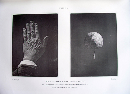
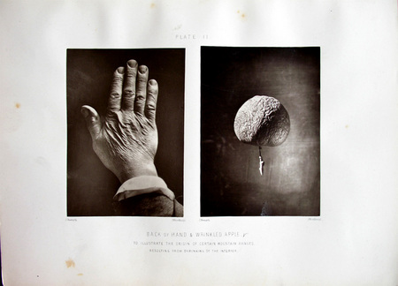
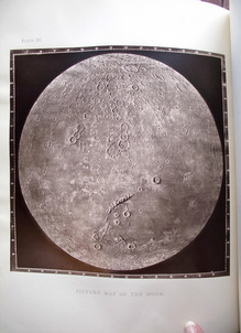
 1st ed., heliotype dated 1865
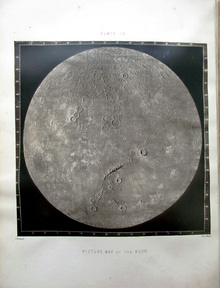
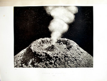 2nd ed., woodburytype dated 1864
It was a time when many men and women were attempting to find the perfect form of reproduction: the durable photograph. One that would not fade or change over time AND could be printed in ink (independent of the action of light), so it could be made on cloudy days.
Heliotypes, autotypes, and woodburytypes were only a few of the non-silver prints made from photographic negatives. Each had their own drawbacks, especially the beautiful woodburytype, which was the most time-consuming. Some publishers preferred the heliotype, which did not have the glossy surface of the woodburytype or the albumen photograph. The autotype was the quickest but didn’t have the detail of the others.
Is it possible that Nasmyth and Murray were experimenting with book illustration, to see which edition would remain true longer? If so, the woodburytype won because the third edition of this book, published in 1885, is listed as having only woodburytypes (not held at Princeton).
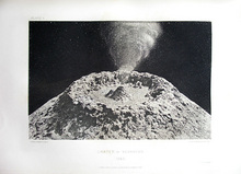
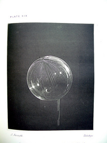 1st ed., single heliotype
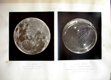 2nd ed., two woodburytypes
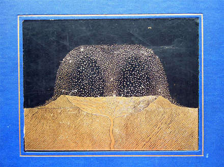
1st ed., front cover
James Nasmyth (1808-1890) and James Carpenter (1840-1899), The Moon: Considered as a Planet, a World, and a Satellite. 1st edition (London: John Murray 1874). Graphic Arts Collection GAX 2012- in process. With 23 plates, including 6 photogravures, 4 heliotypes, 2 lithographs and 1 chromolithograph after drawings or photographs by Nasmyth, 12 mounted photographs on 11 leaves (10 autotypes by Brooks, Day & Son and 2 woodburytypes), and various wood engravings with text.
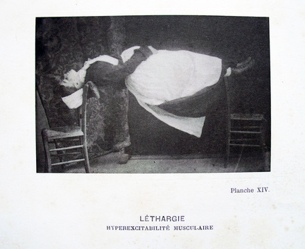
James Nasmyth (1808-1890) and James Carpenter (1840-1899), The Moon: Considered as a Planet, a World, and a Satellite. 2nd edition (London: John Murray 1874). Graphic Arts Collection GAX Oversize 2003-0202Q. Note, frontispiece and plates XII, XIII XVI, and XX are photogravures in the first edition, woodburytypes in second edition; plates II, XIX, XXI, XXIII in first edition are heliotypes, woodburytypes in second edition; plate XIX in first edition has one illustration (glass globe cracked) and two illustrations in second edition (add the full moon); plate III is woodburytype in both editions, but larger in first edition; plate XIV is woodburytype in both editions, but smaller in first edition.


Recent Comments