Recently in Acquisitions Category

"Irish" in six translations

celan6.jpg


celan1.jpg

Irish. Designed by Sol LeWitt (1928-2007); written by Paul Celan; translated by Pierre Joris, Harry Gilonis, Jerome Rothenberg, Edwin Morgan, Anselm Hollo, and Nuala Ní Dhomhnill. Edinburgh: Morning Star, 1977. Celan’s poem in German, with five English translations and one Irish translation. Copy 61 of 100. Graphic Arts (GAX) 2010- in process.

celan2.jpg
celan3.jpg
celan4.jpg
celan5.jpg
celan7.jpg
celan8.jpg

Polyorama Panoptique

| 1 Comment
polyorama
polyorama3
polyorama
polyorama


The polyorama panoptique was first sold in 1822 as a souvenir to visitors of the auditorium-size diorama designed by Louis Jacques Mandé Daguerre (1787-1851). Janet Buerger credits the French optician Lemaire with the invention of the toy viewing device. Simply constructed with a wooden frame and paper bellows, the box holds a single hand-colored lithographic slide that has been pierced with small holes and hidden additions of color, which are illuminated when the light source moves from the front to the back.

megalethoscope.jpg

In the 1870s, the Italian opitian Carlo Ponti adapted the device for the viewing of photographic slides. Unlike Lemaire’s simple boxes, Ponti’s megalethoscopes were often resting on elaborate, carved tables or figures, like our winged lion.

Polyorama Panoptique, Paris, ca. 1850. Graphic Arts (GAX) 2010- in process

Graphodromie. Etching the sound of the word.

cursive3

F. J. Astier (active 1800s), Graphodromie, ou Écriture cursive applicable à tous les idiomes… inventée et adaptée à la langue française. Etchings by Ambroise Tardieu (1788-1841). (Paris: [Pillet for] the author, Pillet, Tardieu, Mme Vve Courcier, 1816). Graphic Arts (GAX) 2010- in process

cursive
cursive5
cursive2

F.J. Astier, the French Minister of the Interior, wrote this treatise on a new form of shorthand or phonetic writing, in which one records the sound of the word rather than transcribing the letters. In theory, this allowed those who could not read or write to copy spoken sentences. He asserts that the system can be learned in less than a month, would increase the amount of work accomplished, and would drastically cut down on administrative paper.

“Astier’s system resembles a printing method elaborated a few years later by Comte de Lasteyrie (1759-1849), who developed a system of printing for the masses that eliminated capital letters, accented vowels, and other ‘unnecessary sorts’ (described in Lasteyrie’s 1837 Typographie économique).” See René Havette, Bibliographie de la Stenographie Française (Paris 1906).

French Sign Painter's Pattern Book

signs2
Sign painter’s pattern book. France, ca. 1880-90. Graphic Arts 2010- in process
signs5
signs4
signs1
signs3
signs7
signs6

A large folio pattern book/trade catalogue of signs and labels for clothing shops has been acquired, holding approximately 205 printed examples on 53 stiff-card leaves, each with a dust sheet. The first 13 signs are double page spreads (20 x 25”); the next 17 are single-page (20 x 13”) and the remainder, mostly three to a page or more, are smaller. They appear to have been printed lithographically and in most cases are varnished. Many incorporate gold printing either in borders or letters. All of the signs in one way or another pertain to clothing (vetements), both in styles Français and Anglais.

Each sign is numbered in pencil along with the price, to facilitate ordering. While the designs are not signed, there is one clue. Both covers, front and rear, are decorated with two large initials, an “A” on the upper cover, and an “L” on the lower cover. Thus the maker’s initials were probably ‘AL.’

Soft reading, with a fringe

In 1897, the Aldershot Cottage Hospital (approximately thirty-five miles from London) finally opened with beds for ten patients. Every fall, the town of Aldershot had been holding a carnival or park fête to raise money in order to build a hospital. Special cloth programs and issues of the Aldershot newspaper were printed on colorful silk/satin and sold as souvenirs. Several of these from the first and second carnivals have been acquired by graphic arts. Note the advertisement on the front page for a typewriter offering visible writing.

The Aldershot News. No. 72, Saturday, November 2, 1895 (Aldershot: printed and published by the Proprietors, Gale and Polden, Ltd., Wellington Works, 1895). Printed on yellow silk. Graphic Arts (GAX) 2010- in process.

The First Aldershot Cyclists and Tradesmen’s Carnival in Aid of the Proposed Cottage Hospital for Aldershot … November 5th, 1894. Official programme. 10 leaves printed on pink silk. Graphic Arts (GAX) 2010- in process.

Official Programme of the Second Annual Hospital Carnival … Wednesday, October 30, 1895. (Aldershot: J. May, Steam Printer, 1895). 10 leaves printed on yellow silk. Graphic Arts (GAX) 2010- in process.

Georges Perec

perec
perec2
Georges Perec (1936-1982). La Vita, Istruzioni per l’Uso (Life: A User’s Manual). Milano: Rizzoli, 2009. Graphic Arts (GAX) 2010- in process.

The “BUR design” series marks the 60th anniversary of the famous pocket series published by Rizzoli. The idea was “to pick out a group of classics and then, entrust each to a well known artist, designer, or architect to be enlarged, mixed up, or submitted to physical transformation. … [creating] books which may be different and yet are still books, books which hide under a new disguise.”

The book chosen here is Georges Perec’s La Vita, Istruzioni per l’Uso (Life: a User’s Manual), which has been transformed by the Italian designer Enzo Mari (born 1932) into a jigsaw puzzle in a Plexiglas frame. The puzzle’s eighteen pieces are each small books with one chapter of Perec’s text, translated into Italian. The work is delivered along with a short volume explaining the project and a copy of the original book.

My thanks to Linda Turzynski who processed this acquisition for us.

Bubbles from the Brunnens of Nassau

| 1 Comment
bubbles3

Eric Quayle writes, “By 1834 the battle was won, and it was then that the first fully cloth-bound book appeared which featured pictorial covers. This was a landmark in book design, and must have caused a considerable stir in the publishing world. The idea seems to have been the brain-child of the author, the eccentric Sir Francis Bond Head (1793-1875). Bubbles from the Brunnens of Nassau was published by John Murray in 1834 … [and] the tipped-in plates of the first edition were described as having been drawn by Burges’s patent Paneidolon.” The first edition sold out, as did the second edition published the same year. (The Collector’s Book of Books. Graphic Arts GARF Z987.Q34Q)

Ellen Morris puts it in anything way, “This period also produced the first full-cover designs: John Murray’s 1834 issue of Bubbles from the Brunnens of Nassau is reputedly the earliest publisher’s cloth binding with a full pictorial design on its cover.” (The Art of Publishers’ Bookbindings 1815-1915 Graphic Arts GA Oversize Z269.3.P8 M67 2000Q)

Princeton has acquired a first edition of Head’s Bubbles with the unusual cover design of a hiker walking across the globe while blowing bubbles stamped, front and back, not on cloth but on vellum. The paneidolon seems to have been a compromise between a camera obscura and a camera lucida, involving a box big enough for the artist’s head and arm, in which one could trace a transmitted image.

bubbles
bubbles2

Sir Francis Bond Head (1793-1875), Bubbles from the Brunnens of Nassau. 1st ed. (London: J. Murray, 1834). Graphic Arts GAX 2010- in process.

Color Printing Samples

| 1 Comment
victorian printing album
victorian printing album2
Victorian Color Printing Album. [London, 1890s]. Graphic Arts (GAX) 2010- in process.

This lovely album of fancy color printing may be a sample book of M. L. Jonas Wolf & co, Ltd, of 21 Australian Avenue, London. The volume offers examples of printing on forty-five unnumbered leaves, with approximately 135 samples (both mounted and unmounted), most of them numbered in pencil on the blank leaf above the sample. A few are dated: 1896 and 1897. Some have M.L. Jonas Wolf’s stamp on the back.


victorian printing album3
victorian printing album7
Judging by the nature of the images here, it seems that the company produced standard, pleasing images designed to be used for decorative purposes such as greetings cards, calendars, menus, advertisements and other mass-produced printed products. The pictures are largely designed to appeal to the dreams of the aspirant middle class: cherubic children and kittens, shepherdesses, lords and ladies in historical dress, soldiers and sailors, and colorful animals.
victorian printing album6
victorian printing album4

The mounted images, which vary from about 200 x 150mm to 450 x 300mm in size, are all numbered in the same hand in pencil, and it is probable that the volume was part reference and part sample book. Annotations read, for instance, “21047 grained block” or “21182 varnished block” or “21061 gelatined, incrusted, block” (the last named being partly raised and gilt, and available as an alternative 21060 without incrustation). Some of the blocks include movables or flaps. One image of a sailor has him climbing up (or down) a real rope. A calendar, pictured above, entitled Sunny Days, has the months concealed by the wings of six butterflies, whose wings can be folded back to check a date.

Vincente Huidobro

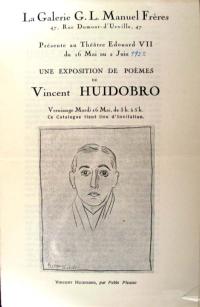
La Galerie G.L. Manuel frères, 47, rue Dumont-d’Urville, 47, présente au Théatre Edouard VII du 16 ma au 2 juin, une exposition de poèmes de Vincent Huidobro([Paris: s.n., Imp. Union), 1922. Graphic Arts (GAX) 2010- in process

In 1916, the Chilean poet Vicente Huidobro (1893-1948) founded a new artistic movement, which he called Creationism. He wrote that a poet shouldn’t just “sing to the rose but make it flower in the poem itself” (Por qué cantáis la rosa, hacedla florecer). Huidobro left Chile and settled in Paris, where he mixed with the Parisian avant-garde, including Pablo Picasso, Juan Gris, Jacques Lipchitz, Joan Miró, and Paul Eluard. In 1921, Huidobro founded the first of several arts journals, this one called Creación (self-published using a family inheritance).

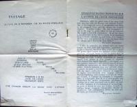
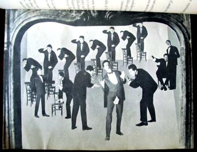
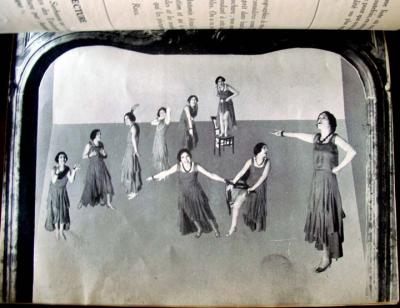
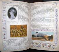
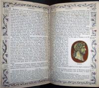
Early in 1922, an exhibition entitled Salle XI opened at Théatre Eduard VII. On the walls were thirteen visual poems by Huidobro, who referred to them as paintings. The exhibition invitation/catalogue (seen here) contains a preface by Maurice Raynal, a portrait of Huidobro by Picasso, and one of Huidobro’s letterpress calligrams titled Paysage (Landscape), dedicated to Picasso.

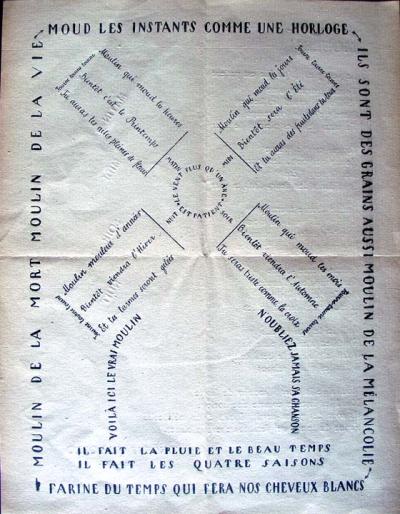
Folded and laid in was the poster/poem/manifesto Moulin, (first published in Creación) whose lines form the image of a windmill, designed by Robert Delaunay. The text of the poem begins at the center, moves outward with verses on each turning blade, and ends with the line at the bottom of the page concerning grey hair. Not long after this, Huidobro abandoned the idea of writing calligrams such as Paysage and Moulin, and began concentrating on the verbal sequence rather than the visual display of words.

See more: The Poet is a Little God: Creationist Verse by Vicente Huidobro (Riverside, CA: Xenos Books, 1990). Firestone Library (F) PQ8097.H8 A17 1990

One possible translation of Paysage:
In the Evening we will stroll down parallel paths
The moon in which you look at yourself
The tree was higher than the mountain
But the mountain was so wide it projected beyond the earth’s edges
The flowing river contains no fish
Do not play on the freshly painted grass
A song leads the sheep toward the stable

Charles Hobson's Trees

hobson5
hobson4
hobson2.jpg
hobson1
hobson6

Charles Hobson, working with the W.S. Merwin, Princeton Class of 1948, poem Trees, has created a new limited edition artists’ book housed in a wooden box. He writes, “The impetus to use palm trees as a visual accompaniment to the poem came from the return address in Hawaii on the letter from W.S. Merwin giving his permission.”

The hinged pages and monotype images can be read horizontally and/or vertically, in daylight or using the tiny flashlight that comes attached to the box. When one shines the flashlight on the tree and through the opening at the back of the book, the light projects mysterious shadows of trees against the the luminous night sky.

Charles Hobson, Trees. Poem by W.S. Merwin (San Francisco: Pacific Editions, 2010). Copy 8 of 30. Graphic Arts (GAX) 2010- in process. For more information, see http://www.charleshobson.com/books/trees.html.

Louis Prang, 1824-1909

Between 1864 and 1876, the American printmaker Louis Prang (born in Poland, 1824-1909) issued a series of collectable albums, offering examples of his company’s brilliant chromolithographs, or Prang’s Chromos, as they were called. The cards were issued in sets of twelve, presented together on double page spreads as seen here. This album contains twelve scenes each of the Hudson River, Central Park, birds, ferns and mosses, leaves, roses, butterflies, fruit blossoms, wild flowers, and pansies.

Chiaroscuro watermark

This sheet of handmade paper comes from the Fabriano Paper Mill in Milan. In regular light, it looks like a blank sheet but when you hold it to the light, the watermark becomes visible. The image, which is a reproduction of Gentile da Fabriano’s “Coronation of the Virgin,” comes from the variations in thinness or thickness in the paper.

The watermark begins with the Italian artisan Annarita Librari carving the engraving in wax; a process that may take from five months to a year to complete. Copper dies (positive & negative) are made from the wax sculpture. The dies are pressed into a brass screen, which will form the papermaking mould. Then, tiny wads of screen must be stuffed and stitched invisibly into the mould as reinforcements in all the cavities, such as the forehead or cheeks.

We are fortunate to have acquired two examples of Ms. Librari’s work, one of which is seen here. To see Gentile da Fabriano’s original tempera and gold leaf panel, see: http://www.getty.edu/art/gettyguide/artObjectDetails?artobj=736

Light-and-shade watermark depicting the “Coronation of the Virgin” by the Renaissance painter Gentile da Fabriano (Milan, Fabriano Paper Mill, 2006). Graphic Arts GAX 2010- in process.

Paper Manufacturing in France

If you can’t get to Rare Book School this summer to attend “H-60. History of European and American Papermaking” taught by experts Timothy Barrett and John Bidwell, you might want to peruse the issues of Le Papier. This beautifully designed journal, recently acquired by graphic arts, covers the history, manufacturing, and distribution of paper in France.

Modern paper production began in 1799, when Nicolas Louis Robert (1761-1828) patented a machine to produce a continuous roll of paper rather than form it one sheet at a time. (Note Le Papier still uses a hand paper mould on its cover). Although the modern production methods spread quickly to other countries, France continued to be a center of the paper industry. Le Papier offers articles and advertisements documenting the specific companies selling the equipment, producing the raw materials, and distributing the final product throughout Europe.

Le Papier: revue technique des industries du papier et du livre. Paris, 1898-19??. Graphic Arts GAX 2010- in process

For more on the history of papermaking, see Dard Hunter, Papermaking: The History and Technique of an Ancient Craft (New York: Alfred A. Knopf, 1943). Graphic Arts GAX TS1090 .H816 1943

Die Olympischen Spiele 1936

Ludwig Haymann, Die Olympischen Spiele 1936 (The Olympic Games 1936). With 100 stereographs by Heinrich Hoffmann (Dießen/Ammersee: Raumbild-Verlag Otto Schönstein 1936). Graphic Arts GAX 2010- in process

The German artist Heinrich Hoffmann (1885-1957) was the friend and official photographer for Adolf Hitler (1889-1945). He wrote and illustrated a number of books about Hitler, as well as creating propaganda images for the Hitler government.

Hoffmann was assigned to document the 1936 summer Olympics in Berlin, at which American athlete Jesse Owens (1913-1980) won four gold medals. This volume presents 100 gelatin silver stereographic photographs of the games pasted to leaves and housed in slots along the back cover. A stereo viewer is inserted at the front.

Readers can view three-dimensional images of the opening ceremonies, the architecture of the Olympic Stadium and Village, Adolf Hitler, marching Hitler Youth, competing athletes, Leni Riefenstahl, and many other recognizable figures at the Olympic Games.

Le Theatre Alfred Jarry de l'Hostilite Publique

| 1 Comment

In 1925, the French playwright Roger Vitrac (1899-1952) and artist/director Antonin Artaud (1896-1948) were expelled from the surrealists by André Breton (1896-1966). Together, they conceived and established the Théatre Alfred-Jarry, named in honor of Alfred Jarry (1873-1907) author of Ubu trilogy and inventor of pataphysics. The theater presented radically innovative productions over four seasons, from 1926 to 1929.


Le Theatre Alfred Jarry et l’Hostilite Publique (Paris: Antonin Artaud and Roger Vitrac, 1930). Photomontages by Eli Lotar. Illustrated wrappers by G.L. Roux. Graphic Arts GAX 2010-in process

This small volume offers an overview of the coming season (which was never realized). To illustrate the pamphlet, they hired Romanian photographer Eli Lotar (born Eliazar Lotar Teodoresco, 1905-1969) who prepared nine photomontages, superimposing multiple posed images of the actress Josette Lusson, Vitrac, and Artaud. These are not scenes from a particular play but images directed by Artaud from his imagination.

Susan Sontag wrote a biography of Artaud, noting that his

"work denies that there is any difference between art and thought, between poetry and truth. Despite the breaks in exposition and the varying of "forms" within each work, everything he wrote advances a line of argument. Artaud is always didactic… Artaud is someone who has made a spiritual trip for us—a shaman. It would be presumptuous to reduce the geography of Artaud’s trip to what can be colonized. Its authority lies in the parts that yield nothing for the reader except intense discomfort of the imagination."

A Peep at the Creed-Worshippers

| 1 Comment

Bruce Dorsey writes

“At the end of the 1820s, American Quakers suffered a bitter and long-term division known as the Hicksite schism. Following a … Yearly Meeting in April 1827, a group of Quaker reformers separated themselves from the main body of Friends, and formed their own independent meeting. The schism in the Philadelphia meeting spread rapidly outward in concentric circles disrupting other Quaker meetings throughout North America. By the end of the decade, Philadelphia Quakers had divided into two distinct and hostile factions.” (“Friends Becoming Enemies: Philadelphia Benevolence and the Neglected Era of American Quaker History,” Journal of the Early Republic, 18, no. 3 (Autumn 1998)).

The reformers or Hicksite Quakers thought Orthodox publications linking the Friends with traditional Protestant doctrines were attempts to impose a creed on Quakerism, “an engine of oppression and restraint against the freedom of mind….” They responded with their own publications, of which this is one. Published anonymously, the “hole in the wall” refers to James Parnell, a Quaker martyr, who was jailed and forced to sleep in a hole far up on the cell wall. One day, while climbing up he fell and died.

The leader of the reform movement and their namesake was Elias Hicks (1748-1830). Hicks preached obedience to the light within, a phrase used in Hole in the Wall, leading some to believe the anonymous author was Hicks. The book is surprisingly illustrated with three copper plate engravings, rather than the customary wood engravings. Hicks’s cousin painter Edward Hicks (1780-1849) was also a member of the Hicksite Quakers and may have helped Elias with the creation of these naïve works.

Hole in the Wall: or a Peep at the Creed-Worshippers. Embellished with cuts by the author. [S.l.: s.n.], 1828. Graphic Arts GAX 2010- in process. Gift of David B. Long, in honor of Gillett G. Griffin.

Asamblea de Artistas Revolucionarios de Oaxaca

| 1 Comment

The Asamblea de Artistas Revolucionarios de Oaxaca (Assembly of Revolutionary Artists of Oaxaca or ASARO) grew out of the 2006 Oaxaca teachers’ strike and the violence that followed. ASARO formed as a collective, no individual artist’s names are used, working in a variety of mediums to commemorate public actions and critique political responses. For instance, the print above documents the army’s use of helicopters to drop chemicals on peaceful protesters. Graphic Arts has acquired forty-nine woodcuts, stencils, and poster by ASARO, many as large as 100 x 70 cm.

http://asar-oaxaca.blogspot.com/

http://www.artslant.com/chi/articles/show/16050

A bilingual interview with ASARO was published by the Houston (Texas) Independent Media Center in 2008.

Here are a few segments: Retomamos la forma de asamblea, porque creemos en la posibilidad de recuperación de la fuerza comunitaria en el arte, y porque la asamblea es al forma en que los pueblos dialogan y toman decisiones basadas en los intereses colectivos. De esta manera, respondemos también ante el llamado de la APPO, conformar un frente amplio de resistencia civil. (We have retaken the form of the assembly because we believe in the possibility to recover the power of the collective in art and because the assembly is the form in which the pueblos have a dialogue and hold decisions based on collective interests. In this way, we respond as well before the call of the APPO to create an ample front of civil resistance.)

Proponemos, iniciar un movimiento artístico, donde el fin sea el contacto directo con la gente, en las calles y espacios públicos. (We seek to initiate an artistic movement where the final goal is direct contact with people in the streets and in public spaces.)

Creemos que el arte publico (diversas disciplinas artísticas) es una forma de comunicación que permiten el dialogo con todos los sectores de la sociedad y hacen posible la visualización de las condiciones reales de existencia, las normas y contradicciones de la sociedad que habitamos. (We believe that public art (in all its diverse artistic disciplines) is a form of communication that allows a dialogue with all sectors of society and which makes possible the visualization of the real conditions of existence—the norms and contradictions of the society which we all inhabit.)

For the full interview, see http://houston.indymedia.org/news/2008/06/64061.php

See also: Louis E.V. Nevaer. Protest Graffiti-Mexico: Oaxaca (New York, NY: Mark Batty, 2009.) RECAP: Marquand Library GT3913.16.O29 N48 2009

Reference book with added decoration

These are pages from a reprint of the Roman part of the History and Biography section of the Encyclopaedia Metropolitana, published in Glasgow 1853. A dry book? This copy has been carefully decorated by a reader in the early twentieth century with original borders and illustrations on more than fifty of its pages.

Encyclopaedia Metropolitana or System of Universal Knowledge... (Glasgow: Richard Griffin and Co., 1853). Graphic Arts GAX 2010 -in process.

Hand-painted books by Robaudi and Grivaz

The French painter and illustrator Alcide Theophile Robaudi (1850-1928) first studied with sculptor Gustav Bonardel (1837-1896) and landscape painter Flix Malard in Nice before being accepted into the prestigious École des Beaux-Arts in Paris. There he worked under Jean Leon Gerome (1824-1904) and his later work still shows the influence of Gerome’s academic style. Robaudi became a sought after illustrator, designing plates for such authors as Dumas, George Sands, Balzac, Munger, and Verlaine.

Princeton University was recently given a unique copy of La cité des eaux by the French symbolist poet Henri de Régnier (1864-1936). The volume is completely hand- painted by Robaudi, including the text, in watercolor with gouache highlights. It was created and sumptuously bound for Louis Bougier in 1912, ten years after Régnier’s book of poems was released.

Our anonymous donor also presented us with Edmond Rostand’s Les romanesques (Paris, 1904). Unlike the Robaudi volume, this book is one of ten copies privately published by the painter Eugène Grivaz (1852-1915). Graphic Arts now owns copy no. 3. Each deluxe volume was hand-painted in watercolors and bound in an elegant, decorative binding.

Happy Anniversary Ed Colker

In honor of fifty years of poetry and prints from Ed Colker and his presses Editions du Grenier and Haybarn Press, a new portfolio has just been issued featuring one poem each from fifteen poets and visual responses from Mr. Colker. The letterpress printing is by Bradley Hutchinson and the color lithograph frontispiece was printed by Maurice Sanchez at Derrière L’Etoile Studio. Poets House (10 River Terrace at Murray Street in Lower Manhattan) is mounting an exhibit of the poems & prints by Mr. Colker, with an opening reception on Thursday, July 8, from 6:00-8:00 p.m. The show will be on view through Saturday, September 18 during regular Poets House library hours. Admission Free. http://www.poetshouse.org/progcoming.htm

Ed Colker and Michael Anania, Gathering: Fifteen Poets/Poems (Millwood, NY: Haybarn Press, 2010). Copy 47 of 125. Graphic Arts GAX 2010 -in process.

Contents: Thursday’s child / Michael Anania —Argument / René Char; translated by Mary Ann Caws — Pentecost Sunday in Lahinch / J.A. Collins — Crush #77; Crush #320 / Lea Graham — The price / Robert Hawks — The book is molded from clay / Edmond Jabes (from The book of questions); translated by Rosmarie Waldrop — A sentence to be read upon those who refuse to soar / J. Curtis Johnson — Second threshold, learning to trust in another language; Boulevard, meals in the open air / Catherine Kasper (from Blueprints of the city) — A hundred love sonnets, XII / Pablo Neruda; translated by Audrey Lumsden Kouvel — Vision, a note on astrophysics / Kathleen Norris — Abnormal weather / Deborah Pease — The rainbow is a tree / Abraham Sutzkever; translated by Barnett Zumoff — Unresolved / David Ray Vance — (from The reproduction of profiles) / Rosmarie Waldrop — Praying for rain in Sante Fe (for Don Murdoch) / Jeanne Murray Walker.

The Haybarn Press announcement reads “To mark the 50th year of our fine print editions inspired by poetry and poets, we present Gathering - a new portfolio of fifteen poems and translations … with visual responses by Ed Colker. … The publication is meant as an expression of appreciation for the poets and the works that have joined and illuminated the journey of a half-century. …A color lithograph frontispiece is followed by the artist’s preface and a broadside page with a color vignette for each poem.”

1 2 3 4 5 6 7 8 9 10 11 12 13 14 15 16 17 18 19

Recent Comments

  • Howard Coblentz: I have a round seal shaped like a pear a read more
  • John Overholt: Wikipedia's entry for Sir Francis says: "Throughout Baring's lifetime his read more
  • Serge Rodrigue: It is a precious thing you have a book from read more
  • Colin Wicks: I have a copy of “A Round Game.” And it read more
  • Laurence Hilonowitz: I was a Customer, Friend of Bob Wilson. I Live read more
  • allen scheuch: Absolutely STUNNING! Those colors, those designs made my day! Thanks, read more
  • Olivier: Hello Diane, If you are still looking for an examplare read more
  • Stella Jackson-Smith: I have a framed picture by A.Brouet, signed with the read more
  • John Podeschi: I remember Dale fondly from my days at Yale (1971-1980). read more
  • Joyce Barth: I have some or all of this same poem. I read more