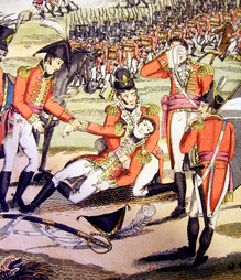
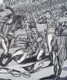
These are close-ups from the Battle of New Orleans and Death of Major General Packenham [sic] on the 8th of January 1815 by Joseph Yeager (ca. 1792-1859) after William Edward West (1788-1857). We are adding the second state of the print to show the change in Major General Lambert’s hand.
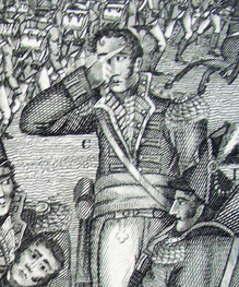
As noted by John Carbonell, “It is usually claimed that there are two states of the West/Yeager engraving; we can tag them respectively the “handkerchief” state and the “finger” state. In the first, General Lambert … is holding a handkerchief to his face. In the second, the handkerchief is gone and Lambert’s exposed index finger points upward.” (John Carbonell, “Prints of the Battle of New Orleans,” in Prints of the American West (1983) (Marquand NE505 .P55)
Why? The folklore around the print states that officers in the Army complained about the view of a soldier crying for his lost comrade and demanded that the handkerchief be removed. The pointing figure was the best the engraver could do without altering more of the composition.
But which Army was complaining? Lambert was a British officer and this print shows the battle from the British point of view. It is, however, an American print published in Philadelphia. Was it the American Army that demanded the change in the British soldier? Was Lambert too sympathetic a figure when the focus of the image was meant to be the death of the British troops?
In addition to the complex iconography, there are five variants of the print, which we often categorize into two first states (with handkerchief) and three second states (without handkerchief). We believe our second print is the 2nd state, 2nd variation.
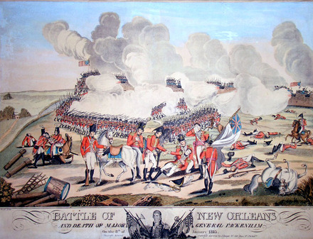
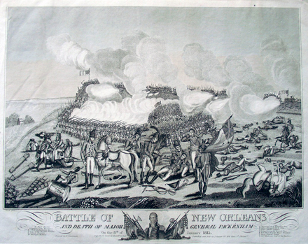
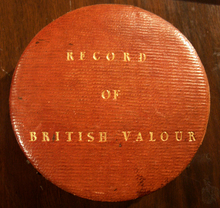
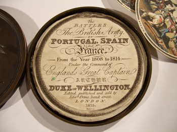
Joseph Yeager (ca. 1792-1859) after a design by William Edward West (1788-1857), The Battle of New Orleans and Death of Major General Packenham on the 8th of January 1815. Philadelphia: Published and Sold by J. Yeager, [1816]. Hand colored engraving. 1st and 2nd state. Purchased in part with support of the Barksdale-Dabney-Henry Fund, 2012.


Recent Comments