Recently in Acquisitions Category

The First Lady of Ephemera, Bella Landauer

| 1 Comment
Bella C. Landauer (1875-1960), Album of calling cards, 1920-1950. Graphic Arts (GAX) 2009- in process

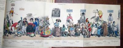
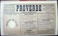
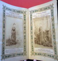
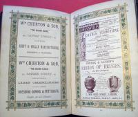
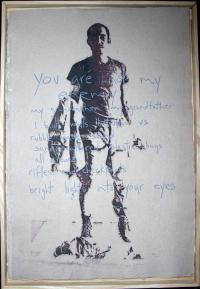
A New York City housewife, who we call the First Lady of American Advertising Ephemera, Bella Landauer bought her first pieces in 1923. Her collection grew, eventually forming one of the largest in the United States, including tradecards, advertising fans, valentines, almanacs, invitations, telegrams, lottery tickets, and more.

When she was out of room at home, Alexander Wall, director of the New-York Historical Society offered her an unused kitchen on the top floor of his building as a workroom. This provided storage, as well as water to help soak the labels off jars and wash other specimens. While the NYHS kept some of the collection, aeronautical material was sent to the Smithsonian Institution, and other groups to the Metropolitan Museum of Art, Dartmouth College, and the Baker Library in Hanover.

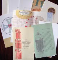
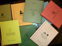
Princeton owns 16 small books about the collection, including Some Alcoholic Americana. Graphic Arts GAX 2004-3749N; Some American Billheads. Firestone NC1810.L23f; and Some Terpsichorean Ephemera. Annex A 4291.558

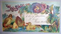
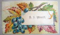
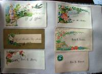
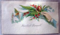
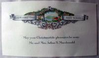
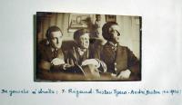
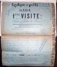
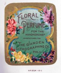
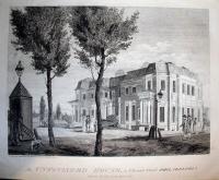
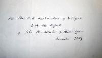
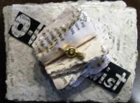
We now own a piece of the collection itself, with this scrapbook, holding 263 calling cards (and a few miscellaneous items) including cards from or signed by Palmer Cox, William Cullen Bryant, Henry W. DeForest and others.

Ogden N. Hood, Class of 1852

Ogden N. Rood (1831-1902), 13 untitled drawings, ca.1880. Graphic Arts (GAX) 2009- in process

Columbia University chemistry professor Ogden Nicholas Rood, Princeton class of 1852, had a passion for the science of color. He published a number of influential books, including Modern Chromatics, with Applications to Art and Industry (Annex A P94.852.051.05) and Students’ Text-Book of Color (ND1259.R67).

Hood made a number of trips to Europe to do research and to paint. Graphic Arts recently acquired thirteen drawing after bas reliefs made by Hood while in Florence. Writing in The American Journal of Science (1903), Arthur Wright commented, “It may be added that Professor Rood’s work upon [Modern Chromatics] was greatly facilitated by his own experience as an artist. As early as his residence in Munich [ca. 1854-58] he had practiced painting in oil, and attached a high degree of proficiency. He had a great skill in drawing, and became expert in painting in water-colors, some of his pictures having been shown at the exhibitions of the Academy of Design in New York.”

Princeton also owns a small collection of letters written by Rood from New York and Germany, 1843-1902. Manuscripts Division CO602

Printed Illumination


Livre d’heures [Book of hours] (Paris: Engelmann et Graf, 1875). Graphic Arts (GAX) 2009- in process

The nineteenth-century French artist Godefroy Engelmann I (1788-1839) studied painting at the Académie des Beaux-Arts but turned his talent to printmaking when he was introduced to the new medium of lithography in 1813. On a trip to Munich, Engelmann purchased a press, stones, and all the equipment needed to set up a studio, which he did in Mulhouse, France, followed by presses in Paris and in London.

Engelmann excelled at color lithography which reproduced the look of chalk drawings and oil paintings for fine art prints. In his twenty years of production, he was responsible for most of the major technical developments of the medium, publishing two important treatises, Manuel du dessinateur lithographe (1822) and Traité théorique et pratique de lithographie (1835-40).

Engelmann’s son Godefroy II (1814-1897) joined the firm in 1837, and merged the business with the publisher Graf to form ‘Engelmann et Graf’. The firm quickly established itself as the leading company in France for the printing of facsimiles of illuminated manuscripts, such as this chromolithographic book of hours.

Parabaik of Myanmar

| 2 Comments


This tiny folded-paper book or parabaik (also spelled parabeik) came to the department with no attribution or provenance. It is untitled and constructed in the traditional Burmese/Myanmar manner, with the heavy paper cut and pasted into one long strip, then folded accordion style and attached to wood boards. The binding has an identical relief decoration on either side, ornamented with glass facets.

The hand-painted text, written in a round Burmese hand, forms circles around animal figures, astrological symbols, and runes. Although we do not have an expert on campus who has been able to translate this lovely volume, the characters do not appear to form complete sentences, but are perhaps the sounds or syllables that form magical chants or charms.

Untitled book of charms [parabaik], 20th century. Gift of Alfred L. Bush. Graphic Arts (GAX) 2009- in process

Charles Philipon's La Caricature

| 1 Comment

La Caricature, journal fondé et dirigé par Charles Philipon (Paris: Aubert, 1830-1835). Année 1-5, v. 1-10, no. 1-251; 4 nov. 1830-27 août 1835. Graphic Arts (GAX) 2009- in process


Princeton’s Rare Books and Special Collections recently acquired a complete set of La Caricature in the original publisher’s binding, with all lithographs and advertisements as originally published.


Following the July revolution of 1830, the citizen-king Louis-Philippe took over the French throne. Artist Charles Philipon (1800-1862) took advantage of a relaxation in censorship laws to establish La Caricature, a journal of politics and art. Through 251 issues—four pages with two or three lithographs in each—over five years from 1830 to 1835, La Caricature become the most famous of all the nineteenth-century satirical magazines.

The major contributors were Honoré Daumier (1808-1879) and J.J. Grandville (Jean Ignace Isidore Gérard, 1803-1847) but there were also lithographs by Henry-Bonaventure Monnier (1799-1877), Denis-August-Marie Raffet (1804-1860), Paul Gavarni (1804-1866), Charles Joseph Traviés de Villers (1804-1859), and others.


Included in this set are the first 15 plates (out of 24 published) of the Mensuelle supplements. As the text and images of La Caricature became more and more aggressive in their attacks on Louis-Philippe, the magazine was seized over a dozen times, the publishers repeatedly prosecuted, and Philipon served a year in jail. To cover legal costs, Philipon and his brother-in-law Gabriel Aubert created a special edition of La Caricature: L’Association pour la liberté de la presse (or Association mensuelle lithographique).

Association members paid an extra franc above the regular subscription price of 52 francs and received one extra lithograph. Although subscribers were galvanized behind demands for freedom of the press, the French government succeeded in passing legislation in 1835 that forced La Caricature to close.

Attached is a complete index to the artists and their work in each issue: http://libweb5.princeton.edu/visualmaterials/gapdf/caricature.pdf

24 Nights

24 Nights: The Limited Edition. Music by Eric Clapton, commentary by Derek Taylor, drawings by Peter Blake (Guildford: Genesis Publications, 1991). Graphic Arts division (GAX) 2009- in process

Guitarist Eric Clapton has been playing annual concerts in London’s Albert Hall since 1987. What began as a three-night engagement for his small band has grown in format and duration each year.

In February of 1990, Clapton played 18 concerts with four different bands. These performances were recorded but he was unhappy with the results. Clapton returned in 1991 for a one-month stint, playing 24 concerts using different back-up bands every week. Recordings from 1990 and 1991 were mixed and released at the end of the year as 24 Nights.

This project came at a difficult moment in Clapton’s life because that March his young son died. Many of his friends came forward to offer their support, one of whom was Sir Peter Thomas Blake. A leading artist of the British Pop movement of the 1960s, Blake is perhaps best known for the album cover he designed for Sgt. Pepper’s Lonely Hearts Club Band. Blake not only designed the 1991 album art for Clapton but went on to create a scrapbook/collage of performance and tour remembrances. British journalist Derek Taylor (1932-1997) joined the project, offering a commentary to match Blake’s images. A limited edition two volume set was published to accompany a double CD with 18 live recordings of Clapton playing with Buddy Guy, Robert Cray, Phil Collins, and the National Philharmonic Orchestra.

Vandercook Book

The Vandercook Book (New York: Roni Gross and Barbara Henry, 2009). Edition: 100. Graphic Arts (GAX) 2009- in process

The first Vandercook printing press was developed by Robert Vandercook, working in Chicago in September 1909, and so, this is its one hundredth anniversary. To celebrate, Roni Gross and Barbara Henry at the New York Center for the Book have assembled and published a limited edition box set highlighting the work that master printers across the county are doing on their Vandercooks.

This anniversary edition includes 30 broadsides by 30 diverse printers working with monotype, polymer plates, linoleum, and many other printing surfaces on a variety of papers. A bound pamphlet with essays by Barbara Henry, Henry Morris of Bird & Bull Press, Michael Peich of Aralia Press, Fritze Klinke of NA Graphics, Paul Moxon and Perry Tymeson is also included.

Later this spring, a traveling exhibition of the printed works from this edition can be seen at The Printing Museum in Houston Texas, Rutgers University in New Jersey, Columbia University in New York, The Book Club of California and the University of Washington.

A vandercook blog: http://vandercookpress.info/vanderblog/

ELuArd's dADa jOUrnAl pROverBE

Paul Éluard (1895-1952), editor, Proverbe (No 1, fév. 1920-No 6, juil. 1921). Graphic Arts (GAX) 2009- in process


Graphic Arts recently acquired a complete set of the Dada periodical Proverbe, edited by the French poet Paul Éluard (born Eugène Émile Paul Grindel, 1895-1952). Not only is this an incredibly rare set, difficult to find in its complete six issues, but our copy is extra illustrated with a fabulous array of Dada research materials. These include:

A handwritten letter from Paul Eluard to the French writer Édouard Dujardin (1861-1949) July 1, 1920.

An invitation to the Max Ernst (1891-1976) exhibition at the “Sans Pareil” Gallery in 1920. This show introduced Ernst and his collages to Parisian society.

A vintage photograph of Eluard along with André Breton (1896-1966), Philippe Soupault (1897-1990), Jacques Rigaud (1681-1754) and Serge Charchoune (1888-1975) at the Ernst opening at the “Sans Pareil” Gallery.

A vintage photograph of Tristan Tzara (1896-1963), Breton and Rigaud.

A poster for Excursions et visites dada. 1ère visite: Eglise Saint Julien le Pauvre. Jeudi, 14 avril (1921). Signers include Buffet, Aragon, Arp, Breton, Éluard, Fraenkel, Hussar, Péret, Picabia, Ribemont-Dessaignes, Rigaut, Soupault et Tzara.

An original drawing by Louis Favre (1892-1956) of Celine Arnauld (1885-1952)

An original prospectus and subscription bulletin for Proverbe

Contemporary photographic portraits of Breton and Tzara printed in offset, and press clippings with photographs of Tzara and Éluard from the forties.

The volume is bound in boards with tipped on duplicate wrappers from Proverbe No. 6 Numero Speciale d’Art et Poesie. Also tipped into the volume are seven hand-written pages describing the importance of Proverbe with the original bookseller’s description of this special copy.

McSweeney's

GA 2009- in process

I am catching up on past issues of McSweeney’s.

McSweeney’s was founded in 1998 by Dave Eggers on a mission to published only works rejected by other magazines. Ten years later, artists and authors seek out the magazine to present their latest work. Beyond the literary awards, McSweeney’s has won multiple design awards including AIGA 50 Books Award, AIGA 365 Illustration Award, and the Print Design Regional Award.

Every issue has a unique theme and physical format, such as McSweeney’s 28 shown here. The theme is 21st-century fables with text by Daniel Alarcón, Sheila Heti, Nathan Englander, and five others. A different illustrator worked on each volume and the entire set of eight small books is boxed to form two additional images.

Issue no. 19 comes in a cigar box-type container. Inside you find a stash of “recovered works”: pamphlets, info-cards, and letters such as might be pulled from anyone’s closet, except these include T.C. Boyle’s feral child novella and other equally curious stories.

The current issue has art on every page, bound with a die-cut cover and wrapped in several kinds of cloth. To see the run to date: http://store.mcsweeneys.net/
index.cfm/fuseaction/catalog.list/object_id/9772B00C-B37F-4915-88F8-8ED96E79EBF1/Journals.cfm

Paul Landacre

| 2 Comments

Jake Zeitlin (1902-198) moved to Los Angeles in 1925 and in only two years, was operating one of the most popular bookstores in the city. Nicknamed At the Sign of the Grasshopper because of the symbol on the front, the shop became a local hangout for writers and artists, who browsed the shelves and enjoyed works of visual art in the shop’s small gallery.

One of the local artists Zeitlin introduced to the neighborhood was Paul Landacre (1893-1963) whose first one-man show was held at the bookstore in 1930 and received a favorable reviewed by Arthur Millier in Prints magazine. The Zeitlin’s and the Landacre’s became good friends and Paul’s wife Margaret even worked as a secretary for the bookshop.

When Zeitlin established his own publishing imprint, Primavera Press, Landacre was asked to illustrate many of the books. The first in 1933 was Marguerite Wilbur’s translation of Alexandre Dumas’ gold rush novel A Gil Blas in California. Pictured at the left is a recently acquired sheet of proofs for chapter headings in this book.

1933 was a busy year for Landacre, who submitted designs for the proposed Limited Editions publication of W.H. Hudson’s Green Mansions. Although some proof pages were printed by Grant Dahlstrom, the design was not selected and these chapter headings (top and bottom) were never published. Note, as Jake Wien below reminds us, that Landacre went on to illustrate three future editions for the Club.

For a bibliography of Primavera Press, see A Garland for Jake Zeitlin, on the occasion of his 65th birthday & the anniversary of his 40th year in the book trade (Los Angeles: Grant Dahlstrom & Saul Marks, 1967) Firestone Library (F) 0334.993.37

Horrifying Stories from Chile

| 2 Comments

Guillermo Frommer (born 1953), Relatos espeluznantes [Horrifying Stories] (Santiago, Chile: [printed at the Taller Artes Visuales], 2006). 63 cm. The first volume of the series was published in 2003. This is number two. It is unclear whether there will be others. Graphic Arts Collection (GAX) Oversize 2008-0025E

The Chilean artist Guillermo Frommer had an international education in printmaking. Both his parents were artists and he made his first prints under their direction in Chile. In the 1970s, he studied at the University of Ottawa, Canada, and then, received a degree from the Ontario College of Art in Toronto. His interest in lithography led to a residency at the Tamarind Institute in Albuquerque, New Mexico. Although Tamarind is known primarily for its stone printing, Frommer also worked with xylography, engraving, and silkscreen.

When he returned to Chile in 1987, Frommer joined the Visual Arts Workshop (Taller Artes Visuales or TAV), a printing collective founded in 1974 by artists exempted from the Faculty of Arts at the University of Chile. Today, Frommer is a professor of printing in Santiago and continues to create his own work through the TAV.

L'Exposition surréaliste de 1938

| 1 Comment

Man Ray (1890-1976), Résurrection des mannequins (Paris: Jean Petithory, 1966). 15 gelatin silver photographs. Graphic Arts (GAX) 2008- in process

In 1938, the writer André Breton (1896-1966) and poet Paul Éluard (1895-1952) organized the Exposition Internationale du Surréalisme at the Galerie Beaux-Arts in Paris. Each of fifteen artists were given a dressmaker’s mannequin as their canvas and encouraged to transform the figure in any way they desired. The artists included Salvador Dalí, Óscar Dominguez, Marcel Duchamp, Leo Malet, André Masson, Joan Miró, Wolfgang Paalen, Kurt Seligmann, Yves Tanguy, Marcel Jean, Max Ernst, Espinoza, Maurice Henry, Sonia Mosse, and Man Ray.

Man Ray organized the lighting and photographed the show. Twenty-eight years later, he printed and published a limited edition of these photographs, along with a descriptive text, under the title Résurrection des mannequins. Man Ray designed the binding and pursuaded the great surrealist printer Guy Lévis Mano to design and print the pages.

Princeton’s copy is inscribed by Man Ray to his friend William Copley (1919-1996). In 1947, Copley opened a Los Angeles gallery dedicated to the Surrealists and to Man Ray’s work in particular. When nothing sold, he closed the gallery, purchasing much of the art for his own private collection. In 1979, Copley sold this collection for $6.7 million, at the time the highest auction sale of a single owner’s collection in the United States.

London Illustrated

Joseph John Elliott (1835-1903) and Clarence Edmund Fry (1840-1897) founded the celebrated photography studio of Elliott & Fry in 1863. Their business succeeded by offering noted actors, scientists, politicians, and writers a free photographic portrait, which could then be reproduced on hundreds of cartes-de-visite for sale to the Victorian public. By 1886, they had outgrown their studio at 55 Baker Street, Portman Square, and opened a second branch in South Kensington.

Elliott & Fry received a commission in 1870 to provide photographs for a deluxe London guidebook. Twelve portraits of contemporary actresses and actors were chosen to augment a series of steel engravings. Hundreds of original photographs had to be hand-trimmed and pasted onto pages with lithographed borders to illustrate these volumes. A lively descriptive text provides details on contemporary hotels, parks, clubs, theaters, markets, railway routes, and houses of trade.

Henry Herbert, London (Illustrated). A Complete Guide to the Places of Amusement. 8th edition (London: Herbert, 1879). Graphic Arts (GAX) 2008- in process

Juan Pascoe and Taller Martín Pescador

| 3 Comments

Princeton University library is the fortunate new owner of 84 books, 54 broadsides, and several hundred pieces of printing ephemera handset, hand-printed, and mostly hand-bound by the Mexican master printer Juan Pascoe at the Taller Martín Pescador.


Francisco Segovia, Alquimia de la luz, 1979.

Alfonso D’Aquino, Briznas: poemas;
ilustrados por Dionisio Pascoe, 1997.


Tarjeta para el 20 aniversario del Grupo Mono Blanco (White Monkey, Pascoe’s musical ensemble), 1998.

Born in Chicago in 1946, Pascoe was educated in the United States, while spending vacations at his father’s home in Mixcoac, outside Mexico City. He learned the art of letterpress printing at the age of 25 as an apprentice to Harry Duncan at the Cummington Press in West Branch, Iowa. When Pascoe moved full-time to Mexico in 1973, he set-up a print shop with a renovated nineteenth-century R. Hoe Washington handpress and sets of Spectrum and Garamond type, with Castellar for titling and initials. In 1975, Pascoe established his own imprint, named the Taller Martín Pescador (Kingfisher Workshop) at the suggestion of the writer Roberto Bolaño.

Cartel de El Cuento del Venerable Mono, 2003.

Artemio Rodriguez exhibition poster

From the beginning, Pascoe set all the type by hand, inked and printed each page, and personally sewed each quire into their unpretentious paper covers. As his reputation grew, the projects became more elaborate but the technology remained the same. Authors published at the press include some of the major name in Latin American literature such as Octavio Paz, Gabriel Garciá Márquez, Efraín Huerta, Juan José Arreola, Roberto Bolaño, José Luis Rivas, and Francisco Segovia.

Juan Pascoe, La Mona, 2002

Poemas de Raul Renan: catulinarias & saficas, grabado de Dionisio Pascoe, 1979

Since 1981, Pascoe has worked in a shop outside Tacámbaro, Michoacán. After years researching and published texts on the history of Mexican typography and printing, Taller Martín Pescador has become the foremost source for traditional Mexican graphic arts as well as innovative Latin American literature and poetry.

Cartel de Los signos del zodiaco: doce textos/ escritos por Francisco Hernandez, 1997

Cartel de Dos Villancicos de Sor Juana Ines de la Cruz, 1999


For more information, continue below.

Face powder and cold cream

| 2 Comments

Jarden Lithographing Company, Catalogue and price list of original label designs, talcum wraps, and sachet envelopes in stock (Philadelphia: Jarden Lithographing Company, no date). Graphic Arts (GAX) 2008- in process

This sales catalogue from the Jarden company of Philadelphia offers 60 leaves of chromolithographic plates presenting 181 labels for hair tonic, face powder, cold cream, perfume, and more. The images are not pasted in but printed directly onto the pages.

Lithography was perfected in Europe during the 1790s but it was in American printing companies, such as Jarden in Philadelphia, where the commercial use of color printing really evolved in the second half of the 1800s. For the first time, relatively cheap color images became possible, surpassing the use of stencil or hand-applied color for commercial applications. Up to two dozen oil-based color inks might be used, each from a separate printing stone in perfect registration, to achieve a density and richness of tone. The integration of golds and silvers heighten the metallic shine of the final chromolithograph.

Combat Paper Portfolio

| 1 Comment

You Are Not My Enemy. Combat Paper Portfolio 4 (Vermont: People’s Republic of Paper, 2008). Copy 8 of 8. Graphic Arts (GAX) 2008- in process

After six years in the army…[Drew] Cameron moved to Vermont and took a $10 papermaking course at a community college. Something clicked. He began practicing the trade out of the Green Door Studio artists’ collective in Burlington. One night back in 2007, Cameron took his old fatigues out of the closet. “I hadn’t put that thing on my body since Iraq,” he says. “I was thinking about it systematically at first. Where do I cut? Well, I’ll start with my left arm. Then I started feeling this overwhelming feeling of empowerment and emotional expression. I started ripping and pulling at my uniform until I was down to my skivvies.” From those scraps he created the first sheet of Combat Paper. http://www.veteransforcommonsense.org/articleid/11262

Combat Paper is a publication of the People’s Republic of Paper, a collaboration betwen Iraqi veterans, activists, and artists. This project is conceived & coordinated by Drew Matott, former director of Green Door Studio in Burlington, Vermont, and Drew Cameron, current director of Green Door Studio and an Iraq War Veteran.

Through papermaking workshops veterans use their uniforms worn in combat to create cathartic works of art. The uniforms are cut up, literally beaten to a pulp, and formed into sheets of paper. Veterans use the transformative process of papermaking to reclaim their uniform as art and begin to embrace their experiences as a soldier in war.

For more information on the Combat Paper Project, see: http://www.combatpaper.org/about.html

One of several videos of the project can be seen at: http://www.youtube.com/watch?v=wUtXYCihavw

Early Views of Philadelphia

Album assembled by John McAllister Jr. (1786-1877) containing 26 prints (mounted restrikes of engravings by William Birch and others) and 16 photographs (salted paper prints from glass plate negatives) of streets and buildings in Philadelphia. ca. 1859. Previously owned by Mrs. A. A. Auchincloss, Martin P. Snider, and Jay T. Snider. Graphic Arts (GAX) 2008- in process


The prints and photographs in this album represent some of the earliest images made of Philadelphia. A similar album was given to the Library Company by McAllister’s son, John A. McAllister, in 1886.

John McAllister Sr. (1753-1830) immigrated to America in 1775 and moved to Philadelphia in 1781 where he opened a shop that grew into an optical business specializing in eyeglasses. John McAllister Jr. joined the business in 1807 and listed his occupation as optician. In addition to spectacles, they sold microscopes, spyglasses, magic lanterns, camera lucidas and obscuras, lenses, and other photography equipment. The shop was frequented by the earliest practitioners in photography who became John Jr.’s friends and colleagues.

McAllister was also a noted antiquarian and collector of Philadelphia history. His diary indicates that he hired Frederick Debourg Richards (1822-1903) to photograph the homes of his father and himself, along with other Philadelphia landmarks. Throughout his life, Richards pursued a career as a landscape painter while making his living primarily through photography. He settled in Philadelphia in 1848, opening a daguerreotype studio across from Independence Hall. In the 1850s, like many photographers, Richards made a transition from images on copper plates to paper, forming a partnership with John Betts. Several of the paper prints in this album hold the blind stamp from the studio of Richards and Betts. Other photographs in the album can be attributed to another prominent Philadelphia paper photographer James McClees.

Eight of the restrikes included in this album are from The City of Philadelphia by William Birch (1779-1851), published in 1800. Birch made the engravings “as a memorial of [Philadelphia’s] progress for the first century.” The deluxe edition included hand-colored plates and sold for the enormous sum of $35. Today, this volume is extremely rare and even the loose plates highly collectable. Eight restrikes from his second book, The Country Seats of the United States of North America, published 1809, are also included in this McAllister album.

For a complete list of the salted paper photographs, continue below.

New Year's Gifts for the People

| 1 Comment

J.J. Grandville (1803-1847), Etrennes au Peuple (New Year’s Gifts for the People). Lithograph on China paper. Published in La Caricature, no 113, planche 235, January 3, 1833.

The French caricaturist Jean Ignace Isidore Gérard, working under the pseudonym of J.J. Grandville, created a number of plates for French magazines including Le Silhouette, L’Artiste, Le Charivari, and La Caricature. This satirical scene denounces the repressive actions of the French government under Louis-Philippe, which sought to limit freedom of the press and personal expression. The image presents a man being stabbed in the back and pelted with a rain of iconic objects, including pears (representing Louis-Philippe), crutches (Talleyrand, who was then ambassador in London), a parsley pot (Jean-Charles Persil who attacked the newspapers as a prosecutor under Louis-Philippe), guns, chains, keys, bolts, cross, medals, cords, scissors, hats, bell and shoes, each representing members of the government.

This print is part of a recent donation generously given by Dr. William Helfand, president of the Grolier Club and a consultant to the National Library of Medicine, the Philadelphia Museum of Art and other institutions in areas relating to art and medicine. Dr. Helfand has written five books including Quack, Quack, Quack: the Sellers of Nostrums in Prints, Posters, Ephemera & Books… (GA Oversize 2005-0625Q), and The Picture of Health (Marquand Library N8223 .H44 1991) He has also published a number of articles on prints, caricatures, posters and ephemera relating to pharmacy and medicine. This posting shows only a few of the wonderful eighteenth- and nineteenth-century prints coming to Princeton thanks to Dr. Helfand.

Paul Gavarni (1804-1866), Enfant Terrible, 1833. Lithograph.

Honoré Daumier (1808-1879), Le Malade imaginaire (Hypocondriac), 1833. Lithograph.


After the painting by Thomas Wyck (ca.1616-1677), The Alchemist in his Laboratory. Engraving, ca. 1700.

Engraved by Jean-Jacques de Boissieu (1736-1810) after a drawing by Karl Du Jardin, Les Grands Charlatans, or Charlatan with guitar player and crowd. Engraving (drawing 1657), printed 1772.

O-Livre-Twist and others

| 1 Comment

Maria G. Pisano, Theater of Operations (Plainsboro: Memory Press, 2006). Graphic Arts (GAX) 2008- in process
Maria G. Pisano, O-Livre-Twist (Plainsboro: Pisano, 2001). Graphic Arts (GAX) 2008- in process

Maria Pisano is a book artist, printmaker, and papermaker who publishes limited edition books under the imprint Memory Press. Many of her projects are represented in the graphic arts collection.

The title Theater of Operations refers to the convention of naming a battle as a theatre and the spiral-bound book unfolds to form a miniature stage. Created in response to the first gulf war, the volume is divided into three sections—W A R—each made up of 8 pages cut into additive shapes with images of war laser printed on acidic paper.

O-Livre-Twist is made from a recycled copy of Dicken’s classic.

Hecatombe 9-11 was created in 2007. Pisano writes, “This memorial book is an attempt to come to terms with an experience that is a constant open wound for the nation. It incorporates all the victims’ names along with photographs of destroyed buildings and the impromptu memorials created by loved ones on downtown walls.”

Maria Pisano, Hecatombe 9-11 (Plainsboro: Memory Press, 2007). Graphic Arts (GAX) 2008- in process

The Penographic

…the writer is enabled to use it for 10 or 12 hours with the same ease as with a pencil…!

Patent Penographic or Writing Instrument [broadside] (London: W. Robson & Co., ca.1819). Graphic Arts division GAX 2008- in process

Scheffer’s Penographic, patented in 1819, was one of the first workable fountain pens. Its secret was a flexible tube made of a goose quill and pig’s bladder. Pressure was exerted on a lever and a knob to propel ink into the nib when desired.

1 2 3 4 5 6 7 8 9 10 11 12 13 14 15 16 17 18 19

Recent Comments

  • Howard Coblentz: I have a round seal shaped like a pear a read more
  • John Overholt: Wikipedia's entry for Sir Francis says: "Throughout Baring's lifetime his read more
  • Serge Rodrigue: It is a precious thing you have a book from read more
  • Colin Wicks: I have a copy of “A Round Game.” And it read more
  • Laurence Hilonowitz: I was a Customer, Friend of Bob Wilson. I Live read more
  • allen scheuch: Absolutely STUNNING! Those colors, those designs made my day! Thanks, read more
  • Olivier: Hello Diane, If you are still looking for an examplare read more
  • Stella Jackson-Smith: I have a framed picture by A.Brouet, signed with the read more
  • John Podeschi: I remember Dale fondly from my days at Yale (1971-1980). read more
  • Joyce Barth: I have some or all of this same poem. I read more