Recently in Acquisitions Category

Un espejo de nuestro mundo

Mirror to Our World / Un espejo de nuestra mundo (Chiapas, México: San Cristóbal de Las Casas, 2007). Copy no. 5 of 100. Graphic Arts (GAX) 2008- in process

Recently acquired for the Graphic Arts division is this limited-edition portfolio celebrating the achievements of the Maya photographers in and around San Cristóbal de Las Casas in the Chiapas Highlands. The portfolio was produced under the auspices of the Chiapas Photography Project, which assists and promotes the artistic work of the region’s indigenous peoples. For information, see http://www.chiapasphoto.org/

The Project has developed two distinct programs: the Archivo Fotográfico Indígena / Indigenous Photography Archive (AFI) and Lok’tamayach, Fotógrafos Mayas de Chiapas / Mayan Photographers from Chiapas. The Archive holds over 75,000 photographs by more than 200 photographers from 10 different ethnic groups.

Un espejo de nuestro mundo comes in a cloth slipcase made by Paxku’ Pavlu from Nabenchauk, Zinacantán. The design is taken from a pirik mochebal of the 1970s/80s, which was a type of shawl used by women in Tzotzil-speaking Zinacantán, a community in the Chiapas Highlands. The shawl was worn for everyday activities and has traditionally been characterized by a basket-weave pattern dating from pre-Columbian times. http://www.chiapasphoto.org/shop.html


Petul Hernández Guzmán, Te ants jlo’bile meybil yu’un te jkaxlane. The male clown dressed as a woman is embraced by the white clown. La mujer marucha está abrazada por el ladino, 2001


Genaro Sántiz Gómez, K’in ta Chamula. Celebration in Chamula. Fiesta en Chamula, 1997.

Family Bible. Superfine Edition.

| 10 Comments

New Devotional and Practical Pictorial Family Bible, Containing the Old and New Testaments, Apocrypha, Concordance, and Psalms in Metre… . Superfine Edition. (Philadelphia, PA; Chicago, IL; St. Louis, MO; and Atlanta GA: National Publishing Co., 1879). Gift of Rev. Dr. Stephen White, Princeton’s Episcopal chaplain. Graphic Arts GAX 2008- in process

The King James Bible was the Harry Potter of the nineteenth-century. The family bible might have been the only book purchased for an American home and so, publishers crammed them with additions to make their volume more desirable.

This 1879 edition includes pages with pre-printed photograph holders, space for genealogy, maps, charts, chromolitho-graphed prayers, and 2,500 illustrations.

Also: Illustrations of scenes and incidents in the life of Christ; the cities and towns of the bible; scenes in the life of St. Paul; topographical sketch of Jerusalem and the holy land; the wanderings in the wilderness; illustrations of the tabernacle and Solomon’s temple; scenes in the lives of the patriarchs, prophets and kings of the old testament; illustrations of bible scenes and incidents; animals, birds, insects, etc, of the bible; illustrations of the trees, plants, and flowers of the bible; biographies of the reformers and martyrs, etc.

Together with: Dr. William Smith’s Dictionary of the Bible in which every important scriptural word is full explained, and a complete history of each book of the bible, beautifully illustrated, a history of all the religious denominations of the world, illustrations of the parables of Jesus and proverbs of Solomon, history of the translation of the bible, chronological and other useful tables, treatises, maps, etc., designed to promote and facilitate the study of the sacred scriptures.

We Perish to Publish: The Crumple Press

In the November 11, 2007 issue of The New Yorker, Professor Anthony Grafton, Henry Putnam University Professor of History at Princeton University, wrote about the libraries of the past and what they tell us about the books of the future: http://www.newyorker.com/reporting/
2007/11/05/071105fa_fact_grafton
.

Professor Grafton had more to say on the transformation of reading, writing, and information-storage in the digital age and happily, his words caught the attention of the guys at Crumpled Press. Together they have published an expanded version of the essay, now entitled Codex in Crisis.

Crumpled Press is a small, alternative publisher, which promises books and pamphlets made by hand for a distinctive look and feel. The press is jointly edited by Nicholas Jahr, Jordan Kenneth McIntyre, and Alexander Bick (a Princeton graduate student), who assert that their “books may be purchased for education, enlightenment, trade, and tra-la-la.” They aspire to create an audience for good writing instead of packaging writing for a target audience. “Liberated from the waste and uncrumpled to inspire: this is The Crumpled Press.”

Note: To celebrate Crumpled Press’s third anniversary, there will be a reading 6:00 on July 7 at the Cornelia Street Cafe in New York City. http://www.crumpledpress.org/

Codex in Crisis was published in limited edition of 250 copies and graphic arts is fortunate to have purchased one on the night of its unveiling. Whether copies are still available is doubtful.

Professor Grafton is the author of ten books and the coauthor, editor, coeditor, or translator of nine others. Two collections of essays, Defenders of the Text (1991) and Bring Out Your Dead (2001), cover most of the topics and themes that appeal to him. His current project is a large-scale study of the science of chronology in 16th- and 17th-century Europe: how scholars attempted to assign dates to past events, reconstruct ancient calendars, and reconcile the Bible with competing accounts of the past.

Twenty Volumes of "Phiz"

David Croal Thomson (1855-1930), Life and Labours of Hablôt Knight Browne “Phiz” (London: Chapman and Hall, 1884). 1 vol. in 20, extra-illustrated with 1250 plates. Graphic Arts (GAX) 2008- in process

Newly acquired by the graphic arts division is this unique twenty-volume extra-illustrated copy of Life and Labours of Hablôt Knight Browne. Browne was the 19th-century illustrator best known for his steel-plate etchings and wood engravings for ten books by Charles Dickens.

Dickens was already a popular author when his illustrator Robert Seymour committed suicide. The practically unknown Browne was selected to complete The Pickwick Papers and went on to collaborate with Dickens until 1859. Browne took the nickname “Phiz” to complement Dickens’ penname “Boz.”

As it was originally published in 1884, Thomson’s single volume biography contained an engraved portrait and 130 illustrations (GA Rowlandson 946). Princeton’s unique copy has been vastly expanded to 20 volumes, extra-illustrated with the insertion of more than 1250 plates, including 11 watercolours, 81 pencil and ink drawings (a few with a touch of colour or double-sided), and 11 autograph manuscript items signed by Browne.

Among the manuscripts are a group of charming illustrated letters to Frederick William Cosens, an avid collector of Dickens. Cosens commissioned Browne to furnish him with watercolor drawings of every image he had created for a Dickens novels (more than 400 in all). It has been speculated that this 20 volume set is the work or commission of Cosens, although the provenance is not certain.

These volumes present to researchers not only a wonderful collection of art by one of the great illustrators of the 19th century, but also a number of variant states of the final plates. The sketches and letters provide documentary information about Browne that cannot be obtained elsewhere.

Pathé Baby

| 9 Comments

By the early 1920s, the Société Pathé Frères had built the largest film equipment and production company in the world. To increase their 1922 Christmas sales, they released the first projector meant for home use: the Pathé Baby. Kodak quickly released its own brand of home equipment and film, which found greater popularity and by 1935 Pathé was forced into bankruptcy.

The 9.5 mm Pathé Baby films come in small cassettes holding approximately 30 feet of film that plays for around 60 seconds. What makes it unique is that it has sprocket holes down the center rather than on the sides. The film also has an ingenious little notch cut into each title frame that triggers the projector to stop for a few seconds, even though the operator continues to crank the film, allowing viewers time to read the text.

Princeton's collection of optical devices, and optical prints and photographs, is basically a pre-cinema collection. However, thanks to the help of Professor Rubén Gallo, we recently acquired a 1920s Pathé Baby projector along with approximately 1,000 Pathé films, including natural history, animation, biography, current events, and multi-reel comedies and dramas.

Here is a sample (black & white, no sound):


You need JavaScript turned on and the Flash Player installed to see this video.

There is a group of enthusiasts based in the United Kingdom who still use 9.5 mm film. Their website is www.Pathescope.freeserve.co.uk/Pathe95.htm

Novel Handbill

Handbill for The Comic Novel or Downing St. and the Days of Victoria (London, Feb. 1840). Graphic Arts collection GA2008- in process

This handbill announces that part one of The Comic Novel or Downing St. and the Days of Victoria will appear on February 1, 1840, and parts will continue to appear each month for the next twenty months. It goes on to promise two, or sometimes three, full-page steel engravings with each part, along with wood-engraved head and tail pieces, vignettes, and silhouettes “in as great variety as the story will admit, without too much overburdening the text.” The back page asks for advertisers to buy space in each part, priced by size, with a full page costing 2 pounds, 5 shillings. Each part will be sold to the general public for one shilling.

In the end, the public seems to have lost interest in the series after a few months because only four parts of The Comic Novel were published, each about eight pages including the advertising. This was not uncommon. Only the best loved writers, such as Charles Dickens, could sustain an audience over a year or more.

One contemporary dealer speculates that the writer/illustrator introduced here under the pseudonym “Lynx” might have been John Leech (1817-1864), the caricaturist who would make a name for himself in the following years working for Punch and in 1843 with illustrations for Dickens’ A Christmas Carol. However, there is nothing in the publication to substantiate this guess.

To read more about serial novels of the Victorian period, try

N.N. Feltes, Modes of Production of Victorian Novels, University of Chicago Press, Chicago, 1986. Z326 .F44 1986.

Linda K. Hughes and Michael Lund, The Victorian Serial, University Press of Virginia, Charlottesville, 1991. PR468.P37 H84 1991.

J. Don Vann, Victorian Novels in Serial, MLA, New York, 1985. Z2014.F4 V36 1985.

Graham Law, Serializing Fiction in the Victorian Press, Houndmills [England]; New York: Palgrave, 2000. PR878.P78 L39 2000

Eloísa Cartonera

When Argentina’s economy collapsed in 2001, thousands of people were forced out of work. Some made a meager living by scavenging for scraps of cardboard and paper, which could be sold to recyclers. The scavengers became known as “cartoneros” or the cardboard people. Early in 2003, a group of artists and writers came together to figure out a way to help the cartoneros earn a better wage or find them a more regular employment. From these dreams, the alternative publishing house of Eloísa Cartonera was born.

The seven-person publishing collective includes writer Santiago Vega (who publishes under the name Washington Cucurto) and the visual artist Javier Barilaro. Their small office space in Buenos Aires’ La Boca district is donated by Fernando Laguna, another artist and financial partner. Eloísa Cartonera buys the cardboard at $1.50 a kilo when the market price is $0.30, and uses the material to create unique covers for a series of books, which they sell to finance the purchase of more cardboard. Some cartoneros are also employed to help print the texts and paint the covers.

The books include the work of prominent Argentine authors such as Ricardo Piglia, César Aira, and Rodolfo Enrique. Princeton already owns around 100 titles, ranging from fiction to poetry to comics, and continues to collect thanks to the insight of Latin-American bibliographer Fernando Acosta-Rodriguez. Eloísa Cartonera now has their own website: http://www.eloisacartonera.com.ar/eloisa/home.html and has established similar projects in Peru, Bolivia, and Brazil, where it is called Dulcinéia Catadora.

Soft-cutting

Abraham Bosse (1602-1676), Tractaet in Wat Manieren men of Root Koper Snijden oste Etzen Zal… (Amsterdam: Jacob van Meurs, 1662). Graphic Arts, GA2008. in process

In 1645, Abraham Bosse, an instructor at the Académie royale in Paris, published an engraving manual specifically focused on the technique called taille-douce or soft cutting, which is the cutting of straight lines on soft copper plates. Sixteen wonderfully detailed illustrations show the individual steps of cutting and printing a plate, including the use of a new, rolling press. As the manual continues, Bosse also introduces etching, the more modern printing technique using of baths of acid to cut the lines in the copper.

The book proved quite popular, revised many times and translated into several languages. With each new edition, there are additions and corrections as the practice of etching itself was changing. To collect each variation is to document the progression of technical printing information both practical and historical.

Princeton is fortunate to have not only the first French edition and the first German translation, but has now acquired the rare first Dutch translation. The Dutch edition has, in particular, a section on recipes for the composition of hard varnishes that can be used as an etching ground. Both summer and winter recipes are included, taking into account the changes in humidity that effects the artist’s materials. To compare earlier editions, see:

Abraham Bosse (1602-1676), Traicté des manieres de graver en taille dovce svr l’airin (Paris: Chez ledit Bosse, 1645) Marquand Library (SAX): Rare Books NE1760 .B67
Abraham Bosse (1602-1676), Kunstbüchlein: handelt von der Radier- und Etzkunst (Nürnberg: In Verlegung Paulus Fürsten…, 1652) Rare Books (Ex), NE1760 .B7315 1652s

Marquand Library acquires rare "Dutch Details"

Ed Ruscha (born 1937), Dutch Details (Deventer, The Netherlands: Stichting Octopus / Sonsbeek 71, 1971). 23 pp. with 116 photomechanical illustrations. Edition of 3,000. Marquand Library SPHX TR654.R872 1971q

Edward Ruscha’s books of sequential photomechanical images began in 1963 with Twentysix Gasoline Stations, (GAX 2006-2396N) published in an edition of 400 numbered copies under the imprint “A National Excelsior Publication,” funded by Ruscha himself. The 26 pages offer black and white images of gas stations along Route 66, which Ruscha had taken in 1962. The format had great appeal to him and he went on to produce several dozen other sequential image books over the next few decades. For many historians, Ruscha’s Gasoline Stations represents the beginning of the American artists’ books movement.

1971 was a busy year for Ruscha. He completed five paintings, along with books, films, prints, and drawings, and received a Guggenheim Foundation fellowship. Three books were completed this year: A Few Palm Trees, Records, and Dutch Details. The third was a commission by Sonsbeek ‘71, an international arts exhibition at the Groninger Museum, for which Ruscha was to create a work on site that would then be exhibited. As the plane was approaching The Netherlands, the pilot announced that the weather was bad and he would have more details soon. Ruscha thought, “Dutch details,” and that was the beginning of the project.

Unlike other book projects, Dutch Details is horizontal in format. The images are of bridges and the buildings taken with a hand-held camera. Although the Octopus Foundation published a large edition, the majority of the print run was mistakenly destroyed in a warehouse, and the remaining copies are now highly sought after by Ruscha collectors.

Ruscha said “I don’t want people to go look at these photographs after they are enlarged and they see them on the wall in museums, maybe under the auspice of a museum and consider them to be like a painting … The book, in the end, will be a closer representation of the project.”

Amadou Bamba Day in Harlem

| 2 Comments


Touba / New York (New York: Khelcom Press, 2004). Edition: 45; printed on Kumohadamashi paper. Graphic Arts GAX 2008- in process.

Touba / New York is an examination of the Murid Brotherhood, a Sufi Muslim movement dedicated to the promotion of peace. The word Mouride in Arabic means “one who desires,” and the Mourides are one of the fastest growing religious movement in West Africa.

Once a year, Sheik Mourtada Mbaké, the youngest son of Amadou Bamba and the spiritual leader of the Mourides, travels to Harlem. The growing community of Senegalese expatriates gather around a red-brick building named the House of Islam on 137th Street and Edgecombe Avenue. They come to pay homage to the Sheik and receive his blessing. The week-long celebration begins on July 21 and ends on July 28, Amadou Bamba Day, with a huge parade down 116th street, through Little Senegal. The overwhelming majority of the men and women in this parade were originally from Touba (pronounced ta-wa-ba), the second largest city in Senegal and the location of Bamba’s sacred burial place.

This book grew out of the artist Peter Bogardus’ encounters and travels with descendants of Sheik Bamba and his foremost student, Ibra Fall. Text is printed from woodcuts cut by Peter Bogardus after calligraphy by Sherif Fall and Shaykh Ndiguel Fall. Illustrations include 35 photogravures by Bogardus.

An Album of Gems

| 1 Comment

Cambridge album (Massachusetts: Remick & Rice, 1867). GAX 2007-0085S. Gift of Donald Farren, Class of 1958.

This Cambridge photograph album is dated 1867 and contains 205 gem tintypes, many with hand coloring. The word “Cambridge” on the title page does not refer to the photographs inside but was simply the album brand sold by Remick and Rice, the major producers of gem tintype albums. The album measures 3 1/2 x 3 1/4 inches; with each photo opening measuring 7/8 of an inch high by 5/8 of an inch wide, or about the size of a quarter. This size tintype would fit nicely into a locket, tiepin, or broach.

The tintype was patented in 1856 (thanks for the correction below) but not widely produced until a few years later. The format known as a gem or bon ton was usually made using a multi-lens camera with repeating back and was extremely popular in the United States during the 1860s. They were quick to make, inexpensive to buy (10 cents per dozen), and durable.

For more information, read: Janice Schimmelman, The Tintype in America, 1856-1880 (Philadelphia: American Philosophical Society, 2007). TR375 .S35 2007.
For gem tintypes, see Marcel Safier’s page: http://members.ozemail.com.au/
~msafier/photos/tintypes.html

Anamorphic Self-Portrait by Chuck Close

| 5 Comments

Chuck Close. Self-Portrait (anamorphic), 2007. Publisher: Two Palms. Edition: 4/20. Engraving with embossment on black Twinrocker handmade paper, mounted on wooden box/platform, with polished stainless steel cylinder. 24 x 24 x 12 inches. Printer: Douglas Volle. Acrylic printing plate: David Lasry. GA 2008.

For more than 600 years, artists have been experimenting with spatial illusion to the great delight of the viewing public. A wonderful timeline of experimentation in perspective theory and spatial illusion has been mounted by the Getty at: http://www.getty.edu
/art/exhibitions/geometry/timeline.html
.

One optical technique is the anamorphic or distorted image, meant to be understood only when viewed at an acute angle or through a reflective cylinder. Some well-known examples of anamorphosis in art are the drawings in Leonardo da Vinci’s notebooks or the skull in the foreground of Hans Holbein the Younger’s painting The Ambassadors (1533, National Gallery, London). More recent examples can be seen painted on the stairs leading up to the Philadelphia Museum of Art or the stairs leading out of Pennsylvania Station in New York City.

Last fall, American artist Chuck Close created his first two anamorphic portraits at Two Palms studio in New York, http://www.twopalms.us/, utilizing a complex system of laser engraving and embossing. His Self-Portrait (Anamorphic), now in the collection of graphic arts, is a perfect example of the artist’s belief that “how an artist chooses to do something is often as important as what the artist chooses to do.” The image begins, like all his work, with a straight photographic portrait. His friend Phillip Glass once commented that for Close, the photograph “is simply the carrier for the idea; the occasion for the work to take place.”

Close divided the photograph into sections and painted each section abstractly and yet, when viewed at a distance the image reads as a realistic portrait. Then, a set of these portraits was distorted into a circular pattern, which was engraved by laser onto an acrylic plate. Once inked, the plate was pressed into hand-made paper using an overhead hydraulic press that can exert up to 750 tons of vertical pressure evenly on the paper and plate. The final image can only be seen realistically through a polished cylinder placed in the center of the design.

The graphic arts division at Princeton holds a wonderful collection of optical devices together with a collection of the optical prints and photographs to be used with each device. A small selection is currently on view on the second floor of Rare Books and Special Collections, Firestone Library.

A New Translation of Jayadeva's "Gita-Govinda"

The Gita Govinda or Song of Krishna is considered by many experts to be among the finest examples of Sanskrit poetry. It was written in the 12th century by the great poet, Jayadeva, and describes the relationship between the Krishna and his lover, Radha. The poetry is organized into 12 cantos or chapters, each sub-divided into 24 divisions called Prabandhas, containing couplets grouped into 8, called Ashtapadis.

Kamini. A Cycle of Poems from Jayadeva’s Gita-Govinda. Translated by Andrew Schelling. Designed and printed by Ken Botnick (St. Louis: emdash, 2007). Edition: 65. GAX 2008

The first English translation of Jayadeva’s 1000-year-old songs was by Sir William Jones in 1792. This new translation was completed by the contemporary poet, Andrew Schelling, who selected 29 poems from the 12 cantos to create a suite of poetic images of desire and longing, embracing both introspection and eroticism.

Schelling lives in Boulder, Colorado, where he teaches poetry, Sanskrit, and wilderness writing at Naropa University. He was the 1992 recipient of the Academy of American Poets award for translation and received a Witter Bynner Foundation for Poetry grant in 1996 and 2001. For more of his translations, see: Amaru, Erotic love poems from India. A translation of the Amarushataka by Andrew Schelling (Boston; London: Shambhala, 2004). Indo-European Philology Coll. (Indo). Firestone, PK3791.A43 A812 2004

Printed at emdash Press, Kamini employs 20 colors to capture the various blue manifestations of Krishna. The text is printed in English and Sanskrit, hand-set in Dante type on Bugra paper. The images, photographed by Ken Botnick last spring during a trip to India on a Fulbright grant, were transfered to photo-polymer plates and printed with the letterpress text.

Botnick is professor of visual communications and director of the Nancy Spirtas Kranzberg Studio for the Illustrated Book, at Washington University in St. Louis. He is also the director, designer, and master printer of emdash Press. His career began at the University of Wisconsin, where his classmate Steve Miller had just launched Red Ozier Press. In the fall of 1979, Miller and Botnick received an NEH grant and moved the press New York City, where it ran successfully until 1988. Miller went to the University of Alabama as director of book arts, while Botnick joined Yale University Press as head of art book design and production. In 1997, he moved to St. Louis and Washington University.

Graphic Arts holds a number of Red Ozier editions and two other recent emdash books: Kavya (2003), a series of classical Sanskrit poems collected by Octavio Paz; and In Defense of the Book (2001) by William Gass. These wonderful books are available, without appointment, in the Department of Rare Books and Special Collection reading room.

The Sensation of the Day is the Great National Painting

| 7 Comments

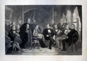
Washington Irving and His Literary Friends at Sunnyside, 1864. Steel line and stipple engraving. 56 x 78.5 cm. Engraving by Thomas Oldham Barlow (1824-1889), after a drawing by Felix Octavius Carr Darley (1822-1888), made from photographs by Mathew B. Brady (1823-1896), in conjunction with an oil painting by Christian Schussele (1824-1879).

Over several weeks in December of 1863, the following advertisement ran in the New York Times: “THE SENSATION OF THE DAY IS THE GREAT NATIONAL PAINTING!! OF WASHINGTON IRVING AND HIS LITERARY FRIENDS AT SUNNYSIDE BY F.O.C. DARLEY AND C. SCHUPELLE [sic] NOW ATTRACTING the attention of lovers of Art and Literature. ON EXHIBITION DAY AND EVENING, at the Derby Galleries, No. 625 Broadway.”

The single painting on view featured Irving in his Hudson River home with fifteen literary friends, including Longfellow, Cooper, Hawthorne, and others. An image of the painting, now at the National Portrait Gallery in Washington D.C., along with complete identification of the sitters can be found at: http://galleries.fototagger.com/link.php?action=detailimage&id=512&sort=0

The painting came quickly after Schussele’s 1862 success with Men of Progress, a similar painting representing nineteen distinguished American inventors. In fact, one 1863 reviewer begins by mentioning the lack of novelty in the design of such works. It was a common format to draw together prominent men, particularly in a time of war, when groups of generals and politicians were often seen in contemporary illustrated newspapers and journals.

However, the Washington Irving painting and engraving found tremendous success with the public. A small booklet was prepared and sold at the gallery describing the making of the two works, along with biographical sketches of each of the sitters.

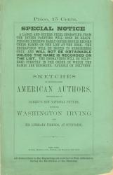
Sketches of Distinguished American Authors, Represented in Darley’s New National Picture Entitled Washington Irving and his Literary Friends, at Sunnyside (New York: Irving Publishing Company, 1864).

According to the booklet and the press, the making of the engraving was a long and elaborate process. The original sketch or design was created by Felix Darley, who has a long history with Irving’s work and with the writer personally. To help with this drawing, Mathew Brady was hired to photograph the individual sitters. Some of these photographs can be seen today at the Library of Congress Prints and Photographs division. According to the Times, another final photograph was taken of the whole design, which is the source the engraver, Thomas Barlow, worked from over a period of three years. In a separate studio, Schussele rendered the work in oil.

The edition had four separate grades and prices. Artist’s proofs sold for $50, proofs before the lettering were $30, India proofs sold for $15, and the final prints for $10. The booklet was an extra 15 cents, which also gave you free admission during the exhibition of the painting. The introductory text of the booklet is so appealing that I include it in full. If you would like to read it, continue below.

The Chain Gang Abroad 1888

J.A. Chain, The Chain Gang Abroad: Around Europe with a Camera ([Denver?], 1888). Photograph album containing 274 mounted albumen prints (many with hand-coloring); captioned and embellished by hand; one photograph laid in. Graphic Arts division GAX in process

The Chain gang included J.A. Chain, a partner in the Denver Chain and Hardy Bookstore; his wife, painter Helen Henderson Chain (1848-1892); and their son Fred. The credit on the title page of this album implies that it was J.A. who created the albumen photographs, but there is good reason to believe the album itself was assembled and embellished by Helen.

Of the 19th-century western artists, Helen Chain was Colorado’s most prominent female painter. She settled in Denver in 1871 but traveled to Europe and to New York to study; in particular, spending one season working in the studio of George Innes. She illustrated several books, including John Lewis Dyer, The Snow-Shoe Itinerant. An Autobiography of the Rev. John L. Dyer. . . (Cincinnati, Published for the author by Cranston & Stowe, 1890). Rare Books: Western Americana Collection (WA) Rollins 0800.

This was a family of travelers, with Helen sketching and painting wherever they went. She was the first women to paint the Mount of the Holy Cross on site in 1877 and five years later, the first to exhibit New Mexico pueblo scenes at the National Academy of Design. The Chains joined photographer William Henry Jackson on a tour of Mexico in 1883 and he might have been their tutor in photography.

The 1888 trip to Europe, documented in this album, began in Dresden and proceeded through Nuremberg, Venice, Rome, and Switzerland. Classic views of well-known landmarks are mixed with very personal scenes, most notably one of Helen in bed with her feet protruding from an enormous comforter. These photographs are each trimmed and mounted with copious notes and decorative painted elements to create a unique, personal journal.

Taking the Stump

| 1 Comment

Taking the Stump or Stephen in Search of His Mother (New York: Currier & Ives, 1860). Lithograph. Graphic Arts division GA2007.04097

This political cartoon sets Democrat Stephen A. Douglas against Republican Abraham Lincoln during the presidential campaign of 1860. From left to right, the figures represent John Bell of Tennessee (Constitutional Union party candidate); John A. Wise (influential Democratic governor of Virginia); Douglas; James Buchanan (Democratic incumbent president); John C. Breckenridge (Buchanan’s vice-president and Democratic candidate); and Lincoln.

An interpretation of the scene comes from Americana dealer William Reese:
The cartoon is a play on the word “stump,” serving as a colloquial expression for both campaigning and a wooden leg. In “taking the stump” to campaign, Douglas is handicapped by a pegleg; in a dialogue balloon he explains his condition to Bell and Wise by stating that he “fell over a big lump of Breckenridge, and have been very lame ever since.” In turn, Breckenridge has his right foot and lower leg wrapped in bandages, and Buchanan presents him with a pegleg, telling his Vice President, “Here, Breck, as Dug [Douglas] has taken the stump, you must stump it too.” Breckenridge, perhaps alluding to his poor showing at the Democratic Party’s May convention, replies, “I suppose I must, but I know it will be of no use, for I feel that I haven’t got a leg to stand on.” Lincoln, leaning against a symbolic split-rail fence and the only figure depicted in casual dress, declares to the others, “Go it yet cripples! Wooden legs are cheap, but a stumping won’t save you.”

More information: Bernard Reilly, American Political Prints 1766-1876 (1991) GA Oversize E183.3.R45 1991Q and Currier & Ives: a Catalogue Raisonne (1983) GA Oversize NE 2312.C8 A4 1983Q.

Souvenirs d'Orient 1878

Félix Bonfils (1831-1885), “St. Sophia at Constantinople,” Souvenirs d’Orient: album pittoresque des sites, villes et ruines les plus remarquables d’Athenes & Constantinople (Alais: Chez l’auteur, 1878). Graphic Arts division GAX 2008. Acquired with matching funds provided by the Program in Hellenic Studies with the support of the Stanley J. Seeger Hellenic Fund.

Completed in only five years, St. Sophia or Hagia Sophia is today a museum in Istanbul, Turkey. What began as a basilica, then a mosque, underwent a full restoration between 1847 and 1849, by the Swiss-Italian architects Gaspare and Giuseppe Fossati. In particular, the minarets were altered to make them equal in height, as seen in this photograph taken by Félix Bonfils taken in the 1870s.

Bonfils opened his first photography studio in Beirut in 1867, working together with his wife and son. They made numerous trips through Europe, the Middle East, and later the Far East. The photographs were sold individually and in luxurious bound albums published out of a second studio in Alès, France.

The introduction to this 1878 album states that the “collection of photographs of the Orient’s principal sites—initiated, executed and completed by Monsieur F. Bonfils with unequaled perseverance—should be regarded as one of the most considerable achievements—picturesque, artistic and scientific—of our epoch.”

For more information on the Bonfils business, see Andrew Szegedy-Maszak, “The Genius of Félix Bonfils,” Archaeology 54, no. 3 (May/June 2001).

How to Make Writing Ink 1659

| 1 Comment

Edward Cocker, The Pen’s Triumph: being a copy-book, containing variety of examples of all hands practised in this nation according to the present mode, adorned with incompatable knots and flourishes… (to be sold with other of the authors works, by John Dowse Stationer, at the great north door of St. Pauls Church London, 1659). 23 (of 27) engraved plates.

This new year’s eve, instead of drinking three pints of wine, why not use it to make your own batch of writing ink? Here’s a recipe written by Edward Cocker (1631-1675). Cocker was a London mathematician and engraver, who taught writing and arithmetic. His extraordinary talent as a calligrapher enabled him to create over 20 copy books, which included alphabets in “German”, “Italian”, “Roman”, and “Print” hands. In addition, his manuals offered instruction in cutting pen nibs, holding the pen, and the making of ink. These actual recipes are rare and Cocker’s continues to be a resource to contemporary artists and historians.

A slightly earlier recipe can be found in the online text A Booke of Secrets: shewing diuers waies to make and prepare all sorts of inke, and colours … Also to write with gold and siluer, or any kind of mettall out of the pen … newly translated into English, by W.P. (London: Printed by Adam Islip for Edward White, and are to be sold at his shop at the little north dore of Pouls, at the signe of the Gun, 1596). Search the title in the main catalog or use your Princeton ID to log into http://wwwlib.umi.com/eebo/image/3783

Cocker is perhaps best-known for his manuals on basic arithmetic, reissued in dozens of editions over several centuries. Graphic Arts holds: Cocker’s Tutor to Arithmetick: being a new and most easie method, so easie that the meanest capacity may understand it at first sight, written and invented by Edward Cocker master in writing; there is also sold with this book that excellent copy-book called The tutor to writing. (London: Printed by R. D. and are to be sold by Tho. Rooks stationer at the Lamb and Ink-bottle at the East-end of S. Paul’s Church, where is also sold all sorts of blanck bonds, [1664]). GAX 2004.3217N

The Natural History of the Lion

| 1 Comment

Wood-engraved block by John S. Horton, for John J. Harrod, The Introduction to the Academical Reader (Baltimore: Harrod, 1830). Hamilton 1742. Woodblock is a gift of David B. Long in honor of Gillett Griffin.

This engraved wood block is signed in the block ‘Horton’. It was produced by the New England wood-engraver John S. Horton to head the chapter “The Natural History of the Lion” in publisher John J. Harrod’s 1830 The Introduction to the Academical Reader. A history of the lion is just one essay in this compilation of “pleasing and instructive pieces … intended to induce and promote the love of learning, virtue, and piety in the minds of juvenile classes of readers.”

The title page offers the inspirational text: “By reading we learn not only the actions and sentiments of different nations and ages, but we transfer to ourselves the knowledge and improvements of the wisest and best of mankind.” Credited to Watts on the Mind, the actual source is The Improvement of the Mind: Containing a Variety of Remarks and Rules for the Attainment and Communication of Useful Knowledge, in Religion, the Sciences, and in Common Life, by Isaac Watts (1674-1748)

Harrod’s book is one of several thousand American imprints illustrated with wood-engravings, identified in the Sinclair Hamilton collection within the graphic arts division. The collection is searchable online as well as in the published catalogue: Early American Book Illustrators and Wood Engravers, 1670-1870 (GA Z1023 .P9 1968).

The process of wood engraving involves the cutting of an image in relief on a hard, end-grain block of wood. The engraver cuts away the parts of the block that are to remain white in the finished image. The hardness of the wood allows the engraver to cut multiple thin lines, creating a more complex image than was possible with the soft matrix used for woodcuts. Wood engraving was the technique of choice for book illustration in the early nineteenth century.

Early Cut-Paper Silhouettes

Long before Kara Walker, there were many folk artists practicing the tradition of cut-paper silhouettes. Pictured above is one page from an album of black paper scenes created by a young girl in memory of her visit to Yverdon in Switzerland. The book is dated Londres 3 Mai 1832 and includes 15 elaborate silhouettes cut from waxed black paper to fit the size of the page. The wax provides a shine that catches the light and adds depth and dimension, not often found in American cut paper work.

Most images are captioned, presumably by the artist, with one entry reading "A ma chere petite Elise en souvenir de son affcte LR." The album has one ownership insciption on the marbled pastedown of P. Atkinson, Belmont, Shipley, with a blindstamp on the free endpaper of the same address.

In 2002, the contemporary artist Kara Walker combined her own black paper silhouettes with the poetry of Toni Morrison for a limited-edition book entitled Five Poems (Las Vegas: Rainmaker Editions, 2002). The book is designed by Peter Rutledge Koch, and printed letterpress from digital imaging and photo-polymer plates at Peter Koch, Printers in Berkeley, California, in a signed edition of 399 numbered and 26 lettered copies. The graphic arts division holds no. 128 (GAX Oversize 2006-0733Q). More of Walker's art can be seen in a retrospective at the Whitney Museum of American Art through February 3, 2008. http://www.whitney.org/www/exhibition/kara_walker/index.html

1 2 3 4 5 6 7 8 9 10 11 12 13 14 15 16 17 18 19

Recent Comments

  • Howard Coblentz: I have a round seal shaped like a pear a read more
  • John Overholt: Wikipedia's entry for Sir Francis says: "Throughout Baring's lifetime his read more
  • Serge Rodrigue: It is a precious thing you have a book from read more
  • Colin Wicks: I have a copy of “A Round Game.” And it read more
  • Laurence Hilonowitz: I was a Customer, Friend of Bob Wilson. I Live read more
  • allen scheuch: Absolutely STUNNING! Those colors, those designs made my day! Thanks, read more
  • Olivier: Hello Diane, If you are still looking for an examplare read more
  • Stella Jackson-Smith: I have a framed picture by A.Brouet, signed with the read more
  • John Podeschi: I remember Dale fondly from my days at Yale (1971-1980). read more
  • Joyce Barth: I have some or all of this same poem. I read more