Recently in Acquisitions Category

I Would Prefer Not To

| No Comments
scanlan7.jpg
Herman Melville (1819-1891) and Joseph Scanlan, Two Views (Brussels: Bartleby & Co., 2003). Copy 26 of 50. Graphic Arts GAX 2010- in process

This artists’ book includes the stories “Bartleby, the Scrivener” by Herman Melville and “Window Stunt” by Joe Scanlan, Professor of Visual Arts in the Lewis Center for the Arts and Director of the Program in Visual Arts at Princeton University. Scanlan first wrote this variation on Melville’s short story in the course of nine straight days, transposing the New York City narrative to Chicago where he was living. The 2003 volume marks his third refinement on Bartleby, this time moving the story to Brooklyn, as Scanlan rewrites the same story over and over again in an effort to make it perfect.

Mr. Scanlan writes, “I was delighted when Thorsten Baensch proposed to me the idea of Two Views. His books are so beautifully realized that I was able to overcome the absurdity of publishing a short story of mine alongside Herman Melville. Thorsten pays great attention to detail and insists on reading being a hands-on experience, from the handmade storage box to the tipped-in plates to the color of thread for the binding.”

“Of course the coup de gras is the stereoscopic viewer that is “hidden” under the cushion for the book. It was my idea to include it—I liked the obvious play on the idea of “two views”—but it was Thorsten who knew there was an extensive stereoscopic image archive at Williams Collge, so he went there and would not leave until he found an image of Wall Street from the same era as Bartleby the Scrivener.”

scanlan5.jpg

A Gift of William Steig Drawings

| 1 Comment
steig1.jpg

The Graphic Arts collection is extremely fortunate to have received a donation of 187 original drawings by William Steig (1907-2003) from the Steig Family estate. These include cartoons for the New Yorker, drawings for his children’s and adult books, and some work that has never been published.


steig12.jpg
steig9.jpg

In his obituary, the New York Times noted that William Steig “graduated from high school when he was 15, and studied for two years at City College in New York, three years at the National Academy of Design and five days at Yale.” Art critic Sarah Boxer went on to note that “in the mid-1930’s, Mr. Steig began making ”symbolic drawings,” pen-and-ink works expressing states of mind. Like the poems of E. E. Cummings, they were subconscious excursions rendered on paper. When these drawings came out, nobody had seen anything quite like them.”


steig10.jpg
steig8.jpg

Steig sold his first drawing to the New Yorker in 1930 and has contributed more than 1600 cartoons to the magazine. His work joins drawings by other great New Yorker cartoonist in our collection, such as Henry Martin, Whitney Darrow Jr., George Booth, and many others. Our library also holds twenty-two books of his wonderful drawings, including Grown-Ups Get To Do All the Driving, Rejected Lovers, Agony in the Kindergarten, and of course, Shrek!


steig11.jpg
steig5.jpg

We are sincerely grateful to Ms. Jeanne Steig and the administrators of the estate for their generosity and assistance in making the donation possible. Please note that Ms. Steig is also a marvelous artist. See an interview at: http://fnewsmagazine.com/wp/2009/11/interview-with-jeanne-steig/


steig7.jpg
steig6.jpg

Drawings by William Marshall Craig

| No Comments
craigwilliam2.jpg
William Marshall Craig (ca. 1765- ca. 1834), Original Drawings by William Marshall Craig painter to Queen Charlotte & H.R.H. Duke of York, together with many of his coloured drawings for the Marquess of Stafford Gallery 1810-12 ([London, early 19th century, some dated 1803 and 1811]). Graphic Arts GA2010- in process

craigwilliam.jpg
craigwilliam3.jpg

The British artist William Marshall Craig (ca. 1765- ca. 1834) painted miniature portraits of the royalty and the aristocracy of late eighteenth and early nineteenth-century London. In this recently acquired sketchbook, we see nine wash drawings and forty-one hand-colored etchings, including “Pleasures of the Imagination” (above). The original poem (published 1743) is by Mark Akenside, but this drawing is oddly accompanied by three lines attributed to George Crabbe.

An illustration to The Tempest, (Act I scene ii), showing Prospero and Miranda (below) is the only drawing fully colored. The album was apparently compiled about a century after Craig’s death. Both the style and the bookplate, which is that of Sir Algernon Tudor-Craig (1873-1943), suggest that it was put together in about 1910-20. According to Christopher Edwards, Tudor-Craig was a herald and an authority on eighteenth-century Chinese armorial porcelain, but he also compiled a catalogue of the library of the Freemasons’ Hall in London.


craigwilliam4.jpg
craigwilliam5.jpg

Craig is best remembered for his course of lectures on drawing, painting, and engraving delivered and then published in 1821 (Firestone ND1130.C9).

The title page of that book recognizes him as “painter to his Royal Highness the Duke of York” and so, it is interesting that his introduction reflects on patronage, in particular. He writes, “Patronage is the proper nutriment of arts, but it should be patronage founded on solid common sense, and on feelings refined by contemplation; or, like deleterious food, it will excite bad habits, and unwholesome usages, in those who receive it.

…An artist may labour for years, and without ceasing to produce works of real excellence; but it is all in vain, unless he find persons qualified to appreciate his powers; and, on the other hand, when youthful talent begins to show its dawnings, the well-informed patron may greatly assist to guide and direct its course, till it arrive at meridian splendour.”


craigwilliam6.jpg
craigwilliam7.jpg

David Godine celebrates 40 years in publishing

| No Comments
godine3.jpg
“It began in a barn with one press and three smart people,” said the fine press publisher David Godine last night at the opening of an exhibition of his books held at the Grolier Club in New York City. While still in his early twenties, Godine rented an abandoned cow barn in Brookline, Massachusetts, for the price of one book a year. 1968 and 1969 were spent fitting it out with the basics—electricity, heat, and plumbing—before he, Lance Hidy, and Martha Rockwell could begin production.

David R. Godine Inc. had three basic guidelines: to offer a wide selection of books of editorial and textual importance; to produce books that delighted the eye and did not offend the purse; and to maintain the highest production standards.

godine.jpg

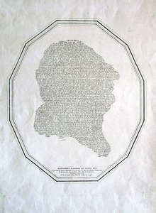
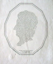
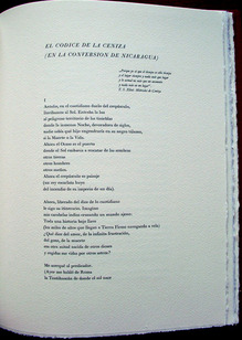
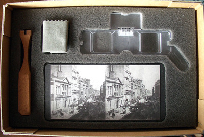
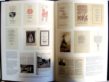
One of their most ambitious early projects was Specimen Days by Walt Whitman (1819-1892). Because of the large edition size, the book was set at Stinehour Press and printed by Meriden Press. “We would be the architects, but not necessarily the builders,” writes Godine. A three-page rave review in the New York Times Sunday Book Review assured the book’s success. “The next day Richard Abel called from Oregon to order five hundred copies. We had never shipped more than three copies of anything to anyone in our history.” (GAX Oversize 2007-0365Q)

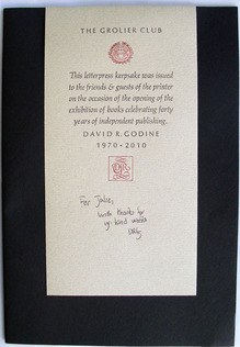
I am one of the fortunate few who walked away last night with a copy of the keepsake Godine wrote and printed for the occasion: David Godine: the Letterpress Years: Offprint from Matrix 29.

godine2.jpg

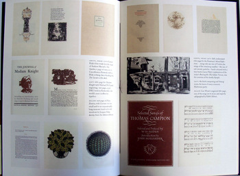
Princeton holds hundreds of Godine books, including eight of his rare imprints from 1969 printed at Leonard Baskin’s Gehenna Press, where Godine was an apprentice while still preparing his own shop:

Henry David Thoreau (1817-1862), Civil Disobedience. Graphic Arts Collection (GA) HM278 .T45 1969

Stephen Spender (1909-1995), Generous Days. Graphic Arts Collection (GAX) 2004-3567N

Joel Barlow (1754-1812), Hasty-pudding; a poem in three cantos written at Chambery in Savoy during January MDCCLXXXXIII. Graphic Arts Off-Site RCPXG-3164531

James Agee (1909-1955), Last letter of James Agee to Father Flye. Graphic Arts Off-Site RCPXG-3164614

Henry David Thoreau (1817-1862), Plea for Captain John Brown. Graphic Arts Collection 2004-3568N

Beatrice Warde (1900-1969), Rescuing mouse: a speech. Graphic Arts 2010-0708N

Andrew Marvell (1621-1678), To his coy mistress. Graphic Arts Off-Site RCPXG-3169583

Arthur Freeman (1938-1970), Assays of bias. Rare Books (Ex) PS3511.R425 A9

For more, see: http://www.godine.com/
and
http://www.grolierclub.org/

Frederick Evans' platinotypes for the Immortal Don

| No Comments
evans4.jpg
Miguel de Cervantes Saavedra (1547-1616), The History of Don Quixote of the Mancha. Translated from the Spanish … by Thomas Shelton, annis 1612, 1620. Introductions by James Fitzmaurice-Kelly, 1896 ([London: privately printed, 1913]). 4 volumes extra-illustrated with 99 platinotypes. Vol. 1 contains an addition title-page: “Illustrations to Cervantes’ Don Quixote by Arthur Boyd Houghton, 1866. Facsimile reproductions in platinotype of Dalziel Brothers’ woodcuts by Frederick H. Evans. Privately printed, MCMXIII.” Graphic Arts GAX 2010- in process.

evans2.jpg
evans9.jpg
This four volume set of Don Quixote belonged to the photographer and bookseller Frederick Henry Evans (1853-1943). The set is extra-illustrated with 99 photographic facimiles of illustrations drawn by Arthur Boyd Houghton (1836-1875) and printed by the Brothers Dalziel (Edward, George, John, Margaret Jane!, and Thomas), the most influential British wood engraving firm in the 1860s and 1870s. Evans made these plates by photographing the ink prints and then, using the negative to make platium (photographic) positives.

evans10.jpg
evans7.jpg
evans3.jpg
evans1.jpg
According to a note from Evans, only three platium prints were made from each negative and then, the negative was destroyed. Evans printed and privately published this edition of three, as he did with a number of classic illustrated books in his personal library. Each volume has two Frederick Evans’ bookplates: one designed by F.C. Tilney and the other an adaptation of the Morte Darthur borders by Aubrey Beardsley (possibly authorized by the artist).

Evans also wrote: “The smaller drawings have been enlarged to make the set uniform in size. These drawings - the most imaginative, respectful and comedically heroic ever made for the immortal Don - have been reproduced in this beautiful photographic process expressly to illustrate the best English translation….”


evans5.jpg
evans8.jpg


And if that is not enough, laid-in is an autographed letter dated 1916, from Charles Ricketts. “Dear Mr. Evans, I remember you quite well and congratulate you on your reproductions of Houghton’s Don Quixote illustrations. …It may interest you to know that Whistler, who admired Houghton greatly, has a special liking for the Don Quixote series which he was the first to bring to my notice. Ever sincerely yours, C. Ricketts”.

http://www.kimeia.com/pdf/history.pdf

Waiting in line for your daily newspaper

| No Comments
postoffice3.jpg
William Endicott, lithographed after a drawing by H. F. Cox, Post Office, San Francisco, California. A Faithful Representation of the Crowds Daily Applying at that Office for Letters and Newspapers. Lithograph. New York: William Endicott & Co., [ca. 1850]. Graphic Arts GA2010- In process

postoffice.jpg
postoffice2.jpg
The California Gold rush began in January 1848, bringing nearly 300,000 people to California. On November 9, 1848, the first San Francisco branch of the United States Post Office opened at the corner of Clay and Pike Streets. During the height of the gold rush, there was no delivery of mail to the mines or to the tent cities of Sacramento and Stockton. Miners had to come to San Francisco, where lines began forming early each morning for the 7:00 a.m. opening.

Notice that there are four lines. On the left, where the sign says “Espanol”, the branch offered Spanish speaking service. In the middle was general delivery and on the right box delivery. Around the corner to the far right was a door where daily newspapers were collected. By October 1849, more than 45,000 letters had piled up undelivered in this post office and the clerks had to barricade themselves in to protect themselves from the crowd.

Harry Twyford Peters (1881-1948), California on Stone (Garden City, N.Y.: Doubleday, Doran & Company, inc., 1935). Graphic Arts: Reference Collection (GARF) Oversize NE2310.C2 P4 1935q

Ted Morgan, A Shovel of Stars: the Making of the American West, 1800 to the Present (New York, NY: Simon & Schuster, 1995). Firestone Library (F) F591 .M865 1995

More Jack Sheppard

| No Comments
jack sheppard20

The Daily Journal. Tuesday 17 November 1724
“Yesterday morning, about nine of the clock, the famous John Sheppard was carried up from the Condemn’d Hold to the Chapel in Newgate, where having heard prayers and received the Holy Sacrament, he was brought down again to the Press-Yard between ten and eleven, when Mr Watson came in the name of the sheriffs to demand his body;

Mr Perry and Mr Reuse … deliver’d the same: Mr Watson told the prisoner, that he must put him on a pair of handcuffs for his security; he vehemently resisted the same, flying into the greatest passion, and endeavour’d to beat the Officers; upon searching him, they found a penknife conceal’d about his cloaths, with which ‘tis apprehended, he design’d to have cut the ropes, and attempted to escape out of the car … .

When he arrived at the Tree, he sent for Mr Applebee, a printer, into the cart, and in the view of several thousands of people, deliver’d to him a printed pamphlet, Entitled, A Narrative of all the Robberies and Escapes of John Sheppard, … which he desired might be forthwith printed and publish’d.”

Portions of this text, written by Sheppard, are reprinted in: The Life and Exploits of Jack Sheppard: a Notorious Housebreaker and Footpad; giving a full acount of his numerous robberies: his escape from the New Prison; his commitment to Newgate; he is tried, and receives sentence of death; his wonderful escape from thence although loaded with irons; he is retaken, confined in the condemned cell, and chained to the floor; then removed to a stronger place in Newgate, called the Castle, from which place he escapes in the night; he is again taken, and secured in Newgate; after which he is hung at Tyburn (Derby: Thomas Richardson; London: Simpkin, Marshall and Co.; Portsea: S. Horsey, [1830?]). Graphic Arts Collection (GAX) 2010-1247N

Newpaper text from: Rictor Norton, “Jack Sheppard, Jail-Breaker,” Early Eighteenth-Century Newspaper Reports: A Sourcebook, 9 October 2003. http://grubstreet.rictornorton.co.uk/sheppard.htm

Sunrise is coming after while

| No Comments
hughes4tp.jpg
Langston Hughes (1902-1967), Sunrise is Coming After While. Poems selected by Maya Angelou; prints by Phoebe Beasley (New York: Limited Editions Club, 1998). Copy 170 of 300. Numbered and signed by Phoebe Beasley and Maya Angelou. Graphic Arts GAX 2010- in process

The Limited Editions Club created and published modern fine press editions for a small group of subscribers. This was a high volume business, with as many as twelve projects completed each year in editions of 1500. The Club was founded and managed by George Macy (1900-1956) from 1929 to 1956; by Helen Macy from 1956 to 1968; and their son Jonathan Macy from 1968 to 1970. During the 1970s, the imprint was bought and sold several times, with little artistic success until 1978, when Sidney Shiff (1924-2010) took over.

hughes.jpg
hughes2.jpg

Under Shiff’s direction, a number of beautiful livres d’artistes were produced highlighting the work of African American writers and artists. For the 1998 season, Shiff contacted the poet Maya Angelou (born Marguerite Annie Johnson, 1928) and LA artist Phoebe Beasley (born 1944) to develop a book of poetry by Langston Hughes (1902-1967). Angelou selected the poems and Beasley responded to them with six brightly colored screen prints. Angelou then completed the volume by writing both an introduction and an afterword. Drexel Press printed Beasley’s plates and the text was designed and hand-set in Monotype perpetua by Michael and Winifred Bixler.

hughes5.jpg
hughes3.jpg

For more information on Angelou, see http://www.nytimes.com/2010/10/27/arts/design/27archive.html?partner=rss&emc=rss
For more information on Beasley, see www.PhoebeBeasley.com
For more information on Hughes, see http://www.langstonhughessociety.org/
For more information on the Limited Editions Club, see http://www.majure.net/lechistory.htm
and
William Burton, “The Decline and Fall of The Limited Editions Club,” American Book Collector (July/August 1980).

hughes6.jpg

First Cuban illustrated book

| 1 Comment
parra7.jpg
parra1.jpg
parra5.jpg
parra6.jpg
parra4.jpg

Born in Portugal, Antonio Parra y Callado traveled to Cuba around 1771 on a commission from Madrid’s newly established Royal Cabinet of Natural History (later called the National Museum of Natural Sciences). The thirty-two-year-old enthusiast, with no academic training, collected plants and seeds to be sent back to the museum’s Botanical Garden.

Parra quickly became fascinated with the Cuban culture, the topography, and the diverse natural history of the Caribbean. His studies expanded, eventually focusing on marine life, collecting and documenting specimens of salt and fresh water fish, crustaceans, corals, eels, turtles, and other marine plant life over the next thirty years.

Parra married and his son, Manuel Antonio Parra y Muñoz, was born in Havana. A talented artist, Manuel joined his father’s research team while still a teen-ager, sketching, etching, and printing images of the specimens they collected. Together they published an exhaustive study of the fish of Cuba, which is believed to be the first scientific treatise published in Cuba, as well as the first Cuban illustrated book.

The volume describes and illustrates sixty different species of fish and twenty-three crustaceans. Among the most interesting is a folding plate following the title page that presents a group of lobsters on an elaborate silver platter. The book’s plates account for nearly one half of the island’s production of printed images in the eighteenth century. Parra established his own Cabinet of Natural History in Havana; I wonder if anyone reading this has been there?

The final chapter, added without explanation, documents a black slave with an enlarged hernia. Identified by researchers at the John Carter Brown Library as Domingo Fernández, this man was one of the first Caribbean slaves to be depicted in a published source.

parra3.jpg

Antonio Parra y Callado (1739-18??), Descripcion de diferentes piezas de historia natural las mas del ramo maritimo: representadas en setenta y cinco laminas (Havana: En la imprenta de la Capitanía General, 1787). 75 copper plate etchings, one hand colored. Graphic Arts (GAX) in process. Purchased with the fund given by Kenneth H. Rockey, Class of 1916, in memory of his wife, Isabel A. Rockey.

nast4.jpg

Bernard Reilly, in his catalogue American Political Prints, 1766-1876, describes this Thomas Nast broadside as “a searing, election-year indictment of four prominent figures in the democratic party.” He continues:

“Former New York governor and democratic presidential nominee Horatio Seymour is portrayed as a ‘rioter.’ Standing in a burning city, he waves his hat in the air while he steps on the back of a crawling figure. In the background a corpse hangs from a lamppost. Between 1862 and 1964 Seymour had opposed Lincoln’s was policies, and he was branded as instigator of the 1863 New York draft riots.”

“Tennessee general Nathan Bedford Forrest, the founder of the Ku Klux Klan, and infamous for his role in the massacre of surrendered Union troops at Fort Pillow, is called ‘The Butcher Forrest.’ He waves a flag labeled ‘No Quarter’ and fires a pistol.”

“Confederate Admiral Raphael Semmes is portrayed as a pirate, wielding a knife in one hand and holding a flaming torch in the other … . Semmes was the scourge of Union shipping during the Civil War. Under his command the Alabama, a British-built ship, captured sixty-two merchant vessels, most of which were burned. An excerpt from Semmes’s July 1868 speech at Mobile, Alabama, appears below this image.”

“Confederate cavalry officer Wade Hampton appears as a hangman. He holds his plumed hat at his side and wears inscribed ‘C.S.A.’ (Confederate States of America). In the distance three Yankee soldiers hang from a gallows.”

Thomas Nast (1840-1902), Leaders of the Democratic Party, 1868. 38 x 24 inches (96 x 61 cm). Wood engraved broadside. Graphic arts GA2010- in process.

Bernard Reilly, American Political Prints, 1766-1876 (Boston, Mass.: G.K. Hall, 1991). Graphic Arts Collection (GA) Oversize E183.3 .R45 1991q.

Tobacco packaging papers

| No Comments

tobacco3.jpg
tobacco4.jpg
tobacco2.jpg

“Tobacco was among the first commodities to be sold in printed paper wrappers,” writes Michael Twyman, in his Enclyclopedia of Ephemera.

“The design element of tobacco papers was normally confined to the centre of the printed sheet, which was large enough to accommodate varying quantities of tobacco. The earliest designs were in the tradition of the bookplate, but later they took on the characteristics of the trade card and were often printed from plates actually designed as trade cards. Engraved pictorial designs were common in Germany, Holland, and France; although almost everywhere they gave way to the crude woodcuts that were to remain the common denominator….”

Here are three recently acquired nineteenth-century examples from Amsterdam.

Maurice Rickards, The Encyclopedia of Ephemera; edited and completed by Michael Twyman, with the assistance of Sally De Beaumont and Amoret Tanner (New York: Routledge, 2000). Graphic Arts: Reference Collection (GARF), Oversize NC1280 .R52 2000q

"Irish" in six translations

| No Comments
celan6.jpg


celan1.jpg

Irish. Designed by Sol LeWitt (1928-2007); written by Paul Celan; translated by Pierre Joris, Harry Gilonis, Jerome Rothenberg, Edwin Morgan, Anselm Hollo, and Nuala Ní Dhomhnill. Edinburgh: Morning Star, 1977. Celan’s poem in German, with five English translations and one Irish translation. Copy 61 of 100. Graphic Arts (GAX) 2010- in process.

celan2.jpg
celan3.jpg
celan4.jpg
celan5.jpg
celan7.jpg
celan8.jpg

Polyorama Panoptique

| 1 Comment
polyorama
polyorama3
polyorama
polyorama


The polyorama panoptique was first sold in 1822 as a souvenir to visitors of the auditorium-size diorama designed by Louis Jacques Mandé Daguerre (1787-1851). Janet Buerger credits the French optician Lemaire with the invention of the toy viewing device. Simply constructed with a wooden frame and paper bellows, the box holds a single hand-colored lithographic slide that has been pierced with small holes and hidden additions of color, which are illuminated when the light source moves from the front to the back.

megalethoscope.jpg

In the 1870s, the Italian opitian Carlo Ponti adapted the device for the viewing of photographic slides. Unlike Lemaire’s simple boxes, Ponti’s megalethoscopes were often resting on elaborate, carved tables or figures, like our winged lion.

Polyorama Panoptique, Paris, ca. 1850. Graphic Arts (GAX) 2010- in process

Graphodromie. Etching the sound of the word.

| No Comments
cursive3

F. J. Astier (active 1800s), Graphodromie, ou Écriture cursive applicable à tous les idiomes… inventée et adaptée à la langue française. Etchings by Ambroise Tardieu (1788-1841). (Paris: [Pillet for] the author, Pillet, Tardieu, Mme Vve Courcier, 1816). Graphic Arts (GAX) 2010- in process

cursive
cursive5
cursive2

F.J. Astier, the French Minister of the Interior, wrote this treatise on a new form of shorthand or phonetic writing, in which one records the sound of the word rather than transcribing the letters. In theory, this allowed those who could not read or write to copy spoken sentences. He asserts that the system can be learned in less than a month, would increase the amount of work accomplished, and would drastically cut down on administrative paper.

“Astier’s system resembles a printing method elaborated a few years later by Comte de Lasteyrie (1759-1849), who developed a system of printing for the masses that eliminated capital letters, accented vowels, and other ‘unnecessary sorts’ (described in Lasteyrie’s 1837 Typographie économique).” See René Havette, Bibliographie de la Stenographie Française (Paris 1906).

French Sign Painter's Pattern Book

| No Comments
signs2
Sign painter’s pattern book. France, ca. 1880-90. Graphic Arts 2010- in process
signs5
signs4
signs1
signs3
signs7
signs6

A large folio pattern book/trade catalogue of signs and labels for clothing shops has been acquired, holding approximately 205 printed examples on 53 stiff-card leaves, each with a dust sheet. The first 13 signs are double page spreads (20 x 25”); the next 17 are single-page (20 x 13”) and the remainder, mostly three to a page or more, are smaller. They appear to have been printed lithographically and in most cases are varnished. Many incorporate gold printing either in borders or letters. All of the signs in one way or another pertain to clothing (vetements), both in styles Français and Anglais.

Each sign is numbered in pencil along with the price, to facilitate ordering. While the designs are not signed, there is one clue. Both covers, front and rear, are decorated with two large initials, an “A” on the upper cover, and an “L” on the lower cover. Thus the maker’s initials were probably ‘AL.’

Soft reading, with a fringe

| No Comments

In 1897, the Aldershot Cottage Hospital (approximately thirty-five miles from London) finally opened with beds for ten patients. Every fall, the town of Aldershot had been holding a carnival or park fête to raise money in order to build a hospital. Special cloth programs and issues of the Aldershot newspaper were printed on colorful silk/satin and sold as souvenirs. Several of these from the first and second carnivals have been acquired by graphic arts. Note the advertisement on the front page for a typewriter offering visible writing.

The Aldershot News. No. 72, Saturday, November 2, 1895 (Aldershot: printed and published by the Proprietors, Gale and Polden, Ltd., Wellington Works, 1895). Printed on yellow silk. Graphic Arts (GAX) 2010- in process.

The First Aldershot Cyclists and Tradesmen’s Carnival in Aid of the Proposed Cottage Hospital for Aldershot … November 5th, 1894. Official programme. 10 leaves printed on pink silk. Graphic Arts (GAX) 2010- in process.

Official Programme of the Second Annual Hospital Carnival … Wednesday, October 30, 1895. (Aldershot: J. May, Steam Printer, 1895). 10 leaves printed on yellow silk. Graphic Arts (GAX) 2010- in process.

Georges Perec

| No Comments
perec
perec2
Georges Perec (1936-1982). La Vita, Istruzioni per l’Uso (Life: A User’s Manual). Milano: Rizzoli, 2009. Graphic Arts (GAX) 2010- in process.

The “BUR design” series marks the 60th anniversary of the famous pocket series published by Rizzoli. The idea was “to pick out a group of classics and then, entrust each to a well known artist, designer, or architect to be enlarged, mixed up, or submitted to physical transformation. … [creating] books which may be different and yet are still books, books which hide under a new disguise.”

The book chosen here is Georges Perec’s La Vita, Istruzioni per l’Uso (Life: a User’s Manual), which has been transformed by the Italian designer Enzo Mari (born 1932) into a jigsaw puzzle in a Plexiglas frame. The puzzle’s eighteen pieces are each small books with one chapter of Perec’s text, translated into Italian. The work is delivered along with a short volume explaining the project and a copy of the original book.

My thanks to Linda Turzynski who processed this acquisition for us.

Bubbles from the Brunnens of Nassau

| 1 Comment
bubbles3

Eric Quayle writes, “By 1834 the battle was won, and it was then that the first fully cloth-bound book appeared which featured pictorial covers. This was a landmark in book design, and must have caused a considerable stir in the publishing world. The idea seems to have been the brain-child of the author, the eccentric Sir Francis Bond Head (1793-1875). Bubbles from the Brunnens of Nassau was published by John Murray in 1834 … [and] the tipped-in plates of the first edition were described as having been drawn by Burges’s patent Paneidolon.” The first edition sold out, as did the second edition published the same year. (The Collector’s Book of Books. Graphic Arts GARF Z987.Q34Q)

Ellen Morris puts it in anything way, “This period also produced the first full-cover designs: John Murray’s 1834 issue of Bubbles from the Brunnens of Nassau is reputedly the earliest publisher’s cloth binding with a full pictorial design on its cover.” (The Art of Publishers’ Bookbindings 1815-1915 Graphic Arts GA Oversize Z269.3.P8 M67 2000Q)

Princeton has acquired a first edition of Head’s Bubbles with the unusual cover design of a hiker walking across the globe while blowing bubbles stamped, front and back, not on cloth but on vellum. The paneidolon seems to have been a compromise between a camera obscura and a camera lucida, involving a box big enough for the artist’s head and arm, in which one could trace a transmitted image.

bubbles
bubbles2

Sir Francis Bond Head (1793-1875), Bubbles from the Brunnens of Nassau. 1st ed. (London: J. Murray, 1834). Graphic Arts GAX 2010- in process.

Color Printing Samples

| 1 Comment
victorian printing album
victorian printing album2
Victorian Color Printing Album. [London, 1890s]. Graphic Arts (GAX) 2010- in process.

This lovely album of fancy color printing may be a sample book of M. L. Jonas Wolf & co, Ltd, of 21 Australian Avenue, London. The volume offers examples of printing on forty-five unnumbered leaves, with approximately 135 samples (both mounted and unmounted), most of them numbered in pencil on the blank leaf above the sample. A few are dated: 1896 and 1897. Some have M.L. Jonas Wolf’s stamp on the back.


victorian printing album3
victorian printing album7
Judging by the nature of the images here, it seems that the company produced standard, pleasing images designed to be used for decorative purposes such as greetings cards, calendars, menus, advertisements and other mass-produced printed products. The pictures are largely designed to appeal to the dreams of the aspirant middle class: cherubic children and kittens, shepherdesses, lords and ladies in historical dress, soldiers and sailors, and colorful animals.
victorian printing album6
victorian printing album4

The mounted images, which vary from about 200 x 150mm to 450 x 300mm in size, are all numbered in the same hand in pencil, and it is probable that the volume was part reference and part sample book. Annotations read, for instance, “21047 grained block” or “21182 varnished block” or “21061 gelatined, incrusted, block” (the last named being partly raised and gilt, and available as an alternative 21060 without incrustation). Some of the blocks include movables or flaps. One image of a sailor has him climbing up (or down) a real rope. A calendar, pictured above, entitled Sunny Days, has the months concealed by the wings of six butterflies, whose wings can be folded back to check a date.

Vincente Huidobro

| No Comments

La Galerie G.L. Manuel frères, 47, rue Dumont-d’Urville, 47, présente au Théatre Edouard VII du 16 ma au 2 juin, une exposition de poèmes de Vincent Huidobro([Paris: s.n., Imp. Union), 1922. Graphic Arts (GAX) 2010- in process

In 1916, the Chilean poet Vicente Huidobro (1893-1948) founded a new artistic movement, which he called Creationism. He wrote that a poet shouldn’t just “sing to the rose but make it flower in the poem itself” (Por qué cantáis la rosa, hacedla florecer). Huidobro left Chile and settled in Paris, where he mixed with the Parisian avant-garde, including Pablo Picasso, Juan Gris, Jacques Lipchitz, Joan Miró, and Paul Eluard. In 1921, Huidobro founded the first of several arts journals, this one called Creación (self-published using a family inheritance).

Early in 1922, an exhibition entitled Salle XI opened at Théatre Eduard VII. On the walls were thirteen visual poems by Huidobro, who referred to them as paintings. The exhibition invitation/catalogue (seen here) contains a preface by Maurice Raynal, a portrait of Huidobro by Picasso, and one of Huidobro’s letterpress calligrams titled Paysage (Landscape), dedicated to Picasso.

Folded and laid in was the poster/poem/manifesto Moulin, (first published in Creación) whose lines form the image of a windmill, designed by Robert Delaunay. The text of the poem begins at the center, moves outward with verses on each turning blade, and ends with the line at the bottom of the page concerning grey hair. Not long after this, Huidobro abandoned the idea of writing calligrams such as Paysage and Moulin, and began concentrating on the verbal sequence rather than the visual display of words.

See more: The Poet is a Little God: Creationist Verse by Vicente Huidobro (Riverside, CA: Xenos Books, 1990). Firestone Library (F) PQ8097.H8 A17 1990

One possible translation of Paysage:
In the Evening we will stroll down parallel paths
The moon in which you look at yourself
The tree was higher than the mountain
But the mountain was so wide it projected beyond the earth’s edges
The flowing river contains no fish
Do not play on the freshly painted grass
A song leads the sheep toward the stable

1 2 3 4 5 6 7 8 9 10 11 12 13 14 15 16 17 18 19

Recent Comments

  • V.E.G.: James Franklin, Benjamin Franklin's half-brother is a direct descendant of read more
  • Bob Fleck: Nice comments and well worth it. read more
  • N. Sutherland: Do you have any further biographical material on this Thomas read more
  • john W: Have the complete collection of EA Seguy papillons including front read more
  • Vermathio: algarabia, charabia et Picabia. Le premier désigne la langue read more
  • Matt SCOVILL: I have the complete "bookplates in Japan" box. I am read more
  • Daniel Joseph Bobroff: April 30, 2013 To Princeton University: This is a Plaintiff read more
  • Ana Paula: Nice! I wish I could be there to enjoy it! read more
  • Nora Lin: What a shame! Those rooms were inspirational, not only on read more
  • pepesel: Why did they have to close it? That seems shortsighted. read more