Assignment 3

Names:
Dale Markowitz
Raymond Zhong
Amy Zhou
Joshua Prager
Daniel Chyan

i.
What were the most severe problems with the app/site?
How do these problems fit into Nielsen’s heuristic categories? What are some suggestions to fix the UI, and how do your proposed changes relate to the heuristic categories?

One of the most egregious problems we found with Blackboard was its lack of naming conventions in the folders containing documents.  For example, while Blackboard has an e-reserves tab, a course materials tab, and a syllabus tab, we have known professors to interpret these tabs completely inconsistently (syllabus in course materials folder, etc). This makes our ability to find relevant course material extremely difficult. We believe this violates H4, consistency and standards. We also found that H1. Visibility of System Status was violated. Particularly, students cannot tell when important course material is updated, and we found an update about Blackboard going down 7 days ago still listed on the site.  Finally, we found H8. Noise to Signal ratio to be violated, as the home page was covered in somewhat irrelevant information and tools. For example, a good section of the home page is taken up by a side panel telling users how to use Blackboard, which really should be encapsulated in the “Help” tab since it is rarely used.

ii.

H1 (Visibility of system status) gave us a better way to think about the top-down interface of Blackboard, starting from the front page. It made it obvious that there is a usability problem when students do not know the latest news, grades, or assignments in their courses.

H6 (Recognition rather than recall) exposed usability problems that would have been easy to gloss over after using Blackboard for multiple years. We noticed that recognition is difficult while using the Tools page (icons are nondescriptive, page is overfull, etc.) to access grades or send email. The heuristic also made it easier to observe when information was not exposed in previews, forcing students to recall the contents of a document with a given title, rather than recognizing it visually or through an excerpt.

iii.
One usability issue encountered was the presence of red herrings that linked to unhelpful pages. For example, clicking on the “Courses” tab leads to a page that contains all courses ever taken rather than a page of current courses. In addition, the prominent top Princeton logo links to the contextually unhelpful Princeton website rather than the landing page for Blackboard.

iv.
How does a physical book violate Nielsen’s guidelines for usability. Use a hardbound copy of Harry Potter as an example.

Joshua Prager’s Evaluation

Dale Markowitz’s Evaluation

Daniel Chyan’s Evaluation

Amy Zhou’s Evaluation (typed from a phone, so please excuse copious typos)

Raymond Zhong’s Evaluation


A3 Dohan Yucht Cheong Saha

Assignment 3: Heuristic Evaluation

Group Members


  1. Andrew Cheong

  2. Shubhro Saha

  3. Miles Yucht

  4. David Dohan


Some of the most severe problems in SCORE include lack of address authentication and inability to login to SCORE for a certain amount of time and having terse and unhelpful error messages which did not facilitate recovery whatsoever. While SCORE does ask for the user to double check if his/her address is correct, SCORE itself will not check if the address is authentic. This error would fall under H5 (error prevention). SCORE should be capable of detecting obvious bad input such as “hodge podge” with simple (or complex) regular expressions. Also the inability to login would fall under H9 (help users recover from errors). This was further compounded by lack of helpful messages. One proposed solution was to provide more helpful error messages that would allow the user to have an approach to recover from this message. Either by providing a list of steps to check the user’s situation.


I think that one good final exam question might be: develop a set of heuristic that you might use to evaluate an interface. The Nielsen heuristics are absolutely helpful in parsing the components of an interface and checking that it works in a way that is helpful and useful, but if you don’t think in that way or perhaps if you think that some of the heuristics are necessary or should be evaluated in a different way, you might want to use a different set of standards to judge an interface by.


One other suitable question that could be posed on an exam might be something like the following: some components of the heuristic evaluation are arguably more important than others in terms of the overall experience (the inability to undo in a text-editing program might be a much more egregious flaw than a bogged down interface). Which heuristics would you consider to be the most significant or important when evaluating a couple sample interfaces, such as:


  • Email client,

  • Text editing software,

  • Image design software, or

  • File explorer?


While there are many elements of the list of heuristics that would surface while exploring an interface without an explicit list, Nielsen’s list of heuristics makes it more likely that you will explore parts of the program that one might not have otherwise looked at.  H9-help users recognize, diagnose, and recover from errors-, for example, makes it far more likely that we will try to deliberately break the software.  This goes beyond finding situations that confuse us to actively trying to confuse the software.


H10, help and documentation, is also something that evaluators don’t usually think about when assessing the usability of the program. We tend to assume that help documentation is a section to be avoided because users go there only if they’re confused. Nonetheless, many applications get to the point of complexity where not everything can be understood at first glance. Help documentation is key in these cases.


This could just be a derivative of H8 (Aesthetic and minimalist design), but we’d like to draw attention to fact that color scheme and element decoration in an application’s design is super-important. No doubt, SCORE is an eyesore. Students want to log out as soon as possible so spare their inner design conscience. The choice of various shades of blue is sickening. The occasional burst of sea green in the buttons does not help much.


Links to Original Observations:


A3 – iTunes Group

Sam, Yared, Connie, Alejandro

i. Major problems that we found include:

  • Inconsistencies in the left-hand menus (H4). We can fix this by keeping a left-hand menu present the whole time, rather than changing it constantly (this would also be consistent with the Finder).
  • Difficulty finding the Help file in Windows, and Help doesn’t occur while not online (H10). Have a question mark icon in the upper left-hand bar.
  • Inconsistency between top-bar menus (Music, Videos, etc.) (H4). Have “List” do the same thing in both, add an “Unplayed” option under Music, parallel to “Unwatched”.
  • The status window is used for all statuses, and will block out other information (H1). This can be fixed by splitting the status window into  several windows with specific purposes.
  • The user’s can’t stop the “Up Next” playlist from by default adding the next songs on a list to it. (H3). We could simply have this be something that the user can deactivate through the Preferences menu.

ii.

  • We wouldn’t necessarily have looked for “help” if we hadn’t been told to.
  • Most of the problems we found were issues that we encountered throughout extended use of the program in a normal setting. The challenge was then to see under which Nielsen heuristic these issues fit. In that sense, the Nielsen heuristics made us think more about what category these problems fit under and how we could change them.

iii.

  • Many users found “problems” related to the system changing form generation to generation. These are more about getting used to the changes than real “problems”, and do not fit within the Nielsen heuristics.
  • A heuristic we could use is “Generational Consistency” and “Cross-Platform Consistency”. 

iv.

  • Name five Nielsen heuristics.
  • How important do you think it is to keep programs consistent from one generation to the next? Should this be considered when judging the heuristics of a program?

Links to our PDFs:

Alejandro: https://www.dropbox.com/s/qobyn9i3zmoe59k/av_notes.pdf

Connie: https://docs.google.com/file/d/0B6ZddJLaXAx7N3duWUx5WVhRVTQ/edit?usp=sharing

Yared: https://www.dropbox.com/s/9g7frrclv2wc9hi/Heuristic%20Evaluation.pdf

Sam Payne: https://www.dropbox.com/s/9qgkodjdrnasy9u/SamPayneA3.pdf

A3 heuristic evaluation

Craigslist Evaluation

by Andrew Ferg, Ryan Soussan, John Subosits – aferg, rsoussan, subosits

aferg: https://www.dropbox.com/s/iao1pr387b4fagv/A3.pdf

rsoussan: https://www.dropbox.com/s/e1mk3oq5j647g5t/HCIIn_ClassAssignment.pdf

subosits: https://www.dropbox.com/s/tj3sb4ghyaiqhhg/Craigslist.docx

i) The most severe problem with the site in our opinion was the complete lack of regular structure to users posts. when seraching for a gig pr product, cost/pay is often not included, and the title of the post (which is all you see before clicking on the post for more info) has information in a random order (and occasionally tells you NOTHING useful about the product or event. Our suggested fixes included a more structured posting system, perhaps one with more guidelines, perhaps more categories in which to post, and certainly making price a required field for all posts, unless posting in the “free” category.

ii) Nielsen’s heuristics did not really seem to help a tin for this. A large deal of the hueristics were actually folowed, or were not very relevant to the context of the site, and the large overarching problems with craigslist were apparent from the beginning. However, it did help a bit to have the “Consistency and standards” and “error prevention” heuristics clearly stated.

iii) Since craigslist is a search-heavy site, it would be very useful to add more filtering criteria in order to improve the search function, and find other ways to improve the searching experiece (e.g. return related searches when there are no/few results, rather than just displaying a “nothing found” message.

iv)

1. Match prototyping example, including heuristic evaluation to a picture or example of them in use, or a situation in which they are being iplemented effectively.

2. Match each of the 10 heuristics to a picture or example of it being very well or very poorly used.

Assignment 3: Bonnie, Harvest, Valya, Erica

Names


Bonnie, Valya, Harvest, Erica

Short summary of our discussion of each of the four discussion questions

1. Most severe problems with the app/site?

iTunes has a lot of problems with hidden options, features, and menus. Most icons don’t have any text associated with them, even on rollover, which meant that we had no idea what many of them did. To fix the UI, we recommend including more text along with the icons, as well as displaying important features like the sidebar by default. While iTunes 11 is trying to look minimalist by removing the sidebar by default, there are a lot of functions that aren’t implemented anywhere else. So, either the sidebar should be viewable by default, or there should be some sort of indicator showing that the sidebar can be expanded.

2. Which problems were made easier to find by the list of Nielsen’s heuristics?

Nielsen’s heuristics helped us realize how terrible hidden features are, and find some features that we may not even have known existed. Many of us discovered new features, including things like “play next” and “show sidebar.” We also thought that they helped us articulate why some UI issues were problems.

3. Did anyone encounter usability problems that seemed to not be included under any of Nielsen’s heuristics? Additional heuristics?

Nielsen’s heuristics are broad enough that generally everything can be crammed into one of the categories. However, Nielsen doesn’t have a clearly defined category that emphasizes user workflows; iTunes has several workflows that are too long, branch too much, or are difficult to find the correct path through; these kinds of usability issues plague many interfaces, but they don’t show up under a clear category in Nielsen’s heuristics.

4. Useful class discussion questions or final exam questions

  • How does your consideration of the heuristics change if thinking from the perspective of a disabled user?
  • What insights do Nielsen’s heuristics give you that general usage of the interface wouldn’t?
  • What happens when you can’t reasonably satisfy multiple Nielsen heuristics in a given design? Does that mean the design is fundamentally incorrect, or are there reasonable cases where a designer must choose which heuristic takes priority?

Links to individual heuristic evaluations


Erica: https://docs.google.com/document/d/1bO7fgCGKGg9M-pNOGSogmzvatyzKAcvbeYNMFblXo5E/edit?usp=sharing
Valya:
https://www.dropbox.com/s/cdkw98990o79jdz/Heuristics.pdf
Harvest:
https://docs.google.com/file/d/0B9ZsvvU1nAexM2xMenZCSTVnVWc/edit?usp=sharing
Bonnie:
https://docs.google.com/file/d/0BzHbdcSoIIg5MUVvckxmQmV2MEU/edit?usp=sharing

Assignment 3 – Heuristic Evaluation of SCORE

Junjun, Saswathi, Angela, Edward

1. Most Severe Problems

Login errors

When attempting to log in, users quite frequently get redirected to an error page saying that they are “not authorized to log into PeopleSoft”. This may also happen even when the username and password are correct, and before 2am. This is a very annoying and severe error (we rated it a 3).
This violates the following heuristics:

  • Heuristic 9: help users recognize, diagnose, and recover from errors: “Not authorized” is both unhelpful and seemingly incorrect (students should be authorized to log in), and does not propose and form of solution. The error message should at least be more informative (was it a bad username/password combination? Is the time invalid for the particular user?); it should also not occur when the username/password are correct.
  • Heuristic 7: flexibilty and efficiency of use: The user must then go back to the original login page after receiving this error; it would be much more efficient to display error messages on the original login page, so that the user can easily try logging in again.

Class Registration

Users must search for courses to enroll in by course number to find a specific course. This information is not available easily through SCORE
This violates the following heuristic:

  • Heuristic 6: recognition rather than recall: the course numbers must be looked up, as no one remembers them. Users should be able to search courses by keywords and words in the course titles, or have SCORE integrated with ICE or even the Registrar’s page.

2. Problems Recognized Because of Nielsen’s Heuristics

We noticed a problem with consistency in the navigation interfaces – tabs, drop-down menus, and radio buttons are all used at different times for navigation. We only noticed this as a distinct problem by learning about Nielsen’s heuristics. Thus, H4 was a useful heuristic.

Also, we did not directly notice the lack of help and documentation as a problem. Since we all have used SCORE a lot, we already know what to click and what all the cryptic things mean. However, we realized (and remembered) how little sense it made for a first-time user after reading over the list of heuristics. Thus, H10 was a useful heuristic.

3. Non-Nielsen Usability Problems

Since the heuristics seem very broad, most of our problems fit into them (and several problems seem to fit more than one heuristic).

One problem that didn’t quite fit was the login error (“You are not authorized by PeopleSoft”) described above. While the error message isn’t very useful, the main problem seems to be an error of functionality. The user should be able to log in, but they cannot.

We might add a heuristic called “consistent functionality”: The system should behave predictably and consistently.

4. Useful Class Discussion Questions

  1. Are any of the heuristics inherently more severe than the others? Explain why.
  2. Is there a line between usability flaws and functional flaws? How terrible can a UI be before the application is no longer functional?
  3. Here are a list of several usability problems. What heuristic violation would you categorize them as, and why?
    • automatic logout without warning
    • no file previews available
    • faulty spell check
    • etc.
  4. Give examples of severity level 4 violations for each heuristic.

5. Solo Heuristic Evaluation Links

Junjun: https://dl.dropbox.com/u/49280262/JunjunChenA2.pdf
Saswathi: https://docs.google.com/a/princeton.edu/file/d/0By483E15Y63_cGpDQXVFanAzUE0/edit?usp=sharing
Angela: https://docs.google.com/file/d/0B0fj2iAnOQwcOGZGSnk4dFJJUlU/edit?usp=sharing
Edward: https://docs.google.com/document/d/11uVTSsP-xRlUDFN6l3am83bPBsQVlEhQ3oJNN0eUoP8/edit?usp=sharing

L2 — Saxobeat

GROUP NAMES: Vivian, Harvest, Neil, Alan

GROUP NUMBER: 25

WHAT WE BUILT:

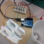
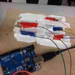
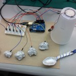
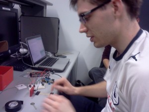
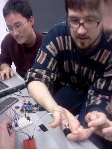
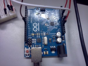
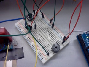
We played around with capacitive proximity sensing to detect when a user touches the instrument when we considered building 3 music instrument prototypes. We used the same circuit design for a 5-note musical instrument and varied the interface. Each uses aluminum foil in various configurations to play different notes. The first is a guitar tab style device, with aluminum covering stiff paper tabs. The second is a mini piano using pistachio shells to hold clumps of aluminum foil. The final design is a xylophone kit style device, using capacitive sensing with spoons hitting aluminum balls which act as the xylophone bars. We liked the xylophone the best because it had the most interesting visual setup and a comfortable interface, letting users play notes quickly and intuitively. It’s a fun, easy-to-use instrument with a creatively natural use of spoons 🙂

PROTOTYPE #1: GUITAR TABS

The user strums or just simple touches a tab in order to play a corresponding note.

Music: “When the Saints Go Marching In”

PROTOTYPE #2: PISTACHIO PIANO

Pistachio shells are used as the base to hold balls of aluminum. The user touches their finger to each aluminum-covered shell to play a note.

Music: “Turret Opera,” Portal 2

FINAL PROTOTYPE: SAXOBEAT

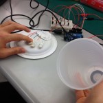
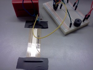
User holds the round end of the spoon, engaging the capacitive nature of the aluminum material. The round end is connected to the flat tip using a wire, and touching the aluminum balls generates a note.

Music: “Mr. Saxobeat,” Alexandra Stan

LIST OF PARTS:

  • Balls of aluminum (x5)
  • Plastic spoons (x2)
  • Aluminum sheet
  • 10 megaohm resistor (x5)
  • Arduino Uno (x1)
  • Piece of cardboard (x1)
  • Breadboard (x1)
  • Wires

SETUP INSTRUCTIONS: 

  1.  Wrap the round end of the spoon with aluminum. Wrap the thin, flat end of the spoon with aluminum as well. Tape a piece of wire connecting the round and flat end.
  2. Secure the five balls of aluminum to a stiff piece of cardboard using electric tape.
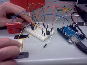
  3. Wire up the arduino. Place the five resistors on the breadboard and connect each end to a digital pin. Connect another end of each resistor to an aluminum ball.
  4. Upload the code and enjoy!

ARDUINO CODE:

// Team Deep Thought
// "Saxobeat" Musical Instrument

#include 

CapacitiveSensor   Eb = CapacitiveSensor(3,2);        // 10 megohm resistor between pins 4 & 2, pin 2 is sensor pin, add wire, foil
CapacitiveSensor   D = CapacitiveSensor(5,4);
CapacitiveSensor   C = CapacitiveSensor(7,6);
CapacitiveSensor   Bb = CapacitiveSensor(9,8);
CapacitiveSensor   A = CapacitiveSensor(12,11);
int spkr = 10;

// Turret Opera
int fA = 440;
int fBb = 466;
int fC = 523;
int fD = 587;
int fEb = 622;

// When the Saints Go Marching In
int wC = 262;
int wD = 294;
int wE = 330;
int wF = 349;
int wG = 392;

// Saxobeat
int sB = 494;
int sCs = 554;
int sD = 587;
int sE = 659;
int sFs = 740;

void setup()                    
{

   A.set_CS_AutocaL_Millis(0xFFFFFFFF);
   Bb.set_CS_AutocaL_Millis(0xFFFFFFFF);
   C.set_CS_AutocaL_Millis(0xFFFFFFFF);
   D.set_CS_AutocaL_Millis(0xFFFFFFFF);
   Eb.set_CS_AutocaL_Millis(0xFFFFFFFF);
   pinMode(spkr, OUTPUT);
   Serial.begin(9600);

}

void loop()
{
    long nA = A.capacitiveSensor(30);
    long nBb = Bb.capacitiveSensor(30);
    long nC = C.capacitiveSensor(30);
    long nD = D.capacitiveSensor(30);
    long nEb = Eb.capacitiveSensor(30);

    // Turret Opera
//    if (nA > 1000) tone(spkr, fA, 80);
//    else if (nBb > 1000) tone(spkr, fBb, 80);
//    else if (nC > 1000) tone(spkr, fC, 80);
//    else if (nD > 1000) tone(spkr, fD, 80);
//    else if (nEb > 1000) tone(spkr, fEb, 80);
//    
//    // Saints 
//    if (nA > 1000) tone(spkr, wC, 80);
//    else if (nBb > 1000) tone(spkr, wD, 80);
//    else if (nC > 1000) tone(spkr, wE, 80);
//    else if (nD > 1000) tone(spkr, wF, 80);
//    else if (nEb > 1000) tone(spkr, wG, 80);

    // Saxobeat
    if (nA > 1000) tone(spkr, sB, 80);
    else if (nBb > 1000) tone(spkr, sCs, 80);
    else if (nC > 1000) tone(spkr, sD, 80);
    else if (nD > 1000) tone(spkr, sE, 80);
    else if (nEb > 1000) tone(spkr, sFs, 80);

}

Lab 2 (The Elite Four)

The Elite Four (#24)
Clay Whetung (cwhetung@)
Jae Young Lee (jyltwo@)
Jeff Snyder (jasnyder@)
Michael Newman (menewman@)

What we built and why:
We built a softpot-based instrument that plays totally rocking guitar solos. It uses a softpot to select frequency and a button that allows sound to be played when pressed. We are collectively fans of not just one specific band, but rather the whole genre of rock ‘n’ roll. We wanted to make sure that all aspects of our instrument went up to 11, right across the board. Therefore, we modified our softpot-based prototype to use the most rocking of all pitch mappings: the blues scale. We were able to achieve a good approximation of many rock classics with our instrument, including “Tonight I’m Gonna Rock You Tonight” and “Stonehenge.” The thing we liked most about the final iteration was its ability to play sick guitar solos as well as classic riffs. Pitch was a little difficult to control precisely with a finger, as we needed a range of two octaves to really rock out, but it was easy to control with precision using a pencil or other stylus-like object. In a future iteration, the ability to play multiple notes at once would help us to rock out even harder. Specifically, the ability to play power chords would help us cement our status as one of F114’s loudest lab groups.

Prototypes:

Prototype 1

Jeff demonstrates our first prototype, a softpot-based instrument.

Jeff demonstrates our first prototype, a softpot-based instrument.

This prototype features a softpot that controls frequency (broken up into discrete notes) and a button that, when clicked, plays a note. By moving a finger along the softpot and simultaneously pressing the button, it’s possible to play simple melodies.

Prototype 2

By flexing his finger, Clay can change the frequency of this instrument.

By flexing his finger, Clay can change the frequency of this instrument.

This prototype features a flex sensor that controls frequency and a button that, when clicked, plays a note. We attached the flex sensor to our subject’s finger so that he was able to play different melodies simply by bending his finger while pressing the button.

Prototype 3

In this prototype, frequency is controlled by a force sensor, and clicking a button allows a note to be played. One can play a tune by squeezing the force sensor with varying degrees of force while simultaneously pressing the button.

The final system:
For the final system, we chose to work with our first prototype: the softpot-based instrument. As before, the button controls when a note is being played, but the mapping of softpot to frequency was altered to allow playing “guitar solos.” Below, we have photos and video of the system in action.

The entire system

The entire system

The final system's Arduino connections

The final system’s Arduino connections

Closeup of the breadboard, with button and speaker

Closeup of the breadboard, with button and speaker

finalphoto5

Closeup of the frequency-controlling softpot

As seen in the video, the system has been refined to allow rockin’ riffs instead of just simple melodies. This change was made by altering the system’s code, not by changing the hardware.

Ingredients:
1 Softpot
1 Speaker
1 Large Button
1 Arduino
Breadboard(s)
Jumper Wires
Tape

Recipe:
0. Insert the softpot, speaker, and button into the breadboard. The speaker and button are most easily inserted spanning the middle divider. You may find it helpful for the following steps to connect ground and +5V to the power rails of the breadboard.
1. Attach the far left pin of the softpot to ground and the far right to +5V. Connect the middle pin to the A0 pin of the Arduino.
2. Connect one side of the speaker to ground and the other to one side of the button. Connect the other side of the button to pin 8 of the Arduino.
3. For added stability, tape the softpot to a hard surface (like the table).

Source code:

/* 
  Authors: jasnyder, cwhetung, menewman, jyltwo
  Date: 3/4/2013
  COS 436 Lab L2: Awesome Electric Guitar Instrument

  Our instrument: By using a softpot, we created something similar
  to a keyboard. We first experimented with a typical scale, and eventually
  chose notes to make a solo electric guitar. There are 10 possible pitches
  mapped by the softpot, and the sound is outputted through the speaker as
  values are continously read in. 
*/

#include "pitches.h"

// Pitches on our guitar
int pitches[] = {NOTE_G5, NOTE_AS5, NOTE_C6, NOTE_DS6, NOTE_F6, 
                 NOTE_FS6, NOTE_G6, NOTE_AS6, NOTE_C7, NOTE_DS7};

//  Musical constants
const int NOTE_DELAY = 300; // ms
const int NOTE_DUR = 250;   // ms

//  Pin connection constants
const int softpot = A1;
const int speaker = 8;

// Softpot reading
int softpotValue = 0;
// Mapped value of softpot
int note = 0;

// Continuously read values from the softpot and output the corresponding tone
void loop() {
  softpotValue = analogRead(softpot);
  note = map(softpotValue, 0, 1023, 0, 9);

  tone(speaker, pitches[note], 1);
}

P2

Group 7 Members

David Lackey

Conducted an hour and a half of observations.  Led the blogging / project managed.

John O’Neill

Conducted an hour of observations and thirty minutes of interviews.  Led user-casing / user tasking.

Horia Radoi

Conducted 40 minutes of observations and interviews and was the primary story-boarder.

Overview

The problem that we are addressing is bad sitting posture with students who are working at desks.  Our proposed solution is a wearable posture detector in the form of an under armor shirt.  This solution addresses the problem because we can gather all of the necessary information about the user’s back posture and alert them through the device that they’re wearing.  It can be easily embedded in the user experience without taking too much away from the task at hand.

Description of Observations

Our target user group includes people who study at desks and who are concerned with their sitting posture.  Additionally, these people need to be comfortable with the idea of technology helping their well-being.  We could have focused on posture in other realms, such as weight-lifting, etc, but we wanted to focus on an application of posture where many people spend a great deal of time.  Also, back problems associated with sedentary life styles is quite common.

See Appendix for thorough collection of observations.

User 1

User number 1 is a female undergraduate who has a history of back-related problems and has to spend a majority of their day in front of a laptop. They often enjoy using their computer for non-work activities, including watching videos, but dislike how using a laptop often requires you to look down / crane your neck. One of their greatest priorities is being able to focus in on their laptop work for hours at a time. They are a great candidate, given their applicability to our target user group (undergraduates who work at desks,) their history of dealing with back issues, and their laptop-heavy workflow.

User 2

We were unable to conduct an interview with user 2, but, based on the hour and fifteen minutes that we observed her for, we were able to extract a lot of important information about long-term seating habits for a relevant target user.

She was studying scientific books in the Friend Engineering Center Library, meaning that it is very likely that she is some sort of engineering student.

User 3

Our third user does not study in libraries that often.  She does, however, study in a chair at a desk in her room.  Without the scrutiny of others, it’s harder for her to force herself to not slouch.  Her priorities include making her room a productive, but healthy place to study.  She likes to study in her room more than the library.

Observations

To observe people, we would sit towards the edges of large seating areas in libraries.  This allowed us to pinpoint students who seemed to be a part of the target user group.  We identified these students by their noticeably bad seating posture.

Each of our users were clearly dealing with discomfort from long periods of sitting.  To deal with it, they would often stretch their backs, change to another position, or rub their necks.  See the Appendix A for the minute by minute observations of user 2.  Many of the observed mannerisms (such as those discussed in the above paragraph) were present in our observations of other users as well.

We found user 3’s note about the scrutiny of others to be very interesting.  Being scrutinized by others actually has an impact on your posture.  Being able to impose this scrutiny artificially through the device could prove to be beneficial.

A unique thing about user 1 is that she had back problems earlier in life, so back posture is especially important.

In terms of workflow, users 1 and 2 both appreciated long periods of time to focus on work.  User 3, however, approached work with a more off and on approach.  User 3 said that this made it a little easier to maintain proper back posture, since it was for shorter periods of time.

Task Analysis

  1. Who is going to use the system?

Undergraduate students who are concerned with their back posture while working and wish to improve it through the use of technology. Can be adapted to fit general people who are concerned about their posture while doing office work, or people who need a specific form for an athletic activity.

  1. What tasks do they now perform?

Working at desks with improper back, neck, and wrist posture, often for extended periods of time (over 15 minutes in a single posture). This causes problems in the long run. A specific target group would be young adults, who are at the end of their growth period, and for whom a poor posture can have long-lasting health effects.

  1. What tasks are desired?

To maintain proper posture while working at a desk.

  1. How are the tasks learned?

An extremely basic, printed walkthrough will accompany the hardware. This manual will explain how a user sets a “default” / “base” posture, and what will happen when one deviates from the base posture. At the same time, a doctor can set up a desired position during a consultation, and the user will have the choice to move between his personal mode or the doctor suggestion.

  1. Where are the tasks performed?

Wherever a student is working at a desk (the library, their room, etc.) or doing an activity that would put the back in a non-ideal position.

  1. What’s the relationship between user & data?

The user can interact with the data and set up an ideal back position, can switch between two modes (one of which is considered to be a physician’s recommendation). The analysis and alerting will be done automatically.

  1. What other tools does the user have?

None. He will interact with the computer through SET and CHANGE buttons, and will need to wear the hardware in order for it to function.

  1. How do users communicate with each other?

They don’t. This is an individual product. Different modes can be loaded using the USB cable.

  1. How often are the tasks performed?

It is recommended for users to wear the device every time their back will be in the same position for a long period of time (ie. while working, doing homework, working out etc.)

  1. What are the time constraints on the tasks?

There will be no time constraints except for the battery life of the device.

  1. What happens when things go wrong?

If things go wrong, the system may be encouraging bad back habits, which is counterproductive.

Description of Three Tasks

Task #1: Set up a desired back position.
The user must designate the “default” or “base” posture that will function as the user’s desired posture. This can be done by the user (or, for use cases outside of those we are studying, by a medical professional.) The user chooses a good posture and presses a button on the device to set the base;
the system will memorize this ideal position in order to record how far away the user deviates from it.

Difficulty Analysis

Finding a desirable posture requires no hardware or software – just an acute attention to how your body is feeling when undergoing certain postures. This means that our task is easy when performed using pre-existing tools and applications. Under a system, however, a “desired back position” has a specific definition and requires calibration, thus the level of difficulty is moderate.

Task #2: Alert user if back position / posture deviates too far from desired posture. Small motors in the system (ideally along the back / along the area of bad posture) will vibrate to notify the user that they have bad posture. We need to test whether we notify the user after a certain threshold of deviance (slouches too much,) if an improper posture is held for too long a duration (slouching for too long,) or some combination of the two.

Difficulty Analysis

One can currently ask another person to monitor their own posture, but this requires an additional person who is watching at all times, making this difficulty-level moderate. However, the device alerts the user automatically / without volition of the user, making this task difficulty easy.

Task #3: Monitor how their posture changes. User can optionally plug the wearable device into the laptop, which will record the readings of the resistors. We can use this data to show the users – in a nice, visual format – how often and how much they deviated from their ideal posture.

Difficulty Analysis

There may be some medical device that quantifies / provides feedback on a patient’s posture, but we are unaware of such things. This high barrier is why we are monitor this task as difficult. However, with this device, the user only needs to plug in the device, which is why we label this task as moderate.

Interface Design

Description

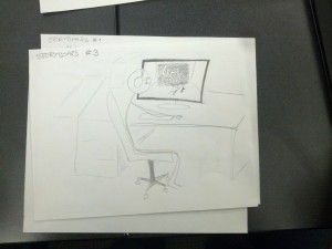
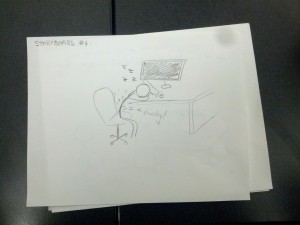
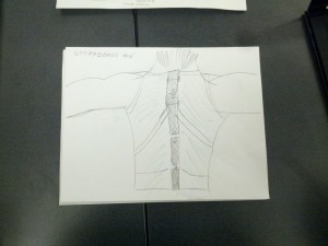
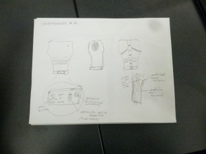
The system is a wearable device that helps users maintain good posture. It monitors the user’s back posture and alerts them when it deviates from a desirable position, and can optionally provide the user with data on when and by how much they deviate from their desired posture. In form, the device is similar to underarmor; this is because the slim fit allows the sensor to more accurately monitor changes in the user’s posture. If the user has a chance to plug the device into a laptop, a program can extract readings from the device, allow the user to view changes in their posture over time. Ideally, such a system would encourage healthier habits in regards to posture. To our knowledge, there is currently no wearable system is dynamically monitors and provides feedback for bad posture.

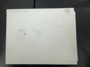
Storyboards
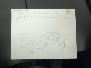
Colonial (8)  Colonial (6) Colonial (5) Colonial (4) Colonial (3)

System Sketches

Colonial (2) Colonial (1)

Appendix A – Minute by Minute Observations of User 2

  • Where: Friend Library 2nd Floor
  • When: 12:00 PM on 3/8/12
  • Girl in green jacket sits and gets comfortable
    • Puts jacket around chair
    • Has a small world coffee
  • First sits on edge of her seat and uses smartphone
  • Stands up and starts to pull items out of backpack
    • Pulls out Windows computer
  • Sits back down and rolls back sleeves
    • Ties back hair
    • Cleans glasses
  • Looks out the window
  • Immediate posture
    • Edge of seat
    • One foot on ground
    • Kind of hunched over computer
  • Gets up and takes a photo of the snow with smartphone through window
  • Sits back down
    • Feet all over the place
    • Upper body pretty steady
      • Both elbows out resting on the table
      • Head forward over keyboard
      • Shoulders close together
  • After 5 mins, sits up tall briefly
    • Adjusts hair and maintains position for a few seconds
  • Returns to a position with a lesser posture
    • Head is more forward and lower
    • More slumped over computer in general
  • Slowly gravitates to original position over the course of several minutes
  • When: 12:15 PM
  • Legs reach a somewhat consistent form of being crossed
  • Head gets lower again
  • When: 12:21
  • Rubs neck with left hand
  • Rolls up sleeves and returns to work
  • Reaches the new posture
    • Elbows still resting on table
    • Left hand on neck
    • Right hand using computer
  • Puts on big green jacket
  • Goes to original posture
  • When: 12:40
  • Hunched more forward
  • Hunches over her phone every once in a while to send a text
  • When: 12:45
  • Leans more on right side
  • Sits up tall and puts elbows close together as a stretch
  • Almost back to original posture, elbows slightly more in
  • Elbows out again, more slump
  • Leans way forward with arms on lap and stays with this new posture
  • Leans back in chair after brief back twist stretch
  • Leans forward again
  • Gets up and throws coffee away
  • When: 12:50
  • Arms on lap, hunched forward
  • leaning forward on right arm
  • Sits tall and scoots chair forward so that her back is flush to the back of the chair and she’s close to desk
    • Arms on lap
  • When: 1:00
    • Left elbow on chair’s left arm
    • Leans
  • When: 1:10
  • Shift from elbow to elbow on chair’s arms
  • Looks uncomfortable
  • When 1:15
  • Stretches back backwards over chair
  • Leans forwards again with arms on lap

P2 – The Backend Cleaning Inspectors

Group Number
8

Members and Their Tasks

  • Tae Jun Ham (tae@): Designed the lock system.
  • Peter Yu (keunwooy@): Conducted an interview, helped with the design and the write-up.
  • Dylan Bowman (dbowman@): Conducted an interview, helped design the product and answer questions.
  • Green Choi (ghchoi@): Conducted an interview, drew the sketches and helped with the write-up.

All members contributed pretty much equally.

Problem and Solution Overview
Our idea addresses the common problem at Princeton of strangers tampering with, moving, or even stealing other peoples’ laundry that is left in the machine after the cycle. Our solution is to build a locking system to provide security. It will take Princeton NetID from the user and lock the machine until the grace period (10 minutes or so after the end of the cycle) is over. The user will be notified about the status of the machine via email. Other users who are waiting to use the machine can inquire the current user when he/she will retrieve the laundry by pressing a button on our device. By providing security and enabling the communication between users, our system can effectively prevent theft and tampering with laundry.

Description of Interviewees

  1. Male, 21, Junior, Econ Major, from Pennsylvania. Varsity soccer player. Normal/preppy style. Laundry every three weeks
  2. Male, 21, Senior, Architecture Major from Boston. Normal/preppy style. Laundry every month
  3. Female, 19, Freshman, No major yet from San Diego, California. Athletic style. Laundry once every month.

We chose these people, because they were doing their laundry or waiting to do their laundry in the laundry rooms on campus. These people are perfect candidates for our CI interview as they are our target users.

CI Interview Description
We waited in the laundry rooms of various locations on campus to interview people who came to do their laundry. We would then politely ask them to participate in a short interview, and we would ask them questions about their laundry process and related things. We kept things focused on specific things they did during their laundry process and what specific things were important or not important to them during that process. Some example questions we asked during our interviews: Describe your typical laundry routine in as much detail as possible. Do you stay while your laundry is running, or do you go do other things in the meantime? Do you usually retrieve your laundry as soon as it’s done or do you wait a certain amount of time (either accidentally or on purpose) before you do? Have you or your roommates ever had any problems with people taking your laundry out of the machines before? When d you usually do your laundry? And many more…

One theme that was common in our interviews was that people did not wait in the laundry room for their laundry to be done. They would usually return to their rooms or another place on campus to do work or other activities and return to get their laundry once it was done. This would imply that most people on campus do not wait around while their laundry is running. This is pretty easily explainable: Most people at Princeton are incredibly busy. Students have school work, real work, job applications, sports practices, musical practices, social activities, etc. They need to use any possible time they have to do these things and waiting around for their laundry to finish is not an option really unless they are doing work while they wait (which is what one of our subjects actually does). However, most people prefer to do their work in their rooms or a library rather than in a laundry room, and thus most people do not remain around to watch their clothes.

Another theme that was common in our interviews was that they seldom came back on time to retrieve their laundry, usually coming back 15 to 30 minutes late. Again, people are busy doing things and sometimes those things don’t end exactly when their laundry ends. Or sometimes people just forget their laundry is running. Both explanations have a hand in this effect, and our product can help with both. Only a few differences were observable. First, the subjects all had different levels of how far they would go when dealing with another person’s laundry. One said that he would take out a person’s laundry from either a washer or dryer if it was done running. Another said that he would only take it out of the dryer. This is interesting, but the fact still exists that people do take things out of machines when people don’t want them to and that’s where our product comes in. One last difference is the interview with the girl revealed concerns about the privacy of her clothes. We think this is fairly straightforward in that girls are more conscious about their clothes being seen or touched by other people. We feel that this feeling is in the majority among girls at Princeton.

Answers to 11 Questions
1. Who is going to use system?
– There are two parties involved in the laundry rooms on campus: people who are using the washing machines (the Current User) and people who are waiting to use the washing machines (the Next User). Let’s assume laundry thieves are included in the second group.

2. What tasks do they now perform?
– As of now, the Current User simply brings his/her laundry to the laundry room, puts the laundry in the machine, goes back to whatever he/she was doing, and then comes back to retrieve the laundry.
– The amount of time between when the laundry is done and when the student retrieves his/her laundry varies widely, and it’s one of the main causes of the temperament of laundry and theft.
– The Next User, when there is no available laundry machine, usually takes finished laundry out of the machine to use the machine. Thieves will steal the laundry that has been taken out of the machine.

3. What tasks are desired?
– As for the Current User, protection from other students taking their stuff out of the machines or steal it without knowledge of the user is desired. The task that we will provide with our product will be to prevent potential thieves or laundry miscreants from messing with or stealing the user’s clothes, something that is very personal and meaningful to most students.
– As for the Next User, a channel to communicate with the Current User of the laundry machine is desired. It could be a button that will send the Current User of the machine a message that someone wants to use the laundry machine. The Current User can also send a notification back to the device when he/she will be back. This way, the Next User knows when the Current User will be back and is less likely to take the laundry out, thereby preventing theft and temperament.

4. How are the tasks learned?
– Instructions will be emailed to student residential listserves
– Instruction placards or flyers will be posted in laundry rooms and on machines
– Instruction manual will be included with the product.

5. Where are the tasks performed?
– In public laundry rooms across campus with wifi connections

6. What’s the relationship between user & data?
– We deal with few data which include laundry machine status and user’s Princeton NetID. For laundry machine status, we will let all users to see it in remote location via separate website. For user’s Princeton NetID, as this information is private,

7. What other tools does the user have?
– Virtually all users will have access to constant communication through email. Our product will take advantage of this by emailing the user when certain actions occur, such as their laundry being done, or when someone waiting to use the machine presses a warning button on the locking unit during the wash cycle or during the waiting period.

8. How do users communicate with each other?
– One important way our product will facilitate important communication between users is through the use of a certain button that serves the following purpose: Our user’s laundry machines will remain locked by our product for a certain period of grace time after the laundry is done. If someone is waiting to do their laundry and all of the machines are taken, they can press the button once at any time during the cycle. Our product will then send a quick email to the user alerting them that someone is waiting to use their machine and that they should retrieve their laundry as soon as possible after its done. This is an important way that the users of our product will communicate with each other.

9. How often are the tasks performed?
– Per individual user: Anywhere from once a week to once every 3 weeks.
– Campus-wide: Frequency depends on the time of the day and the day of the week. Students tend to do their laundry in after-class hours, later at night, and on the weekends.
– It is here noted that the late night hours are often used to avoid the very problem of laundry tampering that we are trying to solve.

10. What are the time constraints on the tasks?
– Users washing their clothes have the time constraint of the laundry cycle time, plus the varying time constraint of the grace period time that is determined based on the laundry room traffic at given times or days of the week. This grace period may be determined by survey or dynamically as users use our machines.

11. What happens when things go wrong?
– When the grace period is over, our product will automatically unlock. This means that anyone can get to the current user’s laundry. This isn’t exactly “things going wrong” as the product was designed this way. This situation would be more of the user’s fault. One thing that could wrong is our product malfunctions and either: 1) unlocks when it shouldn’t and allows things to be stolen. Hopefully our code can have some fallback mechanism to at least alert the user that their laundry is no longer locked. 2) remains locked when it shouldn’t be. This is a bit more difficult to deal with as there really is no other way to fix this other than physically breaking into the lock. Thus, we must be extremely careful to not allow this to happen in our product.

Description of Three Tasks
1. Current User: Locking the machine:
– User inputs netID into locking unit keypad. This netID is used as the password for unlocking the machine, as well as the email address used to send warning messages by the locking unit (and the next user).

2. Next User: Sending message to current user that laundry is done and someone is waiting to use the machine:
– The next user waiting for the machine (when no other machines are open) can press a button at any time during the cycle. When the button is pressed (only once per cycle), our product will send an email to the current user saying that someone is waiting to use their machine after they are done and that they should go retrieve their laundry as soon as possible after it is done.
– Current Difficulty with current technology/tools: Close to impossible. There is almost no way to tell who is using which machine and just as hard to contact them even if you do know who is using it (assuming you’re not friends with that person).
– Difficulty with our Product: Easy. Literally as easy as pressing a button.

3. Current User: Unlock the machine:
– If the machine is currently locked (during the grace period), the current user must input his netID to unlock the door and extract his laundry.

– Current Difficulty with current technology/tools: Very easy. Just open the door of the machine…
– Difficulty with our Product: Easy/Moderate. The user will simply input his netID during the grace period after the wash cycle, unlocking the door and allowing him to take out his pristine, un-tampered-with laundry. The only difficulty with this step is the user forgetting, ignoring, or failing to comply with the warning messages and not unlocking the unit on time. This will result in the automatic unlocking of the door and the giving up of the laundry’s sanctity and innocence to the winds of fate.

Interface Design
Our system provides the user with extra security for his/her laundry and better means of communication between users. After starting the laundry machine, the user will lock it with our device by entering the NetID. Our device gives the user a short grace period after the laundry is finished. During this time, the Next User can send the Current User an email by simply pressing a button on our device, thereby notifying the Current User that there is a person waiting to use the machine. This will prompt the Current User to retrieve his/her laundry. If the Current User needs more time, he can simply reply to the email to let the Next User know when he/she will be retrieving the laundry.

This slideshow requires JavaScript.

This slideshow requires JavaScript.